Why Does Beige, Black & White Work So Well in the Kitchen? (And How to Copy It)
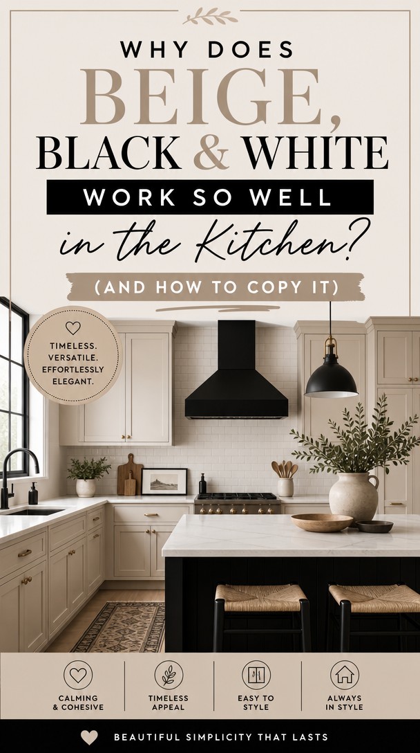
There’s something undeniably powerful about a kitchen dressed in beige, black, and white—it feels both timeless and deeply intentional.
If you’re the kind of woman who believes every room deserves the same thoughtfulness as your wardrobe, this palette is your perfect starting point.
Let’s explore how these three neutrals can transform your kitchen into a space that truly speaks your language.
Why Beige, Black & White Works So Well in the Kitchen
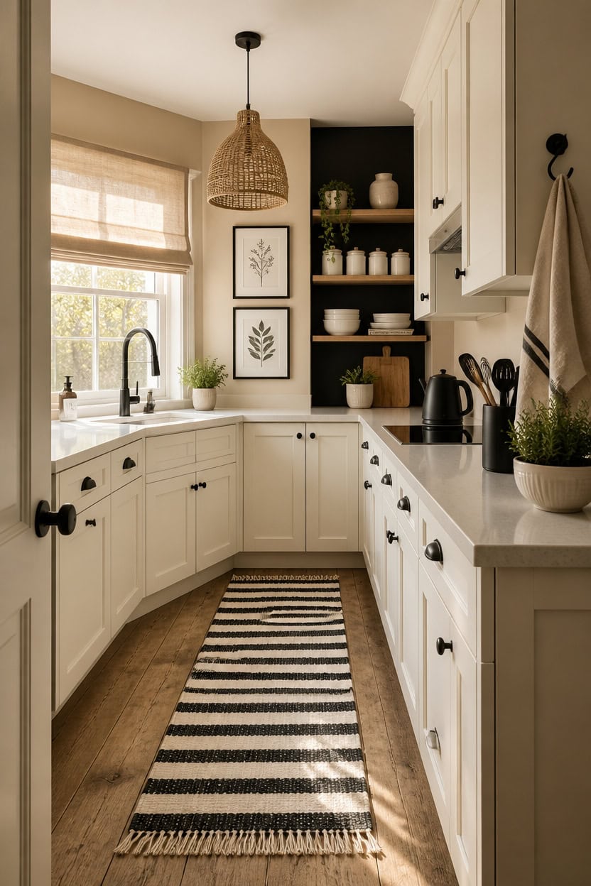
Beige, black, and white work as a trio because each color plays a defined role — beige warms, white opens, and black anchors. Without the beige, a black-and-white kitchen feels cold and clinical; without the black, beige and white blur together with no visual edge. Use a 60/30/10 ratio: beige on walls and larger surfaces, white on cabinets and counters, black as the sharp punctuation in fixtures and frames.
Lead with beige warmth: Choose a warm greige or sand tone for walls so the space never reads sterile or showroom-flat.
Use white to reflect light: White cabinets or open shelving bounce natural light around the kitchen and keep the palette from feeling heavy.
Let black do the editing: A few black accents — pendant lights, a faucet, frame edges — give the eye a clear place to land.
Avoid pattern overload: Stick to one patterned textile, like a striped rug, so the neutral palette stays calm and intentional.
a soft, warm greige that bridges the black and white without feeling muddy or dated.
a true, grounded black that makes displayed dishware and decor pop dramatically.
 Madison Park Cordless Roman Shades, Linen Blend Blinds, 31x64 Natural
View Price
Madison Park Cordless Roman Shades, Linen Blend Blinds, 31x64 Natural
View Price
 Bodum 27oz Bistro Gooseneck Electric Water Kettle, Pour Over Coffee & Tea, Stainless Steel, Matte Black
View Price
Bodum 27oz Bistro Gooseneck Electric Water Kettle, Pour Over Coffee & Tea, Stainless Steel, Matte Black
View Price
 Umite Chef Dinnerware Set for 4, 12 Pieces Plates and Bowls Set
View Price
Umite Chef Dinnerware Set for 4, 12 Pieces Plates and Bowls Set
View Price
 KOZYFLY Black White Striped Runner Rug 2x6 ft Woven Washable Hallway Runner
View Price
KOZYFLY Black White Striped Runner Rug 2x6 ft Woven Washable Hallway Runner
View Price
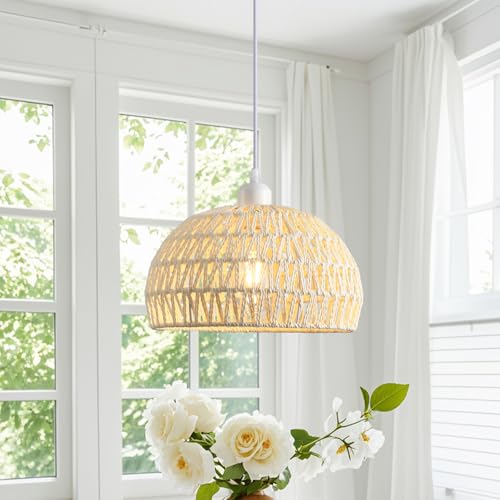 Rattan Pendant Light, 11" Boho Dome Dining Room Chandelier, Cream Woven Kitchen Pendant Lighting over Island, Coastal Wicker Light Pendant Hanging Light Fixture for Nursery Entryway Bedroom, E26
View Price
Rattan Pendant Light, 11" Boho Dome Dining Room Chandelier, Cream Woven Kitchen Pendant Lighting over Island, Coastal Wicker Light Pendant Hanging Light Fixture for Nursery Entryway Bedroom, E26
View Price
 2Pcs Black Frame Botanical Plant Boho Leaf Eucalyptus Wall Art 12x16in
View Price
2Pcs Black Frame Botanical Plant Boho Leaf Eucalyptus Wall Art 12x16in
View Price
 ZEBERBO 4 Piece Airtight Ceramic Canister Set With Attached Wooden Spoon Reusable Chalk Labels For Dry Goods Sugar Coffee Tea Kitchen Storage Use (White)
View Price
ZEBERBO 4 Piece Airtight Ceramic Canister Set With Attached Wooden Spoon Reusable Chalk Labels For Dry Goods Sugar Coffee Tea Kitchen Storage Use (White)
View Price
 Steelware Central Large Black Kitchen Utensil Holder - Stainless Steel Cooking Utensil Crock & Countertop Organizer, Extra Large Metal Spatula Holder for Countertop Decor
View Price
Steelware Central Large Black Kitchen Utensil Holder - Stainless Steel Cooking Utensil Crock & Countertop Organizer, Extra Large Metal Spatula Holder for Countertop Decor
View Price
How to Find Your Version of Beige
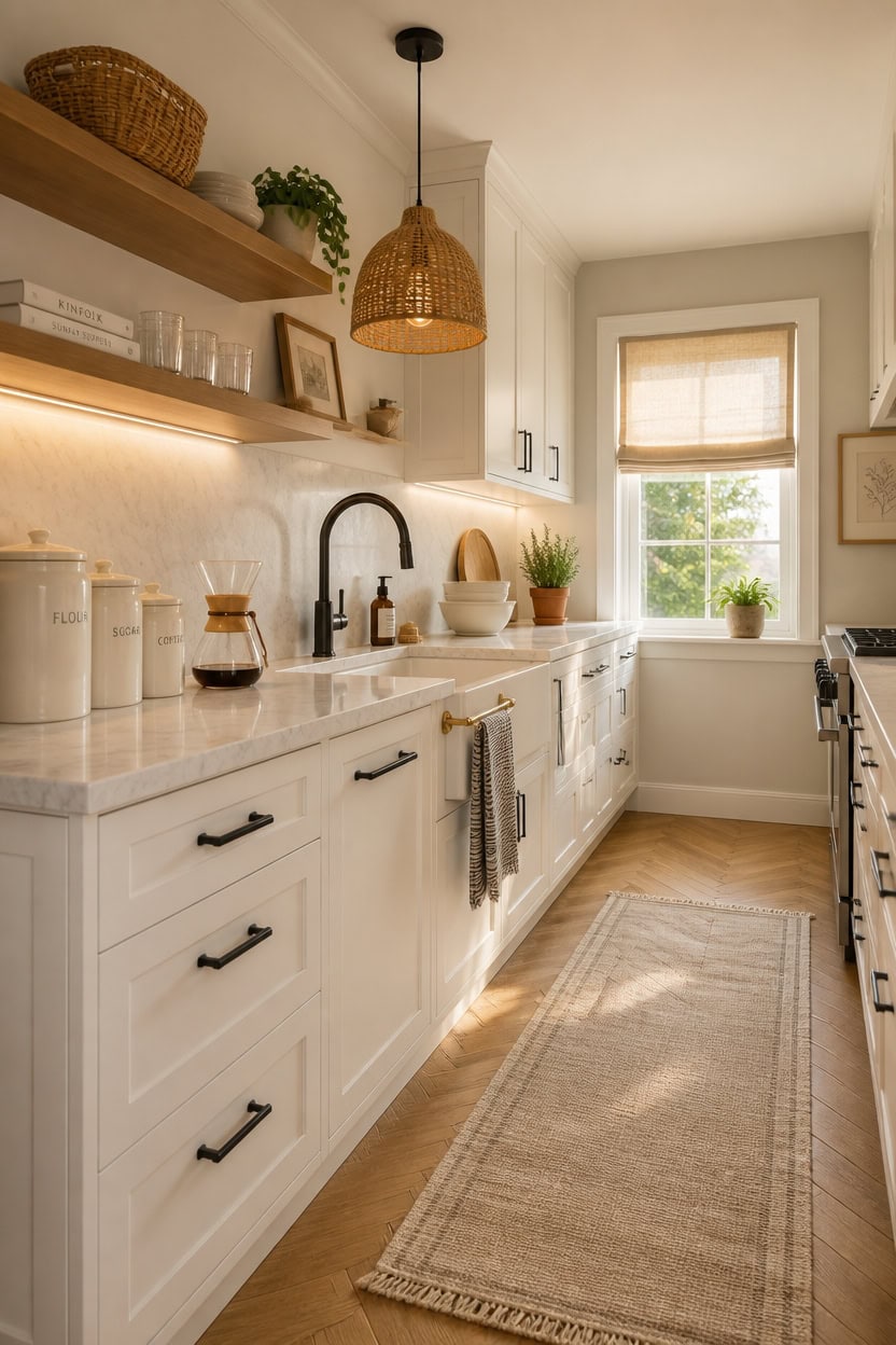
Beige isn’t one color — it reads completely differently depending on the undertones already present in your kitchen’s lighting, flooring, and countertops. A beige with pink undertones can look peachy in warm afternoon light, while a beige with gray undertones can flatten into a dull greige under LED lighting. Test three to four samples on your actual walls and live with them for two days before committing.
Check undertones first: Hold a white piece of paper next to the paint chip — any pink, yellow, or green will show immediately against the neutral white.
Match your fixed finishes: If your countertops are cool-toned, choose a beige that leans gray; if your floors are warm wood, pull a beige with a golden or tan undertone.
Test in natural and artificial light: Kitchen lighting changes color dramatically from morning sun to evening overhead bulbs, so sample swatches must be checked in both.
Narrow by elimination: Rule out anything that reads orange, peachy, or lavender first — what’s left will almost always work as a true beige anchor.
a soft warm greige that adapts to both cool and warm light without pulling muddy or orange.
 Sweese Porcelain Serving Bowls Set, 10-42 oz, Versatile for Salad, Soup, Snacks, Microwave Dishwasher Safe, White
View Price
Sweese Porcelain Serving Bowls Set, 10-42 oz, Versatile for Salad, Soup, Snacks, Microwave Dishwasher Safe, White
View Price
 Black and White Striped Hand Towels for Bathroom, Vintage Kitchen Decor
View Price
Black and White Striped Hand Towels for Bathroom, Vintage Kitchen Decor
View Price
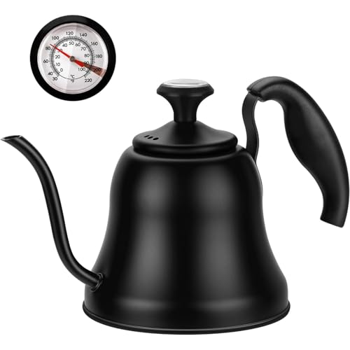 Chefbar Tea Kettle with Thermometer, Gooseneck Pour Over, 28oz, Matte Black
View Price
Chefbar Tea Kettle with Thermometer, Gooseneck Pour Over, 28oz, Matte Black
View Price
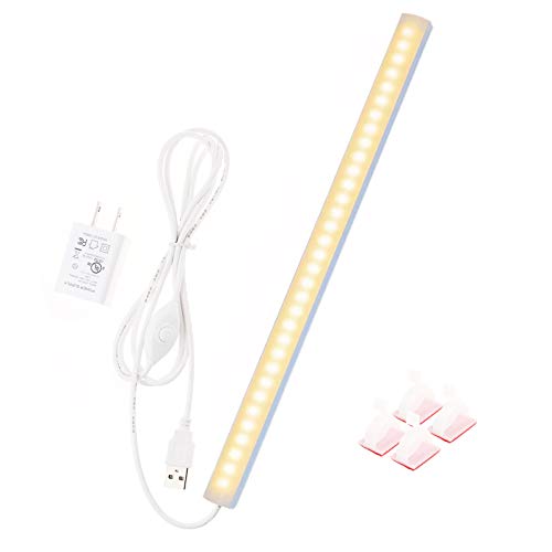 JUSJUBR 12-Inch Slim LED Under Cabinet Light with Memory Function, Warm White 3000K Dimmable USB Light Bar for Rooms
View Price
JUSJUBR 12-Inch Slim LED Under Cabinet Light with Memory Function, Warm White 3000K Dimmable USB Light Bar for Rooms
View Price
 AyshwillDec 2 Pack Wicker Pendant Light Natural Woven Pendant Light Boho Chandelier Light Fixture Dome Rustic Farmhouse Pendant Lights Rattan Light Fixture for Kitchen Island Dining Room (Bulb Incl.)
View Price
AyshwillDec 2 Pack Wicker Pendant Light Natural Woven Pendant Light Boho Chandelier Light Fixture Dome Rustic Farmhouse Pendant Lights Rattan Light Fixture for Kitchen Island Dining Room (Bulb Incl.)
View Price
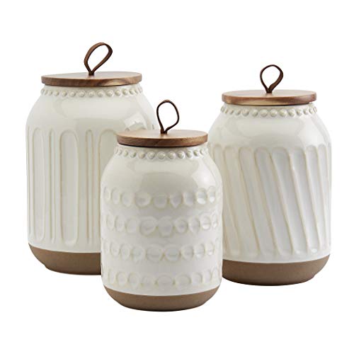 TTU Tabletops Gallery Ceramic Canister Collection- Stoneware Designed Kitchen Storage Embossed Acacia Wood White Set, 3 Piece Embossed Ziggy White Canister Set
View Price
TTU Tabletops Gallery Ceramic Canister Collection- Stoneware Designed Kitchen Storage Embossed Acacia Wood White Set, 3 Piece Embossed Ziggy White Canister Set
View Price
 KOZYFLY Runners for Hallways 2x6 ft Washable Kitchen Runner Non Slip Rubber Backed Hall Runners Cotton Entryway Runner Rugs for Indoor Backdoor Bedroom Kitchen, Oatmeal Beige
View Price
KOZYFLY Runners for Hallways 2x6 ft Washable Kitchen Runner Non Slip Rubber Backed Hall Runners Cotton Entryway Runner Rugs for Indoor Backdoor Bedroom Kitchen, Oatmeal Beige
View Price
Black Accents That Don’t Overpower a Beige Kitchen
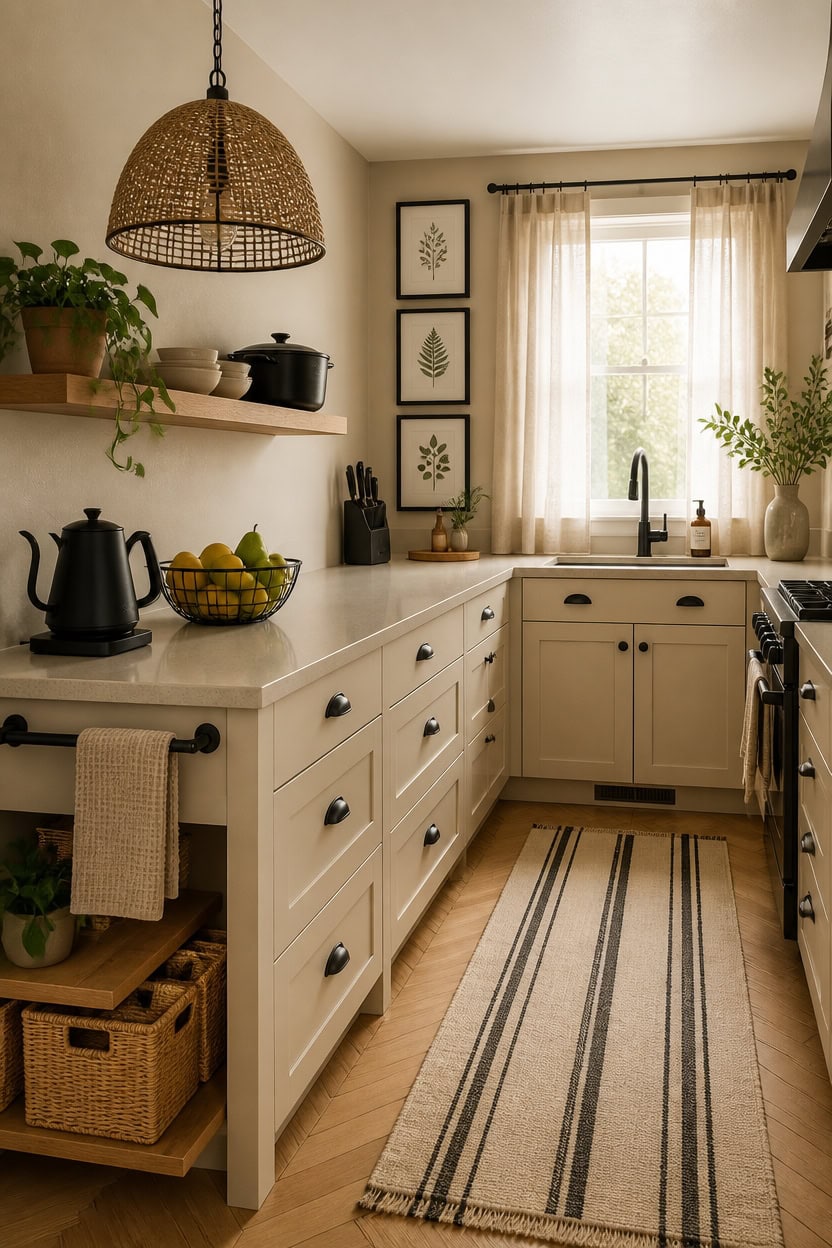
Black accents work best in a beige kitchen when they appear in small, deliberate doses rather than as a dominant surface. The contrast is strong enough that even a few well-placed black elements — a light fixture, a pot rack, a frame cluster — read clearly against a warm neutral background. Keep black to no more than 20 percent of the visual field so it sharpens the space without shifting the mood from calm to dramatic.
Cluster, don’t scatter: Group black accents together instead of spreading them randomly so the eye reads them as intentional, not busy.
Match the finish to the mood: Matte black reads organic and lived-in; glossy black reads sharper and more modern — pick one and stay consistent.
Use black to frame, not fill: Black works best on outlines and edges — light shades, frames, faucet silhouettes — rather than on large flat surfaces.
Balance with warmth: Follow every black accent with a warm-toned natural material nearby, like wood or woven rattan, to keep the kitchen feeling grounded.
a true matte black that anchors the lower half of the kitchen without competing with the warm beige walls above.
a warm greige that wraps the room in cohesion while letting the black accents below stand out cleanly.
 Cosori Gooseneck Electric Kettle with Temperature Control, 0.8L, Black
View Price
Cosori Gooseneck Electric Kettle with Temperature Control, 0.8L, Black
View Price
 7UYUU Fruit Bowl for Kitchen Counter, Black Wire Fruit Bowl, Metal Countertop Fruit Basket, 11 Inches Round Holder for Lemon, Banana, Candy, Snack in Office (Round C)
View Price
7UYUU Fruit Bowl for Kitchen Counter, Black Wire Fruit Bowl, Metal Countertop Fruit Basket, 11 Inches Round Holder for Lemon, Banana, Candy, Snack in Office (Round C)
View Price
 Black Framed Canvas Wall Art for Living Room - Large Size Decor for Bedroom, Green Leaves Paintings, Office Pictures, Kitchen and Bathroom Decoration - Set of 3 Piece Framed Art Prints
View Price
Black Framed Canvas Wall Art for Living Room - Large Size Decor for Bedroom, Green Leaves Paintings, Office Pictures, Kitchen and Bathroom Decoration - Set of 3 Piece Framed Art Prints
View Price
 JONATHAN Y Campana 1-Light Pendant Dome Ceiling Lamp, 20", Black
View Price
JONATHAN Y Campana 1-Light Pendant Dome Ceiling Lamp, 20", Black
View Price
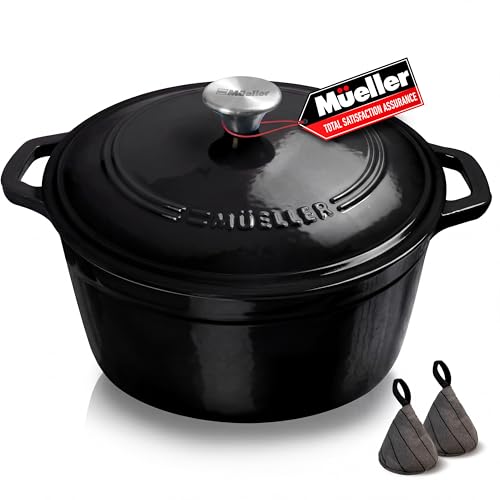 MUELLER HOME 6 Quart Enameled Cast Iron Pot Dutch Oven, Heavy-Duty
View Price
MUELLER HOME 6 Quart Enameled Cast Iron Pot Dutch Oven, Heavy-Duty
View Price
 Homaxy 100% Cotton Waffle Weave Kitchen Dish Towels 4-Pack, Beige
View Price
Homaxy 100% Cotton Waffle Weave Kitchen Dish Towels 4-Pack, Beige
View Price
 KAIZEN Bamboo Knife Block Without Knives - Perfectly Sized Universal Knife Holder for Knives, Scissors - Unique Knife Storage for Counter Top with Anti-Slip Base (Black)
View Price
KAIZEN Bamboo Knife Block Without Knives - Perfectly Sized Universal Knife Holder for Knives, Scissors - Unique Knife Storage for Counter Top with Anti-Slip Base (Black)
View Price
 LEEVAN Outdoor Runner Rug 2x4.3 Black and White Striped Front Porch Rug
View Price
LEEVAN Outdoor Runner Rug 2x4.3 Black and White Striped Front Porch Rug
View Price
Where White Belongs in a Beige and Black Kitchen
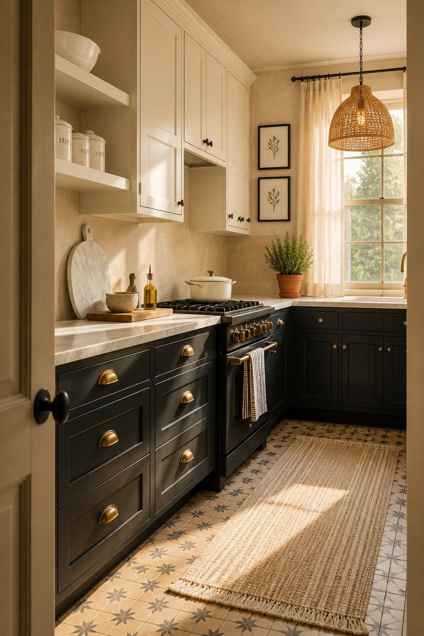
White acts as the pressure valve in a beige and black kitchen — it prevents the two heavier tones from closing in on each other. Because beige already holds warmth and black holds visual weight, white introduces lightness without competing with either tone. Use it on upper cabinets, open shelving surfaces, or ceiling trim to lift the eye upward and keep the space from feeling low and heavy.
Aim high with white: Place white on upper surfaces — cabinets, shelves, ceilings — so it draws the eye up and adds perceived height.
Let white breathe: Keep white surfaces relatively clear of clutter so the light they reflect actually reaches the rest of the room.
Use white to separate: Position white between black and beige elements to give each color space to register on its own.
Stay warm or cool consistently: Choose either a warm white or a cool white and repeat it across every white surface so the palette reads as intentional.
a soft warm white that lifts the kitchen’s upper half without clashing with warm beige walls below.
a clean, crisp white that creates clear separation between the ceiling plane and the warmer tones working below it.
 Ceramic Kitchen Canisters for Countertop Set of 3 w/ Airtight Ceramic Lids
View Price
Ceramic Kitchen Canisters for Countertop Set of 3 w/ Airtight Ceramic Lids
View Price
 Hisencn Enameled Cast Iron Skillet,Ceramic Cast Iron Frying Pan Sets,White
View Price
Hisencn Enameled Cast Iron Skillet,Ceramic Cast Iron Frying Pan Sets,White
View Price
 Premium Kitchen Towels 6 Pack 100% Cotton 20"x28" Dish Towels Black Striped
View Price
Premium Kitchen Towels 6 Pack 100% Cotton 20"x28" Dish Towels Black Striped
View Price
 KC KULLICRAFT 8×12 Inches White Marble Cheese & Charcuterie Board
View Price
KC KULLICRAFT 8×12 Inches White Marble Cheese & Charcuterie Board
View Price
 DOWAN 9.8'' Serving Bowls, 86 oz Large Salad Bowl, Ceramic Serving Dishes, Set of 2, Pumpkin Shape for Christmas, Entertaining, Party, Kitchen, Dinner, Banquet, Housewarming Gift, White
View Price
DOWAN 9.8'' Serving Bowls, 86 oz Large Salad Bowl, Ceramic Serving Dishes, Set of 2, Pumpkin Shape for Christmas, Entertaining, Party, Kitchen, Dinner, Banquet, Housewarming Gift, White
View Price
 ELYCCUPA 20”Hand Woven Rattan Chandelier Boho Pendant Light Adjustable Coastal Pendant Light for Kitchen Island Dining Living Room, White, UL Listed
View Price
ELYCCUPA 20”Hand Woven Rattan Chandelier Boho Pendant Light Adjustable Coastal Pendant Light for Kitchen Island Dining Living Room, White, UL Listed
View Price
 Framed Black and White Floral Wall Art for Bedroom, 4 Piece 11x14 In
View Price
Framed Black and White Floral Wall Art for Bedroom, 4 Piece 11x14 In
View Price
 EARTHALL Woven Runner Rug 2x6 Ft Washable Runners for Hallways Cotton Non Slip Rubber Backed Kitchen Runner Braided Indoor Floor Carpet for Entryway, Hallway, Kitchen, Bedroom, Beige/Ivory
View Price
EARTHALL Woven Runner Rug 2x6 Ft Washable Runners for Hallways Cotton Non Slip Rubber Backed Kitchen Runner Braided Indoor Floor Carpet for Entryway, Hallway, Kitchen, Bedroom, Beige/Ivory
View Price
Countertops That Carry a Beige, Black & White Kitchen
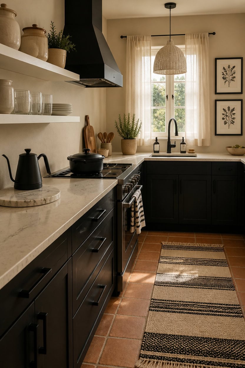
Countertops in a beige, black, and white kitchen do the most work when they bridge all three tones rather than belong purely to one. A honed white marble or quartz with thin black veining pulls the palette together because it contains literal traces of each color already in it. If white-dominant stone feels too stark, a warm cream or greige surface with dark veining achieves the same effect with more softness.
Lead with veining: Choose a countertop where the veining color mirrors your cabinet or floor tone so the surface connects rather than interrupts.
Finish matters: Honed finishes read warmer and softer than polished — better for a beige-grounded kitchen that needs less sheen, not more.
Balance light and dark surfaces: If your countertops are light, ground the kitchen with dark lower cabinets or a black island accent so the room doesn’t float.
Repeat the countertop edge profile: Use the same edge detail on any island or peninsula as on perimeter counters so the surface reads as one intentional decision.
a true black that anchors the countertop visually and gives the veining something solid to echo.
a warm mid-tone beige that keeps the countertop’s white and cream tones from reading cold against the surrounding space.
 Bloomingville Black & White Striped Marble Cutting Board
View Price
Bloomingville Black & White Striped Marble Cutting Board
View Price
 Velaze 7.5 QT Enameled Cast Iron Dutch Oven Pot with Lid,Black
View Price
Velaze 7.5 QT Enameled Cast Iron Dutch Oven Pot with Lid,Black
View Price
 COTTON CRAFT Oversized Kitchen Towels - 4 Pack 100% Cotton Absorbent Towels
View Price
COTTON CRAFT Oversized Kitchen Towels - 4 Pack 100% Cotton Absorbent Towels
View Price
 Ceramic Kitchen Canisters for Countertop Set of 3 w/Airtight Bamboo Lids
View Price
Ceramic Kitchen Canisters for Countertop Set of 3 w/Airtight Bamboo Lids
View Price
 FuseBrew Gooseneck Electric Kettle 1000W | Pour Over Coffee Kettle with Steady Flow Spout & Balanced Handle, 0.8L Matte Black Tea Kettle for Home Barista Espresso Station Countertop- Black
View Price
FuseBrew Gooseneck Electric Kettle 1000W | Pour Over Coffee Kettle with Steady Flow Spout & Balanced Handle, 0.8L Matte Black Tea Kettle for Home Barista Espresso Station Countertop- Black
View Price
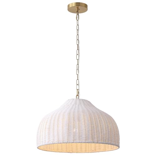 JONATHAN Y Eliza 20" Bohemian White & Brass Gold Woven Rattan Dome Pendant
View Price
JONATHAN Y Eliza 20" Bohemian White & Brass Gold Woven Rattan Dome Pendant
View Price
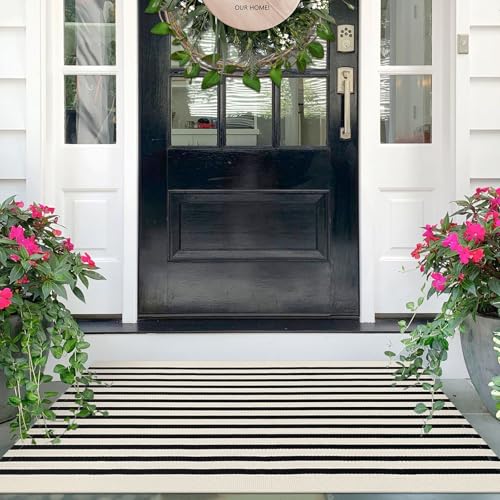 IOHOUZE 2.3x3.6 Striped Outdoor Door Mat, Washable Porch Rug, Black Beige
View Price
IOHOUZE 2.3x3.6 Striped Outdoor Door Mat, Washable Porch Rug, Black Beige
View Price
Kitchen Runners for This Palette
Rugs USA best-selling kitchen runners in this palette's colors, linked in 2' 6" x 6', the size for the floor in front of the sink and stove. Many are machine washable.
- Free shipping
- 30-day returns
- 210,000+ five-star reviews
 Simple Serpent Rug – Black & Off White
View Price
Simple Serpent Rug – Black & Off White
View Price
 Chunky Jute Tasseled Rug – Off White
View Price
Chunky Jute Tasseled Rug – Off White
View Price
 Softest Knit Wool Rug – Off White
View Price
Softest Knit Wool Rug – Off White
View Price
 Jute Braided Rug – Off White
View Price
Jute Braided Rug – Off White
View Price
 Jute Braided Saturn Border Rug – Off White
View Price
Jute Braided Saturn Border Rug – Off White
View Price
 Jute And Denim Even Stripes Rug – Off White
View Price
Jute And Denim Even Stripes Rug – Off White
View Price
 Handwoven Jute Jagged Chevron Rug – Off White
View Price
Handwoven Jute Jagged Chevron Rug – Off White
View Price
 Handwoven Jute Ribbed Solid Rug – Off White
View Price
Handwoven Jute Ribbed Solid Rug – Off White
View Price
 Perfect Handwoven Jute-Blend Rug – Natural
View Price
Perfect Handwoven Jute-Blend Rug – Natural
View Price
 Jute Braided Rug – Natural
View Price
Jute Braided Rug – Natural
View Price
 Chunky Jute Tasseled Rug – Natural
View Price
Chunky Jute Tasseled Rug – Natural
View Price
 Forever Vintage Rug – Neutral
View Price
Forever Vintage Rug – Neutral
View Price
 Floral Ornament Rug – Ivory
View Price
Floral Ornament Rug – Ivory
View Price
 Hand Woven Jute with Wool Fringe Rug – Natural
View Price
Hand Woven Jute with Wool Fringe Rug – Natural
View Price
 Seagrass with Border Rug – Beige
View Price
Seagrass with Border Rug – Beige
View Price
 Handwoven Jute Ribbed Solid Rug – Natural
View Price
Handwoven Jute Ribbed Solid Rug – Natural
View Price
 Brenda Hazy Heraldry Washable Rug – Beige
View Price
Brenda Hazy Heraldry Washable Rug – Beige
View Price
 Everywhere Hand-Braided Indoor/Outdoor Rug – Ivory
View Price
Everywhere Hand-Braided Indoor/Outdoor Rug – Ivory
View Price
 Handspun Jute Rug – Natural
View Price
Handspun Jute Rug – Natural
View Price
 Fading Herati Medallion Rug – Beige
View Price
Fading Herati Medallion Rug – Beige
View Price
 Scandinavia Diamond Rug – Beige
View Price
Scandinavia Diamond Rug – Beige
View Price
 Vanni Checkered Fringed Rug – Beige
View Price
Vanni Checkered Fringed Rug – Beige
View Price
 Melrose Checked Rug – Cream
View Price
Melrose Checked Rug – Cream
View Price
 Timeless Charm Spill Proof Washable Rug – Beige
View Price
Timeless Charm Spill Proof Washable Rug – Beige
View Price
 Ricki Mottled Abstract Rug – Beige
View Price
Ricki Mottled Abstract Rug – Beige
View Price
 Melange Tiles Rug – Beige
View Price
Melange Tiles Rug – Beige
View Price
 Aylin Diamond Tasseled Rug – Beige
View Price
Aylin Diamond Tasseled Rug – Beige
View Price
 Patricia Jute and Wool Rug – Ivory
View Price
Patricia Jute and Wool Rug – Ivory
View Price
 Ruth Washable Splatter Rug – Ivory
View Price
Ruth Washable Splatter Rug – Ivory
View Price
 Paddle Rug – Ivory
View Price
Paddle Rug – Ivory
View Price
 Rosette Medallion Fringed Rug – Beige
View Price
Rosette Medallion Fringed Rug – Beige
View Price
 Cardinal Cartouche Rug – Beige
View Price
Cardinal Cartouche Rug – Beige
View Price
 Sisal Border Rug – Beige
View Price
Sisal Border Rug – Beige
View Price
 Shia Bordered Washable Indoor/Outdoor Rug – Beige
View Price
Shia Bordered Washable Indoor/Outdoor Rug – Beige
View Price
 Native Collage Rug – Beige
View Price
Native Collage Rug – Beige
View Price
 Meena Fading Garden Spill Proof Washable Rug – Beige
View Price
Meena Fading Garden Spill Proof Washable Rug – Beige
View Price
 Bayberry Spill Proof Vintage Washable Rug – Sand
View Price
Bayberry Spill Proof Vintage Washable Rug – Sand
View Price
 Speckled Wool-Blend Rug – Wheat
View Price
Speckled Wool-Blend Rug – Wheat
View Price
 Everywhere Hand-Braided Indoor/Outdoor Rug – Salt And Pepper
View Price
Everywhere Hand-Braided Indoor/Outdoor Rug – Salt And Pepper
View Price
 Ring Around The Rosette Rug – Black
View Price
Ring Around The Rosette Rug – Black
View Price
Cabinet Finishes Worth Committing To in a Neutral Kitchen
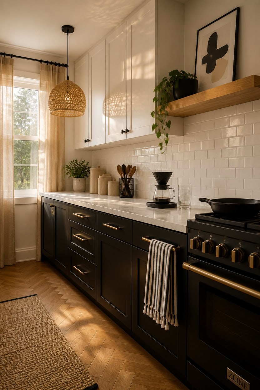
Cabinet finishes in a neutral kitchen hold up best when they commit to one role — warm or cool — rather than trying to split the difference. In a beige, black, and white palette, that means your cabinets either anchor the room with depth and contrast or soften it with warmth, not both at once. Pick your finish family first, then let hardware and countertops fill in the gaps.
Flat versus shaker: Flat-front cabinets push the palette modern and minimal; shaker doors add dimension without introducing new color.
Upper and lower split: Paint uppers a lighter tone and lowers darker to give the kitchen visual weight without making it feel heavy.
Matte over gloss: Matte cabinet finishes absorb light rather than bounce it, which keeps a high-contrast palette from feeling harsh.
Commit to one wood tone: If you add any open shelving or floating wood elements, make sure every visible wood reads the same tone.
a soft warm white that keeps the upper portion of the kitchen open and bright without going stark.
a grounded true black that creates the split-tone contrast that makes neutral kitchens feel intentional.
 Moss & Stone 3-Pcs Beige Canisters Set for Kitchen Storage Airtight Jars
View Price
Moss & Stone 3-Pcs Beige Canisters Set for Kitchen Storage Airtight Jars
View Price
 Lodge Pre-Seasoned Cast Iron Skillet, PFAS-Free, 10.25 Inches
View Price
Lodge Pre-Seasoned Cast Iron Skillet, PFAS-Free, 10.25 Inches
View Price
 InHome NH3149 Chelsea Antique White Peel & Stick Tin Tiles, Metallic
View Price
InHome NH3149 Chelsea Antique White Peel & Stick Tin Tiles, Metallic
View Price
 Cotton Clinic Assorted Kitchen Towels 5 Pack – Soft Absorbent Quick Drying Table & Kitchen Linen - Dish Towels, Dish Cloths, Tea Towel and Cleaning Towel with Hanging Loop – 16x28 / Black White
View Price
Cotton Clinic Assorted Kitchen Towels 5 Pack – Soft Absorbent Quick Drying Table & Kitchen Linen - Dish Towels, Dish Cloths, Tea Towel and Cleaning Towel with Hanging Loop – 16x28 / Black White
View Price
 OXO Brew Single Serve Pour-Over Coffee Maker, 12 oz. - Matte Black
View Price
OXO Brew Single Serve Pour-Over Coffee Maker, 12 oz. - Matte Black
View Price
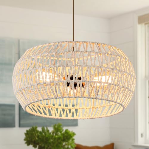 Boho Pendant Light,Dinning Room Light Fixture Rattan Chandelier Cream White Hanging Light Ceiling Mount Hand Woven Lamp Shade Bohemian Drum Chandelier Basket Light for Bedroom Kitchen Island Hallway
View Price
Boho Pendant Light,Dinning Room Light Fixture Rattan Chandelier Cream White Hanging Light Ceiling Mount Hand Woven Lamp Shade Bohemian Drum Chandelier Basket Light for Bedroom Kitchen Island Hallway
View Price
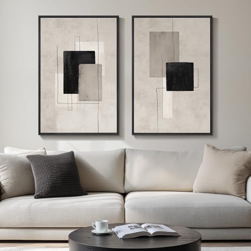 Large Framed Neutral Black Beige Abstract Wall Art Decor Set of 2, 20x30 In
View Price
Large Framed Neutral Black Beige Abstract Wall Art Decor Set of 2, 20x30 In
View Price
 iDesign Kitchen Crock Utensil Holder, Matte Black, Steel
View Price
iDesign Kitchen Crock Utensil Holder, Matte Black, Steel
View Price
Hardware That Makes a Beige, Black & White Kitchen Feel Curated
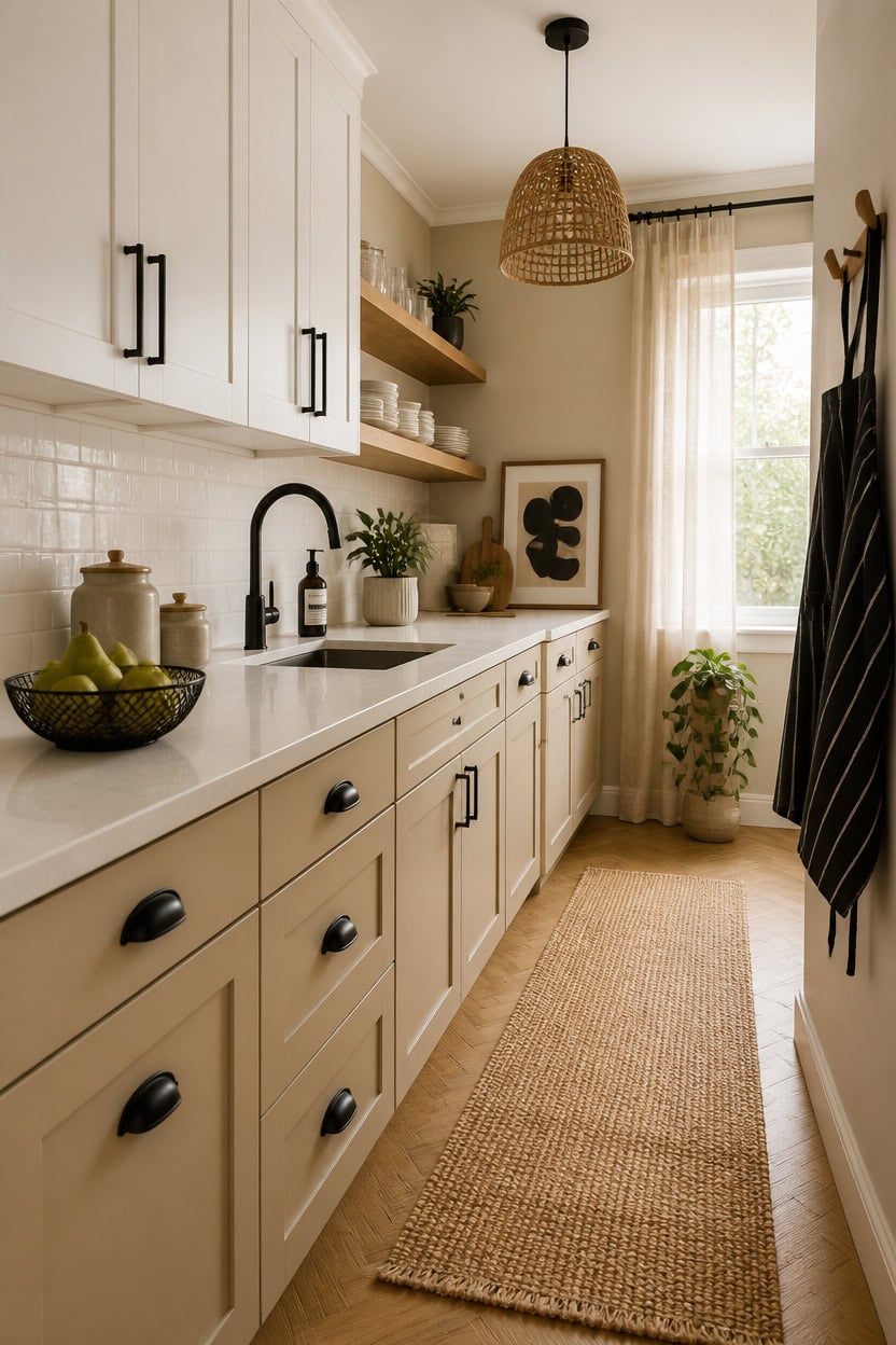
Matte black hardware pulls together a beige, black, and white kitchen without adding a new color to the mix — it deepens the palette rather than competing with it. Because hardware is one of the few elements that touches every part of the kitchen, its finish sets the tone for how deliberate the whole room looks. Stick to one metal finish across cabinet pulls, faucets, and light fixtures so the eye moves smoothly rather than stopping at each inconsistency.
Finish consistency: Match hardware finish to at least one other metal in the room — faucet, lighting, or appliance trim.
Pull length matters: Longer bar pulls read more modern; smaller cup pulls or knobs shift the tone toward traditional or farmhouse.
Avoid mixed metals: Two metal finishes require careful spacing and intention — one dominant, one accent, never equal.
Dark hardware on light cabinets: Matte black on white or cream uppers creates the sharpest visual contrast in a neutral kitchen.
a warm sand tone that makes black hardware pop without competing with white cabinetry.
a grounded matte black that mirrors the hardware finish and makes the whole kitchen feel intentional.
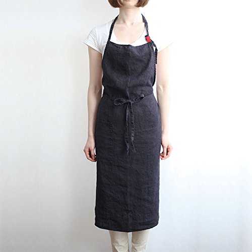 Linen Apron 4 Color, Unisex Adjustable Easy Care House Simple Long Apron Black
View Price
Linen Apron 4 Color, Unisex Adjustable Easy Care House Simple Long Apron Black
View Price
 MALACASA 12 Pcs Porcelain Plates and Bowls Sets,Dinnerware Set for 4,White
View Price
MALACASA 12 Pcs Porcelain Plates and Bowls Sets,Dinnerware Set for 4,White
View Price
 Simple Trending Round Metal Fruit Basket Bowl for Kitchen Counter - Rust-Proof, Non-Slip & Breathable Wire Organizer for Fruits, Veggies, Snacks, Black (11“ Diameter x 3.2” H)
View Price
Simple Trending Round Metal Fruit Basket Bowl for Kitchen Counter - Rust-Proof, Non-Slip & Breathable Wire Organizer for Fruits, Veggies, Snacks, Black (11“ Diameter x 3.2” H)
View Price
 Hand-Woven Rattan Pendant Lights Kitchen Island wiht 12 Inch Wickel Shade
View Price
Hand-Woven Rattan Pendant Lights Kitchen Island wiht 12 Inch Wickel Shade
View Price
 Large Framed Neutral Black and Beige Abstract Wall Art Set of 2, 24x36 In
View Price
Large Framed Neutral Black and Beige Abstract Wall Art Set of 2, 24x36 In
View Price
 8ft Natural Jute Hallway Runner Rug Non Slip Washable, Rubber Backed Long Indoor Entryway Runner, Absorbent Kitchen Carpet Sink Rug, Camel
View Price
8ft Natural Jute Hallway Runner Rug Non Slip Washable, Rubber Backed Long Indoor Entryway Runner, Absorbent Kitchen Carpet Sink Rug, Camel
View Price
Our Favorite Kitchen Wall Art
The best-reviewed kitchen prints at Wayfair, with the ones in this palette's colors first.
- Free shipping over $35
- Picked at 4.6 stars or higher
 Country Red and White
View Price
Country Red and White
View Price
 White and Gold Champagne Flow V Champagne
View Price
White and Gold Champagne Flow V Champagne
View Price
 The Cafe Terrace by Vincent Van Gogh
View Price
The Cafe Terrace by Vincent Van Gogh
View Price
 Sage Garden 2 Piece Picture Frame Graphic Art Print Set
View Price
Sage Garden 2 Piece Picture Frame Graphic Art Print Set
View Price
 Sweet Experience
View Price
Sweet Experience
View Price
 Watercolor Lemons in Mason Jar Landscape by Tre Sorelle
View Price
Watercolor Lemons in Mason Jar Landscape by Tre Sorelle
View Price
 Interplay Print on Canvas
View Price
Interplay Print on Canvas
View Price
 Watercolor Lemons in Mason Jar on Shiplap by Tre Sorelle
View Price
Watercolor Lemons in Mason Jar on Shiplap by Tre Sorelle
View Price
 Autumn Kitchen by Danhui Nai
View Price
Autumn Kitchen by Danhui Nai
View Price
 Old Favorites by Irena Orlov
View Price
Old Favorites by Irena Orlov
View Price
 Kitchen Food Culinary Gathering Pen and Ink Food and Drinks
View Price
Kitchen Food Culinary Gathering Pen and Ink Food and Drinks
View Price
 Wooden Kitchen Items
View Price
Wooden Kitchen Items
View Price
 Le Chateau Wrapped Canvas Machine Made Print
View Price
Le Chateau Wrapped Canvas Machine Made Print
View Price
 Fruit and Wine by Yoakum
View Price
Fruit and Wine by Yoakum
View Price
 Kitchen Food Vintage Citrus Botanical Rustic Orange Framed
View Price
Kitchen Food Vintage Citrus Botanical Rustic Orange Framed
View Price
 Autumn Fall Thanksgiving Pumpkin in Orange Forest Nature
View Price
Autumn Fall Thanksgiving Pumpkin in Orange Forest Nature
View Price
 Kitchen Food Herbs and Spice in Spoons Kitchen Cooking Food
View Price
Kitchen Food Herbs and Spice in Spoons Kitchen Cooking Food
View Price
Backsplash Choices That Anchor a Beige, Black & White Kitchen
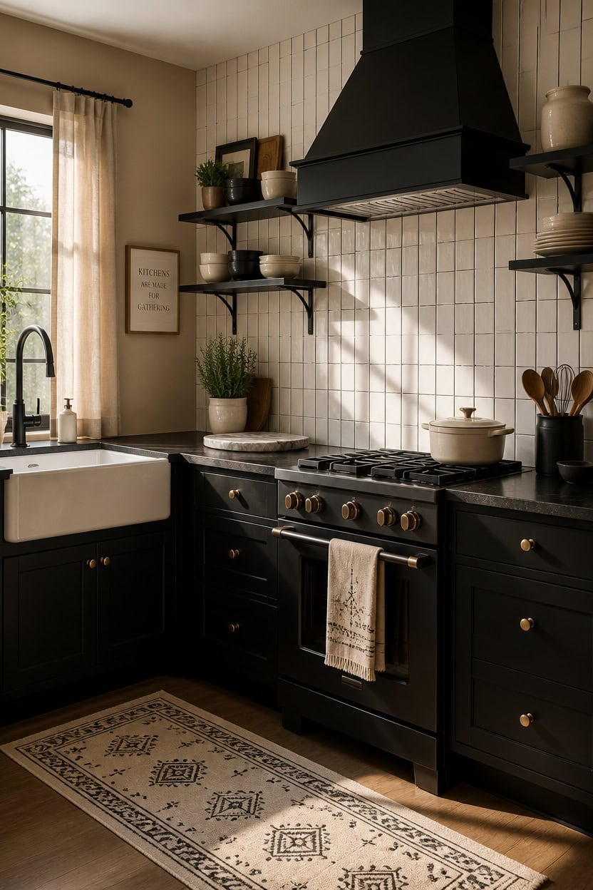
Subway tile in a matte or satin finish anchors a beige, black, and white kitchen better than glossy options because it reflects light without creating glare that washes out the palette. The slight texture variation between grout lines gives the wall depth, which keeps a neutral kitchen from feeling flat or staged. Choose a warm white tile paired with charcoal or dark gray grout to reinforce both ends of the color range at once.
Grout color is the decision: Dark grout on white tile reads as graphic and intentional; light grout disappears and softens the look.
Tile size shifts the feel: Small mosaic tiles add detail and texture; large-format slabs read more sleek and modern.
Pattern adds personality: A vertical stacked layout feels contemporary; a classic brick offset stays timeless and safe for resale.
Beige in the tile: Cream or warm white tiles pull beige tones forward; bright white tiles push contrast and lean cooler.
a warm sand tone that softens the contrast between white tile and dark grout without competing with either.
a deep matte black that echoes dark grout lines and makes the backsplash feel like part of a deliberate design plan.
 Art3d 102-Pack Peel and Stick Backsplash on Subway Tile, Glossy White
View Price
Art3d 102-Pack Peel and Stick Backsplash on Subway Tile, Glossy White
View Price
 TEC Color Matched Caulk by Colorfast Ind. (Sanded) (929 Charcoal Gray)
View Price
TEC Color Matched Caulk by Colorfast Ind. (Sanded) (929 Charcoal Gray)
View Price
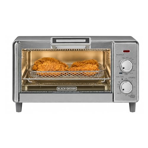 BLACK+DECKER 4-Slice Air Fry Toaster Oven, 5-in-1 Countertop Oven
View Price
BLACK+DECKER 4-Slice Air Fry Toaster Oven, 5-in-1 Countertop Oven
View Price
 MIKIGEY Ceramic Mixing Bowls, Embossed Nesting Bowls Set of 4, Mixing Bowl Set for Serving, Baking, Cooking and Gift, Microwave and Dishwasher Safe, 20/47/99/148 oz, Off-White
View Price
MIKIGEY Ceramic Mixing Bowls, Embossed Nesting Bowls Set of 4, Mixing Bowl Set for Serving, Baking, Cooking and Gift, Microwave and Dishwasher Safe, 20/47/99/148 oz, Off-White
View Price
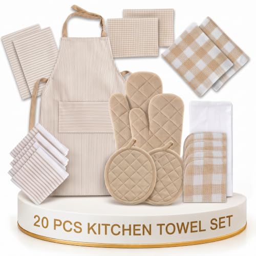 LANE LINEN 20 Piece Kitchen Linen Set - Soft Absorbent Cotton Dish Towels, Reusable Terry Dish Cloths, Flour Sack Towels for Baking, Quilted Oven Mitts & Pot Holders for Everyday Cooking - Beige
View Price
LANE LINEN 20 Piece Kitchen Linen Set - Soft Absorbent Cotton Dish Towels, Reusable Terry Dish Cloths, Flour Sack Towels for Baking, Quilted Oven Mitts & Pot Holders for Everyday Cooking - Beige
View Price
 Hiceeden 8 x 12 Inches Marble Cutting Board, Stone Cutting Board with Non-Slip Feet for Kitchen Countertop, Rectangular Serving Slab for Charcuterie, Cheese, Pastry, Scratch & Heat Resistant, White
View Price
Hiceeden 8 x 12 Inches Marble Cutting Board, Stone Cutting Board with Non-Slip Feet for Kitchen Countertop, Rectangular Serving Slab for Charcuterie, Cheese, Pastry, Scratch & Heat Resistant, White
View Price
 Oggi Steel Holder Utensil Crock, Jumbo, Black - 7'' (7211.3)
View Price
Oggi Steel Holder Utensil Crock, Jumbo, Black - 7'' (7211.3)
View Price
 Maples Rugs Moderna Geometric Runner Rug – Made in USA – Washable, Non Slip Indoor Carpet for Hallway, Kitchen, and Laundry Room, 2' x 6', Black/Cream
View Price
Maples Rugs Moderna Geometric Runner Rug – Made in USA – Washable, Non Slip Indoor Carpet for Hallway, Kitchen, and Laundry Room, 2' x 6', Black/Cream
View Price
Lighting Fixtures That Work in a Beige, Black & White Kitchen
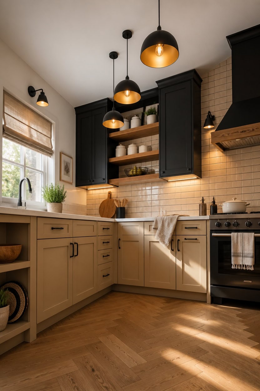
Pendant lights do the heaviest lifting in a beige, black, and white kitchen because they add a vertical visual element that connects upper and lower zones. A matte black fixture pulls the darkest value in the palette upward, which prevents the room from feeling bottom-heavy. For kitchens with white upper cabinets, a cluster of two or three pendants over the island or peninsula adds rhythm without requiring a bold color commitment.
Finish matches grout: Matte black fixtures echo dark grout lines so the hardware and backsplash read as one cohesive layer.
Warm bulb temperature matters: A 2700K bulb adds warmth that keeps beige tones from shifting gray under artificial light.
Layered sources beat one overhead: Combine pendants with under-cabinet LEDs so the counter surface stays bright and the palette stays accurate.
Scale to ceiling height: Low ceilings call for flush or semi-flush fixtures; higher ceilings can carry a deeper drum or globe pendant.
matched from the wall in this photo — the closest Benjamin Moore shade.
a deep matte black that anchors the upper zone and makes pendant fixtures disappear into a deliberate dark field.
 SADUENFR Black 3-Light Pendant Lighting, Modern Dining Room Light Fixture Over Table with Hammered Glass, Cluster Hanging Lights for Kitchen Island Dining Room
View Price
SADUENFR Black 3-Light Pendant Lighting, Modern Dining Room Light Fixture Over Table with Hammered Glass, Cluster Hanging Lights for Kitchen Island Dining Room
View Price
 JONATHAN Y Homer Industrial Dome Pendant 13", White/Brass Gold
View Price
JONATHAN Y Homer Industrial Dome Pendant 13", White/Brass Gold
View Price
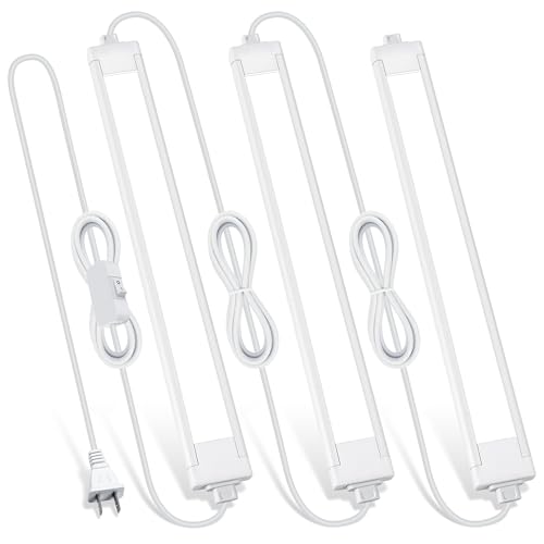 Lazukes 3 Pack Plug in Under Cabinet Lighting for Kitchen
View Price
Lazukes 3 Pack Plug in Under Cabinet Lighting for Kitchen
View Price
 Chitomars Placemats Set of 6, Vinyl Woven Heat-Resistant Place Mats
View Price
Chitomars Placemats Set of 6, Vinyl Woven Heat-Resistant Place Mats
View Price
 10 Strawberry Street Embossed Ceramic Kitchen Canister Set, Set of 3, Hampton White
View Price
10 Strawberry Street Embossed Ceramic Kitchen Canister Set, Set of 3, Hampton White
View Price
 WILDMOS Fruit Basket,black Wire Basket with Acacia Wood Base,large Fruit Bowl for Countertop,black Baskets for Fruits, Breads, Vegetables Storage. (12-inch)
View Price
WILDMOS Fruit Basket,black Wire Basket with Acacia Wood Base,large Fruit Bowl for Countertop,black Baskets for Fruits, Breads, Vegetables Storage. (12-inch)
View Price
 Chicology Cordless Roman Window Shade, Belgian Flax, 34"W x 64"H
View Price
Chicology Cordless Roman Window Shade, Belgian Flax, 34"W x 64"H
View Price
 Homemory Black 2 Pack Wall Sconce Candle Holder, Rustic Metal Decor
View Price
Homemory Black 2 Pack Wall Sconce Candle Holder, Rustic Metal Decor
View Price
Our Favorite Cabinet Hardware
- Free shipping over $35
- Picked at 4.8 stars or higher
 Amerock Bar Pulls Center-to-Center Cabinet Pull
View Price
Amerock Bar Pulls Center-to-Center Cabinet Pull
View Price
 GlideRite Roman Modern Bar Pull
View Price
GlideRite Roman Modern Bar Pull
View Price
 GlideRite Roman Bar Pull
View Price
GlideRite Roman Bar Pull
View Price
 Amerock Bar Pulls T-Shaped Cabinet Knob
View Price
Amerock Bar Pulls T-Shaped Cabinet Knob
View Price
 Amerock Edona 1-1/4" Mushroom Cabinet Knob
View Price
Amerock Edona 1-1/4" Mushroom Cabinet Knob
View Price
 GlideRite Mushroom Knob Multipack
View Price
GlideRite Mushroom Knob Multipack
View Price
 Amerock 3" Center-to-Center Cup Pull Multipack
View Price
Amerock 3" Center-to-Center Cup Pull Multipack
View Price
 GlideRite Classic 3" Cup/Bin Pull Multipack
View Price
GlideRite Classic 3" Cup/Bin Pull Multipack
View Price
 Top Knobs Channing Cup/Bin Pull
View Price
Top Knobs Channing Cup/Bin Pull
View Price
 Hickory Hardware Refined Rustic 12" Appliance Pull
View Price
Hickory Hardware Refined Rustic 12" Appliance Pull
View Price
 Franklin Brass Stratford 7-9/16" Bar Pull
View Price
Franklin Brass Stratford 7-9/16" Bar Pull
View Price
How Texture Carries a Neutral Kitchen When Color Steps Back
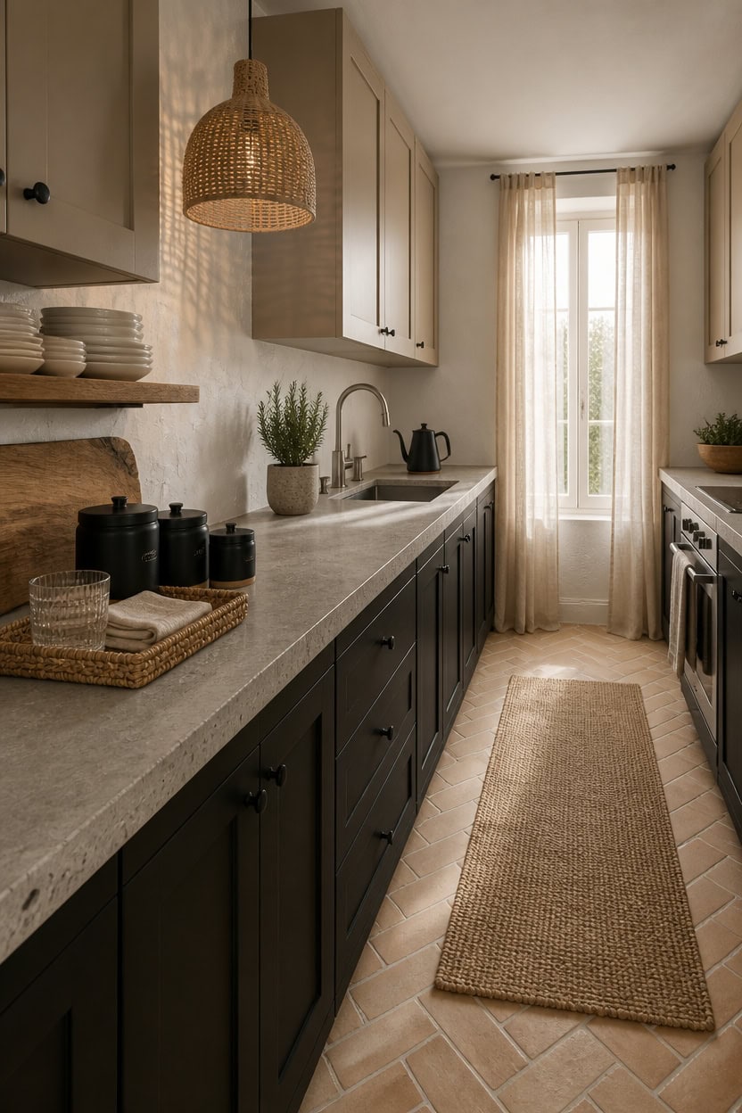
Texture is the design tool that keeps a neutral kitchen from feeling empty or cold when color is minimal. Rough linen, woven rattan, brushed stone, and matte ceramic all catch light differently, so they create visual contrast without adding a single new hue. Run at least three distinct textures on any visible surface — countertop, textiles, and open shelving — to keep the eye moving.
Layer matte against gloss: Pair matte ceramic canisters with a polished stone cutting board so each surface reads as intentional, not accidental.
Bring in woven elements: A rattan pendant shade or woven placemat breaks up hard kitchen surfaces and adds warmth that beige paint alone cannot deliver.
Use natural fiber for softness: A jute or cotton kitchen runner underfoot adds tactile variety that pulls the whole floor zone into the texture conversation.
Mix smooth and rough on shelves: Stack smooth white dishes beside a rough-grain wood board so open shelving looks curated rather than just filled.
a warm sand tone that reads as a soft background so woven textures and matte finishes stand out against it.
a deep matte black that anchors the space and makes rough-grain wood and ceramic textures pop against its flat, light-absorbing surface.
 10 Strawberry Street Embossed Marquis Ceramic Kitchen Canister Set, Set of 3, Matte Black
View Price
10 Strawberry Street Embossed Marquis Ceramic Kitchen Canister Set, Set of 3, Matte Black
View Price
 JONATHAN Y Eliza 1-Light Pendant Dome Rattan Metal 20", Brown/Brass Gold
View Price
JONATHAN Y Eliza 1-Light Pendant Dome Rattan Metal 20", Brown/Brass Gold
View Price
 KOZYFLY Runners for Hallways 2x5 ft Washable Kitchen Runner Non Slip Rubber Backed Hall Runners Cotton Entryway Runner Rugs for Indoor Backdoor Bedroom Kitchen, Oatmeal Beige
View Price
KOZYFLY Runners for Hallways 2x5 ft Washable Kitchen Runner Non Slip Rubber Backed Hall Runners Cotton Entryway Runner Rugs for Indoor Backdoor Bedroom Kitchen, Oatmeal Beige
View Price
 Kitsure Acacia Wood Cutting Board for Kitchen, Large, Edge Grain
View Price
Kitsure Acacia Wood Cutting Board for Kitchen, Large, Edge Grain
View Price
 JoyJolt Mesa Stoneware Dinner Plates Set of 6, 10.5” Dish Set, Dishwasher and Microwave Safe Plate Set, Modern Rustic Dinnerware, Kitchen Serving Dishes - Matte White (Linen)
View Price
JoyJolt Mesa Stoneware Dinner Plates Set of 6, 10.5” Dish Set, Dishwasher and Microwave Safe Plate Set, Modern Rustic Dinnerware, Kitchen Serving Dishes - Matte White (Linen)
View Price
 StorageWorks Small Wicker Scalloped Trays, Natural Seagrass Serving Tray
View Price
StorageWorks Small Wicker Scalloped Trays, Natural Seagrass Serving Tray
View Price
 LANE LINEN Kitchen Dish Towels 100% Cotton Soft & Absorbent 6 Pack - Beige
View Price
LANE LINEN Kitchen Dish Towels 100% Cotton Soft & Absorbent 6 Pack - Beige
View Price
Layering Natural Materials in a Beige, Black & White Kitchen
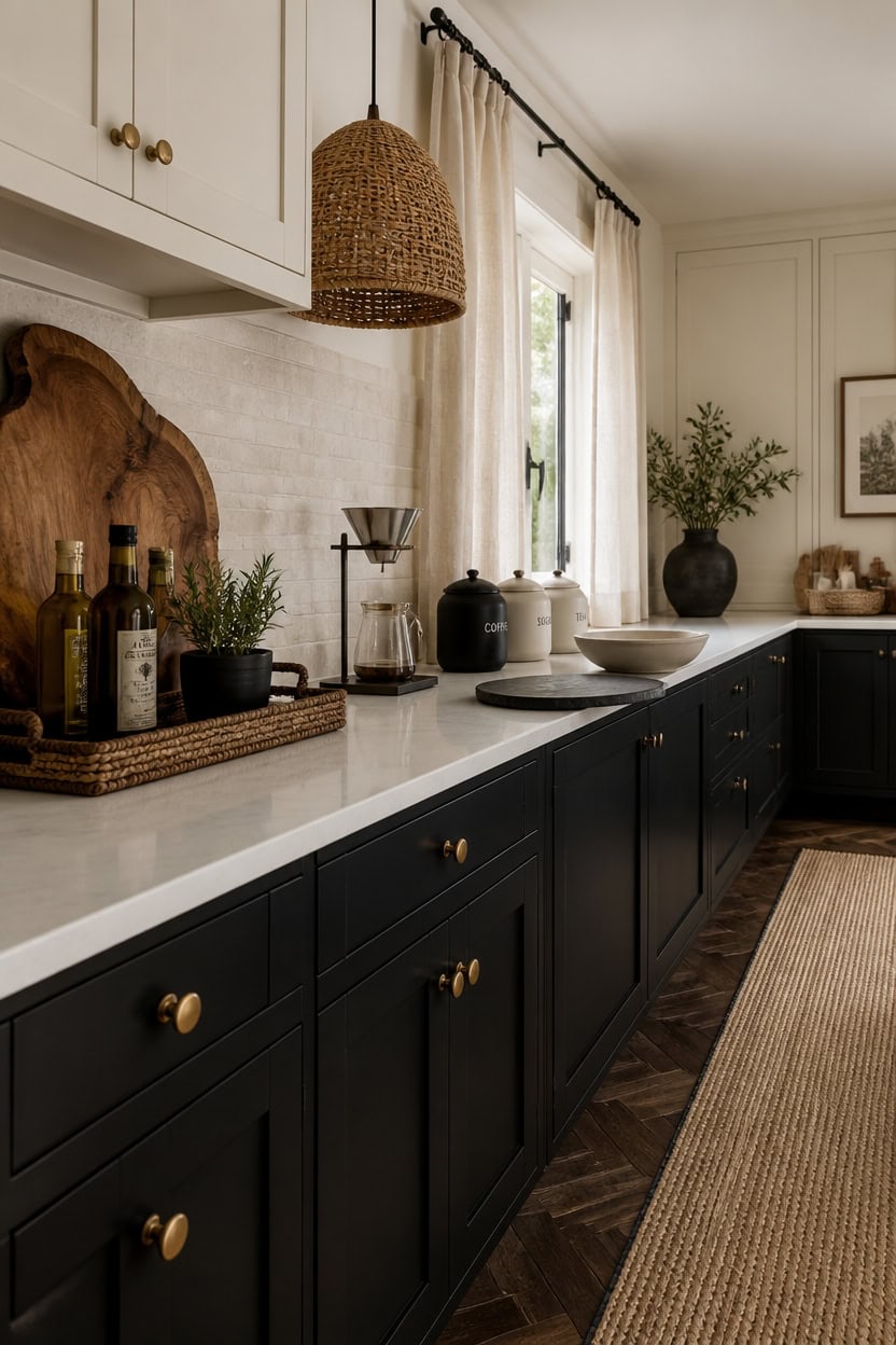
Natural materials do the heavy lifting in a beige, black, and white kitchen because they soften the contrast between dark and light without muddying either tone. Wood grain, woven fiber, and raw stone each carry warmth that painted or lacquered surfaces cannot replicate on their own. Introduce at least two natural materials at countertop height and one at floor level so the layering feels intentional from every angle.
Start with wood: A raw-edge or acacia cutting board on the counter adds organic warmth that breaks up the hard contrast between black and white.
Weave in fiber: A rattan pendant or woven seagrass tray pulls ceiling and countertop into the same natural material language without competing with the palette.
Ground with stone: A honed marble or slate trivet or serving board reads as a neutral material that bridges white surfaces and black accents seamlessly.
Soften the floor zone: A jute or cotton runner underfoot anchors the space and keeps the black-and-white contrast from feeling too sharp at ground level.
a creamy white with warm undertones that lets natural wood and woven textures read richly against it.
a flat, deep black that makes raw wood grain and stone surfaces stand out with strong visual contrast.
 Large Acacia Serving Board with Handles, 36 x 12 Inch Rectangular Charcuterie Platter, Natural Wood Server for Meat, Cheese Board, and Party Appetizers, Extra Long 3ft, Light
View Price
Large Acacia Serving Board with Handles, 36 x 12 Inch Rectangular Charcuterie Platter, Natural Wood Server for Meat, Cheese Board, and Party Appetizers, Extra Long 3ft, Light
View Price
 Woven Pendant Light Boho Chandelier, Rattan Pendant Lights Kitchen Island, Farmhouse Pendant Lighting with Hand Woven Wicker Shade, Boho Chandelier Light Fixtures Ceiling Hanging Light
View Price
Woven Pendant Light Boho Chandelier, Rattan Pendant Lights Kitchen Island, Farmhouse Pendant Lighting with Hand Woven Wicker Shade, Boho Chandelier Light Fixtures Ceiling Hanging Light
View Price
 Puino 2x6 Jute Runner Rug: Washable Non-Slip Hallway Rugs Natural Beige
View Price
Puino 2x6 Jute Runner Rug: Washable Non-Slip Hallway Rugs Natural Beige
View Price
 10 Strawberry Street Marble Ceramic Kitchen Canister Set, Set of 3, White/Black
View Price
10 Strawberry Street Marble Ceramic Kitchen Canister Set, Set of 3, White/Black
View Price
 SPESHSTONES Marble Trivets for Dining Table & Hot Dishes Set of 2
View Price
SPESHSTONES Marble Trivets for Dining Table & Hot Dishes Set of 2
View Price
 2 Pack Rectangle Rattan Serving Trays with Handles, Decorative Woven Wicker Organizer Baskets Storage Tray for Coffee Table, Bread, Fruit, Snacks
View Price
2 Pack Rectangle Rattan Serving Trays with Handles, Decorative Woven Wicker Organizer Baskets Storage Tray for Coffee Table, Bread, Fruit, Snacks
View Price
 JoyJolt Mesa 30oz Stoneware Pasta Bowls Set of 4, Salad and Serving Bowl for Kitchen, Oatmeal, Soup, Dinner - Matte Linen White, Dishwasher and Microwave Safe, Wide and Shallow Plate
View Price
JoyJolt Mesa 30oz Stoneware Pasta Bowls Set of 4, Salad and Serving Bowl for Kitchen, Oatmeal, Soup, Dinner - Matte Linen White, Dishwasher and Microwave Safe, Wide and Shallow Plate
View Price
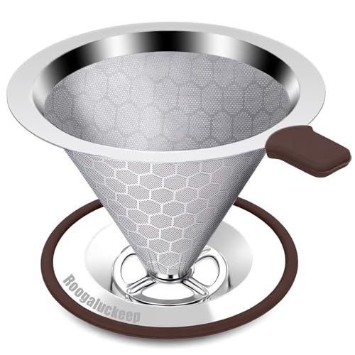 Roogaluckeep Pour Over Coffee Maker, Reusable Stainless Steel Filter
View Price
Roogaluckeep Pour Over Coffee Maker, Reusable Stainless Steel Filter
View Price
Our Favorite Aprons, Potholders and Towels
- Free shipping over $35
- Picked at 4.3 stars or higher
 Damontray 3-Piece Cotton Blend Pot Holder Set
View Price
Damontray 3-Piece Cotton Blend Pot Holder Set
View Price
 KitchenAid Beacon 2-Piece Potholder Set
View Price
KitchenAid Beacon 2-Piece Potholder Set
View Price
 Lavish Home Silicone Pot Holder and Trivet Mat
View Price
Lavish Home Silicone Pot Holder and Trivet Mat
View Price
 Annistyn Cotton Waffle Dish Cloths
View Price
Annistyn Cotton Waffle Dish Cloths
View Price
 Assorted Cotton Waffle Dish Cloths
View Price
Assorted Cotton Waffle Dish Cloths
View Price
 Cerca Windowpane Waffle Dish Cloths
View Price
Cerca Windowpane Waffle Dish Cloths
View Price
 KitchenAid Albany Kitchen Towel 4-Pack
View Price
KitchenAid Albany Kitchen Towel 4-Pack
View Price
 KitchenAid Albany Dishcloth 8-Pack
View Price
KitchenAid Albany Dishcloth 8-Pack
View Price
 T-fal Flat Waffle Kitchen Dishcloth Set
View Price
T-fal Flat Waffle Kitchen Dishcloth Set
View Price
 KitchenAid Asteroid Textured Oven Mitt
View Price
KitchenAid Asteroid Textured Oven Mitt
View Price
 KitchenAid Ribbed Soft Silicone Oven Mitt
View Price
KitchenAid Ribbed Soft Silicone Oven Mitt
View Price
 Damontray 2-Piece Cotton Oven Mitt Set
View Price
Damontray 2-Piece Cotton Oven Mitt Set
View Price
 Solid Color Cotton Chef Apron
View Price
Solid Color Cotton Chef Apron
View Price
 Wolsingham Plaid Cotton Apron Set
View Price
Wolsingham Plaid Cotton Apron Set
View Price
 Zimmerman Striped Cotton Bib Apron
View Price
Zimmerman Striped Cotton Bib Apron
View Price
 Cotton Stripe Tea Towel
View Price
Cotton Stripe Tea Towel
View Price
 KAF Home Popcorn Terry Towels
View Price
KAF Home Popcorn Terry Towels
View Price
 Cotton Waffle Weave Tea Towel
View Price
Cotton Waffle Weave Tea Towel
View Price
How Pattern Works in a Beige, Black & White Kitchen
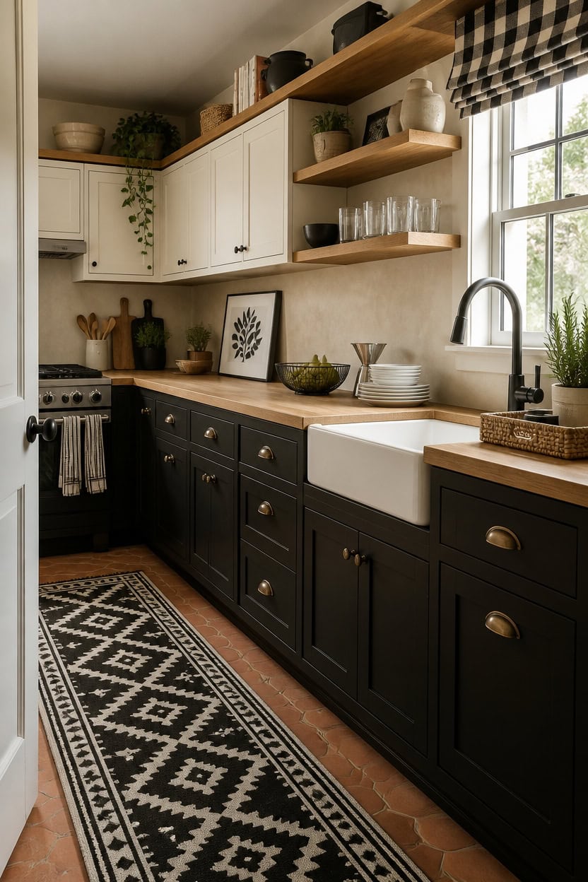
Pattern in a beige, black, and white kitchen works best when it appears in one dominant location and repeats as a smaller echo somewhere else. A bold graphic pattern on dish towels or a runner rug gives the eye a place to land without overwhelming a neutral palette. Keep patterned pieces in the same two or three colors already present so the design feels pulled together instead of accidental.
Lead with textile pattern: A geometric or stripe runner rug in black and white does the most work with the least visual risk in a neutral kitchen.
Echo the pattern small: Repeat the same pattern type — stripe, check, or grid — on a dish towel or napkin set to create rhythm without clutter.
Anchor with solid surfaces: Every patterned piece needs at least two solid neighbors — a plain ceramic bowl, a raw wood board — so pattern reads as intentional, not busy.
Stay in the palette: Any pattern you introduce should use only beige, black, white, or natural cream so it supports the existing color story rather than competing with it.
a warm creamy white that makes black and white patterns nearby feel graphic and intentional rather than stark.
a deep, flat black that grounds patterned textiles and makes white pattern elements pop with sharp contrast.
 KAF Home Natural Rustic Farmhouse Slubbed Kitchen Towel | 100% Cotton Dish Towel, 18 x 28 Inches | Soft and Absorbent (Black, Set of 4)
View Price
KAF Home Natural Rustic Farmhouse Slubbed Kitchen Towel | 100% Cotton Dish Towel, 18 x 28 Inches | Soft and Absorbent (Black, Set of 4)
View Price
 Ceramic Plates and Bowls Sets, White Dinnerware Set for Kitchen, Modern Design Dinner Plates, Stoneware Dishware Sets, Microwave and Dishwasher Safe
View Price
Ceramic Plates and Bowls Sets, White Dinnerware Set for Kitchen, Modern Design Dinner Plates, Stoneware Dishware Sets, Microwave and Dishwasher Safe
View Price
 WILDMOS Fruit Basket,black Wire Basket with Acacia Wood Base,large Fruit Bowl for Countertop,black Baskets for Fruits, Breads, Vegetables Storage. (10-inch)
View Price
WILDMOS Fruit Basket,black Wire Basket with Acacia Wood Base,large Fruit Bowl for Countertop,black Baskets for Fruits, Breads, Vegetables Storage. (10-inch)
View Price
 WOSIBO 2 Pack Buffalo Check Plaid Window Valances White and Black Farmhouse Design Window Treatment Decor Curtains Rod Pocket Valances for Kitchen/Living Room 16" x 56"
View Price
WOSIBO 2 Pack Buffalo Check Plaid Window Valances White and Black Farmhouse Design Window Treatment Decor Curtains Rod Pocket Valances for Kitchen/Living Room 16" x 56"
View Price
 Pour Over Coffee Dripper, Stainless Steel Coffee Filter 600 Mesh Ultra-Fine,Paperless Reusable Coffee Filter,1-2 Cup Portable Single Serve Coffee Maker for Home Office Travel
View Price
Pour Over Coffee Dripper, Stainless Steel Coffee Filter 600 Mesh Ultra-Fine,Paperless Reusable Coffee Filter,1-2 Cup Portable Single Serve Coffee Maker for Home Office Travel
View Price
 ENGLANT-4 Panels Set Framed Canvas Print for Seascape Beach and Boat Sunrise Scenery Black and White Giclee Canvas Print Wall Art Ready to Hang
View Price
ENGLANT-4 Panels Set Framed Canvas Print for Seascape Beach and Boat Sunrise Scenery Black and White Giclee Canvas Print Wall Art Ready to Hang
View Price
 Rattan Serving Tray, Rectangle Wicker Storage Basket for Organizing
View Price
Rattan Serving Tray, Rectangle Wicker Storage Basket for Organizing
View Price
Small Appliances and Cookware as Design Choices, Not Afterthoughts
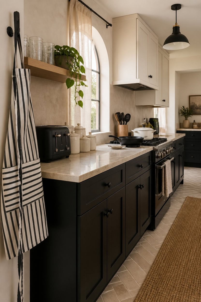
Small appliances and cookware pull double duty in a beige, black, and white kitchen — they function every day and shape the visual tone of every surface they touch. A matte black toaster sitting next to a white ceramic canister set isn’t background noise; it’s a design decision that reinforces the palette the same way a piece of art would. Choose every countertop appliance and pot deliberately, and the kitchen reads as curated rather than assembled by accident.
Lead with black appliances: A matte black toaster or kettle reads as intentional décor in a black and white kitchen rather than a random machine on the counter.
Use cookware as color: A white enameled Dutch oven or black cast iron skillet visible on the stove extends the palette into functional zones most people ignore.
Match finishes, not brands: Mixing brands is fine as long as the finish — matte black, stainless, or white ceramic — stays consistent across every countertop piece.
Edit the countertop: Three to four coordinating appliances in the same finish read as a styled vignette; six mismatched ones read as clutter regardless of color.
a warm creamy white that makes matte black appliances pop without creating a harsh, cold contrast.
a deep flat black that visually anchors dark cookware and appliances so they blend into the design rather than crowd the counter.
 Cuisinart Toaster, Defrost & Reheat, Stainless Steel, 4 Extra-Wide Slots
View Price
Cuisinart Toaster, Defrost & Reheat, Stainless Steel, 4 Extra-Wide Slots
View Price
 Enameled Cast Iron Dutch Oven - Umite Chef 5QT Pot with Lid & Cotton Potholders - Heavy-Duty Cookware for Bread Baking, Braising, Stews, Roasting(Cream White)
View Price
Enameled Cast Iron Dutch Oven - Umite Chef 5QT Pot with Lid & Cotton Potholders - Heavy-Duty Cookware for Bread Baking, Braising, Stews, Roasting(Cream White)
View Price
 Utopia Kitchen Cast Iron Skillet Set 3 Piece 6 8 10 Inch PFAS-Free Black
View Price
Utopia Kitchen Cast Iron Skillet Set 3 Piece 6 8 10 Inch PFAS-Free Black
View Price
 Cuisinart Air Fryer, 2.6-Quart Compact Basket Fryer with 3 Cooking Functions to Air Fry, Roast, and Bake, 3 Airfryer Presets, Dishwasher-Safe Parts, AIR-80, Stainless Steel & Black
View Price
Cuisinart Air Fryer, 2.6-Quart Compact Basket Fryer with 3 Cooking Functions to Air Fry, Roast, and Bake, 3 Airfryer Presets, Dishwasher-Safe Parts, AIR-80, Stainless Steel & Black
View Price
 Large Black Wood Utensil Holder for Kitchen Decor Spoon Spatula Organizer
View Price
Large Black Wood Utensil Holder for Kitchen Decor Spoon Spatula Organizer
View Price
 Chef Works Unisex Three Pocket Apron, Black White Pinstripe, One Size
View Price
Chef Works Unisex Three Pocket Apron, Black White Pinstripe, One Size
View Price
 Selamica 4.8 Inch Ceramic Spoon Rest with Holder, Set of 4, Black
View Price
Selamica 4.8 Inch Ceramic Spoon Rest with Holder, Set of 4, Black
View Price
Our Favorite Cooking Utensils
- Free shipping over $35
- Picked at 4.4 stars or higher
 Lux Decor 23-Piece Nylon and Stainless Steel Kitchen Utensil Set
View Price
Lux Decor 23-Piece Nylon and Stainless Steel Kitchen Utensil Set
View Price
 Caraway 5-Piece Wooden Utensil Set
View Price
Caraway 5-Piece Wooden Utensil Set
View Price
 BergHOFF Studio 23-Piece Tub of Cooking Utensils
View Price
BergHOFF Studio 23-Piece Tub of Cooking Utensils
View Price
 Rachael Ray Stainless Steel Bench Scraper
View Price
Rachael Ray Stainless Steel Bench Scraper
View Price
 Henckels Stainless Steel Silicone Tongs
View Price
Henckels Stainless Steel Silicone Tongs
View Price
 Cuisinox Disher Ice Cream Scoop
View Price
Cuisinox Disher Ice Cream Scoop
View Price
 Farberware Professional Ice Cream Scoop
View Price
Farberware Professional Ice Cream Scoop
View Price
 Henckels Stainless Steel Ladle
View Price
Henckels Stainless Steel Ladle
View Price
 Staub Silicone Spatula Spoon with Wood Handle
View Price
Staub Silicone Spatula Spoon with Wood Handle
View Price
 KitchenAid Gourmet Stainless Steel Flex Turner
View Price
KitchenAid Gourmet Stainless Steel Flex Turner
View Price
Open Shelving Done Right in a Beige, Black & White Kitchen
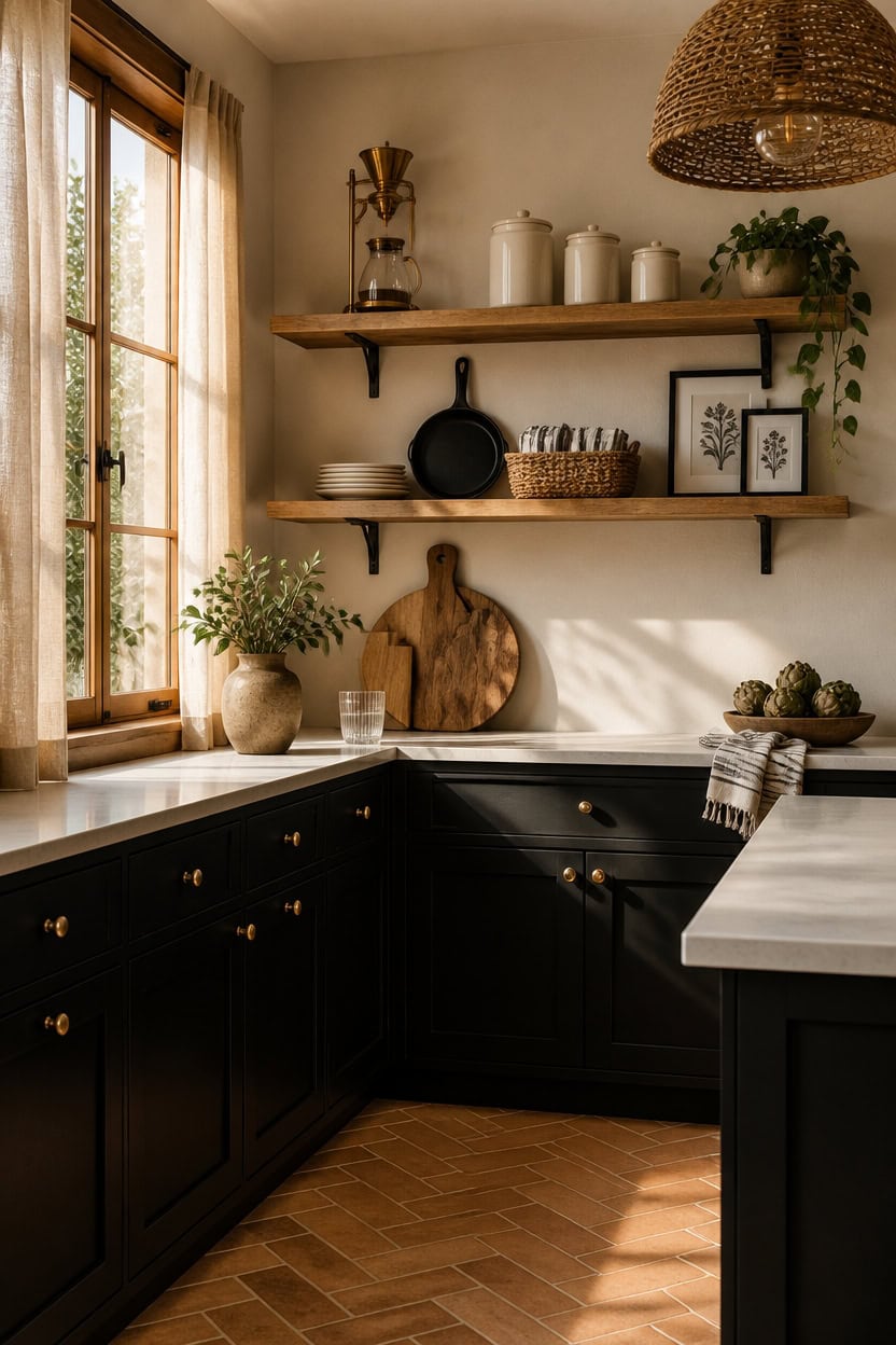
Open shelving works in a beige, black, and white kitchen when every object on it earns its place visually and functionally. Negative space — the deliberate gaps between objects — is what separates a styled shelf from a crowded one, and most people skip it entirely. Treat one third of each shelf as breathing room and the remaining two thirds as your display zone.
Anchor with height: Place the tallest item at one end of the shelf so the eye has a starting point before moving across the vignette.
Stack in threes: Group objects in odd numbers — a stack of white plates, a black canister, and a small plant reads as composed rather than random.
Mix texture, not color: Keep everything in the beige, black, and white palette, but vary materials — ceramic, wood, woven, and metal — so the shelf has depth without visual noise.
Edit ruthlessly: If removing one item makes the shelf look better, it shouldn’t be there.
the warm creamy white makes black and dark wood objects stand out without creating stark contrast.
the deep black anchors the shelf display above and creates a strong visual base for the whole wall.
 Lodge Pre-Seasoned Cast Iron Skillet with Silicone Handle Holder, 12 Inches
View Price
Lodge Pre-Seasoned Cast Iron Skillet with Silicone Handle Holder, 12 Inches
View Price
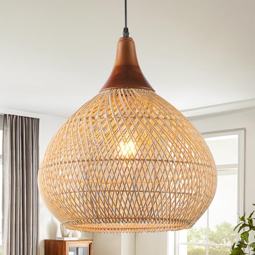 Karjearl Rattan Pendant Light, 15.7" Rattan Chandelier Hand-Woven Boho Pendant Light Fixtures with Solid Wood, Basket Wicker Chandelier for Dining Room Kitchen Island Living Room
View Price
Karjearl Rattan Pendant Light, 15.7" Rattan Chandelier Hand-Woven Boho Pendant Light Fixtures with Solid Wood, Basket Wicker Chandelier for Dining Room Kitchen Island Living Room
View Price
 Sorbus Storage Basket with Lid, 3-Piece Woven Set for Shelves (Beige)
View Price
Sorbus Storage Basket with Lid, 3-Piece Woven Set for Shelves (Beige)
View Price
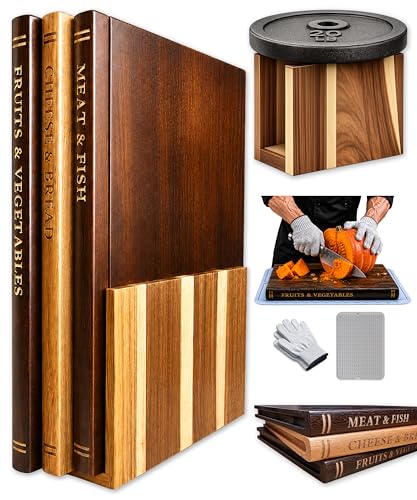 Book Cutting Board Set, Kitchen Cutting Boards, 3 Labeled Boards with Stand
View Price
Book Cutting Board Set, Kitchen Cutting Boards, 3 Labeled Boards with Stand
View Price
 Urban Villa Kitchen Towels Cotton Dish Towels 20”x30” (Set of 6) Black
View Price
Urban Villa Kitchen Towels Cotton Dish Towels 20”x30” (Set of 6) Black
View Price
 Bodum 34oz Pour Over Coffee Maker, High-Heat Borosilicate Glass with Reusable Stainless Steel Filter and Cork Grip - Made in Portugal
View Price
Bodum 34oz Pour Over Coffee Maker, High-Heat Borosilicate Glass with Reusable Stainless Steel Filter and Cork Grip - Made in Portugal
View Price
Styling the Counter in a Neutral Kitchen Like the Rest of Your Home
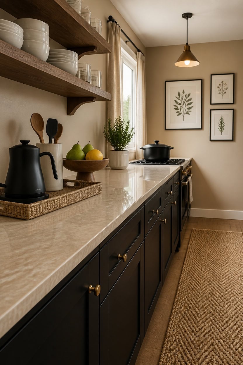
Your countertop tells the same visual story as the rest of your home when you treat it as a surface, not a storage zone. Objects placed directly on the counter without intention read as clutter, even in a beautiful neutral kitchen — but the same objects grouped on a tray or riser become a vignette. Keep the counter palette locked to the same beige, black, and white your kitchen already runs on so the eye moves through the room without stopping on a single jarring piece.
Lead with function: Every counter object should have a reason to exist — a kettle, a fruit bowl, a utensil holder — styled items with no use get dusty fast.
Use a tray as a frame: Corralling three to five objects on a flat tray creates an intentional moment the eye reads as decor rather than random placement.
Match the material language: If your shelves have ceramic and wood, bring the same materials to the counter so the whole kitchen reads as one cohesive decision.
Leave half the counter bare: Open counter space signals confidence in the edit and makes the styled sections look deliberate rather than overstuffed.
the warm sandy undertone wraps the counter vignette in softness without competing with your objects.
the deep black grounds the counter display above and anchors the entire neutral palette cleanly.
 LATCHHOOK White Large Utensil Holder for Kitchen Counter, High 7.2” Glossy Ceramic Utensils Crock for Countertop, Spatula Cooking Utensil Holder Easy to Clean for Farmhouse 7.2×5.8 INCH
View Price
LATCHHOOK White Large Utensil Holder for Kitchen Counter, High 7.2” Glossy Ceramic Utensils Crock for Countertop, Spatula Cooking Utensil Holder Easy to Clean for Farmhouse 7.2×5.8 INCH
View Price
 Hand-Woven Rattan-Style Storage Basket with Handles, Beige Oval Organizer Tray for Bathroom Kitchen Living Room | Fruit, Snack, Cosmetic & Toiletries Organizer | Decorative Multi-Purpose Basket
View Price
Hand-Woven Rattan-Style Storage Basket with Handles, Beige Oval Organizer Tray for Bathroom Kitchen Living Room | Fruit, Snack, Cosmetic & Toiletries Organizer | Decorative Multi-Purpose Basket
View Price
 Velaze 6 QT Enameled Cast Iron Dutch Oven Pot with Lid, Black
View Price
Velaze 6 QT Enameled Cast Iron Dutch Oven Pot with Lid, Black
View Price
 Wooden Fruit Bowl for Kitchen Counter, Bamboo Pedestal Fruit Basket, Vented
View Price
Wooden Fruit Bowl for Kitchen Counter, Bamboo Pedestal Fruit Basket, Vented
View Price
 NLUS 2 Pack Cooking Aprons for Women with Pockets Adjustable Kitchen Bib Aprons for Women Men Chef, Black/White Stripe (Classic Black/White Stripes)
View Price
NLUS 2 Pack Cooking Aprons for Women with Pockets Adjustable Kitchen Bib Aprons for Women Men Chef, Black/White Stripe (Classic Black/White Stripes)
View Price
 7ft Natural Jute Hallway Runner Rug Non Slip Washable, Rubber Backed Long Khaki Indoor Entryway Runner, Absorbent Kitchen Carpet Sink Rug
View Price
7ft Natural Jute Hallway Runner Rug Non Slip Washable, Rubber Backed Long Khaki Indoor Entryway Runner, Absorbent Kitchen Carpet Sink Rug
View Price
When Your Neutral Kitchen Feels Flat and How to Fix It
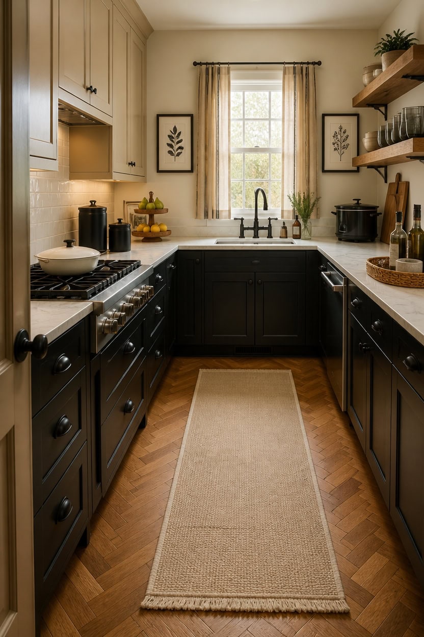
A flat neutral kitchen usually lacks contrast in value — meaning everything reads at the same visual weight, so nothing stands out. Adding one dark anchor, like a black canister set or a deeply toned cutting board, gives the eye a place to land and makes the lighter pieces look brighter by comparison. Even small shifts in texture, like swapping a smooth ceramic for a rough woven piece, create enough visual friction to make the palette feel alive again.
Add a dark anchor: One black or deep-toned object breaks the sameness and gives the neutral palette a clear focal point.
Layer textures intentionally: Combine matte, glossy, and woven surfaces so the light reads differently across each material.
Bring in organic shapes: A curved fruit bowl or irregular ceramic piece disrupts the rigidity of flat neutral surfaces and adds warmth.
Vary object height: Group items at three different heights — low, mid, and tall — so the eye travels upward instead of skimming along one flat plane.
the warm undertone lifts a flat neutral kitchen without pulling the palette away from its existing foundation.
the deep contrast grounds the space and eliminates the visual monotony that makes neutral kitchens feel washed out.
 JOJUNO Black Ceramic Canister with Bamboo Lid, 3-Piece Airtight Jars
View Price
JOJUNO Black Ceramic Canister with Bamboo Lid, 3-Piece Airtight Jars
View Price
 Rattan Serving Tray,Rectangle Wicker Storage Basket Set of 3 for Organizing
View Price
Rattan Serving Tray,Rectangle Wicker Storage Basket Set of 3 for Organizing
View Price
 Segretto Cookware Enameled Cast Iron Skillet, 10.25-IN Bianco Perla (Off-White) Enamel Skillet Pan, No Seasoning Required and Cast Iron Frying Pan
View Price
Segretto Cookware Enameled Cast Iron Skillet, 10.25-IN Bianco Perla (Off-White) Enamel Skillet Pan, No Seasoning Required and Cast Iron Frying Pan
View Price
 3 Tier Fruit Basket for Kitchen Counter, Solid Acacia Wood Fruit Stand
View Price
3 Tier Fruit Basket for Kitchen Counter, Solid Acacia Wood Fruit Stand
View Price
 EisEver Black and White Floral Wall Art Set of 3, Neutral Minimalist Bathroom Decor, Modern Flower Canvas Prints, Elegant Nature Botanical Artworks for Bedroom Living Room Wood Framed 12x16 inch
View Price
EisEver Black and White Floral Wall Art Set of 3, Neutral Minimalist Bathroom Decor, Modern Flower Canvas Prints, Elegant Nature Botanical Artworks for Bedroom Living Room Wood Framed 12x16 inch
View Price
 LANE LINEN Cotton Kitchen Towels Set, 4-Pack – Absorbent, Quick-Drying Dish Towels, Tea Towels, 18" x 28" - Slate Grey
View Price
LANE LINEN Cotton Kitchen Towels Set, 4-Pack – Absorbent, Quick-Drying Dish Towels, Tea Towels, 18" x 28" - Slate Grey
View Price
 Elite Gourmet MST-250XBX Electric Ceramic Slow Cooker, 1.5 Qt, Black
View Price
Elite Gourmet MST-250XBX Electric Ceramic Slow Cooker, 1.5 Qt, Black
View Price
 KOZYFLY Boho Runners for Hallways 2x6 ft Washable Kitchen Runner Non Slip Rubber Backed Hall Runners Cotton Entryway Runner Rugs for Indoor Backdoor Bedroom Kitchen, Orange Beige/Tan/Brown
View Price
KOZYFLY Boho Runners for Hallways 2x6 ft Washable Kitchen Runner Non Slip Rubber Backed Hall Runners Cotton Entryway Runner Rugs for Indoor Backdoor Bedroom Kitchen, Orange Beige/Tan/Brown
View Price