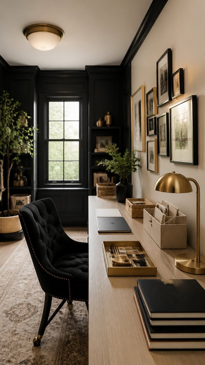
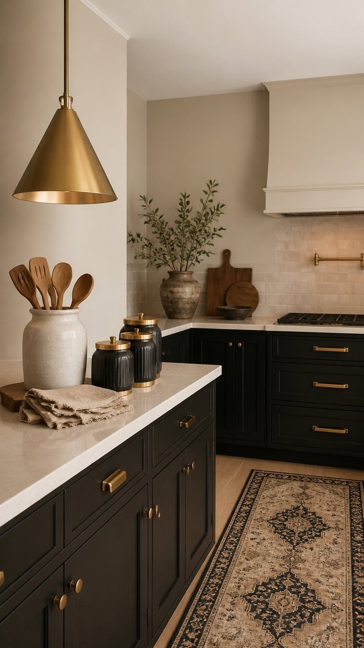
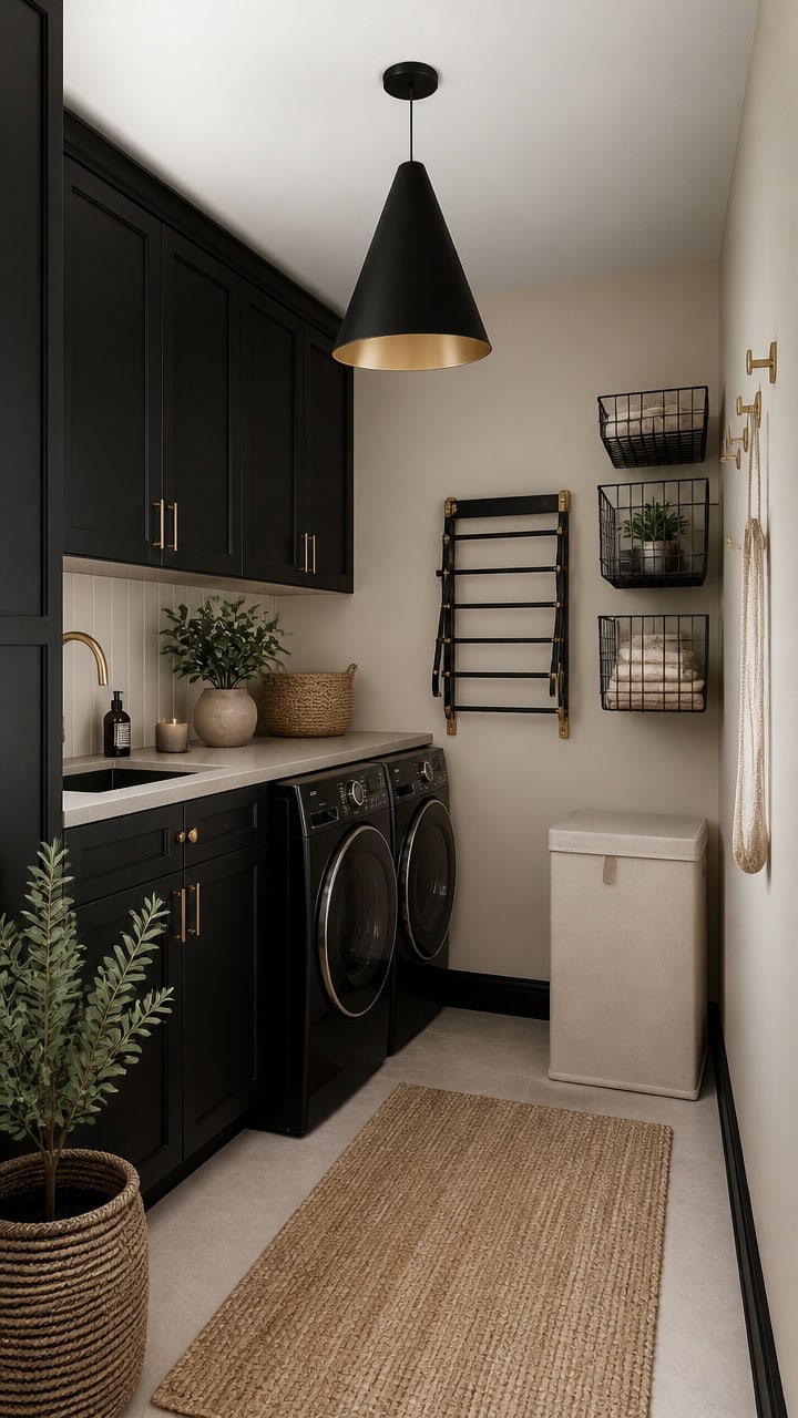
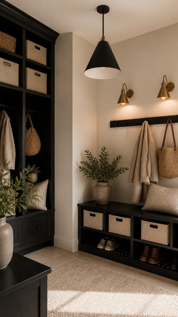
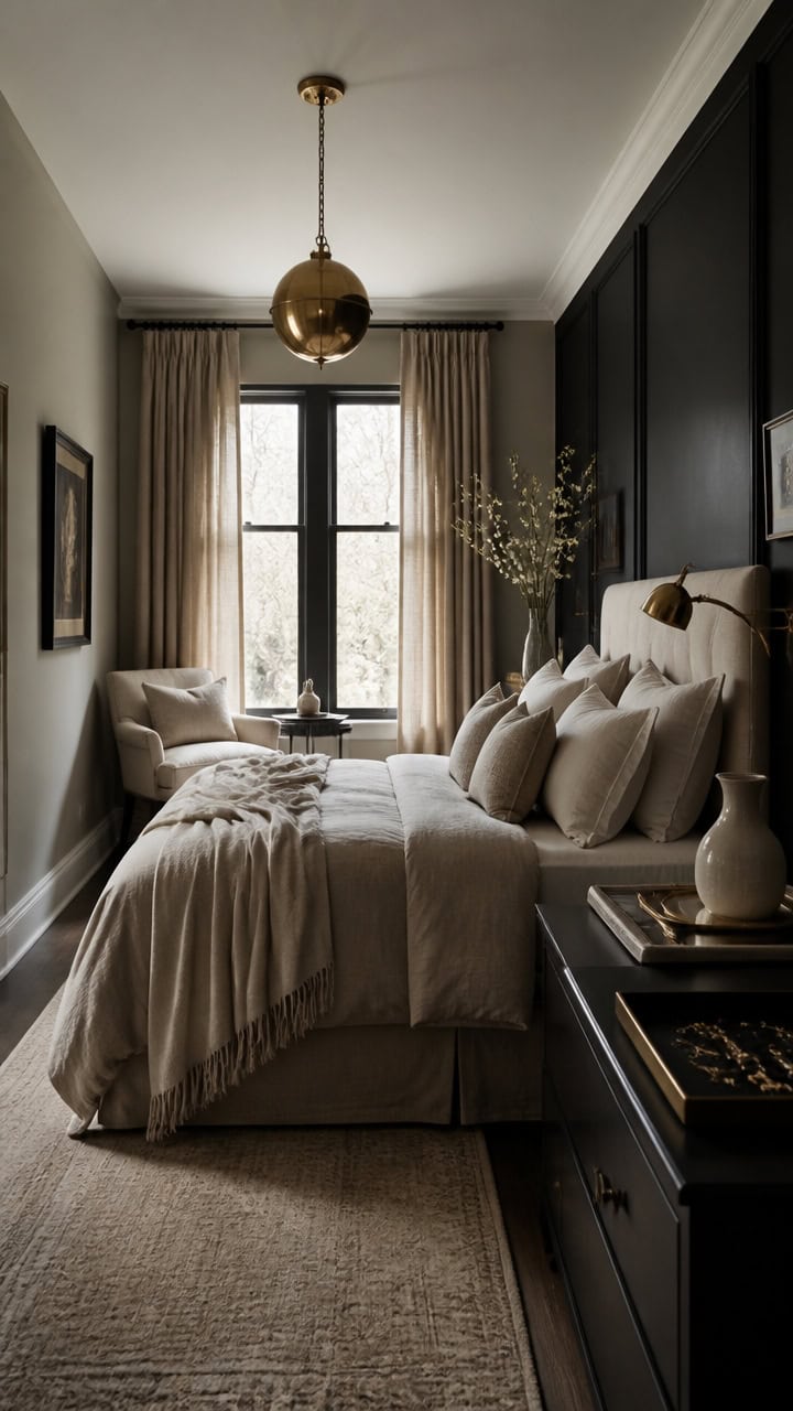
Black and Beige and Gold Living Rooms That Have Always Looked Exactly Like This

You’ve seen this room before you ever walked into it. Beige walls, a linen sofa, one black lacquered piece standing guard, brass catching the lamplight just so.
It feels inevitable, like it couldn’t have turned out any other way. But that effortlessness is engineered, down to the last placed object.
What actually makes it work is the pairing of black and beige, with gold warming the space between them.
Why Black, Gold, and Beige Never Goes Out of Style
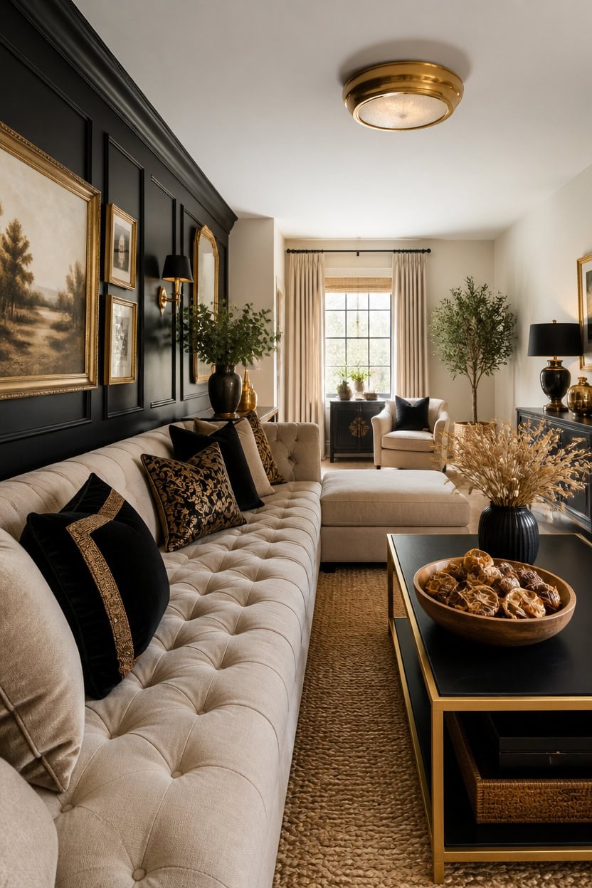
Very light beige Peau de Soie on the main walls creates a soft base that never competes with gold accents. Deep black Midnight Oil on the accent wall adds weight, anchoring the room without darkening the whole space. A wooden bowl of dried citrus on the coffee table pulls the gold tones back into view for a timeless look.
Anchor with black: Use black on one wall or feature to keep the palette from feeling washed out.
Layer beige as the base: Let very light beige dominate walls and large furniture for an airy backdrop.
Add gold sparingly: Use gold in hardware, lighting, and frames so it reads as accent, not overload.
Balance texture: Mix matte black, soft beige textiles, and metallic gold finishes to keep the room from feeling flat.
this very light beige keeps the room bright and lets black and gold accents stand out. [very light]
this deep black grounds the room and creates a bold backdrop for gold decor. [dark]
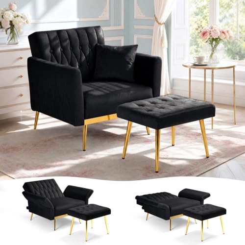 ACMEASE Velvet Accent Chair w/Ottoman & Adjustable Backrest, Black
View Price
ACMEASE Velvet Accent Chair w/Ottoman & Adjustable Backrest, Black
View Price
 ZENFUN Wooden Decorative Bowl, Wood Round Serving Bowl, Walnut Tray Dish Kitchen Dining for Fruits, 9.4" Diameter x 2.5" Height, Seamless
View Price
ZENFUN Wooden Decorative Bowl, Wood Round Serving Bowl, Walnut Tray Dish Kitchen Dining for Fruits, 9.4" Diameter x 2.5" Height, Seamless
View Price
 Large Framed Gold Abstract Wall Art for Living Room, 3 Piece Canvas Prints
View Price
Large Framed Gold Abstract Wall Art for Living Room, 3 Piece Canvas Prints
View Price
 Vorthio 89" Heavy-Duty 3 Seater Couch, Farmhouse Slipcover Sofa, with High Back & Rolled Arms, Soft Breathable Linen-Textured Lawson Couch for Living Room, Set of 2, Beige
View Price
Vorthio 89" Heavy-Duty 3 Seater Couch, Farmhouse Slipcover Sofa, with High Back & Rolled Arms, Soft Breathable Linen-Textured Lawson Couch for Living Room, Set of 2, Beige
View Price
 GIGIZAZA Pack of 4 Decorative Velvet Pillow Covers 18x18 Black Gold
View Price
GIGIZAZA Pack of 4 Decorative Velvet Pillow Covers 18x18 Black Gold
View Price
 hykolity 13 inch Flush Mount LED Ceiling Light Fixture,1300LM,5CCT
View Price
hykolity 13 inch Flush Mount LED Ceiling Light Fixture,1300LM,5CCT
View Price
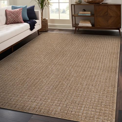 Beverly Rug Easy Jute Natural Rug 6x9 Solid Washable Durable Outdoor Indoor Area Rugs for Living Dining Room Patio Office Stain Resistant Non Shedding Casual Indoor Outside Carpet 6 x 9 Natural
View Price
Beverly Rug Easy Jute Natural Rug 6x9 Solid Washable Durable Outdoor Indoor Area Rugs for Living Dining Room Patio Office Stain Resistant Non Shedding Casual Indoor Outside Carpet 6 x 9 Natural
View Price
 Kate and Laurel Celia Modern Round Coffee Table; 28 x 28 x 19; Black and Gold; Coffee Table for Living Room Decor; Storage; and Display
View Price
Kate and Laurel Celia Modern Round Coffee Table; 28 x 28 x 19; Black and Gold; Coffee Table for Living Room Decor; Storage; and Display
View Price
The Beige Sectional That Anchors This Timeless Look
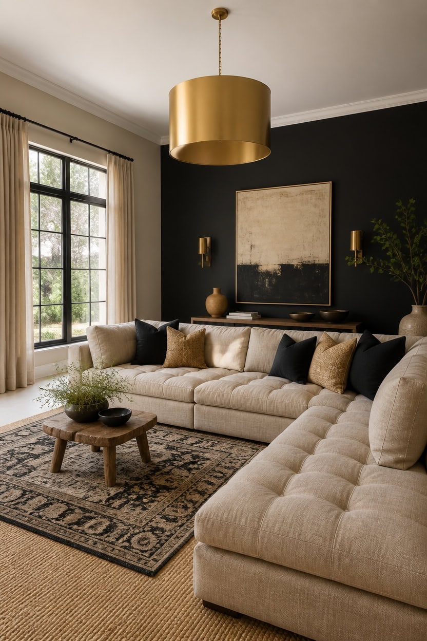
A beige sectional matches the very light beige Peau de Soie walls, letting the seating blend into the backdrop. The deep black Midnight Oil accent wall behind it adds contrast so the neutral sofa never reads as flat. Add layered rugs with a low stool near its base to add texture without disrupting the room’s calm palette.
Choose a low-profile silhouette: A sectional with clean lines keeps the beige palette feeling modern, not bulky.
Match fabric to wall tone: Pick a linen or performance fabric close to the wall’s beige so the piece blends in.
Anchor with a jute rug: Layer a natural fiber rug under the sectional to define the seating area.
Balance with dark accents: Pair the beige sofa with black or gold accessories to prevent a washed-out look.
this very light beige lets the beige sectional blend into a soft, airy backdrop. [very light]
this deep black adds contrast behind the sectional so the neutral tones do not fade together. [dark]
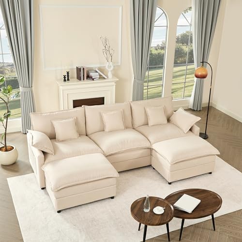 GOSUHI 108" U-Shaped Modular Cloud Couch, Deep Seat, Linen Beige
View Price
GOSUHI 108" U-Shaped Modular Cloud Couch, Deep Seat, Linen Beige
View Price
 jinchan 6ft Washable Round Area Rug, Soft Chinoiserie Floral, Sage Green
View Price
jinchan 6ft Washable Round Area Rug, Soft Chinoiserie Floral, Sage Green
View Price
 Janoray Black Velvet Accent Chair Set of 2 with Wingback
View Price
Janoray Black Velvet Accent Chair Set of 2 with Wingback
View Price
 KCO Single Modern Mini Brushed Brass Gold Cylinder Pendant Light Fixture
View Price
KCO Single Modern Mini Brushed Brass Gold Cylinder Pendant Light Fixture
View Price
 Tosleo Velvet Throw Pillow Covers 18x18 inch Pack of 2 Gold Decor Black
View Price
Tosleo Velvet Throw Pillow Covers 18x18 inch Pack of 2 Gold Decor Black
View Price
 Easy Jute Rug 9x12 Indoor Outdoor Natural Rugs Solid Fiber Rug Woven Area Rug Boho Easy Clean Inside Carpet for Living Room Bedroom Dining Room Hallway or Outdoor Patio Porch (9 X 12 Natural)
View Price
Easy Jute Rug 9x12 Indoor Outdoor Natural Rugs Solid Fiber Rug Woven Area Rug Boho Easy Clean Inside Carpet for Living Room Bedroom Dining Room Hallway or Outdoor Patio Porch (9 X 12 Natural)
View Price
 HARRITPURE Round Mirror 30 Gold Wall Mounted Circle Mirrors
View Price
HARRITPURE Round Mirror 30 Gold Wall Mounted Circle Mirrors
View Price
 Kate and Laurel Celia Metal Foldable Round Accent Table, 18.25" x 18.25" x 22", Black Surface and Gold Frame, Modern Minimalist Design and Detachable Magnetic Tabletop
View Price
Kate and Laurel Celia Metal Foldable Round Accent Table, 18.25" x 18.25" x 22", Black Surface and Gold Frame, Modern Minimalist Design and Detachable Magnetic Tabletop
View Price
How Black Lacquer Furniture Sets the Room’s Tone
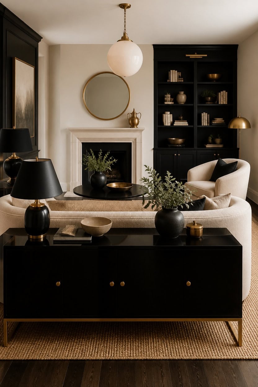
A black lacquer console anchors the seating group with a glossy, reflective surface that reads as a deliberate accent rather than clutter. The very light beige Luminaire walls keep the sheen from competing with the room, while the deep black Onyx accent wall behind the console grounds the piece in shadow. Set a vintage brass object on the mantel nearby so the lacquer’s reflection has something warm to catch.
Keep the finish singular: Stick to one lacquer piece so the shine reads as intentional, not busy.
Pair with matte textures: Balance the glossy surface with a linen sofa or wool rug nearby.
Let light do the work: Place the piece where a lamp or window can hit the lacquer for reflection.
Add warmth with brass: A small brass object nearby softens the black’s coolness.
this very light beige keeps the room bright so the lacquer furniture stands out as the dark focal point. [very light]
this deep black gives the lacquer console a shadowed backdrop that deepens its shine. [dark]
 ChooChoo High Gloss 63 Inch Long Console Table with LED Light
View Price
ChooChoo High Gloss 63 Inch Long Console Table with LED Light
View Price
 Serene Spaces Living Lightweight Antique Brass Decorative Bowl - Elegant Potpourri Catchall for Diwali Home Décor, Entryway and Dining Table, 2.75" Tall & 8" Diameter
View Price
Serene Spaces Living Lightweight Antique Brass Decorative Bowl - Elegant Potpourri Catchall for Diwali Home Décor, Entryway and Dining Table, 2.75" Tall & 8" Diameter
View Price
 Round Wall Mirror 24 Inch Gold Vanity Mirror with Metal Frame
View Price
Round Wall Mirror 24 Inch Gold Vanity Mirror with Metal Frame
View Price
 CINSARY 30" Tall Black and Gold Table Lamps Set of 2 for Living Room
View Price
CINSARY 30" Tall Black and Gold Table Lamps Set of 2 for Living Room
View Price
 MIULEE Decorative Linen Pillow Covers 20x20 Inch Natural Beige
View Price
MIULEE Decorative Linen Pillow Covers 20x20 Inch Natural Beige
View Price
 FATORRI Coffee Table with Storage Shelf, 2-Tier Wood Rectangular Coffee Tables, Mid-Century Modern Living Room Center Table with Fluted Panel (Black)
View Price
FATORRI Coffee Table with Storage Shelf, 2-Tier Wood Rectangular Coffee Tables, Mid-Century Modern Living Room Center Table with Fluted Panel (Black)
View Price
 Homemory Fall Halloween Table Decor, Gold Metal Candle Holders Set of 3
View Price
Homemory Fall Halloween Table Decor, Gold Metal Candle Holders Set of 3
View Price
See it in a whole home
The Black, Beige and Gold home tour
Marble and Gold Coffee Tables as the Focal Point
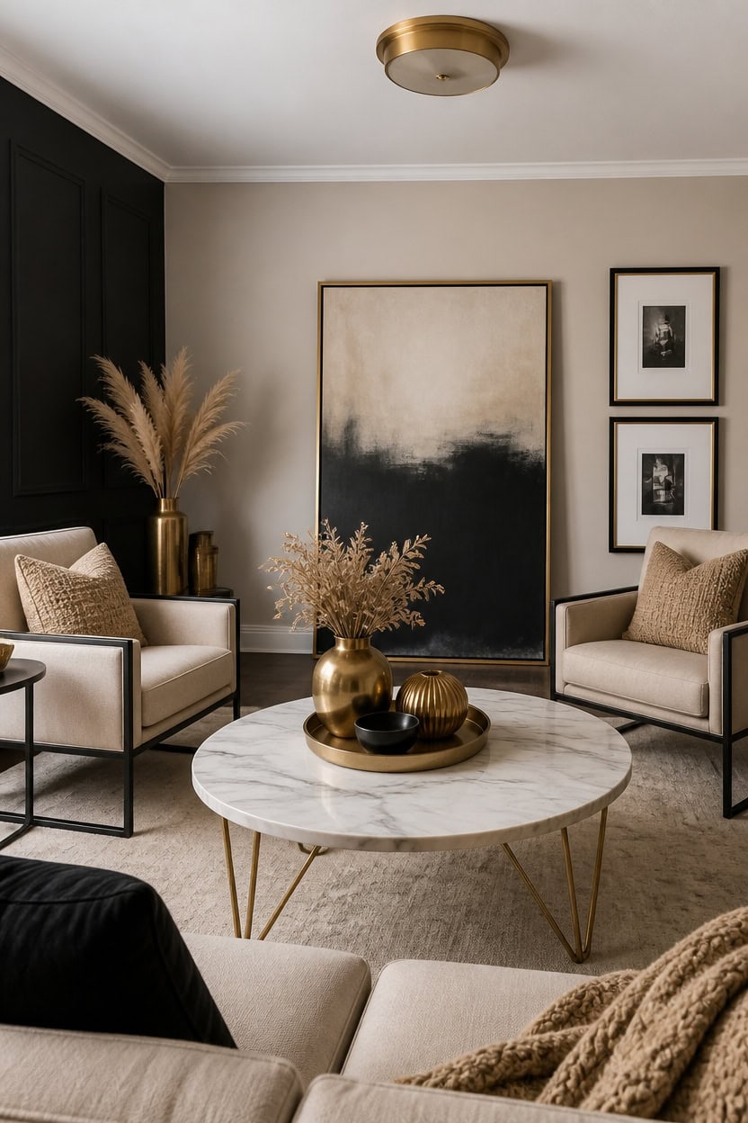
A marble-top coffee table with gold hairpin legs anchors the room. Very light beige Richmond Gray on the main walls keeps the marble’s veining visible, while deep black Wrought Iron on the accent wall lets the gold trim stand out. Lean a large framed art piece against the wall so its edge lines up with the marble grain.
Choose one statement piece: Let a single marble and gold coffee table do the visual work instead of stacking accent tables.
Anchor with a low object: Set a stone bowl or tray on the marble top so the gold legs still show underneath.
Match metal tones: Keep other gold accents in the room the same warmth as the table’s trim.
Give it breathing room: Leave open floor space around the table so the marble pattern reads clearly.
this very light beige keeps the room bright enough for the marble’s veining to stand out. [very light]
this deep black gives the gold coffee table trim a dark backdrop that makes it read as a highlight. [dark]
 VASAGLE Round Coffee Table, 2-Tier, Faux Marble Top, Glass Storage Shelf
View Price
VASAGLE Round Coffee Table, 2-Tier, Faux Marble Top, Glass Storage Shelf
View Price
 Honyee Full Length Mirror, 63" x 24" Wall Mirror, Flannel Wrapped Wooden Frame Floor Mirror, Irregular Wavy Mirror Hanging or Leaning Against Wall for Cloakroom/Bedroom/Living Room, Milk Tea
View Price
Honyee Full Length Mirror, 63" x 24" Wall Mirror, Flannel Wrapped Wooden Frame Floor Mirror, Irregular Wavy Mirror Hanging or Leaning Against Wall for Cloakroom/Bedroom/Living Room, Milk Tea
View Price
 Yaheetech Small 25.5in Wide Velvet Barrel Accent Chair for Bedroom, Black
View Price
Yaheetech Small 25.5in Wide Velvet Barrel Accent Chair for Bedroom, Black
View Price
 Tosuoka Washable Rug 8x10 Area Rugs for Living Room, Beige Cream Abstract
View Price
Tosuoka Washable Rug 8x10 Area Rugs for Living Room, Beige Cream Abstract
View Price
 Gold Stainless Steel Plates, Round Decorative Tray for Coffee Table Styling, 6.7"
View Price
Gold Stainless Steel Plates, Round Decorative Tray for Coffee Table Styling, 6.7"
View Price
 upsimples Vintage 8x10 Picture Frame, Antique Black and Gold Frames, 2 Pack
View Price
upsimples Vintage 8x10 Picture Frame, Antique Black and Gold Frames, 2 Pack
View Price
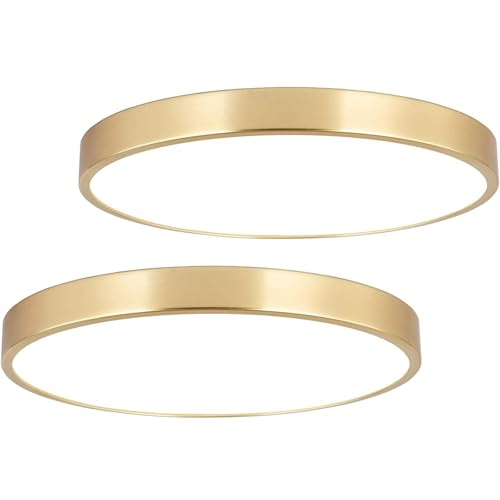 SOTTAE 2 Pack 12 Inch Brushed Gold Metal Flush Mount LED Ceiling Light,3000K-5000K 20W Thin Round Ceiling Lamp,Modern Low Profile Ceiling Light Fixtures for Bedroom Living Room Kitchen Bathroom
View Price
SOTTAE 2 Pack 12 Inch Brushed Gold Metal Flush Mount LED Ceiling Light,3000K-5000K 20W Thin Round Ceiling Lamp,Modern Low Profile Ceiling Light Fixtures for Bedroom Living Room Kitchen Bathroom
View Price
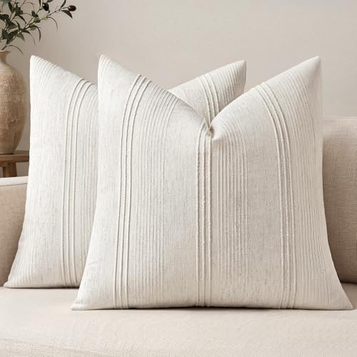 MIULEE Decorative Striped Throw Pillow Covers 18x18 in Natural Beige 2 Pack
View Price
MIULEE Decorative Striped Throw Pillow Covers 18x18 in Natural Beige 2 Pack
View Price
Why Some Rooms Swap Gold for Warmer Brass
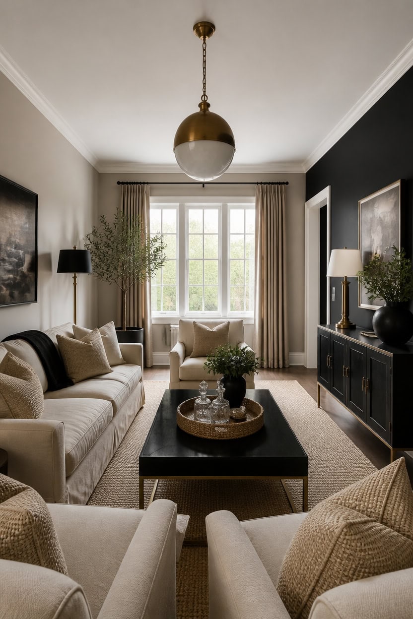
Brass reads warmer than gold under lamp light, so rooms with warm wood tones switch gold trim for brass fixtures. Light beige Bennington Gray covers the main walls while deep black Notre Dame marks the accent wall, letting that warm glow stand out. Set a woven tray with a decanter set on the coffee table so the brass matches the wall’s warm cast.
Match wood warmth: Pair brass fixtures with oak or walnut furniture legs for a matching warm tone.
Layer light sources: Warm bulb temperatures make brass read golden instead of yellow.
Limit gold accents: Use gold only in small trim pieces so brass stays the dominant metal.
Test in natural light: Brass shifts warmer in daylight than gold does under overhead bulbs.
this light beige lets the brass fixtures’ warm glow stand out without competing for attention. [light]
this deep black gives brass hardware a dark backdrop that makes the warm tone read clearly. [dark]
 Fairlee 26" Tall Table Lamp Gold Brass Candlestick Antique Traditional
View Price
Fairlee 26" Tall Table Lamp Gold Brass Candlestick Antique Traditional
View Price
 Round Rattan Serving Tray Set (2 Nesting Sizes) with Handles, 4 Coasters Included, Handwoven Boho Wicker Organizer for Coffee Table or Ottoman, 14.2 x 2.3 in and 11.9 x 1.7 in
View Price
Round Rattan Serving Tray Set (2 Nesting Sizes) with Handles, 4 Coasters Included, Handwoven Boho Wicker Organizer for Coffee Table or Ottoman, 14.2 x 2.3 in and 11.9 x 1.7 in
View Price
 Modern Oversized Accent Reading Chair for Living Room, 43", Chenille, Beige
View Price
Modern Oversized Accent Reading Chair for Living Room, 43", Chenille, Beige
View Price
 Treela 9 Set 6x8 Inch Black Frames for Picture Sizes 4x6, Metal Glass Vintage Brass Floating Photo Frame Vertical Tabletop Display for Wedding Home Office Desk Decorations(frame Size 6x8 Inch)
View Price
Treela 9 Set 6x8 Inch Black Frames for Picture Sizes 4x6, Metal Glass Vintage Brass Floating Photo Frame Vertical Tabletop Display for Wedding Home Office Desk Decorations(frame Size 6x8 Inch)
View Price
 EIHU HOME 18x18 Boucle Throw Pillow Covers, Set of 2, Beige
View Price
EIHU HOME 18x18 Boucle Throw Pillow Covers, Set of 2, Beige
View Price
 Audickic 3-Pack Pendant Lights Kitchen Island, Gold Hanging Lights Fixtures with Clear Glass Globe Shade, Brass Kitchen Island Lighting for Dining Room, AD-22280-1P3-GD
View Price
Audickic 3-Pack Pendant Lights Kitchen Island, Gold Hanging Lights Fixtures with Clear Glass Globe Shade, Brass Kitchen Island Lighting for Dining Room, AD-22280-1P3-GD
View Price
 PHWOTAN Square Metal Coffee Table Legs 16 x 18in Supports Up to 800LBS
View Price
PHWOTAN Square Metal Coffee Table Legs 16 x 18in Supports Up to 800LBS
View Price
8' x 10' Rugs for This Palette
Rugs USA best sellers in this palette's colors, linked in 8' x 10', the size that fits most living rooms with the front legs of the sofa and chairs on the rug. Every design comes in other sizes too.
- Free shipping
- 30-day returns
- 210,000+ five-star reviews
 Simple Serpent Rug – Black & Off White
View Price
Simple Serpent Rug – Black & Off White
View Price
 Cranbury Plush Textured Washable Rug – Sand
View Price
Cranbury Plush Textured Washable Rug – Sand
View Price
 Summit Plush Textured Washable Rug – Sand
View Price
Summit Plush Textured Washable Rug – Sand
View Price
 Everywhere Hand-Braided Indoor/Outdoor Rug – Salt And Pepper
View Price
Everywhere Hand-Braided Indoor/Outdoor Rug – Salt And Pepper
View Price
 Ring Around The Rosette Rug – Black
View Price
Ring Around The Rosette Rug – Black
View Price
 Jute Braided Rug – Black
View Price
Jute Braided Rug – Black
View Price
 Diamond Pinstripes Rug – Black
View Price
Diamond Pinstripes Rug – Black
View Price
 Seagrass with Border Rug – Black
View Price
Seagrass with Border Rug – Black
View Price
 Venetian Pinstripes Indoor/Outdoor Rug – Black
View Price
Venetian Pinstripes Indoor/Outdoor Rug – Black
View Price
 Dotted Diamond Trellis Rug – Black
View Price
Dotted Diamond Trellis Rug – Black
View Price
 Shaggy Moroccan Lattice Fringe Rug – Black
View Price
Shaggy Moroccan Lattice Fringe Rug – Black
View Price
 Moroccan Trellis Rug – Black
View Price
Moroccan Trellis Rug – Black
View Price
 Monochrome Bordered Indoor/Outdoor Rug – Grey
View Price
Monochrome Bordered Indoor/Outdoor Rug – Grey
View Price
 Moroccan Diamond Pinstripes Tassel Rug – Black
View Price
Moroccan Diamond Pinstripes Tassel Rug – Black
View Price
 Irregular Parallel Bars Rug – Black
View Price
Irregular Parallel Bars Rug – Black
View Price
 Striped Border Indoor/Outdoor Flatweave Rug – Black
View Price
Striped Border Indoor/Outdoor Flatweave Rug – Black
View Price
 Melrose Checked Rug – Charcoal
View Price
Melrose Checked Rug – Charcoal
View Price
 Jute Harlequin Trellis Rug – Black
View Price
Jute Harlequin Trellis Rug – Black
View Price
 Paddle Rug – Black
View Price
Paddle Rug – Black
View Price
 Downing Plaid Wool Rug by Nate Berkus – Grey
View Price
Downing Plaid Wool Rug by Nate Berkus – Grey
View Price
 Diamond Geometric Rug – Black
View Price
Diamond Geometric Rug – Black
View Price
 Serge Bordered Wool Rug by Nate Berkus – Tan
View Price
Serge Bordered Wool Rug by Nate Berkus – Tan
View Price
 Moroccan Trellis Rug – White and Black
View Price
Moroccan Trellis Rug – White and Black
View Price
 Perfect Handwoven Jute-Blend Rug – Natural
View Price
Perfect Handwoven Jute-Blend Rug – Natural
View Price
 Jute Braided Rug – Natural
View Price
Jute Braided Rug – Natural
View Price
 Softest Knit Wool Rug – Off White
View Price
Softest Knit Wool Rug – Off White
View Price
 Jute Braided Rug – Off White
View Price
Jute Braided Rug – Off White
View Price
 Maren Hazy Swirls Rug – Beige
View Price
Maren Hazy Swirls Rug – Beige
View Price
 Chunky Jute Tasseled Rug – Off White
View Price
Chunky Jute Tasseled Rug – Off White
View Price
 Floral Ornament Rug – Ivory
View Price
Floral Ornament Rug – Ivory
View Price
 Fading Herati Medallion Rug – Beige
View Price
Fading Herati Medallion Rug – Beige
View Price
 Chunky Jute Tasseled Rug – Natural
View Price
Chunky Jute Tasseled Rug – Natural
View Price
 Forever Vintage Rug – Neutral
View Price
Forever Vintage Rug – Neutral
View Price
 Native Collage Rug – Beige
View Price
Native Collage Rug – Beige
View Price
 Moroccan Diamond Pinstripes Tassel Rug – Off White
View Price
Moroccan Diamond Pinstripes Tassel Rug – Off White
View Price
 Handspun Jute Rug – Natural
View Price
Handspun Jute Rug – Natural
View Price
 Handwoven Jute Ribbed Solid Rug – Natural
View Price
Handwoven Jute Ribbed Solid Rug – Natural
View Price
 Melrose Checked Rug – Cream
View Price
Melrose Checked Rug – Cream
View Price
 Shaded Shag With Tassels Rug – Ivory
View Price
Shaded Shag With Tassels Rug – Ivory
View Price
 Plush Solid Shaggy Rug – Off White
View Price
Plush Solid Shaggy Rug – Off White
View Price
What Good Lighting Does for a Black and Gold Room
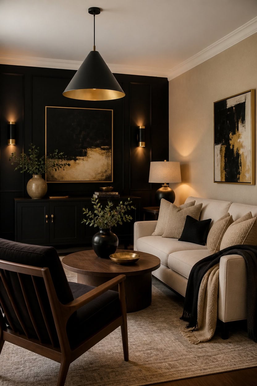
Good lighting layers ambient, task, and accent sources so a black and gold room stays readable at every hour. Very light beige Papaya on the main walls bounces daylight and lamp glow evenly, while deep black Black on the accent wall sharpens gold hardware under warm bulbs. A draped throw over the sofa arm softens the light before it reaches that dark wall.
Layer three sources: Combine ambient, task, and accent lighting so no corner reads flat.
Choose warm bulbs: Warm white bulbs keep black surfaces from looking dull or gray.
Point light at gold: Aim a lamp or sconce toward gold trim so it catches a visible glow.
Add dimmers: Dimmer switches let the room shift from bright daytime to a quieter evening mood.
this very light beige lets lamp light bounce evenly across the room. [very light]
this deep black gives gold hardware a dark backdrop that reads sharp under any light source. [dark]
 3-Pack Matte Black Pendant Lights Cone Kitchen Island Pendant Lighting
View Price
3-Pack Matte Black Pendant Lights Cone Kitchen Island Pendant Lighting
View Price
 STHOUYN 35" Black Leather Oversized Accent Chair with Wood Armrests, Mid-Century Modern Tufted Living Room Chair, Comfy Reading Sofa Chair with Lumbar Support & Thick Cushion Waiting Room Office
View Price
STHOUYN 35" Black Leather Oversized Accent Chair with Wood Armrests, Mid-Century Modern Tufted Living Room Chair, Comfy Reading Sofa Chair with Lumbar Support & Thick Cushion Waiting Room Office
View Price
 MIULEE 20x20 Decorative Boucle Couch Pillow Covers Beige
View Price
MIULEE 20x20 Decorative Boucle Couch Pillow Covers Beige
View Price
 Bloomingville Soft Reclaimed Cotton Blend Throw with Diamond Pattern and Fringe, Black and Beige
View Price
Bloomingville Soft Reclaimed Cotton Blend Throw with Diamond Pattern and Fringe, Black and Beige
View Price
 Gold Candle Warmer Lamp with 24h Cycle Timer, Dimmable Wax Melt Warmer
View Price
Gold Candle Warmer Lamp with 24h Cycle Timer, Dimmable Wax Melt Warmer
View Price
 Wall Candle Sconce Holder Set of 2 Metal Black Wall Candle Holder Farmhouse
View Price
Wall Candle Sconce Holder Set of 2 Metal Black Wall Candle Holder Farmhouse
View Price
 Household Essentials Round Coffee Table in Ashwood Rustic Wood Grain and Black Metal Frame, Black
View Price
Household Essentials Round Coffee Table in Ashwood Rustic Wood Grain and Black Metal Frame, Black
View Price
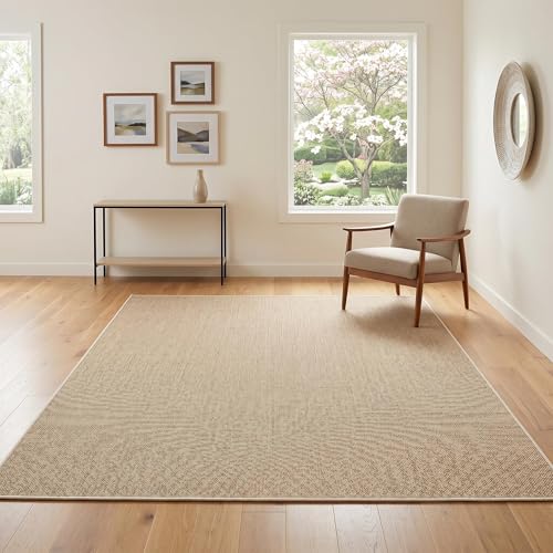 Garvee Woven Textured Area Rug 5x7 Washable Rugs for Living Room Tan
View Price
Garvee Woven Textured Area Rug 5x7 Washable Rugs for Living Room Tan
View Price
How to Layer Textures in an All-Beige Room
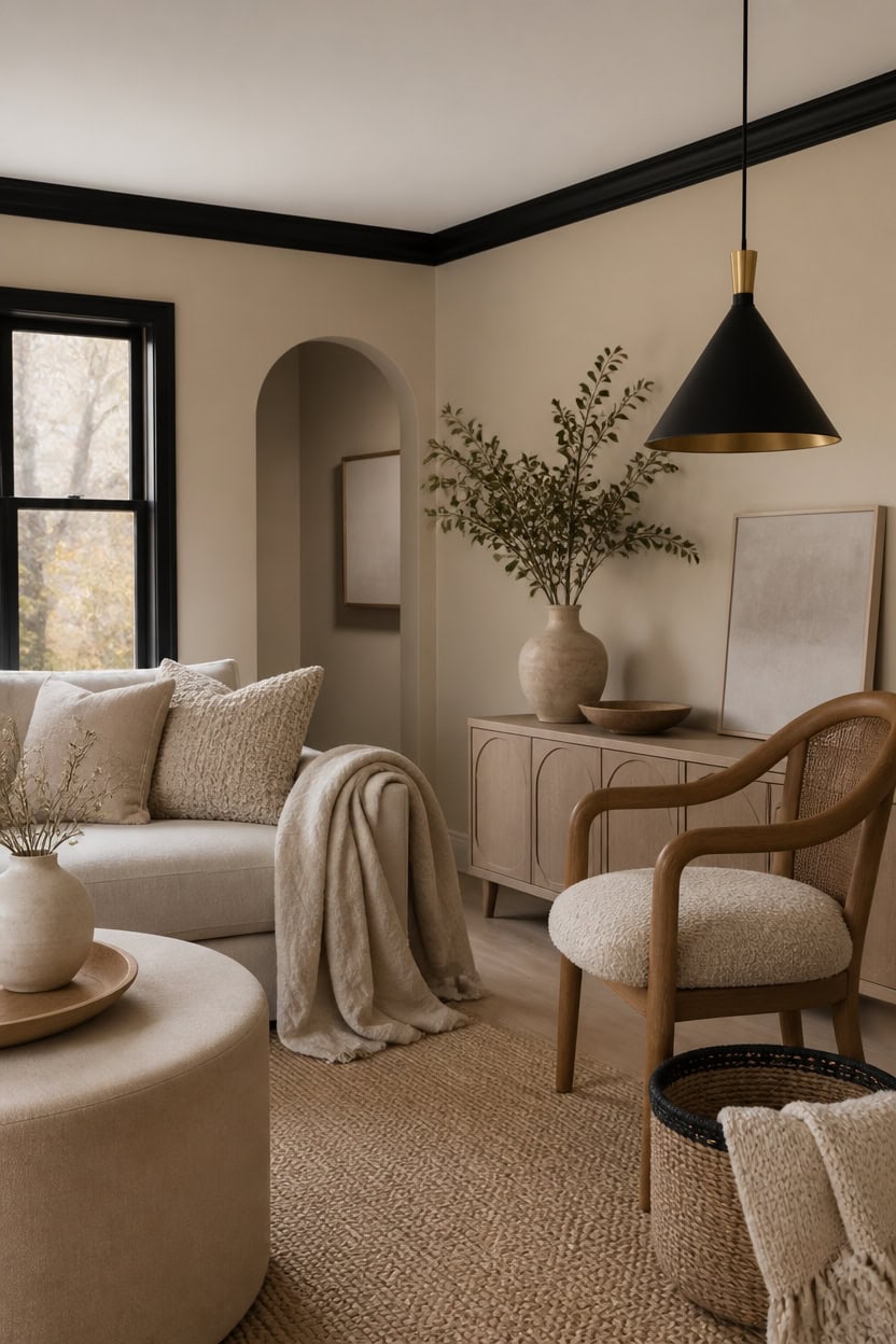
Mixing linen, ceramic, and wool textures keeps an all-beige room from looking flat under one neutral tone. Very light beige Papaya covers the main walls, while deep black trim sharpens the edges without adding another hue. A draped throw over the sofa arm adds a fourth texture that pulls the layers together.
Mix matte and shine: Pair a matte throw with a glossy ceramic vase to create contrast within the same beige tone.
Add nubby texture: A boucle or woven throw pillow reads warmer than a flat linen surface.
Vary pile height: Layer a low-pile jute rug under a plush wool throw for visual depth.
Anchor with wood: A wood-back chair breaks up soft textiles with one hard surface.
this very light beige lets soft texture layers read without visual noise. [very light]
this deep black outlines doorways and baseboards, adding definition to an all-beige room. [dark]
 DREAMINGO Abstract Chenille Couch Cover Blanket Beige Khaki Black Boho Sofa Cover, Washable Furniture Protector, Universal Slipcover for Couch, Geometric Brushstroke Jacquard, Large 71"x118"
View Price
MIULEE 18x18 Decorative Boucle Couch Pillow Covers Beige
View Price
DREAMINGO Abstract Chenille Couch Cover Blanket Beige Khaki Black Boho Sofa Cover, Washable Furniture Protector, Universal Slipcover for Couch, Geometric Brushstroke Jacquard, Large 71"x118"
View Price
MIULEE 18x18 Decorative Boucle Couch Pillow Covers Beige
View Price
 Larexius Chunky Knit Throw Blanket for Couch,50x60 Inches Cream
View Price
Larexius Chunky Knit Throw Blanket for Couch,50x60 Inches Cream
View Price
 SAFAVIEH Natural Fiber Area Rug 6x9, Jute Knotted Natural NF447A
View Price
SAFAVIEH Natural Fiber Area Rug 6x9, Jute Knotted Natural NF447A
View Price
 Karl home Mid-Century Accent Chair, Woven Rope Arms, Beige
View Price
Karl home Mid-Century Accent Chair, Woven Rope Arms, Beige
View Price
 KSANA Modern Black Gold Pendant Light, 1-Light Farmhouse Pendant Lighting for Kitchen Island, Dining Room, Hallway, Foyer and Bedroom
View Price
KSANA Modern Black Gold Pendant Light, 1-Light Farmhouse Pendant Lighting for Kitchen Island, Dining Room, Hallway, Foyer and Bedroom
View Price
 JONATHAN Y Parker Ribbed Ceramic Gourd Nightstand Table Lamp 21.5", White
View Price
JONATHAN Y Parker Ribbed Ceramic Gourd Nightstand Table Lamp 21.5", White
View Price
 Small Woven Cotton Rope Basket with Leather Handle, Black
View Price
Small Woven Cotton Rope Basket with Leather Handle, Black
View Price
Wall Art for This Palette
The best-reviewed prints at Wayfair in this palette's colors. Most come in several sizes.
- Free shipping over $35
- Picked at 4.5 stars or higher
 Mid Century Shape Abstract Contours Black and White Beige
View Price
Mid Century Shape Abstract Contours Black and White Beige
View Price
 Grunge Abstract Paint Stroke Effect Tan Gray Neutral
View Price
Grunge Abstract Paint Stroke Effect Tan Gray Neutral
View Price
 Geometric Subtle Abstract Modern Minimalist Neutral Home
View Price
Geometric Subtle Abstract Modern Minimalist Neutral Home
View Price
 Minimal Geometric Compostions of Elementary Forms XIV
View Price
Minimal Geometric Compostions of Elementary Forms XIV
View Price
 Mid Century Modern Boho Bold Bright Yellow Green Leaves
View Price
Mid Century Modern Boho Bold Bright Yellow Green Leaves
View Price
 2 Piece Yellow Botanical Branch with Leaves I
View Price
2 Piece Yellow Botanical Branch with Leaves I
View Price
 Mid Century Modern Black and White Minimalist Abstract Home
View Price
Mid Century Modern Black and White Minimalist Abstract Home
View Price
 Sky Above Photograph
View Price
Sky Above Photograph
View Price
 Vintage Pine Tree Drawing Classic Country Rustic
View Price
Vintage Pine Tree Drawing Classic Country Rustic
View Price
 Crane Heron Bird Vibrant Watercolor Blue Heron
View Price
Crane Heron Bird Vibrant Watercolor Blue Heron
View Price
 Sweet Peonies I by Vincent Van Gogh
View Price
Sweet Peonies I by Vincent Van Gogh
View Price
 Amarian Decadent Young Woman After the Dance Ramon Casas
View Price
Amarian Decadent Young Woman After the Dance Ramon Casas
View Price
 Watercolor Tan Brown Waves Organic Modern Abstract
View Price
Watercolor Tan Brown Waves Organic Modern Abstract
View Price
 And Minimal Woman Silhouette I Abstract Shapes
View Price
And Minimal Woman Silhouette I Abstract Shapes
View Price
 The Cafe Terrace by Vincent Van Gogh
View Price
The Cafe Terrace by Vincent Van Gogh
View Price
 Sun Mountain Landscape Abstract Neutral Forest
View Price
Sun Mountain Landscape Abstract Neutral Forest
View Price
 Sun Tipped Tropicals
View Price
Sun Tipped Tropicals
View Price
 Mid Century Modern Boho Organic Tropical Leaf
View Price
Mid Century Modern Boho Organic Tropical Leaf
View Price
 Beige Botanical Impressions III Abstract Botanicals
View Price
Beige Botanical Impressions III Abstract Botanicals
View Price
 Mid Century Modern Boho Idea4wall
View Price
Mid Century Modern Boho Idea4wall
View Price
 Mid Century Modern Boho Duotone Beige Abstract Lines
View Price
Mid Century Modern Boho Duotone Beige Abstract Lines
View Price
 Pastel Tan Brown Green Hues
View Price
Pastel Tan Brown Green Hues
View Price
 Blue Wildfloers Liquid Ink I Modern Flowers
View Price
Blue Wildfloers Liquid Ink I Modern Flowers
View Price
 Bright Orange Boho Sun Burst
View Price
Bright Orange Boho Sun Burst
View Price
 Morning Rise by Alex Hanson Painting
View Price
Morning Rise by Alex Hanson Painting
View Price
 Autumn on a Country Road by Danny Head
View Price
Autumn on a Country Road by Danny Head
View Price
 Calm Reflections by Studio Arts Meadow Birch Trees
View Price
Calm Reflections by Studio Arts Meadow Birch Trees
View Price
 Mid Century Shape Muted Abstract Color Blocks
View Price
Mid Century Shape Muted Abstract Color Blocks
View Price
 Pine Tree Enchanted Forest II Tree Pine
View Price
Pine Tree Enchanted Forest II Tree Pine
View Price
 Rustic Countryside Moody Rural Countryside Landscape
View Price
Rustic Countryside Moody Rural Countryside Landscape
View Price
 Autumn Fall Color Autumn Scene Fall Forest Maple Trees
View Price
Autumn Fall Color Autumn Scene Fall Forest Maple Trees
View Price
 Abstract Botanical Bohemian Orange Brown Floral
View Price
Abstract Botanical Bohemian Orange Brown Floral
View Price
 Paddle Your Own Canoe Phrase Mountain Lake Adventure
View Price
Paddle Your Own Canoe Phrase Mountain Lake Adventure
View Price
 Smokey Sunrise
View Price
Smokey Sunrise
View Price
 Mid Century Modern Boho Vibrant Green Yellow Abstract
View Price
Mid Century Modern Boho Vibrant Green Yellow Abstract
View Price
 Pink and Gold Angel Wings Abstract Spirals
View Price
Pink and Gold Angel Wings Abstract Spirals
View Price
 Abstract Geode Gold and Blue Marble Abstract Marble
View Price
Abstract Geode Gold and Blue Marble Abstract Marble
View Price
 Vintage Flower in Pastel Modern Art Wall Decor
View Price
Vintage Flower in Pastel Modern Art Wall Decor
View Price
 Abstract Botanical Classic Floral Plant
View Price
Abstract Botanical Classic Floral Plant
View Price
 Golden Mid Century Boho Drawing Abstract Minimalism
View Price
Golden Mid Century Boho Drawing Abstract Minimalism
View Price
Bringing Wood Tones Into a Black and Gold Room
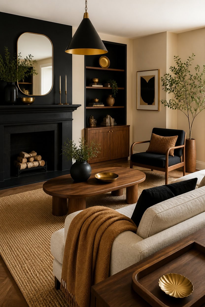
Real wood grain reads warm against a black and gold palette when it appears in furniture legs, floors, or a mantel rather than in paint. One wood-tone anchor, like a walnut console or oak floor, keeps a black and gold room warm. Very light beige Papaya on the main walls softens deep black Black paint on the fireplace surround, letting the wood read warm. A draped throw over the sofa arm in a honey tone ties the wood grain to both painted surfaces.
Wood species contrast: Pair a warm walnut table with black-painted trim for depth.
Metal bridge: Brass or gold hardware ties wood tones to the black backdrop.
Rug layering: A jute or wool rug in tan grounds wood furniture against dark walls.
Repeat the wood: Use the same wood finish on at least two pieces for cohesion.
this very light beige balances the wood tones and keeps the black accents from feeling heavy. [very light]
this deep black frames the wood mantel and gives the room a strong focal point. [dark]
 JOINICE 31.5" Round Coffee Table with Storage for Living Room, Walnut
View Price
JOINICE 31.5" Round Coffee Table with Storage for Living Room, Walnut
View Price
 Caiselee 15.7 Inch Modern Pendant Lights Kitchen Island, Black and Gold 1-Light Single Pendant Lighting Fixtures, Metal Cone Farmhouse Ceiling Hanging Light for Dining Room Over Sink Table Hallway
View Price
Caiselee 15.7 Inch Modern Pendant Lights Kitchen Island, Black and Gold 1-Light Single Pendant Lighting Fixtures, Metal Cone Farmhouse Ceiling Hanging Light for Dining Room Over Sink Table Hallway
View Price
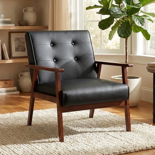 STHOUYN Black Leather Accent Chair, Waiting Chair with Wooden Arms
View Price
STHOUYN Black Leather Accent Chair, Waiting Chair with Wooden Arms
View Price
 KUNJOULAM Modern Table Lamp, 17.3" Small Desk Light with Brass Metal Droplet Base, Black Cylinder Linen Drum Shade, Nightstand Lamp for Bedroom Living Room Nightstand Office
View Price
KUNJOULAM Modern Table Lamp, 17.3" Small Desk Light with Brass Metal Droplet Base, Black Cylinder Linen Drum Shade, Nightstand Lamp for Bedroom Living Room Nightstand Office
View Price
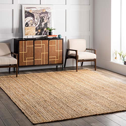 nuLOOM Rigo Hand Woven Farmhouse Jute Area Rug, 8x10, Natural
View Price
nuLOOM Rigo Hand Woven Farmhouse Jute Area Rug, 8x10, Natural
View Price
 Glamativity Large 4 Pcs Colorful And Black Double-Sided Gold Leaf Metal Wall Art, 22.5 x 15.7'' Botanical Abstract Wall Décor Metal Leaf with Frame, 3D Textured Sculptures, Modern Wall Art With Ginkgo Biloba Design for Living Room Bedroom Bathroom Study (L Size 22.5 x 15.7'')
View Price
Glamativity Large 4 Pcs Colorful And Black Double-Sided Gold Leaf Metal Wall Art, 22.5 x 15.7'' Botanical Abstract Wall Décor Metal Leaf with Frame, 3D Textured Sculptures, Modern Wall Art With Ginkgo Biloba Design for Living Room Bedroom Bathroom Study (L Size 22.5 x 15.7'')
View Price
 topathleticstore Wooden Jewelry Display Tray, Organizer for Rings, Necklaces, Earrings, Catchall Holder, Trinket Dish, Key Tray (Oval)
View Price
topathleticstore Wooden Jewelry Display Tray, Organizer for Rings, Necklaces, Earrings, Catchall Holder, Trinket Dish, Key Tray (Oval)
View Price
Cozy Family Rooms That Still Feel Polished
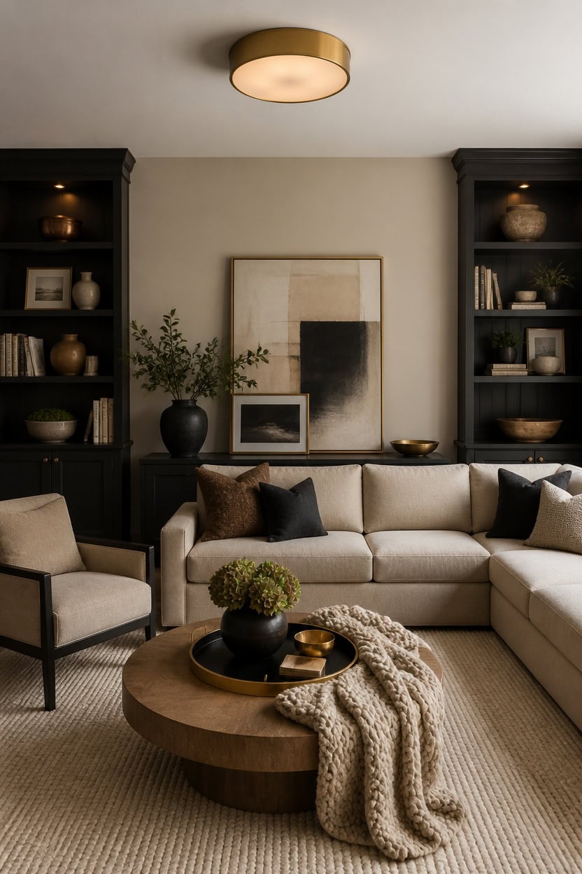
Cozy family rooms lean on a very light beige called Richmond Gray for the main walls, keeping the space open and warm underfoot. Deep black Wrought Iron on the built-in shelving grounds the room and gives everyday items a rich backdrop instead of a busy one. Lean a framed art piece against the wall near the built-ins to add a lived-in, polished layer.
Layer soft textures: Add a chunky knit throw and velvet pillows so the room feels touchable, not stiff.
Keep black to one furniture zone: Limit black to the built-ins or a single console so beige stays dominant.
Warm up with wood tones: Mix in a wood coffee table to soften the black-and-beige contrast.
Add gold in small doses: Use gold picture frames and lamp bases to keep the palette polished, not flashy.
this very light beige keeps the family room bright and welcoming. [very light]
this deep black grounds the room and gives shelved items a rich backdrop. [dark]
 Large Framed Modern Abstract Horizontal Wall Art for Living Room, 60x30 In
View Price
Large Framed Modern Abstract Horizontal Wall Art for Living Room, 60x30 In
View Price
 COLAMY Modern Accent Chair, Upholstered Barrel Chair with Curved Back,Black
View Price
COLAMY Modern Accent Chair, Upholstered Barrel Chair with Curved Back,Black
View Price
 ABCASA 102.6" L Shaped Modular Sectional Couch with Washable Chenille Cover, 4 Seater Deep Seat Sofa with Storage Ottoman & Reversible Chaise for Living Room, Pet-Friendly, Beige
View Price
ABCASA 102.6" L Shaped Modular Sectional Couch with Washable Chenille Cover, 4 Seater Deep Seat Sofa with Storage Ottoman & Reversible Chaise for Living Room, Pet-Friendly, Beige
View Price
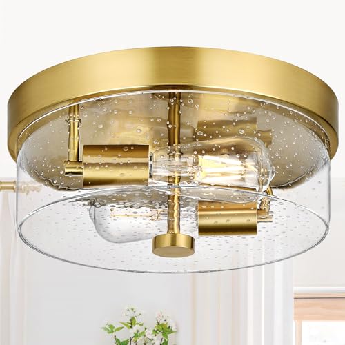 Flush Mount Ceiling Light Fixtures, 2-Light Gold Ceiling Mount for Farmhouse with Seeded Glass Lampshade, Industrial Flush Mount Light Fixture Farmhouse for Hallway, Kitchen, Entryway and Foyer
View Price
Flush Mount Ceiling Light Fixtures, 2-Light Gold Ceiling Mount for Farmhouse with Seeded Glass Lampshade, Industrial Flush Mount Light Fixture Farmhouse for Hallway, Kitchen, Entryway and Foyer
View Price
 Decorative Bamboo Serving Tray Set with Gold Metal Handles, 2 Pack Ottoman Coffee Table Trays, 14.5x9.8 and 15.75x11 Inches (Black)
View Price
Decorative Bamboo Serving Tray Set with Gold Metal Handles, 2 Pack Ottoman Coffee Table Trays, 14.5x9.8 and 15.75x11 Inches (Black)
View Price
 Bigacogo Chunky Knit Throw Blanket for Couch, 40x60 inches, Beige
View Price
Bigacogo Chunky Knit Throw Blanket for Couch, 40x60 inches, Beige
View Price
 VASAGLE Round Coffee Table, 31.5-Inch Center Table, Tapered Legs
View Price
VASAGLE Round Coffee Table, 31.5-Inch Center Table, Tapered Legs
View Price
 Lessymo 8x10 Area Rugs for Living Room, Washable Rug Faux Wool Brown Beige
View Price
Lessymo 8x10 Area Rugs for Living Room, Washable Rug Faux Wool Brown Beige
View Price
Removable Wallpaper for This Palette
Removable designer wallpaper from Wallshoppe, picked to match this palette. An easy way to add pattern to any room, and every design is available as a sample.
- Designed and printed in the USA
- Non-toxic inks
- Featured in NYT Wirecutter
 Buka Patchwork Wallpaper by Chris Benz – Flax
View Price
Buka Patchwork Wallpaper by Chris Benz – Flax
View Price
 Tent Stripe Large Wallpaper by Chris Benz – Mustard
View Price
Tent Stripe Large Wallpaper by Chris Benz – Mustard
View Price
 Tent Stripe Small Wallpaper by Chris Benz – Mustard
View Price
Tent Stripe Small Wallpaper by Chris Benz – Mustard
View Price
 Buka Patchwork Wallpaper by Chris Benz – Blue
View Price
Buka Patchwork Wallpaper by Chris Benz – Blue
View Price
 Townhouse Wallpaper by Sarah Jessica Parker – Pearl on Charcoal
View Price
Townhouse Wallpaper by Sarah Jessica Parker – Pearl on Charcoal
View Price
 Townhouse Wallpaper by Sarah Jessica Parker – Pearl on Parchment
View Price
Townhouse Wallpaper by Sarah Jessica Parker – Pearl on Parchment
View Price
 Monroe Street Wallpaper by Chris Benz – Yellow
View Price
Monroe Street Wallpaper by Chris Benz – Yellow
View Price
 Buka Patchwork Wallpaper by Chris Benz – Burlap
View Price
Buka Patchwork Wallpaper by Chris Benz – Burlap
View Price
 The Queens Lace' Wallpaper by Sarah Jessica Parker – Oyster
View Price
The Queens Lace' Wallpaper by Sarah Jessica Parker – Oyster
View Price
 Persimmon Birds Wallpaper by Nathan Turner – Mustard
View Price
Persimmon Birds Wallpaper by Nathan Turner – Mustard
View Price
 Pacifico Palm Wallpaper by Nathan Turner – Onyx
View Price
Pacifico Palm Wallpaper by Nathan Turner – Onyx
View Price
 Life is a Banquet Stripe Wallpaper by Lingua Franca – Blues
View Price
Life is a Banquet Stripe Wallpaper by Lingua Franca – Blues
View Price
 Ojai Stripe Wallpaper by Wallshoppe – Iced Chai
View Price
Ojai Stripe Wallpaper by Wallshoppe – Iced Chai
View Price
 Sidewalk Wallpaper by Chris Benz – Green
View Price
Sidewalk Wallpaper by Chris Benz – Green
View Price
 Lemons Wallpaper by Nathan Turner – White
View Price
Lemons Wallpaper by Nathan Turner – White
View Price
 Fleur De Camomille Wallpaper by Sarah Jessica Parker – Parchment
View Price
Fleur De Camomille Wallpaper by Sarah Jessica Parker – Parchment
View Price
 Large Dumbo Wallpaper by Chris Benz – Yellow
View Price
Large Dumbo Wallpaper by Chris Benz – Yellow
View Price
 Tent Stripe Large Wallpaper by Chris Benz – Brown Red
View Price
Tent Stripe Large Wallpaper by Chris Benz – Brown Red
View Price
 Arance Dolci Wallpaper by Carly Beck – Black
View Price
Arance Dolci Wallpaper by Carly Beck – Black
View Price
 Stacks Wallpaper by Sarah Jessica Parker – Natural
View Price
Stacks Wallpaper by Sarah Jessica Parker – Natural
View Price
 Eleanor Rigby Wallpaper by Wallshoppe – Charcoal / Umber
View Price
Eleanor Rigby Wallpaper by Wallshoppe – Charcoal / Umber
View Price
 El Quijote Wallpaper by Chris Benz – Black
View Price
El Quijote Wallpaper by Chris Benz – Black
View Price
 Life is a Banquet Stripe Wallpaper by Lingua Franca – Persimmon + Blue
View Price
Life is a Banquet Stripe Wallpaper by Lingua Franca – Persimmon + Blue
View Price
 Small Dumbo Wallpaper by Chris Benz – Yellow
View Price
Small Dumbo Wallpaper by Chris Benz – Yellow
View Price
 Lemons Wallpaper by Nathan Turner – Indigo
View Price
Lemons Wallpaper by Nathan Turner – Indigo
View Price
 Townhouse Wallpaper by Sarah Jessica Parker – Teal on Charcoal
View Price
Townhouse Wallpaper by Sarah Jessica Parker – Teal on Charcoal
View Price
 Large Dumbo Wallpaper by Chris Benz – Latte
View Price
Large Dumbo Wallpaper by Chris Benz – Latte
View Price
 El Quijote Wallpaper by Chris Benz – Pink / Yellow
View Price
El Quijote Wallpaper by Chris Benz – Pink / Yellow
View Price
 Large Dumbo Wallpaper by Chris Benz – Black
View Price
Large Dumbo Wallpaper by Chris Benz – Black
View Price
 Pacifico Palm Wallpaper by Nathan Turner – Cappuccino
View Price
Pacifico Palm Wallpaper by Nathan Turner – Cappuccino
View Price
 El Quijote Wallpaper by Chris Benz – Umber / Charcoal
View Price
El Quijote Wallpaper by Chris Benz – Umber / Charcoal
View Price
 Large Madison Stripe Wallpaper by Chris Benz – Tan
View Price
Large Madison Stripe Wallpaper by Chris Benz – Tan
View Price
 Tent Stripe Large Wallpaper by Chris Benz – Rust Terracotta Pink
View Price
Tent Stripe Large Wallpaper by Chris Benz – Rust Terracotta Pink
View Price
 Tent Stripe Large Wallpaper by Chris Benz – Magenta Red
View Price
Tent Stripe Large Wallpaper by Chris Benz – Magenta Red
View Price
 Lemons Wallpaper by Nathan Turner – Blue
View Price
Lemons Wallpaper by Nathan Turner – Blue
View Price
 Fiddle Fig Wallpaper by Nathan Turner – Onyx
View Price
Fiddle Fig Wallpaper by Nathan Turner – Onyx
View Price
 Eleanor Rigby Wallpaper by Wallshoppe – Safari
View Price
Eleanor Rigby Wallpaper by Wallshoppe – Safari
View Price
 Tent Stripe Large Wallpaper by Chris Benz – Blue
View Price
Tent Stripe Large Wallpaper by Chris Benz – Blue
View Price
 Lafayette Patchwork Wallpaper by Chris Benz – Brown
View Price
Lafayette Patchwork Wallpaper by Chris Benz – Brown
View Price
 El Quijote Wallpaper by Chris Benz – Mustard
View Price
El Quijote Wallpaper by Chris Benz – Mustard
View Price
Mid-Century Living Rooms With a Gold Twist
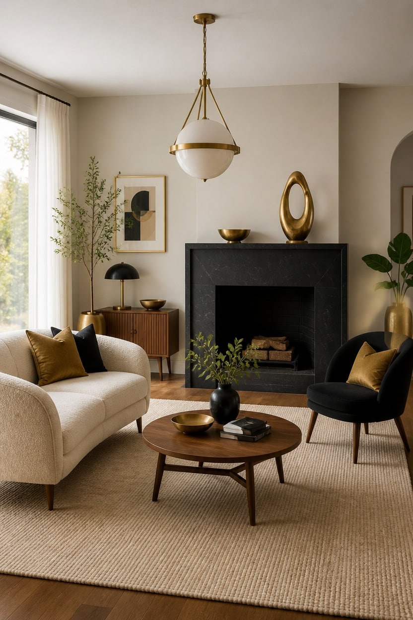
A 70/30 split works best here: very light beige Luminaire dominates the main walls, while deep black Onyx wraps the fireplace surround for contrast. This ratio keeps the mid-century room airy without letting the black overpower the wood tones and gold accents. Set a vintage brass object on the mantel to tie the era-appropriate warmth together.
Choose tapered wood legs: Pick sofas and chairs with slim wood legs to keep the mid-century silhouette light.
Add warm gold in metal, not paint: Use brass or gold hardware and lighting instead of painted gold accents.
Balance black with warm wood: Pair Onyx black with walnut or teak pieces so the room stays inviting.
Keep patterns geometric: Choose simple geometric prints on pillows or rugs to match the mid-century era.
this very light beige keeps the mid-century room bright and airy. [very light]
this deep black creates a bold focal point that echoes mid-century drama. [dark]
 SUJUN Elegant Cast Iron Bird Statue with Vintage Brass Coating
View Price
SUJUN Elegant Cast Iron Bird Statue with Vintage Brass Coating
View Price
 SoarTalent Barrel Dining Chair with Arms Set of 2, Upholstered Linen Armchair, Curved Back Mid-Century Accent Chair with Solid Wood Legs, Kitchen Dining Room, Breakfast Nook,Home Office,Black
View Price
SoarTalent Barrel Dining Chair with Arms Set of 2, Upholstered Linen Armchair, Curved Back Mid-Century Accent Chair with Solid Wood Legs, Kitchen Dining Room, Breakfast Nook,Home Office,Black
View Price
 80" Mid-Century Modern Boucle Cloud Sofa, Deep Seat 3-Seater Couch, Cream
View Price
80" Mid-Century Modern Boucle Cloud Sofa, Deep Seat 3-Seater Couch, Cream
View Price
 Weiscode 2 Pack Black Gold Throw Pillow Covers 18x18 Home Decor Modern Art
View Price
Weiscode 2 Pack Black Gold Throw Pillow Covers 18x18 Home Decor Modern Art
View Price
 ZttRiee Round Coffee Table with Sliding Doors, Mid-Century, Walnut
View Price
ZttRiee Round Coffee Table with Sliding Doors, Mid-Century, Walnut
View Price
 Bagood 10 Inch Globe Pendant Light Gold Mid Century Pendant Light Adjustable Hanging Light Fixture Globe Pendant Lights Kitchen Island Clear Glass with Brass Finish for Dining Room
View Price
Bagood 10 Inch Globe Pendant Light Gold Mid Century Pendant Light Adjustable Hanging Light Fixture Globe Pendant Lights Kitchen Island Clear Glass with Brass Finish for Dining Room
View Price
 Large Framed Boho Black White Abstract Wall Art for Living Room, 24x36 In
View Price
Large Framed Boho Black White Abstract Wall Art for Living Room, 24x36 In
View Price
Full-On Glam Living Rooms That Lean Into Drama
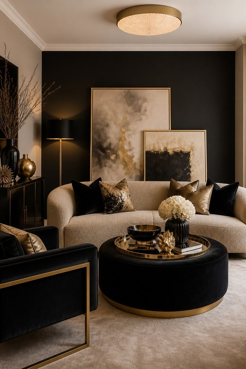
Very light beige Richmond Gray covers the main walls, while deep black Wrought Iron takes over one accent wall for instant drama. This contrast lets gold mirrors and metallic pillows catch light without disappearing into an all-black room. Lean framed art against the dark wall to soften the line between light and dark.
Layer metallics: Mix brass, gold, and mirrored finishes so light bounces around the room.
Add texture with velvet: Use velvet upholstery to soften the sharp black and beige contrast.
Anchor with one dark wall: Keep black to a single wall so the room stays bright overall.
Use oversized art: Pick large-scale framed pieces to match the drama of the palette.
this very light beige keeps the glam room bright enough to handle bold accents. [very light]
this deep black creates a dramatic backdrop for gold and mirrored decor. [dark]
 Furnimart Black Velvet Accent Chair Mid Century Modern Living Room Chairs; Comfy Armchair Leisure Vanity Guest Wingback Chair for Office Study Vanity Bedroom Waiting Room
View Price
Furnimart Black Velvet Accent Chair Mid Century Modern Living Room Chairs; Comfy Armchair Leisure Vanity Guest Wingback Chair for Office Study Vanity Bedroom Waiting Room
View Price
 xuperbonus Small Ottoman with Storage,Folding Round Ottoman with Gold Trim,Velvet Storage Stool,Foot Stool with Soft Padded,Foot Rest for Living Room13“x13”x12.4(YZbeige,1pcs)
View Price
xuperbonus Small Ottoman with Storage,Folding Round Ottoman with Gold Trim,Velvet Storage Stool,Foot Stool with Soft Padded,Foot Rest for Living Room13“x13”x12.4(YZbeige,1pcs)
View Price
 Kate and Laurel Ciel Metal Mirrored Ornate Scalloped Decorative Tray, Gold
View Price
Kate and Laurel Ciel Metal Mirrored Ornate Scalloped Decorative Tray, Gold
View Price
 ZLINA Set of 2 Velvet Decorative Throw Pillow Covers Black White Patchwork with Gold Leather Pillow Covers 18 × 18 Inch Cushion Covers Decor Living Room Sofa Bedroom Car
View Price
ZLINA Set of 2 Velvet Decorative Throw Pillow Covers Black White Patchwork with Gold Leather Pillow Covers 18 × 18 Inch Cushion Covers Decor Living Room Sofa Bedroom Car
View Price
 Furnify 114" Cloud-Loaf Modular Sectional Sofa with Ottoman, Modern Boucle Cloud Couch for Living Room, 67" Deep Seat L-Shaped Sofa Set, Boneless Comfy Memory Foam Couches, No Assembly, Beige
View Price
Furnify 114" Cloud-Loaf Modular Sectional Sofa with Ottoman, Modern Boucle Cloud Couch for Living Room, 67" Deep Seat L-Shaped Sofa Set, Boneless Comfy Memory Foam Couches, No Assembly, Beige
View Price
 COVLON Round Side Table, Fluted Drum End Table, Tambour Accent Table
View Price
COVLON Round Side Table, Fluted Drum End Table, Tambour Accent Table
View Price
Our Favorite Floor Lamps
- Free shipping over $35
- Picked at 4.5 stars or higher
 Coleford 65" 3-Light Tree Floor Lamp with Woven Rattan Shades
View Price
Coleford 65" 3-Light Tree Floor Lamp with Woven Rattan Shades
View Price
 Crevan 65" Dimmable Rattan Tree Floor Lamp with 3 Bulbs
View Price
Crevan 65" Dimmable Rattan Tree Floor Lamp with 3 Bulbs
View Price
 Rasch 65" Tree Floor Lamp with Dimmable Bulbs
View Price
Rasch 65" Tree Floor Lamp with Dimmable Bulbs
View Price
 Rhodes 63" 1-Light Traditional Floor Lamp
View Price
Rhodes 63" 1-Light Traditional Floor Lamp
View Price
 Brayana 64" Silver Traditional Floor Lamp
View Price
Brayana 64" Silver Traditional Floor Lamp
View Price
 Mctaggart 66" Distressed Traditional Floor Lamp
View Price
Mctaggart 66" Distressed Traditional Floor Lamp
View Price
 Aarzo 69.6" Arched Rattan Floor Lamp with LED and Remote
View Price
Aarzo 69.6" Arched Rattan Floor Lamp with LED and Remote
View Price
 Peavine 76" Rattan Arched Floor Lamp with Remote Control
View Price
Peavine 76" Rattan Arched Floor Lamp with Remote Control
View Price
 Atlasburg 63" Metal Arched Floor Lamp with Rattan Shade
View Price
Atlasburg 63" Metal Arched Floor Lamp with Rattan Shade
View Price
 Kigali 62.5" Light Wood Tripod Floor Lamp
View Price
Kigali 62.5" Light Wood Tripod Floor Lamp
View Price
 62.71" Solid Wood Floor Lamp with Linen Shade
View Price
62.71" Solid Wood Floor Lamp with Linen Shade
View Price
 Jan 65" Torchiere Floor Lamp
View Price
Jan 65" Torchiere Floor Lamp
View Price
 Pilsen 58" Task Floor Lamp
View Price
Pilsen 58" Task Floor Lamp
View Price
The Mistakes That Break This Black-and-Gold Combo
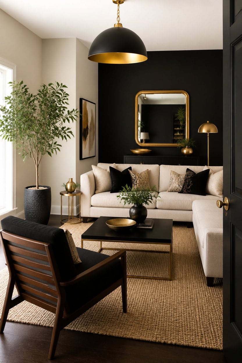
Letting black spread past one wall breaks the balance between deep black Jet Black and very light Splendor beige. Too much gold without enough matte black flattens the contrast that makes this pairing intentional. Leaving corners bare is another slip; add a large floor plant in a textured planter near the black wall.
Too much black: Limit deep black to one wall or accent piece, not multiple surfaces.
Ignoring gold balance: Add gold in small doses—frames, hardware, or light fixtures—not as a second dominant tone.
Skipping contrast anchors: Pair black with very light beige, never a mid-tone beige, so the drama stays clear.
Leaving corners empty: Fill dead space with plants or art so black accents don’t feel isolated.
this very light beige keeps the room open and lets black accents read as intentional contrast. [very light]
this deep black stays a focal point without overwhelming the room when kept to one wall. [dark]
 Kante 21.7" Tall Concrete Planter, Large Round Bullet Pot, Weathered Finish
View Price
Kante 21.7" Tall Concrete Planter, Large Round Bullet Pot, Weathered Finish
View Price
 SESIMENT Farmhouse Pendant Lighting for Kitchen Island,Black and Gold Dome Pendant Light Fixtures, Industrial Hanging Ceiling Light for Dining Room Foyer Cafe Kitchen Sink,2 Pack
View Price
SESIMENT Farmhouse Pendant Lighting for Kitchen Island,Black and Gold Dome Pendant Light Fixtures, Industrial Hanging Ceiling Light for Dining Room Foyer Cafe Kitchen Sink,2 Pack
View Price
 SilkWood Studio Hadwin Cane Back Accent Chair, Solid Wood Frame, Black
View Price
SilkWood Studio Hadwin Cane Back Accent Chair, Solid Wood Frame, Black
View Price
 Heavy Duty Ektorp Sofa Cover Only Compatible with IKEA 3 Seat Slipcover
View Price
Heavy Duty Ektorp Sofa Cover Only Compatible with IKEA 3 Seat Slipcover
View Price
 HARRITPURE Arched Bathroom Mirror 30"x48" Gold Large Wall Mounted Mirror
View Price
HARRITPURE Arched Bathroom Mirror 30"x48" Gold Large Wall Mounted Mirror
View Price
 Mordchil HF 2-Tier Round End Side Table, Small Metal Side Table with Removable Tray, Folding Accent Tables for Living Room, Balcony, Nightstand for Bedroom, Outdoor Tables for Patio, Gold
View Price
Mordchil HF 2-Tier Round End Side Table, Small Metal Side Table with Removable Tray, Folding Accent Tables for Living Room, Balcony, Nightstand for Bedroom, Outdoor Tables for Patio, Gold
View Price
How to Recreate the Look Without It Feeling Dated
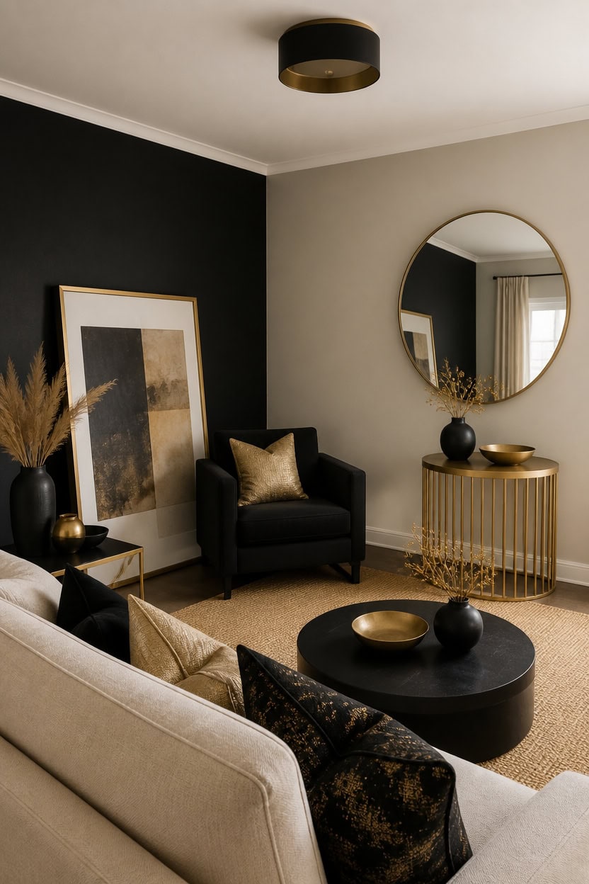
Repainting the accent wall in deep black Wrought Iron keeps drama without feeling dated, since its charcoal undertone softens pure black. Very light beige Richmond Gray on the main walls keeps the space open and current. Lean a large framed art piece against the black wall to add depth without cluttering the corner.
Update the mix: Swap high-gloss black for a matte or textured finish to avoid a shiny, dated look.
Refresh gold accents: Choose brushed or antique gold finishes instead of bright polished gold.
Layer textures: Mix linen, jute, and wood so the palette never feels flat.
Edit accessories: Rotate in one or two new pieces each season to keep the room current.
this deep black keeps the focal point moody without slipping into a dated high-contrast look. [dark]
this very light beige keeps the room airy and prevents the black from feeling heavy. [very light]
 Honyee Full Length Mirror, 63" x 24" Wall Mirror, Flannel Wrapped Wooden Frame Floor Mirror, Irregular Wavy Mirror Hanging or Leaning Against Wall for Cloakroom/Bedroom/Living Room, Black
View Price
Honyee Full Length Mirror, 63" x 24" Wall Mirror, Flannel Wrapped Wooden Frame Floor Mirror, Irregular Wavy Mirror Hanging or Leaning Against Wall for Cloakroom/Bedroom/Living Room, Black
View Price
 TLSUNNY Accent Chair, Upholstered Teddy Fabric Living Room Chairs
View Price
TLSUNNY Accent Chair, Upholstered Teddy Fabric Living Room Chairs
View Price
 Black Flush Mount Ceiling Light Fixtures, 2-Light Ceiling Mount for Farmhouse with Seeded Glass Lampshade, Industrial Flush Mount Light Fixture Farmhouse for Hallway, Kitchen, Entryway and Foyer
View Price
Black Flush Mount Ceiling Light Fixtures, 2-Light Ceiling Mount for Farmhouse with Seeded Glass Lampshade, Industrial Flush Mount Light Fixture Farmhouse for Hallway, Kitchen, Entryway and Foyer
View Price
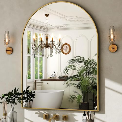 HARRITPURE Arched Wall Mirror 30"x40" Gold Arch Bathroom Vanity Mirror
View Price
HARRITPURE Arched Wall Mirror 30"x40" Gold Arch Bathroom Vanity Mirror
View Price
 TeoKJ 2 Tier Gold Side Table, Folding Round Metal End Table Small Nightstand with Two Removable Tray for Bedroom Living Room Small Spaces Bedside Gold
View Price
TeoKJ 2 Tier Gold Side Table, Folding Round Metal End Table Small Nightstand with Two Removable Tray for Bedroom Living Room Small Spaces Bedside Gold
View Price
Our Favorite Slipcovers
- Free shipping over $35
- Picked at 4.4 stars or higher
 Reversible Non-Slip Couch Cover for 3-Cushion Couch
View Price
Reversible Non-Slip Couch Cover for 3-Cushion Couch
View Price
 Medallion Reversible Sofa Pet Furniture Protector Slipcover
View Price
Medallion Reversible Sofa Pet Furniture Protector Slipcover
View Price
 Pizarro 4-Piece Stretch Jacquard Sofa Slipcover for 3-Cushion Couch
View Price
Pizarro 4-Piece Stretch Jacquard Sofa Slipcover for 3-Cushion Couch
View Price
 Water Resistant Non-Slip Recliner Chair Slipcover with Pocket
View Price
Water Resistant Non-Slip Recliner Chair Slipcover with Pocket
View Price
 Patchwork Reversible Recliner Pet Furniture Protector Slipcover
View Price
Patchwork Reversible Recliner Pet Furniture Protector Slipcover
View Price
 Medallion Reversible Recliner Pet Furniture Protector Slipcover
View Price
Medallion Reversible Recliner Pet Furniture Protector Slipcover
View Price
 Pizarro 3-Piece Stretch Jacquard Loveseat Slipcover for 2-Cushion Couch
View Price
Pizarro 3-Piece Stretch Jacquard Loveseat Slipcover for 2-Cushion Couch
View Price
 Soft Velvet Plush 3-Piece Stretch Loveseat Slipcover for 2-Cushion Couch
View Price
Soft Velvet Plush 3-Piece Stretch Loveseat Slipcover for 2-Cushion Couch
View Price
 100% Waterproof Microfiber Sofa Slipcover with Elastic Straps
View Price
100% Waterproof Microfiber Sofa Slipcover with Elastic Straps
View Price
 Medallion Reversible Chair Pet Furniture Protector Slipcover
View Price
Medallion Reversible Chair Pet Furniture Protector Slipcover
View Price
 Rich Velvet Stretch 2-Piece Box Cushion Armchair Slipcover
View Price
Rich Velvet Stretch 2-Piece Box Cushion Armchair Slipcover
View Price
 2-Piece L-Shaped Sectional Couch Cover, Machine Washable
View Price
2-Piece L-Shaped Sectional Couch Cover, Machine Washable
View Price
 Stretch Sectional Couch Cover with Anti-Slip Pet Protection
View Price
Stretch Sectional Couch Cover with Anti-Slip Pet Protection
View Price