How a Blue and White Bathroom Stays Honest Without Going Cold

You paint your bathroom to match a Wedgwood teacup, and something goes wrong. The walls read less like porcelain and more like a walk-in freezer.
It’s not the color that failed you; it’s everything you paired with it. Before you repaint, know that the fix is in what you put around the blue and white, not in the blue and white itself.
Why Blue and White Bathrooms Turn Cold
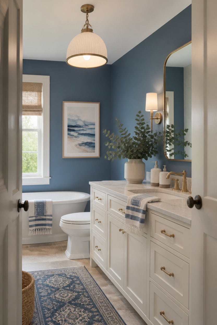
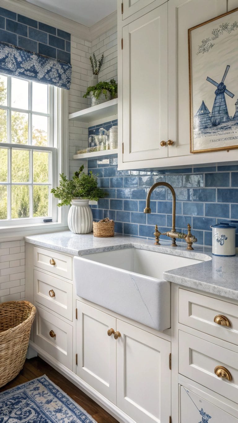
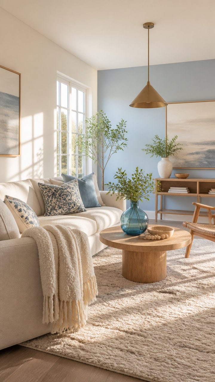
Cold blue-white bathrooms often share one light value, so nothing anchors the eye. Mid-tone blue Azurite on the main walls against very light white Seapearl on the vanity adds contrast that keeps the room from flattening into gray. A small eucalyptus bundle in a vase on the vanity edge adds warmth to balance the cool tones.
Layer warm metals: Brass or brushed gold fixtures cut the chill of pure blue and white.
Add texture underfoot: A jute or wood-look bath mat keeps the palette from feeling sterile.
Balance value, not hue: Pair a mid-tone blue with a soft white instead of stark white to avoid flat contrast.
Bring in a living element: Plants or greenery add warmth that paint alone cannot.
a mid-tone blue that grounds the space without reading dark or heavy. [mid-tone]
a soft white that keeps the room bright while separating it from the blue walls. [very light]
 Yaheetech 24" Bathroom Vanity with Sink, 2 Doors & 1 Drawer Cabinet, White
View Price
Yaheetech 24" Bathroom Vanity with Sink, 2 Doors & 1 Drawer Cabinet, White
View Price
 VOOVA & MOVAS Stripe Towels, Cotton Blend, Ultra Soft, Blue Gray White
View Price
VOOVA & MOVAS Stripe Towels, Cotton Blend, Ultra Soft, Blue Gray White
View Price
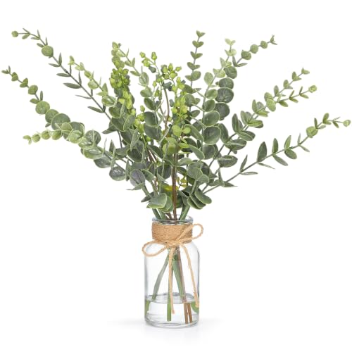 FAVOWREATH 6 Pcs Artificial Eucalyptus Stems with Glass Vase Fake Plants
View Price
FAVOWREATH 6 Pcs Artificial Eucalyptus Stems with Glass Vase Fake Plants
View Price
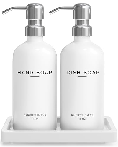 White Glass Hand and Dish Soap Dispenser Set by Brighter Barns - Kitchen Soap Dispenser Set with Tray & Pump for Office, Hotel, Vacation Rental, Airbnb - Modern Kitchen Decor & Accessories (White)
View Price
White Glass Hand and Dish Soap Dispenser Set by Brighter Barns - Kitchen Soap Dispenser Set with Tray & Pump for Office, Hotel, Vacation Rental, Airbnb - Modern Kitchen Decor & Accessories (White)
View Price
 PADOOR Non-Slip Bath Mat, Braided Absorbent Bathroom Mat, 20''x32'' Beige
View Price
PADOOR Non-Slip Bath Mat, Braided Absorbent Bathroom Mat, 20''x32'' Beige
View Price
 MgLoyht Pendant Lights, Farmhouse Pendant Lamp with Metal Shade (White Inside), Matte Black Industrial Pendant Lighting for Kitchen Island, Dining Room, Bedroom, Hallway
View Price
MgLoyht Pendant Lights, Farmhouse Pendant Lamp with Metal Shade (White Inside), Matte Black Industrial Pendant Lighting for Kitchen Island, Dining Room, Bedroom, Hallway
View Price
 Lucyound Antique Brass Double Towel Bar, 24 inch Bath Towel Holder Wall Mount, Vintage Gold Decorative Bathroom Accessories, Brass Petal-Relief Series
View Price
Lucyound Antique Brass Double Towel Bar, 24 inch Bath Towel Holder Wall Mount, Vintage Gold Decorative Bathroom Accessories, Brass Petal-Relief Series
View Price
 Large Framed Abstract Coastal Blue White Wall Art for Living Room, 24x36 In
View Price
Large Framed Abstract Coastal Blue White Wall Art for Living Room, 24x36 In
View Price
Common Mistakes That Make a Blue and White Bathroom Feel Sterile
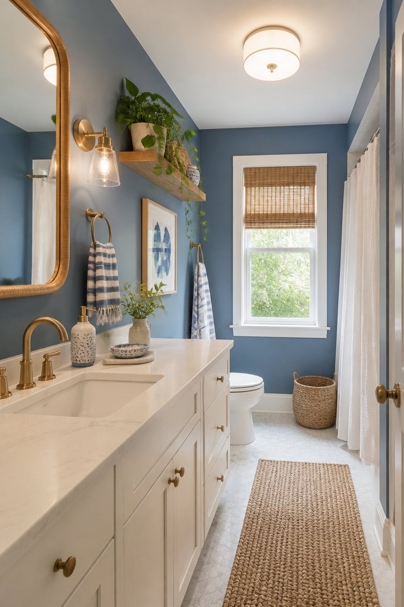
Mismatched sheens create the sterile look faster than any color choice. Mid-tone blue Seaport Blue on the main walls paired with very light white Stone White on the vanity gives the room a value break that flat finishes erase. Keep sheen consistent across matte walls and satin trim, then let a trailing plant on a floating shelf soften the edges.
Uniform sheen: Mixing matte walls with glossy trim breaks up flatness better than color alone.
No texture layer: Smooth tile without a woven mat or plant reads sterile no matter the palette.
Single light source: One overhead bulb flattens blue and white together; add a warm sconce.
Bare surfaces: Empty counters and shelves need one grounding object to avoid a showroom look.
a mid-tone blue that keeps the room from feeling flat under bathroom lighting. [mid-tone]
a soft, very light white that separates the vanity from the wall color. [very light]
 WucaFl Fake Plants with White Pot, Realistic Artificial Pothos Hanging Plant, Faux Indoor Plant for Home Office Bathroom Shelf Cabinet Decor
View Price
WucaFl Fake Plants with White Pot, Realistic Artificial Pothos Hanging Plant, Faux Indoor Plant for Home Office Bathroom Shelf Cabinet Decor
View Price
 SAFAVIEH Natural Fiber Accent Rug 2x3 Jute Knotted, Natural NF447A
View Price
SAFAVIEH Natural Fiber Accent Rug 2x3 Jute Knotted, Natural NF447A
View Price
 VICNIE 2-Light Flush Mount Ceiling Light, 12 Inch Modern Light Fixtures
View Price
VICNIE 2-Light Flush Mount Ceiling Light, 12 Inch Modern Light Fixtures
View Price
 Savoy House 9-4128-1-322 Caldwell Vintage Mid-Century Modern Etched White Opal Glass Bathroom Vanity Wall Sconce, 1-Light 60 Watt, 10" H x 5" W, Warm Brass
View Price
Savoy House 9-4128-1-322 Caldwell Vintage Mid-Century Modern Etched White Opal Glass Bathroom Vanity Wall Sconce, 1-Light 60 Watt, 10" H x 5" W, Warm Brass
View Price
 Le fil blanc Bath Towels Set for Bathroom – Luxury 6-Piece Cotton Towels, Soft Absorbent & Quick Dry, 600 GSM Bath Towels for Bathroom, Hotel Spa Quality (White/Blue Azure, 6- Bath Towel Set)
View Price
Le fil blanc Bath Towels Set for Bathroom – Luxury 6-Piece Cotton Towels, Soft Absorbent & Quick Dry, 600 GSM Bath Towels for Bathroom, Hotel Spa Quality (White/Blue Azure, 6- Bath Towel Set)
View Price
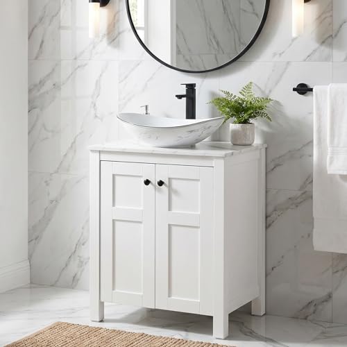 SOLIDEE 24 Inch White Bathroom Vanity with Marble Texture Top, Traditional Standing Pedestal Cabinet with Marble Boat Ceramic Sink
View Price
SOLIDEE 24 Inch White Bathroom Vanity with Marble Texture Top, Traditional Standing Pedestal Cabinet with Marble Boat Ceramic Sink
View Price
 White Glass Hand and Dish Soap Dispenser Set by Brighter Barns - 12oz Kitchen Soap Dispenser Set with Pump & Tray for Hotel, Vacation Rental, Home - Modern Kitchen Decor & Accessories (White/Silver)
View Price
White Glass Hand and Dish Soap Dispenser Set by Brighter Barns - 12oz Kitchen Soap Dispenser Set with Pump & Tray for Hotel, Vacation Rental, Home - Modern Kitchen Decor & Accessories (White/Silver)
View Price
 Extra Large Framed Blue Abstract Wall Art for Living Room, Horizontal 30x60
View Price
Extra Large Framed Blue Abstract Wall Art for Living Room, Horizontal 30x60
View Price
What Warmth Really Means in a Blue and White Bathroom
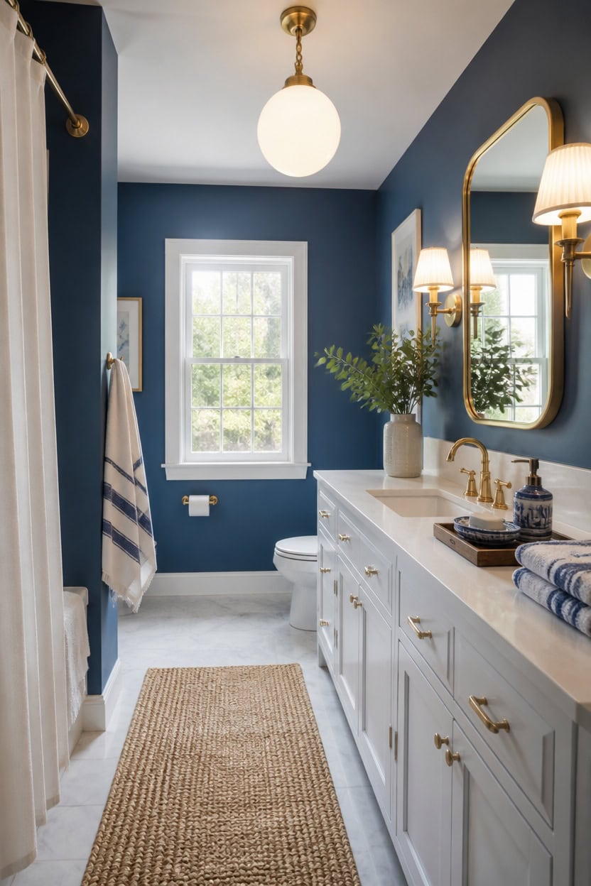
Warmth here comes from light temperature and metal tone. Deep blue Newburyport Blue on the main walls holds richness under warm bulbs, while very light white Ewing Blue on the vanity bounces that glow into the room. A ceramic soap dispenser and dish set in warm ivory grounds the cool palette.
Warm bulb temperature: Choose 2700K bulbs so blue tones stay inviting instead of icy.
Metal finish matters: Brass or warm nickel fixtures add warmth without changing wall color.
Layered light sources: Combine a sconce with the overhead fixture to avoid a flat, cold wash.
One warm object: An ivory soap dish or wood tray keeps the palette from feeling clinical.
a deep tone that keeps its saturation under warm lighting. [dark]
a very light white that reflects warm light back into the room. [very light]
 GMISUN Kitchen Soap Dispenser, 16 Oz Kitchen Dish Soap Dispenser Set with Ceramic Tray & Bamboo Brush, 2Pcs Farmhouse Dish Soap Dispenser for Kitchen, Modern White Glass Liquid Hand Soap Dispenser
View Price
GMISUN Kitchen Soap Dispenser, 16 Oz Kitchen Dish Soap Dispenser Set with Ceramic Tray & Bamboo Brush, 2Pcs Farmhouse Dish Soap Dispenser for Kitchen, Modern White Glass Liquid Hand Soap Dispenser
View Price
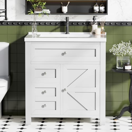 JUMMICO 30" Bathroom Vanity with Sink, White
View Price
JUMMICO 30" Bathroom Vanity with Sink, White
View Price
 Lavish Home Bathroom Towels Set, Bathroom Accessories, Navy, Set of 6
View Price
Lavish Home Bathroom Towels Set, Bathroom Accessories, Navy, Set of 6
View Price
 Teqinchy Gold Wall Sconces Vintage Milk Glass Bathroom Vanity Light E26
View Price
Teqinchy Gold Wall Sconces Vintage Milk Glass Bathroom Vanity Light E26
View Price
 Skelang Clear Lip-less Glass Lamp Shade, Cylindrical Light Cover with Fitter Opening, Replacement for Chandelier, Bathroom Vanity Light, Pendant, 4 Pcs
View Price
Skelang Clear Lip-less Glass Lamp Shade, Cylindrical Light Cover with Fitter Opening, Replacement for Chandelier, Bathroom Vanity Light, Pendant, 4 Pcs
View Price
 Trending Now Wood Bath Tray – Bathtub Tray for Tub, Expandable Bamboo Bath Tray & Bathtub Caddy with Book Holder, Wine Glass Holder, Phone & Tablet Stand, Spa Bath Accessories, Birthday Gifts for Mom
View Price
Trending Now Wood Bath Tray – Bathtub Tray for Tub, Expandable Bamboo Bath Tray & Bathtub Caddy with Book Holder, Wine Glass Holder, Phone & Tablet Stand, Spa Bath Accessories, Birthday Gifts for Mom
View Price
Pick a Blue Undertone That Feels Alive
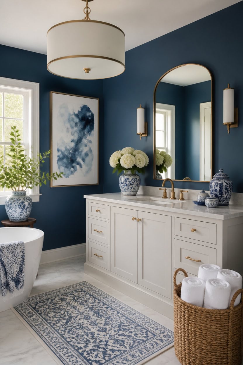
Undertone determines whether a blue reads warm or cool once light hits it. Deep blue Winding Waterway on the main walls carries a gray undertone that keeps the color from looking flat. Very light white Balboa Mist on the vanity shares that same gray thread, so the two surfaces feel connected instead of competing. A basket of rolled towels nearby echoes that cool base and keeps the blue reading true, not washed out.
Check gray vs violet base: Hold swatches in natural light to see if the blue leans gray or purple.
Test large swatches: Paint two-foot squares on the wall since small chips shift under bathroom lighting.
Match metal warmth: Pick an undertone that plays well with your fixture finish, cool nickel or warm brass.
View at different times: Check the color at morning and evening light before committing.
a deep blue with a gray undertone that keeps its richness in daylight and lamp light. [dark]
a very light white with the same gray thread that ties the two surfaces together. [very light]
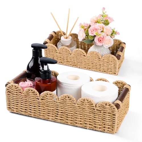 Paper Rope Toilet Paper Storage Small Basket, Set of 2 Scalloped Edge Woven Wicker Baskets with Wooden Handles, Decorative Countertop & Toilet Tank Basket for Bathroom Living Room Home Decor, Beige
View Price
Paper Rope Toilet Paper Storage Small Basket, Set of 2 Scalloped Edge Woven Wicker Baskets with Wooden Handles, Decorative Countertop & Toilet Tank Basket for Bathroom Living Room Home Decor, Beige
View Price
 LIKIMIO 24" Bathroom Vanity with Sink, 2 Drawers & Open Shelf, White
View Price
LIKIMIO 24" Bathroom Vanity with Sink, 2 Drawers & Open Shelf, White
View Price
 4 Piece Blue and White Ceramic Bathroom Accessories Set, Chinoiserie Floral Soap Dispenser, 2 Toothbrush Holders/Tumblers and Soap Dish, Porcelain Style Bath Countertop Decor
View Price
4 Piece Blue and White Ceramic Bathroom Accessories Set, Chinoiserie Floral Soap Dispenser, 2 Toothbrush Holders/Tumblers and Soap Dish, Porcelain Style Bath Countertop Decor
View Price
 Winnker Round Mirror 30 inch Gold, Circle Mirror, Brushed Gold Metal Frame
View Price
Winnker Round Mirror 30 inch Gold, Circle Mirror, Brushed Gold Metal Frame
View Price
 Buovikalo Drum Pendant Light, 18” Drum Light Fixture with Linen Shade
View Price
Buovikalo Drum Pendant Light, 18” Drum Light Fixture with Linen Shade
View Price
 Madison Park Evan 100% Cotton Bath Rug Plush Absorbent, 20" x 30", Blue
View Price
Madison Park Evan 100% Cotton Bath Rug Plush Absorbent, 20" x 30", Blue
View Price
 PENGYEE 4 Pack Small Potted Eucalyptus Fake Plants for Bathroom Shelf
View Price
PENGYEE 4 Pack Small Potted Eucalyptus Fake Plants for Bathroom Shelf
View Price
 Large Framed Blue Abstract Wall Art Decor, Square Coastal Print, 30x30 Inch
View Price
Large Framed Blue Abstract Wall Art Decor, Square Coastal Print, 30x30 Inch
View Price
Get the Blue-to-White Ratio Right
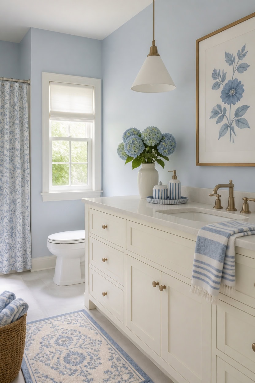
The best blue-to-white ratio runs seventy-thirty: very light blue Bashful Blue covers most of the main walls, and very light white Mascarpone stays on the vanity. This split keeps the room airy since both colors sit in the same soft value range. Hang a framed botanical print above the vanity to anchor the white portion of the ratio.
Use the 70/30 rule: Let blue dominate about seventy percent of the wall space, with white filling the rest.
Anchor with trim: Add white trim to break up large blue surfaces and keep the ratio balanced.
Test in daylight: Check the ratio in natural light since blue can visually take over a small room.
Balance with accents: Use white towels or a botanical print to widen the white presence without repainting.
a very light blue that keeps the seventy percent portion airy and soft. [very light]
a very light white that completes the thirty percent balance with a creamy finish. [very light]
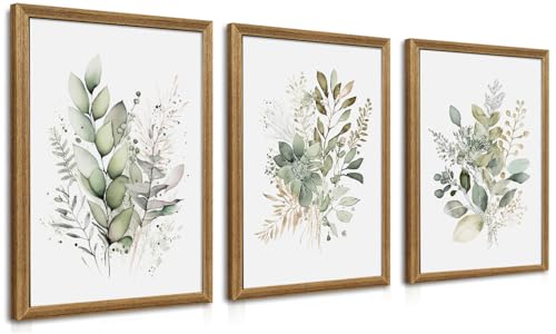 WRFON Framed Sage Green Botanical Wall Art Set of 3, Watercolor Eucalyptus & Wild Plant Canvas Prints, Minimalist Green Wall Decor for Living Room Bedroom Bathroom, 12x16 Inches
View Price
WRFON Framed Sage Green Botanical Wall Art Set of 3, Watercolor Eucalyptus & Wild Plant Canvas Prints, Minimalist Green Wall Decor for Living Room Bedroom Bathroom, 12x16 Inches
View Price
 SOLIDEE 30'' Modern Bathroom Vanity with Sink, White
View Price
SOLIDEE 30'' Modern Bathroom Vanity with Sink, White
View Price
 Lunoku 8 Piece Towel Set, 2 XL Bath (31.5*63 in) 2 Hand 4 Washcloths, Blue
View Price
Lunoku 8 Piece Towel Set, 2 XL Bath (31.5*63 in) 2 Hand 4 Washcloths, Blue
View Price
 COHOSEGE 16 Oz Glass Soap Dispenser Set 2 Pack for Kitchen Sink,Contains Hand and Dish Soap Dispenser,White Kitchen Utensils
View Price
COHOSEGE 16 Oz Glass Soap Dispenser Set 2 Pack for Kitchen Sink,Contains Hand and Dish Soap Dispenser,White Kitchen Utensils
View Price
 CozeCube Navy Blue Striped 24"x16" Non Slip Washable Bath Mat
View Price
CozeCube Navy Blue Striped 24"x16" Non Slip Washable Bath Mat
View Price
 OIAHOMY 75L Large Blanket Basket Woven Cotton Rope Storage Basket Brown
View Price
OIAHOMY 75L Large Blanket Basket Woven Cotton Rope Storage Basket Brown
View Price
 TokeShimi 30 Inch Brushed Nickel Mirror Round Tempered, Shatterproof Bathroom Vanity Mirror Circle, Metal Farmhouse Wall Mounted Mirror for Vanity, Entryway, Bedroom, Restroom, Living Room
View Price
TokeShimi 30 Inch Brushed Nickel Mirror Round Tempered, Shatterproof Bathroom Vanity Mirror Circle, Metal Farmhouse Wall Mounted Mirror for Vanity, Entryway, Bedroom, Restroom, Living Room
View Price
 Coferset 2 Pack Small Fake Plants Eucalyptus Potted,Sage Green
View Price
Coferset 2 Pack Small Fake Plants Eucalyptus Potted,Sage Green
View Price
Washable Bathroom Rugs for This Palette
Machine-washable Rugs USA best sellers in this palette's colors, linked in 2' x 3', the size for in front of a vanity or tub.
- Free shipping
- 30-day returns
- 210,000+ five-star reviews
 Faded Abstract Washable Rug – Blue Grey
View Price
Faded Abstract Washable Rug – Blue Grey
View Price
 Reverse Herringbone Washable Rug – Blue
View Price
Reverse Herringbone Washable Rug – Blue
View Price
 Washable Solid Shag Rug – Light Blue
View Price
Washable Solid Shag Rug – Light Blue
View Price
 Washable Solid Shag Rug – Navy
View Price
Washable Solid Shag Rug – Navy
View Price
 Malta Machine Washable Rug – Blue
View Price
Malta Machine Washable Rug – Blue
View Price
 Faded Abstract Spill Proof Washable Rug – Blue Grey
View Price
Faded Abstract Spill Proof Washable Rug – Blue Grey
View Price
 Tessa Leopard Washable Rug – Blue
View Price
Tessa Leopard Washable Rug – Blue
View Price
 Cranbury Plush Textured Washable Rug – Blue
View Price
Cranbury Plush Textured Washable Rug – Blue
View Price
 Paint Chip Machine Washable Rug – Blue
View Price
Paint Chip Machine Washable Rug – Blue
View Price
 Celia Medallion Washable Rug – Dark Blue
View Price
Celia Medallion Washable Rug – Dark Blue
View Price
 Drusilae Abstract Washable Rug – Light Blue
View Price
Drusilae Abstract Washable Rug – Light Blue
View Price
 Distressed Persian Rug – Blue
View Price
Distressed Persian Rug – Blue
View Price
 Antique Chevron Rug – Blue
View Price
Antique Chevron Rug – Blue
View Price
 Faded Star Petal Emblem Rug – Blue
View Price
Faded Star Petal Emblem Rug – Blue
View Price
 Honeycomb Labyrinth Rug – Blue
View Price
Honeycomb Labyrinth Rug – Blue
View Price
 Everywhere Hand-Braided Indoor/Outdoor Rug – Navy
View Price
Everywhere Hand-Braided Indoor/Outdoor Rug – Navy
View Price
 Florid Dreams Rug – Blue
View Price
Florid Dreams Rug – Blue
View Price
 Plush Solid Shaggy Rug – Navy
View Price
Plush Solid Shaggy Rug – Navy
View Price
 Persian Vintage Rug – Teal
View Price
Persian Vintage Rug – Teal
View Price
 Striped Border Indoor/Outdoor Flatweave Rug – Navy
View Price
Striped Border Indoor/Outdoor Flatweave Rug – Navy
View Price
 Hand Braided Twined Jute And Denim Rug – Blue
View Price
Hand Braided Twined Jute And Denim Rug – Blue
View Price
 Floral Fireworks Indoor/Outdoor Rug – Blue
View Price
Floral Fireworks Indoor/Outdoor Rug – Blue
View Price
 Iliana Striped Starfish Rug – Grey
View Price
Iliana Striped Starfish Rug – Grey
View Price
 Distressed Persian Rug – Dark Blue
View Price
Distressed Persian Rug – Dark Blue
View Price
 Serene Waterfall Rug – Blue
View Price
Serene Waterfall Rug – Blue
View Price
 Jute Braided Rug – Navy
View Price
Jute Braided Rug – Navy
View Price
 Selune Washable Rug – Light Blue
View Price
Selune Washable Rug – Light Blue
View Price
 Mara Washable Rug – Light Blue
View Price
Mara Washable Rug – Light Blue
View Price
 Liora Traditional Washable Rug – Blue
View Price
Liora Traditional Washable Rug – Blue
View Price
 Athens Washable Rug – Light Blue
View Price
Athens Washable Rug – Light Blue
View Price
 Diamond Pinstripes Washable Rug – White
View Price
Diamond Pinstripes Washable Rug – White
View Price
 Washable Solid Shag Rug – Off White
View Price
Washable Solid Shag Rug – Off White
View Price
 Ivana Checkered Plush Cloud Washable Rug – Off White
View Price
Ivana Checkered Plush Cloud Washable Rug – Off White
View Price
 Moroccan Washable Rug – White
View Price
Moroccan Washable Rug – White
View Price
 Kris Striped Plush Cloud Washable Rug – Off White
View Price
Kris Striped Plush Cloud Washable Rug – Off White
View Price
 Milazia Honeycomb Plush Cloud Washable Rug – White
View Price
Milazia Honeycomb Plush Cloud Washable Rug – White
View Price
 Simple Serpent Rug – Black & Off White
View Price
Simple Serpent Rug – Black & Off White
View Price
Adjust Your Blue and White Ratio for a Small Bathroom
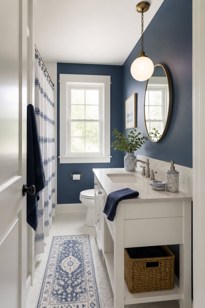
For a small bathroom, shift to roughly eighty percent white, saving deep blue Newburyport Blue for one accent wall. This keeps the color from crowding a tight footprint while still adding depth. Paint the trim in very light white Ewing Blue and set a ceramic soap dispenser and dish set on the vanity to carry the blue in small doses.
Pick one accent wall: Save deep blue for a single wall instead of spreading it across the room.
Widen the white base: Let white cover trim, ceiling line, and most tile to open the space.
Scale down blue accents: Swap large blue items for smaller ones like a soap dish or folded towel.
Check under artificial light: Small bathrooms often skip daylight, so test swatches under the vanity light too.
a deep blue that adds a focal point without covering every surface. [dark]
a very light white that keeps sightlines open in a tight footprint. [very light]
 MOMEEMO Soap Dispenser Kitchen Set with Ceramic Tray, White
View Price
MOMEEMO Soap Dispenser Kitchen Set with Ceramic Tray, White
View Price
 ALBAD 16-Inch Modern Bathroom Vanity with Sink, Compact Bathroom Vanity Set with Storage, Freestanding Small Space Bath Cabinet, Single Sink Cabinet with Adjustable Shelf (White, 16 Inch)
View Price
ALBAD 16-Inch Modern Bathroom Vanity with Sink, Compact Bathroom Vanity Set with Storage, Freestanding Small Space Bath Cabinet, Single Sink Cabinet with Adjustable Shelf (White, 16 Inch)
View Price
 American Veteran Towel, Hand Towels for Bathroom Set of 4, 100% Cotton Turkish Hand Towel Sets, Soft Hand Face Towels, Navy Blue Hand Towels
View Price
American Veteran Towel, Hand Towels for Bathroom Set of 4, 100% Cotton Turkish Hand Towel Sets, Soft Hand Face Towels, Navy Blue Hand Towels
View Price
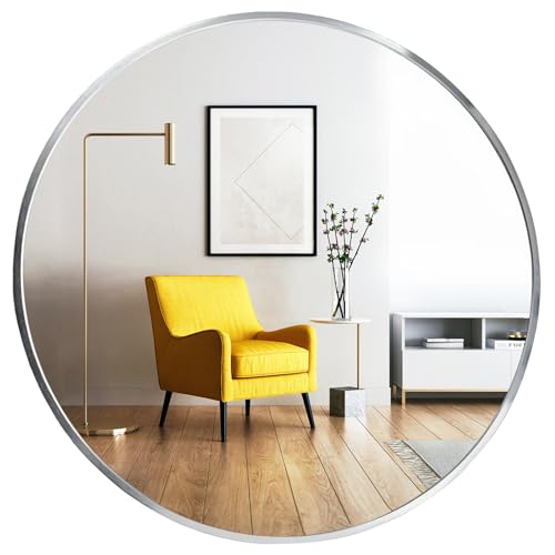 Oruii Round Mirror, 24 inch Silver Circle Mirror,Bruhsed Nickel Metal Frame
View Price
Oruii Round Mirror, 24 inch Silver Circle Mirror,Bruhsed Nickel Metal Frame
View Price
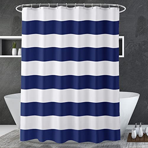 AmazerBath Navy Blue Shower Curtain Stripes, 72" W x 72" H Blue and White Shower Curtain, Fabric Shower Curtains for Bathroom with 2 Heavy Stones, Water Repellent
View Price
AmazerBath Navy Blue Shower Curtain Stripes, 72" W x 72" H Blue and White Shower Curtain, Fabric Shower Curtains for Bathroom with 2 Heavy Stones, Water Repellent
View Price
 Wicker Toilet Paper Basket, Water Hyacinth Storage Baskets, Toilet Tank Basket for Bathroom for Toilet Tank Top,Pantry, Back of Toilet Basket, Bathroom Baskets for Organizing, 2 Packs
View Price
Wicker Toilet Paper Basket, Water Hyacinth Storage Baskets, Toilet Tank Basket for Bathroom for Toilet Tank Top,Pantry, Back of Toilet Basket, Bathroom Baskets for Organizing, 2 Packs
View Price
 Simple Solid Ceramic Tissue Box Cover, Square Tissue Holder, White
View Price
Simple Solid Ceramic Tissue Box Cover, Square Tissue Holder, White
View Price
 SUPMIND 16P Blue Glass Bud Vases, Small Flower Vases for Table Centerpieces
View Price
SUPMIND 16P Blue Glass Bud Vases, Small Flower Vases for Table Centerpieces
View Price
Layer Different Whites Instead of One Flat Shade
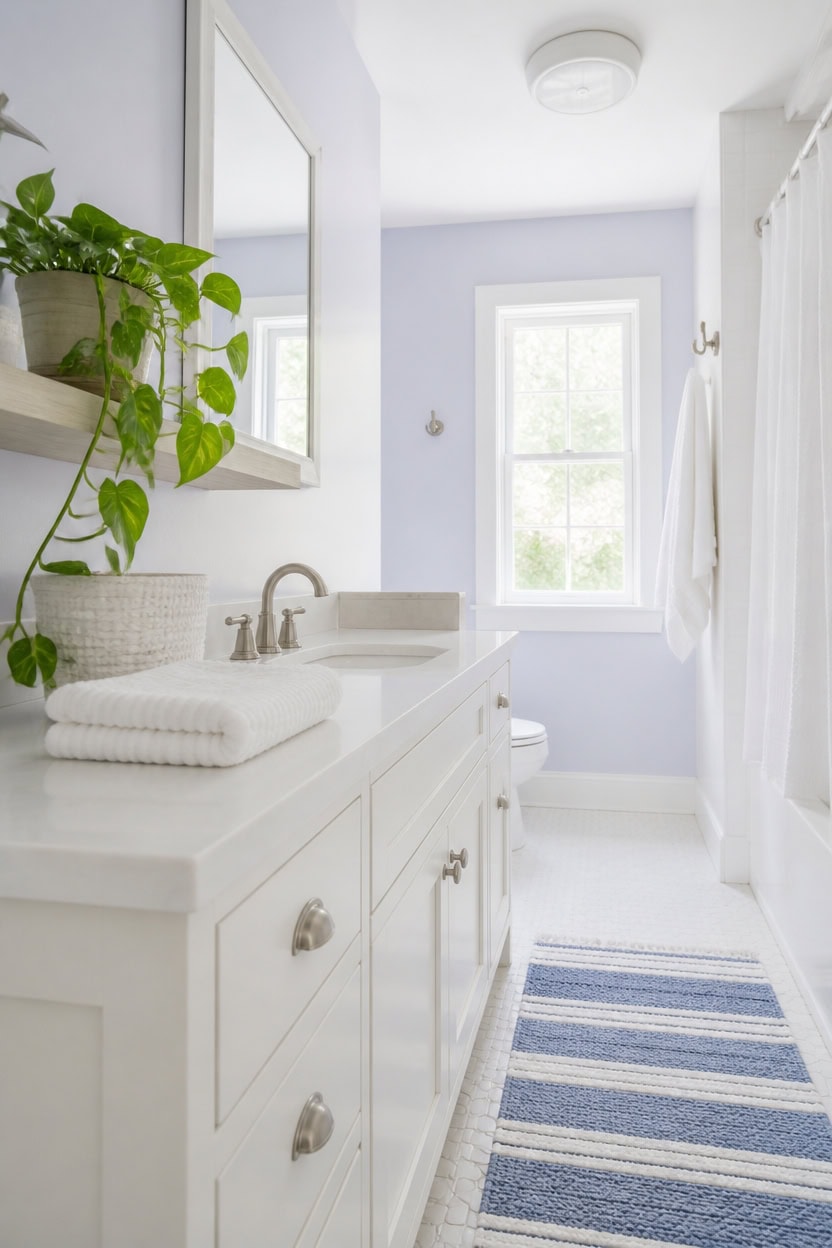
Very light white Rock Harbor Violet covers the main walls, while very light white Marilyn’s Dress dresses the vanity to add subtle depth without introducing another hue. The two whites share matching light reflectance but differ enough in undertone to create dimension. Rest a trailing plant on a floating shelf to soften the layered white palette.
Vary the sheen: Use eggshell on the walls and semi-gloss on the vanity so light catches each finish differently.
Group warm and cool whites: Pair a cooler wall white with a slightly warmer vanity white so the layers feel intentional.
Test large swatches: Paint big sample boards side by side on the same wall before committing to either shade.
Anchor with one accent: Keep a single blue element, like a towel, so the whites read as layered, not mismatched.
a soft, very light white that gives the room a calm backdrop for layering. [very light]
a slightly warmer very light white that adds quiet contrast against the walls. [very light]
 LUZOGA Artificial Hanging Plants with Black Pot, 39.37" Faux Pothos Trailing Vines, Potted Fake Greenery Indoor for Home Bathroom Bedroom Wall Shelf Decor
View Price
LUZOGA Artificial Hanging Plants with Black Pot, 39.37" Faux Pothos Trailing Vines, Potted Fake Greenery Indoor for Home Bathroom Bedroom Wall Shelf Decor
View Price
 Luxurious 4-Pack Ribbed Striped Hand Towels (White) – Hotel & Spa Cotton
View Price
Luxurious 4-Pack Ribbed Striped Hand Towels (White) – Hotel & Spa Cotton
View Price
 ABenkle Small Basket with Handles, Boho Decorative Rope Woven Dog Cat Toy Storage Bin Shelf Storage Organizer, Easter Christmas Gift Basket, 12"x8"x5", White
View Price
ABenkle Small Basket with Handles, Boho Decorative Rope Woven Dog Cat Toy Storage Bin Shelf Storage Organizer, Easter Christmas Gift Basket, 12"x8"x5", White
View Price
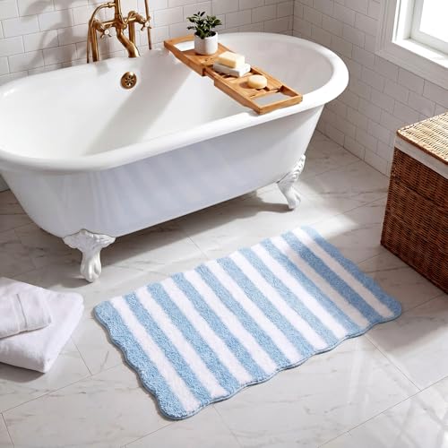 Klyyo Clyro Coastal Scalloped Bath Mat 20x32'' Blue White Striped Bath Rug
View Price
Klyyo Clyro Coastal Scalloped Bath Mat 20x32'' Blue White Striped Bath Rug
View Price
 Mfring Round Bathroom Mirror, Circle Mirror, White, 20" L x 20" W, 1 Pack
View Price
Mfring Round Bathroom Mirror, Circle Mirror, White, 20" L x 20" W, 1 Pack
View Price
 Y-in Hand Tissue Box Cover, Square Facial Tissue Holder with Bottom, White
View Price
Y-in Hand Tissue Box Cover, Square Facial Tissue Holder with Bottom, White
View Price
 White Classic Luxury Ivory Bath Towel Set of 8 - Soft 100% Turkish Cotton
View Price
White Classic Luxury Ivory Bath Towel Set of 8 - Soft 100% Turkish Cotton
View Price
Our Favorite Bathroom Wall Art
- Free shipping over $35
- Picked at 4.6 stars or higher
 "Bathroom" Textual Art Print
View Price
"Bathroom" Textual Art Print
View Price
 "My Aim Is To Keep This Bathroom Clean" Print on Wood
View Price
"My Aim Is To Keep This Bathroom Clean" Print on Wood
View Price
 "Bathroom Rules" Wrapped Canvas Textual Art
View Price
"Bathroom Rules" Wrapped Canvas Textual Art
View Price
 Mallon "Love Embracing" by Rikki Drotar Print
View Price
Mallon "Love Embracing" by Rikki Drotar Print
View Price
 Luxury Bath "Bain De Luxe III" by Daphne Brissonnet
View Price
Luxury Bath "Bain De Luxe III" by Daphne Brissonnet
View Price
 Donkey Green Tub White Print
View Price
Donkey Green Tub White Print
View Price
 "Wash Your Paws" by Marla Rae Wrapped Canvas
View Price
"Wash Your Paws" by Marla Rae Wrapped Canvas
View Price
 Stupell Country Washroom Still Life Stretched Canvas
View Price
Stupell Country Washroom Still Life Stretched Canvas
View Price
 "Brady Wash Your Hands" by Jennifer Pugh Print on Wood
View Price
"Brady Wash Your Hands" by Jennifer Pugh Print on Wood
View Price
 Classic Bathroom Prints by Gregory Gorham 2-Piece Canvas Set
View Price
Classic Bathroom Prints by Gregory Gorham 2-Piece Canvas Set
View Price
 Stupell Chic Bathroom Interior 2-Piece Framed Art Set
View Price
Stupell Chic Bathroom Interior 2-Piece Framed Art Set
View Price
Add Texture So the Palette Doesn’t Fall Flat
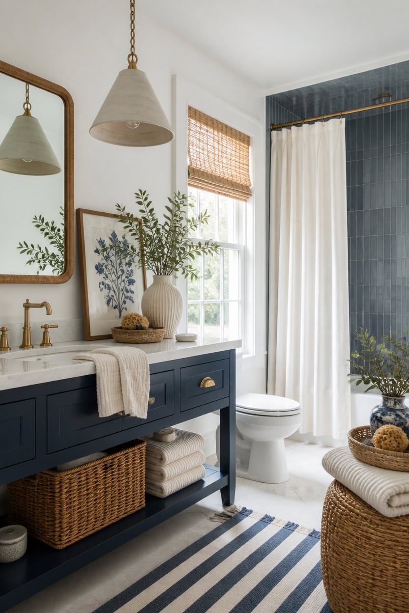
Layering rough linen, ribbed ceramic, and woven rattan keeps a two-white bathroom from looking sterile. Deep blue Narragansett Green on the vanity grounds the palette, while very light white Winter Orchard on the main walls keeps the room bright and airy. A framed botanical print on the wall adds a soft, textured focal point without introducing a third color.
Mix matte and glossy: Pair a matte vanity finish with glossy tile for contrast.
Layer natural fibers: Add a woven basket or rattan shelf for tactile warmth.
Use textured textiles: Choose ribbed or waffle-weave towels over flat cotton.
Add a dimensional print: Hang a framed botanical print with raised matting for depth.
a very light white that keeps the room bright while textured accents carry the visual interest. [very light]
a deep blue that grounds the palette and makes ribbed hardware and woven textures stand out. [dark]
 Botanical Bathroom Wall Art Framed Sage Green Bathroom Signs Decor Eucalyptus Leaf Canvas Prints Boho Minimalist Aesthetic Artwork
View Price
Botanical Bathroom Wall Art Framed Sage Green Bathroom Signs Decor Eucalyptus Leaf Canvas Prints Boho Minimalist Aesthetic Artwork
View Price
 Madison Park 100% Zero Twist Cotton Bath Towel Set of 6 for Bathroom, Grey
View Price
Madison Park 100% Zero Twist Cotton Bath Towel Set of 6 for Bathroom, Grey
View Price
 GRANNY SAYS Wicker Storage Baskets, Waterproof Wicker Basket with Handles
View Price
GRANNY SAYS Wicker Storage Baskets, Waterproof Wicker Basket with Handles
View Price
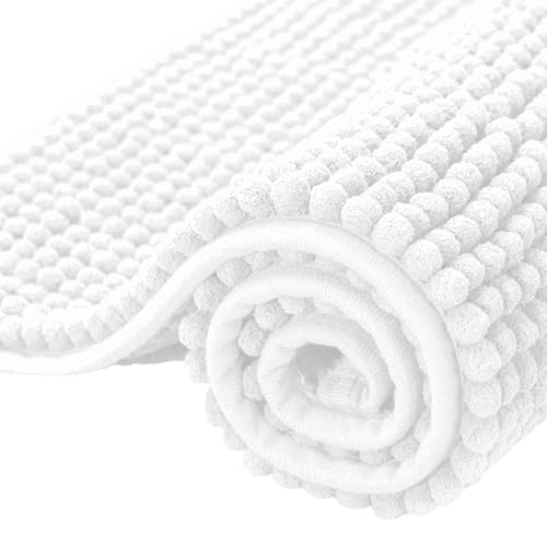 SUBRTEX Bathroom Rugs Chenille Bath Rug Soft Short Plush Bath Mat Soft Shower Mat Water Absorbent Shower Mat Quick Dry Machine Washable(White,18" x 24")
View Price
SUBRTEX Bathroom Rugs Chenille Bath Rug Soft Short Plush Bath Mat Soft Shower Mat Water Absorbent Shower Mat Quick Dry Machine Washable(White,18" x 24")
View Price
 WBKATN White Vanity Stool, Small Vanity Chair, Makeup Bench Seat for Deak
View Price
WBKATN White Vanity Stool, Small Vanity Chair, Makeup Bench Seat for Deak
View Price
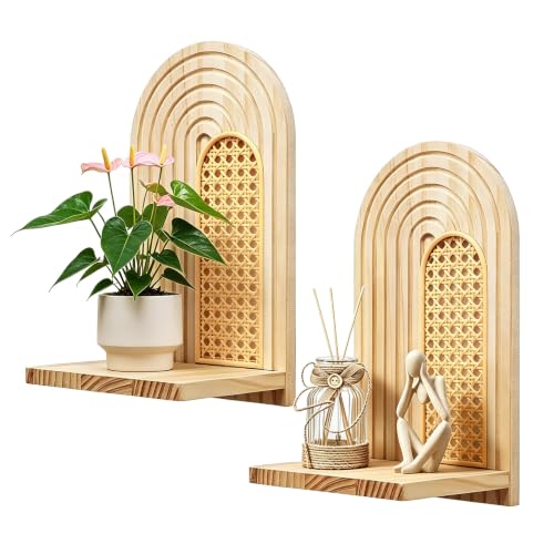 Nashcom Floating Shelves for Wall Set of 2, Solid Pine Wood & Rattan Wall Shelf, Boho Decorative Shelves, Small Floating Shelves for Bedroom, Living Room, Bathroom, Office Natural
View Price
Nashcom Floating Shelves for Wall Set of 2, Solid Pine Wood & Rattan Wall Shelf, Boho Decorative Shelves, Small Floating Shelves for Bedroom, Living Room, Bathroom, Office Natural
View Price
Choose Matte Finishes Over Glossy Tile for Warmth
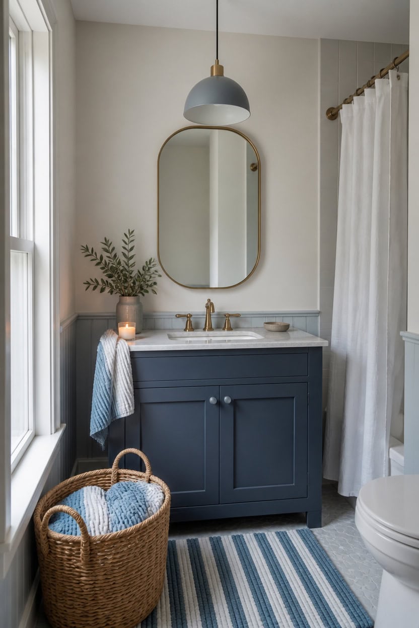
Matte paint absorbs light, keeping a small bathroom calm rather than reflective. Very light white Summer Shower on the main walls stays soft under a matte finish, while deep blue Gentleman’s Gray on the vanity holds a warm, chalky look instead of a hard sheen. A small candle on the vanity edge softens the glow from the dome pendant.
Matte over glossy: Choose a matte or eggshell finish for walls to soften glare in a small room.
Save shine for tile: Reserve gloss for shower tile only, not the surrounding walls.
Check both lighting types: Matte finishes can look flat under bulbs, so test swatches day and night.
Balance sheen levels: Pair a matte vanity with satin faucet hardware so the room does not read too flat.
a very light white that stays soft and even under a matte finish. [very light]
a deep blue that holds a warm, chalky look instead of a hard sheen. [dark]
 TkoYuHm 2 Pack Glass Pillar Candle Holders 4 Inch Ribbed Edge Design Decorative Candle Plate with Serrated Edges Clear Amber Display Stand for Wedding Home Decor Table Centerpieces
View Price
TkoYuHm 2 Pack Glass Pillar Candle Holders 4 Inch Ribbed Edge Design Decorative Candle Plate with Serrated Edges Clear Amber Display Stand for Wedding Home Decor Table Centerpieces
View Price
 Natheeph 14OZ Ceramic Soap Dispenser Bathroom/Kitchen Can Fill Liquid-White
View Price
Natheeph 14OZ Ceramic Soap Dispenser Bathroom/Kitchen Can Fill Liquid-White
View Price
 Blue Loom Ribbed Bath Towels Set, 100% Cotton 600GSM, Soft Absorbent Durable 2 Bath Towels, 2 Hand Towels, 2 Wash Cloths for Bathroom - Mason (58" x 30" inch Towels) (White, 6 Piece)
View Price
Blue Loom Ribbed Bath Towels Set, 100% Cotton 600GSM, Soft Absorbent Durable 2 Bath Towels, 2 Hand Towels, 2 Wash Cloths for Bathroom - Mason (58" x 30" inch Towels) (White, 6 Piece)
View Price
 SESIMENT Farmhouse Pendant Lighting for Kitchen Island,Black and Gold Dome Pendant Light Fixtures, Industrial Hanging Ceiling Light for Dining Room Foyer Cafe Kitchen Sink,2 Pack
View Price
SESIMENT Farmhouse Pendant Lighting for Kitchen Island,Black and Gold Dome Pendant Light Fixtures, Industrial Hanging Ceiling Light for Dining Room Foyer Cafe Kitchen Sink,2 Pack
View Price
 LA JOLIE MUSE Small Wicker Baskets for Organizing, Desert 3 Pack
View Price
LA JOLIE MUSE Small Wicker Baskets for Organizing, Desert 3 Pack
View Price
 Small Faux Teddy Fur Vanity Stool, Cute Vanity Stools with Cushion, White Makeup Vanity Chair for Small Spaces, Living Room, Bedroom, Bathroom, Entryway, Ottoman Foot Rest for Couch Sillas Modern
View Price
Small Faux Teddy Fur Vanity Stool, Cute Vanity Stools with Cushion, White Makeup Vanity Chair for Small Spaces, Living Room, Bedroom, Bathroom, Entryway, Ottoman Foot Rest for Couch Sillas Modern
View Price
 COTTON CRAFT Euro Spa Waffle Weave 6 Piece Towel Set - 100% Cotton - Linen
View Price
COTTON CRAFT Euro Spa Waffle Weave 6 Piece Towel Set - 100% Cotton - Linen
View Price
Removable Wallpaper for This Palette
Removable designer wallpaper from Wallshoppe, picked to match this palette. An easy way to add pattern to any room, and every design is available as a sample.
- Designed and printed in the USA
- Non-toxic inks
- Featured in NYT Wirecutter
 Townhouse Wallpaper by Sarah Jessica Parker – Peacock
View Price
Townhouse Wallpaper by Sarah Jessica Parker – Peacock
View Price
 Monroe Street Wallpaper by Chris Benz – Blue
View Price
Monroe Street Wallpaper by Chris Benz – Blue
View Price
 Small Dumbo Wallpaper by Chris Benz – Navy
View Price
Small Dumbo Wallpaper by Chris Benz – Navy
View Price
 The Queens Lace' Wallpaper by Sarah Jessica Parker – Misty Blue
View Price
The Queens Lace' Wallpaper by Sarah Jessica Parker – Misty Blue
View Price
 El Quijote Wallpaper by Chris Benz – Multi / Blue / Green
View Price
El Quijote Wallpaper by Chris Benz – Multi / Blue / Green
View Price
 Sweet Caroline Wallpaper by Wallshoppe – Blue
View Price
Sweet Caroline Wallpaper by Wallshoppe – Blue
View Price
 Townhouse Wallpaper by Sarah Jessica Parker – Morning Dew on Misty Blue
View Price
Townhouse Wallpaper by Sarah Jessica Parker – Morning Dew on Misty Blue
View Price
 El Quijote Wallpaper by Chris Benz – Multi / Blue / Coral
View Price
El Quijote Wallpaper by Chris Benz – Multi / Blue / Coral
View Price
 Small Dumbo Wallpaper by Chris Benz – Deep Sea
View Price
Small Dumbo Wallpaper by Chris Benz – Deep Sea
View Price
 Best Fronds Wallpaper by Wallshoppe – Gray
View Price
Best Fronds Wallpaper by Wallshoppe – Gray
View Price
 Pebble Wallpaper by Sugar Paper – French Blue On White
View Price
Pebble Wallpaper by Sugar Paper – French Blue On White
View Price
 Large Dumbo Wallpaper by Chris Benz – Deep Sea
View Price
Large Dumbo Wallpaper by Chris Benz – Deep Sea
View Price
 Eleanor Rigby Wallpaper by Wallshoppe – Indigo
View Price
Eleanor Rigby Wallpaper by Wallshoppe – Indigo
View Price
 Pratt Paint Wallpaper by Chris Benz – Rainbow
View Price
Pratt Paint Wallpaper by Chris Benz – Rainbow
View Price
 Large Dumbo Wallpaper by Chris Benz – Navy
View Price
Large Dumbo Wallpaper by Chris Benz – Navy
View Price
 Tangier Medallion Wallpaper by Wallshoppe – Blue
View Price
Tangier Medallion Wallpaper by Wallshoppe – Blue
View Price
 Bloc Wallpaper by Wallshoppe – Elephant
View Price
Bloc Wallpaper by Wallshoppe – Elephant
View Price
 Grosgrain Stripe Wallpaper by Sarah Jessica Parker – Morning Dew Cream
View Price
Grosgrain Stripe Wallpaper by Sarah Jessica Parker – Morning Dew Cream
View Price
 Best Fronds Wallpaper by Wallshoppe – Sky
View Price
Best Fronds Wallpaper by Wallshoppe – Sky
View Price
 Crosstown Plaid On White Wallpaper by Sarah Jessica Parker – Silver Pearl
View Price
Crosstown Plaid On White Wallpaper by Sarah Jessica Parker – Silver Pearl
View Price
 Best Fronds Wallpaper by Wallshoppe – Caribbean
View Price
Best Fronds Wallpaper by Wallshoppe – Caribbean
View Price
 Lemons Wallpaper by Nathan Turner – Blue
View Price
Lemons Wallpaper by Nathan Turner – Blue
View Price
 Pinstripe Wallpaper by Sugar Paper – Navy
View Price
Pinstripe Wallpaper by Sugar Paper – Navy
View Price
 Cabana Stripe Wallpaper by Sugar Paper – French Blue
View Price
Cabana Stripe Wallpaper by Sugar Paper – French Blue
View Price
 Veronica Wallpaper by Wallshoppe – Blue
View Price
Veronica Wallpaper by Wallshoppe – Blue
View Price
 Malibu Wallpaper by Nathan Turner – Blue On White
View Price
Malibu Wallpaper by Nathan Turner – Blue On White
View Price
 Best Fronds Wallpaper by Wallshoppe – Cadet Blue
View Price
Best Fronds Wallpaper by Wallshoppe – Cadet Blue
View Price
 Block Print Wallpaper by Sugar Paper – French Blue On White
View Price
Block Print Wallpaper by Sugar Paper – French Blue On White
View Price
 Dainty Dot Wallpaper by Sugar Paper – French Blue On White
View Price
Dainty Dot Wallpaper by Sugar Paper – French Blue On White
View Price
 Pebble Wallpaper by Sugar Paper – Navy On White
View Price
Pebble Wallpaper by Sugar Paper – Navy On White
View Price
 El Quijote Wallpaper by Chris Benz – Navy
View Price
El Quijote Wallpaper by Chris Benz – Navy
View Price
 Deux Bois Wallpaper by Nathan Turner – Blue
View Price
Deux Bois Wallpaper by Nathan Turner – Blue
View Price
 Hillhouse Block Print Small Wallpaper by Nathan Turner – Blue Green
View Price
Hillhouse Block Print Small Wallpaper by Nathan Turner – Blue Green
View Price
 El Quijote Wallpaper by Chris Benz – Sky
View Price
El Quijote Wallpaper by Chris Benz – Sky
View Price
 Chenille Stripe Wallpaper by Chris Benz – Red White + Blue
View Price
Chenille Stripe Wallpaper by Chris Benz – Red White + Blue
View Price
 Teensy Floral Wallpaper by Sugar Paper – French Blue On White
View Price
Teensy Floral Wallpaper by Sugar Paper – French Blue On White
View Price
 Lily Pad Lake Wallpaper by Carly Beck – Peacock
View Price
Lily Pad Lake Wallpaper by Carly Beck – Peacock
View Price
 Topo Tile Wallpaper by Carly Beck
View Price
Topo Tile Wallpaper by Carly Beck
View Price
 Palm Shuffle Wallpaper by Wallshoppe – Green / Caribbean
View Price
Palm Shuffle Wallpaper by Wallshoppe – Green / Caribbean
View Price
 Pacifico Palm Wallpaper by Nathan Turner – Ivory
View Price
Pacifico Palm Wallpaper by Nathan Turner – Ivory
View Price
Pay Attention to Your Grout Lines
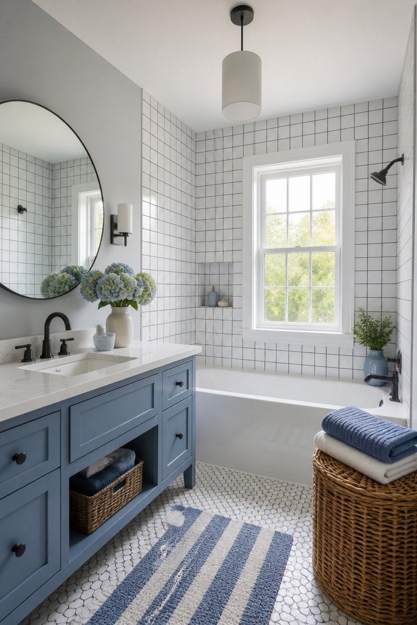
Dark grout on white tile forms a bold grid; matching grout blends smooth. Very light gray Gray Lake on the main walls stays quiet, and light blue Chiswell Blue on the vanity adds cool contrast. Keep a woven laundry hamper in the corner so the grid stays the room’s focal detail.
Match grout to tile: Choose grout close to tile color to keep small tiled walls feeling larger.
Use dark grout for pattern: Pick a contrasting grout to highlight tile shape and grid lines.
Seal grout regularly: Apply grout sealer yearly to prevent staining in high-moisture zones.
Test grout swatches wet: Check grout color once wet, since it darkens compared to the dry sample.
a very light gray that keeps the grout lines from feeling busy. [very light]
a light blue that echoes the tile’s cool undertone without competing with the grid. [light]
 Best Choice Products Half Moon Laundry Hamper w/Lid, Woven Half Round Laundry Basket, w/Removable Liner & Bult-in Handles for Bathroom, Bedroom & Laundry Room - Chestnut
View Price
Best Choice Products Half Moon Laundry Hamper w/Lid, Woven Half Round Laundry Basket, w/Removable Liner & Bult-in Handles for Bathroom, Bedroom & Laundry Room - Chestnut
View Price
 Lumkew Grout Cleaner Brush V Shape, Stiff Grout Cleaning Brushes for Tile Floor, Handheld Grout Scrub Brush Set for Shower, Bathroom, Kitchen, Household Use,2 pcs
View Price
Lumkew Grout Cleaner Brush V Shape, Stiff Grout Cleaning Brushes for Tile Floor, Handheld Grout Scrub Brush Set for Shower, Bathroom, Kitchen, Household Use,2 pcs
View Price
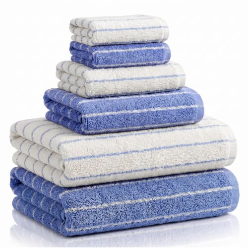 Hillsuren 6 Pcs Large Bath Towels Set 28x55 Inch Cotton Towel, Blue, White
View Price
Hillsuren 6 Pcs Large Bath Towels Set 28x55 Inch Cotton Towel, Blue, White
View Price
 FLYZC Vanity Stool Chair, Square Faux Leather Makeup Chair with Metal Legs, Cute Small Ottoman Vanity Bench, Foot Stool Chair for Vanity for Bedroom, Living Room, Bathroom, White
View Price
FLYZC Vanity Stool Chair, Square Faux Leather Makeup Chair with Metal Legs, Cute Small Ottoman Vanity Bench, Foot Stool Chair for Vanity for Bedroom, Living Room, Bathroom, White
View Price
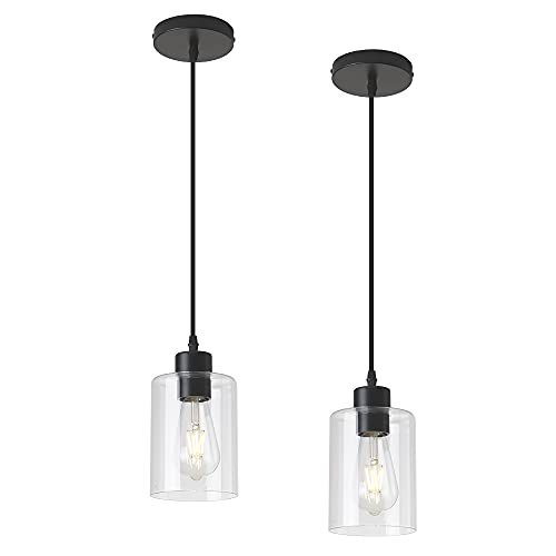 KLSS Modern Black Farmhouse Clear Glass Cylinder Pendant Light Fixture,Island Lights for Kitchen,Mini Pendant Lighting for Kitchen Island Decor - 4.75 Inch Shade 58 Inch Cord (Black 2 Pack)
View Price
KLSS Modern Black Farmhouse Clear Glass Cylinder Pendant Light Fixture,Island Lights for Kitchen,Mini Pendant Lighting for Kitchen Island Decor - 4.75 Inch Shade 58 Inch Cord (Black 2 Pack)
View Price
 DEBETOOL 6-Piece Bamboo Dish Brush Set with Coconut Sponge
View Price
DEBETOOL 6-Piece Bamboo Dish Brush Set with Coconut Sponge
View Price
Match Your Lighting Fixtures to the Blue You Chose
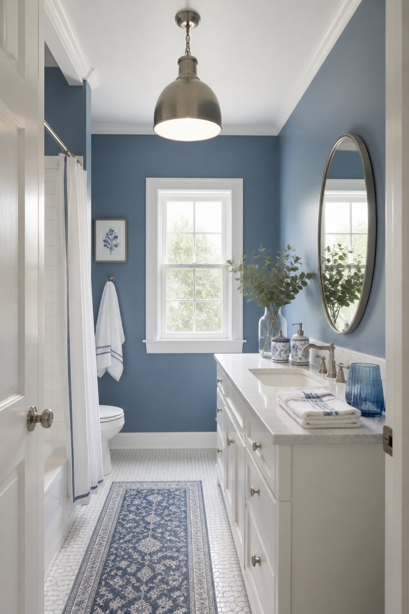
Cool white bulbs bring out the gray undertone in mid-tone blue Azurite on the main walls, while warm bulbs flatter very light white Seapearl on the vanity. Matching bulb temperature to each surface keeps the paint reading true instead of shifting green or yellow under mismatched light. Place a small eucalyptus bundle in a vase beside the mirror to soften the fixture glow.
Check bulb temperature: Use warm bulbs near white surfaces so the finish never reads cold or flat.
Test swatches under fixtures: View paint chips under the actual vanity lights before committing.
Layer light sources: Combine sconces and a ceiling fixture so the blue tone stays consistent.
Match metal finishes: Pick fixture finishes that read well against both wall and vanity color.
a mid-tone blue that grounds the room without competing with the lighting. [mid-tone]
a very light white that bounces fixture light softly across the space. [very light]
 Coferset Fake Eucalyptus Stems in Glass Vase with Faux Water,Gray Vase
View Price
Coferset Fake Eucalyptus Stems in Glass Vase with Faux Water,Gray Vase
View Price
 SESIMENT Brushed Nickel Industrial Pendant Light 11.8inches 2 Packs,Mental Hanging Light Fixtures for Kitchen Island,Dome Pendant Light,Ceiling Light Fixtures for Restaurant Dining Room Aisle
View Price
SESIMENT Brushed Nickel Industrial Pendant Light 11.8inches 2 Packs,Mental Hanging Light Fixtures for Kitchen Island,Dome Pendant Light,Ceiling Light Fixtures for Restaurant Dining Room Aisle
View Price
 Wall Sconces Set of Two, Hardwired Brushed Nickel Bathroom Sconces Wall Lighting with Clear Glass, Modern Sconces Wall Decor Set of 2 Bathroom Light Fixtures for Mirror Hallway (Bulbs Not Included)
View Price
Wall Sconces Set of Two, Hardwired Brushed Nickel Bathroom Sconces Wall Lighting with Clear Glass, Modern Sconces Wall Decor Set of 2 Bathroom Light Fixtures for Mirror Hallway (Bulbs Not Included)
View Price
 Galental Round Vanity Mirror with Lights, 16" Crystal Frame, Touch Control
View Price
Galental Round Vanity Mirror with Lights, 16" Crystal Frame, Touch Control
View Price
 Coastal Blue & White Ceramic Soap Dispenser Set with Gold Pump – 3-Piece Bathroom & Kitchen Accessories with Tray, Refillable Lotion & Dish Soap Pump Bottles for Beach House & Nautical Décor
View Price
Coastal Blue & White Ceramic Soap Dispenser Set with Gold Pump – 3-Piece Bathroom & Kitchen Accessories with Tray, Refillable Lotion & Dish Soap Pump Bottles for Beach House & Nautical Décor
View Price
 Peri Home 2 Piece Cotton Bath Towel Set, Embroidered, White, Blue Scallop
View Price
Peri Home 2 Piece Cotton Bath Towel Set, Embroidered, White, Blue Scallop
View Price
 Blue Bathroom Accessories 5 Pcs, Glass Bathroom Accessory Set, Vintage Blue Bathroom Set, Royal Soap Dispenser and Toothbrush Holder Set, Qtip Holder, Small Flower Vase, Modern Bathroom Decor
View Price
Blue Bathroom Accessories 5 Pcs, Glass Bathroom Accessory Set, Vintage Blue Bathroom Set, Royal Soap Dispenser and Toothbrush Holder Set, Qtip Holder, Small Flower Vase, Modern Bathroom Decor
View Price
 Vagusicc Wicker Storage Basket, Paper Rope Wicker Baskets with Handles, Toilet Paper Basket for Toilet Tank Top, Small Wicke Baskets for Organizing Shelves, 2-Pack, White
View Price
Vagusicc Wicker Storage Basket, Paper Rope Wicker Baskets with Handles, Toilet Paper Basket for Toilet Tank Top, Small Wicke Baskets for Organizing Shelves, 2-Pack, White
View Price
Our Favorite Medicine Cabinets
- Free shipping over $35
- Picked at 4.6 stars or higher
 Gervon Rectangle Recessed Medicine Cabinet
View Price
Gervon Rectangle Recessed Medicine Cabinet
View Price
 Haslem Recessed Framed Medicine Cabinet with Mirror
View Price
Haslem Recessed Framed Medicine Cabinet with Mirror
View Price
 Garnes Recessed or Surface Mount Framed Medicine Cabinet
View Price
Garnes Recessed or Surface Mount Framed Medicine Cabinet
View Price
 Farmhouse Recessed Metal Medicine Cabinet with Mirror
View Price
Farmhouse Recessed Metal Medicine Cabinet with Mirror
View Price
 Voijin 24" x 36" Framed Metal Medicine Cabinet
View Price
Voijin 24" x 36" Framed Metal Medicine Cabinet
View Price
 Bryand Farmhouse Surface Mount Metal Medicine Cabinet
View Price
Bryand Farmhouse Surface Mount Metal Medicine Cabinet
View Price
 Cyrille Recessed & Surface Framed Medicine Cabinet with Mirror
View Price
Cyrille Recessed & Surface Framed Medicine Cabinet with Mirror
View Price
 Chouchanik 3-Door Framed Medicine Cabinet with Mirror
View Price
Chouchanik 3-Door Framed Medicine Cabinet with Mirror
View Price
 Lunara 2-Door Framed Medicine Cabinet with Mirror
View Price
Lunara 2-Door Framed Medicine Cabinet with Mirror
View Price
 Husai Aluminum Frameless Medicine Cabinet with Mirrored Door
View Price
Husai Aluminum Frameless Medicine Cabinet with Mirrored Door
View Price
 Gerding 31.5" Frameless Medicine Cabinet with Mirror
View Price
Gerding 31.5" Frameless Medicine Cabinet with Mirror
View Price
 Omeed Mirrored Aluminum Medicine Cabinet
View Price
Omeed Mirrored Aluminum Medicine Cabinet
View Price
 Kassady LED Lighted Medicine Cabinet with Defog Mirror
View Price
Kassady LED Lighted Medicine Cabinet with Defog Mirror
View Price
 Surface Mount Frameless Medicine Cabinet with LED Lighting
View Price
Surface Mount Frameless Medicine Cabinet with LED Lighting
View Price
 Livvia Frameless LED Medicine Cabinet with Anti-Fog
View Price
Livvia Frameless LED Medicine Cabinet with Anti-Fog
View Price
Watch How Morning and Evening Light Change Your Blue Tile
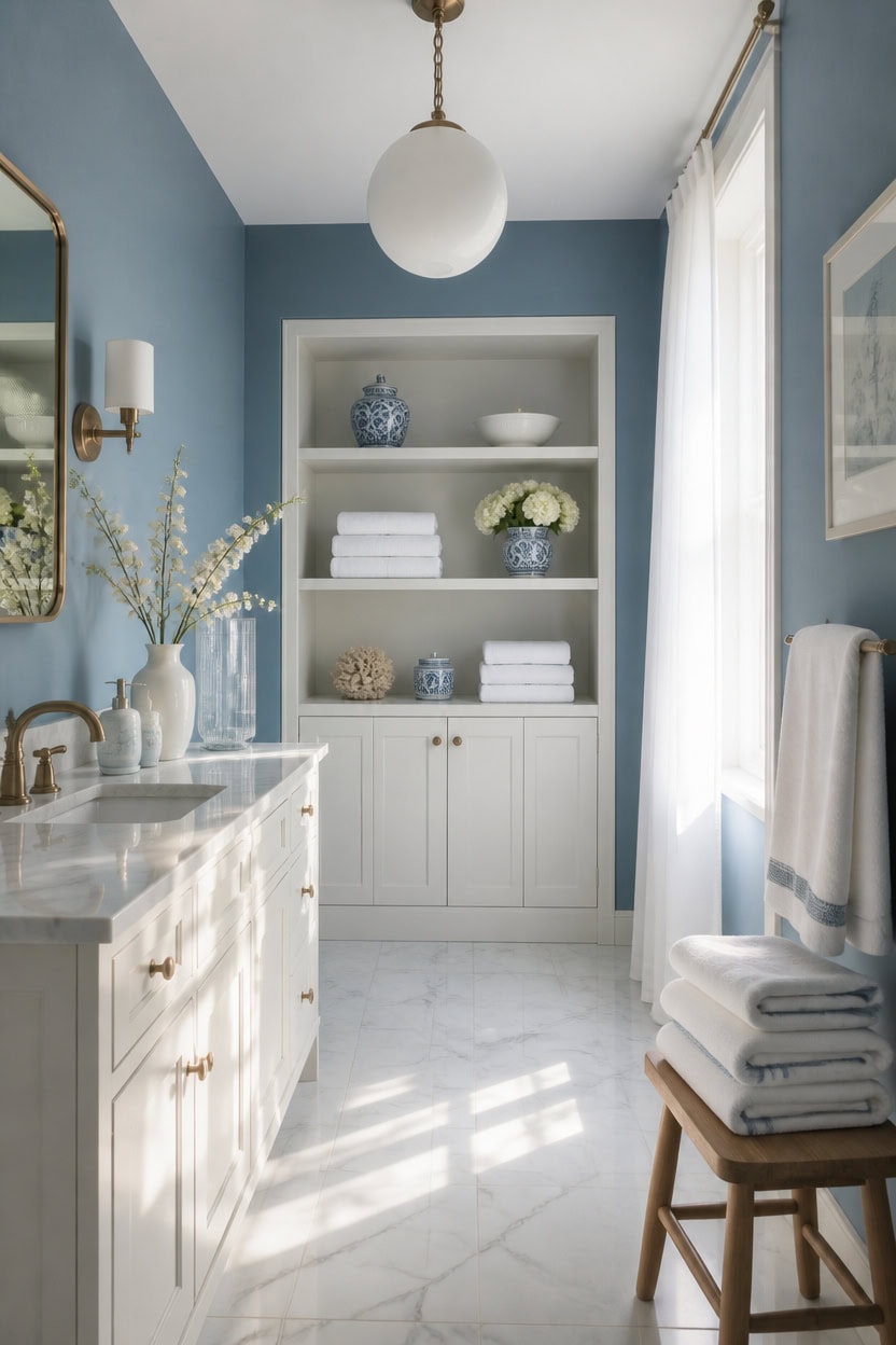
Morning light cools mid-tone blue Hamilton Blue tile toward gray, while afternoon sun warms very light white Marilyn’s Dress trim to a cream tone. Tile reflects more light than paint, so the same blue looks cooler at dawn and warmer at dusk. Test swatches at both times, then set hand towels on a nearby stool to see the shift.
Test at two times: View the same tile swatch at 9 a.m. and again near sunset.
Track window direction: North-facing windows keep tile cooler; south or west windows warm it.
Use daylight bulbs for review: Swap to daylight-temperature bulbs when checking true tile color.
Note shadow lines: Grout lines cast longer shadows in low afternoon light, changing the pattern’s look.
a mid-tone blue that holds its tone through shifting daylight. [mid-tone]
a very light white that warms gently under evening light. [very light]
 YUMORE Hand Towel Holder Stand for Bathroom & Kitchen, Freestanding T-Shape Towel Rack with Weighted Base, Matte Black
View Price
YUMORE Hand Towel Holder Stand for Bathroom & Kitchen, Freestanding T-Shape Towel Rack with Weighted Base, Matte Black
View Price
 Globe Electric 64023 1-Light Pendant, Polished Chrome Finish, Clear Glass Shade with Frosted Glass Insert, Pendant Light Fixture, Adjustable Height, Light Fixture Ceiling Hanging, Bulb Not Included
View Price
Globe Electric 64023 1-Light Pendant, Polished Chrome Finish, Clear Glass Shade with Frosted Glass Insert, Pendant Light Fixture, Adjustable Height, Light Fixture Ceiling Hanging, Bulb Not Included
View Price
 Full Spectrum Light Bulb, 6000K Natural Sunlight Bulbs, 9W 60W Equivalent LED Light Bulb, Natural Light Bulbs A19, E26/E27 LED Light Bulbs for Home, 6 Pack
View Price
Full Spectrum Light Bulb, 6000K Natural Sunlight Bulbs, 9W 60W Equivalent LED Light Bulb, Natural Light Bulbs A19, E26/E27 LED Light Bulbs for Home, 6 Pack
View Price
 Gwine White Short Sheer Curtains 36 Inch Length 2 Panels for Kitchen
View Price
Gwine White Short Sheer Curtains 36 Inch Length 2 Panels for Kitchen
View Price
 RZCNC Navy Blue Bathroom Accessories Set, 4-Piece Blue Ceramic Bathroom Decorations Accessories Set,Contain Toothbrush Cup,Soap Dispenser,Soap Dish,Tumbler
View Price
RZCNC Navy Blue Bathroom Accessories Set, 4-Piece Blue Ceramic Bathroom Decorations Accessories Set,Contain Toothbrush Cup,Soap Dispenser,Soap Dish,Tumbler
View Price
 White Classic Luxury Light Blue Bath Towel Set of 8-100% Turkish Cotton
View Price
White Classic Luxury Light Blue Bath Towel Set of 8-100% Turkish Cotton
View Price
 Haturi Glass Bathroom Accessories Set, Navy Blue Bathroom Set, 4 Pcs
View Price
Haturi Glass Bathroom Accessories Set, Navy Blue Bathroom Set, 4 Pcs
View Price
 DUMOS 28 Inch Round LED Bathroom Mirror with Lights, Circle Vanity Mirror
View Price
DUMOS 28 Inch Round LED Bathroom Mirror with Lights, Circle Vanity Mirror
View Price
Warm Up Your Fixtures With the Right Metal Tone
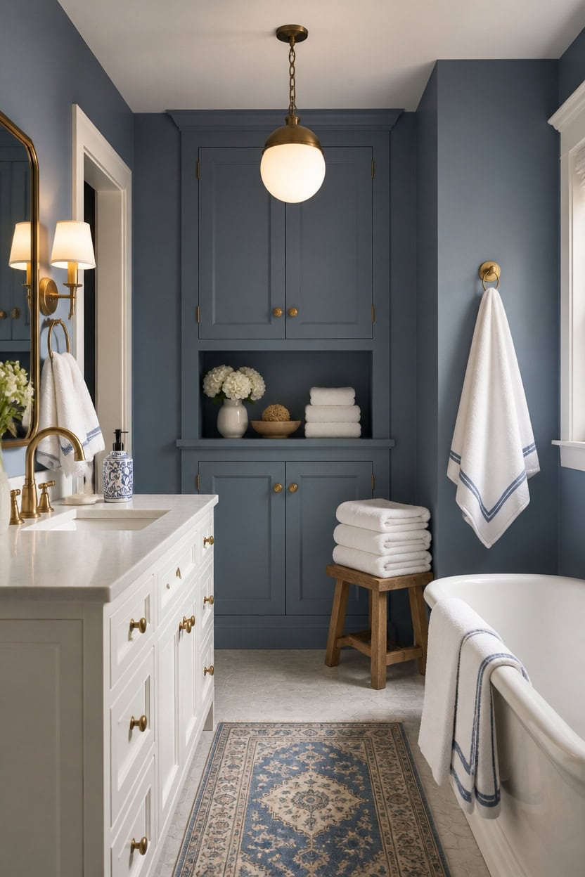
Brushed brass and aged gold pull warmth from mid-tone blue Hamilton Blue walls, while chrome and nickel flatten that blue toward gray. Very light white Marilyn’s Dress on the vanity mirrors that metal tone, so warm brass reads warmer there too. Swap in brass fixtures, then stack hand towels on a stool nearby to check the warmth.
Match warm to warm: Pair brass or gold fixtures with warm-leaning blues like Hamilton Blue.
Test under bulbs: View metal samples under daylight and warm bulbs before buying.
Layer two finishes: Mix a warm faucet with a cool towel bar for intentional contrast.
Check reflections: Watch how the vanity mirror bounces metal tone across white surfaces.
a mid-tone blue that warms alongside brass fixtures. [mid-tone]
a very light white that reflects nearby metal tones. [very light]
 CeroDimo 2 Pack Boho Hand Towels for Bathroom Kitchen Spa Guest Soft Absorbent Decorative Cotton Towels Farmhouse Bathroom Linen Set Cream White(14x30 Inch)
View Price
CeroDimo 2 Pack Boho Hand Towels for Bathroom Kitchen Spa Guest Soft Absorbent Decorative Cotton Towels Farmhouse Bathroom Linen Set Cream White(14x30 Inch)
View Price
 HITSLAM Gold 30 Inch Towel Bar for Bathroom, SUS304 Stainless Steel Bathroom Towel Rack Wall Mounted, Modern Home Decor Bath Towel Holder with Hardware Accessories (Total Length 31.6 Inch)
View Price
HITSLAM Gold 30 Inch Towel Bar for Bathroom, SUS304 Stainless Steel Bathroom Towel Rack Wall Mounted, Modern Home Decor Bath Towel Holder with Hardware Accessories (Total Length 31.6 Inch)
View Price
 WINKEAR Brushed Gold Bathroom Faucet, Single Hole Bathroom Sink Faucet
View Price
Winnker Gold Round Mirror 28 inch, Circle Mirror, Brushed Gold Metal Frame
View Price
WINKEAR Brushed Gold Bathroom Faucet, Single Hole Bathroom Sink Faucet
View Price
Winnker Gold Round Mirror 28 inch, Circle Mirror, Brushed Gold Metal Frame
View Price
 Audickic 2 Pack Pendant Lights Kitchen Island, 8" Gold Pendant Light Fixtures with Globe Clear Glass Shade, Modern Brass Kitchen Island Lighting for Bathroom, AD-22280-2PL-GD
View Price
Audickic 2 Pack Pendant Lights Kitchen Island, 8" Gold Pendant Light Fixtures with Globe Clear Glass Shade, Modern Brass Kitchen Island Lighting for Bathroom, AD-22280-2PL-GD
View Price
 RZDEAL 4pcs Solid Brass Cabinet Knobs Pulls Cabinet Drawer Dresser Gold Knobs Modern Handles(1"x1"/25mmx25mm),Brushed Brass Finish
View Price
RZDEAL 4pcs Solid Brass Cabinet Knobs Pulls Cabinet Drawer Dresser Gold Knobs Modern Handles(1"x1"/25mmx25mm),Brushed Brass Finish
View Price
Our Favorite Towel Bars
- Free shipping over $35
- Picked at 4.7 stars or higher
 Moen Align 24" Wall Mounted Towel Bar
View Price
Moen Align 24" Wall Mounted Towel Bar
View Price
 Delta Trinsic Wall Mount Towel Bar
View Price
Delta Trinsic Wall Mount Towel Bar
View Price
 AngleSimple 23.75" Stainless Steel Towel Bar
View Price
AngleSimple 23.75" Stainless Steel Towel Bar
View Price
 Moen Align 9" Modern Hand Towel Bar
View Price
Moen Align 9" Modern Hand Towel Bar
View Price
 Moen Triva 9" Wall Mounted Towel Bar
View Price
Moen Triva 9" Wall Mounted Towel Bar
View Price
 Moen Align 18" Wall Mounted Towel Bar
View Price
Moen Align 18" Wall Mounted Towel Bar
View Price
 Moen Brantford 24" Wall Mounted Towel Bar
View Price
Moen Brantford 24" Wall Mounted Towel Bar
View Price
 Moen Preston 24" Wall Mounted Towel Bar
View Price
Moen Preston 24" Wall Mounted Towel Bar
View Price
 Delta Cassidy 24" Wall Mounted Towel Bar
View Price
Delta Cassidy 24" Wall Mounted Towel Bar
View Price
 Kohler Alteo Wall Mounted Towel Bar
View Price
Kohler Alteo Wall Mounted Towel Bar
View Price
 Moen Genta LX 24" Wall Mounted Towel Bar
View Price
Moen Genta LX 24" Wall Mounted Towel Bar
View Price
 Kohler Elate Wall Mounted Round Towel Bar
View Price
Kohler Elate Wall Mounted Round Towel Bar
View Price
 Delta Trinsic 24" Double Wall Mount Towel Bar
View Price
Delta Trinsic 24" Double Wall Mount Towel Bar
View Price
 Moen Wynford Double 24" Wall Mounted Towel Bar
View Price
Moen Wynford Double 24" Wall Mounted Towel Bar
View Price
Finish With Textiles That Add the Last Bit of Warmth
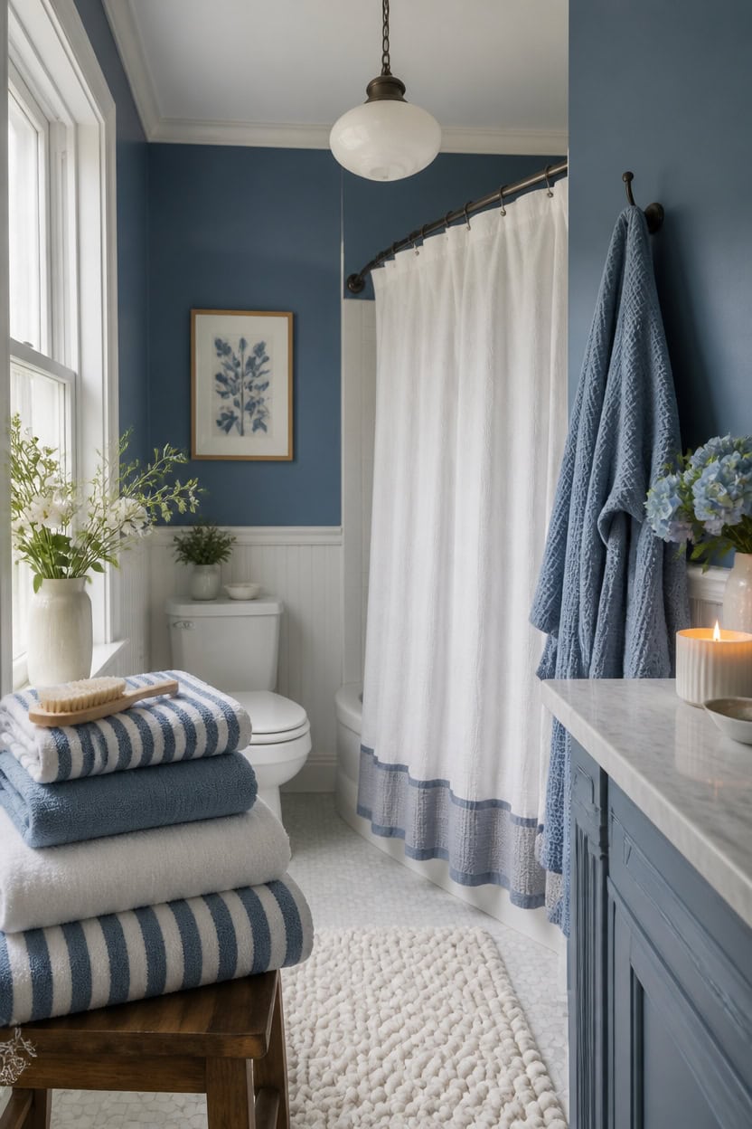
Layering three textile weights—terry, waffle weave, and linen—creates warmth without clutter in a blue and white bathroom. Mid-tone blue Stained Glass on the accent wall behind the tub grounds the palette, while very light white Etiquette on the trim keeps edges crisp. Set a small candle on the vanity edge so its glow warms the linen textures each evening.
Layer three textures: Combine terry towels, waffle-weave robes, and linen shower curtains for depth.
Match metal tones: Choose brushed nickel or brass hooks that echo the faucet finish.
Fold with intention: Stack towels in thirds so blue and white stripes stay visible.
Add a bath mat: Choose a chunky knit mat in white to soften cold tile underfoot.
a mid-tone blue that grounds the palette without darkening the room. [mid-tone]
a very light white that keeps edges crisp against the blue. [very light]
 Turquaz Lightweight Waffle Knit Kimono Bathrobe - Soft Cotton Blend Spa Robe, Fast-Drying Full-Length Unisex Robes for Women
View Price
Turquaz Lightweight Waffle Knit Kimono Bathrobe - Soft Cotton Blend Spa Robe, Fast-Drying Full-Length Unisex Robes for Women
View Price
 Amazon Basics Linen Style Bathroom Shower Curtain, 100% Polyester, 72" x 72", Bright White
View Price
Amazon Basics Linen Style Bathroom Shower Curtain, 100% Polyester, 72" x 72", Bright White
View Price
 Madison Park Splendor Reversible 100% Cotton Bath Rug, 17 x 24, White
View Price
Madison Park Splendor Reversible 100% Cotton Bath Rug, 17 x 24, White
View Price
 4 Pack Brushed Nickel Towel Hooks, SUS304 Stainless Steel Bathroom Hooks
View Price
4 Pack Brushed Nickel Towel Hooks, SUS304 Stainless Steel Bathroom Hooks
View Price
 Tortoise Shell Candle Holder | Medium Size 3.9" | Cheetah & Leopard Print Candle Holder | Large Amber Glass Votive for Vanity | Animal Pattern Glass Decor | Tea Light, Jar Candle & Vanity Accent
View Price
Tortoise Shell Candle Holder | Medium Size 3.9" | Cheetah & Leopard Print Candle Holder | Large Amber Glass Votive for Vanity | Animal Pattern Glass Decor | Tea Light, Jar Candle & Vanity Accent
View Price
 4 Pack Storage Baskets for Organizing, 13''Lx11''Wx8''H Woven Baskets for Storage Toys, Towels, Books, and Clothes, Cotton Rope Basket for Shelves with Handle
View Price
4 Pack Storage Baskets for Organizing, 13''Lx11''Wx8''H Woven Baskets for Storage Toys, Towels, Books, and Clothes, Cotton Rope Basket for Shelves with Handle
View Price