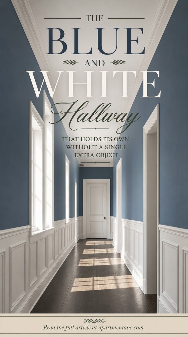
The Blue and White Hallway That Holds Its Own Without a Single Extra Object
A hallway shouldn’t need much to say everything. You walk through it daily, yet you rarely stop to notice why some feel finished while others feel forced.
Blue and white, done right, doesn’t shout for attention: it earns it through restraint. That restraint is the specific logic behind why blue and white works so consistently, and once you see it, you won’t unsee it.
Why Blue and White Works So Well in Hallways
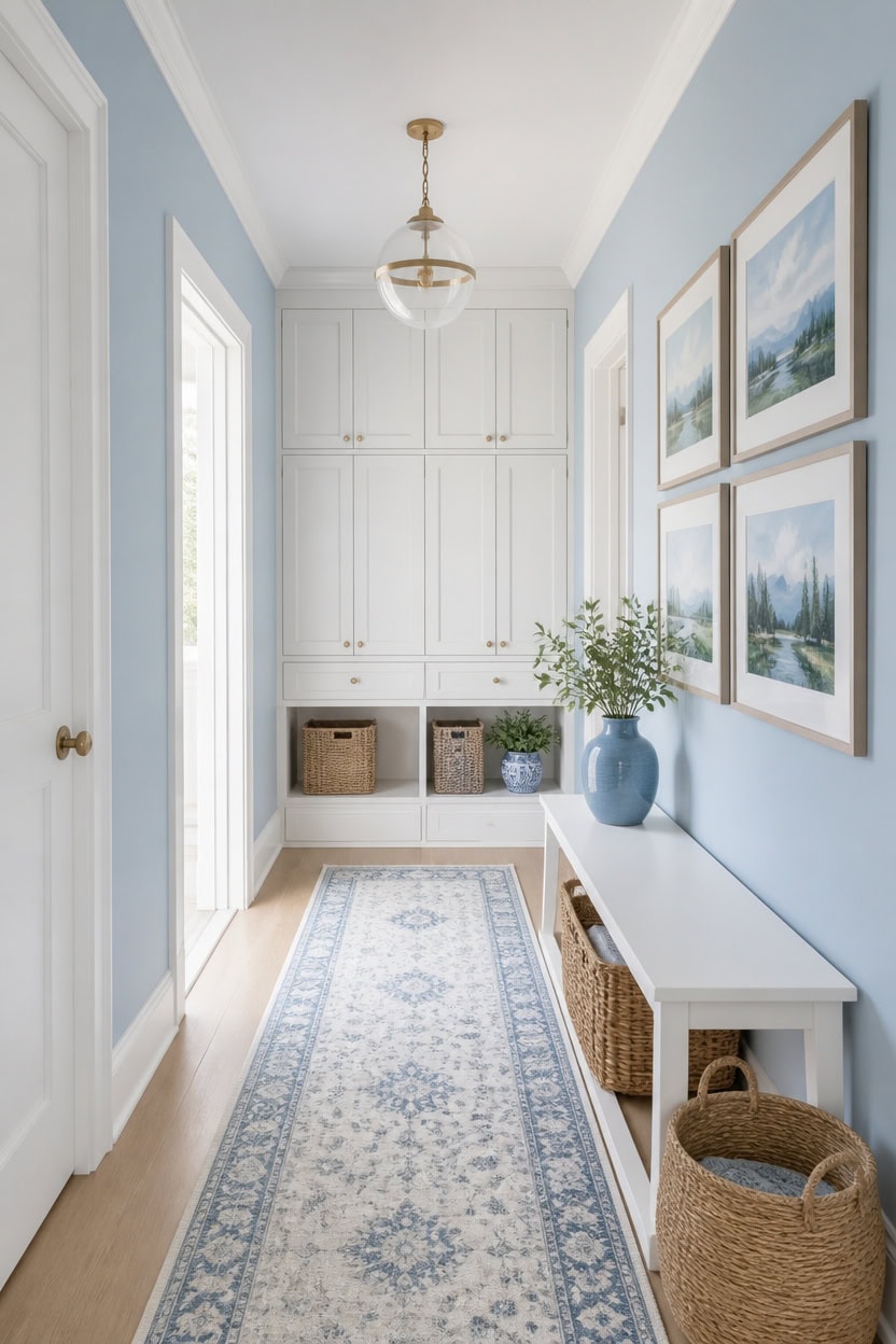
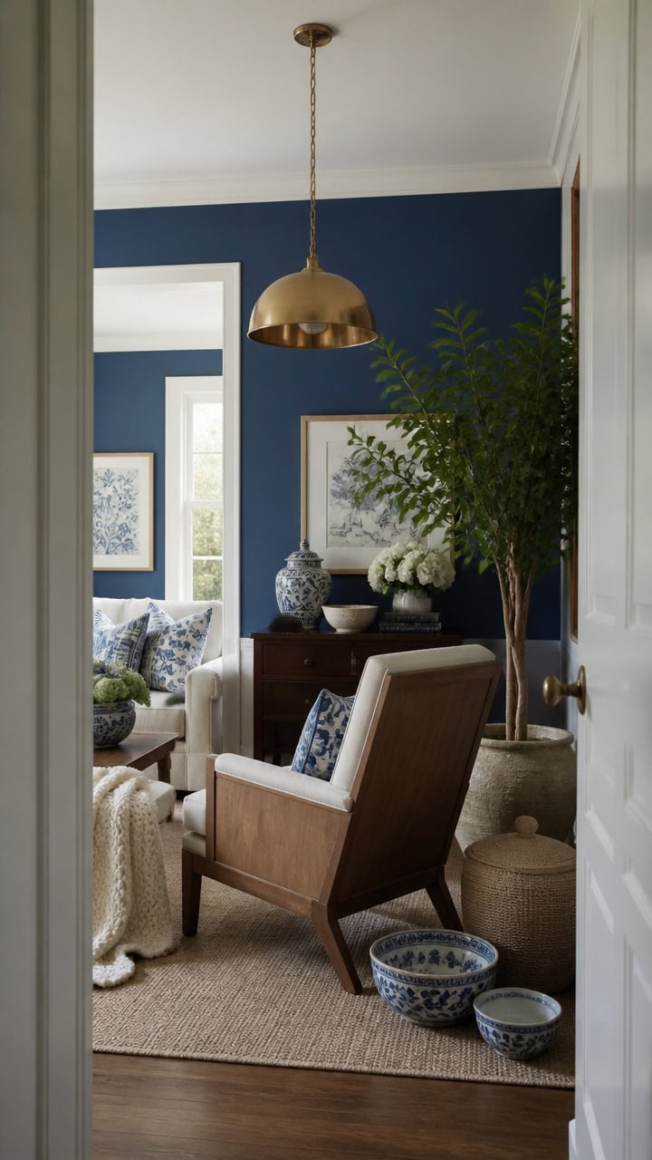
Blue and white work in hallways because both colors bounce available light instead of absorbing it. Light blue Franklin Lakes covers the main walls for a calm base, and very light white Candle White brightens the trim for clean sightlines. A row of framed landscape prints along the wall echoes both tones without crowding the passage.
Reflective pairing: Blue and white both bounce light, so the hallway feels brighter even without windows.
Contrast at eye level: Keep white on trim and doors so sightlines guide movement toward the next room.
Consistent undertone: Choose a blue with the same warmth or coolness as the white to avoid a muddy look.
Vertical accents: Add art or mirrors in blue-and-white tones to break up long wall runs.
the light blue keeps the passage feeling airy while adding a touch of depth. [light]
the crisp white defines the architecture and reflects hallway light. [very light]
 Framed Forest Wall Art Set of 3, Misty Mountain Landscape Canvas Wall Decor Paintings, Nature Tree River Scenery Artwork Prints Pictures for Living Room Bedroom Office 12x16 Inch
View Price
Framed Forest Wall Art Set of 3, Misty Mountain Landscape Canvas Wall Decor Paintings, Nature Tree River Scenery Artwork Prints Pictures for Living Room Bedroom Office 12x16 Inch
View Price
 Lansny Abstract Washable Runners for Hallway 2x8 Runner Rug Non Slip Indoor
View Price
Lansny Abstract Washable Runners for Hallway 2x8 Runner Rug Non Slip Indoor
View Price
 Dseap Wall Mounted Coat Rack - 5 Tri Hooks, Heavy Duty, Stainless Steel, Metal Coat Hook Rail for Coat Hat Towel Purse Robes Mudroom Bathroom Entryway,White
View Price
Dseap Wall Mounted Coat Rack - 5 Tri Hooks, Heavy Duty, Stainless Steel, Metal Coat Hook Rail for Coat Hat Towel Purse Robes Mudroom Bathroom Entryway,White
View Price
 Alaterre Newport Solid Wood Entryway Bench with Woven Rope Seat, White
View Price
Alaterre Newport Solid Wood Entryway Bench with Woven Rope Seat, White
View Price
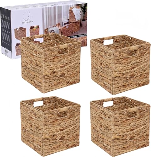 12x12in Storage Baskets 4 Pcs Water Hyacinth Basket,Foldable Storage Cubes
View Price
12x12in Storage Baskets 4 Pcs Water Hyacinth Basket,Foldable Storage Cubes
View Price
 Blue Ceramic Vase Set - 3 Blue Small Vases, Farmhouse Country Flower Vase Home Decor, Living Room Decoration, Table Decoration, Fireplace Decor, and Entrance Decorations Centerpieces
View Price
Blue Ceramic Vase Set - 3 Blue Small Vases, Farmhouse Country Flower Vase Home Decor, Living Room Decoration, Table Decoration, Fireplace Decor, and Entrance Decorations Centerpieces
View Price
 Audickic 3-Pack Pendant Lights Kitchen Island, Gold Hanging Lights Fixtures with Clear Glass Globe Shade, Brass Kitchen Island Lighting for Dining Room, AD-22280-1P3-GD
View Price
Audickic 3-Pack Pendant Lights Kitchen Island, Gold Hanging Lights Fixtures with Clear Glass Globe Shade, Brass Kitchen Island Lighting for Dining Room, AD-22280-1P3-GD
View Price
 SONGMICS Console Table with 3 Fabric Drawers, Narrow Entryway Furniture
View Price
SONGMICS Console Table with 3 Fabric Drawers, Narrow Entryway Furniture
View Price
What Makes a Blue and White Hallway Feel Complete?
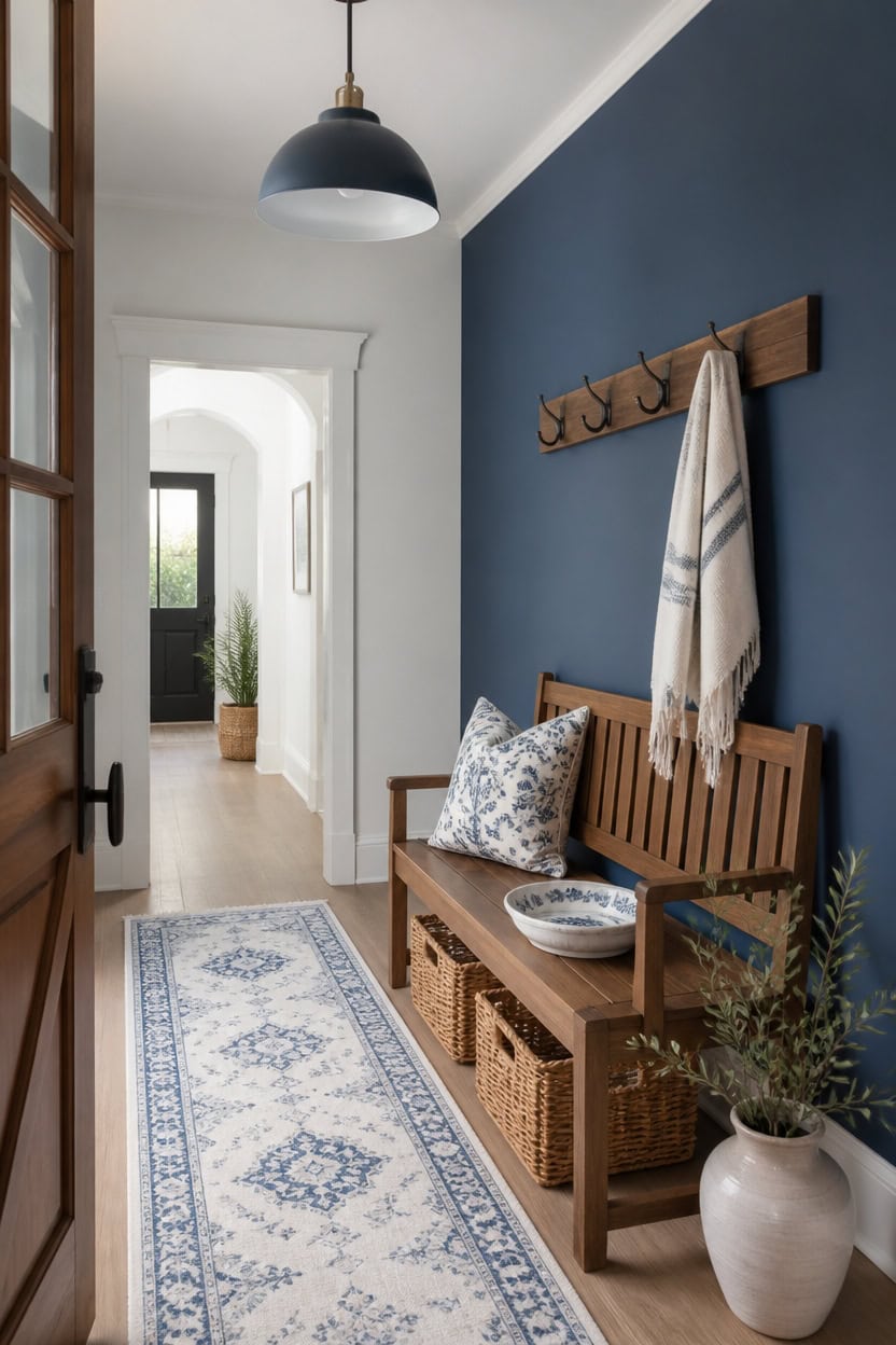
Mid-tone blue Azurite covers the accent wall behind the entry bench, and very light white Seapearl finishes the trim. This pairing repeats the palette at both a low and high point, keeping the corridor cohesive. Add a row of coat hooks holding a folded throw near the door so guests see the scheme right away.
Layer at multiple heights: Repeat blue and white from floor trim to eye-level art for continuity.
Balance matte and glossy finishes: Pair a matte wall with semi-gloss trim to add subtle depth.
Use texture for warmth: Add woven or knit textiles so the palette does not feel flat.
Frame the path with symmetry: Mirror wall art or hooks on both sides to guide movement.
the mid-tone blue adds quiet depth without darkening the corridor. [mid-tone]
the very light white keeps sightlines crisp and reflects available light. [very light]
 Dseap Coat Rack Wall Mounted - 5 Tri Hooks, Heavy Duty, Stainless Steel, Metal Coat Hook Rail for Coat Hat Towel Purse Robes Mudroom Bathroom Entryway (Black, 2 Packs)
View Price
Dseap Coat Rack Wall Mounted - 5 Tri Hooks, Heavy Duty, Stainless Steel, Metal Coat Hook Rail for Coat Hat Towel Purse Robes Mudroom Bathroom Entryway (Black, 2 Packs)
View Price
 TRIBEWOOD 55" Solid Wood Entryway Bench, Farmhouse Dining Bench with Back
View Price
TRIBEWOOD 55" Solid Wood Entryway Bench, Farmhouse Dining Bench with Back
View Price
 Gold Pendant Light 2 Packs, Modern Farmhouse Pendant Lights Kitchen Island
View Price
Gold Pendant Light 2 Packs, Modern Farmhouse Pendant Lights Kitchen Island
View Price
 Chicrug 2x6 Blue Washable Runner Rug for Hallway Kitchen Entryway Non Slip
View Price
Chicrug 2x6 Blue Washable Runner Rug for Hallway Kitchen Entryway Non Slip
View Price
 3D Textured Framed Blue and White Abstract Wall Art Set, 3 Piece, 16x24 In
View Price
3D Textured Framed Blue and White Abstract Wall Art Set, 3 Piece, 16x24 In
View Price
 7.08 inch Ceramic Jewelry Tray Trinket Dish Plate Bowl Table Decor
View Price
7.08 inch Ceramic Jewelry Tray Trinket Dish Plate Bowl Table Decor
View Price
 Gresorth 5 Inch Small Artificial Sage Potted Plant Decoration - 1 Pc
View Price
Gresorth 5 Inch Small Artificial Sage Potted Plant Decoration - 1 Pc
View Price
 eHemco Extra Large Water Hyacinth Wicker Storage Baskets, Set of 6
View Price
eHemco Extra Large Water Hyacinth Wicker Storage Baskets, Set of 6
View Price
The Color Psychology Behind a Calm Blue and White Hallway
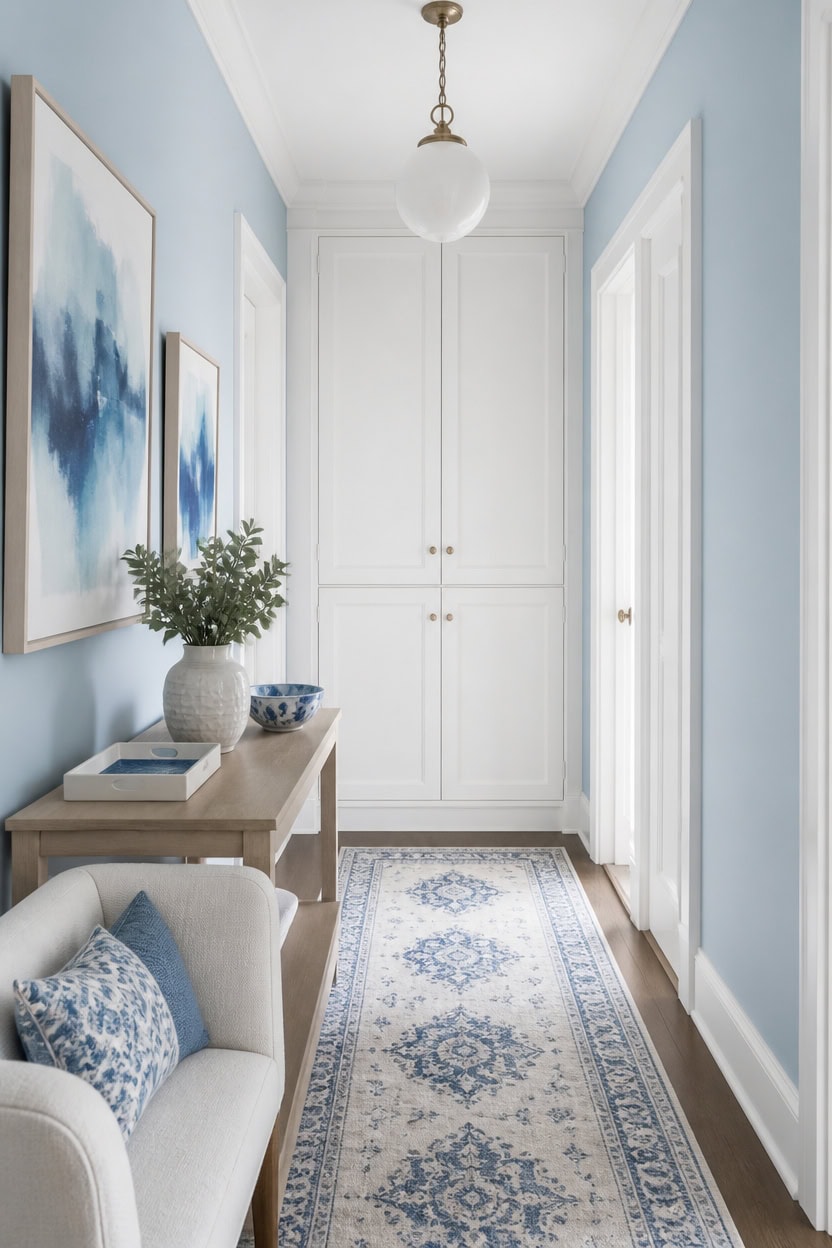
Light blue Franklin Lakes on the main hallway walls draws on documented color psychology, since blue tones lower heart rate and ease shifts between rooms. Very light white Candle White trim keeps the palette grounded, reflecting hallway light so the blue never reads as cold or dark. Place a small console table with a ceramic catch-all tray near the door.
Use cool tones for calm: Blue lowers visual stimulation, helping a narrow hallway feel less rushed.
Balance with warm light: Add warm-toned bulbs so the blue and white palette does not feel clinical.
Keep white matte on walls: A matte finish softens light bounce for a gentler shift.
Anchor with one grounding accent: A single wood or brass piece keeps the palette from feeling too cool.
the light blue lowers visual stimulation and eases the shift between rooms. [light]
the very light white keeps the palette airy and reflects available light. [very light]
 OAKOA Large Decorative Bowl for Home Decor - Key Bowl for Entryway Table
View Price
OAKOA Large Decorative Bowl for Home Decor - Key Bowl for Entryway Table
View Price
 Madison Park Accent Bench, Plush Upholstered, Nailhead Trim, & Padded Seat Entryway Bench Small, End of Bed Bench with Back, 49.5" W x 19.25" D x 23" H, Green
View Price
Madison Park Accent Bench, Plush Upholstered, Nailhead Trim, & Padded Seat Entryway Bench Small, End of Bed Bench with Back, 49.5" W x 19.25" D x 23" H, Green
View Price
 DLLT Vintage Globe Pendant Hanging Light, Matte Black, 1-Light, E26 Base, Ideal for Dining Room, Kitchen Island, Living Room, Home Office
View Price
DLLT Vintage Globe Pendant Hanging Light, Matte Black, 1-Light, E26 Base, Ideal for Dining Room, Kitchen Island, Living Room, Home Office
View Price
 AROGAN 2x6 Runner Rug for Hallway, Long Runner Rugs Non Slip, Blue
View Price
AROGAN 2x6 Runner Rug for Hallway, Long Runner Rugs Non Slip, Blue
View Price
 Large Framed Blue Abstract Wall Art for Living Room, Modern 3D Artwork
View Price
Large Framed Blue Abstract Wall Art for Living Room, Modern 3D Artwork
View Price
 Honey-Can-Do Woven Water Hyacinth Wicker Storage Baskets, Nesting Set of 3
View Price
Honey-Can-Do Woven Water Hyacinth Wicker Storage Baskets, Nesting Set of 3
View Price
 KROUJITY 7.6'' Ceramic Decorative Bowl, Key Bowl for Entryway Table
View Price
KROUJITY 7.6'' Ceramic Decorative Bowl, Key Bowl for Entryway Table
View Price
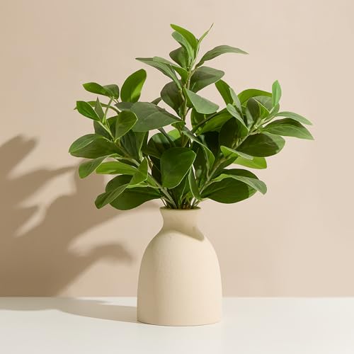 16" Artificial Eucalyptus Stems Potted Plant Indoor Fake Plants
View Price
16" Artificial Eucalyptus Stems Potted Plant Indoor Fake Plants
View Price
How Hallway Size Shapes Your Blue and White Choices
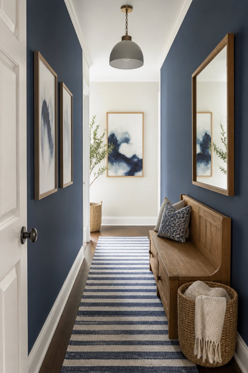
Mid-tone blue Azurite on the main walls anchors a narrow hallway, while very light white Seapearl on the accent wall keeps the sightline open. The darker hue recedes visually and the lighter one advances, tricking the eye into reading extra width. Hang a wall-mounted mirror opposite the accent wall to reinforce that added depth.
Measure width first: Hallways under three feet read best with one dominant light tone.
Use depth for length: A darker end wall shortens a very long hallway visually.
Reserve accent walls for narrow spots: One lighter wall widens the tightest sections.
Test large swatches: Tape poster-size samples at both ends before committing.
the mid-tone blue anchors a narrow run without closing it in. [mid-tone]
the very light white bounces available light back down the hallway. [very light]
 ZMYCZ Full Length Mirror Wall Mounted, 48"x16" Oval Hanging Mirror (Black)
View Price
ZMYCZ Full Length Mirror Wall Mounted, 48"x16" Oval Hanging Mirror (Black)
View Price
 Tribesigns 63" Entryway Bench, Farmhouse Shoe Storage Bench with Shelves
View Price
Tribesigns 63" Entryway Bench, Farmhouse Shoe Storage Bench with Shelves
View Price
 SESIMENT Farmhouse Pendant Lighting for Kitchen Island,Black and Gold Dome Pendant Light Fixtures, Industrial Hanging Ceiling Light for Dining Room Foyer Cafe Kitchen Sink,2 Pack
View Price
SESIMENT Farmhouse Pendant Lighting for Kitchen Island,Black and Gold Dome Pendant Light Fixtures, Industrial Hanging Ceiling Light for Dining Room Foyer Cafe Kitchen Sink,2 Pack
View Price
 Beeiva Striped 2X6 Runner Rug for Bathroom, Washable Runners for Hallways Entryway, Blue Runner Rugs with Non Slip Rubber Backing, Soft Low Pile Floor Carpet for Indoor Kitchen Porch Bedroom
View Price
Beeiva Striped 2X6 Runner Rug for Bathroom, Washable Runners for Hallways Entryway, Blue Runner Rugs with Non Slip Rubber Backing, Soft Low Pile Floor Carpet for Indoor Kitchen Porch Bedroom
View Price
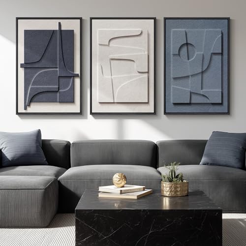 Large 3D Textured Framed Blue White Abstract Wall Art Set, 3 Piece 20x30 In
View Price
Large 3D Textured Framed Blue White Abstract Wall Art Set, 3 Piece 20x30 In
View Price
 Franklin Brass R33120K-PNB-R Heavy Duty Coat and Hat Hook Rack, 26-1/2 in. Lacquered Pine and Brass
View Price
Franklin Brass R33120K-PNB-R Heavy Duty Coat and Hat Hook Rack, 26-1/2 in. Lacquered Pine and Brass
View Price
 27" Ficus Tree Artificial Plants in Ceramic Pot,Faux Potted Plant
View Price
27" Ficus Tree Artificial Plants in Ceramic Pot,Faux Potted Plant
View Price
 StorageWorks Wicker Baskets, Wicker Storage Baskets for Shelves, 2-Pack
View Price
StorageWorks Wicker Baskets, Wicker Storage Baskets for Shelves, 2-Pack
View Price
Choosing Your Blue and White Color Palette
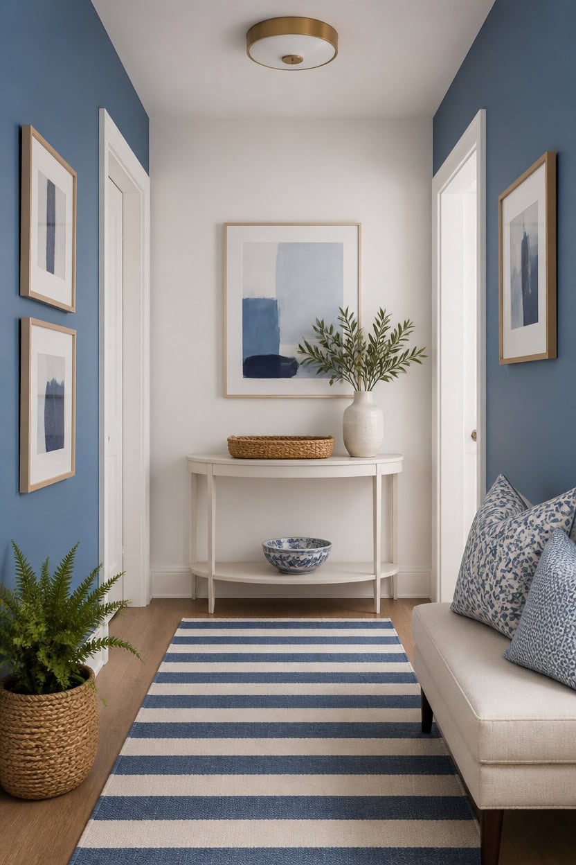
Mid-tone blue Blue Dusk covers the main walls while very light white First Light brightens the accent wall, forming this hallway’s core palette. Limiting the scheme to one dominant blue and one supporting white keeps the hallway cohesive, not busy. A slim console table with a woven catchall tray sits against the accent wall to show both tones together.
Anchor with one blue: Pick a single dominant blue for the largest surfaces to avoid visual clutter.
Limit white variations: Use one true white shade for accents to keep trim and wall tones aligned.
Test in changing light: Check swatches in morning and evening light since hallway light shifts fast.
Balance warm and cool: Pair a cooler blue with a warm-toned white to balance the palette.
the mid-tone blue grounds the hallway without darkening it too much. [mid-tone]
the very light white keeps the far end bright and open. [very light]
 Kings Brand Narrow Console Table with Storage Shelf for Entryway, White
View Price
Kings Brand Narrow Console Table with Storage Shelf for Entryway, White
View Price
 Beeiva Striped Blue Runners for Hallways, 2.5x8 Washable Bathroom Runner with Rubber Backed, Non Slip Soft Low Pile Indoor Floor Carpet for Kitchen Bedroom Porch High Traffic Areas
View Price
Beeiva Striped Blue Runners for Hallways, 2.5x8 Washable Bathroom Runner with Rubber Backed, Non Slip Soft Low Pile Indoor Floor Carpet for Kitchen Bedroom Porch High Traffic Areas
View Price
 Blue and White Chinoiserie vase - Vintage Ceramic vase with Antique Design, Perfect for Chinoiserie Home Decor 9in Flower vase04
View Price
Blue and White Chinoiserie vase - Vintage Ceramic vase with Antique Design, Perfect for Chinoiserie Home Decor 9in Flower vase04
View Price
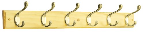 Liberty Hardware RPLR6DJ-PNB-L1 27-Inch 6 Heavy Duty Coat and Hat Hook Rail, Pine and Polished Brass
View Price
Liberty Hardware RPLR6DJ-PNB-L1 27-Inch 6 Heavy Duty Coat and Hat Hook Rail, Pine and Polished Brass
View Price
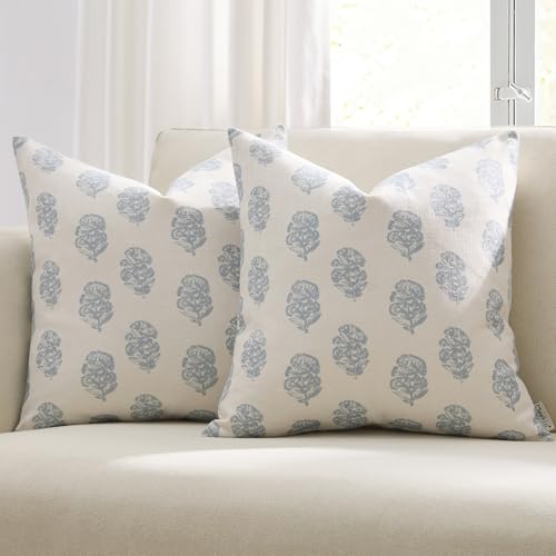 Meekio Floral Block Print Pillow Covers 18x18 Set of 2, Blue and White
View Price
Meekio Floral Block Print Pillow Covers 18x18 Set of 2, Blue and White
View Price
 Hopewood Faux Plants, Small Fake Plant for Bathroom, Decorative Artificial Plants for Farmhouse Desk Shelf Decor with A Weave Basket (9.8inch)
View Price
Hopewood Faux Plants, Small Fake Plant for Bathroom, Decorative Artificial Plants for Farmhouse Desk Shelf Decor with A Weave Basket (9.8inch)
View Price
Hallway Runners for This Palette
Rugs USA best-selling runners in this palette's colors, linked in 2' 6" x 8', the length that suits most hallways. Longer sizes are on each rug's page.
- Free shipping
- 30-day returns
- 210,000+ five-star reviews
 Jute And Denim Even Stripes Rug – Off White
View Price
Jute And Denim Even Stripes Rug – Off White
View Price
 Flatweave Cotton Giant Octopus Rug – Blue Multicolor
View Price
Flatweave Cotton Giant Octopus Rug – Blue Multicolor
View Price
 Everywhere Hand-Braided Indoor/Outdoor Rug – Navy
View Price
Everywhere Hand-Braided Indoor/Outdoor Rug – Navy
View Price
 Distressed Persian Rug – Blue
View Price
Distressed Persian Rug – Blue
View Price
 Faded Abstract Washable Rug – Blue Grey
View Price
Faded Abstract Washable Rug – Blue Grey
View Price
 Hand Braided Twined Jute And Denim Rug – Blue
View Price
Hand Braided Twined Jute And Denim Rug – Blue
View Price
 Reverse Herringbone Washable Rug – Blue
View Price
Reverse Herringbone Washable Rug – Blue
View Price
 Antique Chevron Rug – Blue
View Price
Antique Chevron Rug – Blue
View Price
 Persian Vintage Rug – Teal
View Price
Persian Vintage Rug – Teal
View Price
 Honeycomb Labyrinth Rug – Blue
View Price
Honeycomb Labyrinth Rug – Blue
View Price
 Faded Star Petal Emblem Rug – Blue
View Price
Faded Star Petal Emblem Rug – Blue
View Price
 Herringbone Cotton Flatwoven Rug – Navy
View Price
Herringbone Cotton Flatwoven Rug – Navy
View Price
 Chunky Jute Tasseled Rug – Blue
View Price
Chunky Jute Tasseled Rug – Blue
View Price
 Jute And Denim Even Stripes Rug – Denim
View Price
Jute And Denim Even Stripes Rug – Denim
View Price
 Jute Braided Rug – Navy
View Price
Jute Braided Rug – Navy
View Price
 Patty Washable Rainy Days Rug – Blue Multicolor
View Price
Patty Washable Rainy Days Rug – Blue Multicolor
View Price
 Paneled Geometric Rug – Navy
View Price
Paneled Geometric Rug – Navy
View Price
 Starfish Indoor/Outdoor Rug – Navy
View Price
Starfish Indoor/Outdoor Rug – Navy
View Price
 Fish Indoor/Outdoor Rug – Navy
View Price
Fish Indoor/Outdoor Rug – Navy
View Price
 Tani Vintage Blocks Rug – Navy
View Price
Tani Vintage Blocks Rug – Navy
View Price
 Serene Waterfall Rug – Blue
View Price
Serene Waterfall Rug – Blue
View Price
 Distressed Persian Rug – Dark Blue
View Price
Distressed Persian Rug – Dark Blue
View Price
 Striped Border Indoor/Outdoor Flatweave Rug – Navy
View Price
Striped Border Indoor/Outdoor Flatweave Rug – Navy
View Price
 Withered Bloom In Bouquet Rug – Blue
View Price
Withered Bloom In Bouquet Rug – Blue
View Price
 Floral Fringed Rug – Blue
View Price
Floral Fringed Rug – Blue
View Price
 Moroccan Trellis Rug – Dark Blue
View Price
Moroccan Trellis Rug – Dark Blue
View Price
 Forever Vintage Rug – Light Blue
View Price
Forever Vintage Rug – Light Blue
View Price
 Faded Shadow Mystique Rug – Blue
View Price
Faded Shadow Mystique Rug – Blue
View Price
 Molly Octopus Spill Proof Washable Rug – Blue
View Price
Molly Octopus Spill Proof Washable Rug – Blue
View Price
 Sanaya Transitional Floral Indoor/Outdoor Rug – Navy
View Price
Sanaya Transitional Floral Indoor/Outdoor Rug – Navy
View Price
 Chunky Jute Tasseled Rug – Off White
View Price
Chunky Jute Tasseled Rug – Off White
View Price
 Softest Knit Wool Rug – Off White
View Price
Softest Knit Wool Rug – Off White
View Price
 Jute Braided Rug – Off White
View Price
Jute Braided Rug – Off White
View Price
 Diamond Pinstripes Washable Rug – White
View Price
Diamond Pinstripes Washable Rug – White
View Price
 Jute Braided Saturn Border Rug – Off White
View Price
Jute Braided Saturn Border Rug – Off White
View Price
 Handwoven Jute Jagged Chevron Rug – Off White
View Price
Handwoven Jute Jagged Chevron Rug – Off White
View Price
 Pearl Contemporary Mars Rug – Blush
View Price
Pearl Contemporary Mars Rug – Blush
View Price
 Moroccan Trellis Rug – Black and White
View Price
Moroccan Trellis Rug – Black and White
View Price
How Much Contrast Should a Blue and White Hallway Have?
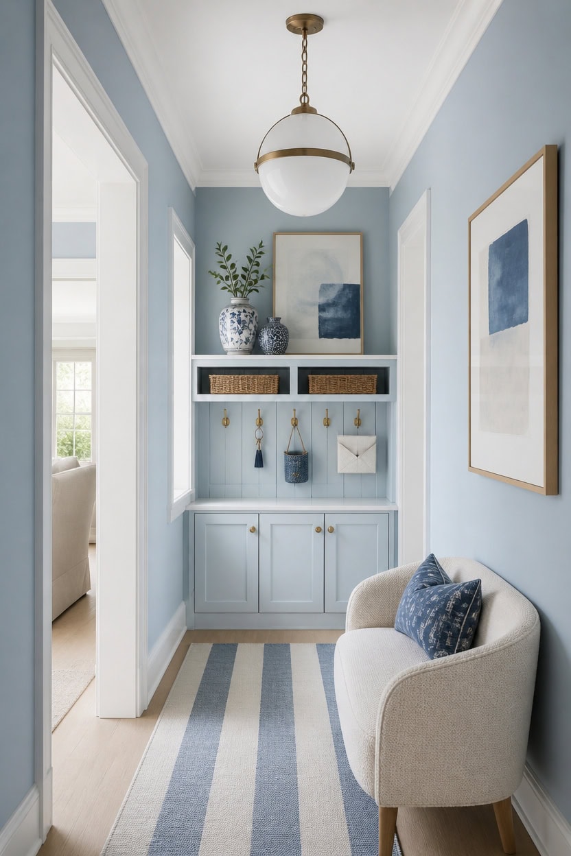
Light blue Franklin Lakes covers the main walls at a soft depth, while very light white Candle White brightens the trim for gentle contrast. This keeps the hallway lively, not stark, since the trim’s brightness never overwhelms the wall’s steady blue. A wall-mounted key and mail organizer by the entry shows how the two tones frame daily items without clashing.
Use the 70/30 rule: Let one tone cover most surfaces while the other fills a smaller share.
Add a value step: Choose tones with a visible difference in lightness, not just hue.
Soften with neutrals: Bring in gray or wood tones to ease sharp jumps between blue and white.
Check reflected light: Glossy trim can push contrast higher than expected once light hits it.
the light blue sets a steady depth that keeps the hallway calm. [light]
the very light white sharpens edges for a controlled dose of contrast. [very light]
 SWTYMIKI Key Holder Wall Mount - Wooden Key Hooks for Wall with Mail Organizer & 6 Hooks, 2 Installation Ways Key Hanger, Key Rack with Shelf for Entryway Living Room Bedroom Office Home Decor Black
View Price
SWTYMIKI Key Holder Wall Mount - Wooden Key Hooks for Wall with Mail Organizer & 6 Hooks, 2 Installation Ways Key Hanger, Key Rack with Shelf for Entryway Living Room Bedroom Office Home Decor Black
View Price
 Lynnoland Industrial Farmhouse Semi Flush Mount Ceiling Light, Black, Seeded Glass Shade, Ceiling Mount Light Fixture for Hallway Corridor Kitchen Entryway Passageway Bathroom Bedroom
View Price
Lynnoland Industrial Farmhouse Semi Flush Mount Ceiling Light, Black, Seeded Glass Shade, Ceiling Mount Light Fixture for Hallway Corridor Kitchen Entryway Passageway Bathroom Bedroom
View Price
 SAFAVIEH Courtyard Outdoor Runner Rug 2'3"x6'7", Beige & Blue CY6062-233
View Price
SAFAVIEH Courtyard Outdoor Runner Rug 2'3"x6'7", Beige & Blue CY6062-233
View Price
 JolieJulie 6'' Key Bowl, Purse Bowl - Small Decorative Bowl, White
View Price
JolieJulie 6'' Key Bowl, Purse Bowl - Small Decorative Bowl, White
View Price
 ooit Ceramic Vintage Vases Set of 3, Blue and White Flower Decorative Vase Chinoiserie Decor Rustic Farmhouse Retro Floral Vases for Table Bookshelf Mantel Kitchen Living Room Office
View Price
ooit Ceramic Vintage Vases Set of 3, Blue and White Flower Decorative Vase Chinoiserie Decor Rustic Farmhouse Retro Floral Vases for Table Bookshelf Mantel Kitchen Living Room Office
View Price
 Whonline Fake Hanging Plants, Artificial Small Potted Plants for Indoor Outdoor Aesthetic Office Living Room Shelf Decor (1 Pack)
View Price
Whonline Fake Hanging Plants, Artificial Small Potted Plants for Indoor Outdoor Aesthetic Office Living Room Shelf Decor (1 Pack)
View Price
Why Proportion Matters More Than Decor
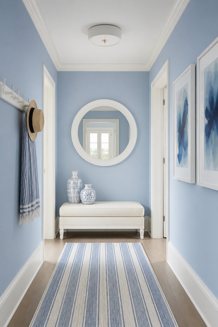
Light blue Saratoga Springs covers the main walls while very light white Vanilla Milkshake outlines the trim, holding a steady seventy-thirty split. This ratio lets the eye settle on one dominant tone before the lighter trim adds a crisp edge. A wall-mounted coat and hat rack near the entry shows how small accents carry the palette without crowding the space.
Weigh the wall math: Let one color cover about seventy percent of the surfaces before adding the second.
Measure trim width: Thin trim reads as an accent, while wide trim starts to read as a second wall color.
Balance floor to ceiling: Keep the bolder tone lower so the hallway does not feel top-heavy.
Test in both light conditions: Proportions that look right at noon can shift once evening light hits the hall.
the light blue keeps the dominant tone grounded across the largest surface. [light]
the very light white defines the edges without eating into the wall’s share. [very light]
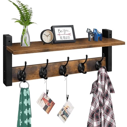 Homode Wall Hooks with Shelf, Wood Coat Rack with Shelf Wall-Mounted, Entryway Hanging Shelves with 5 Metal Hooks for Clothes Hats Towel Purse Robes, Bathroom Mudroom Bedroom, Rustic Brown Black
View Price
Homode Wall Hooks with Shelf, Wood Coat Rack with Shelf Wall-Mounted, Entryway Hanging Shelves with 5 Metal Hooks for Clothes Hats Towel Purse Robes, Bathroom Mudroom Bedroom, Rustic Brown Black
View Price
 AOAOPQ Hanging Round Mirror White Metal Frame Circle Wall Mirrors for Entryway Bathroom Vanity Living Room
View Price
AOAOPQ Hanging Round Mirror White Metal Frame Circle Wall Mirrors for Entryway Bathroom Vanity Living Room
View Price
 Vintage Ceramic Vases Set of 3, Blue and White Flower Vase Waterproof
View Price
Vintage Ceramic Vases Set of 3, Blue and White Flower Vase Waterproof
View Price
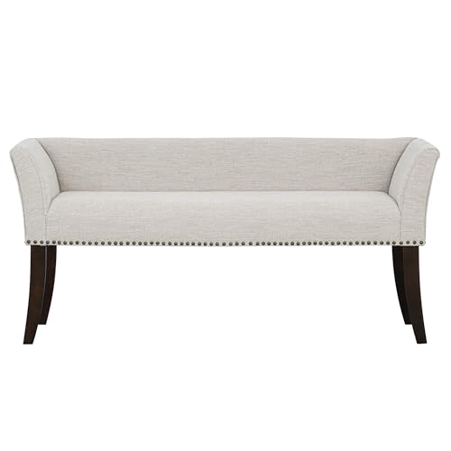 Madison Park Accent Bench for Living Room, Upholstered with Nailhead Trim, & Padded Seat Entryway Bench Small, End of Bed Bench with Back, 49.5" W x 19.25" D x 23" H, White Cream
View Price
Madison Park Accent Bench for Living Room, Upholstered with Nailhead Trim, & Padded Seat Entryway Bench Small, End of Bed Bench with Back, 49.5" W x 19.25" D x 23" H, White Cream
View Price
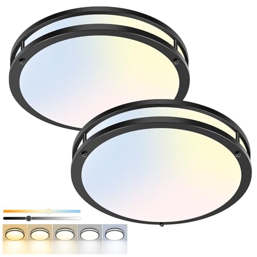 hepside 13inch Flush Mount Ceiling Light Fixture 2 Pack, Dimmable & 5 Color Temperatures Ceiling Light Black, 24W 3000K 3500K 4000K 5000K 6500K Adjustable Ceiling Lamps for Bathroom Bedroom Hallway
View Price
hepside 13inch Flush Mount Ceiling Light Fixture 2 Pack, Dimmable & 5 Color Temperatures Ceiling Light Black, 24W 3000K 3500K 4000K 5000K 6500K Adjustable Ceiling Lamps for Bathroom Bedroom Hallway
View Price
Wall Art for This Palette
The best-reviewed prints at Wayfair in this palette's colors. Most come in several sizes.
- Free shipping over $35
- Picked at 4.5 stars or higher
 Ocean Eye I 3 Piece Wrapped Canvas Print Set
View Price
Ocean Eye I 3 Piece Wrapped Canvas Print Set
View Price
 White and Blue Feather Spiral II Abstract Geometric
View Price
White and Blue Feather Spiral II Abstract Geometric
View Price
 Coral Teal Bold Mountains Landscape Mountain
View Price
Coral Teal Bold Mountains Landscape Mountain
View Price
 Abstract Geode Gold and Blue Marble Abstract Marble
View Price
Abstract Geode Gold and Blue Marble Abstract Marble
View Price
 The Cafe Terrace by Vincent Van Gogh
View Price
The Cafe Terrace by Vincent Van Gogh
View Price
 Waters Edge I Watercolor
View Price
Waters Edge I Watercolor
View Price
 Detour by Isabelle Z
View Price
Detour by Isabelle Z
View Price
 Orange Teal Botanical Whirlwind IV Watercolor
View Price
Orange Teal Botanical Whirlwind IV Watercolor
View Price
 Sun Mountain Landscape Abstract Neutral Forest
View Price
Sun Mountain Landscape Abstract Neutral Forest
View Price
 Blue Heron Bird Portrait Coastal Beach Decor
View Price
Blue Heron Bird Portrait Coastal Beach Decor
View Price
 Hope Painting
View Price
Hope Painting
View Price
 Mermaid Blue Mermaid on Wood Effect Panel
View Price
Mermaid Blue Mermaid on Wood Effect Panel
View Price
 Pastel Watercolor Blue Paint Stroke Abstract Landscape
View Price
Pastel Watercolor Blue Paint Stroke Abstract Landscape
View Price
 Pottery and Flowers Still Life I Trees
View Price
Pottery and Flowers Still Life I Trees
View Price
 Glorious Ginkgo
View Price
Glorious Ginkgo
View Price
 Blue Wildfloers Liquid Ink I Modern Flowers
View Price
Blue Wildfloers Liquid Ink I Modern Flowers
View Price
 Morning Rise by Alex Hanson Painting
View Price
Morning Rise by Alex Hanson Painting
View Price
 I Love the Rain
View Price
I Love the Rain
View Price
 Crane Heron Bird Vibrant Watercolor Blue Heron
View Price
Crane Heron Bird Vibrant Watercolor Blue Heron
View Price
 USA Yosemite National Park Landscape III USA
View Price
USA Yosemite National Park Landscape III USA
View Price
 Abstract Orange and Blue River Ink III Abstract Marble
View Price
Abstract Orange and Blue River Ink III Abstract Marble
View Price
 Orange Poppy Impression I Painting
View Price
Orange Poppy Impression I Painting
View Price
 Abstract Orange and Blue River Ink Abstract Marble
View Price
Abstract Orange and Blue River Ink Abstract Marble
View Price
 Gazley Pink Blue Pastel Patchwork Abstract Collages
View Price
Gazley Pink Blue Pastel Patchwork Abstract Collages
View Price
 Teal Orange Petal Mosaics II Abstract Botanicals
View Price
Teal Orange Petal Mosaics II Abstract Botanicals
View Price
 Abstract Blue Landscape Modern Minimalist Navy Blue
View Price
Abstract Blue Landscape Modern Minimalist Navy Blue
View Price
 Mid Century Modern Black and White Minimalist Abstract Home
View Price
Mid Century Modern Black and White Minimalist Abstract Home
View Price
 Mid Century Shape Abstract Contours Black and White Beige
View Price
Mid Century Shape Abstract Contours Black and White Beige
View Price
 White and Grey Geometric Depths I Abstract Geometric
View Price
White and Grey Geometric Depths I Abstract Geometric
View Price
 Beige Botanical Impressions III Abstract Botanicals
View Price
Beige Botanical Impressions III Abstract Botanicals
View Price
 Mid Century Modern Boho Duotone Beige Abstract Lines
View Price
Mid Century Modern Boho Duotone Beige Abstract Lines
View Price
 Pastel Tan Brown Green Hues
View Price
Pastel Tan Brown Green Hues
View Price
 Abstract Botanical Faded Sage Green Tropical Palm Tree
View Price
Abstract Botanical Faded Sage Green Tropical Palm Tree
View Price
 Sweet Peonies I by Vincent Van Gogh
View Price
Sweet Peonies I by Vincent Van Gogh
View Price
 Minted Brush Canvas Minimal Abstracts by Art Remedy
View Price
Minted Brush Canvas Minimal Abstracts by Art Remedy
View Price
 Watercolor Tan Brown Waves Organic Modern Abstract
View Price
Watercolor Tan Brown Waves Organic Modern Abstract
View Price
 Autumn Kitchen by Danhui Nai
View Price
Autumn Kitchen by Danhui Nai
View Price
 And Minimal Woman Silhouette I Abstract Shapes
View Price
And Minimal Woman Silhouette I Abstract Shapes
View Price
Paint Finishes That Make Blue and White Pop
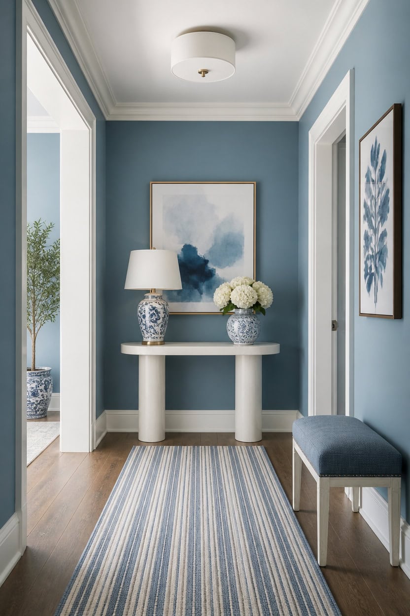
Mid-tone blue Blue Dusk reads richest in an eggshell finish on the main walls, hiding minor dents while keeping the color true. Very light white First Light on the trim needs a satin or semi-gloss sheen to resist scuffs near doorframes. A white oval console table with a drawer sits against the solid wall, echoing the crisp line where wall meets trim.
Match sheen to traffic: Use eggshell on hallway walls since flat paint shows scuffs quickly.
Reserve semi-gloss for trim: Trim gets bumped often, so a glossier finish wipes clean easily.
Test swatches under hallway light: Sheen changes how blue and white read in narrow spaces.
Keep finish consistent room to room: Matching sheen levels between connecting spaces avoids visual patchiness.
an eggshell finish lets the mid-tone blue stay saturated without highlighting wall texture. [mid-tone]
a satin or semi-gloss sheen on the very light white keeps edges durable near daily foot traffic. [very light]
 ONBRILL 55 Inch Console Table with 2 Drawers, Entryway Tables with Storage
View Price
ONBRILL 55 Inch Console Table with 2 Drawers, Entryway Tables with Storage
View Price
 JONATHAN Y Penelope Ginger Jar 22" LED Table Lamp, Blue/White
View Price
JONATHAN Y Penelope Ginger Jar 22" LED Table Lamp, Blue/White
View Price
 Winnker White Round Mirror 30 inch, Circle Mirror, Matte White Metal Frame
View Price
Winnker White Round Mirror 30 inch, Circle Mirror, Matte White Metal Frame
View Price
 DLLT Flush Mount LED Ceiling Light: 13 Inch 5CCT (3000K-6000K) & Dimmable Ceiling Light Fixtures for Bedroom Hallway - 24W Modern Brushed Nickel Super Bright Kitchen Lighting Fixtures Ceiling
View Price
DLLT Flush Mount LED Ceiling Light: 13 Inch 5CCT (3000K-6000K) & Dimmable Ceiling Light Fixtures for Bedroom Hallway - 24W Modern Brushed Nickel Super Bright Kitchen Lighting Fixtures Ceiling
View Price
 Madison Park Accent Bench for Living Room, Upholstered with Nailhead Trim, & Padded Seat Entryway Bench Small, End of Bed Bench with Back, 49.5" W x 19.25" D x 23" H, Taupe Multi
View Price
Madison Park Accent Bench for Living Room, Upholstered with Nailhead Trim, & Padded Seat Entryway Bench Small, End of Bed Bench with Back, 49.5" W x 19.25" D x 23" H, Taupe Multi
View Price
Working With Light in a Blue and White Hallway
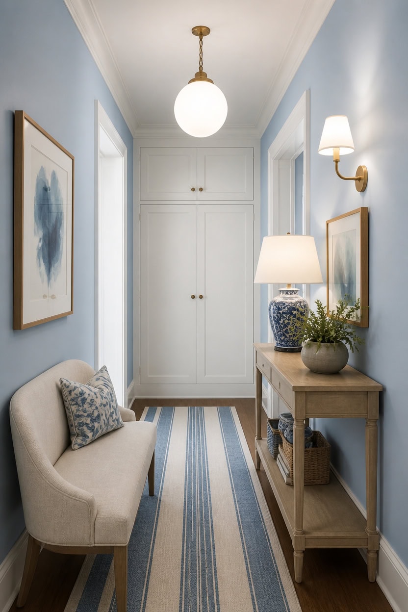
Layering a flush mount, wall sconces, and a table lamp keeps a narrow hallway lit at every level. Light blue Franklin Lakes on the main walls reflects daylight softly, while very light white Candle White on the trim keeps edges crisp under artificial light. A wall-mounted sconce beside the console adds warm, directional light that highlights the blue-and-white palette after dark.
Layer light sources: Combine a flush mount, wall sconces, and a lamp for even coverage.
Bounce light with trim: Very light trim reflects daylight deeper into the hall.
Use a dimmer: Adjust sconces from bright morning light to a soft evening glow.
Angle the mirror: Position a mirror across from a light source to double brightness.
a light blue keeps the hallway feeling bright without losing color depth. [light]
a very light white reflects both daylight and artificial light along the hallway. [very light]
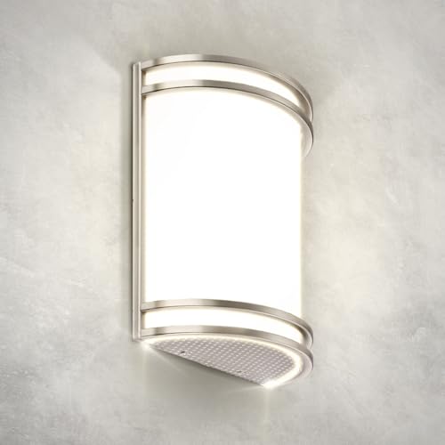 ASD Indoor LED Wall Sconce Lights, Brushed Nickel 3000/4000/5000K ETL
View Price
ASD Indoor LED Wall Sconce Lights, Brushed Nickel 3000/4000/5000K ETL
View Price
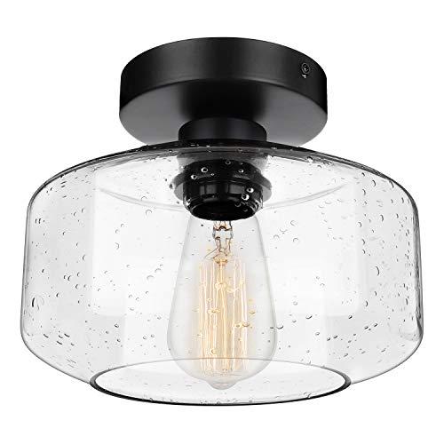 SunRider Industrial Semi-Flush Mount Ceiling Light Seeded Glass Shade Black
View Price
SunRider Industrial Semi-Flush Mount Ceiling Light Seeded Glass Shade Black
View Price
 Bailey Boucle-Style Curved Storage Accent Bench
View Price
Bailey Boucle-Style Curved Storage Accent Bench
View Price
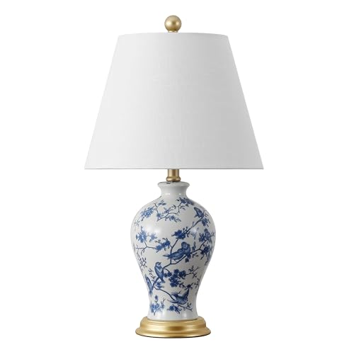 JONATHAN Y Grace 24" French Country Floral Urn Ceramic Lamp, Blue/White
View Price
JONATHAN Y Grace 24" French Country Floral Urn Ceramic Lamp, Blue/White
View Price
 Large Framed Blue White Abstract Wall Art for Living Room, 3 Piece 24x36 In
View Price
Large Framed Blue White Abstract Wall Art for Living Room, 3 Piece 24x36 In
View Price
Removable Wallpaper for This Palette
Removable designer wallpaper from Wallshoppe, picked to match this palette. An easy way to add pattern to any room, and every design is available as a sample.
- Designed and printed in the USA
- Non-toxic inks
- Featured in NYT Wirecutter
 Townhouse Wallpaper by Sarah Jessica Parker – Peacock
View Price
Townhouse Wallpaper by Sarah Jessica Parker – Peacock
View Price
 Monroe Street Wallpaper by Chris Benz – Blue
View Price
Monroe Street Wallpaper by Chris Benz – Blue
View Price
 Small Dumbo Wallpaper by Chris Benz – Navy
View Price
Small Dumbo Wallpaper by Chris Benz – Navy
View Price
 The Queens Lace' Wallpaper by Sarah Jessica Parker – Misty Blue
View Price
The Queens Lace' Wallpaper by Sarah Jessica Parker – Misty Blue
View Price
 El Quijote Wallpaper by Chris Benz – Multi / Blue / Green
View Price
El Quijote Wallpaper by Chris Benz – Multi / Blue / Green
View Price
 Sweet Caroline Wallpaper by Wallshoppe – Blue
View Price
Sweet Caroline Wallpaper by Wallshoppe – Blue
View Price
 Townhouse Wallpaper by Sarah Jessica Parker – Morning Dew on Misty Blue
View Price
Townhouse Wallpaper by Sarah Jessica Parker – Morning Dew on Misty Blue
View Price
 El Quijote Wallpaper by Chris Benz – Multi / Blue / Coral
View Price
El Quijote Wallpaper by Chris Benz – Multi / Blue / Coral
View Price
 Small Dumbo Wallpaper by Chris Benz – Deep Sea
View Price
Small Dumbo Wallpaper by Chris Benz – Deep Sea
View Price
 Best Fronds Wallpaper by Wallshoppe – Gray
View Price
Best Fronds Wallpaper by Wallshoppe – Gray
View Price
 Pebble Wallpaper by Sugar Paper – French Blue On White
View Price
Pebble Wallpaper by Sugar Paper – French Blue On White
View Price
 Large Dumbo Wallpaper by Chris Benz – Deep Sea
View Price
Large Dumbo Wallpaper by Chris Benz – Deep Sea
View Price
 Eleanor Rigby Wallpaper by Wallshoppe – Indigo
View Price
Eleanor Rigby Wallpaper by Wallshoppe – Indigo
View Price
 Pratt Paint Wallpaper by Chris Benz – Rainbow
View Price
Pratt Paint Wallpaper by Chris Benz – Rainbow
View Price
 Large Dumbo Wallpaper by Chris Benz – Navy
View Price
Large Dumbo Wallpaper by Chris Benz – Navy
View Price
 Tangier Medallion Wallpaper by Wallshoppe – Blue
View Price
Tangier Medallion Wallpaper by Wallshoppe – Blue
View Price
 Bloc Wallpaper by Wallshoppe – Elephant
View Price
Bloc Wallpaper by Wallshoppe – Elephant
View Price
 Grosgrain Stripe Wallpaper by Sarah Jessica Parker – Morning Dew Cream
View Price
Grosgrain Stripe Wallpaper by Sarah Jessica Parker – Morning Dew Cream
View Price
 Best Fronds Wallpaper by Wallshoppe – Sky
View Price
Best Fronds Wallpaper by Wallshoppe – Sky
View Price
 Crosstown Plaid On White Wallpaper by Sarah Jessica Parker – Silver Pearl
View Price
Crosstown Plaid On White Wallpaper by Sarah Jessica Parker – Silver Pearl
View Price
 Best Fronds Wallpaper by Wallshoppe – Caribbean
View Price
Best Fronds Wallpaper by Wallshoppe – Caribbean
View Price
 Lemons Wallpaper by Nathan Turner – Blue
View Price
Lemons Wallpaper by Nathan Turner – Blue
View Price
 Pinstripe Wallpaper by Sugar Paper – Navy
View Price
Pinstripe Wallpaper by Sugar Paper – Navy
View Price
 Cabana Stripe Wallpaper by Sugar Paper – French Blue
View Price
Cabana Stripe Wallpaper by Sugar Paper – French Blue
View Price
 Veronica Wallpaper by Wallshoppe – Blue
View Price
Veronica Wallpaper by Wallshoppe – Blue
View Price
 Malibu Wallpaper by Nathan Turner – Blue On White
View Price
Malibu Wallpaper by Nathan Turner – Blue On White
View Price
 Best Fronds Wallpaper by Wallshoppe – Cadet Blue
View Price
Best Fronds Wallpaper by Wallshoppe – Cadet Blue
View Price
 Block Print Wallpaper by Sugar Paper – French Blue On White
View Price
Block Print Wallpaper by Sugar Paper – French Blue On White
View Price
 Dainty Dot Wallpaper by Sugar Paper – French Blue On White
View Price
Dainty Dot Wallpaper by Sugar Paper – French Blue On White
View Price
 Pebble Wallpaper by Sugar Paper – Navy On White
View Price
Pebble Wallpaper by Sugar Paper – Navy On White
View Price
 El Quijote Wallpaper by Chris Benz – Navy
View Price
El Quijote Wallpaper by Chris Benz – Navy
View Price
 Deux Bois Wallpaper by Nathan Turner – Blue
View Price
Deux Bois Wallpaper by Nathan Turner – Blue
View Price
 Hillhouse Block Print Small Wallpaper by Nathan Turner – Blue Green
View Price
Hillhouse Block Print Small Wallpaper by Nathan Turner – Blue Green
View Price
 El Quijote Wallpaper by Chris Benz – Sky
View Price
El Quijote Wallpaper by Chris Benz – Sky
View Price
 Chenille Stripe Wallpaper by Chris Benz – Red White + Blue
View Price
Chenille Stripe Wallpaper by Chris Benz – Red White + Blue
View Price
 Teensy Floral Wallpaper by Sugar Paper – French Blue On White
View Price
Teensy Floral Wallpaper by Sugar Paper – French Blue On White
View Price
 Lily Pad Lake Wallpaper by Carly Beck – Peacock
View Price
Lily Pad Lake Wallpaper by Carly Beck – Peacock
View Price
 Topo Tile Wallpaper by Carly Beck
View Price
Topo Tile Wallpaper by Carly Beck
View Price
 Palm Shuffle Wallpaper by Wallshoppe – Green / Caribbean
View Price
Palm Shuffle Wallpaper by Wallshoppe – Green / Caribbean
View Price
 Pacifico Palm Wallpaper by Nathan Turner – Ivory
View Price
Pacifico Palm Wallpaper by Nathan Turner – Ivory
View Price
Flooring Choices That Complement Blue and White
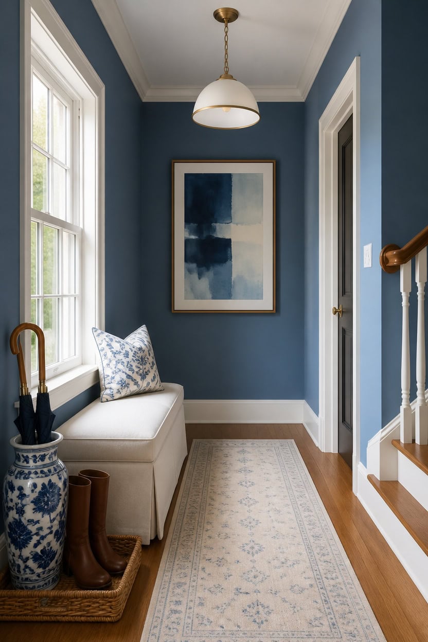
Mid-tone blue Stained Glass on the main walls stays balanced against warm wood-tone flooring, avoiding visual competition. Very light white Etiquette on the trim sharpens the line where wall meets floor in a narrow hallway. A woven boot tray near the entry catches wet shoes while echoing the same blue-and-white palette.
Warm wood tones: Choose oak or walnut flooring to balance cool blue walls with natural warmth.
Light-value rugs: A runner in ivory or soft blue keeps the floor from feeling heavy in a narrow space.
Consistent sheen: Match satin or matte floor finishes to the room’s soft, muted color palette.
Contrast at the baseboard: Let very light trim separate the floor color from the wall for a clean line.
a mid-tone blue that pairs well with warm wood flooring without overwhelming the space. [mid-tone]
a very light white that sharpens the line between wall and floor. [very light]
 SUPENUIN Boot-Tray Heavy Duty Rubber Mat with Lip Waterproof Shoe Mat Tray for Entryway Indoor Outdoor Multi Use Catch All Trays Entryway Shoe Storage 16x27.5 Inches
View Price
SUPENUIN Boot-Tray Heavy Duty Rubber Mat with Lip Waterproof Shoe Mat Tray for Entryway Indoor Outdoor Multi Use Catch All Trays Entryway Shoe Storage 16x27.5 Inches
View Price
 Restydon 2x8 Runner Rug Non Slip,Washable Hallway Runner Rug,Beige
View Price
Restydon 2x8 Runner Rug Non Slip,Washable Hallway Runner Rug,Beige
View Price
 Comfy to go Entryway Bench - Beige Bench for Bedroom, Modern Ottoman End of Bed, Corduroy Padded Benches for Living Room, Foyer, Mudroom, Hallway - 39" L x 14" W x 17" H
View Price
Comfy to go Entryway Bench - Beige Bench for Bedroom, Modern Ottoman End of Bed, Corduroy Padded Benches for Living Room, Foyer, Mudroom, Hallway - 39" L x 14" W x 17" H
View Price
 Karjearl Black Pendant Lights Kitchen Island, 11.8" Modern Dome Pendant Light Fixtures Farmhouse Hanging Lights for Dining Room Hallway Sink Entryway
View Price
Karjearl Black Pendant Lights Kitchen Island, 11.8" Modern Dome Pendant Light Fixtures Farmhouse Hanging Lights for Dining Room Hallway Sink Entryway
View Price
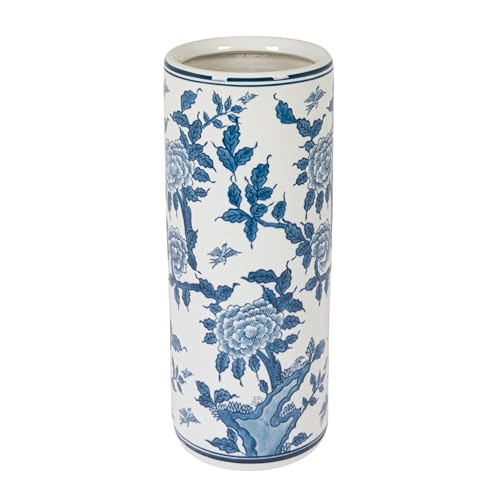 Creative Co-Op Blue and White Ceramic Umbrella Stand
View Price
Creative Co-Op Blue and White Ceramic Umbrella Stand
View Price
Should Your Hallway Ceiling Match or Contrast?
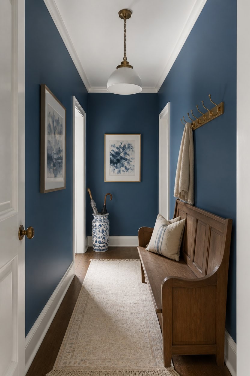
Extending mid-tone blue Azurite up to the ceiling line, instead of stopping partway up the wall, removes the visual stop point that makes a low hallway feel capped. Very light white Seapearl on the trim and ceiling edge holds a crisp, deliberate break so the color shift reads as a choice. A wall-mounted brass coat hook rack sits below this line, drawing the eye downward instead of up toward the ceiling.
Carry color upward: Run the wall color to the ceiling line instead of stopping at a standard cut-in height.
Keep one break point: Let trim, not the ceiling paint, mark the only color change in the space.
Match sheen to purpose: Use a flatter finish overhead so light bounces evenly instead of highlighting flaws.
Skip busy ceiling colors: A painted ceiling in a second hue competes with wall color in a narrow hallway.
carrying this mid-tone blue up to the ceiling line removes the usual stopping point in a low hallway. [mid-tone]
the very light white keeps a clean, deliberate break where wall meets ceiling. [very light]
 QULYEA Coat Rack Wall Mount,Vintage Wall Hooks Coat Hooks Antique Towel Racks for Bathroom Entryway Wall Mounted CoatRack Clothes Heavy Duty
View Price
QULYEA Coat Rack Wall Mount,Vintage Wall Hooks Coat Hooks Antique Towel Racks for Bathroom Entryway Wall Mounted CoatRack Clothes Heavy Duty
View Price
 LITTLE TREE Solid Wood Bench with Back, 47-Inch Long Farmhouse Wooden Indoor Window Bench Seat for Entryway, Mudroom, Living Room, Easy Assembly, Rustic Brown
View Price
LITTLE TREE Solid Wood Bench with Back, 47-Inch Long Farmhouse Wooden Indoor Window Bench Seat for Entryway, Mudroom, Living Room, Easy Assembly, Rustic Brown
View Price
 Red Lantern 24" Floral Blue & White Porcelain Umbrella Stand
View Price
Red Lantern 24" Floral Blue & White Porcelain Umbrella Stand
View Price
 Mordchil HF Bamboo Narrow Console Table, 39.4"(L) Wood Small Entryway Table, Accent Slim Hallway Tables, Thin Sofa Side Tables for Hallway, Living Room, Bedroom, Foyer, Walnut
View Price
Mordchil HF Bamboo Narrow Console Table, 39.4"(L) Wood Small Entryway Table, Accent Slim Hallway Tables, Thin Sofa Side Tables for Hallway, Living Room, Bedroom, Foyer, Walnut
View Price
 NIORSUN Battery Operated Wall Sconce Set of 2,Gold Rechargeable Wall Lights with 10400mAh Dimmable Bulbs and Remote,10 Colors Wireless Wall Lamps for Bedroom Living Room Hallway Decor
View Price
NIORSUN Battery Operated Wall Sconce Set of 2,Gold Rechargeable Wall Lights with 10400mAh Dimmable Bulbs and Remote,10 Colors Wireless Wall Lamps for Bedroom Living Room Hallway Decor
View Price
Our Favorite Faux Trees
- Free shipping over $35
- Picked at 4.4 stars or higher
 Altman Faux Olive Tree with White Planter
View Price
Altman Faux Olive Tree with White Planter
View Price
 Alvina 96" Artificial Olive Tree with White Planter
View Price
Alvina 96" Artificial Olive Tree with White Planter
View Price
 6 ft Faux Olive Tree with Fruit and Realistic Leaves
View Price
6 ft Faux Olive Tree with Fruit and Realistic Leaves
View Price
 Adarna 60" Artificial Fiddle Leaf Fig Tree
View Price
Adarna 60" Artificial Fiddle Leaf Fig Tree
View Price
 Adcock 8 ft Artificial Ficus Tree in White Planter
View Price
Adcock 8 ft Artificial Ficus Tree in White Planter
View Price
 Adcock Faux Ficus Tree in White Planter
View Price
Adcock Faux Ficus Tree in White Planter
View Price
 Adcock Artificial Dracaena Tree in Pot
View Price
Adcock Artificial Dracaena Tree in Pot
View Price
 Artificial Bamboo Tree in Pot
View Price
Artificial Bamboo Tree in Pot
View Price
 Adcock 6.5 ft Artificial Bamboo Tree in Cream Planter
View Price
Adcock 6.5 ft Artificial Bamboo Tree in Cream Planter
View Price
 Adcock Artificial Majesty Palm Tree in Pot
View Price
Adcock Artificial Majesty Palm Tree in Pot
View Price
 6.5 ft Artificial Bird of Paradise Tree in Black Cement Pot
View Price
6.5 ft Artificial Bird of Paradise Tree in Black Cement Pot
View Price
 6 ft Artificial Traveler's Palm in White Planter
View Price
6 ft Artificial Traveler's Palm in White Planter
View Price
Trim and Molding Worth Keeping
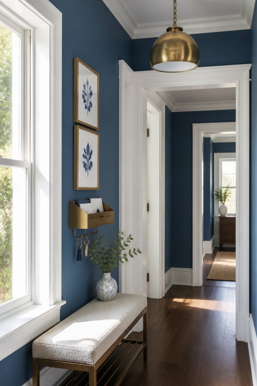
Mid-tone blue Azurite covers the main walls, while very light white Seapearl highlights the trim and molding for a crisp edge. This lighter trim keeps decorative casing and baseboards visible instead of disappearing into the wall color. A wall-mounted brass mail and key drop tray sits below the molding line, keeping daily clutter off the fresh paint.
Keep original profiles: Preserve deep-set casing and baseboards instead of replacing them with flat stock.
Paint trim one step lighter: A lighter white keeps decorative edges visible against the wall color.
Fill only true damage: Patch cracks or gaps, not the molding’s natural texture and shadow lines.
Match sheen to durability: Use a semi-gloss on trim so it wipes clean without dulling the profile.
the mid-tone blue lets original trim profiles read clearly against it. [mid-tone]
the very light white keeps decorative casing details crisp and visible. [very light]
 GTK Key Holder for Wall, Key Hooks with Tray and 6 Hooks, Wall Mounted Key Holder for Hallway, Key Rack with Shelf for Mail Storage (Gold)
View Price
GTK Key Holder for Wall, Key Hooks with Tray and 6 Hooks, Wall Mounted Key Holder for Hallway, Key Rack with Shelf for Mail Storage (Gold)
View Price
 Set of 3 Blue Floral Framed Wall Art Botanical Prints Flowers Wall Decor
View Price
Set of 3 Blue Floral Framed Wall Art Botanical Prints Flowers Wall Decor
View Price
 Vercraft 24" Scalloped Wood Wall Mirror, Boho Wall Decor, White
View Price
Vercraft 24" Scalloped Wood Wall Mirror, Boho Wall Decor, White
View Price
 PrinceDeco Velvet Spandex Bench Covers for Dining Room (Large, Ivory)
View Price
PrinceDeco Velvet Spandex Bench Covers for Dining Room (Large, Ivory)
View Price
 Maxcheck 24 Pcs Small Blue and White Porcelain Vase Mini Chinoiserie Bud
View Price
Maxcheck 24 Pcs Small Blue and White Porcelain Vase Mini Chinoiserie Bud
View Price
 Yosoan Set of 2 Brass Linen Fabric Shade Antique Industrial Wall Sconce
View Price
Yosoan Set of 2 Brass Linen Fabric Shade Antique Industrial Wall Sconce
View Price
 Art3d Beadboard Wainscoting Wall Panel Kit, 37.8 x 9.84 Inch, Matte White
View Price
Art3d Beadboard Wainscoting Wall Panel Kit, 37.8 x 9.84 Inch, Matte White
View Price
Doors and Hardware in a Minimalist Blue and White Hallway
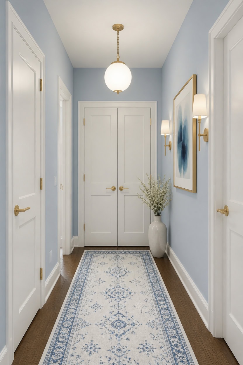
Brass lever hardware reads best against wall color with depth, not flat matching trim. Light blue Franklin Lakes on the main walls gives brass finishes a warm backdrop, while very light white Candle White on the doors keeps each opening bright. Use one brass lever set on every door so the hardware reads as a single detail, not scattered shine.
Match finish, not color: Keep all door hardware in one brass finish for a cohesive look.
Contrast the panel: Paint doors a shade lighter than the walls so hardware stands out.
Simplify hinges: Swap mismatched hinges for a matching set instead of mixing metals.
Center every lever: Install handles at the same height on each door for a tailored look.
the light blue keeps the hallway feeling airy while giving brass hardware a warm surface to catch light. [light]
the very light white keeps each door bright and helps the brass lever hardware stand out clearly. [very light]
 Kwikset San Clemente Front Door Lock Handle and Deadbolt Set, Entry Door Handleset Exterior with Interior Reversible Lever, Satin Brass, Pick Resistant SmartKey Rekey Deadbolt Security
View Price
Kwikset San Clemente Front Door Lock Handle and Deadbolt Set, Entry Door Handleset Exterior with Interior Reversible Lever, Satin Brass, Pick Resistant SmartKey Rekey Deadbolt Security
View Price
 TDCHINGES Rounded Door Hinges 3.5" X 3 1/2 Inch Brushed Brass 5/8" Radius
View Price
TDCHINGES Rounded Door Hinges 3.5" X 3 1/2 Inch Brushed Brass 5/8" Radius
View Price
 SILOLOOM Washable Vintage 2x6 Runner Rug Non Slip Runners for Hallway
View Price
SILOLOOM Washable Vintage 2x6 Runner Rug Non Slip Runners for Hallway
View Price
 4 Pack Door Stoppers for Bottom of Door, White 4.8x2.2x1.3in Door Stops, Rubber Door Stopper Wedge, Sturdy Stackable Door Stops for Floor
View Price
4 Pack Door Stoppers for Bottom of Door, White 4.8x2.2x1.3in Door Stops, Rubber Door Stopper Wedge, Sturdy Stackable Door Stops for Floor
View Price
 Framed Abstract Canvas Wall Art Set of 2 Blue Wall Decor Prints 12x16
View Price
Framed Abstract Canvas Wall Art Set of 2 Blue Wall Decor Prints 12x16
View Price
 Kings Brand Narrow Console Table with Storage Shelf for Entryway, White
View Price
Kings Brand Narrow Console Table with Storage Shelf for Entryway, White
View Price
Adding Texture Without Adding More Objects
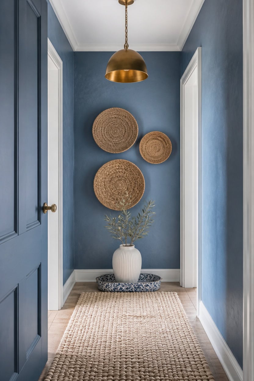
Texture comes from surface finish, not from adding more furniture to a narrow hallway. Mid-tone blue Azurite on the main walls introduces a subtle grain when applied with a matte finish, while very light white Seapearl on the trim keeps edges sharp and bright. A woven jute wall basket set brings tactile depth without crowding the floor plan.
Layer natural fibers: Add a jute runner or woven basket for tactile contrast without clutter.
Mix matte and satin finishes: Pair a matte wall with satin trim so light catches the surface differently.
Introduce wood grain: A single wood shelf or bench brings warmth without extra decor.
Vary textile weave: Swap a smooth runner for a nubby wool or sisal weave underfoot.
the mid-tone blue holds a soft grain that reads as texture under hallway light. [mid-tone]
the very light white sharpens the edges so the wall’s texture stands out clearly. [very light]
 CHI AN HOME Wicker 23 Inch Jute Wall Decor Baskets, Set of 6 Extra Large Woven Jute Wall Plates, 23",21",15",13",12,10", Decorative Baskets for Wall Arts, Wall Hanging for Bedroom, Living Room, Office
View Price
CHI AN HOME Wicker 23 Inch Jute Wall Decor Baskets, Set of 6 Extra Large Woven Jute Wall Plates, 23",21",15",13",12,10", Decorative Baskets for Wall Arts, Wall Hanging for Bedroom, Living Room, Office
View Price
 SAFAVIEH Abstract Collection Runner Rug - 2'3" x 10', Blue & Grey, Handmade Wool, Ideal for High Traffic Areas in Living Room, Bedroom (ABT201A)
View Price
SAFAVIEH Abstract Collection Runner Rug - 2'3" x 10', Blue & Grey, Handmade Wool, Ideal for High Traffic Areas in Living Room, Bedroom (ABT201A)
View Price
 Ceramic Vase for Flowers – Modern Small Ribbed Textured Flower Vase for Home Decor, Pampas Grass, Decorative, Farmhouse, Coffee Table, Kitchen Centerpieces, Bookshelf and Home Living (White)
View Price
Ceramic Vase for Flowers – Modern Small Ribbed Textured Flower Vase for Home Decor, Pampas Grass, Decorative, Farmhouse, Coffee Table, Kitchen Centerpieces, Bookshelf and Home Living (White)
View Price
 ZeeMart Linen Checked Farmhouse Table Runner, 13x72 Inches Neutral Beige
View Price
ZeeMart Linen Checked Farmhouse Table Runner, 13x72 Inches Neutral Beige
View Price
 VSUINGO 9.2" Porcelain Small Bathroom Narrow Tray - Blue
View Price
VSUINGO 9.2" Porcelain Small Bathroom Narrow Tray - Blue
View Price
 ELYONA 2 Pack Hammered Pendant Lights 12” Vintage Metal & Wood Dome Hanging Lamp Antique Gold Industrial Kitchen Pendant Light Fixtures for Island, Farmhouse, Dining Room, Sink, Hallway, Brushed Brass
View Price
ELYONA 2 Pack Hammered Pendant Lights 12” Vintage Metal & Wood Dome Hanging Lamp Antique Gold Industrial Kitchen Pendant Light Fixtures for Island, Farmhouse, Dining Room, Sink, Hallway, Brushed Brass
View Price
 Ferrochef Large Rattan Wall Shelf for Boho Nursery Decor,Natural Brown
View Price
Ferrochef Large Rattan Wall Shelf for Boho Nursery Decor,Natural Brown
View Price
What to Leave Out of a Blue and White Hallway
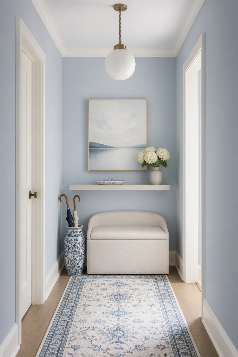
Narrow hallways lose function when too many pieces compete for floor space. Light blue Franklin Lakes on the main walls and very light white Candle White on the trim already add depth, so a slim storage bench should be the only floor piece. Skip anything wide enough to force foot traffic around it.
Oversized art: Skip large framed pieces that crowd the narrow wall plane.
Bulky furniture: Swap a full console table for a slim wall-mounted shelf instead.
Too many patterns: Limit prints to one textile so the blue and white palette stays calm.
Floor clutter: Keep the runner rug the only floor layer to preserve walking space.
the light blue keeps the narrow hallway feeling open and uncluttered. [light]
the very light white sharpens the edges without adding visual weight. [very light]
 Bailey Boucle-Style Curved Storage Accent Bench
View Price
Bailey Boucle-Style Curved Storage Accent Bench
View Price
 Sawysine Blue White Ceramic Umbrella Stand with Lotus in Vine Design
View Price
Sawysine Blue White Ceramic Umbrella Stand with Lotus in Vine Design
View Price
 CABDM 5 Pack Decorative Heavy Duty Towel Hooks for Hanging Robe Double Brushed Brass Coat Hooks Wall Mounted with Screws for Key, Towel, Bags, Cup, Hat
View Price
CABDM 5 Pack Decorative Heavy Duty Towel Hooks for Hanging Robe Double Brushed Brass Coat Hooks Wall Mounted with Screws for Key, Towel, Bags, Cup, Hat
View Price
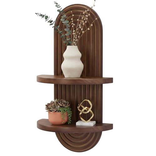 SweetSage Mordern Wall Shelf with Arched Mid Century Art Boho Decor Design Floating Shelves for Home Bedroom Living Room Farmhouse Display Wall Plant Holder Decoration, 22 x 11.8 Inch, Walnut
View Price
SweetSage Mordern Wall Shelf with Arched Mid Century Art Boho Decor Design Floating Shelves for Home Bedroom Living Room Farmhouse Display Wall Plant Holder Decoration, 22 x 11.8 Inch, Walnut
View Price
 Ophanie Blue Runner Rug for Hallway, 2x6 Bedroom Bedside Living Room Rugs, Non Slip Fluffy Soft Shaggy Carpet for Kids Girls Boys Dorm Nursery Home Decor Aesthetic
View Price
Ophanie Blue Runner Rug for Hallway, 2x6 Bedroom Bedside Living Room Rugs, Non Slip Fluffy Soft Shaggy Carpet for Kids Girls Boys Dorm Nursery Home Decor Aesthetic
View Price
 OUVR Black Globe Pendant Light, 1-Pack Modern Clear Glass Hanging Fixture
View Price
OUVR Black Globe Pendant Light, 1-Pack Modern Clear Glass Hanging Fixture
View Price
 ARPEOTCY Bamboo Framed Botanical Wall Art, 4 Pcs Blue Hydrangea, 11x14inch
View Price
ARPEOTCY Bamboo Framed Botanical Wall Art, 4 Pcs Blue Hydrangea, 11x14inch
View Price
 Uxcell 2-Pack Marble Ceramic Bathroom Vanity Tray, Blue, Rectangular, 2 Sizes (Small & Medium), Shatterproof & Heat-Resistant, Organizer for Soaps, Keys, Trinkets
View Price
Uxcell 2-Pack Marble Ceramic Bathroom Vanity Tray, Blue, Rectangular, 2 Sizes (Small & Medium), Shatterproof & Heat-Resistant, Organizer for Soaps, Keys, Trinkets
View Price
How to Avoid a Cold, Sterile Look
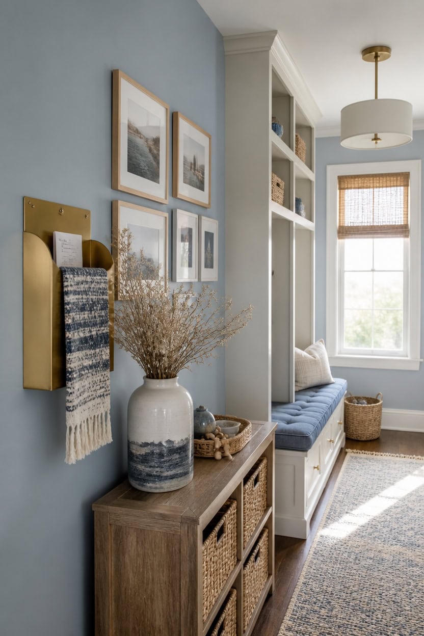
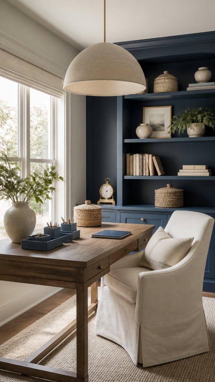
Light blue Chiswell Blue on the accent wall softens the hallway’s straight lines, while very light white Gray Lake on the built-in cubbies keeps storage feeling clean, not clinical. A woven runner and warm wood tones add texture paint alone can’t provide. A wall-mounted mail organizer in brushed brass gives the space a lived-in touch.
Too much white: Break up bright walls with a woven runner for warmth.
Bare walls: Hang a framed photo gallery to add personality.
Flat lighting: Swap sterile bulbs for a warm-toned pendant fixture.
No texture: Layer a linen wall hanging over painted surfaces.
the light blue adds warmth without overwhelming the narrow space. [light]
the very light white keeps the storage feeling airy, not sterile. [very light]
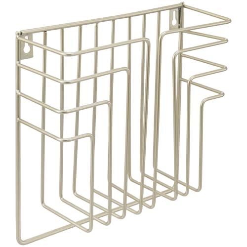 MyGift Modern Art Deco Style Brass Tone Metal Wire Floating Magazine Rack and File Folder Holder, Wall Mounted Home or Office Storage for Documents or Mail
View Price
MyGift Modern Art Deco Style Brass Tone Metal Wire Floating Magazine Rack and File Folder Holder, Wall Mounted Home or Office Storage for Documents or Mail
View Price
 Kate and Laurel Bordeaux Coastal Gallery Wall Kit, Set of 10 with Assorted Size Frames in 3 Different Finishes, White, Blue and Gray
View Price
Kate and Laurel Bordeaux Coastal Gallery Wall Kit, Set of 10 with Assorted Size Frames in 3 Different Finishes, White, Blue and Gray
View Price
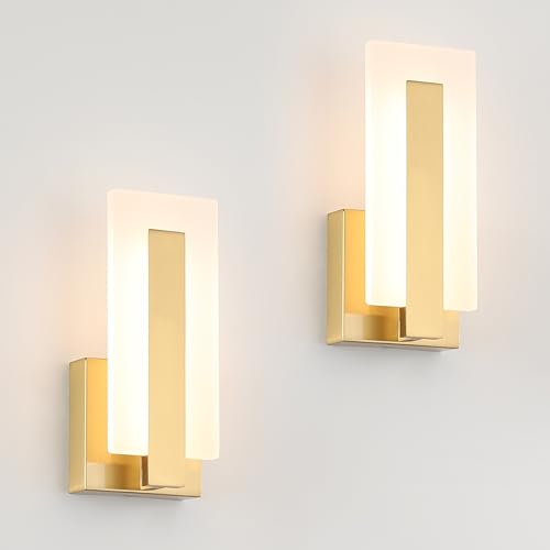 Joosenhouse Modern LED Wall Sconce Set of 2, Brass Warm White Light Wall Sconce 3000K, Hardwired Up and Down Wall Mount Light for Hallway, Bedroom, Study, Living Room Indoor Wall Light
View Price
Joosenhouse Modern LED Wall Sconce Set of 2, Brass Warm White Light Wall Sconce 3000K, Hardwired Up and Down Wall Mount Light for Hallway, Bedroom, Study, Living Room Indoor Wall Light
View Price
 OHDCE Blue Ocean Wave Tapestry 50x60 Inch, Abstract Watercolor Coastal Tapestry Wall Hanging, Nautical Sea Wave Ocean Wall Decor for Beach House Bedroom Living Room
View Price
OHDCE Blue Ocean Wave Tapestry 50x60 Inch, Abstract Watercolor Coastal Tapestry Wall Hanging, Nautical Sea Wave Ocean Wall Decor for Beach House Bedroom Living Room
View Price
 Optish Coat Rack Wall Mount, 16.5 Inches Wood Coat Hooks, Wall Hooks for Hanging, Hat Rack Bag Hanger Key Holder for Wall, Purse Hanger Towel Racks for Bathroom (1Pack, Brown)
View Price
Optish Coat Rack Wall Mount, 16.5 Inches Wood Coat Hooks, Wall Hooks for Hanging, Hat Rack Bag Hanger Key Holder for Wall, Purse Hanger Towel Racks for Bathroom (1Pack, Brown)
View Price
 SincereLuxe Blue and White Ceramic Vase 8”, Vintage Decorative Pottery Floral Vase for Hydrangeas, Crackle Glaze Chinoiserie Vase for French Country Rustic Farmhouse Coffee Table & Mantel Decor
View Price
SincereLuxe Blue and White Ceramic Vase 8”, Vintage Decorative Pottery Floral Vase for Hydrangeas, Crackle Glaze Chinoiserie Vase for French Country Rustic Farmhouse Coffee Table & Mantel Decor
View Price
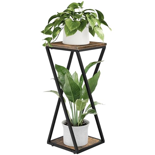 Bamworld Tall Plant Stand Indoor Corner, Brown
View Price
Bamworld Tall Plant Stand Indoor Corner, Brown
View Price
Other Rooms Where Blue and White Works Just as Well
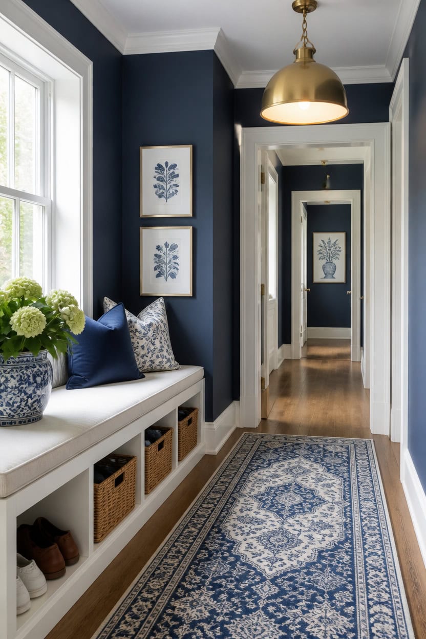
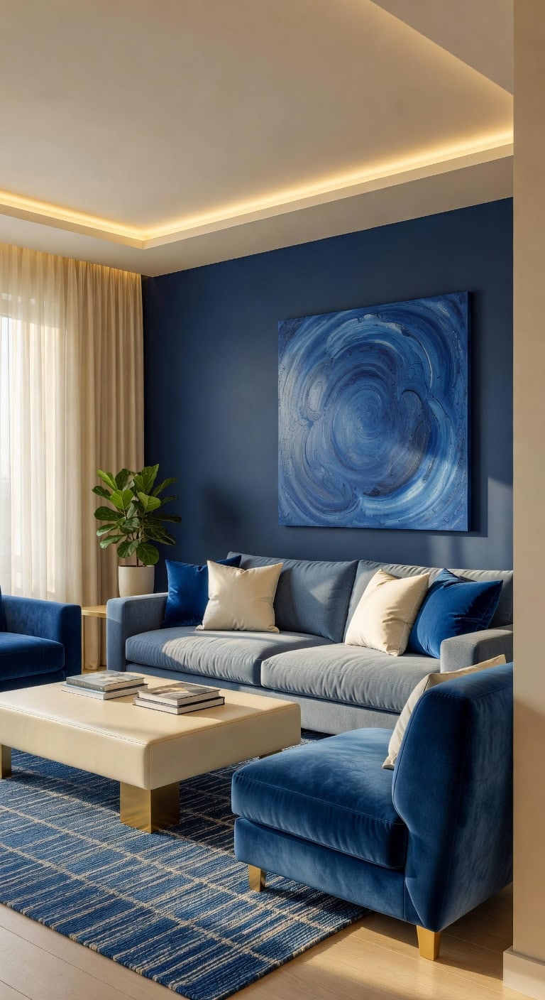
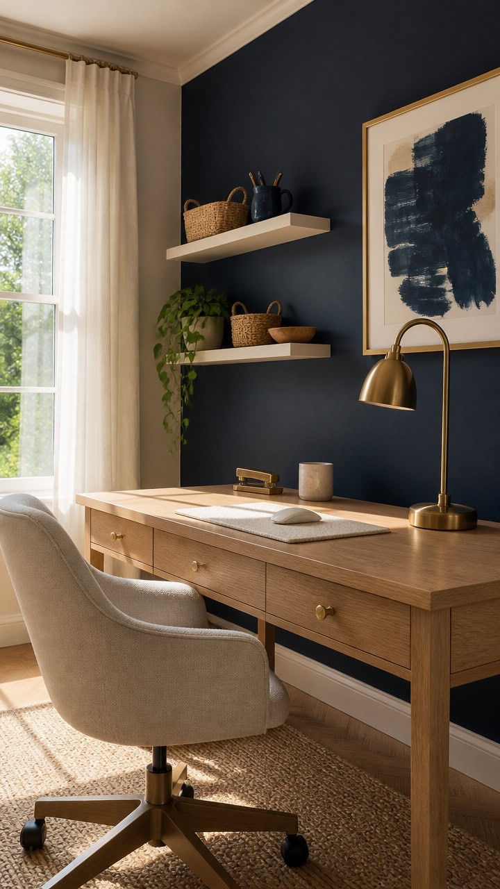
Deep blue Gentleman’s Gray on the main walls and very light white Summer Shower on the trim keep this pairing adaptable. The cool blue and bright white balance warm wood floors or cool tile in any room. A shoe storage bench with cubbies shows the same scheme handles daily foot traffic well.
Match undertones: Choose a warm or cool white that matches existing trim before adding blue elsewhere.
Scale the depth: Save deeper blues for low-traffic rooms and use lighter blues where natural light is limited.
Repeat one accent: Carry the same white trim color through the hallway, kitchen, and bath for flow.
Test in different light: Swatch both colors in morning and evening light before committing to a full room.
the deep blue grounds the space without closing it in. [dark]
the very light white keeps edges crisp against the deeper wall color. [very light]
 HOOBRO Shoe Storage Bench with Cushion, 39.4" L Entryway Bench with 12 Cubbies, Entryway Hall Tree with Storage, Shoe Cabinet with Coat Rack for Bedroom, Hallway, Holds up to 330 lb, BF112HX01G1
View Price
HOOBRO Shoe Storage Bench with Cushion, 39.4" L Entryway Bench with 12 Cubbies, Entryway Hall Tree with Storage, Shoe Cabinet with Coat Rack for Bedroom, Hallway, Holds up to 330 lb, BF112HX01G1
View Price
 Caiselee 17.7 Inch Large Dome Pendant Light, Brushed Gold Pendant Lighting
View Price
Caiselee 17.7 Inch Large Dome Pendant Light, Brushed Gold Pendant Lighting
View Price
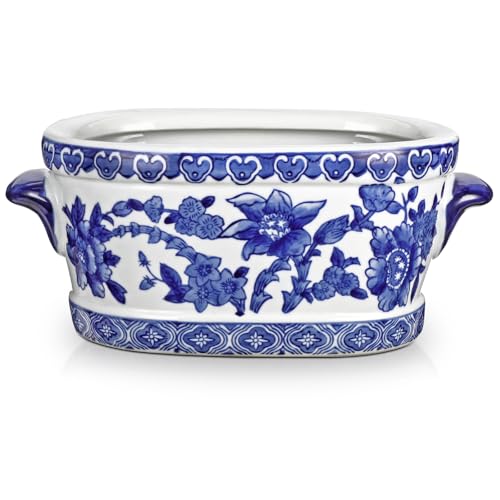 Arborus Blue and White Ceramic Planter Pot – Vintage Floral Oval Cachepot Vase for Indoor Plants, Flowers & Succulents – Glazed Chinese Porcelain Style Decorative Bowl – 7.4" Size – No Drainage
View Price
Arborus Blue and White Ceramic Planter Pot – Vintage Floral Oval Cachepot Vase for Indoor Plants, Flowers & Succulents – Glazed Chinese Porcelain Style Decorative Bowl – 7.4" Size – No Drainage
View Price
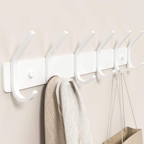 Coat Rack Wall Mount Hooks - 15 Inch White Metal 6-Hook Rack(1 Pack)
View Price
Coat Rack Wall Mount Hooks - 15 Inch White Metal 6-Hook Rack(1 Pack)
View Price
 Yilobi 5 Pack Woven Storage Baskets, Decorative Storage Bins for Organizing
View Price
Yilobi 5 Pack Woven Storage Baskets, Decorative Storage Bins for Organizing
View Price
 Red Lantern 24" Antique White Porcelain Umbrella Stand
View Price
Red Lantern 24" Antique White Porcelain Umbrella Stand
View Price