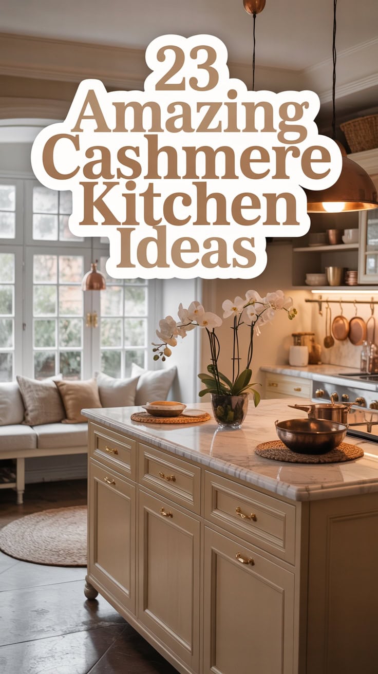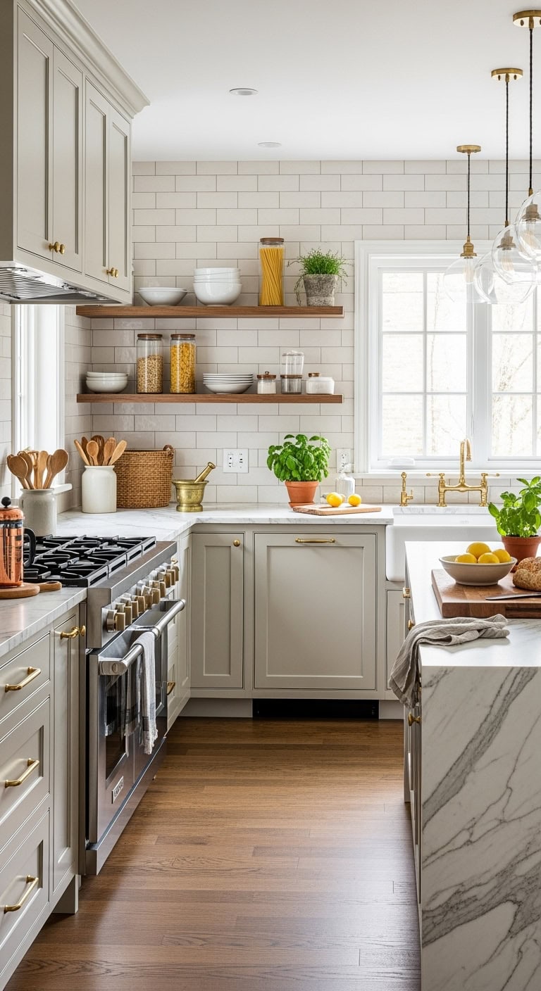
23 Amazing Cashmere Kitchen Ideas

Luxurious cashmere kitchens blend warmth with sophistication, but the unexpected design combinations that make them irresistible might surprise even seasoned decorators.

There’s a reason cashmere has become one of the most sought-after kitchen cabinet colors — it brings warmth and sophistication without feeling cold or clinical.

This versatile neutral works beautifully across styles, from modern to traditional, making it a designer favorite.

Whether you’re planning a full remodel or a simple refresh, these cashmere kitchen ideas will spark serious inspiration.

What Makes Cashmere the Perfect Kitchen Color?

warm beige cashmere kitchen

Cashmere reads as warm white in most kitchen lighting, but it carries a soft beige undertone that makes it far more forgiving than true white or stark cream. That undertone absorbs warm light from pendant fixtures and natural wood tones instead of bouncing them back as harsh glare. If your kitchen gets cool north-facing light, cashmere will still feel cozy rather than gray or washed out.

Here’s how to nail it:

  • Undertone pairing: Cashmere’s beige base works best alongside warm wood tones, matte black hardware, or soft brass accents.
  • Surface placement: Use cashmere on upper cabinets to keep the upper half of the kitchen light and airy without going stark white.
  • Contrast balance: Pair cashmere uppers with a slightly deeper lower cabinet tone to ground the space and add visual weight.
  • Lighting rule: Warm-white bulbs in the 2700K range bring out cashmere’s creaminess; cool daylight bulbs push it toward gray.

DIY Paint Transformation

  • Upper cabinets: Paint the upper cabinet frames and doors in “White Dove” OC-17 (Benjamin Moore) – this warm, barely-there white sits just light enough to keep cashmere tones bright without reading stark.
  • Lower cabinets or island: Paint the lower cabinet base in “Pale Oak” OC-20 (Benjamin Moore) – its warm greige undertone echoes cashmere’s biscuit depth for a tonal, layered finish.

Shop The Look

  1. Cashmere ceramic dinnerware set matte neutral dishwasher safe
  2. Warm white linen dish towel set kitchen embroidered
  3. Enameled cast iron Dutch oven cream kitchen cookware
  4. Brass pendant light set kitchen modern cluster
  5. Wooden cutting board large end grain kitchen countertop
  6. Cream and beige kitchen runner rug washable cotton
  7. Glass canister set airtight kitchen storage neutral label
  8. Botanical framed wall art print set neutral kitchen large

Warm vs. Cool Cashmere: Which Tone Suits Your Kitchen?

warm vs cool cashmere tones

Warm cashmere leans into yellow and beige undertones, while cool cashmere pulls slightly toward gray and greige. Your kitchen’s light source is the deciding factor — warm cashmere thrives under incandescent or south-facing light, while cool cashmere holds up better in north-facing kitchens where natural light is flat and blue-leaning. Choosing the wrong version for your light exposure can make the whole kitchen feel either muddy or washed out.

Here’s how to nail it:

  • Warm cashmere: Pairs naturally with honey wood tones, unlacquered brass, and terracotta accents for a soft, layered kitchen palette.
  • Cool cashmere: Works best with pale gray countertops, matte chrome, or white oak cabinetry where you want calm without going cold.
  • Test before committing: Paint two large swatches on opposite walls and check them at morning, midday, and evening light before choosing.
  • Undertone anchor: If your countertops have a pink or beige vein, warm cashmere will harmonize; gray or white veining calls for cool cashmere.

DIY Paint Transformation

  • Upper cabinets: Paint the upper cabinet doors and frames in “White Dove” OC-17 (Benjamin Moore) – its barely-there yellow warmth reinforces warm cashmere tones without overwhelming the space.
  • Lower cabinets or island: Paint the lower cabinet base in “Pale Oak” OC-20 (Benjamin Moore) – its soft greige undertone bridges warm and cool cashmere reads for a grounded, cohesive finish.

Shop The Look

  1. Cashmere ceramic dinner plate set matte neutral dishwasher safe
  2. Warm white linen kitchen apron adjustable neutral unisex
  3. Gooseneck electric kettle brushed stainless kitchen countertop
  4. Cream and greige kitchen runner rug washable cotton
  5. Warm wood serving board rectangular kitchen charcuterie
  6. Woven pendant light shade large rattan kitchen ceiling
  7. Framed neutral botanical print set kitchen wall art large
  8. Glass spice jar set airtight labeled kitchen storage

Cashmere Kitchen Cabinets That Never Go Out of Style

Bright white kitchen with elegant cabinetry, natural light, and decorative accents.

Cashmere cabinetry works because it sits in the exact middle of the color spectrum — not white, not gray, not beige, but a quiet blend of all three. That neutrality means it never fights with countertops, hardware, or backsplash tile the way a more committed color would. Choose a shaker or flat-front door profile and the finish does the heavy lifting across decades of shifting trends.

Here’s how to nail it:

  • Door profile matters: Shaker doors in cashmere read timeless; highly ornate raised-panel doors can make the color feel dated.
  • Hardware as the anchor: Unlacquered brass or matte black hardware gives cashmere cabinets a clear design point of view without needing a second accent color.
  • Full kitchen or partial: Cashmere works equally well on all cabinets or split with white uppers — both approaches hold up long-term.
  • Finish sheen: A satin or eggshell finish protects high-touch cabinet surfaces while keeping the tone soft and matte-adjacent.

DIY Paint Transformation

  • Upper cabinet doors and frames: Paint in “White Dove” OC-17 (Benjamin Moore) – its gentle warmth keeps upper cabinets from reading stark against cashmere lowers.
  • Lower cabinets or island base: Paint in “Pale Oak” OC-20 (Benjamin Moore) – its soft greige undertone mirrors cashmere’s middle-ground warmth for a grounded, cohesive cabinet finish.

Shop The Look

  1. Cashmere linen dish towel set neutral kitchen everyday
  2. Enameled cast iron Dutch oven cream kitchen cookware
  3. Warm wood utensil holder large kitchen countertop storage
  4. Cream ceramic mixing bowl set nested kitchen
  5. Woven rattan pendant light shade large kitchen ceiling
  6. Framed neutral botanical print set kitchen wall art large
  7. Greige cotton kitchen runner rug washable low pile
  8. Glass canister set airtight labeled kitchen countertop storage

The Best Countertop Colors to Pair With Cashmere

Bright kitchen with beige cabinets, open shelving, and marble countertops.

Warm whites, soft greiges, and pale quartzite tones sit closest to cashmere without competing for attention. Cashmere’s blended undertone — part warm, part cool — means countertops with too much yellow or too much blue will pull the cabinets in an unintended direction. Stick to stones and surfaces with low saturation and a mix of warm and cool veining to keep the whole kitchen balanced.

Here’s how to nail it:

  • White marble or quartzite: Calacatta or Taj Mahal quartzite bring soft warm veining that mirrors cashmere’s greige base without going too cream-heavy.
  • Pale greige quartz: Engineered quartz in a muted greige — think light putty or warm linen — locks the countertop in the same tonal family as the cabinets.
  • Avoid cool grays: Pure blue-gray countertops pull cashmere’s undertone toward lavender and create an unintended color shift under kitchen lighting.
  • Dark contrast option: Soft black or charcoal soapstone adds grounding contrast without the harshness of jet black, keeping the palette earthy and warm.

DIY Paint Transformation

  • Kitchen walls: Paint the walls in “White Dove” OC-17 (Benjamin Moore) – its creamy warmth keeps the wall from going stark white next to cashmere cabinets and pale countertops.
  • Kitchen ceiling: Paint the ceiling in “Pale Oak” OC-20 (Benjamin Moore) – its soft greige undertone connects the upper plane to the countertop palette and keeps the space feeling cohesive.

Shop The Look

  1. Cream ceramic dinner plate set stacked kitchen everyday
  2. Marble pastry board with handles kitchen counter
  3. Warm greige linen dish towel set neutral kitchen
  4. Gooseneck electric kettle matte black kitchen countertop
  5. Natural wood fruit bowl large kitchen counter display
  6. Framed abstract neutral art print set kitchen wall large
  7. Cream cotton kitchen runner rug washable low pile
  8. Glass jar set airtight bamboo lid kitchen pantry storage

Hardware Finishes That Look Stunning With Cashmere Cabinets

Bright kitchen with white cabinetry, gold hardware, and a large window letting in natural sunlight.

Brushed brass, unlacquered brass, and warm satin nickel are the three hardware finishes that feel most at home on cashmere cabinets. Cashmere’s greige base pulls warm, so gold-adjacent metals reinforce that warmth without making the kitchen feel overdone or trendy. Matte black works too, but only when the rest of the palette is warm enough to stop the contrast from feeling harsh.

Here’s how to nail it:

  • Brushed brass: Its muted gold tone mirrors cashmere’s warm undertone without the shine of polished brass competing with the cabinet color.
  • Satin nickel: A softer silver-adjacent option that reads warm rather than cool, making it the safest choice for mixed-metal kitchens.
  • Matte black: Adds contrast and grounding when cashmere is paired with light countertops, but avoid it if your tile or flooring already reads dark.
  • Skip chrome: Polished chrome pulls cashmere’s undertone toward lavender-gray, making the cabinets look cooler and less intentional under standard kitchen lighting.

DIY Paint Transformation

  • Kitchen walls: Paint the walls in “White Dove” OC-17 (Benjamin Moore) – its creamy warmth keeps the wall from competing with brushed brass hardware and lets cashmere cabinets sit center stage.
  • Kitchen ceiling: Paint the ceiling in “Pale Oak” OC-20 (Benjamin Moore) – its soft greige undertone echoes the cashmere tone above and keeps the space from feeling top-heavy.

Shop The Look

  1. Brushed brass cabinet pull set kitchen drawer modern
  2. Satin nickel bar pull hardware kitchen shaker style
  3. Warm white ceramic dinnerware set everyday kitchen
  4. Matte black toaster four-slice kitchen countertop compact
  5. Marble and brass serving board kitchen charcuterie
  6. Cream linen kitchen apron adjustable unisex neutral
  7. Warm greige cotton dish towel set woven kitchen
  8. Framed vintage kitchen botanical print set neutral large

The Best Tiles and Backsplashes to Pair With Cashmere

Bright kitchen with white cabinetry, open shelves, and natural sunlight streaming through the window.

Warm white zellige tiles, handmade ceramic subway tiles, and soft travertine slabs are the three backsplash categories that consistently work with cashmere cabinets. Cashmere’s warm greige base needs a backsplash with similar warmth or subtle texture to avoid a flat, mismatched look. Go creamy or stone-toned first, and only introduce pattern through tile shape rather than competing color.

Here’s how to nail it:

  • Zellige tile: Its irregular, handmade surface catches light in ways that make cashmere’s warm undertone shift and deepen throughout the day.
  • Travertine slab: The soft ivory and tan veining mirrors cashmere’s greige base so closely that the two read as one cohesive material story.
  • Handmade subway tile: An off-white or cream version adds familiar structure without the clinical coolness that bright white beveled tiles introduce.
  • Avoid cool gray tile: Blue-gray or cool slate backsplashes pull cashmere’s undertone lavender and make the entire kitchen feel unresolved.

DIY Paint Transformation

  • Kitchen walls: Paint the walls in “Pale Oak” OC-20 (Benjamin Moore) – its soft greige warmth ties the backsplash and cashmere cabinets together without the wall competing for attention.
  • Kitchen ceiling: Paint the ceiling in “White Dove” OC-17 (Benjamin Moore) – its creamy white lifts the ceiling while keeping the warm tonal palette consistent from floor to top.

Shop The Look

  1. Peel and stick zellige tile backsplash cream kitchen self-adhesive
  2. Travertine look peel and stick backsplash tile warm ivory kitchen
  3. Handmade ceramic subway tile white cream kitchen backsplash
  4. Warm white Dutch oven enameled cast iron kitchen
  5. Brass canister set kitchen counter tea coffee sugar
  6. Natural jute kitchen runner rug washable neutral
  7. Vintage tile-style framed kitchen wall art set neutral large
  8. Warm linen roman shade kitchen window cream neutral

Cashmere Kitchen Flooring Ideas That Actually Work

Bright kitchen with white cabinetry, open wooden shelves, and large window letting in natural sunlig.

White oak, warm-toned travertine, and wide-plank honey-toned wood floors are the three flooring categories that consistently anchor cashmere kitchens without competing with the cabinets. Cashmere’s greige warmth reads best when the floor below it shares the same brown-beige family rather than pulling cool or gray. Avoid dark espresso floors with cashmere — the high contrast eats up the cabinet color’s softness and makes the kitchen feel heavier than intended.

Here’s how to nail it:

  • White oak hardwood: Its warm, light grain echoes cashmere’s creamy undertone and makes the kitchen feel open without feeling cold.
  • Travertine tile: The natural ivory and tan variation in travertine sits so close to cashmere’s base that the two materials feel intentionally matched.
  • Honey-toned LVP: A warm, mid-tone luxury vinyl plank gives you the same brown-beige warmth as wood at a fraction of the cost and with better moisture resistance.
  • Skip cool gray tile: Slate or blue-toned ceramic floors pull cashmere’s undertone lavender and make the whole kitchen feel off.

DIY Paint Transformation

  • Kitchen walls: Paint the walls in “Pale Oak” OC-20 (Benjamin Moore) – its soft greige warmth bridges the cashmere cabinets and the warm floor without the wall drawing attention away from either.
  • Kitchen ceiling: Paint the ceiling in “White Dove” OC-17 (Benjamin Moore) – its creamy, warm white lifts the ceiling height visually while keeping the tonal palette consistent from floor to top.

Shop The Look

  1. Warm honey oak peel and stick floor tile wood grain vinyl kitchen
  2. Travertine look porcelain floor tile warm ivory natural stone style
  3. White oak herringbone vinyl plank flooring sample kitchen warm tone
  4. Cream ceramic mixing bowl set nested kitchen countertop
  5. Warm brass gooseneck faucet kitchen single hole
  6. Natural jute braided area rug large kitchen dining
  7. Warm linen dish towel set striped neutral kitchen
  8. Wicker pendant light shade large kitchen ceiling

Two-Tone Cashmere Kitchen Designs Worth Stealing

Bright kitchen featuring navy blue cabinets, white walls, and natural sunlight from a window.

Pairing cashmere uppers with a contrasting lower cabinet color gives the kitchen a grounded, layered look that a single cabinet color simply cannot achieve. The two-tone approach works because it visually separates the upper and lower zones, making the room feel taller and more intentional. Keep cashmere on top and go darker or deeper on the bottom — navy, forest green, or charcoal all anchor the kitchen without overpowering the soft warmth above.

Here’s how to nail it:

  • Cashmere over navy: The warm beige-gray of cashmere uppers softens navy lowers into something cozy rather than cold or nautical.
  • Cashmere over forest green: Green lowers pull out cashmere’s faint warm undertone and give the kitchen an organic, earthy character that feels collected over time.
  • Cashmere over charcoal: This is the most versatile pairing — charcoal grounds the kitchen without competing, and brass or matte black hardware ties both tones together cleanly.
  • Keep the island neutral: If you have an island, paint it to match the lower cabinet color rather than introducing a third color that splinters the palette.

DIY Paint Transformation

  • Upper cabinets: Paint the upper cabinets in “Pale Oak” OC-20 (Benjamin Moore) – its creamy greige warmth reads as a soft cashmere tone that makes the ceiling feel higher and the kitchen feel open.
  • Lower cabinets: Paint the lower cabinets in “Newburyport Blue” HC-155 (Benjamin Moore) – its deep, grounded navy anchors the kitchen base and creates a two-tone contrast that feels intentional and classic.

Shop The Look

  1. Navy blue enameled Dutch oven cast iron kitchen
  2. Cashmere cream ceramic dinnerware set dishwasher safe
  3. Warm brass dome pendant light kitchen modern
  4. Wooden knife block natural grain kitchen countertop
  5. Linen kitchen apron neutral tones adjustable unisex
  6. Dark green ceramic canister set airtight kitchen storage
  7. Warm neutral striped dish towel set kitchen linen
  8. Framed vintage botanical print set kitchen wall art

Using Cashmere in a Small Kitchen Without Losing Light

Bright white kitchen with ample storage and natural sunlight from window.

Small kitchens get into trouble when the paint color competes with the light instead of working with it. Cashmere’s warm greige base reflects light softly rather than bouncing it harshly, which means it holds a room together without making walls feel like they’re closing in. The key move is keeping cashmere on every vertical surface and pulling light into the room through reflective countertops, open shelving, and window treatments that don’t block the glass.

Here’s how to nail it:

  • Skip the dark lowers: In a small kitchen, dark base cabinets absorb the light you need — paint everything in cashmere and let hardware and textiles carry the contrast instead.
  • Use open shelving: Replacing one or two upper cabinet doors with open shelves breaks up the wall mass and keeps the cashmere color from feeling like a solid block.
  • Add warm light sources: Warm-toned under-cabinet LEDs or a brass pendant above the sink reinforce cashmere’s warm undertone and prevent the space from reading flat under overhead lights.
  • Let the window breathe: Use a lightweight linen roman shade instead of heavy curtains — it filters light without eating into the visual square footage of the kitchen.

DIY Paint Transformation

  • Cabinets: Paint all cabinets in “White Dove” OC-17 (Benjamin Moore) – its warm off-white leans into cashmere’s creamy undertone and makes a compact kitchen feel open without washing out under natural light.
  • Walls: Paint the walls in “Pale Oak” OC-20 (Benjamin Moore) – its soft greige warmth reads as a quiet cashmere backdrop that stretches the room visually while keeping every surface cohesive.

Shop The Look

  1. Cashmere cream ceramic dinnerware set stackable dishwasher safe
  2. Gooseneck electric kettle matte cream kitchen countertop
  3. Warm brass under-cabinet LED light strip kitchen
  4. Lightweight linen roman shade natural woven window kitchen
  5. Open wood wall shelf bracket set floating kitchen
  6. Ceramic spice jar set labeled airtight small kitchen storage
  7. Warm neutral striped kitchen dish towel set linen
  8. Framed minimalist botanical print set small kitchen wall art

How Cashmere Works in a Kitchen-Diner or Open-Plan Layout

Bright and inviting kitchen featuring white cabinetry, open shelving, and a large window with sheer.

Open-plan spaces need cashmere to do two jobs at once — connect the kitchen visually to the dining or living zone while still letting each area feel distinct. Cashmere’s neutral greige base sits far enough from white to feel intentional but close enough to warm white that it doesn’t create a hard visual break when zones shift materials. Use it on the kitchen cabinetry and carry the same warmth into the adjoining space through textiles, wood tones, and lighting so the eye reads the whole floor as one cohesive scene.

Here’s how to nail it:

  • Anchor with flooring: Let continuous flooring run uninterrupted between zones so cashmere cabinets and walls don’t feel cut off from the rest of the space.
  • Mirror the warmth: Pick dining chairs, a sofa arm, or a pendant shade in a tone that pulls from cashmere’s warm undertone — this stitches the two zones together without matching exactly.
  • Break at the ceiling: A different pendant style over the dining table versus the kitchen sink creates zone definition without needing a wall or color change to do the work.
  • Keep contrast low: Avoid dark accent walls in the adjoining room — a soft warm white or linen tone next to cashmere cabinetry reads as intentional layering rather than a competing palette.

DIY Paint Transformation

  • Cabinets: Paint kitchen cabinets in “White Dove” OC-17 (Benjamin Moore) – its creamy warmth sits just a breath below cashmere tone and keeps the kitchen from reading as a separate box inside an open floor plan.
  • Walls: Paint shared walls and the dining zone in “Pale Oak” OC-20 (Benjamin Moore) – its soft greige reads as a warm continuous backdrop that holds both the kitchen and dining space inside a single unified palette.

Shop The Look

  1. Cashmere cream enameled cast iron Dutch oven kitchen
  2. Warm white ceramic serving bowl set large shallow
  3. Natural rattan woven pendant light shade dining kitchen
  4. Cream linen tablecloth dining table washable neutral
  5. Warm brass taper candle holder set dining table
  6. Framed neutral abstract art set large kitchen dining wall
  7. Woven jute and cotton kitchen dining runner rug large
  8. Wooden round serving tray handles kitchen dining

Cashmere Kitchen Styles Ranked: Shaker, Handleless, and In-Frame

Cozy kitchen featuring white cabinetry, a large window with curtains, and warm natural sunlight. Per.

Shaker doors suit cashmere best because the recessed panel gives the paint somewhere to land with depth, while handleless designs rely entirely on the finish to carry the look. In-frame kitchens bring a furniture-like weight that cashmere softens without washing out. Knowing which style fits your space before you commit saves you from a finish that works against the cabinet construction.

Here’s how to nail it:

  • Shaker with cashmere: The shadow line inside the recessed panel adds subtle contrast so cashmere reads rich rather than flat across a run of doors.
  • Handleless with cashmere: Push-to-open or J-pull profiles keep the surface clean, but cashmere needs a matte or eggshell sheen here — satin will show fingerprints and break the seamless look.
  • In-frame with cashmere: The exposed frame creates a natural grid that cashmere fills warmly, making it the strongest choice for traditional or country kitchens where furniture character matters.
  • Match the door style to your hardware finish: Shaker takes unlacquered brass well, handleless needs none, and in-frame suits dark pewter or oil-rubbed bronze to honor the furniture-era reference.

DIY Paint Transformation

  • Cabinets: Paint kitchen cabinets in “White Dove” OC-17 (Benjamin Moore) – its creamy warmth reads as true cashmere across both flat Shaker panels and in-frame stiles without pulling yellow under kitchen task lighting.
  • Walls: Paint kitchen walls in “Pale Oak” OC-20 (Benjamin Moore) – its greige warmth wraps the cabinetry in a tone close enough to cashmere that the room reads as one layered palette rather than two competing shades.

Shop The Look

  1. Cashmere cream enameled cast iron Dutch oven kitchen large
  2. Warm white ceramic dinnerware set dishwasher safe kitchen
  3. Natural rattan woven pendant light shade kitchen large
  4. Linen kitchen dish towel set neutral striped washable
  5. Unlacquered brass taper candle holder set kitchen dining
  6. Framed neutral abstract art set kitchen wall large
  7. Woven jute cotton kitchen runner rug washable neutral
  8. Bread box wooden farmhouse kitchen countertop cream

Cashmere Kitchen Ideas From Budget Refresh to Full Renovation

Bright kitchen with white cabinets, open wooden shelves, and a large window letting in natural sunli.

A budget refresh can move a kitchen toward cashmere with paint and textiles alone, while a full renovation earns the look through cabinetry, stone, and layered lighting. The finish level you choose determines how many elements need to work together to read as intentional rather than accidental. Start with the investment you can make now and plan the next stage around the anchor piece you put in first.

Here’s how to nail it:

  • Budget refresh first: Swap hardware, add cashmere-toned textiles, and repaint cabinets before touching anything structural.
  • Mid-range upgrade: Replace cabinet doors only and pair them with a new countertop material — quartz in warm white reads closest to cashmere in undertone.
  • Full renovation anchor: Lock in cashmere cabinetry as the fixed point, then build the countertop, backsplash, and lighting plan outward from that decision.
  • Stage your spending: A refresh done well holds the room for two to three years while you save for the renovation that completes it.

DIY Paint Transformation

  • Cabinets: Paint kitchen cabinets in “White Dove” OC-17 (Benjamin Moore) – its creamy warmth reads as true cashmere under kitchen task lighting without pulling yellow on flat or shaker door profiles.
  • Walls: Paint kitchen walls in “Pale Oak” OC-20 (Benjamin Moore) – its soft greige tone wraps cashmere cabinetry in a layered warmth that makes the whole room read as one considered palette.

Shop The Look

  1. Cashmere cream enameled cast iron Dutch oven kitchen large
  2. Warm white ceramic tumbler set kitchen dishwasher safe
  3. Linen striped dish towel set neutral kitchen washable
  4. Natural jute woven pendant light shade kitchen large
  5. Wooden utensil holder countertop kitchen cream large
  6. Framed neutral botanical print set kitchen wall art
  7. Cream cotton woven kitchen runner rug washable
  8. Glass airtight canister set kitchen countertop storage

1. Cashmere Cabinet Color Choices

cashmere cabinets warm neutral versatile design

Picture your kitchen wrapped in the dreamiest cashmere cabinets – like wearing your favorite cozy sweater while cooking! This soft, warm beige-gray is having a major moment, and honestly, it’s the neutral that plays nice with everything.

Your cashmere cabinet style game plan:

  • Pair with brass hardware for instant warmth
  • Add white marble countertops for classic elegance
  • Mix in natural wood accents for texture
  • Layer cream and ivory textiles
  • Include black fixtures for modern contrast
  • Bring in sage green plants or accessories
  • Install warm under-cabinet lighting

Pro Tip: Keep your walls lighter than your cashmere cabinets (think whisper white or soft linen) to prevent the space from feeling too heavy. This creates beautiful depth while maintaining that airy, sophisticated vibe you’re after!

2. Soft Beige Cabinet Finishes
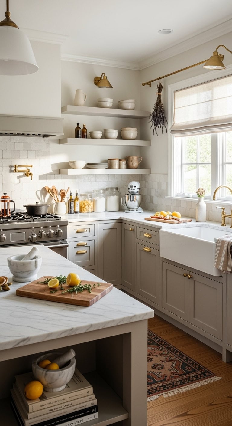
soft elegant timeless harmonious

Those soft beige cabinet finishes are basically the silk pajamas of kitchen design – luxuriously smooth and impossibly chic! Whether you go matte for that chalky European vibe or satin for subtle glow, this finish whispers elegance without shouting for attention.

Master your soft beige finish details:

  • Choose matte for fingerprint resistance
  • Go satin for gentle light reflection
  • Add texture with reeded cabinet doors
  • Incorporate champagne gold pulls
  • Mix in white oak shelving
  • Balance with honed granite counters
  • Include linen Roman shades

Pro Tip: Test your beige finish samples at different times of day – morning light makes them peachy while evening light pulls out gray undertones. This guarantees you’ll love your choice 24/7, not just during that magical golden hour!

3. Warm Neutral Wall Colors
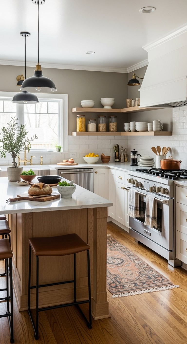
cozy inviting versatile warm neutral walls

Those warm neutral walls are like wrapping your kitchen in a cozy cashmere sweater – instantly inviting and eternally stylish! You’ll want shades that play beautifully with natural light while creating that perfect backdrop for your culinary adventures.

Paint your perfect warm neutral canvas:

  • Try “greige” for modern sophistication
  • Layer in warm mushroom tones
  • Consider barely-there blush undertones
  • Paint ceiling in whisper white
  • Add depth with tone-on-tone wainscoting
  • Include natural wood floating shelves
  • Frame with white trim work

Pro Tip: Paint large swatches directly on your walls and live with them for a week – warm neutrals are chameleons that shift dramatically with your lighting. What looks perfectly taupe at noon might go full pink at sunset!

4. Creamy White Countertop Options
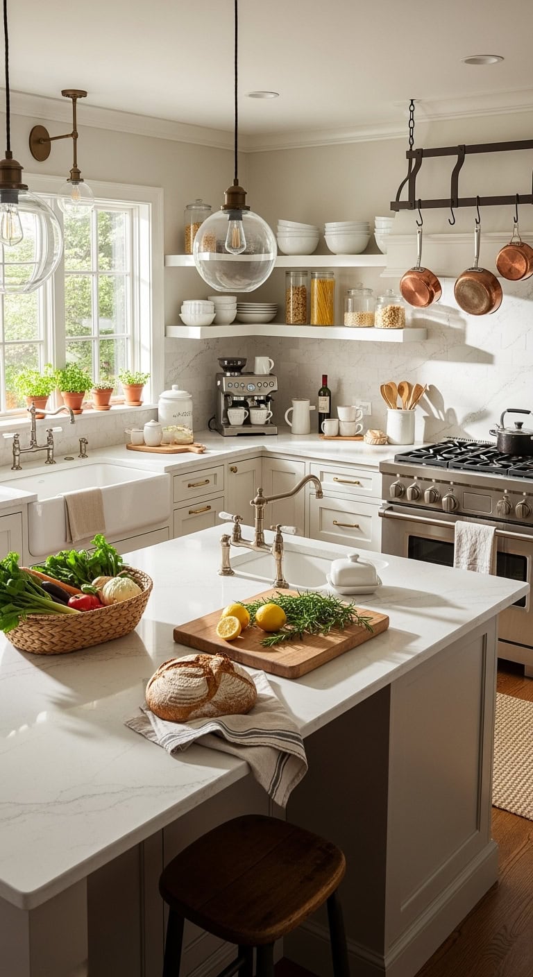
luxurious creamy countertop design ideas

Those creamy white countertops are the kitchen equivalent of your favorite cashmere cardigan – luxuriously smooth, impossibly chic, and somehow making everything else look more expensive! You’ll discover these surfaces aren’t just gorgeous; they’re the ultimate canvas for your culinary creativity.

Choose your creamy white dream surface:

  • Opt for quartz with subtle veining
  • Consider honed marble for organic luxury
  • Select porcelain slabs for durability
  • Mix in waterfall edge islands
  • Add undermount farmhouse sinks
  • Include brushed gold hardware
  • Incorporate leather-finish granite options

Pro Tip: Request samples of your top three choices and test them with red wine, coffee, and turmeric – better to discover maintenance needs now than after installation! Creamy whites with warm undertones hide everyday wear beautifully while keeping that fresh, airy vibe you’re after.

5. Natural Wood Accent Details
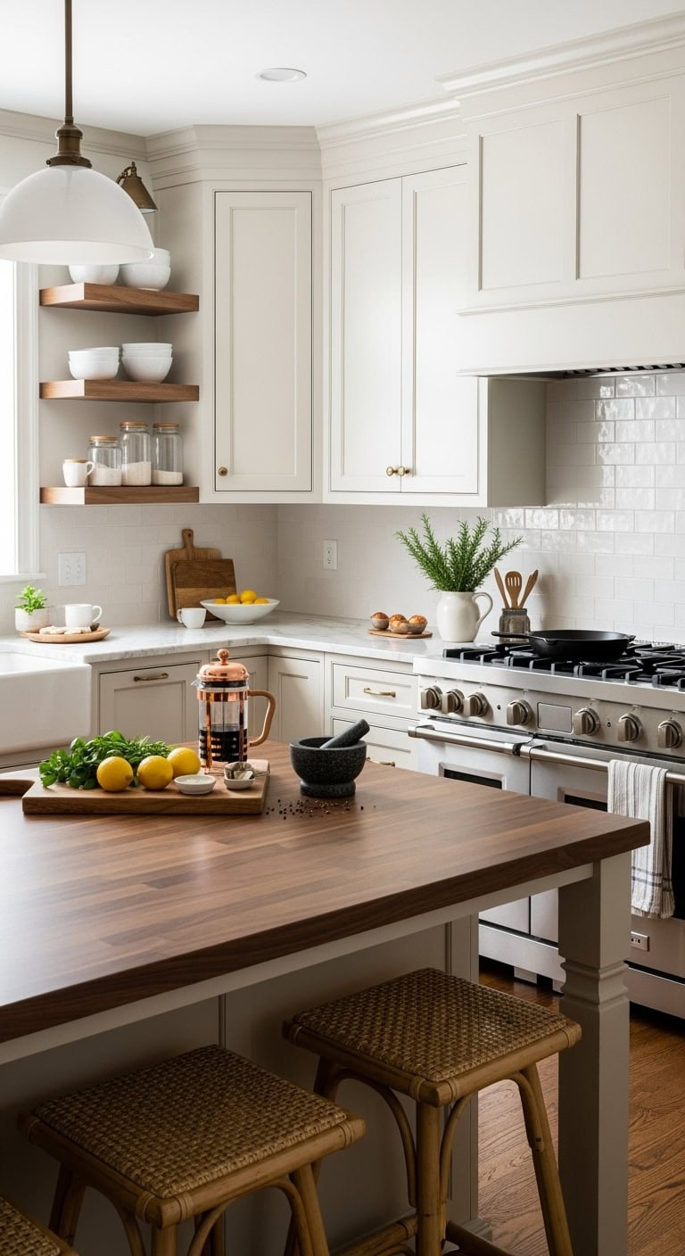
cozy rustic layered hygge

Natural wood accents are like adding a cozy cashmere throw to your kitchen’s shoulders – instantly warming up all those creamy surfaces with organic texture that whispers “hygge” without trying too hard! You’ll find these elements bring that perfect lived-in luxury vibe.

Layer in wood’s natural warmth:

  • Float open walnut shelving displays
  • Install white oak ceiling beams
  • Add cutting board countertop sections
  • Choose wood-topped kitchen islands
  • Include rattan bar stool backs
  • Display olive wood serving pieces
  • Frame windows with natural shutters

Pro Tip: Stick to one wood tone throughout your kitchen (mixing cherry with oak is like wearing brown shoes with a black belt – technically fine, but why risk it?). Your cashmere palette loves blonde to medium woods best!

6. Brushed Gold Hardware Selection
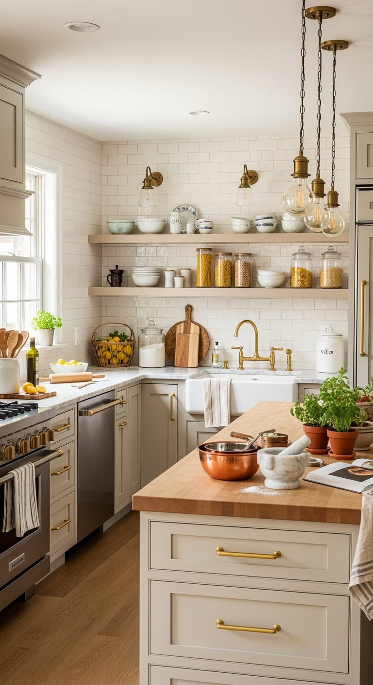
sophisticated elevated warm intentional

Brushed gold hardware is the jewelry your cashmere kitchen’s been waiting for – subtle, sophisticated, and just flashy enough to make your neighbors wonder if you hired a designer (you didn’t, you’re just that good!). These warm metallic touches elevate every cabinet pull from functional to fabulous.

Select hardware that catches the light:

  • Install elongated cabinet pulls
  • Choose oversized drawer handles
  • Add bridge-style faucet fixtures
  • Select pendant light chains
  • Include gold-framed mirror accents
  • Pick champagne-finished hinges
  • Feature metallic outlet covers

Pro Tip: Keep your gold hardware matte or brushed rather than polished – you want whispered elegance, not Vegas showroom! Mix sizes but maintain the same finish throughout for that cohesive, curated look that makes everything feel intentionally expensive.

7. Marble Backsplash Tile Patterns
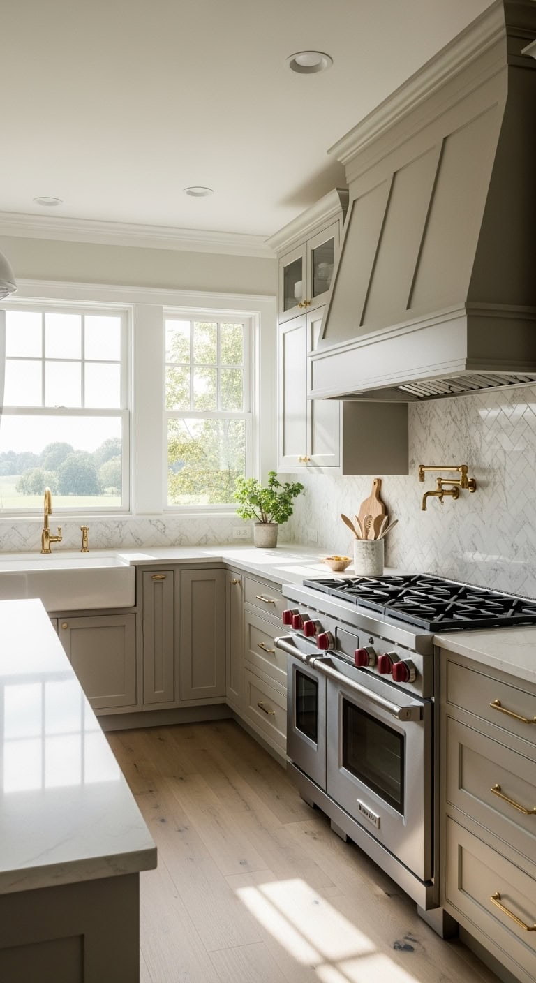
luxurious timeless dramatic marble backsplash patterns

Marble backsplash tiles are like the silk scarf of your cashmere kitchen – luxurious, timeless, and guaranteed to make you feel fancy while scrambling eggs on a Tuesday morning. These veined beauties bring natural drama without the diva attitude, creating visual flow that ties your whole space together.

Pattern your marble for maximum impact:

  • Try herringbone layouts for movement
  • Install vertical stack patterns
  • Create hexagon honeycomb designs
  • Mix subway tiles with mosaic borders
  • Add waterfall edge details
  • Include book-matched vein patterns
  • Feature arabesque shaped tiles

Pro Tip: Choose honed marble over polished for your backsplash – it hides water spots better and plays beautifully with cashmere’s matte finish. Keep grout lines minimal and color-matched to let those gorgeous veins do all the talking!

8. Soft Linen Window Treatments
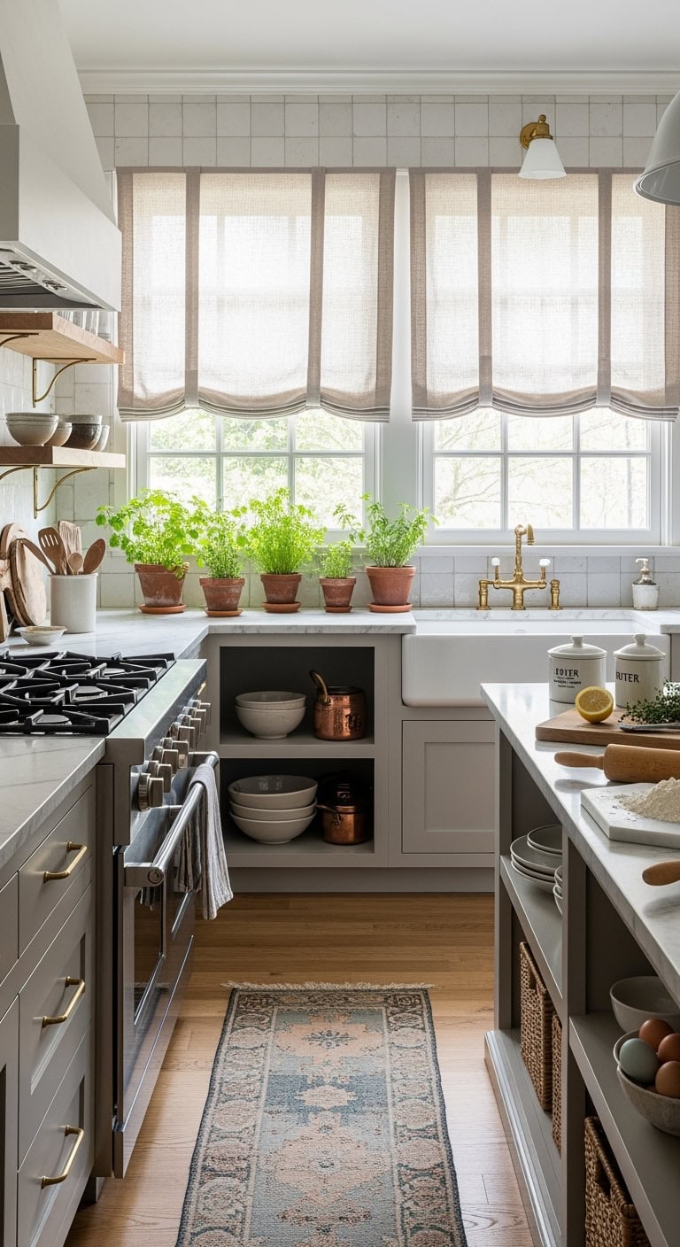
cozy ethereal relaxed versatile

Soft linen window treatments are the cozy cardigan your cashmere kitchen desperately needs – breezy, effortless, and somehow making everything feel more expensive than it actually is. These textile beauties filter light like Instagram’s best filter, creating that dreamy glow that makes your morning coffee feel like a spa moment.

Layer your linens for perfection:

  • Choose relaxed Roman shades
  • Add sheer café curtains underneath
  • Pick natural oatmeal tones
  • Go for subtle texture variations
  • Install inside-mount for clean lines
  • Mix weights for seasonal flexibility
  • Include tie-back options for versatility

Pro Tip: Pair heavier linen drapes with lighter sheers on double rods – you’ll get privacy when needed but can still flood your space with that gorgeous filtered light that makes your cashmere cabinets look absolutely ethereal!

9. Neutral Island Pendant Lighting
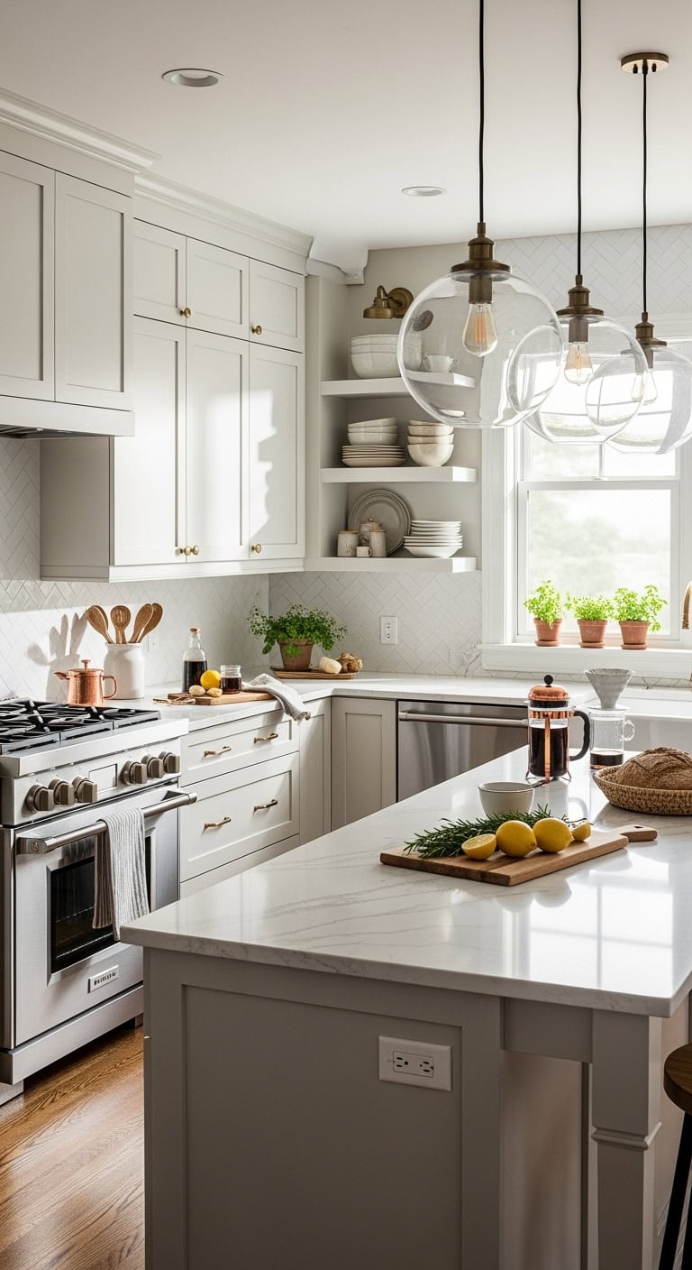
understated kitchen island pendant lighting

Neutral island pendant lighting is like jewelry for your cashmere kitchen – the perfect finishing touch that pulls your whole look together without screaming for attention. These understated beauties create intimate pools of light that make your island feel like the VIP section of your home, where all the good conversations and midnight snacks happen.

Light up your life with these picks:

  • Choose oversized glass globes
  • Try woven rattan shades
  • Select matte black hardware
  • Hang in odd numbers
  • Mix pendant sizes slightly
  • Keep 30-36 inches above counter
  • Add dimmers for mood control

Pro Tip: Go for warm-toned bulbs (2700K-3000K) in your pendants – they’ll make your cashmere cabinets glow like they’re lit by candlelight, and everyone looks better in that lighting (including your leftover pizza)!

10. Cashmere Paint Color Schemes
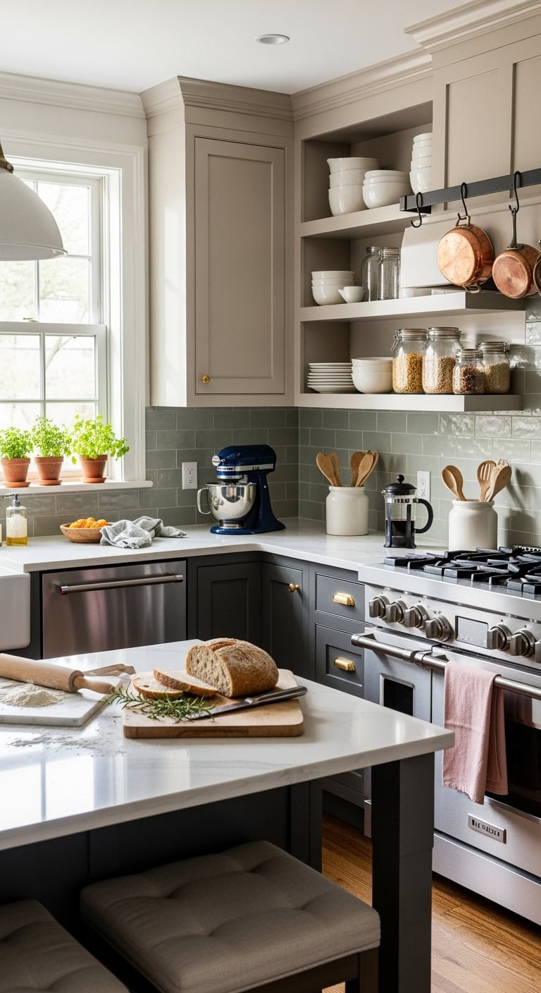
elegant neutral kitchen color schemes

Cashmere paint colors are the chameleons of the kitchen world – they play nice with literally everything while somehow making your space feel like it got a fancy degree in sophistication. Think of these shades as your kitchen’s perfect neutral foundation that whispers elegance instead of shouting it from the rooftops.

Paint your way to perfection:

  • Layer warm whites with cashmere
  • Add sage green accents
  • Include charcoal gray touches
  • Try blush pink details
  • Mix in navy blue elements
  • Consider terracotta accessories
  • Embrace two-tone cabinets

Pro Tip: Test paint colors at different times of day – that “perfect” cashmere can look totally different at noon versus dinnertime, and nobody wants surprise beige when they ordered sophisticated greige!

11. Plush Floor Runner Options
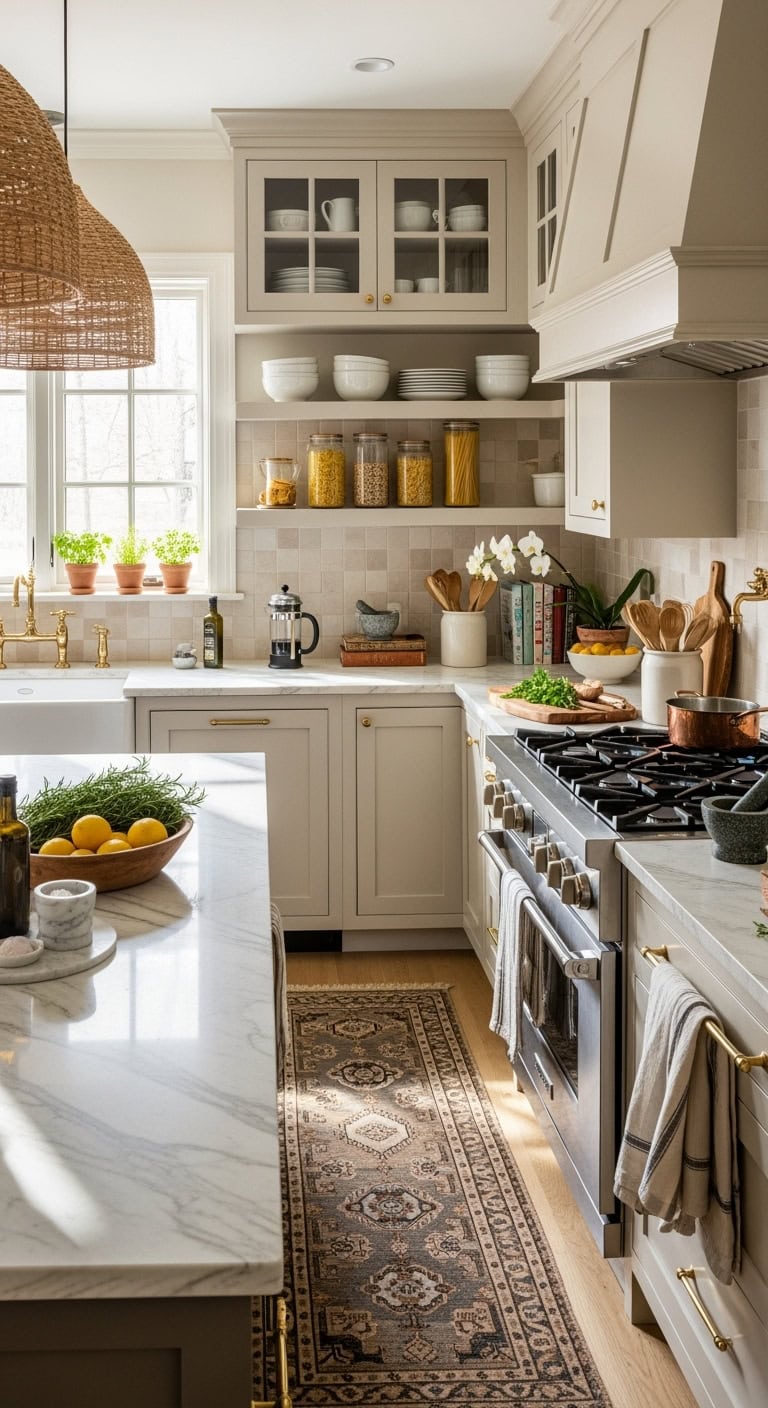
plush cashmere washable versatile floor runners

Your kitchen floor deserves the VIP treatment with plush cashmere-toned runners that make standing at the sink feel less like a chore and more like a spa moment. These soft beauties don’t just cushion your feet – they tie your whole cashmere kitchen vibe together like the cozy hug you didn’t know your floors needed.

Runner styles that’ll make you swoon:

  • Moroccan trellis patterns
  • Vintage Persian designs
  • Modern geometric shapes
  • Textured jute blends
  • Watercolor abstract prints
  • Classic herringbone weaves
  • Subtle ombré gradients

Pro Tip: Choose washable runners for high-traffic zones – because let’s be real, that gorgeous cashmere runner won’t stay gorgeous long if it can’t handle your morning coffee spills and pasta sauce adventures!

12. Coordinating Cashmere Dining Chairs
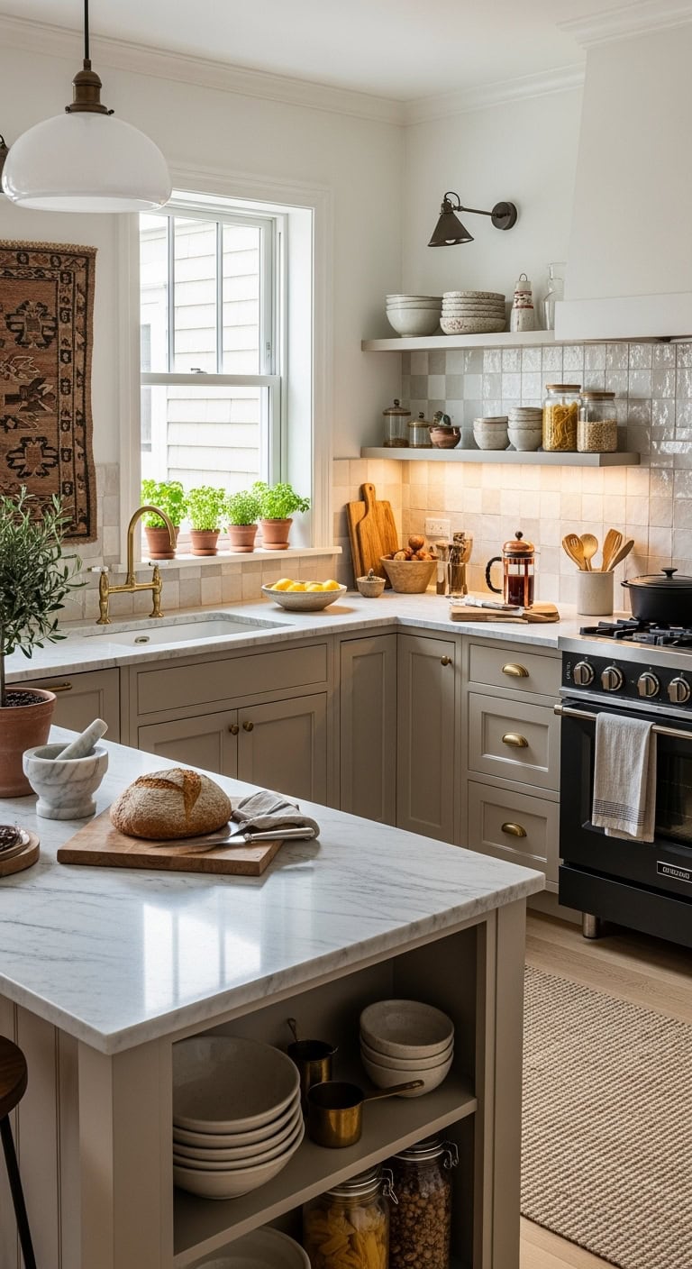
luxurious layered contrasting dining chair styles

Your dining chairs are about to become the main characters in your cashmere kitchen story! Visualize this: you’re sinking into buttery-soft upholstered seats that make even Monday morning breakfasts feel luxurious. Mix textures and materials to keep things interesting – because matchy-matchy is so last decade.

Chair styles that’ll steal the show:

  • Tufted velvet backs
  • Linen-wrapped seats
  • Cane backs with cushioned seats
  • Leather with brass studs
  • Bouclé fabric beauties
  • Woven rattan details
  • Sleek wooden frames

Pro Tip: Pair lighter cashmere chairs with a darker table (or vice versa) to create depth – your dining space needs that sweet contrast to avoid looking like one giant beige blob, no matter how chic that blob might be!

13. Matte Cashmere Cabinet Textures
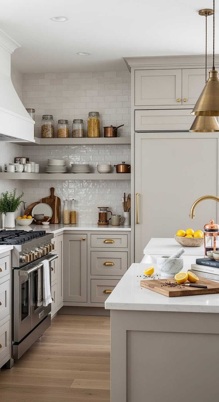
velvety matte cashmere cabinet textures

Your cabinets are about to get the glow-up they deserve with matte cashmere finishes that whisper sophistication! Forget glossy surfaces that show every fingerprint – matte textures hide life’s little messes while looking effortlessly expensive. These velvety-smooth doors feel like cashmere sweaters for your kitchen (minus the dry cleaning bills).

Texture combinations that nail it:

  • Flat matte lacquer finish
  • Brushed wood grain overlay
  • Soft-touch laminate coating
  • Chalky paint treatment
  • Subtle lime-washed effect
  • Raw wood undertones
  • Micro-textured surfaces

Pro Tip: Break up all that beautiful matte monotony with one glossy element – maybe your backsplash or hardware – because even the most sophisticated spaces need a tiny bit of shine to catch the light and keep things from falling flat!

14. Cashmere Upholstered Breakfast Nook
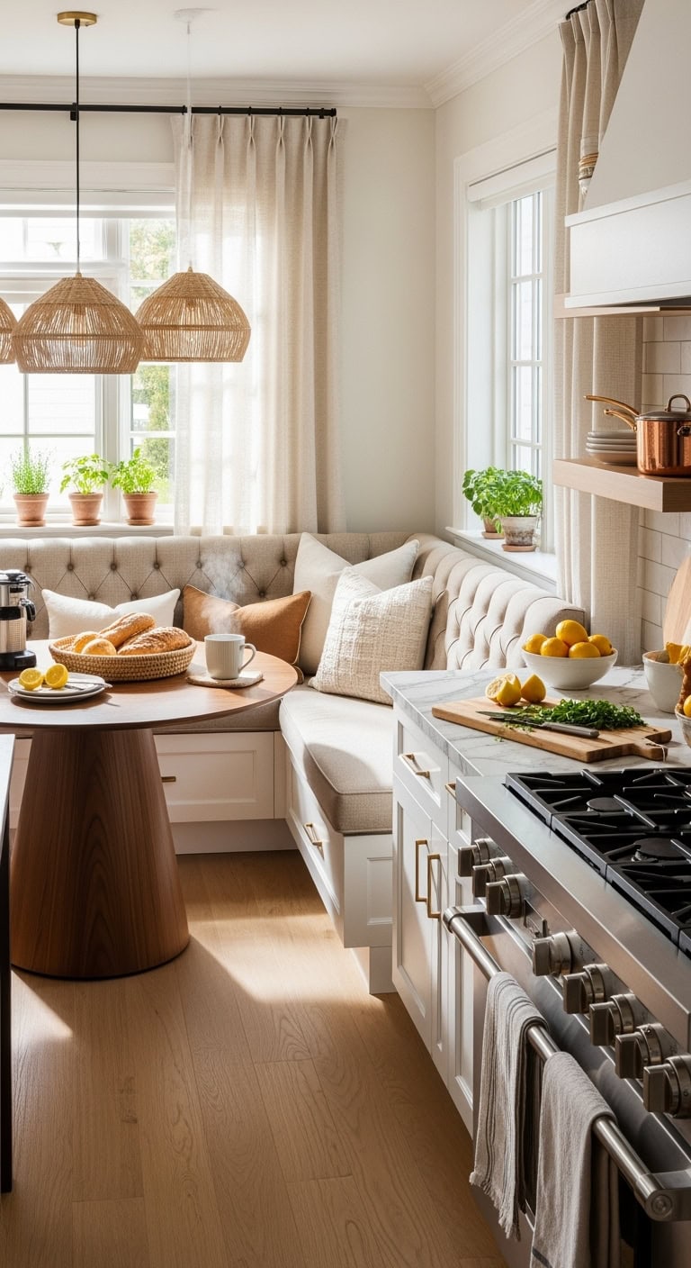
cozy cashmere clad breakfast nook sanctuary

Envision this: your morning coffee spot wrapped in the softest cashmere upholstery that practically begs you to linger! Transform that forgotten corner into a cozy breakfast nook where cashmere-toned cushions meet your sleepiest morning self with a warm hug.

Essential nook elements to nail:

  • Plush banquette seating in oatmeal cashmere
  • Tufted back cushions for extra comfort
  • Washable performance fabric (because spills happen!)
  • Contrast piping in camel or cream
  • Built-in storage underneath seats
  • Mix of throw pillows in varied textures
  • Round pedestal table in warm wood

Pro Tip: Choose performance fabrics that look luxe but laugh at coffee spills – your future self will thank you when someone inevitably knocks over their orange juice during Sunday brunch chaos!

15. Monochromatic Cashmere Appliance Finishes
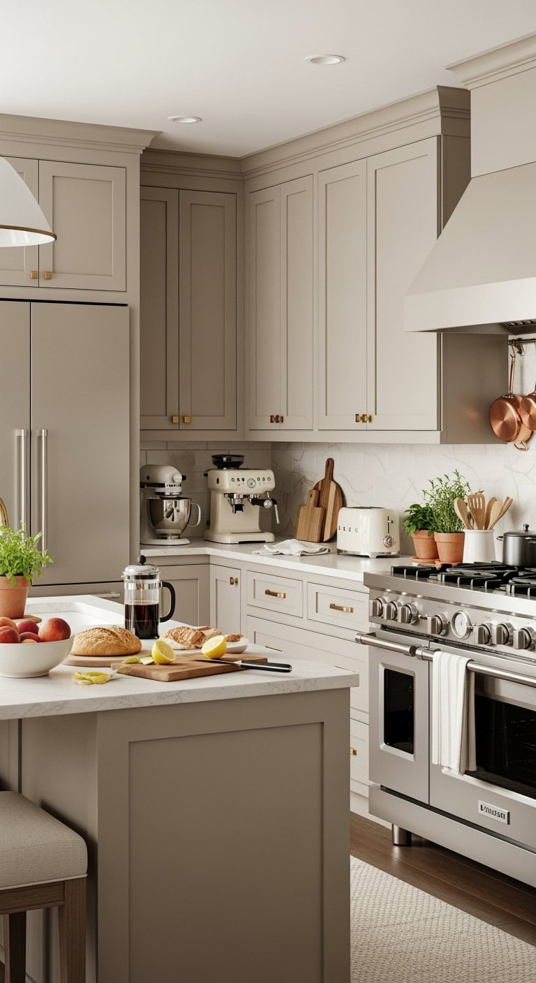
monochromatic luxurious cohesive appliance coordination

Picture your dream kitchen where every appliance whispers luxury in matching cashmere tones – like your appliances got together and decided to coordinate their outfits! This monochromatic magic creates visual flow that makes your space feel bigger and infinitely more sophisticated.

Must-have cashmere appliance moments:

  • Matte champagne refrigerator finish
  • Coordinating range hood in brushed cashmere
  • Dishwasher with custom panel overlay
  • Small appliances in complementary beige tones
  • Warm metallic hardware accents
  • Coffee maker in creamy latte shade
  • Matching mixer and toaster set

Pro Tip: Mix matte and slightly metallic finishes within your cashmere palette to avoid that “everything came from the same showroom” look – subtle variation keeps things interesting while maintaining that cohesive, pulled-together vibe you’re after!

16. Layered Cashmere Textile Accents
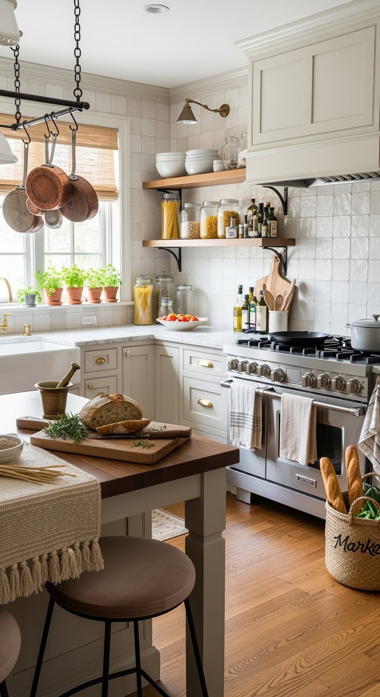
cozy layered luxurious textured

Think of your cashmere kitchen as a cozy sweater you can walk into – where every textile adds another layer of touchable luxury! You’re basically creating a Pinterest board come to life, but one you can actually spill coffee on (though hopefully you won’t).

Layer these dreamy textile moments:

  • Linen Roman shades in wheat tones
  • Chunky knit runner rugs in cream
  • Natural jute placemats with fringe details
  • Velvet bar stool cushions in nude blush
  • Woven baskets for counter storage
  • Canvas market bags as decor
  • Textured tea towels in oatmeal hues

Pro Tip: Follow the 60-30-10 rule with your textiles – 60% smooth surfaces (like cotton), 30% medium texture (linen or canvas), and 10% statement texture (chunky knits or velvet) to keep your layering game strong without overwhelming the space!

17. Cashmere Kitchen Storage Solutions
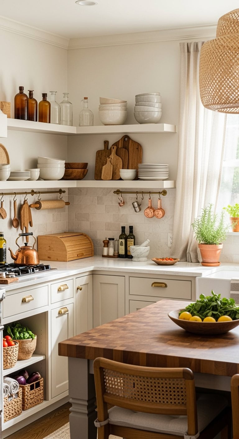
cozy functional chic kitchen storage solutions

Your cashmere kitchen storage isn’t just functional – it’s where Marie Kondo meets cozy cabin vibes! Picture open shelving that whispers “sophisticated farmhouse” while keeping your prettiest dishes on display like the art they deserve to be.

Storage solutions that spark joy:

  • Floating white oak shelves with hidden brackets
  • Wicker pull-out pantry baskets
  • Ceramic canisters in matte biscuit
  • Rattan bread boxes with linen liners
  • Glass jars with wooden lids
  • Mesh produce bags hung on hooks
  • Cream-painted pegboard for utensils

Pro Tip: Keep your counters 80% clear by designating “homes” for everything – display only your most beautiful everyday items (think olive oil in a pretty bottle or your grandmother’s mixing bowls) while tucking away the less photogenic stuff behind closed doors!

18. Vintage Cashmere Range Hood
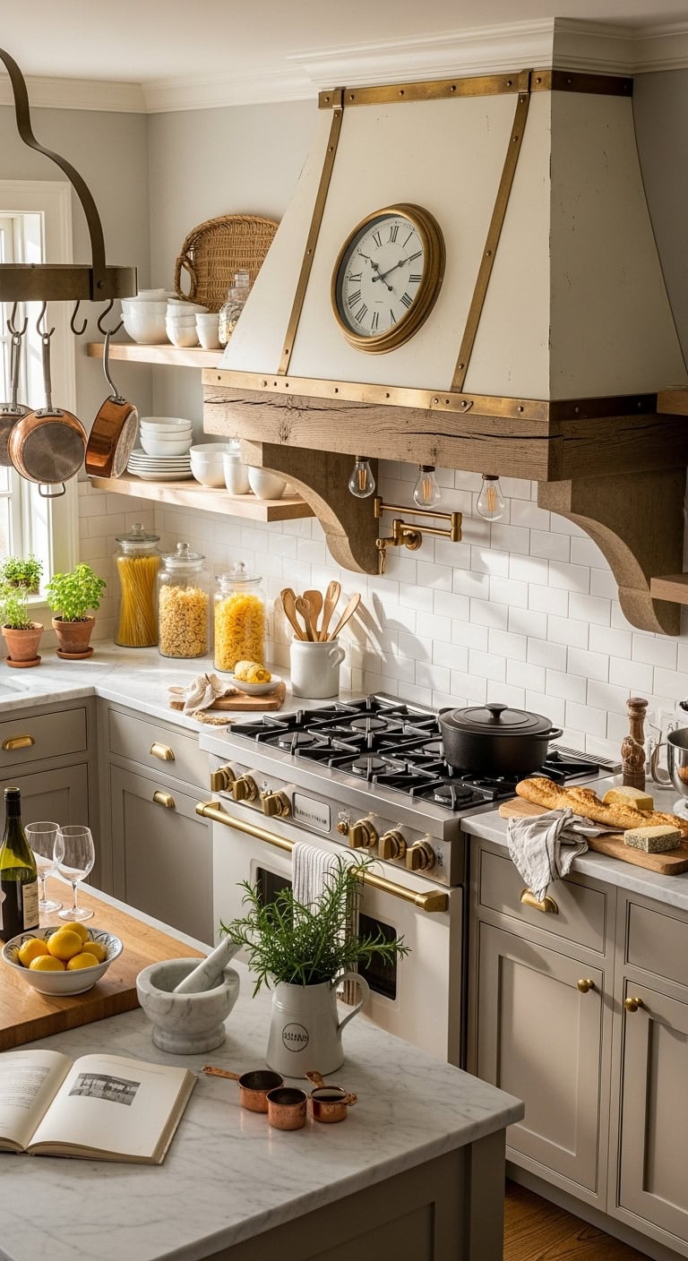
vintage cashmere old world sophistication

Your vintage cashmere range hood is the crown jewel that makes everyone go “ooh!” when they walk in – think old-world charm meets modern sophistication. This isn’t just ventilation; it’s a statement piece that anchors your entire kitchen with that perfect “I found this at a French flea market” energy (even if you totally ordered it online).

Vintage hood elements that steal the show:

  • Aged brass strapping and rivets
  • Cream-painted metal with subtle distressing
  • Curved apron front with decorative corbels
  • Antique copper accent trim
  • Exposed Edison bulb lighting underneath
  • Weathered wood beam mantel overlay
  • Roman numeral clock face detail

Pro Tip: Balance your showstopping hood with simpler backsplash tiles – let it be the drama queen while everything else plays supporting cast. Too many focal points create visual chaos instead of cozy!

19. Cashmere Open Shelving Displays
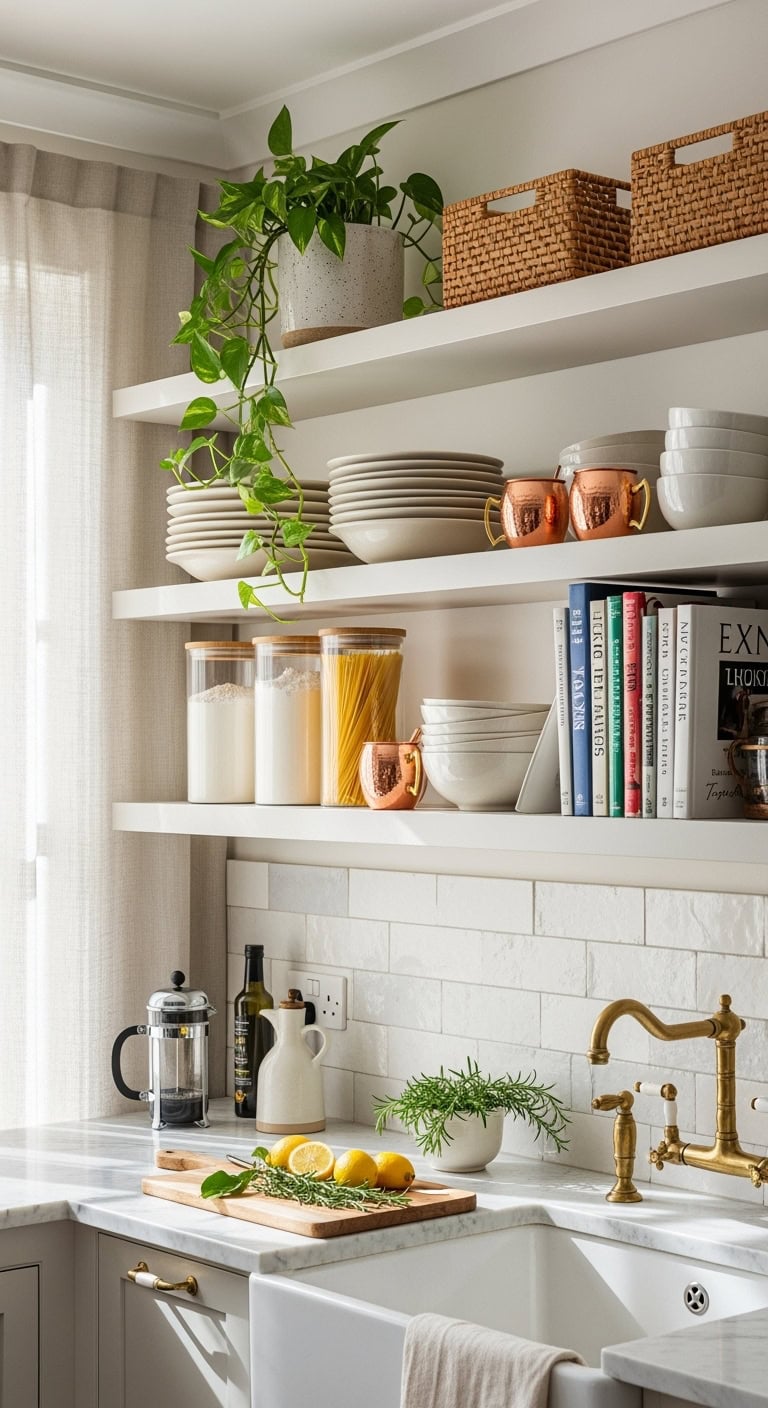
cashmere open shelving organized showcase

Your cashmere open shelving is where function meets “look how organized my life is” vibes – even if you’re secretly shoving things in drawers before guests arrive. These floating beauties showcase your prettiest pieces while keeping everyday essentials within arm’s reach, all wrapped in that creamy, dreamy hue.

Display-worthy shelf styling secrets:

  • Stacked vintage ironstone dishes
  • Glass canisters with wooden lids
  • Trailing pothos in ceramic planters
  • Cookbook collection spine-out
  • Woven baskets for texture
  • Copper Moscow mule mugs
  • Mix of heights and negative space

Pro Tip: Follow the rule of thirds – one-third functional items, one-third decorative pieces, one-third empty space. Your shelves need room to breathe, or they’ll look like a garage sale exploded!

20. Cashmere Quartz Waterfall Edge
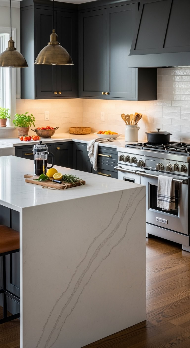
seamless modern sophisticated breathtaking waterfall edge

Waterfall edge perfection points:

  • Seamless veining alignment
  • Mitred corners for crisp edges
  • LED strip lighting underneath
  • Bar stool tuck-under space
  • Contrasting dark cabinetry base
  • Brushed gold hardware accents
  • Statement pendant lights above

Pro Tip: Keep the waterfall side clutter-free – this baby deserves to be the star! Save the coffee maker and toaster for the perimeter counters where they won’t compete with your stone’s gorgeous natural patterns.

21. Cashmere Pantry Door Designs
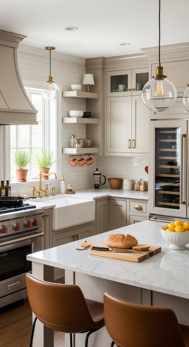
cashmere pantry door design showcase

Your pantry door is begging for the cashmere treatment! Transform that boring slab into a showstopper that makes grabbing snacks feel fancy.

Cashmere pantry door magic:

  • Soft beige shaker-style panels
  • Frosted glass inserts with gold framing
  • Antique brass cremone bolt hardware
  • Hidden soft-close hinges
  • Subtle grain wood texture
  • Chalk-painted “Pantry” script lettering
  • Interior motion-sensor lighting

Pro Tip: Match your pantry door’s cashmere tone to your cabinet color but go one shade lighter – it creates depth without looking mismatched. Add a full-length chalkboard panel on the inside for grocery lists and meal planning. Your future organized self will thank you!

22. Cashmere Ceramic Sink Options
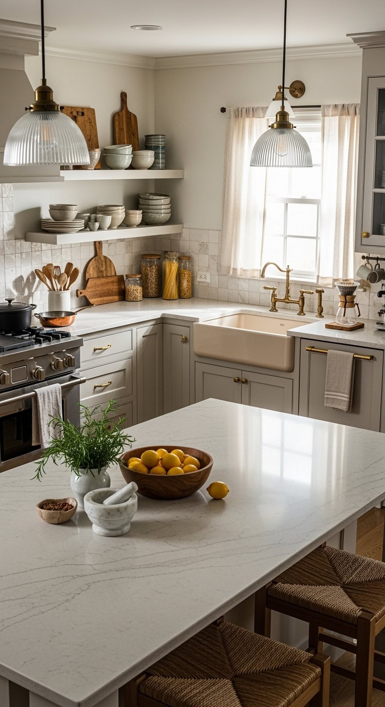
cashmere ceramic sink design perfection

Time to dish about cashmere ceramic sinks that’ll make washing dishes feel less like a chore and more like a spa experience. Your sink deserves to be gorgeous!

Cashmere ceramic sink perfection:

  • Farmhouse apron-front in warm bisque
  • Undermount with subtle flecks
  • Fireclay with matte finish
  • Double-bowl butler sink style
  • Workstation sink with bamboo accessories
  • Integrated drainboard detail
  • Champagne-toned composite options

Pro Tip: Pair your cashmere sink with oil-rubbed bronze or brushed gold fixtures for instant elegance. Skip the stark white – it’ll make your cashmere cabinets look dingy. Instead, choose a sink that’s either perfectly matched or 2-3 shades darker for a grounding effect that anchors your whole kitchen design!

23. Cashmere Kitchen Ceiling Beams
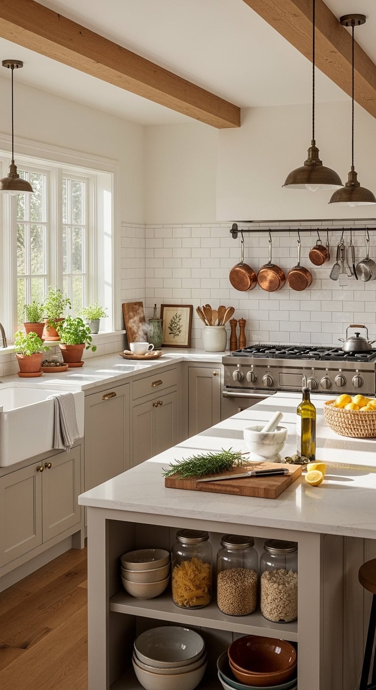
cozy sophisticated cashmere kitchen ceiling beams

Look up and let those cashmere ceiling beams steal the show! Nothing says “cozy sophistication” like the perfect overhead statement that ties your whole kitchen together.

Beam dreams for your cashmere space:

  • Reclaimed wood in weathered oak
  • White-washed rustic pine beams
  • Faux wood in matching cashmere tone
  • Dark walnut for dramatic contrast
  • Exposed natural cedar beams
  • Painted beams with subtle distressing
  • Box beams with crown molding detail

Pro Tip: Keep your beam spacing proportional to your kitchen size – massive beams in a tiny kitchen will feel oppressive! For standard 8-9 foot ceilings, stick with 4-6 inch wide beams. And here’s the secret: run them perpendicular to your longest wall to make the space feel wider and more balanced.

Conclusion

You’ve discovered how cashmere kitchens aren’t just about color—they’re a cocoon of comfort that wraps your home in warmth. Like a favorite sweater worn through countless seasons, these soft neutral tones become the backdrop to your family’s story. From beige cabinets to creamy countertops, you’ll create a space that whispers rather than shouts. Your cashmere kitchen becomes the heart’s refuge, where morning coffee tastes richer and evening conversations flow deeper.