The Dark Gray and Cream Dining Room That Handles Both Candles and Overhead Light
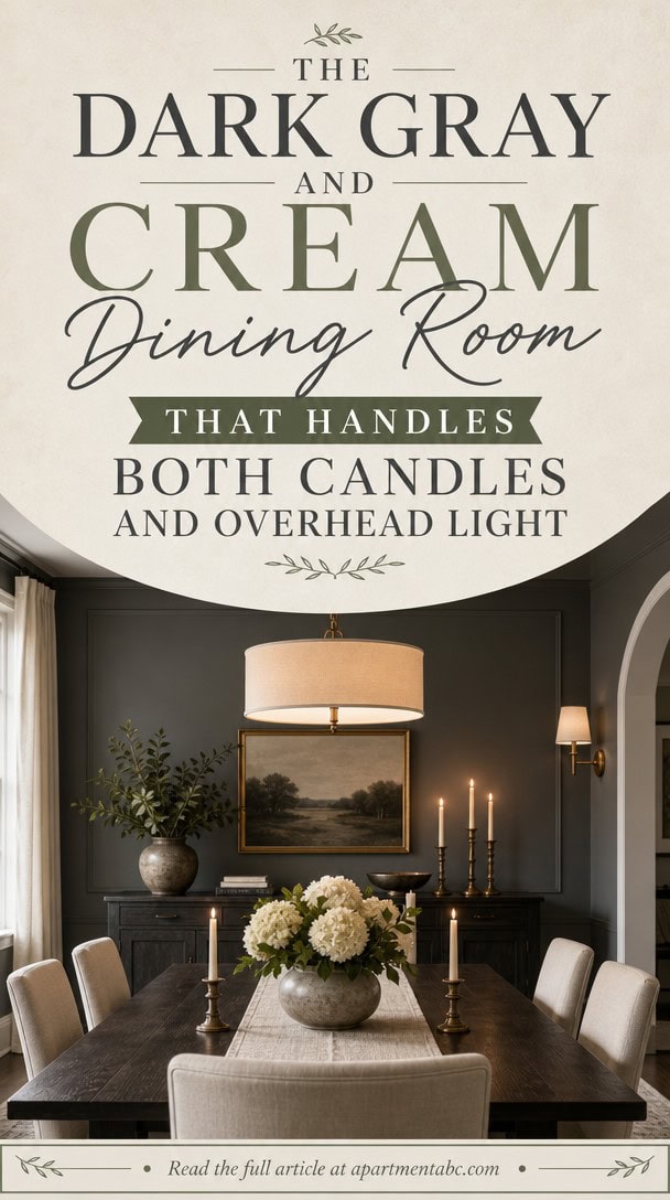
You want a dining room that works at 7pm and at midnight, under a pendant and under candlelight alone. That’s harder than it sounds.
Dark gray walls can turn moody or flat depending on the bulb, the hour, the undertone you picked at the paint counter. The pairing that handles both is dark gray with cream.
Get it right, and the room shifts with you. Here’s where to start.
Why Dark Gray and Cream Work So Well Together
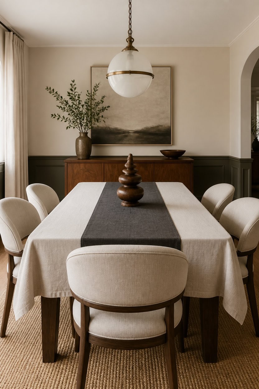
Cream Somerset Peach spreads across the main walls in a very light wash, while the wainscoting below the chair rail wears deep gray Ashwood Moss. This split keeps the room bright at eye level yet grounded near the floor, avoiding a cave-like feel. Add a sculptural turned-wood object on the sideboard to bridge the two tones with warm, natural grain.
Balance the ratio: Keep cream dominant on walls and trim gray to accent areas for balance.
Anchor with wood tones: Use warm wood furniture to soften the contrast between dark and light.
Layer metallic accents: Add brass or warm gold hardware to keep the pairing from feeling cold.
Repeat both colors twice: Echo gray and cream in textiles so the palette feels intentional, not accidental.
creates a soft, bright backdrop that keeps the room open. [very light]
grounds the lower half of the room with rich depth. [dark]
 Montary 59-inch Natural Oak Wabi-Sabi Round Dining Table with 35-inch Tempered Glass Lazy Susan, Handcrafted Japanese Style Sculptural Solid Wood Dining Table for Living Room & Restaurant
View Price
Montary 59-inch Natural Oak Wabi-Sabi Round Dining Table with 35-inch Tempered Glass Lazy Susan, Handcrafted Japanese Style Sculptural Solid Wood Dining Table for Living Room & Restaurant
View Price
 YIDATONG Upholstered Dining Chairs Set of 4, Modern Curved Back, Gray
View Price
YIDATONG Upholstered Dining Chairs Set of 4, Modern Curved Back, Gray
View Price
 HITHOS 54" W Kitchen Buffet Cabinet with Storage, Coffee Bar Cabinet, Grain
View Price
HITHOS 54" W Kitchen Buffet Cabinet with Storage, Coffee Bar Cabinet, Grain
View Price
 Umite Chef Dinnerware Set for 4, 12 Pieces Plates and Bowls Set
View Price
Umite Chef Dinnerware Set for 4, 12 Pieces Plates and Bowls Set
View Price
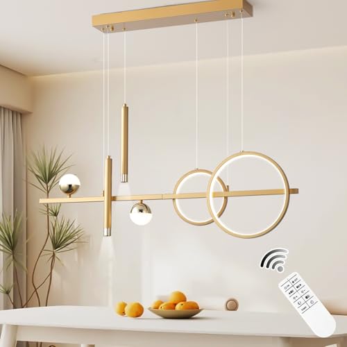 ORANOOR LED Gold Chandelier for Dining Room 39in Dimmable Modern Chandelier
View Price
ORANOOR LED Gold Chandelier for Dining Room 39in Dimmable Modern Chandelier
View Price
 RUSVILLA 8x10 feet Natural Jute & Wool Area Rug,– Handwoven Mini Check Natural Fiber Rug with 4" Border, Neutral Boho Farmhouse Rug for Living Room,Dining Room,Bedroom | 0.6" Pile (8' x 10')
View Price
RUSVILLA 8x10 feet Natural Jute & Wool Area Rug,– Handwoven Mini Check Natural Fiber Rug with 4" Border, Neutral Boho Farmhouse Rug for Living Room,Dining Room,Bedroom | 0.6" Pile (8' x 10')
View Price
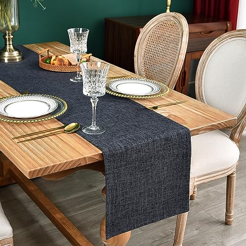 NEWISHER Reversible Double Layer Table Runner Faux Linen Fabric 13x48inch
View Price
NEWISHER Reversible Double Layer Table Runner Faux Linen Fabric 13x48inch
View Price
Picking Undertones That Keep Dark Gray From Feeling Cold
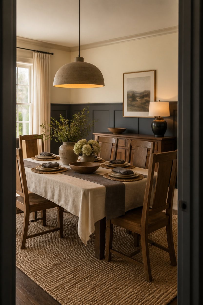
Undertones matter more than lightness or darkness when pairing gray and cream. Very light cream Cayman Islands on the main walls carries a warm base that keeps deep gray Temptation on the wainscoting from feeling flat. Set a linen runner with folded napkins and stacked plates on the table to echo that warmth in the tablescape.
Check warm bases: Look for red or yellow undercurrents in both paint chips before buying.
Test in natural light: View swatches morning and evening since undertones shift with light.
Match trim to walls: Keep wainscoting warm-toned gray so it never reads bluish or cold.
Use warm whites: Choose cream with a beige or peach cast, not a stark white base.
wraps the room in a soft, warm cream that keeps the space bright. [very light]
grounds the lower half of the room in a warm-toned deep gray. [dark]
 Gandeer 6 Sets Boho Place Mats Set Round Woven Placemats Table Decor
View Price
Gandeer 6 Sets Boho Place Mats Set Round Woven Placemats Table Decor
View Price
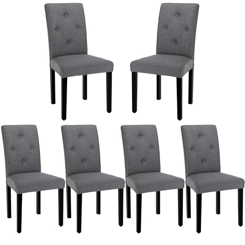 VECELO Upholstered Dining Chairs Set of 6, Modern Fabric and Solid Wood Legs &High Back for Kitchen/Living Room- Dark Gray
View Price
VECELO Upholstered Dining Chairs Set of 6, Modern Fabric and Solid Wood Legs &High Back for Kitchen/Living Room- Dark Gray
View Price
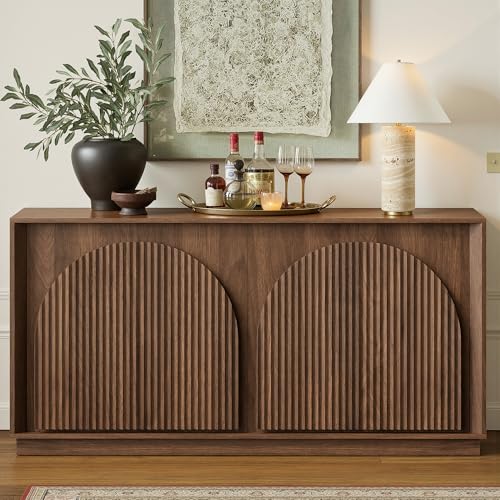 win2win 65" Sideboard Buffet Cabinet with Storage, Modular Credenza, Walnut
View Price
win2win 65" Sideboard Buffet Cabinet with Storage, Modular Credenza, Walnut
View Price
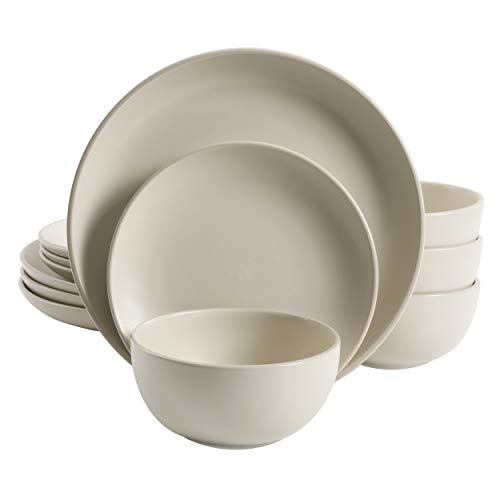 Gibson Home Rockaway 12-Piece Round Stoneware Dinnerware Set, Service for 4 – Cream Plates and Bowls, Modern Matte Finish, Microwave & Dishwasher Safe
View Price
Gibson Home Rockaway 12-Piece Round Stoneware Dinnerware Set, Service for 4 – Cream Plates and Bowls, Modern Matte Finish, Microwave & Dishwasher Safe
View Price
 PINDODO Pendant Lights for Kitchen Island, 11.8" Black and Gold Farmhouse Pendant Light, Dome Pendant Light Fixtures for Dining Room, Living Room, Bedroom, Cafe, Bar, 2 Pack
View Price
PINDODO Pendant Lights for Kitchen Island, 11.8" Black and Gold Farmhouse Pendant Light, Dome Pendant Light Fixtures for Dining Room, Living Room, Bedroom, Cafe, Bar, 2 Pack
View Price
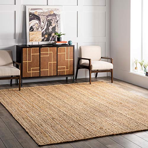 nuLOOM Rigo Natural Solid Flatweave Area Rug, 6' x 9'
View Price
nuLOOM Rigo Natural Solid Flatweave Area Rug, 6' x 9'
View Price
 Nacuci Grey Cloth Napkins Set of 6 Washable Dinner Napkins, 18X18 in
View Price
Nacuci Grey Cloth Napkins Set of 6 Washable Dinner Napkins, 18X18 in
View Price
Our Favorite Glassware Sets
 Libbey Cabos 16-Piece Tumbler and Rocks Glass Set
View Price
Libbey Cabos 16-Piece Tumbler and Rocks Glass Set
View Price
 Libbey Blue Ribbon Impressions 16-Piece Glass Set
View Price
Libbey Blue Ribbon Impressions 16-Piece Glass Set
View Price
 Libbey Ascent 16-Piece Tumbler and Rocks Glass Set
View Price
Libbey Ascent 16-Piece Tumbler and Rocks Glass Set
View Price
 Jax Highball Glass 14 oz
View Price
Jax Highball Glass 14 oz
View Price
 Jax Drinking Glass 11 oz
View Price
Jax Drinking Glass 11 oz
View Price
 Jupiter Drinking Glass
View Price
Jupiter Drinking Glass
View Price
 Libbey Polaris 16-Piece Tumbler and Rocks Glass Set
View Price
Libbey Polaris 16-Piece Tumbler and Rocks Glass Set
View Price
 Libbey Classic 16-Piece Rocks Glass Set
View Price
Libbey Classic 16-Piece Rocks Glass Set
View Price
 Dublin Crystal Whiskey Glass 11 oz
View Price
Dublin Crystal Whiskey Glass 11 oz
View Price
 Libbey Stemless 12-Piece Wine Glass Party Set
View Price
Libbey Stemless 12-Piece Wine Glass Party Set
View Price
 Tumlin 20 oz Crystal Wine Glass Set
View Price
Tumlin 20 oz Crystal Wine Glass Set
View Price
 Vale 21 oz Wine Glass Set
View Price
Vale 21 oz Wine Glass Set
View Price
 Libbey Classic Goblet Party Glasses, Set of 12
View Price
Libbey Classic Goblet Party Glasses, Set of 12
View Price
 Veneziano 9 oz Goblet Set
View Price
Veneziano 9 oz Goblet Set
View Price
 Libbey Blue Ribbon Goblet Beverage Glasses
View Price
Libbey Blue Ribbon Goblet Beverage Glasses
View Price
The Dark Gray Paint Color That Sets the Foundation
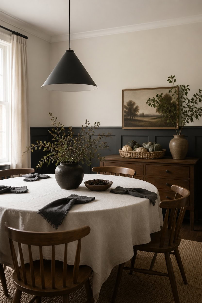
French White on the main walls, a very light cream, pairs with Deep Indigo on the wainscoting, a deep gray, to anchor the room. The dark lower half keeps the eye grounded while the pale upper wall reflects daylight. Set a woven basket of gourds on the sideboard to echo that same light-to-dark balance.
Anchor with depth: Choose a dark gray with enough pigment saturation to ground the room without reading black.
Test large swatches: Paint a poster-board sample and view it beside the cream trim before committing.
Balance light and dark: Keep dark gray below the chair rail and let cream carry the upper walls.
Mind the sheen: Use an eggshell finish on the wainscoting so the dark color stays rich instead of flat.
grounds the lower walls with a weighted, moody foundation. [dark]
keeps the upper walls bright and airy above the dark trim. [very light]
 Arborus 10" Artificial Pumpkin with Woven Basket for Fall Centerpiece Decor
View Price
Arborus 10" Artificial Pumpkin with Woven Basket for Fall Centerpiece Decor
View Price
 LITTLE TREE Round Dining Table for 4-6 People, 47 Inches Dining Room Table with Wooden Pedestal Base, Modern Dinner Table, Circle Kitchen Tables for Dining Room, Kitchen, Living Room(Table Only)
View Price
LITTLE TREE Round Dining Table for 4-6 People, 47 Inches Dining Room Table with Wooden Pedestal Base, Modern Dinner Table, Circle Kitchen Tables for Dining Room, Kitchen, Living Room(Table Only)
View Price
 Yaheetech Dining Chairs Set of 4 Upholstered Kitchen Chairs Dark Gray
View Price
Yaheetech Dining Chairs Set of 4 Upholstered Kitchen Chairs Dark Gray
View Price
 Dijiahua Black Pendant Lights 3 Pack for Kitchen Island,Small Modern Industrial Chandeliers with Cone Metal Shade,Mini Adjustable Cord Hanging Lighting Fixtures for Over Sink,Bar,Dining Room
View Price
Dijiahua Black Pendant Lights 3 Pack for Kitchen Island,Small Modern Industrial Chandeliers with Cone Metal Shade,Mini Adjustable Cord Hanging Lighting Fixtures for Over Sink,Bar,Dining Room
View Price
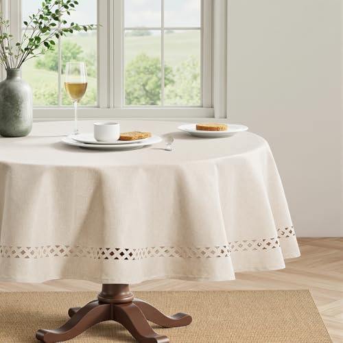 MIULEE Beige 60 Inch Round Linen Tablecloth with Decorative Cutouts
View Price
MIULEE Beige 60 Inch Round Linen Tablecloth with Decorative Cutouts
View Price
 H.VERSAILTEX Linen Textured Cloth Napkins Set of 12 (18" X 18") Linen Textured Dinner Napkins Waterproof Extra Soft Thick Durable Reusable Napkins with Hemmed Edges, Heather Gray
View Price
H.VERSAILTEX Linen Textured Cloth Napkins Set of 12 (18" X 18") Linen Textured Dinner Napkins Waterproof Extra Soft Thick Durable Reusable Napkins with Hemmed Edges, Heather Gray
View Price
 Umite Chef 24-Piece Stoneware Dinnerware Set for 8, Plates and Bowls Set
View Price
Umite Chef 24-Piece Stoneware Dinnerware Set for 8, Plates and Bowls Set
View Price
Our Favorite Dining Room Decor
 Dining Table Centerpieces
See the Top 10
Dining Table Centerpieces
See the Top 10
 Ceramic Vases
See the Top 10
Ceramic Vases
See the Top 10
 Faux Flower Arrangements
See the Top 10
Faux Flower Arrangements
See the Top 10
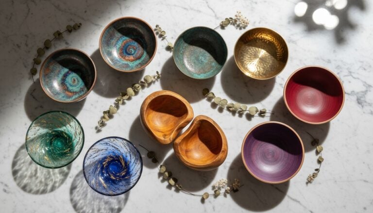 Decorative Bowls
See the Top 10
Decorative Bowls
See the Top 10
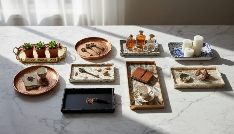 Decorative Trays
See the Top 10
Decorative Trays
See the Top 10
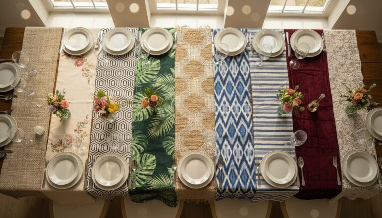 Table Runners
See the Top 10
Table Runners
See the Top 10
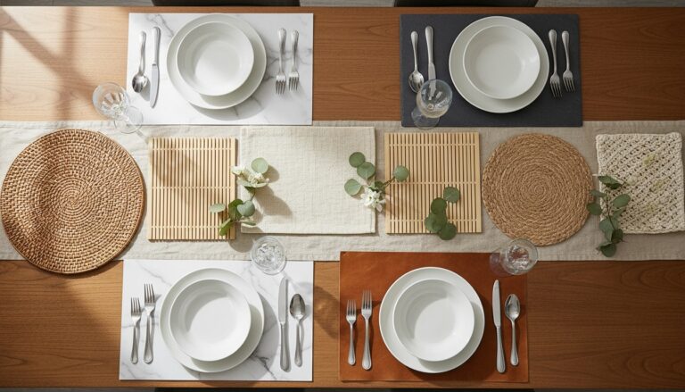 Placemats
See the Top 10
Placemats
See the Top 10
 Cloth Napkins
See the Top 10
Cloth Napkins
See the Top 10
 Napkin Rings
See the Top 10
Napkin Rings
See the Top 10
 Tiered Serving Trays
See the Top 10
Tiered Serving Trays
See the Top 10
 Indoor Planters
See the Top 10
Indoor Planters
See the Top 10
 Mirrored Decorative Trays
See the Top 10
Mirrored Decorative Trays
See the Top 10
Why Cream Trim Makes Dark Walls Feel Lighter
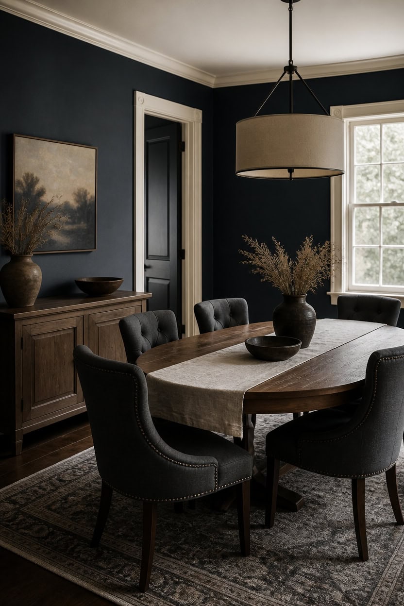
Deep gray Deep Indigo on the main walls absorbs light, while very light cream Vanilla Ice Cream on the trim reflects it back. The pale trim creates a break that keeps dark walls from feeling heavy. Set a ceramic pitcher holding dried grasses on the sideboard to echo that same light line.
Use a wide trim board: Wider molding gives cream color more surface to bounce light across the wall.
Match sheen to walls: Semi-gloss trim reflects more light than a flat dark wall finish.
Keep trim continuous: Run the cream color around doors and windows so the light band never breaks.
Pair with metallic accents: Brass or nickel hardware picks up the trim’s brightness and carries it into the room.
creates a moody backdrop that grounds the dining room. [dark]
bounces daylight along the walls and lightens the dark tone. [very light]
 Mora Ceramic Giant Water Pitcher with Handle, 55oz Stoneware Jug Carafe for Drinks, Juice, Flowers etc - Microwave and Dishwasher Safe - Liquorice
View Price
Mora Ceramic Giant Water Pitcher with Handle, 55oz Stoneware Jug Carafe for Drinks, Juice, Flowers etc - Microwave and Dishwasher Safe - Liquorice
View Price
 GarveeHome 63" Long Oval Dining Table with Wooden Base for 4-6 People
View Price
GarveeHome 63" Long Oval Dining Table with Wooden Base for 4-6 People
View Price
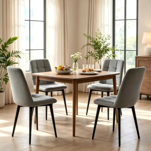 JMGJOY Velvet Dining Chairs Set of 4,Upholstered Gray Dining Room Chairs
View Price
JMGJOY Velvet Dining Chairs Set of 4,Upholstered Gray Dining Room Chairs
View Price
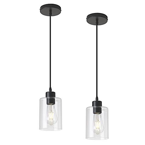 KLSS Modern Black Farmhouse Clear Glass Cylinder Pendant Light Fixture,Island Lights for Kitchen,Mini Pendant Lighting for Kitchen Island Decor - 4.75 Inch Shade 58 Inch Cord (Black 2 Pack)
View Price
KLSS Modern Black Farmhouse Clear Glass Cylinder Pendant Light Fixture,Island Lights for Kitchen,Mini Pendant Lighting for Kitchen Island Decor - 4.75 Inch Shade 58 Inch Cord (Black 2 Pack)
View Price
 ZeeMart Linen Checked Farmhouse Table Runner, 13x72 Inches Neutral Beige
View Price
ZeeMart Linen Checked Farmhouse Table Runner, 13x72 Inches Neutral Beige
View Price
Our Favorite Wall Art
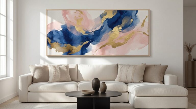 Abstract Canvas Wall Art
See the Top 10
Abstract Canvas Wall Art
See the Top 10
 Large Canvas Wall Art
See the Top 10
Large Canvas Wall Art
See the Top 10
 3-Piece Framed Wall Art Sets
See the Top 10
3-Piece Framed Wall Art Sets
See the Top 10
 Landscape Canvas Wall Art
See the Top 10
Landscape Canvas Wall Art
See the Top 10
 Coastal Wall Art
See the Top 10
Coastal Wall Art
See the Top 10
 Watercolor Prints
See the Top 10
Watercolor Prints
See the Top 10
 Color Block Wall Art
See the Top 10
Color Block Wall Art
See the Top 10
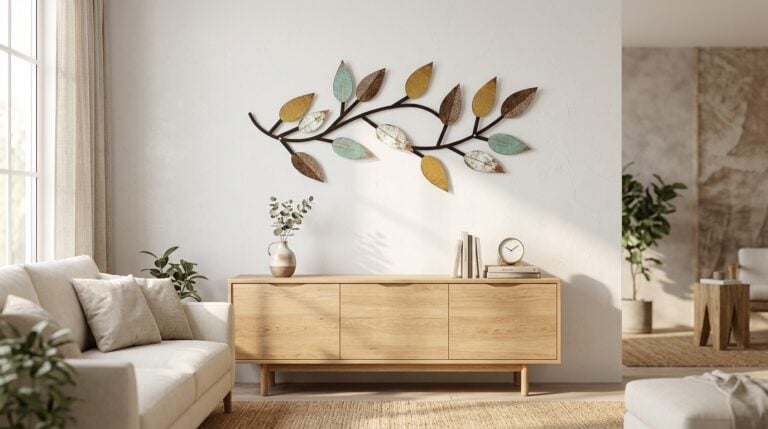 Metal Leaf Wall Decor
See the Top 10
Metal Leaf Wall Decor
See the Top 10
 Black and White Prints
See the Top 10
Black and White Prints
See the Top 10
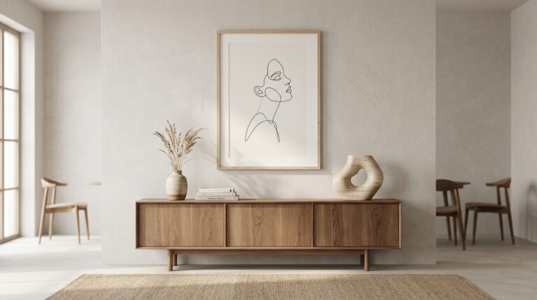 Minimalist Line Art Prints
See the Top 10
Minimalist Line Art Prints
See the Top 10
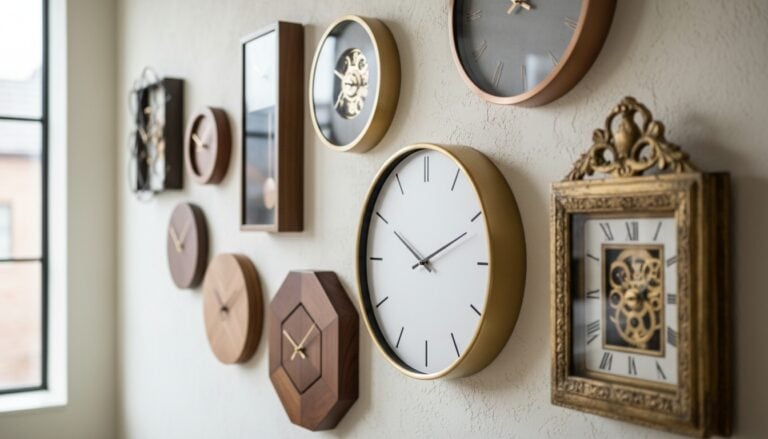 Decorative Wall Clocks
See the Top 10
Decorative Wall Clocks
See the Top 10
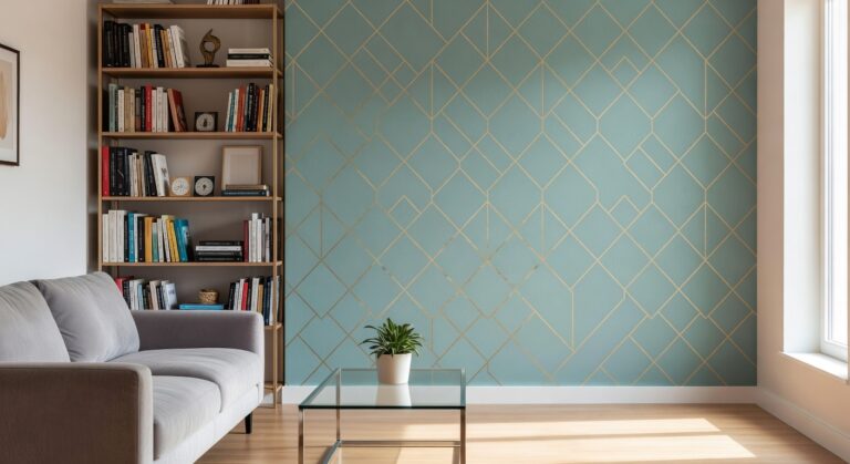 Peel and Stick Wallpaper
See the Top 10
Peel and Stick Wallpaper
See the Top 10
How This Room Looks Under Candlelight
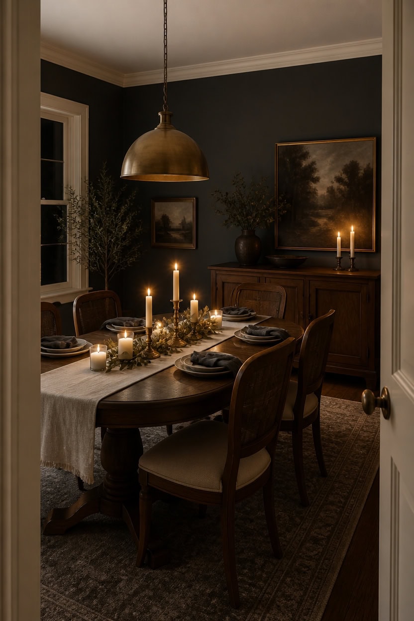
Candlelight sharpens the contrast between deep gray Temptation walls and very light cream Cayman Islands trim, making the trim glow. Warm bulb light shifts color temperature toward amber, softening the gray without dulling the cream. Place the linen runner with folded napkins and stacked plates at the table’s center to carry that same glow.
Use warm bulbs: Choose 2700K bulbs to mimic candle warmth without flicker.
Dim the overhead fixture: Lower brightness so the pendant reads as ambient glow, not task light.
Add reflective metal: Brass or nickel pieces bounce warm light across the dark walls.
Layer low-level lighting: Place a table lamp or wall sconce below eye level for softer shadows.
deepens the room’s mood so candle glow stands out against the dark backdrop. [dark]
keeps the trim luminous under warm bulb light, echoing candlelight’s brightness. [very light]
 Auscmu TC Linen Table Runner and Placemats Set of 6, Cream
View Price
Auscmu TC Linen Table Runner and Placemats Set of 6, Cream
View Price
 HAPPYMONT Upholstered Dining Chair Set of 4, Farmhouse Fabric Kitchen Chair
View Price
HAPPYMONT Upholstered Dining Chair Set of 4, Farmhouse Fabric Kitchen Chair
View Price
 SESIMENT Gold-Electroplated Industrial Pendant Light 11.8inches 2 Packs,Mental Hanging Light Fixtures for Kitchen Island,Dome Pendant Light,Ceiling Light Fixtures for Restaurant Dining Room Aisle
View Price
SESIMENT Gold-Electroplated Industrial Pendant Light 11.8inches 2 Packs,Mental Hanging Light Fixtures for Kitchen Island,Dome Pendant Light,Ceiling Light Fixtures for Restaurant Dining Room Aisle
View Price
 BEAUTYPEAK 42 Inch Round Mirror, Metal Frame Circle Mirror, Gold
View Price
BEAUTYPEAK 42 Inch Round Mirror, Metal Frame Circle Mirror, Gold
View Price
See it in a whole home
The Dark Gray and Cream home tour
Take the colors with you
Dark Gray and Cream: the complete room-by-room paint guide


56 pages. Answer two questions — what kind of floor you have and which way your windows face — and the guide narrows it to three Benjamin Moore cans that cover all nine rooms. Not fourteen. Three.
What Changes When You Flip on the Overhead Light?
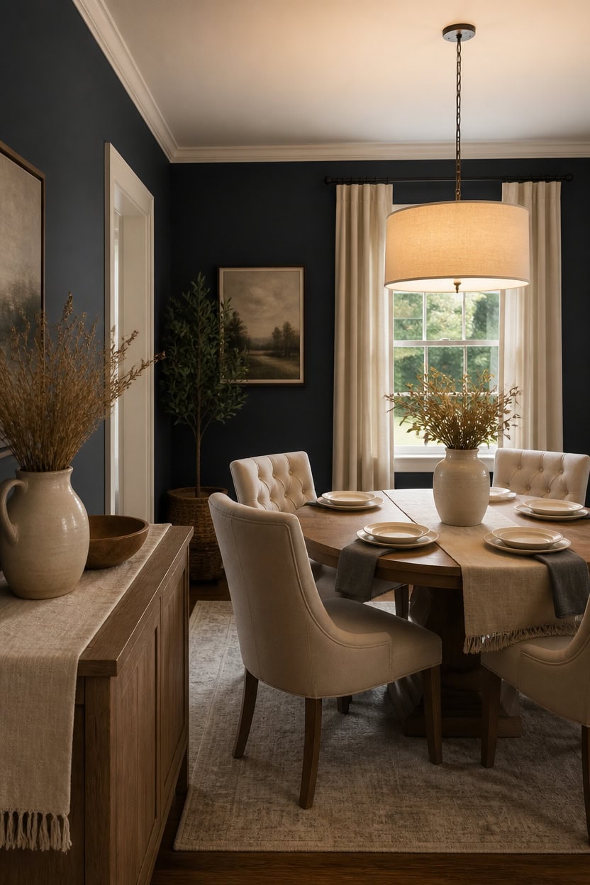
Overhead light cools deep gray Deep Indigo walls, pulling out a blue undertone the candle glow hides. Very light cream Vanilla Ice Cream trim stays bright and true under any bulb temperature. Flip the switch only for cleanup, then let the ceramic pitcher holding dried grasses anchor the sideboard once the room dims again.
Match bulb color: Use warm white 3000K bulbs to avoid a stark blue-toned gray.
Check reflectivity: Bright overhead light shows wall texture that candlelight tends to smooth over.
Balance with lamps: Keep a table lamp on so the overhead fixture isn’t the only light source.
Test after dark: View the walls once the sun sets, since overhead light reveals true undertones best then.
overhead light pulls out its cool undertone, giving the room a sharper edge after sunset. [dark]
stays bright and clean under direct bulb light instead of warm candle glow. [very light]
 Quoowiit Ceramic Rustic Vase with Handle, Green Distressed Decorative Farmhouse Pitcher Vase for Home Decor Living Room Bedroom Kitchen Office Shelf Decor Centerpiece Table Decoration
View Price
Quoowiit Ceramic Rustic Vase with Handle, Green Distressed Decorative Farmhouse Pitcher Vase for Home Decor Living Room Bedroom Kitchen Office Shelf Decor Centerpiece Table Decoration
View Price
 Welzona Upholstered Dining Chairs Set of 4, Button Tufted Parsons Dining Chair with Solid Wood Legs, Modern Fabric Side Chair for Dining Room/Kitchen/Restaurant/Hotel- Grey
View Price
Welzona Upholstered Dining Chairs Set of 4, Button Tufted Parsons Dining Chair with Solid Wood Legs, Modern Fabric Side Chair for Dining Room/Kitchen/Restaurant/Hotel- Grey
View Price
 MEXO Modern Crystal Pendant Light,Black Chandelier Light Fixture, Cylinder Adjustable Height Pendant Lights for Kitchen,Dining Room,Living Room,Foyer,Hallway
View Price
MEXO Modern Crystal Pendant Light,Black Chandelier Light Fixture, Cylinder Adjustable Height Pendant Lights for Kitchen,Dining Room,Living Room,Foyer,Hallway
View Price
 Solino Home 100% Linen Table Runner Natural, Classic Hemstitch 14 x 72 in
View Price
Solino Home 100% Linen Table Runner Natural, Classic Hemstitch 14 x 72 in
View Price
 Einhomn 47.2-inch Round Dining Table, Kitchen Table for 4-6, Farmhouse Circle Dining Room Table, Space Saving Wood Kitchen & Dining Room Furniture, Oak
View Price
Einhomn 47.2-inch Round Dining Table, Kitchen Table for 4-6, Farmhouse Circle Dining Room Table, Space Saving Wood Kitchen & Dining Room Furniture, Oak
View Price
Our Favorite Dinnerware and Serveware
 Dinnerware Sets
See the Top 10
Dinnerware Sets
See the Top 10
 Stoneware Dinnerware Sets
See the Top 10
Stoneware Dinnerware Sets
See the Top 10
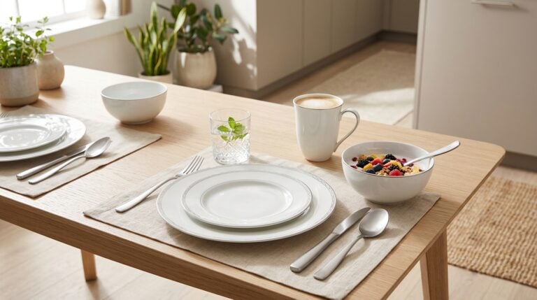 Porcelain Dinnerware Sets
See the Top 10
Porcelain Dinnerware Sets
See the Top 10
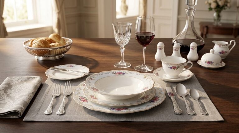 Bone China Dinnerware Sets
See the Top 10
Bone China Dinnerware Sets
See the Top 10
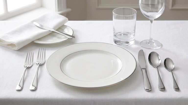 Flatware Sets
See the Top 10
Flatware Sets
See the Top 10
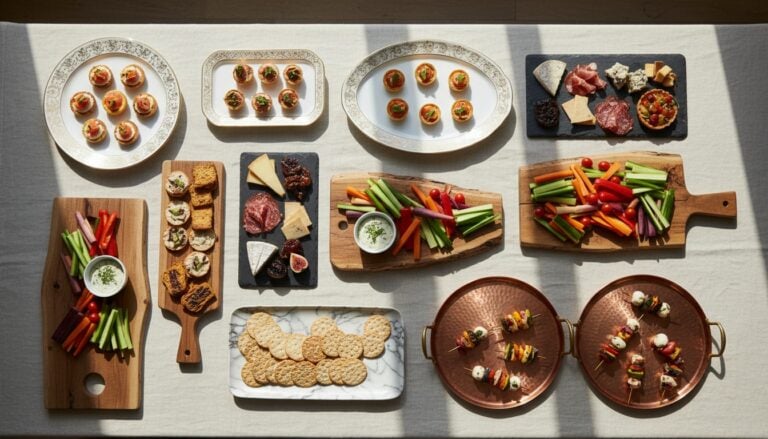 Serving Platters
See the Top 10
Serving Platters
See the Top 10
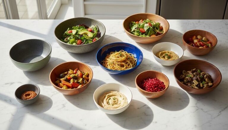 Serving Bowls
See the Top 10
Serving Bowls
See the Top 10
 Salad Bowl Sets
See the Top 10
Salad Bowl Sets
See the Top 10
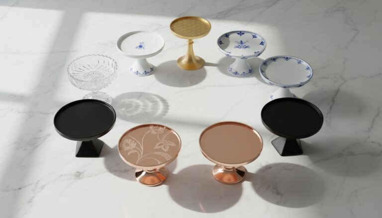 Cake Stands
See the Top 10
Cake Stands
See the Top 10
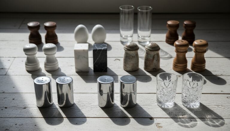 Salt and Pepper Shakers
See the Top 10
Salt and Pepper Shakers
See the Top 10
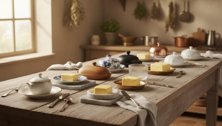 Butter Dishes
See the Top 10
Butter Dishes
See the Top 10
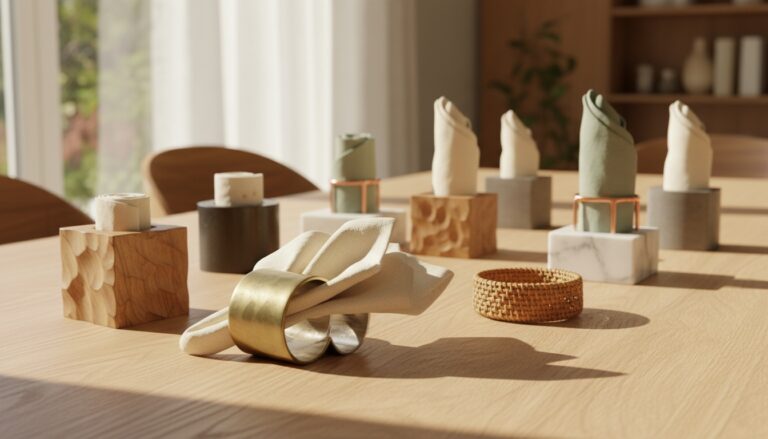 Napkin Holders
See the Top 10
Napkin Holders
See the Top 10
Choosing a Table That Holds Its Own Against Dark Walls
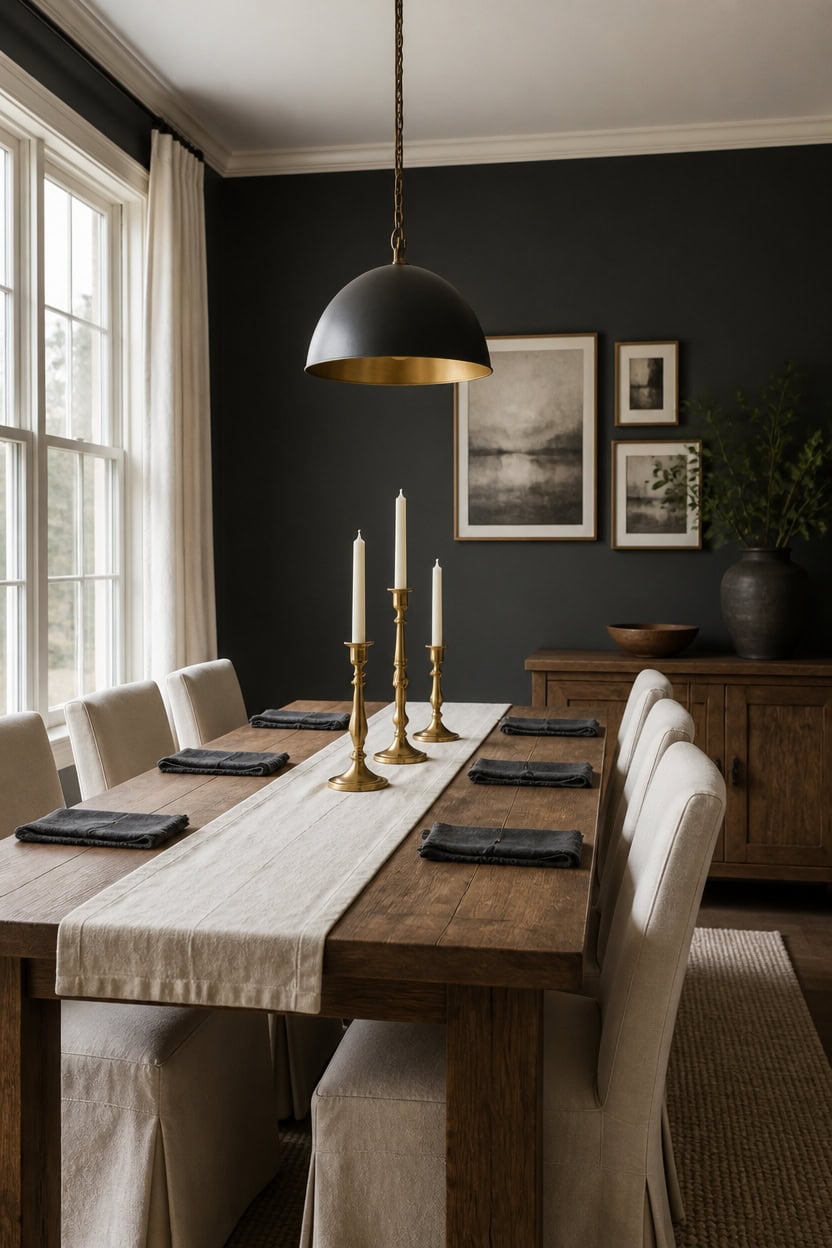
A rectangular wood dining table with substantial legs holds its own against deep gray Cheating Heart walls instead of blending into the color. Very light cream Opal trim keeps the room bright, so the table’s silhouette stays sharp against the dark backdrop. Pair it with a cluster of brass candlesticks at the center to anchor the scale.
Match scale to wall depth: A large tabletop balances the visual weight of deep gray walls.
Choose a finish that reflects light: Matte or lightly glossed wood tops keep the room from feeling too heavy.
Keep legs open and visible: Slim or turned legs let floor space show, which eases the dark backdrop.
Test against both lighting moods: View the table under lamp light and daylight before you commit.
a deep charcoal-gray that gives the table’s wood tone something solid to stand against. [dark]
a soft cream that keeps the room’s edges light and stops the walls from closing in. [very light]
 weselon 78 Inch Dining Table for 6 8 10, Modern Farmhouse Rectangular Kitchen Table, Long Dining Room Tables with Wood Strip Base for Kitchen Living Room (Walnut)
View Price
weselon 78 Inch Dining Table for 6 8 10, Modern Farmhouse Rectangular Kitchen Table, Long Dining Room Tables with Wood Strip Base for Kitchen Living Room (Walnut)
View Price
 chairus Slipcovered Upholstered Parsons Dining Chairs Set of 4, Cream White
View Price
chairus Slipcovered Upholstered Parsons Dining Chairs Set of 4, Cream White
View Price
 SESIMENT Farmhouse Pendant Lighting for Kitchen Island,Black and Gold Dome Pendant Light Fixtures, Industrial Hanging Ceiling Light for Dining Room Foyer Cafe Kitchen Sink,2 Pack
View Price
SESIMENT Farmhouse Pendant Lighting for Kitchen Island,Black and Gold Dome Pendant Light Fixtures, Industrial Hanging Ceiling Light for Dining Room Foyer Cafe Kitchen Sink,2 Pack
View Price
 Perfnique Brass Candlestick Holders Set of 3 - Antique Gold Iron Candle Holders for Christmas, Birthday, Wedding, Party, Dining Table, Fireplace Mantel Decor
View Price
Perfnique Brass Candlestick Holders Set of 3 - Antique Gold Iron Candle Holders for Christmas, Birthday, Wedding, Party, Dining Table, Fireplace Mantel Decor
View Price
 Solino Home 100% Linen Dining Table Runner Ivory Woven, Fete 14 x 72 in
View Price
Solino Home 100% Linen Dining Table Runner Ivory Woven, Fete 14 x 72 in
View Price
Our Favorite Wall Mirrors
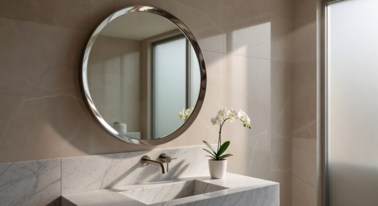 Frameless Round Mirrors
See the Top 10
Frameless Round Mirrors
See the Top 10
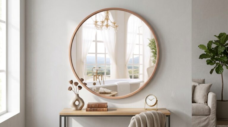 Round Wood Mirrors
See the Top 10
Round Wood Mirrors
See the Top 10
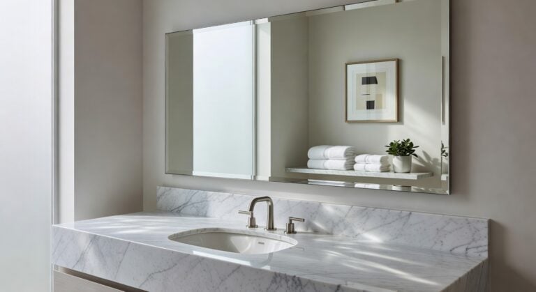 Frameless Rectangular Mirrors
See the Top 10
Frameless Rectangular Mirrors
See the Top 10
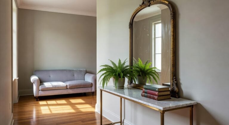 Arched Metal Mirrors
See the Top 10
Arched Metal Mirrors
See the Top 10
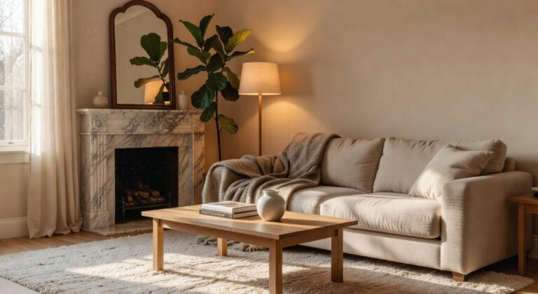 Arched Wood Mirrors
See the Top 10
Arched Wood Mirrors
See the Top 10
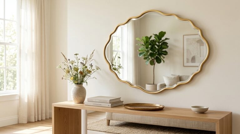 Scalloped Mirrors
See the Top 10
Scalloped Mirrors
See the Top 10
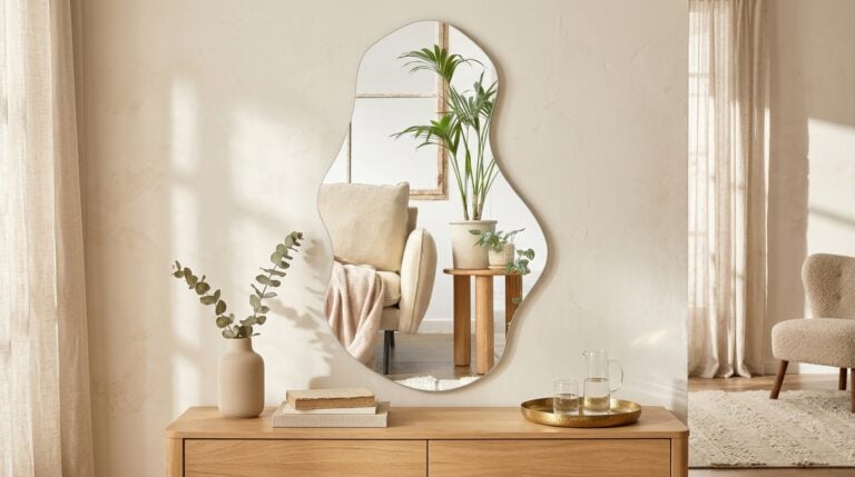 Irregular Mirrors
See the Top 10
Irregular Mirrors
See the Top 10
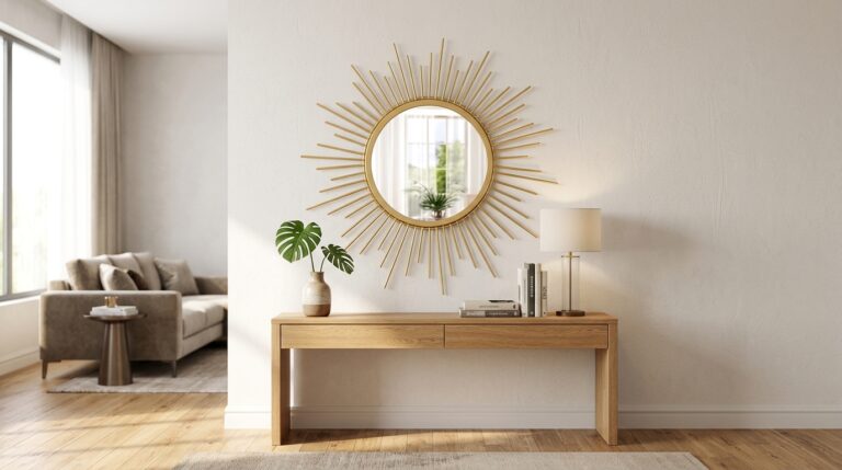 Sunburst Mirrors
See the Top 10
Sunburst Mirrors
See the Top 10
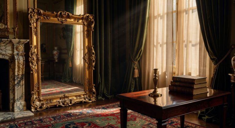 Ornate Gold Mirrors
See the Top 10
Ornate Gold Mirrors
See the Top 10
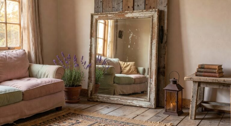 Farmhouse Wood Mirrors
See the Top 10
Farmhouse Wood Mirrors
See the Top 10
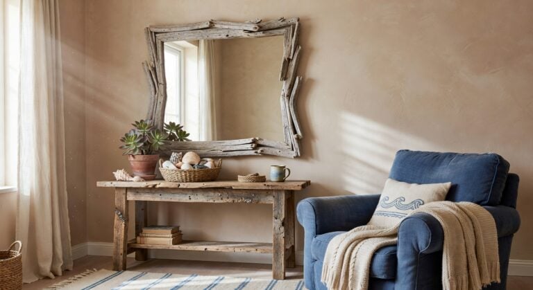 Driftwood Coastal Mirrors
See the Top 10
Driftwood Coastal Mirrors
See the Top 10
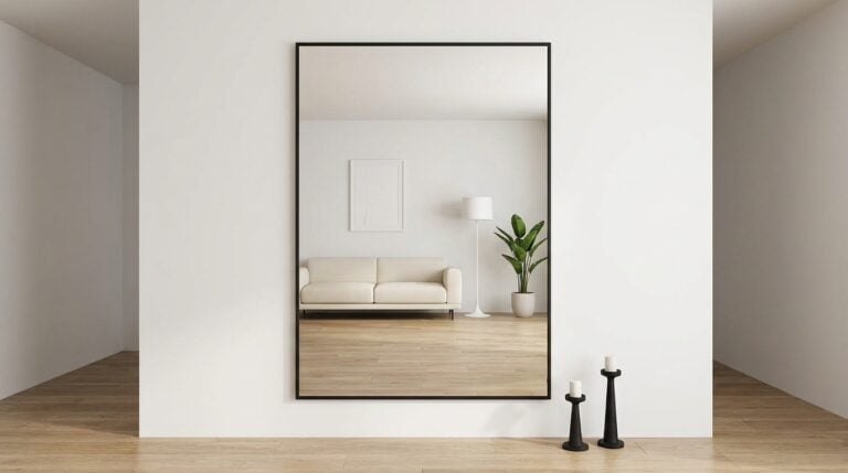 Large Full-Length Mirrors
See the Top 10
Large Full-Length Mirrors
See the Top 10
The Chair Fabric That Bridges Both Lighting Moods
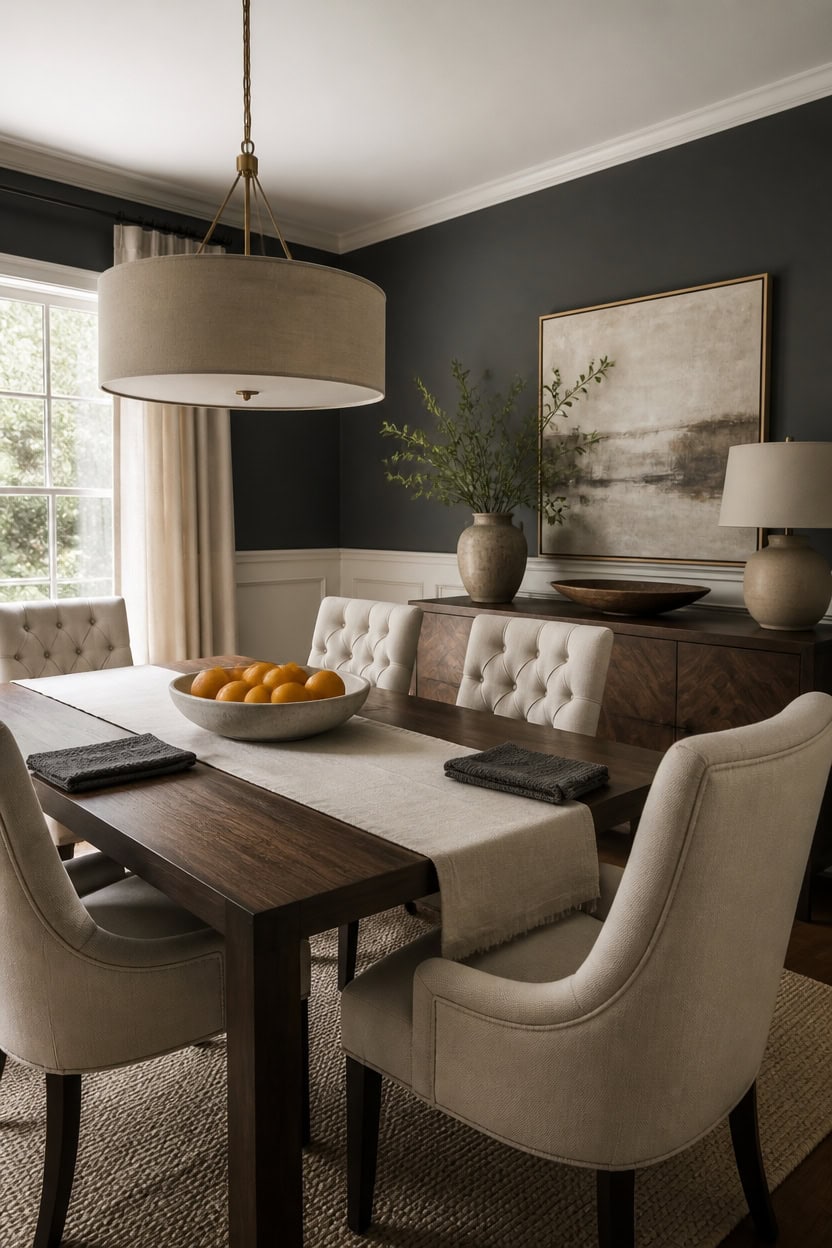
The fabric on your dining chairs needs to work under two very different light sources without shifting tone dramatically. A mid-weight cotton blend in a soft neutral holds its color whether lamps are glowing or afternoon light pours through the window, unlike thin linens that wash out or heavy velvets that go muddy. Pair tufted upholstered seating in that stable neutral with the deep gray Iron Mountain accent wall and the very light cream Natural Linen wainscoting, then let a low ceramic bowl of whole citrus sit at the table’s center to pull the warm tones together.
Pick a mid-weight weave: Cotton or cotton-poly blends resist color shift between daylight and lamp light.
Stay in the neutral family: Oatmeal, bone, or soft gray fabrics echo both the dark walls and cream trim without competing.
Test swatches at night: Hold fabric samples under your dining fixture before buying, since warm bulbs can yellow pale fabrics.
Add texture, not pattern: A subtle weave hides everyday wear better than a busy print in a high-use chair.
a deep charcoal-gray that grounds the room and gives upholstery fabric a rich backdrop. [dark]
a very light cream that lifts the lower half of the room and keeps daylight bouncing. [very light]
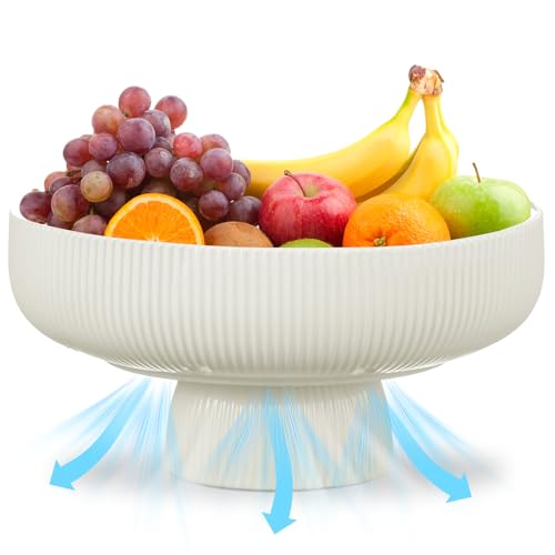 Sawysine 11" Ceramic Fruit Bowl with Ventilation Holes and Pedestal
View Price
Sawysine 11" Ceramic Fruit Bowl with Ventilation Holes and Pedestal
View Price
 COLAMY Button Tufted Dining Chairs Set of 6, Parsons Upholstered Fabric Dining Room Chairs Kitchen Chairs with Wood Legs and Padded Seat, Taupe
View Price
COLAMY Button Tufted Dining Chairs Set of 6, Parsons Upholstered Fabric Dining Room Chairs Kitchen Chairs with Wood Legs and Padded Seat, Taupe
View Price
 Fanousek 20Inch Drum Chandeliers, Gold and White Drum Chandelier with Metal and Fabric Shade, Adjustable Height, Simple Modern Large Drum Pendant Light Fixture Dining Room Bedroom Kitchen Entryway
View Price
Fanousek 20Inch Drum Chandeliers, Gold and White Drum Chandelier with Metal and Fabric Shade, Adjustable Height, Simple Modern Large Drum Pendant Light Fixture Dining Room Bedroom Kitchen Entryway
View Price
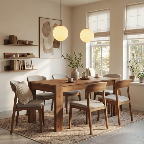 LITTLE TREE 55 Inch Solid Wood Rectangular Dining Table, 29.53" Standard Dining Height Farmhouse Kitchen Table with Thick Sturdy Legs, Compact 4‑6 Person Dinner Table, Rustic Brown, Table Only
View Price
LITTLE TREE 55 Inch Solid Wood Rectangular Dining Table, 29.53" Standard Dining Height Farmhouse Kitchen Table with Thick Sturdy Legs, Compact 4‑6 Person Dinner Table, Rustic Brown, Table Only
View Price
Our Favorite Area Rugs
 Calvo Ivory/Off-White Oriental Area Rug
View Price
Calvo Ivory/Off-White Oriental Area Rug
View Price
 DeSoto Oriental Gray/Ivory Area Rug
View Price
DeSoto Oriental Gray/Ivory Area Rug
View Price
 Hartley Oriental Indoor Rug
View Price
Hartley Oriental Indoor Rug
View Price
 Durand Abstract Modern Machine Woven Area Rug in Beige/Gray
View Price
Durand Abstract Modern Machine Woven Area Rug in Beige/Gray
View Price
 Adrihana Machine Woven Abstract Area Rug
View Price
Adrihana Machine Woven Abstract Area Rug
View Price
 Lurdes Geometric Area Rug
View Price
Lurdes Geometric Area Rug
View Price
 Antonije Tie Dye Shag Area Rug
View Price
Antonije Tie Dye Shag Area Rug
View Price
 Shahen Rectangle Shag Area Rug
View Price
Shahen Rectangle Shag Area Rug
View Price
 Latrissa Moroccan Flatweave Wool Charcoal/Cream Area Rug
View Price
Latrissa Moroccan Flatweave Wool Charcoal/Cream Area Rug
View Price
 Armina Handmade Tufted Wool Ivory/Beige Area Rug
View Price
Armina Handmade Tufted Wool Ivory/Beige Area Rug
View Price
 Ardee Hand-Flatweave Jute Area Rug
View Price
Ardee Hand-Flatweave Jute Area Rug
View Price
 Roehit Oriental Machine Washable Area Rug
View Price
Roehit Oriental Machine Washable Area Rug
View Price
 Alice Machine Washable Oriental Flatweave Red/Blue/Ivory Area Rug
View Price
Alice Machine Washable Oriental Flatweave Red/Blue/Ivory Area Rug
View Price
 Mya Machine Washable Oriental Area Rug
View Price
Mya Machine Washable Oriental Area Rug
View Price
Choosing a Chandelier That Works With Dark Gray Walls
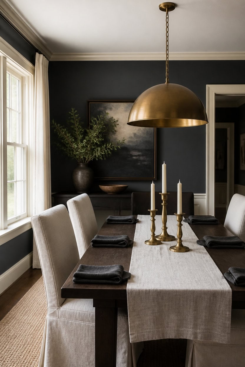
A chandelier reads best when it visually contrasts the wall color instead of blending into it. Choose a fixture with metal or glass elements, since fabric shades vanish against deep dark gray Cheating Heart walls. Reflective finishes bounce light off the very light cream Calming Cream trim, keeping the fixture visible from every seat, so pick a dome shape that echoes the rectangular table and let the brass candlesticks below match its metal tone.
Match fixture width to table: Keep the chandelier no wider than the table so sightlines stay clear at both ends.
Pick warm-toned bulbs: Warm white bulbs keep the glow from turning dark gray walls flat and cold.
Balance the metal finish: Brass or aged bronze reads warmer against dark gray than bright chrome or nickel.
Hang at a comfortable eye level: Position the bottom of the shade so light spreads evenly across the whole table.
a deep charcoal-gray that gives the chandelier’s metal finish a dramatic backdrop. [dark]
a very light cream that outlines doorways and windows so light bounces back toward the fixture. [very light]


Our Favorite Faux Trees
 Altman Faux Olive Tree with White Planter
View Price
Altman Faux Olive Tree with White Planter
View Price
 Alvina 96" Artificial Olive Tree with White Planter
View Price
Alvina 96" Artificial Olive Tree with White Planter
View Price
 6 ft Faux Olive Tree with Fruit and Realistic Leaves
View Price
6 ft Faux Olive Tree with Fruit and Realistic Leaves
View Price
 Adarna 60" Artificial Fiddle Leaf Fig Tree
View Price
Adarna 60" Artificial Fiddle Leaf Fig Tree
View Price
 Adcock 8 ft Artificial Ficus Tree in White Planter
View Price
Adcock 8 ft Artificial Ficus Tree in White Planter
View Price
 Adcock Faux Ficus Tree in White Planter
View Price
Adcock Faux Ficus Tree in White Planter
View Price
 Adcock Artificial Dracaena Tree in Pot
View Price
Adcock Artificial Dracaena Tree in Pot
View Price
 Artificial Bamboo Tree in Pot
View Price
Artificial Bamboo Tree in Pot
View Price
 Adcock 6.5 ft Artificial Bamboo Tree in Cream Planter
View Price
Adcock 6.5 ft Artificial Bamboo Tree in Cream Planter
View Price
 Adcock Artificial Majesty Palm Tree in Pot
View Price
Adcock Artificial Majesty Palm Tree in Pot
View Price
 6.5 ft Artificial Bird of Paradise Tree in Black Cement Pot
View Price
6.5 ft Artificial Bird of Paradise Tree in Black Cement Pot
View Price
 6 ft Artificial Traveler's Palm in White Planter
View Price
6 ft Artificial Traveler's Palm in White Planter
View Price
Layering Sconces and Lamps for Evening Warmth
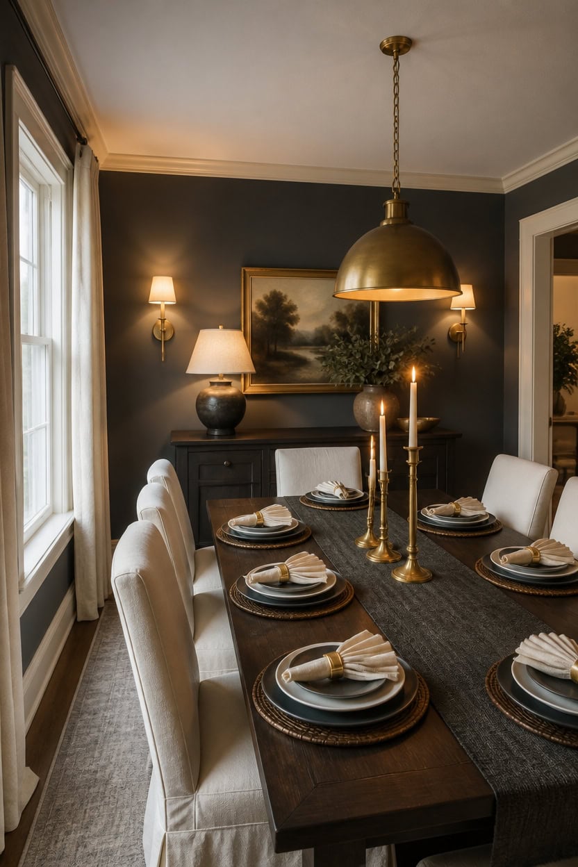
Stack three light heights so no fixture works alone after dark. This mix keeps the deep gray Cheating Heart walls from flattening at night, since warm bulbs bounce off the very light cream Calming Cream trim. Add brass candlesticks in a cluster of three at the table’s center for a low warm glow.
Set sconce height: Mount sconces about five feet up so light lands at eye level, not the ceiling.
Add a sideboard lamp: A single lamp fills the shadows the overhead fixture leaves behind.
Mix bulb tones: Keep sconces, lamps, and candlelight all warm white so nothing clashes.
Use separate dimmers: Wire sconces and lamps on different switches for flexible evening light.
a deep charcoal-gray that lets sconce and lamp glow read as warm pools instead of flat light. [dark]
a very light cream that bounces lamp and sconce light back across the room after sunset. [very light]
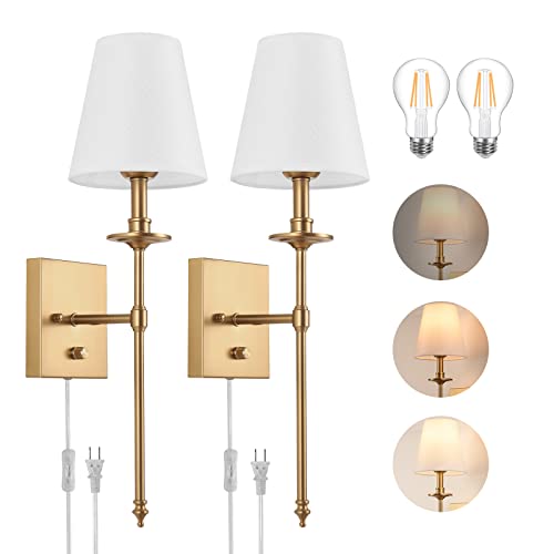 Dimmable Wall Sconces Set of Two, Plug in Wall Sconces White Fabric Shade, Wall Lamp for Bedroom, Living room, Plug in Wall Light Sconces Wall Decor Set of 2, LED Bulbs Included, Antique Brass
View Price
Dimmable Wall Sconces Set of Two, Plug in Wall Sconces White Fabric Shade, Wall Lamp for Bedroom, Living room, Plug in Wall Light Sconces Wall Decor Set of 2, LED Bulbs Included, Antique Brass
View Price
 Signature Design by Ashley Rainermen Ceramic Table Lamp, 21", Off White
View Price
Signature Design by Ashley Rainermen Ceramic Table Lamp, 21", Off White
View Price
 Antique Brass Iron Taper Candle Holder - Set of 3 Decorative Candle Stand
View Price
Antique Brass Iron Taper Candle Holder - Set of 3 Decorative Candle Stand
View Price
 DM Furniture Parsons Dining Chairs Set of 4, Upholstered Slipcovered Dining Room Chairs with Removable Washable Skirt, High Back Kitchen Chairs with Solid Wood Legs, Cream White Linen Fabric
View Price
DM Furniture Parsons Dining Chairs Set of 4, Upholstered Slipcovered Dining Room Chairs with Removable Washable Skirt, High Back Kitchen Chairs with Solid Wood Legs, Cream White Linen Fabric
View Price
 GarveeHome Farmhouse Dining Table for 6-8 People, 71 in Long Kitchen Tables
View Price
GarveeHome Farmhouse Dining Table for 6-8 People, 71 in Long Kitchen Tables
View Price
 ZeeMart Graphite Grey Table Runners 72 Inches Long, Burlap Linen Style Rustic Farmhouse Table Runner, Boho Woven Dining Table Runner, 13x72 Inches, Graphite Grey
View Price
ZeeMart Graphite Grey Table Runners 72 Inches Long, Burlap Linen Style Rustic Farmhouse Table Runner, Boho Woven Dining Table Runner, 13x72 Inches, Graphite Grey
View Price
 Ruvanti Cloth Napkins Set of 12, Cotton Enrich 18”x18” - Ivory/Cream
View Price
Ruvanti Cloth Napkins Set of 12, Cotton Enrich 18”x18” - Ivory/Cream
View Price
Renter-Friendly Wallpaper for This Palette
Removable designer wallpaper from Wallshoppe, picked to match this palette. An easy way to add pattern to a rental, and every design is available as a sample.
 The Queens Lace' Wallpaper by Sarah Jessica Parker – Silver
View Price
The Queens Lace' Wallpaper by Sarah Jessica Parker – Silver
View Price
 Townhouse Wallpaper by Sarah Jessica Parker – Pearl on Parchment
View Price
Townhouse Wallpaper by Sarah Jessica Parker – Pearl on Parchment
View Price
 Buka Patchwork Wallpaper by Chris Benz – Flax
View Price
Buka Patchwork Wallpaper by Chris Benz – Flax
View Price
 Buka Patchwork Wallpaper by Chris Benz – Burlap
View Price
Buka Patchwork Wallpaper by Chris Benz – Burlap
View Price
 The Queens Lace' Wallpaper by Sarah Jessica Parker – Oyster
View Price
The Queens Lace' Wallpaper by Sarah Jessica Parker – Oyster
View Price
 Sweet Caroline Wallpaper by Wallshoppe – Fog
View Price
Sweet Caroline Wallpaper by Wallshoppe – Fog
View Price
 Best Fronds Wallpaper by Wallshoppe – Storm
View Price
Best Fronds Wallpaper by Wallshoppe – Storm
View Price
 Tent Stripe Large Wallpaper by Chris Benz – Mustard
View Price
Tent Stripe Large Wallpaper by Chris Benz – Mustard
View Price
 Life is a Banquet Stripe Wallpaper by Lingua Franca – Blues
View Price
Life is a Banquet Stripe Wallpaper by Lingua Franca – Blues
View Price
 Ojai Stripe Wallpaper by Wallshoppe – Iced Chai
View Price
Ojai Stripe Wallpaper by Wallshoppe – Iced Chai
View Price
 Pinstripe Wallpaper by Sugar Paper – Grey
View Price
Pinstripe Wallpaper by Sugar Paper – Grey
View Price
 Small Dumbo Wallpaper by Chris Benz – Black
View Price
Small Dumbo Wallpaper by Chris Benz – Black
View Price
 Best Fronds Wallpaper by Wallshoppe – Gray
View Price
Best Fronds Wallpaper by Wallshoppe – Gray
View Price
 Bloc Wallpaper by Wallshoppe – Stone
View Price
Bloc Wallpaper by Wallshoppe – Stone
View Price
 Fleur De Camomille Wallpaper by Sarah Jessica Parker – Parchment
View Price
Fleur De Camomille Wallpaper by Sarah Jessica Parker – Parchment
View Price
 Tent Stripe Large Wallpaper by Chris Benz – Brown Red
View Price
Tent Stripe Large Wallpaper by Chris Benz – Brown Red
View Price
 Eleanor Rigby Wallpaper by Wallshoppe – Storm
View Price
Eleanor Rigby Wallpaper by Wallshoppe – Storm
View Price
 Stacks Wallpaper by Sarah Jessica Parker – Natural
View Price
Stacks Wallpaper by Sarah Jessica Parker – Natural
View Price
 Barbara Ann Wallpaper by Wallshoppe – Dior Gray
View Price
Barbara Ann Wallpaper by Wallshoppe – Dior Gray
View Price
 Eleanor Rigby Wallpaper by Wallshoppe – Charcoal / Umber
View Price
Eleanor Rigby Wallpaper by Wallshoppe – Charcoal / Umber
View Price
 The Queens Lace' Wallpaper by Sarah Jessica Parker – Pepper
View Price
The Queens Lace' Wallpaper by Sarah Jessica Parker – Pepper
View Price
 Life is a Banquet Stripe Wallpaper by Lingua Franca – Persimmon + Blue
View Price
Life is a Banquet Stripe Wallpaper by Lingua Franca – Persimmon + Blue
View Price
 Large Dumbo Wallpaper by Chris Benz – Latte
View Price
Large Dumbo Wallpaper by Chris Benz – Latte
View Price
 Bloc Wallpaper by Wallshoppe – Elephant
View Price
Bloc Wallpaper by Wallshoppe – Elephant
View Price
 Eleanor Rigby Wallpaper by Wallshoppe – Flint / Dior Gray
View Price
Eleanor Rigby Wallpaper by Wallshoppe – Flint / Dior Gray
View Price
 Large Dumbo Wallpaper by Chris Benz – Black
View Price
Large Dumbo Wallpaper by Chris Benz – Black
View Price
 Pacifico Palm Wallpaper by Nathan Turner – Cappuccino
View Price
Pacifico Palm Wallpaper by Nathan Turner – Cappuccino
View Price
 Large Madison Stripe Wallpaper by Chris Benz – Tan
View Price
Large Madison Stripe Wallpaper by Chris Benz – Tan
View Price
 Tent Stripe Large Wallpaper by Chris Benz – Rust Terracotta Pink
View Price
Tent Stripe Large Wallpaper by Chris Benz – Rust Terracotta Pink
View Price
 Tent Stripe Small Wallpaper by Chris Benz – Mustard
View Price
Tent Stripe Small Wallpaper by Chris Benz – Mustard
View Price
 Parsons Paint Wallpaper by Chris Benz – Silver
View Price
Parsons Paint Wallpaper by Chris Benz – Silver
View Price
 Tent Stripe Large Wallpaper by Chris Benz – Magenta Red
View Price
Tent Stripe Large Wallpaper by Chris Benz – Magenta Red
View Price
 Crosstown Plaid On White Wallpaper by Sarah Jessica Parker – Silver Pearl
View Price
Crosstown Plaid On White Wallpaper by Sarah Jessica Parker – Silver Pearl
View Price
 Eleanor Rigby Wallpaper by Wallshoppe – Safari
View Price
Eleanor Rigby Wallpaper by Wallshoppe – Safari
View Price
 Tent Stripe Large Wallpaper by Chris Benz – Blue
View Price
Tent Stripe Large Wallpaper by Chris Benz – Blue
View Price
 Lafayette Patchwork Wallpaper by Chris Benz – Brown
View Price
Lafayette Patchwork Wallpaper by Chris Benz – Brown
View Price
 Pebble Wallpaper by Sugar Paper – Grey On White
View Price
Pebble Wallpaper by Sugar Paper – Grey On White
View Price
 Tent Stripe Large Wallpaper by Chris Benz – Seaglass Blue
View Price
Tent Stripe Large Wallpaper by Chris Benz – Seaglass Blue
View Price
 Small Dumbo Wallpaper by Chris Benz – Latte
View Price
Small Dumbo Wallpaper by Chris Benz – Latte
View Price
 Crosstown Plaid Wallpaper by Sarah Jessica Parker – Olive on Silver
View Price
Crosstown Plaid Wallpaper by Sarah Jessica Parker – Olive on Silver
View Price
How Candle Placement Shapes the Mood
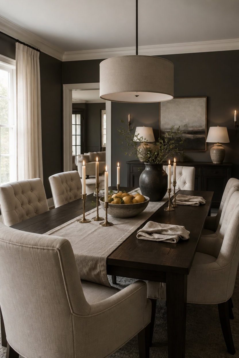
Centerpiece height controls how mood reads across the table: keep any tabletop object under twelve inches so sightlines stay open during dinner conversation. Deep charcoal Iron Mountain covers the main walls to absorb glare, while very light cream Natural Linen brightens the trim so the room stays open. A low ceramic bowl of whole citrus at the table’s center adds warmth without blocking sightlines.
Center the bowl: Place the citrus bowl at the table’s midpoint so sightlines stay balanced.
Mind the height: Keep centerpiece pieces low so guests can talk across the table freely.
Layer with texture: Pair the ceramic bowl with a linen runner for quiet depth.
Leave breathing room: Space decor at least a foot from each place setting.
a deep charcoal that keeps evening light from bouncing too bright off the surface. [dark]
a very light cream that keeps sightlines open by reflecting soft light around the room. [very light]
 OAKOA Large Decorative Bowl - Stone Fruit Bowl - Stone Bowl Decorative
View Price
OAKOA Large Decorative Bowl - Stone Fruit Bowl - Stone Bowl Decorative
View Price
 OVENTA Modern Tufted Upholstered Dining Chairs Set of 2, Beige Linen Dining Room Chair with Solid Wood Legs, Sillas de Comedor, Kitchen Chairs (Beige, Linen Set of 2)
View Price
OVENTA Modern Tufted Upholstered Dining Chairs Set of 2, Beige Linen Dining Room Chair with Solid Wood Legs, Sillas de Comedor, Kitchen Chairs (Beige, Linen Set of 2)
View Price
 HILUXIA 18" Modern Double Drum Fabric Pendant Light, Large Hanging Ceiling Chandelier Fixture with Dual Layer Fabric Shade, Ideal for Dining Room, Living Room, Bedroom, and Kitchen
View Price
HILUXIA 18" Modern Double Drum Fabric Pendant Light, Large Hanging Ceiling Chandelier Fixture with Dual Layer Fabric Shade, Ideal for Dining Room, Living Room, Bedroom, and Kitchen
View Price
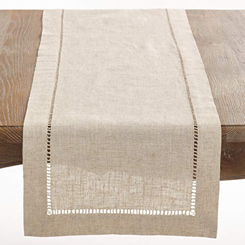 Saro Lifestyle Poly and Linen Blend Hemstitched Table Runner with Hemstitch Border, 16"x72", Natural
View Price
Saro Lifestyle Poly and Linen Blend Hemstitched Table Runner with Hemstitch Border, 16"x72", Natural
View Price
 PORCER 8.2 Inch Ceramic Vase, Terracotta Rustic Vase Farmhouse Decorative Vase Boho Decor, Ceramic Vases for Home Decor, Living Room, Entryway, Floor, Holiday Wedding Christmas New Year Gifts - Gray
View Price
PORCER 8.2 Inch Ceramic Vase, Terracotta Rustic Vase Farmhouse Decorative Vase Boho Decor, Ceramic Vases for Home Decor, Living Room, Entryway, Floor, Holiday Wedding Christmas New Year Gifts - Gray
View Price
 Accent Home Natural Linen Cloth Napkins, Set of 12, 18x18 Inches
View Price
Accent Home Natural Linen Cloth Napkins, Set of 12, 18x18 Inches
View Price
 Sweet Home Collection 100% Cotton Placemats for Dining Room Rectangle Two Tone Woven Fabric 13" x 19" Soft Durable Table Mat Set, Set of 6, Eggshell
View Price
Sweet Home Collection 100% Cotton Placemats for Dining Room Rectangle Two Tone Woven Fabric 13" x 19" Soft Durable Table Mat Set, Set of 6, Eggshell
View Price
Our Favorite Bar Stools
 Faux Leather Modern Low Back Counter Stool
View Price
Faux Leather Modern Low Back Counter Stool
View Price
 Bartonville Solid Wood Backless Counter and Bar Stool with Upholstered Seat
View Price
Bartonville Solid Wood Backless Counter and Bar Stool with Upholstered Seat
View Price
 Mid-Century Modern Swivel Counter Height Bar Stools, Set of 2
View Price
Mid-Century Modern Swivel Counter Height Bar Stools, Set of 2
View Price
 Vannie Upholstered Counter Stool with Solid Wood Frame
View Price
Vannie Upholstered Counter Stool with Solid Wood Frame
View Price
 Kymberlynn Swivel Upholstered Low Back Bar and Counter Stool
View Price
Kymberlynn Swivel Upholstered Low Back Bar and Counter Stool
View Price
 Hesson Swivel Faux Leather Low Back Bar Stools
View Price
Hesson Swivel Faux Leather Low Back Bar Stools
View Price
 Zager Faux Leather Swivel Adjustable Height Bar Stool
View Price
Zager Faux Leather Swivel Adjustable Height Bar Stool
View Price
 Penacook Swivel Adjustable Height Bar Stool
View Price
Penacook Swivel Adjustable Height Bar Stool
View Price
 Jobani Swivel Stool
View Price
Jobani Swivel Stool
View Price
 Vannie Upholstered Counter Stool with Solid Wood Frame
View Price
Vannie Upholstered Counter Stool with Solid Wood Frame
View Price
 Sitaram Swivel Stool
View Price
Sitaram Swivel Stool
View Price
 Upholstered Low Back Counter Stool with Metal Frame
View Price
Upholstered Low Back Counter Stool with Metal Frame
View Price
 Burney Counter Stool
View Price
Burney Counter Stool
View Price
 24" Seat Height Upholstered Velvet Counter Stool with Arms
View Price
24" Seat Height Upholstered Velvet Counter Stool with Arms
View Price
 Mangu Upholstered Swivel Stool
View Price
Mangu Upholstered Swivel Stool
View Price
 26" Swivel Upholstered Counter Stool with Wood Frame
View Price
26" Swivel Upholstered Counter Stool with Wood Frame
View Price
 Ljubka Faux Leather Swivel Stools
View Price
Ljubka Faux Leather Swivel Stools
View Price
 Faux Leather Counter Height Bar Stools with Back
View Price
Faux Leather Counter Height Bar Stools with Back
View Price
 Bisto Upholstered Counter Height Bar Stool with Solid Wood Legs
View Price
Bisto Upholstered Counter Height Bar Stool with Solid Wood Legs
View Price
 Liekele Upholstered Sled Base Bar Stool
View Price
Liekele Upholstered Sled Base Bar Stool
View Price
 Swivel Upholstered Adjustable Height Counter Stool with Metal Frame
View Price
Swivel Upholstered Adjustable Height Counter Stool with Metal Frame
View Price
 Swivel Upholstered Counter Stool
View Price
Swivel Upholstered Counter Stool
View Price
 26" Swivel Upholstered Counter Stool with Walnut Bentwood Frame
View Price
26" Swivel Upholstered Counter Stool with Walnut Bentwood Frame
View Price
 Solid Wood Upholstered Counter Stool
View Price
Solid Wood Upholstered Counter Stool
View Price
 Berneta 26" Upholstered Counter Stools
View Price
Berneta 26" Upholstered Counter Stools
View Price
 Norflett Solid Wood Swivel Counter Stool
View Price
Norflett Solid Wood Swivel Counter Stool
View Price
 Makylia Swivel 26" Counter Stool
View Price
Makylia Swivel 26" Counter Stool
View Price
 Uniondale Swivel Upholstered 26.2" Counter Stool with Rattan Cane Back
View Price
Uniondale Swivel Upholstered 26.2" Counter Stool with Rattan Cane Back
View Price
 Vernon 27" Barrel Counter Stools with Backrest and Arms, Set of 2
View Price
Vernon 27" Barrel Counter Stools with Backrest and Arms, Set of 2
View Price
 Rasnick Faux Leather Counter and Bar Stool with Iron Frame
View Price
Rasnick Faux Leather Counter and Bar Stool with Iron Frame
View Price
 Vincentas Upholstered Counter Stool
View Price
Vincentas Upholstered Counter Stool
View Price
 Carneshia Upholstered Solid Wood Counter Stool
View Price
Carneshia Upholstered Solid Wood Counter Stool
View Price
 Charney 27" Upholstered Barrel Counter Stool with Metal Frame
View Price
Charney 27" Upholstered Barrel Counter Stool with Metal Frame
View Price
 Arleine Swivel 26.7" Upholstered Counter Stool
View Price
Arleine Swivel 26.7" Upholstered Counter Stool
View Price
 360° Swivel Upholstered Counter and Bar Stool with Solid Wood Frame
View Price
360° Swivel Upholstered Counter and Bar Stool with Solid Wood Frame
View Price
 Elora Swivel Counter and Bar Stool
View Price
Elora Swivel Counter and Bar Stool
View Price
 Drees Swivel Upholstered Counter and Bar Stool with Wood Backrest
View Price
Drees Swivel Upholstered Counter and Bar Stool with Wood Backrest
View Price
 Malling 26" Upholstered Swivel Stool
View Price
Malling 26" Upholstered Swivel Stool
View Price
 Arvelle Swivel Counter and Bar Stool
View Price
Arvelle Swivel Counter and Bar Stool
View Price
 Maven Lane Pullman Stool with Fabric Upholstery
View Price
Maven Lane Pullman Stool with Fabric Upholstery
View Price
Overhead Lighting That Won’t Wash Out Dark Gray Walls
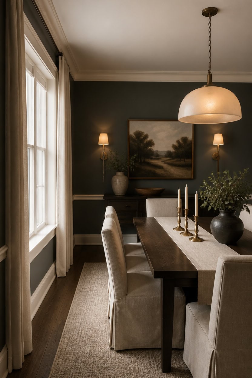
A dimmable pendant with a frosted shade spreads soft light without turning the deep gray Cheating Heart walls flat. Diffused light bounces off the very light cream Calming Cream trim, balancing the darker walls so the room stays bright. Dim the fixture during dinner and let a cluster of brass candlesticks add warm, layered light at the table.
Layer three light sources: Combine a pendant, wall sconces, and a dimmer for flexible brightness.
Choose warm bulbs: Pick 2700K bulbs so dark walls read rich, not gloomy.
Hang for even spread: Keep the pendant’s bottom low enough to pool light over the table without glare.
Add reflective surfaces: Use a mirror or metallic accents to bounce light across the room.
a deep gray that stays grounded and rich once warm overhead light hits it. [dark]
a very light cream that catches and spreads soft light around the room. [very light]
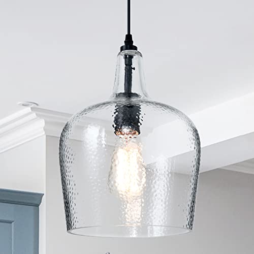 ELYCCUPA Glass Pendant Light Modern Black 1 Light Single Dome Pendant Lighting Fixtures for Kitchen Island Dining Room Hallway, Wide 10 Inch, E26, UL Listed
View Price
ELYCCUPA Glass Pendant Light Modern Black 1 Light Single Dome Pendant Lighting Fixtures for Kitchen Island Dining Room Hallway, Wide 10 Inch, E26, UL Listed
View Price
 Consciot A19 LED Light Bulbs Dimmable, 60W Equivalent, 3000K, 5 Packs
View Price
Consciot A19 LED Light Bulbs Dimmable, 60W Equivalent, 3000K, 5 Packs
View Price
 CIMOTA Removable Slipcovered Dining Chairs Set of 2, Modern Upholstered Kitchen Chairs, Armless Kitchen & Dining Room Side Chair, Linen Beige
View Price
CIMOTA Removable Slipcovered Dining Chairs Set of 2, Modern Upholstered Kitchen Chairs, Armless Kitchen & Dining Room Side Chair, Linen Beige
View Price
 BEAUTYPEAK 30 Inch Round Mirror, Metal Frame Circle Mirror, Gold
View Price
BEAUTYPEAK 30 Inch Round Mirror, Metal Frame Circle Mirror, Gold
View Price
Our Favorite Dining Chairs and Benches
 Solon Upholstered Solid Wood Dining Chair
View Price
Solon Upholstered Solid Wood Dining Chair
View Price
 Aunnika Upholstered Side Chair
View Price
Aunnika Upholstered Side Chair
View Price
 Modern Compact Fabric Upholstered Dining Chair
View Price
Modern Compact Fabric Upholstered Dining Chair
View Price
 Modern Tech Fabric Upholstered Dining Chairs
View Price
Modern Tech Fabric Upholstered Dining Chairs
View Price
 Modern Curved Back Upholstered Side Dining Chair
View Price
Modern Curved Back Upholstered Side Dining Chair
View Price
 Stanford Upholstered Curved Solid Wood Dining Chair
View Price
Stanford Upholstered Curved Solid Wood Dining Chair
View Price
 Upholstered Side Dining Chairs with Solid Wood Legs
View Price
Upholstered Side Dining Chairs with Solid Wood Legs
View Price
 Josiha Wood Dining Chairs, Set of 6
View Price
Josiha Wood Dining Chairs, Set of 6
View Price
 Upholstered Solid Wood Dining Side Chair
View Price
Upholstered Solid Wood Dining Side Chair
View Price
 Upholstered Velvet Kitchen Dining Armchair
View Price
Upholstered Velvet Kitchen Dining Armchair
View Price
 Velvet Barrel-Back Dining Chair with Gold Caps
View Price
Velvet Barrel-Back Dining Chair with Gold Caps
View Price
 Modern Velvet Dining Chairs, Set of 4
View Price
Modern Velvet Dining Chairs, Set of 4
View Price
 Bason Upholstered Faux Leather Dining Chairs, Set of 6
View Price
Bason Upholstered Faux Leather Dining Chairs, Set of 6
View Price
 Upholstered Chenille Dining Chairs with Metal Legs
View Price
Upholstered Chenille Dining Chairs with Metal Legs
View Price
 Modern PU Leather Upholstered Side Dining Chair
View Price
Modern PU Leather Upholstered Side Dining Chair
View Price
 Marilina Dining Bench
View Price
Marilina Dining Bench
View Price
 Vienna Reclaimed Pine Wood Dining Bench
View Price
Vienna Reclaimed Pine Wood Dining Bench
View Price
 Ruby-Jai Dining Bench
View Price
Ruby-Jai Dining Bench
View Price
The Rug That Grounds a Dark Gray and Cream Room
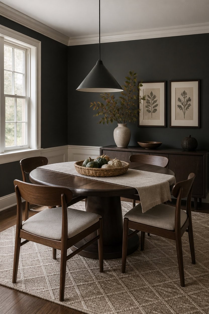
A wool rug with a subtle diamond pattern grounds the room, pairing the deep gray French Beret walls with the very light Lancaster Whitewash trim. Its texture softens the floor so the room doesn’t feel top-heavy. Set a woven basket of gourds nearby to echo the rug’s warm tones.
Extend the rug: Make sure it extends well past the chairs so nobody rolls off the edge.
Pick a pattern with depth: A subtle geometric or diamond weave hides crumbs and adds texture without competing with the walls.
Anchor with natural fiber: A wool or jute blend grounds the room while staying easy to clean under a dining table.
Layer, don’t match: Let the rug pick up one wall tone instead of matching it exactly for visual depth.
a deep charcoal-gray that grounds the rug’s cool undertones. [dark]
a very light cream that keeps the rug’s pattern from feeling boxed in. [very light]
 DM Furniture 47" Round Dining Table with Wooden Pedestal Base, Reclaimed Pine Wood Dinner Table for 4, Heavy Duty Pedestal Table for Kitchen/Dining Room/Living Room/Restaurant, Walnut
View Price
DM Furniture 47" Round Dining Table with Wooden Pedestal Base, Reclaimed Pine Wood Dinner Table for 4, Heavy Duty Pedestal Table for Kitchen/Dining Room/Living Room/Restaurant, Walnut
View Price
 DM Furniture Windsor Dining Chairs Set of 4, Spindle Back Wooden Chairs
View Price
DM Furniture Windsor Dining Chairs Set of 4, Spindle Back Wooden Chairs
View Price
 Matte Black Mini Pendant Light 7.87in Cone Kitchen Island Pendant Lighting
View Price
Matte Black Mini Pendant Light 7.87in Cone Kitchen Island Pendant Lighting
View Price
 ANSSO Wool Rugs 8x10 for Living Room,80% Merino Wool and 20% Cotton Soft Tufted Area Rug with Cotton Non-Slip Backing,Large Area Rug for Bedroom Bedroom, Dining and Home Office (Beige Cream)
View Price
ANSSO Wool Rugs 8x10 for Living Room,80% Merino Wool and 20% Cotton Soft Tufted Area Rug with Cotton Non-Slip Backing,Large Area Rug for Bedroom Bedroom, Dining and Home Office (Beige Cream)
View Price
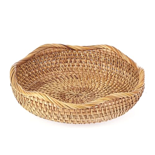 Hipiwe Natural Rattan Tray 8.5" Wicker Key Basket Bowl for Entryway Table
View Price
Hipiwe Natural Rattan Tray 8.5" Wicker Key Basket Bowl for Entryway Table
View Price
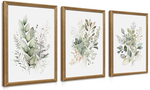 WRFON Framed Sage Green Botanical Wall Art Set of 3, Watercolor Eucalyptus & Wild Plant Canvas Prints, Minimalist Green Wall Decor for Living Room Bedroom Bathroom, 12x16 Inches
View Price
WRFON Framed Sage Green Botanical Wall Art Set of 3, Watercolor Eucalyptus & Wild Plant Canvas Prints, Minimalist Green Wall Decor for Living Room Bedroom Bathroom, 12x16 Inches
View Price
 ONBRILL 48 Inch Buffet Cabinet with Storage, Brown
View Price
ONBRILL 48 Inch Buffet Cabinet with Storage, Brown
View Price
Our Favorite Dining Room Lights
 Gilmour 3-Light Drum Chandelier
View Price
Gilmour 3-Light Drum Chandelier
View Price
 Aasim 24" 5-Light Dimmable Drum Chandelier
View Price
Aasim 24" 5-Light Dimmable Drum Chandelier
View Price
 Loram 6-Light Dimmable Drum Chandelier
View Price
Loram 6-Light Dimmable Drum Chandelier
View Price
 Quitman 5-Light 35" Gold/Black Linear Island Light
View Price
Quitman 5-Light 35" Gold/Black Linear Island Light
View Price
 Dimmable Rectangle Kitchen Island Chandelier
View Price
Dimmable Rectangle Kitchen Island Chandelier
View Price
 Motofumi 5-Light 39.4" Rectangle Linear Chandelier
View Price
Motofumi 5-Light 39.4" Rectangle Linear Chandelier
View Price
 Erdenheim Modern Rectangle Crystal Chandelier
View Price
Erdenheim Modern Rectangle Crystal Chandelier
View Price
 Jewellia 16-Light Metal Sputnik Chandelier with Glass Shades
View Price
Jewellia 16-Light Metal Sputnik Chandelier with Glass Shades
View Price
 Faustena 16-Light Bubble Glass Sputnik Chandelier
View Price
Faustena 16-Light Bubble Glass Sputnik Chandelier
View Price
 Arba 3-Light Dimmable Solid Wood Drum Chandelier
View Price
Arba 3-Light Dimmable Solid Wood Drum Chandelier
View Price
 Kaidenn 22" 4-Light Wood Veneer Drum Chandelier
View Price
Kaidenn 22" 4-Light Wood Veneer Drum Chandelier
View Price
 5-Light Drum Chandelier with Fabric and Rope Shades
View Price
5-Light Drum Chandelier with Fabric and Rope Shades
View Price
 Ashauna 4-Light Dimmable Rectangular Chandelier
View Price
Ashauna 4-Light Dimmable Rectangular Chandelier
View Price
 Rowley 6-Light Dimmable Traditional Chandelier
View Price
Rowley 6-Light Dimmable Traditional Chandelier
View Price
 5-Light Dimmable Classic Traditional Chandelier
View Price
5-Light Dimmable Classic Traditional Chandelier
View Price
Brass, Gold, or Silver: Best Accents for Dark Gray Walls?
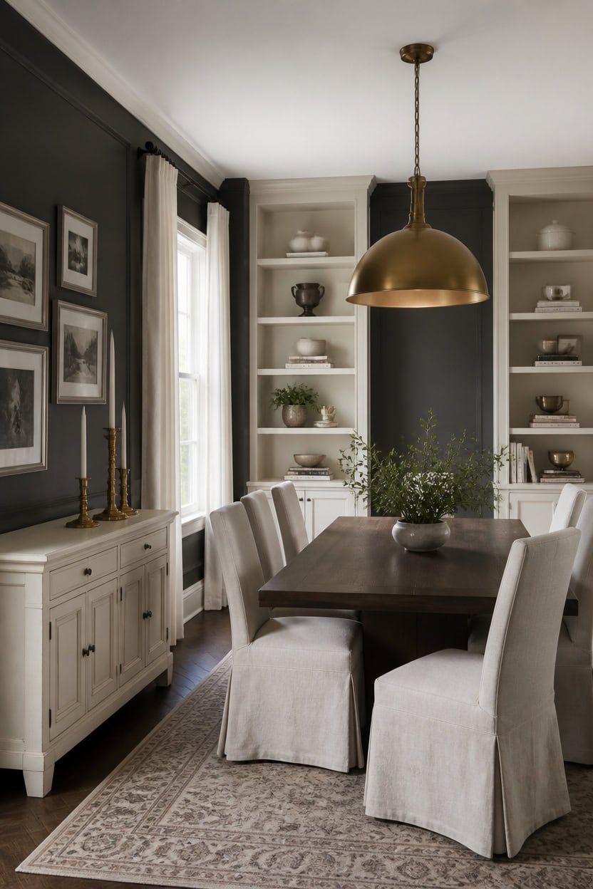
Deep gray Cheating Heart covers the main walls, while very light cream Calming Cream brightens the built-in shelving for a crisp two-tone frame. Brass finishes read warmer against this pairing than silver or chrome because the metal picks up undertones from both the charcoal gray and the pale cream. Cluster three brass candlesticks on the sideboard to anchor the metal tone without overwhelming the table.
Warm brass: Reflects an amber glow against dark walls, warming the whole room.
Cool silver: Adds crisp contrast but can look stark against deep gray without a warm partner.
Muted gold: Bridges brass warmth and silver shine without fighting either finish.
Mixed metals: Let one finish lead and use the second only in small accents for depth.
a deep charcoal-gray that grounds the room and lets brass accents glow. [dark]
a very light cream that keeps the storage wall bright against the dark walls. [very light]
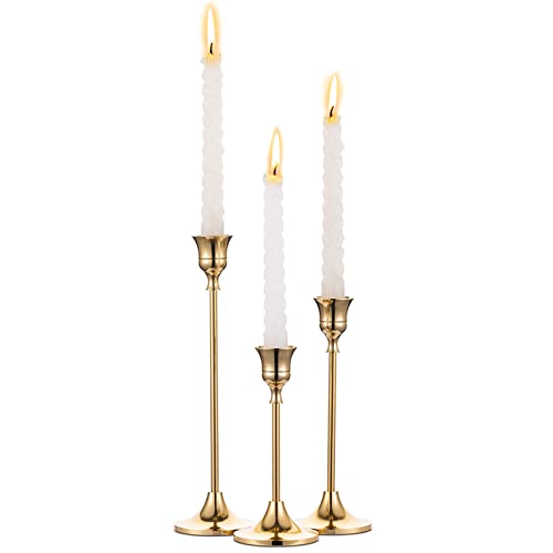 Candlestick Holders Taper Candle Holders, Set of 3 Candle Stick Holders Set, Brass Gold Candlestick Holder Set, Vintage Modern Decorative Centerpiece for Table Mantel Wedding Housewarming Gift
View Price
Candlestick Holders Taper Candle Holders, Set of 3 Candle Stick Holders Set, Brass Gold Candlestick Holder Set, Vintage Modern Decorative Centerpiece for Table Mantel Wedding Housewarming Gift
View Price
 Tribesigns 47-Inch Dining Table for 4, Walnut Brown Kitchen Dinner Table with Heavy Duty Pedestal, Farmhouse Wooden Eating Table for Home, Dining Room, Small Space
View Price
Tribesigns 47-Inch Dining Table for 4, Walnut Brown Kitchen Dinner Table with Heavy Duty Pedestal, Farmhouse Wooden Eating Table for Home, Dining Room, Small Space
View Price
 Caiselee 17.7 Inch Large Dome Pendant Light, Brushed Gold Pendant Lighting
View Price
Caiselee 17.7 Inch Large Dome Pendant Light, Brushed Gold Pendant Lighting
View Price
 RAKLE Avantgarde Stemless Wine Glasses Set of 4, 14.3oz Gold Rimmed Drinking Tumblers for Red White Rose Wine and Cocktails, Lead-Free Durable Dishwasher Safe Glassware, Elegant Gold Accented Design
View Price
RAKLE Avantgarde Stemless Wine Glasses Set of 4, 14.3oz Gold Rimmed Drinking Tumblers for Red White Rose Wine and Cocktails, Lead-Free Durable Dishwasher Safe Glassware, Elegant Gold Accented Design
View Price
 FansaFurn Modern 4-Door Sideboard Buffet for Living Room
View Price
FansaFurn Modern 4-Door Sideboard Buffet for Living Room
View Price
 Camden Reed Gallery Wall Frame Set, 8 Piece, 16x20 and 16x16 Inch Matted Frames, Black and Silver
View Price
Camden Reed Gallery Wall Frame Set, 8 Piece, 16x20 and 16x16 Inch Matted Frames, Black and Silver
View Price
 Lootkell Warm Gold Curtain Rods for Windows 72 to 144 Adjustable Length Heavy Duty 1" Diameter Brass Bronze Long Window Curtain Rod with Solid Metal Finials for Outdoor Farmhouse Bedroom Living Room
View Price
Lootkell Warm Gold Curtain Rods for Windows 72 to 144 Adjustable Length Heavy Duty 1" Diameter Brass Bronze Long Window Curtain Rod with Solid Metal Finials for Outdoor Farmhouse Bedroom Living Room
View Price
Hand-Painted Art for This Palette
Museum-quality hand-painted reproductions from HandmadePiece, chosen to match this palette. Every canvas is painted to order, photo-approved before it ships, and covered by a 60-day money-back guarantee.
 Poppies at Argenteuil, Claude Monet
View Price
Poppies at Argenteuil, Claude Monet
View Price
 The Magpie, Claude Monet
View Price
The Magpie, Claude Monet
View Price
 A Sunday Afternoon on La Grande Jatte, Georges Seurat
View Price
A Sunday Afternoon on La Grande Jatte, Georges Seurat
View Price
 Water Lilies, Claude Monet
View Price
Water Lilies, Claude Monet
View Price
 The Water-Lily Pond (Japanese Bridge), Claude Monet
View Price
The Water-Lily Pond (Japanese Bridge), Claude Monet
View Price
 Boulevard Montmartre at Night, Camille Pissarro
View Price
Boulevard Montmartre at Night, Camille Pissarro
View Price
 Irises in Monet's Garden, Claude Monet
View Price
Irises in Monet's Garden, Claude Monet
View Price
 Luncheon of the Boating Party, Pierre-Auguste Renoir
View Price
Luncheon of the Boating Party, Pierre-Auguste Renoir
View Price
 Branches with Almond Blossom, Vincent van Gogh
View Price
Branches with Almond Blossom, Vincent van Gogh
View Price
 The Starry Night, Vincent van Gogh
View Price
The Starry Night, Vincent van Gogh
View Price
 Starry Night Over the Rhone, Vincent van Gogh
View Price
Starry Night Over the Rhone, Vincent van Gogh
View Price
 Sunflowers, Vincent van Gogh
View Price
Sunflowers, Vincent van Gogh
View Price
 Irises, Vincent van Gogh
View Price
Irises, Vincent van Gogh
View Price
 Road with Cypress and Star, Vincent van Gogh
View Price
Road with Cypress and Star, Vincent van Gogh
View Price
 The Milkmaid, Johannes Vermeer
View Price
The Milkmaid, Johannes Vermeer
View Price
 The Birth of Venus, Sandro Botticelli
View Price
The Birth of Venus, Sandro Botticelli
View Price
 View of Delft, Johannes Vermeer
View Price
View of Delft, Johannes Vermeer
View Price
 The Goldfinch, Carel Fabritius
View Price
The Goldfinch, Carel Fabritius
View Price
 Girl with a Pearl Earring, Johannes Vermeer
View Price
Girl with a Pearl Earring, Johannes Vermeer
View Price
 Mona Lisa, Leonardo da Vinci
View Price
Mona Lisa, Leonardo da Vinci
View Price
 Composition VIII, Wassily Kandinsky
View Price
Composition VIII, Wassily Kandinsky
View Price
 Several Circles, Wassily Kandinsky
View Price
Several Circles, Wassily Kandinsky
View Price
 The Scream, Edvard Munch
View Price
The Scream, Edvard Munch
View Price
 Squares with Concentric Rings, Wassily Kandinsky
View Price
Squares with Concentric Rings, Wassily Kandinsky
View Price
 The Tree of Life, Gustav Klimt
View Price
The Tree of Life, Gustav Klimt
View Price
 The Kiss, Gustav Klimt
View Price
The Kiss, Gustav Klimt
View Price
 Flower Garden, Gustav Klimt
View Price
Flower Garden, Gustav Klimt
View Price
 Wanderer above the Sea of Fog, Caspar David Friedrich
View Price
Wanderer above the Sea of Fog, Caspar David Friedrich
View Price
 Old Live Oak Tree and Bluebonnets, Julian Onderdonk
View Price
Old Live Oak Tree and Bluebonnets, Julian Onderdonk
View Price
 The Lady of Shalott, John William Waterhouse
View Price
The Lady of Shalott, John William Waterhouse
View Price
See how the paintings are made
Setting the Table for Weeknights and Special Occasions
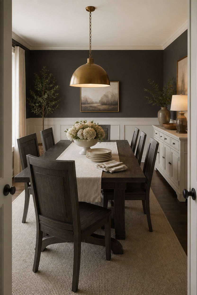
A well-set table for both quick dinners and special gatherings starts with a linen runner over deep gray Temptation walls, so the eye has a calm base no matter what sits on top. Very light cream Cayman Islands trim keeps the lower wall bright, which stops the room from feeling closed in on busy weeknights. Keep a linen runner with folded napkins and stacked plates ready on the sideboard so the table resets in minutes.
Keep a base layer: A neutral linen runner works under both everyday plates and holiday china.
Swap the serveware: Trade weeknight ceramic bowls for a footed compote when hosting guests.
Layer textures, not colors: Stick to the gray and cream palette so any table setting feels intentional.
Fold napkins ahead: Pre-fold napkins and stack plates in the sideboard for quick weeknight resets.
a deep gray that grounds nightly dinners and holiday gatherings alike. [dark]
a very light cream that keeps the lower wall bright under table lighting. [very light]
 85 Pcs Boho Table Runner Set, Cheesecloth Table Runner, Round Wooden Candle Plate, 6 Cloth Napkins, 6 Wooden Bead Napkin Rings, 70 PCS Dried Pampas Grass Decor and White Vase for Kitchen Table Decor
View Price
85 Pcs Boho Table Runner Set, Cheesecloth Table Runner, Round Wooden Candle Plate, 6 Cloth Napkins, 6 Wooden Bead Napkin Rings, 70 PCS Dried Pampas Grass Decor and White Vase for Kitchen Table Decor
View Price
 Gibson Elite Gelston Stoneware Matte Reactive Glaze 16 Piece (Service for 4) Plates and Bowl Dinnerware Set - Cream
View Price
Gibson Elite Gelston Stoneware Matte Reactive Glaze 16 Piece (Service for 4) Plates and Bowl Dinnerware Set - Cream
View Price
 Rtteri Ceramic Compote Vase Pedestal Bowl for Centerpiece, 10.2'' Wx6.2''H
View Price
Rtteri Ceramic Compote Vase Pedestal Bowl for Centerpiece, 10.2'' Wx6.2''H
View Price
 IFBUY Modern Curved 70" Buffet Cabinet with 4 Storage Doors, Cream
View Price
IFBUY Modern Curved 70" Buffet Cabinet with 4 Storage Doors, Cream
View Price
 Glaver's Drinking Glasses Set of 4 Highball Glass Cups, 17 Oz. Basic Cooler Glassware, ideal for Water, Juice, Cocktails, Iced Tea and more. Dishwasher Safe.
View Price
Glaver's Drinking Glasses Set of 4 Highball Glass Cups, 17 Oz. Basic Cooler Glassware, ideal for Water, Juice, Cocktails, Iced Tea and more. Dishwasher Safe.
View Price
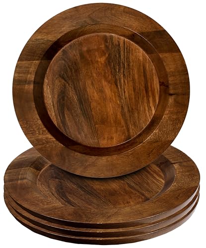 CLEENTABLE Wooden Charger Plates Set of 4 13 Inch Walnut Round Dinnerware
View Price
CLEENTABLE Wooden Charger Plates Set of 4 13 Inch Walnut Round Dinnerware
View Price
Our Favorite Sideboards and Buffets
 Piotrowski 55.1" Solid and Manufactured Wood Sideboard
View Price
Piotrowski 55.1" Solid and Manufactured Wood Sideboard
View Price
 Eilisha Modern Reeded Sideboard with Arched Doors
View Price
Eilisha Modern Reeded Sideboard with Arched Doors
View Price
 Arianna 61" Sideboard
View Price
Arianna 61" Sideboard
View Price
 Jamyia Wood Sideboard with 2 Doors and Adjustable Shelves
View Price
Jamyia Wood Sideboard with 2 Doors and Adjustable Shelves
View Price
 Corbey 64.8" Fluted Buffet Cabinet with Symmetrical Arc Doors
View Price
Corbey 64.8" Fluted Buffet Cabinet with Symmetrical Arc Doors
View Price
 Nicolee 56" Sideboard
View Price
Nicolee 56" Sideboard
View Price
 Amarilys 62.2" Sideboard
View Price
Amarilys 62.2" Sideboard
View Price
 Acelynn 31.5" Wide Sideboard
View Price
Acelynn 31.5" Wide Sideboard
View Price
 Scarlett 67.8" Wide 2-Drawer Buffet Table
View Price
Scarlett 67.8" Wide 2-Drawer Buffet Table
View Price
 Adra 55.1" Sideboard with 3 Drawers and Adjustable Shelves
View Price
Adra 55.1" Sideboard with 3 Drawers and Adjustable Shelves
View Price
 71" Large Farmhouse Sideboard with Adjustable Shelves and 2 Large Drawers
View Price
71" Large Farmhouse Sideboard with Adjustable Shelves and 2 Large Drawers
View Price
 59.3" Wide Modern 4-Drawer Buffet Cabinet
View Price
59.3" Wide Modern 4-Drawer Buffet Cabinet
View Price
 Tahara 42.5" Wide 3-Drawer Sideboard
View Price
Tahara 42.5" Wide 3-Drawer Sideboard
View Price
 Iasiah Modern 45" 3-Door Solid Wood Sideboard with Adjustable Shelves
View Price
Iasiah Modern 45" 3-Door Solid Wood Sideboard with Adjustable Shelves
View Price
 Collynns 4-Door Sideboard
View Price
Collynns 4-Door Sideboard
View Price
 Large Fluted Coffee Bar Cabinet with Fridge Space and Wine Storage
View Price
Large Fluted Coffee Bar Cabinet with Fridge Space and Wine Storage
View Price
 Iasiah Modern 60" 4-Door Solid Wood Sideboard with Adjustable Shelves
View Price
Iasiah Modern 60" 4-Door Solid Wood Sideboard with Adjustable Shelves
View Price
 Zosia 55.1" Modern Sideboard Buffet with Adjustable Shelves
View Price
Zosia 55.1" Modern Sideboard Buffet with Adjustable Shelves
View Price
 Dorne 60" Modern High Gloss Burl Sideboard with Adjustable Shelves
View Price
Dorne 60" Modern High Gloss Burl Sideboard with Adjustable Shelves
View Price
 Alvieri Farmhouse 58" 3-Drawer 4-Cabinet Sideboard with Solid Wood Legs
View Price
Alvieri Farmhouse 58" 3-Drawer 4-Cabinet Sideboard with Solid Wood Legs
View Price
 Almus 55" Sideboard with 4 Glass Doors, 2 Large Drawers and Adjustable Shelves
View Price
Almus 55" Sideboard with 4 Glass Doors, 2 Large Drawers and Adjustable Shelves
View Price
 Agnes 58" Transitional 4-Door Sideboard with Cable Management
View Price
Agnes 58" Transitional 4-Door Sideboard with Cable Management
View Price
Budget Swaps for Recreating This Look at Home
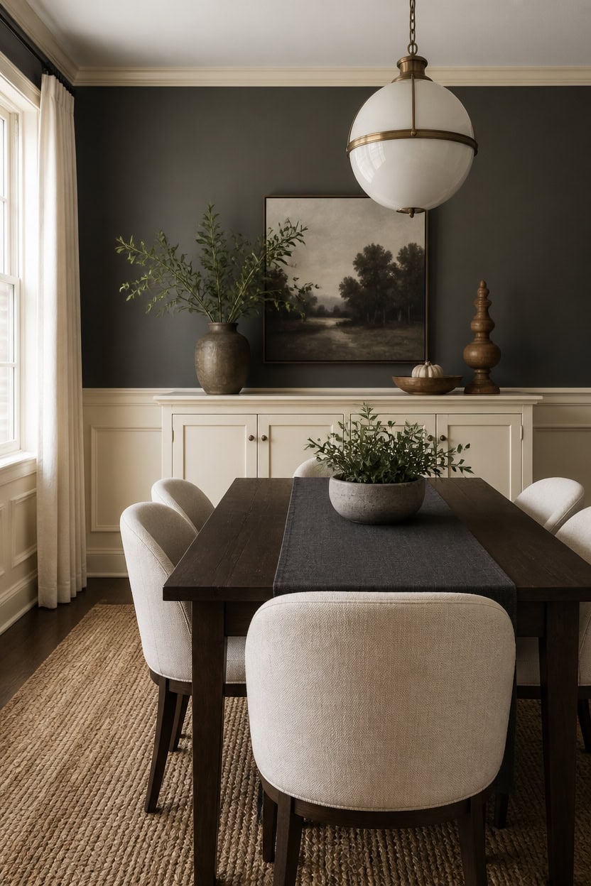
Deep gray Ashwood Moss on the main walls sets a moody backdrop that budget-friendly swaps can build around without expensive furniture. Very light cream Somerset Peach on the trim keeps the room airy and prevents the dark walls from feeling heavy. Add a sculptural turned-wood object to the sideboard for a low-cost focal point that ties the two tones together.
Paint over pricey wallpaper: Use a deep gray finish for a designer look without paper costs.
Swap hardware, not furniture: Update knobs and pulls on existing pieces instead of buying new.
DIY wainscoting look: Use trim boards and a very light cream paint to mimic panel molding.
Thrift the accents: Find turned-wood objects and ceramic pieces secondhand for character.
a deep gray that anchors the room without high-end wall treatments. [dark]
a very light cream that brightens the space and pairs affordably with any furniture. [very light]
 bali & pari Noleta Hand-Carved Suar Wood Side Table – Sculptural Hourglass Accent Table with Natural Grain, Modern Boho Style for Living Room or Bedroom, 14-inch Wide, Natural Brown
View Price
bali & pari Noleta Hand-Carved Suar Wood Side Table – Sculptural Hourglass Accent Table with Natural Grain, Modern Boho Style for Living Room or Bedroom, 14-inch Wide, Natural Brown
View Price
 MALOL Dining Chairs Set of 4, Upholstered Kitchen & Dining Room Chairs with Curved Back and Bronze Metal Legs, Comfortable Modern Dining Side Chairs for Dining Room, Kitchen, Beige
View Price
MALOL Dining Chairs Set of 4, Upholstered Kitchen & Dining Room Chairs with Curved Back and Bronze Metal Legs, Comfortable Modern Dining Side Chairs for Dining Room, Kitchen, Beige
View Price
 EDISHINE 2-Pack Pendant Light Kitchen Island Clear Glass Globe Black
View Price
EDISHINE 2-Pack Pendant Light Kitchen Island Clear Glass Globe Black
View Price
 Pokini Ceramic Dinnerware Sets for 4, 12pcs Plates and Bowls Sets Dish Set
View Price
Pokini Ceramic Dinnerware Sets for 4, 12pcs Plates and Bowls Sets Dish Set
View Price
 Q&J Fabric Co. Linen-Textured Table Runner 1 Pack 13x84 Inch Charcoal Grey
View Price
Q&J Fabric Co. Linen-Textured Table Runner 1 Pack 13x84 Inch Charcoal Grey
View Price
 Furnivado 59" Solid Wood Buffet Cabinet, Accent Cabinet with 4 Carved Doors
View Price
Furnivado 59" Solid Wood Buffet Cabinet, Accent Cabinet with 4 Carved Doors
View Price
 HUGOLEM 6 Pack Antique Brass Kitchen Cabinet Knobs Round Drawer Pulls
View Price
HUGOLEM 6 Pack Antique Brass Kitchen Cabinet Knobs Round Drawer Pulls
View Price
Our Favorite Dining Tables
 12-Person Rectangular Wood Dining Table
View Price
12-Person Rectangular Wood Dining Table
View Price
 70.8" Modern Rectangular Wood Dining Table for 6-8
View Price
70.8" Modern Rectangular Wood Dining Table for 6-8
View Price
 Ballarat Heavy Duty Rectangular Solid Wood Dining Table
View Price
Ballarat Heavy Duty Rectangular Solid Wood Dining Table
View Price
 55" Oval Dining Table with Wood Base
View Price
55" Oval Dining Table with Wood Base
View Price
 Iris Oak Oval Dining Table
View Price
Iris Oak Oval Dining Table
View Price
 Haiden Oval Dining Table
View Price
Haiden Oval Dining Table
View Price
 Lyons Solid Wood Dining Table
View Price
Lyons Solid Wood Dining Table
View Price
 Drea Solid Wood 4 or 6 Seater Dining Table
View Price
Drea Solid Wood 4 or 6 Seater Dining Table
View Price
 Ellen Solid Pine Wood Dining Table
View Price
Ellen Solid Pine Wood Dining Table
View Price
 Joceline Extendable Sintered Stone Dining Table
View Price
Joceline Extendable Sintered Stone Dining Table
View Price
 Behesh 78.7" Stainless Steel and Sintered Stone Dining Table
View Price
Behesh 78.7" Stainless Steel and Sintered Stone Dining Table
View Price
 Modern Minimalist Oval Sintered Stone Dining Table
View Price
Modern Minimalist Oval Sintered Stone Dining Table
View Price
 Fairfield Extendable Solid Wood Dining Table
View Price
Fairfield Extendable Solid Wood Dining Table
View Price
 Pelia Extendable Pine Round Solid Wood Dining Table
View Price
Pelia Extendable Pine Round Solid Wood Dining Table
View Price
 Yanely Extendable Acacia Solid Wood Dining Table
View Price
Yanely Extendable Acacia Solid Wood Dining Table
View Price
Our Favorite Dining Table Sets
 Shivani 5-Piece Modern Dining Set with Rectangular Wood Table
View Price
Shivani 5-Piece Modern Dining Set with Rectangular Wood Table
View Price
 Bryona 59" 4-Person Wood Trestle Dining Set
View Price
Bryona 59" 4-Person Wood Trestle Dining Set
View Price
 Turgeon 4-Person Dining Set
View Price
Turgeon 4-Person Dining Set
View Price
 Aunnika 5-Piece Round Dining Set with Tempered Glass Table
View Price
Aunnika 5-Piece Round Dining Set with Tempered Glass Table
View Price
 Folmar 5-Piece Dining Set with Round Table
View Price
Folmar 5-Piece Dining Set with Round Table
View Price
 Kinnith Round 4-Person Glass Top Pedestal Dining Set
View Price
Kinnith Round 4-Person Glass Top Pedestal Dining Set
View Price
 9-Piece Extendable Dining Table Set with Upholstered Chairs
View Price
9-Piece Extendable Dining Table Set with Upholstered Chairs
View Price
 Atkins 8-Person Dining Set with Expandable Table
View Price
Atkins 8-Person Dining Set with Expandable Table
View Price
 8-Person Modern Oak Extendable Dining Set
View Price
8-Person Modern Oak Extendable Dining Set
View Price
 Ezzah Rectangular Dining Set with Benches
View Price
Ezzah Rectangular Dining Set with Benches
View Price
 Lashbrook 6-Person Solid Wood Dining Set
View Price
Lashbrook 6-Person Solid Wood Dining Set
View Price
 Shawn 6-Person Trestle Dining Set
View Price
Shawn 6-Person Trestle Dining Set
View Price
 Latoyta Modern 5-Piece Rectangular Glass Top Dining Set
View Price
Latoyta Modern 5-Piece Rectangular Glass Top Dining Set
View Price
 8-Person Modern Extendable Kitchen Dining Set
View Price
8-Person Modern Extendable Kitchen Dining Set
View Price
 5-Piece Modern Extendable Kitchen Dining Set
View Price
5-Piece Modern Extendable Kitchen Dining Set
View Price