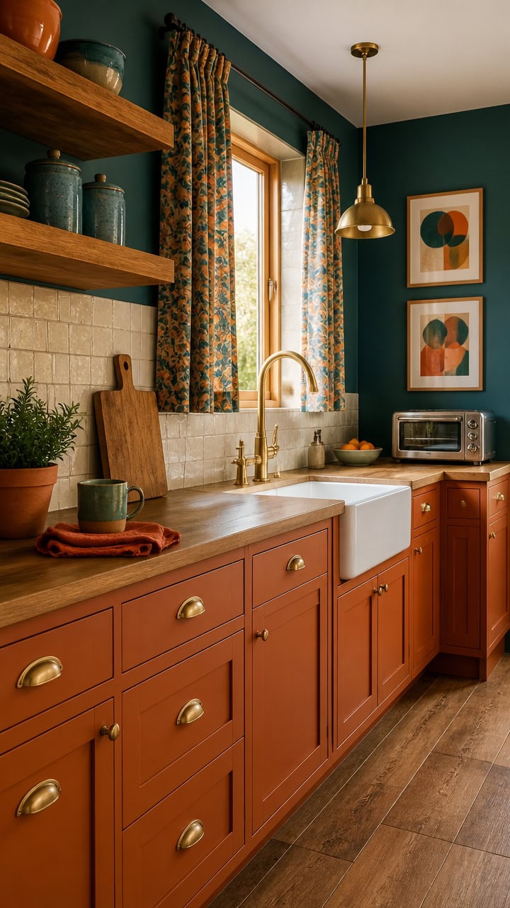
Why Deep Teal & Burnt Orange Living Rooms Were Made for Wandering Spirits
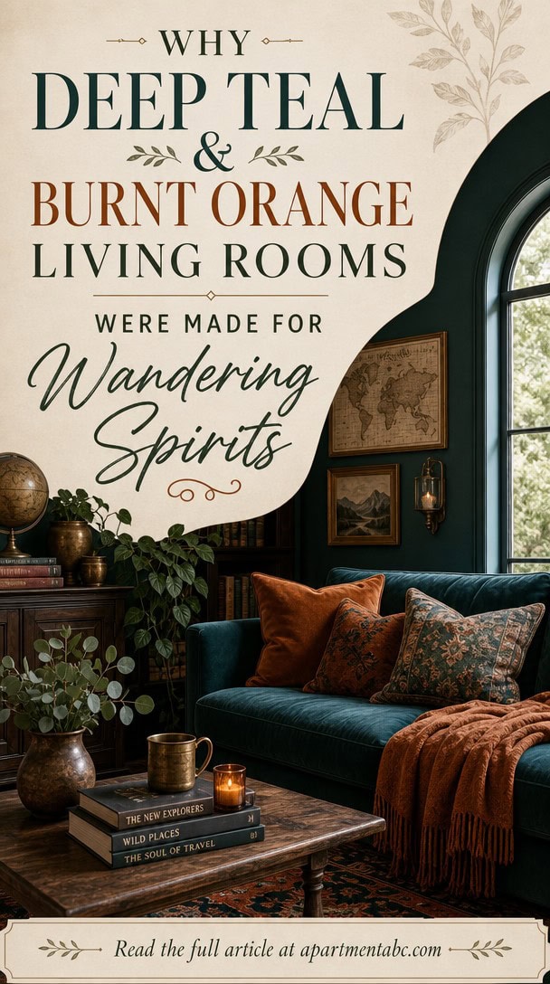
You know that itch, the one that shows up right after you’ve unpacked from a trip and your living room suddenly looks beige and apologetic. You’re not imagining it. Some rooms just sit there. Others feel like they’re already halfway to somewhere else. The difference usually comes down to two colors doing something most living rooms never attempt.
What Makes Deep Teal and Burnt Orange Work Together?
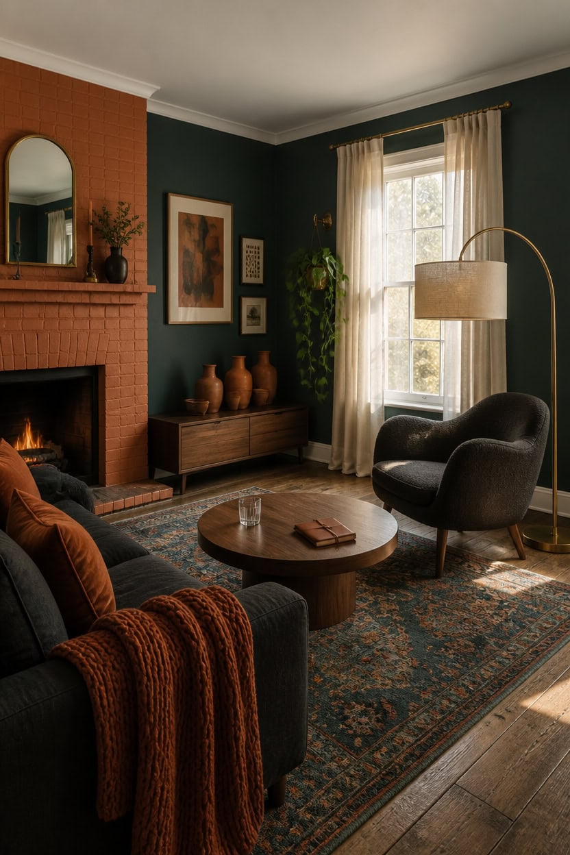
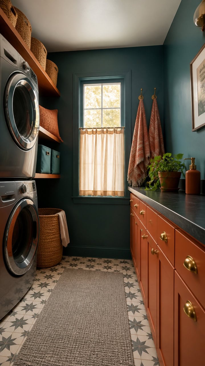
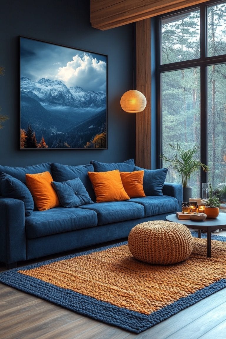
Deep teal and burnt orange share a color temperature trick: teal’s blue-green base cools the room while orange’s warmth keeps it from feeling sterile. The two sit almost opposite each other on the wheel, so together they create energy without clashing. Paint the main walls in a deep teal like Beau Green (2054-20) and let burnt orange enter through furniture and accessories for balance.
Anchor with teal walls: Use the deep teal as the dominant wall color so the room reads calm, not busy.
Layer orange in accents: Bring burnt orange in through pillows, throws, and one statement chair.
Keep metals warm: Brass or bronze fixtures pull the orange undertone through the room’s hardware.
Balance with wood tones: Medium walnut or oak furniture bridges the cool wall and warm accents.
a deep, saturated teal that grounds the room and sets a moody backdrop [very dark].
a warm burnt orange that pulls the eye and adds contrast against the teal walls [mid-tone].
 GriNeed Fall Orange Throw Pillow Covers Decorative Velvet Set of 2 18x18 Inch Pillow Covers, Soft Burnt Orange Pillowcases for Couch Sofa Bed Living Room, Farmhouse Boho Decor, Accent Cushion Covers
View Price
GriNeed Fall Orange Throw Pillow Covers Decorative Velvet Set of 2 18x18 Inch Pillow Covers, Soft Burnt Orange Pillowcases for Couch Sofa Bed Living Room, Farmhouse Boho Decor, Accent Cushion Covers
View Price
 JOINICE 31.5" Round Coffee Table with Storage for Living Room, Walnut
View Price
JOINICE 31.5" Round Coffee Table with Storage for Living Room, Walnut
View Price
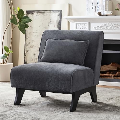 Womina Armless Accent Chair Comfy Upholstered Modern Living Room Side Chair
View Price
Womina Armless Accent Chair Comfy Upholstered Modern Living Room Side Chair
View Price
 Nintiue Upgraded Modern Arc Dimmable Tall Standing Floor Lamp with Linen Shade, 1200 Lumens LED Bulb Included, for Living & Reading Room, Bedroom, Office & Nursery, Brass
View Price
Nintiue Upgraded Modern Arc Dimmable Tall Standing Floor Lamp with Linen Shade, 1200 Lumens LED Bulb Included, for Living & Reading Room, Bedroom, Office & Nursery, Brass
View Price
 KensTro Ceramic Vase Set of 3 with Handles, Aged Terracotta Finish
View Price
KensTro Ceramic Vase Set of 3 with Handles, Aged Terracotta Finish
View Price
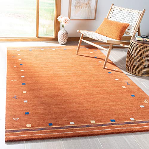 SAFAVIEH Area Rug 8x10 - Himalaya Collection - Large - Rust, Handmade Wool, Ideal for Living Room, Bedroom, Office, Dining Space (HIM563P)
View Price
SAFAVIEH Area Rug 8x10 - Himalaya Collection - Large - Rust, Handmade Wool, Ideal for Living Room, Bedroom, Office, Dining Space (HIM563P)
View Price
 Decofy Mid Century TV Stand for TVs up to 65 Inches, Entertainment Center with Storage, Power Outlet, Fluted Sliding Doors & Adjustable Shelves, Modern Media TV Console Table for Living Room (Walnut)
View Price
Decofy Mid Century TV Stand for TVs up to 65 Inches, Entertainment Center with Storage, Power Outlet, Fluted Sliding Doors & Adjustable Shelves, Modern Media TV Console Table for Living Room (Walnut)
View Price
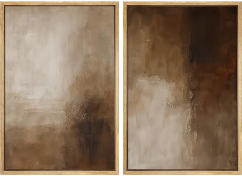 Ashbrook Framed Canvas Print Wall Art Set Warm Brown Abstract Texture Earth Tone Neutral Illustrations Modern Art Decorative for Living Room, Bedroom, Office - 24"x36"x2 Natural
View Price
Ashbrook Framed Canvas Print Wall Art Set Warm Brown Abstract Texture Earth Tone Neutral Illustrations Modern Art Decorative for Living Room, Bedroom, Office - 24"x36"x2 Natural
View Price
The Travel-Inspired Psychology Behind Teal and Orange
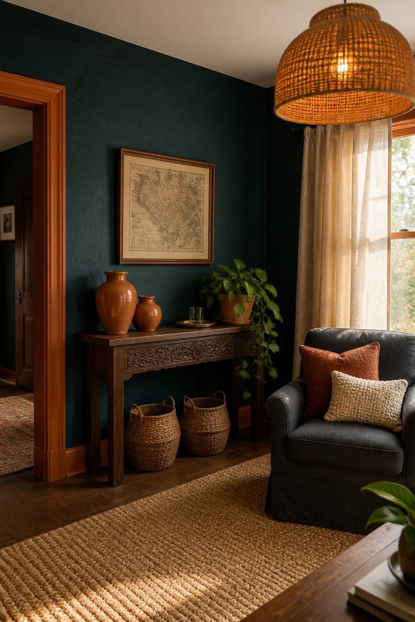
Teal and burnt orange trace directly to travel memory, which explains why the pairing feels intentional rather than trendy. Teal recalls harbor water and tiled courtyards, while burnt orange echoes clay roofs and spice markets. Together they trigger a sense of a well-traveled home instead of a themed one, especially when the teal stays on walls and orange stays in movable layers.
Source the memory: Pick one travel reference (Mediterranean coast, desert market) and let it guide fabric choices.
Skip literal souvenirs: Use color and texture instead of obvious travel trinkets to avoid a themed look.
Ground with texture: Woven baskets, jute, and rough ceramics reinforce the well-traveled feel without clutter.
Keep orange portable: Confine burnt orange to pillows, art, and a rug so the palette can evolve over time.
a deep teal that reads like still harbor water and anchors the travel-inspired mood [very dark].
a warm burnt orange that traces the room’s edges like sun-baked clay [mid-tone].
 SAFAVIEH Natural Fiber Area Rug 6x9, Jute Knotted Natural NF447A
View Price
SAFAVIEH Natural Fiber Area Rug 6x9, Jute Knotted Natural NF447A
View Price
 MIULEE Soft Chenille Fall Throw Pillow Covers Burnt Orange 18x18 Pack of 2
View Price
MIULEE Soft Chenille Fall Throw Pillow Covers Burnt Orange 18x18 Pack of 2
View Price
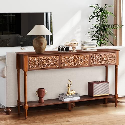 weselon 55.5" Carved Console Table with 3 Drawers, 2-Tier Sofa Table with Glossy Floral Surface and Solid Wood Legs, Mid-Century Modern Entryway Table for Living Room Hallway (Walnut)
View Price
weselon 55.5" Carved Console Table with 3 Drawers, 2-Tier Sofa Table with Glossy Floral Surface and Solid Wood Legs, Mid-Century Modern Entryway Table for Living Room Hallway (Walnut)
View Price
 PURVONNIE Terracotta Ceramic Vase Set of 2, Rustic Boho Home Table Decor
View Price
PURVONNIE Terracotta Ceramic Vase Set of 2, Rustic Boho Home Table Decor
View Price
 LUCORUSC Hanging Light Lamp Shades Boho Rattan Lamp Shades, Woven LampShades for Floor Lamps Rattan Pendant Lights Boho Lamp Ceiling Light, Plug in Pendant Light Fixtures Hanging Lamp 1.54lb
View Price
LUCORUSC Hanging Light Lamp Shades Boho Rattan Lamp Shades, Woven LampShades for Floor Lamps Rattan Pendant Lights Boho Lamp Ceiling Light, Plug in Pendant Light Fixtures Hanging Lamp 1.54lb
View Price
 Kate and Laurel Sylvie Vintage Black and White World Map Framed Canvas Wall Art Set by The Creative Bunch Studio, 2 Piece 18x24 Natural, Chic Map Art for Wall
View Price
Kate and Laurel Sylvie Vintage Black and White World Map Framed Canvas Wall Art Set by The Creative Bunch Studio, 2 Piece 18x24 Natural, Chic Map Art for Wall
View Price
 Castle Place Mid-Century Modern Accent Chair, Linen Upholstery, Wooden Armrests, Cushioned Seat, Easy Assembly, Charcoal Grey
View Price
Castle Place Mid-Century Modern Accent Chair, Linen Upholstery, Wooden Armrests, Cushioned Seat, Easy Assembly, Charcoal Grey
View Price
 11x11in Storage Baskets 4 Pcs Storage Bins for Shelves,Laundry Organizers
View Price
11x11in Storage Baskets 4 Pcs Storage Bins for Shelves,Laundry Organizers
View Price
Where Teal and Burnt Orange Draw Their Global Roots
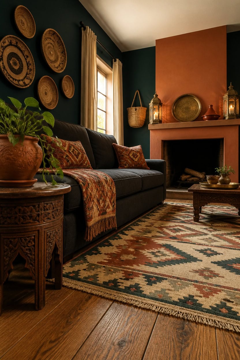
Mediterranean fishing villages and North African souks gave this pairing its DNA, where whitewashed walls meet teal-shuttered windows and market stalls overflow with paprika and turmeric. Coastal Greece and Portugal favor teal as a cooling counterpoint to relentless sun, while Moroccan and Turkish interiors push burnt orange through tile work and dyed textiles. Both regions treat the colors as structural, not decorative, which is why they hold up in a living room instead of feeling like a costume.
Study tile patterns: Mediterranean zellige tile shows how teal and terra-cotta sit next to each other without competing.
Favor natural dye tones: Souk textiles use plant-based orange dyes, so choose fabrics with a muted, slightly smoky orange rather than a bright pumpkin.
Layer regional textures: Combine flat-weave kilim patterns with rougher jute to mirror how these regions mix materials.
Respect the ratio: Teal reads as architecture in its region of origin, so keep it dominant on walls while orange stays secondary.
a deep teal that recalls shuttered Mediterranean facades and grounds the room in its coastal reference [very dark].
a warm burnt orange that echoes souk pottery and gives the hearth a market-stall warmth [mid-tone].
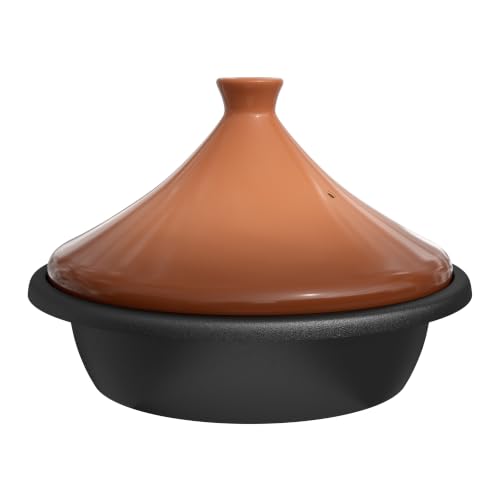 Kook Moroccan Tagine, Enameled Cast Iron Cooking Pot, 3.3 Qt, Terracotta
View Price
Kook Moroccan Tagine, Enameled Cast Iron Cooking Pot, 3.3 Qt, Terracotta
View Price
 JAIPUR KILIM RUGS Set of 4 Wool Jute Vintage Kilim Cushion Covers,Home Decor Pillowcases Handwoven Turkish Pillow Decorative Throw Pillow Covers (Multicolor-11)
View Price
JAIPUR KILIM RUGS Set of 4 Wool Jute Vintage Kilim Cushion Covers,Home Decor Pillowcases Handwoven Turkish Pillow Decorative Throw Pillow Covers (Multicolor-11)
View Price
 SIMPLIHOME Rolf 16" Wide Solid Wood Round End Table in Walnut Brown
View Price
SIMPLIHOME Rolf 16" Wide Solid Wood Round End Table in Walnut Brown
View Price
 FRELISH DECOR Hand Woven Jute Area Rug 4'x6' - Geometric Design (Natural)
View Price
FRELISH DECOR Hand Woven Jute Area Rug 4'x6' - Geometric Design (Natural)
View Price
 2 Pcs Hanging Hexagon Decorative Moroccan Candle Lantern Holders, Handmade Hanging Tea Light Holder in Bronze Metal & Red & Purple Glass Gift & Decor Items
View Price
2 Pcs Hanging Hexagon Decorative Moroccan Candle Lantern Holders, Handmade Hanging Tea Light Holder in Bronze Metal & Red & Purple Glass Gift & Decor Items
View Price
 INGOFIN Terracotta Pots Set with Saucer - 5/6/7 inch Ceramic Clay Planters with Drainage Hole, Garden Flower Succulent Pots with Tray for Indoor Outdoor Plants, Set of 3
View Price
INGOFIN Terracotta Pots Set with Saucer - 5/6/7 inch Ceramic Clay Planters with Drainage Hole, Garden Flower Succulent Pots with Tray for Indoor Outdoor Plants, Set of 3
View Price
 Luxanimarion 110" U-Shaped Sectional Sofa Couch for Living Room,Modern Modular Sofa with Double Chaise,Classic Lounge Couch Sleeper for Apartment, Charcoal
View Price
Luxanimarion 110" U-Shaped Sectional Sofa Couch for Living Room,Modern Modular Sofa with Double Chaise,Classic Lounge Couch Sleeper for Apartment, Charcoal
View Price
 Tel Charme * 8 Pack 12 Inch Boho Wall Basket Decor
View Price
Tel Charme * 8 Pack 12 Inch Boho Wall Basket Decor
View Price
How to Start a Teal and Orange Living Room
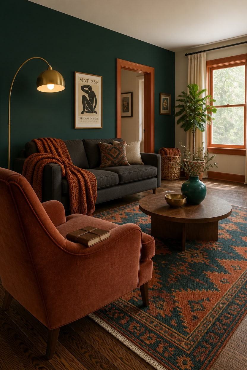
Begin with the largest surface first, then build outward with smaller doses of contrast. Paint “Beau Green” on the main wall to set a deep teal foundation, since starting big prevents the room from feeling like an afterthought collage. Add burnt orange through one anchor piece, like a chair or rug, before layering in smaller accents.
Anchor with one wall: Commit to teal on the largest wall before adding any orange accents.
Pick one orange anchor: Choose a single large orange piece, like an armchair or rug, instead of scattering small orange items.
Test swatches in daylight: Both colors shift depending on natural light, so check samples morning and evening.
Build in thirds: Split the room roughly into teal dominant, neutral support, and orange accent zones.
a deep teal that anchors the room and gives it a coastal backbone [very dark].
a warm burnt orange that outlines doorways and window frames with a market-stall glow [mid-tone].
 Mjkone Modern Linen 107" Convertible L-Shaped Couch, Dark Grey
View Price
Mjkone Modern Linen 107" Convertible L-Shaped Couch, Dark Grey
View Price
 DREAMSIDEA Accent Chairs Set of 2, Comfy Reading Armchair, Terracotta
View Price
DREAMSIDEA Accent Chairs Set of 2, Comfy Reading Armchair, Terracotta
View Price
 WESHIONGOO Chunky Knit Blanket Throw for Couch Bed 40"×40" Burnt Orange
View Price
WESHIONGOO Chunky Knit Blanket Throw for Couch Bed 40"×40" Burnt Orange
View Price
 Vintage Ceramic Flower Vase Set of 3, Rustic Farmhouse Vase for Home Decor, Distressed Decorative Vase for Table Entryway Mantel Centerpiece Living Room Bathroom Bedroom (Pale Teal Wood)
View Price
Vintage Ceramic Flower Vase Set of 3, Rustic Farmhouse Vase for Home Decor, Distressed Decorative Vase for Table Entryway Mantel Centerpiece Living Room Bathroom Bedroom (Pale Teal Wood)
View Price
 ZttRiee Round Coffee Table with Sliding Doors, Mid-Century, Walnut
View Price
ZttRiee Round Coffee Table with Sliding Doors, Mid-Century, Walnut
View Price
 U'Artlines Boho Vintage Area Rug 5x7 Machine Washable Carpet, Rust&Teal
View Price
U'Artlines Boho Vintage Area Rug 5x7 Machine Washable Carpet, Rust&Teal
View Price
 Arc Floor Lamps for Living Room, Modern Tall Standing Lamp Remote Control,Stepless Dimmable Gold Floor Lamp with Hanging Dome Shade, Over Couch Arched Reading Lamp for Bedroom, Office (Bulb Included)
View Price
Arc Floor Lamps for Living Room, Modern Tall Standing Lamp Remote Control,Stepless Dimmable Gold Floor Lamp with Hanging Dome Shade, Over Couch Arched Reading Lamp for Bedroom, Office (Bulb Included)
View Price
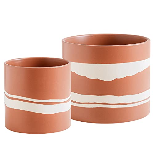 Nihow Ceramic Modern Plant Pot with Drainage for Indoor Plants,5+7 inch
View Price
Nihow Ceramic Modern Plant Pot with Drainage for Indoor Plants,5+7 inch
View Price
Choose the Right Teal Shade for Your Walls
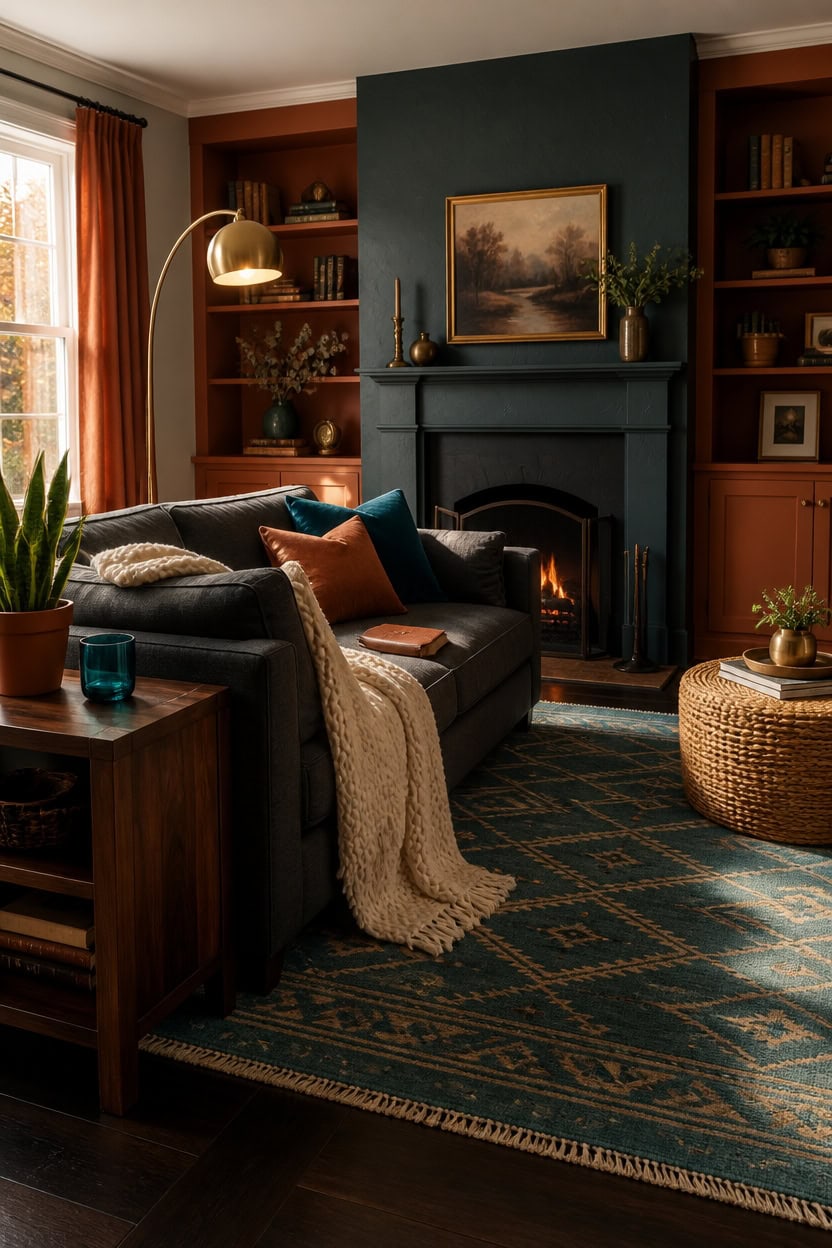
Teal reads differently depending on how much green or blue sits underneath it, and that undertone decides whether the wall feels coastal or moody. Naples Blue works as the main accent wall in this design because its blue-green base stays balanced in both warm and cool light. Test a sample swatch on the wall for at least two days before committing to the full gallon.
Check the undertone: Hold swatches next to a plain white sheet to spot hidden green or blue leanings.
Match room size: Save the darkest teals for large walls with strong natural light, lighter teals for smaller rooms.
Sample before buying: Paint a poster-board swatch and move it around the room to see shifts at different times of day.
Coordinate with existing wood tones: Cooler teals pair best with walnut and espresso furniture already in the room.
a rich teal that grounds the seating area without swallowing the light [dark].
a deep burnt-orange brown that frames the teal wall with warmth [dark].
 MIULEE Velvet Throw Pillow Covers 18x18 Inch Pack of 2 Teal
View Price
MIULEE Velvet Throw Pillow Covers 18x18 Inch Pack of 2 Teal
View Price
 Plank+Beam Classic Console Table, 46 Inch, Walnut
View Price
Plank+Beam Classic Console Table, 46 Inch, Walnut
View Price
 Ciicool 5x7 Area Rugs for Living Room, Modern Geometric Washable Rug Teal
View Price
Ciicool 5x7 Area Rugs for Living Room, Modern Geometric Washable Rug Teal
View Price
 KOUFALL Burnt Orange Curtains 84 Inch Length for Living Room,Bohemian Boho Decor Set of 2 Panels Grommet Faux Linen Semi Sheer Curtains for Dining Room Bedroom 52x84 Inches Long
View Price
KOUFALL Burnt Orange Curtains 84 Inch Length for Living Room,Bohemian Boho Decor Set of 2 Panels Grommet Faux Linen Semi Sheer Curtains for Dining Room Bedroom 52x84 Inches Long
View Price
 Vortether 23" Farmhouse Ceramic Table Lamp Modern Bedside Lamps Matte Teal
View Price
Vortether 23" Farmhouse Ceramic Table Lamp Modern Bedside Lamps Matte Teal
View Price
 Torre & Tagus Blown Glass Teal Bud Vases Set of 3 - Hand Blown Turquise Vase Set & Clear Small Teal Vase for Flowers, Glass Turquoise Decor for Wedding & Home Decor (Mini Lustre)
View Price
Torre & Tagus Blown Glass Teal Bud Vases Set of 3 - Hand Blown Turquise Vase Set & Clear Small Teal Vase for Flowers, Glass Turquoise Decor for Wedding & Home Decor (Mini Lustre)
View Price
8' x 10' Rugs for This Palette
Rugs USA best sellers in this palette's colors, linked in 8' x 10', the size that fits most living rooms with the front legs of the sofa and chairs on the rug. Every design comes in other sizes too.
- Free shipping
- 30-day returns
- 210,000+ five-star reviews
 Drusilae Abstract Washable Rug – Light Blue
View Price
Drusilae Abstract Washable Rug – Light Blue
View Price
 Mara Washable Rug – Light Blue
View Price
Mara Washable Rug – Light Blue
View Price
 Patty Washable Rainy Days Rug – Blue Multicolor
View Price
Patty Washable Rainy Days Rug – Blue Multicolor
View Price
 Tani Vintage Blocks Rug – Navy
View Price
Tani Vintage Blocks Rug – Navy
View Price
 Everywhere Hand-Braided Indoor/Outdoor Rug – Navy
View Price
Everywhere Hand-Braided Indoor/Outdoor Rug – Navy
View Price
 Speckled Wool-Blend Rug – Denim
View Price
Speckled Wool-Blend Rug – Denim
View Price
 Charlisa Washable Faded Snowflake Rug – Blue
View Price
Charlisa Washable Faded Snowflake Rug – Blue
View Price
 Iris Textured Abstract Rug – Blue
View Price
Iris Textured Abstract Rug – Blue
View Price
 Lianna Washable Vines Rug – Blue
View Price
Lianna Washable Vines Rug – Blue
View Price
 Striped Border Indoor/Outdoor Flatweave Rug – Navy
View Price
Striped Border Indoor/Outdoor Flatweave Rug – Navy
View Price
 Floral Fireworks Indoor/Outdoor Rug – Blue
View Price
Floral Fireworks Indoor/Outdoor Rug – Blue
View Price
 Distressed Persian Rug – Blue
View Price
Distressed Persian Rug – Blue
View Price
 Antique Chevron Rug – Blue
View Price
Antique Chevron Rug – Blue
View Price
 Faded Star Petal Emblem Rug – Blue
View Price
Faded Star Petal Emblem Rug – Blue
View Price
 Honeycomb Labyrinth Rug – Blue
View Price
Honeycomb Labyrinth Rug – Blue
View Price
 Florid Dreams Rug – Blue
View Price
Florid Dreams Rug – Blue
View Price
 Reverse Herringbone Washable Rug – Blue
View Price
Reverse Herringbone Washable Rug – Blue
View Price
 Plush Solid Shaggy Rug – Navy
View Price
Plush Solid Shaggy Rug – Navy
View Price
 Persian Vintage Rug – Teal
View Price
Persian Vintage Rug – Teal
View Price
 Barbed Iris Medallion Rug – Blue
View Price
Barbed Iris Medallion Rug – Blue
View Price
 Herringbone Cotton Flatwoven Rug – Navy
View Price
Herringbone Cotton Flatwoven Rug – Navy
View Price
 Flatweave Cotton Giant Octopus Rug – Blue Multicolor
View Price
Flatweave Cotton Giant Octopus Rug – Blue Multicolor
View Price
 Peggy Washable Abstract Rug – Blue
View Price
Peggy Washable Abstract Rug – Blue
View Price
 Hand Braided Twined Jute And Denim Rug – Blue
View Price
Hand Braided Twined Jute And Denim Rug – Blue
View Price
 Iliana Striped Starfish Rug – Grey
View Price
Iliana Striped Starfish Rug – Grey
View Price
 Distressed Persian Rug – Dark Blue
View Price
Distressed Persian Rug – Dark Blue
View Price
 Molly Octopus Spill Proof Washable Rug – Blue
View Price
Molly Octopus Spill Proof Washable Rug – Blue
View Price
 Hand Braided Denim And Jute Striped Diamonds Rug – Yellow
View Price
Hand Braided Denim And Jute Striped Diamonds Rug – Yellow
View Price
 Rasali Checkered Box Rug – Orange
View Price
Rasali Checkered Box Rug – Orange
View Price
 Alexia Diamond Tasseled Rug – Rust
View Price
Alexia Diamond Tasseled Rug – Rust
View Price
 Rosette Medallion Washable Rug – Peach
View Price
Rosette Medallion Washable Rug – Peach
View Price
 Florid Dreams Rug – Peach
View Price
Florid Dreams Rug – Peach
View Price
 Vintage Medallion Washable Rug – Peach
View Price
Vintage Medallion Washable Rug – Peach
View Price
 Rosette Medallion Spill Proof Washable Rug – Peach
View Price
Rosette Medallion Spill Proof Washable Rug – Peach
View Price
 Timeworn Medallion Printed Rug – Pale Terracotta
View Price
Timeworn Medallion Printed Rug – Pale Terracotta
View Price
 Forever Vintage Rug – Rust
View Price
Forever Vintage Rug – Rust
View Price
 Faded Geometric Washable Rug – Rust
View Price
Faded Geometric Washable Rug – Rust
View Price
 Rosette Medallion Fringed Rug – Rust
View Price
Rosette Medallion Fringed Rug – Rust
View Price
 Katana Collage Washable Rug – Rust
View Price
Katana Collage Washable Rug – Rust
View Price
 Virgina Medallion Fringe Rug – Rust
View Price
Virgina Medallion Fringe Rug – Rust
View Price
Pick Burnt Orange Accents That Complement Teal
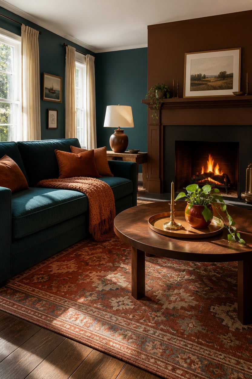
Chocolate Candy Brown works as the burnt-orange anchor because its deep brown-orange base carries warmth without competing with teal’s cool pull. This subtopic centers the fireplace surround and a companion wall in that same warm tone. Balance is the goal: enough burnt orange to ground the room, not so much it overheats the space.
Layer, don’t match: Pair one deep burnt-orange surface with lighter terra-cotta textiles so the color has depth.
Anchor with wood: Walnut and rust tones share the same warm base, so furniture blends instead of clashing.
Keep metals warm: Brass and copper hardware pick up the orange undertone better than chrome or nickel.
Use orange as punctuation: One or two bold pieces read as intentional, five feels scattered.
a deep burnt-orange brown that becomes the room’s warm focal point [dark].
a rich teal that lets the orange surround stand out by contrast [dark].
 MIULEE Decorative Outdoor Pillow Covers Fall 18x18 Burnt Orange
View Price
MIULEE Decorative Outdoor Pillow Covers Fall 18x18 Burnt Orange
View Price
 HAIOOU Round Coffee Table for Living Room with Open Storage -Walnut Wood
View Price
HAIOOU Round Coffee Table for Living Room with Open Storage -Walnut Wood
View Price
 Nourison Home 23" Greyish Brown Earth Tone Rustic Farmhouse Ceramic Table Lamp for Bedroom, Living Room, Dining, Office, with Beige Linen Shade
View Price
Nourison Home 23" Greyish Brown Earth Tone Rustic Farmhouse Ceramic Table Lamp for Bedroom, Living Room, Dining, Office, with Beige Linen Shade
View Price
 PHF Soft Chenille Waffle Knit Throw Blanket for Sofa, Warm, Terracotta
View Price
PHF Soft Chenille Waffle Knit Throw Blanket for Sofa, Warm, Terracotta
View Price
 Set of 2 Hurricane Candle Holder Set with Glass Dome & Iron Base
View Price
Set of 2 Hurricane Candle Holder Set with Glass Dome & Iron Base
View Price
 MyGift 11 Inch Deluxe Hammered Copper Kithchen Accessories Tray - Aluminum Plated Copper Platter and Vanity Tray - Handcrafted in India
View Price
MyGift 11 Inch Deluxe Hammered Copper Kithchen Accessories Tray - Aluminum Plated Copper Platter and Vanity Tray - Handcrafted in India
View Price
 DTICON Vintage Washable 8x10 Area Rug Living Room Rugs, Beige
View Price
DTICON Vintage Washable 8x10 Area Rug Living Room Rugs, Beige
View Price
 Colorful Ceramic Vase Set, Small Burnt Orange Blue Yellow Vases Home Decor,Fall Décor Modern Farmhouse Vases for Home Decor, Organic Decor Accents for Living Room, Table, Shelf, Entryway, Set of 3
View Price
Colorful Ceramic Vase Set, Small Burnt Orange Blue Yellow Vases Home Decor,Fall Décor Modern Farmhouse Vases for Home Decor, Organic Decor Accents for Living Room, Table, Shelf, Entryway, Set of 3
View Price
Best Furniture for a Teal and Orange Living Room
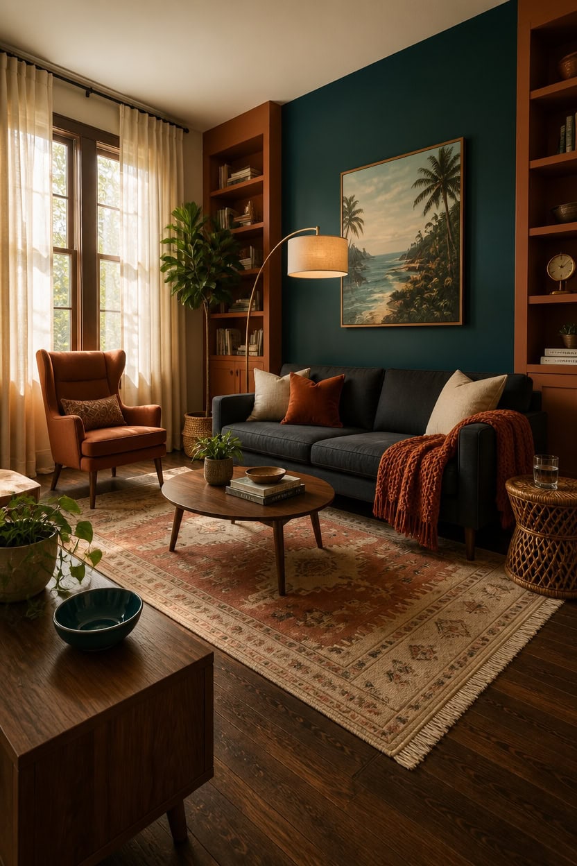
A charcoal linen sofa anchors the room while the built-in shelving flanking it wears Baked Terra Cotta for warmth against the deep teal accent wall in Ocean Tropic. Neutral upholstery lets the teal and orange rotate through pillows, throws, and lamps without a costly reupholster. Choose furniture in matte finishes so the saturated wall colors read as the visual highlight.
Stay neutral on big pieces: Choose sofas and case goods in charcoal, walnut, or cream so color lives in accessories.
Mix wood tones intentionally: Pair walnut and rattan pieces to echo the warm orange undertone.
Choose one statement chair: A single teal or rust accent chair adds color without overwhelming the room.
Keep silhouettes simple: Clean-lined furniture lets the wall colors and textiles carry the personality.
a deep teal that grounds the room’s cool half [dark].
a warm burnt-orange that ties the wood furniture to the wall color [mid-tone].
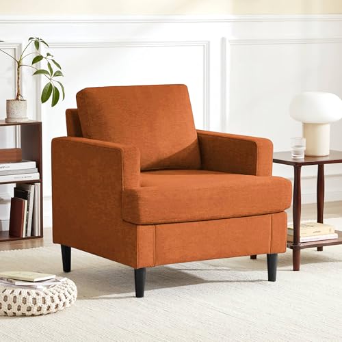 Weture Mid-Century Accent Chair, Orange Armchair Living Room Chairs
View Price
Weture Mid-Century Accent Chair, Orange Armchair Living Room Chairs
View Price
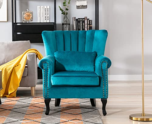 Kmax Teal Blue Accent Chair Velvet Wingback Chair with Pillow Nail-Head Channel Tufted Oversized Club Chair for Living Room Bedroom Guest Room
View Price
Kmax Teal Blue Accent Chair Velvet Wingback Chair with Pillow Nail-Head Channel Tufted Oversized Club Chair for Living Room Bedroom Guest Room
View Price
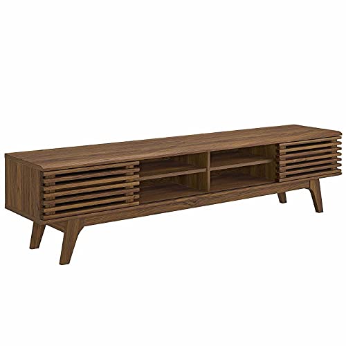 Modway Render 70" Mid-Century Modern Low Profile Media Console Entertainment TV Stand in Walnut Walnut
View Price
Modway Render 70" Mid-Century Modern Low Profile Media Console Entertainment TV Stand in Walnut Walnut
View Price
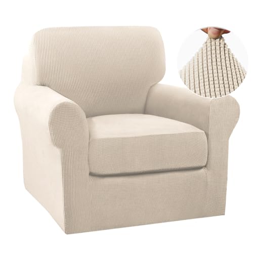 Turquoize 2 Piece Chair Covers Chair Slipcovers for Living Room Small Armchair Cover with Arms Washable Furniture Cover for Chairs Feature Thick Jacquard Fabric (Small Armchair, Biscotti Beige)
View Price
Turquoize 2 Piece Chair Covers Chair Slipcovers for Living Room Small Armchair Cover with Arms Washable Furniture Cover for Chairs Feature Thick Jacquard Fabric (Small Armchair, Biscotti Beige)
View Price
 Dimmable Floor Lamp for Living Room, 65" Tall Metal Standing Lamp with LED Bulb, Mid Century Modern Arc Floor Lamp with Linen Shade for Bedroom, Reading Room, Office & Nursery, Gold and Walnut Color
View Price
Dimmable Floor Lamp for Living Room, 65" Tall Metal Standing Lamp with LED Bulb, Mid Century Modern Arc Floor Lamp with Linen Shade for Bedroom, Reading Room, Office & Nursery, Gold and Walnut Color
View Price
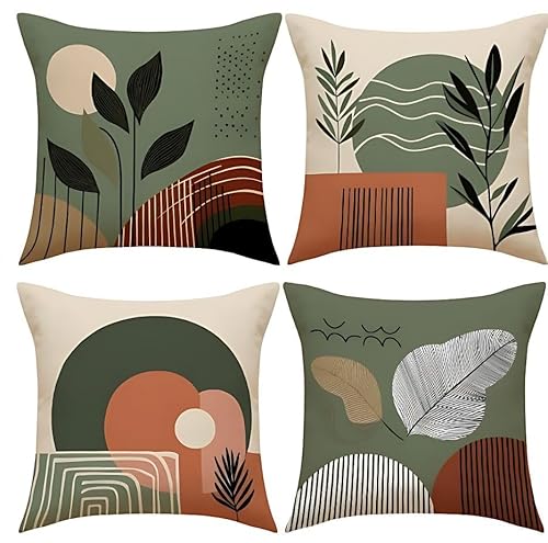 Hopomoon Terracotta and Sage Throw Pillow Covers 18x18 Inches Set of 4
View Price
Hopomoon Terracotta and Sage Throw Pillow Covers 18x18 Inches Set of 4
View Price
Wall Art for This Palette
The best-reviewed prints at Wayfair in this palette's colors. Most come in several sizes.
- Free shipping over $35
- Picked at 4.5 stars or higher
 Orange Teal Botanical Whirlwind IV Watercolor
View Price
Orange Teal Botanical Whirlwind IV Watercolor
View Price
 Pastel Watercolor Blue Paint Stroke Abstract Landscape
View Price
Pastel Watercolor Blue Paint Stroke Abstract Landscape
View Price
 Crane Heron Bird Vibrant Watercolor Blue Heron
View Price
Crane Heron Bird Vibrant Watercolor Blue Heron
View Price
 Coral Teal Bold Mountains Landscape Mountain
View Price
Coral Teal Bold Mountains Landscape Mountain
View Price
 Abstract Orange and Blue River Ink III Abstract Marble
View Price
Abstract Orange and Blue River Ink III Abstract Marble
View Price
 Orange Poppy Impression I Painting
View Price
Orange Poppy Impression I Painting
View Price
 Abstract Orange and Blue River Ink Abstract Marble
View Price
Abstract Orange and Blue River Ink Abstract Marble
View Price
 Teal Orange Petal Mosaics II Abstract Botanicals
View Price
Teal Orange Petal Mosaics II Abstract Botanicals
View Price
 Ocean Eye I 3 Piece Wrapped Canvas Print Set
View Price
Ocean Eye I 3 Piece Wrapped Canvas Print Set
View Price
 The Cafe Terrace by Vincent Van Gogh
View Price
The Cafe Terrace by Vincent Van Gogh
View Price
 Waters Edge I Watercolor
View Price
Waters Edge I Watercolor
View Price
 Detour by Isabelle Z
View Price
Detour by Isabelle Z
View Price
 Sun Mountain Landscape Abstract Neutral Forest
View Price
Sun Mountain Landscape Abstract Neutral Forest
View Price
 Blue Heron Bird Portrait Coastal Beach Decor
View Price
Blue Heron Bird Portrait Coastal Beach Decor
View Price
 Hope Painting
View Price
Hope Painting
View Price
 Mermaid Blue Mermaid on Wood Effect Panel
View Price
Mermaid Blue Mermaid on Wood Effect Panel
View Price
 White and Blue Feather Spiral II Abstract Geometric
View Price
White and Blue Feather Spiral II Abstract Geometric
View Price
 Pottery and Flowers Still Life I Trees
View Price
Pottery and Flowers Still Life I Trees
View Price
 Glorious Ginkgo
View Price
Glorious Ginkgo
View Price
 Blue Wildfloers Liquid Ink I Modern Flowers
View Price
Blue Wildfloers Liquid Ink I Modern Flowers
View Price
 Morning Rise by Alex Hanson Painting
View Price
Morning Rise by Alex Hanson Painting
View Price
 I Love the Rain
View Price
I Love the Rain
View Price
 USA Yosemite National Park Landscape III USA
View Price
USA Yosemite National Park Landscape III USA
View Price
 Abstract Geode Gold and Blue Marble Abstract Marble
View Price
Abstract Geode Gold and Blue Marble Abstract Marble
View Price
 Gazley Pink Blue Pastel Patchwork Abstract Collages
View Price
Gazley Pink Blue Pastel Patchwork Abstract Collages
View Price
 Abstract Blue Landscape Modern Minimalist Navy Blue
View Price
Abstract Blue Landscape Modern Minimalist Navy Blue
View Price
 Arenda Autumn Bridge
View Price
Arenda Autumn Bridge
View Price
 Mid Century Modern Boho Organic Tropical Leaf
View Price
Mid Century Modern Boho Organic Tropical Leaf
View Price
 Orange and Grey Forest Autumn Elegance II Forest
View Price
Orange and Grey Forest Autumn Elegance II Forest
View Price
 Minimalism Modern Scandinavian Serenity
View Price
Minimalism Modern Scandinavian Serenity
View Price
 Bright Orange Boho Sun Burst
View Price
Bright Orange Boho Sun Burst
View Price
 Macaulee Bohemian Earthly Floral Collage II Abstract Boho
View Price
Macaulee Bohemian Earthly Floral Collage II Abstract Boho
View Price
 Autumn on a Country Road by Danny Head
View Price
Autumn on a Country Road by Danny Head
View Price
 Sweet Peonies I by Vincent Van Gogh
View Price
Sweet Peonies I by Vincent Van Gogh
View Price
 Mid Century Modern Boho Pastel Green Geometric Jungle Palm
View Price
Mid Century Modern Boho Pastel Green Geometric Jungle Palm
View Price
 Abstract Botanical Bohemian Orange Brown Floral
View Price
Abstract Botanical Bohemian Orange Brown Floral
View Price
 Autumn Vintage Orange Village New York
View Price
Autumn Vintage Orange Village New York
View Price
Layer Global-Inspired Textiles in Teal and Orange
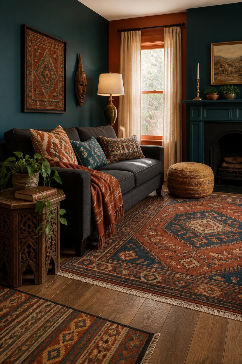
Global textiles bring the teal and orange palette into fabric layers that paint alone cannot achieve. A Moroccan-style rug grounds the seating area while block-print or ikat pillow covers add pattern without clashing. Rotate a lightweight throw across seasons so the charcoal sofa never looks static.
Anchor with a patterned rug: A Moroccan or kilim rug in rust and teal ties the floor to the accent wall.
Layer pattern scales: Pair a large-scale ikat pillow with a smaller block-print pillow for depth.
Mix weaves and textures: Combine woven cotton, linen, and wool so the layers feel collected, not matched.
Add one bold throw: Drape a striped or embroidered throw over the sofa arm for an easy color swap.
this deep teal grounds the textiles pooled nearby on the floor [very dark].
this warm burnt-orange frames the room and echoes the rug’s rust tones [mid-tone].
 Loloi Layla Ocean/Rust 7'-6" x 9'-6" Area Rug
View Price
Loloi Layla Ocean/Rust 7'-6" x 9'-6" Area Rug
View Price
 GV DUOKE Boho Throw Pillow Covers 18x18 Set of 4, 4 Different Curated Patterns, Double Sided Print Decorative Pillow Covers for Couch Bed Living Room, Hidden Zipper Polyester Cushion Cover
View Price
GV DUOKE Boho Throw Pillow Covers 18x18 Set of 4, 4 Different Curated Patterns, Double Sided Print Decorative Pillow Covers for Couch Bed Living Room, Hidden Zipper Polyester Cushion Cover
View Price
 JBH Hand Block Print Reversible Throw Pillow Covers 18x18 Inch (Set of 2)
View Price
JBH Hand Block Print Reversible Throw Pillow Covers 18x18 Inch (Set of 2)
View Price
 Alpaca & Sheep Wool Blanket, Full/Queen, Heavyweight Warmth, Earth Tones
View Price
Alpaca & Sheep Wool Blanket, Full/Queen, Heavyweight Warmth, Earth Tones
View Price
 Kokaaee Embroidered Lumbar Pillow Cover 20x12 Inch, Flower Cluster
View Price
Kokaaee Embroidered Lumbar Pillow Cover 20x12 Inch, Flower Cluster
View Price
 SAFAVIEH Kilim Collection Runner Rug - 2'3" x 9', Grey & Black, Handmade Flat Weave Jute, Ideal for High Traffic Areas in Living Room, Bedroom (KLM762F)
View Price
SAFAVIEH Kilim Collection Runner Rug - 2'3" x 9', Grey & Black, Handmade Flat Weave Jute, Ideal for High Traffic Areas in Living Room, Bedroom (KLM762F)
View Price
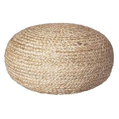 Decor Therapy Round Pouf Ottoman Footrest, Natural Jute Woven, Boho Pouf, Bohemian Style Casual Seating for Living Room, Bedroom, Patio Decor 19"x 19"x 10.5"
View Price
Decor Therapy Round Pouf Ottoman Footrest, Natural Jute Woven, Boho Pouf, Bohemian Style Casual Seating for Living Room, Bedroom, Patio Decor 19"x 19"x 10.5"
View Price
Lighting Choices That Enhance Teal and Orange Rooms
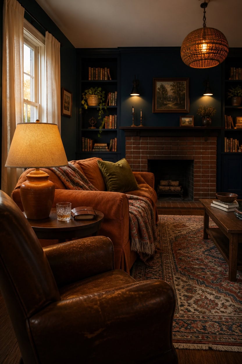
Warm layered lighting pulls the deep teal fireplace and burnt-orange trim into focus after dark, when flat overhead light would flatten both colors. This section uses an accent wall painted in a teal-blue tone with built-in shelving finished in burnt orange, so lamps and sconces cast warm light across both surfaces. Mixing bulb temperatures and fixture heights keeps the room from feeling like a single lit box.
Layer three light sources: Combine a floor lamp, table lamp, and overhead fixture so no single light does all the work.
Choose warm bulbs: Bulbs rated around 2700K keep teal from turning cold and orange from turning muddy.
Add a dimmer: Dimmer switches let the same fixtures shift from bright evenings to soft, moody nights.
Pick metal finishes with intent: Brass or bronze finishes pick up the warmth in the burnt-orange trim better than chrome.
this deep teal-blue gives lamps and sconces a rich backdrop to glow against [dark].
this warm burnt-orange brown catches lamp light and echoes the trim without repeating it exactly [dark].
 Nourison Home 23" Rust Orange Ceramic Pot Table Lamp for Bedroom, Living Room, Dining Office, with White Tapered Drum Shade
View Price
Nourison Home 23" Rust Orange Ceramic Pot Table Lamp for Bedroom, Living Room, Dining Office, with White Tapered Drum Shade
View Price
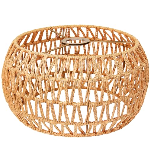 LUCORUSC Hanging Light Lamp Shades Boho Rattan Lamp Shades, Woven LampShades for Floor Lamps Rattan Pendant Lights Boho Lamp Ceiling Light, Table Lamps, Plug in Pendant Light
View Price
LUCORUSC Hanging Light Lamp Shades Boho Rattan Lamp Shades, Woven LampShades for Floor Lamps Rattan Pendant Lights Boho Lamp Ceiling Light, Table Lamps, Plug in Pendant Light
View Price
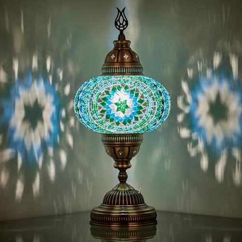 DEMMEX Battery-Operated Turkish Moroccan Mosaic Table Lamp – 12” H, 5” W, Portable Stained Glass Lantern for Indoor & Outdoor Use, Cordless Handmade Decorative Light for Bedroom, Patio & Camping, Teal
View Price
DEMMEX Battery-Operated Turkish Moroccan Mosaic Table Lamp – 12” H, 5” W, Portable Stained Glass Lantern for Indoor & Outdoor Use, Cordless Handmade Decorative Light for Bedroom, Patio & Camping, Teal
View Price
 Gothic Wall Candle Sconces Set of 2 - Metal, Black
View Price
Gothic Wall Candle Sconces Set of 2 - Metal, Black
View Price
 Hortsun Medium rustic orange Drum Lamp Shade Set of 2 Fabric Lampshade
View Price
Hortsun Medium rustic orange Drum Lamp Shade Set of 2 Fabric Lampshade
View Price
 LED Christmas Lights Indoor Outdoor, 33FT 100 Count Mini String Lights
View Price
LED Christmas Lights Indoor Outdoor, 33FT 100 Count Mini String Lights
View Price
 TOPGREENER Plug-in Dimmer Switch for Lamps, Full Range Control,6-FT Cord,1P
View Price
TOPGREENER Plug-in Dimmer Switch for Lamps, Full Range Control,6-FT Cord,1P
View Price
Removable Wallpaper for This Palette
Removable designer wallpaper from Wallshoppe, picked to match this palette. An easy way to add pattern to any room, and every design is available as a sample.
- Designed and printed in the USA
- Non-toxic inks
- Featured in NYT Wirecutter
 Arance Dolci Wallpaper by Carly Beck – Peacock
View Price
Arance Dolci Wallpaper by Carly Beck – Peacock
View Price
 Arance Dolci Wallpaper by Carly Beck – Blue
View Price
Arance Dolci Wallpaper by Carly Beck – Blue
View Price
 Life is a Banquet Stripe Wallpaper by Lingua Franca – Persimmon + Blue
View Price
Life is a Banquet Stripe Wallpaper by Lingua Franca – Persimmon + Blue
View Price
 Bellport Madras Large Wallpaper by Chris Benz – Multi
View Price
Bellport Madras Large Wallpaper by Chris Benz – Multi
View Price
 Townhouse Wallpaper by Sarah Jessica Parker – Peacock
View Price
Townhouse Wallpaper by Sarah Jessica Parker – Peacock
View Price
 Monroe Street Wallpaper by Chris Benz – Blue
View Price
Monroe Street Wallpaper by Chris Benz – Blue
View Price
 Pacifico Palm Wallpaper by Nathan Turner – Green on Indigo
View Price
Pacifico Palm Wallpaper by Nathan Turner – Green on Indigo
View Price
 Arance Dolci Wallpaper by Carly Beck – Pink
View Price
Arance Dolci Wallpaper by Carly Beck – Pink
View Price
 Small Dumbo Wallpaper by Chris Benz – Navy
View Price
Small Dumbo Wallpaper by Chris Benz – Navy
View Price
 Persimmon Birds Wallpaper by Nathan Turner – Persimmon
View Price
Persimmon Birds Wallpaper by Nathan Turner – Persimmon
View Price
 Buka Patchwork Wallpaper by Chris Benz – Blue
View Price
Buka Patchwork Wallpaper by Chris Benz – Blue
View Price
 The Queens Lace' Wallpaper by Sarah Jessica Parker – Misty Blue
View Price
The Queens Lace' Wallpaper by Sarah Jessica Parker – Misty Blue
View Price
 El Quijote Wallpaper by Chris Benz – Multi / Blue / Green
View Price
El Quijote Wallpaper by Chris Benz – Multi / Blue / Green
View Price
 Sweet Caroline Wallpaper by Wallshoppe – Blue
View Price
Sweet Caroline Wallpaper by Wallshoppe – Blue
View Price
 Lafayette Patchwork Wallpaper by Chris Benz – Teal
View Price
Lafayette Patchwork Wallpaper by Chris Benz – Teal
View Price
 Pacifico Palm Wallpaper by Nathan Turner – Peach
View Price
Pacifico Palm Wallpaper by Nathan Turner – Peach
View Price
 Fiddle Fig Wallpaper by Nathan Turner – Indigo
View Price
Fiddle Fig Wallpaper by Nathan Turner – Indigo
View Price
 Townhouse Wallpaper by Sarah Jessica Parker – Morning Dew on Misty Blue
View Price
Townhouse Wallpaper by Sarah Jessica Parker – Morning Dew on Misty Blue
View Price
 Arance Dolci Wallpaper by Carly Beck – Orange
View Price
Arance Dolci Wallpaper by Carly Beck – Orange
View Price
 El Quijote Wallpaper by Chris Benz – Persimmon
View Price
El Quijote Wallpaper by Chris Benz – Persimmon
View Price
 Large Madison Stripe Wallpaper by Chris Benz – Indigo
View Price
Large Madison Stripe Wallpaper by Chris Benz – Indigo
View Price
 Lemons Wallpaper by Nathan Turner – Peacock
View Price
Lemons Wallpaper by Nathan Turner – Peacock
View Price
 El Quijote Wallpaper by Chris Benz – Multi / Blue / Coral
View Price
El Quijote Wallpaper by Chris Benz – Multi / Blue / Coral
View Price
 Tent Stripe Large Wallpaper by Chris Benz – Mustard
View Price
Tent Stripe Large Wallpaper by Chris Benz – Mustard
View Price
 Persimmon Birds Wallpaper by Nathan Turner – Washed Sienna
View Price
Persimmon Birds Wallpaper by Nathan Turner – Washed Sienna
View Price
 Small Dumbo Wallpaper by Chris Benz – Deep Sea
View Price
Small Dumbo Wallpaper by Chris Benz – Deep Sea
View Price
 Life is a Banquet Stripe Wallpaper by Lingua Franca – Blues
View Price
Life is a Banquet Stripe Wallpaper by Lingua Franca – Blues
View Price
 Lafayette Patchwork Wallpaper by Chris Benz – Blue
View Price
Lafayette Patchwork Wallpaper by Chris Benz – Blue
View Price
 Electric Palm Wallpaper by Nathan Turner – Pool
View Price
Electric Palm Wallpaper by Nathan Turner – Pool
View Price
 Large Madison Stripe Wallpaper by Chris Benz – Blue
View Price
Large Madison Stripe Wallpaper by Chris Benz – Blue
View Price
 Best Fronds Wallpaper by Wallshoppe – Gray
View Price
Best Fronds Wallpaper by Wallshoppe – Gray
View Price
 The Mums Wallpaper by Sarah Jessica Parker – Navy
View Price
The Mums Wallpaper by Sarah Jessica Parker – Navy
View Price
 Pebble Wallpaper by Sugar Paper – French Blue On White
View Price
Pebble Wallpaper by Sugar Paper – French Blue On White
View Price
 Pacifico Palm Wallpaper by Nathan Turner – Sky Blue
View Price
Pacifico Palm Wallpaper by Nathan Turner – Sky Blue
View Price
 Mums for Marion Wallpaper by Sarah Jessica Parker – Navy
View Price
Mums for Marion Wallpaper by Sarah Jessica Parker – Navy
View Price
 El Quijote Wallpaper by Chris Benz – Blues
View Price
El Quijote Wallpaper by Chris Benz – Blues
View Price
 Large Dumbo Wallpaper by Chris Benz – Deep Sea
View Price
Large Dumbo Wallpaper by Chris Benz – Deep Sea
View Price
 Faux Bois Wallpaper by Nathan Turner – Blue
View Price
Faux Bois Wallpaper by Nathan Turner – Blue
View Price
 Arance Dolci Wallpaper by Carly Beck – Black
View Price
Arance Dolci Wallpaper by Carly Beck – Black
View Price
 Eleanor Rigby Wallpaper by Wallshoppe – Indigo
View Price
Eleanor Rigby Wallpaper by Wallshoppe – Indigo
View Price
Mix Patterns Without Overwhelming a Teal and Orange Room
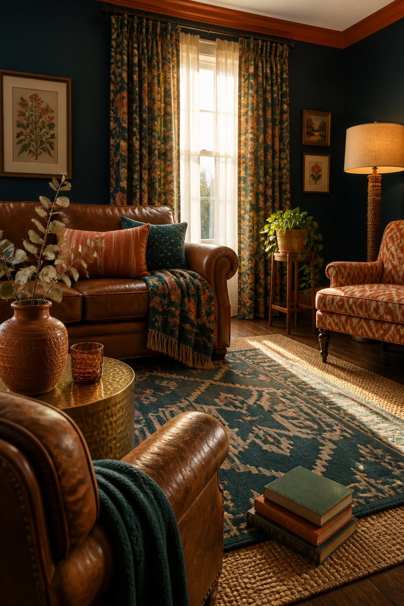
Pattern mixing works best with a three-scale rule: one large-scale print, one medium stripe or geometric, and one small-scale texture, all sharing either teal or orange as a connecting thread. This keeps multiple patterns from competing for attention. The living room in this section uses walls painted a deep teal-blue, with trim in a warm terracotta orange to anchor the mixed textiles.
Pick a pattern anchor: Choose one large-scale print, like a bold botanical or geometric rug, to set the visual scale for everything else.
Repeat one color, not one pattern: Let teal or orange reappear across prints so the eye connects them instead of counting patterns.
Vary the scale on purpose: Pair a big print with a small check or dot so patterns don’t visually fight at the same size.
Leave solid ground: Use solid-color furniture or walls as a rest area between patterned throw pillows, rugs, and curtains.
this deep teal-blue gives patterned textiles a calm, dark backdrop to stand out against [very dark].
this warm burnt-orange tone frames the room and echoes the orange running through the mixed patterns [mid-tone].
 Ciicool 8x10 Area Rugs for Living Room, Modern Geometric Washable Rug Teal
View Price
Ciicool 8x10 Area Rugs for Living Room, Modern Geometric Washable Rug Teal
View Price
 Aegero Pack of 2 Corduroy Decorative Throw Pillow Covers 18x18 Inch, Rust
View Price
Aegero Pack of 2 Corduroy Decorative Throw Pillow Covers 18x18 Inch, Rust
View Price
 Miyotaa Retro Flower Sage Green Orange Blanket 50Wx60H Inch Matisse Groovy 70s Funky Trendy Aesthetic Gift Warm Fuzzy Throw Blanket for Sofa Bed Throws Birthday Presents
View Price
Miyotaa Retro Flower Sage Green Orange Blanket 50Wx60H Inch Matisse Groovy 70s Funky Trendy Aesthetic Gift Warm Fuzzy Throw Blanket for Sofa Bed Throws Birthday Presents
View Price
 DREAMSIDEA Accent Chair Set of 1, Comfy Reading Armchair, Pattern Floral
View Price
DREAMSIDEA Accent Chair Set of 1, Comfy Reading Armchair, Pattern Floral
View Price
 5.3 Inch Small Terracotta Vintage Ceramic Flower Vase, Short Distressed Washed Farmhouse Matte Vase, Table Centerpiece for Living Room Entryway Kitchen Bathroom, Fits Dried Pampas Grass(Terracotta)
View Price
5.3 Inch Small Terracotta Vintage Ceramic Flower Vase, Short Distressed Washed Farmhouse Matte Vase, Table Centerpiece for Living Room Entryway Kitchen Bathroom, Fits Dried Pampas Grass(Terracotta)
View Price
 HERAYLI Velvet Decorative Throw Pillow Covers, Soft Square Cushion Case Home Decor for Living Room Couch Bed Sofa, Set of 2 Pack, Teal, 18x18 Inch
View Price
HERAYLI Velvet Decorative Throw Pillow Covers, Soft Square Cushion Case Home Decor for Living Room Couch Bed Sofa, Set of 2 Pack, Teal, 18x18 Inch
View Price
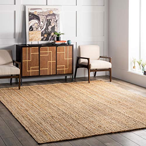 nuLOOM Rigo Hand Woven Farmhouse Jute Area Rug, 8x10, Natural
View Price
nuLOOM Rigo Hand Woven Farmhouse Jute Area Rug, 8x10, Natural
View Price
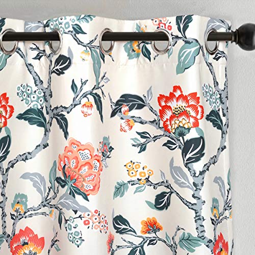 DriftAway Ada Floral Thermal Insulated Double Layer Room Darkening Blackout Curtains Botanical Leaf Flower Printed Patterned Drapes Lined Set of 2 Panels Each 52 Inch by 84 Inch Ivory Orange Teal
View Price
DriftAway Ada Floral Thermal Insulated Double Layer Room Darkening Blackout Curtains Botanical Leaf Flower Printed Patterned Drapes Lined Set of 2 Panels Each 52 Inch by 84 Inch Ivory Orange Teal
View Price
Balance Bold Teal and Orange With Neutral Tones
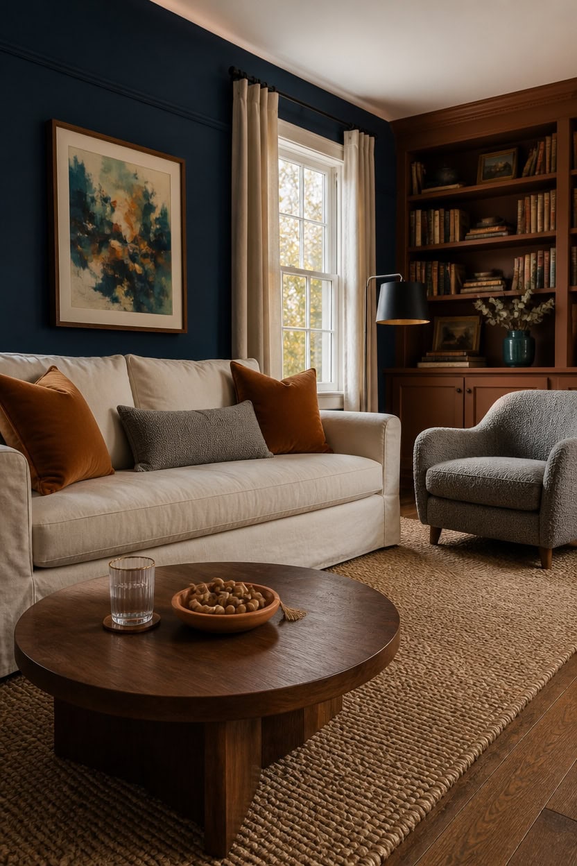
A 70-20-10 ratio keeps teal and orange from overwhelming a room: seventy percent neutral tones, twenty percent teal, ten percent orange accents. This ratio lets the bold colors act as focal points rather than background noise. Paint the main walls in Naples Blue, a deep teal-blue tone, letting cream and gray furnishings carry the rest of the balance.
Anchor with a neutral base: Use cream, gray, or beige for the largest furniture pieces so bold colors read as accents.
Layer teal and orange in small doses: Add pillows, art, or a vase in teal and orange to keep the palette lively without saturating the room.
Use texture to soften intensity: Choose linen, wood, or wool textures in neutral tones to balance the saturated wall color.
Keep trim or built-ins in a supporting hue: Let a secondary color anchor cabinetry or trim so the room doesn’t compete for attention.
this deep teal-blue tone gives the room its bold backdrop while staying calm enough for neutral furnishings to shine [dark].
this deep burnt-orange brown tone grounds the room without competing with the teal walls [dark].
 Vorthio 89" Heavy-Duty 3 Seater Couch, Farmhouse Slipcover Sofa, with High Back & Rolled Arms, Soft Breathable Linen-Textured Lawson Couch for Living Room, Set of 2, Cream White
View Price
Vorthio 89" Heavy-Duty 3 Seater Couch, Farmhouse Slipcover Sofa, with High Back & Rolled Arms, Soft Breathable Linen-Textured Lawson Couch for Living Room, Set of 2, Cream White
View Price
 UNUQLIVCO 360° Swivel Accent Armchair, 39.3" Oversized, Dark Gray
View Price
UNUQLIVCO 360° Swivel Accent Armchair, 39.3" Oversized, Dark Gray
View Price
 Sunddo Small Blue Ceramic Vase 4 Inch
View Price
Sunddo Small Blue Ceramic Vase 4 Inch
View Price
 GriNeed Throw Pillow Covers Burnt Orange Set of 2 18x18 Inch Fall Pillow Covers, Soft Velvet Farmhouse Neutral Decorative Pillowcases for Couch Sofa Bed, Home Boho Decor, Modern Cushion Covers
View Price
GriNeed Throw Pillow Covers Burnt Orange Set of 2 18x18 Inch Fall Pillow Covers, Soft Velvet Farmhouse Neutral Decorative Pillowcases for Couch Sofa Bed, Home Boho Decor, Modern Cushion Covers
View Price
 SAFAVIEH Natural Fiber Area Rug 9x12, Jute Knotted Large Natural NF447A
View Price
SAFAVIEH Natural Fiber Area Rug 9x12, Jute Knotted Large Natural NF447A
View Price
 Round Coffee Table with Storage, Modern Wooden Coffee Table
View Price
Round Coffee Table with Storage, Modern Wooden Coffee Table
View Price
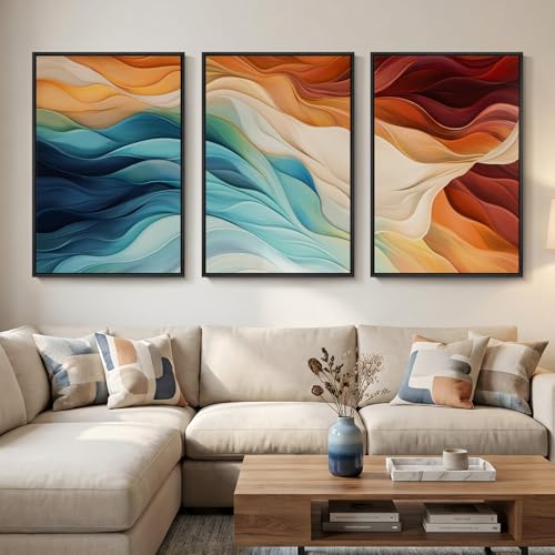 Large Framed Blue Orange Abstract Wall Art for Living Room, 3 Piece 24x36
View Price
Large Framed Blue Orange Abstract Wall Art for Living Room, 3 Piece 24x36
View Price
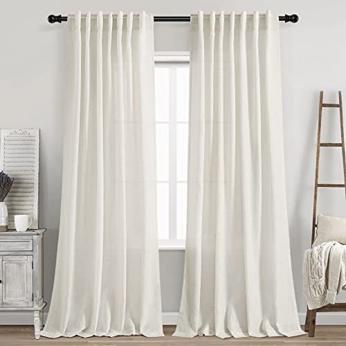 Cream Linen Back Tab Curtains 84 Inch Length for Living Room 2 Panel Set Neutral Modern Farmhouse Window Privacy Semi Sheer Linen Drapes Rustic Pinch Pleated Look Curtain Natural Ivory Colored
View Price
Cream Linen Back Tab Curtains 84 Inch Length for Living Room 2 Panel Set Neutral Modern Farmhouse Window Privacy Semi Sheer Linen Drapes Rustic Pinch Pleated Look Curtain Natural Ivory Colored
View Price
Our Favorite Floor Lamps
- Free shipping over $35
- Picked at 4.5 stars or higher
 Coleford 65" 3-Light Tree Floor Lamp with Woven Rattan Shades
View Price
Coleford 65" 3-Light Tree Floor Lamp with Woven Rattan Shades
View Price
 Crevan 65" Dimmable Rattan Tree Floor Lamp with 3 Bulbs
View Price
Crevan 65" Dimmable Rattan Tree Floor Lamp with 3 Bulbs
View Price
 Rasch 65" Tree Floor Lamp with Dimmable Bulbs
View Price
Rasch 65" Tree Floor Lamp with Dimmable Bulbs
View Price
 Rhodes 63" 1-Light Traditional Floor Lamp
View Price
Rhodes 63" 1-Light Traditional Floor Lamp
View Price
 Brayana 64" Silver Traditional Floor Lamp
View Price
Brayana 64" Silver Traditional Floor Lamp
View Price
 Mctaggart 66" Distressed Traditional Floor Lamp
View Price
Mctaggart 66" Distressed Traditional Floor Lamp
View Price
 Aarzo 69.6" Arched Rattan Floor Lamp with LED and Remote
View Price
Aarzo 69.6" Arched Rattan Floor Lamp with LED and Remote
View Price
 Peavine 76" Rattan Arched Floor Lamp with Remote Control
View Price
Peavine 76" Rattan Arched Floor Lamp with Remote Control
View Price
 Atlasburg 63" Metal Arched Floor Lamp with Rattan Shade
View Price
Atlasburg 63" Metal Arched Floor Lamp with Rattan Shade
View Price
 Kigali 62.5" Light Wood Tripod Floor Lamp
View Price
Kigali 62.5" Light Wood Tripod Floor Lamp
View Price
 62.71" Solid Wood Floor Lamp with Linen Shade
View Price
62.71" Solid Wood Floor Lamp with Linen Shade
View Price
 Jan 65" Torchiere Floor Lamp
View Price
Jan 65" Torchiere Floor Lamp
View Price
 Pilsen 58" Task Floor Lamp
View Price
Pilsen 58" Task Floor Lamp
View Price
Blend Bohemian and Mid-Century Style With Teal and Orange
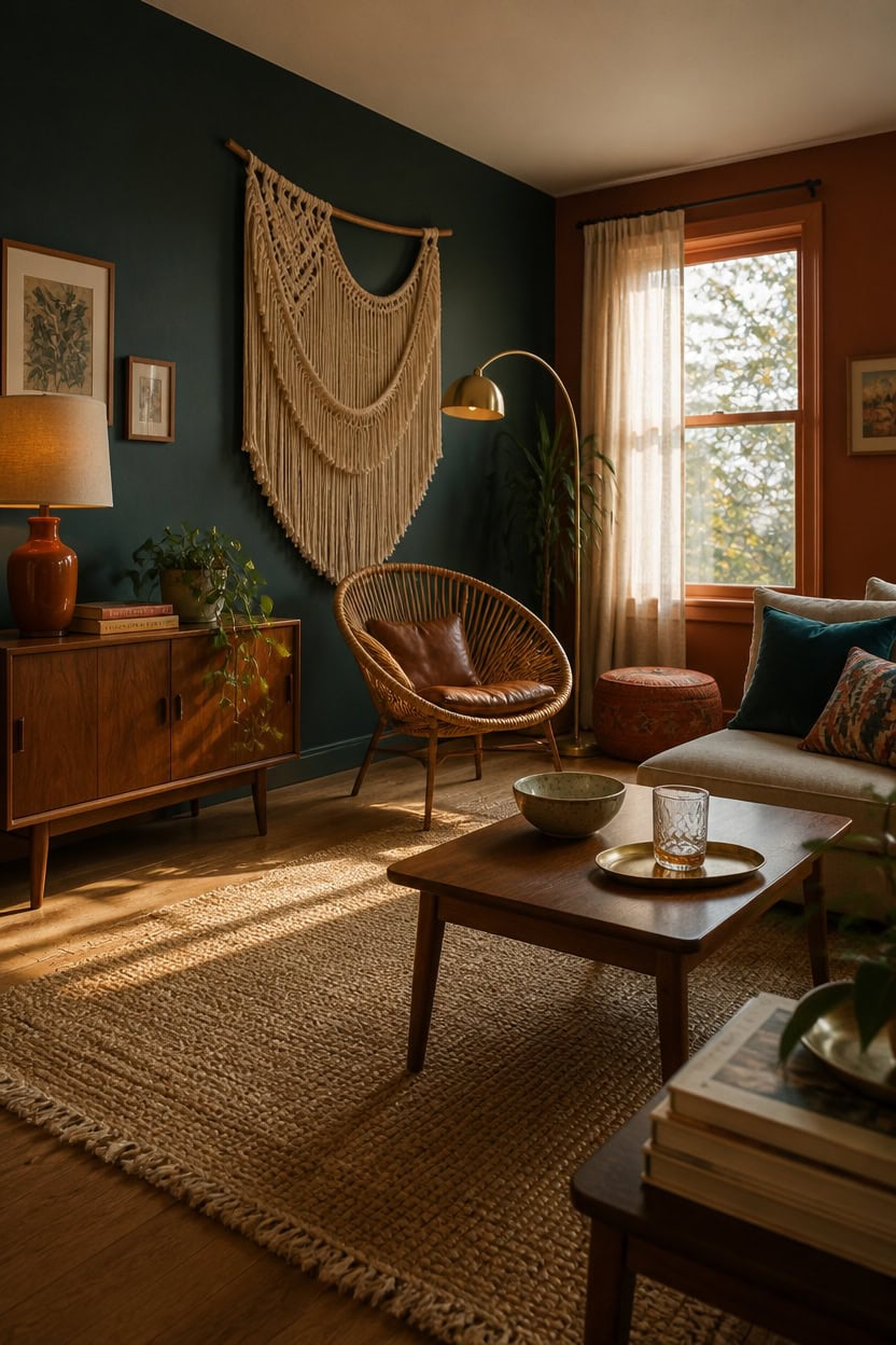
Bohemian textures and mid-century lines meet on an accent wall painted in Beau Green, a deep teal that grounds the eclectic mix. The dark teal backdrop lets rattan, brass, and walnut furniture stand out without competing for attention. Pair the wall with one burnt orange accent, like a woven pouf or ceramic lamp, to keep the boho warmth balanced against the clean mid-century lines.
Mix eras deliberately: Pair a mid-century credenza with a rattan boho chair for contrast.
Layer textures: Combine woven jute, leather, and brass to bridge both styles.
Anchor with one bold wall: Let the teal wall carry the boho-mod mashup so furniture stays simple.
Add warmth sparingly: Use burnt orange in one or two spots like pillows or a lamp shade.
this deep teal-blue tone anchors the boho-mod mix and lets furniture textures shine [very dark].
this warm burnt-orange trim ties the mid-century wood tones to the boho palette [mid-tone].
 Bali & pari Kaka Nature Rattan Dining Chair - Boho Wicker Armchair with Curved Back, Natural
View Price
Bali & pari Kaka Nature Rattan Dining Chair - Boho Wicker Armchair with Curved Back, Natural
View Price
 Fluted Round Nesting Coffee Table Set of 2 Circle Center Table Living Room
View Price
Fluted Round Nesting Coffee Table Set of 2 Circle Center Table Living Room
View Price
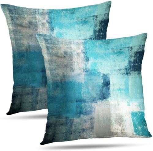 Alricc Throw Pillow Covers for Couch, 18x18 Inch, 2 Pack, Turquoise
View Price
Alricc Throw Pillow Covers for Couch, 18x18 Inch, 2 Pack, Turquoise
View Price
 JUNNAI 25" Modern Orange Ceramic Table Lamp for Living Room Nightstand 3-Way Dimmable Farmhouse Lamp for Bedroom Bedside Entryway Tabletop Office with White Slub Fabric Lampshade (Bulb Included)
View Price
JUNNAI 25" Modern Orange Ceramic Table Lamp for Living Room Nightstand 3-Way Dimmable Farmhouse Lamp for Bedroom Bedside Entryway Tabletop Office with White Slub Fabric Lampshade (Bulb Included)
View Price
 Macrame Wall Hanging Wedding Hanger Tassel Knotting Boho Decor 47"W*25"L
View Price
Macrame Wall Hanging Wedding Hanger Tassel Knotting Boho Decor 47"W*25"L
View Price
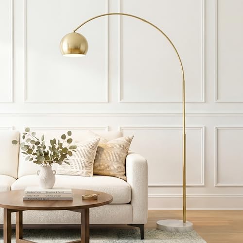 Brightech Olivia Floor Lamp - Chic Arc Lamp with Rounded Spolight Head and Marble Base for Living Room, Tall Standing Lamp with LED Light Bulb for Bedroom Reading, Boho Home Decor for Office - Brass
View Price
Brightech Olivia Floor Lamp - Chic Arc Lamp with Rounded Spolight Head and Marble Base for Living Room, Tall Standing Lamp with LED Light Bulb for Bedroom Reading, Boho Home Decor for Office - Brass
View Price
 CAMILSON Easy Jute Rug 8x10, Indoor Outdoor Natural Color Fiber Area Rugs for Living Room and Patio Rug Herringbone Seagrass Boho Woven Design Easy-Cleaning Washable Outside Carpet Alfombras 8 x 10
View Price
CAMILSON Easy Jute Rug 8x10, Indoor Outdoor Natural Color Fiber Area Rugs for Living Room and Patio Rug Herringbone Seagrass Boho Woven Design Easy-Cleaning Washable Outside Carpet Alfombras 8 x 10
View Price
 SIGNFORD Framed Canvas Print Wall Art Set Burnt Orange and Teal Abstract Warm Tone Modern Illustrations Modern Art Relax/Calm for Living Room, Bedroom, Office - 24"x36"x3 Black
View Price
SIGNFORD Framed Canvas Print Wall Art Set Burnt Orange and Teal Abstract Warm Tone Modern Illustrations Modern Art Relax/Calm for Living Room, Bedroom, Office - 24"x36"x3 Black
View Price
Small-Space Solutions for a Teal and Orange Room
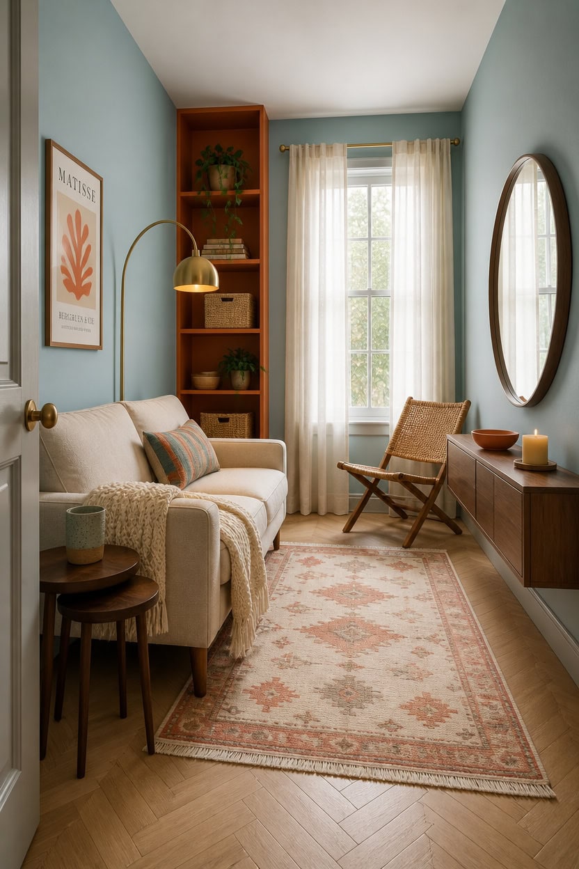
Small spaces benefit from a lighter teal on the main walls instead of a saturated dark one, since pale color reflects more light and keeps the room from feeling boxed in. Paradiso, a soft blue-teal, works as the wall color while burnt orange stays confined to a single built-in unit or shelf. This pairing keeps square footage feeling open while still delivering on the teal-and-orange theme.
Go pale on the teal: A lighter teal wall bounces light around instead of absorbing it.
Concentrate orange in one spot: Save burnt orange for a single shelf, bench, or small cabinet.
Use mirrors to multiply light: A mirror across from a window doubles the sense of space.
Choose leggy furniture: Pieces with visible legs read as lighter and take up less visual weight.
this soft teal-blue keeps small walls feeling airy instead of closing them in [light].
this warm orange gives the room’s one bold accent without overwhelming a tight footprint [mid-tone].
 Vesgantti 48" Loveseat Sofa, Small Couch with Solid Wood Legs, Blue
View Price
Vesgantti 48" Loveseat Sofa, Small Couch with Solid Wood Legs, Blue
View Price
 HARRITPURE Round Mirror 30 Black Wall Mounted Circle Mirrors
View Price
HARRITPURE Round Mirror 30 Black Wall Mounted Circle Mirrors
View Price
 Hyfirm Walnut Nesting Tables Set of 3, Mid Century Side Tables
View Price
Hyfirm Walnut Nesting Tables Set of 3, Mid Century Side Tables
View Price
 Topfinel Decorative Throw Pillow Covers Cushion Cases, Set of 4 Soft Velvet Modern Double-Sided Designs, Mix and Match for Boho Farmhouse Fall Home Decor (18x18 inch, Orange/Teal)
View Price
Topfinel Decorative Throw Pillow Covers Cushion Cases, Set of 4 Soft Velvet Modern Double-Sided Designs, Mix and Match for Boho Farmhouse Fall Home Decor (18x18 inch, Orange/Teal)
View Price
 Nintiue Upgraded Modern Arc Dimmable Tall Standing Floor Lamp with Linen Shade, 1200 Lumens LED Bulb Included, for Living & Reading Room, Bedroom, Office & Nursery, Gold
View Price
Nintiue Upgraded Modern Arc Dimmable Tall Standing Floor Lamp with Linen Shade, 1200 Lumens LED Bulb Included, for Living & Reading Room, Bedroom, Office & Nursery, Gold
View Price
 Tiita Rattan Folding Dining Chair, Bamboo Frame for Small Spaces, Walnut
View Price
Tiita Rattan Folding Dining Chair, Bamboo Frame for Small Spaces, Walnut
View Price
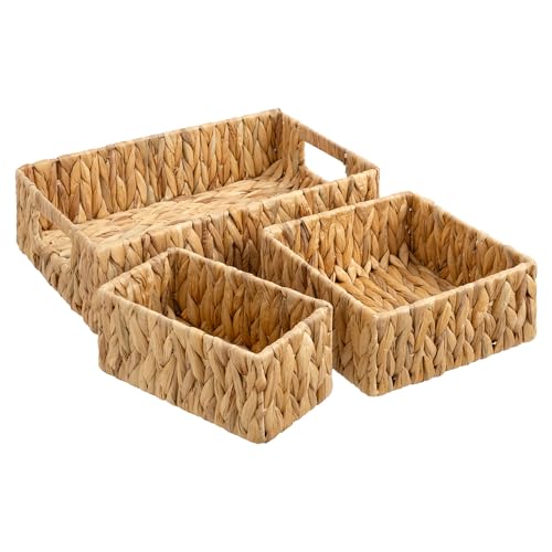 StorageWorks Pantry Baskets for Shelves 3 Pack, Rectangular Wicker Basket with Handles, Natural Water Hyacinth Woven Baskets for Living Room, Toilet, Shelf Storage Basket for Home Decor
View Price
StorageWorks Pantry Baskets for Shelves 3 Pack, Rectangular Wicker Basket with Handles, Natural Water Hyacinth Woven Baskets for Living Room, Toilet, Shelf Storage Basket for Home Decor
View Price
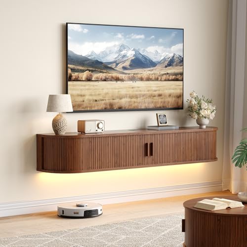 ComfyCorner 63" Floating TV Stand, Wall Mounted Entertainment Center Walnut
View Price
ComfyCorner 63" Floating TV Stand, Wall Mounted Entertainment Center Walnut
View Price
Our Favorite Slipcovers
- Free shipping over $35
- Picked at 4.4 stars or higher
 Reversible Non-Slip Couch Cover for 3-Cushion Couch
View Price
Reversible Non-Slip Couch Cover for 3-Cushion Couch
View Price
 Medallion Reversible Sofa Pet Furniture Protector Slipcover
View Price
Medallion Reversible Sofa Pet Furniture Protector Slipcover
View Price
 Pizarro 4-Piece Stretch Jacquard Sofa Slipcover for 3-Cushion Couch
View Price
Pizarro 4-Piece Stretch Jacquard Sofa Slipcover for 3-Cushion Couch
View Price
 Water Resistant Non-Slip Recliner Chair Slipcover with Pocket
View Price
Water Resistant Non-Slip Recliner Chair Slipcover with Pocket
View Price
 Patchwork Reversible Recliner Pet Furniture Protector Slipcover
View Price
Patchwork Reversible Recliner Pet Furniture Protector Slipcover
View Price
 Medallion Reversible Recliner Pet Furniture Protector Slipcover
View Price
Medallion Reversible Recliner Pet Furniture Protector Slipcover
View Price
 Pizarro 3-Piece Stretch Jacquard Loveseat Slipcover for 2-Cushion Couch
View Price
Pizarro 3-Piece Stretch Jacquard Loveseat Slipcover for 2-Cushion Couch
View Price
 Soft Velvet Plush 3-Piece Stretch Loveseat Slipcover for 2-Cushion Couch
View Price
Soft Velvet Plush 3-Piece Stretch Loveseat Slipcover for 2-Cushion Couch
View Price
 100% Waterproof Microfiber Sofa Slipcover with Elastic Straps
View Price
100% Waterproof Microfiber Sofa Slipcover with Elastic Straps
View Price
 Medallion Reversible Chair Pet Furniture Protector Slipcover
View Price
Medallion Reversible Chair Pet Furniture Protector Slipcover
View Price
 Rich Velvet Stretch 2-Piece Box Cushion Armchair Slipcover
View Price
Rich Velvet Stretch 2-Piece Box Cushion Armchair Slipcover
View Price
 2-Piece L-Shaped Sectional Couch Cover, Machine Washable
View Price
2-Piece L-Shaped Sectional Couch Cover, Machine Washable
View Price
 Stretch Sectional Couch Cover with Anti-Slip Pet Protection
View Price
Stretch Sectional Couch Cover with Anti-Slip Pet Protection
View Price
Common Mistakes to Avoid With Teal and Orange Decor
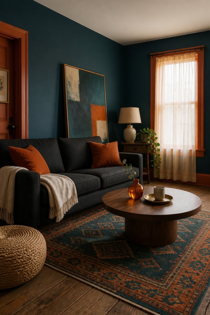
Common teal-and-orange pairings fail when both colors compete at full strength, leaving the room feeling busy instead of balanced. Naples Blue on the main wall solves this by anchoring the space in a deep, moody blue-teal that lets orange stay purely as accent. The fix is proportion — one dominant color, one supporting color, never a fifty-fifty split.
Skipping the ratio rule: Keep teal on 70% of surfaces and orange under 30% to avoid visual noise.
Matching saturation levels: Pairing a bright teal with a bright orange creates clash instead of contrast.
Ignoring undertones: A blue-heavy teal fights a red-heavy orange, so check both leanings first.
Overusing orange in large pieces: Big orange furniture overwhelms a room this saturated in teal.
this deep teal grounds the room without feeling flat [dark].
this warm orange frames doorways and window casings with a controlled dose of contrast [mid-tone].
 Lcokin Burnt Orange Abstract Throw Pillow Covers 18x18 in Set of 2, Decor Art Painting Orange Pillow Case Square Cushion Covers for Sofa Bed Couch Living Room
View Price
Lcokin Burnt Orange Abstract Throw Pillow Covers 18x18 in Set of 2, Decor Art Painting Orange Pillow Case Square Cushion Covers for Sofa Bed Couch Living Room
View Price
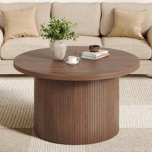 ComfyCorner 31.5" Round Coffee Table, Mid Century Modern Fluted Drum Table
View Price
ComfyCorner 31.5" Round Coffee Table, Mid Century Modern Fluted Drum Table
View Price
 Signature Design by Ashley Ceramic Table Lamp, Bedside, Antique White
View Price
Signature Design by Ashley Ceramic Table Lamp, Bedside, Antique White
View Price
 Zealude Abstract Washable 8x10 Rugs for Living Room,Large Orange 8 x 10 Area Rug for Bedroom Dining Room, Modern Boho Geometric Ultra Thin Floor Carpet for Kids Girls Nursery Apartment (Orange/Teal)
View Price
Zealude Abstract Washable 8x10 Rugs for Living Room,Large Orange 8 x 10 Area Rug for Bedroom Dining Room, Modern Boho Geometric Ultra Thin Floor Carpet for Kids Girls Nursery Apartment (Orange/Teal)
View Price
 Teal Orange Accent Large Abstract Canvas Wall Art For Living Room 29"×58"
View Price
Teal Orange Accent Large Abstract Canvas Wall Art For Living Room 29"×58"
View Price
 UPSTORE 8.27in Hand-Made Orange Glass Bud Vase for Home Table Centerpieces
View Price
UPSTORE 8.27in Hand-Made Orange Glass Bud Vase for Home Table Centerpieces
View Price
 Pouf Ottoman Foot Rest Stuffed – 20” Diameter x 14” Tall Cozy Floor Pouf for Living Room, Bedroom, Nursery & More – 100% Cotton Knit Shell, EPS Bead Filled Footrest & Accent Chair, Beige
View Price
Pouf Ottoman Foot Rest Stuffed – 20” Diameter x 14” Tall Cozy Floor Pouf for Living Room, Bedroom, Nursery & More – 100% Cotton Knit Shell, EPS Bead Filled Footrest & Accent Chair, Beige
View Price
Where to Source Decor for Your Teal and Orange Room
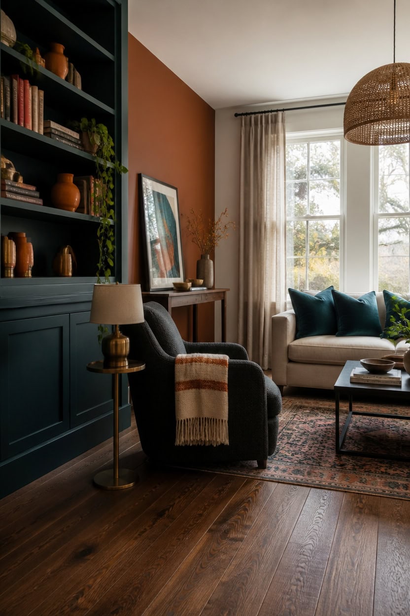
Sourcing decor for a teal and orange room works best when you treat big-box stores and specialty sellers as two different toolkits. Paint the built-ins in “Beau Green” first, since that anchor color tells you which orange accessories will read as complementary rather than clashing. Buy large furniture in solid neutrals from major retailers, then hunt smaller marketplaces and local makers for the orange accent pieces that carry the room’s character.
Split your sourcing: Buy sofas and case goods from big retailers, save small decor for boutique or handmade sellers.
Test swatches at home: Order fabric or paint samples before committing to a full order of teal textiles.
Shop secondhand for character: Vintage or resale sites often carry warmer, richer orange tones than new mass-market pieces.
Buy accent pieces last: Choose orange decor after your teal furniture arrives so undertones actually match in real light.
this deep teal gives the shelves a moody backdrop for displayed decor [dark].
this warm brownish orange adds depth without overpowering the teal built-ins [dark].
 Omax Decor Zola Mid Century Modern Accent Chair Arm Chair, Living Room Furniture, Charcoal/Walnut
View Price
Omax Decor Zola Mid Century Modern Accent Chair Arm Chair, Living Room Furniture, Charcoal/Walnut
View Price
 Orange Ceramic Bud Vases Set of 4, Farmhouse Style - Mantle & Shelf Decor - Living Room, Bathroom, Office & More
View Price
MIULEE Velvet Throw Pillow Covers 20x20 Inch Pack of 2 Teal
View Price
Orange Ceramic Bud Vases Set of 4, Farmhouse Style - Mantle & Shelf Decor - Living Room, Bathroom, Office & More
View Price
MIULEE Velvet Throw Pillow Covers 20x20 Inch Pack of 2 Teal
View Price
 ELYCCUPA 20”Hand Woven Rattan Chandelier Boho Pendant Light Adjustable Coastal Pendant Light for Kitchen Island Dining Living Room, White, UL Listed
View Price
ELYCCUPA 20”Hand Woven Rattan Chandelier Boho Pendant Light Adjustable Coastal Pendant Light for Kitchen Island Dining Living Room, White, UL Listed
View Price
 JOINICE Fluted Console Table with Drawers for Entryway 43", Walnut
View Price
JOINICE Fluted Console Table with Drawers for Entryway 43", Walnut
View Price
 PuTian Merino Wool Blanket, Throw for Camping, 87" x 63", Bohemia Orange
View Price
PuTian Merino Wool Blanket, Throw for Camping, 87" x 63", Bohemia Orange
View Price
 LevvArts Teal Orange Brown Wall Decor Abstract Circles Paintings Geometric Canvas Art Vintage Bathroom Dcoration Each Panel 12"x16"
View Price
LevvArts Teal Orange Brown Wall Decor Abstract Circles Paintings Geometric Canvas Art Vintage Bathroom Dcoration Each Panel 12"x16"
View Price
 Fairlee 26" Tall Table Lamp Gold Brass Candlestick Antique Traditional
View Price
Fairlee 26" Tall Table Lamp Gold Brass Candlestick Antique Traditional
View Price
Seasonal Tweaks to Keep Your Teal and Orange Room Fresh
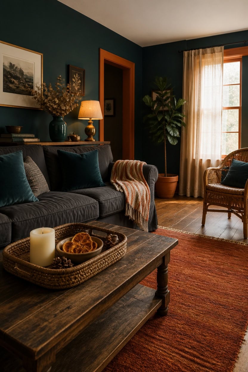
Seasonal color rotation works best when you keep the deep teal walls fixed and swap only the orange layer through textiles and small decor. This approach protects the big paint investment while letting burnt orange shift toward rust in fall or brighten toward coral in summer. Store off-season pillow covers and throws in labeled bins so switching takes minutes, not hours.
Rotate textiles only: Swap throw pillow covers and blankets each season instead of repainting or buying new furniture.
Shift orange tones with the calendar: Use rust and burnt sienna in fall, then move to coral or peach for spring and summer.
Layer in natural materials: Add pinecones, dried citrus, or seasonal branches in a bowl for low-cost seasonal texture.
Keep teal as the constant: Let the walls and large furniture anchor the room while smaller pieces carry seasonal change.
this deep teal stays consistent through every seasonal swap [dark].
this warm orange trim ties the woodwork to the room’s rotating orange accents year-round [mid-tone].
 Sofa Shield® Sofa Slip Cover for Dogs with Strap, Charcoal Linen
View Price
Sofa Shield® Sofa Slip Cover for Dogs with Strap, Charcoal Linen
View Price
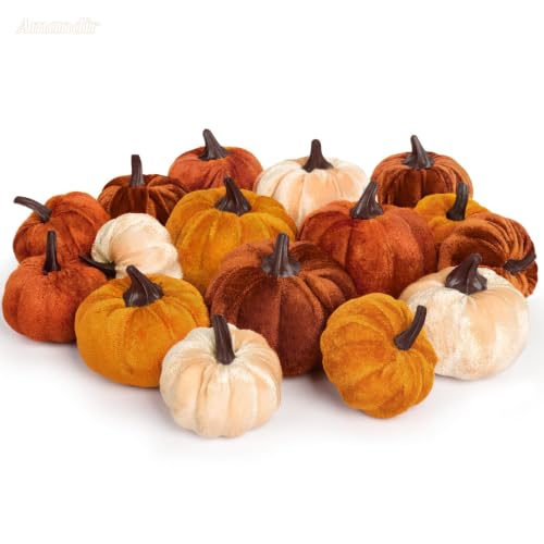 16Pcs Fall Artificial Velvet Pumpkins 3 Sizes Fake Small Foam Pumpkin Decor
View Price
16Pcs Fall Artificial Velvet Pumpkins 3 Sizes Fake Small Foam Pumpkin Decor
View Price
 decorUhome Chenille Teal Velvet Throw Pillow Covers 20x20 Set of 2
View Price
decorUhome Chenille Teal Velvet Throw Pillow Covers 20x20 Set of 2
View Price
 Amyhill 8 Pcs Fall Table Centerpiece Autumn Tray Decorations Set
View Price
Amyhill 8 Pcs Fall Table Centerpiece Autumn Tray Decorations Set
View Price
 HOKYHOKY Fluted Console Table with Drawers, 47.1" Entryway Table, Walnut
View Price
HOKYHOKY Fluted Console Table with Drawers, 47.1" Entryway Table, Walnut
View Price
 DII Braided Striped Throw Blanket, 50x60, Vintage Orange/Red on Cream
View Price
DII Braided Striped Throw Blanket, 50x60, Vintage Orange/Red on Cream
View Price
 hjn Ceramic Vase Set of 3 Teal Flower Vase for Home Decor, Modern Decorative Vase for Flowers Vases for Your Ideal Shelf Decor/Table/Living Room/Kitchen/Office-Teal
View Price
hjn Ceramic Vase Set of 3 Teal Flower Vase for Home Decor, Modern Decorative Vase for Flowers Vases for Your Ideal Shelf Decor/Table/Living Room/Kitchen/Office-Teal
View Price
 Oneach 19.5” Brass Gold Small Table Lamps Set of 2 for Living Room Bedroom
View Price
Oneach 19.5” Brass Gold Small Table Lamps Set of 2 for Living Room Bedroom
View Price
Styling Tricks for a Passport-Stamped Living Room
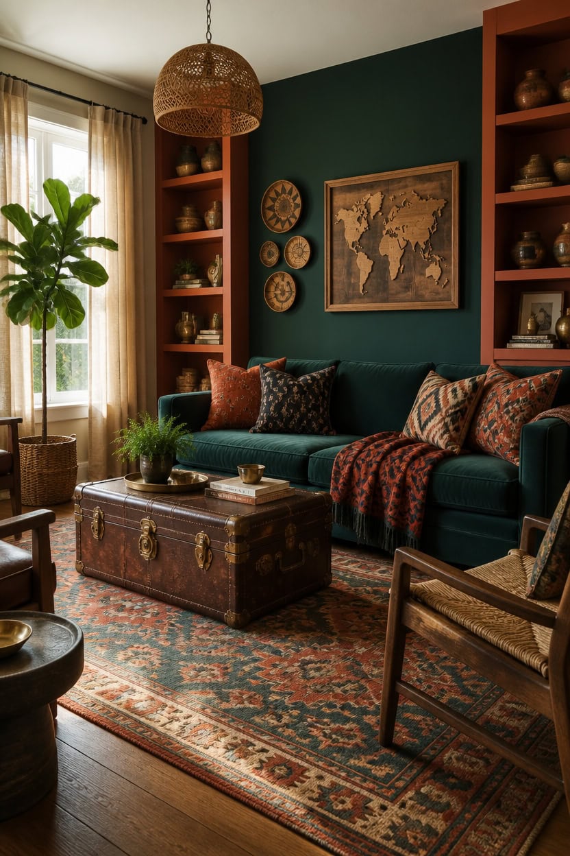
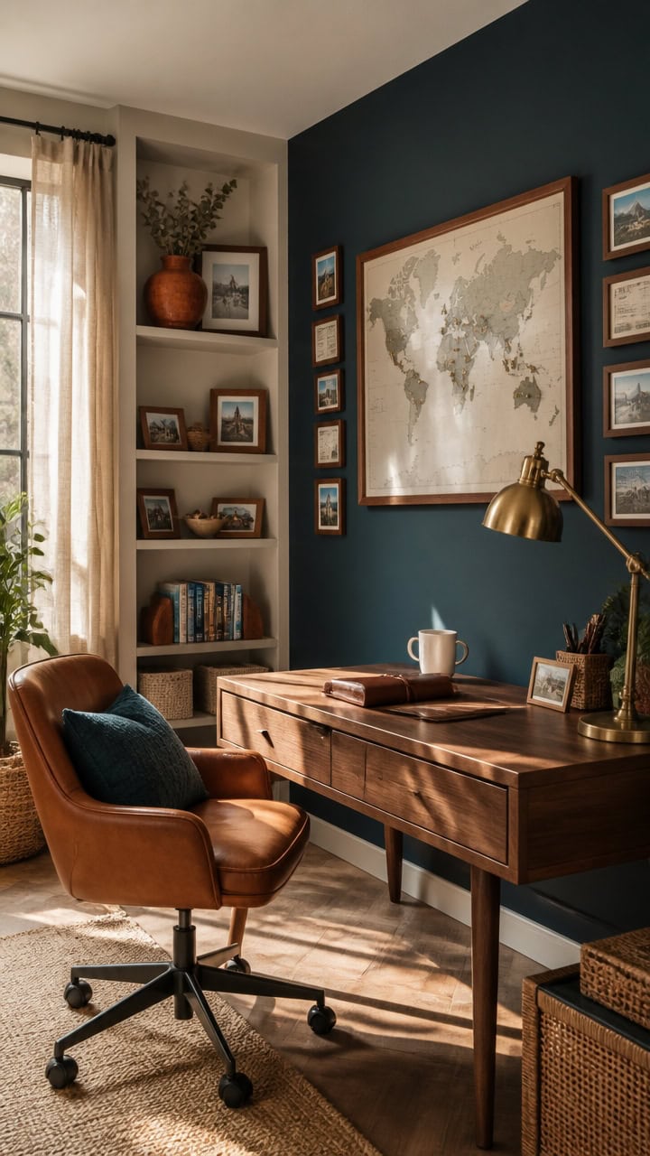
Layering pieces from different countries works when one steady wall color anchors the mix, so patterns and textures feel curated instead of cluttered. An accent wall painted in a deep teal ties global textiles together without competing with travel-inspired patterns. This anchor color lets kilim rugs, batik pillows, and carved wood pieces from different regions read as one cohesive collection rather than clutter. Group souvenirs in threes on open shelves to keep the well-traveled look organized instead of chaotic.
Layer global textiles: Mix kilim rugs, batik pillows, and ikat throws in teal and orange tones.
Display travel finds in groups: Cluster maps, pottery, and carved pieces in odd numbers on shelves.
Ground the mix with one wall: Keep a single deep teal wall as the backdrop for eclectic patterns.
Add global lighting: Use a woven pendant or lantern-style lamp to reinforce the well-traveled feel.
this deep teal creates a moody backdrop for global textiles and travel finds [very dark].
this warm orange tone highlights displayed souvenirs and pottery [mid-tone].
 Kilim Area Rugs for 9x12 Wool Jute Reversible Southwestern Area Rug Geometric Design Red Multicolor Hand Woven Rug Thick 0.19" Flatweave Carpet Indoor Outdoor Rugs for Bedroom Dining Room Living Room
View Price
Kilim Area Rugs for 9x12 Wool Jute Reversible Southwestern Area Rug Geometric Design Red Multicolor Hand Woven Rug Thick 0.19" Flatweave Carpet Indoor Outdoor Rugs for Bedroom Dining Room Living Room
View Price
 Waiyear Orange Teal Throw Pillow Covers Set of 2 18x18 Marble Decorative
View Price
Waiyear Orange Teal Throw Pillow Covers Set of 2 18x18 Marble Decorative
View Price
 Enjoy The Wood 3D Wooden World Map Wall Art (Multicolor, M)
View Price
Enjoy The Wood 3D Wooden World Map Wall Art (Multicolor, M)
View Price
 DWXJICF American Style Retro Pendant Lighting Coastal Farmhouse Large Hanging Lamp Rattan Pendant Light Fixture Ceiling with Antique Pendant Chain for Bathroom Ceiling,Dining,Bedroom,Entryway
View Price
DWXJICF American Style Retro Pendant Lighting Coastal Farmhouse Large Hanging Lamp Rattan Pendant Light Fixture Ceiling with Antique Pendant Chain for Bathroom Ceiling,Dining,Bedroom,Entryway
View Price
 ONESIXEC 10 Pack Wood Decorative Bowls Long Heavy Handmade Carved Key Bowl for Entryway Table Home Decor Rustic Boho Decor Bowls for Candle Making Potpourri Catch (9.4" x 5.5" x 1.7")
View Price
ONESIXEC 10 Pack Wood Decorative Bowls Long Heavy Handmade Carved Key Bowl for Entryway Table Home Decor Rustic Boho Decor Bowls for Candle Making Potpourri Catch (9.4" x 5.5" x 1.7")
View Price
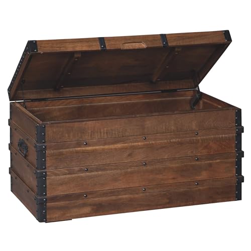 Signature Design by Ashley Storage Trunk Coffee Table, Brown, Kettleby
View Price
Signature Design by Ashley Storage Trunk Coffee Table, Brown, Kettleby
View Price
 CHI AN HOME Wicker 23 Inch Jute Wall Decor Baskets, Set of 6 Extra Large Woven Jute Wall Plates, 23",21",15",13",12,10", Decorative Baskets for Wall Arts, Wall Hanging for Bedroom, Living Room, Office
View Price
CHI AN HOME Wicker 23 Inch Jute Wall Decor Baskets, Set of 6 Extra Large Woven Jute Wall Plates, 23",21",15",13",12,10", Decorative Baskets for Wall Arts, Wall Hanging for Bedroom, Living Room, Office
View Price
 collectiblesBuy Handmade Brass Armillary Sphere Globe Clock Spherical Astrolabe Vintage Compass Handmade Nautical Decor for Office Desk & Home Decoration
View Price
collectiblesBuy Handmade Brass Armillary Sphere Globe Clock Spherical Astrolabe Vintage Compass Handmade Nautical Decor for Office Desk & Home Decoration
View Price