The Gray and Copper Kitchen That Gets Stranger and Better Over Time
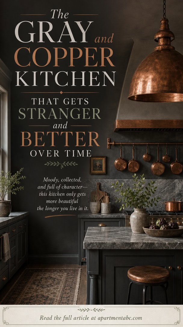
Like Dorian Gray’s portrait, this kitchen ages in reverse: the gray stays composed while the copper does all the changing. You’ll notice it first in the pendant lights, then in the kettle’s slow bronze creep.
Nothing about this room announces itself. It just keeps shifting, quietly, until you realize the space you walked into isn’t quite the one you’re standing in now.
The Gray Cabinets Anchoring This Kitchen’s Cool Mood
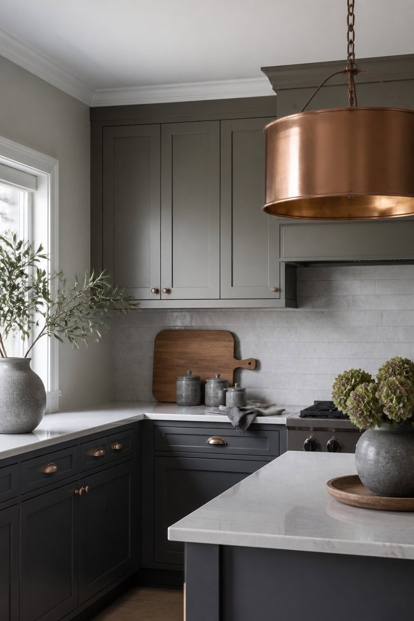
Very light gray Stonington Gray covers the main walls, and mid-tone gray Gray Mountain wraps the upper cabinets. The shift in depth keeps the cool tone consistent without feeling flat. A wooden cutting board leaning against the backsplash adds warmth and texture at counter height.
Layer the shades: Use two grays of different depth so the cabinets read as a deliberate layer, not a mismatch.
Anchor with lower mass: Keep the darker or deeper gray on the larger cabinet run to ground the room.
Match sheen levels: Use a satin finish on cabinets so light bounces evenly across the cool tone.
Let hardware breathe: Space copper pulls evenly so they punctuate the gray without crowding it.
creates a soft, cool backdrop that keeps the kitchen light and airy. [very light]
adds a deeper gray layer that grounds the cabinetry without clashing with the walls. [mid-tone]
 KRUPS Simply Brew Compact 5 Cup Coffee Maker: Stainless Steel Design, Pause & Brew, Keep Warm, Reusable Filter, Drip-Free Carafe
View Price
KRUPS Simply Brew Compact 5 Cup Coffee Maker: Stainless Steel Design, Pause & Brew, Keep Warm, Reusable Filter, Drip-Free Carafe
View Price
 Book Cutting Board Set with Stand,3-Piece Real Hardwood Kitchen Boards
View Price
Book Cutting Board Set with Stand,3-Piece Real Hardwood Kitchen Boards
View Price
 10 Strawberry Street Embossed Diamond Ceramic Kitchen Canister Set, Set of 3, Gray
View Price
10 Strawberry Street Embossed Diamond Ceramic Kitchen Canister Set, Set of 3, Gray
View Price
 Smithcraft Copper Measuring Cups and Spoons Set, Metric & US Stainless Steel 5 Measuring Cups and 6 Measuring Spoons for Baking & Kitchen
View Price
Smithcraft Copper Measuring Cups and Spoons Set, Metric & US Stainless Steel 5 Measuring Cups and 6 Measuring Spoons for Baking & Kitchen
View Price
 Nacuci Grey Cloth Napkins Set of 6 Washable Dinner Napkins, 18X18 in
View Price
Nacuci Grey Cloth Napkins Set of 6 Washable Dinner Napkins, 18X18 in
View Price
 Range Kleen SM1417CWR Copper Insulated Counter Mat, 14-inches x 17-inches
View Price
Range Kleen SM1417CWR Copper Insulated Counter Mat, 14-inches x 17-inches
View Price
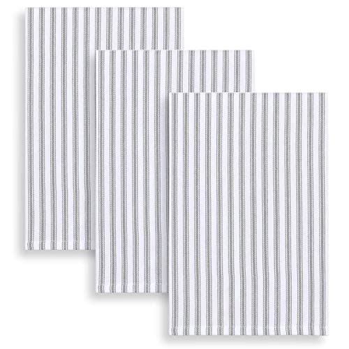 Cackleberry Home Alloy Gray and White Ticking Stripe Kitchen Towels Woven Cotton 18 x 28 Inches, Set of 3
View Price
Cackleberry Home Alloy Gray and White Ticking Stripe Kitchen Towels Woven Cotton 18 x 28 Inches, Set of 3
View Price
 Large Round Copper Bronze Drum Pendant Light Chandelier for Dining Room
View Price
Large Round Copper Bronze Drum Pendant Light Chandelier for Dining Room
View Price
A Countertop That Bridges Gray Cabinets and Copper Accents
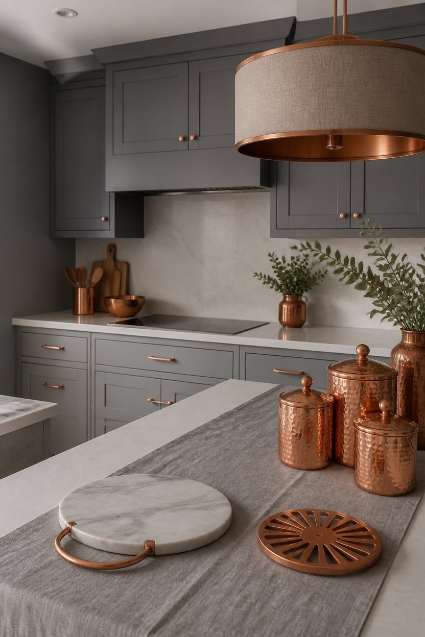
A quartz-look countertop in a pale stone tone gives the eye a resting point between the cool gray cabinetry and the warm copper pieces scattered across the counter. Mid-tone gray Stormy Sky covers the upper cabinets while mid-tone gray Geddy Gray coats the main walls, giving the room one matched backdrop. That shared depth lets a light stone countertop read as the true midpoint between cool cabinetry and warm copper. A marble cheese board with a copper handle sits near the sink, echoing that same handoff.
Match the depth: Choose a countertop with the same lightness as the cabinets so no surface pulls focus.
Warm the edge: Add a copper edge trim or handle to soften the stone’s coolness.
Repeat the copper: Echo the same copper tone in one nearby fixture so the bridge feels intentional.
Keep grout light: Use a light grout line so the countertop does not compete with the cabinet color.
gives the cabinetry a mid-tone gray base that sits between the lighter countertop and the room’s copper warmth. [mid-tone]
wraps the room in a matching mid-tone gray so the countertop’s contrast reads as intentional, not harsh. [mid-tone]
 Coloch Marble and Acacia Wood Cutting Board, Charcuterie Chopping Board with Handle, Decorative Serving Board for Cheese, Steak, Bread, Fruit (white)
View Price
Coloch Marble and Acacia Wood Cutting Board, Charcuterie Chopping Board with Handle, Decorative Serving Board for Cheese, Steak, Bread, Fruit (white)
View Price
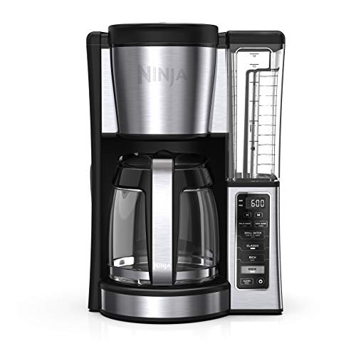 Ninja Fresh Brew Coffee Maker, 12 Cup Glass Carafe, Stainless Steel, CE251
View Price
Ninja Fresh Brew Coffee Maker, 12 Cup Glass Carafe, Stainless Steel, CE251
View Price
 Copper Tea Time Trivet, 8¼"
View Price
Copper Tea Time Trivet, 8¼"
View Price
 TTU Tabletops Gallery Hobnail Style 4 Piece Timeless Grey Stoneware Nesting Mixing Bowl Set for Baking and Cooking
View Price
TTU Tabletops Gallery Hobnail Style 4 Piece Timeless Grey Stoneware Nesting Mixing Bowl Set for Baking and Cooking
View Price
 nu steel Etched Antique Copper Stainless Steel 4pc Canister Set, Beautiful Food Storage Container for Kitchen Counter, Tea, Sugar, Coffee, Caddy, Flour Canister with Rubber seal lid, TG-1392AC-SET4
View Price
nu steel Etched Antique Copper Stainless Steel 4pc Canister Set, Beautiful Food Storage Container for Kitchen Counter, Tea, Sugar, Coffee, Caddy, Flour Canister with Rubber seal lid, TG-1392AC-SET4
View Price
 Winotic Grey Cotton Table Runner 13 x 72 Inches Long Farmhouse Style
View Price
Winotic Grey Cotton Table Runner 13 x 72 Inches Long Farmhouse Style
View Price
 Smithcraft Measuring Cups and Spoons Set 14, Copper Measuring Cups and Spoons Set for Dry & Liquid, Metric & US Stainless Steel 6 Measure Cups and 7 Spoons Set w/Leveler for Kitchen & Baking
View Price
Smithcraft Measuring Cups and Spoons Set 14, Copper Measuring Cups and Spoons Set for Dry & Liquid, Metric & US Stainless Steel 6 Measure Cups and 7 Spoons Set w/Leveler for Kitchen & Baking
View Price
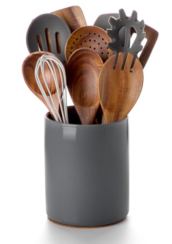 Nucookery Ceramic Kitchen Utensil Holder for Countertop Organizer 6.4" Gray
View Price
Nucookery Ceramic Kitchen Utensil Holder for Countertop Organizer 6.4" Gray
View Price
Our Favorite Cabinet Hardware
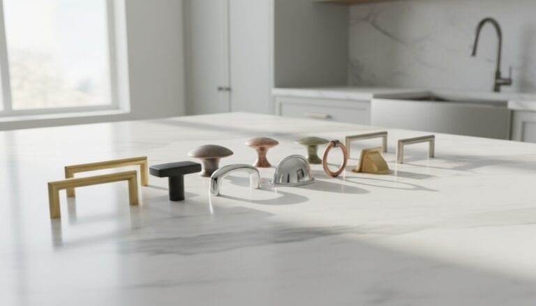 Cabinet Pulls
See the Top 10
Cabinet Pulls
See the Top 10
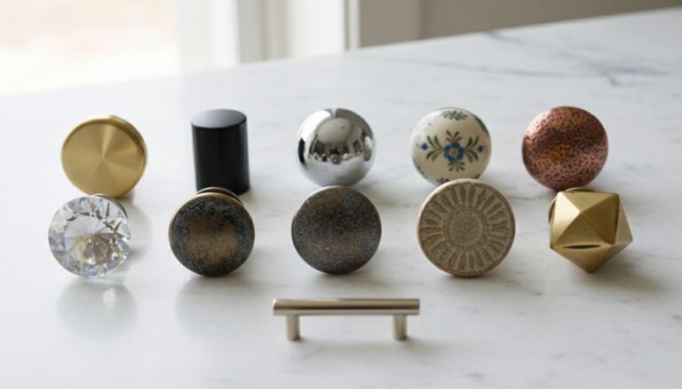 Cabinet Knobs
See the Top 10
Cabinet Knobs
See the Top 10
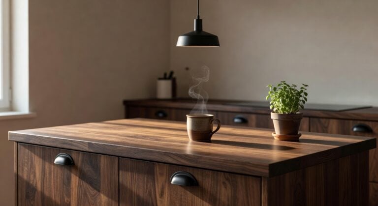 Cup Pulls
See the Top 10
Cup Pulls
See the Top 10
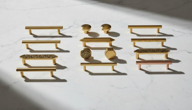 Gold Cabinet Pulls
See the Top 10
Gold Cabinet Pulls
See the Top 10
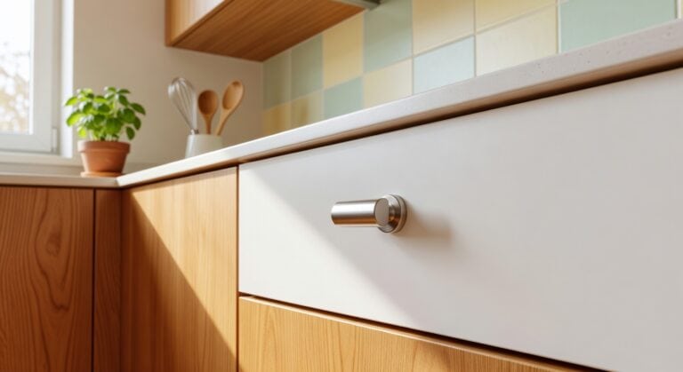 Brushed Nickel Knobs
See the Top 10
Brushed Nickel Knobs
See the Top 10
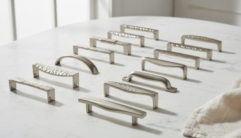 Brushed Nickel Pulls
See the Top 10
Brushed Nickel Pulls
See the Top 10
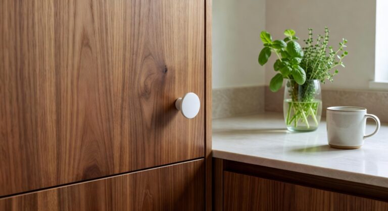 Ceramic Knobs
See the Top 10
Ceramic Knobs
See the Top 10
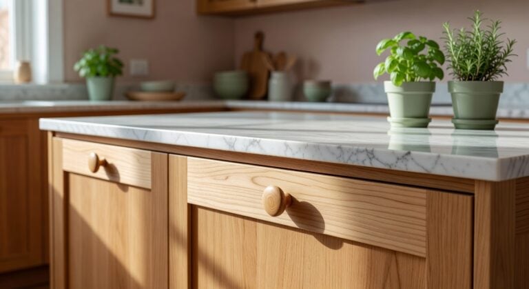 Wood Knobs
See the Top 10
Wood Knobs
See the Top 10
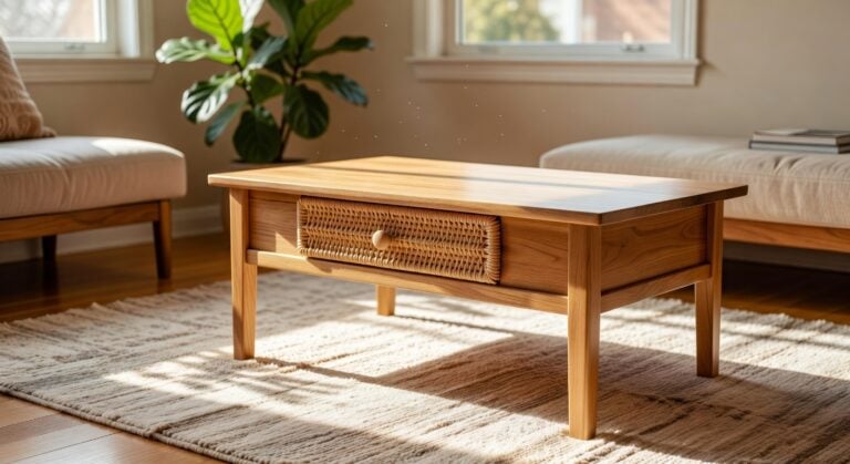 Rattan Knobs
See the Top 10
Rattan Knobs
See the Top 10
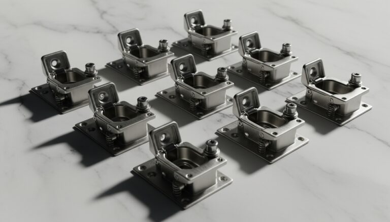 Soft Close Hinges
See the Top 10
Soft Close Hinges
See the Top 10
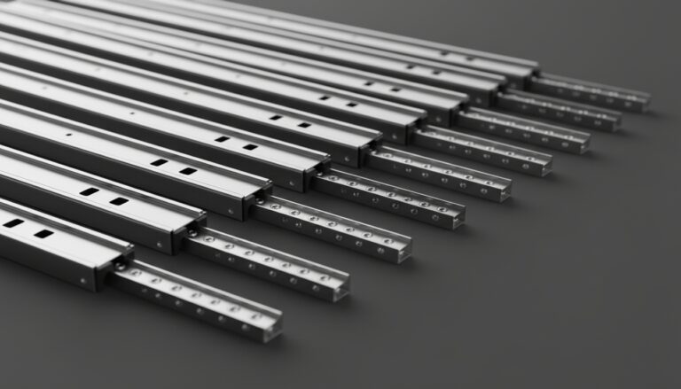 Drawer Slides
See the Top 10
Drawer Slides
See the Top 10
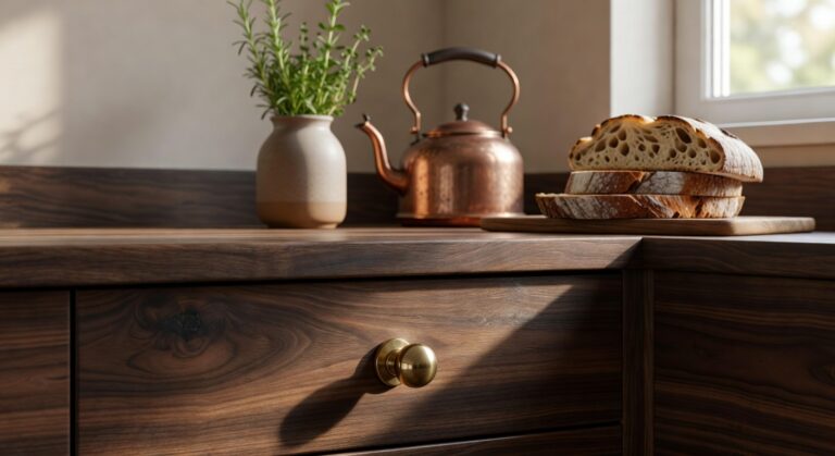 Brass Cabinet Knobs
See the Top 10
Brass Cabinet Knobs
See the Top 10
The Backsplash Texture Hiding in Plain Sight
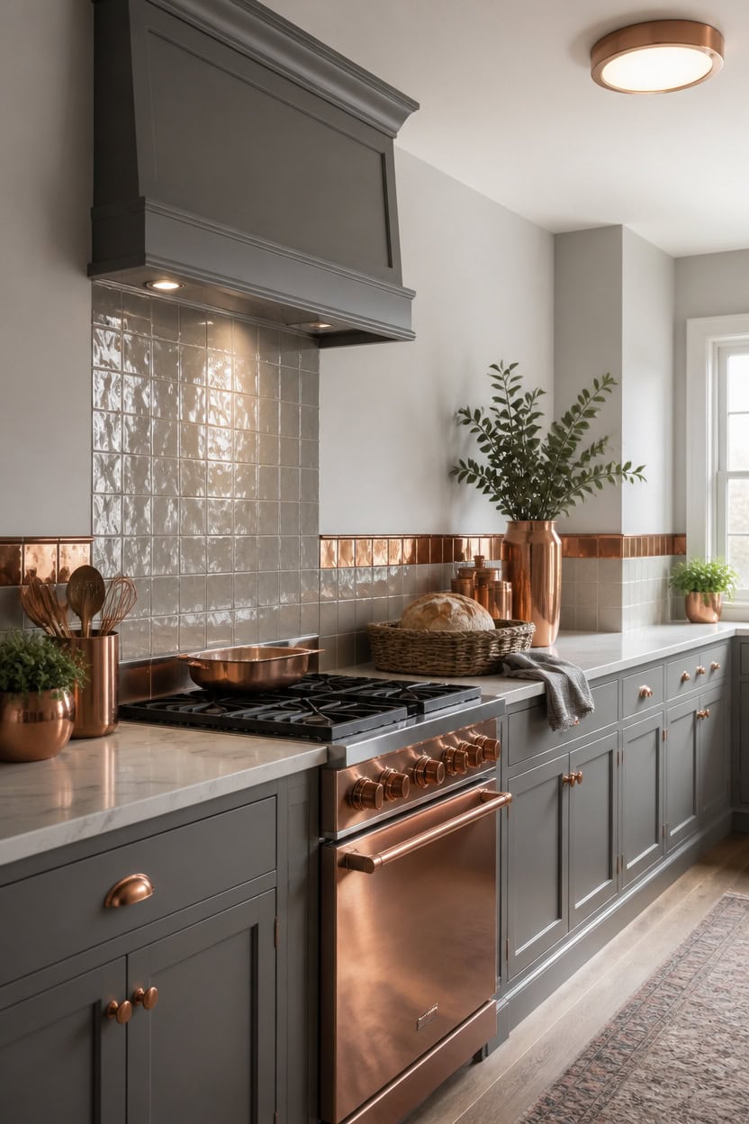
A stack of glossy white subway tiles is rarely the whole story on this backsplash; a light grasscloth-look wallpaper panel or a hand-glazed zellige tile run behind the range gives the wall real dimension once light hits it at an angle. Very light gray Angel’s Wings on the main walls keeps the kitchen open, while mid-tone gray Arctic Seal on the backsplash trim frames the tile’s raised texture. That trim color adds depth without pulling attention from the copper accents nearby. A woven wicker bread basket on the counter echoes that warm undertone, tying the backsplash into the room.
Angle the light: Position a task light or pendant so it rakes across the tile and reveals its texture.
Keep grout quiet: Match grout closely to the tile so the pattern reads as texture, not lines.
Use trim as a frame: A painted trim edge around the backsplash draws the eye without adding a new color family.
Balance with flat surfaces: Pair the textured tile with a smooth countertop so the wall stays the focal point.
keeps the room bright so the textured backsplash reads as the star surface. [very light]
frames the tile’s raised pattern with a deeper gray edge. [mid-tone]
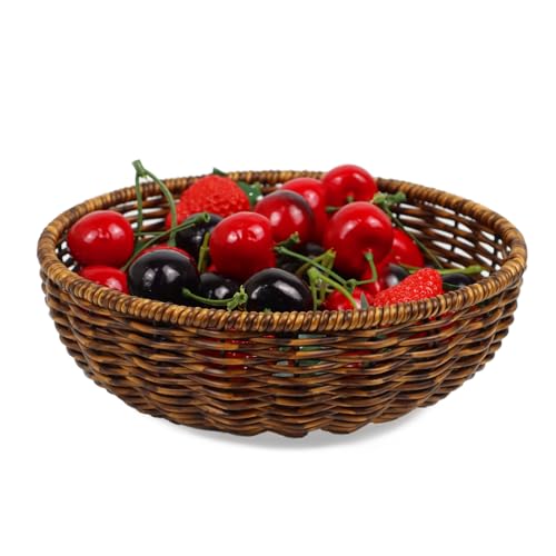 Round Fruit Baskets Bowl for Kitchen Counter, Bread Woven Wicker Basket
View Price
Round Fruit Baskets Bowl for Kitchen Counter, Bread Woven Wicker Basket
View Price
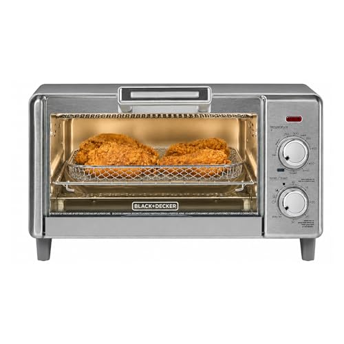 BLACK+DECKER 4-Slice Air Fry Toaster Oven, 5-in-1 Countertop Oven
View Price
BLACK+DECKER 4-Slice Air Fry Toaster Oven, 5-in-1 Countertop Oven
View Price
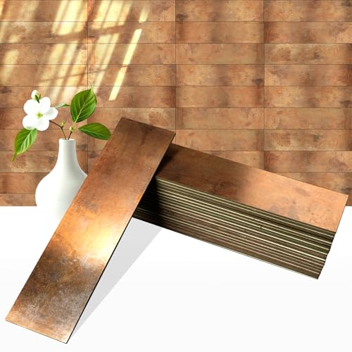 OYASIMI 80-Piece Retro Copper Thick PVC Peel and Stick Backsplash, 2" x 8" Waterproof Subway Tile Peel and Stick Wall Tiles for Kitchen and Bathroom
View Price
OYASIMI 80-Piece Retro Copper Thick PVC Peel and Stick Backsplash, 2" x 8" Waterproof Subway Tile Peel and Stick Wall Tiles for Kitchen and Bathroom
View Price
 Tikooere 10 Inch Ceramic Dinner Plates Set of 4, Dark Gray, High Edges
View Price
Tikooere 10 Inch Ceramic Dinner Plates Set of 4, Dark Gray, High Edges
View Price
 Monarch Abode Kitchen Utensil Holder – Hand Hammered Metal Antique Copper Utensil Holder, Decorative Utensil Crock for Kitchen Counter, Cooking Tool and Spatula Holder for Countertop, Caddy Organizer
View Price
Monarch Abode Kitchen Utensil Holder – Hand Hammered Metal Antique Copper Utensil Holder, Decorative Utensil Crock for Kitchen Counter, Cooking Tool and Spatula Holder for Countertop, Caddy Organizer
View Price
 Premium Kitchen Towels 6 Pack 100% Cotton, 20"x28" Dish Towels - Grey
View Price
Premium Kitchen Towels 6 Pack 100% Cotton, 20"x28" Dish Towels - Grey
View Price
 Dark Academia Kitchen Wall Art Gold Framed, Moody Vintage Copper Pots Still Life Canvas Print, Antique Kitchen Wall Art Decor for Coffee Bar Dining Room 10x8 Inch
View Price
Dark Academia Kitchen Wall Art Gold Framed, Moody Vintage Copper Pots Still Life Canvas Print, Antique Kitchen Wall Art Decor for Coffee Bar Dining Room 10x8 Inch
View Price
 10 Strawberry Street Wazee Matte 9"/48oz Serving Bowl, Set of 2, Charcoal
View Price
10 Strawberry Street Wazee Matte 9"/48oz Serving Bowl, Set of 2, Charcoal
View Price
Our Favorite Kitchen Towels, Aprons and Curtains
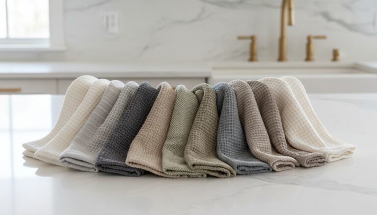 Kitchen Towels
See the Top 10
Kitchen Towels
See the Top 10
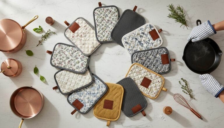 Pot Holders
See the Top 10
Pot Holders
See the Top 10
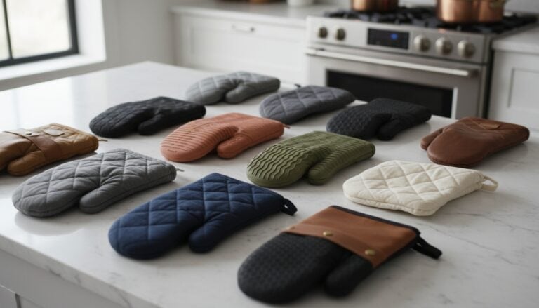 Oven Mitts
See the Top 10
Oven Mitts
See the Top 10
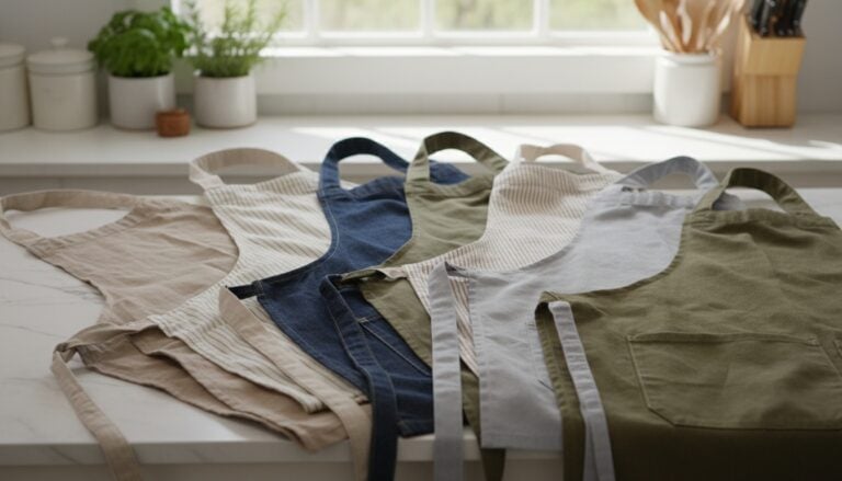 Aprons
See the Top 10
Aprons
See the Top 10
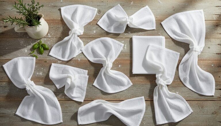 Flour Sack Towels
See the Top 10
Flour Sack Towels
See the Top 10
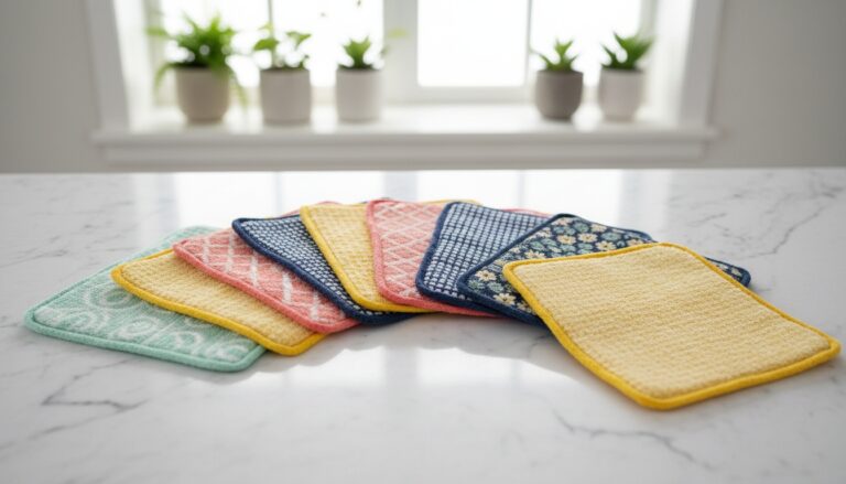 Swedish Dishcloths
See the Top 10
Swedish Dishcloths
See the Top 10
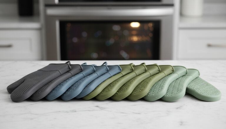 Silicone Oven Mitts
See the Top 10
Silicone Oven Mitts
See the Top 10
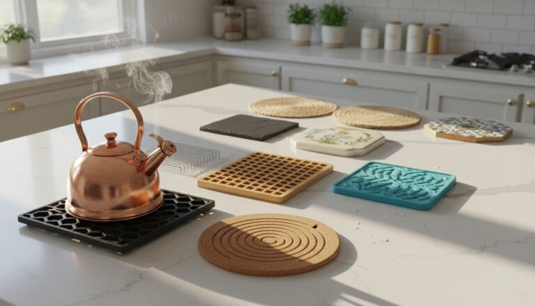 Trivets
See the Top 10
Trivets
See the Top 10
 Aprons for Men
See the Top 10
Aprons for Men
See the Top 10
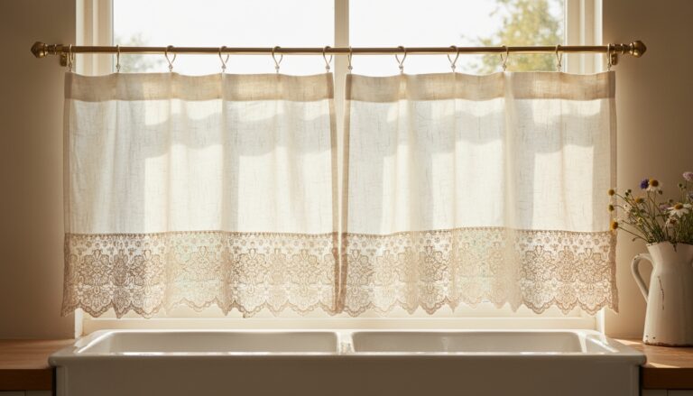 Cafe Curtains
See the Top 10
Cafe Curtains
See the Top 10
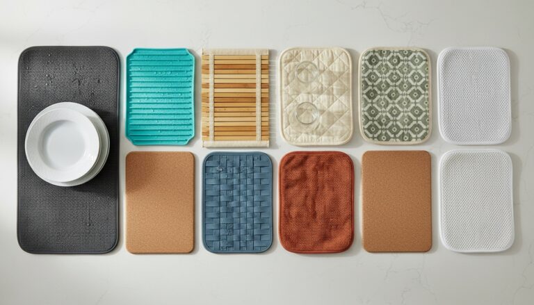 Dish Drying Mats
See the Top 10
Dish Drying Mats
See the Top 10
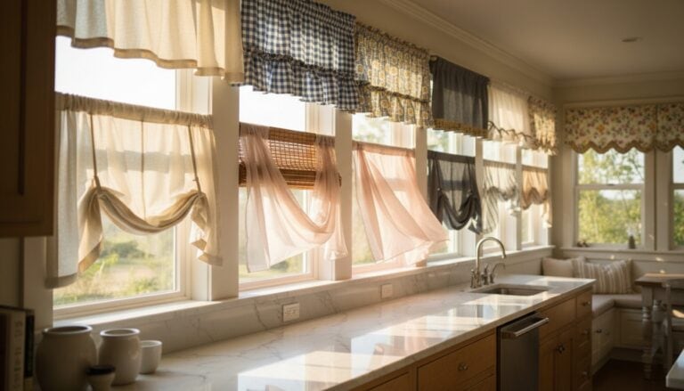 Kitchen Valances
See the Top 10
Kitchen Valances
See the Top 10
Flooring That Grounds This Gray and Copper Palette
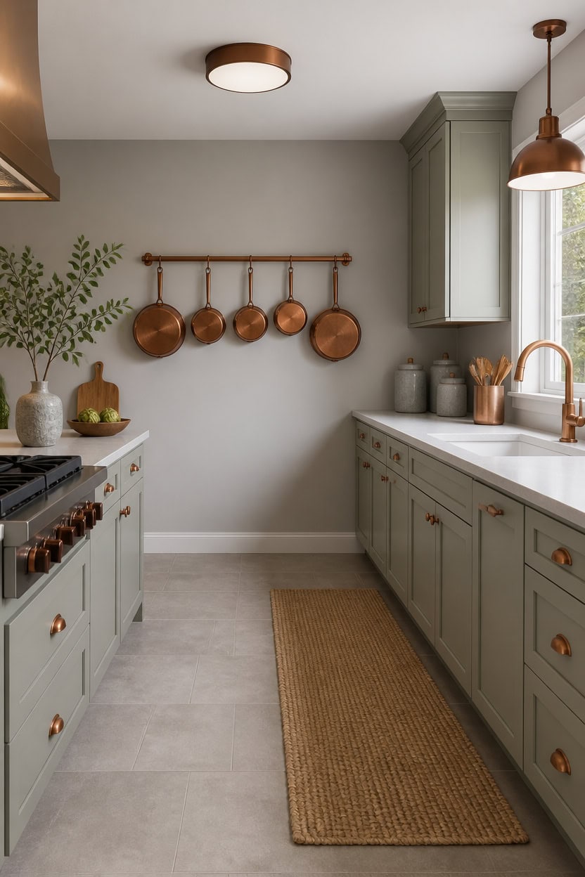
Large-format porcelain tile in warm gray grounds this kitchen without competing with the copper accents overhead. Light gray Cape May Cobblestone on the main walls stays airy, while light gray Misted Green on the cabinets adds cool depth that echoes the floor. A woven jute runner rug along the sink run adds warmth underfoot and protects the tile daily.
Match tile to grout: Choose grout only a shade darker than the tile so the floor reads as one plane.
Layer a runner: Add a jute or wool runner rug to break up large tile spans and add texture.
Repeat the metal tone: Echo copper accents in floor-level details, like a toe-kick strip, for continuity.
Keep sightlines open: Pick a floor tone that sits between the wall and cabinet colors so nothing jumps out.
keeps the kitchen bright so the floor tile can carry the visual weight. [light]
adds a cool gray tone that ties the cabinetry to the flooring below. [light]
 Hausattire Hand Woven Jute Runner Rug, Natural, 22x72
View Price
Hausattire Hand Woven Jute Runner Rug, Natural, 22x72
View Price
 BLACK+DECKER 4-Slice Toaster Oven with Natural Convection, Stainless Steel, TO1760SS (TO1760SST-1)
View Price
BLACK+DECKER 4-Slice Toaster Oven with Natural Convection, Stainless Steel, TO1760SS (TO1760SST-1)
View Price
 Whitehall Products Maple Leaf Wall Decor, Antique Copper
View Price
Whitehall Products Maple Leaf Wall Decor, Antique Copper
View Price
 Sweejar Ceramic Canisters Sets for Kitchen Countertop, Relief Food Storage Jar with Bamboo Lid, Stackable Container for Flour, Coffee, Pasta, Cereal, Tea, Cookies, Sugar, Spices, Pack of 4 (Gray)
View Price
Sweejar Ceramic Canisters Sets for Kitchen Countertop, Relief Food Storage Jar with Bamboo Lid, Stackable Container for Flour, Coffee, Pasta, Cereal, Tea, Cookies, Sugar, Spices, Pack of 4 (Gray)
View Price
 Monarch Abode Kitchen Utensil Holder – Ridge Embossed Metal Antique Copper Utensil Holder, Decorative Utensil Crock for Kitchen Counter, Cooking Tool and Spatula Holder for Countertop, Caddy Organizer
View Price
Monarch Abode Kitchen Utensil Holder – Ridge Embossed Metal Antique Copper Utensil Holder, Decorative Utensil Crock for Kitchen Counter, Cooking Tool and Spatula Holder for Countertop, Caddy Organizer
View Price
 Ronanemon Ceramic Fruit Bowl,10.2" Decorative Bowl, Large Fruit Bowl for Kitchen Counter, Pedestal Bowl, Kitchen Counter Décor, Bread Candy Snacks Organizer(Black Gray)
View Price
Ronanemon Ceramic Fruit Bowl,10.2" Decorative Bowl, Large Fruit Bowl for Kitchen Counter, Pedestal Bowl, Kitchen Counter Décor, Bread Candy Snacks Organizer(Black Gray)
View Price
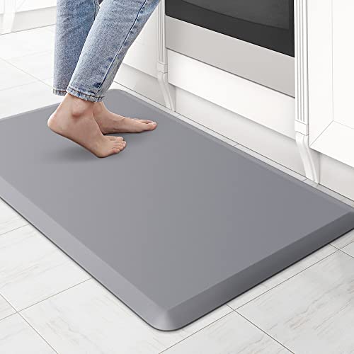 KitchenClouds Kitchen Mat Cushioned Anti Fatigue Rug 17.3"x28" Waterproof Non Slip Standing Desk Mat Comfort Floor Mats for Kitchen House Sink Office (Grey)
View Price
KitchenClouds Kitchen Mat Cushioned Anti Fatigue Rug 17.3"x28" Waterproof Non Slip Standing Desk Mat Comfort Floor Mats for Kitchen House Sink Office (Grey)
View Price
 hykolity 12 Inch LED Round Flat Panel Light,3CCT,3000K/4000K/5000K
View Price
hykolity 12 Inch LED Round Flat Panel Light,3CCT,3000K/4000K/5000K
View Price
Our Favorite Kitchen Mats and Runners
 Anti-Fatigue Mats
See the Top 10
Anti-Fatigue Mats
See the Top 10
 Kitchen Runners
See the Top 10
Kitchen Runners
See the Top 10
 Kitchen Rug Sets
See the Top 10
Kitchen Rug Sets
See the Top 10
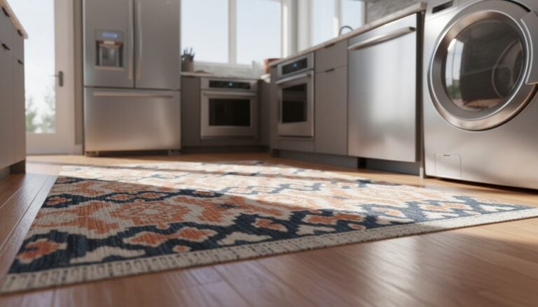 Washable Kitchen Rugs
See the Top 10
Washable Kitchen Rugs
See the Top 10
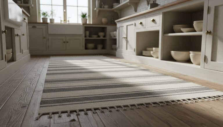 Farmhouse Kitchen Runners
See the Top 10
Farmhouse Kitchen Runners
See the Top 10
 Boho Kitchen Runners
See the Top 10
Boho Kitchen Runners
See the Top 10
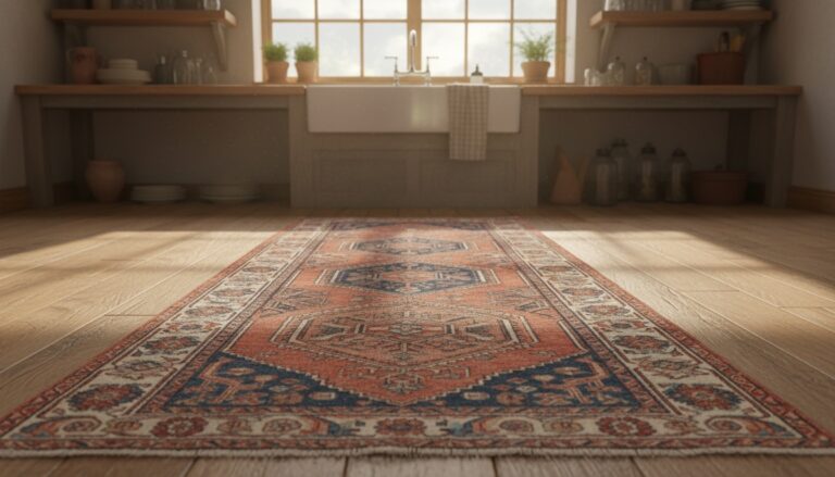 Vintage Kitchen Runners
See the Top 10
Vintage Kitchen Runners
See the Top 10
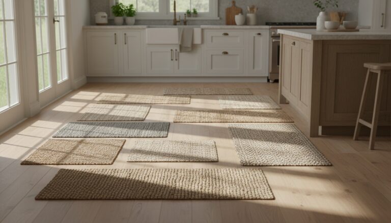 Jute Kitchen Runners
See the Top 10
Jute Kitchen Runners
See the Top 10
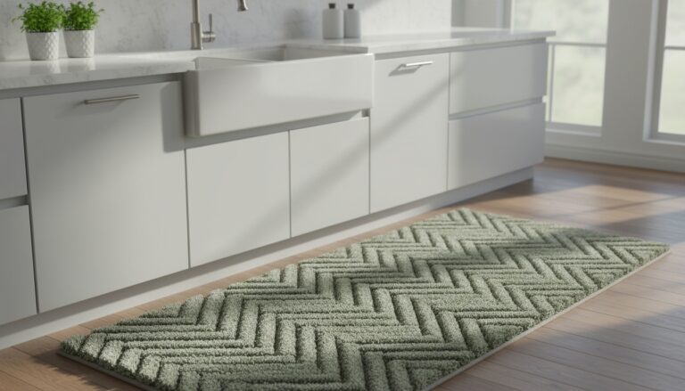 Kitchen Sink Rugs
See the Top 10
Kitchen Sink Rugs
See the Top 10
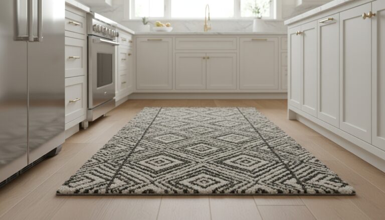 Wool Kitchen Runners
See the Top 10
Wool Kitchen Runners
See the Top 10
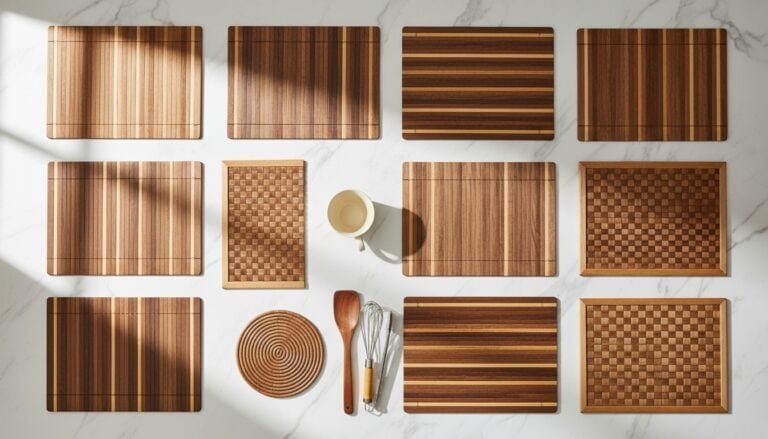 Bamboo Kitchen Mats
See the Top 10
Bamboo Kitchen Mats
See the Top 10
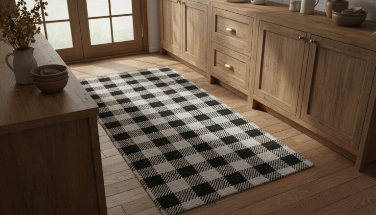 Buffalo Plaid Rugs
See the Top 10
Buffalo Plaid Rugs
See the Top 10
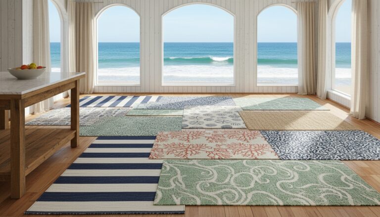 Coastal Kitchen Rugs
See the Top 10
Coastal Kitchen Rugs
See the Top 10
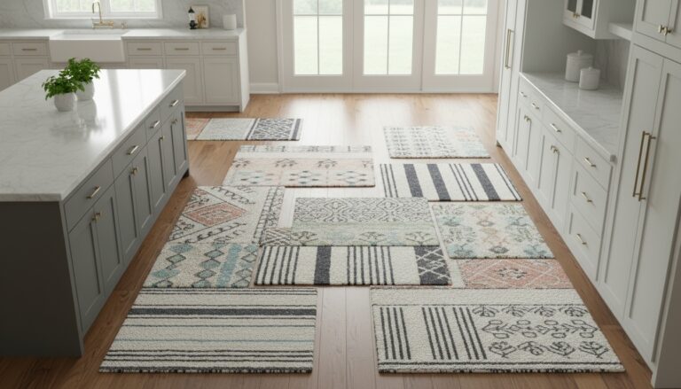 Cotton Kitchen Rugs
See the Top 10
Cotton Kitchen Rugs
See the Top 10
Lighting Fixtures That Warm Up the Gray Walls
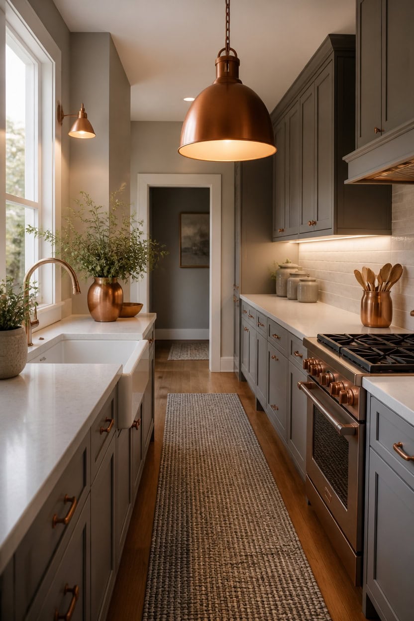
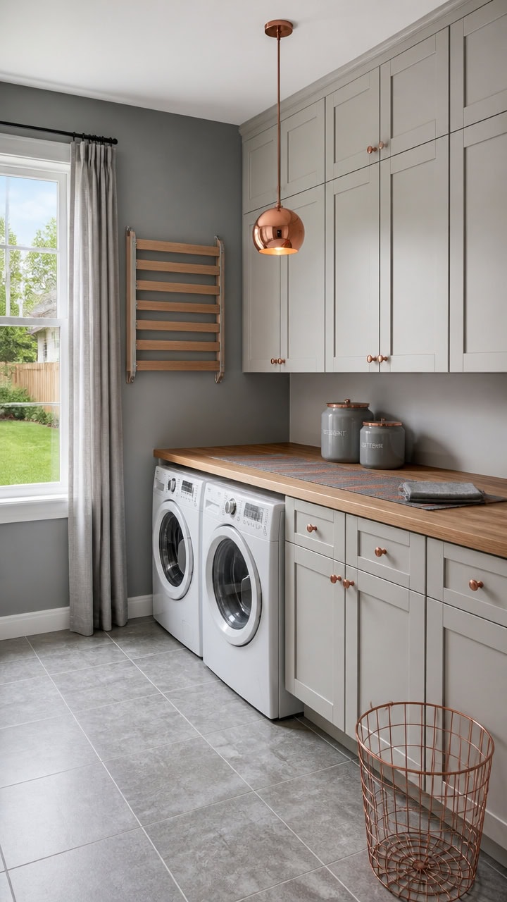
Warm bulb temperature balances light gray La Paloma Gray on the main walls with very light gray Winter Solstice on the backsplash trim. This warmth keeps the grays from reading sterile under bright overhead light. Layer a copper dome pendant with an under-cabinet LED strip to wash counters in warm light.
Layer three light sources: Combine ambient, task, and accent lighting so the gray walls never look flat.
Choose warm bulbs: Pick 2700K bulbs to counter the natural coolness of gray paint.
Add a warm metal finish: Copper or brass fixtures pick up warmth without fighting the gray tones.
Dim for evening: Install a dimmer so the room shifts from bright task light to a soft glow.
a light gray backdrop that lets warm lighting fixtures stand out against a calm surface. [light]
a very light gray that bounces extra glow across the counters. [very light]
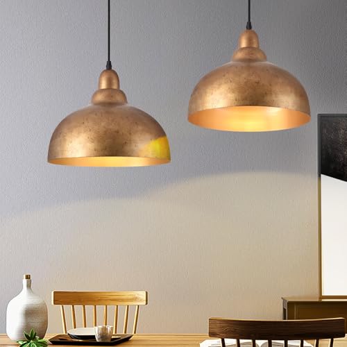 Ziqqeelam 2 Pack 11.8" Copper Pendant Light Kitchen Island Farmhouse Hanging Pendant Light Fixtures, Vintage Dome Pendant Lights Kitchen Island, Dome Chandelier for Kitchen Island Dining Room
View Price
Ziqqeelam 2 Pack 11.8" Copper Pendant Light Kitchen Island Farmhouse Hanging Pendant Light Fixtures, Vintage Dome Pendant Lights Kitchen Island, Dome Chandelier for Kitchen Island Dining Room
View Price
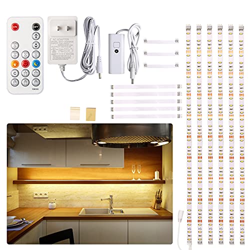 WOBANE Under Cabinet LED Lighting Kit,Dimmable Strip Lights with RF Remote
View Price
WOBANE Under Cabinet LED Lighting Kit,Dimmable Strip Lights with RF Remote
View Price
 Nihow Food Storage Jar,Ceramic Canister Sets for The Kitchen,Set of 4,Gray
View Price
Nihow Food Storage Jar,Ceramic Canister Sets for The Kitchen,Set of 4,Gray
View Price
 Monarch Abode Kitchen Utensil Holder – Wave Embossed Metal Antique Copper Utensil Holder, Decorative Utensil Crock for Kitchen Counter, Cooking Tool and Spatula Holder for Countertop, Caddy Organizer
View Price
Monarch Abode Kitchen Utensil Holder – Wave Embossed Metal Antique Copper Utensil Holder, Decorative Utensil Crock for Kitchen Counter, Cooking Tool and Spatula Holder for Countertop, Caddy Organizer
View Price
 Elite Gourmet ERC006SS 6-Cup Electric Rice Cooker with Stainless Steel Inner Pot, Makes Soups, Stews, Porridges, Grains and Cereals, 6 cup (3 cups uncooked), Black
View Price
Elite Gourmet ERC006SS 6-Cup Electric Rice Cooker with Stainless Steel Inner Pot, Makes Soups, Stews, Porridges, Grains and Cereals, 6 cup (3 cups uncooked), Black
View Price
 YDKGL Kitchen Runner Rug Mat Non Slip Hallway Runner Washable Gray 2x6 ft
View Price
YDKGL Kitchen Runner Rug Mat Non Slip Hallway Runner Washable Gray 2x6 ft
View Price
 Westinghouse 6370400 Iron Hill Washed Copper One-Light Indoor Wall Fixture White
View Price
Westinghouse 6370400 Iron Hill Washed Copper One-Light Indoor Wall Fixture White
View Price
 HABITAAS Fruit Bowl for Kitchen Counter – Handmade Spun Bamboo, Large 11.75" Fruit Basket, Eco-Friendly Decorative Serving Bowl for Home Decor, Produce Storage & Centerpiece (Gray)
View Price
HABITAAS Fruit Bowl for Kitchen Counter – Handmade Spun Bamboo, Large 11.75" Fruit Basket, Eco-Friendly Decorative Serving Bowl for Home Decor, Produce Storage & Centerpiece (Gray)
View Price
The One Corner That Shouldn’t Work, But Does
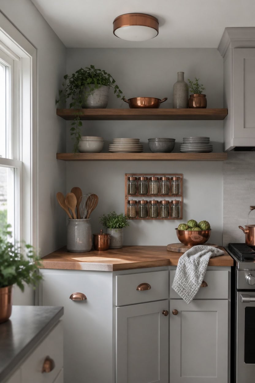
Light gray Boothbay Gray covers the main walls while very light gray After the Rain colors the cabinet doors, softening the odd angle of this corner. The close tonal match keeps the eye moving instead of stopping at the seam. A wood butcher block prep counter fills the tight space, turning an awkward corner into real work surface.
Break the grid: Let one corner ignore the room’s straight lines for visual interest.
Add depth with layering: Stack open shelving above a solid lower surface to keep the eye moving.
Repeat one material: Echo copper or wood already used elsewhere so the corner feels connected.
Keep function first: A working corner needs real storage or prep space, not just decor.
a light gray that softens the corner’s odd angle. [light]
a very light gray that keeps the tight corner feeling open. [very light]
 CONSDAN Butcher Block Countertop, 48 x 36 Inches, USA Grown Solid Hard Maple Hardwood, for Kitchen Island, Laundry Room, RV, Camper, Office Desk, Bar Table, Prefinished with Food-Safe Oil, 1.5" Thick
View Price
CONSDAN Butcher Block Countertop, 48 x 36 Inches, USA Grown Solid Hard Maple Hardwood, for Kitchen Island, Laundry Room, RV, Camper, Office Desk, Bar Table, Prefinished with Food-Safe Oil, 1.5" Thick
View Price
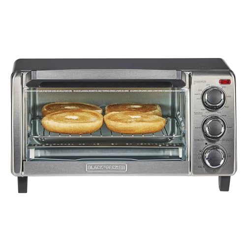 BLACK+DECKER TO1313SBD Toaster Oven, 15.47 Inch, Silver
View Price
BLACK+DECKER TO1313SBD Toaster Oven, 15.47 Inch, Silver
View Price
 3.2 QT Solid Copper Whistling Kettle | Large Capacity & Cool-Touch Handle
View Price
3.2 QT Solid Copper Whistling Kettle | Large Capacity & Cool-Touch Handle
View Price
 Yundu Porcelain Gray Marble Utensil Crock, Kitchen Utensil Holder for Countertop, 7″ Large Size for Storage,Table-Protection Cork Mat
View Price
Yundu Porcelain Gray Marble Utensil Crock, Kitchen Utensil Holder for Countertop, 7″ Large Size for Storage,Table-Protection Cork Mat
View Price
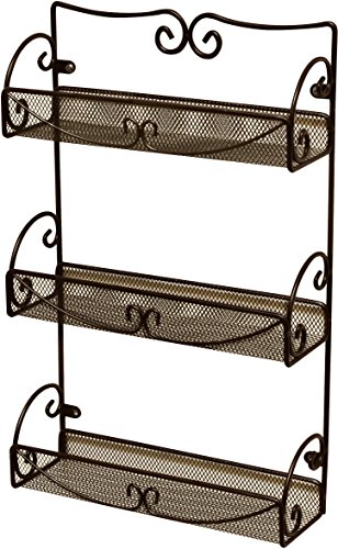 Deco Brothers 3 Tier Wall Mounted Hanging Spice Rack, Bronze
View Price
Deco Brothers 3 Tier Wall Mounted Hanging Spice Rack, Bronze
View Price
 PERFNIQUE Indoor Herb Garden, Herb Planter Set with Tray, Farmhouse Indoor Plant Pots, Windowsill Herb Garden with Drainage(Planter only) for Indoor/Outdoor, Window Pots(White)
View Price
PERFNIQUE Indoor Herb Garden, Herb Planter Set with Tray, Farmhouse Indoor Plant Pots, Windowsill Herb Garden with Drainage(Planter only) for Indoor/Outdoor, Window Pots(White)
View Price
 Homaxy 380 GSM Cotton Premium Kitchen Towels 6 Pack, 18"x 28", Grey
View Price
Homaxy 380 GSM Cotton Premium Kitchen Towels 6 Pack, 18"x 28", Grey
View Price
 libtit 13-Inch Flush Mount Ceiling Lights, Dimmable 3000K-6500K Adjustable LED Ceiling Light, 24W Round Slim Light Fixture, Brushed Nickel for Kitchen, Bedroom, Bathroom, Hallway-ETL Listed
View Price
libtit 13-Inch Flush Mount Ceiling Lights, Dimmable 3000K-6500K Adjustable LED Ceiling Light, 24W Round Slim Light Fixture, Brushed Nickel for Kitchen, Bedroom, Bathroom, Hallway-ETL Listed
View Price
Our Favorite Cooking Utensils and Gadgets
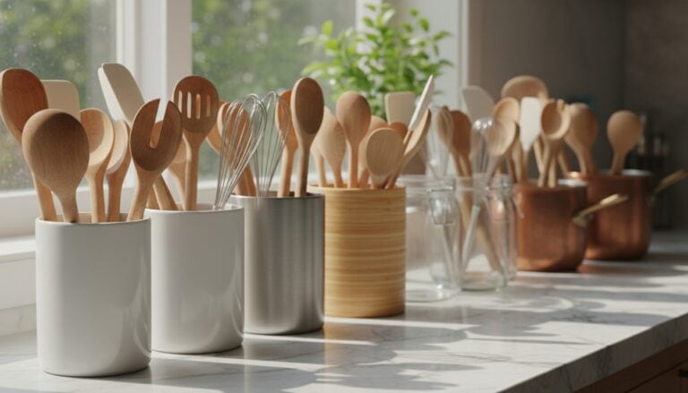 Utensil Holders
See the Top 10
Utensil Holders
See the Top 10
 Wooden Spoons
See the Top 10
Wooden Spoons
See the Top 10
 Silicone Spatulas
See the Top 10
Silicone Spatulas
See the Top 10
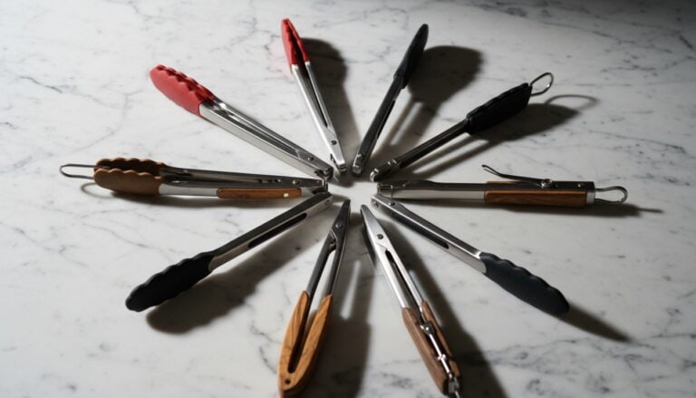 Kitchen Tongs
See the Top 10
Kitchen Tongs
See the Top 10
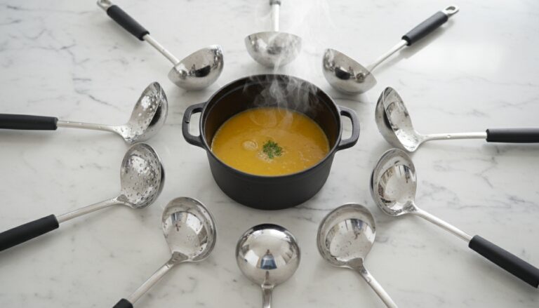 Ladles
See the Top 10
Ladles
See the Top 10
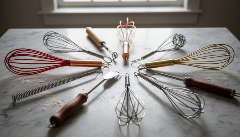 Whisks
See the Top 10
Whisks
See the Top 10
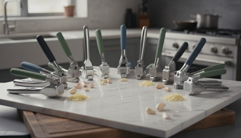 Garlic Presses
See the Top 10
Garlic Presses
See the Top 10
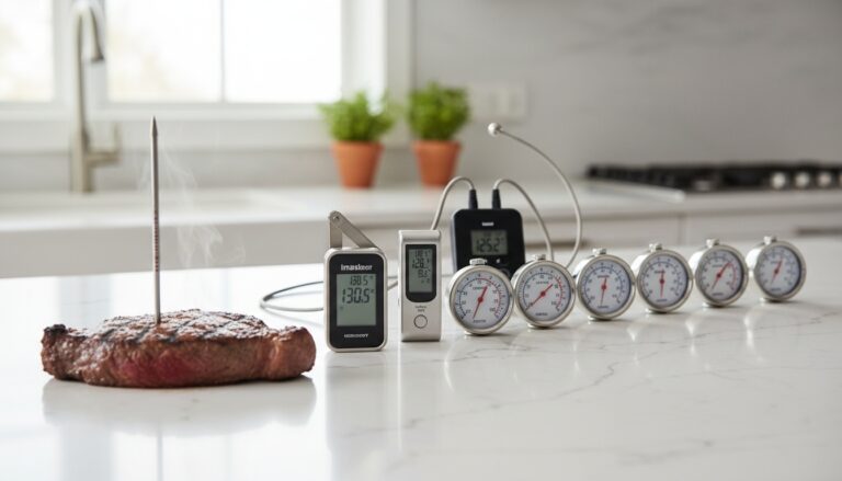 Meat Thermometers
See the Top 10
Meat Thermometers
See the Top 10
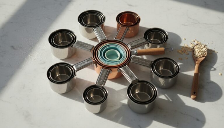 Measuring Cups
See the Top 10
Measuring Cups
See the Top 10
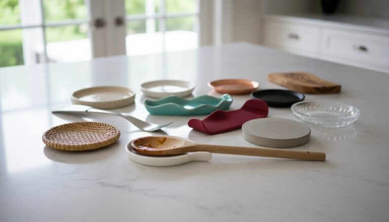 Spoon Rests
See the Top 10
Spoon Rests
See the Top 10
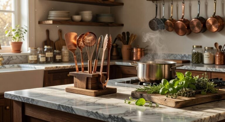 Copper Utensil Sets
See the Top 10
Copper Utensil Sets
See the Top 10
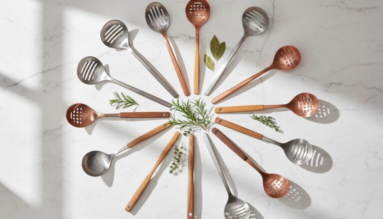 Slotted Spoons
See the Top 10
Slotted Spoons
See the Top 10
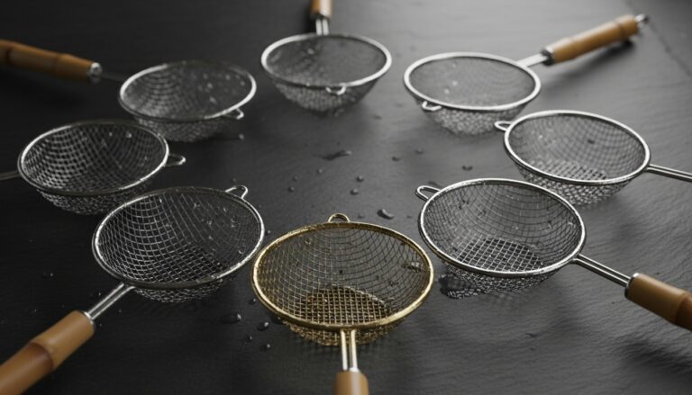 Spider Strainers
See the Top 10
Spider Strainers
See the Top 10
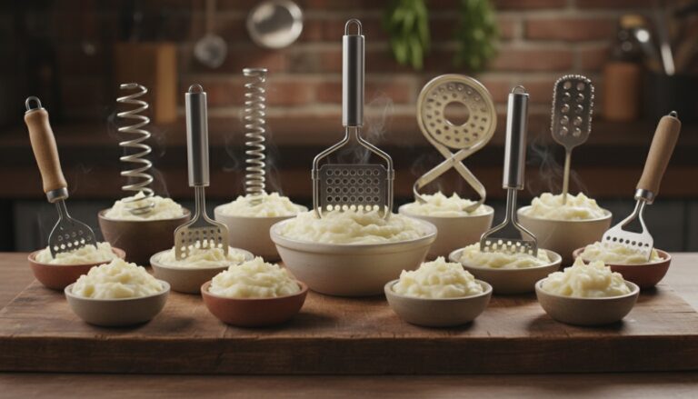 Potato Mashers
See the Top 10
Potato Mashers
See the Top 10
Small Flaws That Became This Kitchen’s Best Features
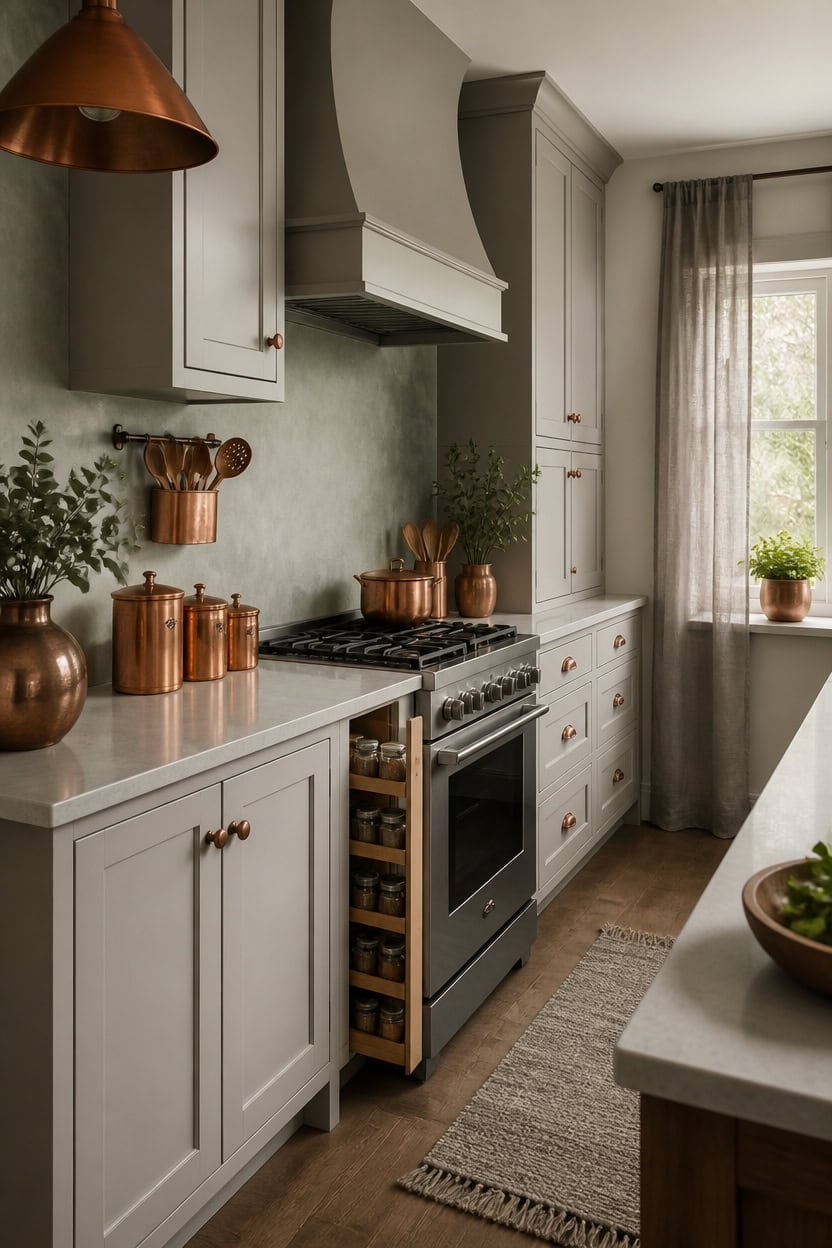
Very light gray Antique Jade covers the accent wall behind the range, smoothing an oddly placed vent into the room’s rhythm. Very light gray Wish reappears on the cabinet doors, keeping the palette calm across two different textures. A narrow pull-out spice rack turns a slim gap beside the stove into real storage, proof that awkward inches can still work hard.
Name the flaw first: Identify what feels off before deciding how to fix it.
Let function decide: Turn odd gaps into storage instead of hiding them.
Match the palette: Keep new surfaces in the same tone family as the room.
Add one metal accent: A copper touch signals intention, not accident.
a very light gray that softens an oddly placed vent. [very light]
a very light gray that keeps the palette calm across two textures. [very light]
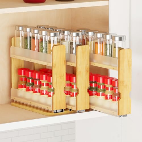 SpaceAid Bamboo Pull Out Spice Rack Organizer for Cabinet, Heavy Duty Slide Out Seasoning Kitchen Pantry Sliding Vertical Organization, 7.6" Wide, 3 Drawers(2" Wide), 2-Tier, Natural
View Price
SpaceAid Bamboo Pull Out Spice Rack Organizer for Cabinet, Heavy Duty Slide Out Seasoning Kitchen Pantry Sliding Vertical Organization, 7.6" Wide, 3 Drawers(2" Wide), 2-Tier, Natural
View Price
 Oster Classic Series Heritage Blender with 6-Cup Glass Jar, 1000 Peak Watts, 600 Rated Watts, Stainless Steel Countertop Blender
View Price
Oster Classic Series Heritage Blender with 6-Cup Glass Jar, 1000 Peak Watts, 600 Rated Watts, Stainless Steel Countertop Blender
View Price
 Old Dutch Antique Copper 'Wave' Canister Set, 4 Qt, 2 Qt, 1 Qt, 1 Qt
View Price
Old Dutch Antique Copper 'Wave' Canister Set, 4 Qt, 2 Qt, 1 Qt, 1 Qt
View Price
 Gibson Elite Maple Grove 4-Piece Stoneware Nesting Bowl Set (9", 7", 5.5", and 4.4"), Reactive Glaze Mixing and Serving Bowls, Dishwasher and Microwave Safe, Gray
View Price
Gibson Elite Maple Grove 4-Piece Stoneware Nesting Bowl Set (9", 7", 5.5", and 4.4"), Reactive Glaze Mixing and Serving Bowls, Dishwasher and Microwave Safe, Gray
View Price
 Dseap Kitchen Utensil Holder Hanger, Pot and Pan Rack Wall Mounted, Kitchen Rail with 8 Hooks for Hanging Cooking Utensils, Mugs, Spoons, Wall Mounted, Antique Copper New
View Price
Dseap Kitchen Utensil Holder Hanger, Pot and Pan Rack Wall Mounted, Kitchen Rail with 8 Hooks for Hanging Cooking Utensils, Mugs, Spoons, Wall Mounted, Antique Copper New
View Price
 Chyhomenyc Gray Kitchen Curtains 45 Inch Length 2 Panels, Light Filtering Faux Linen Slub Textured Short Curtains, Soft Airy Window Treatment Rod Pocket Curtain for Living Room Bedroom, 30Wx45L Inch
View Price
Chyhomenyc Gray Kitchen Curtains 45 Inch Length 2 Panels, Light Filtering Faux Linen Slub Textured Short Curtains, Soft Airy Window Treatment Rod Pocket Curtain for Living Room Bedroom, 30Wx45L Inch
View Price
 volila Herb Planter Indoor - Set of 3 Teal Blue Indoor Herb Garden Pots for Plants with Leather Handled Tray - Window Sill Plant Shelf - Herb Pots with Drainage Holes and Labels
View Price
volila Herb Planter Indoor - Set of 3 Teal Blue Indoor Herb Garden Pots for Plants with Leather Handled Tray - Window Sill Plant Shelf - Herb Pots with Drainage Holes and Labels
View Price
 2Pcs Farmhouse Pendant Light Rustic Cone Shade Mounted Fixture Hanging Ceiling Lamp Antique Painted Finish Small Size Light
View Price
2Pcs Farmhouse Pendant Light Rustic Cone Shade Mounted Fixture Hanging Ceiling Lamp Antique Painted Finish Small Size Light
View Price
Our Favorite Cutting Boards
 Caraway 4-Piece Cutting Board Set
View Price
Caraway 4-Piece Cutting Board Set
View Price
 Henckels 3-Piece Plastic Cutting Board Set
View Price
Henckels 3-Piece Plastic Cutting Board Set
View Price
 Henckels 12" Plastic Cutting Board, Pure White
View Price
Henckels 12" Plastic Cutting Board, Pure White
View Price
 John Boos Wood Edge Grain Reversible Cutting Board
View Price
John Boos Wood Edge Grain Reversible Cutting Board
View Price
 Ironwood Gourmet Acacia End Grain Prep Station Cutting Board
View Price
Ironwood Gourmet Acacia End Grain Prep Station Cutting Board
View Price
 Ironwood Gourmet Square End Grain Chef's Board
View Price
Ironwood Gourmet Square End Grain Chef's Board
View Price
 Oceanstar 3-Piece Bamboo Cutting Board Set
View Price
Oceanstar 3-Piece Bamboo Cutting Board Set
View Price
 Imperial Home 3-Piece Bamboo Cutting Board Set
View Price
Imperial Home 3-Piece Bamboo Cutting Board Set
View Price
 Sachar 3-Piece Bamboo Cutting Board Set
View Price
Sachar 3-Piece Bamboo Cutting Board Set
View Price
 Yeung Marble Pastry Board
View Price
Yeung Marble Pastry Board
View Price
 Yeomans Marble Pastry Cutting Board
View Price
Yeomans Marble Pastry Cutting Board
View Price
 Starcraft Glass Cutting Board
View Price
Starcraft Glass Cutting Board
View Price
 Acacia Wood Stovetop Cover Board with Handles
View Price
Acacia Wood Stovetop Cover Board with Handles
View Price
 Lipper Bamboo Over-the-Sink Cutting Board
View Price
Lipper Bamboo Over-the-Sink Cutting Board
View Price
 Sangdo 30" x 20" Bamboo Noodle Board Stove Cover
View Price
Sangdo 30" x 20" Bamboo Noodle Board Stove Cover
View Price
How This Gray and Copper Kitchen Ages So Well
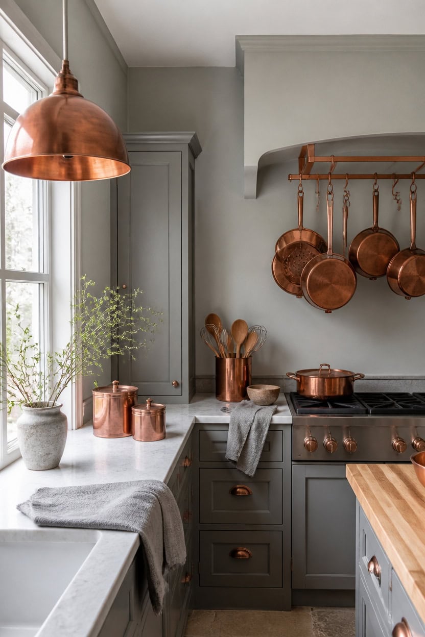
Light gray La Paloma Gray covers the main walls, giving the room a soft backdrop that ages well. Very light gray Winter Solstice on the trim keeps edges crisp for years. A hanging copper pot rack above the stove gains warmth as it darkens, anchoring the room’s aging charm.
Choose fade-resistant paint: Use a durable matte or eggshell finish that resists yellowing over time.
Let copper darken naturally: Skip sealants so copper accents develop a warm patina.
Clean gray surfaces gently: Wipe walls and trim with mild soap to avoid dulling the finish.
Rotate small accents: Swap textiles seasonally to keep the palette feeling intentional, not worn.
a light gray that stays calm as the kitchen ages. [light]
a very light gray that keeps sightlines crisp around doors and windows. [very light]
 KES 48 Inch Oil Bronze Hanging Pot Rack Ceiling Mount with 130lb Capacity
View Price
KES 48 Inch Oil Bronze Hanging Pot Rack Ceiling Mount with 130lb Capacity
View Price
 Aroma Housewares Select Stainless Rice Cooker & Warmer with Uncoated Inner Pot, 3-Cup(uncooked)/6-Cup(cooked)/ 1.2Qt, ARC-753SGB, Black
View Price
Aroma Housewares Select Stainless Rice Cooker & Warmer with Uncoated Inner Pot, 3-Cup(uncooked)/6-Cup(cooked)/ 1.2Qt, ARC-753SGB, Black
View Price
 Old Dutch 4 Piece Decor "CHALKBOARD" Canister Set, 4 quart, Copper
View Price
Old Dutch 4 Piece Decor "CHALKBOARD" Canister Set, 4 quart, Copper
View Price
 TEAKISS Ceramic Large Mixing Bowls for Kitchen, Set of 2 Big Serving Bowls for Cooking, Popcorn, Salad, Soup, Baking, Dough Bread Making Bowl, 10 inch + 8 inch, White
View Price
TEAKISS Ceramic Large Mixing Bowls for Kitchen, Set of 2 Big Serving Bowls for Cooking, Popcorn, Salad, Soup, Baking, Dough Bread Making Bowl, 10 inch + 8 inch, White
View Price
 Dseap Pot Rack - Pots and Pans Hanging Rack Rail with 8 Hooks, Double Bars, Pot Hangers for Kitchen, Wall Mounted, Antique Copper
View Price
Dseap Pot Rack - Pots and Pans Hanging Rack Rail with 8 Hooks, Double Bars, Pot Hangers for Kitchen, Wall Mounted, Antique Copper
View Price
 LANE LINEN 100% Cotton Kitchen Dish Cloths, Ultra Soft Absorbent Quick Drying Dish Towels, Multiweave Wash Cloths Dish Towel Sets, 13x28 Inches, 4 Pack - Grey
View Price
LANE LINEN 100% Cotton Kitchen Dish Cloths, Ultra Soft Absorbent Quick Drying Dish Towels, Multiweave Wash Cloths Dish Towel Sets, 13x28 Inches, 4 Pack - Grey
View Price
 Lodge Pre-Seasoned Cast Iron Skillet Set, 8, 10.25 and 12 Inches
View Price
Lodge Pre-Seasoned Cast Iron Skillet Set, 8, 10.25 and 12 Inches
View Price
 Ymlii 2 Light Copper Dome Pendant Lights Kitchen Island
View Price
Ymlii 2 Light Copper Dome Pendant Lights Kitchen Island
View Price
Our Favorite Kitchen Organizers
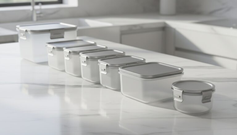 Airtight Pantry Containers
See the Top 10
Airtight Pantry Containers
See the Top 10
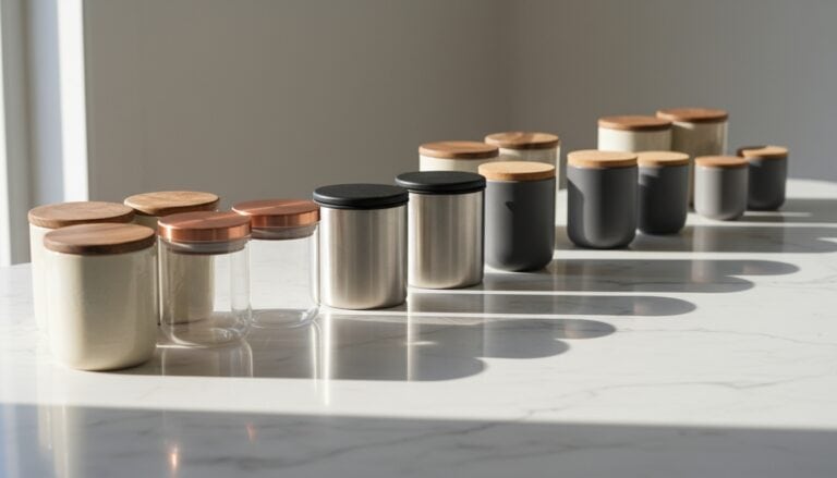 Kitchen Canister Sets
See the Top 10
Kitchen Canister Sets
See the Top 10
 Under Sink Organizers
See the Top 7
Under Sink Organizers
See the Top 7
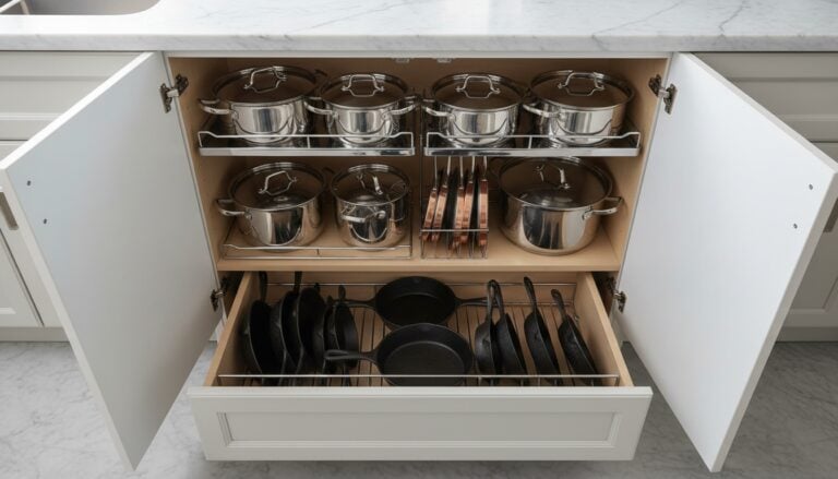 Pot and Pan Organizers
See the Top 6
Pot and Pan Organizers
See the Top 6
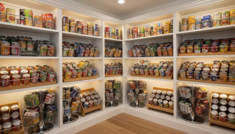 Can Organizers
See the Top 10
Can Organizers
See the Top 10
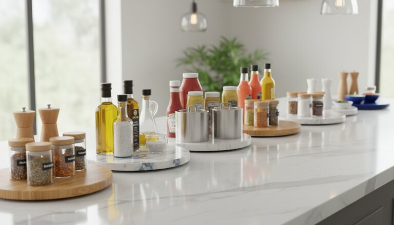 Lazy Susans
See the Top 10
Lazy Susans
See the Top 10
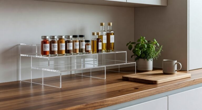 Cabinet Shelf Risers
See the Top 10
Cabinet Shelf Risers
See the Top 10
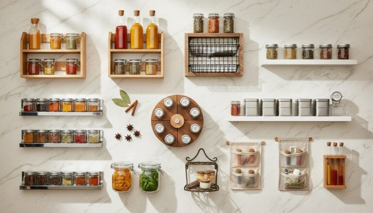 Spice Racks
See the Top 10
Spice Racks
See the Top 10
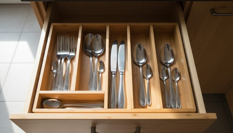 Silverware Drawer Organizers
See the Top 10
Silverware Drawer Organizers
See the Top 10
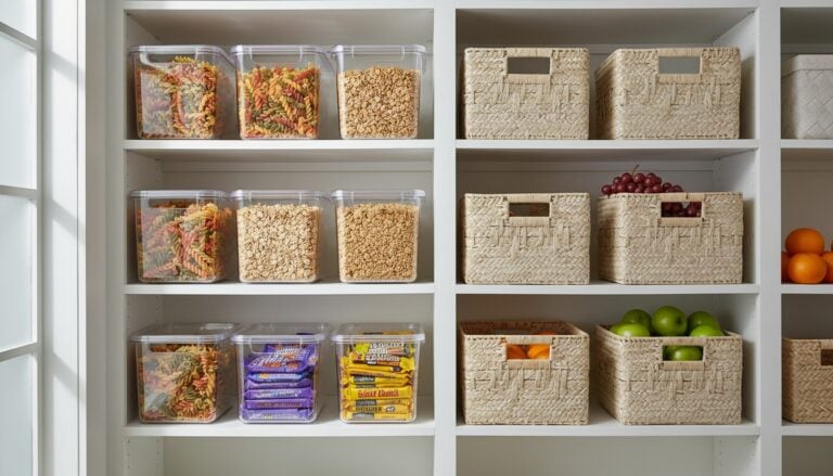 Pantry Storage Bins
See the Top 10
Pantry Storage Bins
See the Top 10
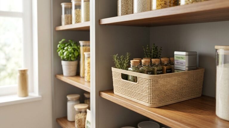 Woven Cabinet Baskets
See the Top 10
Woven Cabinet Baskets
See the Top 10
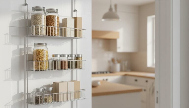 Over the Door Pantry Organizers
See the Top 10
Over the Door Pantry Organizers
See the Top 10
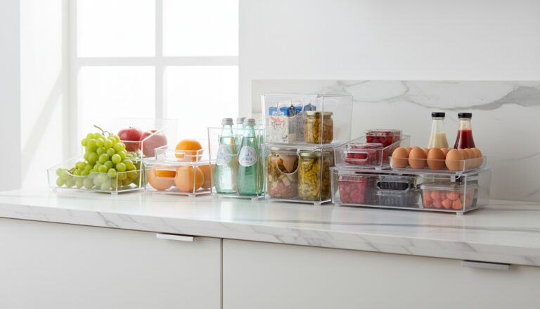 Fridge Organizer Bins
See the Top 3
Fridge Organizer Bins
See the Top 3
 Bakers Racks
See the Top 10
Bakers Racks
See the Top 10
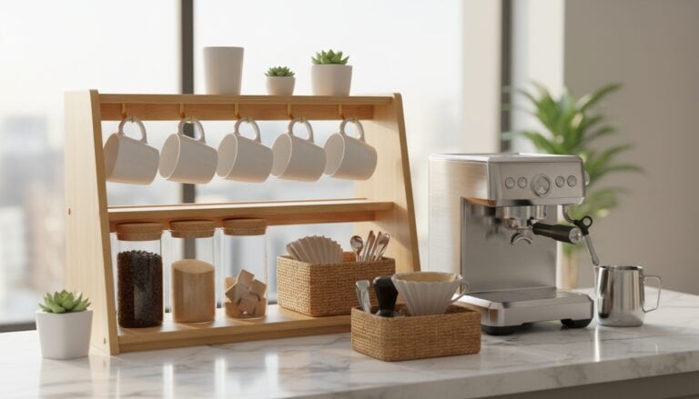 Coffee Station Organizers
See the Top 10
Coffee Station Organizers
See the Top 10
Why Patina Is the Secret to Its Charm
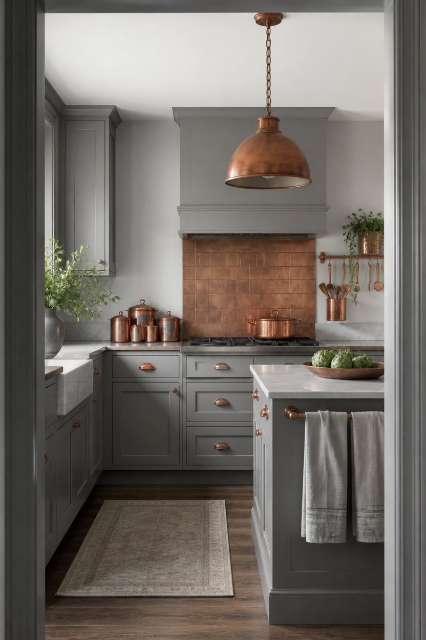
Copper patina forms through natural oxidation, not sealant, turning bright metal warm brown-green. Light gray Sterling Silver on the main walls and light gray Boothbay Gray on the trim keep the backdrop neutral, letting copper read as intentional. A copper backsplash panel behind the stove shows this aging fastest, deepening with each pot.
Skip sealants: Let copper oxidize naturally instead of coating it with lacquer.
Use mild cleaners: Wipe copper with soap and water, never abrasive polish, to keep patina even.
Rotate light exposure: Move copper pieces occasionally so patina develops evenly across all sides.
Pair with matte paint: Choose a matte gray finish on walls so it does not compete with copper’s changing sheen.
a light gray that keeps the backdrop calm as copper deepens nearby. [light]
a light gray that keeps edges crisp without competing with copper’s patina. [light]
 Wall Wear Peel and Stick Metal Backsplash Tiles, Patina Copper, 10-Pack
View Price
Wall Wear Peel and Stick Metal Backsplash Tiles, Patina Copper, 10-Pack
View Price
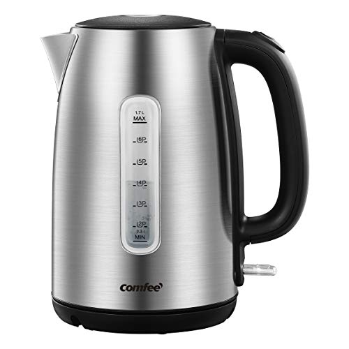 COMFEE' Stainless Steel Electric Kettle, 1.7 Liter Tea Kettle Electric & Hot Water Kettle, 1500W Fast Boil with LED Light, Auto Shut-Off and Boil-Dry Protection
View Price
COMFEE' Stainless Steel Electric Kettle, 1.7 Liter Tea Kettle Electric & Hot Water Kettle, 1500W Fast Boil with LED Light, Auto Shut-Off and Boil-Dry Protection
View Price
 11.8" Small Antique Metal Copper Dome Hanging Pendant Light Kitchen Island
View Price
11.8" Small Antique Metal Copper Dome Hanging Pendant Light Kitchen Island
View Price
 AmorArc Stoneware Dinnerware Sets for 4,12Pcs Plates and Bowls Set
View Price
AmorArc Stoneware Dinnerware Sets for 4,12Pcs Plates and Bowls Set
View Price
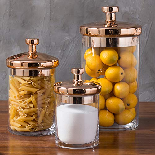 MyGift Glass Apothecary Cookie Jar Set with Copper Lid
View Price
MyGift Glass Apothecary Cookie Jar Set with Copper Lid
View Price
 LIVINATI Highly Absorbent Cotton Kitchen Towels for Drying Dishes - Set of 6 Dish Towels - Narrow Light Gray Stripes Plaid Waffle Dishtowels - 18"X28" Large Lint Free Linen Tea Hand Bulk T Towls
View Price
LIVINATI Highly Absorbent Cotton Kitchen Towels for Drying Dishes - Set of 6 Dish Towels - Narrow Light Gray Stripes Plaid Waffle Dishtowels - 18"X28" Large Lint Free Linen Tea Hand Bulk T Towls
View Price
 Lodge Cast Iron 5-Piece Set, PFAS-Free Pre-Seasoned Kitchen Set
View Price
Lodge Cast Iron 5-Piece Set, PFAS-Free Pre-Seasoned Kitchen Set
View Price
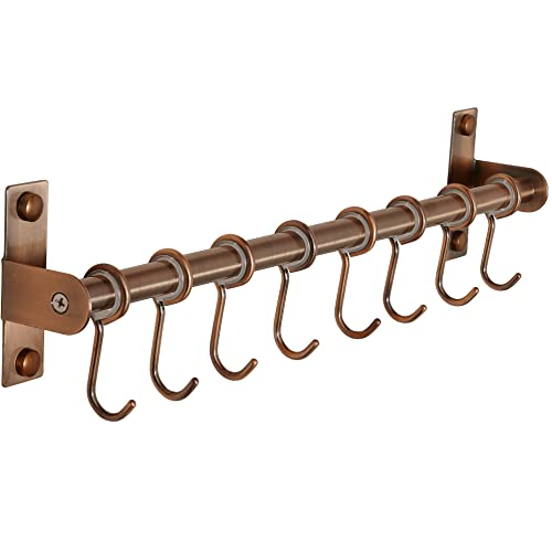 Dseap Kitchen Utensil Holder Hanger, Pot and Pan Rack Wall Mount, Kitchen Rail with 8 Hooks for Hanging Cooking Utensils, Mugs, Spoons, Wall Mounted, Stainless Steel, Antique Copper
View Price
Dseap Kitchen Utensil Holder Hanger, Pot and Pan Rack Wall Mount, Kitchen Rail with 8 Hooks for Hanging Cooking Utensils, Mugs, Spoons, Wall Mounted, Stainless Steel, Antique Copper
View Price
Our Favorite Spice and Countertop Essentials
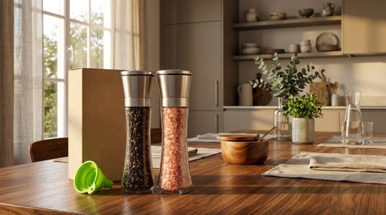 Salt and Pepper Grinder Sets
See the Top 10
Salt and Pepper Grinder Sets
See the Top 10
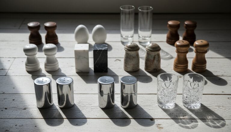 Salt and Pepper Shakers
See the Top 10
Salt and Pepper Shakers
See the Top 10
 Mortar and Pestles
See the Top 10
Mortar and Pestles
See the Top 10
 Spice Jar Sets
See the Top 10
Spice Jar Sets
See the Top 10
 Oil Dispenser Bottles
See the Top 10
Oil Dispenser Bottles
See the Top 10
 Oil Sprayers
See the Top 10
Oil Sprayers
See the Top 10
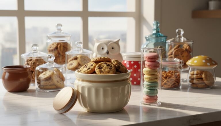 Cookie Jars
See the Top 10
Cookie Jars
See the Top 10
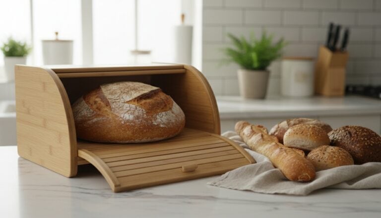 Bread Boxes
See the Top 10
Bread Boxes
See the Top 10
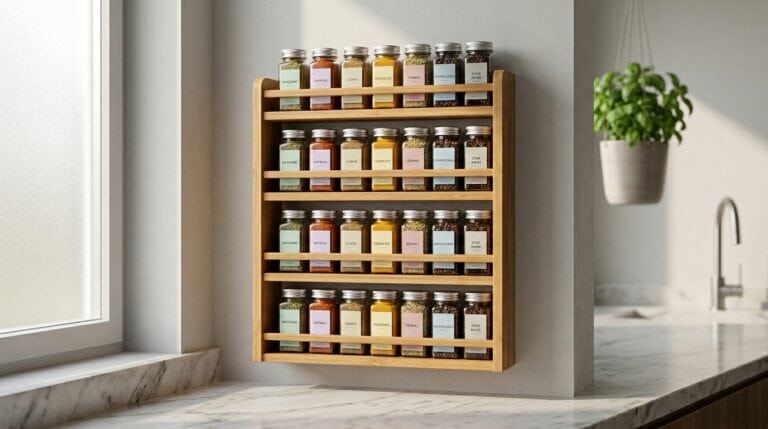 Wall-Mounted Spice Racks
See the Top 10
Wall-Mounted Spice Racks
See the Top 10
 Countertop Wine Racks
See the Top 10
Countertop Wine Racks
See the Top 10
 Mug Holders
See the Top 10
Mug Holders
See the Top 10
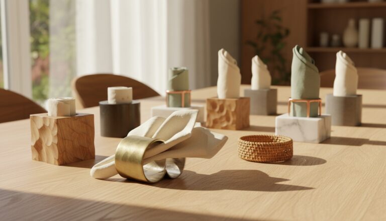 Napkin Holders
See the Top 10
Napkin Holders
See the Top 10
Open Shelving and the Clutter Worth Keeping
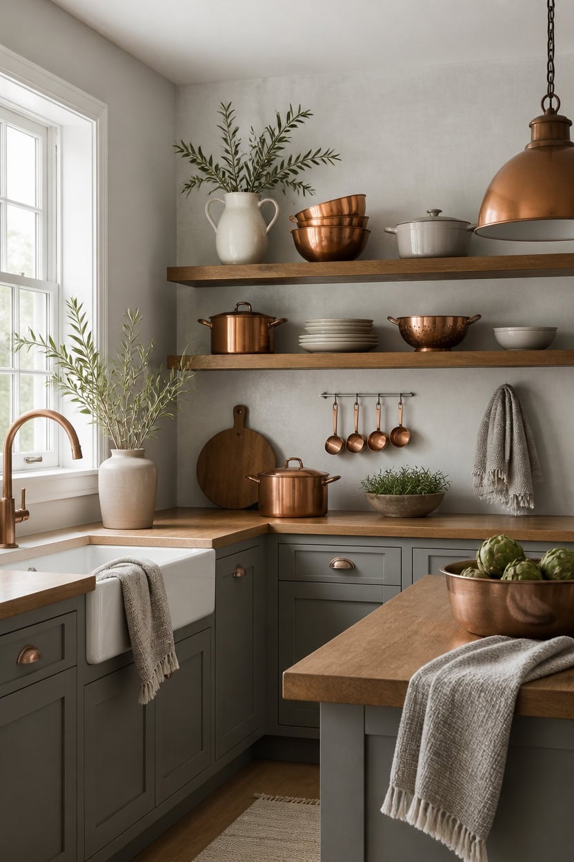
Open shelving works only when every item earns its spot through daily use, not just looks. Very light gray Coventry Gray on the main walls sets a calm base, while very light gray Cumulus Cloud on the accent wall keeps copper as the focal point. Copper mixing bowls stacked on the open shelf prove the rule, staying out because they get used every week.
One-in-one-out rule: Add a new piece only after removing one that no longer earns its space.
Group by use: Keep cooking tools you touch weekly together, not scattered pretty objects.
Leave breathing room: Fill each shelf about two-thirds full so the eye can rest.
Repeat a material: Echo copper or gray across a few shelf items to tie the display together.
a very light gray that keeps the backdrop calm behind open shelving. [very light]
a very light gray that lets copper pieces stand out as focal points. [very light]
 Godinger 5 Piece Hammered Copper Plated Stackable Storage Bowl Set with airtight Lids
View Price
Godinger 5 Piece Hammered Copper Plated Stackable Storage Bowl Set with airtight Lids
View Price
 Aroma Housewares 6-Cup (Cooked yield ) / 1.2Qt. Select Stainless Pot-Style Rice Cooker, & Food Steamer, One-Touch Operation, White
View Price
Aroma Housewares 6-Cup (Cooked yield ) / 1.2Qt. Select Stainless Pot-Style Rice Cooker, & Food Steamer, One-Touch Operation, White
View Price
 Goovilla Shelf Bracket, Floating Shelf Brackets 6 inch Long, 6 Pack, Black
View Price
Goovilla Shelf Bracket, Floating Shelf Brackets 6 inch Long, 6 Pack, Black
View Price
 Color Up Measuring Cup Set, 8 Piece – Includes 2 Cup, Copper Finish, Stainless Steel, Accurate for Wet & Dry Ingredients, Embossed Markings, Easy-Pour Spouts, Dishwasher-Safe, Kitchen Essential
View Price
Color Up Measuring Cup Set, 8 Piece – Includes 2 Cup, Copper Finish, Stainless Steel, Accurate for Wet & Dry Ingredients, Embossed Markings, Easy-Pour Spouts, Dishwasher-Safe, Kitchen Essential
View Price
 Homaxy 100% Cotton Waffle Weave Kitchen Dish Towels 4-Pack, Light Gray
View Price
Homaxy 100% Cotton Waffle Weave Kitchen Dish Towels 4-Pack, Light Gray
View Price
 Ceramic Flower Vase for Home Decor, Vintage Green Pitcher Vase 8 Inch
View Price
Ceramic Flower Vase for Home Decor, Vintage Green Pitcher Vase 8 Inch
View Price
 6 Pack Wire Baskets for Pantry Organization and Storage, Kitchen Organizer, 2 XXLarge & 2 XLarge & 2 Large
View Price
6 Pack Wire Baskets for Pantry Organization and Storage, Kitchen Organizer, 2 XXLarge & 2 XLarge & 2 Large
View Price
Our Favorite Knives and Slicers
 Knife Block Sets
See the Top 10
Knife Block Sets
See the Top 10
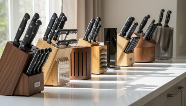 Knife Blocks
See the Top 10
Knife Blocks
See the Top 10
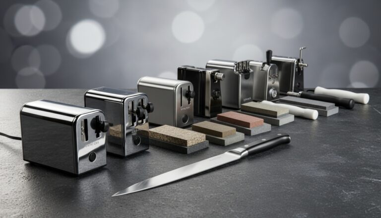 Knife Sharpeners
See the Top 10
Knife Sharpeners
See the Top 10
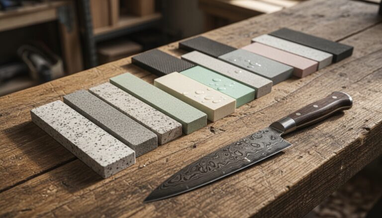 Whetstones
See the Top 10
Whetstones
See the Top 10
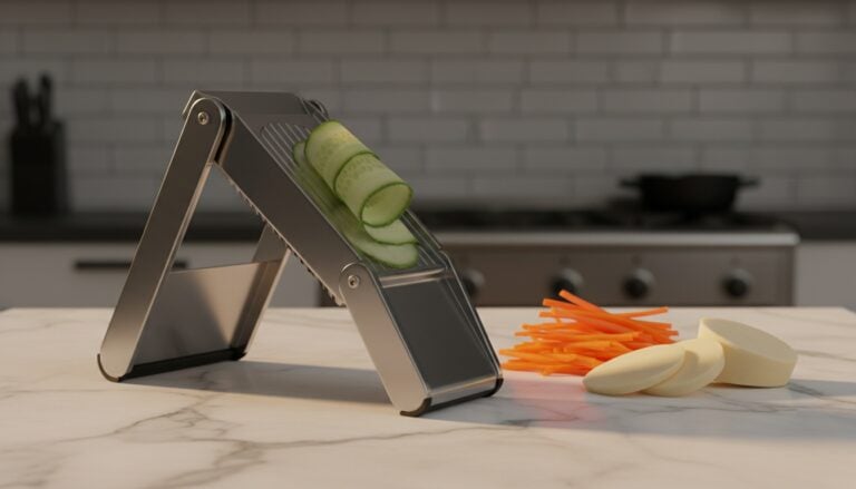 Mandoline Slicers
See the Top 10
Mandoline Slicers
See the Top 10
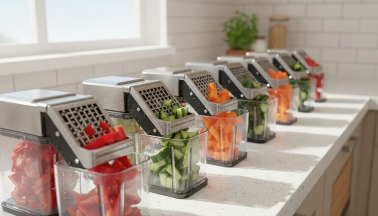 Vegetable Choppers
See the Top 10
Vegetable Choppers
See the Top 10
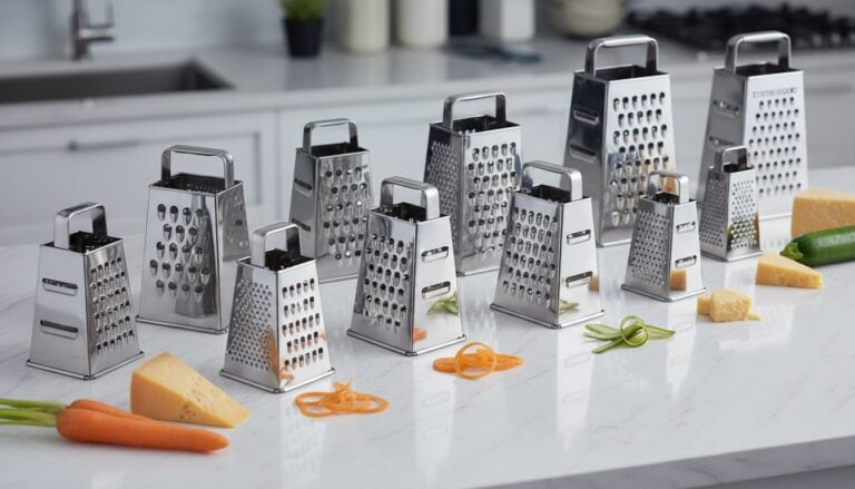 Box Graters
See the Top 10
Box Graters
See the Top 10
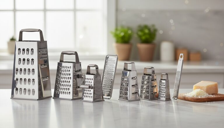 Cheese Graters
See the Top 10
Cheese Graters
See the Top 10
 Microplane Zesters
See the Top 10
Microplane Zesters
See the Top 10
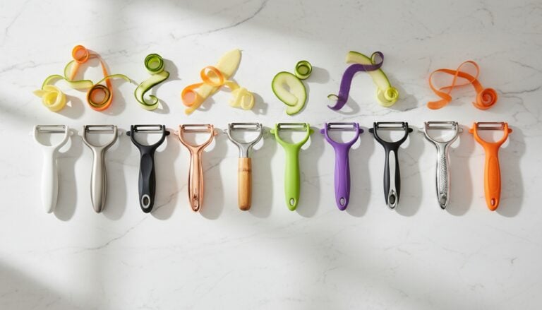 Vegetable Peelers
See the Top 10
Vegetable Peelers
See the Top 10
 Kitchen Shears
See the Top 10
Kitchen Shears
See the Top 10
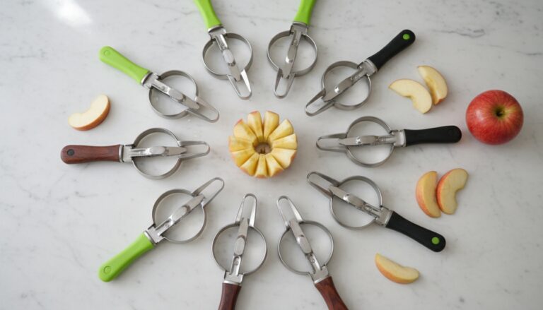 Apple Slicers
See the Top 10
Apple Slicers
See the Top 10
Copper Pots and Pans as Everyday Decor
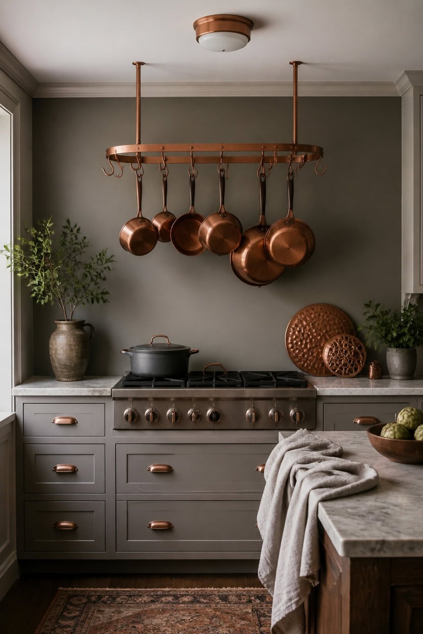
A hanging pot rack turns copper pots and pans into everyday display, within reach of the stove. Light gray Boothbay Gray on the accent wall grounds the copper tones, while very light gray After the Rain on the trim keeps edges crisp. Keep the pot rack stocked with pieces used weekly, since idle pans read as clutter.
Group by weight and use: Heaviest pans go on lower rungs, light skillets stay up top for easy reach.
Space pieces evenly: Leave gaps between hooks so shapes read as a display, not storage.
Match metal tones: Keep only copper-finish pieces on the rack and skip mismatched steel pans.
Rotate seasonally: Swap a stockpot for a smaller skillet in warmer months to keep the display current.
a light gray that lets the copper pieces read as warm focal points. [light]
a very light gray that keeps sightlines crisp against the copper display. [very light]
 ROTHLEY 39.4 Inch Stainless Steel Wall Mounted Hanging Pot and Pan Rack with Adjustable S Hooks, Antique Copper
View Price
ROTHLEY 39.4 Inch Stainless Steel Wall Mounted Hanging Pot and Pan Rack with Adjustable S Hooks, Antique Copper
View Price
 BLACK+DECKER TO3250XSBD 8-Slice Extra Wide Convection Countertop Toaster Oven, Includes Bake Pan, Broil Rack & Toasting Rack, Stainless Steel/Black
View Price
BLACK+DECKER TO3250XSBD 8-Slice Extra Wide Convection Countertop Toaster Oven, Includes Bake Pan, Broil Rack & Toasting Rack, Stainless Steel/Black
View Price
 Ceramic Rotating Kitchen Utensil Holder for Countertop, 7.2'' Gray
View Price
Ceramic Rotating Kitchen Utensil Holder for Countertop, 7.2'' Gray
View Price
 hykolity 13 inch Flush Mount LED Ceiling Light Fixture,5CCT
View Price
hykolity 13 inch Flush Mount LED Ceiling Light Fixture,5CCT
View Price
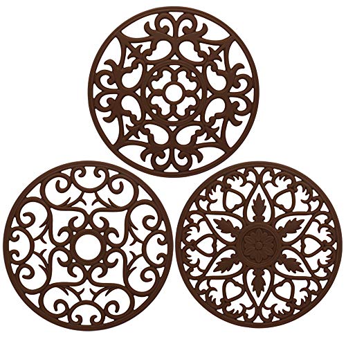 ME.FAN Trivets for Dishes/Pots/Pans, 3 Pcs Silicone Mats, Flexible/Durable/Non Slip Hot Pads to Protect Table and Counter Top (Coffee)
View Price
ME.FAN Trivets for Dishes/Pots/Pans, 3 Pcs Silicone Mats, Flexible/Durable/Non Slip Hot Pads to Protect Table and Counter Top (Coffee)
View Price
 Soapstone 3 qt Dutch oven with copper handles by Cookstone | Handcrafted from a block of pure soapstone | Non-toxic and Non-stick | Unique, durable and eco-friendly
View Price
Soapstone 3 qt Dutch oven with copper handles by Cookstone | Handcrafted from a block of pure soapstone | Non-toxic and Non-stick | Unique, durable and eco-friendly
View Price
Our Favorite Backsplash Tiles
 Ackland Amara 8" x 8" Encaustic-Look Matte Porcelain Tile
View Price
Ackland Amara 8" x 8" Encaustic-Look Matte Porcelain Tile
View Price
 Merola Arte 10" x 10" Porcelain Patterned Tile
View Price
Merola Arte 10" x 10" Porcelain Patterned Tile
View Price
 Cruz Bay Studio Sliced Pebble Mosaic Tile
View Price
Cruz Bay Studio Sliced Pebble Mosaic Tile
View Price
 Cruz Bay Studio Natural Stone Mosaic Sheet
View Price
Cruz Bay Studio Natural Stone Mosaic Sheet
View Price
 Merola Hudson Tangier Porcelain Mosaic Tile
View Price
Merola Hudson Tangier Porcelain Mosaic Tile
View Price
 Bedrosians Cloe 2.5" x 8" Handmade-Look Glossy Ceramic Subway Tile
View Price
Bedrosians Cloe 2.5" x 8" Handmade-Look Glossy Ceramic Subway Tile
View Price
 Bond Tile Chateau 3" x 12" Ceramic Subway Tile
View Price
Bond Tile Chateau 3" x 12" Ceramic Subway Tile
View Price
 Giorbello 3" x 6" Glass Subway Tile
View Price
Giorbello 3" x 6" Glass Subway Tile
View Price
 Ackland Camden 4" x 12" Gauged Slate Subway Tile
View Price
Ackland Camden 4" x 12" Gauged Slate Subway Tile
View Price
 Merola Rambla 15" x 23" Porcelain Stone-Look Tile
View Price
Merola Rambla 15" x 23" Porcelain Stone-Look Tile
View Price
 Supreme Tile Carrara White Hexagon Polished Marble Mosaic
View Price
Supreme Tile Carrara White Hexagon Polished Marble Mosaic
View Price
 Bond Tile Southampton 4" x 4" Satin Handmade-Look Wall Tile
View Price
Bond Tile Southampton 4" x 4" Satin Handmade-Look Wall Tile
View Price
 Bedrosians Cloe 5" x 5" Handmade-Look Glossy Ceramic Wall Tile
View Price
Bedrosians Cloe 5" x 5" Handmade-Look Glossy Ceramic Wall Tile
View Price
 Bond Tile San Luis 4" x 12" Polished Handmade-Look Ceramic Wall Tile
View Price
Bond Tile San Luis 4" x 12" Polished Handmade-Look Ceramic Wall Tile
View Price
Personal Touches That Keep This Kitchen From Feeling Staged
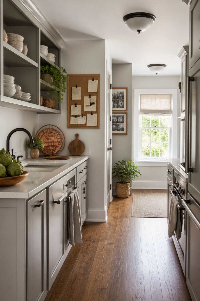
Handwritten recipe cards pinned to a cork board give a kitchen real family history instead of showroom polish. Very light gray Angel’s Wings on the main walls keeps the backdrop calm, while mid-tone gray Arctic Seal on the open shelf backs adds quiet depth. Hang the cork memo board near the entry so daily notes and drawings stay visible, not tucked away.
Display real paperwork: Pin actual grocery lists and school notices instead of staged art.
Mix in handmade items: A child’s drawing or hand-lettered sign adds authentic warmth.
Rotate seasonally: Swap photos and cards every few months so the display stays current.
Keep one dedicated spot: Confine personal items to one board or shelf so the rest of the kitchen stays clean.
a very light gray that keeps the backdrop calm enough for personal touches to stand out. [very light]
a mid-tone gray that adds quiet depth behind displayed keepsakes. [mid-tone]
 DOLLAR BOSS Double-Sided Bulletin Boards with Linen, 16"x12" 1PC Cork Board
View Price
DOLLAR BOSS Double-Sided Bulletin Boards with Linen, 16"x12" 1PC Cork Board
View Price
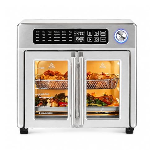 Emeril Lagasse 26QT French Door Multi-Function Air Fryer Toaster Oven
View Price
Emeril Lagasse 26QT French Door Multi-Function Air Fryer Toaster Oven
View Price
 upsimples Picture Frames set of 19, Including 8x10, 5x7, 4x6 Black Frame
View Price
upsimples Picture Frames set of 19, Including 8x10, 5x7, 4x6 Black Frame
View Price
 DOWAN 7.2" Large Ceramic Utensil Holder for Kitchen Counter, Grey
View Price
DOWAN 7.2" Large Ceramic Utensil Holder for Kitchen Counter, Grey
View Price
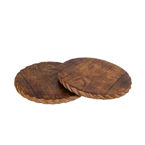 Mie Creations Wooden Trivets for Hot Dishes Set of 2, Kitchen Decor 8''
View Price
Mie Creations Wooden Trivets for Hot Dishes Set of 2, Kitchen Decor 8''
View Price
 Oceanstar Bamboo Recipe Box with Divider, Natural, 6.80" W x 4.90" D x 5.10" H
View Price
Oceanstar Bamboo Recipe Box with Divider, Natural, 6.80" W x 4.90" D x 5.10" H
View Price
 Mkono Home Sign Wall Decor, Farmhouse Wood Letters Eucalyptus for O, Brown
View Price
Mkono Home Sign Wall Decor, Farmhouse Wood Letters Eucalyptus for O, Brown
View Price
Our Favorite Kitchen Lighting
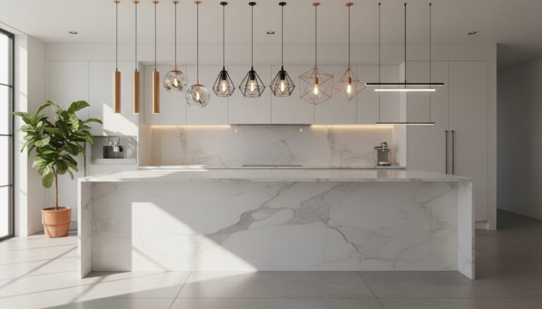 Kitchen Island Pendant Lights
See the Top 10
Kitchen Island Pendant Lights
See the Top 10
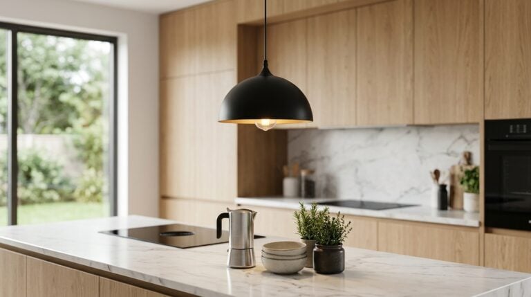 Dome Pendant Lights
See the Top 10
Dome Pendant Lights
See the Top 10
 Glass Globe Pendant Lights
See the Top 10
Glass Globe Pendant Lights
See the Top 10
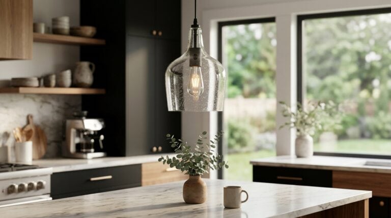 Seeded Glass Pendant Lights
See the Top 10
Seeded Glass Pendant Lights
See the Top 10
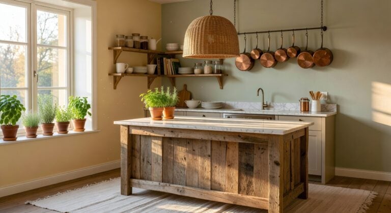 Rattan Pendant Lights
See the Top 10
Rattan Pendant Lights
See the Top 10
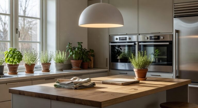 Ceramic Pendant Lights
See the Top 10
Ceramic Pendant Lights
See the Top 10
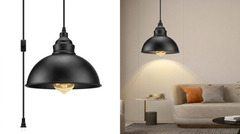 Plug-In Pendant Lights
See the Top 10
Plug-In Pendant Lights
See the Top 10
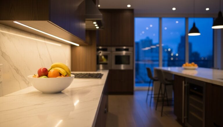 Under Cabinet Lights
See the Top 10
Under Cabinet Lights
See the Top 10
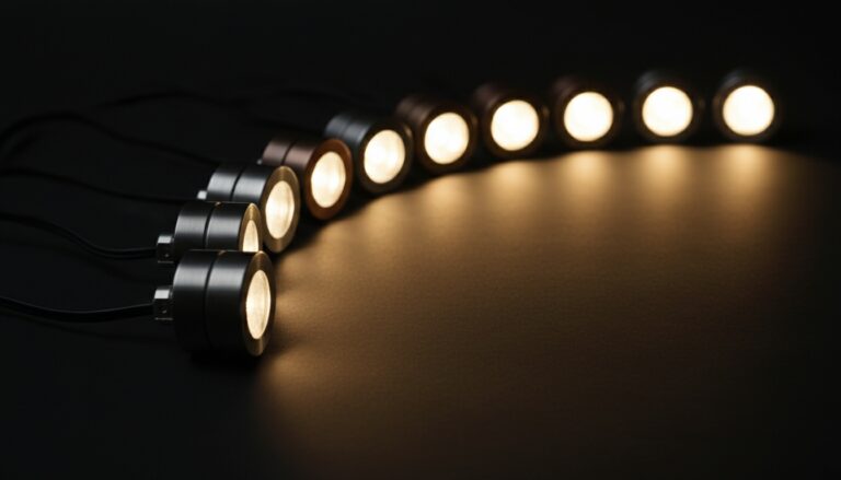 Puck Lights
See the Top 10
Puck Lights
See the Top 10
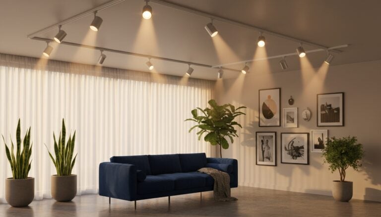 Track Lighting
See the Top 10
Track Lighting
See the Top 10
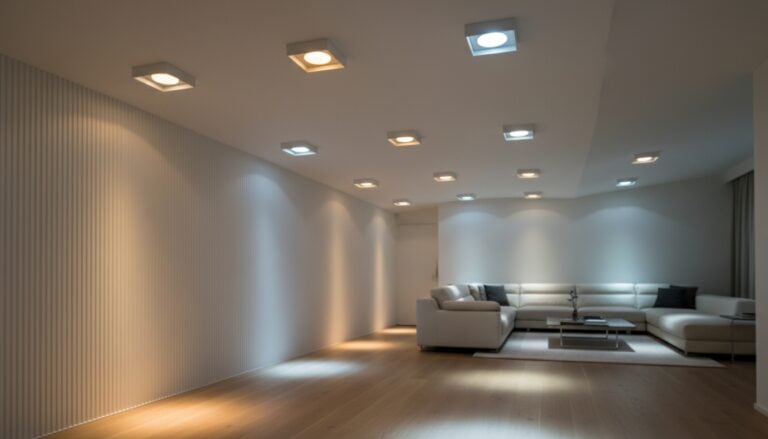 Recessed Lights
See the Top 10
Recessed Lights
See the Top 10
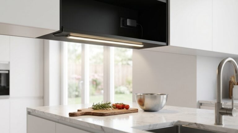 Under-Cabinet LED Strips
See the Top 10
Under-Cabinet LED Strips
See the Top 10
Lessons Every Gray and Copper Kitchen Can Teach You
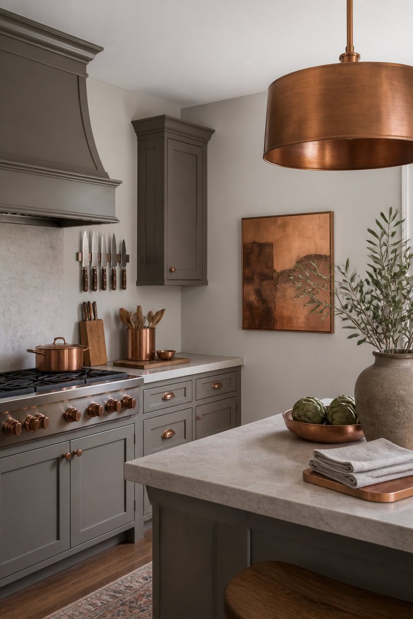
Very light gray London Fog on the main walls keeps light bouncing evenly, and mid-tone gray Quarry Rock on the cabinets grounds the room. This split works because it lets copper metal read as an accent rather than compete with the gray base. Mount a magnetic knife strip near the range so its copper blades add warmth without clutter.
Repeat the ratio: Keep gray dominant across walls and cabinets, letting copper stay the accent, never the reverse.
Anchor with one metal: Stick to copper for hardware and fixtures so the palette reads planned, not mixed.
Let function lead: Choose everyday tools, like a knife strip or trivet, that double as decor.
Rotate small pieces: Swap linens and small copper items seasonally to keep the kitchen feeling lived-in.
a very light gray that keeps the room bright and lets copper accents stand out. [very light]
a mid-tone gray that grounds the space without competing with copper hardware. [mid-tone]
 HOSHANHO Magnetic Knife Strips, Magnetic Knife Holder for Wall 16 Inch
View Price
HOSHANHO Magnetic Knife Strips, Magnetic Knife Holder for Wall 16 Inch
View Price
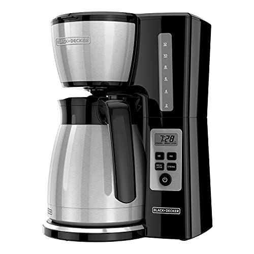 BLACK+DECKER 12 Cup Thermal Programmable Coffee Maker with Brew Strength and VORTEX Technology, Black/Steel, CM2046S
View Price
BLACK+DECKER 12 Cup Thermal Programmable Coffee Maker with Brew Strength and VORTEX Technology, Black/Steel, CM2046S
View Price
 Mud Pie Copper Kitchen Utensil Holder with Embossed UTENSILS Tag
View Price
Mud Pie Copper Kitchen Utensil Holder with Embossed UTENSILS Tag
View Price
 Sango Asher 12-Piece Stoneware Dinnerware Set for 4, Grey Ceramic Plates and Bowls Sets, Modern Dish Set with Reactive Glaze, Durable Kitchen Dishes for Casual Dining, Microwave & Dishwasher Safe
View Price
Sango Asher 12-Piece Stoneware Dinnerware Set for 4, Grey Ceramic Plates and Bowls Sets, Modern Dish Set with Reactive Glaze, Durable Kitchen Dishes for Casual Dining, Microwave & Dishwasher Safe
View Price
 Ayuzawa Handmade Cloth Napkins 100% Cotton Napkins with Fringe,Delicate Handmade Cloth Napkins for Dinners, Parties, Weddings and More,18 x 18 Inch Set of 4 - Light Grey
View Price
Ayuzawa Handmade Cloth Napkins 100% Cotton Napkins with Fringe,Delicate Handmade Cloth Napkins for Dinners, Parties, Weddings and More,18 x 18 Inch Set of 4 - Light Grey
View Price
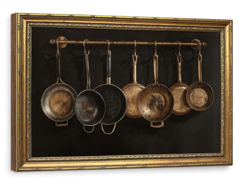 Large Dark Academia Kitchen Wall Art Gold Framed, Moody Vintage Copper Pots Still Life Canvas Print, Statement Antique Wall Art for Dining Room Coffee Bar 16x24 Inch
View Price
Large Dark Academia Kitchen Wall Art Gold Framed, Moody Vintage Copper Pots Still Life Canvas Print, Statement Antique Wall Art for Dining Room Coffee Bar 16x24 Inch
View Price
 Koville Marble Cutting Board for Kitchen, 20x16 Inches Large Marble Slab Cheese Board, Rectangular Serving Board for Baking Charcuterie Pastry, Natural Stone Board for Countertop(Monte Grigio)
View Price
Koville Marble Cutting Board for Kitchen, 20x16 Inches Large Marble Slab Cheese Board, Rectangular Serving Board for Baking Charcuterie Pastry, Natural Stone Board for Countertop(Monte Grigio)
View Price
 22" Copper Drum Chandelier For Dining Room Farmhouse Brass Pendant Light
View Price
22" Copper Drum Chandelier For Dining Room Farmhouse Brass Pendant Light
View Price
Our Favorite Dutch Ovens, Pots and Bakeware
 Enameled Cast Iron Dutch Ovens
See the Top 10
Enameled Cast Iron Dutch Ovens
See the Top 10
 Dutch Ovens
See the Top 10
Dutch Ovens
See the Top 10
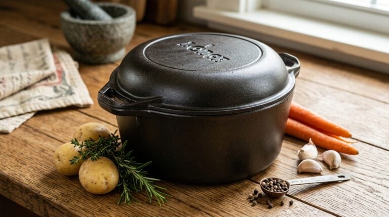 Cast Iron Dutch Ovens
See the Top 10
Cast Iron Dutch Ovens
See the Top 10
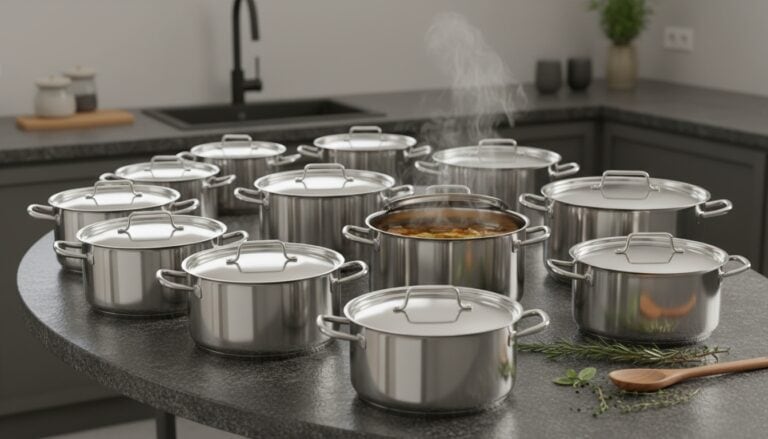 Stock Pots
See the Top 10
Stock Pots
See the Top 10
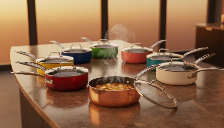 Saucepans
See the Top 10
Saucepans
See the Top 10
 Casserole Dishes
See the Top 10
Casserole Dishes
See the Top 10
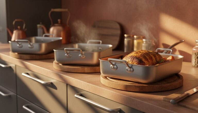 Roasting Pans
See the Top 10
Roasting Pans
See the Top 10
 Double Boilers
See the Top 10
Double Boilers
See the Top 10
 Steamer Baskets
See the Top 10
Steamer Baskets
See the Top 10
 Baking Sheets
See the Top 10
Baking Sheets
See the Top 10
 Mixing Bowl Sets
See the Top 10
Mixing Bowl Sets
See the Top 10
 Loaf Pans
See the Top 10
Loaf Pans
See the Top 10
How to Let Your Own Kitchen Get Stranger on Purpose
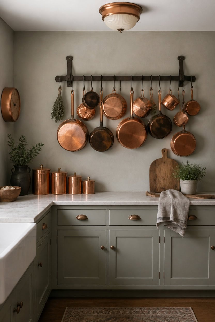
Letting one deliberately odd object break the matched palette is what makes a gray and copper kitchen feel collected, not staged. Light gray Cape May Cobblestone on the main walls and light gray Misted Green on the cabinets keep the base calm enough to absorb that eccentricity. Hang a wall-mounted iron pot rack with mismatched copper cookware near the stove for real character.
Add one wild card: Choose a single unexpected object, like a vintage pot rack, that breaks the matched set.
Keep the frame steady: Let gray walls and cabinets stay unified so the odd piece has room to stand out.
Collect, don’t curate: Favor pieces gathered over time instead of matching store sets.
Limit the strangeness: Cap eccentric pieces at one or two so the room doesn’t look cluttered.
a light gray that keeps the room calm enough for one eccentric accent to stand out. [light]
a light gray that grounds the space while still reading as neutral. [light]
 KES 150 lb High-Capacity Oil Rubbed Bronze Pot Rack Wall Mounted with Pot Lid Holder, 34 Inch Heavy-Duty Pots and Pans Hanging Rack with 20 Hooks, Drilling Template Provided for Easy Install
View Price
KES 150 lb High-Capacity Oil Rubbed Bronze Pot Rack Wall Mounted with Pot Lid Holder, 34 Inch Heavy-Duty Pots and Pans Hanging Rack with 20 Hooks, Drilling Template Provided for Easy Install
View Price
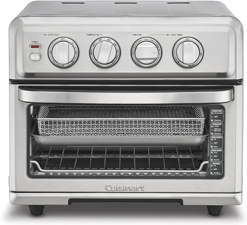 Cuisinart Air Fryer Toaster Oven, 1800W, 8-in-1 with Air Fry, Convection, Broil & Warm, 0.6 Cubic Feet, 60-Minute Timer, TOA-70NAS, Stainless Steel
View Price
Cuisinart Air Fryer Toaster Oven, 1800W, 8-in-1 with Air Fry, Convection, Broil & Warm, 0.6 Cubic Feet, 60-Minute Timer, TOA-70NAS, Stainless Steel
View Price
 Foxtop 12 Inch Retro Wall Clock Round Silent Battery Operated Clock, Copper
View Price
Foxtop 12 Inch Retro Wall Clock Round Silent Battery Operated Clock, Copper
View Price
 thelampgoods Handcrafted Copper Flush Mount Ceiling Light - Rustic Farmhouse Lighting for Kitchen, Bathroom & Entryway - Antique Industrial Metal Fixture - Made in USA
View Price
thelampgoods Handcrafted Copper Flush Mount Ceiling Light - Rustic Farmhouse Lighting for Kitchen, Bathroom & Entryway - Antique Industrial Metal Fixture - Made in USA
View Price
 JEmarble Pastry Board 16x24 inch(Gray) with Non-Slip Rubber Feets for Stability Perfect for Keep the Dough Cool and Chocolate Tempering(Premium Quality)
View Price
JEmarble Pastry Board 16x24 inch(Gray) with Non-Slip Rubber Feets for Stability Perfect for Keep the Dough Cool and Chocolate Tempering(Premium Quality)
View Price
Our Favorite Small Kitchen Appliances
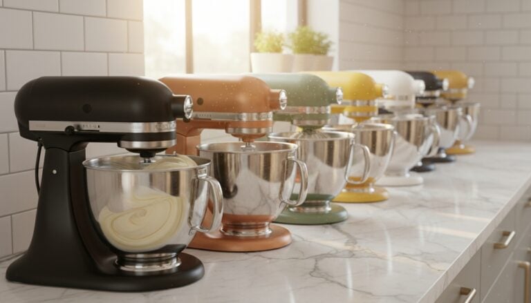 Stand Mixers
See the Top 10
Stand Mixers
See the Top 10
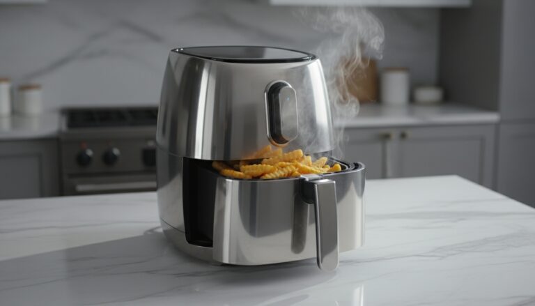 Air Fryers
See the Top 10
Air Fryers
See the Top 10
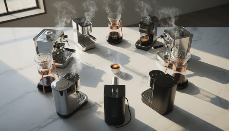 Coffee Makers
See the Top 10
Coffee Makers
See the Top 10
 Espresso Machines
See the Top 10
Espresso Machines
See the Top 10
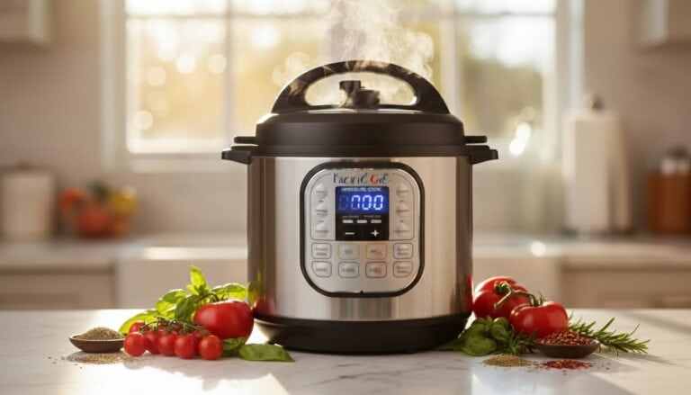 Instant Pots
See the Top 10
Instant Pots
See the Top 10
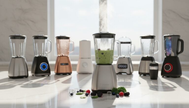 Blenders
See the Top 10
Blenders
See the Top 10
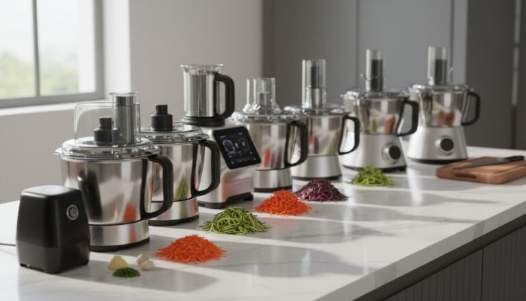 Food Processors
See the Top 10
Food Processors
See the Top 10
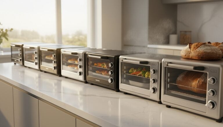 Toaster Ovens
See the Top 10
Toaster Ovens
See the Top 10
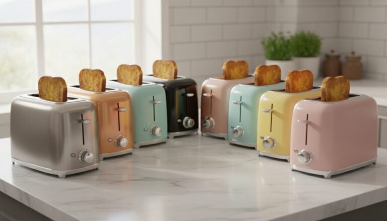 2-Slice Toasters
See the Top 10
2-Slice Toasters
See the Top 10
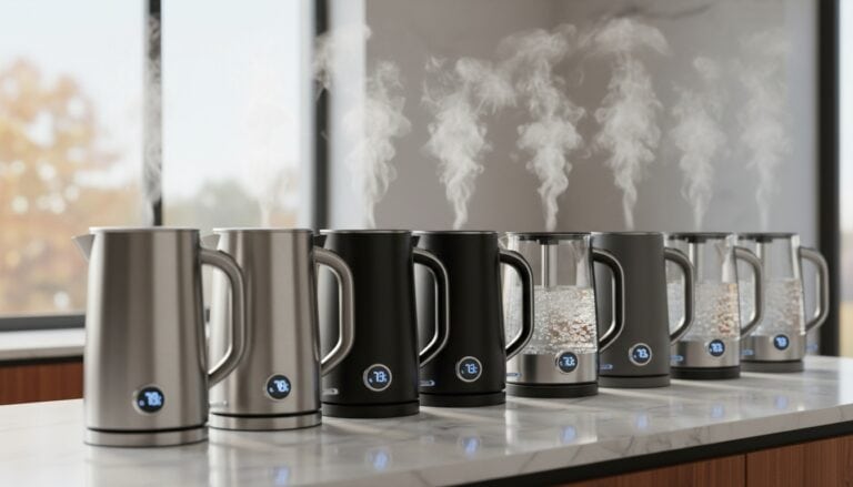 Electric Kettles
See the Top 10
Electric Kettles
See the Top 10
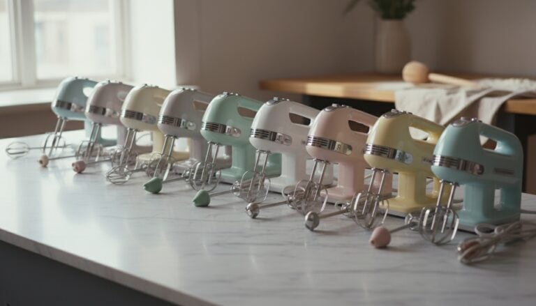 Hand Mixers
See the Top 10
Hand Mixers
See the Top 10
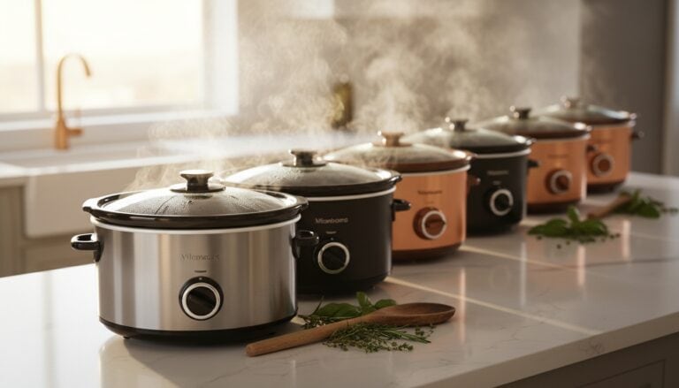 Slow Cookers
See the Top 10
Slow Cookers
See the Top 10
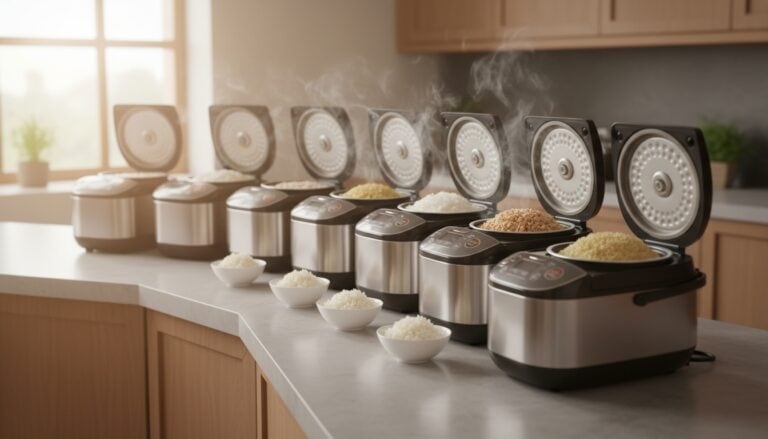 Rice Cookers
See the Top 10
Rice Cookers
See the Top 10
 Ice Makers
See the Top 10
Ice Makers
See the Top 10
 Waffle Makers
See the Top 10
Waffle Makers
See the Top 10
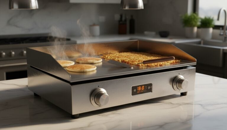 Electric Griddles
See the Top 10
Electric Griddles
See the Top 10
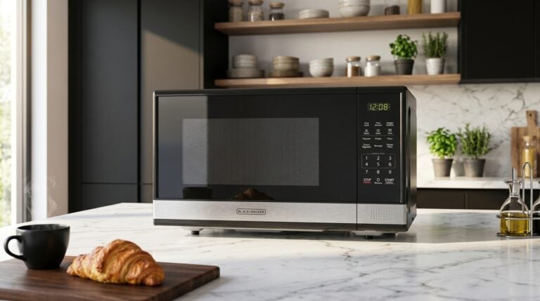 Countertop Microwaves
See the Top 10
Countertop Microwaves
See the Top 10
Our Favorite Kitchen Faucets
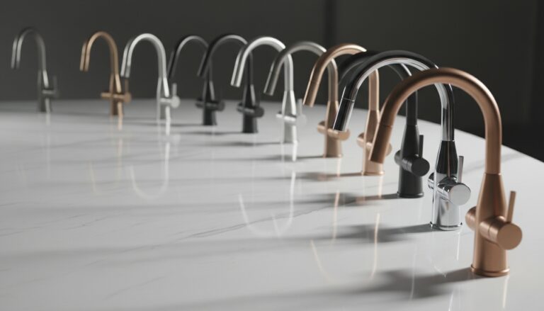 Kitchen Faucets
See the Top 10
Kitchen Faucets
See the Top 10
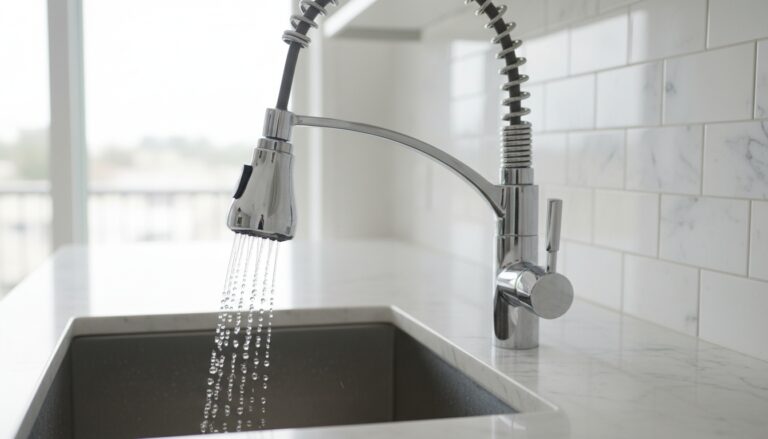 Pull-Down Kitchen Faucets
See the Top 10
Pull-Down Kitchen Faucets
See the Top 10
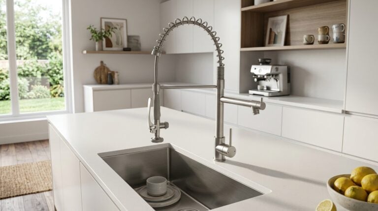 Commercial-Style Kitchen Faucets
See the Top 10
Commercial-Style Kitchen Faucets
See the Top 10
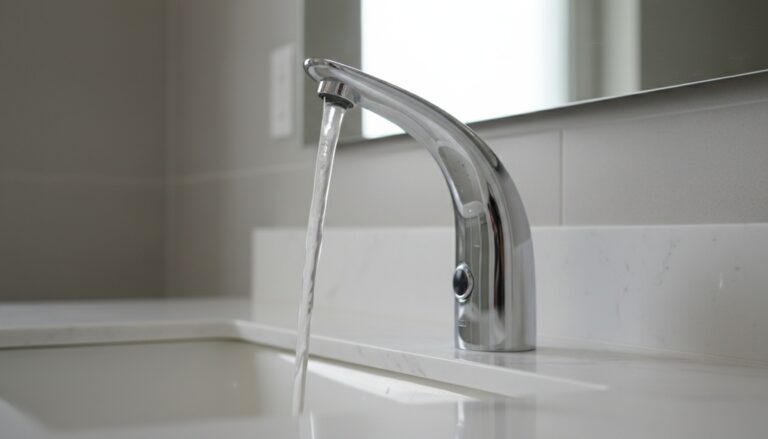 Touchless Kitchen Faucets
See the Top 10
Touchless Kitchen Faucets
See the Top 10
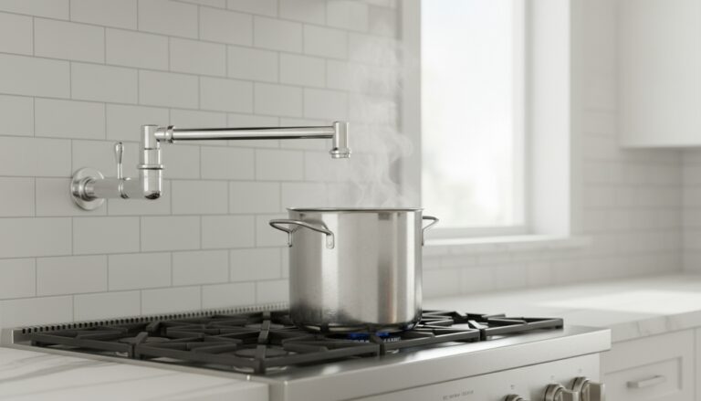 Pot Filler Faucets
See the Top 6
Pot Filler Faucets
See the Top 6
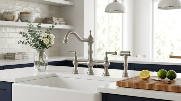 Bridge Kitchen Faucets
See the Top 10
Bridge Kitchen Faucets
See the Top 10
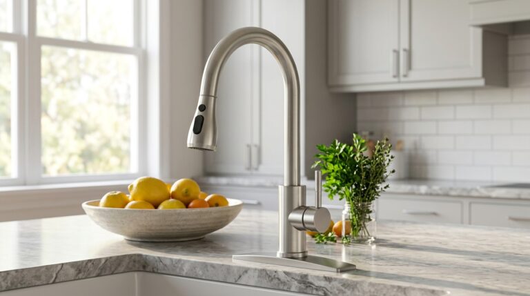 Single-Handle Kitchen Faucets
See the Top 10
Single-Handle Kitchen Faucets
See the Top 10
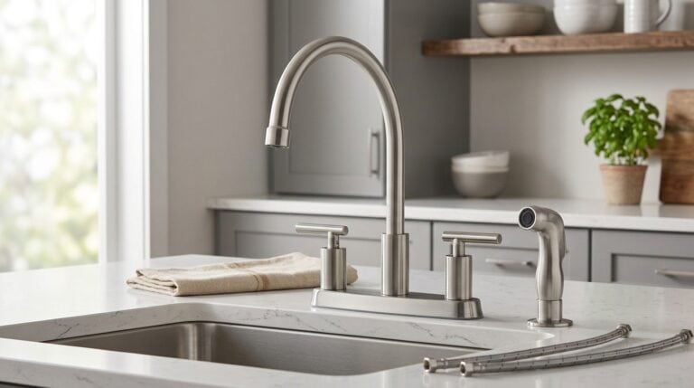 Kitchen Faucets with Side Sprayer
See the Top 10
Kitchen Faucets with Side Sprayer
See the Top 10
 Sink Soap Dispensers
See the Top 10
Sink Soap Dispensers
See the Top 10
 Faucet Water Filters
See the Top 10
Faucet Water Filters
See the Top 10
 Instant Hot Water Dispensers
See the Top 10
Instant Hot Water Dispensers
See the Top 10
 Faucet Aerators
See the Top 10
Faucet Aerators
See the Top 10
Our Favorite Cookware Sets and Pans
 Nonstick Cookware Sets
See the Top 10
Nonstick Cookware Sets
See the Top 10
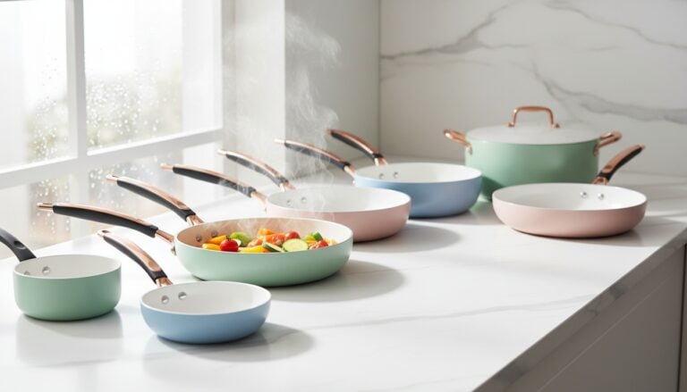 Ceramic Cookware Sets
See the Top 10
Ceramic Cookware Sets
See the Top 10
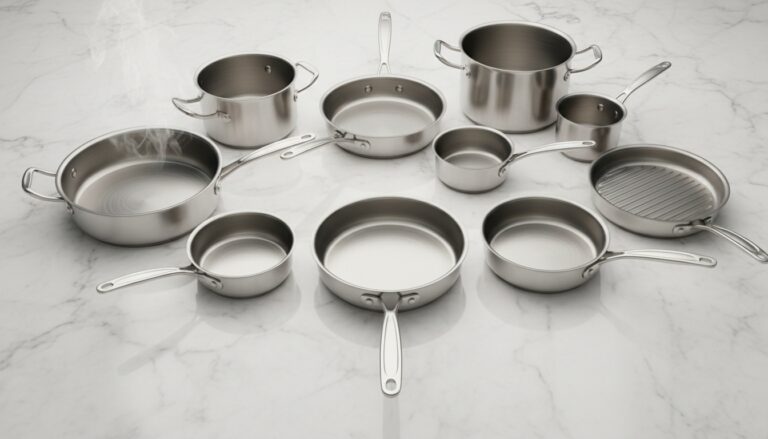 Stainless Steel Cookware Sets
See the Top 10
Stainless Steel Cookware Sets
See the Top 10
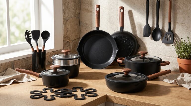 Non-Toxic Cookware Sets
See the Top 10
Non-Toxic Cookware Sets
See the Top 10
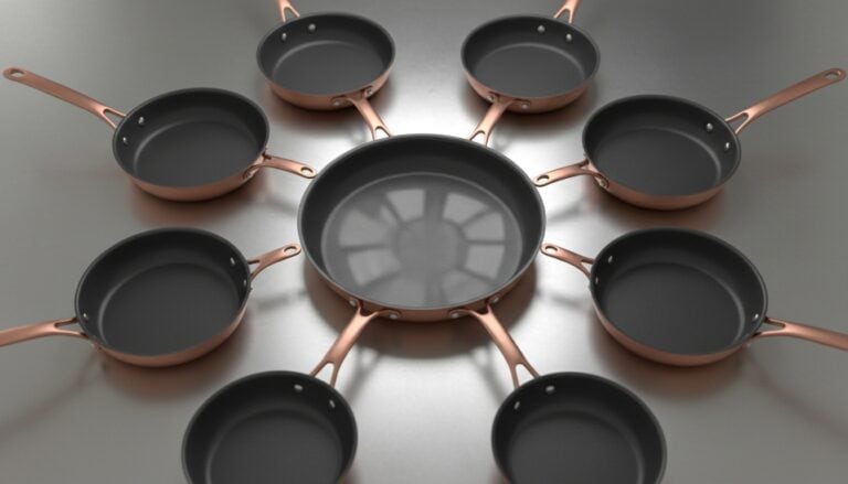 Nonstick Frying Pans
See the Top 10
Nonstick Frying Pans
See the Top 10
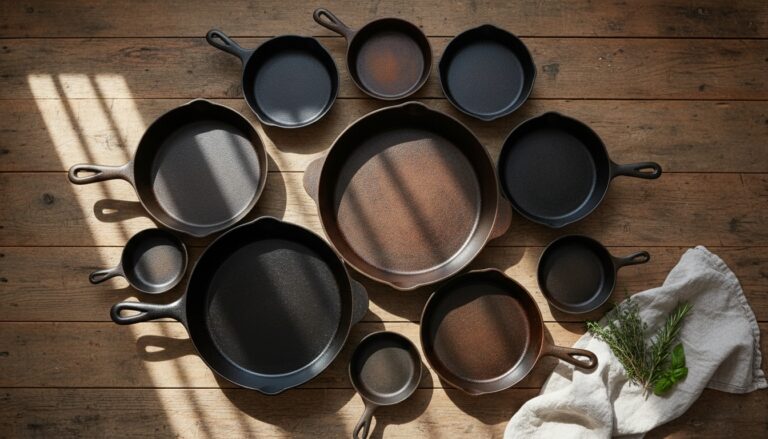 Cast Iron Skillets
See the Top 10
Cast Iron Skillets
See the Top 10
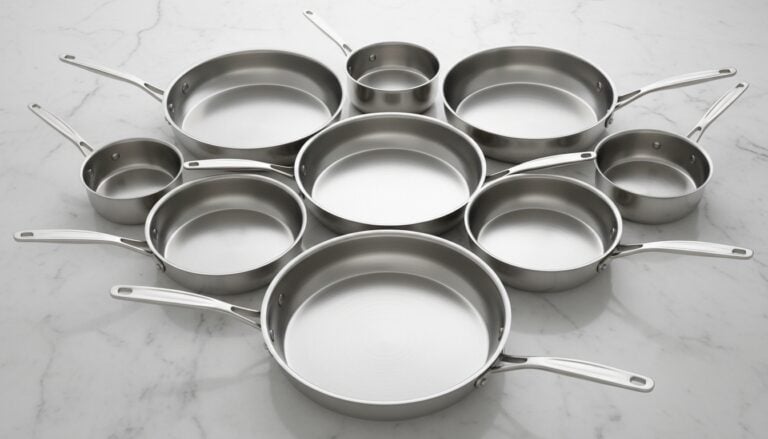 Stainless Steel Frying Pans
See the Top 10
Stainless Steel Frying Pans
See the Top 10
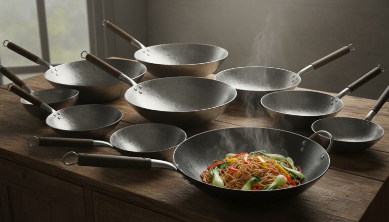 Woks
See the Top 10
Woks
See the Top 10
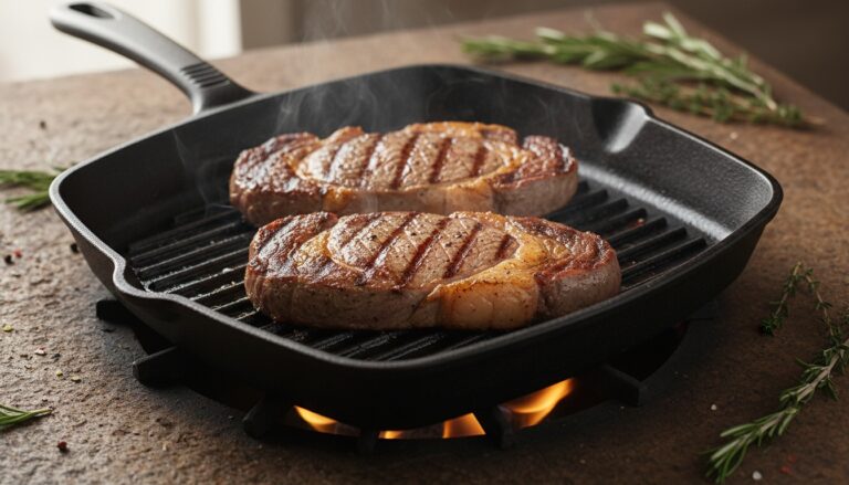 Grill Pans
See the Top 10
Grill Pans
See the Top 10
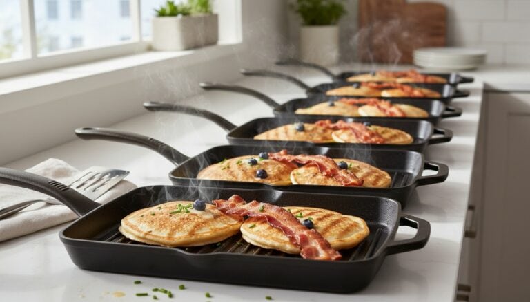 Griddle Pans
See the Top 10
Griddle Pans
See the Top 10
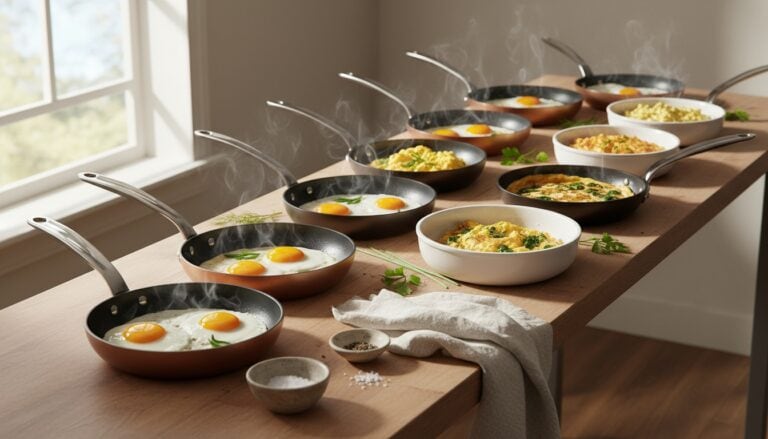 Egg Pans
See the Top 10
Egg Pans
See the Top 10
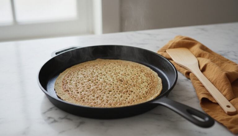 Crepe Pans
See the Top 10
Crepe Pans
See the Top 10
Our Favorite Kitchen Sinks
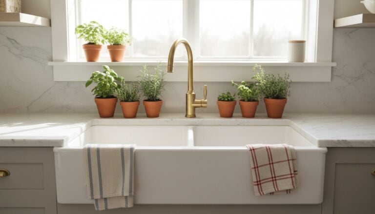 Farmhouse Sinks
See the Top 10
Farmhouse Sinks
See the Top 10
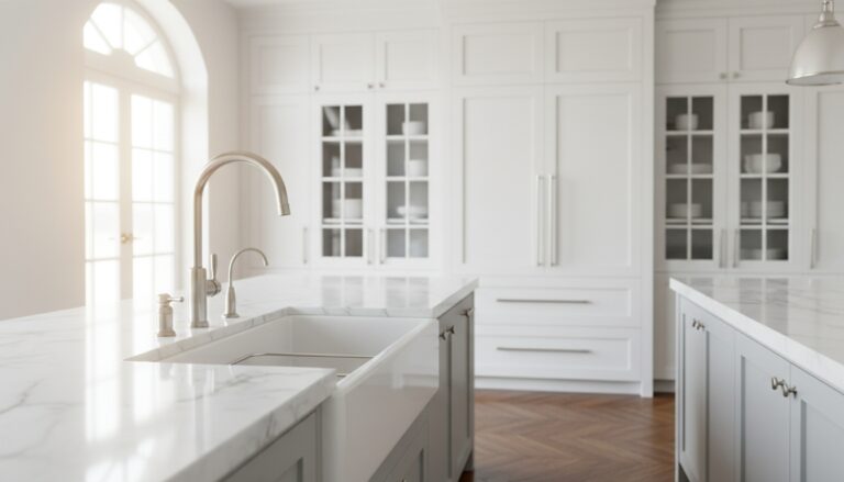 Kitchen Sinks
See the Top 10
Kitchen Sinks
See the Top 10
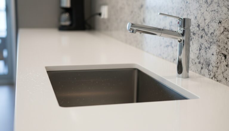 Undermount Sinks
See the Top 10
Undermount Sinks
See the Top 10
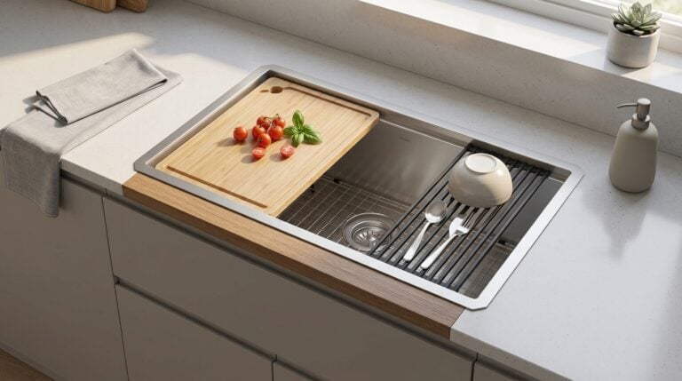 Workstation Sinks
See the Top 10
Workstation Sinks
See the Top 10
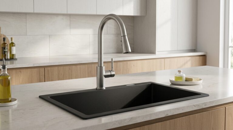 Granite Composite Sinks
See the Top 10
Granite Composite Sinks
See the Top 10
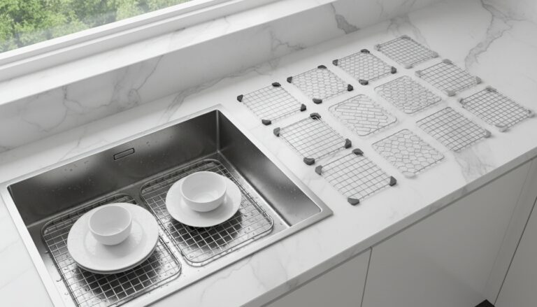 Sink Grids
See the Top 10
Sink Grids
See the Top 10
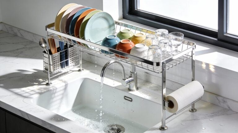 Over-Sink Dish Racks
See the Top 10
Over-Sink Dish Racks
See the Top 10
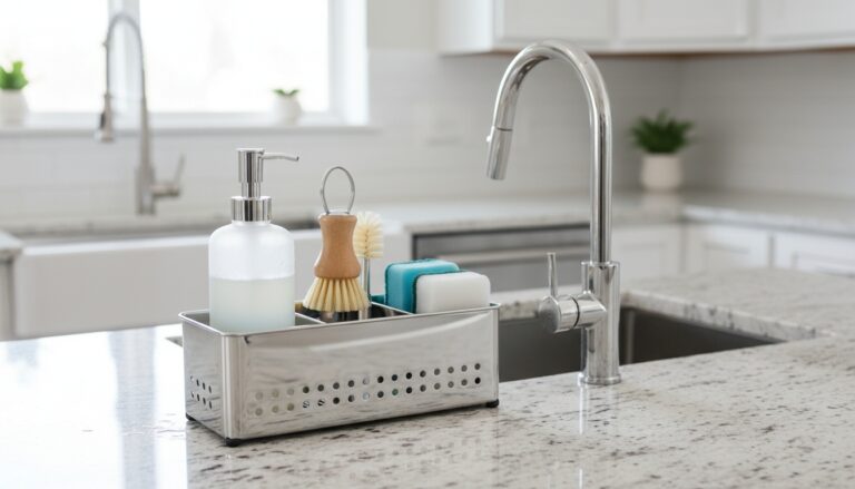 Sink Caddies
See the Top 10
Sink Caddies
See the Top 10
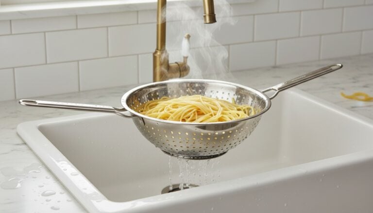 Over-Sink Colanders
See the Top 10
Over-Sink Colanders
See the Top 10
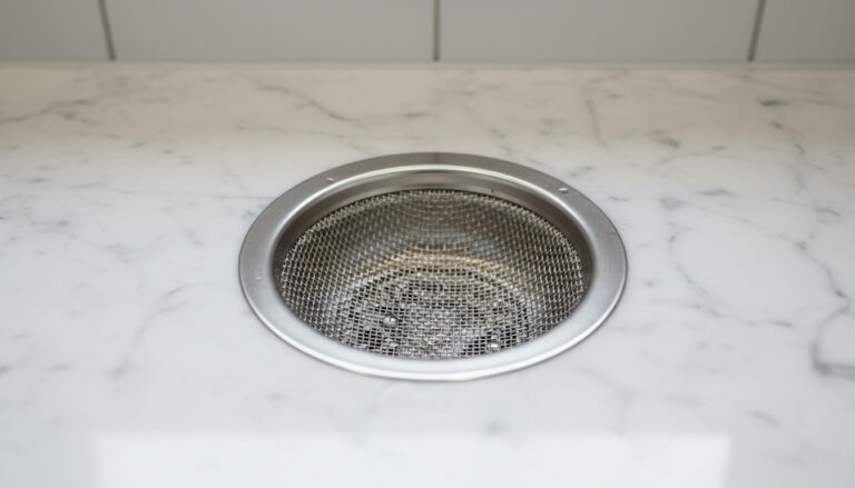 Kitchen Sink Strainers
See the Top 10
Kitchen Sink Strainers
See the Top 10
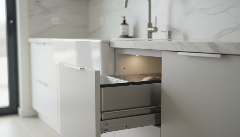 Under-Sink Trash Cans
See the Top 10
Under-Sink Trash Cans
See the Top 10
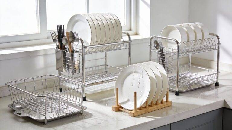 Dish Racks
See the Top 10
Dish Racks
See the Top 10