A Gray and White Dining Room That Holds the Conversation, Not the Decor
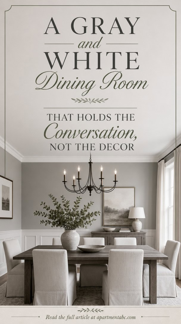
You’ve probably heard that color sets the mood in a dining room. That theory only holds up so far. Gray and white don’t perform tricks or demand attention: they hold space for something else.
The mood shifts when you notice what’s missing: no bold accent wall, no matching set, no forced focal point. What’s left standing in its place is the conversation, and it says more than color ever could.
Why Gray and White Dining Rooms Feel So Calm

Light gray Museum Piece on the main walls paired with very light white Seapearl on the wainscoting keeps the room from feeling stark. This low-contrast pairing reflects daylight evenly, which softens shadows instead of creating hard edges. Layer a linen runner with folded napkins and stacked plates down the table for texture without breaking the calm tone.
Low contrast pairing: Keep wall and trim shades within one or two steps of each other for a soft look.
Matte finishes: Choose eggshell or matte paint to avoid glare that reads as busy.
Warm wood accents: Add a wood table or chairs so the gray-white palette does not feel flat.
Soft textiles: Use linen napkins and runners to add texture without adding color contrast.
the light gray keeps the room airy while still grounding the space. [light]
the very light white brightens the lower half of the room and reflects light upward. [very light]
 Signature Design by Ashley Shullden Upholstered Dining Chair, Set of 2
View Price
Signature Design by Ashley Shullden Upholstered Dining Chair, Set of 2
View Price
 4 Sets Boho Table Runner and Woven Round Placemats Set, White, 12x72
View Price
4 Sets Boho Table Runner and Woven Round Placemats Set, White, 12x72
View Price
 10 Strawberry Street Simply White 10.5" Round Dinner Plate, Set of 6
View Price
10 Strawberry Street Simply White 10.5" Round Dinner Plate, Set of 6
View Price
 Tribesigns 47 inch Round Dining Table Wood Kitchen Table for Dining Room, 47" Dinner Room Tables for 4-6, Farmhouse Accent Furniture with Wooden Tabletop and Cross Base, Rustic Grey
View Price
Tribesigns 47 inch Round Dining Table Wood Kitchen Table for Dining Room, 47" Dinner Room Tables for 4-6, Farmhouse Accent Furniture with Wooden Tabletop and Cross Base, Rustic Grey
View Price
 Creative Co-Op 87-Ounce Embossed Stripe Ceramic Pitcher, Distressed White
View Price
Creative Co-Op 87-Ounce Embossed Stripe Ceramic Pitcher, Distressed White
View Price
 RELEANY Washable 5'x7' Abstract Area Rug for Living Room Gray White
View Price
RELEANY Washable 5'x7' Abstract Area Rug for Living Room Gray White
View Price
 Large Framed Black and White Gray Abstract Wall Art Set, 3 Piece 24x36 Inch
View Price
Large Framed Black and White Gray Abstract Wall Art Set, 3 Piece 24x36 Inch
View Price
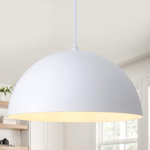 ASHUAQI 18 inch White Dome Pendant Light, Modern Farmhouse White Pendant Light, Large Pendant Lamp for Kitchen Island Dining Room Bedroom Hallway Foyer
View Price
ASHUAQI 18 inch White Dome Pendant Light, Modern Farmhouse White Pendant Light, Large Pendant Lamp for Kitchen Island Dining Room Bedroom Hallway Foyer
View Price
Choose the Right Shade of Gray for Your Walls
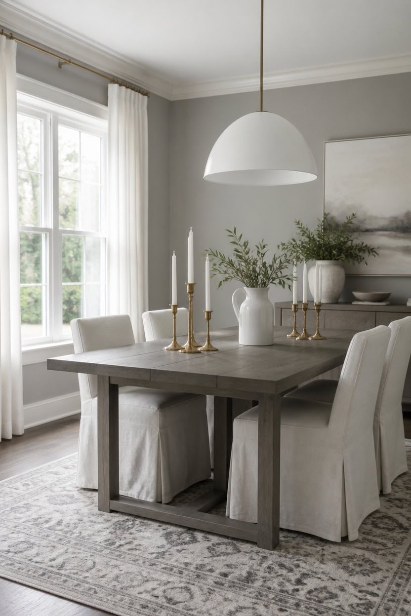
Choosing the right shade means matching the gray’s depth to your room’s light, not picking a color you like in isolation. Mid-tone gray Gray Pinstripe covers the main walls for depth, while very light white Summer Shower brightens the trim. This pairing balances weight and light so the room reads grounded, not heavy. Set brass candlesticks in a cluster of three down the table to link both tones with warm metal.
Test large swatches: Paint poster-board samples and view them at different times of day.
Match natural light: Cooler grays suit south-facing rooms; warmer grays suit north-facing rooms.
Consider undertones: Check for blue, green, or purple undertones under both daylight and lamp light.
Balance with trim: Pair a mid-tone gray wall with a lighter white trim to define the edges.
the mid-tone gray adds quiet depth while still reading neutral. [mid-tone]
the very light white keeps edges crisp and defines the architecture. [very light]
 DM Furniture Farmhouse Dining Chairs Set of 2, Upholstered Barrel Dining Chairs with Pleated Skirt, Slipcovered Kitchen & Dining Room Chairs, Curved Back Accent Chairs for Living Room, Dark Gray
View Price
DM Furniture Farmhouse Dining Chairs Set of 2, Upholstered Barrel Dining Chairs with Pleated Skirt, Slipcovered Kitchen & Dining Room Chairs, Curved Back Accent Chairs for Living Room, Dark Gray
View Price
 Perfnique Brass Candlestick Holders Set of 3 - Antique Gold Iron Candle Holders for Christmas, Birthday, Wedding, Party, Dining Table, Fireplace Mantel Decor
View Price
Perfnique Brass Candlestick Holders Set of 3 - Antique Gold Iron Candle Holders for Christmas, Birthday, Wedding, Party, Dining Table, Fireplace Mantel Decor
View Price
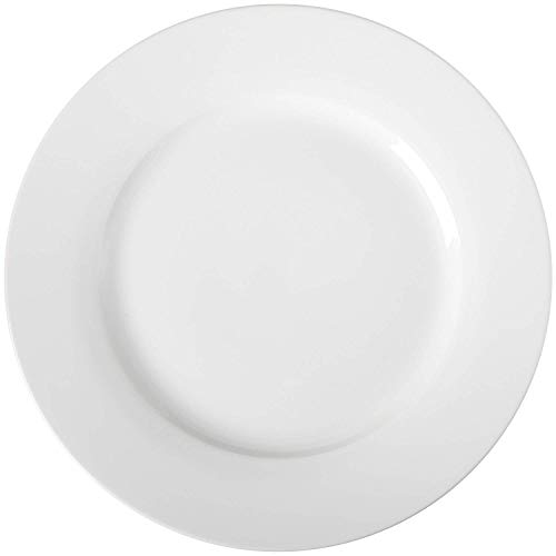 Amazon Basics 6-Piece White Dinner Plate Set, Microwave and Dishwasher Safe for Everyday Use, 10.5 inches
View Price
Amazon Basics 6-Piece White Dinner Plate Set, Microwave and Dishwasher Safe for Everyday Use, 10.5 inches
View Price
 GIANTEX Dining Table for 4-6, 63" Large Rectangular Kitchen Table, Grey
View Price
GIANTEX Dining Table for 4-6, 63" Large Rectangular Kitchen Table, Grey
View Price
 MEIJIA Milk Glass Pendant Lights Kitchen Island 2 Pack Schoolhouse Pendant
View Price
MEIJIA Milk Glass Pendant Lights Kitchen Island 2 Pack Schoolhouse Pendant
View Price
 8x10 Washable Area Rug for Living Room Bedroom: Non-Slip Modern White Gray
View Price
8x10 Washable Area Rug for Living Room Bedroom: Non-Slip Modern White Gray
View Price
 Large Framed Black White Gray Abstract Wall Art for Living Room, 24x36 In
View Price
Large Framed Black White Gray Abstract Wall Art for Living Room, 24x36 In
View Price
 White Ceramic Pitcher Vase, 8" Jug 1.5L Water Pitcher 50 Oz Versatile Jug Farmhouse Flower Vase for Home Décor, Utensil Holder Kitchen Storage Pot, for Home Office Hotel, Dishwasher & Microwave Safe
View Price
White Ceramic Pitcher Vase, 8" Jug 1.5L Water Pitcher 50 Oz Versatile Jug Farmhouse Flower Vase for Home Décor, Utensil Holder Kitchen Storage Pot, for Home Office Hotel, Dishwasher & Microwave Safe
View Price
Layer Whites So the Room Doesn’t Feel Flat
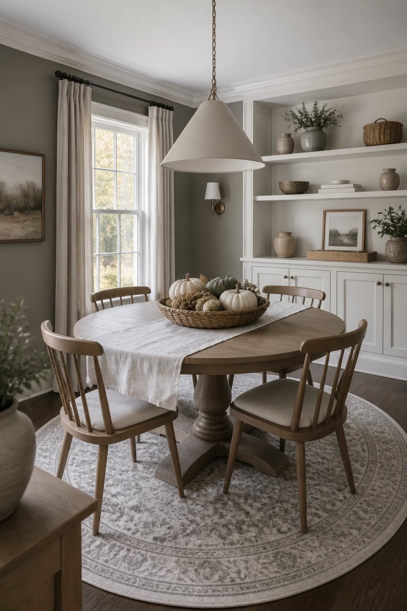
Layering mid-tone gray Stone on the main walls with very light white Winter Orchard on the built-ins keeps depth without feeling flat. The contrast lets the built-in shelves recede while the walls anchor the room’s weight under mixed daylight and lamp light. Set a woven basket of gourds on the built-in shelf to link both tones with natural texture.
Vary sheen, not just shade: Mix matte trim with eggshell walls to add depth without extra color.
Layer three whites: Combine a cool white, a warm white, and a creamy white so the eye has somewhere to land.
Anchor with texture: Add linen, wood, and ceramic pieces so the whites don’t feel sterile.
Test at night: View swatches under lamp light since whites shift warmer after dark.
the mid-tone gray keeps the room grounded while lighter surfaces do the work of bouncing light. [mid-tone]
the very light white lets stacked white dinnerware read as one layered story instead of clutter. [very light]
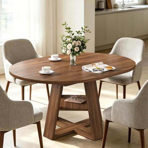 43.3"-59" Extendable Round Oval Dining Table for 4-8 with Storage Shelf
View Price
43.3"-59" Extendable Round Oval Dining Table for 4-8 with Storage Shelf
View Price
 Signature Design by Ashley Moriville Upholstered Dining Chairs Set of 2
View Price
Signature Design by Ashley Moriville Upholstered Dining Chairs Set of 2
View Price
 Umite Chef Dinnerware Set for 4, 12 Pieces Plates and Bowls Set
View Price
Umite Chef Dinnerware Set for 4, 12 Pieces Plates and Bowls Set
View Price
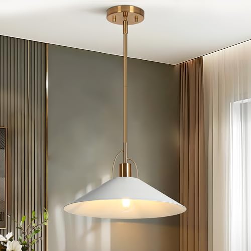 KSANA Pendant Lights Kitchen Island 14'' Gold and White Metal Pendant Light
View Price
KSANA Pendant Lights Kitchen Island 14'' Gold and White Metal Pendant Light
View Price
 TOPZEA 10 Pack Round Gift Baskets, 8 Inch Natural Bamboo Woven Fruit Basket, Small Wicker Bread Roll Serving Basket, Food Storage Bin Handmade Baskets for Kitchen Restaurant Centerpiece Christmas
View Price
TOPZEA 10 Pack Round Gift Baskets, 8 Inch Natural Bamboo Woven Fruit Basket, Small Wicker Bread Roll Serving Basket, Food Storage Bin Handmade Baskets for Kitchen Restaurant Centerpiece Christmas
View Price
 ZeeMart Linen Textured Border Table Runner, 14 x 72 Inch White
View Price
ZeeMart Linen Textured Border Table Runner, 14 x 72 Inch White
View Price
 Unique Loom Sofia Collection Area Rug - Grand (5' 3" x 8' Oval, Light Gray/ Ivory)
View Price
Unique Loom Sofia Collection Area Rug - Grand (5' 3" x 8' Oval, Light Gray/ Ivory)
View Price
 Large Framed Boho Black White Abstract Wall Art for Living Room, 24x36 In
View Price
Large Framed Boho Black White Abstract Wall Art for Living Room, 24x36 In
View Price
Choose Chairs That Add Texture, Not Color
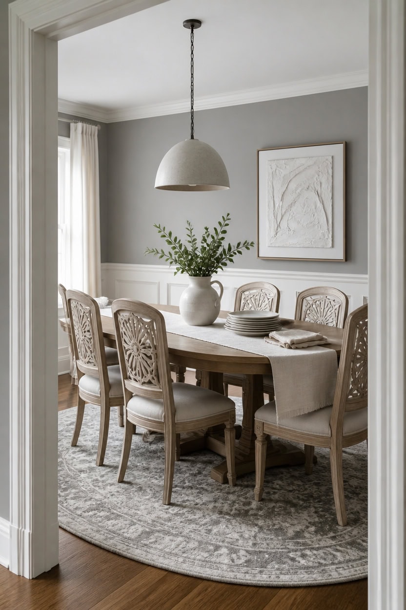
Wood-back dining chairs with carved panels add texture when the accent wall behind them stays light gray Museum Piece. Very light white Seapearl on the trim keeps the sightline clean so grain and shape read first. Set a linen table runner with folded napkins and stacked plates at center to keep chairs as the focal texture.
Vary the back shape: Mix ladder-back or wood-panel chairs for grain, not extra hue.
Keep the seat fabric neutral: Stick to cream or oatmeal upholstery so texture, not color, stands out.
Layer materials: Combine cane, rattan, or woven rush with the solid wood frame.
Limit to two finishes: One wood tone and one fabric keeps the look calm.
the light gray backdrop lets carved chair backs read as texture instead of blending into busy color. [light]
the very light white edge keeps sightlines crisp so chair silhouettes stand out. [very light]
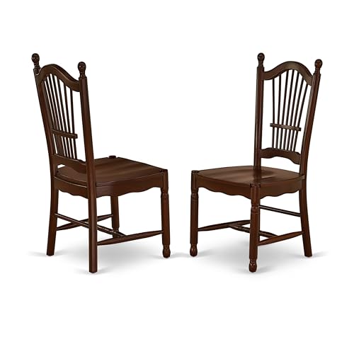 East West Furniture DOC-MAH-W Dover Kitchen Dining Chairs - Slat Back Wood Seat Chairs, Set of 2, Mahogany
View Price
East West Furniture DOC-MAH-W Dover Kitchen Dining Chairs - Slat Back Wood Seat Chairs, Set of 2, Mahogany
View Price
 BESTANO Woven Rattan Dining Chairs Set of 4, Farmhouse Wicker Boho Dining Chairs, Armless Wooden Cane Kitchen Dining Chair with Weave Hemp Seat and Back
View Price
BESTANO Woven Rattan Dining Chairs Set of 4, Farmhouse Wicker Boho Dining Chairs, Armless Wooden Cane Kitchen Dining Chair with Weave Hemp Seat and Back
View Price
 Gandeer 6 Sets Boho Place Mats Set Round Woven Placemats Table Decor
View Price
Gandeer 6 Sets Boho Place Mats Set Round Woven Placemats Table Decor
View Price
 ROYAL CRAFT WOOD Wooden Cutting Boards for Kitchen Appliances - Non Toxic Bamboo Wood Cutting Board Set with Deep Juice Groove, Side Handles, Charcuterie & Butcher Block for Meat, Meal Prep & Serving
View Price
ROYAL CRAFT WOOD Wooden Cutting Boards for Kitchen Appliances - Non Toxic Bamboo Wood Cutting Board Set with Deep Juice Groove, Side Handles, Charcuterie & Butcher Block for Meat, Meal Prep & Serving
View Price
 JONATHAN Y Boho Vintage Diamond Cream/Gray Oval Area Rug 4X6 ft, Moroccan Hype for Living Room, Bedroom, Kitchen, Office, Easy-Cleaning, High Traffic, Pet-Friendly, Non-Shedding (MOH101B-4OV)
View Price
JONATHAN Y Boho Vintage Diamond Cream/Gray Oval Area Rug 4X6 ft, Moroccan Hype for Living Room, Bedroom, Kitchen, Office, Easy-Cleaning, High Traffic, Pet-Friendly, Non-Shedding (MOH101B-4OV)
View Price
 Ayshwilldec 17.6 inch Hemp Rope Woven Pendant Light Wicker Pendant Light 3-light Rattan Light Fixture Boho Chandelier Farmhouse Chandelier Dome Pendants Light for Dining Room Bedroom Kitchen(Bulb Incl
View Price
Ayshwilldec 17.6 inch Hemp Rope Woven Pendant Light Wicker Pendant Light 3-light Rattan Light Fixture Boho Chandelier Farmhouse Chandelier Dome Pendants Light for Dining Room Bedroom Kitchen(Bulb Incl
View Price
 Ceramic Flower Vase with Handle, 9.65 inch Tall Ceramic Vase Home Decor Farmhouse Pitcher Vases Decorative Table Vases for Living Room Bathroom Coffee Table Centerpieces Bookshelf Kitchen Fireplace
View Price
Ceramic Flower Vase with Handle, 9.65 inch Tall Ceramic Vase Home Decor Farmhouse Pitcher Vases Decorative Table Vases for Living Room Bathroom Coffee Table Centerpieces Bookshelf Kitchen Fireplace
View Price
Add Natural Materials to Soften the Space
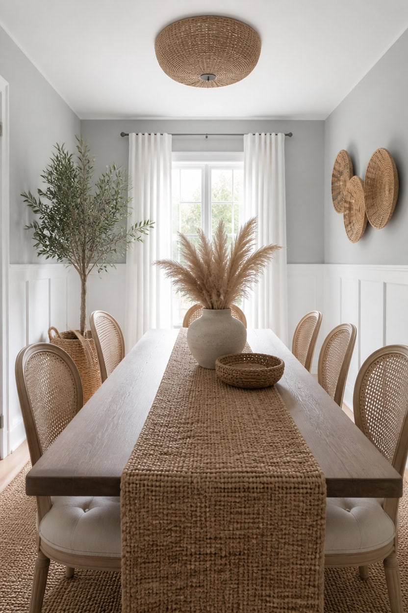
Light gray Shaker Gray on the main walls grounds the room while letting jute and rattan textures stand out. Very light white Rock Harbor Violet on the wainscoting keeps the lower half crisp so natural fibers read as the focus. A potted olive tree in a floor planter beside the table adds living texture that softens the hard lines.
Layer natural fibers: Combine jute, rattan, and wicker so textures vary without adding color.
Bring in a live plant: A floor planter adds organic shape and softens straight furniture lines.
Use wood grain accents: Choose unfinished or lightly stained wood pieces for warmth.
Add woven textiles: Swap smooth linens for a chunky jute runner or woven placemats.
the light gray backdrop lets rattan and jute textures stand out without competing for attention. [light]
the very light white base keeps the lower wall crisp so natural fiber accents read clearly. [very light]
 Blueming Home Decor Medium Olive Tree Basket, Natural Woven Planter
View Price
Blueming Home Decor Medium Olive Tree Basket, Natural Woven Planter
View Price
 TYBOATLE Farmhouse Rattan Dining Chairs Set of 4 (Cream White)
View Price
TYBOATLE Farmhouse Rattan Dining Chairs Set of 4 (Cream White)
View Price
 Rpzloila 12.6” Rattan Ceiling Light, 3-Light Boho Light Fixture
View Price
Rpzloila 12.6” Rattan Ceiling Light, 3-Light Boho Light Fixture
View Price
 COTTON CRAFT Jute Braided Table Runner - 13x36 inches Natural Table Runner
View Price
COTTON CRAFT Jute Braided Table Runner - 13x36 inches Natural Table Runner
View Price
 Teakhaus Edge-Grain Teak Wood Carving Board with Juice Groove, Extra Large
View Price
Teakhaus Edge-Grain Teak Wood Carving Board with Juice Groove, Extra Large
View Price
 9 Pack Boho Wall Basket Set, hanging Woven Wall Basket Decor, Seagrass Rattan Wicker Boho Wall Decor, Eco-Friendly Round Art for Farmhouse Bedroom Living Room Display Table Settings Kitchen Home
View Price
9 Pack Boho Wall Basket Set, hanging Woven Wall Basket Decor, Seagrass Rattan Wicker Boho Wall Decor, Eco-Friendly Round Art for Farmhouse Bedroom Living Room Display Table Settings Kitchen Home
View Price
 Craft Trade Reversible Oval Braided Jute Area Rug, Natural Fiber, 5x7 ft
View Price
Craft Trade Reversible Oval Braided Jute Area Rug, Natural Fiber, 5x7 ft
View Price
 Tiangrid 25 Pcs Dried Pampas Grass Centerpiece with Ceramic Vases, Retro
View Price
Tiangrid 25 Pcs Dried Pampas Grass Centerpiece with Ceramic Vases, Retro
View Price
8' x 10' Rugs for This Palette
Rugs USA best sellers in this palette's colors, linked in 8' x 10', the size for a table that seats four to six, so the chairs stay on the rug when pulled out. Every design comes in other sizes too.
- Free shipping
- 30-day returns
- 210,000+ five-star reviews
 Moroccan Trellis Rug – Grey
View Price
Moroccan Trellis Rug – Grey
View Price
 Keyara Spill Proof Washable Rug – Stone
View Price
Keyara Spill Proof Washable Rug – Stone
View Price
 Florid Dreams Rug – Silver
View Price
Florid Dreams Rug – Silver
View Price
 Everywhere Hand-Braided Indoor/Outdoor Rug – Salt And Pepper
View Price
Everywhere Hand-Braided Indoor/Outdoor Rug – Salt And Pepper
View Price
 Ring Around The Rosette Rug – Grey
View Price
Ring Around The Rosette Rug – Grey
View Price
 Broken Lattice Rug – Grey
View Price
Broken Lattice Rug – Grey
View Price
 Honeycomb Labyrinth Rug – Grey
View Price
Honeycomb Labyrinth Rug – Grey
View Price
 Ruby Distressed Mist Rug – Grey
View Price
Ruby Distressed Mist Rug – Grey
View Price
 Moroccan Trellis Rug – Dark Grey
View Price
Moroccan Trellis Rug – Dark Grey
View Price
 Harley Vintage Medallion Rug – Light Grey
View Price
Harley Vintage Medallion Rug – Light Grey
View Price
 Mae Traverse Stripes Rug – Grey
View Price
Mae Traverse Stripes Rug – Grey
View Price
 Adelaide Harlequin Indoor/Outdoor Rug – Dark Grey
View Price
Adelaide Harlequin Indoor/Outdoor Rug – Dark Grey
View Price
 Iris Textured Abstract Rug – Light Grey
View Price
Iris Textured Abstract Rug – Light Grey
View Price
 Striped Border Indoor/Outdoor Flatweave Rug – Dark Grey
View Price
Striped Border Indoor/Outdoor Flatweave Rug – Dark Grey
View Price
 Shaggy Lattice Tassel Rug – Light Grey
View Price
Shaggy Lattice Tassel Rug – Light Grey
View Price
 Bayberry Spill Proof Vintage Washable Rug – Green Grey
View Price
Bayberry Spill Proof Vintage Washable Rug – Green Grey
View Price
 Broken Lattice Rug – Charcoal
View Price
Broken Lattice Rug – Charcoal
View Price
 Everywhere Hand-Braided Indoor/Outdoor Rug – Charcoal
View Price
Everywhere Hand-Braided Indoor/Outdoor Rug – Charcoal
View Price
 Ripple Waves Rug – Grey
View Price
Ripple Waves Rug – Grey
View Price
 Perfect Handwoven Jute-Blend Rug – Charcoal
View Price
Perfect Handwoven Jute-Blend Rug – Charcoal
View Price
 Fredrika Geometric Washable Rug – Light Grey
View Price
Fredrika Geometric Washable Rug – Light Grey
View Price
 Andrea Bordered Spill Proof Washable Rug – Charcoal
View Price
Andrea Bordered Spill Proof Washable Rug – Charcoal
View Price
 Iliana Striped Starfish Rug – Grey
View Price
Iliana Striped Starfish Rug – Grey
View Price
 Monochrome Bordered Indoor/Outdoor Rug – Grey
View Price
Monochrome Bordered Indoor/Outdoor Rug – Grey
View Price
 Melrose Checked Rug – Charcoal
View Price
Melrose Checked Rug – Charcoal
View Price
 Downing Plaid Wool Rug by Nate Berkus – Grey
View Price
Downing Plaid Wool Rug by Nate Berkus – Grey
View Price
 Sundara Modern Plaid Indoor/Outdoor Rug – Grey Multi
View Price
Sundara Modern Plaid Indoor/Outdoor Rug – Grey Multi
View Price
 Softest Knit Wool Rug – Off White
View Price
Softest Knit Wool Rug – Off White
View Price
 Jute Braided Rug – Off White
View Price
Jute Braided Rug – Off White
View Price
 Chunky Jute Tasseled Rug – Off White
View Price
Chunky Jute Tasseled Rug – Off White
View Price
 Moroccan Diamond Pinstripes Tassel Rug – Off White
View Price
Moroccan Diamond Pinstripes Tassel Rug – Off White
View Price
 Plush Solid Shaggy Rug – Off White
View Price
Plush Solid Shaggy Rug – Off White
View Price
 Easy Shag Lattice Rug – White
View Price
Easy Shag Lattice Rug – White
View Price
 Handwoven Jute Ribbed Solid Rug – Off White
View Price
Handwoven Jute Ribbed Solid Rug – Off White
View Price
 Handspun Jute Rug – Off White
View Price
Handspun Jute Rug – Off White
View Price
 Washable Solid Shag Rug – Off White
View Price
Washable Solid Shag Rug – Off White
View Price
 Pearl Contemporary Mars Rug – Blush
View Price
Pearl Contemporary Mars Rug – Blush
View Price
 Speckled Wool-Blend Rug – Alabaster
View Price
Speckled Wool-Blend Rug – Alabaster
View Price
 Ivana Checkered Plush Cloud Washable Rug – Off White
View Price
Ivana Checkered Plush Cloud Washable Rug – Off White
View Price
 Jute Braided Saturn Border Rug – Off White
View Price
Jute Braided Saturn Border Rug – Off White
View Price
Use Lighting to Warm Up Gray and White Rooms
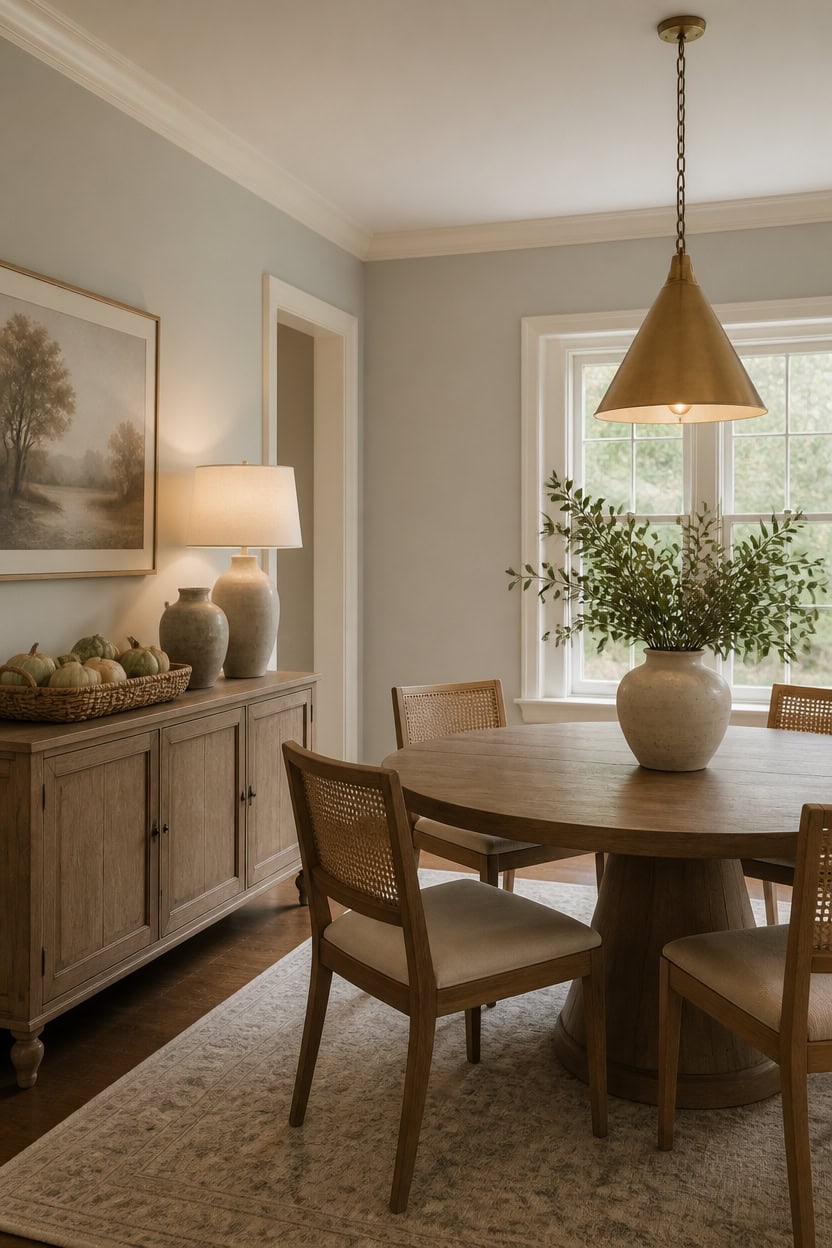
A woven basket of gourds on the sideboard catches the warm glow. Warm brass sconces beside the built-ins cast a golden glow that keeps the very light gray Wish accent wall from feeling flat. Very light white Mascarpone trim frames the same wall, bouncing that warm light back into the room instead of absorbing it.
Layer three light sources: Combine overhead, task, and ambient lighting for even warmth.
Choose warm bulb temperature: Pick bulbs around 2700K to counter cool gray and white tones.
Add dimmers: Dimmer switches let you adjust brightness for daytime meals and evening gatherings.
Use metallic finishes: Brass fixtures reflect light with a golden cast that softens gray walls.
the very light gray backdrop lets warm light bounce without going stark. [very light]
the very light white trim reflects warm bulb tones instead of absorbing them. [very light]
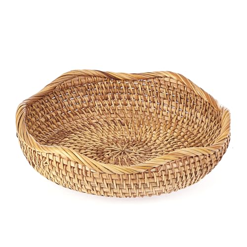 Hipiwe Natural Rattan Tray 8.5" Wicker Key Basket Bowl for Entryway Table
View Price
Hipiwe Natural Rattan Tray 8.5" Wicker Key Basket Bowl for Entryway Table
View Price
 Signature Design by Ashley Bolanburg Upholstered Wood Dining Chairs, 2 Pack
View Price
Signature Design by Ashley Bolanburg Upholstered Wood Dining Chairs, 2 Pack
View Price
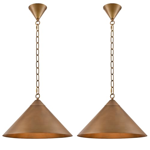 Caiselee 15.8 Inch Antique Brass Farmhouse Pendant Lights, 2 Pack All Metal Kitchen Island Pendant Lighting 71'' Adjustable, Vintage Cone Hanging Light Fixture for Dining Room Table Sink Entryway Bar
View Price
Caiselee 15.8 Inch Antique Brass Farmhouse Pendant Lights, 2 Pack All Metal Kitchen Island Pendant Lighting 71'' Adjustable, Vintage Cone Hanging Light Fixture for Dining Room Table Sink Entryway Bar
View Price
 LITTLE TREE Round Dining Table for 4-6 People, 47 Inches Dining Room Table with Wooden Pedestal Base, Modern Dinner Table, Circle Kitchen Tables for Dining Room, Kitchen, Living Room(Table Only)
View Price
LITTLE TREE Round Dining Table for 4-6 People, 47 Inches Dining Room Table with Wooden Pedestal Base, Modern Dinner Table, Circle Kitchen Tables for Dining Room, Kitchen, Living Room(Table Only)
View Price
 Aipsun Brushed Brass Wall Sconce Indoor Wall Lights Hardwired 1 Pack Up and Down Wall Mount Light for Living Room Bedroom Hallway Corridor Conservatory Warm White 3000K(with G9 Bulbs)
View Price
Aipsun Brushed Brass Wall Sconce Indoor Wall Lights Hardwired 1 Pack Up and Down Wall Mount Light for Living Room Bedroom Hallway Corridor Conservatory Warm White 3000K(with G9 Bulbs)
View Price
 Small Bedside Night Table Lamp for Bedroom, Minimalist Nightstand Lamp with Round Fabric Linen Shade, Study Reading Desk Lamp for Kids Room, Living Room, College Dorm, Home, Office
View Price
Small Bedside Night Table Lamp for Bedroom, Minimalist Nightstand Lamp with Round Fabric Linen Shade, Study Reading Desk Lamp for Kids Room, Living Room, College Dorm, Home, Office
View Price
 GE Relax LED Light Bulbs, 60 Watt, Soft White, A19 (4 Pack)
View Price
GE Relax LED Light Bulbs, 60 Watt, Soft White, A19 (4 Pack)
View Price
 Carrot's Den White Ceramic Vase, Matte Textured Entryway Table Decor
View Price
Carrot's Den White Ceramic Vase, Matte Textured Entryway Table Decor
View Price
Add Texture Through Rugs, Linens, and Drapery
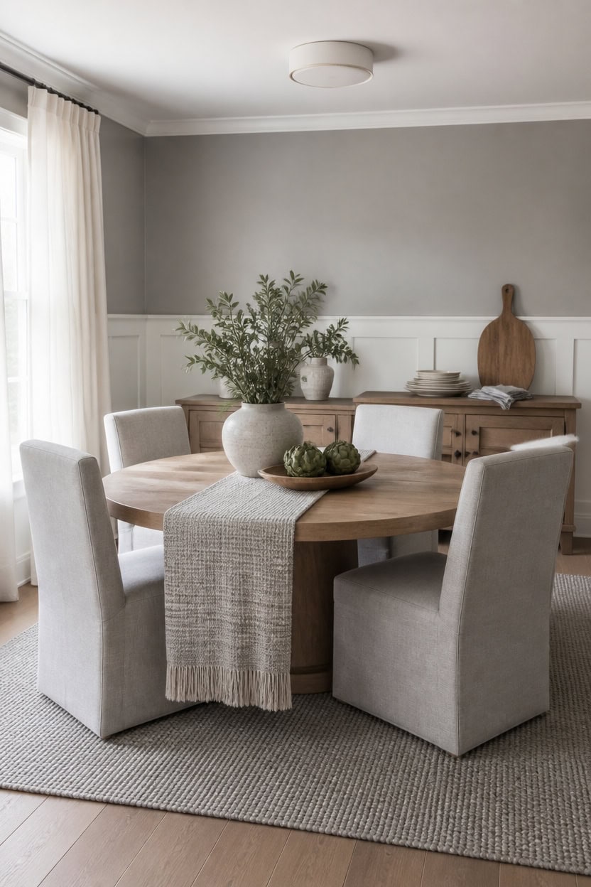
A wool rug, linen napkins, and floor-length drapery add texture without adding color to gray and white rooms. Very light gray Thundercloud Gray walls and very light white Vanilla Milkshake wainscoting stay quiet so woven textures stand out. Set a stack of serving platters with a carving board on the sideboard for matte, tactile contrast.
Layer a wool rug: A low-pile wool rug under the table adds texture without competing with painted walls.
Choose textured linens: Slubbed linen tablecloths and napkins bring subtle grain to the table setting.
Hang floor-length drapery: Heavy drapery panels soften hard corners and add visual weight near windows.
Mix woven and knit fibers: Combine jute, wool, and cotton so no single texture dominates the room.
the very light gray keeps the backdrop calm so layered textiles stand out. [very light]
the very light white trim adds a soft break beneath textured drapery. [very light]
 SAFAVIEH Abstract Area Rug 8x10, Wool Handmade Large Ivory & Grey ABT468G
View Price
SAFAVIEH Abstract Area Rug 8x10, Wool Handmade Large Ivory & Grey ABT468G
View Price
 INFEI Plain Striped Cotton Linen Blended Dinner Cloth Napkins - Set of 12 (40 x 30 cm) - for Events & Home Use (Grey)
View Price
INFEI Plain Striped Cotton Linen Blended Dinner Cloth Napkins - Set of 12 (40 x 30 cm) - for Events & Home Use (Grey)
View Price
 ANRODUO Extra Long Ivory Semi Sheer Linen Curtains 108 inch Length 2 Panels
View Price
ANRODUO Extra Long Ivory Semi Sheer Linen Curtains 108 inch Length 2 Panels
View Price
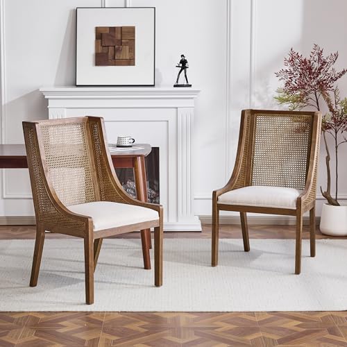 Christopher Knight Home Yone Dining Chairs Set of 2, Modern Dining Chair with Fabric Upholstery, Rubberwood Frame Kitchen Chairs with Cane Webbing, Extra Seat for Dining Room, Beige + Brown
View Price
Christopher Knight Home Yone Dining Chairs Set of 2, Modern Dining Chair with Fabric Upholstery, Rubberwood Frame Kitchen Chairs with Cane Webbing, Extra Seat for Dining Room, Beige + Brown
View Price
 Mikniri 3-Light Semi Flush Mount Ceiling Light, Kitchen Lighting Fixtures Ceiling, Black Dining Room Light Fixtures, Farmhouse Close to Ceiling Lights with Hexagon Cage for Bedroom Hallway Foyer
View Price
Mikniri 3-Light Semi Flush Mount Ceiling Light, Kitchen Lighting Fixtures Ceiling, Black Dining Room Light Fixtures, Farmhouse Close to Ceiling Lights with Hexagon Cage for Bedroom Hallway Foyer
View Price
 LITTLE TREE 47 Inches Round Dining Table for 4, Farmhouse Natural Wooden Dining Room Table with Heavy Duty Fluted Pedestal, Large Circle Kitchen Dinner Table for Dining Room, Living Room (Table Only)
View Price
LITTLE TREE 47 Inches Round Dining Table for 4, Farmhouse Natural Wooden Dining Room Table with Heavy Duty Fluted Pedestal, Large Circle Kitchen Dinner Table for Dining Room, Living Room (Table Only)
View Price
 Manspdier Extra Large Wood 3 Tier Serving Tray Three Tiered Cupcake Stand
View Price
Manspdier Extra Large Wood 3 Tier Serving Tray Three Tiered Cupcake Stand
View Price
 Creative Co-op 72" Woven Cotton Textured Table Runner with Pom Poms & Tassels (DF2416)
View Price
Creative Co-op 72" Woven Cotton Textured Table Runner with Pom Poms & Tassels (DF2416)
View Price
Wall Art for This Palette
The best-reviewed prints at Wayfair in this palette's colors. Most come in several sizes.
- Free shipping over $35
- Picked at 4.5 stars or higher
 White and Grey Geometric Depths I Abstract Geometric
View Price
White and Grey Geometric Depths I Abstract Geometric
View Price
 Beige Botanical Impressions III Abstract Botanicals
View Price
Beige Botanical Impressions III Abstract Botanicals
View Price
 Sweet Peonies I by Vincent Van Gogh
View Price
Sweet Peonies I by Vincent Van Gogh
View Price
 Cool Grey Horizon I
View Price
Cool Grey Horizon I
View Price
 Sun Mountain Landscape Abstract Neutral Forest
View Price
Sun Mountain Landscape Abstract Neutral Forest
View Price
 Grunge Abstract Paint Stroke Effect Tan Gray Neutral
View Price
Grunge Abstract Paint Stroke Effect Tan Gray Neutral
View Price
 Sky Above Photograph
View Price
Sky Above Photograph
View Price
 Pine Tree Misty Mountain II
View Price
Pine Tree Misty Mountain II
View Price
 Ride on Time by Philippe Sainte Laudy
View Price
Ride on Time by Philippe Sainte Laudy
View Price
 Orange and Grey Forest Autumn Elegance II Forest
View Price
Orange and Grey Forest Autumn Elegance II Forest
View Price
 Minimal Landscape Grunge Green Gray Abstract
View Price
Minimal Landscape Grunge Green Gray Abstract
View Price
 Violet Gray I Painting
View Price
Violet Gray I Painting
View Price
 Abstract Shapes and Infinity Lines I Abstract Shapes
View Price
Abstract Shapes and Infinity Lines I Abstract Shapes
View Price
 Abstract Blue Landscape Modern Minimalist Navy Blue
View Price
Abstract Blue Landscape Modern Minimalist Navy Blue
View Price
 Ocean Eye I 3 Piece Wrapped Canvas Print Set
View Price
Ocean Eye I 3 Piece Wrapped Canvas Print Set
View Price
 Mid Century Modern Black and White Minimalist Abstract Home
View Price
Mid Century Modern Black and White Minimalist Abstract Home
View Price
 Mid Century Shape Abstract Contours Black and White Beige
View Price
Mid Century Shape Abstract Contours Black and White Beige
View Price
 White and Blue Feather Spiral II Abstract Geometric
View Price
White and Blue Feather Spiral II Abstract Geometric
View Price
 Mid Century Modern Boho Duotone Beige Abstract Lines
View Price
Mid Century Modern Boho Duotone Beige Abstract Lines
View Price
 Pastel Tan Brown Green Hues
View Price
Pastel Tan Brown Green Hues
View Price
 Abstract Botanical Faded Sage Green Tropical Palm Tree
View Price
Abstract Botanical Faded Sage Green Tropical Palm Tree
View Price
 Coral Teal Bold Mountains Landscape Mountain
View Price
Coral Teal Bold Mountains Landscape Mountain
View Price
 Abstract Geode Gold and Blue Marble Abstract Marble
View Price
Abstract Geode Gold and Blue Marble Abstract Marble
View Price
 Minted Brush Canvas Minimal Abstracts by Art Remedy
View Price
Minted Brush Canvas Minimal Abstracts by Art Remedy
View Price
 Watercolor Tan Brown Waves Organic Modern Abstract
View Price
Watercolor Tan Brown Waves Organic Modern Abstract
View Price
 Autumn Kitchen by Danhui Nai
View Price
Autumn Kitchen by Danhui Nai
View Price
 And Minimal Woman Silhouette I Abstract Shapes
View Price
And Minimal Woman Silhouette I Abstract Shapes
View Price
Keep Wall Art Minimal in This Palette
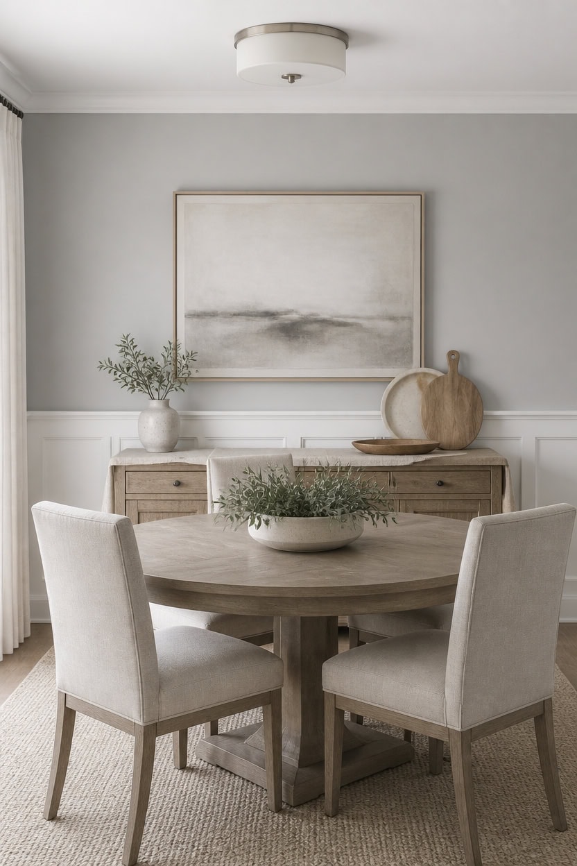
A single framed piece or a small pair of matted prints reads calmer against very light gray Thundercloud Gray walls than a crowded gallery wall. Very light white Vanilla Milkshake wainscoting adds a quiet line beneath the art without competing for attention. Near the sideboard, a stack of serving platters with a carving board fills the wall space instead of more frames.
Limit to one focal piece: Choose a single large print instead of a cluster of small frames.
Leave breathing room: Keep bare wall space around the art so it stands out on its own.
Match frame tone to trim: Pick a frame finish that echoes the wainscoting for a built-in look.
Skip matching sets: Choose one statement piece over identical framed sets that read busy.
the very light gray keeps the backdrop calm so a single framed piece stands out. [very light]
the very light white trim adds a soft line beneath the art without competing for attention. [very light]
 Large Framed Neutral Beige Minimalist Abstract Wall Art, Vertical 30x60 In
View Price
Large Framed Neutral Beige Minimalist Abstract Wall Art, Vertical 30x60 In
View Price
 Tribesigns 47 inch Round Dining Table Wood Kitchen Table for Dining Room, 47" Dinner Room Tables for 4-6, Farmhouse Accent Furniture with Wooden Tabletop and Cross Base, Brown+Black
View Price
Tribesigns 47 inch Round Dining Table Wood Kitchen Table for Dining Room, 47" Dinner Room Tables for 4-6, Farmhouse Accent Furniture with Wooden Tabletop and Cross Base, Brown+Black
View Price
 EVERLUNE Boho Mid Century Modern Dining Chairs Set of 2, Rattan Dinning Chair with a Square Back, Warm Beige Cane Dining Chair, Linen Upholstered Kitchen and Dining Room Chairs, Sillas para Comedor
View Price
EVERLUNE Boho Mid Century Modern Dining Chairs Set of 2, Rattan Dinning Chair with a Square Back, Warm Beige Cane Dining Chair, Linen Upholstered Kitchen and Dining Room Chairs, Sillas para Comedor
View Price
 Kalium 3-Lights Semi Flush Mount Ceiling Light Fixture Black for Kitchen
View Price
Kalium 3-Lights Semi Flush Mount Ceiling Light Fixture Black for Kitchen
View Price
 4-Pack Plastic 16" x 11" Large White Serving Trays Set - Reusable Serving Platters for Cookie, Appetizer, Charcuterie, Snack, Dessert, Party Food Display - Stackable Kitchen CounterTop Tray, BPA Free
View Price
4-Pack Plastic 16" x 11" Large White Serving Trays Set - Reusable Serving Platters for Cookie, Appetizer, Charcuterie, Snack, Dessert, Party Food Display - Stackable Kitchen CounterTop Tray, BPA Free
View Price
 Chardin Home Cotton Table Runner, 13x72 Inch, Neutral Beige Ivory
View Price
Chardin Home Cotton Table Runner, 13x72 Inch, Neutral Beige Ivory
View Price
 Ceramic White Small Vase, Dry Flower Vases Minimalism Style for Modern Table Shelf Home Decor, Fit for Fireplace Bedroom Kitchen Living Room Centerpieces Office Desk Gift (White, Small)
View Price
Ceramic White Small Vase, Dry Flower Vases Minimalism Style for Modern Table Shelf Home Decor, Fit for Fireplace Bedroom Kitchen Living Room Centerpieces Office Desk Gift (White, Small)
View Price
 Boswillon Floating Shelves Set of 2, Small Wall Shelf with Lip, 16in, Black
View Price
Boswillon Floating Shelves Set of 2, Small Wall Shelf with Lip, 16in, Black
View Price
Choose Flooring That Complements Gray and White
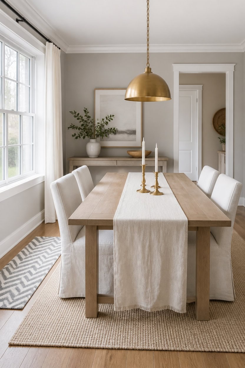
Warm mid-tone wood flooring pairs well with light gray Heather Gray walls and very light white Etiquette trim, since its warmth offsets the cool undertones in both paints. Boards with subtle grain variation hide daily scuffs better than a flat, uniform finish. Near the sideboard, a cluster of three brass candlesticks echoes the floor’s warm tone.
Match warm tones: Choose flooring with warm undertones to balance the room’s cool gray and white palette.
Test large samples: Lay flooring samples flat under both artificial and natural light before deciding.
Choose matte finish: A matte or low-sheen floor avoids glare next to light-reflecting white trim.
Coordinate with rugs: Pick a rug that bridges the floor tone and the wall color for continuity.
the light gray grounds the room without competing with the flooring’s warm tone. [light]
the very light white trim keeps sightlines crisp against the new floor. [very light]
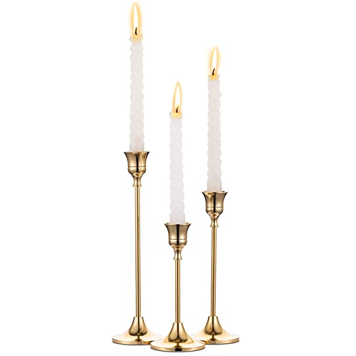 Candlestick Holders Taper Candle Holders, Set of 3 Candle Stick Holders Set, Brass Gold Candlestick Holder Set, Vintage Modern Decorative Centerpiece for Table Mantel Wedding Housewarming Gift
View Price
Candlestick Holders Taper Candle Holders, Set of 3 Candle Stick Holders Set, Brass Gold Candlestick Holder Set, Vintage Modern Decorative Centerpiece for Table Mantel Wedding Housewarming Gift
View Price
 Christopher Knight Home Ace 70.28'L Solid Wood Dining Table for 6-8 People, Rubber Wood Dining Room Table, Minimalist Modern Rectangular Kitchen Table, Easy Assembly Dining Room Furniture, Natural
View Price
Christopher Knight Home Ace 70.28'L Solid Wood Dining Table for 6-8 People, Rubber Wood Dining Room Table, Minimalist Modern Rectangular Kitchen Table, Easy Assembly Dining Room Furniture, Natural
View Price
 CIMOTA Removable Slipcovered Dining Chairs Set of 2, Modern Upholstered Kitchen Chairs, Armless Kitchen & Dining Room Side Chair, Linen Beige
View Price
CIMOTA Removable Slipcovered Dining Chairs Set of 2, Modern Upholstered Kitchen Chairs, Armless Kitchen & Dining Room Side Chair, Linen Beige
View Price
 Gold Pendant Light 2 Packs, Modern Farmhouse Pendant Lights Kitchen Island
View Price
Gold Pendant Light 2 Packs, Modern Farmhouse Pendant Lights Kitchen Island
View Price
 Tosuoka Washable Rug 8x10 Area Rugs for Living Room, Beige Cream Abstract
View Price
Tosuoka Washable Rug 8x10 Area Rugs for Living Room, Beige Cream Abstract
View Price
 Nailttos Gray Runner Rugs for Hallway, 2x6 Washable Luxury Bathroom Rugs
View Price
Nailttos Gray Runner Rugs for Hallway, 2x6 Washable Luxury Bathroom Rugs
View Price
 AuldHome Design White Hobnail Ceramic Pitcher (Large), Vintage Retro Style
View Price
AuldHome Design White Hobnail Ceramic Pitcher (Large), Vintage Retro Style
View Price
 ZeeMart Linen Checked Farmhouse Table Runner, 13x72 Inches Neutral Beige
View Price
ZeeMart Linen Checked Farmhouse Table Runner, 13x72 Inches Neutral Beige
View Price
Removable Wallpaper for This Palette
Removable designer wallpaper from Wallshoppe, picked to match this palette. An easy way to add pattern to any room, and every design is available as a sample.
- Designed and printed in the USA
- Non-toxic inks
- Featured in NYT Wirecutter
 The Queens Lace' Wallpaper by Sarah Jessica Parker – Silver
View Price
The Queens Lace' Wallpaper by Sarah Jessica Parker – Silver
View Price
 Sweet Caroline Wallpaper by Wallshoppe – Fog
View Price
Sweet Caroline Wallpaper by Wallshoppe – Fog
View Price
 Best Fronds Wallpaper by Wallshoppe – Storm
View Price
Best Fronds Wallpaper by Wallshoppe – Storm
View Price
 Pinstripe Wallpaper by Sugar Paper – Grey
View Price
Pinstripe Wallpaper by Sugar Paper – Grey
View Price
 Small Dumbo Wallpaper by Chris Benz – Black
View Price
Small Dumbo Wallpaper by Chris Benz – Black
View Price
 Best Fronds Wallpaper by Wallshoppe – Gray
View Price
Best Fronds Wallpaper by Wallshoppe – Gray
View Price
 Bloc Wallpaper by Wallshoppe – Stone
View Price
Bloc Wallpaper by Wallshoppe – Stone
View Price
 Eleanor Rigby Wallpaper by Wallshoppe – Storm
View Price
Eleanor Rigby Wallpaper by Wallshoppe – Storm
View Price
 The Queens Lace' Wallpaper by Sarah Jessica Parker – Pepper
View Price
The Queens Lace' Wallpaper by Sarah Jessica Parker – Pepper
View Price
 Bloc Wallpaper by Wallshoppe – Elephant
View Price
Bloc Wallpaper by Wallshoppe – Elephant
View Price
 Large Dumbo Wallpaper by Chris Benz – Black
View Price
Large Dumbo Wallpaper by Chris Benz – Black
View Price
 Crosstown Plaid On White Wallpaper by Sarah Jessica Parker – Silver Pearl
View Price
Crosstown Plaid On White Wallpaper by Sarah Jessica Parker – Silver Pearl
View Price
 Pebble Wallpaper by Sugar Paper – Grey On White
View Price
Pebble Wallpaper by Sugar Paper – Grey On White
View Price
 Faux Bois Wallpaper by Nathan Turner – Onyx
View Price
Faux Bois Wallpaper by Nathan Turner – Onyx
View Price
 Faux Bois Wallpaper by Nathan Turner – Grey
View Price
Faux Bois Wallpaper by Nathan Turner – Grey
View Price
 Pratt Paint Wallpaper by Chris Benz – Silver
View Price
Pratt Paint Wallpaper by Chris Benz – Silver
View Price
 Splattered Wallpaper by Nathan Turner – Black / Neutral
View Price
Splattered Wallpaper by Nathan Turner – Black / Neutral
View Price
 Sofia Plaid Wallpaper by Wallshoppe – Fog
View Price
Sofia Plaid Wallpaper by Wallshoppe – Fog
View Price
 Townhouse Wallpaper by Sarah Jessica Parker – Peacock
View Price
Townhouse Wallpaper by Sarah Jessica Parker – Peacock
View Price
 Monroe Street Wallpaper by Chris Benz – Blue
View Price
Monroe Street Wallpaper by Chris Benz – Blue
View Price
 Pacifico Palm Wallpaper by Nathan Turner – Ivory
View Price
Pacifico Palm Wallpaper by Nathan Turner – Ivory
View Price
 Monroe Street Wallpaper by Chris Benz – Brown
View Price
Monroe Street Wallpaper by Chris Benz – Brown
View Price
 Small Dumbo Wallpaper by Chris Benz – Navy
View Price
Small Dumbo Wallpaper by Chris Benz – Navy
View Price
 Persimmon Birds Wallpaper by Nathan Turner – Persimmon
View Price
Persimmon Birds Wallpaper by Nathan Turner – Persimmon
View Price
 The Queens Lace' Wallpaper by Sarah Jessica Parker – Misty Blue
View Price
The Queens Lace' Wallpaper by Sarah Jessica Parker – Misty Blue
View Price
 Townhouse Wallpaper by Sarah Jessica Parker – Pearl on Charcoal
View Price
Townhouse Wallpaper by Sarah Jessica Parker – Pearl on Charcoal
View Price
 El Quijote Wallpaper by Chris Benz – Multi / Blue / Green
View Price
El Quijote Wallpaper by Chris Benz – Multi / Blue / Green
View Price
 Monroe Street Wallpaper by Chris Benz – Yellow
View Price
Monroe Street Wallpaper by Chris Benz – Yellow
View Price
 Sweet Caroline Wallpaper by Wallshoppe – Blue
View Price
Sweet Caroline Wallpaper by Wallshoppe – Blue
View Price
 Townhouse Wallpaper by Sarah Jessica Parker – Morning Dew on Misty Blue
View Price
Townhouse Wallpaper by Sarah Jessica Parker – Morning Dew on Misty Blue
View Price
 Persimmon Birds Wallpaper by Nathan Turner – Mustard
View Price
Persimmon Birds Wallpaper by Nathan Turner – Mustard
View Price
 El Quijote Wallpaper by Chris Benz – Multi / Blue / Coral
View Price
El Quijote Wallpaper by Chris Benz – Multi / Blue / Coral
View Price
 Persimmon Birds Wallpaper by Nathan Turner – Washed Sienna
View Price
Persimmon Birds Wallpaper by Nathan Turner – Washed Sienna
View Price
 Small Dumbo Wallpaper by Chris Benz – Deep Sea
View Price
Small Dumbo Wallpaper by Chris Benz – Deep Sea
View Price
 Townhouse Wallpaper by Sarah Jessica Parker – Silver on Sage
View Price
Townhouse Wallpaper by Sarah Jessica Parker – Silver on Sage
View Price
 Ojai Stripe Wallpaper by Wallshoppe – Iced Chai
View Price
Ojai Stripe Wallpaper by Wallshoppe – Iced Chai
View Price
 Pacifico Palm Wallpaper by Nathan Turner – Garcelle Pink
View Price
Pacifico Palm Wallpaper by Nathan Turner – Garcelle Pink
View Price
 Townhouse Wallpaper by Sarah Jessica Parker – Pearl on Deep Navy
View Price
Townhouse Wallpaper by Sarah Jessica Parker – Pearl on Deep Navy
View Price
 Sweet Caroline Wallpaper by Wallshoppe – Green
View Price
Sweet Caroline Wallpaper by Wallshoppe – Green
View Price
 Lemons Wallpaper by Nathan Turner – White
View Price
Lemons Wallpaper by Nathan Turner – White
View Price
Style a Sideboard That Fits the Look
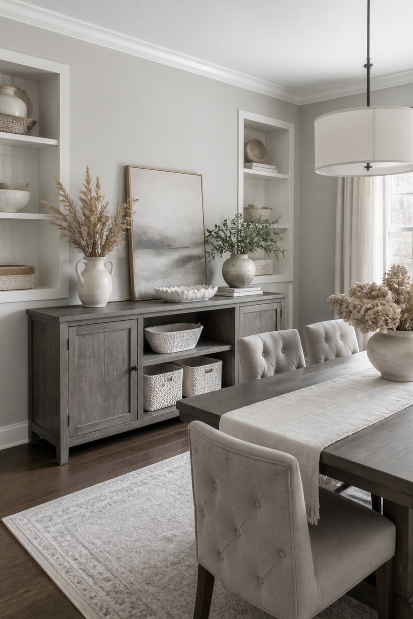
Group sideboard items in threes with varying heights to create a balanced vignette rather than a straight row. This asymmetry keeps the eye moving without cluttering the surface. Light gray Nightingale on the main walls and very light white Gray Lake on the built-in backs frame a ceramic pitcher holding dried grasses as the anchor piece.
Layer heights: Combine tall and short objects so the vignette reads three-dimensional.
Odd-number groupings: Cluster three to five pieces for a natural, unforced arrangement.
Leave negative space: Skip a third of the surface open so the eye can rest.
Anchor with function: Pair a serving piece with décor so the sideboard still feels useful.
the light gray keeps the sideboard vignette from competing with a busy backdrop. [light]
the very light white brightens the display without stealing focus from the pitcher and grasses. [very light]
 Quoowiit Ceramic Rustic Vase with Handle, White Distressed Decorative Farmhouse Pitcher Vase for Home Decor Living Room Bedroom Kitchen Office Shelf Decor Centerpiece Table Decoration
View Price
Quoowiit Ceramic Rustic Vase with Handle, White Distressed Decorative Farmhouse Pitcher Vase for Home Decor Living Room Bedroom Kitchen Office Shelf Decor Centerpiece Table Decoration
View Price
 VASAGLE Farmhouse Buffet Cabinet, Coffee Bar with 2 Drawers
View Price
VASAGLE Farmhouse Buffet Cabinet, Coffee Bar with 2 Drawers
View Price
 Yaheetech Dining Chairs Set of 2 Modern Upholstered Parson Chairs Dark Gray
View Price
Yaheetech Dining Chairs Set of 2 Modern Upholstered Parson Chairs Dark Gray
View Price
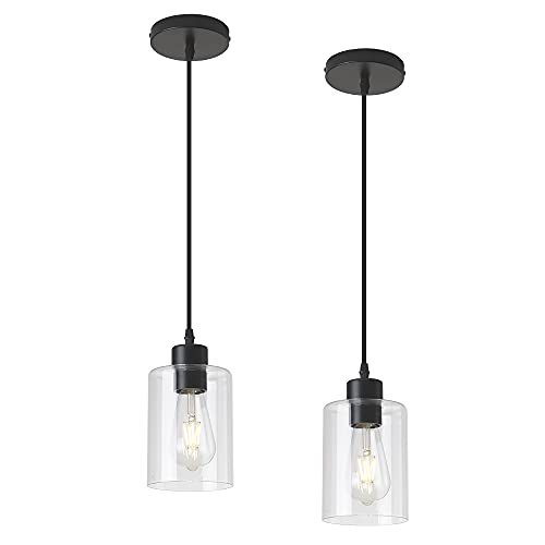 KLSS Modern Black Farmhouse Clear Glass Cylinder Pendant Light Fixture,Island Lights for Kitchen,Mini Pendant Lighting for Kitchen Island Decor - 4.75 Inch Shade 58 Inch Cord (Black 2 Pack)
View Price
KLSS Modern Black Farmhouse Clear Glass Cylinder Pendant Light Fixture,Island Lights for Kitchen,Mini Pendant Lighting for Kitchen Island Decor - 4.75 Inch Shade 58 Inch Cord (Black 2 Pack)
View Price
 Best Choice Products 9x12 Scalloped Shelf Baskets, Woven Storage Bins, Storage Organizers for Pantry, Living Room, Bedroom, Nursery & Laundry, 4 Pack - Natural with White Trim
View Price
Best Choice Products 9x12 Scalloped Shelf Baskets, Woven Storage Bins, Storage Organizers for Pantry, Living Room, Bedroom, Nursery & Laundry, 4 Pack - Natural with White Trim
View Price
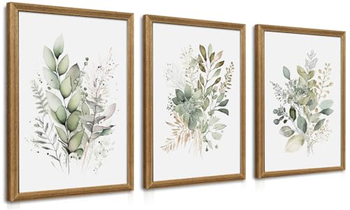 WRFON Framed Sage Green Botanical Wall Art Set of 3, Watercolor Eucalyptus & Wild Plant Canvas Prints, Minimalist Green Wall Decor for Living Room Bedroom Bathroom, 12x16 Inches
View Price
WRFON Framed Sage Green Botanical Wall Art Set of 3, Watercolor Eucalyptus & Wild Plant Canvas Prints, Minimalist Green Wall Decor for Living Room Bedroom Bathroom, 12x16 Inches
View Price
 Gurygo 8" Bathroom Trays - Ceramic Vanity Tray for Bathroom - Small Ceramic Tray - Kitchen Soap Trays - Porcelain Dispenser Organizer for Kitchen Bathtub Counter (White)
View Price
Gurygo 8" Bathroom Trays - Ceramic Vanity Tray for Bathroom - Small Ceramic Tray - Kitchen Soap Trays - Porcelain Dispenser Organizer for Kitchen Bathtub Counter (White)
View Price
Mix Matte and Glossy Finishes for Depth
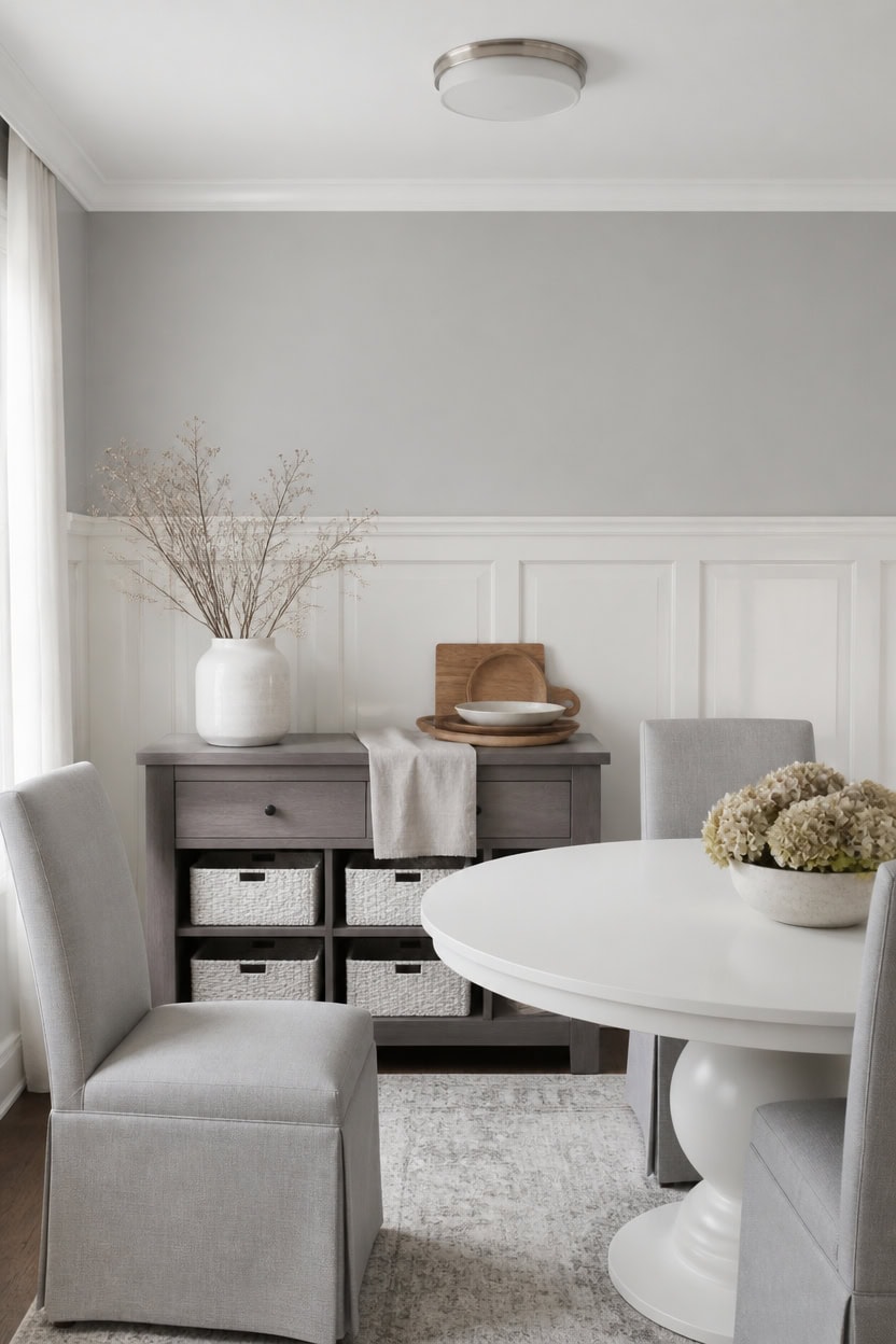
Mixing matte and glossy finishes lets the same color family read as two distinct planes in the room. Matte absorbs light while glossy bounces it, so wall and trim separate visually even when the palette stays close in tone. Very light gray Thundercloud Gray covers the main walls, very light white Vanilla Milkshake coats the wainscoting, and a stack of serving platters with a carving board on the sideboard picks up both the flat and shiny surfaces.
Sheen contrast: Use matte on large wall areas and satin or semi-gloss on trim for a subtle break in texture.
Limit glossy area: Reserve glossy finishes for wainscoting, trim, or a single accent panel so shine stays secondary.
Test under lighting: Check both finishes under the room’s actual light source since gloss reads differently at night.
Match sheen to wear: Put higher sheen on chair rails and door casings for easier cleaning near the table.
the very light gray stays flat and calm behind the shinier trim. [very light]
the very light white catches light and defines the trim line against the walls. [very light]
 Mahasu Platter Acacia Wood Serving Platters Set of 3 Cake Appetizer Plates Kitchen Charcuterie Platter for Food (Set of 3) (12" X 6" X 0.75")
View Price
Mahasu Platter Acacia Wood Serving Platters Set of 3 Cake Appetizer Plates Kitchen Charcuterie Platter for Food (Set of 3) (12" X 6" X 0.75")
View Price
 French Country Rattan Dining Chairs Set of 2, Gray Linen, Wood Frame
View Price
French Country Rattan Dining Chairs Set of 2, Gray Linen, Wood Frame
View Price
 LITTLE TREE Round Dining Table for 4-6 People, 47 Inches White Circle Dinner Kitchen Dining Room Table with Wooden Pedestal Base for Kitchen, Living Room
View Price
LITTLE TREE Round Dining Table for 4-6 People, 47 Inches White Circle Dinner Kitchen Dining Room Table with Wooden Pedestal Base for Kitchen, Living Room
View Price
 HOSTACK 60" W Sideboard Buffet Cabinet with Storage, Kitchen Cabinet, Gray
View Price
HOSTACK 60" W Sideboard Buffet Cabinet with Storage, Kitchen Cabinet, Gray
View Price
 White Ceramic Vase, GUKJOB Small Cute Flower Vase for Pampas Grass, Home, Living Room, Dining Table, Farmhouse, Office Decor, Bedroom, Table, and Kitchen Shelf (White)
View Price
White Ceramic Vase, GUKJOB Small Cute Flower Vase for Pampas Grass, Home, Living Room, Dining Table, Farmhouse, Office Decor, Bedroom, Table, and Kitchen Shelf (White)
View Price
 ICERZCZ Storage Baskets for Organizing 12.5"x9.1"x7.9" (4 Packs) Off White
View Price
ICERZCZ Storage Baskets for Organizing 12.5"x9.1"x7.9" (4 Packs) Off White
View Price
Our Favorite Faux Trees
- Free shipping over $35
- Picked at 4.4 stars or higher
 Altman Faux Olive Tree with White Planter
View Price
Altman Faux Olive Tree with White Planter
View Price
 Alvina 96" Artificial Olive Tree with White Planter
View Price
Alvina 96" Artificial Olive Tree with White Planter
View Price
 6 ft Faux Olive Tree with Fruit and Realistic Leaves
View Price
6 ft Faux Olive Tree with Fruit and Realistic Leaves
View Price
 Adarna 60" Artificial Fiddle Leaf Fig Tree
View Price
Adarna 60" Artificial Fiddle Leaf Fig Tree
View Price
 Adcock 8 ft Artificial Ficus Tree in White Planter
View Price
Adcock 8 ft Artificial Ficus Tree in White Planter
View Price
 Adcock Faux Ficus Tree in White Planter
View Price
Adcock Faux Ficus Tree in White Planter
View Price
 Adcock Artificial Dracaena Tree in Pot
View Price
Adcock Artificial Dracaena Tree in Pot
View Price
 Artificial Bamboo Tree in Pot
View Price
Artificial Bamboo Tree in Pot
View Price
 Adcock 6.5 ft Artificial Bamboo Tree in Cream Planter
View Price
Adcock 6.5 ft Artificial Bamboo Tree in Cream Planter
View Price
 Adcock Artificial Majesty Palm Tree in Pot
View Price
Adcock Artificial Majesty Palm Tree in Pot
View Price
 6.5 ft Artificial Bird of Paradise Tree in Black Cement Pot
View Price
6.5 ft Artificial Bird of Paradise Tree in Black Cement Pot
View Price
 6 ft Artificial Traveler's Palm in White Planter
View Price
6 ft Artificial Traveler's Palm in White Planter
View Price
Maximize Natural Light in the Space
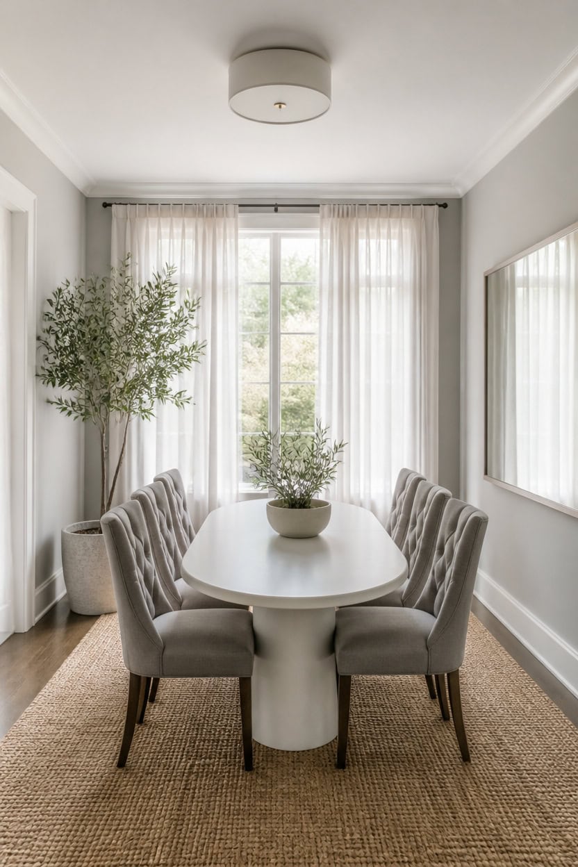
Sheer linen panels replace heavy drapes, letting daylight pass through unfiltered. Light gray Silver Spring on the main walls and very light white Stone White on the trim reflect that light evenly, keeping corners bright. A potted olive tree in a floor planter beside the table adds height without blocking the window view.
Sheer window treatments: Swap heavy drapes for sheer linen panels that let daylight pass through unfiltered.
Mirror placement: Position a large mirror across from the window to double the light in the room.
Reflective trim finish: Choose a satin sheen on trim so it bounces sunlight further into the space.
Low furniture near windows: Keep pieces low along the window wall so light travels unobstructed across the room.
the light gray reflects daylight evenly, keeping the room bright through the day. [light]
the very light white frames doors and windows without adding visual weight to the light. [very light]
 VIVATREES Olive Trees Artificial Indoor, 5FT Tall Faux Olive Tree with White Tall Planter, Artificial Plants with Natural Wood Trunk and Lifelike Fruits for Home Office Decor
View Price
VIVATREES Olive Trees Artificial Indoor, 5FT Tall Faux Olive Tree with White Tall Planter, Artificial Plants with Natural Wood Trunk and Lifelike Fruits for Home Office Decor
View Price
 Nanspring White Linen Curtains 84 inches Long for Bedroom Back Tab Light Filtering Privacy Sheer Modern Farmhouse Coastal Decor Off Cotton Textured Gauze Curtain Living Room 2 Panel Set
View Price
Nanspring White Linen Curtains 84 inches Long for Bedroom Back Tab Light Filtering Privacy Sheer Modern Farmhouse Coastal Decor Off Cotton Textured Gauze Curtain Living Room 2 Panel Set
View Price
 Autdot Large Mirrors for Wall Decor, 48'' x 24'' Antique Brozne Wall Mirror with Bamboo-Joint Design, Rectangular Decorative Mirrors for Bathroom, Entryway, Dining Room, Fireplace
View Price
Autdot Large Mirrors for Wall Decor, 48'' x 24'' Antique Brozne Wall Mirror with Bamboo-Joint Design, Rectangular Decorative Mirrors for Bathroom, Entryway, Dining Room, Fireplace
View Price
 Roundhill Furniture Habit Grey Solid Wood Tufted Parsons Dining Chair (Set of 2), Gray
View Price
Roundhill Furniture Habit Grey Solid Wood Tufted Parsons Dining Chair (Set of 2), Gray
View Price
 Modway Lippa 54" Oval-Shaped Mid-Century Modern Dining Table with Artificial Marble Top and White Base
View Price
Modway Lippa 54" Oval-Shaped Mid-Century Modern Dining Table with Artificial Marble Top and White Base
View Price
 SAFAVIEH Natural Fiber Area Rug 9x12, Jute Knotted Large Natural NF447A
View Price
SAFAVIEH Natural Fiber Area Rug 9x12, Jute Knotted Large Natural NF447A
View Price
 8 Inch Clear Glass Vase for Flowers, Modern Boho Table Decor
View Price
8 Inch Clear Glass Vase for Flowers, Modern Boho Table Decor
View Price
Use Wood Tones and Brass Accents for Warmth
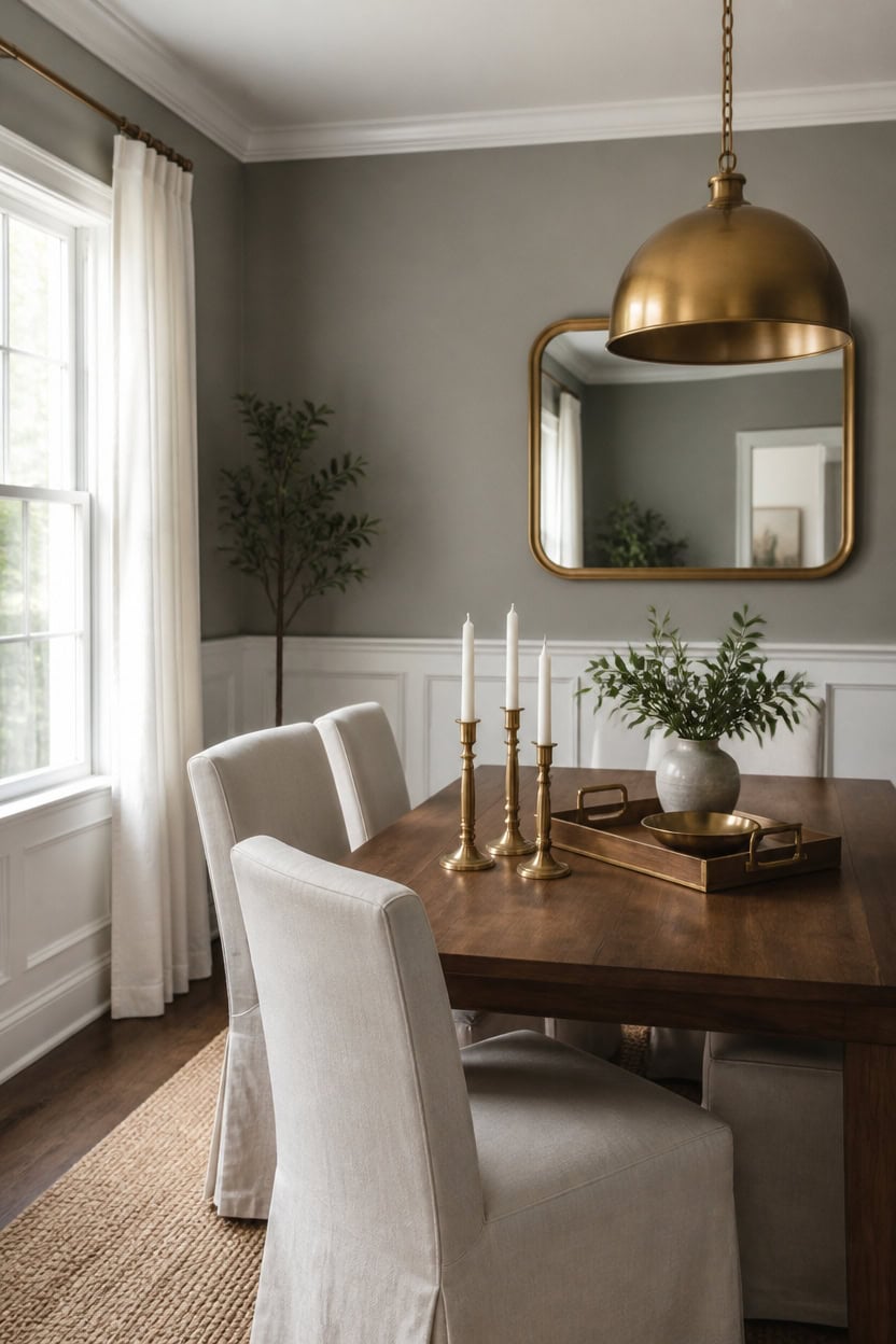
A cluster of three brass candlesticks sits at the center of a walnut dining table, catching the light where mid-tone gray Gray Pinstripe covers the main walls and very light white Summer Shower brightens the wainscoting below. Warm walnut furniture and brass hardware add the missing warmth that a pure gray-and-white palette can lack. Placing the candlesticks together instead of spacing them out gives the metal tones one strong focal point instead of scattered accents.
Layer warm wood: Add a walnut or oak dining table to offset the cool gray-and-white base.
Swap in brass hardware: Replace chrome or nickel pulls with brass on the sideboard or cabinet.
Choose a brass fixture: Pick a brass pendant or sconces to add warm glow overhead.
Repeat the wood tone: Add a wood tray, bowl, or frame to echo the table’s finish.
the mid-tone gray grounds the room and lets warm wood tones stand out. [mid-tone]
the very light white keeps the lower wall crisp against the warm wood furniture. [very light]
 Antique Brass Iron Taper Candle Holder - Set of 3 Decorative Candle Stand
View Price
Antique Brass Iron Taper Candle Holder - Set of 3 Decorative Candle Stand
View Price
 Dining Table for 6, Farmhouse Rectangular Kitchen Table, Walnut Wood
View Price
Dining Table for 6, Farmhouse Rectangular Kitchen Table, Walnut Wood
View Price
 chairus Slipcovered Upholstered Parsons Dining Chairs Set of 6, Cream White
View Price
chairus Slipcovered Upholstered Parsons Dining Chairs Set of 6, Cream White
View Price
 Caiselee 17.7 Inch Large Dome Pendant Light, Brushed Gold Pendant Lighting
View Price
Caiselee 17.7 Inch Large Dome Pendant Light, Brushed Gold Pendant Lighting
View Price
 Joy&Grace Acacia Wood Ottoman Tray with Handles 16.7" x 12.8"
View Price
Joy&Grace Acacia Wood Ottoman Tray with Handles 16.7" x 12.8"
View Price
 Bonverre 20x36 Inch Brass Bathroom Mirror for Wall, Aluminum Frame Rectangle Rectangular Vanity Mirror, Modern Large for Bedroom, Living Room, Horizontal or Vertical
View Price
Bonverre 20x36 Inch Brass Bathroom Mirror for Wall, Aluminum Frame Rectangle Rectangular Vanity Mirror, Modern Large for Bedroom, Living Room, Horizontal or Vertical
View Price
 IFGET 92.63" W Modern Arched Sideboard Buffet Cabinet with Storage, Natural
View Price
IFGET 92.63" W Modern Arched Sideboard Buffet Cabinet with Storage, Natural
View Price
Our Favorite Wall Mirrors
- Free shipping over $35
- Picked at 4.5 stars or higher
 Sabine Metal Round Wall Mirror
View Price
Sabine Metal Round Wall Mirror
View Price
 Karrina Accent Wood Round Mirror
View Price
Karrina Accent Wood Round Mirror
View Price
 Gehard Round Metal Framed Mirror
View Price
Gehard Round Metal Framed Mirror
View Price
 Sabine Metal Rounded Rectangle Wall Mirror
View Price
Sabine Metal Rounded Rectangle Wall Mirror
View Price
 Aevar Tempered Glass and Aluminum Framed Wall Mirror
View Price
Aevar Tempered Glass and Aluminum Framed Wall Mirror
View Price
 Amara Tempered Glass and Aluminum Framed Wall Mirror
View Price
Amara Tempered Glass and Aluminum Framed Wall Mirror
View Price
 Dronfield Arch Mirror
View Price
Dronfield Arch Mirror
View Price
 Sabine Metal Arch Wall Mirror
View Price
Sabine Metal Arch Wall Mirror
View Price
 Ancalin Solid Wood Arched Wall Mirror
View Price
Ancalin Solid Wood Arched Wall Mirror
View Price
 Ali Solid Wood Scalloped Wall Mirror
View Price
Ali Solid Wood Scalloped Wall Mirror
View Price
 Arnott Arch Decorative Wall Mirror with Baroque Metal Frame
View Price
Arnott Arch Decorative Wall Mirror with Baroque Metal Frame
View Price
 Genan Scalloped Rectangle Accent Wall Mirror
View Price
Genan Scalloped Rectangle Accent Wall Mirror
View Price
 Asymmetrical Wood Framed Accent Wall Mirror
View Price
Asymmetrical Wood Framed Accent Wall Mirror
View Price
 Irregular Wall Mirror with Metal Frame
View Price
Irregular Wall Mirror with Metal Frame
View Price
 Solid Wood Irregular Accent Wall Mirror
View Price
Solid Wood Irregular Accent Wall Mirror
View Price
Avoid These Common Gray and White Decorating Mistakes
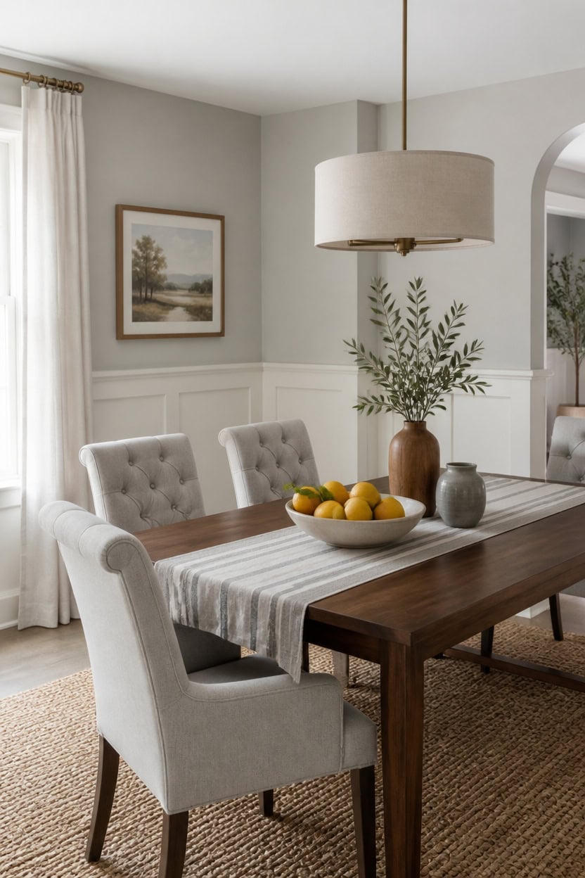
Pairing warm white with cool gray without checking undertones creates a muddy, dingy look. Very light gray Wales Gray on the main walls pairs cleanly with very light white Harwood Putty on the wainscoting since both share a neutral undertone. A low ceramic bowl of whole citrus on the table adds one warm color note without breaking the palette.
Clashing white undertones: Match a warm white to a warm gray so the pairing reads clean, not muddy.
Too much sameness: Break up wall-to-wall gray with one lighter surface, like wainscoting, so the room has depth.
Skipping texture: Mix matte paint, woven fiber, and glossy hardware so the palette doesn’t feel flat.
Ignoring the light: Check paint swatches morning and evening before committing to a full wall of color.
the very light gray keeps the room open without going stark white. [very light]
the very light white grounds the lower wall and reads warmer than a pure white. [very light]
 DUJUST 3 Tier Fruit Bowl, Kiln Altered Glaze Ceramic Fruit Stand, Stackable & Easy to Store, Multifunctional Serving Tray for Fruit/Vegetables/Snacks, Microwave & Dishwasher Safe - Dark Blue
View Price
DUJUST 3 Tier Fruit Bowl, Kiln Altered Glaze Ceramic Fruit Stand, Stackable & Easy to Store, Multifunctional Serving Tray for Fruit/Vegetables/Snacks, Microwave & Dishwasher Safe - Dark Blue
View Price
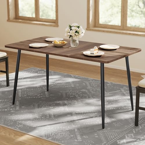 VASAGLE 55.1" Dining Table for 4-6 People, Modern Kitchen Table
View Price
VASAGLE 55.1" Dining Table for 4-6 People, Modern Kitchen Table
View Price
 Aoowow Linen Blend Upholstered Dining Chairs Set of 2,Channel Tufted Dinner Chairs for Kitchen with Solid Wood Legs,Neutral Fabric Side Chairs for Dining Room,Living Room(Beige)
View Price
Aoowow Linen Blend Upholstered Dining Chairs Set of 2,Channel Tufted Dinner Chairs for Kitchen with Solid Wood Legs,Neutral Fabric Side Chairs for Dining Room,Living Room(Beige)
View Price
 Fanousek 20Inch Drum Chandeliers, Gold and White Drum Chandelier with Metal and Fabric Shade, Adjustable Height, Simple Modern Large Drum Pendant Light Fixture Dining Room Bedroom Kitchen Entryway
View Price
Fanousek 20Inch Drum Chandeliers, Gold and White Drum Chandelier with Metal and Fabric Shade, Adjustable Height, Simple Modern Large Drum Pendant Light Fixture Dining Room Bedroom Kitchen Entryway
View Price
 White Marble Look Vase Set of 3, Modern Ceramic Flower Vase for Home Decor, Decorative Vase for Table Entryway Mantel Centerpiece Living Room Bathroom Bedroom (White Gray Marble)
View Price
White Marble Look Vase Set of 3, Modern Ceramic Flower Vase for Home Decor, Decorative Vase for Table Entryway Mantel Centerpiece Living Room Bathroom Bedroom (White Gray Marble)
View Price
 Native Fab Gray Table Runner 72 Inches Long - Boho Striped Table Cover with Fringes - 100% Cotton, Soft, Tight Weave, Non Slip Tablerunner for Dining, Dresser, Wedding - Grey and White (14x72 inches)
View Price
Native Fab Gray Table Runner 72 Inches Long - Boho Striped Table Cover with Fringes - 100% Cotton, Soft, Tight Weave, Non Slip Tablerunner for Dining, Dresser, Wedding - Grey and White (14x72 inches)
View Price
 Framed Black and White Abstract Wall Art for Living Room, 3 Piece 24x36 In
View Price
Framed Black and White Abstract Wall Art for Living Room, 3 Piece 24x36 In
View Price