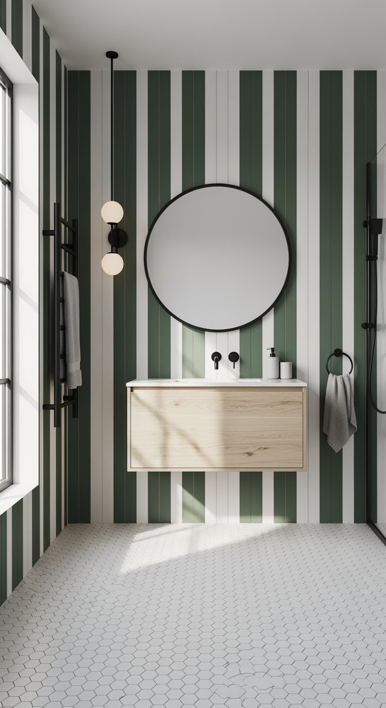
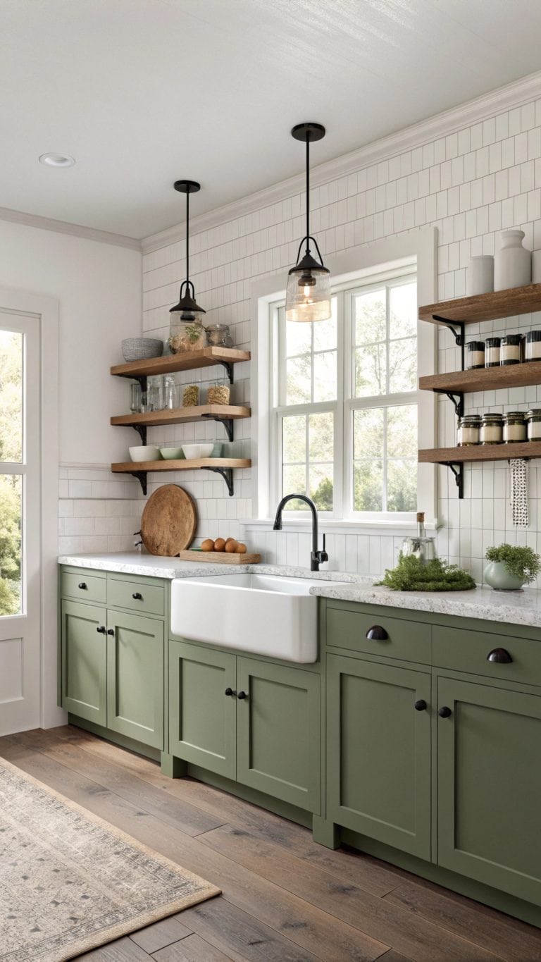
Why Are Green & Cream Living Rooms the Perfect Choice to Bring the Garden Indoors?

There’s something magical about a living room that feels like a breath of fresh air — and pairing green with cream is one of the easiest ways to capture that garden-inspired calm.
These two colors work together beautifully, balancing warmth and freshness in a way that feels effortless.
Here’s how to bring that natural harmony into your space.
Why Green and Cream Work So Well Together in a Living Room
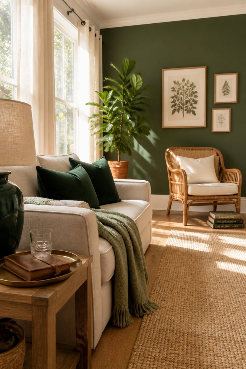
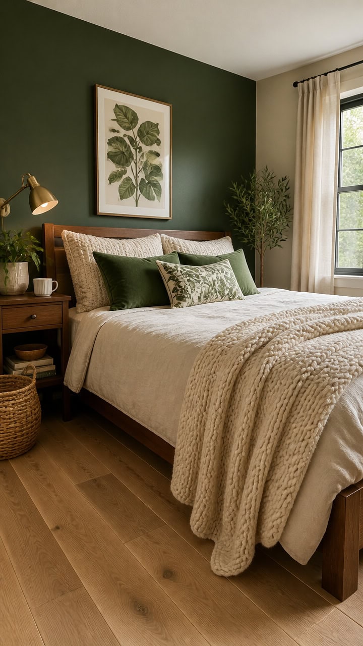
Green brings natural energy into a space, while cream acts as a visual anchor that keeps that energy from becoming overwhelming. Together, they form a ratio that mirrors what you’d find outdoors — lush growth against a neutral backdrop — which explains why the pairing feels so instinctively calm. Use a 70/30 split with cream as your dominant surface color and green reserved for textiles, plants, and one focal-point wall.
Tonal range matters: Choose a green with yellow or blue undertones depending on how much warmth your room already gets from natural light.
Cream as the base: Keep walls, large upholstery, and trim in cream to prevent green from dominating and making the room feel smaller.
Layer the green: Introduce green at multiple scales — a single large piece reads flat, but a patterned pillow, plant, and accent wall together read intentional.
Texture does the work: Velvet green cushions against a linen cream sofa create contrast through texture alone, even when the colors are muted.
a rich, grounded green that anchors the room without darkening the whole space.
a warm cream-white that softens contrast and ties the palette together.
 ELUCHANG Oversized 85" Deep Seat Sofa, Modern Couches for Living Room, 3 Seater Natural Linen Sofa, Upholstered Cushion & Detachable Cover, Comfy Sofa Couch for Apartment, Oatmeal
View Price
ELUCHANG Oversized 85" Deep Seat Sofa, Modern Couches for Living Room, 3 Seater Natural Linen Sofa, Upholstered Cushion & Detachable Cover, Comfy Sofa Couch for Apartment, Oatmeal
View Price
 VAKADO Christmas Emerald Green Velvet Throw Pillow Covers 18x18 Set of 2
View Price
VAKADO Christmas Emerald Green Velvet Throw Pillow Covers 18x18 Set of 2
View Price
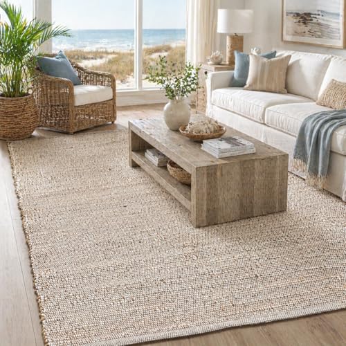 Chardin home 5x7 Jute Cotton Hand Woven Area Rug, Natural Jute/Cream Braided Boho Farmhouse Rug, Rustic Vintage Reversible Natural Fiber Rug for Living Room, Bedroom, Dining Room, Office, or Entryway
View Price
Chardin home 5x7 Jute Cotton Hand Woven Area Rug, Natural Jute/Cream Braided Boho Farmhouse Rug, Rustic Vintage Reversible Natural Fiber Rug for Living Room, Bedroom, Dining Room, Office, or Entryway
View Price
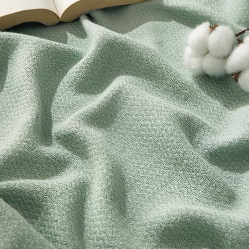 Bedsure 100% Cotton Blanket, Herringbone Weave, Queen Size, Sage Green
View Price
Bedsure 100% Cotton Blanket, Herringbone Weave, Queen Size, Sage Green
View Price
 Nourison Home 23" Olive Green Ceramic Pot Table Lamp for Bedroom, Living Room, Dining Office, with White Tapered Drum Shade
View Price
Nourison Home 23" Olive Green Ceramic Pot Table Lamp for Bedroom, Living Room, Dining Office, with White Tapered Drum Shade
View Price
 LAMIT Cream 90 Inch Long Linen Sheer Curtains 2 Panels Set for Living Room
View Price
LAMIT Cream 90 Inch Long Linen Sheer Curtains 2 Panels Set for Living Room
View Price
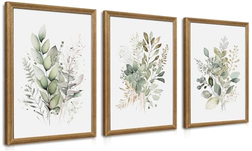 WRFON Framed Sage Green Botanical Wall Art Set of 3, Watercolor Eucalyptus & Wild Plant Canvas Prints, Minimalist Green Wall Decor for Living Room Bedroom Bathroom, 12x16 Inches
View Price
WRFON Framed Sage Green Botanical Wall Art Set of 3, Watercolor Eucalyptus & Wild Plant Canvas Prints, Minimalist Green Wall Decor for Living Room Bedroom Bathroom, 12x16 Inches
View Price
 Pelangi Handmade Rattan Dining Wicker Chair Colonial Color w/Cream Cushion
View Price
Pelangi Handmade Rattan Dining Wicker Chair Colonial Color w/Cream Cushion
View Price
Which Shades of Green Suit a Cream Living Room?
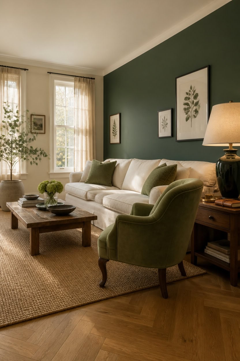
Warm greens, cool greens, and muted greens all behave differently against cream, and choosing the wrong one creates a room that feels either muddy or cold. Cream has yellow undertones that will intensify warm greens like olive and amplify the muddiness of khaki-adjacent shades. Cool greens — sage, eucalyptus, and muted teal-greens — stay clean and distinct against cream because the contrast in undertones keeps each color readable.
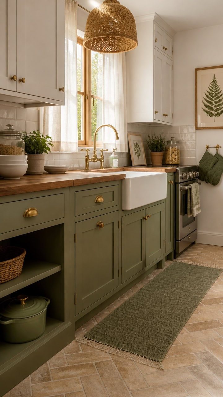
Warm greens (olive, moss): These work best in rooms with cool-toned natural light, where the warmth of the green balances the blue cast from north-facing windows.
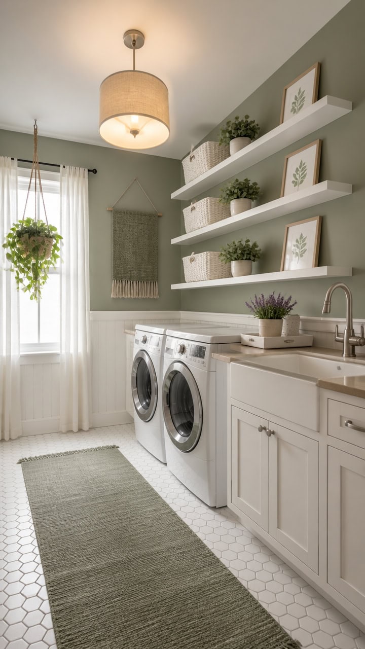
Cool greens (sage, eucalyptus): Pair effortlessly with cream in any light condition because their gray or blue undertones prevent the yellow in cream from turning the whole room yellow-green.
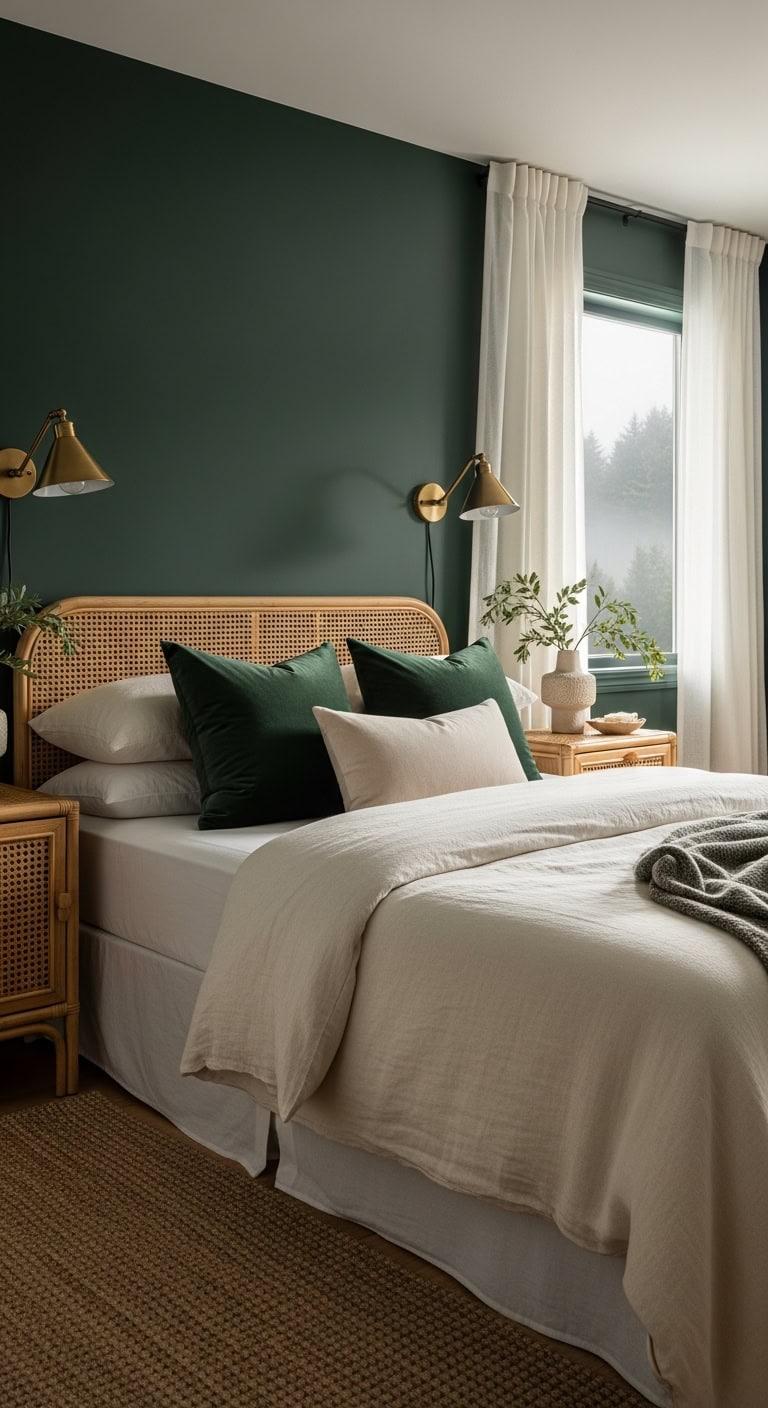
Deep greens (forest, hunter): Use sparingly as an accent wall or single upholstered piece — they add drama without needing a large surface area to read well.
Muted greens (celadon, fern): The safest range for an all-cream room because they carry enough gray to stay sophisticated rather than playful.
a muted, blue-leaning green that reads calm and settled against cream furnishings without darkening the room.
a soft warm cream that wraps the room in an even, cohesive base that lets the green wall stand out cleanly.
 DUOMAY Modern Accent Chair Set of 2 Velvet Slipper Chair with Gold Legs Wingback Side Chair for Living Room Bedroom Entryway Small Corner Chair for Space Saving, Green
View Price
DUOMAY Modern Accent Chair Set of 2 Velvet Slipper Chair with Gold Legs Wingback Side Chair for Living Room Bedroom Entryway Small Corner Chair for Space Saving, Green
View Price
 Vorthio 3-Seater Farmhouse Fabric Sofa, 89" Upholstered Couch for Living Room with Rolled Arms & High Back Support, Slipcovered Sofa for Apartment, Cream White
View Price
Vorthio 3-Seater Farmhouse Fabric Sofa, 89" Upholstered Couch for Living Room with Rolled Arms & High Back Support, Slipcovered Sofa for Apartment, Cream White
View Price
 decorUhome Olive Green Textured Linen Throw Pillow Covers 18x18 Set of 2
View Price
decorUhome Olive Green Textured Linen Throw Pillow Covers 18x18 Set of 2
View Price
 Ferrgoal 4Ft Artificial Eucalyptus Plant with Basket & Silk Leaves
View Price
Chardin home 9x12 Jute Cotton Hand Woven Area Rug, Natural Jute/Cream
View Price
Ferrgoal 4Ft Artificial Eucalyptus Plant with Basket & Silk Leaves
View Price
Chardin home 9x12 Jute Cotton Hand Woven Area Rug, Natural Jute/Cream
View Price
 Vortether 22.5" Green Ceramic Table Lamps for Bedroom, Boho Nightstand Lamp
View Price
Vortether 22.5" Green Ceramic Table Lamps for Bedroom, Boho Nightstand Lamp
View Price
 Large Framed Green Abstract Botanical Wall Art for Living Room, 24x36 In
View Price
Large Framed Green Abstract Botanical Wall Art for Living Room, 24x36 In
View Price
 Jowels Natural Linen Grommet Curtains 96 Inch Long 2 Panels for Living Room
View Price
Jowels Natural Linen Grommet Curtains 96 Inch Long 2 Panels for Living Room
View Price
Forest Green vs Sage: Which Works Better Indoors?
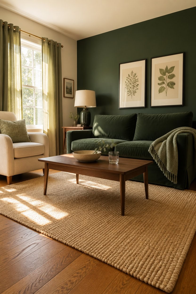
Forest green and sage are both strong living room colors, but they solve completely different problems — forest green adds depth and drama, while sage softens and expands. Forest green needs something to push against, which is why it reads best as an accent wall or single upholstered piece rather than a room-wide color. Sage distributes more evenly across walls, textiles, and trim without visually closing in on the space.
Forest green’s role: Use it on one surface only — an accent wall, a sofa, or large curtains — not layered across multiple elements.
Sage’s role: Sage can cover a full wall or appear in several textiles at once without the room feeling heavy or enclosed.
Light conditions matter: Forest green absorbs light and darkens a room, so it works best in south or west-facing rooms with strong natural light exposure.
Cream as the buffer: Both greens stay readable against cream, but forest green needs more cream surrounding it to avoid feeling cave-like.
a deep, grounded forest green that anchors the room without swallowing surrounding cream surfaces.
a warm cream-leaning white that gives forest green room to breathe without fighting it.
 OUYESSIR 114" U-Shaped Modular Sectional Sofa for Living Room, Green
View Price
OUYESSIR 114" U-Shaped Modular Sectional Sofa for Living Room, Green
View Price
 DM Furniture Modern Farmhouse Accent Chair, Wide Upholstered Linen Armchair with Armrest Pads, French Country Solid Wood Reading Chair for Living Room Bedroom Guest Room, Cream White Fabric
View Price
DM Furniture Modern Farmhouse Accent Chair, Wide Upholstered Linen Armchair with Armrest Pads, French Country Solid Wood Reading Chair for Living Room Bedroom Guest Room, Cream White Fabric
View Price
 decorUhome Sage Green Textured Linen Throw Pillow Covers 18x18 Set of 2
View Price
decorUhome Sage Green Textured Linen Throw Pillow Covers 18x18 Set of 2
View Price
 Chardin home Jute Cotton Area Rug, 6x9, Natural Cream Blue
View Price
Chardin home Jute Cotton Area Rug, 6x9, Natural Cream Blue
View Price
 20.25" Small Table Lamps Set of 2 Modern Ceramic Lamps for Living Room
View Price
20.25" Small Table Lamps Set of 2 Modern Ceramic Lamps for Living Room
View Price
 Jowels Sage Green Linen Grommet Curtains 84 Inch Length for Living Room
View Price
Jowels Sage Green Linen Grommet Curtains 84 Inch Length for Living Room
View Price
 LLEEMPI Sage Green Botanical Wall Art Set of 3, 16x24 Wood Framed Prints
View Price
LLEEMPI Sage Green Botanical Wall Art Set of 3, 16x24 Wood Framed Prints
View Price
 Fluted Round Nesting Coffee Table Set of 2 Circle Center Table Living Room
View Price
Fluted Round Nesting Coffee Table Set of 2 Circle Center Table Living Room
View Price
How Cream Stops Green From Feeling Overpowering
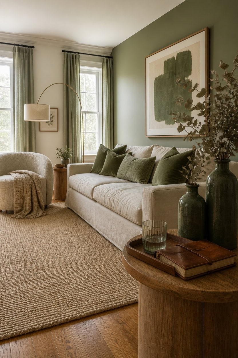
Cream acts as a visual reset between green surfaces, giving the eye somewhere neutral to land before moving to the next green element. Without that break, even a single bold green sofa can start to feel like it’s closing in on the room. A reliable working ratio is roughly 60% cream to 40% green across all surfaces combined — walls, textiles, and furniture included.
Neutral grounding: Let cream carry the largest surfaces — walls and main upholstery — so green reads as intentional rather than overwhelming.
Breathing room between greens: If you use a green sofa and green curtains, separate them visually with a cream rug or cream armchair placed between them.
Cream finish matters: Matte cream walls absorb light and soften green’s intensity more than glossy finishes, which can amplify the color contrast instead of easing it.
Texture adds depth: Layer cream through woven, linen, and knit textures so the neutral areas stay visually interesting without competing with the green.
a warm cream-leaning white that wraps the room in softness and gives every green element room to land without crowding.
a muted, gray-toned sage that reads as calm and grounded against the surrounding cream walls.
 ONEMMLION 107" Modern Curved Sofas for Living Room, Cream White
View Price
ONEMMLION 107" Modern Curved Sofas for Living Room, Cream White
View Price
 MIULEE Pack of 2 Sage Green Decorative Chenille Pillow Covers 20x20 Inch
View Price
MIULEE Pack of 2 Sage Green Decorative Chenille Pillow Covers 20x20 Inch
View Price
 Vintage Vase Set of 3 with Handle, Ceramic Vintage Rustic Vases Home Decor Farmhouse Decorative Vase Pottery Decor Modern for Table Mantel Entryway Bookshelf Living Room Kitchen Bedroom - Green
View Price
Vintage Vase Set of 3 with Handle, Ceramic Vintage Rustic Vases Home Decor Farmhouse Decorative Vase Pottery Decor Modern for Table Mantel Entryway Bookshelf Living Room Kitchen Bedroom - Green
View Price
 Womina Armless Accent Chairs Set of 2 Upholstered Living Room Side Chairs
View Price
Womina Armless Accent Chairs Set of 2 Upholstered Living Room Side Chairs
View Price
 Framed Abstract Sage Green 3 Piece Wall Art for Living Room, 16x24 In
View Price
Framed Abstract Sage Green 3 Piece Wall Art for Living Room, 16x24 In
View Price
 Tollpiz Short Linen Curtains Bedroom Rod Pocket Semi Sheer Curtain Burlap Light Filtering Thick Linen Drapes for Living Room, 38 x 45 inches Long, Sage Green, Set of 2 Panels
View Price
Tollpiz Short Linen Curtains Bedroom Rod Pocket Semi Sheer Curtain Burlap Light Filtering Thick Linen Drapes for Living Room, 38 x 45 inches Long, Sage Green, Set of 2 Panels
View Price
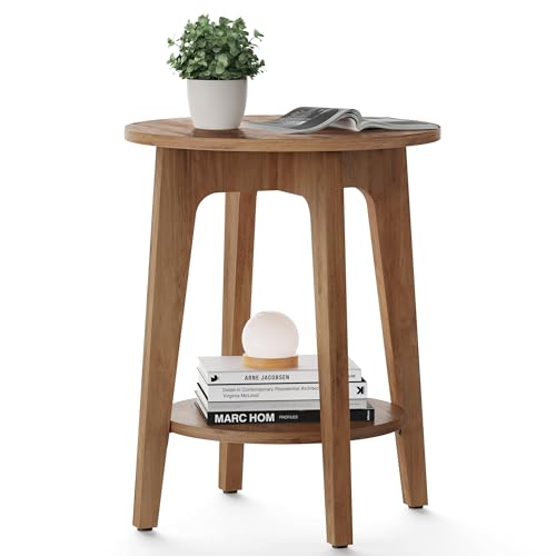 VASAGLE Round Side Table with Lower Shelf, End Table for Small Spaces
View Price
VASAGLE Round Side Table with Lower Shelf, End Table for Small Spaces
View Price
Why Green Always Feels at Home in a Living Room
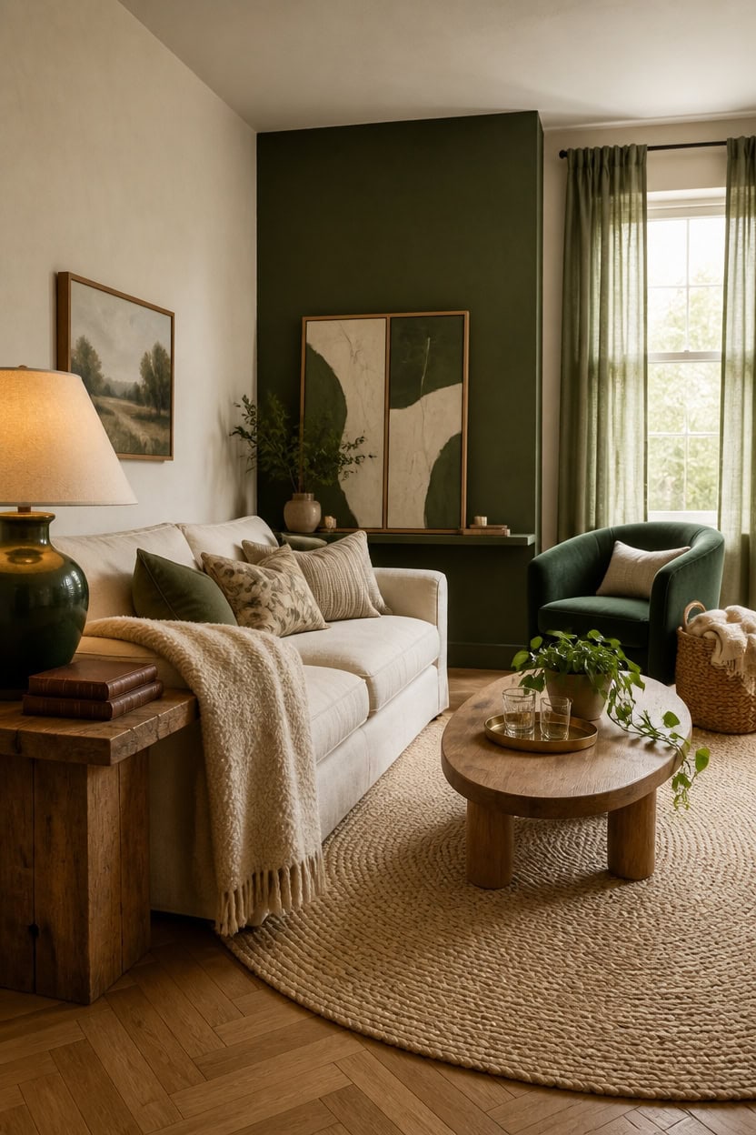
Green has been used in living spaces for centuries because it mirrors the natural world humans are wired to find restful and restorative. Unlike bold primaries that demand attention, green occupies a psychological middle ground — energizing enough to feel alive but grounded enough to stay comfortable over long periods. Pair it with cream and the room becomes even more livable, because cream removes any edge of rawness that a saturated green might carry on its own.
Nature connection: Green triggers the same calm response as looking at trees or grass, which is why it never feels out of place in a room built for relaxing.
Neutral compatibility: Green sits comfortably next to cream, wood, linen, and stone — all the materials that make a living room feel layered and lived-in.
Shade flexibility: From deep hunter to soft sage, green has enough range to work in both bold, high-contrast rooms and quiet, understated ones.
Timeless staying power: Unlike trend-driven colors, green has appeared in well-designed living rooms across every decade without looking dated.
a clean, warm-leaning cream that gives the room a generous, airy foundation without tipping cold.
a rich, deeply saturated green that anchors the room and proves green can hold its own as a statement color.
 AceGuide 115" Oversized Couch L Shaped Sofa Sectional Modular, Deep Seat Big Comfy Couch with Ottoman Storage, Wood Frame, Home Sofa Living Room, Office, Removable Cover, Cream White
View Price
AceGuide 115" Oversized Couch L Shaped Sofa Sectional Modular, Deep Seat Big Comfy Couch with Ottoman Storage, Wood Frame, Home Sofa Living Room, Office, Removable Cover, Cream White
View Price
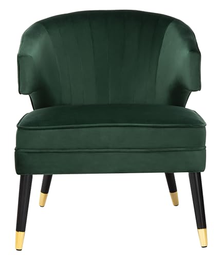 Safavieh Home Stazia Retro Glam Forest Green Velvet and Black Wingback Accent Chair
View Price
Safavieh Home Stazia Retro Glam Forest Green Velvet and Black Wingback Accent Chair
View Price
 Sage Green Total Blackout Curtains for Bedroom 84 Inches Long
View Price
Sage Green Total Blackout Curtains for Bedroom 84 Inches Long
View Price
 Large Framed 3D Textured Boho Abstract Wall Art Decor Set of 2, 24x36 In
View Price
Large Framed 3D Textured Boho Abstract Wall Art Decor Set of 2, 24x36 In
View Price
 HiEnd Accents Teddy Cream 50x60 inch Boucle Throw Blanket
View Price
HiEnd Accents Teddy Cream 50x60 inch Boucle Throw Blanket
View Price
 Casvik Modern Oval Coffee Table with Storage for Living Room, Natural Wood
View Price
Casvik Modern Oval Coffee Table with Storage for Living Room, Natural Wood
View Price
8' x 10' Rugs for This Palette
Rugs USA best sellers in this palette's colors, linked in 8' x 10', the size that fits most living rooms with the front legs of the sofa and chairs on the rug. Every design comes in other sizes too.
- Free shipping
- 30-day returns
- 210,000+ five-star reviews
 Juniper Jute Tiled Rug – Natural
View Price
Juniper Jute Tiled Rug – Natural
View Price
 Cranbury Plush Textured Washable Rug – Green
View Price
Cranbury Plush Textured Washable Rug – Green
View Price
 Speckled Wool-Blend Rug – Verdant Green
View Price
Speckled Wool-Blend Rug – Verdant Green
View Price
 Bayberry Spill Proof Vintage Washable Rug – Green Grey
View Price
Bayberry Spill Proof Vintage Washable Rug – Green Grey
View Price
 Melrose Checked Rug – Moss
View Price
Melrose Checked Rug – Moss
View Price
 Cape May Plush Textured Washable Rug – Green
View Price
Cape May Plush Textured Washable Rug – Green
View Price
 Persian Vintage Rug – Green
View Price
Persian Vintage Rug – Green
View Price
 Floral Fringed Rug – Olive
View Price
Floral Fringed Rug – Olive
View Price
 Shafali Tiled Trellis Rug – Green
View Price
Shafali Tiled Trellis Rug – Green
View Price
 Tropical Foliage Indoor/Outdoor Rug – Green Multicolor
View Price
Tropical Foliage Indoor/Outdoor Rug – Green Multicolor
View Price
 Petra High-Low Wool-Blend Rug – Verdant Green
View Price
Petra High-Low Wool-Blend Rug – Verdant Green
View Price
 Aylin Diamond Tasseled Rug – Green
View Price
Aylin Diamond Tasseled Rug – Green
View Price
 Rasali Checkered Box Rug – Green
View Price
Rasali Checkered Box Rug – Green
View Price
 Melrose Checked Rug – Green
View Price
Melrose Checked Rug – Green
View Price
 Downing Plaid Wool Rug by Nate Berkus – Green
View Price
Downing Plaid Wool Rug by Nate Berkus – Green
View Price
 Jungle Washable Rug – Sage Green
View Price
Jungle Washable Rug – Sage Green
View Price
 Anette Block Striped Rug – Green
View Price
Anette Block Striped Rug – Green
View Price
 Sade Solid Shag Rug – Green
View Price
Sade Solid Shag Rug – Green
View Price
 Nori Lustered Solid Washable Rug – Sage Green
View Price
Nori Lustered Solid Washable Rug – Sage Green
View Price
 Abstract Floral Rug – Green
View Price
Abstract Floral Rug – Green
View Price
 Starke Broken Stripe Wool Rug – Olive
View Price
Starke Broken Stripe Wool Rug – Olive
View Price
 Perfect Handwoven Jute-Blend Rug – Natural
View Price
Perfect Handwoven Jute-Blend Rug – Natural
View Price
 Jute Braided Rug – Natural
View Price
Jute Braided Rug – Natural
View Price
 Softest Knit Wool Rug – Off White
View Price
Softest Knit Wool Rug – Off White
View Price
 Jute Braided Rug – Off White
View Price
Jute Braided Rug – Off White
View Price
 Maren Hazy Swirls Rug – Beige
View Price
Maren Hazy Swirls Rug – Beige
View Price
 Chunky Jute Tasseled Rug – Off White
View Price
Chunky Jute Tasseled Rug – Off White
View Price
 Floral Ornament Rug – Ivory
View Price
Floral Ornament Rug – Ivory
View Price
 Fading Herati Medallion Rug – Beige
View Price
Fading Herati Medallion Rug – Beige
View Price
 Chunky Jute Tasseled Rug – Natural
View Price
Chunky Jute Tasseled Rug – Natural
View Price
 Forever Vintage Rug – Neutral
View Price
Forever Vintage Rug – Neutral
View Price
 Native Collage Rug – Beige
View Price
Native Collage Rug – Beige
View Price
 Moroccan Diamond Pinstripes Tassel Rug – Off White
View Price
Moroccan Diamond Pinstripes Tassel Rug – Off White
View Price
 Handspun Jute Rug – Natural
View Price
Handspun Jute Rug – Natural
View Price
 Handwoven Jute Ribbed Solid Rug – Natural
View Price
Handwoven Jute Ribbed Solid Rug – Natural
View Price
 Melrose Checked Rug – Cream
View Price
Melrose Checked Rug – Cream
View Price
 Shaded Shag With Tassels Rug – Ivory
View Price
Shaded Shag With Tassels Rug – Ivory
View Price
 Plush Solid Shaggy Rug – Off White
View Price
Plush Solid Shaggy Rug – Off White
View Price
 Seagrass with Border Rug – Beige
View Price
Seagrass with Border Rug – Beige
View Price
 Anette Block Striped Rug – Beige
View Price
Anette Block Striped Rug – Beige
View Price
Paint, Wallpaper or Panelling: The Best Wall Treatments for Green and Cream
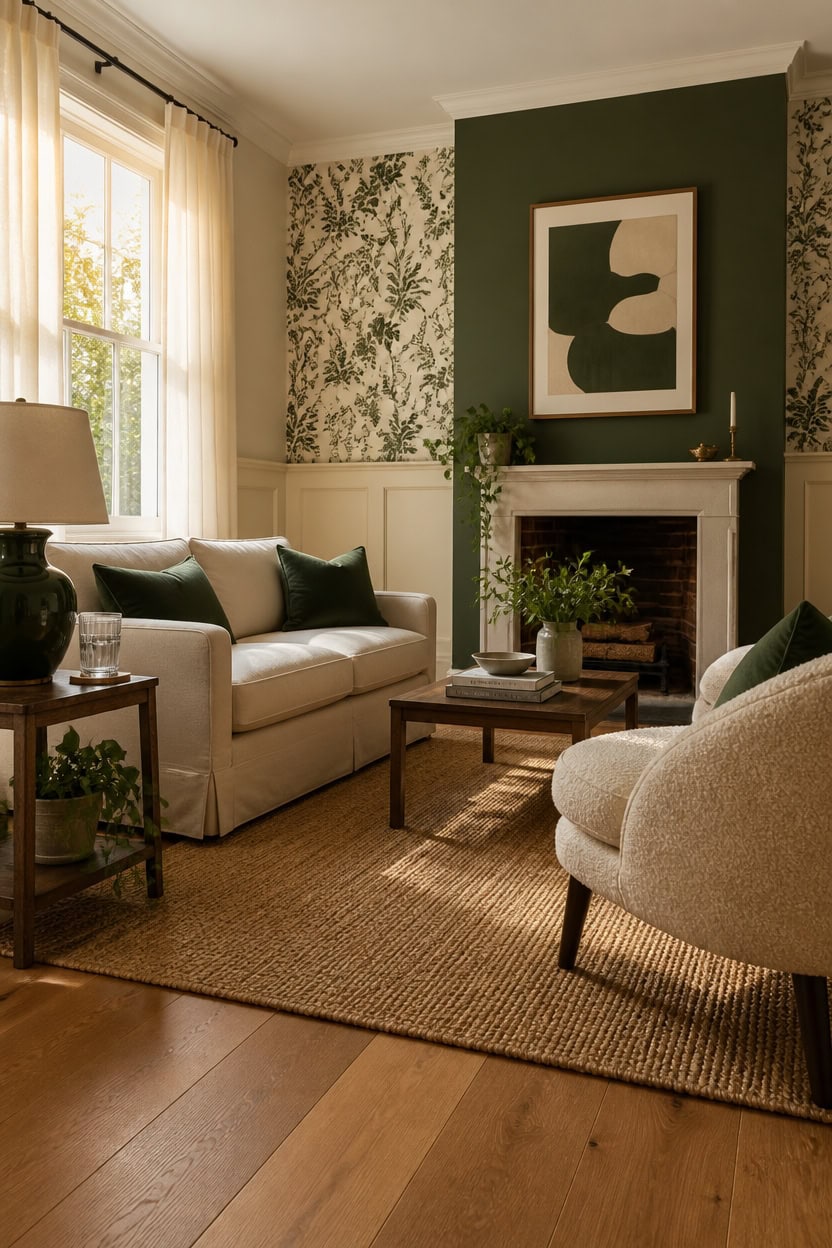
Paint gives you the most control, but wallpaper and panelling can do things a painted wall simply cannot. Each treatment creates a different relationship between green and cream — paint keeps things clean and flexible, wallpaper adds pattern and depth, and panelling brings architectural weight that makes a room feel like it was built with intention. Choose based on how much visual texture the room already has.
Paint for flexibility: A flat or eggshell green paint is the easiest to live with because you can update it without major commitment or cost.
Wallpaper for pattern: A green and cream botanical or geometric wallpaper gives the room a focal point that paint alone cannot deliver without added decor.
Panelling for structure: Shiplap or board-and-batten painted in cream or green adds dimensional texture that reads as craftsmanship rather than decoration.
Layering treatments: Combine panelling on the lower half with paint or wallpaper above to create a finished, designer-quality look without full room wallpaper costs.
a warm cream base that makes green accents pop without flattening the space.
a deep, sophisticated green that pairs with cream to feel both grounded and elegant.
 HAOKHOME William Morris Wallpaper Vintage Wall Paper Sage Green Removable
View Price
HAOKHOME William Morris Wallpaper Vintage Wall Paper Sage Green Removable
View Price
 Brosisincorp Peel and Stick Shiplap Real Wood Wall Panel, Wash White 10 Pcs
View Price
Brosisincorp Peel and Stick Shiplap Real Wood Wall Panel, Wash White 10 Pcs
View Price
 QUORGVES Dark Green Velvet Throw Pillow Covers 18x18 Inch Set of 2
View Price
QUORGVES Dark Green Velvet Throw Pillow Covers 18x18 Inch Set of 2
View Price
 Framed Sage Green Abstract 2 Piece Wall Art for living room, 24x36 Inch
View Price
Framed Sage Green Abstract 2 Piece Wall Art for living room, 24x36 Inch
View Price
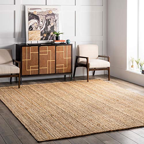 nuLOOM Rigo Hand Woven Farmhouse Jute Area Rug, 8x10, Natural
View Price
nuLOOM Rigo Hand Woven Farmhouse Jute Area Rug, 8x10, Natural
View Price
 Gaussen Boucle Dining Chairs Set of 2, Mid Century Modern Dining Room Chairs with Solid Wood Legs, Terry Fabric Upholstered Kitchen Chairs, Accent Vanity Chair for Living Room(Cream, 2)
View Price
Gaussen Boucle Dining Chairs Set of 2, Mid Century Modern Dining Room Chairs with Solid Wood Legs, Terry Fabric Upholstered Kitchen Chairs, Accent Vanity Chair for Living Room(Cream, 2)
View Price
How to Layer Textures in a Green and Cream Living Room
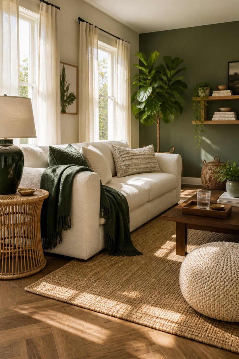
Texture layering works best in a green and cream living room when you mix materials that contrast in feel but stay close in tone. Rough linen next to smooth velvet, a chunky woven rug under a sleek coffee table — these pairings create visual interest without breaking the color story. Start with your largest surface and work inward, adding texture in layers rather than all at once.
Lead with the sofa: Choose a cream linen or boucle sofa as your neutral base, then build texture around it with green accents.
Stack textiles: Layer a velvet throw over a linen cushion, or combine a jute rug with a woven wool blanket to build depth at different heights.
Mix hard and soft: Balance soft furnishings with harder textures like a rattan side table, ceramic lamp, or wooden tray to keep the room grounded.
Use greenery as texture: Real or high-quality faux plants add an organic, dimensional layer that no fabric or rug can replicate.
a warm cream that lets layered textures read clearly without competing with a busy background.
a muted, earthy green that anchors the textured layers without overpowering them.
 Lambswool Modern Cream Boucle Sofas for Living Room,102.7" W,Oversized 3 Seater with 2 Pillows,Deep Seat Couch,Cloud Sofas for Living Room,Office,Apartment,Bedroom
View Price
Lambswool Modern Cream Boucle Sofas for Living Room,102.7" W,Oversized 3 Seater with 2 Pillows,Deep Seat Couch,Cloud Sofas for Living Room,Office,Apartment,Bedroom
View Price
 Exclusivo Mezcla Soft Large Fleece Throw Blanket for Couch, Forest Green
View Price
nuLOOM Rigo Natural Solid Flatweave Area Rug, 6' x 9'
View Price
Exclusivo Mezcla Soft Large Fleece Throw Blanket for Couch, Forest Green
View Price
nuLOOM Rigo Natural Solid Flatweave Area Rug, 6' x 9'
View Price
 AVOIN colorlife Olive Green Boho Decorative Throw Pillow Covers Set of 2, 18 x 18 Inch Woven Stripe Textured Rustic Cushion Case Home Decor for Living Room Couch Sofa
View Price
AVOIN colorlife Olive Green Boho Decorative Throw Pillow Covers Set of 2, 18 x 18 Inch Woven Stripe Textured Rustic Cushion Case Home Decor for Living Room Couch Sofa
View Price
 Eclatara Rattan Round Side Table End Table with Storage Shelf
View Price
Eclatara Rattan Round Side Table End Table with Storage Shelf
View Price
 · REDEARTH · Round Pouf Ottoman - Hand Knitted Boho Poof Footrest - Ivory
View Price
· REDEARTH · Round Pouf Ottoman - Hand Knitted Boho Poof Footrest - Ivory
View Price
 Garvee 5.8FT Artificial Fiddle Leaf Fig Tree
View Price
Garvee 5.8FT Artificial Fiddle Leaf Fig Tree
View Price
Wall Art for This Palette
The best-reviewed prints at Wayfair in this palette's colors. Most come in several sizes.
- Free shipping over $35
- Picked at 4.5 stars or higher
 Mid Century Modern Boho Organic Tropical Leaf
View Price
Mid Century Modern Boho Organic Tropical Leaf
View Price
 Mid Century Modern Boho Bold Bright Yellow Green Leaves
View Price
Mid Century Modern Boho Bold Bright Yellow Green Leaves
View Price
 Pastel Tan Brown Green Hues
View Price
Pastel Tan Brown Green Hues
View Price
 Woodland Forest Landscape Green Watercolor Pastel Mountain
View Price
Woodland Forest Landscape Green Watercolor Pastel Mountain
View Price
 Abstract Landscape Earthy Neutral Green Woodland
View Price
Abstract Landscape Earthy Neutral Green Woodland
View Price
 Sun Tipped Tropicals
View Price
Sun Tipped Tropicals
View Price
 Minimal Landscape Grunge Green Gray Abstract
View Price
Minimal Landscape Grunge Green Gray Abstract
View Price
 Abstract Botanical Faded Sage Green Tropical Palm Tree
View Price
Abstract Botanical Faded Sage Green Tropical Palm Tree
View Price
 Mid Century Modern Boho Pastel Green Geometric Jungle Palm
View Price
Mid Century Modern Boho Pastel Green Geometric Jungle Palm
View Price
 Forest Colors by Studio Arts
View Price
Forest Colors by Studio Arts
View Price
 Minimal Landscape Sage Green Modern Organic
View Price
Minimal Landscape Sage Green Modern Organic
View Price
 Mid Century Modern Boho Vibrant Green Yellow Abstract
View Price
Mid Century Modern Boho Vibrant Green Yellow Abstract
View Price
 Amarian Decadent Young Woman After the Dance Ramon Casas
View Price
Amarian Decadent Young Woman After the Dance Ramon Casas
View Price
 Minimal Landscape Muted Green Watercolor
View Price
Minimal Landscape Muted Green Watercolor
View Price
 Misty Mountain Lake with Pine Forest Pictures
View Price
Misty Mountain Lake with Pine Forest Pictures
View Price
 Autumn Kitchen by Danhui Nai
View Price
Autumn Kitchen by Danhui Nai
View Price
 Sunlight on Jakes Creek I by Danny Head
View Price
Sunlight on Jakes Creek I by Danny Head
View Price
 Rustic Countryside Country Village Rural Landscape Nature
View Price
Rustic Countryside Country Village Rural Landscape Nature
View Price
 Abstract Landscape Emerald Green Mountain Lake Nature
View Price
Abstract Landscape Emerald Green Mountain Lake Nature
View Price
 Simplity Wreath Green Flower Field Flower Field
View Price
Simplity Wreath Green Flower Field Flower Field
View Price
 Mid Century Shape Abstract Contours Black and White Beige
View Price
Mid Century Shape Abstract Contours Black and White Beige
View Price
 Sun Mountain Landscape Abstract Neutral Forest
View Price
Sun Mountain Landscape Abstract Neutral Forest
View Price
 Grunge Abstract Paint Stroke Effect Tan Gray Neutral
View Price
Grunge Abstract Paint Stroke Effect Tan Gray Neutral
View Price
 Beige Botanical Impressions III Abstract Botanicals
View Price
Beige Botanical Impressions III Abstract Botanicals
View Price
 Mid Century Modern Boho Idea4wall
View Price
Mid Century Modern Boho Idea4wall
View Price
 Mid Century Modern Boho Duotone Beige Abstract Lines
View Price
Mid Century Modern Boho Duotone Beige Abstract Lines
View Price
 Blue Wildfloers Liquid Ink I Modern Flowers
View Price
Blue Wildfloers Liquid Ink I Modern Flowers
View Price
 Bright Orange Boho Sun Burst
View Price
Bright Orange Boho Sun Burst
View Price
 Morning Rise by Alex Hanson Painting
View Price
Morning Rise by Alex Hanson Painting
View Price
 Mid Century Shape Muted Abstract Color Blocks
View Price
Mid Century Shape Muted Abstract Color Blocks
View Price
 Pine Tree Enchanted Forest II Tree Pine
View Price
Pine Tree Enchanted Forest II Tree Pine
View Price
 Rustic Countryside Moody Rural Countryside Landscape
View Price
Rustic Countryside Moody Rural Countryside Landscape
View Price
 Geometric Subtle Abstract Modern Minimalist Neutral Home
View Price
Geometric Subtle Abstract Modern Minimalist Neutral Home
View Price
 Vintage Flower in Pastel Modern Art Wall Decor
View Price
Vintage Flower in Pastel Modern Art Wall Decor
View Price
 Abstract Botanical Classic Floral Plant
View Price
Abstract Botanical Classic Floral Plant
View Price
 Teal Orange Petal Mosaics II Abstract Botanicals
View Price
Teal Orange Petal Mosaics II Abstract Botanicals
View Price
 2 Piece Yellow Botanical Branch with Leaves I
View Price
2 Piece Yellow Botanical Branch with Leaves I
View Price
 Le Chateau Wrapped Canvas Machine Made Print
View Price
Le Chateau Wrapped Canvas Machine Made Print
View Price
 Minimal Purple Herbs Country Charm Flowers
View Price
Minimal Purple Herbs Country Charm Flowers
View Price
The Best Fabrics for Green and Cream Sofas
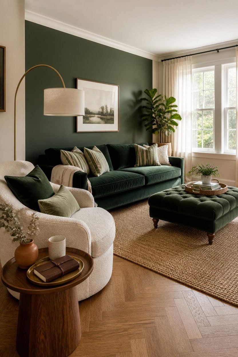
Velvet, linen, and boucle are the three fabrics that consistently work best for green and cream sofas because they hold color depth without looking flat or cheap. Velvet intensifies both green and cream tones, making either shade feel richer under natural light, while linen and boucle keep the palette feeling relaxed and livable. If you want longevity, go for a performance-grade version of whichever fabric you choose, especially in high-use living rooms.
Choose velvet for drama: Deep forest or sage green velvet sofas read as bold anchor pieces without requiring extra decor to fill the room.
Pick boucle for softness: Cream boucle adds warmth and subtle texture that makes a living room feel curated without looking overdone.
Use linen for a relaxed look: Natural cream linen sofas breathe well, photograph cleanly, and pair equally well with dark or muted greens.
Layer fabrics across pieces: If your sofa is boucle, add a velvet armchair or linen accent cushions to build contrast without clashing.
a soft, barely-there cream that lets your sofa fabric read as the star without competing on the walls.
a deep, grounded green that frames your sofa and pulls the palette together cleanly.
 Acanva Mellow Modern Tight Curved Back Velvet Sofa, 3 Seater, Cream
View Price
Acanva Mellow Modern Tight Curved Back Velvet Sofa, 3 Seater, Cream
View Price
 KEIKI 83" Luxury Oversized Velvet Chesterfield Sofa with 2 Pillows, Mid-Century Style 3-Seater Tufted Buttons Couch with High-Density Foam Cushions, Easy Assembly, for Apartment, Living Room, Green
View Price
KEIKI 83" Luxury Oversized Velvet Chesterfield Sofa with 2 Pillows, Mid-Century Style 3-Seater Tufted Buttons Couch with High-Density Foam Cushions, Easy Assembly, for Apartment, Living Room, Green
View Price
 Garvee 38" Wide Sage Green Accent Chair, Modern Linen Upholstered Armchair with High-Density Foam, Comfy Reading & Lounge Chair for Living Room, Bedroom, Home Office & Reading Nook (Earthy Green Tone)
View Price
Garvee 38" Wide Sage Green Accent Chair, Modern Linen Upholstered Armchair with High-Density Foam, Comfy Reading & Lounge Chair for Living Room, Bedroom, Home Office & Reading Nook (Earthy Green Tone)
View Price
 Cethom Decorative Boho Throw Pillow Covers, Farmhouse Textured Pillow Case, 18 x 18 Inch Set of 2, Chair Sofa Bedroom Living Room Home Decor Couch Cushion Case, Olive Green and Beige Striped
View Price
Cethom Decorative Boho Throw Pillow Covers, Farmhouse Textured Pillow Case, 18 x 18 Inch Set of 2, Chair Sofa Bedroom Living Room Home Decor Couch Cushion Case, Olive Green and Beige Striped
View Price
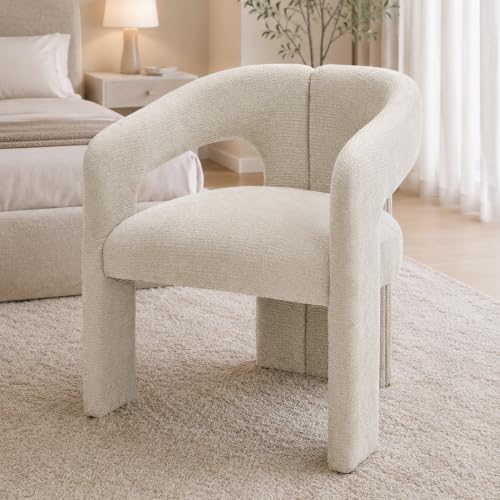 Tbillionnext Modern Boucle Accent Chair, Upholstered Barrel Armchair with Curved Open Back for Living Room Bedroom, Cream White
View Price
Tbillionnext Modern Boucle Accent Chair, Upholstered Barrel Armchair with Curved Open Back for Living Room Bedroom, Cream White
View Price
 Ntomtuex Linen Couch Cushion Cover Sofa Cover for Furniture Replacement Chair Cushion Protector for Pets Slipcover Loveseat Sofa Cushion Furniture Protector Seat Natural 3 Pieces
View Price
Ntomtuex Linen Couch Cushion Cover Sofa Cover for Furniture Replacement Chair Cushion Protector for Pets Slipcover Loveseat Sofa Cushion Furniture Protector Seat Natural 3 Pieces
View Price
 SONGMICS Storage Ottoman Bench, Foot Rest with Legs, Load up to 661.4 lb
View Price
SONGMICS Storage Ottoman Bench, Foot Rest with Legs, Load up to 661.4 lb
View Price
Why Wood, Rattan and Stone Belong in a Green and Cream Living Room
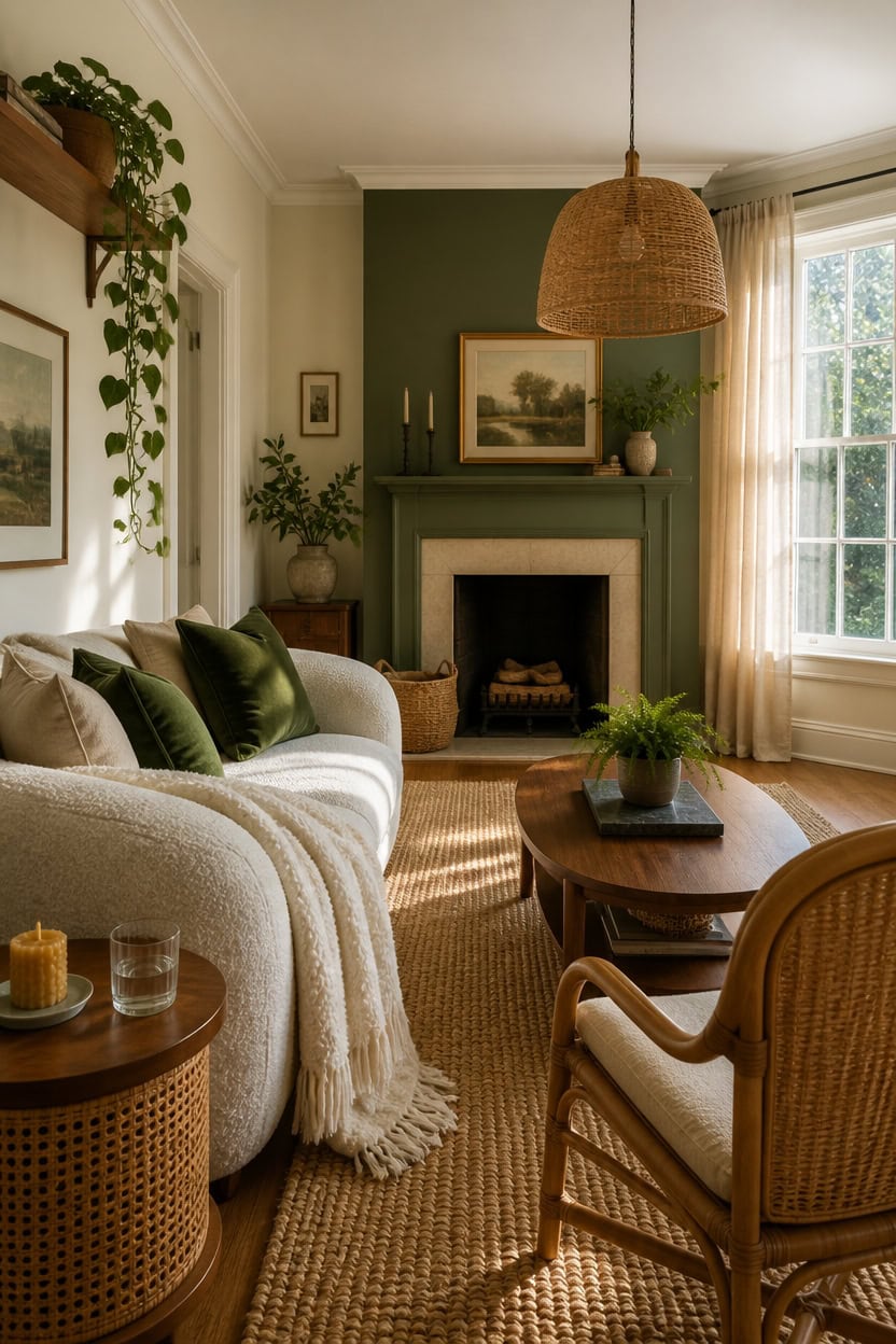
Wood, rattan, and stone work in a green and cream living room because they supply the earthy middle ground that keeps the palette from reading as flat or overly coordinated. Both green and cream are pulled directly from nature, and natural materials echo that origin in a way painted or synthetic surfaces simply cannot. Anchor the room with one or two larger natural material pieces first, then layer smaller ones to build depth without crowding the space.
Lead with wood tones: Medium walnut or warm oak grounds the palette and stops the green-and-cream combination from feeling cold or showroom-styled.
Add rattan for lightness: A rattan chair or pendant shade keeps the room breathing by introducing an open, airy texture that neither wood nor upholstery can replicate.
Use stone as a reset: A stone coffee table or slate tray breaks the softness of cream textiles and prevents the room from feeling overworked or too precious.
Mix scales deliberately: Pair a chunky stone object with fine rattan weaving so the natural materials create visual contrast rather than competing for the same tonal space.
a clean, warm cream that lets the wood and rattan tones read as grounded anchors rather than rustic afterthoughts.
a muted, natural green that bridges your organic materials and pulls the entire room into one cohesive earthy story.
 Rattan Lamp Shade, Handwoven Natural Wicker Lamp Shade
View Price
Rattan Lamp Shade, Handwoven Natural Wicker Lamp Shade
View Price
 Homiflex Coffee Table, Dual Oval Coffee Table for Living Room, 47'' Walnut
View Price
Homiflex Coffee Table, Dual Oval Coffee Table for Living Room, 47'' Walnut
View Price
 NoeBanJe Mid Century Accent Chair, Armchair with Curved Backrest and Upholstered, Reading Chair with Vintage Rattan Hollow Out, for Living Rooms, Bedrooms, Farmhouses, Balconies (Beige)
View Price
NoeBanJe Mid Century Accent Chair, Armchair with Curved Backrest and Upholstered, Reading Chair with Vintage Rattan Hollow Out, for Living Rooms, Bedrooms, Farmhouses, Balconies (Beige)
View Price
 JONATHAN Y Pata Hand Woven Chunky Jute Natural 7x7 Square Indoor Area Rug, Bohemian, Rustic, Cottage, Easy-Cleaning for Living Room, Bedroom, Kitchen, Non-Shedding (NRF102A-7SQ)
View Price
JONATHAN Y Pata Hand Woven Chunky Jute Natural 7x7 Square Indoor Area Rug, Bohemian, Rustic, Cottage, Easy-Cleaning for Living Room, Bedroom, Kitchen, Non-Shedding (NRF102A-7SQ)
View Price
 Natural Travertine Rectangular Decorative Tray 15"x10" – Stone Serving Tray
View Price
HiEnd Accents Teddy Cream 60x90 inch Boucle Throw Blanket
View Price
Natural Travertine Rectangular Decorative Tray 15"x10" – Stone Serving Tray
View Price
HiEnd Accents Teddy Cream 60x90 inch Boucle Throw Blanket
View Price
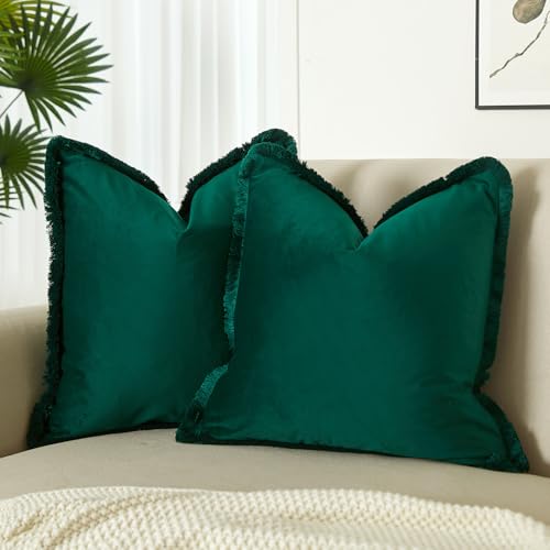 JUSPURBET Forest Green Velvet Throw Pillow Covers 18x18 Inch Set of 2 with Soft Tassel Fringe Luxury Boho Pillowcase for Sofa Couch Bed Home Decor Machine Washable
View Price
JUSPURBET Forest Green Velvet Throw Pillow Covers 18x18 Inch Set of 2 with Soft Tassel Fringe Luxury Boho Pillowcase for Sofa Couch Bed Home Decor Machine Washable
View Price
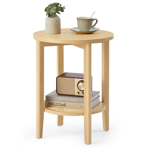 VASAGLE Round Side End Table, 2-Tier Boho Bedside Table with Rattan-Look
View Price
VASAGLE Round Side End Table, 2-Tier Boho Bedside Table with Rattan-Look
View Price
Removable Wallpaper for This Palette
Removable designer wallpaper from Wallshoppe, picked to match this palette. An easy way to add pattern to any room, and every design is available as a sample.
- Designed and printed in the USA
- Non-toxic inks
- Featured in NYT Wirecutter
 Townhouse Wallpaper by Sarah Jessica Parker – Pearl on Parchment
View Price
Townhouse Wallpaper by Sarah Jessica Parker – Pearl on Parchment
View Price
 The Queens Lace' Wallpaper by Sarah Jessica Parker – Oyster
View Price
The Queens Lace' Wallpaper by Sarah Jessica Parker – Oyster
View Price
 Fleur De Camomille Wallpaper by Sarah Jessica Parker – Parchment
View Price
Fleur De Camomille Wallpaper by Sarah Jessica Parker – Parchment
View Price
 Large Madison Stripe Wallpaper by Chris Benz – Tan
View Price
Large Madison Stripe Wallpaper by Chris Benz – Tan
View Price
 Tent Stripe Large Wallpaper by Chris Benz – Seaglass Blue
View Price
Tent Stripe Large Wallpaper by Chris Benz – Seaglass Blue
View Price
 Townhouse Mural Wallpaper by Sarah Jessica Parker – Pearl on Parchment
View Price
Townhouse Mural Wallpaper by Sarah Jessica Parker – Pearl on Parchment
View Price
 Tent Stripe Small Wallpaper by Chris Benz – Seaglass Blue
View Price
Tent Stripe Small Wallpaper by Chris Benz – Seaglass Blue
View Price
 Lily Pad Lake Wallpaper by Carly Beck – Oyster
View Price
Lily Pad Lake Wallpaper by Carly Beck – Oyster
View Price
 Fleur De Camomille Wallpaper by Sarah Jessica Parker – Pearl
View Price
Fleur De Camomille Wallpaper by Sarah Jessica Parker – Pearl
View Price
 Mums for Marion Wallpaper by Sarah Jessica Parker – Oyster
View Price
Mums for Marion Wallpaper by Sarah Jessica Parker – Oyster
View Price
 Townhouse Wallpaper by Sarah Jessica Parker – Peacock
View Price
Townhouse Wallpaper by Sarah Jessica Parker – Peacock
View Price
 Pacifico Palm Wallpaper by Nathan Turner – Ivory
View Price
Pacifico Palm Wallpaper by Nathan Turner – Ivory
View Price
 Pacifico Palm Wallpaper by Nathan Turner – Green on Indigo
View Price
Pacifico Palm Wallpaper by Nathan Turner – Green on Indigo
View Price
 Arance Dolci Wallpaper by Carly Beck – Pink
View Price
Arance Dolci Wallpaper by Carly Beck – Pink
View Price
 Buka Patchwork Wallpaper by Chris Benz – Green
View Price
Buka Patchwork Wallpaper by Chris Benz – Green
View Price
 The Queens Lace' Wallpaper by Sarah Jessica Parker – Silver
View Price
The Queens Lace' Wallpaper by Sarah Jessica Parker – Silver
View Price
 The Queens Lace' Wallpaper by Sarah Jessica Parker – Misty Blue
View Price
The Queens Lace' Wallpaper by Sarah Jessica Parker – Misty Blue
View Price
 Townhouse Wallpaper by Sarah Jessica Parker – Pearl on Charcoal
View Price
Townhouse Wallpaper by Sarah Jessica Parker – Pearl on Charcoal
View Price
 Pacifico Palm Wallpaper by Nathan Turner – Pink
View Price
Pacifico Palm Wallpaper by Nathan Turner – Pink
View Price
 El Quijote Wallpaper by Chris Benz – Multi / Blue / Green
View Price
El Quijote Wallpaper by Chris Benz – Multi / Blue / Green
View Price
 Monroe Street Wallpaper by Chris Benz – Yellow
View Price
Monroe Street Wallpaper by Chris Benz – Yellow
View Price
 Lafayette Patchwork Wallpaper by Chris Benz – Teal
View Price
Lafayette Patchwork Wallpaper by Chris Benz – Teal
View Price
 Buka Patchwork Wallpaper by Chris Benz – Flax
View Price
Buka Patchwork Wallpaper by Chris Benz – Flax
View Price
 Barbara Ann Wallpaper by Wallshoppe – Army Green
View Price
Barbara Ann Wallpaper by Wallshoppe – Army Green
View Price
 Buka Patchwork Wallpaper by Chris Benz – Burlap
View Price
Buka Patchwork Wallpaper by Chris Benz – Burlap
View Price
 Pacifico Palm Wallpaper by Nathan Turner – Peach
View Price
Pacifico Palm Wallpaper by Nathan Turner – Peach
View Price
 Fiddle Fig Wallpaper by Nathan Turner – Indigo
View Price
Fiddle Fig Wallpaper by Nathan Turner – Indigo
View Price
 Townhouse Wallpaper by Sarah Jessica Parker – Morning Dew on Misty Blue
View Price
Townhouse Wallpaper by Sarah Jessica Parker – Morning Dew on Misty Blue
View Price
 Arance Dolci Wallpaper by Carly Beck – Orange
View Price
Arance Dolci Wallpaper by Carly Beck – Orange
View Price
 Lemons Wallpaper by Nathan Turner – Peacock
View Price
Lemons Wallpaper by Nathan Turner – Peacock
View Price
 Tent Stripe Large Wallpaper by Chris Benz – Mustard
View Price
Tent Stripe Large Wallpaper by Chris Benz – Mustard
View Price
 Pacifico Palm Wallpaper by Nathan Turner – Onyx
View Price
Pacifico Palm Wallpaper by Nathan Turner – Onyx
View Price
 Townhouse Wallpaper by Sarah Jessica Parker – Silver on Sage
View Price
Townhouse Wallpaper by Sarah Jessica Parker – Silver on Sage
View Price
 Life is a Banquet Stripe Wallpaper by Lingua Franca – Blues
View Price
Life is a Banquet Stripe Wallpaper by Lingua Franca – Blues
View Price
 Ojai Stripe Wallpaper by Wallshoppe – Iced Chai
View Price
Ojai Stripe Wallpaper by Wallshoppe – Iced Chai
View Price
 Sidewalk Wallpaper by Chris Benz – Green
View Price
Sidewalk Wallpaper by Chris Benz – Green
View Price
 Townhouse Wallpaper by Sarah Jessica Parker – Pearl on Deep Navy
View Price
Townhouse Wallpaper by Sarah Jessica Parker – Pearl on Deep Navy
View Price
 Lafayette Patchwork Wallpaper by Chris Benz – Green
View Price
Lafayette Patchwork Wallpaper by Chris Benz – Green
View Price
 Sweet Caroline Wallpaper by Wallshoppe – Green
View Price
Sweet Caroline Wallpaper by Wallshoppe – Green
View Price
 Lemons Wallpaper by Nathan Turner – White
View Price
Lemons Wallpaper by Nathan Turner – White
View Price
Houseplants That Elevate a Green and Cream Living Room
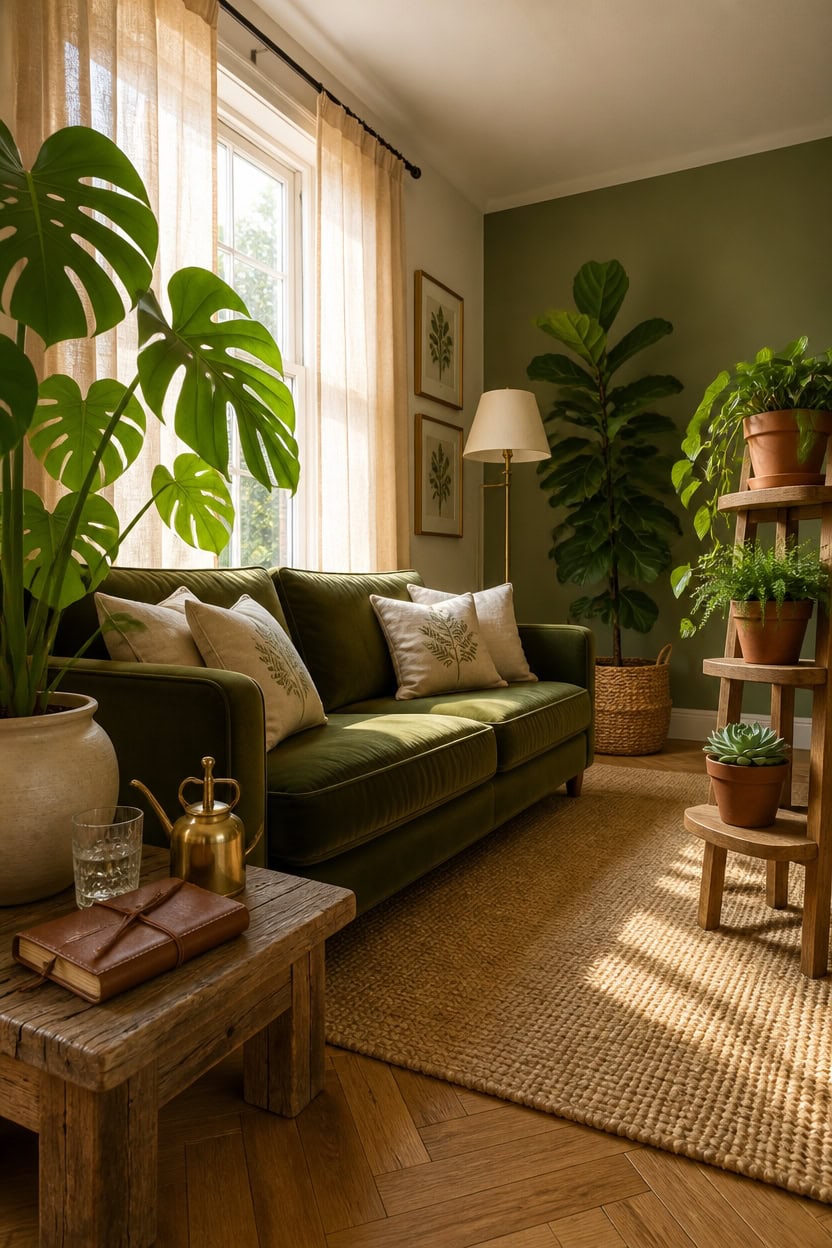
Houseplants bring organic structure to a green and cream living room that textiles and furniture simply cannot replicate. Living greenery deepens the existing green palette while the natural soil tones and terracotta of plant pots anchor cream walls without competing with them. Position larger statement plants first to establish scale, then layer smaller ones at varying heights to fill the room with life rather than clutter.
Go bold with leaf shape: Large-leaf plants like monstera or fiddle-leaf fig create strong silhouettes that hold their own against rich green walls.
Let cream guide your pots: White, cream, or natural terracotta pots keep the planter from fighting the palette and let the plant do the visual work.
Use height strategically: A tall floor plant beside a sofa and a trailing plant on a shelf create a layered vertical story that makes ceilings feel higher.
Cluster in odd numbers: Groups of three plants at different heights look intentional and curated rather than randomly placed around the room.
a warm cream base that makes terracotta pots and dark green foliage pop without competing with either.
a muted earthy green that blurs the line between your living plants and the room itself.
 Aveyas 54'' Tall Large Artificial Monstera Deliciosa Plants, 4.5 Feet Faux Swiss Cheese Floor Plants Fake Tropical Silk Tree with Pot for Indoor Outdoor Office House Living Room Home Decor
View Price
Aveyas 54'' Tall Large Artificial Monstera Deliciosa Plants, 4.5 Feet Faux Swiss Cheese Floor Plants Fake Tropical Silk Tree with Pot for Indoor Outdoor Office House Living Room Home Decor
View Price
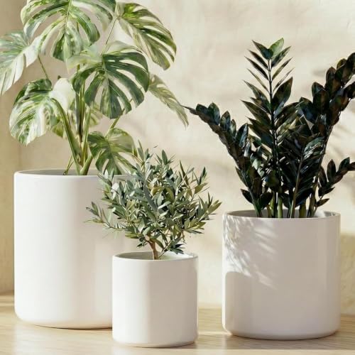 LE TAUCI 10+8+6 Inch Ceramic Pots for Plants, Indoor Planters with Drainage Hole and Plug, Modern Cylinder Flower Pots Set of 3 for Living Room and Bedroom, Satin, White
View Price
LE TAUCI 10+8+6 Inch Ceramic Pots for Plants, Indoor Planters with Drainage Hole and Plug, Modern Cylinder Flower Pots Set of 3 for Living Room and Bedroom, Satin, White
View Price
 JOZHENJU 5Ft Artificial Fiddle Leaf Fig Tree Indoor for Home Decor
View Price
JOZHENJU 5Ft Artificial Fiddle Leaf Fig Tree Indoor for Home Decor
View Price
 Plant Pots Indoor with Drainage 10 Pack Multi-Size Planters Set Terracotta
View Price
Plant Pots Indoor with Drainage 10 Pack Multi-Size Planters Set Terracotta
View Price
 Casafield Set of 3 Braided Seagrass Baskets with Jute Handles - Natural, Woven Storage Basket Planters, Boho Decor for Entryway, Living Room, Bedroom
View Price
Casafield Set of 3 Braided Seagrass Baskets with Jute Handles - Natural, Woven Storage Basket Planters, Boho Decor for Entryway, Living Room, Bedroom
View Price
 Costa Farms Golden Pothos, Live Indoor Plant, Trailing Vine, Air Purifying
View Price
Costa Farms Golden Pothos, Live Indoor Plant, Trailing Vine, Air Purifying
View Price
 GEEBOBO 5 Tiered Tall Plant Stand for Indoor
View Price
GEEBOBO 5 Tiered Tall Plant Stand for Indoor
View Price
 Foindtower Decorative Linen Floral Throw Pillow Cover 18×18 Inch,Sage Green
View Price
Foindtower Decorative Linen Floral Throw Pillow Cover 18×18 Inch,Sage Green
View Price
Lighting That Makes Your Green and Cream Living Room Glow
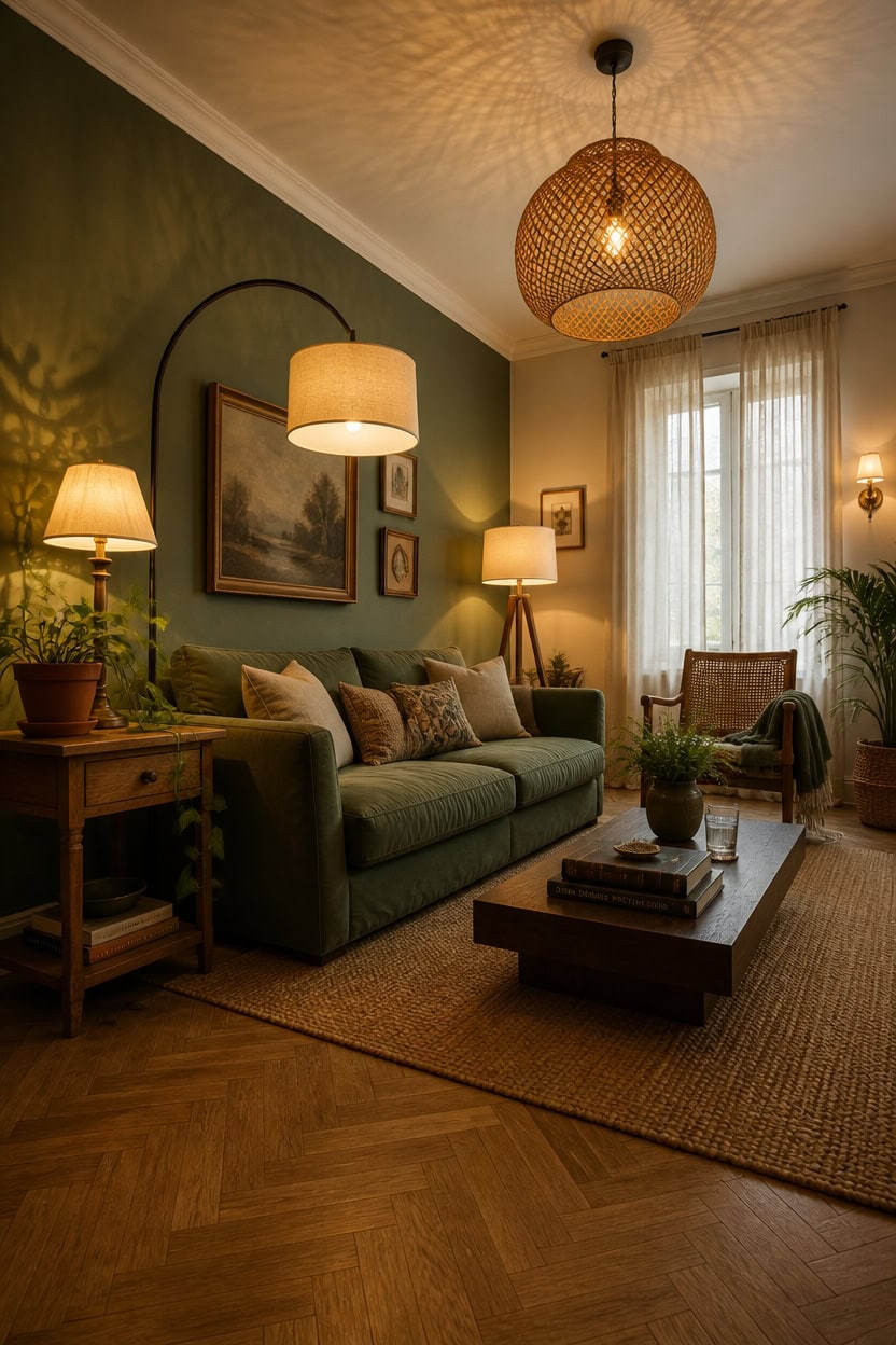
Warm light sources do more work in a green and cream room than most people realize — they pull the yellow undertones out of cream walls while deepening the richness of green without making it look murky. Cream and green both have organic roots, and warm-toned bulbs in the 2700K range honor that by mimicking natural afternoon light. Layer at least three light sources at different heights so no single fixture flattens the room.
Layer your sources: Use ceiling, floor, and table lights together so the room never reads as one-dimensional after dark.
Warm bulbs only: Bulbs above 3000K push cream walls toward white and strip green of its depth — stick to 2700K maximum.
Highlight plants deliberately: A small directional spotlight or uplighter aimed at a statement plant makes living greenery glow like a focal point.
Choose natural materials: Linen, rattan, and wood lamp bases echo the organic palette without adding a new color to manage.
a warm cream tone that reflects warm bulb light downward and makes the whole room feel amber-lit even with modest fixtures.
a muted, earthy green that absorbs light softly and gives pendants and sconces something moody to play against.
 TOBUSA 23.5" Cream Ceramic Table Lamps Set of 2, Modern Nightstand Lamps
View Price
TOBUSA 23.5" Cream Ceramic Table Lamps Set of 2, Modern Nightstand Lamps
View Price
 LAMSU Modern Farmhouse Chandelier Light Fixtures, 5-Lights Large Rattan Pendant Lighting with Hand Woven Wicker Shade, Boho Black Chandeliers for Dining Room Living Room Kitchen Island Bedroom
View Price
LAMSU Modern Farmhouse Chandelier Light Fixtures, 5-Lights Large Rattan Pendant Lighting with Hand Woven Wicker Shade, Boho Black Chandeliers for Dining Room Living Room Kitchen Island Bedroom
View Price
 Ascher Vintage LED Edison Bulbs, 6W, Equivalent 60W, Non-Dimmable, High Brightness Warm White 2700K, ST58 Antique LED Filament Bulbs with 80+ CRI, E26 Medium Base, Clear Glass, Pack of 4
View Price
Ascher Vintage LED Edison Bulbs, 6W, Equivalent 60W, Non-Dimmable, High Brightness Warm White 2700K, ST58 Antique LED Filament Bulbs with 80+ CRI, E26 Medium Base, Clear Glass, Pack of 4
View Price
 【Upgraded】Black Arc Floor Lamps for Living Room - Dimmable Arched Floor Lamp with Remote Control & 2700-6000K 9W LED Bulb Included, Modern Arch Standing lamp, Industrial Tall Lamp for Bedroom Reading
View Price
【Upgraded】Black Arc Floor Lamps for Living Room - Dimmable Arched Floor Lamp with Remote Control & 2700-6000K 9W LED Bulb Included, Modern Arch Standing lamp, Industrial Tall Lamp for Bedroom Reading
View Price
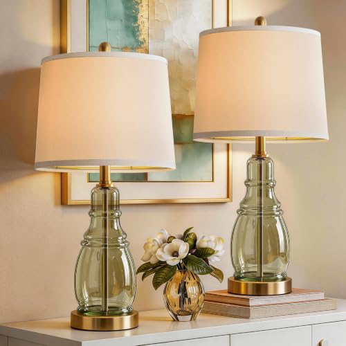 ROTTOGOON Glass Table Lamp Set of 2, Modern Table Lamps for Living Room Bedroom, Bedside Desk Lamps Vintage Nightstand Lamps with Linen Shades, 22", Green
View Price
ROTTOGOON Glass Table Lamp Set of 2, Modern Table Lamps for Living Room Bedroom, Bedside Desk Lamps Vintage Nightstand Lamps with Linen Shades, 22", Green
View Price
 LAMSU Oak Wood Tripod Floor Lamps for Living Room, Boho Floor Lamp with Shelves, Mid Century Rattan Standing Lamp with Fabric Shade, ON/Off Switch, Farmhouse Tall Floor Lamps for Bedroom Office
View Price
LAMSU Oak Wood Tripod Floor Lamps for Living Room, Boho Floor Lamp with Shelves, Mid Century Rattan Standing Lamp with Fabric Shade, ON/Off Switch, Farmhouse Tall Floor Lamps for Bedroom Office
View Price
 Large Drum Lamp Shades Set of 2, 12"Top x 16"Bottom x 11"High, Beige Lampshades for Table Lamps Floor Lamps, Natural Linen Replacement Lamp Shades, Spider, Harp Holders Included, Easy Assembly
View Price
Large Drum Lamp Shades Set of 2, 12"Top x 16"Bottom x 11"High, Beige Lampshades for Table Lamps Floor Lamps, Natural Linen Replacement Lamp Shades, Spider, Harp Holders Included, Easy Assembly
View Price
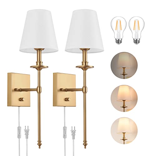 Dimmable Wall Sconces Set of Two, Plug in Wall Sconces White Fabric Shade, Wall Lamp for Bedroom, Living room, Plug in Wall Light Sconces Wall Decor Set of 2, LED Bulbs Included, Antique Brass
View Price
Dimmable Wall Sconces Set of Two, Plug in Wall Sconces White Fabric Shade, Wall Lamp for Bedroom, Living room, Plug in Wall Light Sconces Wall Decor Set of 2, LED Bulbs Included, Antique Brass
View Price
Our Favorite Floor Lamps
- Free shipping over $35
- Picked at 4.5 stars or higher
 Coleford 65" 3-Light Tree Floor Lamp with Woven Rattan Shades
View Price
Coleford 65" 3-Light Tree Floor Lamp with Woven Rattan Shades
View Price
 Crevan 65" Dimmable Rattan Tree Floor Lamp with 3 Bulbs
View Price
Crevan 65" Dimmable Rattan Tree Floor Lamp with 3 Bulbs
View Price
 Rasch 65" Tree Floor Lamp with Dimmable Bulbs
View Price
Rasch 65" Tree Floor Lamp with Dimmable Bulbs
View Price
 Rhodes 63" 1-Light Traditional Floor Lamp
View Price
Rhodes 63" 1-Light Traditional Floor Lamp
View Price
 Brayana 64" Silver Traditional Floor Lamp
View Price
Brayana 64" Silver Traditional Floor Lamp
View Price
 Mctaggart 66" Distressed Traditional Floor Lamp
View Price
Mctaggart 66" Distressed Traditional Floor Lamp
View Price
 Aarzo 69.6" Arched Rattan Floor Lamp with LED and Remote
View Price
Aarzo 69.6" Arched Rattan Floor Lamp with LED and Remote
View Price
 Peavine 76" Rattan Arched Floor Lamp with Remote Control
View Price
Peavine 76" Rattan Arched Floor Lamp with Remote Control
View Price
 Atlasburg 63" Metal Arched Floor Lamp with Rattan Shade
View Price
Atlasburg 63" Metal Arched Floor Lamp with Rattan Shade
View Price
 Kigali 62.5" Light Wood Tripod Floor Lamp
View Price
Kigali 62.5" Light Wood Tripod Floor Lamp
View Price
 62.71" Solid Wood Floor Lamp with Linen Shade
View Price
62.71" Solid Wood Floor Lamp with Linen Shade
View Price
 Jan 65" Torchiere Floor Lamp
View Price
Jan 65" Torchiere Floor Lamp
View Price
 Pilsen 58" Task Floor Lamp
View Price
Pilsen 58" Task Floor Lamp
View Price
Botanical Prints and Artwork That Complete the Garden-Inspired Look
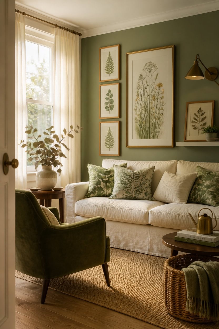
Botanical prints and wall art work best in a green and cream room when they echo the colors already present rather than introduce competing ones — think ink illustrations of ferns, eucalyptus, or wildflowers rendered in deep green on cream or ivory paper. The repetition of organic shapes ties the art to the room’s palette so the wall becomes an extension of the design rather than a separate statement. Frame botanical prints in natural wood or aged brass to keep the garden-inspired feeling grounded and warm.
Layer scales: Mix one large statement print with two or three smaller ones so the wall has rhythm instead of feeling like a single decorative afterthought.
Stay within the palette: Prints with cream backgrounds and green botanical detail pull double duty — they reference the wall color and the accent color at the same time.
Mix mediums carefully: A framed pressed botanical specimen next to a painted watercolor adds depth without chaos, as long as both share the same color family.
Use gallery walls sparingly: Three prints in a tight vertical or horizontal cluster read more intentionally than a sprawling collection that dilutes the garden focus.
a soft, organic green with grey undertones that makes botanical prints look like they belong to the wall rather than sitting on top of it.
a warm cream white that frames botanical art cleanly without pulling the eye away from the prints themselves.
 2PCS Glass Pressed Flower Frame Vintage Distressed Green Wood Botanical Wall Art Rustic Pressed Permanent Flowers Ornaments, Farmhouse Glass Frame Desktop Display Decor with Dried Flowers Plants Specimen for Home, Living Room, Bedroom
View Price
2PCS Glass Pressed Flower Frame Vintage Distressed Green Wood Botanical Wall Art Rustic Pressed Permanent Flowers Ornaments, Farmhouse Glass Frame Desktop Display Decor with Dried Flowers Plants Specimen for Home, Living Room, Bedroom
View Price
 ArtbyHannah Gallery Wall Frame Set, 8 Pack Neutral Wall Decor, Beige, Large
View Price
ArtbyHannah Gallery Wall Frame Set, 8 Pack Neutral Wall Decor, Beige, Large
View Price
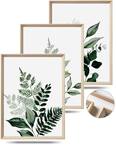 UPWOIGH Olive Leaf Wood Framed Wall Art, 12 x 16 Inch, Set of 3
View Price
UPWOIGH Olive Leaf Wood Framed Wall Art, 12 x 16 Inch, Set of 3
View Price
 Camden Reed Mixed Gallery Wall Frame Set, (2) 16x20 Inch, (1) 11x14 Inch, and (2) 8x10 Inch, 9 Piece, Brass
View Price
Camden Reed Mixed Gallery Wall Frame Set, (2) 16x20 Inch, (1) 11x14 Inch, and (2) 8x10 Inch, 9 Piece, Brass
View Price
 Lvases Snuggle Hollow Ceramic Vase Set of 2, Boho Tabletop Home Decor Vases
View Price
Lvases Snuggle Hollow Ceramic Vase Set of 2, Boho Tabletop Home Decor Vases
View Price
 18 Pcs Natural Eucalyptus Stems - 17" Fragrant for Shower & Vase
View Price
18 Pcs Natural Eucalyptus Stems - 17" Fragrant for Shower & Vase
View Price
 Kawani Sage Green Leaf Pillow Covers 18x18 Inch Set of 2 Spring Leaves Plants Botanical Decorative Pillowcase Cotton Linen Square Cushion Case for Couch Sofa Bedroom Home Decoration
View Price
Kawani Sage Green Leaf Pillow Covers 18x18 Inch Set of 2 Spring Leaves Plants Botanical Decorative Pillowcase Cotton Linen Square Cushion Case for Couch Sofa Bedroom Home Decoration
View Price
How to Make a Small Green and Cream Living Room Feel Larger
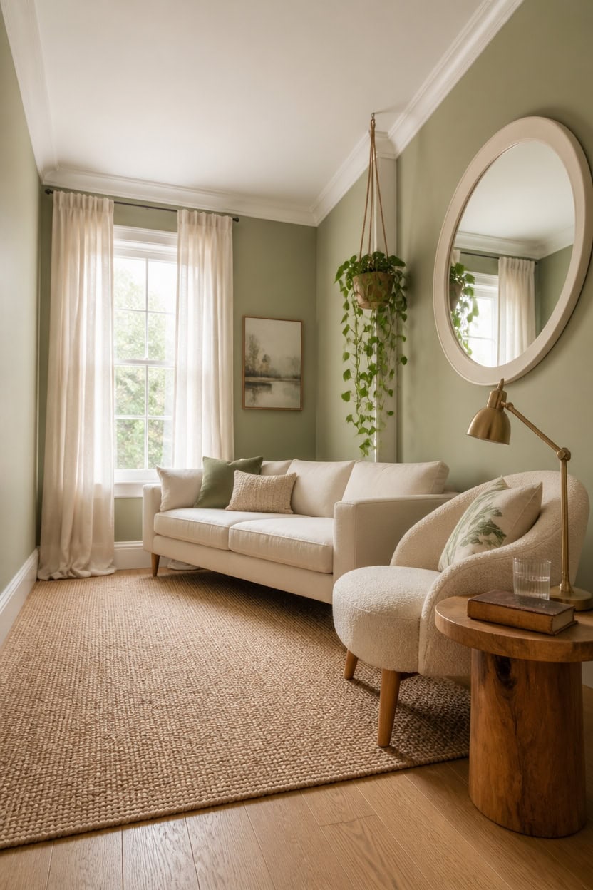
Light colors, low furniture, and reflective surfaces are the three tools that make a small living room feel bigger than it actually is — and a green and cream palette happens to be one of the best combinations for pulling this off. Cream expands walls visually by bouncing light around the room, while a well-placed green keeps the space from feeling cold or sterile. Keep large pieces — sofa, rug, curtains — in cream, and let green appear only in smaller doses so the eye reads open space first.
Use low-profile furniture: Sofas and chairs with exposed legs and low backs create breathing room between furniture and ceiling, making walls feel taller.
Mirror the green: A cream-framed mirror opposite a window doubles natural light and reflects the green accents already in the room without adding visual clutter.
Run curtains floor to ceiling: Hanging curtain rods as close to the ceiling as possible draws the eye upward and makes the room feel taller than it is.
Keep the rug pale: A cream or warm ivory area rug unifies the floor plane into one continuous surface, which reads as more space than a dark or heavily patterned alternative.
so the room wraps in one continuous soft green that removes visual interruptions and stops the eye from bouncing between competing surfaces.
a clean, bright cream white that pushes walls outward and makes the ceiling lift noticeably higher.
 Modway Monica 88 Inch Boucle Sofa in Cream – Comfortable Low Profile 3 Seater Fabric Couch for Living Room, Bedroom, Or Apartment
View Price
Modway Monica 88 Inch Boucle Sofa in Cream – Comfortable Low Profile 3 Seater Fabric Couch for Living Room, Bedroom, Or Apartment
View Price
 SnuYucto Sage Green Leaf Throw Pillow Covers 18x18 Set of 2, Cream Botanical Branch Decorative Cushion Covers, Minimalist Modern Pillow Cases for Sofa Couch Bedroom Living Room Home Decor
View Price
SnuYucto Sage Green Leaf Throw Pillow Covers 18x18 Set of 2, Cream Botanical Branch Decorative Cushion Covers, Minimalist Modern Pillow Cases for Sofa Couch Bedroom Living Room Home Decor
View Price
 Lightweight Linen Semi Sheer Curtains 96 Inch Long 2 Panels Set, 8FT Floor to Ceiling Relaxed Rod Pocket Drapes, Light Oatmeal Warm Cream Ivory Light Filtering Window Drapery for Living Room Bedroom
View Price
Lightweight Linen Semi Sheer Curtains 96 Inch Long 2 Panels Set, 8FT Floor to Ceiling Relaxed Rod Pocket Drapes, Light Oatmeal Warm Cream Ivory Light Filtering Window Drapery for Living Room Bedroom
View Price
 fuxuiwy 24" Round Mirror Farmhouse Wooden Frame Circle Mirrors, Rustic Decorative Distressed Wall Mounted Mirror for Bathroom, Bedroom, Living Room, Entryway, Fireplace, Hall
View Price
fuxuiwy 24" Round Mirror Farmhouse Wooden Frame Circle Mirrors, Rustic Decorative Distressed Wall Mounted Mirror for Bathroom, Bedroom, Living Room, Entryway, Fireplace, Hall
View Price
 Apicizon Round Side Table, Natural Wood Nightstand
View Price
Apicizon Round Side Table, Natural Wood Nightstand
View Price
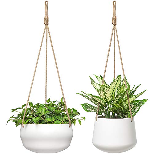 Mkono Ceramic Hanging Planters for Indoor Plants, 8" Shallow & 6" Deep 2Pcs
View Price
Mkono Ceramic Hanging Planters for Indoor Plants, 8" Shallow & 6" Deep 2Pcs
View Price
Our Favorite Slipcovers
- Free shipping over $35
- Picked at 4.4 stars or higher
 Reversible Non-Slip Couch Cover for 3-Cushion Couch
View Price
Reversible Non-Slip Couch Cover for 3-Cushion Couch
View Price
 Medallion Reversible Sofa Pet Furniture Protector Slipcover
View Price
Medallion Reversible Sofa Pet Furniture Protector Slipcover
View Price
 Pizarro 4-Piece Stretch Jacquard Sofa Slipcover for 3-Cushion Couch
View Price
Pizarro 4-Piece Stretch Jacquard Sofa Slipcover for 3-Cushion Couch
View Price
 Water Resistant Non-Slip Recliner Chair Slipcover with Pocket
View Price
Water Resistant Non-Slip Recliner Chair Slipcover with Pocket
View Price
 Patchwork Reversible Recliner Pet Furniture Protector Slipcover
View Price
Patchwork Reversible Recliner Pet Furniture Protector Slipcover
View Price
 Medallion Reversible Recliner Pet Furniture Protector Slipcover
View Price
Medallion Reversible Recliner Pet Furniture Protector Slipcover
View Price
 Pizarro 3-Piece Stretch Jacquard Loveseat Slipcover for 2-Cushion Couch
View Price
Pizarro 3-Piece Stretch Jacquard Loveseat Slipcover for 2-Cushion Couch
View Price
 Soft Velvet Plush 3-Piece Stretch Loveseat Slipcover for 2-Cushion Couch
View Price
Soft Velvet Plush 3-Piece Stretch Loveseat Slipcover for 2-Cushion Couch
View Price
 100% Waterproof Microfiber Sofa Slipcover with Elastic Straps
View Price
100% Waterproof Microfiber Sofa Slipcover with Elastic Straps
View Price
 Medallion Reversible Chair Pet Furniture Protector Slipcover
View Price
Medallion Reversible Chair Pet Furniture Protector Slipcover
View Price
 Rich Velvet Stretch 2-Piece Box Cushion Armchair Slipcover
View Price
Rich Velvet Stretch 2-Piece Box Cushion Armchair Slipcover
View Price
 2-Piece L-Shaped Sectional Couch Cover, Machine Washable
View Price
2-Piece L-Shaped Sectional Couch Cover, Machine Washable
View Price
 Stretch Sectional Couch Cover with Anti-Slip Pet Protection
View Price
Stretch Sectional Couch Cover with Anti-Slip Pet Protection
View Price
How to Keep Your Green and Cream Living Room Fresh All Year
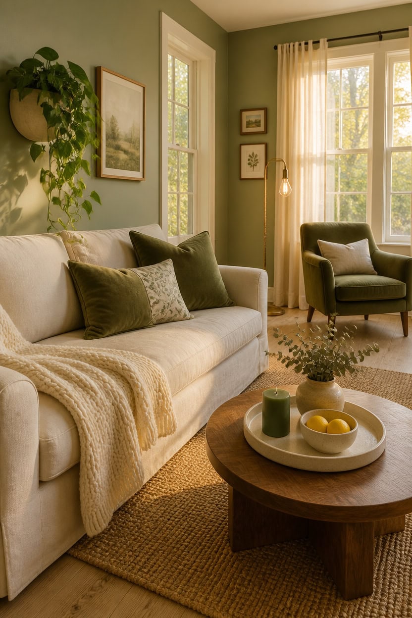
Swapping out a few textiles and natural elements each season is the easiest way to keep a green and cream living room feeling current without repainting or redecorating from scratch. Cream acts as a neutral canvas that absorbs seasonal color shifts naturally, while green shifts in mood depending on what surrounds it — warm amber accents make it feel autumnal, while bright whites and botanicals push it toward fresh spring energy. Rotate just two or three pieces — throw pillows, a blanket, a vase — and the whole room reads differently.
Lean into texture over color: Swap a linen throw for chunky knit in fall and a lightweight cotton weave in summer to signal seasonal change without touching your palette.
Rotate botanicals strategically: Use leafy trailing plants like pothos in spring and summer, then shift to sculptural greenery like eucalyptus stems or dried pampas in fall and winter.
Change one anchor piece: Replacing the coffee table tray styling — a candle cluster in winter, a ceramic bowl with fruit in summer — refreshes the visual center of the room fast.
Let light do the seasonal work: Add a warm-toned lamp in darker months and pull back curtains fully in spring to shift the room’s mood using what you already own.
in a full wrap application so the green reads warmer in winter light and crisper in summer daylight without any changes to the wall itself.
so the clean cream ground amplifies whatever seasonal accents you layer in front of it year-round.
 Larexius Chunky Knit Throw Blanket for Couch,50x60 Inches Cream
View Price
Larexius Chunky Knit Throw Blanket for Couch,50x60 Inches Cream
View Price
 57 Inch 20 Stems Tall Pampas Grass for Floor Vase, Large Fluffy Dried Pampas Grass Decor, Beige Long Pampas Grass, Tall Vase Filler for Living Room, Wedding & Boho Home Decor
View Price
57 Inch 20 Stems Tall Pampas Grass for Floor Vase, Large Fluffy Dried Pampas Grass Decor, Beige Long Pampas Grass, Tall Vase Filler for Living Room, Wedding & Boho Home Decor
View Price
 MIULEE Faux Fur Decorative Throw Pillow Covers 18x18 Set of 2 Sage Green
View Price
MIULEE Faux Fur Decorative Throw Pillow Covers 18x18 Set of 2 Sage Green
View Price
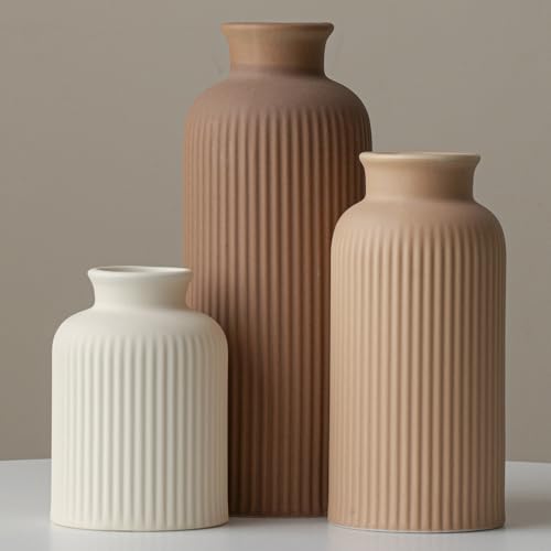 Large Modern Ceramic Vase Set, Coffee Ribbed Matte Design, 3-Piece Decorative Vases for Home, Living Room, Office (XL Coffee Mix)
View Price
Large Modern Ceramic Vase Set, Coffee Ribbed Matte Design, 3-Piece Decorative Vases for Home, Living Room, Office (XL Coffee Mix)
View Price
 10 Inch Hanging Planter, Glazed Hanging Baskets for Indoor Outdoor Plants
View Price
10 Inch Hanging Planter, Glazed Hanging Baskets for Indoor Outdoor Plants
View Price
 ACOHOOK Mid Century Modern 4 Globe Gold Floor Lamp, Dimmable Standing Lamp with 3000K Warm White Bulbs Included, Tall Ambient Floor Lamp for Living Room Bedroom Home Office Sofa Beside Corner Decor
View Price
ACOHOOK Mid Century Modern 4 Globe Gold Floor Lamp, Dimmable Standing Lamp with 3000K Warm White Bulbs Included, Tall Ambient Floor Lamp for Living Room Bedroom Home Office Sofa Beside Corner Decor
View Price
 26Pcs Real Dried Eucalyptus Stems, 17" Blue-Green Dry Flowers
View Price
26Pcs Real Dried Eucalyptus Stems, 17" Blue-Green Dry Flowers
View Price
Common Mistakes to Avoid With Green and Cream Décor
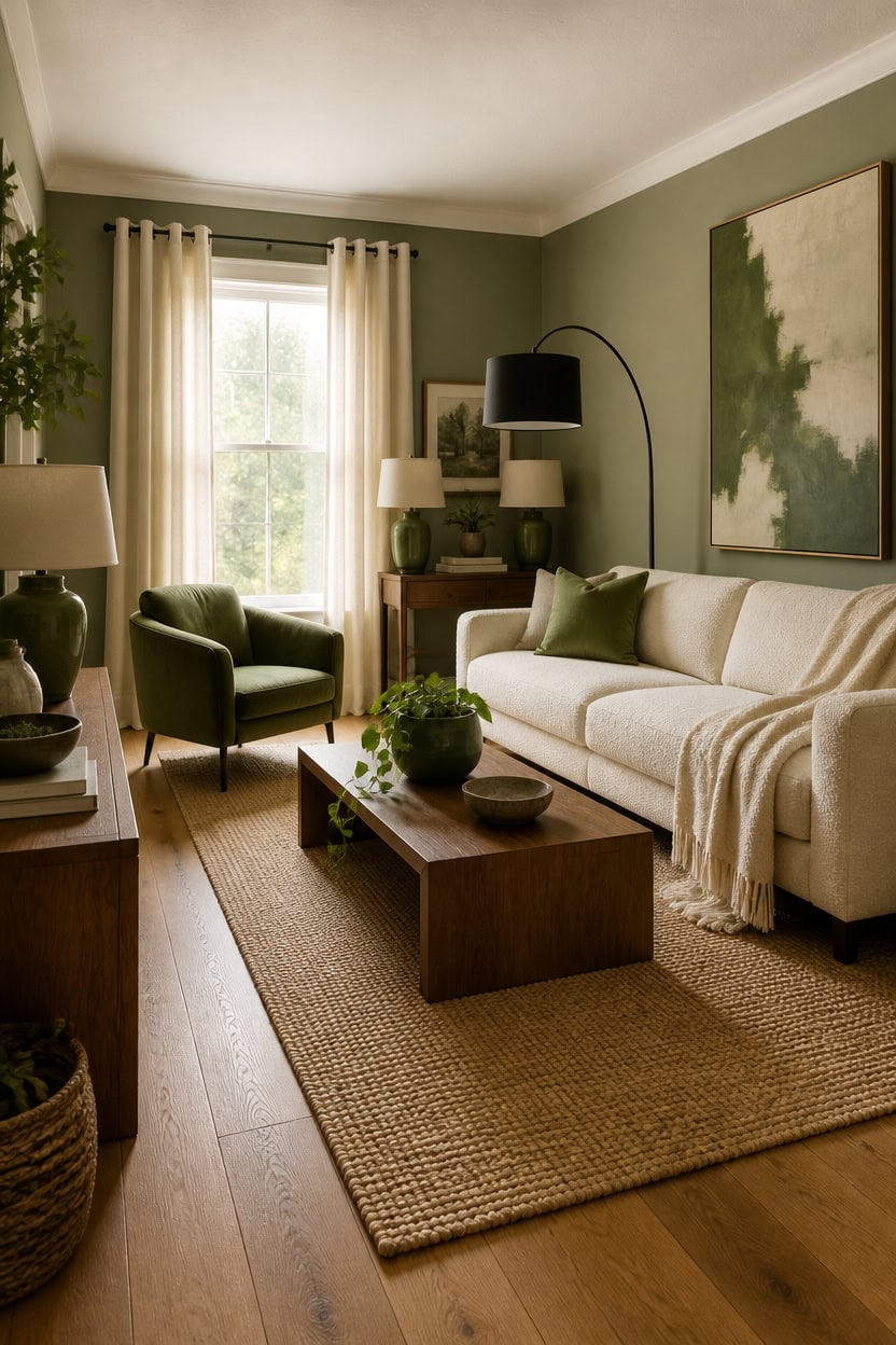
Green and cream décor fails most often when the balance between the two colors gets lost — either the room turns into a sea of flat cream with nowhere for the eye to land, or green overwhelms every surface until it feels heavy and closed in. These two colors have a natural push-pull relationship that only works when one clearly leads and the other supports. Treat cream as the dominant base covering roughly 60 percent of the room, and let green earn its presence through specific, deliberate placements.
Too much green at once: Stacking green on walls, sofa, rug, and curtains simultaneously removes all visual rest — pull it back to two or three surfaces maximum.
Using the wrong green undertone: A yellow-heavy green next to warm cream reads muddy; choose a green with gray or blue undertones to keep the pairing clean and sharp.
Ignoring texture contrast: When both green and cream surfaces share the same flat finish, the palette loses dimension — mix matte, woven, and glossy finishes across each color.
Skipping a dark anchor: Green and cream together can feel washed out without one grounding element in charcoal, walnut, or black to give the eye a stopping point.
this warm, complex green reads softer against cream trim so the room feels layered rather than saturated.
this creamy off-white keeps the boundary between wall and trim intentional without going stark bright white.
 Modern Green Velvet Accent Chairs Set of 2, Barrel Armchairs Living Room
View Price
Modern Green Velvet Accent Chairs Set of 2, Barrel Armchairs Living Room
View Price
 blunique Ultra Soft Cozy Faux Fur Throw Blanket, Fuzzy Plush Thick Bubble Blanket, Oversize Luxury Fluffy Blanket for Couch, Bed, and Living Room, 60x80 Inches, Cream White
View Price
blunique Ultra Soft Cozy Faux Fur Throw Blanket, Fuzzy Plush Thick Bubble Blanket, Oversize Luxury Fluffy Blanket for Couch, Bed, and Living Room, 60x80 Inches, Cream White
View Price
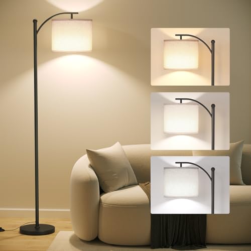 SUNMORY Arc Floor Lamp, Modern Floor Lamp with 3 Color Temperatures Bulb
View Price
SUNMORY Arc Floor Lamp, Modern Floor Lamp with 3 Color Temperatures Bulb
View Price
 Large Framed Green and Beige Abstract Wall Art, 3 Piece Set, Each 20x30 In
View Price
Large Framed Green and Beige Abstract Wall Art, 3 Piece Set, Each 20x30 In
View Price
 YEXINGlow 47" Rectangular Solid Wood Coffee Tables for Living Room, Walnut
View Price
YEXINGlow 47" Rectangular Solid Wood Coffee Tables for Living Room, Walnut
View Price
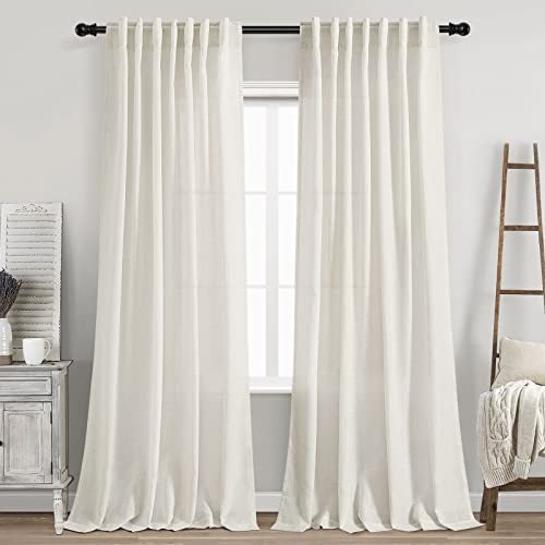 Cream Linen Back Tab Curtains 84 Inch Length for Living Room 2 Panel Set Neutral Modern Farmhouse Window Privacy Semi Sheer Linen Drapes Rustic Pinch Pleated Look Curtain Natural Ivory Colored
View Price
Cream Linen Back Tab Curtains 84 Inch Length for Living Room 2 Panel Set Neutral Modern Farmhouse Window Privacy Semi Sheer Linen Drapes Rustic Pinch Pleated Look Curtain Natural Ivory Colored
View Price
 PoKat 24'' Hand-Textured Green Table Lamps, Farmhouse Bedside Lamp Set of 2
View Price
PoKat 24'' Hand-Textured Green Table Lamps, Farmhouse Bedside Lamp Set of 2
View Price
 Kurrajong Farmhouse Dark Green Fake pothos | Fake Plant for Shelf Decor | Artificial Trailing Ivy Plant with 5" Wide Ceramic Pot | Faux pothos | Feaux Pothos | Bathroom and Kitchen Decor
View Price
Kurrajong Farmhouse Dark Green Fake pothos | Fake Plant for Shelf Decor | Artificial Trailing Ivy Plant with 5" Wide Ceramic Pot | Faux pothos | Feaux Pothos | Bathroom and Kitchen Decor
View Price
Budget-Friendly Ways to Achieve the Green and Cream Look
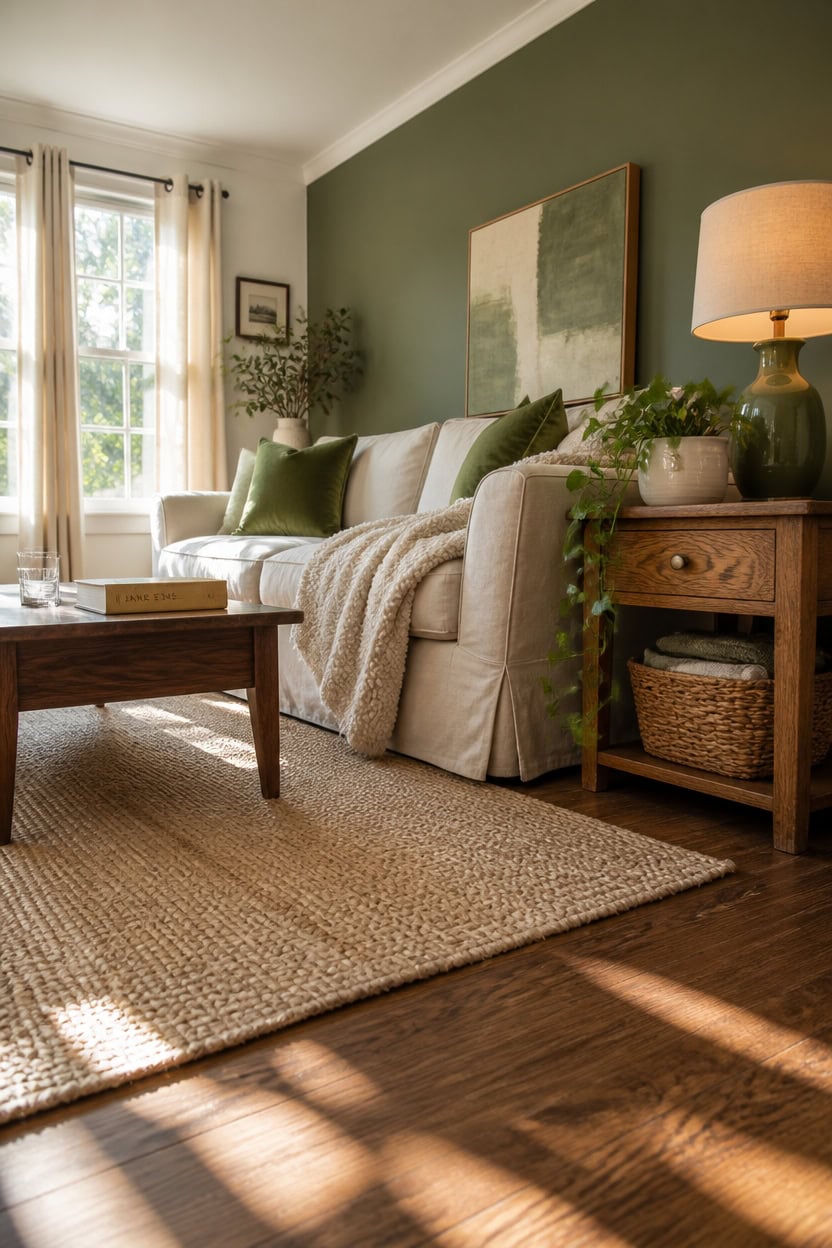
Thrift stores, paint, and strategic fabric swaps can deliver a full green and cream living room transformation for a fraction of what new furniture costs. Cream reads as a neutral across price points, meaning budget finds rarely look cheap when they’re the dominant color in the room. Green earns its place through affordable add-ons like throw pillows, plants, and a single statement chair rather than expensive upholstered pieces.
Start with paint: A single gallon of green paint on one accent wall costs under thirty dollars and changes the entire feel of the room immediately.
Swap textiles first: Replacing throw pillows, a throw blanket, and curtains with cream and green versions costs less than a hundred dollars and shifts the whole color story.
Thrift the anchor pieces: Wooden coffee tables and side tables in walnut or oak are common thrift finds — sand and refinish them to ground the palette without spending full retail price.
Use plants as green volume: A trailing pothos or large fiddle leaf fig adds living green color for under twenty dollars and replaces the need for expensive green upholstery.
this deep, grounded green makes a single wall feel intentional and rich without requiring you to paint the entire room.
this clean cream white keeps the boundaries between surfaces warm without adding cost from additional color purchases.
 MIULEE Velvet Throw Pillow Covers 18x18 Inch Pack of 2 Sage Green
View Price
MIULEE Velvet Throw Pillow Covers 18x18 Inch Pack of 2 Sage Green
View Price
 BGment Oatmeal Linen Curtains 84 Inch Length 2 Panels Set for Living Room
View Price
BGment Oatmeal Linen Curtains 84 Inch Length 2 Panels Set for Living Room
View Price
 Trailing Artificial Pothos Plant with Ceramic Pot, Potted Faux Greenery with Adjustable Drooping Vines,Fake Houseplant for Home Office High Shelf, Cabinet Top & Vertical Indoor Decor (White Pot)
View Price
Trailing Artificial Pothos Plant with Ceramic Pot, Potted Faux Greenery with Adjustable Drooping Vines,Fake Houseplant for Home Office High Shelf, Cabinet Top & Vertical Indoor Decor (White Pot)
View Price
 SAVOR LIFE Farmhouse Coffee Tables for Living Room, Walnut
View Price
SAVOR LIFE Farmhouse Coffee Tables for Living Room, Walnut
View Price
 Framed Sage Green Abstract Landscape Canvas Wall Art Bedroom, 16x24 Inch
View Price
Framed Sage Green Abstract Landscape Canvas Wall Art Bedroom, 16x24 Inch
View Price
Which Interior Styles Suit a Green and Cream Living Room?
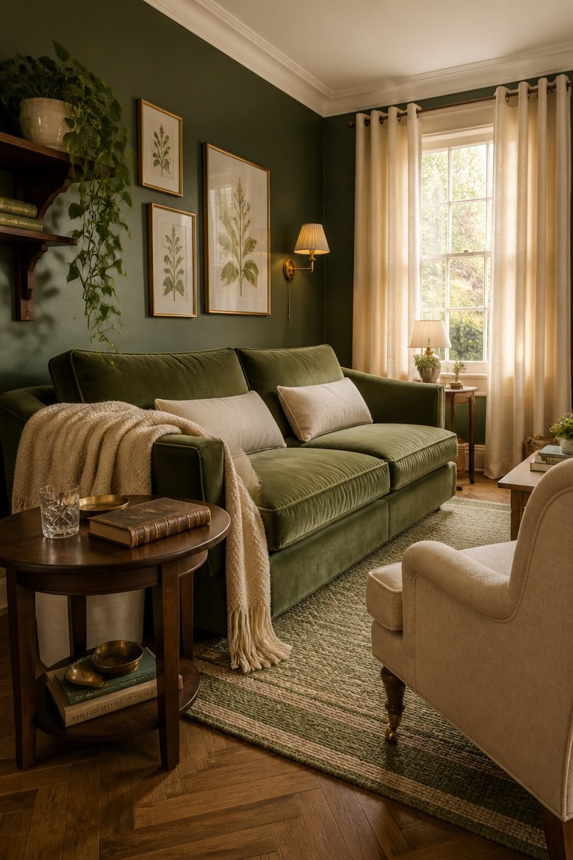
Bohemian, Scandinavian, and traditional English country styles all absorb green and cream naturally because each one already relies on organic textures, layered neutrals, and muted color palettes. Green reads as a grounding earth tone in these spaces rather than an accent that fights for attention. Cream acts as the connective tissue that keeps each style from feeling too cold or too busy.
Bohemian style: Layer sage and olive green through woven textiles, macramé, and trailing plants against cream linen and jute for a relaxed, lived-in feel.
Scandinavian style: Keep the palette clean with soft sage walls and cream wool throws — minimal furniture, natural wood, and negative space do the heavy lifting.
English country style: Deep forest green on one wall or a green floral sofa grounds the room, while cream painted trim and linen upholstery keep it from feeling heavy.
Transitional style: Blend classic silhouettes in cream upholstery with muted green accents through pillows and art for a look that feels current without committing to a single era.
this soft, grayed sage anchors any of these styles without pushing the room toward one rigid aesthetic.
this warm cream white softens the boundaries between wall and ceiling for a cohesive, layered finish.
 DREAMSIDEA Accent Chair Set of 1, Comfy Reading Armchair, Retro Green
View Price
DREAMSIDEA Accent Chair Set of 1, Comfy Reading Armchair, Retro Green
View Price
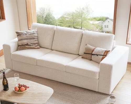 ELUCHANG 85" Modern Couches for Living Room, Natural Linen 3 Seat Sofa, Comfy Deep Seat Sofa, Spring Cushions, Removable Cover, Solid Wood Frame, Easy Assembly Loveseat for Small Space,Apartment,Beige
View Price
ELUCHANG 85" Modern Couches for Living Room, Natural Linen 3 Seat Sofa, Comfy Deep Seat Sofa, Spring Cushions, Removable Cover, Solid Wood Frame, Easy Assembly Loveseat for Small Space,Apartment,Beige
View Price
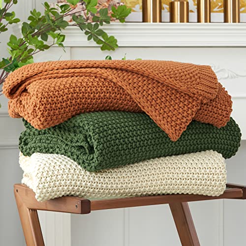 Longhui bedding Chunky Cable Knit Throw Blanket Lightweight Cream 100% Organic Cotton Blanket for Sofa Couch Bed Baby Nursery, Rustic Shabby Chic Modern Farmhouse, 51” x 63” Give Laundering Bag
View Price
Longhui bedding Chunky Cable Knit Throw Blanket Lightweight Cream 100% Organic Cotton Blanket for Sofa Couch Bed Baby Nursery, Rustic Shabby Chic Modern Farmhouse, 51” x 63” Give Laundering Bag
View Price
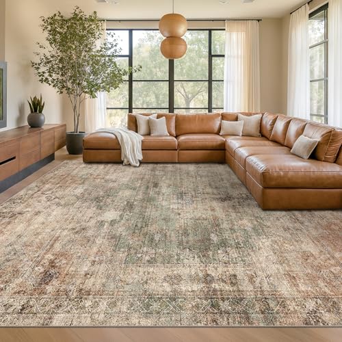 Farmhouse Floor Rugs for Living Room - Brown and Green Dining Room Area Rugs 8x10 for Bedroom, Washable, Soft, Lightweight & Stain Resistance, Neutral Dark Vintage Medallion Decor, Distressed Design
View Price
Farmhouse Floor Rugs for Living Room - Brown and Green Dining Room Area Rugs 8x10 for Bedroom, Washable, Soft, Lightweight & Stain Resistance, Neutral Dark Vintage Medallion Decor, Distressed Design
View Price
 NOVOYOW Solid Wood Round Side Table for Living Room, Bedroom
View Price
NOVOYOW Solid Wood Round Side Table for Living Room, Bedroom
View Price
 Mkono Small Hanging Planters for Indoor Plants, 5 Inch Ceramic Pot 1 Pack
View Price
Mkono Small Hanging Planters for Indoor Plants, 5 Inch Ceramic Pot 1 Pack
View Price
 Seeluck 84 Inch Length Natural Linen Curtains Light Filtering 2 Panels Set
View Price
Seeluck 84 Inch Length Natural Linen Curtains Light Filtering 2 Panels Set
View Price