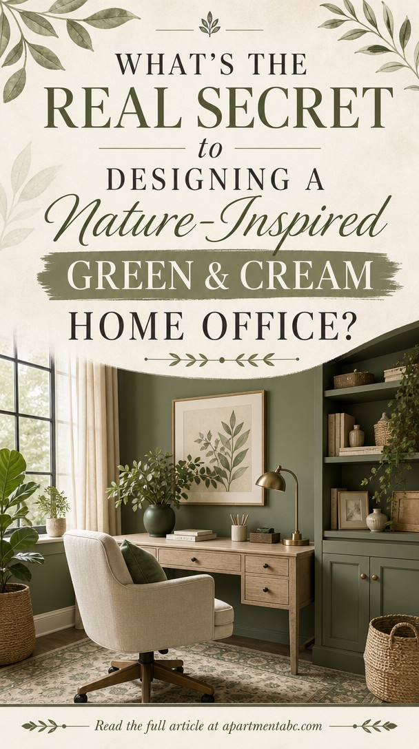
What’s the Real Secret to Designing a Nature-Inspired Green & Cream Home Office?
If you’ve ever dreamed of a workspace that feels like a breath of fresh air, you’re not alone.
Creating a calming office with soft greens and warm creams goes beyond picking pretty colors—it’s about crafting a space that nurtures focus and peace.
Let’s explore the layered design secrets that bring that serene, nature-inspired vision to life.
Why Green and Cream Work So Well Together
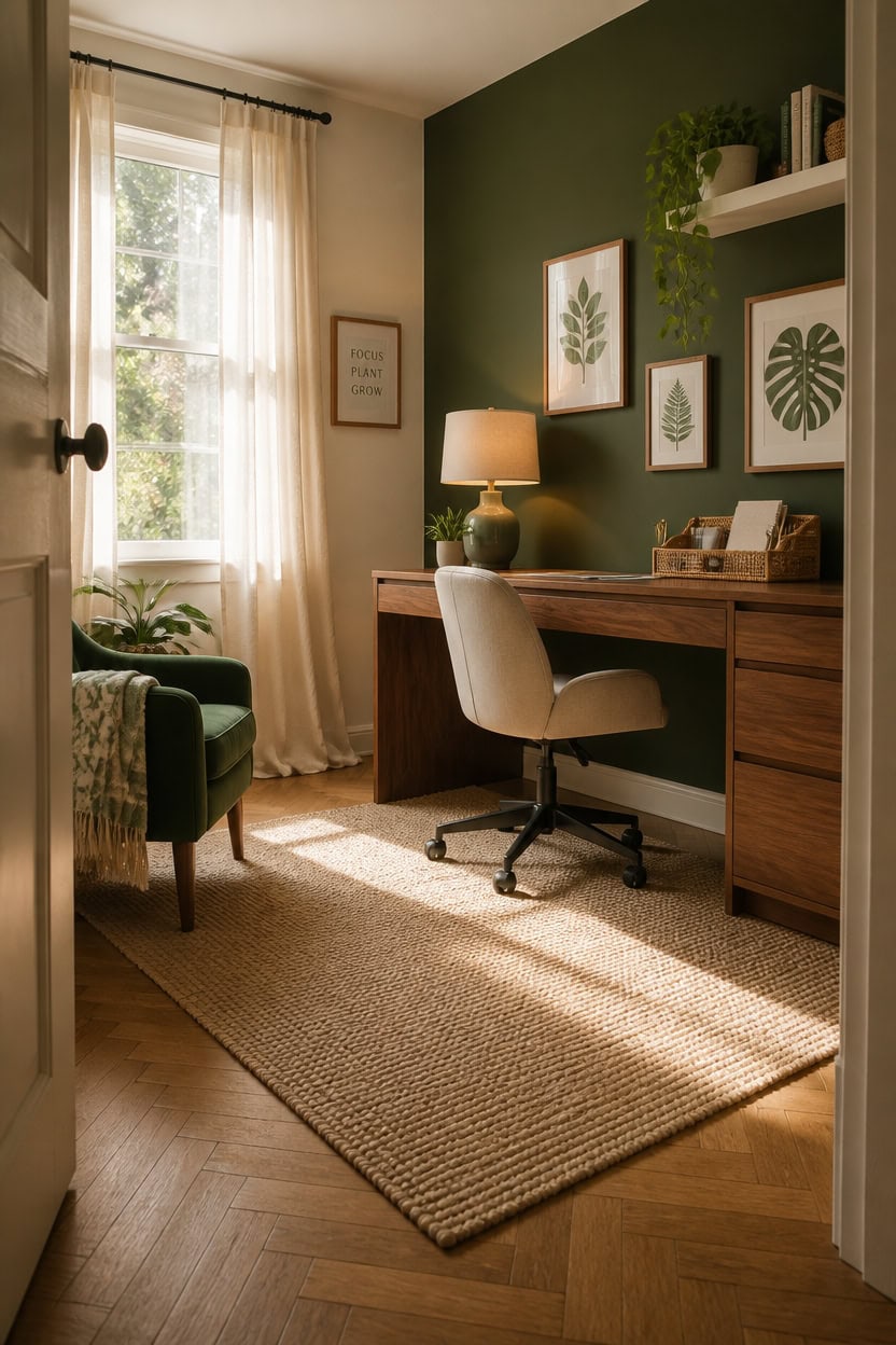
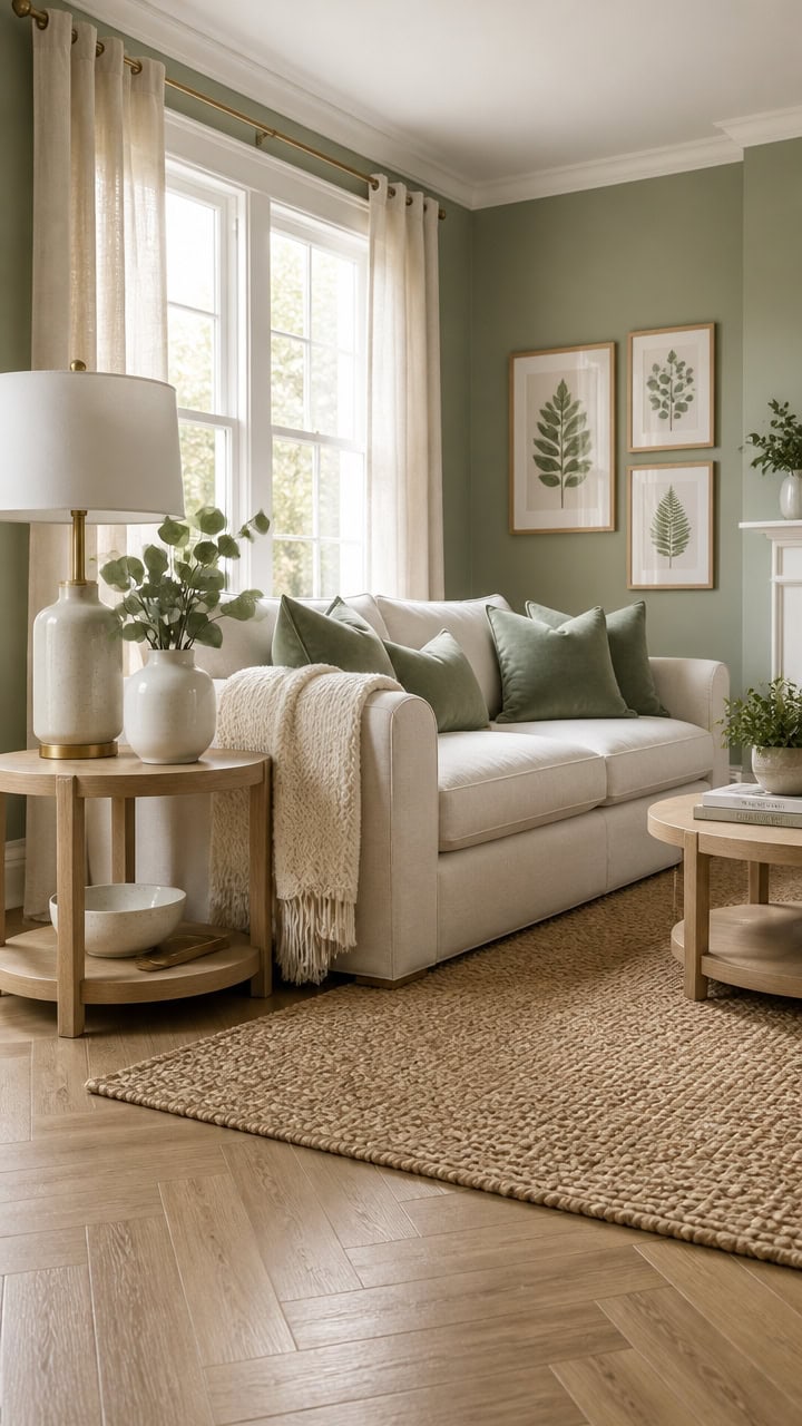
Green sits at the warm-cool midpoint of the color wheel, which means it pairs with cream without creating the jarring contrast you’d get from pairing cream with blue or purple. Cream softens green’s natural intensity, keeping the office from feeling like a greenhouse or a corporate conference room. Use a 60/30/10 ratio — cream on the walls and desk, medium green on one accent wall or shelving, and deep green or natural wood as a grounding third note.
Tone matching: Choose a cream with yellow undertones and a green with warm yellow in it — both colors will read as family rather than clash.
Texture as the connector: Linen, jute, and rattan bridge cream and green naturally because both colors appear in raw, plant-based fibers.
Light as a variable: Natural light pulls green warmer and cream brighter, so test both paint swatches in your office at different times of day before committing.
Layered depth: Vary the green from sage to forest across pillows, plants, and accessories so the palette feels rich rather than flat.
this deep, grounded green turns the desk zone into a focused anchor without overwhelming the room.
this warm, slightly creamy white keeps the space bright and makes the green wall read as intentional rather than accidental.
 Stripes Velvet Home Office Desk Chair, Accent Upholstered Modern Height Adjustable Swivel Chair with Wheels,Ergonomic Task Chair for Living Room,Bedroom,Vanity,Study,Office(Cream)
View Price
Stripes Velvet Home Office Desk Chair, Accent Upholstered Modern Height Adjustable Swivel Chair with Wheels,Ergonomic Task Chair for Living Room,Bedroom,Vanity,Study,Office(Cream)
View Price
 Yaheetech Velvet Accent Chair, Modern Armchair Vanity Chair with Wing Side and Metal Legs, Cozy and Soft Padded and High Back for Living Room/Makeup/Office/Bedroom, Green
View Price
Yaheetech Velvet Accent Chair, Modern Armchair Vanity Chair with Wing Side and Metal Legs, Cozy and Soft Padded and High Back for Living Room/Makeup/Office/Bedroom, Green
View Price
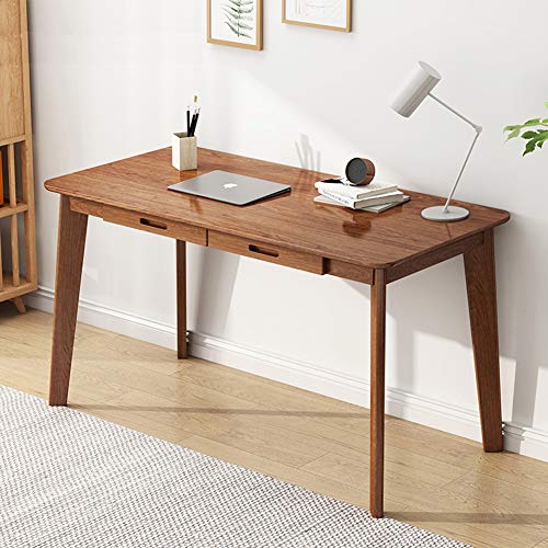 IOTXY Solid Wood Writing Desk - Home Office Workbench Desk with Drawer, Laptop Computer Work Study Table
View Price
IOTXY Solid Wood Writing Desk - Home Office Workbench Desk with Drawer, Laptop Computer Work Study Table
View Price
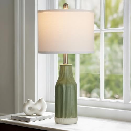 luxeflow 24.5" Ceramic Table Lamp for Bedroom, Sage Green Table Lamp for Living Room End Table, Small Farmhouse Bedside Lamp for Nightstand (1 Pack)
View Price
luxeflow 24.5" Ceramic Table Lamp for Bedroom, Sage Green Table Lamp for Living Room End Table, Small Farmhouse Bedside Lamp for Nightstand (1 Pack)
View Price
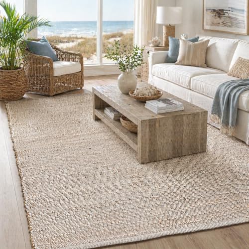 Chardin home 5x7 Jute Cotton Hand Woven Area Rug, Natural Jute/Cream Braided Boho Farmhouse Rug, Rustic Vintage Reversible Natural Fiber Rug for Living Room, Bedroom, Dining Room, Office, or Entryway
View Price
Chardin home 5x7 Jute Cotton Hand Woven Area Rug, Natural Jute/Cream Braided Boho Farmhouse Rug, Rustic Vintage Reversible Natural Fiber Rug for Living Room, Bedroom, Dining Room, Office, or Entryway
View Price
 AVECCO Set of 3 Sage Green Wall Art, Watercolor Botanical Wall Decor, Wood Framed Leaf Modern Plant, Easy to Hang and Fade Resistant, Art Prints for Bedroom Living Room Home Office, 12x16 Inch
View Price
AVECCO Set of 3 Sage Green Wall Art, Watercolor Botanical Wall Decor, Wood Framed Leaf Modern Plant, Easy to Hang and Fade Resistant, Art Prints for Bedroom Living Room Home Office, 12x16 Inch
View Price
 Bedsure GentleSoft 100% Cotton Large Throw Blanket for Couch 50x70 inches - Breathable and Lightweight, Soft Cozy Herringbone Woven Cotton Throw for Summer, Olive Green Office Chair Blanket
View Price
Bedsure GentleSoft 100% Cotton Large Throw Blanket for Couch 50x70 inches - Breathable and Lightweight, Soft Cozy Herringbone Woven Cotton Throw for Summer, Olive Green Office Chair Blanket
View Price
 Ymeibe Synthetic Rattan Desk Organizer | Boho Handwoven Eyeglasses Holder Stand | Desktop Storage for Pens, Scissors, Markers | Natural Home Office Decor
View Price
Ymeibe Synthetic Rattan Desk Organizer | Boho Handwoven Eyeglasses Holder Stand | Desktop Storage for Pens, Scissors, Markers | Natural Home Office Decor
View Price
Which Shades of Green Actually Belong in a Green and Cream Office?
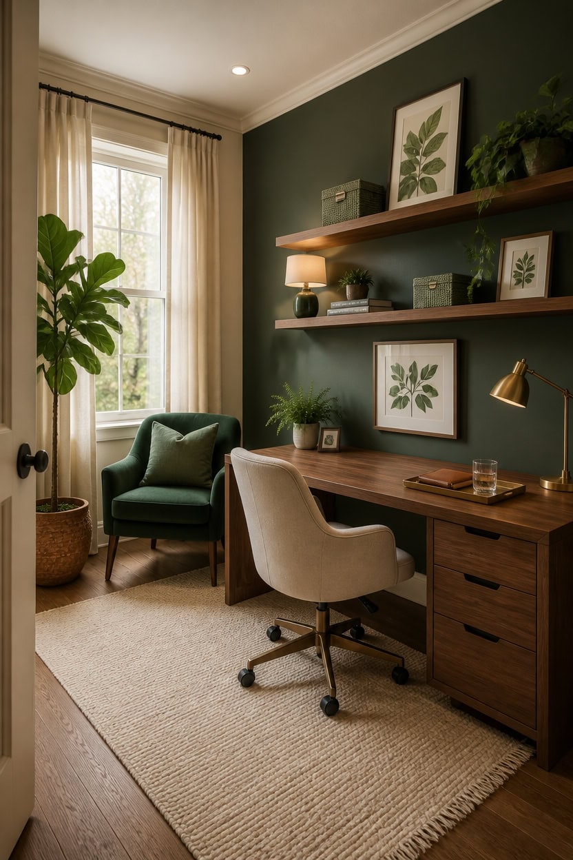
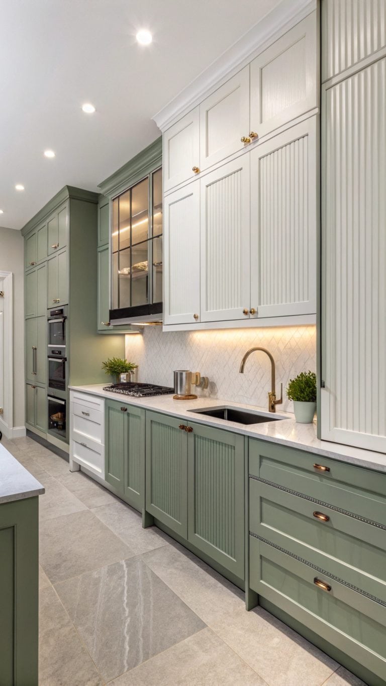
Sage, forest, and olive green are the three shades that actually belong in a nature-inspired office — each one serves a different visual role. Sage reads as a neutral and layers quietly across textiles and accessories without competing with cream walls. Forest and olive carry more depth and work best as anchor points on a single accent wall, a chair, or a plant collection.
Sage as the workhorse: Sage green reads almost like a neutral, so it can appear across multiple items — cushions, lamp shades, small ceramics — without overwhelming cream.
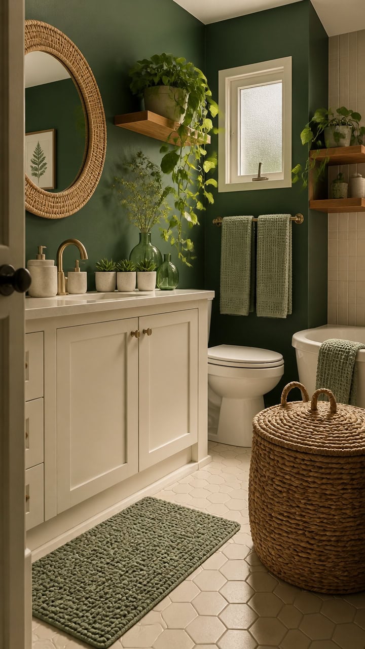
Forest as the focal anchor: Reserve deep forest green for one strong element like an accent wall or velvet chair so it grounds the room without swallowing the light.
Olive for warmth: Olive green pulls yellow into the palette and creates a natural bridge between the green and cream tones that cooler greens cannot.
Avoid cool greens: Blue-toned greens like teal or mint pull away from cream’s warmth and make the palette feel mismatched rather than cohesive.
the green from this look, matched from the photo to its closest Benjamin Moore shade.
matched from the wall in this photo — the closest Benjamin Moore shade.
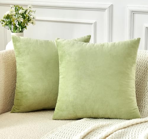 GriNeed Throw Pillow Covers Sage Green Set of 2 18x18 Inch Pillow Covers, Soft Velvet Decorative Pillowcases for Couch Sofa Bed, Home Boho Decor, Modern Farmhouse Cushion Covers
View Price
GriNeed Throw Pillow Covers Sage Green Set of 2 18x18 Inch Pillow Covers, Soft Velvet Decorative Pillowcases for Couch Sofa Bed, Home Boho Decor, Modern Farmhouse Cushion Covers
View Price
 GrandNoor Mid Century Modern Swivel Accent Chair with Solid Wood Legs, Home Office Desk Chair No Wheels, Makeup Chair for Vanity, Upholstered Chair for Bedroom, Green
View Price
GrandNoor Mid Century Modern Swivel Accent Chair with Solid Wood Legs, Home Office Desk Chair No Wheels, Makeup Chair for Vanity, Upholstered Chair for Bedroom, Green
View Price
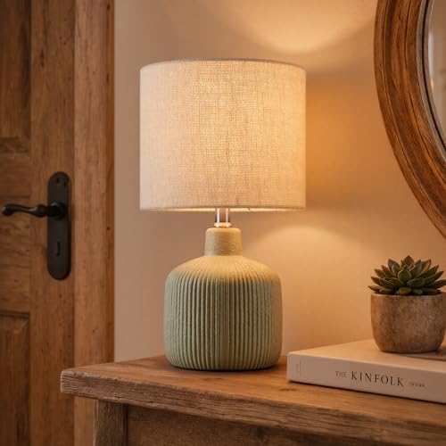 KAWOTI Ceramic Table Lamp, Oliver Green, 17.75"
View Price
KAWOTI Ceramic Table Lamp, Oliver Green, 17.75"
View Price
 COLAMY Cocoon Modern Executive High Back Home Office Chair, Upholstered Desk Chair with Wheels, Vanity Chair with Head and Lumbar Support, Armrest (Beige)
View Price
COLAMY Cocoon Modern Executive High Back Home Office Chair, Upholstered Desk Chair with Wheels, Vanity Chair with Head and Lumbar Support, Armrest (Beige)
View Price
 Arborvigro Artificial Fiddle Leaf Fig Tree 5FT Tall Faux Ficus Lyrata Tree with Planter Fig Silk Artificial Floor Plant Realistic for Indoor Outdoor Home Office Living Room Decor Housewarming Gift
View Price
Arborvigro Artificial Fiddle Leaf Fig Tree 5FT Tall Faux Ficus Lyrata Tree with Planter Fig Silk Artificial Floor Plant Realistic for Indoor Outdoor Home Office Living Room Decor Housewarming Gift
View Price
 Acellegic Sage Green Storage Baskets Set 4 Pack Rustic Paper Rope Woven Decorative Basket for Bathroom Organizer in 3 Size Storage Bin Box Basket for Toilet Shelf Countertop Bedroom (Classic)
View Price
Acellegic Sage Green Storage Baskets Set 4 Pack Rustic Paper Rope Woven Decorative Basket for Bathroom Organizer in 3 Size Storage Bin Box Basket for Toilet Shelf Countertop Bedroom (Classic)
View Price
 Green Leaf Wall Art Set of 2 with Wooden Frame – Minimalist Botanical Plant Prints, Modern Boho Tropical Leaves Painting, Framed Picture Wall Decor 12x16 Inch
View Price
Green Leaf Wall Art Set of 2 with Wooden Frame – Minimalist Botanical Plant Prints, Modern Boho Tropical Leaves Painting, Framed Picture Wall Decor 12x16 Inch
View Price
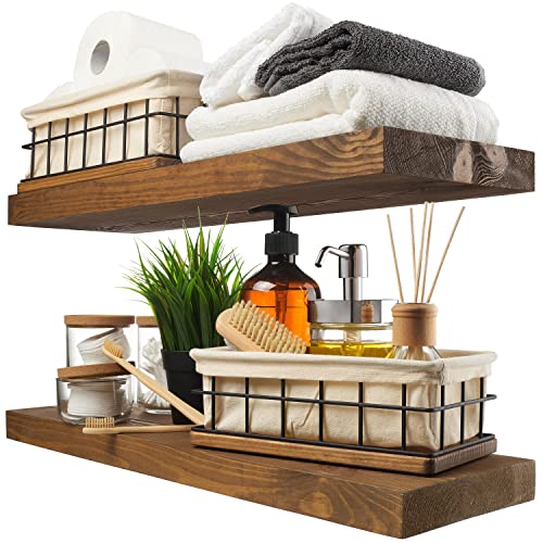 BAOBAB WORKSHOP Wood Floating Shelves for Wall, Bathroom Shelf 24 inch, Solid Wooden Wall Shelves for Bedroom, Walnut Finish, 24W x 6.7D Inch, Set of 2
View Price
BAOBAB WORKSHOP Wood Floating Shelves for Wall, Bathroom Shelf 24 inch, Solid Wooden Wall Shelves for Bedroom, Walnut Finish, 24W x 6.7D Inch, Set of 2
View Price
Which Cream Tones Anchor a Green and Cream Color Scheme?
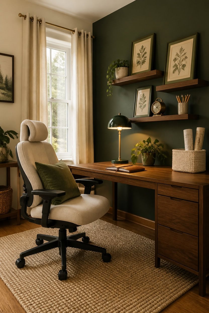
Warm cream tones with yellow or pink undertones anchor a green and cream office far better than cool whites because they mirror the natural warmth already present in sage, olive, and forest green. A cream that leans too cool — closer to white — creates a subtle visual tension that makes the greens look muddy rather than rich. Look for paints labeled antique white, linen, or parchment rather than pure white when choosing your base tone.
Yellow-based cream: Creams with a yellow undertone echo the golden warmth in olive green and create a seamless flow across walls and textiles.
Pink-based cream: A cream with soft pink warmth complements sage green by adding gentle contrast without disrupting the nature-inspired calm of the office.
Avoid stark white: Pure white reads as a separate color rather than a companion, making greens look harsh and disconnected from the overall palette.
Test in natural light: Cream tones shift dramatically from morning to afternoon light, so sample on the actual wall before committing to the full room.
this warm, linen-toned cream wraps the room in soft natural light without competing with any shade of green.
the green from this look, matched from the photo to its closest Benjamin Moore shade.
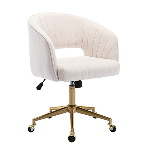 Home Office Chair Swivel Velvet Desk Chair Accent Armchair Upholstered Modern Tufted Chairs with Gold Base for Girls Women Ergonomic Study Seat Computer Task Stools for Living Room(Cream)
View Price
Home Office Chair Swivel Velvet Desk Chair Accent Armchair Upholstered Modern Tufted Chairs with Gold Base for Girls Women Ergonomic Study Seat Computer Task Stools for Living Room(Cream)
View Price
 MIULEE Velvet Throw Pillow Covers 16x16 Inch, Pack of 2 - Sage Green, Soft Solid Decorative Pillow Covers Cushion Cases Modern Luxury Home Decor for Spring Couch Sofa Bedroom Livingroom
View Price
MIULEE Velvet Throw Pillow Covers 16x16 Inch, Pack of 2 - Sage Green, Soft Solid Decorative Pillow Covers Cushion Cases Modern Luxury Home Decor for Spring Couch Sofa Bedroom Livingroom
View Price
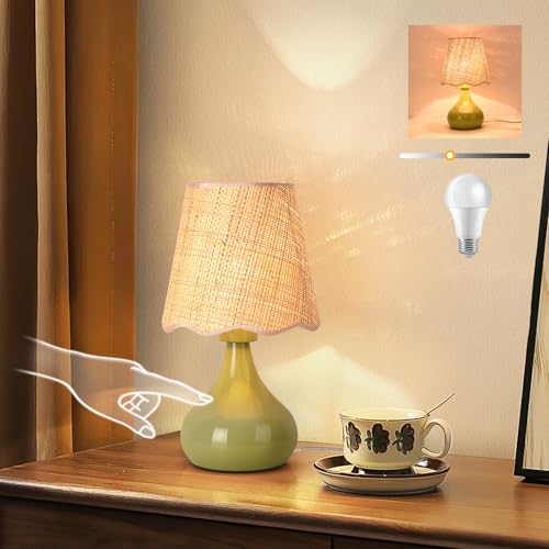 Green Small Touch Control Table Lamp for Bedroom,Green Bedside Lamps for Nightstand,Cute Mini Small Table Lamps for Small Spaces with Scalloped Shade for Kitchen Counter,Bookshelf,Living Room
View Price
Green Small Touch Control Table Lamp for Bedroom,Green Bedside Lamps for Nightstand,Cute Mini Small Table Lamps for Small Spaces with Scalloped Shade for Kitchen Counter,Bookshelf,Living Room
View Price
 SimpleHome 100% Blackout Cream White Linen Curtains 84 Inch Long 2 Panel Set,Faux Linen Textured for Living Room with White Liner Grommet Curtains for Bedroom
View Price
SimpleHome 100% Blackout Cream White Linen Curtains 84 Inch Long 2 Panel Set,Faux Linen Textured for Living Room with White Liner Grommet Curtains for Bedroom
View Price
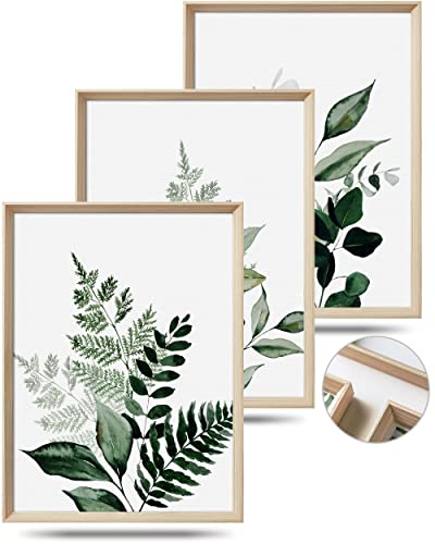 UPWOIGH 12x16 in Green Framed Wall Art, Olive Leaf Plant Canvas Wall Decor, Set of 3 Neutral Botanical Prints Artwork for Living Room and Bedroom, Gift
View Price
UPWOIGH 12x16 in Green Framed Wall Art, Olive Leaf Plant Canvas Wall Decor, Set of 3 Neutral Botanical Prints Artwork for Living Room and Bedroom, Gift
View Price
 fuqing 30 Inch Floating Shelves for Wall Set of 2, Rustic Wood Wall Shelves for Living Room Bedroom Bathroom Home Office - Walnut
View Price
fuqing 30 Inch Floating Shelves for Wall Set of 2, Rustic Wood Wall Shelves for Living Room Bedroom Bathroom Home Office - Walnut
View Price
 Boho Cotton Rope Storage Baskets Set of 2, Woven Wicker Organizer Bins with Wooden Handles, Small Decorative Boxes for Organizing, Toilet Paper Baskets for Bathroom Countertop, Shelves (White 2 Pack)
View Price
Boho Cotton Rope Storage Baskets Set of 2, Woven Wicker Organizer Bins with Wooden Handles, Small Decorative Boxes for Organizing, Toilet Paper Baskets for Bathroom Countertop, Shelves (White 2 Pack)
View Price
Start With the Right Green and Cream Color Ratio
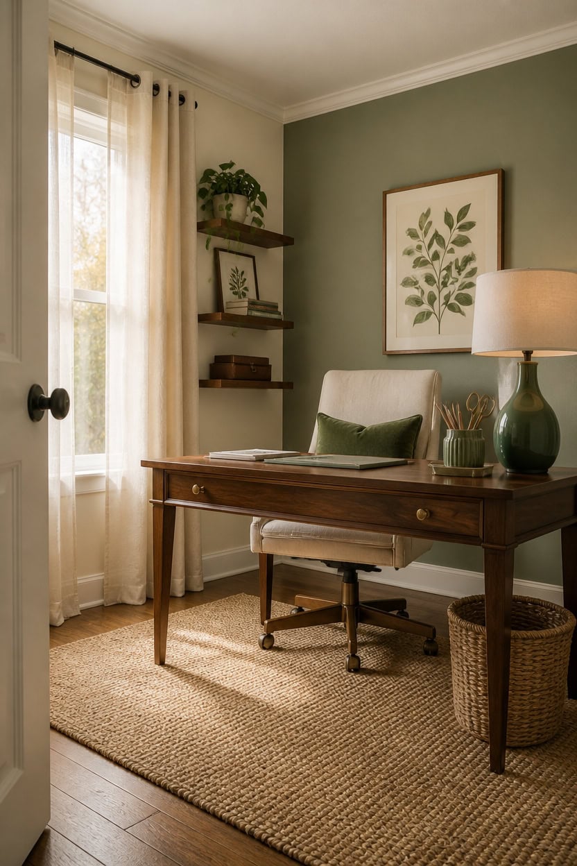
A ratio of 60% cream to 40% green gives a nature-inspired office its grounded, livable quality without tipping into either a stark neutral space or an overwhelming botanical room. Cream does the heavy lifting on walls and large surfaces, giving the eye a place to rest between green elements. The green earns its impact precisely because it appears in focused zones — one accent wall, key textiles, and a handful of decor pieces — rather than spread thin across every surface.
Walls carry the cream: Use cream across three walls and the ceiling to create an enveloping neutral base that green accents can pop against.
One bold green anchor: Designate a single surface — the wall behind the desk, a built-in bookshelf, or a large area rug — as the primary green statement piece in the room.
Layer green in threes: Group green elements in odd numbers across the desk, shelving, and window area to create visual rhythm without overwhelming the cream backdrop.
Balance weight, not just color: Dark forest green reads heavier than sage, so lighter greens can cover more surface area while still maintaining the 60/40 cream-to-green ratio.
this soft warm cream wraps the office in a quiet, candlelit glow that lets green furniture and textiles breathe naturally.
this complex sage-meets-green hue anchors the workspace with earthy depth without darkening the room.
 amseatec Criss Cross Office Chair, PU Leather Vanity Chair with 5-Level Adjustable Armrests & Swivel, Ergonomic Criss Cross Chair for Home Office Bedroom Makeup(Cream)
View Price
amseatec Criss Cross Office Chair, PU Leather Vanity Chair with 5-Level Adjustable Armrests & Swivel, Ergonomic Criss Cross Chair for Home Office Bedroom Makeup(Cream)
View Price
 Apeaka Velvet Accent Chair Green Modern Upholstered Barrel Chair, Wide Arm Chairs for Living Room Bedroom Club Side Chairs with Gold Legs
View Price
Apeaka Velvet Accent Chair Green Modern Upholstered Barrel Chair, Wide Arm Chairs for Living Room Bedroom Club Side Chairs with Gold Legs
View Price
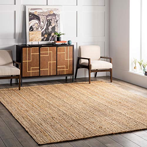 nuLOOM 6x9 Rigo Jute Hand Woven Area Rug, Natural, Solid Farmhouse Design, Natural Fiber, For Bedroom, Living Room, Dining Room, Hallway, Office, Kitchen, Entryway
View Price
nuLOOM 6x9 Rigo Jute Hand Woven Area Rug, Natural, Solid Farmhouse Design, Natural Fiber, For Bedroom, Living Room, Dining Room, Hallway, Office, Kitchen, Entryway
View Price
 bdayanx Small Bedside Table Lamp for Bedroom - Reading Desk Lamp with 3 Color Temperatures,15.5" Nightstand Ceramic Lamp with Fabric Shade for Kids Room,Living Room,Dorm,Home Office (Green+White)
View Price
bdayanx Small Bedside Table Lamp for Bedroom - Reading Desk Lamp with 3 Color Temperatures,15.5" Nightstand Ceramic Lamp with Fabric Shade for Kids Room,Living Room,Dorm,Home Office (Green+White)
View Price
 100% Blackout Linen Textured Curtains 84 Inch Length 2 Panels Set for Living Room, Bedroom, Full Blackout Curtains with Grommets Top, Natural Linen, 52" W x 84" L, 2 Panels
View Price
100% Blackout Linen Textured Curtains 84 Inch Length 2 Panels Set for Living Room, Bedroom, Full Blackout Curtains with Grommets Top, Natural Linen, 52" W x 84" L, 2 Panels
View Price
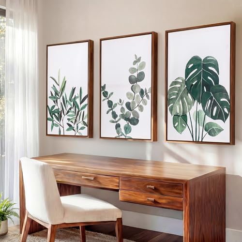 Framed 16x24" Large Botanical Wall Art Set of 3 with 1.38" Deep Floating Frame - Sage Green Plant Wall Decor, Earthy Green Eucalyptus Monstera Olive Leaf Art Prints, Modern Minimalist Nature Watercolor Pictures for Living Room and Bedroom
View Price
Framed 16x24" Large Botanical Wall Art Set of 3 with 1.38" Deep Floating Frame - Sage Green Plant Wall Decor, Earthy Green Eucalyptus Monstera Olive Leaf Art Prints, Modern Minimalist Nature Watercolor Pictures for Living Room and Bedroom
View Price
 PHOENANCEE Floating Shelves for Wall,Display Hanging Shelf Set of 2,Modern Decorative Plants Shelves,Wood Home Decor Storage Chic for Living Room Bedroom Bathroom Office,Oak Frame,2-Tier (Walnut
View Price
PHOENANCEE Floating Shelves for Wall,Display Hanging Shelf Set of 2,Modern Decorative Plants Shelves,Wood Home Decor Storage Chic for Living Room Bedroom Bathroom Office,Oak Frame,2-Tier (Walnut
View Price
 HANKOR Ceramic Pencil Holder for Desk - Cute Gold Trim Pen Aesthetic Makeup Brush Cup Holder Organizer for Desktop Storage Stationery Office Home Supplies (Green)
View Price
HANKOR Ceramic Pencil Holder for Desk - Cute Gold Trim Pen Aesthetic Makeup Brush Cup Holder Organizer for Desktop Storage Stationery Office Home Supplies (Green)
View Price
Wall Textures That Work Best in a Green and Cream Office
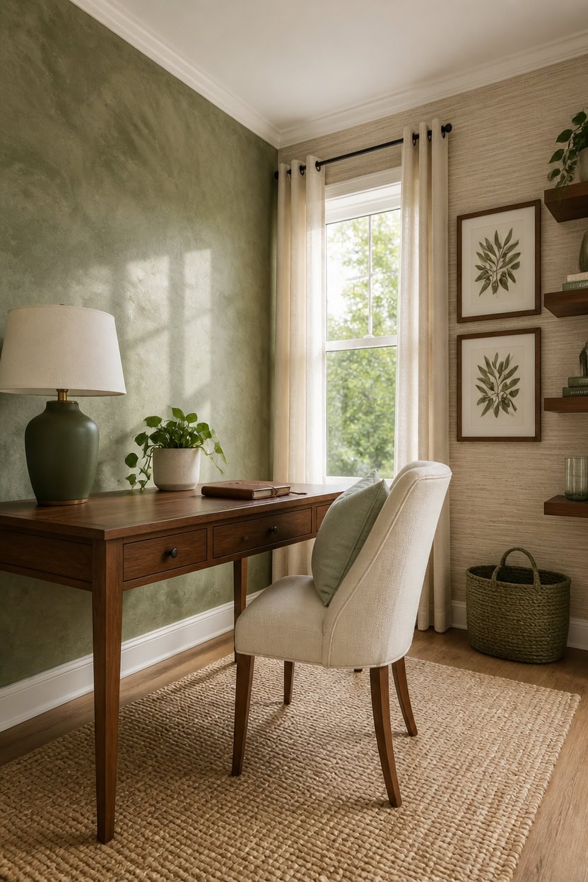
Rough or matte wall textures diffuse light softly across a surface, which keeps cream from reading as flat or sterile and lets green accents feel grounded rather than applied. Smooth walls bounce light in ways that amplify color contrast too sharply, making even a well-balanced green and cream palette feel cold and commercial. A mid-sheen lime plaster, textured wallpaper, or a dry-brushed paint finish gives both colors the warmth and depth they need to feel lived-in.
Lime wash for the accent wall: Lime wash applied to the green accent wall behind the desk creates a layered, organic surface that mimics aged stone or plaster.
Grasscloth on side walls: Grasscloth wallpaper on a cream side wall adds woven texture that reads as natural fiber, reinforcing the nature-inspired theme through material rather than color.
Dry-brush technique for cream walls: A dry-brushed topcoat over cream paint creates subtle directional marks that add visual depth without changing the overall color value.
Matte finish over eggshell: Choosing matte over eggshell for cream walls absorbs light rather than reflecting it, softening the shift between the neutral walls and green focal surfaces.
as the base coat on side walls, then dry-brush a second coat in loose vertical strokes to build a soft, layered surface that adds warmth without texture products.
using a lime wash or dry-brush method on the desk-facing wall, blending wet and dry strokes to create the uneven, earthy depth that makes green feel rooted rather than painted on.
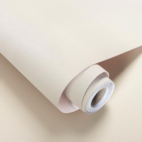 lenify Grasscloth Peel and Stick Wallpaper Beige Faux Linen Wallpaper 15.7inch x 393.7inch Vintage Grasscloth Contact Paper Textured Wall Paper Self Adhesive Cream Beige Removable Vinyl
View Price
lenify Grasscloth Peel and Stick Wallpaper Beige Faux Linen Wallpaper 15.7inch x 393.7inch Vintage Grasscloth Contact Paper Textured Wall Paper Self Adhesive Cream Beige Removable Vinyl
View Price
 MIULEE Decorative Linen Pillow Covers 20x20 Inch Sage Green Boho Farmhouse Neutral Spring Couch Throw Pillows for Bed Pack of 2 Accent Modern Pillowcase Summer Sofa Livingroom Home Decor
View Price
MIULEE Decorative Linen Pillow Covers 20x20 Inch Sage Green Boho Farmhouse Neutral Spring Couch Throw Pillows for Bed Pack of 2 Accent Modern Pillowcase Summer Sofa Livingroom Home Decor
View Price
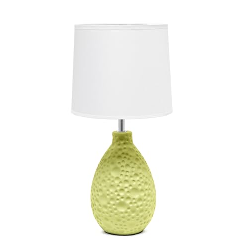 Simple Designs LT1193-GRN 14.17" Refined and Textured Oval Stucco Ceramic Table Lamp, for Living Room, Bedroom, Office, Green
View Price
Simple Designs LT1193-GRN 14.17" Refined and Textured Oval Stucco Ceramic Table Lamp, for Living Room, Bedroom, Office, Green
View Price
 Seeluck Natural Linen Curtains 96 Inches Long 2 Panels Bronze Grommet Curtain Burlap Ivory Cream Colored Light Filtering Semi Sheer Drapes Thick Linen Blend Floor to Ceiling Length Living Room 8ft
View Price
Seeluck Natural Linen Curtains 96 Inches Long 2 Panels Bronze Grommet Curtain Burlap Ivory Cream Colored Light Filtering Semi Sheer Drapes Thick Linen Blend Floor to Ceiling Length Living Room 8ft
View Price
 Woven Storage Baskets for Organizing, Set of 3 Natural Paper Rope Decorative Baskets, Rectangular Wicker Nesting Baskets for Shelves, Bathroom, Pantry, Closet, Kitchen, and Living Room (Sage Green)
View Price
Woven Storage Baskets for Organizing, Set of 3 Natural Paper Rope Decorative Baskets, Rectangular Wicker Nesting Baskets for Shelves, Bathroom, Pantry, Closet, Kitchen, and Living Room (Sage Green)
View Price
Using Cream to Break Up Green Elements
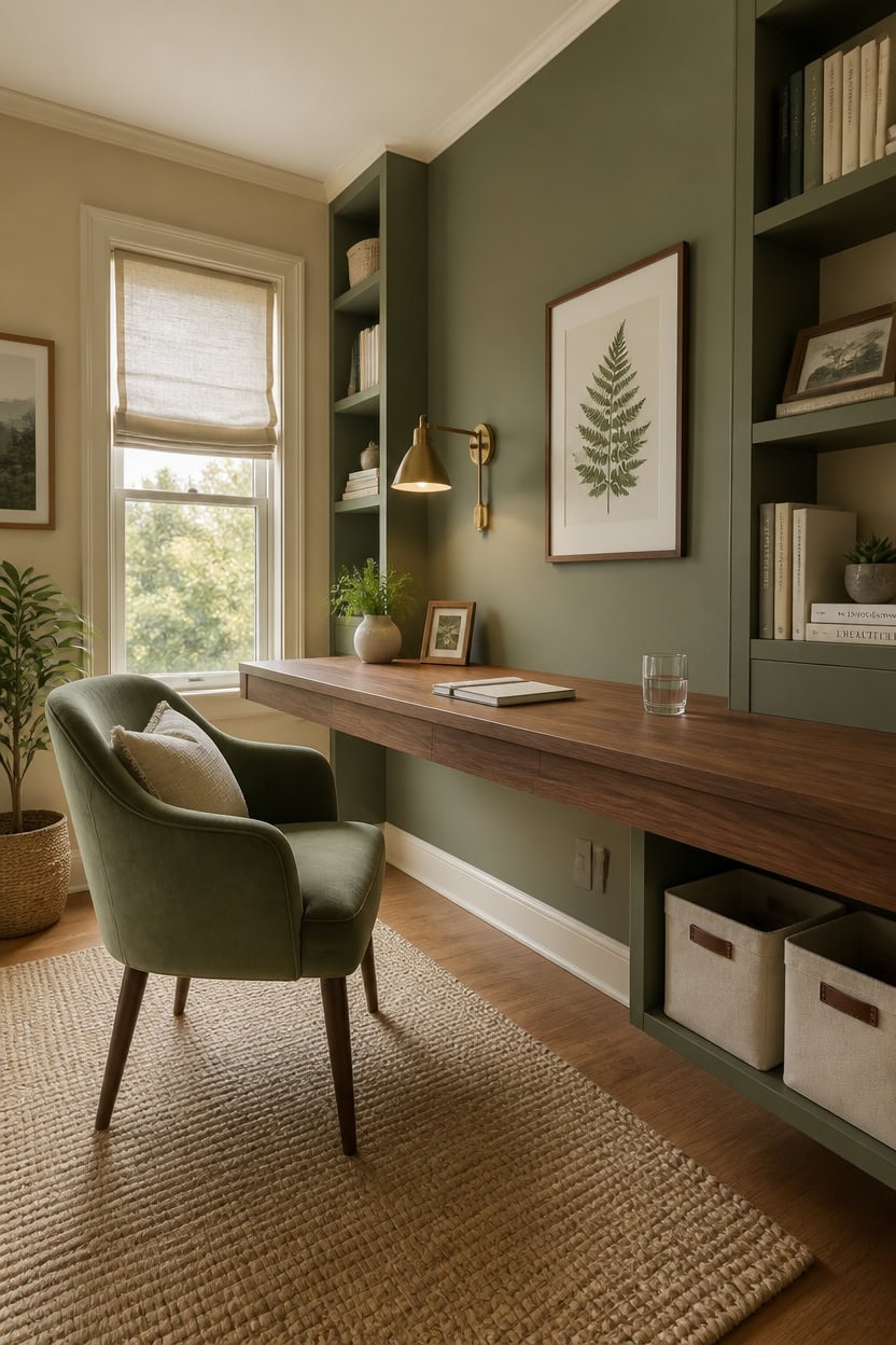
Cream works as a visual pause between green elements, preventing the palette from feeling heavy or one-note when green dominates more than 50 percent of the room. The eye needs a neutral landing point to reset between saturated surfaces, and cream provides that without the coldness of white or the flatness of beige. Use cream on the largest surface area — walls or a desk — while keeping green to focal zones like the accent wall, chair upholstery, or shelving.
Shelf backing as a breaker: Paint the inside back panel of green open shelving in cream to create visual breathing room between rows of books and objects.
Cream desktop surface: A cream or light wood desk surface interrupts the green accent wall behind it, pulling the eye forward and anchoring the workspace in neutral ground.
Trim as a frame: Cream trim around windows and door frames separates green walls from architectural edges, keeping the color from feeling like it consumed the room.
Cream ceiling break: A cream ceiling above a green accent wall lifts the space visually and stops the green from reading as oppressive in a room with lower ceilings.
to create a warm, continuous cream field that gives green accents room to breathe without competing.
as the single green surface, letting the surrounding cream amplify its depth rather than dilute it.
 FORCHEER Waterproof Cream Office Chair Seat Cover Faux Leather Strechable Computer Desk Chair Seat Cushion Slipcover 1 Piece Washable
View Price
FORCHEER Waterproof Cream Office Chair Seat Cover Faux Leather Strechable Computer Desk Chair Seat Cushion Slipcover 1 Piece Washable
View Price
 TINA'S HOME Modern Living Dining Room Chairs, Small Velvet Accent Chair with Golden Metal Legs, Upholstered Cute Tufted Back Side Chair for Kitchen Vanity Patio Beauty Room/SAGE
View Price
TINA'S HOME Modern Living Dining Room Chairs, Small Velvet Accent Chair with Golden Metal Legs, Upholstered Cute Tufted Back Side Chair for Kitchen Vanity Patio Beauty Room/SAGE
View Price
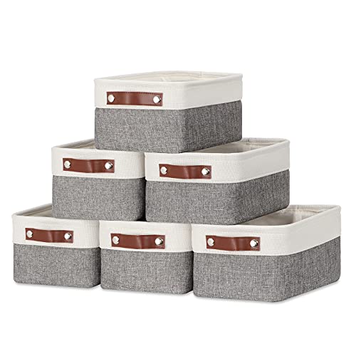 DULLEMELO Small Storage Baskets 6 Pack, Fabric Collapsible Gift Storage Baskets for Shelves, Closets, Nursery, Home, Office Organizing,Small Canvas Linen Rectangular Storage Bins (6-Pack, White&Grey)
View Price
DULLEMELO Small Storage Baskets 6 Pack, Fabric Collapsible Gift Storage Baskets for Shelves, Closets, Nursery, Home, Office Organizing,Small Canvas Linen Rectangular Storage Bins (6-Pack, White&Grey)
View Price
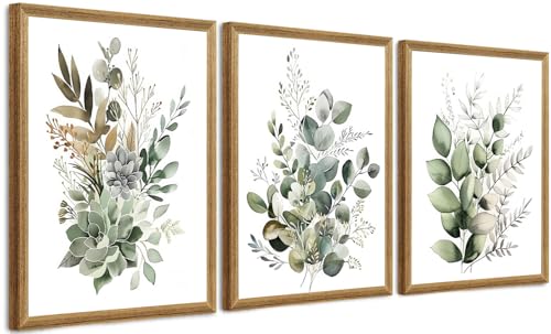 FYLDPSB 3Pcs Framed Wall Art Floral Wall Decor Living Room Canvas Art Botanical Pictures Sage Green Paintings Boho Artwork Modern Farmhouse Flower Prints for Bedroom Bathroom
View Price
FYLDPSB 3Pcs Framed Wall Art Floral Wall Decor Living Room Canvas Art Botanical Pictures Sage Green Paintings Boho Artwork Modern Farmhouse Flower Prints for Bedroom Bathroom
View Price
 ARTKETTY Succulent Pots - Small Succulent Plant Pots with Drainage Set of 6, Ceramic Cactus Planter Pots for Indoor Unique Flower Planter Container for Home Office Decor
View Price
ARTKETTY Succulent Pots - Small Succulent Plant Pots with Drainage Set of 6, Ceramic Cactus Planter Pots for Indoor Unique Flower Planter Container for Home Office Decor
View Price
 MM MELISEN Floating Desk - 30x20 Inch, Walnut Finish Wall-Mounted Desk for Home Office or Bedroom Work. Solid Wood Drop-Leaf Design. Folds up neatly for Small Space Living
View Price
MM MELISEN Floating Desk - 30x20 Inch, Walnut Finish Wall-Mounted Desk for Home Office or Bedroom Work. Solid Wood Drop-Leaf Design. Folds up neatly for Small Space Living
View Price
 Persilux Light Filtering Roman Shades for Indoor Windows Cordless,Pull Down Linen Fabric Roman Blinds,Privacy Window Shades for Door,Bedroom,Office,Easy to Install,Light Filtering-Cream,Custom Size
View Price
Persilux Light Filtering Roman Shades for Indoor Windows Cordless,Pull Down Linen Fabric Roman Blinds,Privacy Window Shades for Door,Bedroom,Office,Easy to Install,Light Filtering-Cream,Custom Size
View Price
Which Fabrics, Woods, and Stones Suit a Green and Cream Office?
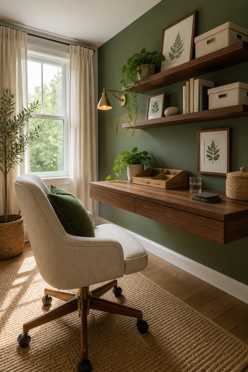
Linen, light wood, and textured stone are the three material categories that hold a green and cream office together without forcing it into a theme. Natural fibers absorb light instead of reflecting it, which softens the contrast between deep greens and warm creams so the room reads as layered rather than loud. Stick to matte and woven finishes across upholstery, rugs, and shelving to keep the palette grounded in something that actually feels like it came from a forest floor.
Linen and cotton upholstery: These breathable fabrics in cream or oatmeal tones sit next to green without fighting it, unlike synthetic velvet that can make color pop too aggressively.
Walnut and oak wood tones: Both warm woods echo the brown undertones in deep greens, making shelves, desks, and frames feel like they grew from the same source.
Jute and sisal rugs: Woven natural fiber rugs add a sandy, neutral base layer that connects cream walls to green accents without adding a third competing color.
Matte limestone or slate accents: A stone paperweight, coaster set, or small tray introduces cool mineral texture that keeps the palette from reading as too warm or cottagecore.
to create a warm cream backdrop that makes natural wood and linen textures glow softly.
to introduce a complex, plant-inspired green that pairs naturally with wood and stone surfaces.
 YEEFY Desk Chair No Wheels Vanity Chair Comfy Accent Chair for Living Dining Room Bedroom Home Office Mid Century Modern Upholstered Armchair Sofa Chair (Beige, 1)
View Price
YEEFY Desk Chair No Wheels Vanity Chair Comfy Accent Chair for Living Dining Room Bedroom Home Office Mid Century Modern Upholstered Armchair Sofa Chair (Beige, 1)
View Price
 Fun Memories 72 Inch Floating Shelves, 12 Inch Deep Wall Shelf for Fireplace Mantel, Large Display Shelf & Storage Shelf, Wood Floating Wall Shelves for Home & Office, Walnut, Set of 1
View Price
Fun Memories 72 Inch Floating Shelves, 12 Inch Deep Wall Shelf for Fireplace Mantel, Large Display Shelf & Storage Shelf, Wood Floating Wall Shelves for Home & Office, Walnut, Set of 1
View Price
 MIULEE Velvet Throw Pillow Covers Set of 2, Soft Neutral Spring Decorative Pillow Cases with Luxurious Textured Vintage Cushion Covers for Home Decor Couch Sofa Bed, Sage Green 18x18 inch
View Price
MIULEE Velvet Throw Pillow Covers Set of 2, Soft Neutral Spring Decorative Pillow Cases with Luxurious Textured Vintage Cushion Covers for Home Decor Couch Sofa Bed, Sage Green 18x18 inch
View Price
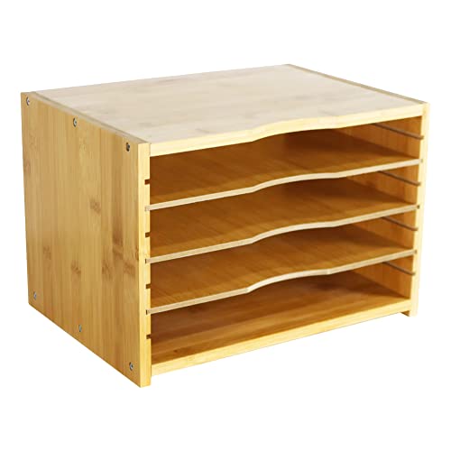 WKWKER File Organizer with 3 Adjustable Shelves Bamboo Document Letter Tray Paper File Sorter for Desktop Office Home Study Workstation Desk Storage Rack (Natural)
View Price
WKWKER File Organizer with 3 Adjustable Shelves Bamboo Document Letter Tray Paper File Sorter for Desktop Office Home Study Workstation Desk Storage Rack (Natural)
View Price
 Slate Drink Coasters with Metal Holder, GOH DODD Set of 8 Black Coasters, 4 Inch Stone Coaster Set Tabletop Protection for Home Outdoor Kitchen Apartment Decor Housewarming Gifts Wedding Party, Square
View Price
Slate Drink Coasters with Metal Holder, GOH DODD Set of 8 Black Coasters, 4 Inch Stone Coaster Set Tabletop Protection for Home Outdoor Kitchen Apartment Decor Housewarming Gifts Wedding Party, Square
View Price
 Lawei 9 Pack Mini Canvas Storage Bins - Collapsible Canvas Shelf Basket Nursery Organizer Box with Handles for Nursery Kids Bathroom Home Office
View Price
Lawei 9 Pack Mini Canvas Storage Bins - Collapsible Canvas Shelf Basket Nursery Organizer Box with Handles for Nursery Kids Bathroom Home Office
View Price
Pick Furniture That Feels Organic, Not Overdone
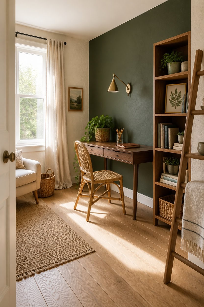
Furniture with clean lines and exposed natural materials keeps a green and cream office from sliding into a themed look. Pieces that show their construction — visible joinery, tapered legs, open shelving — let the materials do the visual work instead of decorative details. Choose one or two statement furniture pieces and keep everything else simple so the room breathes.
Choose visible wood grain: Desks and shelving with exposed wood grain carry the nature theme without needing added decoration or carving.
Keep legs tapered or angled: Furniture that lifts off the floor reads as lighter and less bulky, which suits the airy quality of cream walls.
Limit upholstery to one piece: One upholstered chair in cream linen is enough softness — adding more cushioned pieces tips the room toward overstuffed.
Skip the matching sets: A walnut desk with an oak shelf and a rattan chair creates organic variety, while a matched suite feels more like a showroom than a workspace.
to create a warm, barely-there cream that makes natural wood furniture feel grounded and honest.
matched from this photo — the closest Benjamin Moore shade.
 AVZEAR 43" Oval Fluted Home Office Desk, Small Computer Desk Mid Century Modern Vanity Table with Sliding Tambour Door, Wooden Writing Study Desk for Small Spaces, Bedroom, Office(Wlanut)
View Price
AVZEAR 43" Oval Fluted Home Office Desk, Small Computer Desk Mid Century Modern Vanity Table with Sliding Tambour Door, Wooden Writing Study Desk for Small Spaces, Bedroom, Office(Wlanut)
View Price
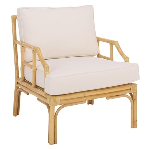 SAFAVIEH Furniture - Kazumi Accent Chair - Coastal Design White Cushion & Natural Rattan - Fully Assembled - Ideal for Living Room, Bedroom, Dining Space, 19.7" Seat Height (ACH6508B)
View Price
SAFAVIEH Furniture - Kazumi Accent Chair - Coastal Design White Cushion & Natural Rattan - Fully Assembled - Ideal for Living Room, Bedroom, Dining Space, 19.7" Seat Height (ACH6508B)
View Price
 Weture Mid-Century Accent Chair,Modern Linen Fabric Armchair for Living Room,Comfy Upholstered Reading Accent Chairs for Bedroom,Single Sofa Chair with Wood Legs (Beige, 1 Pack)
View Price
Weture Mid-Century Accent Chair,Modern Linen Fabric Armchair for Living Room,Comfy Upholstered Reading Accent Chairs for Bedroom,Single Sofa Chair with Wood Legs (Beige, 1 Pack)
View Price
 IOTXY 5-Tier Wooden Shelf Bookcase - Modern Open Bookshelf, Free Standing Storage Rack, Multifunctional Display Stand for Home and Office, Oak, Rectangle
View Price
IOTXY 5-Tier Wooden Shelf Bookcase - Modern Open Bookshelf, Free Standing Storage Rack, Multifunctional Display Stand for Home and Office, Oak, Rectangle
View Price
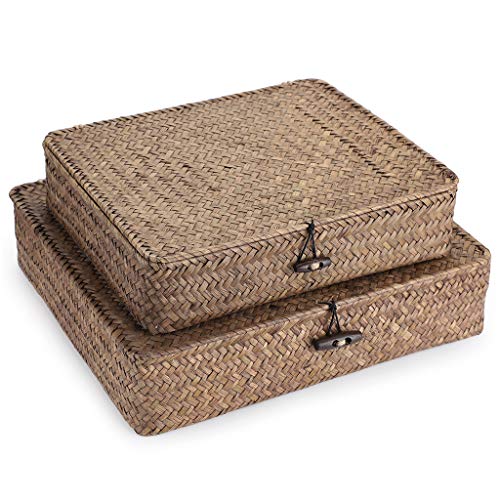 Hipiwe Set of 2 Flat Woven Wicker Storage Bins with Lid Natural Seagrass Basket Multipurpose Home Boxes for Shelf Organizer (Coffee)
View Price
Hipiwe Set of 2 Flat Woven Wicker Storage Bins with Lid Natural Seagrass Basket Multipurpose Home Boxes for Shelf Organizer (Coffee)
View Price
 Smiry Stretch Jacquard Office Computer Chair Seat Covers, Removable Washable Anti-dust Desk Chair Seat Cushion Protectors - Taupe
View Price
Smiry Stretch Jacquard Office Computer Chair Seat Covers, Removable Washable Anti-dust Desk Chair Seat Cushion Protectors - Taupe
View Price
 IBF 5-Tier Solid Wood Ladder Bookshelf with Natural Live Edge
View Price
IBF 5-Tier Solid Wood Ladder Bookshelf with Natural Live Edge
View Price
Layer in Real Plants Without Overwhelming the Room
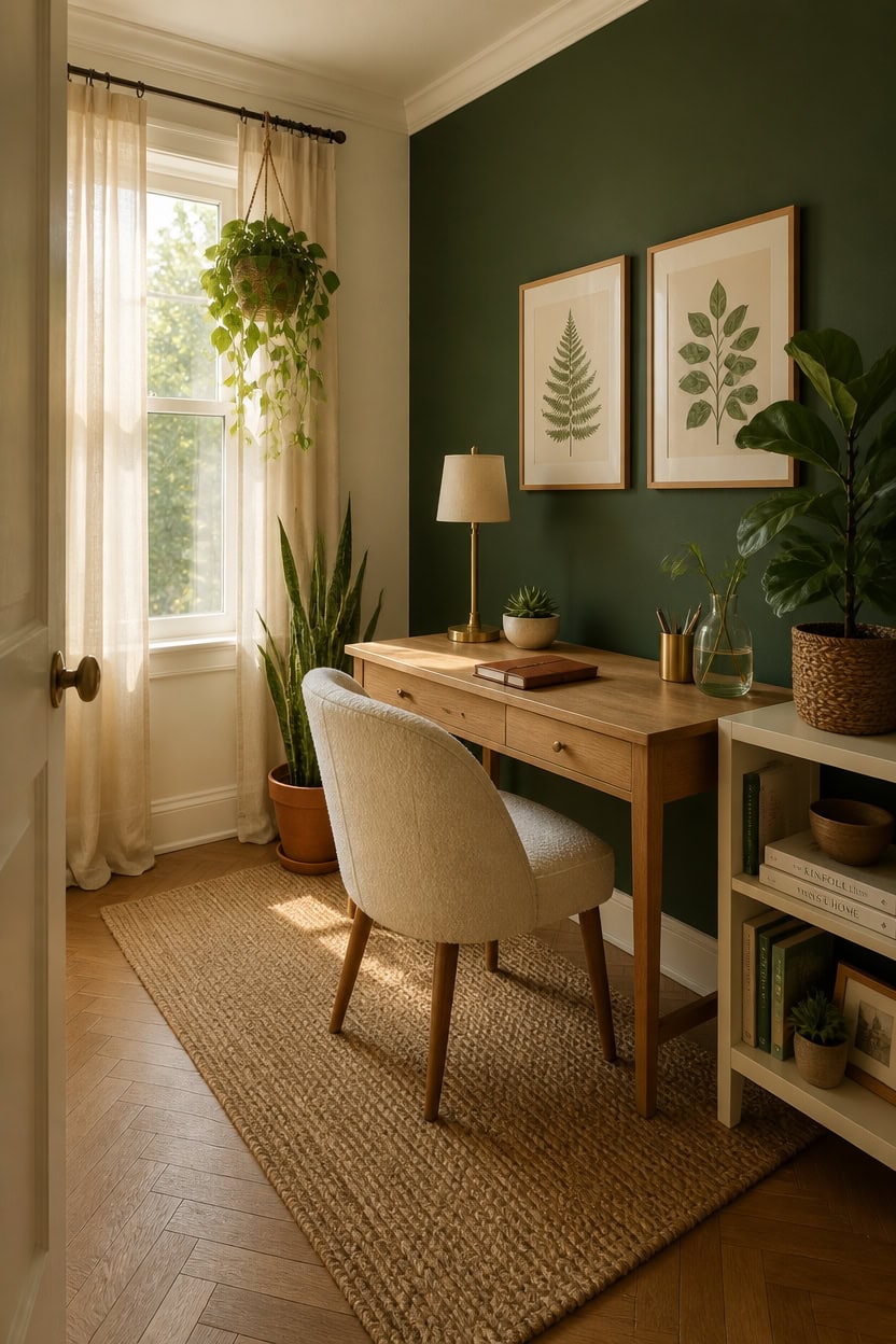
Two or three plants placed at different heights do more for a green and cream office than a shelf lined with identical pots. Varying the height creates a natural layering effect that mirrors how plants actually grow outdoors, which keeps the arrangement from looking staged. Aim for one floor plant, one desk plant, and one hanging or wall-mounted option so the eye moves through the room instead of stopping in one spot.
Vary the vessel materials: A terracotta pot, a woven basket planter, and a simple ceramic dish create visual variety without competing with the green and cream palette.
Choose plants with contrasting leaf shapes: Pairing a broad-leafed pothos with a spiky snake plant and a trailing plant like a string of pearls keeps the arrangement looking curated rather than collected.
Keep desk plants compact: A small succulent or single-stem propagation in a glass vessel adds life to the workspace without blocking sightlines or crowding the surface.
Let some plants trail downward: A hanging pothos or trailing ivy from a high shelf softens hard edges and draws the eye upward, which makes the ceiling feel taller.
so that green foliage reads as a natural extension of the room rather than a contrast inserted into it.
matched from this photo — the closest Benjamin Moore shade.
 Nearly Natural Pothos Hanging Basket UV Resistant (Indoor/Outdoor)
View Price
Nearly Natural Pothos Hanging Basket UV Resistant (Indoor/Outdoor)
View Price
 FaithLand 2-Pack 9 Inch Planter Pots for Indoor Outdoor Plants, Self Watering Flower Pots with Deep Reservoir, Black with Terracotta …
View Price
FaithLand 2-Pack 9 Inch Planter Pots for Indoor Outdoor Plants, Self Watering Flower Pots with Deep Reservoir, Black with Terracotta …
View Price
 TOPZEA Set of 6 Succulent Plant Pots, 4 Inch Glazed Ceramic Pots with Drainage and Saucer, Mini Bonsai Planter Small Flower Pots for Indoor Outdoor Use
View Price
TOPZEA Set of 6 Succulent Plant Pots, 4 Inch Glazed Ceramic Pots with Drainage and Saucer, Mini Bonsai Planter Small Flower Pots for Indoor Outdoor Use
View Price
 Mkono Wall Hanging Planter Propagation Station Glass Flower Vase for Hydroponics Plants, Bathroom, Home Office Living Room Decor Gift, Oblate Set of 4(Plants not Included)
View Price
Mkono Wall Hanging Planter Propagation Station Glass Flower Vase for Hydroponics Plants, Bathroom, Home Office Living Room Decor Gift, Oblate Set of 4(Plants not Included)
View Price
 Keter Resin Rattan Set of 2 Round Hanging Planter Baskets for Indoor and Outdoor Plants-Perfect for Porches and Patio Decor, Cappuccino
View Price
Keter Resin Rattan Set of 2 Round Hanging Planter Baskets for Indoor and Outdoor Plants-Perfect for Porches and Patio Decor, Cappuccino
View Price
 Hallops Rattan Planter with Stand - Set of 3 - Rattan Plant Pot with Legs for Home and Garden Decor - Flower Pot for Indoor Use - Wicker Planter - Comes in 3 Different Sizes
View Price
Hallops Rattan Planter with Stand - Set of 3 - Rattan Plant Pot with Legs for Home and Garden Decor - Flower Pot for Indoor Use - Wicker Planter - Comes in 3 Different Sizes
View Price
 KCKHFA Glass Plant Misters for Inside, 13.5 oz Mister Spray Bottle for Plants, Spring Gardening, Cleaning, Hair, Pets Care with Adjustable Nozzle
View Price
KCKHFA Glass Plant Misters for Inside, 13.5 oz Mister Spray Bottle for Plants, Spring Gardening, Cleaning, Hair, Pets Care with Adjustable Nozzle
View Price
How to Use Botanical and Organic Patterns Without Overdoing It
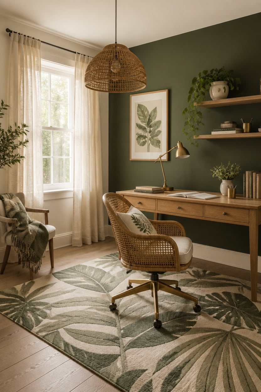
Botanical and organic patterns work best in a green and cream office when they appear in no more than two surfaces at a time — one large-scale and one small-scale. Repeating the same leaf motif across a rug, curtains, and wallpaper collapses the room into a theme rather than a design. Anchor your pattern use to textiles and wall art, and let the solid green and cream elements carry the rest of the room.
Scale contrast matters: Pair one large-scale botanical print with one small, delicate pattern so neither competes for attention.
Ground pattern with solids: Every patterned piece needs at least two adjacent solid surfaces — cream walls or a plain desk chair — to give the eye a resting point.
Limit pattern to soft furnishings: Cushions, a single art print, or a patterned rug keep the pattern removable and easy to restyle without committing to permanent decisions.
Repeat color, not motifs: If your rug features dark green botanical leaves, echo the green in a solid throw rather than another leaf print, which keeps the palette cohesive without visual noise.
so botanical patterns on textiles and art read clearly against a clean, warm neutral backdrop.
matched from this photo — the closest Benjamin Moore shade.
 GarveeHome Provence 8x10 Area Rugs for Living Room, Botanical Grove Sage Green Cottagecore Washable Rug for Bedroom Dining Nursery Low-Pile Vintage Large Carpet
View Price
GarveeHome Provence 8x10 Area Rugs for Living Room, Botanical Grove Sage Green Cottagecore Washable Rug for Bedroom Dining Nursery Low-Pile Vintage Large Carpet
View Price
 Large Framed William Morris Wall Art for Living Room, Set of 3 Vintage Sage Green Botanical Canvas Prints, Van Gogh Floral Plant Artwork for Bedroom, Hallway, or Home Office Decor, 24x36 Inch
View Price
Large Framed William Morris Wall Art for Living Room, Set of 3 Vintage Sage Green Botanical Canvas Prints, Van Gogh Floral Plant Artwork for Bedroom, Hallway, or Home Office Decor, 24x36 Inch
View Price
 avpdupu Square Sage Green Pillow Covers 18x18 Linen Floral Set of 4 - Cushion Covers 18 x 18 for Couch, Decorative Use Indoor and Garden
View Price
avpdupu Square Sage Green Pillow Covers 18x18 Linen Floral Set of 4 - Cushion Covers 18 x 18 for Couch, Decorative Use Indoor and Garden
View Price
 GINAMUSE Multi-Color Gold Green Cable Woven Throw Blanket for Couch,50"X60" Boho Style Textured Blankets for Home Decor,Super Soft Warm Cozy Chunky Blanket with Decorative Tassels for Bed
View Price
GINAMUSE Multi-Color Gold Green Cable Woven Throw Blanket for Couch,50"X60" Boho Style Textured Blankets for Home Decor,Super Soft Warm Cozy Chunky Blanket with Decorative Tassels for Bed
View Price
 HAOKHOME Vintage Floral Wallpaper Peel and Stick Botanical Sage Green/Yellow Wall Murals Home Kitchen Bedroom Decor by William Morris 17.3in x 9.8ft
View Price
HAOKHOME Vintage Floral Wallpaper Peel and Stick Botanical Sage Green/Yellow Wall Murals Home Kitchen Bedroom Decor by William Morris 17.3in x 9.8ft
View Price
 Ropoloogy 3 Set 11 Inches Cloud Shaped Rattan Pendant Light Shade, Woven Rattan Lamp Shades for Ceiling Lighting, Natural Handcrafted for Dining Room, Kitchen Ceiling(Small Cloud Lampshade)
View Price
Ropoloogy 3 Set 11 Inches Cloud Shaped Rattan Pendant Light Shade, Woven Rattan Lamp Shades for Ceiling Lighting, Natural Handcrafted for Dining Room, Kitchen Ceiling(Small Cloud Lampshade)
View Price
 Guken Linen Curtains 84 Inches Long for Living Room Rod Pocket Natural Cream Semi Sheer Curtain 2 Panels Set Boho Farmhouse Light Filtering Window Drapes for Bedroom Beige Ivory 52x84
View Price
Guken Linen Curtains 84 Inches Long for Living Room Rod Pocket Natural Cream Semi Sheer Curtain 2 Panels Set Boho Farmhouse Light Filtering Window Drapes for Bedroom Beige Ivory 52x84
View Price
 White Ceramic Decorative Vases Set of 2, Nordic Minimalist Modern Vases for Table, Wedding, Living Room, Bedroom, Office Home Decoration
View Price
White Ceramic Decorative Vases Set of 2, Nordic Minimalist Modern Vases for Table, Wedding, Living Room, Bedroom, Office Home Decoration
View Price
How Lighting Shapes the Mood of a Green and Cream Office
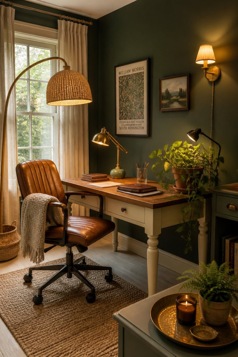
Lighting in a green and cream office does more than illuminate — it controls whether the green reads as rich and grounded or dull and flat. Warm bulb temperatures between 2700K and 3000K pull out the golden undertones in cream surfaces while deepening green into something that feels lush rather than institutional. Layer three light sources — ambient overhead, a task lamp on the desk, and one accent light near a plant or art print — so the room never depends on a single harsh source.
Layer your sources: Combine ceiling, desk, and accent lighting so shadows stay soft and no single fixture creates glare across your work surface.
Match bulb warmth to cream: Bulbs above 4000K make cream walls look gray and cool, killing the nature-inspired warmth the palette is built on.
Use lighting to spotlight green: Aim a small accent or clip light toward your darkest green element — a plant, a framed print, or the accent wall — to make it anchor the room visually.
Avoid overhead-only setups: A single ceiling fixture floods the room with flat light that flattens both the green depth and the cream warmth simultaneously.
so warm-toned lighting reflects off the cream surface and fills the room with a soft, golden glow rather than harsh bounce.
the cream from this look, matched from the photo to its closest Benjamin Moore shade.
 DRAWNCAT Boho Rattan Floor Lamp with Shade – 12W Bright Dimmable LED Bulb, Remote Control 3 Color Temperatures, Modern Farmhouse Handwoven Arc Standing Light for Living Room Bedroom
View Price
DRAWNCAT Boho Rattan Floor Lamp with Shade – 12W Bright Dimmable LED Bulb, Remote Control 3 Color Temperatures, Modern Farmhouse Handwoven Arc Standing Light for Living Room Bedroom
View Price
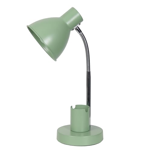 Simple Designs LD1076-SGE 16.22" Sleek Essentials Adjustable Metal Desk Task Lamp with Organizer Compartment, for Office, Desk, Nightstand, Dorm, Sage Green
View Price
Simple Designs LD1076-SGE 16.22" Sleek Essentials Adjustable Metal Desk Task Lamp with Organizer Compartment, for Office, Desk, Nightstand, Dorm, Sage Green
View Price
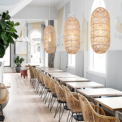 Arturesthome 1 Light Natural Rattan Pendant Light, Woven Chandelier Pendant Lamp Shade, Hanging Ceiling Light, Handmade Lampshade for Bar Hallway D 9.8"* 23.2"
View Price
Arturesthome 1 Light Natural Rattan Pendant Light, Woven Chandelier Pendant Lamp Shade, Hanging Ceiling Light, Handmade Lampshade for Bar Hallway D 9.8"* 23.2"
View Price
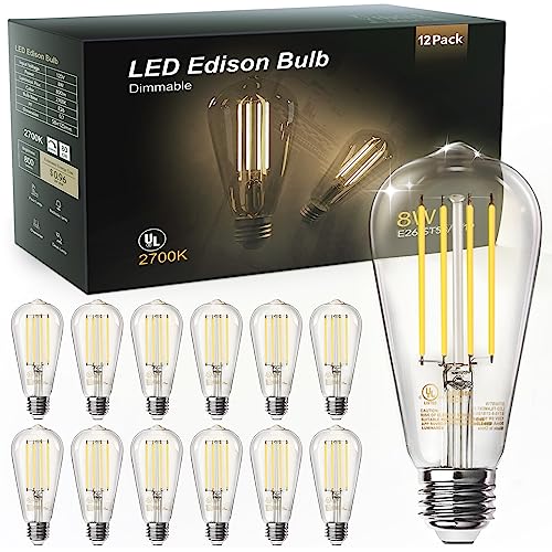 TJOY 12 Pack Vintage 8W ST58 LED Edison Light Bulbs, Dimmable, 60W Equivalent, 800Lumens, 2700K Warm White, E26 Base LED Filament Bulb, CRI80+, Antique Glass Style for Home, Bedroom, Office, Farmhouse
View Price
TJOY 12 Pack Vintage 8W ST58 LED Edison Light Bulbs, Dimmable, 60W Equivalent, 800Lumens, 2700K Warm White, E26 Base LED Filament Bulb, CRI80+, Antique Glass Style for Home, Bedroom, Office, Farmhouse
View Price
 Aspen Creative 38004 Traditional Handsewn Bell Shaped Collapsible Spider Construction Lamp Shade in Cream, 8" Top x 17" Bottom x 13" Slant, Set of 1
View Price
Aspen Creative 38004 Traditional Handsewn Bell Shaped Collapsible Spider Construction Lamp Shade in Cream, 8" Top x 17" Bottom x 13" Slant, Set of 1
View Price
 TRLIFE Wall Sconces Plug in, Dimmable Wall Sconces Brushed Brass Swing Arm Wall Lights Plug in Wall Mounted Light Industrial Wall Lights with 6FT Plug in Cord, E26 Base, UL Listed(Two Arms, 2 Pack)
View Price
TRLIFE Wall Sconces Plug in, Dimmable Wall Sconces Brushed Brass Swing Arm Wall Lights Plug in Wall Mounted Light Industrial Wall Lights with 6FT Plug in Cord, E26 Base, UL Listed(Two Arms, 2 Pack)
View Price
 SYLW Modern Ceramics Table Lamp Green Ceramic Base White Jade Round Ball Glass Accent Table Lamp Living Room Bedroom Bedside Nightstand House Office Home Reading
View Price
SYLW Modern Ceramics Table Lamp Green Ceramic Base White Jade Round Ball Glass Accent Table Lamp Living Room Bedroom Bedside Nightstand House Office Home Reading
View Price
 AKTSNYMPH LED Clamp Spot Lights,Indoor Plants Decor Accent Lighting,Clip on Lights Warm White 3000K Uplights with 9.8FT Cord and Switch for Trade Show,Workshop,Billboard,Desk Lighting,2Pack
View Price
AKTSNYMPH LED Clamp Spot Lights,Indoor Plants Decor Accent Lighting,Clip on Lights Warm White 3000K Uplights with 9.8FT Cord and Switch for Trade Show,Workshop,Billboard,Desk Lighting,2Pack
View Price
Small Green and Cream Office Layouts That Actually Work
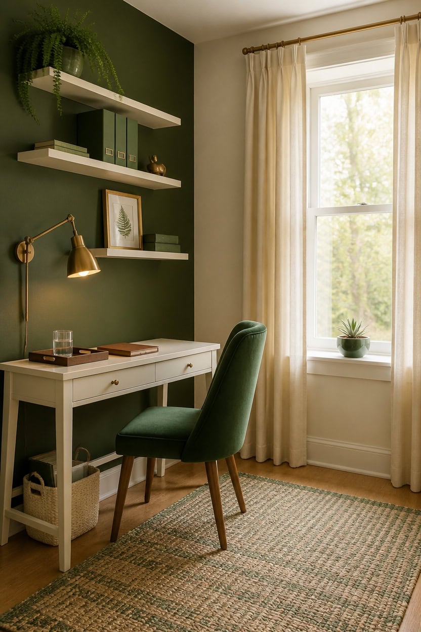
Small offices work best when you commit to one strong layout principle instead of trying to fit every function into the room. In a green and cream palette, keeping the darkest color — green — on a single accent wall behind the desk pulls the eye to one point and stops the room from feeling cluttered. Cream on the remaining walls and furniture reflects light outward, which makes a compact space feel wider than it is.
Float the desk against the accent wall: Pushing the desk toward the green wall creates a clear focal zone and leaves the surrounding cream space open and breathable.
Choose slim-profile furniture: Narrow desks, wall-mounted shelves, and open-leg chairs keep floor space visible, which is the fastest way to make a small room read as larger.
Use vertical space for green: Stack cream shelves up the wall and use plants, green binders, or framed prints on upper shelves to bring the color upward without eating into floor area.
Limit pattern to one item: In a small room, a single cream and green patterned rug or cushion carries the design without overwhelming the square footage.
so cream tones reflect natural light across the compact room and keep the space feeling open rather than boxed in.
the green from this look, matched from the photo to its closest Benjamin Moore shade.
 WOHOMO Folding Desk, 31.5" Small Desk for Small Spaces, Easy Assemble Foldable Computer Desk for Laptop, Mini Portable Working Table Narrow Wooden Writing Workstation for Home Office, White
View Price
WOHOMO Folding Desk, 31.5" Small Desk for Small Spaces, Easy Assemble Foldable Computer Desk for Laptop, Mini Portable Working Table Narrow Wooden Writing Workstation for Home Office, White
View Price
 Home Office Chair Swivel Velvet Desk Chair Accent Armchair Upholstered Modern Tufted Chairs with Gold Base for Girls Women Ergonomic Study Seat Computer Task Stools for Living Room(Green)
View Price
Home Office Chair Swivel Velvet Desk Chair Accent Armchair Upholstered Modern Tufted Chairs with Gold Base for Girls Women Ergonomic Study Seat Computer Task Stools for Living Room(Green)
View Price
 Forbena 24 Inch Bathroom Floating Shelves for Wall Set of 3, Gold Bathroom Shelves Over Toilet Wall Mounted with Rail, Decorative Hanging Shelf for Bedroom Office Living Room Decor (White and Gold)
View Price
Forbena 24 Inch Bathroom Floating Shelves for Wall Set of 3, Gold Bathroom Shelves Over Toilet Wall Mounted with Rail, Decorative Hanging Shelf for Bedroom Office Living Room Decor (White and Gold)
View Price
 SAFAVIEH Natural Fiber Collection Area Rug - 5' x 8', Green, Handmade Boho Fringe Woven Jute, Ideal for High Traffic Areas in Living Room, Bedroom (NF368G)
View Price
SAFAVIEH Natural Fiber Collection Area Rug - 5' x 8', Green, Handmade Boho Fringe Woven Jute, Ideal for High Traffic Areas in Living Room, Bedroom (NF368G)
View Price
 Ton Sin Flower Pots, Light Green Ceramic Plant Pots Set of 3,Small Glazed Succulent Pots with Drainage Hole,Cactus Planter with Saucer,Outdoor Garden Pots (Green)
View Price
Ton Sin Flower Pots, Light Green Ceramic Plant Pots Set of 3,Small Glazed Succulent Pots with Drainage Hole,Cactus Planter with Saucer,Outdoor Garden Pots (Green)
View Price
 TRLIFE Remote Control Dimmable Wall Sconce, Adjustable Color Temperature 2700K-6500K Brushed Brass Swing Arm Wall Lights with Plug in Cord, 11.8" Large White Shade(2 Pack, 2 Bulbs)
View Price
TRLIFE Remote Control Dimmable Wall Sconce, Adjustable Color Temperature 2700K-6500K Brushed Brass Swing Arm Wall Lights with Plug in Cord, 11.8" Large White Shade(2 Pack, 2 Bulbs)
View Price
 Triple Pinch Pleated Curtains for Living Room 90 Inch Linen Curtains 2 Panels Set Natural Cream Light Filtering Semi Sheer Pinch Pleat Drapes Memory Trained 90 Inches Long Neutral Modern Home Decor
View Price
Triple Pinch Pleated Curtains for Living Room 90 Inch Linen Curtains 2 Panels Set Natural Cream Light Filtering Semi Sheer Pinch Pleat Drapes Memory Trained 90 Inches Long Neutral Modern Home Decor
View Price
What to Avoid When Designing a Green and Cream Office
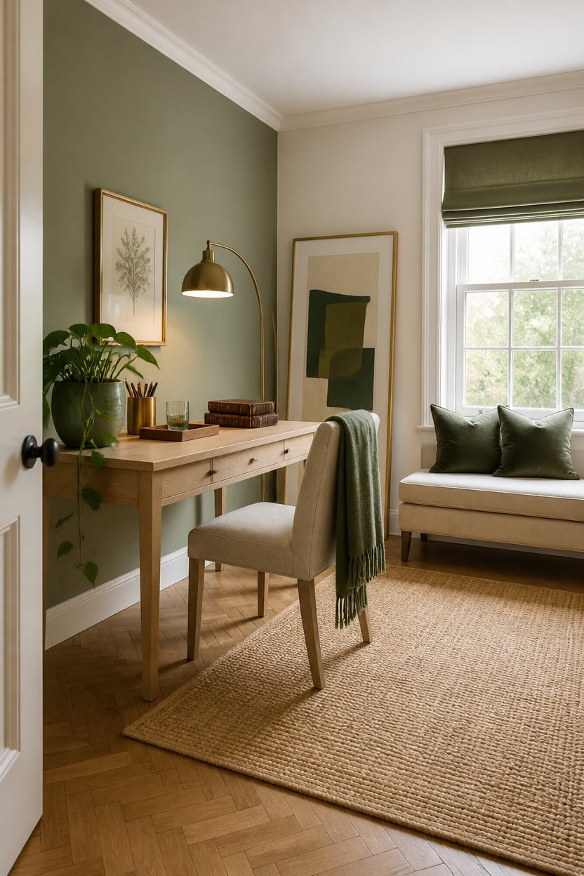
Avoiding common mistakes in a green and cream office keeps the palette from tipping into something that feels either too clinical or too chaotic. Green is a strong color with real visual weight, and cream can easily slide toward yellow or gray depending on the undertones you choose. Getting the balance right means understanding what each color can and cannot carry in a workspace.
Wrong green shade: Cool-toned greens with blue undertones clash with warm cream walls, so stick to earthy, muted greens with yellow or gray bases.
Too much dark green: Using deep green on more than one surface overwhelms the cream and shrinks the room visually, so treat it as an accent, not a base.
Mismatched cream undertones: Cream walls with pink undertones fight against green’s natural earthiness, so test paint samples against your green before committing.
Ignoring natural light: A north-facing office makes both green and cream read darker and cooler, so lean toward lighter shades of each color to compensate.
so the warm cream base keeps the room feeling open and prevents the green accent from dominating too aggressively.
so the soft, grayed green anchors the workspace without the heaviness that darker greens can create in smaller offices.
 KHISCHMO Mid Century Modern Desk Chair, Vanity Chair with Natural Rattan Back, Armless Rattan Desk Chair, Upholstered Cream Linen Office Chair with Wheels
View Price
KHISCHMO Mid Century Modern Desk Chair, Vanity Chair with Natural Rattan Back, Armless Rattan Desk Chair, Upholstered Cream Linen Office Chair with Wheels
View Price
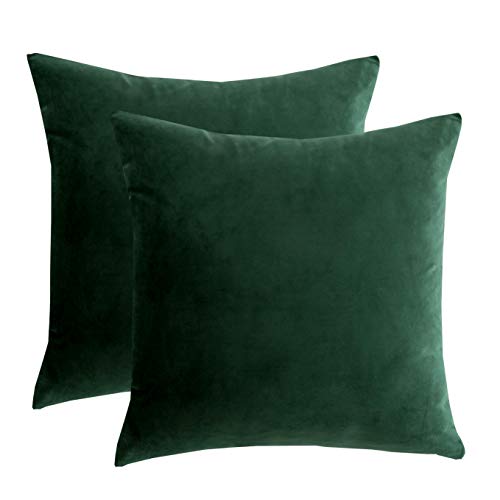 RainRoad Dark Green Decorative Throw Pillow Covers Cushion Cover Pillow Case for Sofa Couch Bed Chair,Soft Square Dark Green Throw Pillows 18x18 Inch,Set of 2
View Price
RainRoad Dark Green Decorative Throw Pillow Covers Cushion Cover Pillow Case for Sofa Couch Bed Chair,Soft Square Dark Green Throw Pillows 18x18 Inch,Set of 2
View Price
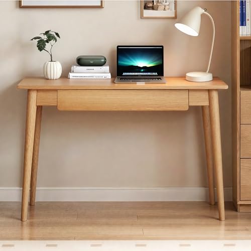 Vadisun 100% Solid Oak Wooden Desk Home Office Desk Mid Century Modern Writing Computer Desk with Drawer for Home Office 31"
View Price
Vadisun 100% Solid Oak Wooden Desk Home Office Desk Mid Century Modern Writing Computer Desk with Drawer for Home Office 31"
View Price
 Ceramic Planter Pots – Planters for Everyday Greenery, Indoor Planters for Shelf or Patio, Striped Scallop Design Garden Home Decor Accent – 8" x 7" & 6" x 6"(Set of 2), Green & White
View Price
Ceramic Planter Pots – Planters for Everyday Greenery, Indoor Planters for Shelf or Patio, Striped Scallop Design Garden Home Decor Accent – 8" x 7" & 6" x 6"(Set of 2), Green & White
View Price
 Ambimall Arc Floor Lamp with Remote and Stepless Dimmable Bulb, Colors Temperature & Brightness Adjustable, Gold Floor Lamps for Living Room(Deep Beige Shade & Gold Pole)
View Price
Ambimall Arc Floor Lamp with Remote and Stepless Dimmable Bulb, Colors Temperature & Brightness Adjustable, Gold Floor Lamps for Living Room(Deep Beige Shade & Gold Pole)
View Price
 Large Framed Green and Beige Abstract Wall Art Set of 3, Modern Neutral Canvas Prints Paintings Artwork for Walls, Minimalist Abstract Pictures for Living Room Dining Room Bedroom Wall Decor 20x30 In
View Price
Large Framed Green and Beige Abstract Wall Art Set of 3, Modern Neutral Canvas Prints Paintings Artwork for Walls, Minimalist Abstract Pictures for Living Room Dining Room Bedroom Wall Decor 20x30 In
View Price
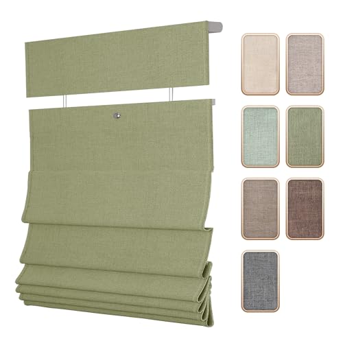 SLKWDOBD Top Down Bottom Up Roman Shades for Windows, Light Filtering Linen TDBU Roman Blinds, Cordless Roman Shades with UV Protection, Privacy, Thermal Insulation for Home, Office, Green Linen
View Price
SLKWDOBD Top Down Bottom Up Roman Shades for Windows, Light Filtering Linen TDBU Roman Blinds, Cordless Roman Shades with UV Protection, Privacy, Thermal Insulation for Home, Office, Green Linen
View Price
Budget Ways to Get a Nature-Inspired Office Look
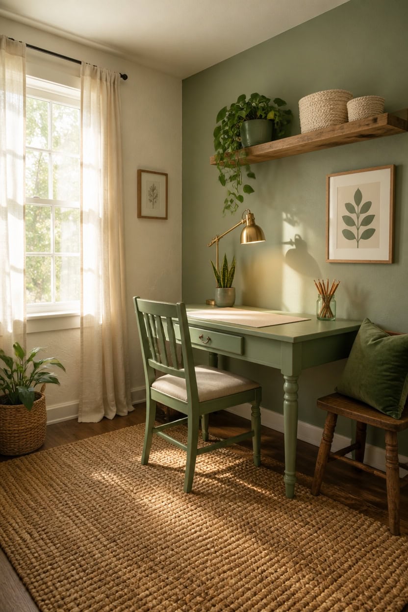
Thrifting, repainting, and swapping out small details can build a nature-inspired office without spending much money at all. Green and cream are both forgiving colors that work across price points because plants, second-hand wood pieces, and affordable linen textiles carry the palette naturally. Start with what you already own and add green through low-cost botanicals and cream through simple fabric changes before buying anything new.
Start with plants: A single potted trailing pothos or snake plant adds real green for under fifteen dollars and outperforms any decor piece.
Repaint what you have: A beat-up desk chair or wooden shelf refreshed in sage green instantly ties budget finds into the nature palette.
Layer cream textiles: A cream linen desk mat, throw, or curtain panel from a discount retailer brings warmth without committing to expensive upholstery.
Shop secondhand wood: Natural wood tones from thrift stores bridge green and cream organically and cost a fraction of new furniture prices.
so the warm cream base keeps the budget-friendly room feeling intentional and pulled together.
matched from the wall in this photo — the closest Benjamin Moore shade.
 Docrin Dark Green Ceramic Planter Set - 6.6"+5.5" Indoor Outdoor Pots with Drainage Holes & Saucers for Home Office Decor
View Price
Docrin Dark Green Ceramic Planter Set - 6.6"+5.5" Indoor Outdoor Pots with Drainage Holes & Saucers for Home Office Decor
View Price
 YSAGi Leather Desk Protector, Office Mat, Large Mouse Mat, Non-Slip PU Leather Blotter, Laptop Desk Mat, Waterproof Writing Pad for Office and Home(Cream, 42" x 17.2")
View Price
YSAGi Leather Desk Protector, Office Mat, Large Mouse Mat, Non-Slip PU Leather Blotter, Laptop Desk Mat, Waterproof Writing Pad for Office and Home(Cream, 42" x 17.2")
View Price
 WOPITUES Wood Floating Shelves Set of 6, Shelves for Wall Decor, Farmhouse Shelf for Bedroom, Bathroom Storage Shelves, Book Shelves for Living Room - Rustic Brown
View Price
WOPITUES Wood Floating Shelves Set of 6, Shelves for Wall Decor, Farmhouse Shelf for Bedroom, Bathroom Storage Shelves, Book Shelves for Living Room - Rustic Brown
View Price
 Wenqik 2 Pcs Knot Pillows Square Knotted Plush Throws Soft Accent Pillows Decoration Cushion for Couch Home Office Living Room Bedroom Bed Sofa Decor, 12'' x 13''(Dark Green,Crystal Velvet)
View Price
Wenqik 2 Pcs Knot Pillows Square Knotted Plush Throws Soft Accent Pillows Decoration Cushion for Couch Home Office Living Room Bedroom Bed Sofa Decor, 12'' x 13''(Dark Green,Crystal Velvet)
View Price
 Set of 3 Rectangular Plastic Woven Storage Baskets, Organization Bins for Classroom, Home Decor, or Office Use, 11" x 7" x 5"
View Price
Set of 3 Rectangular Plastic Woven Storage Baskets, Organization Bins for Classroom, Home Decor, or Office Use, 11" x 7" x 5"
View Price
 Framed Abstract Sage Green 3 Piece Wall Art for Living Room, Modern Neutral Waves Botanical Canvas Artwork for Walls, Minimalist Wabi Sabi Rustic Nature Print Wall Decor for Bedroom Office, 16x24 Inch
View Price
Framed Abstract Sage Green 3 Piece Wall Art for Living Room, Modern Neutral Waves Botanical Canvas Artwork for Walls, Minimalist Wabi Sabi Rustic Nature Print Wall Decor for Bedroom Office, 16x24 Inch
View Price
 LED Desk Lamp With Clamp for Home Office, Eye-Caring Clip on Light with Adjustable Extra Tall Metal Swing Arm, High Intensity Clamp w/A19 E26 Bulb for Working Reading, 3000k Table Lamps Warm Light
View Price
LED Desk Lamp With Clamp for Home Office, Eye-Caring Clip on Light with Adjustable Extra Tall Metal Swing Arm, High Intensity Clamp w/A19 E26 Bulb for Working Reading, 3000k Table Lamps Warm Light
View Price
Finishing Touches That Make a Green and Cream Office Feel Complete
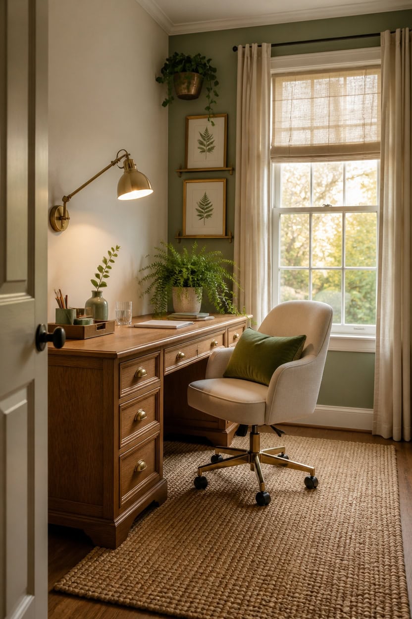
Small details like hardware, lighting, and art placement are what separate a finished office from one that simply has green and cream in it. These final layers work because they create visual continuity across every surface the eye lands on, from the desktop to the walls to the window trim. Choose finishing touches that repeat the palette in at least three different materials — ceramic, metal, and textile — to make the nature theme feel intentional rather than accidental.
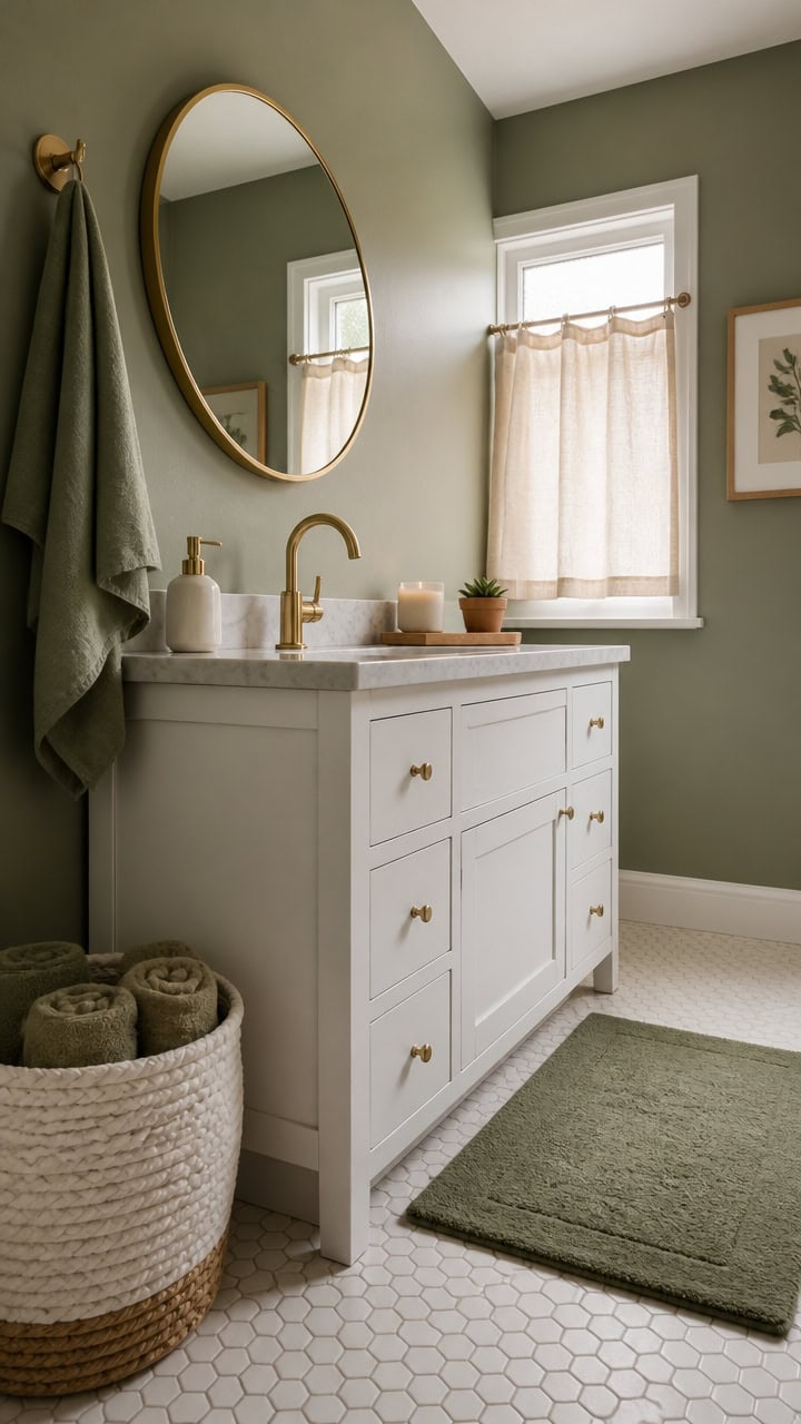
Layer your metals: Brass or aged gold hardware on frames and lamps echoes warm cream tones and prevents the green from reading as cold or clinical.
Repeat green in threes: Place three green elements at different heights — a plant on the desk, wall art at eye level, and a hanging or shelf piece above — to guide the eye upward naturally.
Ground with texture: A woven jute rug or linen curtain panel adds organic texture that ties green botanicals and cream surfaces together without adding more color.
Edit ruthlessly: One cohesive finishing layer of five to seven intentional pieces reads as designed; twelve scattered accessories reads as cluttered regardless of color match.
so the warm cream base unifies every finishing touch placed against it without competing with the decor.
so the soft grayed green creates a composed backdrop that makes brass frames and botanical details stand out.
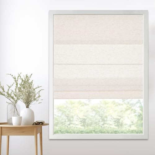 Persilux Cordless Light Filtering Roman Shades for Windows,Natural Woven Linen Fabric Roman Shades,Thermal Insulated Roman Blinds,UV Protection for Bedroom, Living Room, Office,Cream,Customize Size
View Price
Persilux Cordless Light Filtering Roman Shades for Windows,Natural Woven Linen Fabric Roman Shades,Thermal Insulated Roman Blinds,UV Protection for Bedroom, Living Room, Office,Cream,Customize Size
View Price
 Kate and Laurel Levie Modern Floating Wall Shelf Picture Frame Holder Ledge, Gold
View Price
Kate and Laurel Levie Modern Floating Wall Shelf Picture Frame Holder Ledge, Gold
View Price
 Hug Donut Decorative Vase Set - Sage Green Modern Nordic Boho Style Vases Home Decor,Matte Ceramic Decorations for Living Room Shelf, Bookshelf Mantle Entryway Table or Console Décor(Green)
View Price
Hug Donut Decorative Vase Set - Sage Green Modern Nordic Boho Style Vases Home Decor,Matte Ceramic Decorations for Living Room Shelf, Bookshelf Mantle Entryway Table or Console Décor(Green)
View Price
 HYDELITE Gold Swing Arm Wall Lamp Brass Wall Sconces with Linen Shade | Plug-in or Hardwired Wall Light Fixtures Bedroom Bedside, House Reading, Living Room, Home Hallway, Dinning Set of 2
View Price
HYDELITE Gold Swing Arm Wall Lamp Brass Wall Sconces with Linen Shade | Plug-in or Hardwired Wall Light Fixtures Bedroom Bedside, House Reading, Living Room, Home Hallway, Dinning Set of 2
View Price
 KINGROSE 3D Flower Throw Pillow Cover Floral Decorative Pillowcase Soft Cushion Cover for Bed Couch Sofa Living Room 12 x 20 Inches Velvet Green
View Price
KINGROSE 3D Flower Throw Pillow Cover Floral Decorative Pillowcase Soft Cushion Cover for Bed Couch Sofa Living Room 12 x 20 Inches Velvet Green
View Price
 SUPEASY Wooden Desk Organizer, 3-Tier Letter Tray File Organizer with Dual Side Mail Sorter, Solid Wood Desktop Paper Organizer for Office, Home Office, Classroom (Natural Wood)
View Price
SUPEASY Wooden Desk Organizer, 3-Tier Letter Tray File Organizer with Dual Side Mail Sorter, Solid Wood Desktop Paper Organizer for Office, Home Office, Classroom (Natural Wood)
View Price
The Psychology Behind Nature-Inspired Office Design
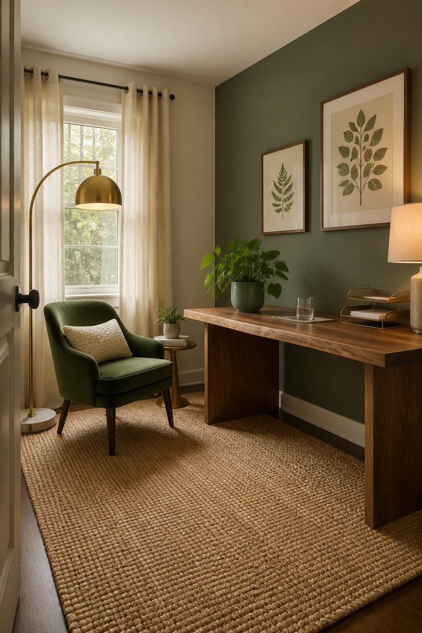
Your brain responds to natural colors the way your body responds to rest — by downshifting out of high-alert mode and into focused, sustained attention. Green activates the part of the nervous system linked to safety and calm, while cream signals warmth and low visual threat, which together reduce the low-grade stress that kills concentration. If your home office uses both colors at the right intensity, you are effectively designing a space that works with your biology instead of against it.
Green triggers restoration: Soft greens like sage or muted olive activate the same neural pathways that respond to trees and open landscapes, lowering mental fatigue.
Cream prevents sensory overload: Warm white and cream surfaces reflect light without the harsh contrast that pure white creates, keeping your visual system calm during long work sessions.
Biophilic cues build focus: Even a single real plant on your desk activates nature-based attention restoration, which research shows improves sustained concentration over time.
Color saturation matters: Muted, grayed-down versions of green work better for focus than bright or jewel-toned greens, which stimulate rather than restore.
so the warm, barely-there cream base keeps the room visually quiet and supports the restorative psychology of the palette.
so the soft grayed green directly behind your line of sight delivers the nature-based calm signal throughout the entire workday.
 Ton Sin Ceramic Plant Pots,4"+5"+6" Inch,Green Flower Pots with Drainage Holes and Tray,Indoor Planters for Plants Pots,Home Office Decoration GIF for Plants,Succulent Pot Set of 3
View Price
Ton Sin Ceramic Plant Pots,4"+5"+6" Inch,Green Flower Pots with Drainage Holes and Tray,Indoor Planters for Plants Pots,Home Office Decoration GIF for Plants,Succulent Pot Set of 3
View Price
 H.VERSAILTEX 100% Blackout Curtains Ivory, Linen Blackout Curtains 96 inch Curtains 2 Panel Set, Elegant Curtain for Bedroom Grommet Drapes for Living Room
View Price
H.VERSAILTEX 100% Blackout Curtains Ivory, Linen Blackout Curtains 96 inch Curtains 2 Panel Set, Elegant Curtain for Bedroom Grommet Drapes for Living Room
View Price
 77” Arc Floor Lamp for Living Room, Upgraded Gold Standing Lamp with Remote, 3 Color Temperatures & Brightness Adjustable, Modern Arched Floor lamp for Bedroom,Office, Antique Brass, LED Bulb Included
View Price
77” Arc Floor Lamp for Living Room, Upgraded Gold Standing Lamp with Remote, 3 Color Temperatures & Brightness Adjustable, Modern Arched Floor lamp for Bedroom,Office, Antique Brass, LED Bulb Included
View Price
 Yaheetech Flower Velvet Vanity Chair, Modern Side Chair Armchair with Golden Metal Legs for Living Room/Dressing Room/Bedroom/Home Office/Kitchen, Green
View Price
Yaheetech Flower Velvet Vanity Chair, Modern Side Chair Armchair with Golden Metal Legs for Living Room/Dressing Room/Bedroom/Home Office/Kitchen, Green
View Price
 OTOSTAR Set of 1 Textured Boucle Throw Pillow Covers Lumbar Pillow Cases Cozy Soft Decorative Couch Cushion Case for Chair Sofa Bedroom Living Room Home Decor 12 x 20 Inch, Cream Beige
View Price
OTOSTAR Set of 1 Textured Boucle Throw Pillow Covers Lumbar Pillow Cases Cozy Soft Decorative Couch Cushion Case for Chair Sofa Bedroom Living Room Home Decor 12 x 20 Inch, Cream Beige
View Price
 Standing Desk – Walnut Solid Wood Desk, Natural Live Edge, Adjustable Height Dual Motor, Sit Stand for Home Office (Black, W60 x D27)
View Price
Standing Desk – Walnut Solid Wood Desk, Natural Live Edge, Adjustable Height Dual Motor, Sit Stand for Home Office (Black, W60 x D27)
View Price