23 Kitchen Cabinets Color Combination Designs That Work Beautifully
If you’re dreaming of a kitchen refresh, switching up your cabinet colors might be the easiest way to make a big impact.
Two-tone cabinets are having a major moment, and the right pairing can breathe new life into your space without a full remodel.
These stunning color combinations will inspire your next design move.
How to Choose a Two-Tone Kitchen Cabinet Color Combination?
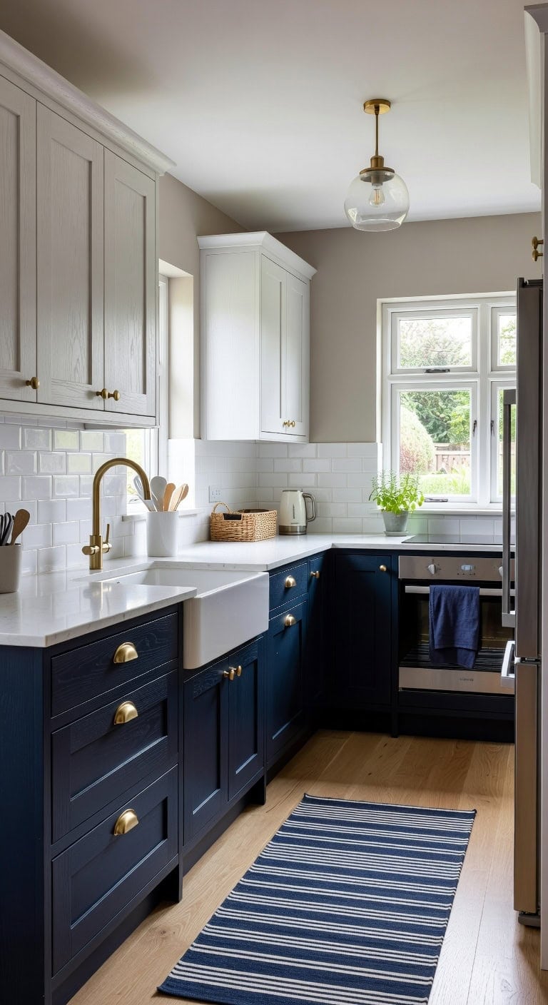
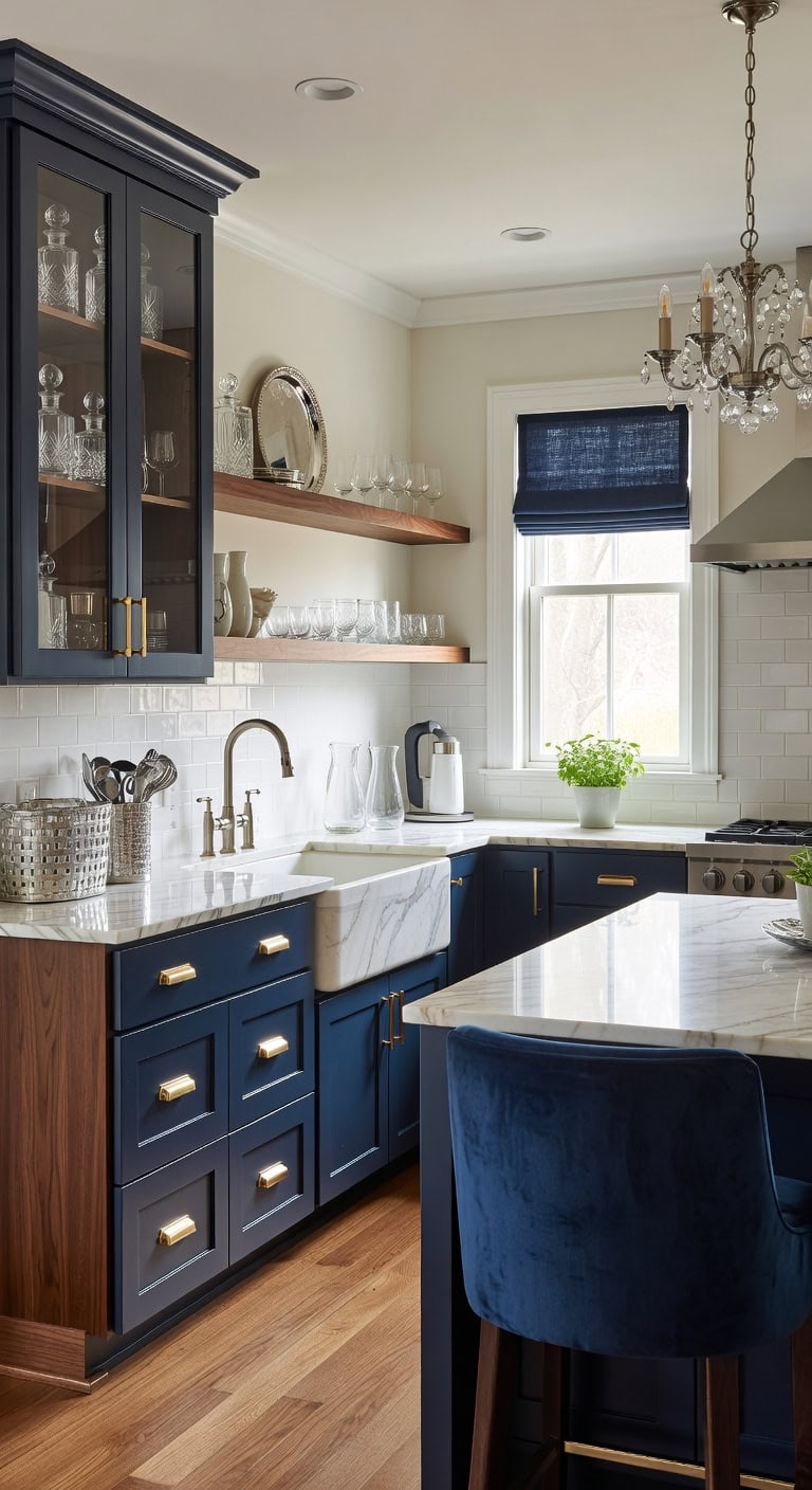
Pairing a warm white upper with a deep navy lower cabinet creates the kind of contrast that instantly grounds a kitchen. The smooth matte finish on the navy base plays against the subtle grain of white shaker doors, while brushed brass hardware ties the two tones together with a warm metallic texture. This combination works whether your kitchen is compact or open-concept.
Lower Cabinets: Paint in “Hale Navy” (Benjamin Moore HC-154) — a rich, saturated navy blue that anchors the bottom half of your kitchen with sophisticated depth and pairs beautifully with almost any countertop material.
Upper Cabinets: Paint in “Simply White” (Benjamin Moore OC-117) — a clean, warm white with the slightest creamy undertone that keeps upper cabinets feeling bright and airy without looking sterile against the bold navy below.
 XSYarn Laundry Room Rug - 20"X47" Kitchen Rug Washable Low-Pile Floor Mat Farmhouse Laundry Decor for Bathroom Hallway Navy Stripe
View Price
XSYarn Laundry Room Rug - 20"X47" Kitchen Rug Washable Low-Pile Floor Mat Farmhouse Laundry Decor for Bathroom Hallway Navy Stripe
View Price
 CABDM 6 Pack Brass Cup Pulls 3"(76mm) Center to Center Drawer Pulls Brushed Brass Cabinet Cup Pulls Kitchen Cabinet Hardware Brushed Gold Cabinet Handles Bin Cup Drawer Handles Gold Knobs.
View Price
CABDM 6 Pack Brass Cup Pulls 3"(76mm) Center to Center Drawer Pulls Brushed Brass Cabinet Cup Pulls Kitchen Cabinet Hardware Brushed Gold Cabinet Handles Bin Cup Drawer Handles Gold Knobs.
View Price
 Brass Pendant Light Kitchen Island, 1-Light Modern Hanging Light Fixture, Adjustable Height Ceiling Light with Frosted Glass Globe, E26 Base, Dining Room, Entryway, Bedroom Lighting, ETL Listed
View Price
Brass Pendant Light Kitchen Island, 1-Light Modern Hanging Light Fixture, Adjustable Height Ceiling Light with Frosted Glass Globe, E26 Base, Dining Room, Entryway, Bedroom Lighting, ETL Listed
View Price
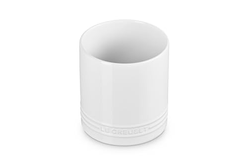 Le Creuset Stoneware Signature Straight Wall Utensil Crock, 1 qt., White
View Price
Le Creuset Stoneware Signature Straight Wall Utensil Crock, 1 qt., White
View Price
 Premium Kitchen Towels 6 Pack 100% Cotton, 20"x28" Dish Towels - Navy Blue
View Price
Premium Kitchen Towels 6 Pack 100% Cotton, 20"x28" Dish Towels - Navy Blue
View Price
 Covzoe 2 Pack Wicker Storage Basket with 3 Compartments
View Price
Covzoe 2 Pack Wicker Storage Basket with 3 Compartments
View Price
 Ivilon Countertop Paper Towel Holder - Weighted Heavy Duty Steel Stand with Non-Slip Base for a Steady One-Handed One Sheet Tear - Fits All Rolls - Warm Gold
View Price
Ivilon Countertop Paper Towel Holder - Weighted Heavy Duty Steel Stand with Non-Slip Base for a Steady One-Handed One Sheet Tear - Fits All Rolls - Warm Gold
View Price
 0.8L Portable Stainless Steel Travel Electric Kettle, Double Wall
View Price
0.8L Portable Stainless Steel Travel Electric Kettle, Double Wall
View Price
Shop The Look
DIY Paint Transformation
Best For: Mid-size kitchens with natural light where the high contrast between upper and lower cabinets adds visual height and dimension without overwhelming the space.
White Uppers and Navy Blue Lowers – A Timeless Cabinet Color Combo
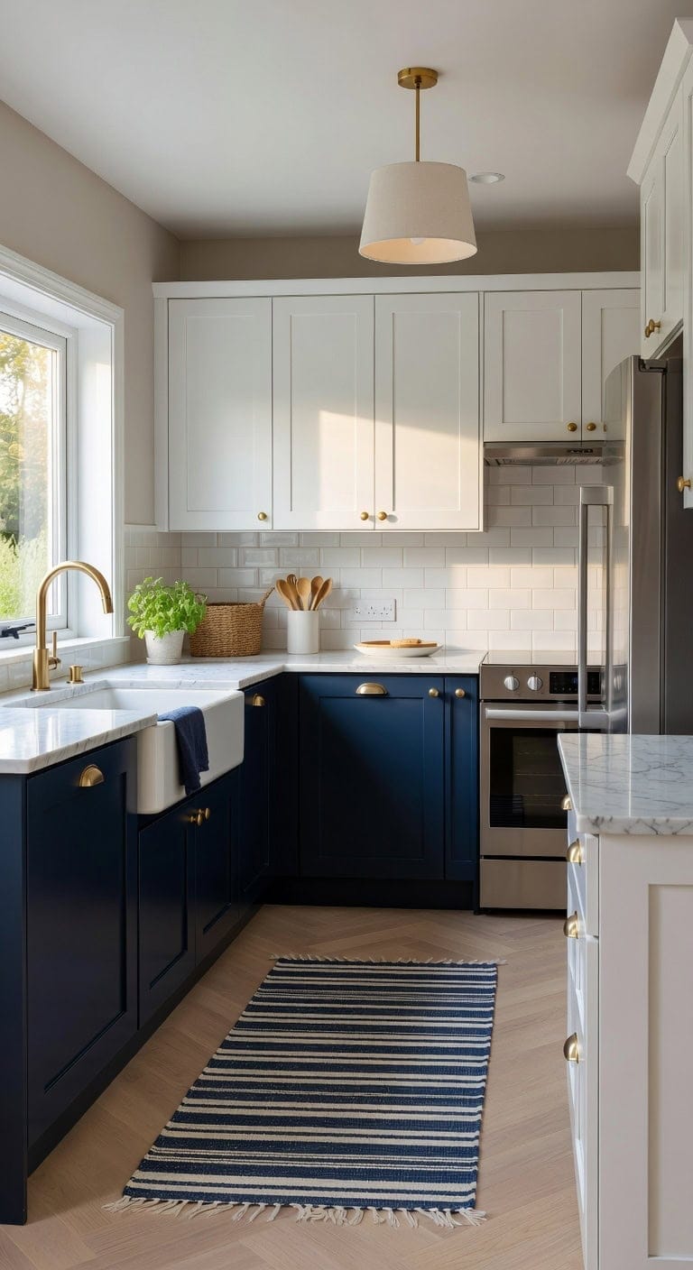
That crisp white-and-navy-blue kitchen you keep pinning actually works in real life. White upper cabinets bounce light across the room while navy blue lowers ground everything with quiet confidence. Pair brushed brass hardware against smooth painted wood and a woven runner underfoot, and the whole space feels collected without trying too hard.
Upper Cabinets: Paint in “Chantilly Lace” (Benjamin Moore OC-65), a reliable true white with zero yellow undertone that keeps uppers looking bright and airy against any wall color.
Lower Cabinets: Paint in “Hale Navy” (Benjamin Moore HC-154), a rich, saturated navy blue with just enough gray depth to read classic rather than costume-like under kitchen lighting.
 JONATHAN Y Washable Orton Distressed Ticking Stripe 2' x 8' Machine-Washable Polyester Runner Rug, Navy and Cream, Farmhouse Vintage Style with Low Pile for Hallway WSH519D-28
View Price
JONATHAN Y Washable Orton Distressed Ticking Stripe 2' x 8' Machine-Washable Polyester Runner Rug, Navy and Cream, Farmhouse Vintage Style with Low Pile for Hallway WSH519D-28
View Price
 HOMOTEK 6 Pack 3 Inch Hole Centers Brushed Brass Drawer Bin Cup Pulls Dresser Pulls for Cabinets, Furniture Handles, Kitchen Cabinet Hardware
View Price
HOMOTEK 6 Pack 3 Inch Hole Centers Brushed Brass Drawer Bin Cup Pulls Dresser Pulls for Cabinets, Furniture Handles, Kitchen Cabinet Hardware
View Price
 LE TAUCI Utensil Holder for Kitchen Counter, 7.3"+5.4" Fluted Ceramic Utensil Crock Organizer for Countertop, Heavy Large Holder for Spatulas, Spoons, Set of 2, White, Kitchen Counter Decor
View Price
LE TAUCI Utensil Holder for Kitchen Counter, 7.3"+5.4" Fluted Ceramic Utensil Crock Organizer for Countertop, Heavy Large Holder for Spatulas, Spoons, Set of 2, White, Kitchen Counter Decor
View Price
 Febeleven Farmhouse 11.81" White Pendant Light with Gold Finish, Industrial Metal Hanging Lighting Fixtures, Adjustable Height Dining Room Chandelier for Kitchen Island Hallway and Foyer 2 Pack
View Price
Febeleven Farmhouse 11.81" White Pendant Light with Gold Finish, Industrial Metal Hanging Lighting Fixtures, Adjustable Height Dining Room Chandelier for Kitchen Island Hallway and Foyer 2 Pack
View Price
 Kitinjoy 100% Cotton Kitchen Towels and Dishcloths Set, Navy Blue
View Price
Kitinjoy 100% Cotton Kitchen Towels and Dishcloths Set, Navy Blue
View Price
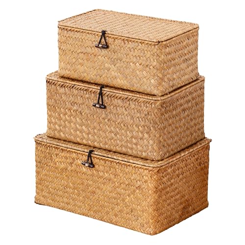 Nonam Wicker Storage Basket with Lid,Seagrass Shelf Basket Set of 3,Nautral
View Price
Nonam Wicker Storage Basket with Lid,Seagrass Shelf Basket Set of 3,Nautral
View Price
 Creative Co-Op Distressed White Bread Box with Lid
View Price
Creative Co-Op Distressed White Bread Box with Lid
View Price
 Ravinte Brushed Brass Solid Knobs Gold Kitchen Cabinet Pull,30 Pack,Round-5
View Price
Ravinte Brushed Brass Solid Knobs Gold Kitchen Cabinet Pull,30 Pack,Round-5
View Price
Shop The Look
DIY Paint Transformation
Best For: Mid-size kitchens with decent natural light where you want bold contrast without overwhelming the room.
Sage Green and Warm Cream Two-Tone Cabinets
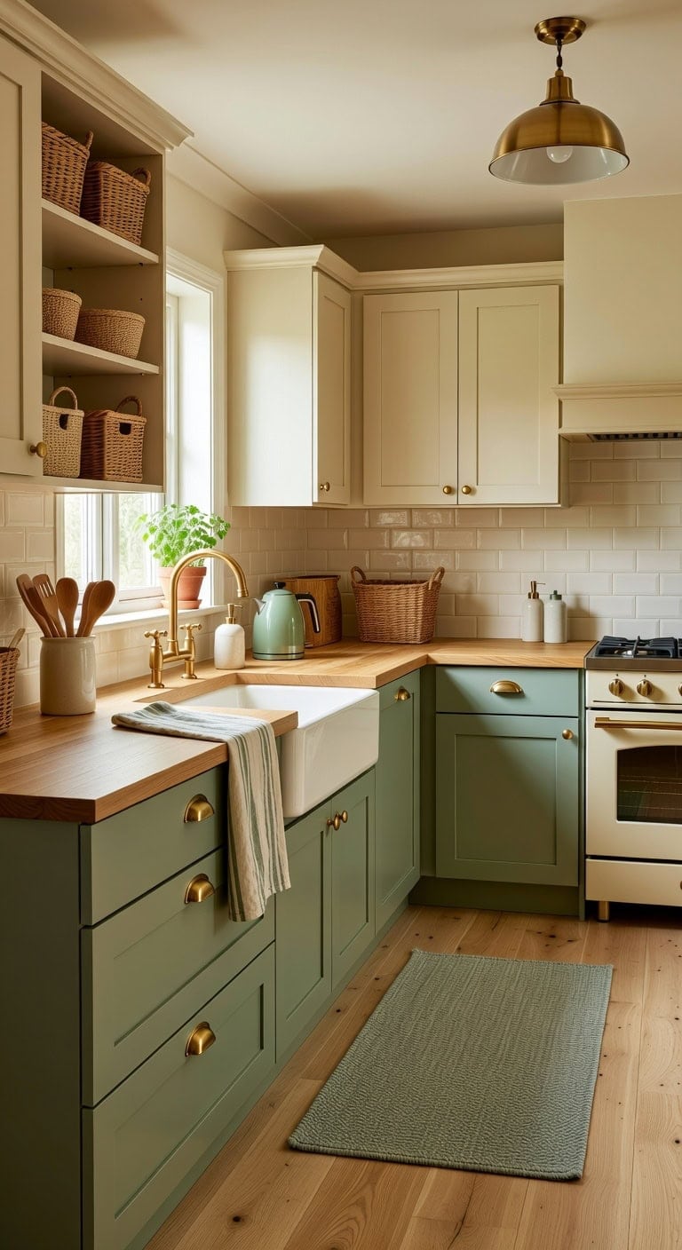
Pairing sage green lowers with warm cream uppers creates a kitchen that feels collected over time rather than designed all at once. The matte finish of painted wood plays beautifully against linen tea towels and woven rattan baskets sitting on open shelving. This soft, earthy combination works whether your kitchen leans cottage, pivotal, or modern farmhouse.
Lower Cabinets: Paint in “Saybrook Sage” (Benjamin Moore HC-114), a muted gray-green that brings organic warmth without feeling too bold, grounding the lower half of the kitchen with quiet earthiness.
Upper Cabinets: Paint in “Warm Cream” (Sherwin-Williams SW 7012 Creamy), a soft yellowish white that keeps the upper portion light and airy while avoiding the starkness of pure white.
 SZUAH Artisan Ceramic Utensil Crock, For Kitchen Counter Top & Dining Table
View Price
SZUAH Artisan Ceramic Utensil Crock, For Kitchen Counter Top & Dining Table
View Price
 Premium Kitchen Towels 6 Pack 100% Cotton, 20"x28" Dish Towels - Sage
View Price
Premium Kitchen Towels 6 Pack 100% Cotton, 20"x28" Dish Towels - Sage
View Price
 Yangqihome Natural Rattan Storage Baskets, Rectangular Woven Fruit Baskets, Decorative Wicker Basket and Small Baskets for Organizing (Set of 3)
View Price
Yangqihome Natural Rattan Storage Baskets, Rectangular Woven Fruit Baskets, Decorative Wicker Basket and Small Baskets for Organizing (Set of 3)
View Price
 Kira Home Vida 12" Mid-Century Modern Pendant Light for Kitchen
View Price
Kira Home Vida 12" Mid-Century Modern Pendant Light for Kitchen
View Price
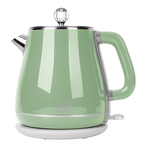 Arcblin 1.8L Electric Kettle, Tea Kettle with Fast Boil 1350W,Sage Green
View Price
Arcblin 1.8L Electric Kettle, Tea Kettle with Fast Boil 1350W,Sage Green
View Price
 Hand and Dish Soap Dispenser Set, Farmhouse Ceramic Soap Dispenser for Kitchen Sink, 15 OZ Vintage Hand Wash Liquid Dispenser for Bathroom Farmhouse Modern Kitchen Decor Accessories
View Price
Hand and Dish Soap Dispenser Set, Farmhouse Ceramic Soap Dispenser for Kitchen Sink, 15 OZ Vintage Hand Wash Liquid Dispenser for Bathroom Farmhouse Modern Kitchen Decor Accessories
View Price
Shop The Look
DIY Paint Transformation
Best For: Medium to large kitchens with natural light where the two-tone split can define zones without making the space feel closed in.
Charcoal Gray Island With White Perimeter Cabinets
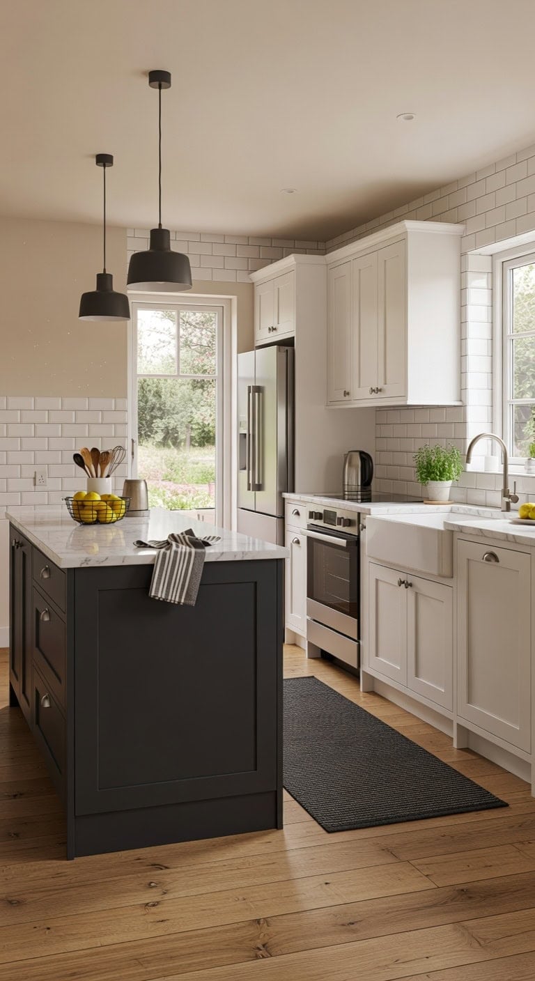
A charcoal gray island anchored between bright white perimeter cabinets creates the kind of contrast that makes your whole kitchen feel intentional and grounded. The smooth matte gray finish plays against glossy white surfaces while warm butcher block or marble countertops soften the edges. This pairing feels modern without trying too hard, and every piece on that island becomes a focal point.
Island: Paint in “Kendall Charcoal” (Benjamin Moore HC-166) — a rich, sophisticated gray with just enough depth to command attention without overwhelming white surroundings. This true charcoal reads as confident and warm under both natural and pendant lighting.
Perimeter Cabinets: Paint in “Chantilly Lace” (Benjamin Moore OC-65) — a clean, crisp white with zero yellow undertone that keeps the walls and surrounding cabinetry feeling airy and expansive against that bold island.
 Charcoal Gray 2X6 Jute Rug Braided Construction - Farmhouse Woven Carpet - Mid-Century Modern Floor Covering for Hallways and Kitchen, Runner 2' x 6'
View Price
Charcoal Gray 2X6 Jute Rug Braided Construction - Farmhouse Woven Carpet - Mid-Century Modern Floor Covering for Hallways and Kitchen, Runner 2' x 6'
View Price
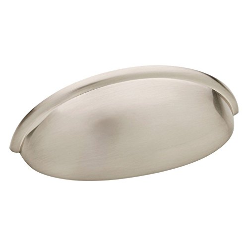 Franklin Brass 10 Pack Brushed Nickel Cabinet Handles 3 inch (76mm) Kitchen Cabinet Handles and Drawer Pulls for Cupboards and Dressers | Cup Pull
View Price
Franklin Brass 10 Pack Brushed Nickel Cabinet Handles 3 inch (76mm) Kitchen Cabinet Handles and Drawer Pulls for Cupboards and Dressers | Cup Pull
View Price
 Modern Pendant Lights Kitchen Island, Matte Black Pendant Light Fixtures with 10" Clear Hammered Glass Shade, Industrial Hanging Pendant Lights Fixture for Kitchen Island Dining Room Bedroom Entryway
View Price
Modern Pendant Lights Kitchen Island, Matte Black Pendant Light Fixtures with 10" Clear Hammered Glass Shade, Industrial Hanging Pendant Lights Fixture for Kitchen Island Dining Room Bedroom Entryway
View Price
 ABRUTY Utensil Holder, 6.7" Ceramic Kitchen Utensil Crock for Countertop Cooking, Modern Utensil Caddy Jar Organizer for Farmhouse Kitchen Counter Decor (White)
View Price
ABRUTY Utensil Holder, 6.7" Ceramic Kitchen Utensil Crock for Countertop Cooking, Modern Utensil Caddy Jar Organizer for Farmhouse Kitchen Counter Decor (White)
View Price
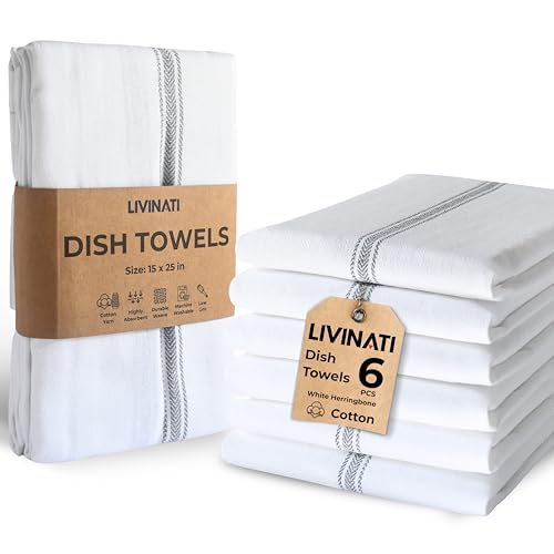 LIVINATI Bulk Kitchen Towels Cotton for Chefs in Commercial Restaurants - 15"X25" - 6 Pack - White Linen Tea Dish Towels - Lint Free Soft Absorbent Center Gray Striped Herringbone Weave Towles
View Price
LIVINATI Bulk Kitchen Towels Cotton for Chefs in Commercial Restaurants - 15"X25" - 6 Pack - White Linen Tea Dish Towels - Lint Free Soft Absorbent Center Gray Striped Herringbone Weave Towles
View Price
 Sevenblue 2 Tier Large Fruit Bowl for Kitchen Counter with 2 Banana Hangers
View Price
Sevenblue 2 Tier Large Fruit Bowl for Kitchen Counter with 2 Banana Hangers
View Price
 vancasso White Bathroom Accessories Set, Ceramic Soap Dispenser and Toothbrush Holder Sets, Stoneware 4 Pcs Bathroom Sink Set for Modern Home Decor
View Price
vancasso White Bathroom Accessories Set, Ceramic Soap Dispenser and Toothbrush Holder Sets, Stoneware 4 Pcs Bathroom Sink Set for Modern Home Decor
View Price
 RHD 0.5L Small Portable Electric Kettle, 600W Stainless Steel Travel Kettle
View Price
RHD 0.5L Small Portable Electric Kettle, 600W Stainless Steel Travel Kettle
View Price
Shop The Look
DIY Paint Transformation
Best For: Open-concept kitchens where the island serves as both a workspace and a visual anchor separating cooking and living areas.
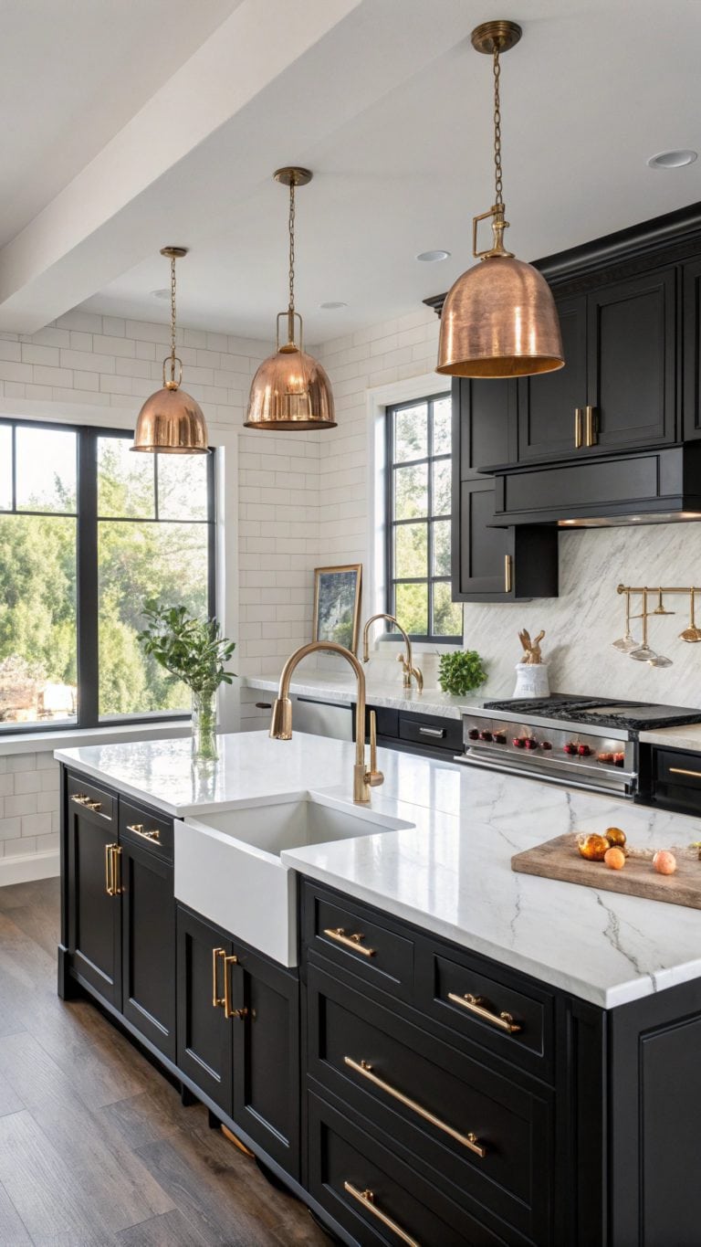
Black and White Cabinets for High-Contrast Drama
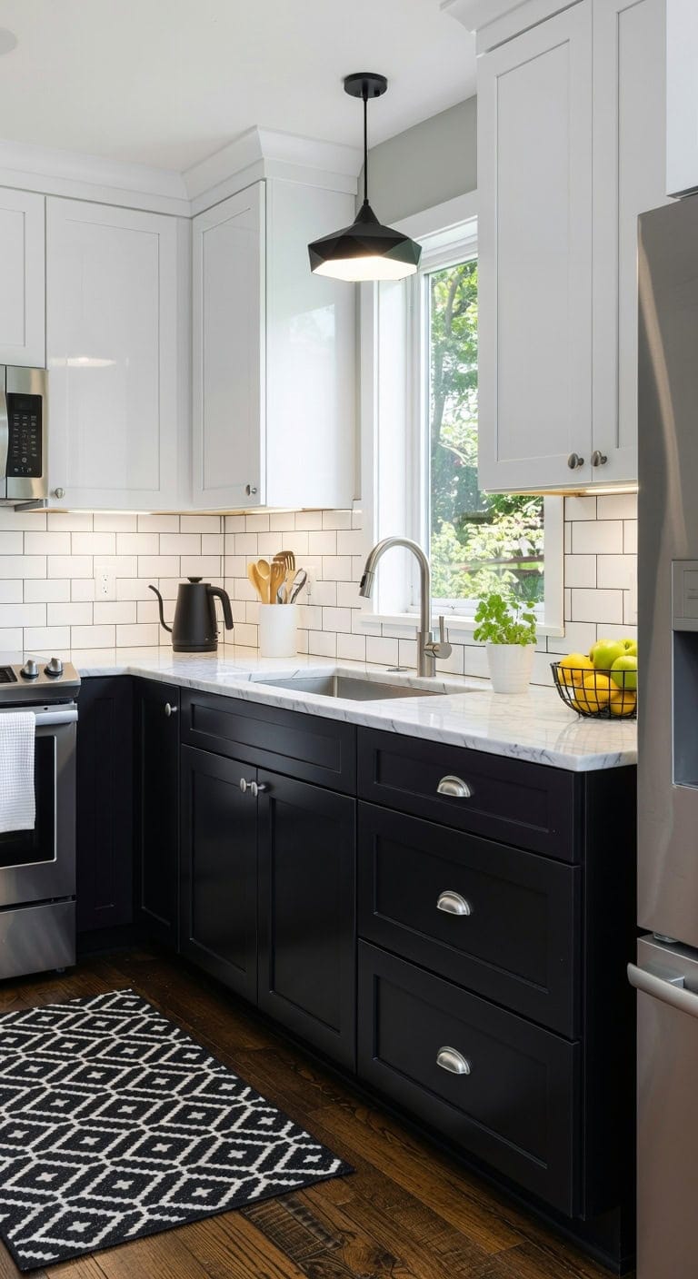
Bold black lower cabinets paired with crisp white uppers create the kind of striking kitchen that stops you mid-scroll. Matte black surfaces play against glossy white finishes while brushed nickel hardware catches light between them. This high-contrast pairing feels modern yet timeless, working beautifully whether your kitchen leans contemporary or shifting.
Lower Cabinets: Paint in “Onyx” (Benjamin Moore 2133-10), a true saturated black that delivers that dramatic anchor without looking washed out or gray, giving your base cabinets serious visual weight.
Upper Cabinets: Paint in “Chantilly Lace” (Benjamin Moore OC-65), the cleanest bright white available that keeps upper cabinets feeling airy and light, maximizing the contrast against those bold black lowers.
 ROYHOME Modern 2x6 Hallway Runner Rug Non Slip Washable Kitchen Rug, Black
View Price
ROYHOME Modern 2x6 Hallway Runner Rug Non Slip Washable Kitchen Rug, Black
View Price
 Ravinte Matte Black Drawer Pulls Cabinet Cup Pulls 3 Inch 10 Pack
View Price
Ravinte Matte Black Drawer Pulls Cabinet Cup Pulls 3 Inch 10 Pack
View Price
 Everbrook Handcrafted Cooking Utensil Holder, Extra-Large Crock, White
View Price
Everbrook Handcrafted Cooking Utensil Holder, Extra-Large Crock, White
View Price
 Pendant Lighting Vintage Industrial Fixtures, Farmhouse Pendant Lamp, Hanging Light Fixtures with Metal Shade (Black Inside), Industrial Black Pendant Lights for Hallway Kitchen Island Dining Room
View Price
Pendant Lighting Vintage Industrial Fixtures, Farmhouse Pendant Lamp, Hanging Light Fixtures with Metal Shade (Black Inside), Industrial Black Pendant Lights for Hallway Kitchen Island Dining Room
View Price
 Amazon Basics Organic Cotton Waffle Weave Kitchen Dish Towels, Ultra Absorbent, Quick Drying, Lint-Free, 15 x 25 inches, 6-Pack
View Price
Amazon Basics Organic Cotton Waffle Weave Kitchen Dish Towels, Ultra Absorbent, Quick Drying, Lint-Free, 15 x 25 inches, 6-Pack
View Price
 CAXXA Countertop Fruit Bowl, Wire Basket for Fruits, Breads, Vegetables,Snacks, Black
View Price
CAXXA Countertop Fruit Bowl, Wire Basket for Fruits, Breads, Vegetables,Snacks, Black
View Price
 RED FACTOR Premium Compost Bin for Kitchen Countertop - Stainless Steel Food Waste Bucket with Innovative Dual Filter Technology - Includes Spare Filters (White, 1.3 Gallon)
View Price
RED FACTOR Premium Compost Bin for Kitchen Countertop - Stainless Steel Food Waste Bucket with Innovative Dual Filter Technology - Includes Spare Filters (White, 1.3 Gallon)
View Price
 Bodum 27oz Bistro Gooseneck Electric Water Kettle, Pour Over Coffee & Tea, Stainless Steel, Matte Black
View Price
Bodum 27oz Bistro Gooseneck Electric Water Kettle, Pour Over Coffee & Tea, Stainless Steel, Matte Black
View Price
Shop The Look
DIY Paint Transformation
Best For: Medium to large kitchens with good natural light where the high-contrast pairing won’t overwhelm the space and both colors can shine.
Forest Green Lowers With Brass-Accented White Uppers
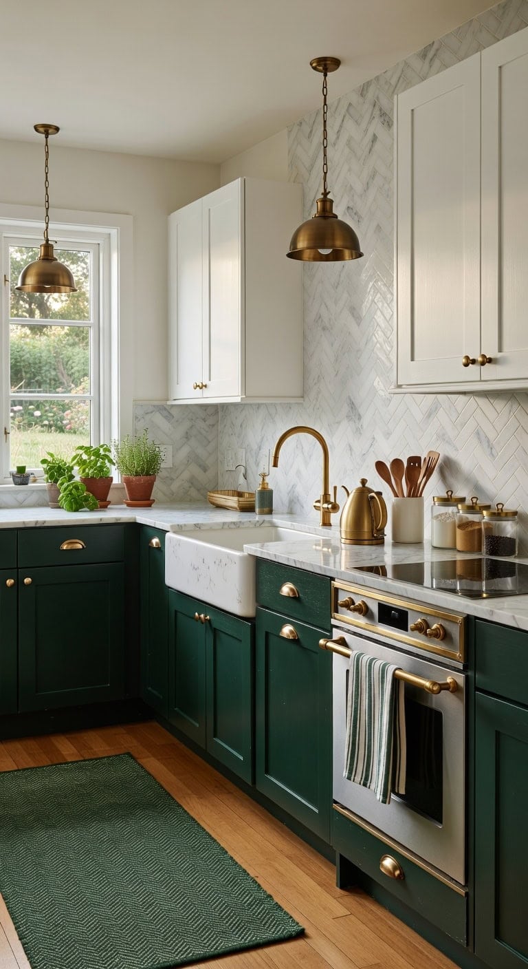
Pairing forest green lowers with crisp white uppers creates a kitchen that feels both grounded and airy. The warm glow of brass hardware pulls these two together, adding a touch of elegance against smooth painted wood and cool marble or quartz countertops. This combination brings nature-inspired richness into everyday cooking spaces without feeling heavy or dark.
a true forest green with blue-black depth that looks stunning on lower cabinets, grounding the kitchen with an earthy, sophisticated anchor that pairs beautifully with brass pulls and knobs.
a clean, bright white with zero yellow undertone, keeping the upper half of your kitchen light and open while letting the brass-accented hardware catch the eye against a pure backdrop.
 CABDM 10 Pack 3-3/4 inch (96mm) Brushed Satin Brass Cabinet Cup Pulls Brushed Gold Drawer Pulls Kitchen Hardware Cabinet Handles Drawer Handles Knobs Cup Pull.
View Price
CABDM 10 Pack 3-3/4 inch (96mm) Brushed Satin Brass Cabinet Cup Pulls Brushed Gold Drawer Pulls Kitchen Hardware Cabinet Handles Drawer Handles Knobs Cup Pull.
View Price
 KOZYFLY Woven 2x7 Washable Kitchen Runner Rug, Non Slip Runners for Hallway, Cotton Entryway Runner, Braided Floor Carpet for Entry, Kitchen, Bedside, Hall, Olive Green/Earthy Green
View Price
KOZYFLY Woven 2x7 Washable Kitchen Runner Rug, Non Slip Runners for Hallway, Cotton Entryway Runner, Braided Floor Carpet for Entry, Kitchen, Bedside, Hall, Olive Green/Earthy Green
View Price
 Kira Home Belle 9" Modern Industrial Mini Pendant Light for Kitchen Island
View Price
Kira Home Belle 9" Modern Industrial Mini Pendant Light for Kitchen Island
View Price
 Barnyard Designs Ceramic Kitchen Utensil Holder Countertop 6.75″ (White)
View Price
Barnyard Designs Ceramic Kitchen Utensil Holder Countertop 6.75″ (White)
View Price
 Casa De Lan Kitchen Towels Set – Pack of 6 (20’’ x 30’’) Extra Large Premium Cotton Dish Towels for Kitchen – Super Striped Towels – Absorbent – 100% Cotton – with Hanging Loop – Green
View Price
Casa De Lan Kitchen Towels Set – Pack of 6 (20’’ x 30’’) Extra Large Premium Cotton Dish Towels for Kitchen – Super Striped Towels – Absorbent – 100% Cotton – with Hanging Loop – Green
View Price
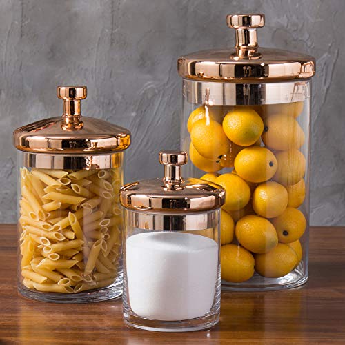 MyGift Glass Apothecary Cookie Jar Set with Copper Lid
View Price
MyGift Glass Apothecary Cookie Jar Set with Copper Lid
View Price
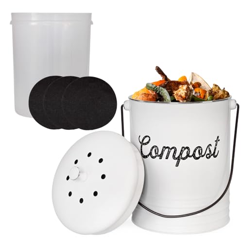 AuldHome Design Kitchen Compost Bin for Countertop | 1.3 Gallon Composting Bucket with Lid | Includes 3 Charcoal Filters | (White Enamel)
View Price
AuldHome Design Kitchen Compost Bin for Countertop | 1.3 Gallon Composting Bucket with Lid | Includes 3 Charcoal Filters | (White Enamel)
View Price
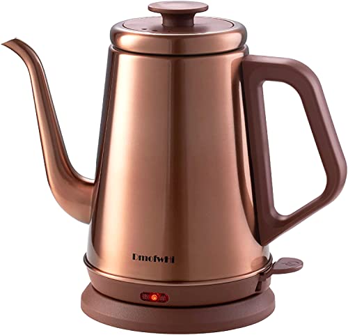 DmofwHi 1000W Gooseneck Electric Kettle (1.0L),100% Stainless Steel BPA Free Tea Kettle with Auto Shut - Off Protection, Pour Over Coffee Kettle -Copper
View Price
DmofwHi 1000W Gooseneck Electric Kettle (1.0L),100% Stainless Steel BPA Free Tea Kettle with Auto Shut - Off Protection, Pour Over Coffee Kettle -Copper
View Price
Best For: Medium to large kitchens with good natural light where the deep green lowers won’t close in the space, especially open-concept layouts connecting to living or dining areas.
Warm Wood Tones Mixed With Matte Black Cabinets
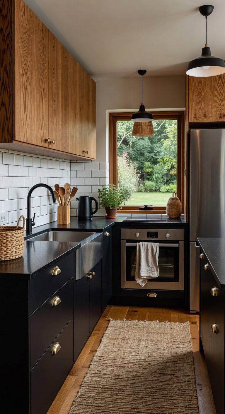
Honey-stained oak next to matte black cabinetry creates a kitchen that feels both grounded and modern. The contrast between smooth dark surfaces and visible wood grain brings natural warmth without overwhelming the space. A woven rug underfoot and brushed metal hardware tie the two finishes together with just enough texture to keep things interesting.
Lower Cabinets: Paint in “Black” (Benjamin Moore HC-190) — a true matte black that reads rich and sophisticated on lower cabinetry, anchoring the kitchen with bold contrast against natural wood uppers.
Upper Cabinets or Island: Stain in “Early American” (Minwax 230) — a warm golden-brown wood tone that highlights natural grain patterns, bringing organic warmth and a lived-in feel that balances all that dark drama below.
 SAFAVIEH Cape Cod Collection Runner Rug - 2'3" x 8', Natural Brown, Handmade Braided Flat Weave Jute (CAP252A)
View Price
Ravinte Matte Black Drawer Pulls Cabinet Cup Pulls 3 Inch 3 Pack
View Price
SAFAVIEH Cape Cod Collection Runner Rug - 2'3" x 8', Natural Brown, Handmade Braided Flat Weave Jute (CAP252A)
View Price
Ravinte Matte Black Drawer Pulls Cabinet Cup Pulls 3 Inch 3 Pack
View Price
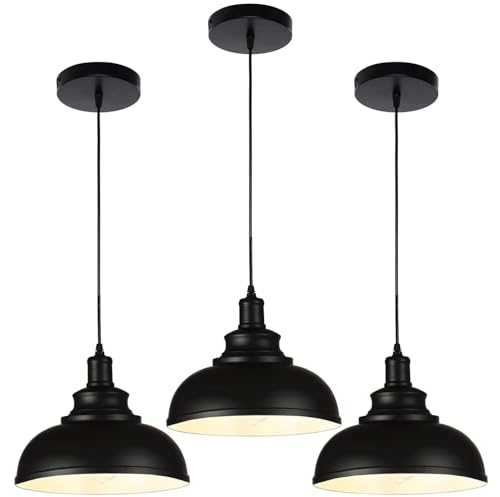 Black Dome Metal Pendant Lights - Hanging Ceiling Fixture for Industrial, Farmhouse Kitchen Island, Dining Room, Foyer (3 pack)
View Price
Black Dome Metal Pendant Lights - Hanging Ceiling Fixture for Industrial, Farmhouse Kitchen Island, Dining Room, Foyer (3 pack)
View Price
 Segtenant Utensil Holder, Acacia Wood Kitchen Utensil Holder for Countertop, 360°Rotating Cooking Utensil Crock for Kitchen Counter, 7.2" Large Utensil Organizer for Spatula
View Price
Segtenant Utensil Holder, Acacia Wood Kitchen Utensil Holder for Countertop, 360°Rotating Cooking Utensil Crock for Kitchen Counter, 7.2" Large Utensil Organizer for Spatula
View Price
 LANE LINEN 100% Cotton Dish Towels for Kitchen Absorbent Lint-Free 12 Pack
View Price
LANE LINEN 100% Cotton Dish Towels for Kitchen Absorbent Lint-Free 12 Pack
View Price
 Rattan Storage Baskets, Wicker Baskets for Organizing, Hand Woven Fruit Basket, Decorative Baskets for Kitchen Counter, Living Room, Bathroom, Set of 3
View Price
Rattan Storage Baskets, Wicker Baskets for Organizing, Hand Woven Fruit Basket, Decorative Baskets for Kitchen Counter, Living Room, Bathroom, Set of 3
View Price
 Chefman Gooseneck Electric Kettle, 0.8L Pour Over, Black
View Price
Chefman Gooseneck Electric Kettle, 0.8L Pour Over, Black
View Price
 BAYKA Floating Shelves for Wall, Wall Mounted Rustic Wood Shelves for Bathroom, Bedroom, Living Room, Kitchen, Hanging Shelf for Books/Storage/Room Decor with 22lbs Capacity (Black, Set of 3, 15.7in)
View Price
BAYKA Floating Shelves for Wall, Wall Mounted Rustic Wood Shelves for Bathroom, Bedroom, Living Room, Kitchen, Hanging Shelf for Books/Storage/Room Decor with 22lbs Capacity (Black, Set of 3, 15.7in)
View Price
Shop The Look
DIY Paint Transformation
Best For: Open-concept kitchens where you want a modern edge softened by natural materials and an approachable, collected-over-time look.
Pale Pink and Marble-White Cabinet Color Pairing
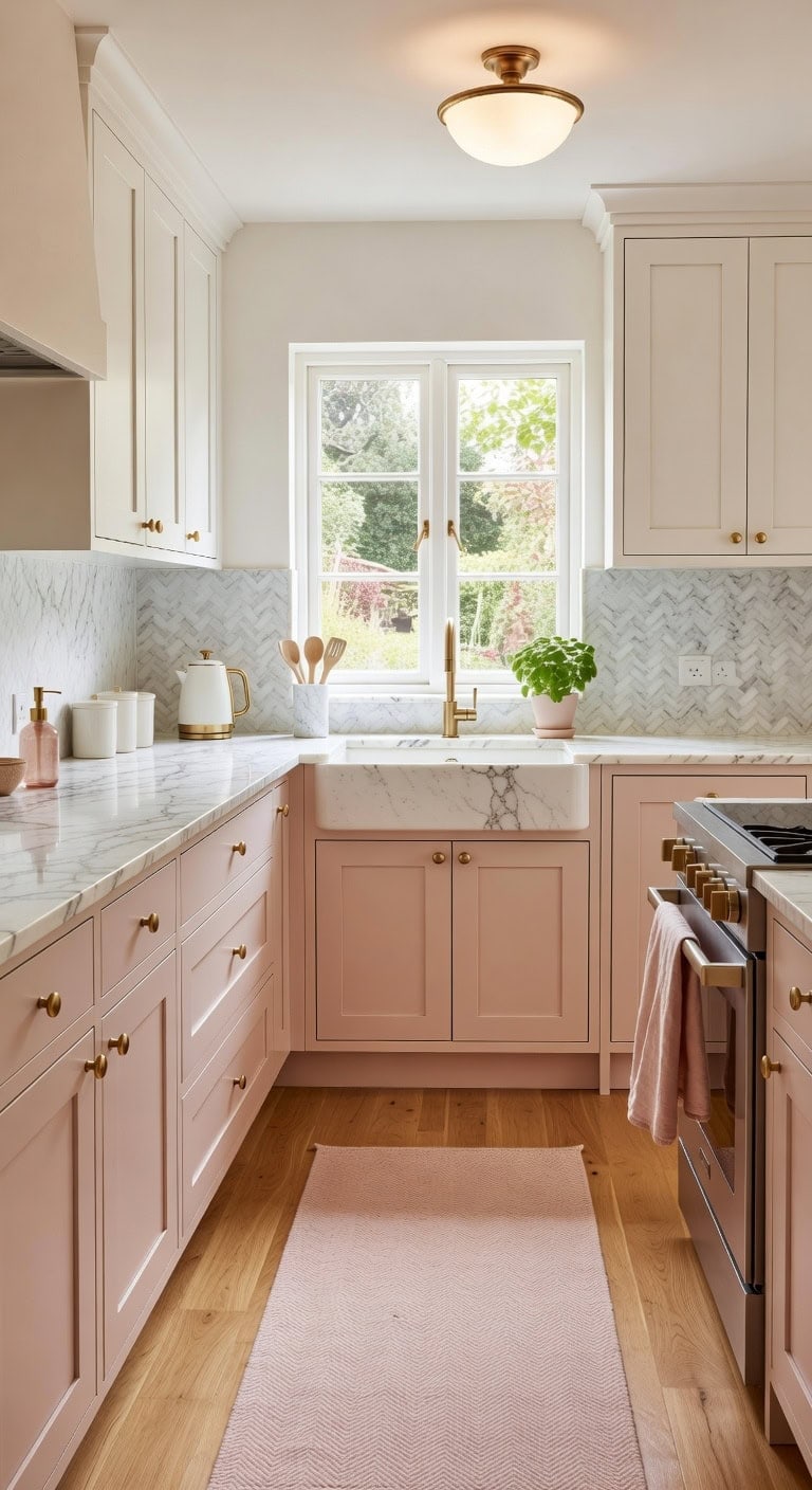
Soft pale pink lower cabinets paired with marble-white uppers create a kitchen that feels fresh yet warmly personal. The blush tones play beautifully against cool veined marble countertops, while brushed brass hardware adds just enough shine to tie everything together. This combination works especially well with natural linen textures and smooth ceramic accessories on the counter.
Lower Cabinets: Paint in “Quaint Rose” (Benjamin Moore 2015-50) — a muted pale pink with warm undertones that reads sophisticated rather than sugary, giving base cabinets a soft blush personality that anchors the room with gentle color.
Upper Cabinets: Paint in “Mountain Peak White” (Benjamin Moore OC-121) — a clean marble-white with the faintest cool gray whisper that mimics natural marble tones, keeping upper cabinets airy and bright while connecting seamlessly to stone countertops.
 Tyrot Boho Floral 2x6 Washable Kitchen & Hallway Runner Rug Ultra-Thin Flat Woven Low Pile Botanical Runner Rug Non-Slip Indoor Runner for Entryway, Laundry, Bathroom and Bedroom, Blush Pink
View Price
Tyrot Boho Floral 2x6 Washable Kitchen & Hallway Runner Rug Ultra-Thin Flat Woven Low Pile Botanical Runner Rug Non-Slip Indoor Runner for Entryway, Laundry, Bathroom and Bedroom, Blush Pink
View Price
 NIZADO Aged Brass Knobs 12 Pack, Solid Warm Gold Cabinet Knobs, Antique Brass Drawer Knobs, Champagne Bronze Kitchen Cabinet Hardware,Diameter 1-1/5"
View Price
NIZADO Aged Brass Knobs 12 Pack, Solid Warm Gold Cabinet Knobs, Antique Brass Drawer Knobs, Champagne Bronze Kitchen Cabinet Hardware,Diameter 1-1/5"
View Price
 HillSpring Large Marble Kitchen Utensil Holder for Countertop, Tool Organizer with Protective Padded Base, Farmhouse Decor Gift, Wine Chiller Bucket, 6.4", Grey
View Price
HillSpring Large Marble Kitchen Utensil Holder for Countertop, Tool Organizer with Protective Padded Base, Farmhouse Decor Gift, Wine Chiller Bucket, 6.4", Grey
View Price
 TRITON LINEN 100% French Linen Tea Towels 14 x 28 Inch (Set of 4,Pink)
View Price
TRITON LINEN 100% French Linen Tea Towels 14 x 28 Inch (Set of 4,Pink)
View Price
 Schoolhouse Style Semi Flush Mount Ceiling Light Fixture, 12" Modern Gold Hallway Ceiling Lamp with Opal Milk Glass Shade Brass, Farmhouse Globe Light for Bedroom Kitchen Hallway Entryway Laundry
View Price
Schoolhouse Style Semi Flush Mount Ceiling Light Fixture, 12" Modern Gold Hallway Ceiling Lamp with Opal Milk Glass Shade Brass, Farmhouse Globe Light for Bedroom Kitchen Hallway Entryway Laundry
View Price
 10 Strawberry Street Embossed Ceramic Kitchen Canister Set, Set of 3, Stamp White
View Price
10 Strawberry Street Embossed Ceramic Kitchen Canister Set, Set of 3, Stamp White
View Price
 400ml/13.5oz Pink Diamond-Textured Glass Soap Dispenser with Silver Pump, Refillable Hand Soap/Lotion Dispenser for Kitchen & Bathroom
View Price
400ml/13.5oz Pink Diamond-Textured Glass Soap Dispenser with Silver Pump, Refillable Hand Soap/Lotion Dispenser for Kitchen & Bathroom
View Price
 West Bend Timeless Electric Kettle Cordless Serving Features Stainless Steel Interior Boil Dry Protection and Auto Shut Off, 1.5-Liter, White/Gold
View Price
West Bend Timeless Electric Kettle Cordless Serving Features Stainless Steel Interior Boil Dry Protection and Auto Shut Off, 1.5-Liter, White/Gold
View Price
Shop The Look
DIY Paint Transformation
Best For: Small to mid-sized kitchens in cottagecore or modern feminine homes where natural light floods in and homeowners want color without overwhelming the space.
Slate Blue Island With Greige Perimeter Cabinets
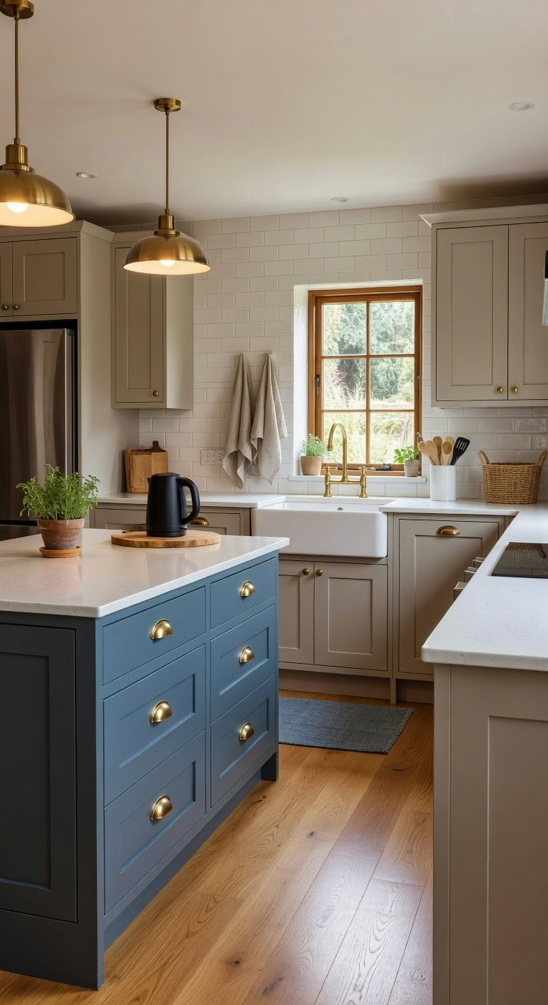
That moody slate blue island anchored against soft greige perimeter cabinets creates the kind of kitchen that feels both grounded and a little unexpected. Brushed brass hardware catches light against the matte blue paint, while a natural wood cutting board and linen tea towels soften all those smooth painted surfaces. This combination works hard without trying too hard.
Island: Paint in “Hale Navy” (Benjamin Moore HC-154) — a sophisticated slate blue with gray undertones that reads moody without going full navy, giving your island real anchor weight in the room.
Perimeter Cabinets: Paint in “Mocha Cream” (Benjamin Moore 995) — a true greige that balances warm beige and cool gray perfectly, keeping the surrounding cabinetry neutral enough to let that island steal the spotlight.
 Chardin home Blue & White Reversible Runner Rug, 2x5 feet Machine Washable Cotton Rug, Perfect for hallways, stairwell, Kitchen Bedroom
View Price
Chardin home Blue & White Reversible Runner Rug, 2x5 feet Machine Washable Cotton Rug, Perfect for hallways, stairwell, Kitchen Bedroom
View Price
 LANE LINEN Kitchen Dish Towels 100% Cotton Soft & Absorbent 6 Pack - Beige
View Price
LANE LINEN Kitchen Dish Towels 100% Cotton Soft & Absorbent 6 Pack - Beige
View Price
 ELYONA Vintage Ash Wood Dome Pendant Light 12" Hanging Lamp with Brushed Brass Metal Shade & Gold Inner Finish, Modern Pendant Light Fixtures for Kitchen Island Dining Room Bedroom Living Room Hallway
View Price
ELYONA Vintage Ash Wood Dome Pendant Light 12" Hanging Lamp with Brushed Brass Metal Shade & Gold Inner Finish, Modern Pendant Light Fixtures for Kitchen Island Dining Room Bedroom Living Room Hallway
View Price
 FUN ELEMENTS Kitchen Utensil Holder, 7.2" Super Large Utensil Crock Heavy and Stable Lace Emboss Ceramic Utensil Holder for Kitchen Counter (Bright White)
View Price
FUN ELEMENTS Kitchen Utensil Holder, 7.2" Super Large Utensil Crock Heavy and Stable Lace Emboss Ceramic Utensil Holder for Kitchen Counter (Bright White)
View Price
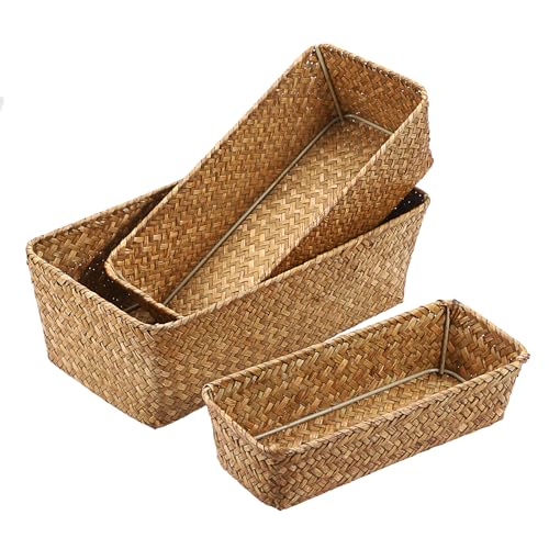 3 Natural Wicker Basket Set Rectangular Seagrass Basket, Caramel
View Price
3 Natural Wicker Basket Set Rectangular Seagrass Basket, Caramel
View Price
 WTJMOV 0.6L Small Electric Tea Kettle Lightweight, 20 Ounce Double Wall Hot Water Boiler Stainless Steel Auto Shut-off, 120V Portable Travel Electric Kettle Fast Boil for Tea and Coffee, Black
View Price
WTJMOV 0.6L Small Electric Tea Kettle Lightweight, 20 Ounce Double Wall Hot Water Boiler Stainless Steel Auto Shut-off, 120V Portable Travel Electric Kettle Fast Boil for Tea and Coffee, Black
View Price
Shop The Look
DIY Paint Transformation
Best For: Mid-sized kitchens with an island where you want visual depth between zones without committing to a dramatically dark full kitchen.
Butter Yellow and Classic White Two-Tone Cabinets
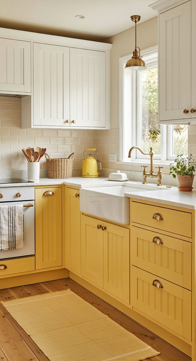
Pairing butter yellow lowers with classic white uppers brings a cheerful warmth that never feels overdone. The soft matte finish of painted wood plays against smooth ceramic countertops and woven linen textures, creating a kitchen that feels collected rather than catalog-perfect. This sunny combination works beautifully in traditional and cottage-style spaces where comfort matters most.
Lower Cabinets: Paint in “Hawthorne Yellow” (Benjamin Moore HC-4), a rich butter yellow with golden undertones that feels classic without veering into neon territory — perfect warmth for base cabinets that anchor the whole room.
Upper Cabinets: Paint in “Chantilly Lace” (Benjamin Moore OC-65), a clean true white with zero yellow or gray cast, keeping the upper half of the kitchen bright and airy against those sunny lowers.
 SAFAVIEH Rag Rug Collection Runner Rug - 2'3" x 6', Yellow & Multi, Handmade Boho Stripe Cotton, Ideal for High Traffic Areas in Living Room, Bedroom (RAR121H)
View Price
SAFAVIEH Rag Rug Collection Runner Rug - 2'3" x 6', Yellow & Multi, Handmade Boho Stripe Cotton, Ideal for High Traffic Areas in Living Room, Bedroom (RAR121H)
View Price
 Nucookery Ceramic Kitchen Utensil Holder for Countertop Organizer 6.4"White
View Price
Nucookery Ceramic Kitchen Utensil Holder for Countertop Organizer 6.4"White
View Price
 MosJos Kitchen Towels Set of 4 Dish Towels Yellow n White Waffle Weave Cotton Hand Towels, 18 x 28 Absorbent Kitchen Linens
View Price
MosJos Kitchen Towels Set of 4 Dish Towels Yellow n White Waffle Weave Cotton Hand Towels, 18 x 28 Absorbent Kitchen Linens
View Price
 KLSS Brass Pendant Lights Kitchen Island,Modern Farmhouse Clear Glass Pendant Light,Gold Light Fixture Kitchen Pendant Mini Hanging Light Fixture for Sink (Brass 2 Pack stem Rod)
View Price
KLSS Brass Pendant Lights Kitchen Island,Modern Farmhouse Clear Glass Pendant Light,Gold Light Fixture Kitchen Pendant Mini Hanging Light Fixture for Sink (Brass 2 Pack stem Rod)
View Price
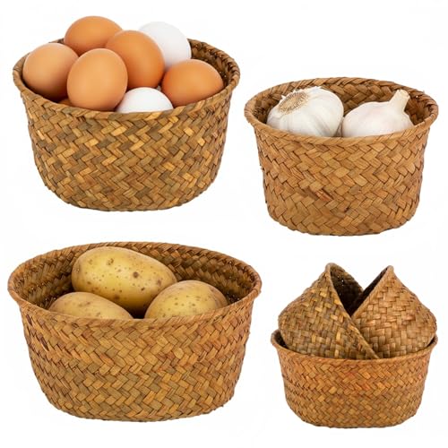 3 Set Small Seagrass Storage Baskets, Natural Woven for Farmhouse Kitchen
View Price
3 Set Small Seagrass Storage Baskets, Natural Woven for Farmhouse Kitchen
View Price
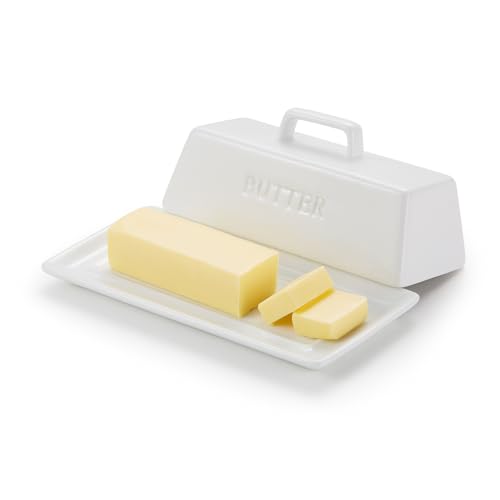 Kook Ceramic Butter Dish with Lid, Countertop, Dishes, Tray, White
View Price
Kook Ceramic Butter Dish with Lid, Countertop, Dishes, Tray, White
View Price
 SUSTEAS 57oz Electric Kettle with Thermometer, Hot Water Pot, Retro Yellow
View Price
SUSTEAS 57oz Electric Kettle with Thermometer, Hot Water Pot, Retro Yellow
View Price
Shop The Look
DIY Paint Transformation
Best For: North-facing kitchens or dimly lit cooking spaces that need an instant mood lift without a full renovation.
Terracotta and Off-White Earthy Cabinet Combo
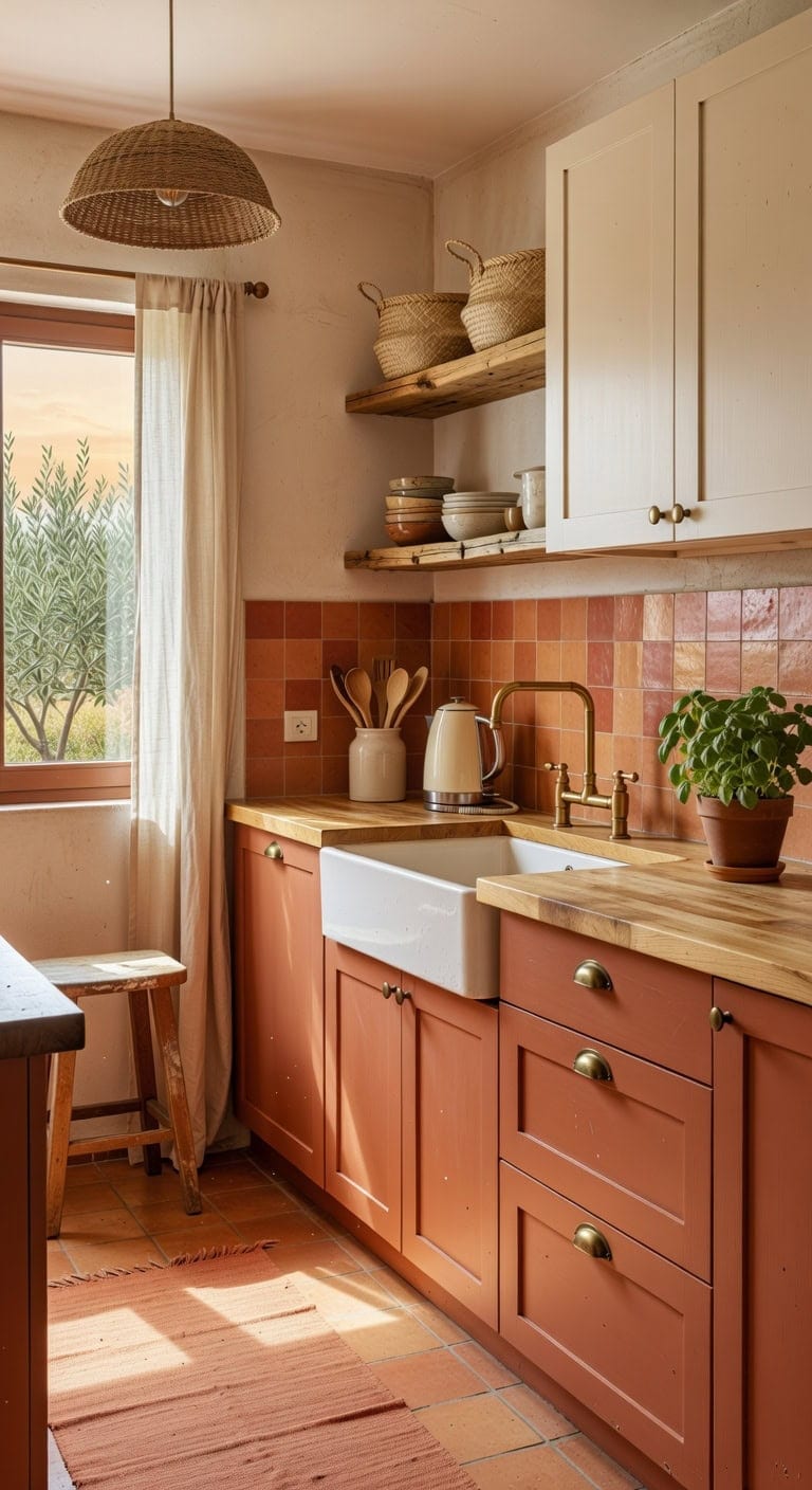
Warm terracotta lower cabinets paired with creamy off-white uppers bring a grounded, sun-baked warmth that makes your kitchen feel like a cozy gathering spot. The contrast of matte clay-toned finishes against smooth linen-textured walls and natural woven accents creates depth without feeling heavy. This earthy palette works beautifully with rustic wood open shelving and handmade ceramic pieces.
a rich, muted terracotta that brings authentic adobe warmth to base cabinets without feeling too orange, grounding the entire kitchen with earthy character.
a soft, warm off-white with just enough depth to avoid looking sterile, complementing the terracotta below while keeping the upper half of the kitchen light and airy.
 LEEVAN Washable Terracotta Hallway Runner Rug, 2x6 Reversible Kitchen Rugs
View Price
LEEVAN Washable Terracotta Hallway Runner Rug, 2x6 Reversible Kitchen Rugs
View Price
 SEEAIRSHOP Wabi-Sabi Dark Brown Rattan Pendant Light Woven Bamboo Shade
View Price
SEEAIRSHOP Wabi-Sabi Dark Brown Rattan Pendant Light Woven Bamboo Shade
View Price
 JIEMEI HOME Kitchen Utensil Holder, 7.2" Large Ceramic Stable Utensil Crock for Countertop, Utensil Organizer with Cork Mat, Removable Bamboo Divider for Easy, Kitchen Decor, Aged Ivory Speckle
View Price
JIEMEI HOME Kitchen Utensil Holder, 7.2" Large Ceramic Stable Utensil Crock for Countertop, Utensil Organizer with Cork Mat, Removable Bamboo Divider for Easy, Kitchen Decor, Aged Ivory Speckle
View Price
 Nanspring Off White Cafe Curtains 45 Inch Length Set 2 Panel Back Tab Pocket Semi Sheer Short Linen White Curtain Tiers for Small Bathroom Window Basement 52x45
View Price
Nanspring Off White Cafe Curtains 45 Inch Length Set 2 Panel Back Tab Pocket Semi Sheer Short Linen White Curtain Tiers for Small Bathroom Window Basement 52x45
View Price
 Orceler 6 inch Terracotta & Clay Pots for Plants with Saucer, Medium Terra Cotta Plant Pots with Drainage Hole, Flowerpot with Tray, Terracotta Pot for Indoor Outdoor Plant - Pack of 4 Planters
View Price
Orceler 6 inch Terracotta & Clay Pots for Plants with Saucer, Medium Terra Cotta Plant Pots with Drainage Hole, Flowerpot with Tray, Terracotta Pot for Indoor Outdoor Plant - Pack of 4 Planters
View Price
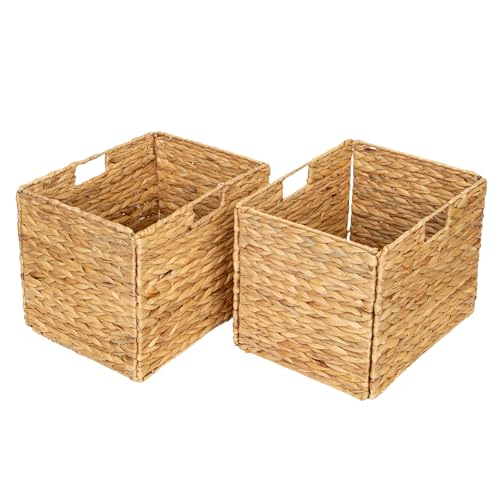 SENRYEE Storage Baskets,Wicker Baskets,Hyacinth Basket For Shelf,Folding 2 Packs Handmade Woven, Seagrass Baskets,Shelf Baskets For Storage Toys Books And Clothes and Other What You Want
View Price
SENRYEE Storage Baskets,Wicker Baskets,Hyacinth Basket For Shelf,Folding 2 Packs Handmade Woven, Seagrass Baskets,Shelf Baskets For Storage Toys Books And Clothes and Other What You Want
View Price
 Nostalgia Retro Electric Kettle,1.7L Enamel-Coated Stainless Steel - Cream
View Price
Nostalgia Retro Electric Kettle,1.7L Enamel-Coated Stainless Steel - Cream
View Price
Best For: Open-concept kitchens or eat-in layouts where a welcoming, Mediterranean-inspired warmth helps the cooking space blend naturally with living and dining areas.
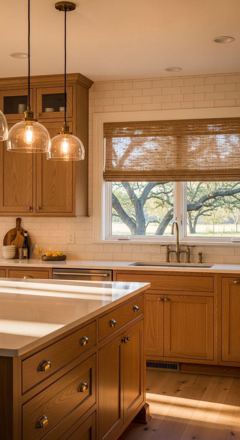
Light Oak and Pure White Scandinavian Cabinet Mix
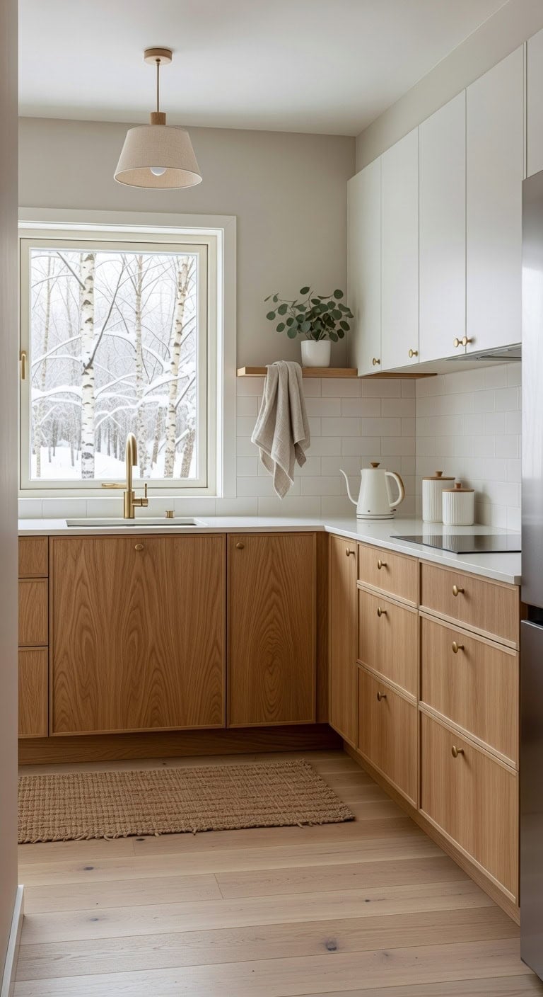
That warm honey tone of light oak paired with crisp pure white cabinets creates the kind of kitchen that feels calm and collected without being cold. The natural wood grain brings texture against smooth matte white surfaces, while linen accents soften every edge. This Scandinavian-inspired mix works beautifully whether your kitchen is compact or wide open.
Shop The Look
SAFAVIEH Cape Cod Collection Runner Rug - 2'3" x 6', Natural Brown, Handmade Braided Flat Weave Jute (CAP252A)
View Price
 CABDM 10 Pack 1 Inch Vintage Ball Brushed Brass Cabinet Knobs Kitchen Cabinet Hardware Brushed Gold Drawer Knobs Pulls for Drawers.
View Price
CABDM 10 Pack 1 Inch Vintage Ball Brushed Brass Cabinet Knobs Kitchen Cabinet Hardware Brushed Gold Drawer Knobs Pulls for Drawers.
View Price
 Ceramic Kitchen Canisters for Countertop Set of 3 w/ Airtight Ceramic Lids
View Price
Ceramic Kitchen Canisters for Countertop Set of 3 w/ Airtight Ceramic Lids
View Price
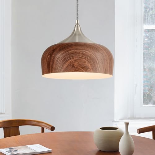 ELYONA Bauhaus Pendant Light Wooden Pattern Dome Pendant Light Fixture Brushed Nickel Metal Modern Adjustable Hanging Lighting for Kitchen Island Dining Room Office Hallway Foyer Bedroom, 12 Inch
View Price
ELYONA Bauhaus Pendant Light Wooden Pattern Dome Pendant Light Fixture Brushed Nickel Metal Modern Adjustable Hanging Lighting for Kitchen Island Dining Room Office Hallway Foyer Bedroom, 12 Inch
View Price
 LANE LINEN Tea Towels for Kitchen 100% Cotton Durable 12 Pack - Beige
View Price
LANE LINEN Tea Towels for Kitchen 100% Cotton Durable 12 Pack - Beige
View Price
 Le Creuset Stoneware Signature Utensil Crock, 2.7 qt., White
View Price
Le Creuset Stoneware Signature Utensil Crock, 2.7 qt., White
View Price
 Nueve&Five Electric Gooseneck Kettle with Thermometer, 1.0L Pour Over Hot Water Kettle for Coffee and Tea, 1000W, Auto Shutoff, Boil-Dry Protection, White
View Price
Nueve&Five Electric Gooseneck Kettle with Thermometer, 1.0L Pour Over Hot Water Kettle for Coffee and Tea, 1000W, Auto Shutoff, Boil-Dry Protection, White
View Price
DIY Paint Transformation
Upper Cabinets: Paint in “Chantilly Lace” (Benjamin Moore OC-65), a dependable pure white with zero yellow undertone that keeps the Scandinavian look honest and bright against natural wood tones below.
Lower Cabinets or Island Base: Paint in “Fox Hollow Brown” (Benjamin Moore 1235), a soft light oak-inspired warm neutral that mimics the golden warmth of real oak grain when applied over primed wood or laminate surfaces.
Best For: Small to midsize kitchens where you want airy brightness up top and grounding natural warmth below without committing to a full wood reface.
Teal and Warm Walnut Cabinet Color Combination
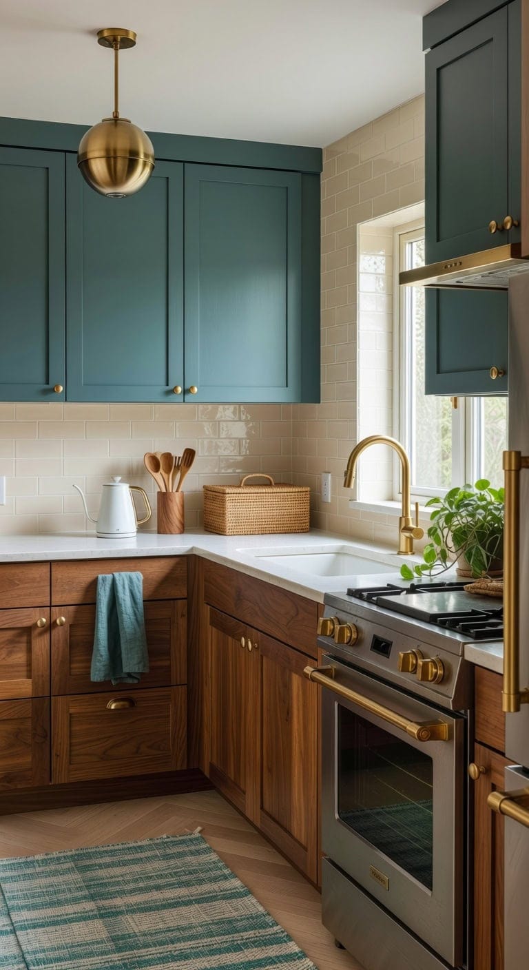
That moody teal against rich walnut grain creates a kitchen that feels collected, not catalog-perfect. The smooth matte teal finish plays off the natural wood texture of warm walnut lowers, while woven rattan accents and brushed brass hardware tie everything together with an organic warmth that makes the whole room feel lived-in and intentional.
Upper Cabinets: Paint in “Galapagos Turquoise” (Benjamin Moore 2057-20), a sophisticated deep teal with blue-green depth that reads dramatic without feeling overwhelming, especially when paired against natural wood tones below.
Lower Cabinets or Island: Stain in “Special Walnut” (Minwax 224), a warm medium-brown wood stain that highlights natural grain patterns and brings that authentic walnut richness to existing wood or unfinished cabinet doors.
 THE BEER VALLEY Chindi Area Runner 2x6 Feet - Teal
View Price
THE BEER VALLEY Chindi Area Runner 2x6 Feet - Teal
View Price
 DEAYOU 2 Pack Imitation Rattan Bread Basket with Lid, Woven Tabletop Food Serving Basket, Poly-Wicker Fruit Basket for Vegetable, Restaurant, Display, Kitchen, Party, Rectangle, 13.8" L x 9.8" W
View Price
DEAYOU 2 Pack Imitation Rattan Bread Basket with Lid, Woven Tabletop Food Serving Basket, Poly-Wicker Fruit Basket for Vegetable, Restaurant, Display, Kitchen, Party, Rectangle, 13.8" L x 9.8" W
View Price
 BTP Milk Glass Pendant Light, Brushed Brass Globe Pendant Lighting for Kitchen Island, Adjustable Height Hanging Light Fixture, Sloped Ceiling Compatible, E26 Pendant Lamp for Dining Room Hallway,Gold
View Price
BTP Milk Glass Pendant Light, Brushed Brass Globe Pendant Lighting for Kitchen Island, Adjustable Height Hanging Light Fixture, Sloped Ceiling Compatible, E26 Pendant Lamp for Dining Room Hallway,Gold
View Price
 Premium Kitchen Towels 6 Pack 100% Cotton, 20"x28" Dish Towels - Teal Check
View Price
Premium Kitchen Towels 6 Pack 100% Cotton, 20"x28" Dish Towels - Teal Check
View Price
 IVE Design Walnut Utensil Holder for Kitchen Wood Utensil Crock Wood Utensil Holder
View Price
IVE Design Walnut Utensil Holder for Kitchen Wood Utensil Crock Wood Utensil Holder
View Price
 Goldenwarm 10Pack Brushed Gold Drawer Knobs for Cabinets, Brushed Brass Round Cabinet Knobs for Dresser Drawers
View Price
Goldenwarm 10Pack Brushed Gold Drawer Knobs for Cabinets, Brushed Brass Round Cabinet Knobs for Dresser Drawers
View Price
 Electric Gooseneck Kettle, 30oz/0.9L Intelligent Temperature Control, Quick Heating, 304 Stainless Steel for Pour Over Coffee, Brew Tea, Boil Hot Water, 1000W (White)
View Price
Electric Gooseneck Kettle, 30oz/0.9L Intelligent Temperature Control, Quick Heating, 304 Stainless Steel for Pour Over Coffee, Brew Tea, Boil Hot Water, 1000W (White)
View Price
Shop The Look
DIY Paint Transformation
Best For: Mid-size kitchens with good natural light where you want bold personality balanced by the grounding warmth of real wood tones.
Deep Red Island With Neutral Taupe Cabinets
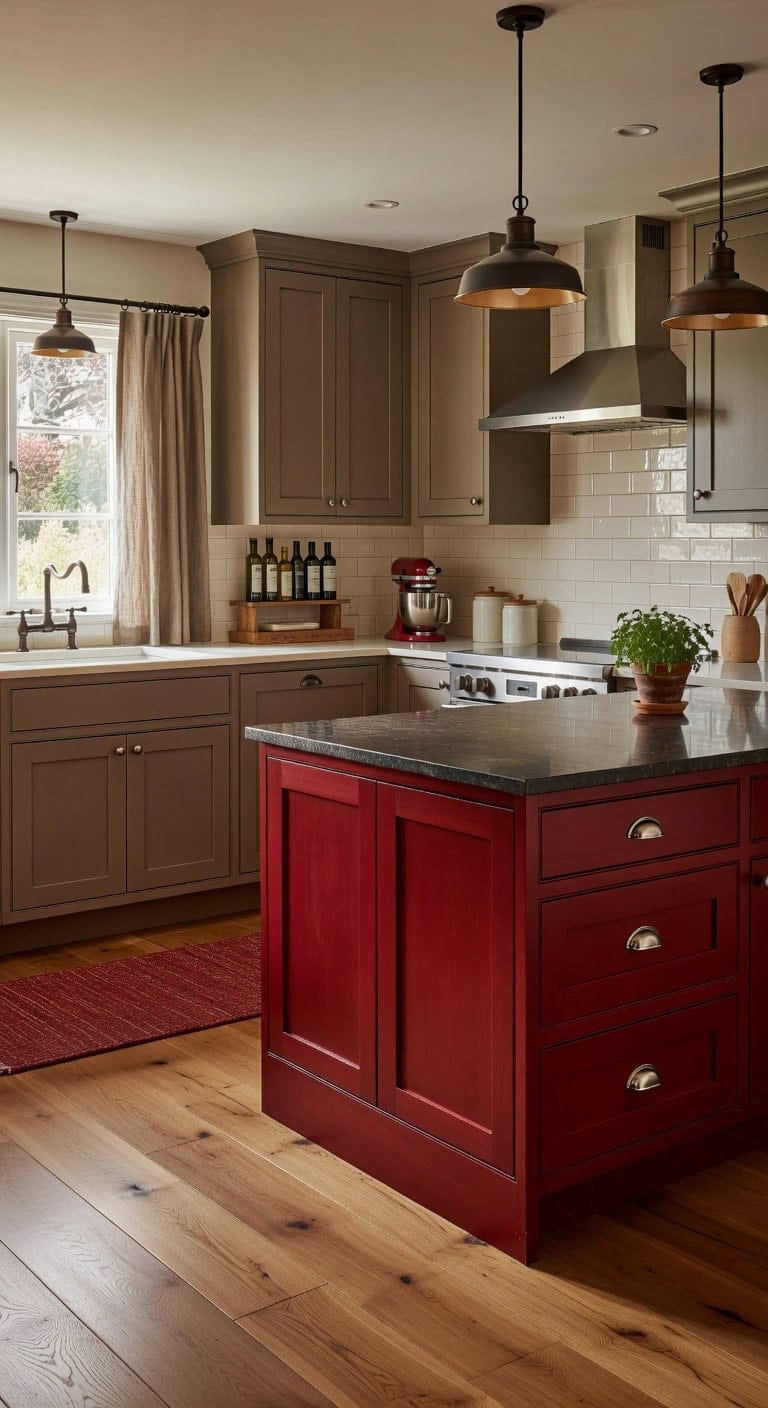
A deep red kitchen island anchored against neutral taupe perimeter cabinets creates the kind of warmth that makes everyone gather around. The matte painted wood of the island plays against smooth taupe cabinetry and brushed metal hardware, giving the whole room grounded, layered texture. This combination feels bold without being overwhelming — confident color meets quiet sophistication.
Island: Paint in “Deco Rose” (Benjamin Moore 1328) — a rich, saturated deep red with earthy undertones that commands attention without veering into cherry territory, perfect for creating a bold focal point on your kitchen island.
Perimeter Cabinets: Paint in “Ashley Gray” (Benjamin Moore HC-87) — a sophisticated neutral taupe with warm gray-brown depth that reads as calm and timeless, letting the red island steal the show while keeping the rest of the kitchen grounded and elegant.
 YDKGL Kitchen Runner Rug Mat Non Slip Hallway Runner Washable Red 2x6 ft
View Price
YDKGL Kitchen Runner Rug Mat Non Slip Hallway Runner Washable Red 2x6 ft
View Price
 ZAUYX 10 Pack 4" Drawer Pulls Brushed Satin Nickel Cabinet Cup Pulls Kitchen Hardware Cabinet Handles Drawer Handles Knobs 4 inch Hole Center
View Price
ZAUYX 10 Pack 4" Drawer Pulls Brushed Satin Nickel Cabinet Cup Pulls Kitchen Hardware Cabinet Handles Drawer Handles Knobs 4 inch Hole Center
View Price
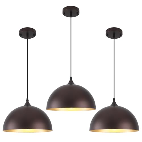 Farmhouse Pendant Light 12 Inch, Modern Pendant Lights Kitchen Island, Adjustable Height Dome Pendant Lights Fixtures for Dining Room Barn,Oil Rubbed Bronze Finish, 3 Pack
View Price
Farmhouse Pendant Light 12 Inch, Modern Pendant Lights Kitchen Island, Adjustable Height Dome Pendant Lights Fixtures for Dining Room Barn,Oil Rubbed Bronze Finish, 3 Pack
View Price
 Barnyard Designs Ceramic Kitchen Utensil Holder Countertop 6.75″ (Red)
View Price
Barnyard Designs Ceramic Kitchen Utensil Holder Countertop 6.75″ (Red)
View Price
 jinchan Striped Linen Kitchen Tier Curtains, 20 Inch, Taupe Grey, 2 Panels
View Price
jinchan Striped Linen Kitchen Tier Curtains, 20 Inch, Taupe Grey, 2 Panels
View Price
 KLM Countertop Coffee Station Organizer, 2 Tier Wooden Shelf for Coffee Bar Accessories, Condiment Storage Caddy for Kitchen, Bathroom Counter Organizer, Home, Office - Brown
View Price
KLM Countertop Coffee Station Organizer, 2 Tier Wooden Shelf for Coffee Bar Accessories, Condiment Storage Caddy for Kitchen, Bathroom Counter Organizer, Home, Office - Brown
View Price
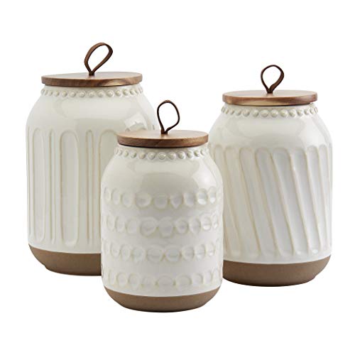 TTU Tabletops Gallery Ceramic Canister Collection- Stoneware Designed Kitchen Storage Embossed Acacia Wood White Set, 3 Piece Embossed Ziggy White Canister Set
View Price
TTU Tabletops Gallery Ceramic Canister Collection- Stoneware Designed Kitchen Storage Embossed Acacia Wood White Set, 3 Piece Embossed Ziggy White Canister Set
View Price
 Dash Everyday Stand Mixer - Compact Tilt-Head Stand Mixer for Everyday Recipes - 6-Speed Power with Stainless Steel Bowl - Red, 3-Quart
View Price
Dash Everyday Stand Mixer - Compact Tilt-Head Stand Mixer for Everyday Recipes - 6-Speed Power with Stainless Steel Bowl - Red, 3-Quart
View Price
Shop The Look
DIY Paint Transformation
Best For: Medium to large kitchens with a freestanding or peninsula island where one bold accent color can shine against a generous backdrop of neutral cabinetry.
All-Gray Monochromatic Cabinets With Varied Finishes
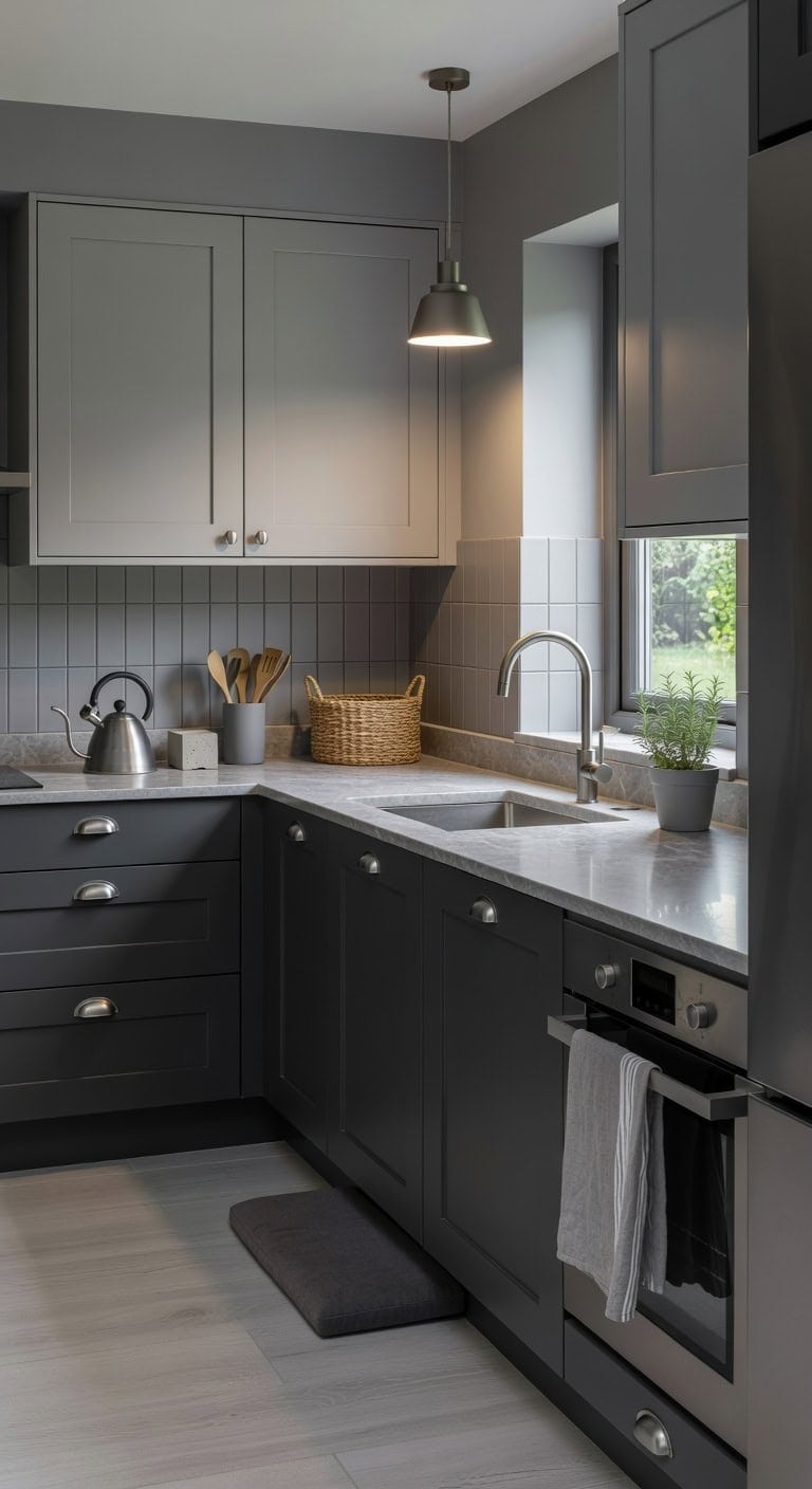
Gray on gray sounds flat until you layer it with intention. Pairing charcoal matte lowers with pale dove-gray uppers creates depth that feels intentional, not boring. Add brushed nickel hardware against a honed stone countertop, and every surface catches light differently. This tonal approach brings quiet sophistication without a single bold color stealing the show.
Lower Cabinets: Paint in “Kendall Charcoal” (Benjamin Moore HC-166) — this rich dark gray with warm undertones anchors the base of your kitchen, giving weight and grounding energy to the lower half of the room without feeling harsh or cold.
Upper Cabinets: Paint in “Apparition” (Benjamin Moore 860) — this popular light gray with subtle greige warmth lifts the upper portion of the kitchen, keeping sightlines open and airy while staying clearly connected to the darker gray below.
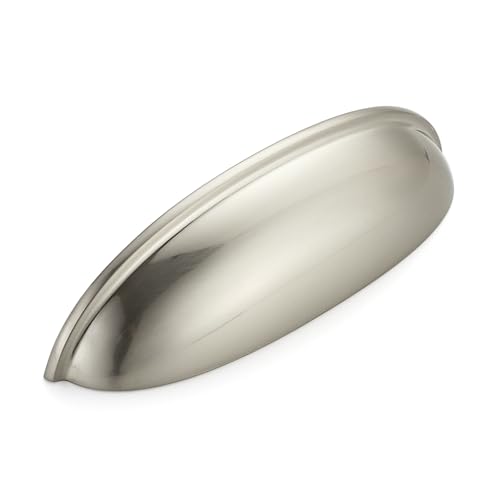 JOY DECOR Brushed Nickel Cabinet Pulls, Cabinet Handles, 5 Inch, 10 Pack
View Price
JOY DECOR Brushed Nickel Cabinet Pulls, Cabinet Handles, 5 Inch, 10 Pack
View Price
 Cotton Dish Towels For Kitchen Drying - Highly Absorbent Light Gray Striped Gingham Plaid Tea Towels - 18"X28" Set Of 6 Farmhouse Linen Dishtowels In Bulk - Pano De Prato Para Cozinha - T Towles Towls
View Price
Cotton Dish Towels For Kitchen Drying - Highly Absorbent Light Gray Striped Gingham Plaid Tea Towels - 18"X28" Set Of 6 Farmhouse Linen Dishtowels In Bulk - Pano De Prato Para Cozinha - T Towles Towls
View Price
 J&V TEXTILES Medallion Embossed Kitchen Mat Cushioned Anti Fatigue Floor Mat, Thick Non Slip Waterproof Kitchen Rugs and Mats,Heavy Duty Foam Standing Mat for Kitchen (Charcoal Gray, 20" X 39")
View Price
J&V TEXTILES Medallion Embossed Kitchen Mat Cushioned Anti Fatigue Floor Mat, Thick Non Slip Waterproof Kitchen Rugs and Mats,Heavy Duty Foam Standing Mat for Kitchen (Charcoal Gray, 20" X 39")
View Price
 DOWAN 7.2" Large Ceramic Utensil Holder for Kitchen Counter, Grey
View Price
DOWAN 7.2" Large Ceramic Utensil Holder for Kitchen Counter, Grey
View Price
 Kichler Missoula 13 1/2" Wide Antique Pewter Pendant
View Price
Kichler Missoula 13 1/2" Wide Antique Pewter Pendant
View Price
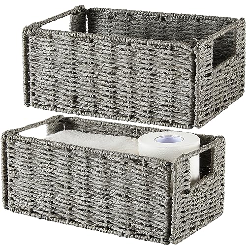 Vagusicc Wicker Storage Basket, Set of 2 Grey Baskets for Toilet Paper
View Price
Vagusicc Wicker Storage Basket, Set of 2 Grey Baskets for Toilet Paper
View Price
 Cosori Gooseneck Electric Kettle with Temperature Control, 0.8L, Silver
View Price
Cosori Gooseneck Electric Kettle with Temperature Control, 0.8L, Silver
View Price
 scout & june Stackable Salt and Pepper Cellars - Countertop Cellar Set with Lids - Food Safe - Great Pinch Pots for Kosher Salt, Spices & Pepper
View Price
scout & june Stackable Salt and Pepper Cellars - Countertop Cellar Set with Lids - Food Safe - Great Pinch Pots for Kosher Salt, Spices & Pepper
View Price
Shop The Look
DIY Paint Transformation
Best For: Galley kitchens or smaller spaces where a monochromatic gray palette adds visual depth and modern polish without overwhelming the room with competing colors.
Mint Green and Bright White Retro Cabinet Colors
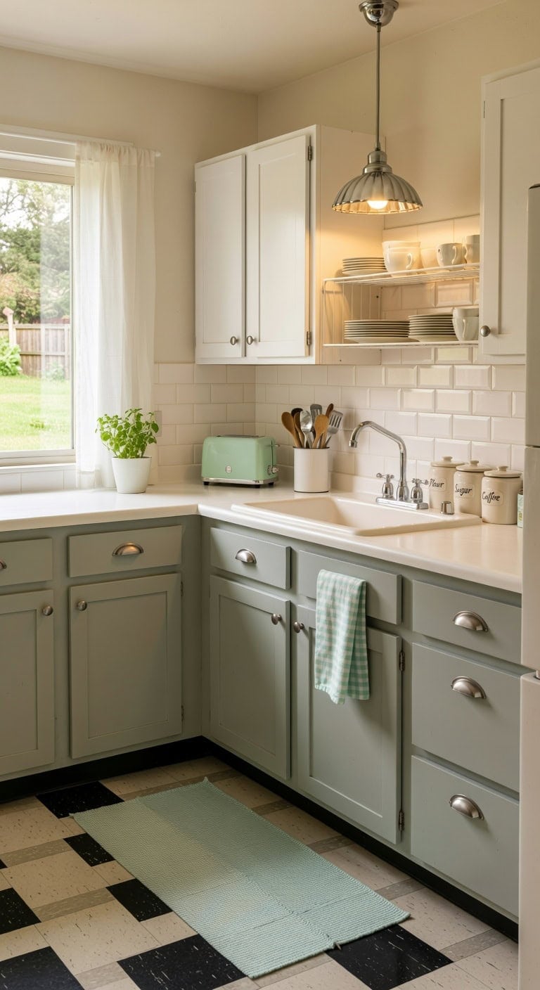
Lower Cabinets: Paint in “Sprout” (Benjamin Moore 1514) — a true soft mint green with just enough gray to keep it grounded and retro without reading pastel. This reads vintage diner in the best possible way and pairs naturally with chrome or nickel hardware.
Upper Cabinets and Trim: Paint in “Chantilly Lace” (Benjamin Moore OC-65) — a clean bright white with zero yellow undertone, giving the space that crisp contrast mint green needs to really pop. It keeps the uppers light and airy so the kitchen never feels heavy.
DIY Paint Transformation
Best For: Small to mid-size kitchens in older homes where you want playful retro personality without committing to a full renovation.
Lavender Lowers With Soft White Upper Cabinets
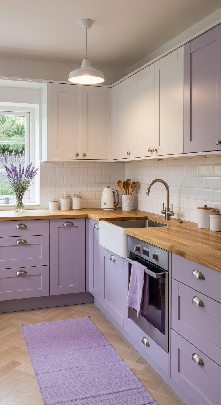
Pairing lavender lower cabinets with soft white uppers creates a kitchen that feels calm yet full of personality. The matte lavender finish plays beautifully against smooth white surfaces, while natural wood countertops or butcher block add warmth that keeps the palette grounded. Brushed silver hardware ties both tones together with a quiet shine that feels intentional.
Lower Cabinets: Paint in “Lily Lavender” (Benjamin Moore 2071-60) — a dusty lavender with gray undertones that reads sophisticated rather than overly sweet, perfect for grounding the bottom half of your kitchen with soft color.
Upper Cabinets: Paint in “Simply White” (Benjamin Moore OC-117) — a warm soft white that avoids looking stark or clinical, creating an airy upper half that makes ceilings feel taller and lets the lavender lowers shine.
 HOMORE Purple Runner Rug 2x6 Washable Hallway Runner Rugs for Kitchen
View Price
HOMORE Purple Runner Rug 2x6 Washable Hallway Runner Rugs for Kitchen
View Price
 HOMOTEK 6 Pack 3 Inch Hole Centers Shiny Bright Brushed Satin Nickel Drawer Bin Cup Pulls Dresser Pulls for Cabinets,Furniture Handles,Kitchen Cabinet Hardware
View Price
HOMOTEK 6 Pack 3 Inch Hole Centers Shiny Bright Brushed Satin Nickel Drawer Bin Cup Pulls Dresser Pulls for Cabinets,Furniture Handles,Kitchen Cabinet Hardware
View Price
 Shenmoyl Pendant Light with White Pleated Ceramic Lmapshade, Brass Vintage Pendant Light Adjustable Hanging Light for Kitchen Island Dining Room Hallway
View Price
Shenmoyl Pendant Light with White Pleated Ceramic Lmapshade, Brass Vintage Pendant Light Adjustable Hanging Light for Kitchen Island Dining Room Hallway
View Price
 HillSpring Black Marble Kitchen Utensil Holder, Weighted Utensils Organizer Crock for Countertop, Wine Chiller Bucket with Protective Padded Base
View Price
HillSpring Black Marble Kitchen Utensil Holder, Weighted Utensils Organizer Crock for Countertop, Wine Chiller Bucket with Protective Padded Base
View Price
 LANE LINEN Kitchen Towels and Dishcloths Sets - 20Pc Kitchen Towel Set, 350 Degree Heat Resistant Oven Mitts & Pot Holder, Reusable Absorbent Dish Cloths for Washing Dishes - Aqua
View Price
LANE LINEN Kitchen Towels and Dishcloths Sets - 20Pc Kitchen Towel Set, 350 Degree Heat Resistant Oven Mitts & Pot Holder, Reusable Absorbent Dish Cloths for Washing Dishes - Aqua
View Price
 MALACASA LYDIA Ceramic Canisters Set with Airtight Lids, 80/40/20 oz Coffee Canisters Sets for the Kitchen, Large Jars for Flour, Sugar, Pasta, Coffee, Cookies, Tea - Set of 3, Hexagon
View Price
MALACASA LYDIA Ceramic Canisters Set with Airtight Lids, 80/40/20 oz Coffee Canisters Sets for the Kitchen, Large Jars for Flour, Sugar, Pasta, Coffee, Cookies, Tea - Set of 3, Hexagon
View Price
 WTJMOV Electric Kettle Stainless Steel, 1.0L Small Water Boiler 1200W Fast Boiling, Double Wall Tea Kettle Pot Automatic Shut Off, Durable Coffee & Tea Maker/Warmer/Heater White
View Price
WTJMOV Electric Kettle Stainless Steel, 1.0L Small Water Boiler 1200W Fast Boiling, Double Wall Tea Kettle Pot Automatic Shut Off, Durable Coffee & Tea Maker/Warmer/Heater White
View Price
 GTIDEA 4pcs Lavender Flowers Artificial Fake Lavender Decor for Outdoors
View Price
GTIDEA 4pcs Lavender Flowers Artificial Fake Lavender Decor for Outdoors
View Price
Shop The Look
DIY Paint Transformation
Best For: Small to mid-sized kitchens that need a playful refresh without overwhelming the space, especially open-concept layouts where the kitchen is visible from living areas.
Olive Green and Matte Black Modern Cabinet Pairing
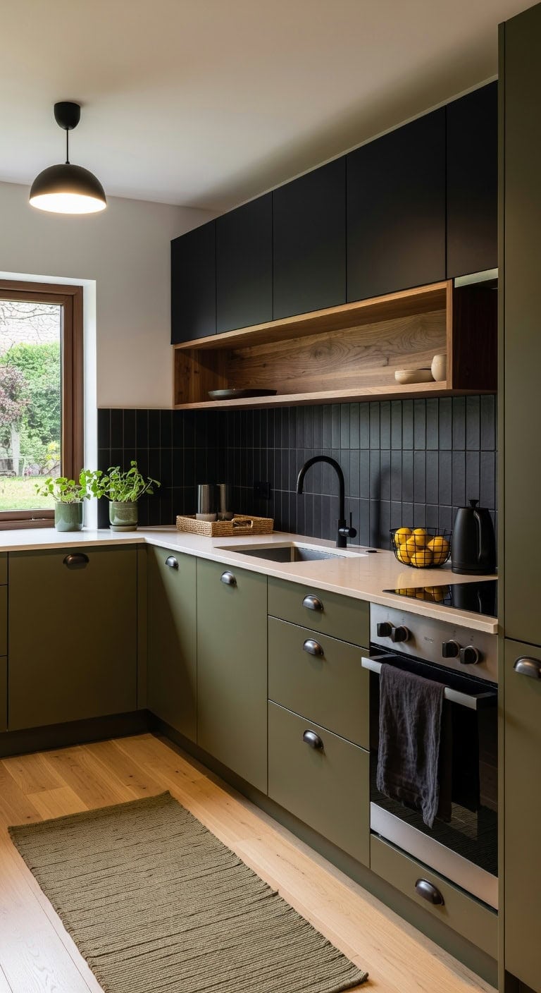
Pairing olive green lowers with matte black uppers creates a kitchen that feels grounded yet bold, like a modern loft with an earthy soul. The soft satin finish of olive cabinetry plays against the flat, light-absorbing depth of black surfaces, while natural wood open shelving bridges both tones with warmth. This combination works beautifully with brushed metal accents and woven textures throughout.
Lower Cabinets: Paint in “Golden Chalice” (Benjamin Moore 2151-20), a rich olive green with golden undertones that reads sophisticated and nature-inspired on lower cabinetry, giving the kitchen a warm, rooted foundation.
Upper Cabinets: Paint in “Onyx” (Benjamin Moore 2133-10), a true matte black that absorbs light beautifully on upper cabinets, creating dramatic contrast and drawing the eye upward without feeling heavy against the olive base.
 CABDM 6 Pack Black Cup Pulls 3"(76mm) Center to Center Drawer Pulls Matte Black Cabinet Cup Pulls Kitchen Cabinet Hardware Vintage Cabinet Handles Bin Cup Drawer Handles Black Knobs.
View Price
CABDM 6 Pack Black Cup Pulls 3"(76mm) Center to Center Drawer Pulls Matte Black Cabinet Cup Pulls Kitchen Cabinet Hardware Vintage Cabinet Handles Bin Cup Drawer Handles Black Knobs.
View Price
 IOHOUZE Washable Runner Rug 2x6 Non Slip Runners for Hallways Entryway Runner Indoor, Kitchen Rugs Woven Cotton Floor Carpet for Kitchen Hall Entrance Bedroom, Olive Green/Dusty Green
View Price
IOHOUZE Washable Runner Rug 2x6 Non Slip Runners for Hallways Entryway Runner Indoor, Kitchen Rugs Woven Cotton Floor Carpet for Kitchen Hall Entrance Bedroom, Olive Green/Dusty Green
View Price
 Design Classics Indy Matte Black Pendant Light with Bowl/Dome Shade
View Price
Design Classics Indy Matte Black Pendant Light with Bowl/Dome Shade
View Price
 Bivvclaz Wooden Utensil Holder, 360°Rotating 7.2" Utensil Holder for Kitchen Counter, Large Kitchen Utensil Holder, Cooking Utensil Crock for Countertop, Black Kitchen Decor and Accessories
View Price
Bivvclaz Wooden Utensil Holder, 360°Rotating 7.2" Utensil Holder for Kitchen Counter, Large Kitchen Utensil Holder, Cooking Utensil Crock for Countertop, Black Kitchen Decor and Accessories
View Price
 Pure Linen Kitchen Tea Towels with Olive Green Stripes - Set of 2
View Price
Pure Linen Kitchen Tea Towels with Olive Green Stripes - Set of 2
View Price
 Metal Wire Fruit Basket, Black Fruit Bowl for Kitchen Counter, Fruit Holder Stand Storage Baskets for Countertop, Home Decor, Table Centerpieces, Vegetable Bowls for Fruits, Veggies, Snacks (Black)
View Price
Metal Wire Fruit Basket, Black Fruit Bowl for Kitchen Counter, Fruit Holder Stand Storage Baskets for Countertop, Home Decor, Table Centerpieces, Vegetable Bowls for Fruits, Veggies, Snacks (Black)
View Price
 Damsun 1.7L Stainless Steel Electric Kettle, 1500W Rapid Boil, Black
View Price
Damsun 1.7L Stainless Steel Electric Kettle, 1500W Rapid Boil, Black
View Price
 vensovo Ceramic Planter Set with Tray, 3 Small Herb Pots, Green Leaf
View Price
vensovo Ceramic Planter Set with Tray, 3 Small Herb Pots, Green Leaf
View Price
Shop The Look
DIY Paint Transformation
Best For: Modern galley or L-shaped kitchens where bold two-tone contrast adds dimension without overwhelming a compact footprint.
Cornflower Blue and Natural Wood Cottage-Style Cabinets
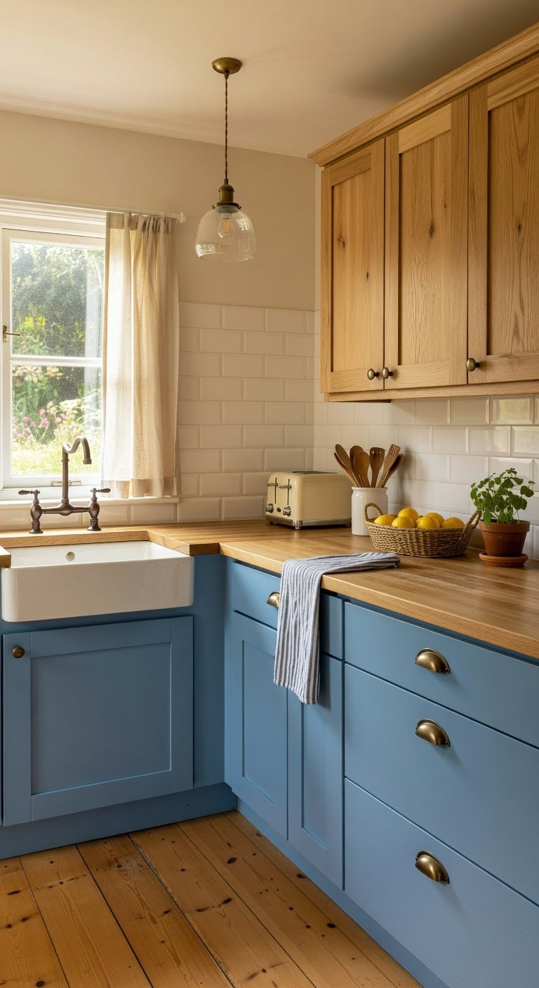
Soft cornflower blue lower cabinets paired with natural wood uppers create a cottage kitchen that feels collected over time rather than designed all at once. The matte painted finish plays beautifully against visible wood grain, while woven basket textures and linen details add warmth. This combination works whether your kitchen is tiny or spacious.
Lower cabinets: Paint in “Blue Nova” (Benjamin Moore 825) — a true cornflower blue with gentle gray undertones that reads soft and cottage-friendly without veering into primary blue territory. Pair with matte or eggshell sheen to keep the look relaxed and unpretentious.
Upper cabinets or open shelving: Finish in “Natural Grain” (Minwax Water-Based Wood Stain) — a clear-to-light wash that lets the natural wood tone shine through while providing subtle protection. Sand lightly before applying to enhance the organic grain pattern that gives cottage kitchens their character.
 Solino Home 100% Pure Linen Dining Table Runner Cornflower Blue, 14 x 48 in
View Price
Solino Home 100% Pure Linen Dining Table Runner Cornflower Blue, 14 x 48 in
View Price
 khtumeware 10 Pack 3" Antique Brass Drawer Pulls Cabinet Cup Pulls Vintage Kitchen Hardware Cabinet Handles Drawer Handles Knobs 3 inch Hole Center
View Price
khtumeware 10 Pack 3" Antique Brass Drawer Pulls Cabinet Cup Pulls Vintage Kitchen Hardware Cabinet Handles Drawer Handles Knobs 3 inch Hole Center
View Price
 Wicker Storage Basket with Lid, Seagrass Storage Baskets for Organizing
View Price
Wicker Storage Basket with Lid, Seagrass Storage Baskets for Organizing
View Price
 Qinyoung Rustic Kitchen Utensil Holder 6 Inch Small Ceramic Utensil Holder with Handle Vintage Crock Decoration Spatula Organizer for Kitchen Countertop Farmhouse Party Supplies(White,Textured)
View Price
Qinyoung Rustic Kitchen Utensil Holder 6 Inch Small Ceramic Utensil Holder with Handle Vintage Crock Decoration Spatula Organizer for Kitchen Countertop Farmhouse Party Supplies(White,Textured)
View Price
 OIYIO Vintage Antique Brass Pendant Light, Textured Glass Island Fixture
View Price
OIYIO Vintage Antique Brass Pendant Light, Textured Glass Island Fixture
View Price
 LANE LINEN Dish Towels 100% Cotton Absorbent Lint-Free 6 Pack
View Price
LANE LINEN Dish Towels 100% Cotton Absorbent Lint-Free 6 Pack
View Price
 CROWNFUL 2-Slice Toaster, Extra Wide Slots Toaster, Retro Stainless Steel with Bagel, Cancel, Defrost, Reheat Function and 6-Shade Settings, Removal Crumb Tray, Cream
View Price
CROWNFUL 2-Slice Toaster, Extra Wide Slots Toaster, Retro Stainless Steel with Bagel, Cancel, Defrost, Reheat Function and 6-Shade Settings, Removal Crumb Tray, Cream
View Price
Shop The Look
DIY Paint Transformation
Best For: Small to mid-size kitchens in older homes, bungalows, or coastal cottages where a cheerful yet grounded palette prevents the space from feeling overly decorated or sterile.
Espresso Brown and Ivory Cream Cabinet Contrast
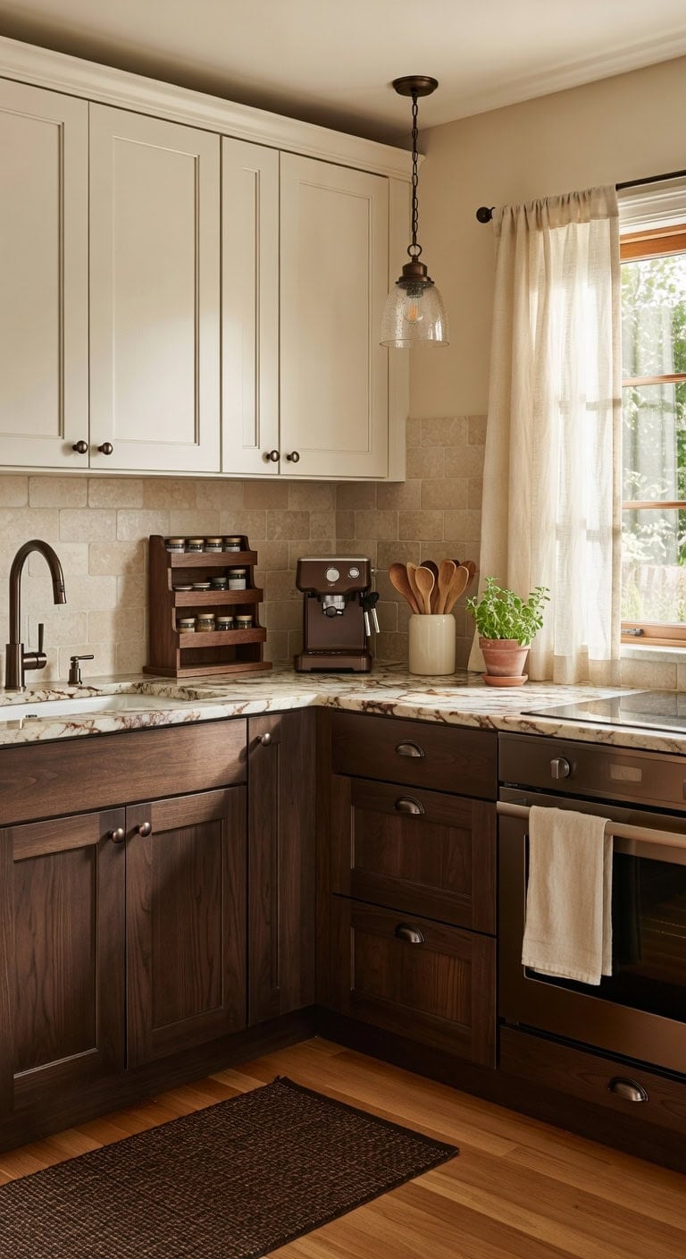
Dark espresso brown base cabinets grounded against ivory cream uppers create a kitchen that feels both warm and polished without trying too hard. The deep wood grain of the lower cabinents plays against smooth cream panels while brushed bronze hardware ties the two tones together. This rich pairing works beautifully with natural stone countertops and woven textiles that soften the shift.
a rich, saturated dark brown with warm chocolate undertones that adds serious depth to base cabinets and kitchen islands without reading as black.
a soft, warm off-white with just enough yellow warmth to complement the espresso tones below, keeping uppers light and airy without stark white coolness.
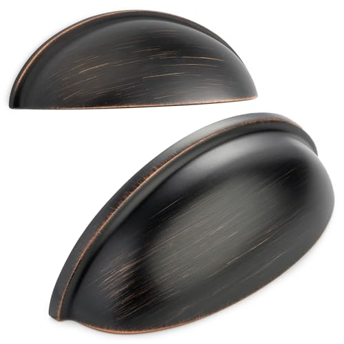 BEROSSA 3 Inch Oil Rubbed Bronze Drawer Pulls Cabinet Cup Pull 10 Pack 1886
View Price
BEROSSA 3 Inch Oil Rubbed Bronze Drawer Pulls Cabinet Cup Pull 10 Pack 1886
View Price
 Ivory Cream White Kitchen Dish Towels, Set of 3, 100% Cotton, 18" x 28"
View Price
Ivory Cream White Kitchen Dish Towels, Set of 3, 100% Cotton, 18" x 28"
View Price
 BEQHAUSE Kitchen Rugs 20"x32", Non-Slip Kitchen Mats for Floor, Brown
View Price
BEQHAUSE Kitchen Rugs 20"x32", Non-Slip Kitchen Mats for Floor, Brown
View Price
 Latinulu 1-Light Pendant Light with Oil Rubbed Bronze Metal Glass Shade and Adjustable Cord Industrial Ceiling Hanging Light for Kitchen Island Bar Dining Room Bedroom Foyer Hallway Farmhouse
View Price
Latinulu 1-Light Pendant Light with Oil Rubbed Bronze Metal Glass Shade and Adjustable Cord Industrial Ceiling Hanging Light for Kitchen Island Bar Dining Room Bedroom Foyer Hallway Farmhouse
View Price
 Arflo Acacia Wooden Spice Rack for Countertop - 3 Tiered Spice Rack Organizer for Cabinet - Kitchen Spices Organizers Holds 21 Jars - Spices Shelf for Kitchen Storage Pantry Seasoning Organizer
View Price
Arflo Acacia Wooden Spice Rack for Countertop - 3 Tiered Spice Rack Organizer for Cabinet - Kitchen Spices Organizers Holds 21 Jars - Spices Shelf for Kitchen Storage Pantry Seasoning Organizer
View Price
 48 Inch Linen Curtains 2 Panels for Cafe Bedroom Bathroom Back Tab Rod Pocket Privacy Semi Sheer Light Filtering Window Treatments Cream Ivory Farmhouse Rustic Door Curtain Small Window 34 x 48 Length
View Price
48 Inch Linen Curtains 2 Panels for Cafe Bedroom Bathroom Back Tab Rod Pocket Privacy Semi Sheer Light Filtering Window Treatments Cream Ivory Farmhouse Rustic Door Curtain Small Window 34 x 48 Length
View Price
 IMUSA 4 Cup Electric Espresso Cappuccino Coffee Maker, Black
View Price
IMUSA 4 Cup Electric Espresso Cappuccino Coffee Maker, Black
View Price
Best For: Traditional or transitional kitchens with standard upper-and-lower layouts where homeowners want dramatic contrast that still feels cozy and inviting rather than stark or modern.
Mushroom Gray and Pale Seafoam Cabinet Color Combo
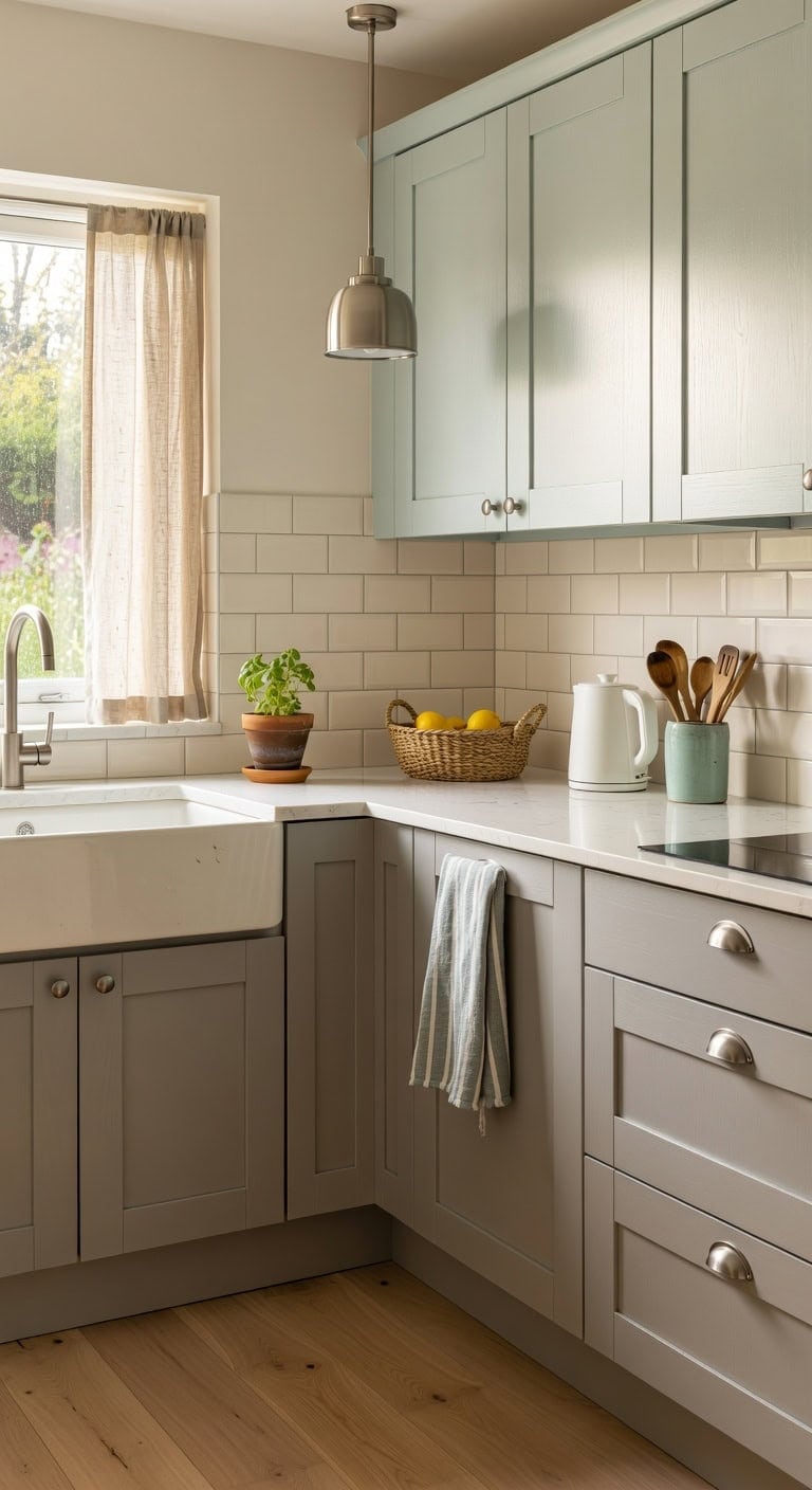
Pairing mushroom gray lowers with pale seafoam uppers creates a kitchen that feels grounded yet refreshingly vibrant. Woven rattan baskets on open shelving add organic warmth against the cool seafoam, while brushed nickel hardware catches the subtle green undertone. A linen café curtain softens the window and ties both muted tones together beautifully.
Lower Cabinets: Paint in “Sparrow” (Benjamin Moore AF-720) — a sophisticated mushroom gray with warm brown-violet undertones that anchors your kitchen base without feeling heavy or cold.
Upper Cabinets: Paint in “Palladian Blue” (Benjamin Moore HC-144) — a whisper-soft pale seafoam that reads airy and green-kissed, opening up the upper half of your kitchen with gentle coastal tranquility.
 Seafoam Curtains 38 Inch Width for Kitchen 2 Panel Back Tab Rod Pocket Semi Sheer Linen Short Cafe Tier Blue Green Curtains for Bathroom Small Windows Basement Laundry Coastal Beach Wide 38x45 Length
View Price
Seafoam Curtains 38 Inch Width for Kitchen 2 Panel Back Tab Rod Pocket Semi Sheer Linen Short Cafe Tier Blue Green Curtains for Bathroom Small Windows Basement Laundry Coastal Beach Wide 38x45 Length
View Price
 OctinPris Satin Brushed Nickel Cabinet Knobs 4 Pack Round Closet Knob
View Price
OctinPris Satin Brushed Nickel Cabinet Knobs 4 Pack Round Closet Knob
View Price
 EITMOW Wicker Storage Baskets 3-Pack Set, Hand-Woven Paper Rope Rattan Bins with Removable Liner, Multi-Size Organizer Baskets for Pantry, Countertop, Bedroom, Bathroom, Shelves (Dark-Brown, L+M+S)
View Price
EITMOW Wicker Storage Baskets 3-Pack Set, Hand-Woven Paper Rope Rattan Bins with Removable Liner, Multi-Size Organizer Baskets for Pantry, Countertop, Bedroom, Bathroom, Shelves (Dark-Brown, L+M+S)
View Price
 Premium Kitchen Towels 6 Pack 100% Cotton, 20"x28" Dish Towels - Aqua
View Price
Premium Kitchen Towels 6 Pack 100% Cotton, 20"x28" Dish Towels - Aqua
View Price
 Bicuzat Ceramic Starfish Embossed Utensil Holder, Large Cooking Utensil Crocks for Countertop, Ocean Style Utensil Organizer for Spatula
View Price
Bicuzat Ceramic Starfish Embossed Utensil Holder, Large Cooking Utensil Crocks for Countertop, Ocean Style Utensil Organizer for Spatula
View Price
 KLSS Brushed Nickel Pendant Lights Kitchen Island - Clear Glass Pendant Light Fixture Multiple Stems Rods 3 Units 12 Inch 3 Units 4 Inch (3 Pack Brushed Nickel)
View Price
KLSS Brushed Nickel Pendant Lights Kitchen Island - Clear Glass Pendant Light Fixture Multiple Stems Rods 3 Units 12 Inch 3 Units 4 Inch (3 Pack Brushed Nickel)
View Price
 Arenarug Upgrade Scalloped Kitchen Mats for Floor 2PC, Gray Kitchen Rugs
View Price
Arenarug Upgrade Scalloped Kitchen Mats for Floor 2PC, Gray Kitchen Rugs
View Price
 OVENTE 1.7L Electric Tea Kettle, 1100W BPA-Free Water Boiler, White KP72W
View Price
OVENTE 1.7L Electric Tea Kettle, 1100W BPA-Free Water Boiler, White KP72W
View Price
Shop The Look
DIY Paint Transformation
Best For: Mid-size kitchens with natural light where you want an earthy-meets-coastal palette that stays relaxed and never overpowering.
Common Two-Tone Cabinet Mistakes and How to Avoid Them
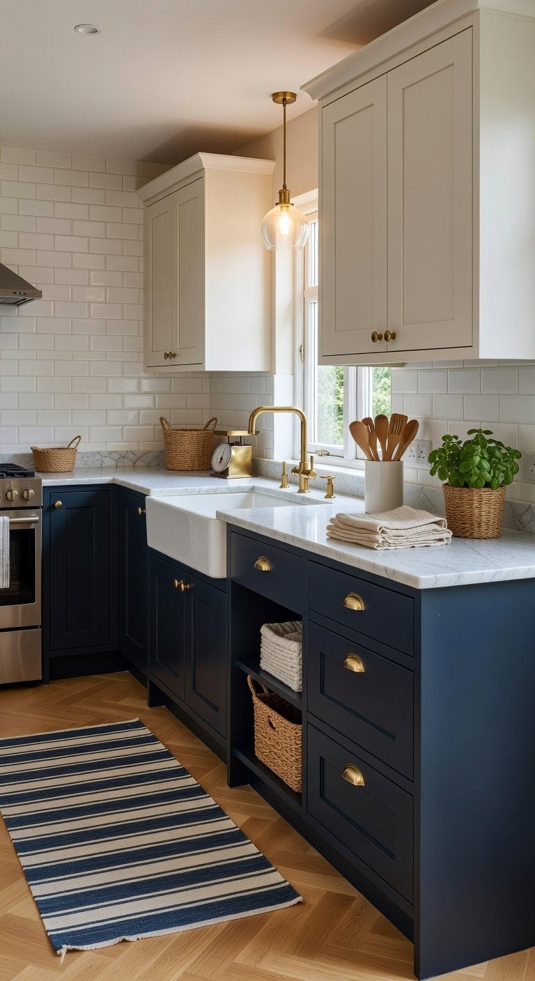
Pairing navy lowers with creamy white uppers sounds simple until the wrong proportions make your kitchen feel chopped in half. Brushed brass hardware against matte painted surfaces and a honed marble countertop can pull everything together — or clash badly if you skip the details. These fixable mistakes trip up even confident DIYers, so knowing what to watch for saves time and money.
Shop The Look
 Lovdeco Carrara Marble Cutting Board 20x16 Inch, Pastry Board For Kitchen, Large White Marble Slab Gift With Non-Slip Feets, 1 Piece
View Price
Lovdeco Carrara Marble Cutting Board 20x16 Inch, Pastry Board For Kitchen, Large White Marble Slab Gift With Non-Slip Feets, 1 Piece
View Price
 JONATHAN Y Khalil Modern Berber Stripe Cream/Navy Runner Rug, 2x8, Contemporary, Bohemian, Easy-Cleaning for Living Room, Bedroom, Kitchen, Pet Friendly, Non-Shedding (MOH207E-28)
View Price
JONATHAN Y Khalil Modern Berber Stripe Cream/Navy Runner Rug, 2x8, Contemporary, Bohemian, Easy-Cleaning for Living Room, Bedroom, Kitchen, Pet Friendly, Non-Shedding (MOH207E-28)
View Price
 LATCHHOOK White Large Utensil Holder for Kitchen Counter, High 7.2” Glossy Ceramic Utensils Crock for Countertop, Spatula Cooking Utensil Holder Easy to Clean for Farmhouse 7.2×5.8 INCH
View Price
LATCHHOOK White Large Utensil Holder for Kitchen Counter, High 7.2” Glossy Ceramic Utensils Crock for Countertop, Spatula Cooking Utensil Holder Easy to Clean for Farmhouse 7.2×5.8 INCH
View Price
 TRITON LINEN 100% French Linen Tea Towels 14 x 28 Inch (Set of 4,Navy)
View Price
TRITON LINEN 100% French Linen Tea Towels 14 x 28 Inch (Set of 4,Navy)
View Price
 Shenmoyl Pendant Light with Clear Striped Glass Lmapshade, Brass Vintage Pendant Light Adjustable Hanging Light for Kitchen Island Dining Room Hallway
View Price
Shenmoyl Pendant Light with Clear Striped Glass Lmapshade, Brass Vintage Pendant Light Adjustable Hanging Light for Kitchen Island Dining Room Hallway
View Price
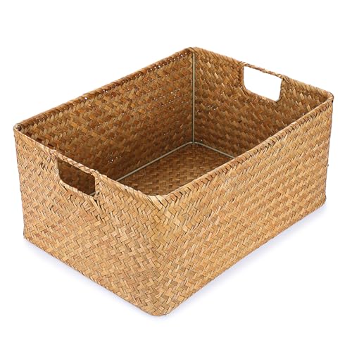 Hipiwe Seagrass Storage Baskets Bin for Shelf, X-Large Woven Wicker Basket
View Price
Hipiwe Seagrass Storage Baskets Bin for Shelf, X-Large Woven Wicker Basket
View Price
 Vintage Food Scale Kitchen Countertop Island Clock Farmhouse Tabletop Home Decor
View Price
Vintage Food Scale Kitchen Countertop Island Clock Farmhouse Tabletop Home Decor
View Price
DIY Paint Transformation
Lower Cabinets: Paint in “Hale Navy” (Benjamin Moore HC-154) — a rich, saturated navy blue that anchors the bottom half of your kitchen without reading black in low light, giving your base cabinets the weight they need to ground the room.
Upper Cabinets: Paint in “White Dove” (Benjamin Moore OC-17) — a soft creamy white with just enough warmth to avoid stark contrast against the navy lowers, creating a balanced two-tone look that feels intentional rather than mismatched.
Best For: Mid-size kitchens with standard 8-to-9-foot ceilings where a strong visual break between upper and lower cabinets adds depth without overwhelming the space.