21 Space Above Kitchen Cabinets Designs That Look Intentional
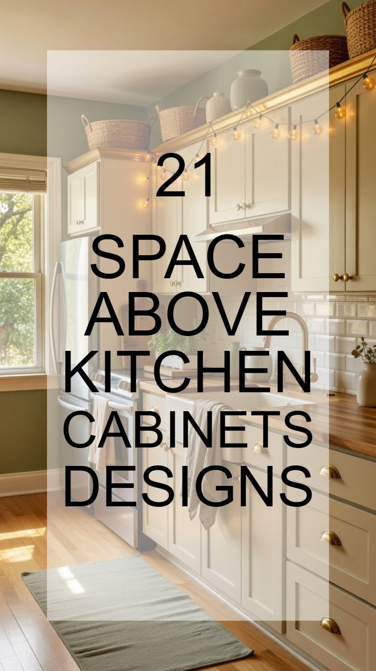
If that empty space above your kitchen cabinets has been bugging you, you’re not alone. It’s one of those overlooked areas that can actually become a stunning design moment with just a little creativity.
Whether you love a collected, layered look or prefer something clean and minimal, these ideas will inspire you to finally make that gap work beautifully.
Why Does the Space Above Kitchen Cabinets Feel So Awkward?
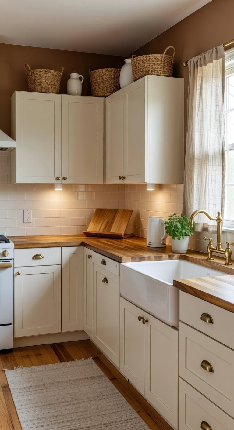
That gap between your cabinet tops and the ceiling collects dust, stares back at you blankly, and makes even a beautiful kitchen feel unfinished. Creamy whites against warm wood grain and woven basket textures can soften that visual tension, but most of us just ignore it. The right mix of height, texture, and intention turns dead space into deliberate style.
Shop The Look
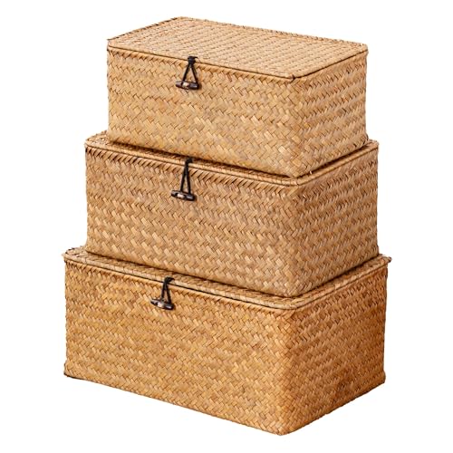 Nonam Wicker Storage Basket with Lid,Seagrass Shelf Basket Set of 3,Natural
View Price
Nonam Wicker Storage Basket with Lid,Seagrass Shelf Basket Set of 3,Natural
View Price
 khtumeware 10 Pack Brushed Brass Cup Pulls 3 Inch Center to Center - Cabinet & Drawer Handles for Kitchen Hardware
View Price
khtumeware 10 Pack Brushed Brass Cup Pulls 3 Inch Center to Center - Cabinet & Drawer Handles for Kitchen Hardware
View Price
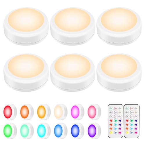 BLS LED Puck Lights with Remote Control, Wireless Under Cabinet & Closet Lighting, RGB 13 Color Changing Lights with Dimmer, Timer & AA Battery Operated, Push, Touch, Stick on for Night, White, 6 Pack
View Price
BLS LED Puck Lights with Remote Control, Wireless Under Cabinet & Closet Lighting, RGB 13 Color Changing Lights with Dimmer, Timer & AA Battery Operated, Push, Touch, Stick on for Night, White, 6 Pack
View Price
 Small White Ceramic Vase Set of 3, Boho Modern White Flower Vase Room Decor, Farmhouse Decor, Vases for Your Kitchen, Bathroom, Bedroom, Living Room, Office&Shelf Centerpiece Table Decorations
View Price
Small White Ceramic Vase Set of 3, Boho Modern White Flower Vase Room Decor, Farmhouse Decor, Vases for Your Kitchen, Bathroom, Bedroom, Living Room, Office&Shelf Centerpiece Table Decorations
View Price
 MIULEE Kitchen Curtain 24 Inch Long 2 Panels Natural Linen White Farmhouse
View Price
MIULEE Kitchen Curtain 24 Inch Long 2 Panels Natural Linen White Farmhouse
View Price
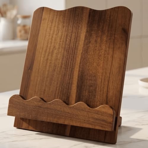 Beautiful Wooden Cookbook Stand for Your Kitchen Counter – Solid Wood Scalloped Book Holder (Acacia)
View Price
Beautiful Wooden Cookbook Stand for Your Kitchen Counter – Solid Wood Scalloped Book Holder (Acacia)
View Price
 WTJMOV 0.6L Small Electric Tea Kettle Lightweight, 20 Ounce Double Wall Hot Water Boiler Stainless Steel Auto Shut-off, 120V Portable Travel Electric Kettle Fast Boil for Tea and Coffee,White
View Price
WTJMOV 0.6L Small Electric Tea Kettle Lightweight, 20 Ounce Double Wall Hot Water Boiler Stainless Steel Auto Shut-off, 120V Portable Travel Electric Kettle Fast Boil for Tea and Coffee,White
View Price
 Restydon 2x8 Runner Rug Non Slip,Washable Hallway Runner Rug,Beige
View Price
Restydon 2x8 Runner Rug Non Slip,Washable Hallway Runner Rug,Beige
View Price
DIY Paint Transformation
Cabinets & Trim: Paint in “Simply White” (Benjamin Moore OC-117) — a clean, versatile cream that brightens cabinet faces and draws the eye upward, making the gap between cabinets and ceiling feel intentional rather than forgotten.
Soffit or Wall Above Cabinets: Paint in “Kingsport Gray” (Benjamin Moore HC-86) — a warm, muted wood-tone brown that recedes visually, shrinking that awkward space so it blends quietly into the background instead of demanding attention.
Best For: Kitchens with 12-inch or greater gaps above standard cabinets where the exposed wall or soffit creates visual disconnection between cabinetry and ceiling line.
Measure Your Gap Before Picking a Design
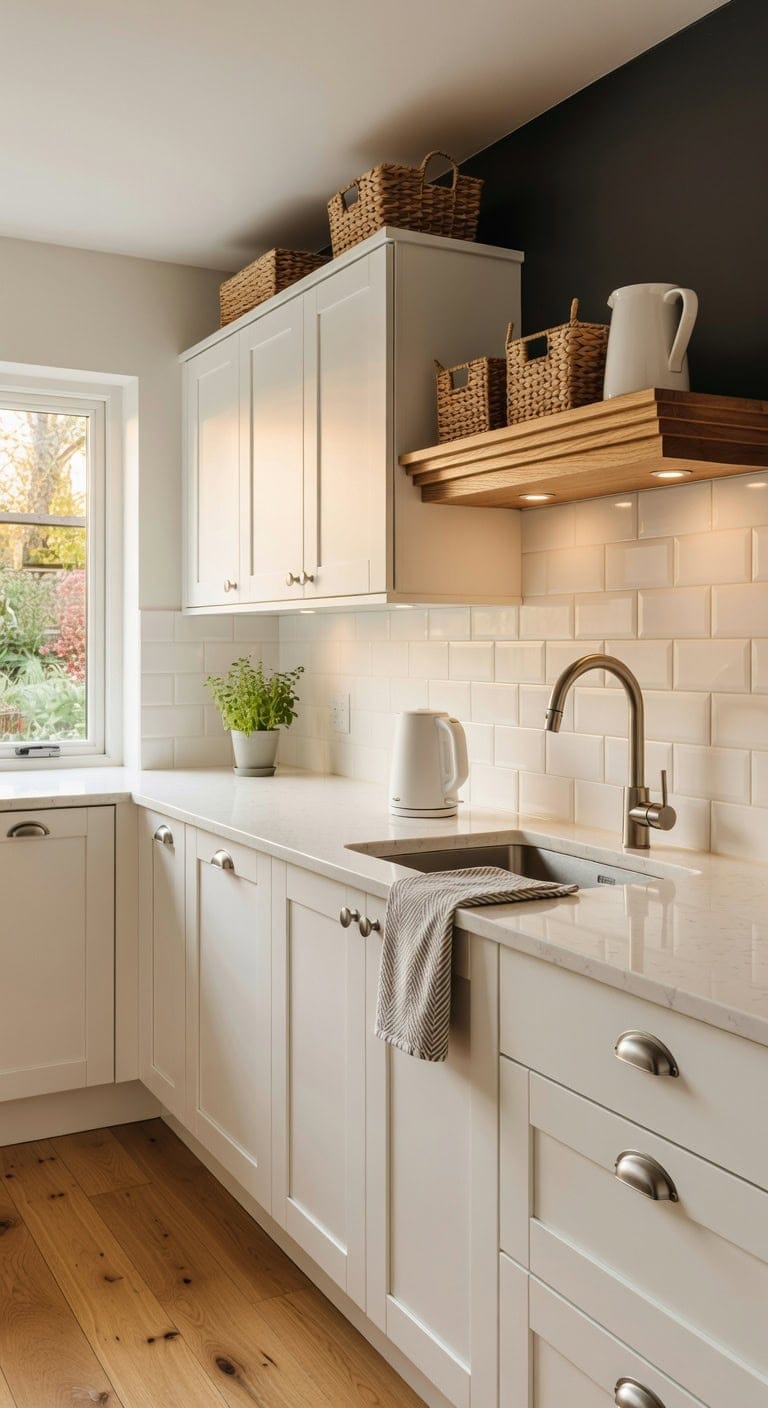
That awkward space between your cabinet tops and the ceiling can feel like a blank canvas or a dust trap — depending on how you approach it. Before you grab baskets or greenery, pull out a tape measure and check whether you’re working with a narrow gap under eight inches or a generous opening over twelve. Knowing your exact measurements helps you pick decor that fits snugly against warm wood textures, woven rattan, and smooth ceramic without looking cramped or lost in empty air.
Shop The Look
 CRAFTSMAN 25-Ft Tape Measure with Fraction Marketing, Retractable, Manual-Locking Blade (CMHT37443S)
View Price
CRAFTSMAN 25-Ft Tape Measure with Fraction Marketing, Retractable, Manual-Locking Blade (CMHT37443S)
View Price
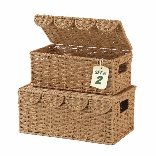 Set of 2 Scalloped Wicker Basket with Lid, Paper Rope Baskets for Shelves
View Price
Set of 2 Scalloped Wicker Basket with Lid, Paper Rope Baskets for Shelves
View Price
 Creative Co-Op 28 oz. Stoneware Pitcher, Reactive Glaze, White (Each One Will Vary)
View Price
Creative Co-Op 28 oz. Stoneware Pitcher, Reactive Glaze, White (Each One Will Vary)
View Price
 khtumeware 10 Pack 3-3/4" Drawer Pulls Brushed Satin Nickel Cabinet Cup Pulls Kitchen Hardware Cabinet Handles Drawer Handles Knobs 3-3/4 inch Hole Center
View Price
khtumeware 10 Pack 3-3/4" Drawer Pulls Brushed Satin Nickel Cabinet Cup Pulls Kitchen Hardware Cabinet Handles Drawer Handles Knobs 3-3/4 inch Hole Center
View Price
 EZVALO RGB Under Cabinet Puck Lights with Remote, Motion Sensor Lights
View Price
EZVALO RGB Under Cabinet Puck Lights with Remote, Motion Sensor Lights
View Price
 LANE LINEN Hand Towels for Kitchen 100% Cotton Absorbent Lint-Free 6 Pack
View Price
LANE LINEN Hand Towels for Kitchen 100% Cotton Absorbent Lint-Free 6 Pack
View Price
 Jerbikas Set of 3 Wooden Display Risers, Tiered Display Stand, Shelf Risers for Table Display, Small Wood Display Shelf
View Price
Jerbikas Set of 3 Wooden Display Risers, Tiered Display Stand, Shelf Risers for Table Display, Small Wood Display Shelf
View Price
 QUAXWELL Retro Electric Tea Kettle, 1.7L, Matte White and Gold
View Price
QUAXWELL Retro Electric Tea Kettle, 1.7L, Matte White and Gold
View Price
Kitchen Runners for This Palette
Rugs USA best-selling kitchen runners in this palette's colors, linked in 2' 6" x 6', the size for the floor in front of the sink and stove. Many are machine washable.
- Free shipping
- 30-day returns
- 210,000+ five-star reviews
 Perfect Handwoven Jute-Blend Rug – Natural
View Price
Perfect Handwoven Jute-Blend Rug – Natural
View Price
 Jute Braided Rug – Natural
View Price
Jute Braided Rug – Natural
View Price
 Everywhere Hand-Braided Indoor/Outdoor Rug – Salt And Pepper
View Price
Everywhere Hand-Braided Indoor/Outdoor Rug – Salt And Pepper
View Price
 Chunky Jute Tasseled Rug – Natural
View Price
Chunky Jute Tasseled Rug – Natural
View Price
 Keyara Spill Proof Washable Rug – Stone
View Price
Keyara Spill Proof Washable Rug – Stone
View Price
 Moroccan Trellis Rug – Grey
View Price
Moroccan Trellis Rug – Grey
View Price
 Everywhere Hand-Braided Indoor/Outdoor Rug – Tan
View Price
Everywhere Hand-Braided Indoor/Outdoor Rug – Tan
View Price
 Chunky Jute Tasseled Rug – Off White
View Price
Chunky Jute Tasseled Rug – Off White
View Price
 Vintage Medallion Washable Rug – Light Grey
View Price
Vintage Medallion Washable Rug – Light Grey
View Price
 Atrium Medallion Washable Rug – Grey
View Price
Atrium Medallion Washable Rug – Grey
View Price
 Softest Knit Wool Rug – Off White
View Price
Softest Knit Wool Rug – Off White
View Price
 Forever Vintage Rug – Neutral
View Price
Forever Vintage Rug – Neutral
View Price
 Floral Ornament Rug – Ivory
View Price
Floral Ornament Rug – Ivory
View Price
 Hand Woven Jute with Wool Fringe Rug – Natural
View Price
Hand Woven Jute with Wool Fringe Rug – Natural
View Price
 Flatweave Cotton Giant Octopus Rug – Blue Multicolor
View Price
Flatweave Cotton Giant Octopus Rug – Blue Multicolor
View Price
 Seagrass with Border Rug – Beige
View Price
Seagrass with Border Rug – Beige
View Price
 Handwoven Jute Ribbed Solid Rug – Natural
View Price
Handwoven Jute Ribbed Solid Rug – Natural
View Price
 Everywhere Hand-Braided Indoor/Outdoor Rug – Navy
View Price
Everywhere Hand-Braided Indoor/Outdoor Rug – Navy
View Price
 Brenda Hazy Heraldry Washable Rug – Beige
View Price
Brenda Hazy Heraldry Washable Rug – Beige
View Price
 Forever Vintage Rug – Rust
View Price
Forever Vintage Rug – Rust
View Price
 Jute Braided Rug – Off White
View Price
Jute Braided Rug – Off White
View Price
 Bohemian Chindi Braided Rug – Multicolor
View Price
Bohemian Chindi Braided Rug – Multicolor
View Price
 Everywhere Hand-Braided Indoor/Outdoor Rug – Ivory
View Price
Everywhere Hand-Braided Indoor/Outdoor Rug – Ivory
View Price
 Handspun Jute Rug – Natural
View Price
Handspun Jute Rug – Natural
View Price
 Wool Geometric Rug – Multicolor
View Price
Wool Geometric Rug – Multicolor
View Price
 Distressed Persian Rug – Blue
View Price
Distressed Persian Rug – Blue
View Price
 Fading Herati Medallion Rug – Beige
View Price
Fading Herati Medallion Rug – Beige
View Price
 Faded Abstract Washable Rug – Blue Grey
View Price
Faded Abstract Washable Rug – Blue Grey
View Price
 Everywhere Hand-Braided Indoor/Outdoor Rug – Charcoal
View Price
Everywhere Hand-Braided Indoor/Outdoor Rug – Charcoal
View Price
 Moroccan Trellis Rug – Dark Grey
View Price
Moroccan Trellis Rug – Dark Grey
View Price
 Ruby Distressed Mist Rug – Grey
View Price
Ruby Distressed Mist Rug – Grey
View Price
 Flourishing Medallion Rug – Multicolor
View Price
Flourishing Medallion Rug – Multicolor
View Price
 Hand Braided Twined Jute And Denim Rug – Blue
View Price
Hand Braided Twined Jute And Denim Rug – Blue
View Price
 Nordic Emblems Washable Rug – Peach
View Price
Nordic Emblems Washable Rug – Peach
View Price
 Broken Lattice Rug – Grey
View Price
Broken Lattice Rug – Grey
View Price
 Tribal Banded Washable Rug – Grey
View Price
Tribal Banded Washable Rug – Grey
View Price
 Honeycomb Labyrinth Rug – Grey
View Price
Honeycomb Labyrinth Rug – Grey
View Price
 Scandinavia Diamond Rug – Beige
View Price
Scandinavia Diamond Rug – Beige
View Price
 Vanni Checkered Fringed Rug – Beige
View Price
Vanni Checkered Fringed Rug – Beige
View Price
 Diamond Mosaic Washable Rug – Grey
View Price
Diamond Mosaic Washable Rug – Grey
View Price
DIY Paint Transformation
Cabinets: Paint in “Simply White” (Benjamin Moore OC-117) — a clean, true white that makes shorter gaps above cabinets feel taller and keeps the eye moving upward without visual weight pulling the space down.
Wall Above Cabinets: Paint in “Kendall Charcoal” (Benjamin Moore HC-166) — a rich, grounding dark tone applied to the recessed wall strip above cabinets that adds dramatic depth and makes decorative objects pop with gallery-like contrast.
Best For: Kitchens with 8-to-14-inch soffit gaps where standard decor looks too small or too large, and a measured, intentional approach prevents cluttered or underwhelming results.
How to Style Above Kitchen Cabinets Without Looking Cluttered
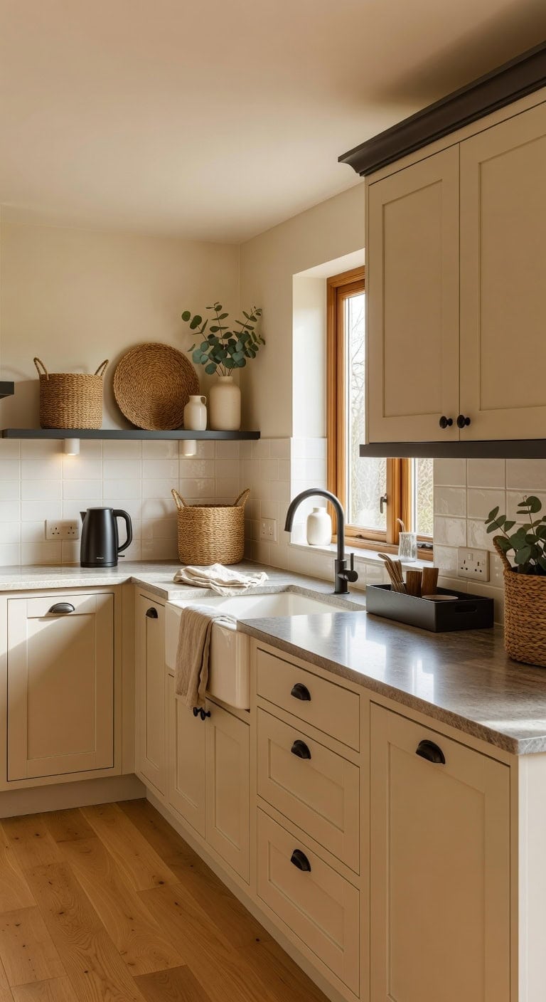
That awkward gap between your cabinets and ceiling can either look like forgotten storage or a curated display that makes your whole kitchen feel finished. Pairing warm cream tones with deep charcoal accents creates instant contrast, especially when you layer woven baskets against smooth ceramic pieces and rough greenery. The trick is editing — less is always more up there.
Our Favorite Kitchen Wall Art
The best-reviewed kitchen prints at Wayfair, with the ones in this palette's colors first.
- Free shipping over $35
- Picked at 4.6 stars or higher
 The Cafe Terrace by Vincent Van Gogh
View Price
The Cafe Terrace by Vincent Van Gogh
View Price
 Sage Garden 2 Piece Picture Frame Graphic Art Print Set
View Price
Sage Garden 2 Piece Picture Frame Graphic Art Print Set
View Price
 Sweet Experience
View Price
Sweet Experience
View Price
 Watercolor Lemons in Mason Jar Landscape by Tre Sorelle
View Price
Watercolor Lemons in Mason Jar Landscape by Tre Sorelle
View Price
 Interplay Print on Canvas
View Price
Interplay Print on Canvas
View Price
 Watercolor Lemons in Mason Jar on Shiplap by Tre Sorelle
View Price
Watercolor Lemons in Mason Jar on Shiplap by Tre Sorelle
View Price
 Autumn Kitchen by Danhui Nai
View Price
Autumn Kitchen by Danhui Nai
View Price
 Country Red and White
View Price
Country Red and White
View Price
 Old Favorites by Irena Orlov
View Price
Old Favorites by Irena Orlov
View Price
 Kitchen Food Culinary Gathering Pen and Ink Food and Drinks
View Price
Kitchen Food Culinary Gathering Pen and Ink Food and Drinks
View Price
 Wooden Kitchen Items
View Price
Wooden Kitchen Items
View Price
 Le Chateau Wrapped Canvas Machine Made Print
View Price
Le Chateau Wrapped Canvas Machine Made Print
View Price
 Fruit and Wine by Yoakum
View Price
Fruit and Wine by Yoakum
View Price
 White and Gold Champagne Flow V Champagne
View Price
White and Gold Champagne Flow V Champagne
View Price
 Kitchen Food Vintage Citrus Botanical Rustic Orange Framed
View Price
Kitchen Food Vintage Citrus Botanical Rustic Orange Framed
View Price
 Autumn Fall Thanksgiving Pumpkin in Orange Forest Nature
View Price
Autumn Fall Thanksgiving Pumpkin in Orange Forest Nature
View Price
 Kitchen Food Herbs and Spice in Spoons Kitchen Cooking Food
View Price
Kitchen Food Herbs and Spice in Spoons Kitchen Cooking Food
View Price
Shop The Look
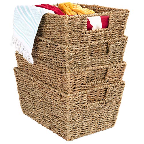 Best Choice Products Rustic Set Of 4 Multipurpose Stackable Seagrass Storage Basket, Handwoven Laundry Organizer Totes for Bedroom and Living Room, Shelves, Pantry w/Insert Handles - Natural
View Price
Best Choice Products Rustic Set Of 4 Multipurpose Stackable Seagrass Storage Basket, Handwoven Laundry Organizer Totes for Bedroom and Living Room, Shelves, Pantry w/Insert Handles - Natural
View Price
 Franklin Brass Francisco (10-Pack) Cabinet Handles 3" Hole Center Pulls | Matte Black Hardware Kitchen Door, Drawers, Dressers, Furniture P29520Z-FB-B
View Price
Franklin Brass Francisco (10-Pack) Cabinet Handles 3" Hole Center Pulls | Matte Black Hardware Kitchen Door, Drawers, Dressers, Furniture P29520Z-FB-B
View Price
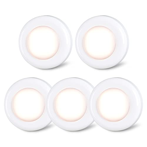 STAR-SPANGLED 2.8” LED Puck Lights Under Cabinet AAA Battery, 5 Pack Warm
View Price
STAR-SPANGLED 2.8” LED Puck Lights Under Cabinet AAA Battery, 5 Pack Warm
View Price
 Matte Clay Flower Vase Set of 3 Minimalist Nordic Modern Decorative Ceramic Vases for Home Table Decor, Fireplace Mantel Shelf Entry Way Console Kitchen Island Dining Table Centerpiece (Cream White)
View Price
Matte Clay Flower Vase Set of 3 Minimalist Nordic Modern Decorative Ceramic Vases for Home Table Decor, Fireplace Mantel Shelf Entry Way Console Kitchen Island Dining Table Centerpiece (Cream White)
View Price
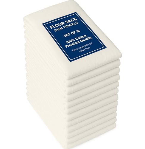 ROYALE LINENS Flour Sack Towels – 12 Pack 28x28 Inch Natural Kitchen Dish Towels – 100% Cotton Tea Towels for Bread Proofing, Cheese Straining, Baking, Cleaning, Drying, Embroidery, Multipurpose Use
View Price
ROYALE LINENS Flour Sack Towels – 12 Pack 28x28 Inch Natural Kitchen Dish Towels – 100% Cotton Tea Towels for Bread Proofing, Cheese Straining, Baking, Cleaning, Drying, Embroidery, Multipurpose Use
View Price
 15.5"x5.8" Matte Black Rectangular Metal Tray, Candle & Jewelry Organizer
View Price
15.5"x5.8" Matte Black Rectangular Metal Tray, Candle & Jewelry Organizer
View Price
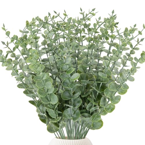 LYRWI 38pcs Eucalyptus Stems Artificial Eucalyptus Leaves Fake Greenery Branches Fake Flowers for Wedding Centerpiece Spring Easter Farmhouse Home Decoration 2026
View Price
LYRWI 38pcs Eucalyptus Stems Artificial Eucalyptus Leaves Fake Greenery Branches Fake Flowers for Wedding Centerpiece Spring Easter Farmhouse Home Decoration 2026
View Price
 Bodum 27oz Bistro Gooseneck Electric Water Kettle, Pour Over Coffee & Tea, Stainless Steel, Matte Black
View Price
Bodum 27oz Bistro Gooseneck Electric Water Kettle, Pour Over Coffee & Tea, Stainless Steel, Matte Black
View Price
DIY Paint Transformation
Above-Cabinet Wall Strip: Paint in “Glacier White” (Benjamin Moore OC-37), a warm cream tone that brightens the space above your cabinets, making that narrow strip of wall feel intentional and airy rather than like an afterthought gathering dust.
Cabinet Crown or Trim: Paint in “Deep Caviar” (Benjamin Moore 2130-20), a rich charcoal that frames the top of your cabinetry with definition, drawing the eye upward and giving your display pieces a dramatic backdrop that keeps the arrangement looking purposeful instead of scattered.
Best For: Kitchens with 12-inch or more gaps above standard cabinets where the open space needs intentional styling without overwhelming the room.
Our Favorite Cabinet Hardware
- Free shipping over $35
- Picked at 4.8 stars or higher
 Amerock Bar Pulls Center-to-Center Cabinet Pull
View Price
Amerock Bar Pulls Center-to-Center Cabinet Pull
View Price
 GlideRite Roman Modern Bar Pull
View Price
GlideRite Roman Modern Bar Pull
View Price
 GlideRite Roman Bar Pull
View Price
GlideRite Roman Bar Pull
View Price
 Amerock Bar Pulls T-Shaped Cabinet Knob
View Price
Amerock Bar Pulls T-Shaped Cabinet Knob
View Price
 Amerock Edona 1-1/4" Mushroom Cabinet Knob
View Price
Amerock Edona 1-1/4" Mushroom Cabinet Knob
View Price
 GlideRite Mushroom Knob Multipack
View Price
GlideRite Mushroom Knob Multipack
View Price
 Amerock 3" Center-to-Center Cup Pull Multipack
View Price
Amerock 3" Center-to-Center Cup Pull Multipack
View Price
 GlideRite Classic 3" Cup/Bin Pull Multipack
View Price
GlideRite Classic 3" Cup/Bin Pull Multipack
View Price
 Top Knobs Channing Cup/Bin Pull
View Price
Top Knobs Channing Cup/Bin Pull
View Price
 Hickory Hardware Refined Rustic 12" Appliance Pull
View Price
Hickory Hardware Refined Rustic 12" Appliance Pull
View Price
 Franklin Brass Stratford 7-9/16" Bar Pull
View Price
Franklin Brass Stratford 7-9/16" Bar Pull
View Price
Trailing Greenery That Cascades Above Kitchen Cabinets
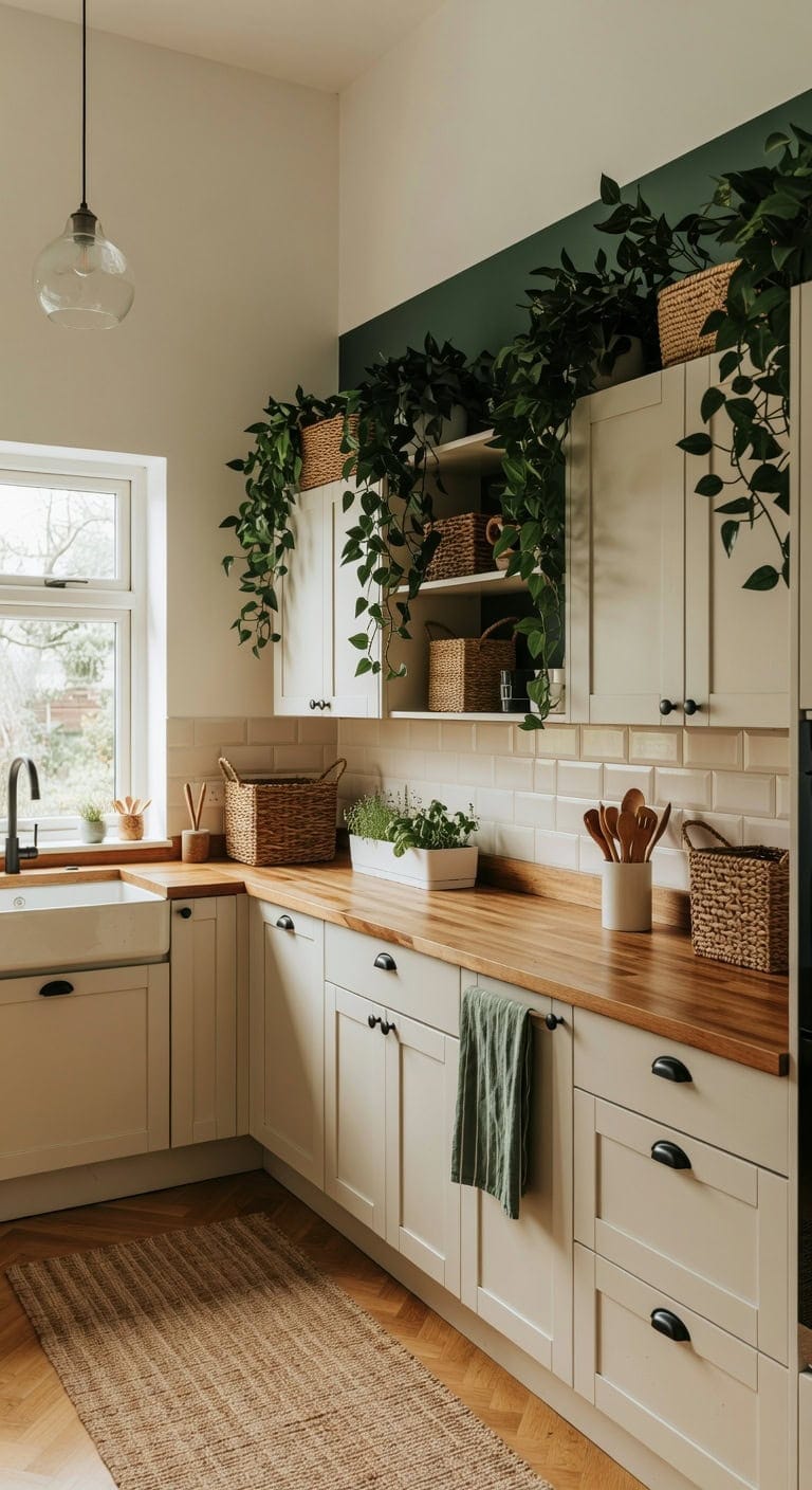
Those lush trailing vines spilling over the top of your cabinets bring a fresh, organic energy that makes the whole kitchen feel alive. Deep forest green leaves draping against warm white cabinetry create a stunning contrast, with woven baskets adding rough texture against smooth painted wood and the soft, leafy movement of each cascading stem. This look is surprisingly easy to pull together with a quick shopping trip.
Shop The Look
 Dplolng 2 Pcs Fake Pothos Vines,Artificial Ivy Garland Greenery Fake Vines for Bedroom Living Room Wall Room Decor Office Wedding Party
View Price
Dplolng 2 Pcs Fake Pothos Vines,Artificial Ivy Garland Greenery Fake Vines for Bedroom Living Room Wall Room Decor Office Wedding Party
View Price
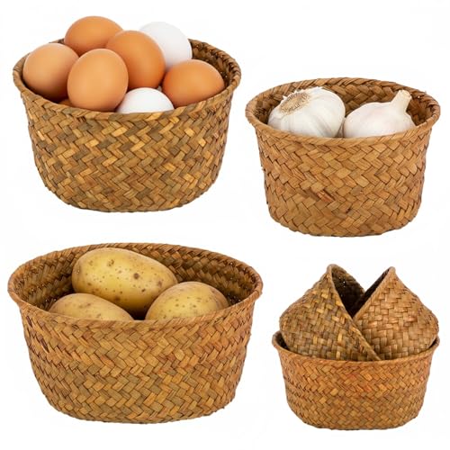 3 Set Small Seagrass Storage Baskets, Natural Woven for Farmhouse Kitchen
View Price
3 Set Small Seagrass Storage Baskets, Natural Woven for Farmhouse Kitchen
View Price
 Ravinte Matte Black Drawer Pulls Cabinet Cup Pulls 3 Inch 10 Pack
View Price
Ravinte Matte Black Drawer Pulls Cabinet Cup Pulls 3 Inch 10 Pack
View Price
 Skelang Clear Lip-less Glass Lamp Shade, Cylindrical Light Cover with Fitter Opening, Replacement for Chandelier, Bathroom Vanity Light, Pendant, 4 Pcs
View Price
Skelang Clear Lip-less Glass Lamp Shade, Cylindrical Light Cover with Fitter Opening, Replacement for Chandelier, Bathroom Vanity Light, Pendant, 4 Pcs
View Price
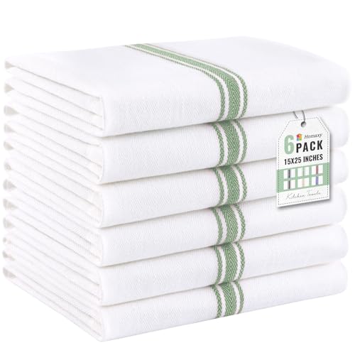 Homaxy 100% Ring Spun Cotton Kitchen Towels 6 Pack, Grass Green Stripe
View Price
Homaxy 100% Ring Spun Cotton Kitchen Towels 6 Pack, Grass Green Stripe
View Price
 LATCHHOOK White utensil holder for Countertop, Glossy White Ceramic Utensil Holder for Kitchen Counter Easy to Clean, Modern Small Cooking Utensil Holder Spatula Crock for Décor, 4.5×6.4 IN
View Price
LATCHHOOK White utensil holder for Countertop, Glossy White Ceramic Utensil Holder for Kitchen Counter Easy to Clean, Modern Small Cooking Utensil Holder Spatula Crock for Décor, 4.5×6.4 IN
View Price
 Barnyard Designs Indoor Herb Garden Planter Pots with Tray Set/3 (White)
View Price
Barnyard Designs Indoor Herb Garden Planter Pots with Tray Set/3 (White)
View Price
Our Favorite Aprons, Potholders and Towels
- Free shipping over $35
- Picked at 4.3 stars or higher
 Damontray 3-Piece Cotton Blend Pot Holder Set
View Price
Damontray 3-Piece Cotton Blend Pot Holder Set
View Price
 KitchenAid Beacon 2-Piece Potholder Set
View Price
KitchenAid Beacon 2-Piece Potholder Set
View Price
 Lavish Home Silicone Pot Holder and Trivet Mat
View Price
Lavish Home Silicone Pot Holder and Trivet Mat
View Price
 Annistyn Cotton Waffle Dish Cloths
View Price
Annistyn Cotton Waffle Dish Cloths
View Price
 Assorted Cotton Waffle Dish Cloths
View Price
Assorted Cotton Waffle Dish Cloths
View Price
 Cerca Windowpane Waffle Dish Cloths
View Price
Cerca Windowpane Waffle Dish Cloths
View Price
 KitchenAid Albany Kitchen Towel 4-Pack
View Price
KitchenAid Albany Kitchen Towel 4-Pack
View Price
 KitchenAid Albany Dishcloth 8-Pack
View Price
KitchenAid Albany Dishcloth 8-Pack
View Price
 T-fal Flat Waffle Kitchen Dishcloth Set
View Price
T-fal Flat Waffle Kitchen Dishcloth Set
View Price
 KitchenAid Asteroid Textured Oven Mitt
View Price
KitchenAid Asteroid Textured Oven Mitt
View Price
 KitchenAid Ribbed Soft Silicone Oven Mitt
View Price
KitchenAid Ribbed Soft Silicone Oven Mitt
View Price
 Damontray 2-Piece Cotton Oven Mitt Set
View Price
Damontray 2-Piece Cotton Oven Mitt Set
View Price
 Solid Color Cotton Chef Apron
View Price
Solid Color Cotton Chef Apron
View Price
 Wolsingham Plaid Cotton Apron Set
View Price
Wolsingham Plaid Cotton Apron Set
View Price
 Zimmerman Striped Cotton Bib Apron
View Price
Zimmerman Striped Cotton Bib Apron
View Price
 Cotton Stripe Tea Towel
View Price
Cotton Stripe Tea Towel
View Price
 KAF Home Popcorn Terry Towels
View Price
KAF Home Popcorn Terry Towels
View Price
 Cotton Waffle Weave Tea Towel
View Price
Cotton Waffle Weave Tea Towel
View Price
DIY Paint Transformation
Upper Walls & Ceiling: Paint in “Glacier White” (Benjamin Moore OC-37), a warm white that mirrors the clean cabinet fronts and gives trailing greenery a bright, airy backdrop to pop against without feeling stark or clinical.
Accent Wall or Open Shelving Back Panel: Paint in “Graystone” (Benjamin Moore 1475), a muted sage-forest green that echoes the cascading foliage above the cabinets and ties the natural, botanical theme seamlessly into the rest of the room.
Best For: Open-concept kitchens with tall ceilings and upper cabinet soffits that need organic warmth and visual height without a full renovation.
Woven Baskets Above Kitchen Cabinets for Textured Storage
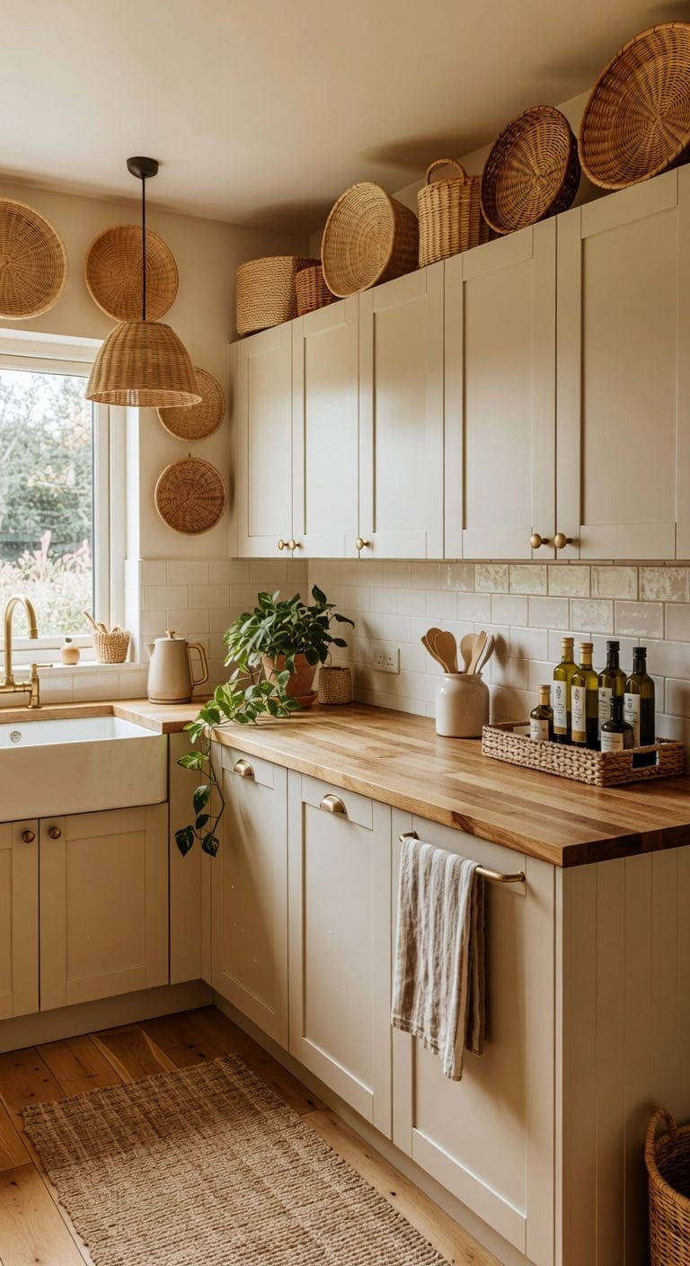
Those woven baskets sitting above your cabinets bring instant warmth that no shelf liner or vase collection can match. Natural tan rattan weaves play beautifully against smooth painted cabinet surfaces and rough linen tea towels draped nearby. The layered texture feels collected over time, not staged overnight. This look works whether your kitchen leans farmhouse, coastal, or boho.
Our Favorite Cooking Utensils
- Free shipping over $35
- Picked at 4.4 stars or higher
 Lux Decor 23-Piece Nylon and Stainless Steel Kitchen Utensil Set
View Price
Lux Decor 23-Piece Nylon and Stainless Steel Kitchen Utensil Set
View Price
 Caraway 5-Piece Wooden Utensil Set
View Price
Caraway 5-Piece Wooden Utensil Set
View Price
 BergHOFF Studio 23-Piece Tub of Cooking Utensils
View Price
BergHOFF Studio 23-Piece Tub of Cooking Utensils
View Price
 Rachael Ray Stainless Steel Bench Scraper
View Price
Rachael Ray Stainless Steel Bench Scraper
View Price
 Henckels Stainless Steel Silicone Tongs
View Price
Henckels Stainless Steel Silicone Tongs
View Price
 Cuisinox Disher Ice Cream Scoop
View Price
Cuisinox Disher Ice Cream Scoop
View Price
 Farberware Professional Ice Cream Scoop
View Price
Farberware Professional Ice Cream Scoop
View Price
 Henckels Stainless Steel Ladle
View Price
Henckels Stainless Steel Ladle
View Price
 Staub Silicone Spatula Spoon with Wood Handle
View Price
Staub Silicone Spatula Spoon with Wood Handle
View Price
 KitchenAid Gourmet Stainless Steel Flex Turner
View Price
KitchenAid Gourmet Stainless Steel Flex Turner
View Price
Shop The Look
 Seagrass Storage Baskets Set of 2 - Round Woven Baskets with Rattan Handles, Large & Small Natural Basket for Blankets, Toys, Laundry, Home Organization (22.66 & 11.92 Gallon Capacity)
View Price
Seagrass Storage Baskets Set of 2 - Round Woven Baskets with Rattan Handles, Large & Small Natural Basket for Blankets, Toys, Laundry, Home Organization (22.66 & 11.92 Gallon Capacity)
View Price
 khtumeware 10 Pack 3" Drawer Pulls Antique Brass Cabinet Cup Pulls Kitchen Hardware Cabinet Handles Drawer Handles Knobs 3 inch Hole Center
View Price
khtumeware 10 Pack 3" Drawer Pulls Antique Brass Cabinet Cup Pulls Kitchen Hardware Cabinet Handles Drawer Handles Knobs 3 inch Hole Center
View Price
 AyshwillDec 3 Pack Wicker Pendant Light Natural Woven Pendant Light Boho Chandelier Light Fixture Dome Rustic Farmhouse Pendant Lights Rattan Light Fixture for Dining Room Kitchen Island (Bulb Incl.)
View Price
AyshwillDec 3 Pack Wicker Pendant Light Natural Woven Pendant Light Boho Chandelier Light Fixture Dome Rustic Farmhouse Pendant Lights Rattan Light Fixture for Dining Room Kitchen Island (Bulb Incl.)
View Price
 Linen Tea Towels for Kitchen Set of 2, 100% Linen, Beige Tea Dish Towel, French Striped, Farmhouse-Style for Washing Dishes, Tan Dishcloth, Stone Wash Hand Towels 18x28
View Price
Linen Tea Towels for Kitchen Set of 2, 100% Linen, Beige Tea Dish Towel, French Striped, Farmhouse-Style for Washing Dishes, Tan Dishcloth, Stone Wash Hand Towels 18x28
View Price
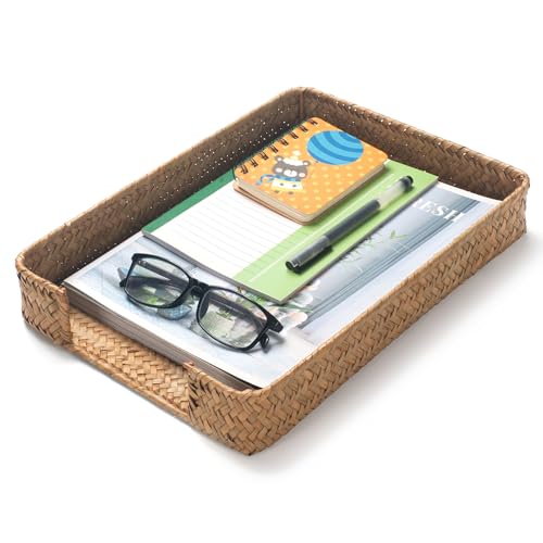 Seagrass Letter Tray, Woven Desk Tray, Wicker Desk Organizer, A4 Paper, Document, File, Mail, Magazine Storage Basket for Office, Classroom, Home Desktop
View Price
Seagrass Letter Tray, Woven Desk Tray, Wicker Desk Organizer, A4 Paper, Document, File, Mail, Magazine Storage Basket for Office, Classroom, Home Desktop
View Price
 LE TAUCI Ceramic Kitchen Utensil Holder- 6.9" Large Cooking Utensil Crock & Organizer for Spatula, Spoon, Whisk - Farmhouse Countertop Storage, Cream Beige, Line
View Price
LE TAUCI Ceramic Kitchen Utensil Holder- 6.9" Large Cooking Utensil Crock & Organizer for Spatula, Spoon, Whisk - Farmhouse Countertop Storage, Cream Beige, Line
View Price
 Evoloop Electric Tea Kettle, 1500W /1.0L Hot Water Boiler Heater Pot, Retro Small Electric Kettle, 100% Stainless Steel BPA Free Electric Teapot, Auto Shut-Off & Boil-Dry Protection(Beige)
View Price
Evoloop Electric Tea Kettle, 1500W /1.0L Hot Water Boiler Heater Pot, Retro Small Electric Kettle, 100% Stainless Steel BPA Free Electric Teapot, Auto Shut-Off & Boil-Dry Protection(Beige)
View Price
DIY Paint Transformation
Cabinet Uppers: Paint in “Glacier White” (Benjamin Moore OC-37) — a creamy warm white that lets the golden tones of woven baskets stand out without competing, giving the whole upper cabinet zone a gallery-like backdrop.
Kitchen Walls: Paint in “Cappuccino” (Benjamin Moore 2096-50) — a soft tan that echoes the natural fiber tones in the basket weave, creating a seamless color flow from wall to cabinet top that makes the textured storage feel intentional and grounded.
Best For: Open-concept kitchens with tall ceilings where the space above cabinets feels empty and needs warmth without visual clutter.
Oversized Pottery and Ceramic Vessels Above Cabinets
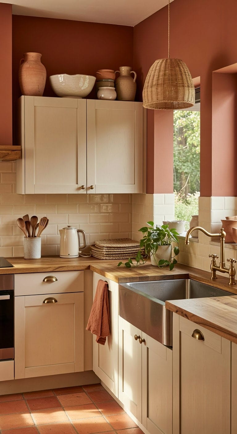
DIY Paint Transformation
Upper walls or soffit area: Paint in “Colonial Brick” (Benjamin Moore 2093-30) — a rich, sun-baked terracotta that echoes the warmth of unglazed pottery and gives the space above cabinets a gallery-like backdrop that makes ceramic vessels pop with intention.
Cabinet faces or surrounding trim: Paint in “Glacier White” (Benjamin Moore OC-37) — a soft, organic cream that mirrors the glazed ceramic vessels and keeps the kitchen feeling open and airy while grounding all that earthy terracotta warmth above.
Best For: Kitchens with at least 12 inches of open space above cabinets where homeowners want a warm, globally inspired look without committing to a full renovation.
Vintage Finds Above Kitchen Cabinets That Tell a Story
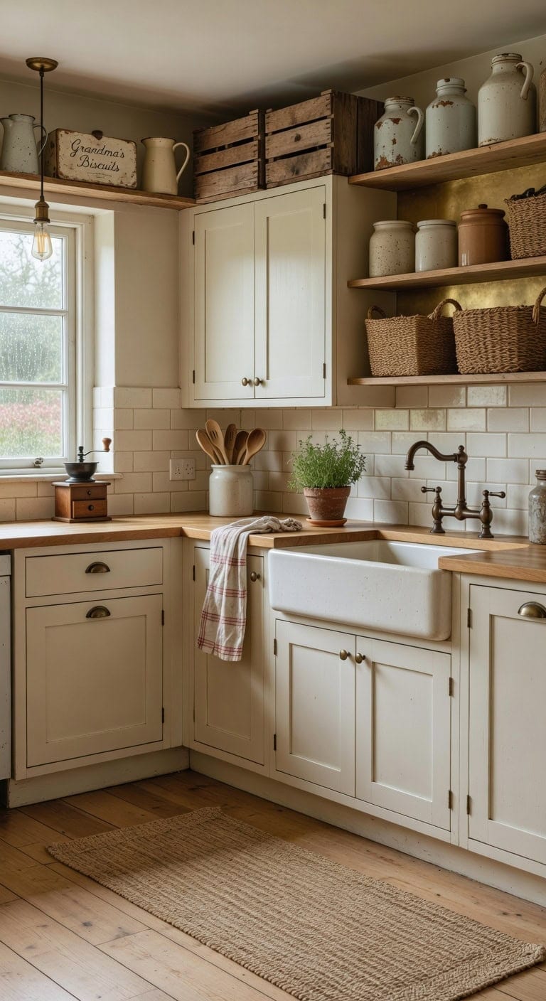
Old milk jugs, weathered wooden crates, and handwritten recipe boxes sitting above your cabinets bring warmth no store-bought set can match. Creamy whites against aged brass finishes create that collected-over-decades look, while the rough texture of chipped enamelware plays beautifully against smooth ceramic crocks and woven basket weave. These pieces spark conversation and make your kitchen feel genuinely lived in.
Shop The Look
 Kamehame Enamel Pitcher Jug, 73oz Enamelware Pitcher with Spout & Handle, Vintage Jug for Iced Tea Water Milk or Flower Vase
View Price
Kamehame Enamel Pitcher Jug, 73oz Enamelware Pitcher with Spout & Handle, Vintage Jug for Iced Tea Water Milk or Flower Vase
View Price
 Household Essentials Seagrass Woven Storage Basket with Handles, Natural
View Price
Household Essentials Seagrass Woven Storage Basket with Handles, Natural
View Price
 Yosoan 1-Light Brass Antique Vintage Edison Kitchen Hanging Pendant Light
View Price
Yosoan 1-Light Brass Antique Vintage Edison Kitchen Hanging Pendant Light
View Price
 Simpli-Magic Flour Sack Kitchen Towels 24"x24" (12 Pack) – 100% Cotton, Lint-Free, High Absorbent Tea Towels – Perfect for Dish, Baking, Crafting
View Price
Simpli-Magic Flour Sack Kitchen Towels 24"x24" (12 Pack) – 100% Cotton, Lint-Free, High Absorbent Tea Towels – Perfect for Dish, Baking, Crafting
View Price
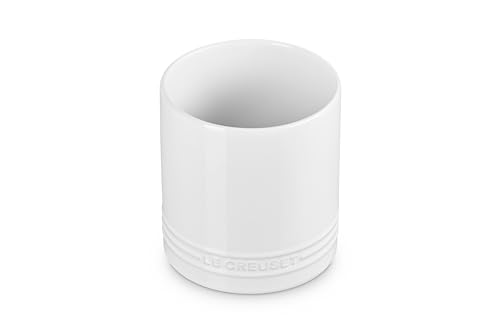 Le Creuset Stoneware Signature Straight Wall Utensil Crock, 1 qt., White
View Price
Le Creuset Stoneware Signature Straight Wall Utensil Crock, 1 qt., White
View Price
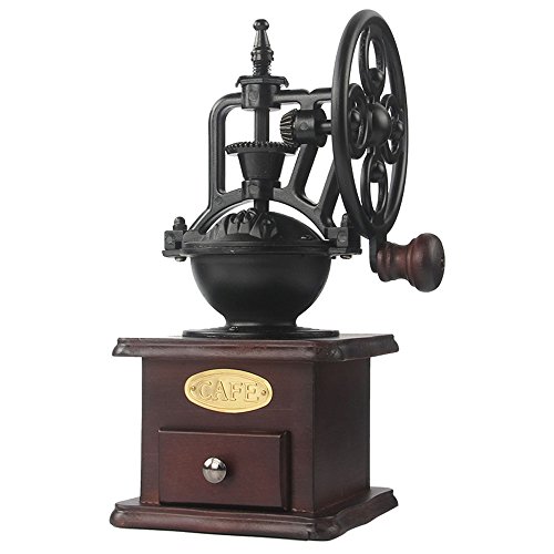 Manual Coffee Grinder Hand Crank
View Price
Manual Coffee Grinder Hand Crank
View Price
DIY Paint Transformation
Cabinet Tops & Trim: Paint in “Swiss Coffee” (Benjamin Moore OC-45) — this warm creamy white sets the perfect backdrop for displaying vintage collections, letting aged patina and character pieces pop without competing for attention.
Wall Behind Open Display: Paint in “Gilded Safari” (Sherwin-Williams SW 9401) — this muted aged brass tone on the wall behind your above-cabinet vignettes adds depth and warmth, mimicking the tarnished metal finishes found on authentic vintage hardware and antique finds.
Best For: Kitchens with traditional or farmhouse bones where the homeowner wants personality-driven decor that feels authentically collected rather than catalog-styled.
Cookbooks and Wooden Cutting Boards on Display
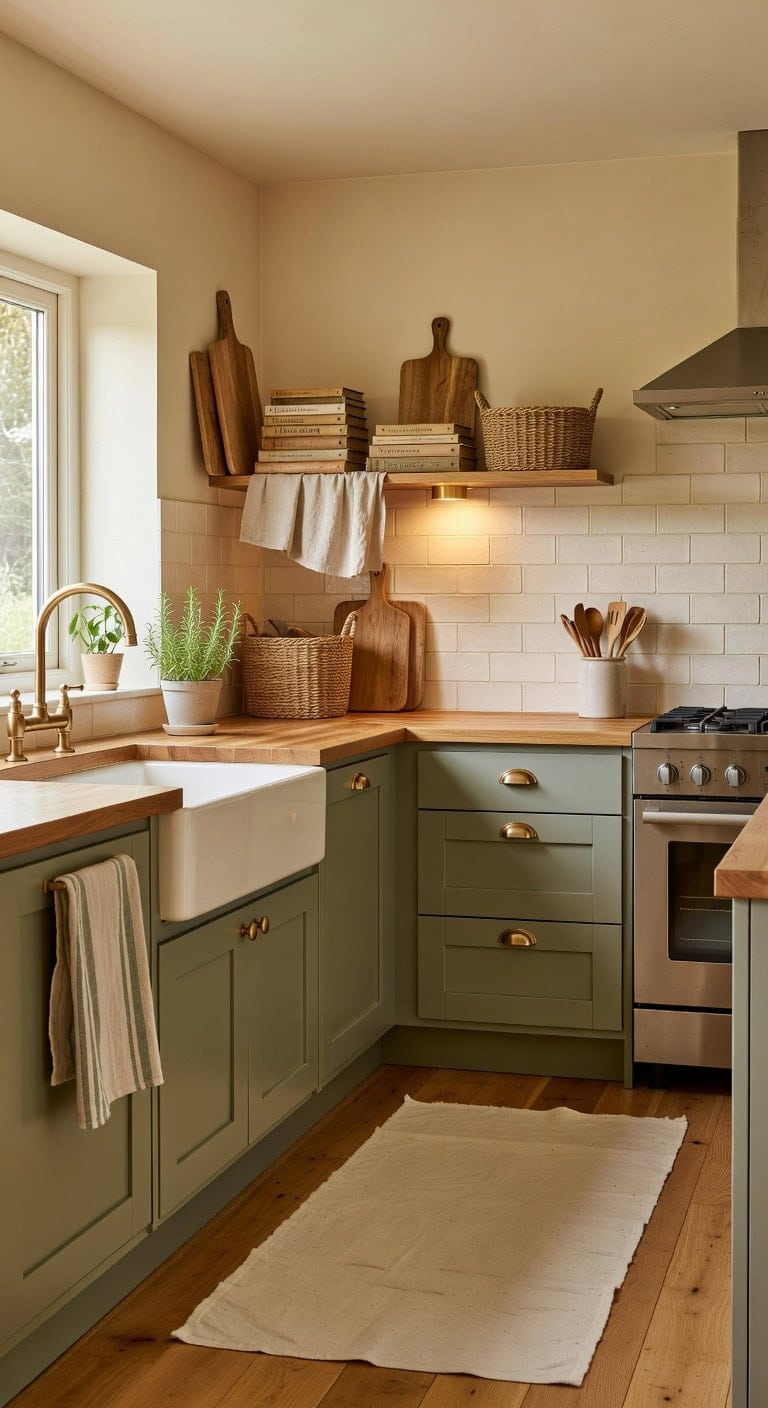
Stacking your favorite cookbooks alongside well-loved wooden cutting boards above the cabinets brings warmth that feels genuinely lived-in. The contrast of creamy paper pages against honey-toned wood grain and maybe a linen cloth underneath creates layered texture that tells your kitchen’s story. This collected-over-time look works beautifully without spending a fortune.
Shop The Look
 Book Cutting Board Set with Stand,3-Piece Real Hardwood Kitchen Boards
View Price
Book Cutting Board Set with Stand,3-Piece Real Hardwood Kitchen Boards
View Price
 Bamboo Cookbook Stand Large, Adjustable Book Holder Tray and Page Paper Clips - Natural Color Large - 4-Position Recipe Book Stand Holds Thick Books for Kitchen Counter, Reading, Studying - Foldable
View Price
Bamboo Cookbook Stand Large, Adjustable Book Holder Tray and Page Paper Clips - Natural Color Large - 4-Position Recipe Book Stand Holds Thick Books for Kitchen Counter, Reading, Studying - Foldable
View Price
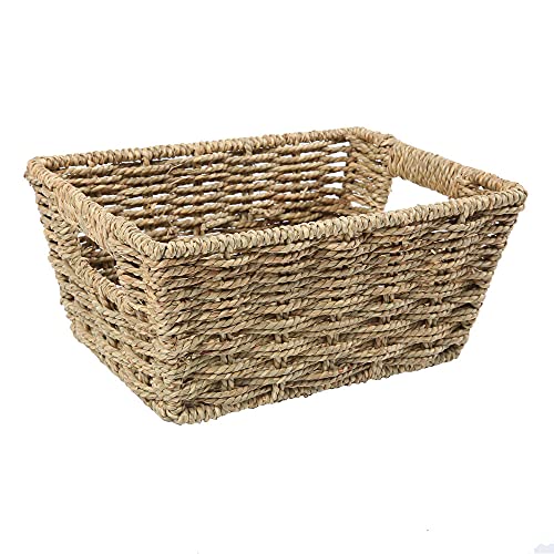 Small Woven Seagrass Storage Basket with Handles, Rectangular Wicker Bin
View Price
Small Woven Seagrass Storage Basket with Handles, Rectangular Wicker Bin
View Price
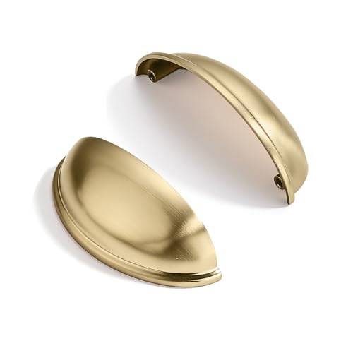 ZAUYX 10 Pack 3" Drawer Pulls Brushed Brass Cabinet Cup Pulls Kitchen Hardware Cabinet Handles Drawer Handles Knobs 3 inch Hole Center
View Price
ZAUYX 10 Pack 3" Drawer Pulls Brushed Brass Cabinet Cup Pulls Kitchen Hardware Cabinet Handles Drawer Handles Knobs 3 inch Hole Center
View Price
 Bumble Kitchen Towels 6 Pack 100% Cotton Dish Towels, 16"x26" - Blue
View Price
Bumble Kitchen Towels 6 Pack 100% Cotton Dish Towels, 16"x26" - Blue
View Price
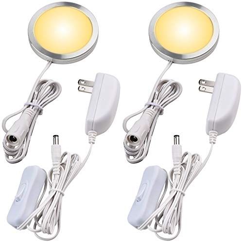 Lvyinyin Single LED Kitchen Under Cabinet Puck Light, 120V Direct Wall Plug in Closet Cupboard Night Light, Easy to Mount, Inline On Off Switch, White Wires, 2 Packs, Warm White
View Price
Lvyinyin Single LED Kitchen Under Cabinet Puck Light, 120V Direct Wall Plug in Closet Cupboard Night Light, Easy to Mount, Inline On Off Switch, White Wires, 2 Packs, Warm White
View Price
 Tastes Round Wood Digital Kitchen Scale, up to 5KG, with All Units and Decorative Design
View Price
Tastes Round Wood Digital Kitchen Scale, up to 5KG, with All Units and Decorative Design
View Price
DIY Paint Transformation
The wall color behind your cookbook and cutting board display matters — it either lets those warm wood tones pop or washes them out entirely. Choosing the right backdrop pulls this whole collected, homey arrangement together.
Above-cabinet wall area: Paint in “Glacier White” (Benjamin Moore OC-37), a soft creamy white that mimics the aged pages of well-thumbed cookbooks and gives wooden pieces a clean backdrop to shine against without feeling stark or cold.
Cabinet tops or display shelf surface: Paint in “Roasted Sesame Seed” (Benjamin Moore 2160-40), a golden wood-inspired tone that ties directly into the cutting board grain, blending seamlessly so the whole arrangement looks intentional rather than placed on mismatched surfaces.
Best For: Traditional or farmhouse kitchens where everyday cooking tools double as meaningful, character-rich decor above the cabinets.
Matching Glass Jars for a Polished, Put-Together Look
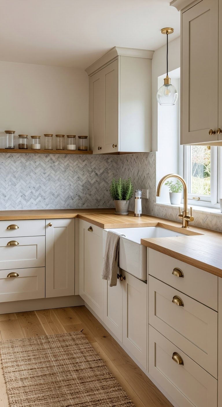
Clear glass and warm wood tones create a kitchen display that feels intentional without trying too hard. Lining up matching glass jars above your cabinets brings smooth, transparent surfaces together with the grain of natural shelving and the soft matte finish of painted cabinet tops. It’s the kind of simple upgrade that makes the whole room look like you planned every detail — even if you pulled it together on a Saturday afternoon.
Shop The Look
 Elements Clear Glass Apothecary Jar Set of 3 with Lids
View Price
Elements Clear Glass Apothecary Jar Set of 3 with Lids
View Price
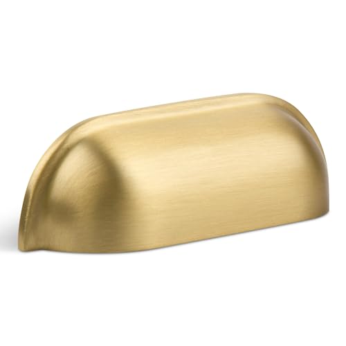 SALISENG-Brushed Matt Gold Cup Kitchen Drawer Pulls 2 Pack, 2-1/2 Inch Small Solid Brass Knobs for Cabinet Cupboard Wardrobe, Flat Dresser Vanity Door Handles, Brass Furniture Hardware Pull
View Price
SALISENG-Brushed Matt Gold Cup Kitchen Drawer Pulls 2 Pack, 2-1/2 Inch Small Solid Brass Knobs for Cabinet Cupboard Wardrobe, Flat Dresser Vanity Door Handles, Brass Furniture Hardware Pull
View Price
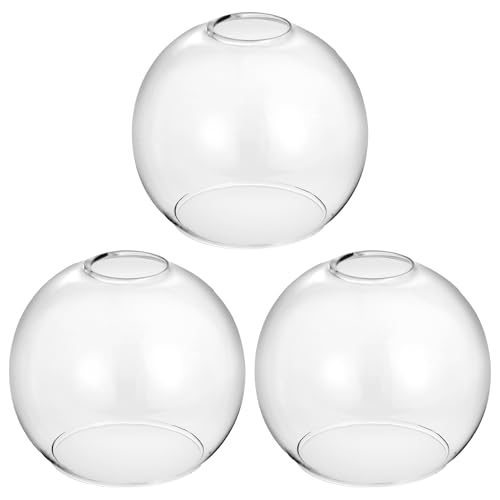 3 Pack Clear Glass Shade Replacements, 1.65 in Fitter 5.1 in Height 5.9 in Diameter Globe Glass Lamp Shade Covers for Light Fixtures, Lampshades for Chandelier Pendant Lights Wall Sconces
View Price
3 Pack Clear Glass Shade Replacements, 1.65 in Fitter 5.1 in Height 5.9 in Diameter Globe Glass Lamp Shade Covers for Light Fixtures, Lampshades for Chandelier Pendant Lights Wall Sconces
View Price
 LANE LINEN 100% Cotton Dish Towels for Kitchen Absorbent Lint-Free 12 Pack
View Price
LANE LINEN 100% Cotton Dish Towels for Kitchen Absorbent Lint-Free 12 Pack
View Price
 Vtopmart Glass Food Storage Jars, 7 Pack Kitchen Containers with Airtight Bamboo Wooden Lids for Pasta, Cookies, Nuts, Coffee Beans, Cereal, Canisters Set for Flour, Pantry Organization, BPA Free
View Price
Vtopmart Glass Food Storage Jars, 7 Pack Kitchen Containers with Airtight Bamboo Wooden Lids for Pasta, Cookies, Nuts, Coffee Beans, Cereal, Canisters Set for Flour, Pantry Organization, BPA Free
View Price
 Aroma Housewares Mini Coffee Grinder and Electric Herb Grinder with 304 Stainless Steel Grinding Blades and a Premium Clear Lid (40 g.), White
View Price
Aroma Housewares Mini Coffee Grinder and Electric Herb Grinder with 304 Stainless Steel Grinding Blades and a Premium Clear Lid (40 g.), White
View Price
 MiLiViNG Tiered Wooden Display Riser Stand, Coffee Stand, Spice rack shelf
View Price
MiLiViNG Tiered Wooden Display Riser Stand, Coffee Stand, Spice rack shelf
View Price
DIY Paint Transformation
Above-Cabinet Wall Area: Paint in “Simply White” (Benjamin Moore OC-117) — this crisp, clean white backdrop lets your glass jar collection shine without competing for attention, keeping the focus on those beautiful transparent silhouettes lined up in a row.
Cabinet Top Surface: Paint in “Sharon Rose” (Benjamin Moore 039) — this soft glass-inspired tone on the cabinet tops echoes the transparency of your jar collection, creating a seamless visual flow that ties the display together from base to wall.
Best For: Kitchens with open soffits or generous gaps above upper cabinets where a curated, uniform display can replace visual clutter and make the room feel polished and purposeful.
Art and Framed Prints Leaned Above Kitchen Cabinets
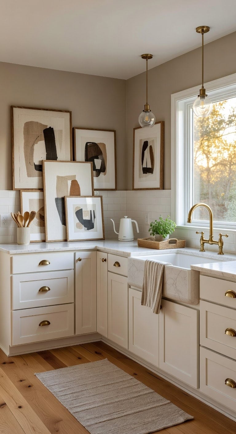
Leaning oversized art and framed prints against the wall above your cabinets instantly adds personality without a single nail hole. The mix of linen-textured matting against smooth wooden frames and matte painted walls creates layered depth that feels collected, not decorated. This casual gallery approach works beautifully in transitional and modern farmhouse kitchens where you want warmth without fuss. It’s the kind of effortless styling that makes a kitchen feel like home.
Shop The Look
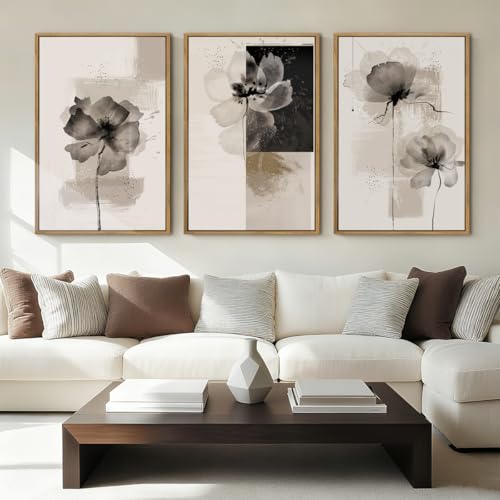 IARTTOP Large Framed Neutral Abstract Wall Art 24x36 Inch Oversized Modern Beige Gray Floral Canvas Wall Decor Minimalist White Flower Art Prints for Living Room Bedroom Set of 3
View Price
IARTTOP Large Framed Neutral Abstract Wall Art 24x36 Inch Oversized Modern Beige Gray Floral Canvas Wall Decor Minimalist White Flower Art Prints for Living Room Bedroom Set of 3
View Price
 ZeeMart Burlap Style Farmhouse Table Runner, 14x72 Inches Warm Beige/Brown
View Price
ZeeMart Burlap Style Farmhouse Table Runner, 14x72 Inches Warm Beige/Brown
View Price
 Rustic Utensil Holder for Kitchen Countertop - 7.6 inch Ceramic Utensil Crock Farmhouse Cooking Utensil Organizer for Spatula, Spoon (M-Rustic)
View Price
Rustic Utensil Holder for Kitchen Countertop - 7.6 inch Ceramic Utensil Crock Farmhouse Cooking Utensil Organizer for Spatula, Spoon (M-Rustic)
View Price
 Bumble Kitchen Towels 6 Pack 100% Cotton Dish Towels, 16"x26" - Tan
View Price
Bumble Kitchen Towels 6 Pack 100% Cotton Dish Towels, 16"x26" - Tan
View Price
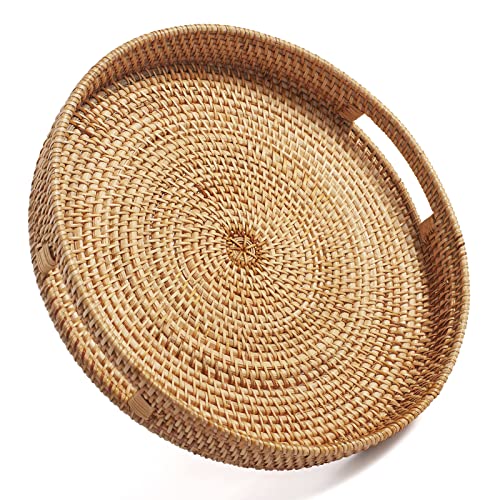 Round Rattan Serving Tray Decorative Woven Ottoman Trays with Handles for Coffee Table Natural (Small 11.8 inch x 2 inch)
View Price
Round Rattan Serving Tray Decorative Woven Ottoman Trays with Handles for Coffee Table Natural (Small 11.8 inch x 2 inch)
View Price
 INK+IVY Auburn Pendant Lighting for Dining Room, Industrial Kitchen Lights, Hand-blown Glass Bell Shaped Pendant Light for Kitchen Island, Foyer, Bedroom, 9" Dia x 95.5" H, Gold/Clear
View Price
INK+IVY Auburn Pendant Lighting for Dining Room, Industrial Kitchen Lights, Hand-blown Glass Bell Shaped Pendant Light for Kitchen Island, Foyer, Bedroom, 9" Dia x 95.5" H, Gold/Clear
View Price
 Nueve&Five Electric Gooseneck Kettle with Thermometer, 1.0L Pour Over Hot Water Kettle for Coffee and Tea, 1000W, Auto Shutoff, Boil-Dry Protection, White
View Price
Nueve&Five Electric Gooseneck Kettle with Thermometer, 1.0L Pour Over Hot Water Kettle for Coffee and Tea, 1000W, Auto Shutoff, Boil-Dry Protection, White
View Price
DIY Paint Transformation
Cabinets: Paint in “Simply White” (Benjamin Moore OC-117) — a clean, versatile white that lets your leaned artwork become the true focal point above the cabinet line without competing for attention.
Walls: Paint in “Revere Pewter” (Benjamin Moore HC-172) — a warm greige tone that acts as a soft backdrop behind framed prints, giving depth to the space while keeping everything feeling grounded and cohesive.
Best For: Mid-sized kitchens with open soffits or generous gaps above the cabinets where leaned art can sit securely and be admired from the primary living areas.
Crown Molding That Closes the Gap Entirely
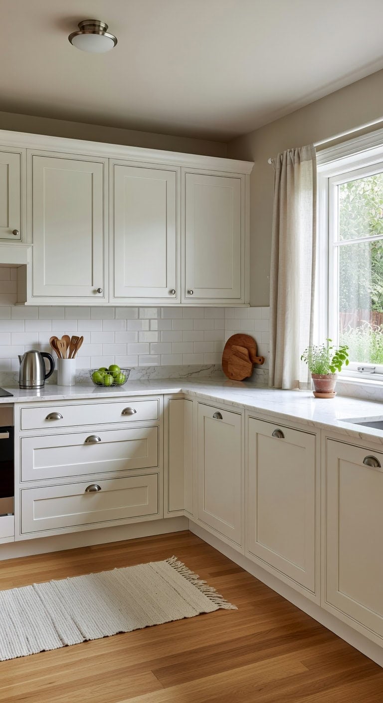
That awkward open space above your cabinets collects dust and looks unfinished — crown molding eliminates it completely. Creamy white molding against soft greige walls creates a seamless, built-in look where smooth painted trim meets the subtle grain of wood cabinetry. This polished detail makes even basic kitchens feel custom and intentional.
Shop The Look
 HOMOTEK 6 Pack 3 Inch Hole Centers Shiny Bright Brushed Satin Nickel Drawer Bin Cup Pulls Dresser Pulls for Cabinets,Furniture Handles,Kitchen Cabinet Hardware
View Price
HOMOTEK 6 Pack 3 Inch Hole Centers Shiny Bright Brushed Satin Nickel Drawer Bin Cup Pulls Dresser Pulls for Cabinets,Furniture Handles,Kitchen Cabinet Hardware
View Price
 hykolity 13 inch Flush Mount LED Ceiling Light Fixture,5CCT
View Price
hykolity 13 inch Flush Mount LED Ceiling Light Fixture,5CCT
View Price
 White Ceramic Utensil Holder with Handle, 6.5" Rustic Countertop Crock
View Price
White Ceramic Utensil Holder with Handle, 6.5" Rustic Countertop Crock
View Price
 jinchan Tier Curtains Rod Pocket 26x20 2 Panels Crude Linen
View Price
jinchan Tier Curtains Rod Pocket 26x20 2 Panels Crude Linen
View Price
 Acacia Wood Cutting Board and Chopping Board with Handle for Meat, Cheese Board, Vegetables, Bread, and Charcuterie - Decorative Wooden Serving Board for Kitchen and Dining Room, Large 17" x 13"
View Price
Acacia Wood Cutting Board and Chopping Board with Handle for Meat, Cheese Board, Vegetables, Bread, and Charcuterie - Decorative Wooden Serving Board for Kitchen and Dining Room, Large 17" x 13"
View Price
 Cuisinart Electric Kettle, Stainless Steel Interior, One-Touch, 1 Liter
View Price
Cuisinart Electric Kettle, Stainless Steel Interior, One-Touch, 1 Liter
View Price
 Sevenblue 2-Tier Fruit Basket with Banana Hangers, Detachable Metal Bowl
View Price
Sevenblue 2-Tier Fruit Basket with Banana Hangers, Detachable Metal Bowl
View Price
DIY Paint Transformation
Walls: Paint in “Mocha Cream” (Benjamin Moore 995) — this warm greige creates a sophisticated neutral backdrop that pairs beautifully with white crown molding and cabinetry, adding depth without competing with architectural trim details.
Cabinets & Crown Molding: Paint in “Simply White” (Benjamin Moore OC-117) — a creamy white with just enough warmth to avoid looking sterile, this shade unifies cabinet faces and crown molding into one seamless surface that looks professionally installed.
Best For: Kitchens with standard-height cabinets and a visible gap below the ceiling where dust collects and the space feels unfinished or builder-grade.
Ceiling-Height Cabinets That Erase the Gap
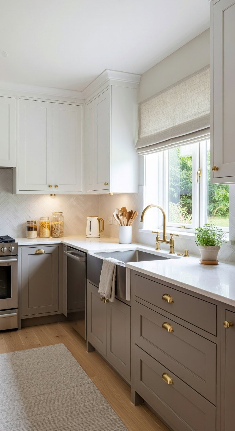
Stretching your cabinets all the way to the ceiling instantly makes a kitchen feel taller, cleaner, and more intentional. Smooth white uppers meet warm wood-toned lowers, creating a crisp contrast against brushed brass pulls and linen-textured Roman shades. The result is a streamlined look that eliminates that awkward dust-collecting shelf above the cabinets entirely.
Shop The Look
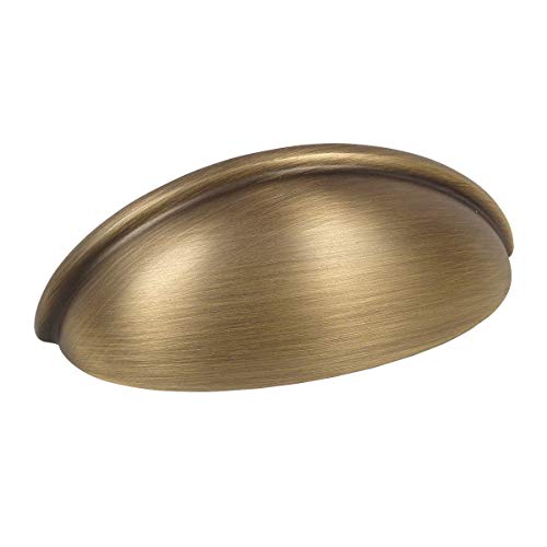 Cosmas 10 Pack 783BAB Brushed Antique Brass Cup Pull 3 Inch Hole Centers
View Price
Cosmas 10 Pack 783BAB Brushed Antique Brass Cup Pull 3 Inch Hole Centers
View Price
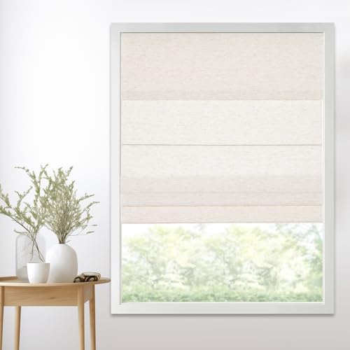 Persilux Light Filtering Roman Shades,Linen Fabric,Cream,Custom Size
View Price
Persilux Light Filtering Roman Shades,Linen Fabric,Cream,Custom Size
View Price
 LE TAUCI Ceramic Kitchen Utensil Holder for Counter, 7.3/5.4", White
View Price
LE TAUCI Ceramic Kitchen Utensil Holder for Counter, 7.3/5.4", White
View Price
 KOZYFLY Boho Runners for Hallways 2x6 ft Washable Kitchen Runner Non Slip Rubber Backed Hall Runners Cotton Entryway Runner Rugs for Indoor Backdoor Bedroom Kitchen, Orange Beige/Tan/Brown
View Price
KOZYFLY Boho Runners for Hallways 2x6 ft Washable Kitchen Runner Non Slip Rubber Backed Hall Runners Cotton Entryway Runner Rugs for Indoor Backdoor Bedroom Kitchen, Orange Beige/Tan/Brown
View Price
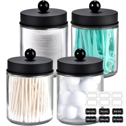 Amolliar Glass Apothecary Jar Qtip Holder Metal Lids 4pc/Black
View Price
Amolliar Glass Apothecary Jar Qtip Holder Metal Lids 4pc/Black
View Price
 BLESSINGLUX 6pack LED Puck Light Kit, 2700-6000K Smart Round Under Cabinet Lighting with APP Control, Compatible with Alexa, Google Assistant, for Under Counter, Kitchen (Gold)
View Price
BLESSINGLUX 6pack LED Puck Light Kit, 2700-6000K Smart Round Under Cabinet Lighting with APP Control, Compatible with Alexa, Google Assistant, for Under Counter, Kitchen (Gold)
View Price
 Premium Kitchen Towels 6 Pack 100% Cotton, 20"x28" Dish Towels - Tan
View Price
Premium Kitchen Towels 6 Pack 100% Cotton, 20"x28" Dish Towels - Tan
View Price
 OVENTE 1.7L Electric Tea Kettle, Fast Boiling Water Heater, White KP72W
View Price
OVENTE 1.7L Electric Tea Kettle, Fast Boiling Water Heater, White KP72W
View Price
DIY Paint Transformation
Upper Cabinets & Ceiling: Paint in “Simply White” (Benjamin Moore OC-117) — a clean, true white that carries the eye upward without interruption, making ceiling-height cabinets feel seamless and architectural against the ceiling line.
Lower Cabinets or Island Base: Paint in “Ashley Gray” (Benjamin Moore HC-87) — a sophisticated warm wood-inspired gray-brown tone that grounds the kitchen, adding natural depth beneath those tall white uppers and complementing brushed brass hardware beautifully.
Best For: Kitchens with standard 8- to 9-foot ceilings where homeowners want a built-in, custom look without a full renovation.
Shiplap or Board and Batten Behind the Cabinets
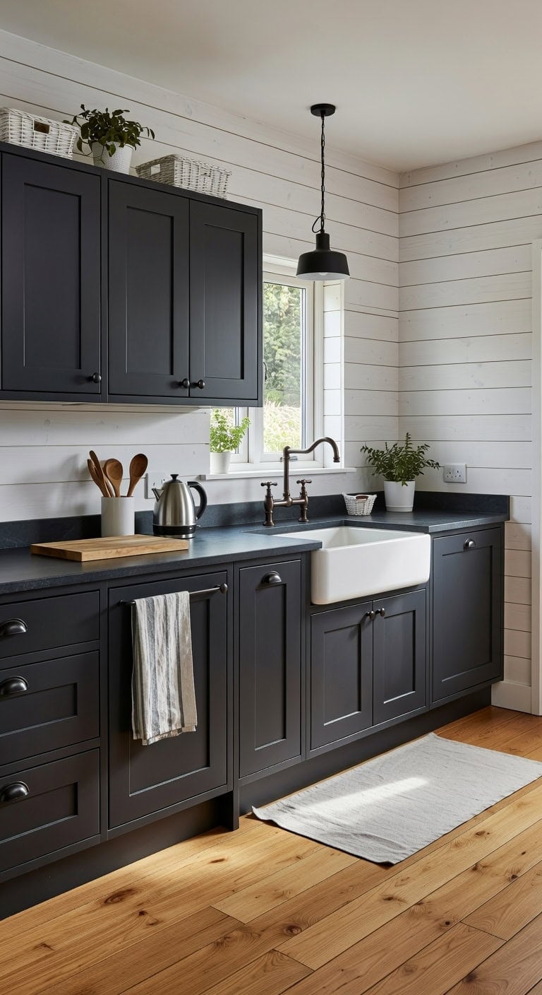
Adding white shiplap or board and batten paneling behind your upper cabinets instantly creates depth and cottage-style charm that feels collected, not catalog-perfect. The interplay of painted wood grain texture against smooth cabinet fronts and woven basket fibers gives your kitchen that layered, lived-in warmth every room deserves.
Shop The Look
 Plastic Storage Baskets 6 Pack Sturdy Storage Organizer Basket Woven Plastic Storage Bins for Shelves,Closet,Countertops, Desktops, Cabinets and Badrooms,Saving Storage, Stylish Design,White
View Price
Plastic Storage Baskets 6 Pack Sturdy Storage Organizer Basket Woven Plastic Storage Bins for Shelves,Closet,Countertops, Desktops, Cabinets and Badrooms,Saving Storage, Stylish Design,White
View Price
 JOY DECOR Matte Black Cabinet Pulls, Cabinet Handles, 5 Inch, 10 Pack
View Price
JOY DECOR Matte Black Cabinet Pulls, Cabinet Handles, 5 Inch, 10 Pack
View Price
 Cotton Dish Towels For Kitchen Drying - Highly Absorbent Wide Beige Striped Plaid Tea Towels - 18"X28" Set Of 6 Farmhouse Linen Dishtowels In Bulk - Pano De Prato Para Cozinha - T Towles Towls
View Price
Cotton Dish Towels For Kitchen Drying - Highly Absorbent Wide Beige Striped Plaid Tea Towels - 18"X28" Set Of 6 Farmhouse Linen Dishtowels In Bulk - Pano De Prato Para Cozinha - T Towles Towls
View Price
 Small Acacia Wood Cutting Board with Handle, 13x7 Charcuterie Serving Tray
View Price
Small Acacia Wood Cutting Board with Handle, 13x7 Charcuterie Serving Tray
View Price
 SESIMENT Farmhouse Pendant Lighting for Kitchen Island,Black and Gold Dome Pendant Light Fixtures, Industrial Hanging Ceiling Light for Dining Room Foyer Cafe Kitchen Sink,2 Pack
View Price
SESIMENT Farmhouse Pendant Lighting for Kitchen Island,Black and Gold Dome Pendant Light Fixtures, Industrial Hanging Ceiling Light for Dining Room Foyer Cafe Kitchen Sink,2 Pack
View Price
 KOZYFLY Runners for Hallways 2x6 ft Washable Kitchen Runner Non Slip Rubber Backed Hall Runners Cotton Entryway Runner Rugs for Indoor Backdoor Bedroom Kitchen, Oatmeal Beige
View Price
KOZYFLY Runners for Hallways 2x6 ft Washable Kitchen Runner Non Slip Rubber Backed Hall Runners Cotton Entryway Runner Rugs for Indoor Backdoor Bedroom Kitchen, Oatmeal Beige
View Price
 Barnyard Designs Ceramic Kitchen Utensil Holder Countertop 6.75″ (White)
View Price
Barnyard Designs Ceramic Kitchen Utensil Holder Countertop 6.75″ (White)
View Price
 Cosori Stainless Steel Electric Kettle, No Plastic Contact with Water, 1.7L
View Price
Cosori Stainless Steel Electric Kettle, No Plastic Contact with Water, 1.7L
View Price
DIY Paint Transformation
Shiplap or Board and Batten Paneling: Paint in “Simply White” (Benjamin Moore OC-117) — a clean, warm white that highlights every groove and shadow line in the planking, giving the wall behind your cabinets architectural dimension without competing with what sits on the shelves.
Cabinet Frames and Trim: Paint in “Wrought Iron” (Benjamin Moore 2124-10) — a rich, almost-black charcoal that grounds the airy paneling and makes hardware pop, creating that classic contrast between dark cabinetry and bright textured walls that feels both modern farmhouse and timeless.
Best For: Cottage, farmhouse, or coastal kitchens where you want the soffit space to feel intentional and architecturally finished rather than like wasted empty wall.
Bold Wallpaper in the Space Above Kitchen Cabinets
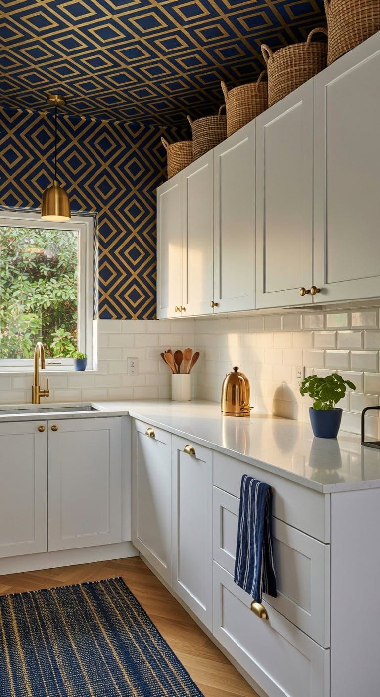
That awkward gap between your cabinet tops and ceiling is actually prime real estate for personality. A bold wallpaper in rich navy and gold transforms dead space into a dramatic focal point, letting patterned paper play against smooth cabinet surfaces and woven basket textures. It’s a small project with seriously big impact.
Shop The Look
 FunStick Geometric Peel and Stick Wallpaper Modern Navy Blue and White Wallpaper for Bathroom Walls Waterproof Blue White Contact Paper for Cabinets Drawers Removable Leaf Line Wall Paper 17.5"x118"
View Price
FunStick Geometric Peel and Stick Wallpaper Modern Navy Blue and White Wallpaper for Bathroom Walls Waterproof Blue White Contact Paper for Cabinets Drawers Removable Leaf Line Wall Paper 17.5"x118"
View Price
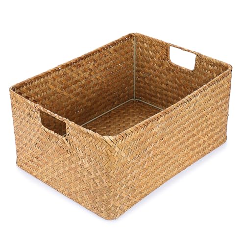 Hipiwe Seagrass Storage Baskets Bin for Shelf, X-Large Woven Wicker Basket
View Price
Hipiwe Seagrass Storage Baskets Bin for Shelf, X-Large Woven Wicker Basket
View Price
 KLSS Brass Pendant Lights Kitchen Island,Modern Farmhouse Clear Glass Pendant Light,Gold Light Fixture Kitchen Pendant Mini Hanging Light Fixture for Sink (Brass 2 Pack stem Rod)
View Price
KLSS Brass Pendant Lights Kitchen Island,Modern Farmhouse Clear Glass Pendant Light,Gold Light Fixture Kitchen Pendant Mini Hanging Light Fixture for Sink (Brass 2 Pack stem Rod)
View Price
 Premium Kitchen Towels 6 Pack 100% Cotton 20"x28" Dish Towels Navy Striped
View Price
Premium Kitchen Towels 6 Pack 100% Cotton 20"x28" Dish Towels Navy Striped
View Price
 ABRUTY Utensil Holder, 6.7" Ceramic Kitchen Utensil Crock for Countertop Cooking, Modern Utensil Caddy Jar Organizer for Farmhouse Kitchen Counter Decor (White)
View Price
ABRUTY Utensil Holder, 6.7" Ceramic Kitchen Utensil Crock for Countertop Cooking, Modern Utensil Caddy Jar Organizer for Farmhouse Kitchen Counter Decor (White)
View Price
 Maples Rugs Blooming Damask Floral Print Runner Rug, 2' x 6', Navy/Gold
View Price
Maples Rugs Blooming Damask Floral Print Runner Rug, 2' x 6', Navy/Gold
View Price
 Aigostar Small Electric Kettle, 1L Portable, 1100W, Brown
View Price
Aigostar Small Electric Kettle, 1L Portable, 1100W, Brown
View Price
DIY Paint Transformation
Upper Wall / Soffit Area: Paint in “North Sea” (Benjamin Moore CC-932) — a saturated navy that grounds the space and lets bold wallpaper patterns feel intentional rather than random, creating a seamless interplay from cabinet top to ceiling.
Cabinet Trim or Crown Molding: Paint in “Hidden Oaks” (Benjamin Moore 1129) — a warm golden tone that frames the wallpapered section with subtle richness, echoing metallic accents in the paper and pulling hardware details upward to connect the whole look.
Best For: Kitchens with at least 12 inches of open space above cabinets where standard soffits or crown molding feel too plain and the homeowner wants character without a full renovation.
LED Strip Lights for a Warm Ambient Glow
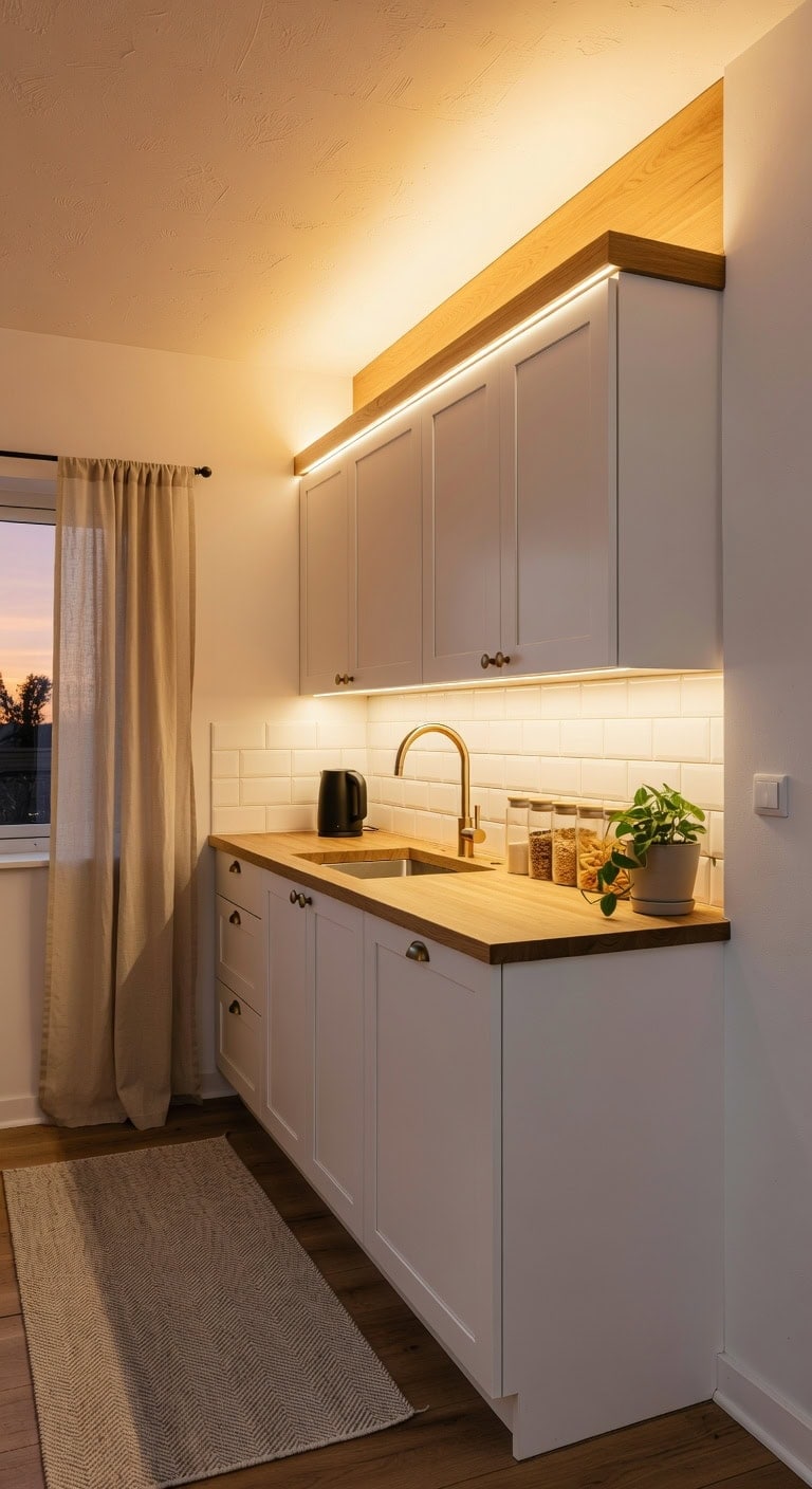
That dead space above your kitchen cabinets suddenly comes alive when you tuck warm-toned LED strip lights along the top edge. The soft glow bounces off textured ceiling plaster and smooth cabinet surfaces, creating depth you never knew your kitchen had. Pair that warm light against clean white cabinetry and natural wood grain accents for an effect that feels cozy yet modern.
Shop The Look
 10 Ft LED Strip Lights, 24V Dual White & Warm White LED Strip Light Kit, Tunable 3000K-6000K with Dimming & Color Temperature Adjustment for Bedroom, Mirror, Home Lighting
View Price
10 Ft LED Strip Lights, 24V Dual White & Warm White LED Strip Light Kit, Tunable 3000K-6000K with Dimming & Color Temperature Adjustment for Bedroom, Mirror, Home Lighting
View Price
 Muzata 6Pack 3.3FT Silver LED Strip Channel with Milky Diffuser U1SW WW
View Price
Muzata 6Pack 3.3FT Silver LED Strip Channel with Milky Diffuser U1SW WW
View Price
 BTF-LIGHTING Mini RF Dimmer Controller 14 Keys for FCOB 3014 5630 5730 3528 Strip Lights DC5V/DC12V/DC24V Brightness Mode Effect Mode Wireless LED Dimmer Controller(Single Color)
View Price
BTF-LIGHTING Mini RF Dimmer Controller 14 Keys for FCOB 3014 5630 5730 3528 Strip Lights DC5V/DC12V/DC24V Brightness Mode Effect Mode Wireless LED Dimmer Controller(Single Color)
View Price
 Ramanta Home Hand Woven Cotton Chindi Rag Rug 2'x6' - Multi
View Price
Ramanta Home Hand Woven Cotton Chindi Rag Rug 2'x6' - Multi
View Price
 Style Setter Clear Glass Kitchen Canister Set, Retro Design 3PC, 34-54oz
View Price
Style Setter Clear Glass Kitchen Canister Set, Retro Design 3PC, 34-54oz
View Price
 Chyhomenyc Natural Blend Linen Curtains 30 Inch Length, 2 Panels
View Price
Chyhomenyc Natural Blend Linen Curtains 30 Inch Length, 2 Panels
View Price
 RHD 0.5L Small Portable Electric Kettle, 600W Stainless Steel Travel Kettle
View Price
RHD 0.5L Small Portable Electric Kettle, 600W Stainless Steel Travel Kettle
View Price
DIY Paint Transformation
Above-Cabinet Wall Area: Paint in “Simply White” (Benjamin Moore OC-117) — this crisp, clean backdrop maximizes the warm LED glow bouncing off the wall surface, making the light feel richer and more intentional without competing with the ambient warmth.
Cabinet Top Surface: Paint in “Cowboy Boots” (Benjamin Moore 1015) — this soft, warm-toned hue on the narrow ledge above your cabinets mirrors the golden tone of the LED strips, blending seamlessly so the light source disappears and only the cozy glow remains visible.
Best For: Kitchens with soffits or deep gaps above upper cabinets where overhead lighting creates shadows and the space feels flat or forgotten after dark.
A Curated Wine Bottle or Spirits Display Above Cabinets
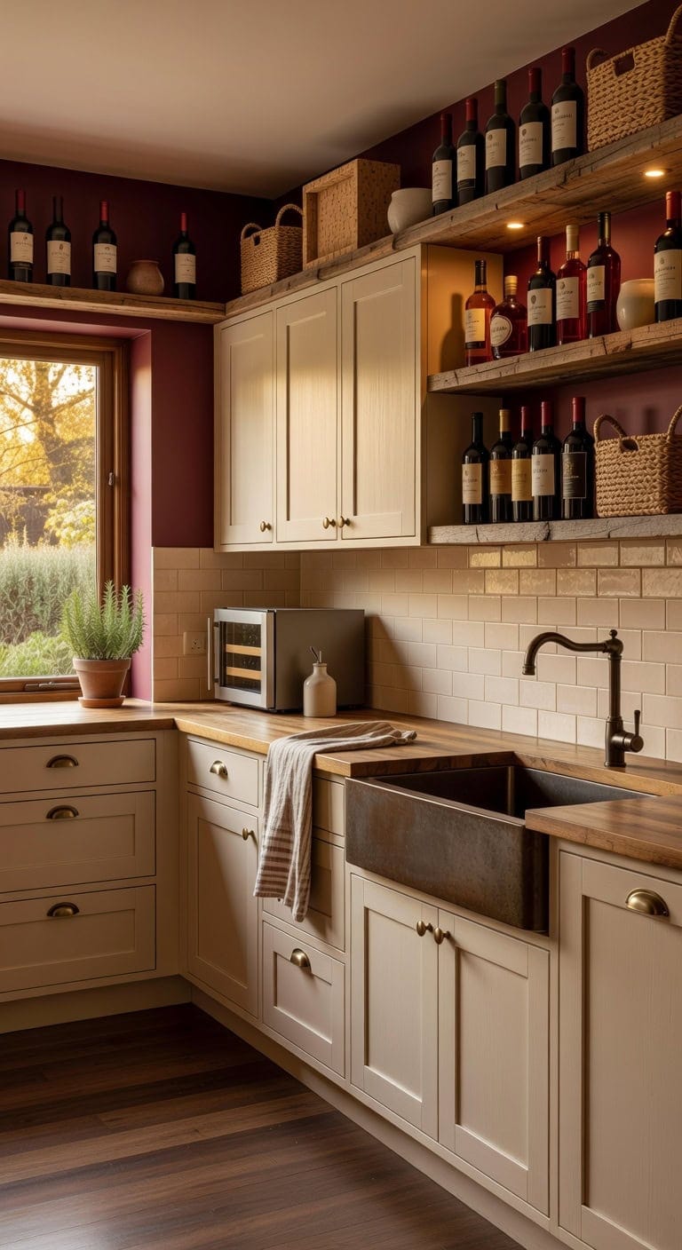
That awkward gap above your kitchen cabinets is practically begging to become your personal wine bar. Deep burgundy bottles against warm wood tones and brushed metal accents create a collected, grown-up look that feels intentional rather than cluttered. Woven basket textures, smooth glass, and matte ceramic pieces round out the display with effortless character.
Shop The Look
 SODUKU Rustic Wood Countertop Wine Rack 6 Bottles No Need Assembly Brown
View Price
SODUKU Rustic Wood Countertop Wine Rack 6 Bottles No Need Assembly Brown
View Price
 BLS LED Puck Lights with Remote Control, Wireless Under Cabinet & Closet Lighting, RGB 13 Color Changing Lights with Dimmer, Timer & AA Battery Operated, Push, Touch, Stick on for Night, Black, 6 Pack
View Price
BLS LED Puck Lights with Remote Control, Wireless Under Cabinet & Closet Lighting, RGB 13 Color Changing Lights with Dimmer, Timer & AA Battery Operated, Push, Touch, Stick on for Night, Black, 6 Pack
View Price
 LANE LINEN Dish Towels 100% Cotton Absorbent Lint-Free 6 Pack
View Price
LANE LINEN Dish Towels 100% Cotton Absorbent Lint-Free 6 Pack
View Price
 vancasso 16 Oz Ceramic Olive Oil Dispenser Bottle, Oil and Vinegar, Cream
View Price
vancasso 16 Oz Ceramic Olive Oil Dispenser Bottle, Oil and Vinegar, Cream
View Price
 EUHOMY 18L Wine Fridge Mini Fridge, Freestanding Counter-top Wine Cooler
View Price
EUHOMY 18L Wine Fridge Mini Fridge, Freestanding Counter-top Wine Cooler
View Price
 Gerrii Wooden Wine Cork Holder Decorative Cork Collector, Wine Bottle
View Price
Gerrii Wooden Wine Cork Holder Decorative Cork Collector, Wine Bottle
View Price
DIY Paint Transformation
Cabinet Tops & Back Wall: Paint in “Burgundy Wine” (Benjamin Moore 2075-10), a rich, moody red-brown that makes glass bottles pop and gives the display niche a dramatic backdrop worthy of a tasting room.
Cabinet Face Frames & Trim: Paint in “White Sand” (Benjamin Moore OC-10), a warm off-white with golden undertones that keeps the surrounding cabinetry bright and clean while letting your curated bottle collection steal the spotlight above.
Best For: Kitchens with at least 12 inches of open space above upper cabinets where homeowners want personality without a full renovation.
Bold Sculptural Objects Grouped in Threes and Fives
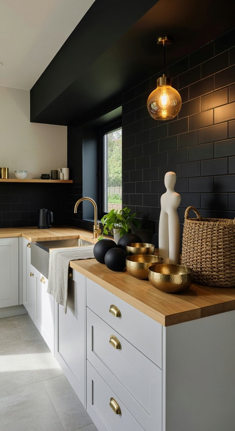
Arranging bold sculptural pieces in odd-numbered clusters above your kitchen cabinets creates visual rhythm that feels intentional without looking staged. Matte ceramic forms next to hammered metal vessels and woven basket textures build layered interest against that open soffit space. Groupings of three or five objects give your eye natural resting points, making even a simple kitchen feel collected and curated over time.
Shop The Look
 Alpha Living Home Black Metal Decorative Balls Set of 3, Modern Table Orbs
View Price
Alpha Living Home Black Metal Decorative Balls Set of 3, Modern Table Orbs
View Price
 Creative Co-Op Round Hammered Metal Serving and Mixing Bowl, Gold Finish
View Price
Creative Co-Op Round Hammered Metal Serving and Mixing Bowl, Gold Finish
View Price
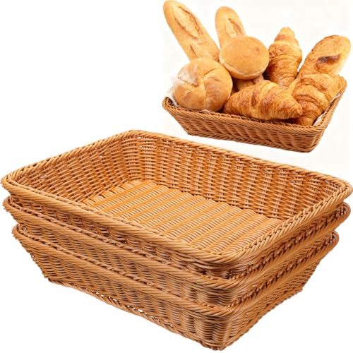 3 Pack Wicker Bread Baskets for Serving 15.8" Large Rattan Tray for Food
View Price
3 Pack Wicker Bread Baskets for Serving 15.8" Large Rattan Tray for Food
View Price
 Sandstone Resin Thinker Statue Style Abstract Sculpture, White, Left
View Price
Sandstone Resin Thinker Statue Style Abstract Sculpture, White, Left
View Price
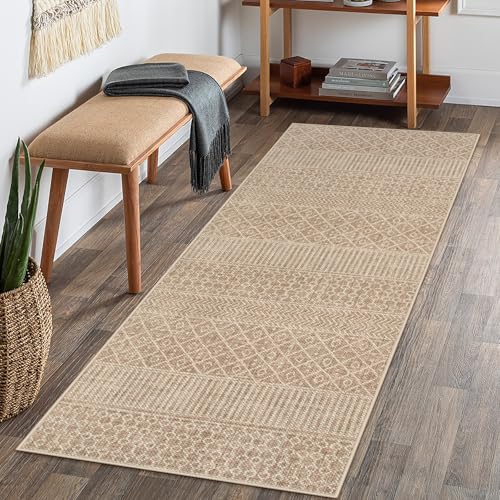 Lahome Farmhouse Washable 2x6 Hallway Runner, Non-Slip, Beige/Brown
View Price
Lahome Farmhouse Washable 2x6 Hallway Runner, Non-Slip, Beige/Brown
View Price
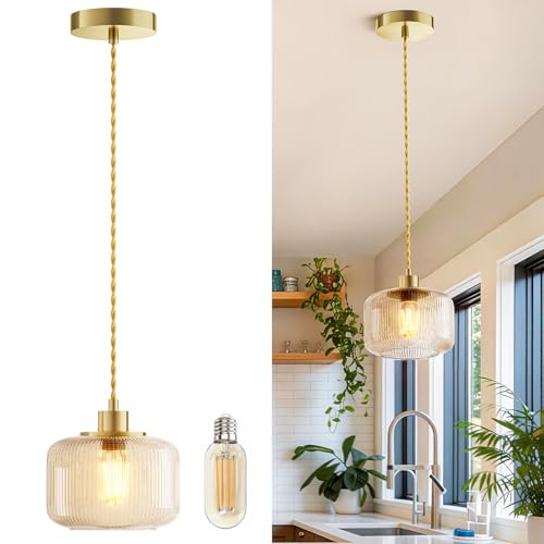 Amber Glass Pendant Light, Vintage Hanging Light for Kitchen Island
View Price
Amber Glass Pendant Light, Vintage Hanging Light for Kitchen Island
View Price
 Elite Gourmet Dual-Voltage Travel Kettle, 0.6L Stainless Steel, Black
View Price
Elite Gourmet Dual-Voltage Travel Kettle, 0.6L Stainless Steel, Black
View Price
DIY Paint Transformation
Above-Cabinet Wall Area: Paint in “Black” (Benjamin Moore HC-190) — this deep, saturated black backdrop makes sculptural silhouettes pop dramatically, giving each grouped object a gallery-worthy presentation against the soffit wall.
Cabinet Top Surface: Paint in “Simply White” (Benjamin Moore OC-117) — a clean, bright white on the cabinet tops reflects light upward onto your sculptural arrangements, creating contrast that sharpens every curve and texture in your three-and-five groupings.
Best For: Open-plan kitchens with tall ceilings and generous soffit space where sculptural arrangements can breathe and be appreciated from multiple angles throughout the room.
Plate Racks and Collected Dishware Above Kitchen Cabinets
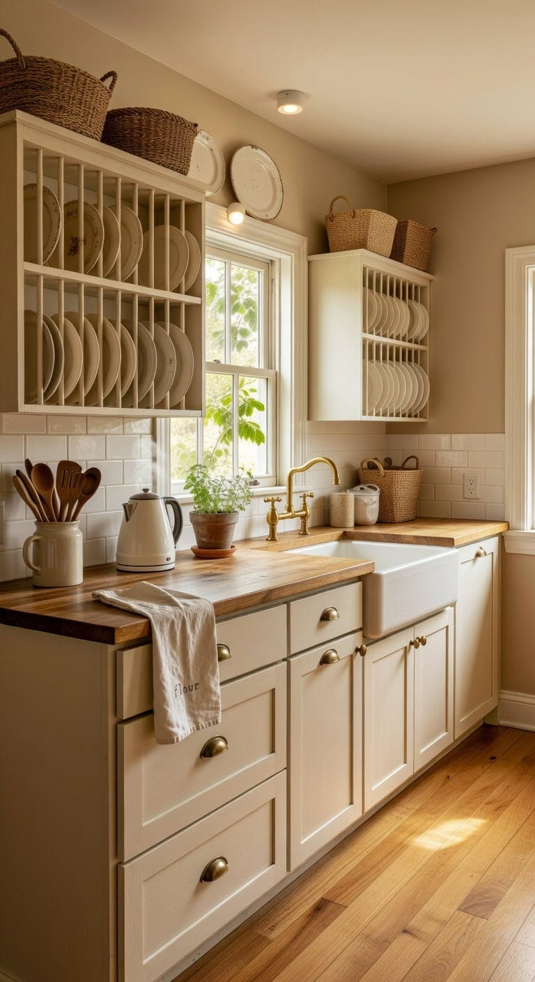
Those open spaces above your cabinets are practically begging for your favorite plates and serving pieces. Creamy white ironstone stacked against warm wood grain and woven basket textures creates a collected-over-time look that feels genuinely lived in. This display-forward approach turns everyday dishware into art while keeping pieces accessible and dust-free behind simple rack rails.
Shop The Look
 SAMEBUTECO Bamboo Wooden Dish Racks Plate Stand Holder Vertical Drainer Kitchen Cabinet Organizer for Dish, Pots, Lids, Bowls, Cups, and Cutting Boards and Books(2 Packs)
View Price
SAMEBUTECO Bamboo Wooden Dish Racks Plate Stand Holder Vertical Drainer Kitchen Cabinet Organizer for Dish, Pots, Lids, Bowls, Cups, and Cutting Boards and Books(2 Packs)
View Price
 Mikasa French Countryside 40-Piece Dinnerware Set, Service for 8
View Price
Mikasa French Countryside 40-Piece Dinnerware Set, Service for 8
View Price
 DOKOT Seagrass Plant Basket with Handles, Round Storage Wicker Basket (10.6inch Diameter x 12.5inch Height, Natural)
View Price
DOKOT Seagrass Plant Basket with Handles, Round Storage Wicker Basket (10.6inch Diameter x 12.5inch Height, Natural)
View Price
![Utopia Kitchen White Flour Sack Towels [24 Pack - 28 x 28 Inch] 100% Cotton](https://m.media-amazon.com/images/I/41Wb7GIswLL._SL500_.jpg) Utopia Kitchen White Flour Sack Towels [24 Pack - 28 x 28 Inch] 100% Cotton
View Price
Utopia Kitchen White Flour Sack Towels [24 Pack - 28 x 28 Inch] 100% Cotton
View Price
 Nucookery Ceramic Kitchen Utensil Holder for Countertop Organizer 6.4" Sand
View Price
Nucookery Ceramic Kitchen Utensil Holder for Countertop Organizer 6.4" Sand
View Price
 Amazon Basics LED Puck Lights, Battery Operated, 50 Lumens, Under Cabinet Lighting, Easy to Install, Easy to Use, Adhesive Backing, 2-Pack, White
View Price
Amazon Basics LED Puck Lights, Battery Operated, 50 Lumens, Under Cabinet Lighting, Easy to Install, Easy to Use, Adhesive Backing, 2-Pack, White
View Price
DIY Paint Transformation
Cabinet Uppers: Paint in “White Dove” (Benjamin Moore OC-17) — this warm, creamy white mirrors the soft ivory tone of collected ironstone dishware and gives upper cabinets a quiet backdrop that lets your plate collection stand out without competing for attention.
Kitchen Walls: Paint in “Mocha Cream” (Benjamin Moore 995) — this grounded, sandy neutral echoes the warm wood tones of plate racks and woven baskets, wrapping the room in a tone that makes white dishware displays pop with gentle contrast.
Best For: Cottage, farmhouse, or traditional kitchens where the homeowner wants to showcase inherited or collected dishware as meaningful everyday décor.
Minimalist Approach: Leave It Empty on Purpose
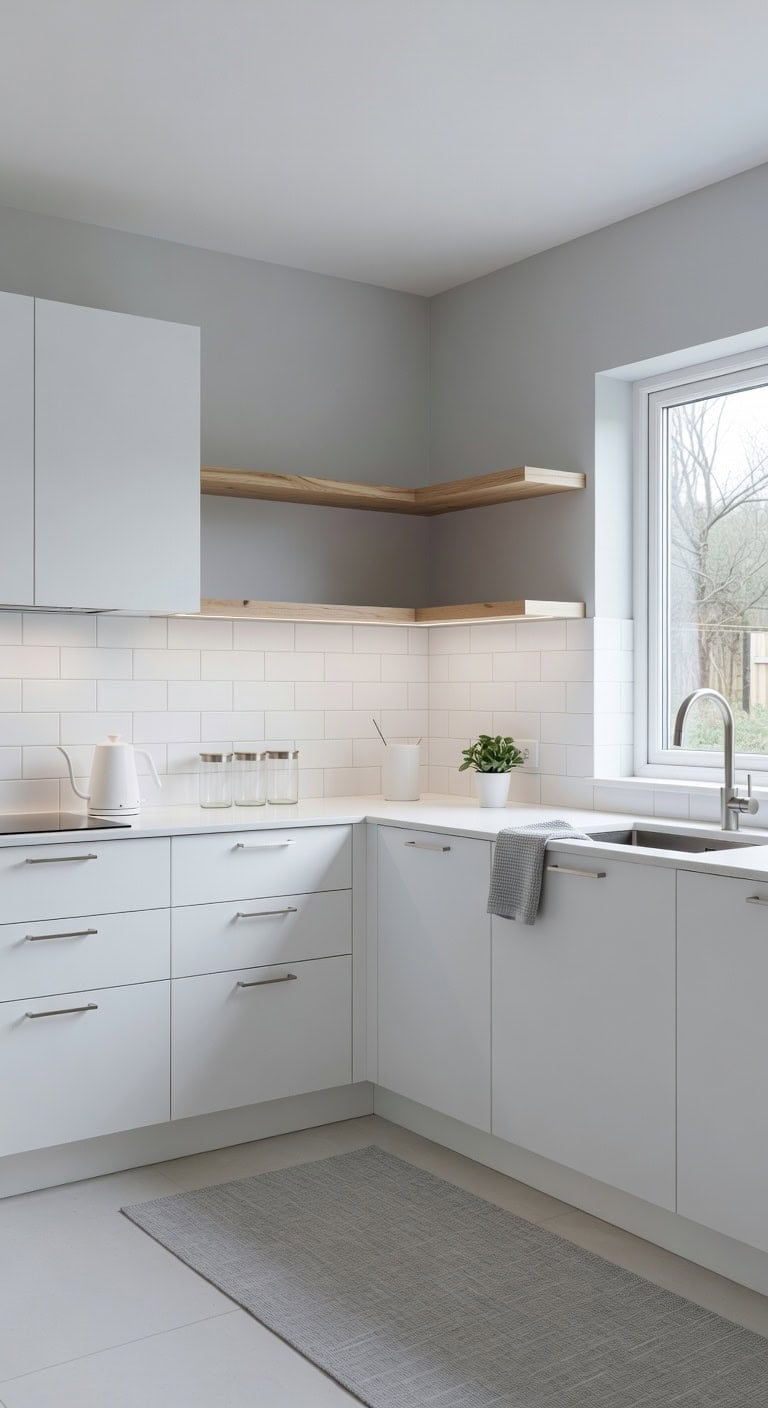
Sometimes the boldest design choice is doing absolutely nothing with that space above your cabinets. A crisp white and soft gray palette lets smooth painted surfaces play against the subtle grain of light wood shelving and the cool touch of brushed metal hardware below. That empty gap becomes the room’s quiet exhale — proving that restraint creates its own kind of beauty.
Shop The Look
 YDKGL Kitchen Rugs Kitchen Mats for Floor Non Slip Washable Gray 17"x47"
View Price
YDKGL Kitchen Rugs Kitchen Mats for Floor Non Slip Washable Gray 17"x47"
View Price
 homdiy 25 Pack 5-1/16" Brushed Nickel Cabinet Pulls Edge Finger Pulls
View Price
homdiy 25 Pack 5-1/16" Brushed Nickel Cabinet Pulls Edge Finger Pulls
View Price
 Govee Cool White LED Strip Lights 16.4ft with Control Box, 6500K, Dimmable
View Price
Govee Cool White LED Strip Lights 16.4ft with Control Box, 6500K, Dimmable
View Price
 COTTON CRAFT Amazing Kitchen Towels - 8 Pack 100% Cotton Waffle Terry Towel
View Price
COTTON CRAFT Amazing Kitchen Towels - 8 Pack 100% Cotton Waffle Terry Towel
View Price
 Aoeoe 4 Pack Glass Storage Jars with Airtight Bamboo Lid, 27 OZ Glass Kitchen Canisters, Clear Container for Coffee Bean Storage, Dry Goods, Cookie, Candy, Tea, Spices and More
View Price
Aoeoe 4 Pack Glass Storage Jars with Airtight Bamboo Lid, 27 OZ Glass Kitchen Canisters, Clear Container for Coffee Bean Storage, Dry Goods, Cookie, Candy, Tea, Spices and More
View Price
 Mecity Electric Kettle Stainless Steel Gooseneck Water Kettle Water Boiler for Pour Over Coffee Fast Heating, Auto Shut Off, 27 fl oz, 1000W, Milk White
View Price
Mecity Electric Kettle Stainless Steel Gooseneck Water Kettle Water Boiler for Pour Over Coffee Fast Heating, Auto Shut Off, 27 fl oz, 1000W, Milk White
View Price
 XIRYAER Ceramic Fruit Bowl for Kitchen Counter,10 Inch Modern Decorative Bowl, Large Fruit Bowl for Table Décor,Cute Fruit Bowls for Bread Candy Snacks,White
View Price
XIRYAER Ceramic Fruit Bowl for Kitchen Counter,10 Inch Modern Decorative Bowl, Large Fruit Bowl for Table Décor,Cute Fruit Bowls for Bread Candy Snacks,White
View Price
DIY Paint Transformation
Cabinets: Paint in “Chantilly Lace” (Benjamin Moore OC-65) — a true, clean white that sharpens every line and makes your intentionally empty soffit space look architectural and deliberate rather than forgotten.
Wall Above Cabinets: Paint in “Stonington Gray” (Benjamin Moore HC-170) — a balanced, cool gray that recedes gently behind the cabinet tops, giving that open gap sophisticated depth without competing for attention.
Best For: Modern or modular kitchens with tall ceilings where the homeowner wants a gallery-like calm and refuses to let clutter encroach into every available inch.
Seasonal Decor You Actually Rotate Above Kitchen Cabinets
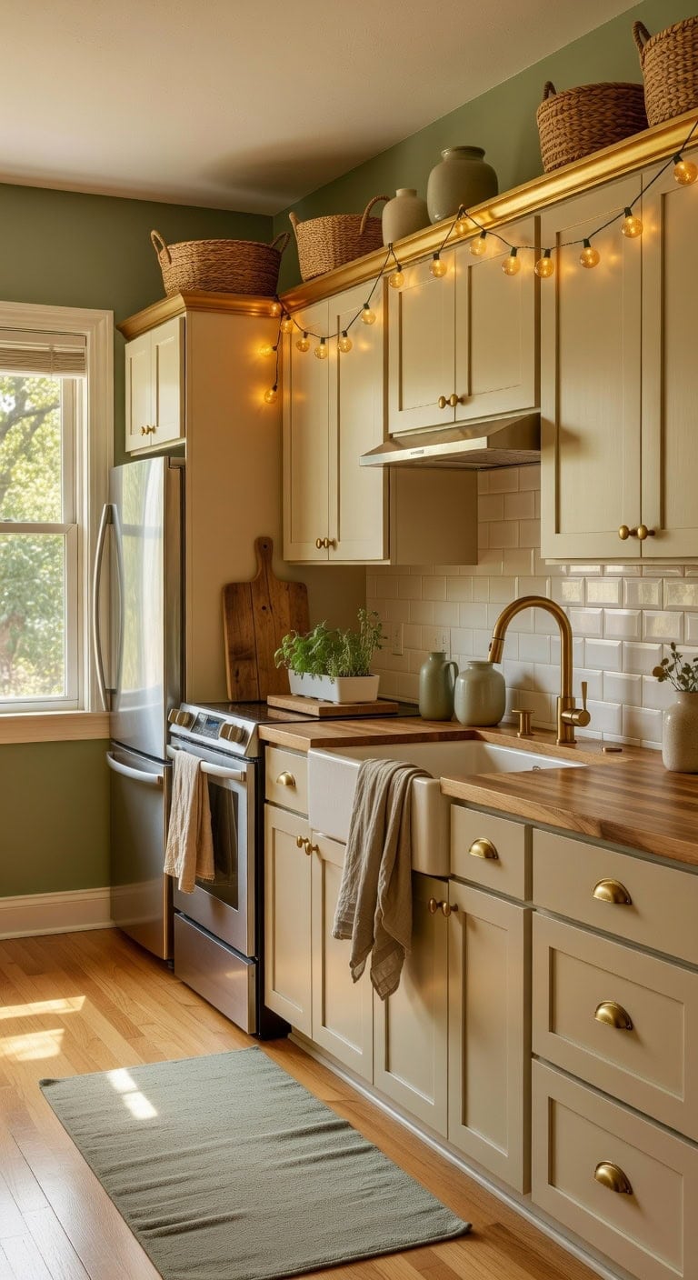
Swapping out that dead space above your cabinets every few months keeps your kitchen feeling fresh without a full redesign. Warm amber tones and cool sage greens work beautifully together when you layer woven baskets against smooth ceramic pieces and nubby linen accents. This is the kind of low-effort refresh that makes the whole room feel intentional and lived-in.
Shop The Look
 X AVIA HANDICRAFTS Set Of 2 Large Woven Blanket Baskets With Handles | Round Wicker Rattan Storage Floor Baskets for Shoe In Living Room | Extra Big Boho Rattan Laundry For Pillow, Blanket
View Price
X AVIA HANDICRAFTS Set Of 2 Large Woven Blanket Baskets With Handles | Round Wicker Rattan Storage Floor Baskets for Shoe In Living Room | Extra Big Boho Rattan Laundry For Pillow, Blanket
View Price
 Ferrochef Sage Green Vintage Floral Vase Retro Chinoiserie Floral Vase
View Price
Ferrochef Sage Green Vintage Floral Vase Retro Chinoiserie Floral Vase
View Price
 Novelty Lights 25ft 50 LED Amber Christmas String Lights, Brown Wire
View Price
Novelty Lights 25ft 50 LED Amber Christmas String Lights, Brown Wire
View Price
 TRITON LINEN 100% French Linen Tea Towels 14 x 28 Inch (Set of 4,Natural)
View Price
TRITON LINEN 100% French Linen Tea Towels 14 x 28 Inch (Set of 4,Natural)
View Price
 HBlife Step Bamboo Wooden Dish Drying Rack Kitchen Plate Display Stand
View Price
HBlife Step Bamboo Wooden Dish Drying Rack Kitchen Plate Display Stand
View Price
 Grow Lights for Indoor Plants Small Potted - Full Spectrum, Auto 3/9/12H Timer, 10-Level Dimming & Adjustable Height - Compact Grow Light for Succulents, Herbs, Foliage in Home/Office (White,1PACK)
View Price
Grow Lights for Indoor Plants Small Potted - Full Spectrum, Auto 3/9/12H Timer, 10-Level Dimming & Adjustable Height - Compact Grow Light for Succulents, Herbs, Foliage in Home/Office (White,1PACK)
View Price
 Yamaziot 2x6 Washable Hallway Runner Rug Non Slip Floral Carpet, Sage Green
View Price
Yamaziot 2x6 Washable Hallway Runner Rug Non Slip Floral Carpet, Sage Green
View Price
DIY Paint Transformation
Above-Cabinet Wall Strip: Paint in “Saybrook Sage” (Benjamin Moore HC-114) — this muted, earthy green creates a calming backdrop that makes your seasonal displays pop against the wall rather than disappearing into basic white drywall.
Cabinet Top Surface: Paint in “Yellow Topaz” (Benjamin Moore CSP-945) — rolling a warm amber tone across the top surface of your cabinets gives each seasonal vignette a cohesive foundation, so mismatched decor pieces instantly look curated and deliberate.
Best For: Kitchens with 12-inch or deeper gaps above standard wall cabinets where seasonal items need a unified backdrop to look styled rather than stored.
Match Your Above-Cabinet Decor to Your Kitchen Style
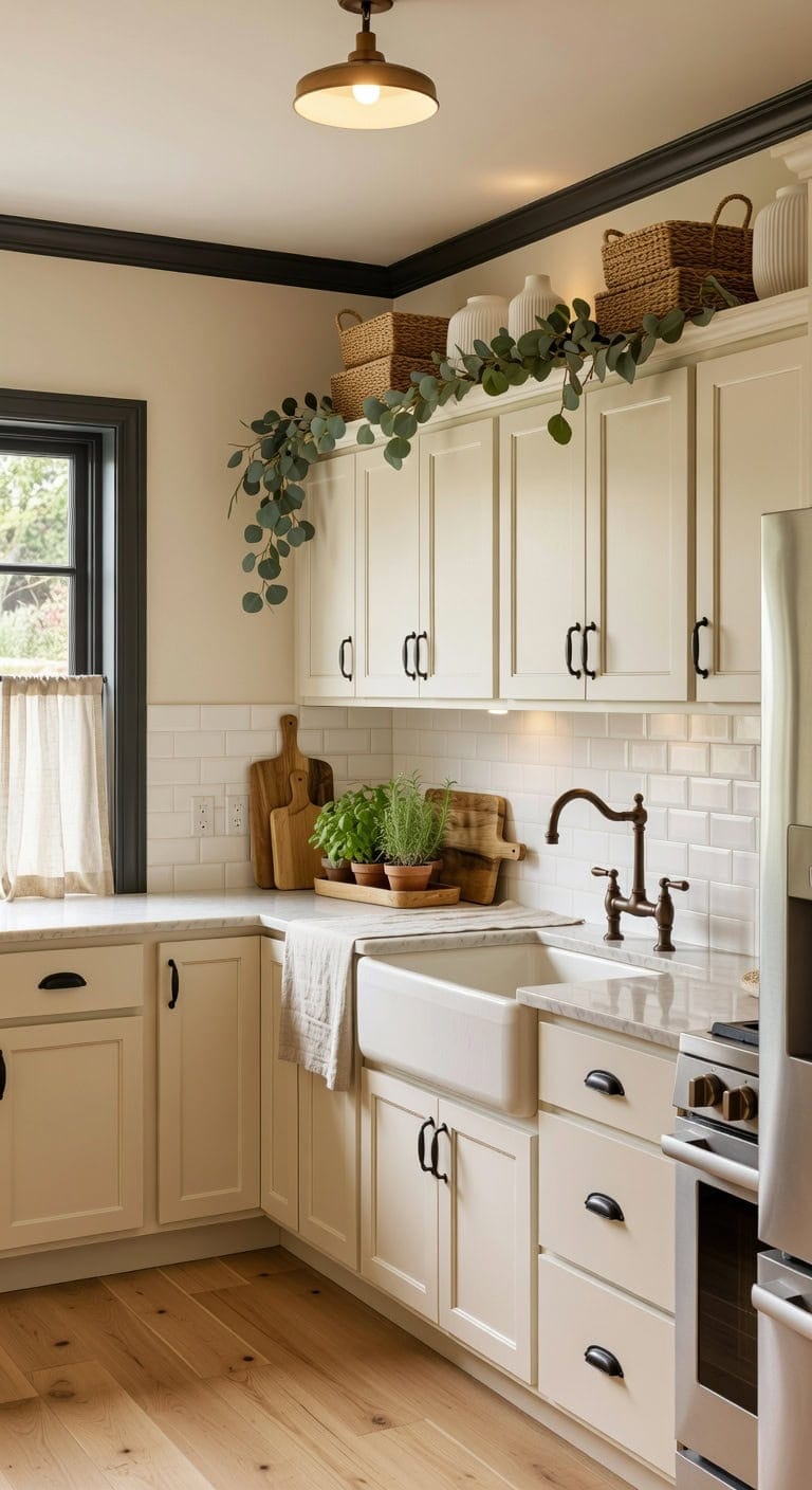
When warm cream tones meet deep charcoal accents above your cabinets, the whole kitchen feels intentional rather than thrown together. Woven baskets bring natural texture against smooth ceramic vases, while linen greenery garlands soften the hard edges of wood and metal. Getting this balance right means your above-cabinet space actually looks like it belongs there.
Shop The Look
 Shimeyao 12 Pcs Cast Iron Cabinet Pulls Heart Design Rustic Matte Black
View Price
Shimeyao 12 Pcs Cast Iron Cabinet Pulls Heart Design Rustic Matte Black
View Price
 TECOMLIGHT Puck Lights with Remote, 3 White Tones & 13 Colors, Black-6 Pack
View Price
TECOMLIGHT Puck Lights with Remote, 3 White Tones & 13 Colors, Black-6 Pack
View Price
 Ceramic Vase for Flowers – Modern Small Ribbed Textured Flower Vase for Home Decor, Pampas Grass, Decorative, Farmhouse, Coffee Table, Kitchen Centerpieces, Bookshelf and Home Living (White)
View Price
Ceramic Vase for Flowers – Modern Small Ribbed Textured Flower Vase for Home Decor, Pampas Grass, Decorative, Farmhouse, Coffee Table, Kitchen Centerpieces, Bookshelf and Home Living (White)
View Price
 DII Chambray Kitchen, Tabletop Collection, Natural, 14x72 Table Runner
View Price
DII Chambray Kitchen, Tabletop Collection, Natural, 14x72 Table Runner
View Price
 Zhehao 3 Pcs Acacia Wood Cutting Board Set with Handle for Charcuterie
View Price
Zhehao 3 Pcs Acacia Wood Cutting Board Set with Handle for Charcuterie
View Price
 Ahopegarden Indoor Garden Hydroponics Growing System: 10 Pods Kit with LED
View Price
Ahopegarden Indoor Garden Hydroponics Growing System: 10 Pods Kit with LED
View Price
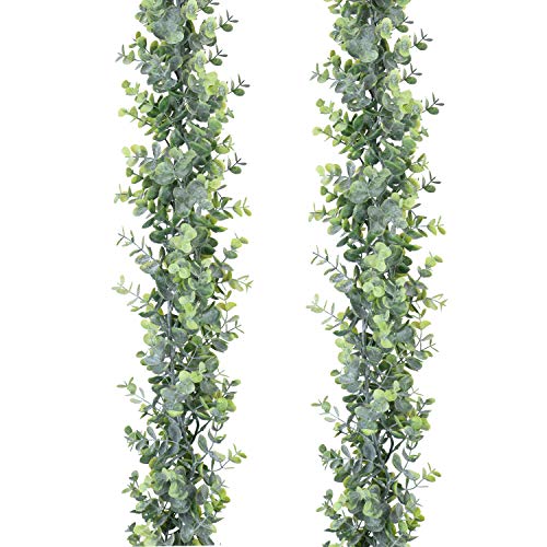 DearHouse Faux Eucalyptus Garland Plant, 2 Pack Artificial Vines Hanging Eucalyptus Leaves Greenery Garland for Wedding Backdrop Arch Wall Decor, 6 Feet/pcs UV Protected Indoor Outdoor
View Price
DearHouse Faux Eucalyptus Garland Plant, 2 Pack Artificial Vines Hanging Eucalyptus Leaves Greenery Garland for Wedding Backdrop Arch Wall Decor, 6 Feet/pcs UV Protected Indoor Outdoor
View Price
DIY Paint Transformation
Above-Cabinet Wall Area: Paint in “Seashell” (Benjamin Moore OC-120) — this warm cream provides a soft, luminous backdrop that makes decorative objects pop without competing with them, giving the illusion of taller ceilings and more breathing room above your cabinetry.
Cabinet Top Accent or Trim: Paint in “Deep Caviar” (Benjamin Moore 2130-20) — this rich charcoal grounds the space with sophisticated depth, creating a dramatic contrast band that frames your decor pieces and draws the eye upward with purpose and polish.
Best For: Traditional or linked kitchens with standard eight-foot ceilings where the gap above cabinets needs cohesion rather than a complete renovation.