Remember when we couldn’t decide between that sleek marble backsplash and those adorable subway tiles for your kitchen reno?
Well, turns out there are literally 21 ways to rock gray and white!
From industrial-chic concrete counters to dreamy Scandinavian vibes, each style tells its own story.
Let’s dive into this design rabbit hole together!
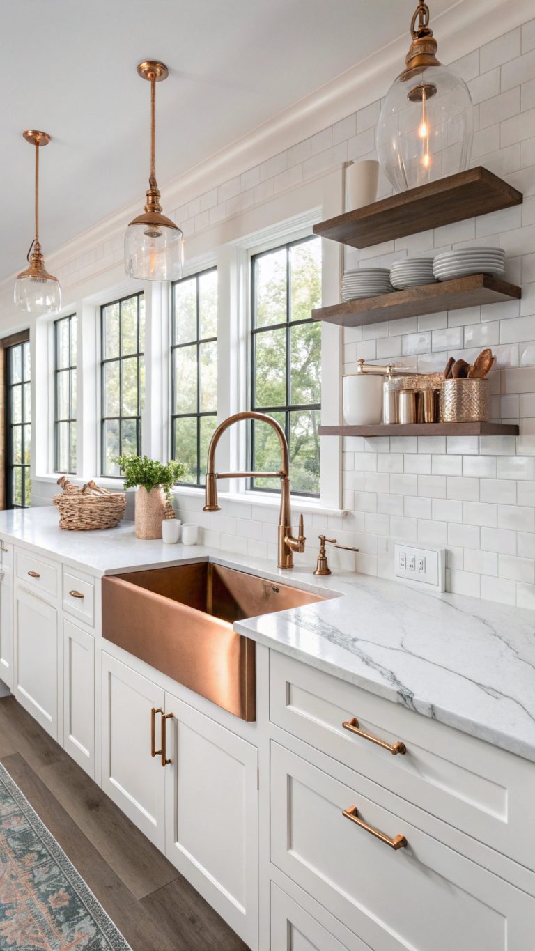
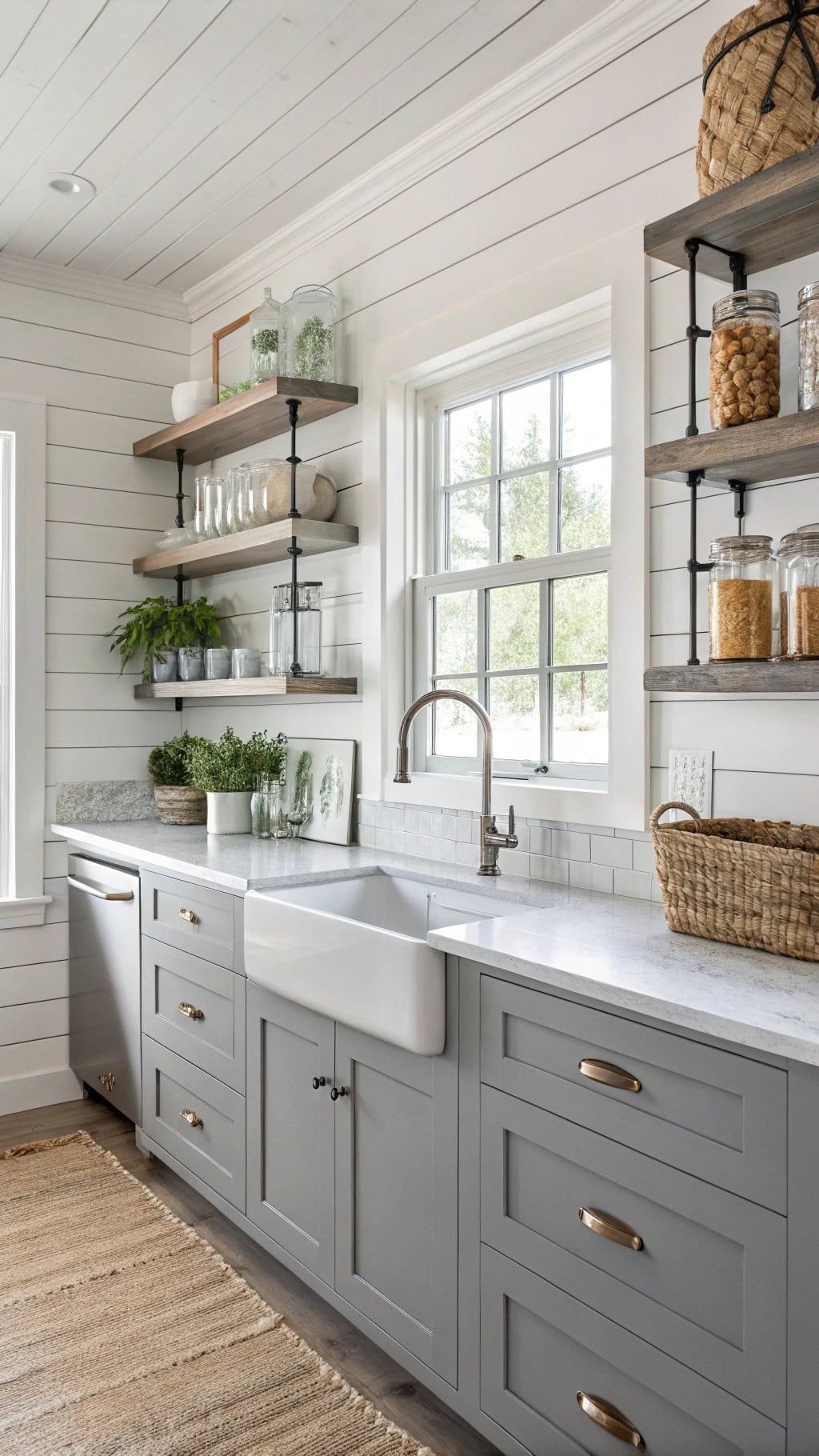
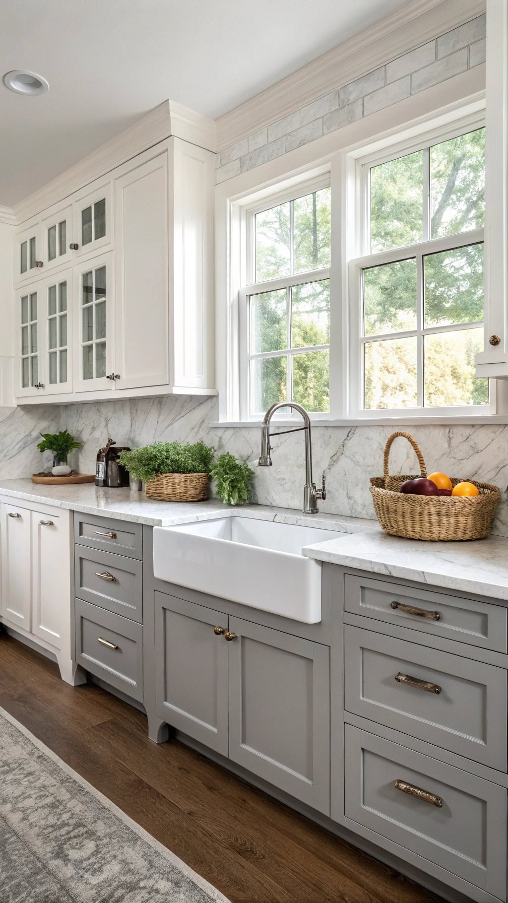
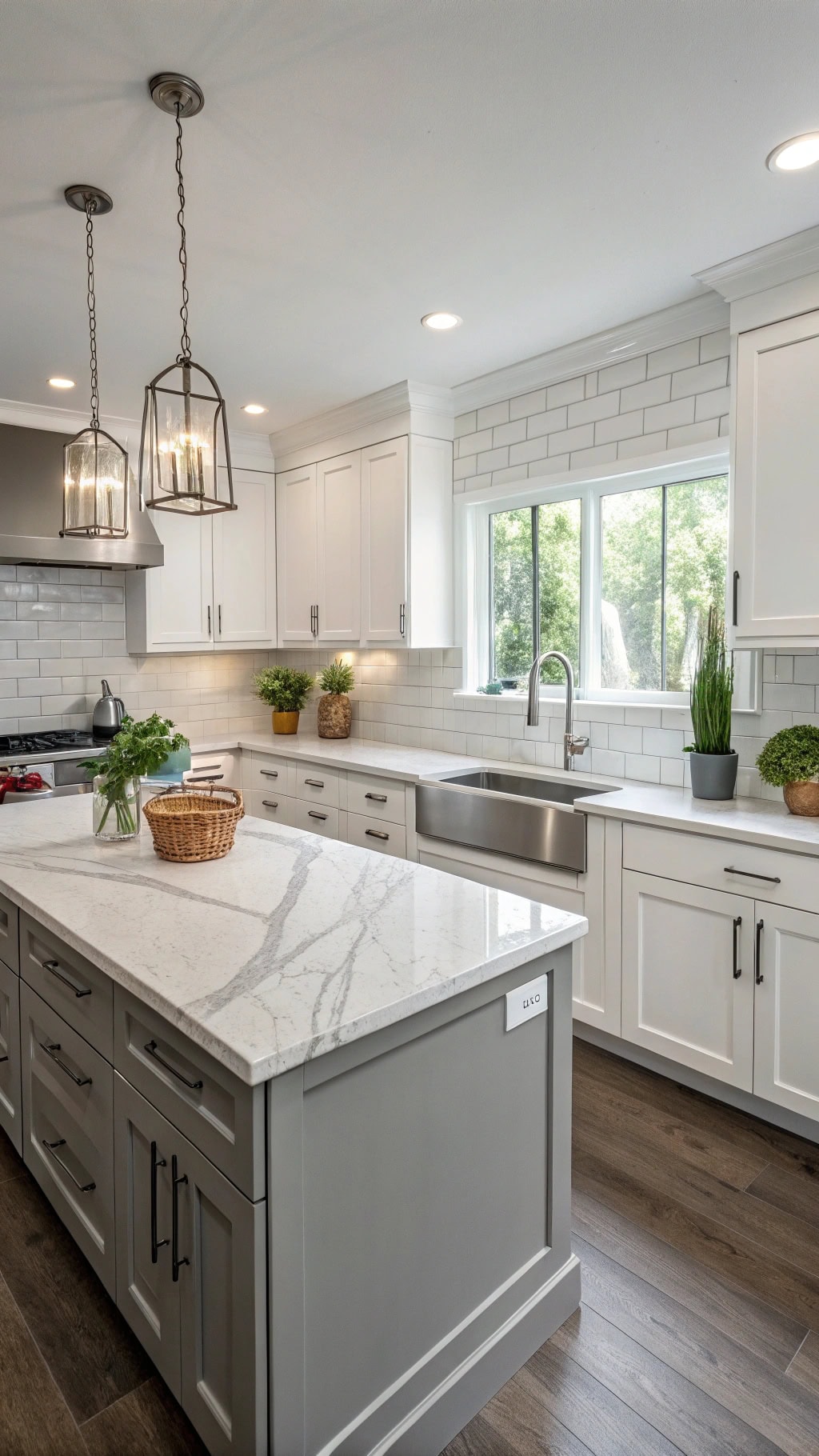
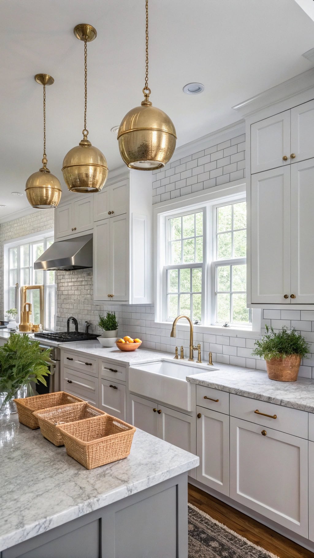
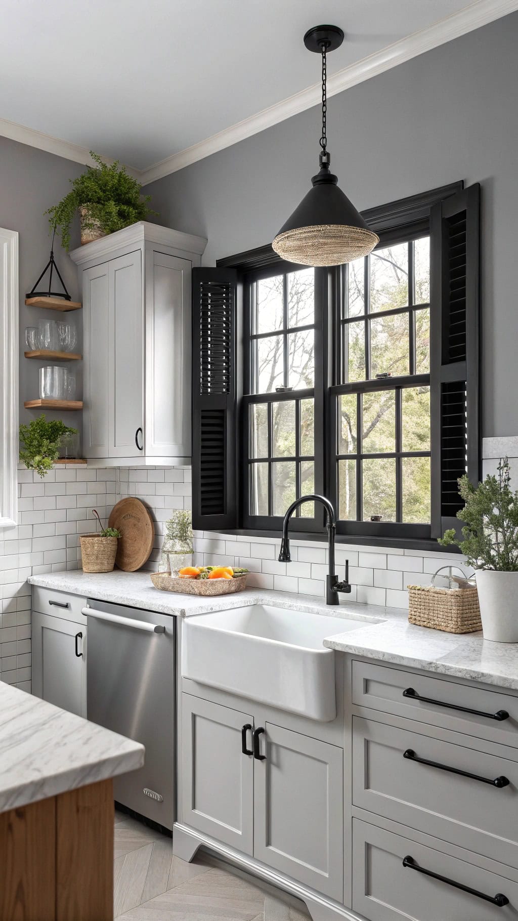
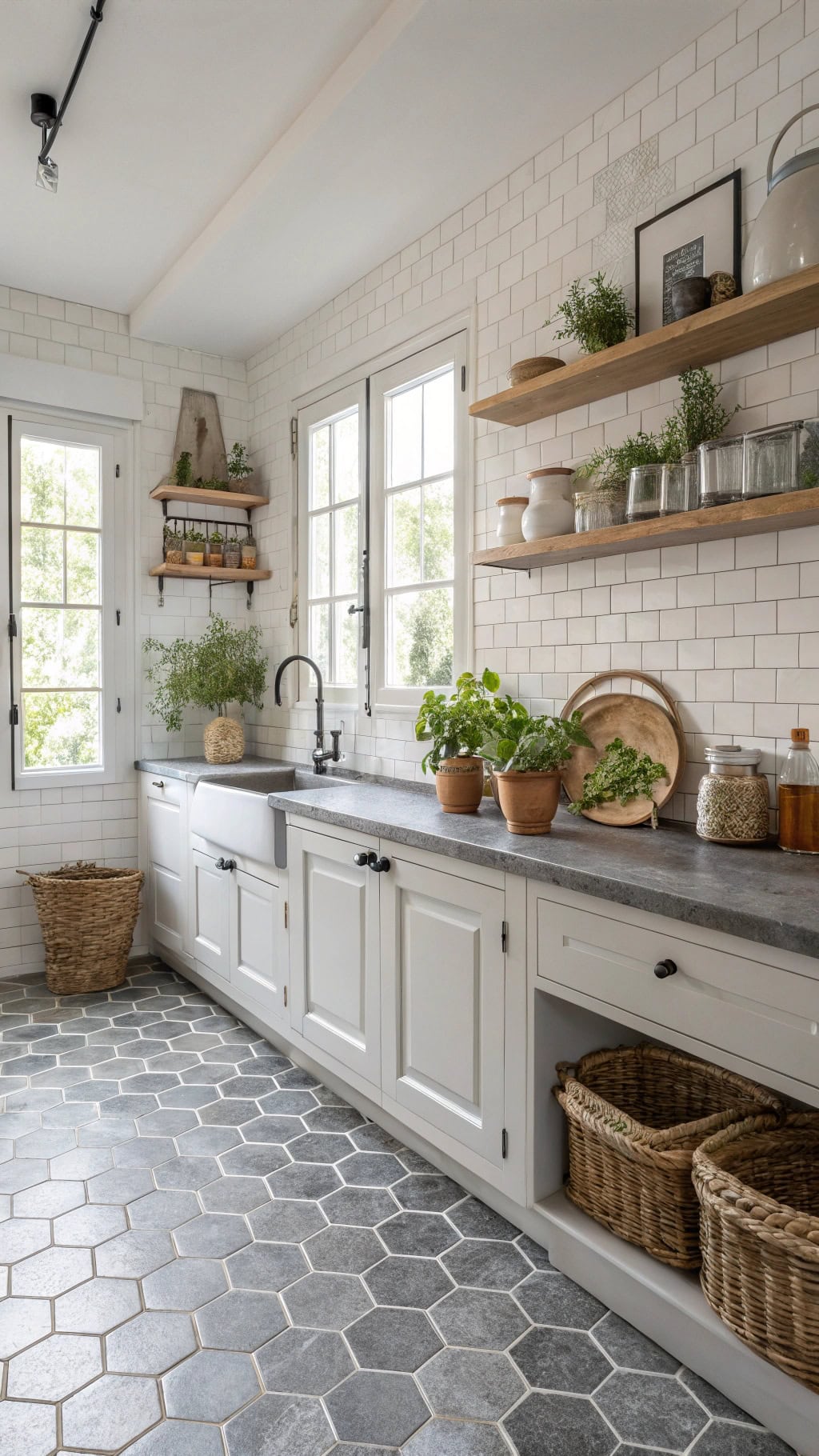
1. Traditional Farmhouse Gray White Cabinets
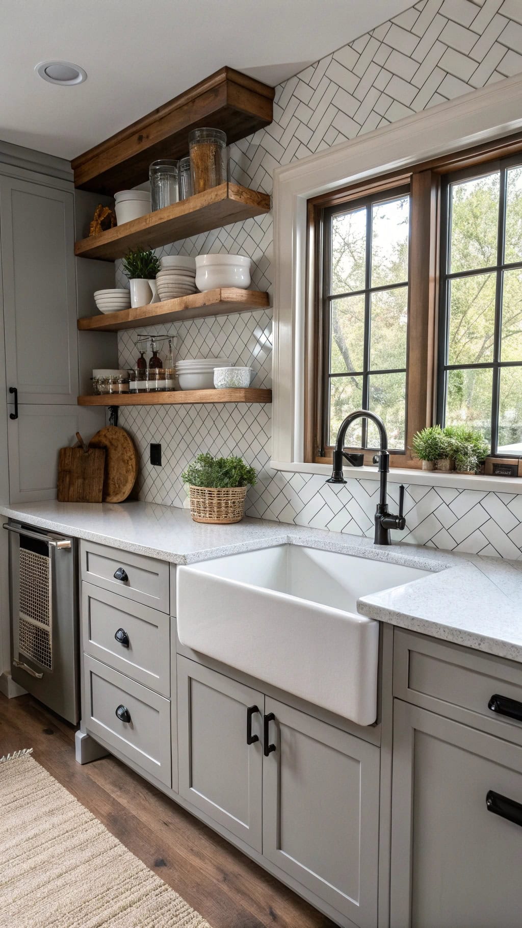
Welcome to the kitchen that makes you want to bake bread from scratch and host Sunday dinners! This cozy-meets-sophisticated vibe brings all the farmhouse feels without looking like you raided grandma’s attic.
- Shaker-style cabinets – classic raised panels that never go out of style
- Apron-front sink – because dishes look cuter in a farmhouse sink
- Subway tile backsplash – laid in herringbone for that fresh twist
- Open shelving – show off your vintage dishware collection
- Black hardware – matte black pulls add that perfect modern edge
Pro Tip: Mix metals strategically! Pair your black hardware with brass or copper light fixtures to avoid that matchy-matchy look. The warmth of mixed metals keeps your gray-white palette from feeling too cold or sterile.
2. Industrial Chic Concrete Countertops
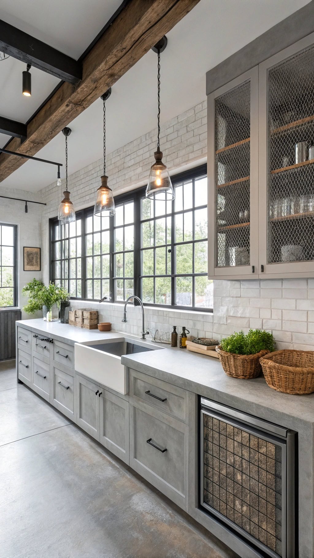
Get ready for your inner city loft dreams! This edgy-meets-elegant style transforms your kitchen into an urban showstopper that screams sophistication.
- Polished concrete counters – that buttery smooth finish you can’t stop touching
- Exposed steel beams – structural elements become your decor
- Wire mesh cabinet inserts – peek-a-boo storage with attitude
- Edison bulb pendants – vintage vibes meet modern function
- Stainless steel appliances – go big with commercial-grade pieces
Pro Tip: Soften those hard industrial edges with natural wood cutting boards and woven baskets. Your concrete and steel need organic textures to keep the space from feeling too cold. Think of it as giving your tough kitchen a cozy sweater!
3. Scandinavian Hygge Kitchen Elements
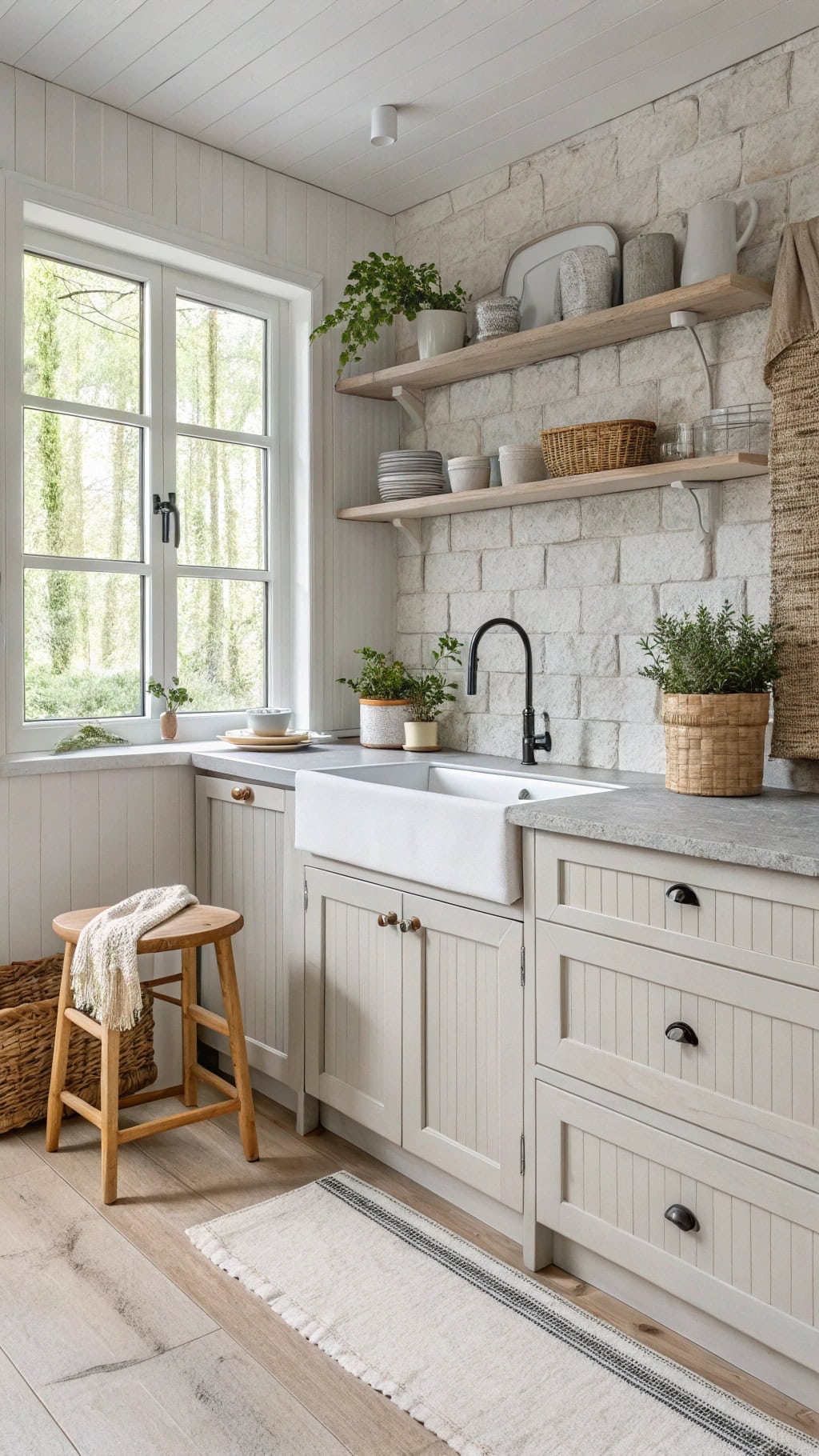
Time to channel your inner Nordic goddess! This cozy-meets-minimal style wraps your kitchen in a warm embrace while keeping things beautifully simple.
- Whitewashed wood cabinets – that perfect imperfect finish
- Light gray stone backsplash – subtle texture without the drama
- Open shelving with ceramics – display those handmade mugs proudly
- Sheepskin throws on stools – because comfort is everything
- Matte black hardware – just enough contrast to keep it interesting
Pro Tip: Layer different shades of white and gray like you’re painting with clouds. Mix warm whites with cool grays, add natural linen runners, and don’t forget the greenery! A few potted herbs or that trendy fiddle leaf fig will breathe life into your serene sanctuary.
4. Transitional Style Mixed Metals
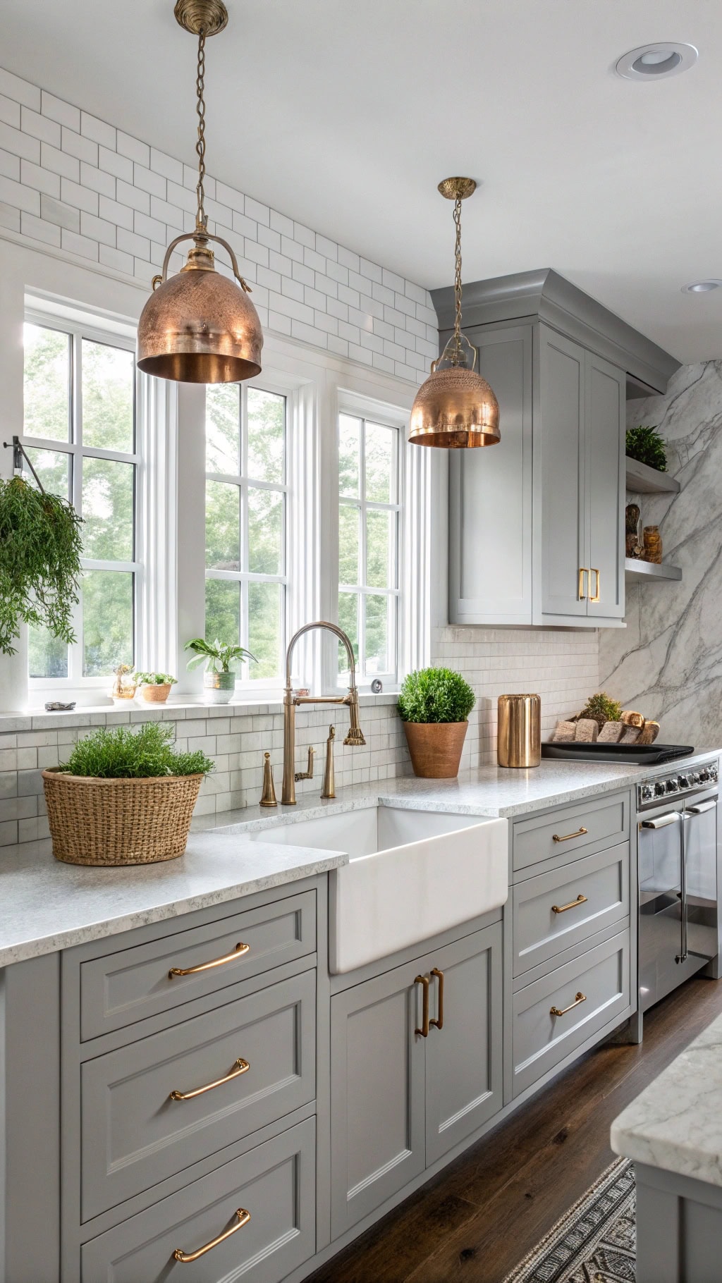
Ready to break all the matchy-matchy rules? Transformative style is where traditional meets modern, and mixed metals are your new BFF!
- Brass cabinet pulls with chrome faucets – who says you can’t have both?
- Copper pendant lights over gray island – that warm glow is everything
- Stainless steel appliances – the reliable neutral player
- Black iron bar stools – grounding the whole metallic party
- Brushed nickel drawer hardware – subtle sophistication wins
Pro Tip: Follow the 70-30 rule when mixing metals. Choose one dominant finish (like chrome) for 70% of your fixtures, then sprinkle in accent metals for the remaining 30%. Keep all your metals in the same temperature family (warm or cool) to avoid that chaotic thrift-store-explosion look. Your kitchen will thank you!
5. Coastal Shiplap Wall Details
Dreaming of that beachy vibe without the sand in your shoes? Shiplap is your coastal kitchen’s secret weapon!
- Horizontal white shiplap behind open shelving – instant vacation mode activated
- Weathered gray shiplap island base – like driftwood, but make it functional
- Vertical shiplap backsplash – height tricks that’ll make your ceilings jealous
- Navy blue accent shiplap wall – because every beach house needs its ocean moment
- Natural wood shiplap ceiling beams – overhead charm that screams “coastal cottage”
Pro Tip: Keep your shiplap gaps consistent at 1/8 inch for that authentic look. Paint the wall behind it dark gray before installation – those shadow lines will pop like crazy! Mix textures by leaving some boards natural and painting others. Your kitchen will feel like a permanent seaside escape!
6. Marble Backsplash Statement Wall
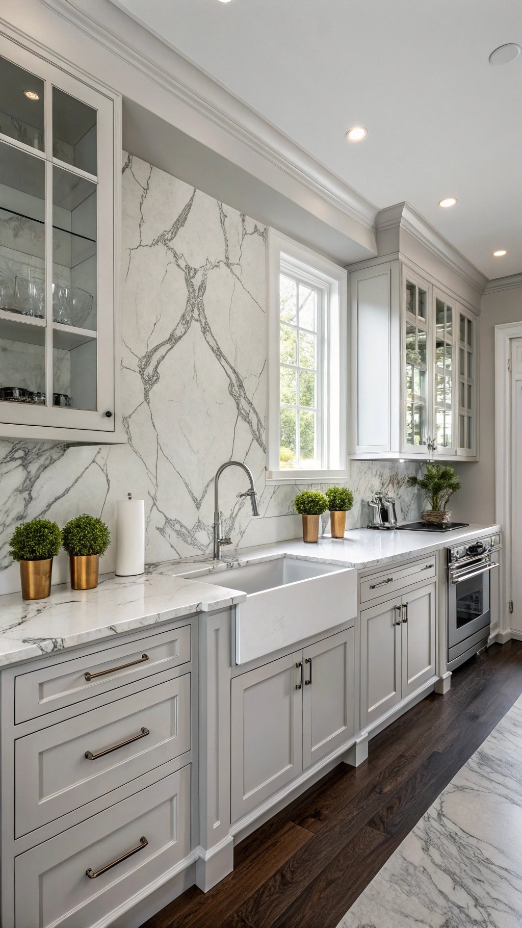
Ready to make jaws drop? A marble backsplash statement wall is your gray and white kitchen’s showstopper moment!
- Floor-to-ceiling Carrara marble slab – drama that whispers luxury, not shouts
- Bookmatched Calacatta panels – nature’s artwork doing all the heavy lifting
- Gray-veined marble with waterfall edges – seamless flow that’ll hypnotize your guests
- Herringbone marble tile pattern – classic meets contemporary in perfect harmony
- Mixed marble and white subway combo – budget-friendly hack that looks like a million bucks
Pro Tip: Balance that marble magnificence with simple white cabinets and minimal decor. Let the stone be your kitchen’s leading lady! Choose warmer gray veining if your space gets limited natural light – it’ll prevent that cold, sterile vibe nobody wants.
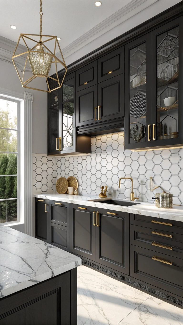
7. Matte Black Hardware Accents
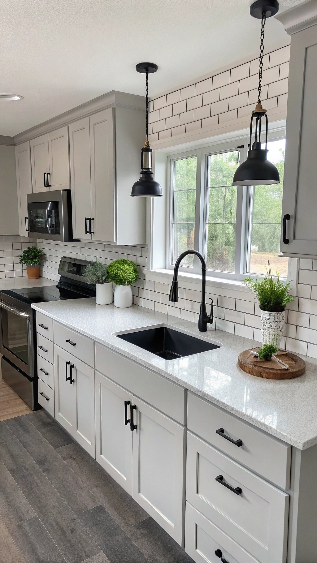
Get ready to add some serious edge! Matte black hardware is the leather jacket your gray and white kitchen’s been craving.
- Cabinet pulls in sleek black bars – instant sophistication without trying too hard
- Matte black faucets and fixtures – plumbing that doubles as jewelry
- Black pendant light frames – architectural interest that draws eyes upward
- Charcoal door handles on white shakers – contrast that makes everything pop
- Black-framed glass cabinet doors – peek-a-boo storage with attitude
Pro Tip: Space out your black accents evenly throughout the kitchen to create visual rhythm. Think of it like adding punctuation marks – too many in one spot feels overwhelming, but scattered strategically? Chef’s kiss! Match your appliances to either white or stainless to keep the palette cohesive.
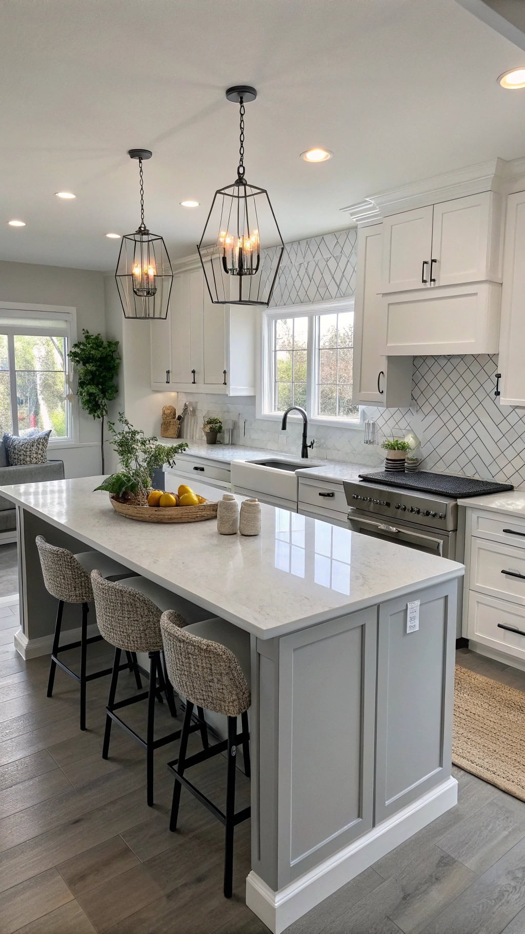
8. Two-toned Island Design
Talk about making a statement! A two-toned island becomes your kitchen’s social butterfly – part prep zone, part conversation starter.
- White base with gray countertop – classic combo that never gets old
- Gray cabinetry topped with white marble – flip the script for unexpected drama
- Mix cabinet styles – shaker doors below, open shelving above
- Contrasting bar stool colors – gray seats against white base or vice versa
- Different hardware finishes – brass on gray, black on white sections
Pro Tip: Keep your island’s color on the lighter side if your kitchen gets limited natural light. Dark islands in dim spaces can feel like black holes sucking up all the brightness. When in doubt, put the darker tone on top (countertop) rather than the base – it’s less visually heavy!
9. Quartz Waterfall Edge Peninsula
Oh, the drama of a waterfall edge! This sleek quartz peninsula cascades down like a frozen waterfall, making your morning coffee feel like a luxury hotel experience.
- Seamless flow – quartz continues vertically to the floor, no interruptions
- Gray veining patterns – choose subtle wisps or bold dramatic streaks
- LED strip lighting underneath – hello, floating island effect!
- Extended overhang for seating – 12-15 inches gives comfy leg room
- Polished or honed finish – glossy for glam, matte for modern minimalism
Pro Tip: Waterfall edges are investment pieces, so pick a quartz pattern you won’t tire of. Busy veining looks stunning in showrooms but can overwhelm daily life. For peninsula waterfalls, consider waterfall-ing just the end cap rather than both sides – you’ll get the wow factor without breaking the bank!
10. Herringbone Gray Wood Flooring
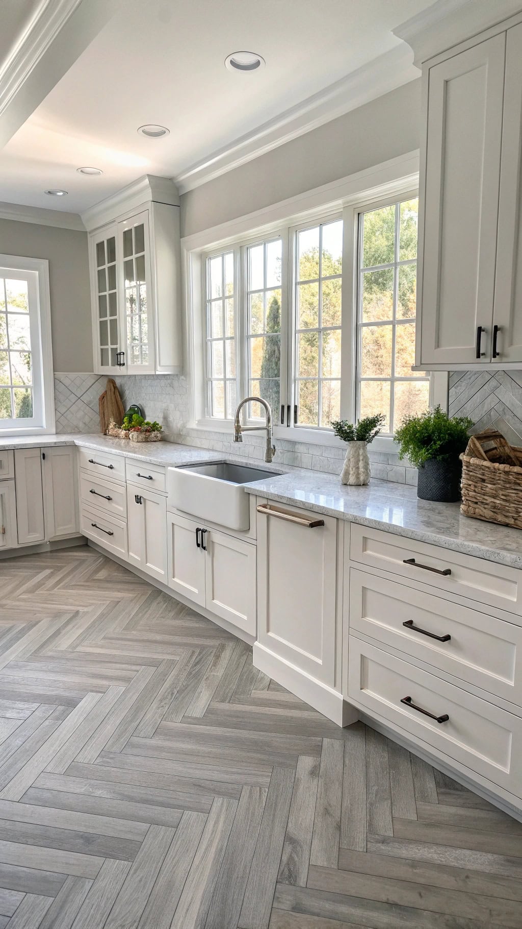
The herringbone pattern instantly elevates your kitchen from “nice” to “OMG, where did you get those floors?!” This zigzag design trick makes your space feel larger and way more expensive than it actually is.
- 45-degree angle magic – creates visual movement and flow
- Mix gray tones – light ash to charcoal for depth without chaos
- Wide plank drama – 5-7 inches shows off the pattern beautifully
- Matte finish preferred – hides scratches and looks authentically aged
- Border detail option – frame the pattern with straight planks for definition
Pro Tip: Herringbone can be visually busy, so if your countertops have dramatic veining, choose a more uniform gray wood tone. Think of it as the supporting actor to your quartz’s leading role – stunning but not competing for attention!
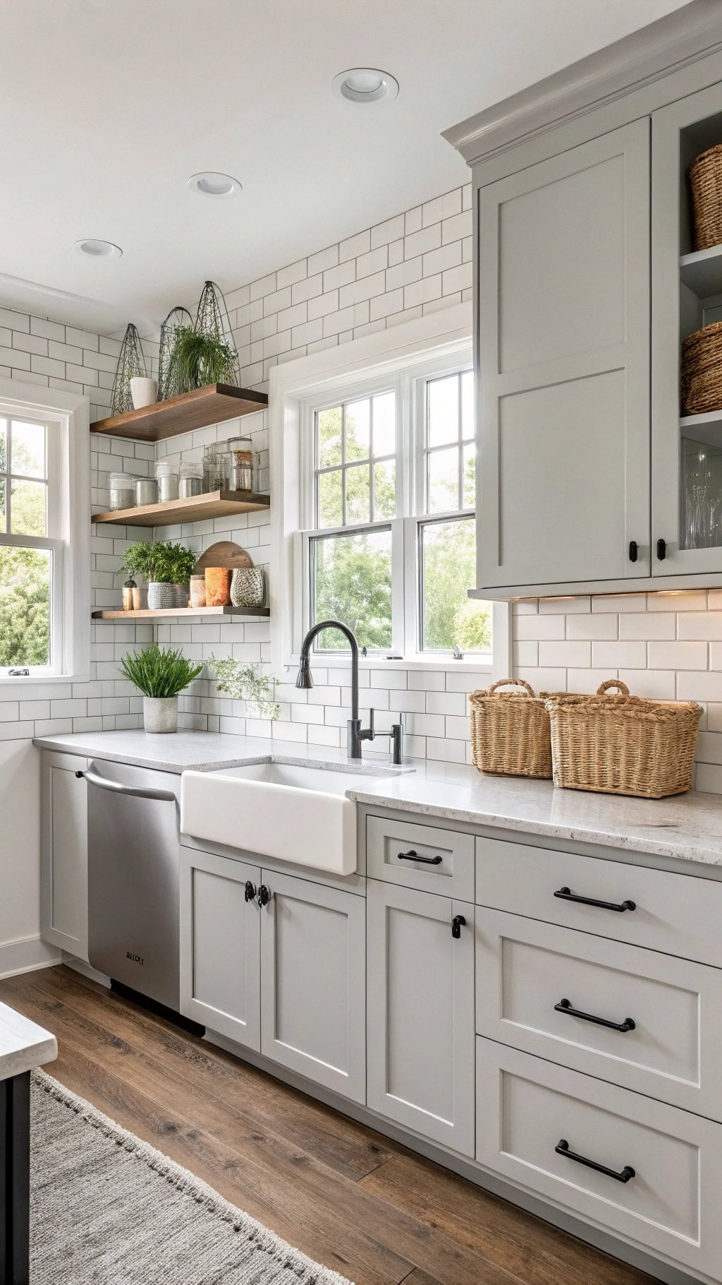
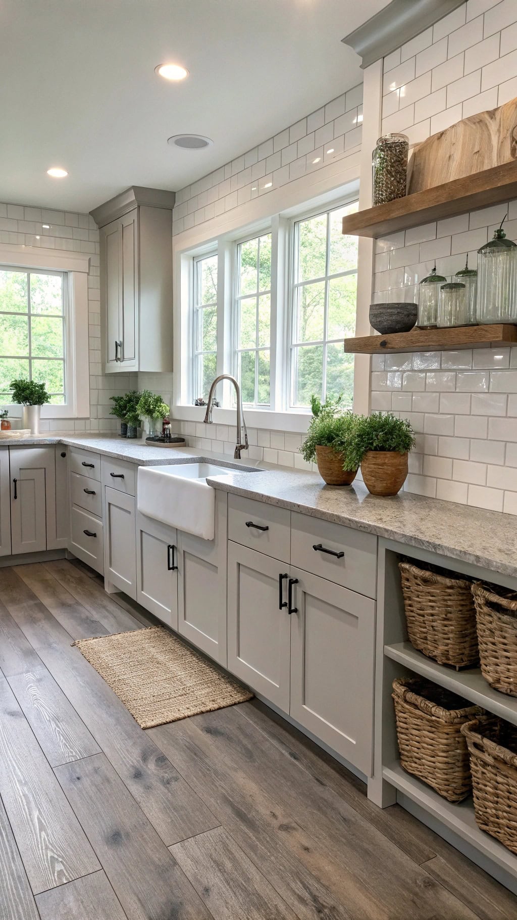
11. Open Shelving Display Solutions
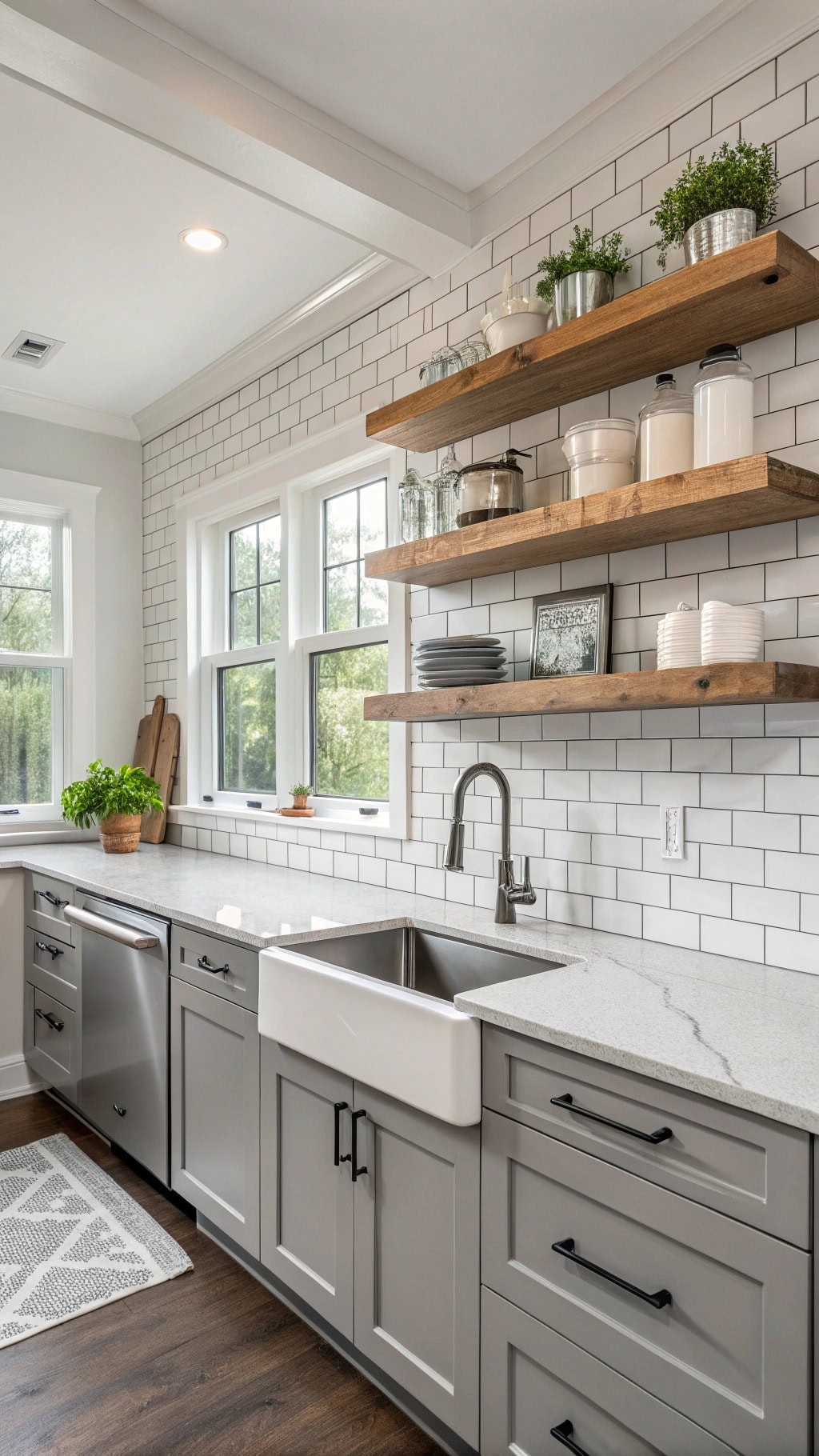
- Floating wood shelves – warm gray-stained oak against white walls chef’s kiss
- Mix heights – stagger 12″ and 8″ depths for visual interest
- Style in odd numbers – groups of 3 or 5 items look intentionally curated
- White dishware hero – your everyday plates become decor (genius, right?)
- Add greenery – small potted herbs break up the gray-white palette
Pro Tip: Keep your “pretty” dishes on display and hide the mismatched tupperware in closed cabinets below. Nobody needs to see that chaos! Maintain a 70/30 ratio – 70% styled items, 30% breathing room to avoid the cluttered thrift store vibe.
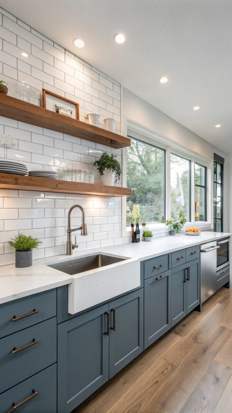
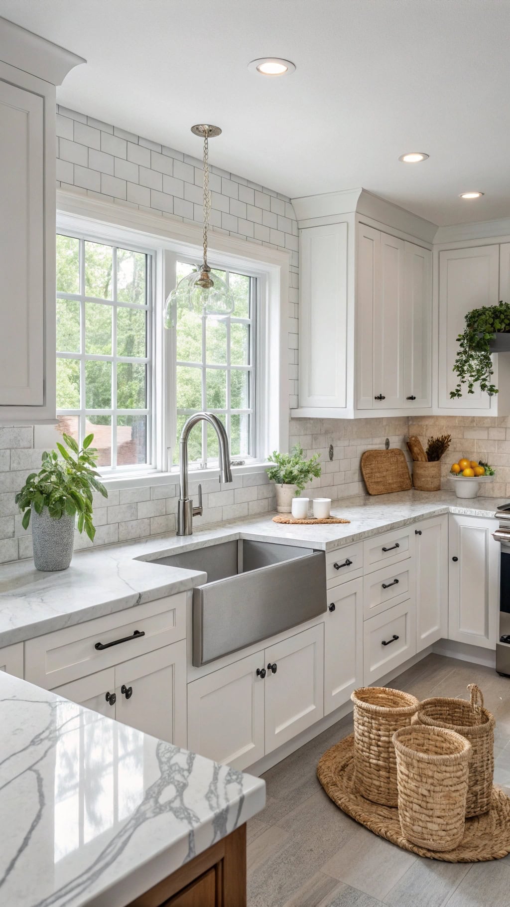
12. Subway Tile Classic Appeal
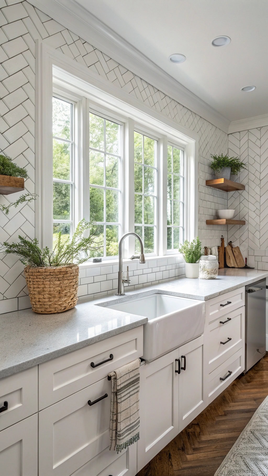
- Classic white 3×6 subway tiles – timeless backdrop that never gets old
- Gray grout surprise – adds subtle definition without screaming “look at my grout lines!”
- Herringbone accent strip – because you’re fancy like that
- Glossy finish reflects light – makes your kitchen feel twice as big
- Run tiles to ceiling – no awkward stopping point halfway up
Pro Tip: Offset your subway tiles at exactly 50% for that authentic vintage vibe. And here’s the secret sauce – use a slightly darker gray grout (think Dove gray, not charcoal) to hide inevitable coffee splashes while keeping things cohesive. Your future self will thank you when you’re not scrubbing grout lines every weekend!
13. Brass Pendant Light Fixtures
- Warm brass finish – instantly elevates your space from “nice” to “wow, where’d you get those?”
- Globe or dome shapes – soften all those straight lines in your kitchen
- Hang in odd numbers – three over an island beats two every single time
- Mix heights for drama – stagger them like you’re creating a brass constellation
- Dimmer switch essential – mood lighting for midnight snacks or dinner parties
Pro Tip: Keep brass fixtures at least 30 inches above your countertop to avoid head bumps during meal prep. The golden rule? Match your brass tones throughout – mixing warm and cool brass is like wearing gold and silver jewelry together (technically fine, but why risk it?). Your cohesive look will make everything feel intentional!
14. Soft Gray Veined Countertops
- Soft gray veining – like nature’s own watercolor painting across your counters
- Subtle pattern variations – no two slabs are twins, and that’s the beauty of it
- Cool undertones – pair perfectly with your white cabinets for that crisp, clean vibe
- Quartz over marble – get the look without the maintenance drama (spilled wine? No panic!)
- Waterfall edges – because your island deserves to make a statement
Pro Tip: Choose veining that’s 2-3 shades darker than your cabinet gray – too matchy-matchy looks forced, while high contrast can feel jarring. Request full slab photos before ordering (Instagram-worthy angles hide busy patterns!). Your sweet spot? Veining that whispers rather than shouts.
15. Sleek Handle-free Cabinet Doors
- Push-to-open mechanisms – wave goodbye to handles and hello to that ultra-modern look
- Integrated finger pulls – hidden grooves that keep your lines clean and your style on point
- Matte finishes – because fingerprints on glossy surfaces are nobody’s friend
- Full-overlay doors – minimal gaps mean maximum sleekness (and fewer crumb-catching crevices!)
- Touch-latch hardware – tap and voilà, your secret snack stash is revealed
Pro Tip: Balance those super-sleek doors with one textured element – maybe a rough-hewn wood shelf or nubby linen curtains. Too much perfection feels cold, but that one organic touch? Chef’s kiss! Test push mechanisms before committing – some need a firm press while others respond to a gentle nudge.
16. Shaker Cabinet Door Profiles
- Five-piece construction – that classic recessed center panel that screams “I have my life together”
- 3-inch rail width – not too chunky, not too skinny, just that Goldilocks sweet spot
- Soft gray paint – Benjamin Moore’s Stonington Gray is basically the yoga pants of kitchen colors
- Crisp white interiors – open those babies up and bam! Instant brightness boost
- Mixed with open shelving – because Shaker can play nice with modern touches too
Pro Tip: Keep hardware simple with matte black pulls or brushed nickel – anything too ornate will clash with Shaker’s clean-lined personality. Want to avoid the “too traditional” trap? Paint just the island in charcoal while keeping perimeter cabinets light gray for that perfect contemporary-meets-classic vibe.
17. Charcoal Window Trim Contrast
- Matte black window frames – like eyeliner for your kitchen, instantly makes everything pop
- White marble sills – because your windows deserve a little luxury too
- Soft gray walls – the perfect backdrop that lets those dark frames steal the show
- Natural wood shutters – warm up all that coolness with honey-toned accents
- Statement pendant lights – echo that charcoal trim with black metal fixtures
Pro Tip: Balance is everything here! If you’re going bold with charcoal trim, keep your cabinet hardware in the same finish family but go lighter – think gunmetal rather than jet black. This prevents your kitchen from feeling too heavy while maintaining that sophisticated contrast you’re after.
18. Textured Gray Wall Panels
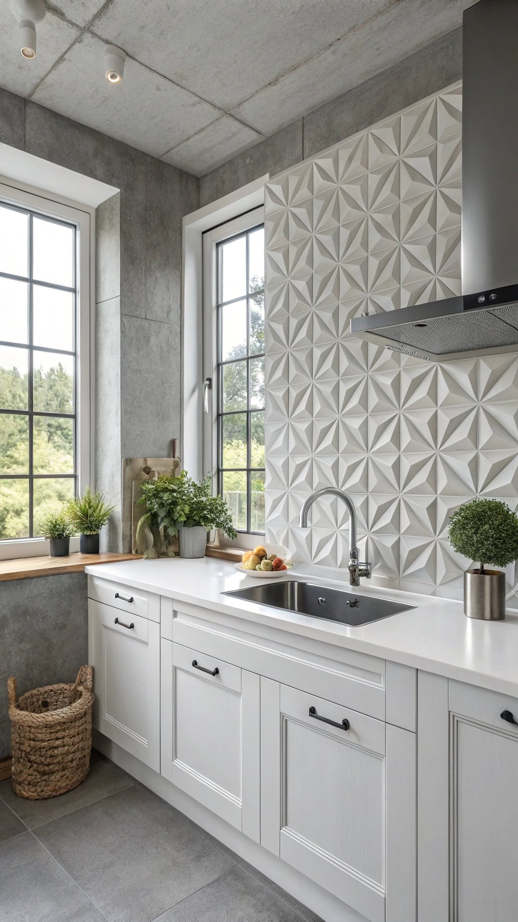
- 3D geometric panels – add depth without the commitment of a full reno
- Subtle linen textures – like your favorite cozy sweater, but for walls
- Horizontal wood-look planks – instant modern farmhouse vibes in soft gray
- Concrete-effect tiles – industrial chic that plays beautifully with white cabinets
- Woven wallpaper accents – texture you can’t help but touch every time you pass
Pro Tip: Mix smooth and textured surfaces to keep things interesting! If you’re going bold with textured panels behind your range, balance it with sleek subway tiles elsewhere. And here’s a secret – textured walls are forgiving with kitchen splashes and fingerprints, making them perfect for high-traffic areas where flat paint might show every little mark.
19. Light Gray Breakfast Bar
- Waterfall edge countertops – that dramatic cascade of gray quartz or marble is pure eye candy
- Mixed seating heights – combine counter stools with a lower bench for versatile entertaining
- Built-in charging stations – hidden USB ports keep devices powered while you chat
- Pendant light trios – hang them low for intimate lighting that makes morning coffee feel special
- Two-tone base – pair light gray top with white cabinet base for that layered look
Pro Tip: Choose a lighter gray for your breakfast bar than your main counters – it’ll make the space feel larger and create a natural focal point. Plus, lighter grays hide crumbs better (we won’t tell if you don’t!).
20. Warm Gray Oak Flooring
- Wire-brushed texture – adds that lived-in feel while hiding everyday scuffs from your kids and pets
- Wide plank boards – go 7 inches or wider for that modern farmhouse vibe you’re craving
- Matte finish – skip the glossy look for something that whispers elegance rather than shouts
- Varied grain patterns – mix boards with different wood grains to avoid that too-perfect manufactured look
- Subtle undertones – choose grays with warm brown hints to keep your space cozy, not cold
Pro Tip: Test your flooring samples at different times of day – that perfect gray oak can look totally different in morning sun versus evening lamplight. Place large samples against your cabinets and live with them for a few days before committing!
21. French Bistro Gray Tiles
- Hexagonal honeycomb patterns – nothing says Parisian café like these classic shapes underfoot
- Weathered stone-look porcelain – get that centuries-old charm without the maintenance headaches
- Mix of light and charcoal grays – create visual interest with a checkerboard or random pattern
- Matte finish with slight texture – prevents slips while nailing that authentic European feel
- White or light gray grout – keeps the focus on your gorgeous tile pattern, not the lines between
Pro Tip: Balance those busy bistro tiles with simple subway tile backsplashes or solid quartz counters. Your eyes need a place to rest, and too many patterns will make your kitchen feel like it’s spinning faster than a French waiter on espresso!
Conclusion
You’ve discovered that gray and white kitchens aren’t just trendy—they’re timeless canvases for your personal style. Whether you’re drawn to sleek minimalism or cozy farmhouse charm, these versatile hues adapt like chameleons to your vision. From industrial concrete to French bistro tiles, you’ll find the perfect blend of elegance and function. Now it’s time to pick your favorite style and transform your cooking space into the heart of your home.