How Can You Transform a Laundry Room Using Only Beige, Black, and White?
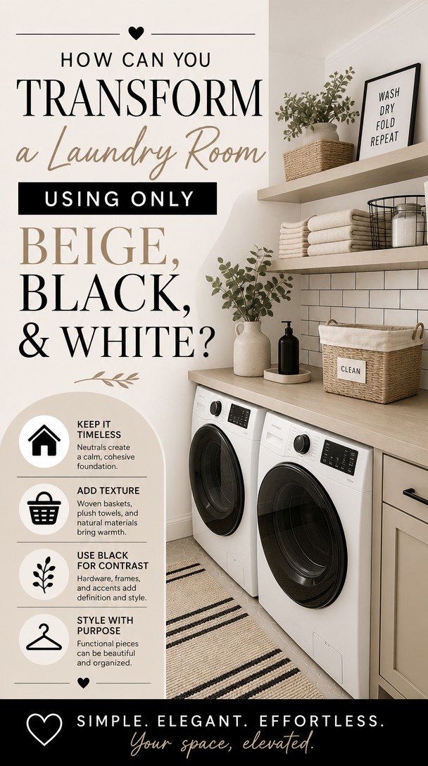
If your laundry room feels like a forgotten corner, a refined beige, black, and white palette can quietly change everything. This understated combination brings warmth, contrast, and polish to a space that deserves more attention.
Whether you’re starting fresh or simply refreshing what’s already there, these ideas will help you create a room that feels truly intentional.
Start With the Right Shade of Beige for Your Laundry Room
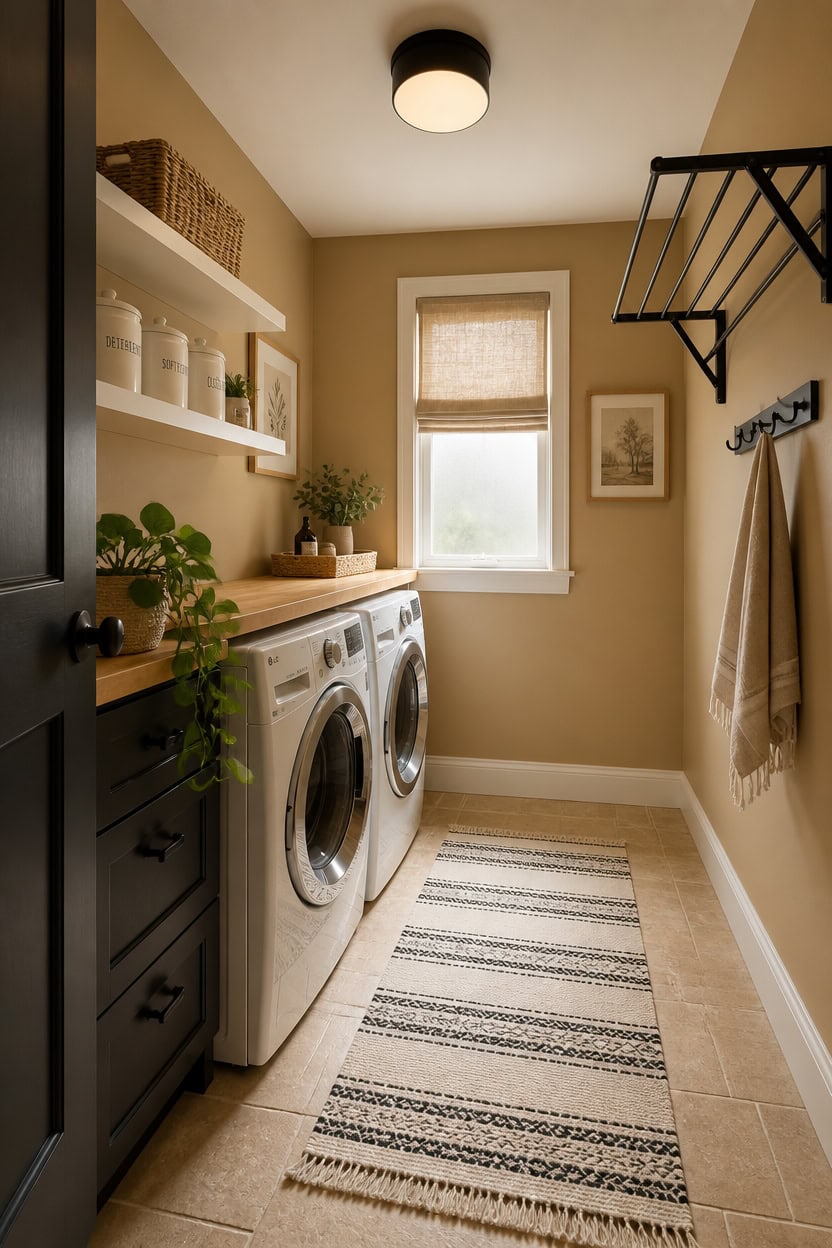
Warm beige reads differently depending on the light in your laundry room, so pulling a swatch from a paint deck and calling it done will cost you. Undertones are the real issue — beige with pink or purple in it looks muddy next to white machines, while beige with yellow or green pulls warm and grounding. Test two or three options directly on your wall in natural and artificial light before committing.
Match undertones to fixtures: Beige with yellow or gray undertones pairs cleanly with white appliances and black hardware.
Avoid pink-leaning beiges: Rosy undertones clash with cool-white machine finishes and make the room look unintentional.
Go one shade deeper than expected: Laundry rooms lose light fast, so a slightly richer beige reads truer than a pale one in dim conditions.
Sample on the largest wall: The biggest wall shows how the color reacts to both overhead lighting and natural light at once.
this golden-neutral tone holds warmth without reading yellow next to white appliances or black hardware.
matched from the wall in this photo — the closest Benjamin Moore shade.
 LA JOLIE MUSE Bathroom Basket Organizers, Paper Rope Storage, Beige 4 Pack
View Price
LA JOLIE MUSE Bathroom Basket Organizers, Paper Rope Storage, Beige 4 Pack
View Price
 Vasunray Wall Mounted Clothes Drying Rack Folding Indoor, Foldable Laundry Drying Rack Collapsible,Invisible, Space Saving, Retractable Towel Drying Rack, with Wall Template(5 Drying Rods, Black 32")
View Price
Vasunray Wall Mounted Clothes Drying Rack Folding Indoor, Foldable Laundry Drying Rack Collapsible,Invisible, Space Saving, Retractable Towel Drying Rack, with Wall Template(5 Drying Rods, Black 32")
View Price
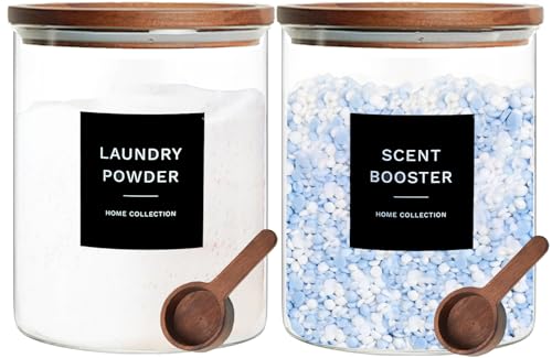 Glass Laundry Storage Containers with Acacia Lids and Scoops, Laundry Jars
View Price
Glass Laundry Storage Containers with Acacia Lids and Scoops, Laundry Jars
View Price
 JINCHAN Tie Up Linen Kitchen Valance 36 Inch 1 Panel Neutral Beige
View Price
JINCHAN Tie Up Linen Kitchen Valance 36 Inch 1 Panel Neutral Beige
View Price
 Coat Rack Wall Mount – 24 Inch Stainless Steel Hook Rail with 8 Double Coat Hooks for Hanging – Wall Mounted Entryway Organizer for Coats, Hats, Bags, Towels, Robes, Bedroom or Bathroom - Black
View Price
Coat Rack Wall Mount – 24 Inch Stainless Steel Hook Rail with 8 Double Coat Hooks for Hanging – Wall Mounted Entryway Organizer for Coats, Hats, Bags, Towels, Robes, Bedroom or Bathroom - Black
View Price
 White Floating Shelves 24 inches Long Set of 3, 24 x 8 Inch Bathroom Wall Shelves Over Toilet for Towels, Modern Wood Mounted Storage Shelf for Bedroom Living Laundry Room Kitchen Office Closet
View Price
White Floating Shelves 24 inches Long Set of 3, 24 x 8 Inch Bathroom Wall Shelves Over Toilet for Towels, Modern Wood Mounted Storage Shelf for Bedroom Living Laundry Room Kitchen Office Closet
View Price
 Tiffasea Black and White Kitchen Rug 2'x4' Washable Indoor Outdoor Rugs
View Price
Tiffasea Black and White Kitchen Rug 2'x4' Washable Indoor Outdoor Rugs
View Price
 flangairy 2 Piece Laundry Room Signs Pictures Wall Decor, 15.7×11.8 Inch Wooden Laundry Care Symbols Chart Wall Art, Stain Removal Wash Guide Print Rustic Farmhouse Decorations for Home Accessories
View Price
flangairy 2 Piece Laundry Room Signs Pictures Wall Decor, 15.7×11.8 Inch Wooden Laundry Care Symbols Chart Wall Art, Stain Removal Wash Guide Print Rustic Farmhouse Decorations for Home Accessories
View Price
Where White Does Its Best Work in a Laundry Room
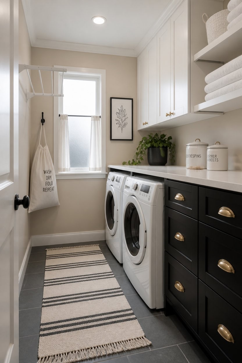
White does the heavy lifting in a beige, black, and white laundry room by acting as the reset between the two stronger elements. It keeps the eye from getting stuck on the dark cabinet fronts or the warm pull of the beige walls. Use white on trim, upper cabinets, and appliance fronts to create breathing room without adding a third competing color.
Use white up high: Upper cabinets and ceiling trim in white draw the eye upward and make the ceiling feel taller than it is.
Apply white to appliances: A white washer and dryer front reads as a built-in design choice, not a default — it anchors the white intentionally.
Layer white textiles: White folded towels, a hanging cloth bag, or a linen curtain panel add softness without adding visual noise.
Keep white bright, not cream: In a laundry room, true white holds up better under artificial light than off-white, which can shift yellow under warm bulbs.
the crisp finish lifts the ceiling line and balances the black lower cabinets below.
matched from the wall in this photo — the closest Benjamin Moore shade.
 FIMELLO 60" Laundry Room Wall Cabinets with Adjustable Shelf, Large Wall Storage Cabinet, White Wall Cabinet with Doors, Upper Kitchen Cabinet, Cabinets for Laundry, Bathroom, Kitchen -White
View Price
FIMELLO 60" Laundry Room Wall Cabinets with Adjustable Shelf, Large Wall Storage Cabinet, White Wall Cabinet with Doors, Upper Kitchen Cabinet, Cabinets for Laundry, Bathroom, Kitchen -White
View Price
 Ceramic Kitchen Canisters for Countertop Set of 3 w/ Airtight Ceramic Lids
View Price
Ceramic Kitchen Canisters for Countertop Set of 3 w/ Airtight Ceramic Lids
View Price
 Household Essentials 148 Hanging Cotton Canvas Laundry Hamper Bag | White, 6" x 16" x 27" (Length x Width x Height)
View Price
Household Essentials 148 Hanging Cotton Canvas Laundry Hamper Bag | White, 6" x 16" x 27" (Length x Width x Height)
View Price
 Curver Set of 4 Large Cube 17L Jute Decorative Plastic Organization and Storage Baskets - Perfect Bins for Home Office, Closet Shelves, Kitchen Pantry and All Bedroom Essentials, White
View Price
Curver Set of 4 Large Cube 17L Jute Decorative Plastic Organization and Storage Baskets - Perfect Bins for Home Office, Closet Shelves, Kitchen Pantry and All Bedroom Essentials, White
View Price
 Pure White Curtains 38 Inch Width for Kitchen Windows 2 Panel Sets Rod Pocket Linen Textured Cafe Tier Light Filtering Short Sheer Curtains for Bedroom Laundry Room Farmhouse Decor Wide 38 x 45 Long
View Price
Pure White Curtains 38 Inch Width for Kitchen Windows 2 Panel Sets Rod Pocket Linen Textured Cafe Tier Light Filtering Short Sheer Curtains for Bedroom Laundry Room Farmhouse Decor Wide 38 x 45 Long
View Price
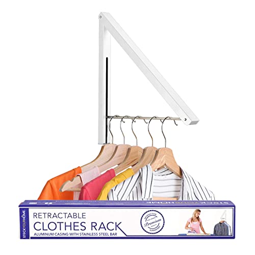 Single Foldable Clothing Rack, Wall-Mounted Retractable Clothes Hanger for Laundry Dryer Room, Hanging Drying Rod, Small Collapsible Folding Garment Racks, Dorm Accessories (White)
View Price
Single Foldable Clothing Rack, Wall-Mounted Retractable Clothes Hanger for Laundry Dryer Room, Hanging Drying Rod, Small Collapsible Folding Garment Racks, Dorm Accessories (White)
View Price
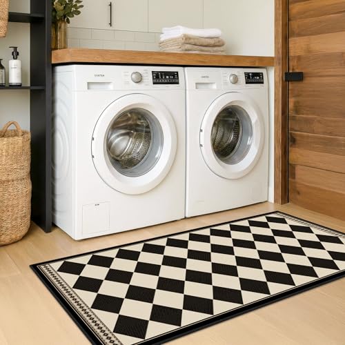 Black and White Checkered 2x5 Easy Jute Laundry Room Rug Runner, Laundry Floor Mat, Washable Non Slip Diamond Boho Carpet for Entryway, Bathroom, Kitchen, Checkerboard Modern Farmhouse Mat
View Price
Black and White Checkered 2x5 Easy Jute Laundry Room Rug Runner, Laundry Floor Mat, Washable Non Slip Diamond Boho Carpet for Entryway, Bathroom, Kitchen, Checkerboard Modern Farmhouse Mat
View Price
 Funny Modern Minimalist Wall Art Poster (8”X10”,Unframed), Set of 6
View Price
Funny Modern Minimalist Wall Art Poster (8”X10”,Unframed), Set of 6
View Price
The Best Wall Finish for a Beige, Black and White Laundry Room
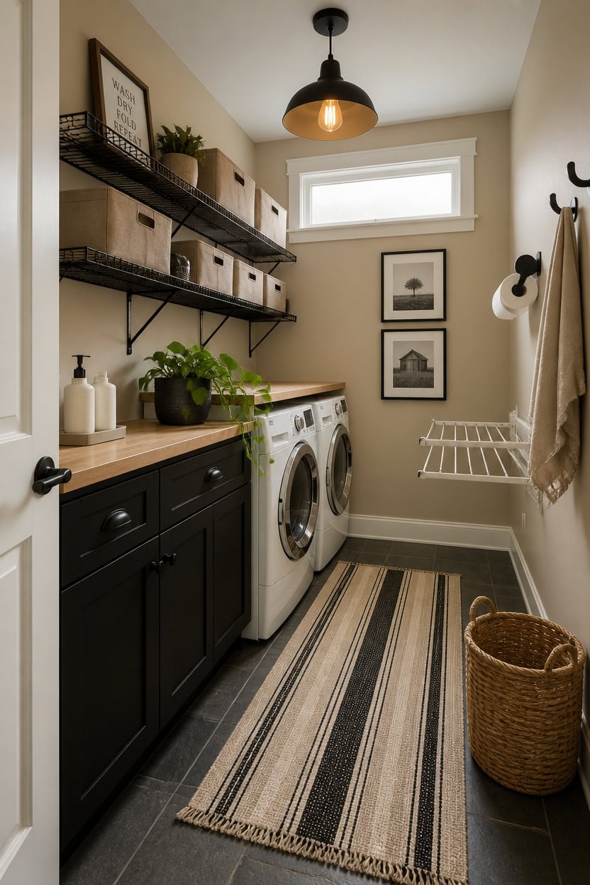
Eggshell finish is the right call for laundry room walls in a beige, black, and white palette — it handles humidity and light splashes better than flat paint without going as shiny as satin. The slight sheen also helps beige walls reflect light back into the room, which keeps the space from feeling closed in between the dark lower cabinets and bright upper ones. If your laundry room lacks a window, eggshell becomes even more important because it holds color truer under artificial lighting than flat finishes do.
Skip flat paint entirely: Flat absorbs moisture and scuffs easily — both guaranteed problems in a working laundry room.
Use eggshell on walls, satin on trim: The slight contrast in sheen helps define the boundary between beige walls and white trim without using a second color.
Test swatches under your actual bulbs: Beige shifts noticeably between warm and cool light, so swatch testing at night matters as much as daytime testing.
Seal high-splash zones: Apply an extra coat near the utility sink or washer hookup where water contact is most likely.
the warm, greige undertone holds steady under both natural and artificial light without reading yellow or pink.
matched from the wall in this photo — the closest Benjamin Moore shade.
 Wall Mount Paper Towel Holder with Shelf, Adhesive Towel Rack Matte Black
View Price
Wall Mount Paper Towel Holder with Shelf, Adhesive Towel Rack Matte Black
View Price
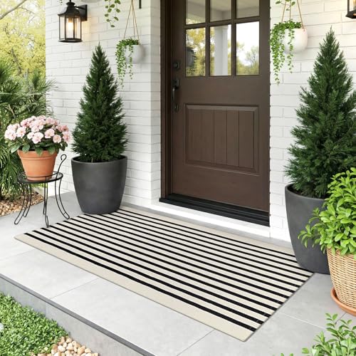 KOZYFLY Beige and Black Striped Runner Rug 2x4.3 ft Mat Woven Cotton Rug
View Price
KOZYFLY Beige and Black Striped Runner Rug 2x4.3 ft Mat Woven Cotton Rug
View Price
 3IngSeagulls 2 Pack Laundry Room Shelves, Wire Baskets with 8 Hooks, Over Washer and Dryer Shelf, Wall Mounted Storage and Clothes Drying Rack, Black
View Price
3IngSeagulls 2 Pack Laundry Room Shelves, Wire Baskets with 8 Hooks, Over Washer and Dryer Shelf, Wall Mounted Storage and Clothes Drying Rack, Black
View Price
 Natheeph 14OZ Ceramic Soap Dispenser Bathroom/Kitchen Can Fill Liquid-White
View Price
Natheeph 14OZ Ceramic Soap Dispenser Bathroom/Kitchen Can Fill Liquid-White
View Price
 Modern 5th Laundry Room Signs (Set of 4 Unframed - 8 x 10 Inches), Wash Dry Fold Repeat, Typography Wall Art Decor Prints, Black and White Print Unframed
View Price
Modern 5th Laundry Room Signs (Set of 4 Unframed - 8 x 10 Inches), Wash Dry Fold Repeat, Typography Wall Art Decor Prints, Black and White Print Unframed
View Price
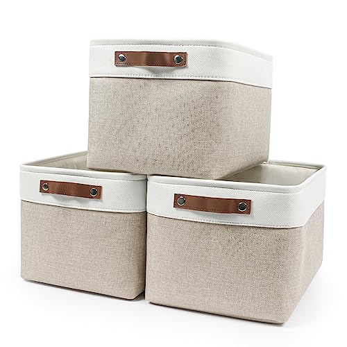 Bagnizer Storage Bins Large Fabric Storage Baskets for Shelves 3 Pack, Decorative Linen Closet Baskets with Handles for Organizing, Shelf, Clothes, Home, Office, 15x11x9.5Inches (Beige&White)
View Price
Bagnizer Storage Bins Large Fabric Storage Baskets for Shelves 3 Pack, Decorative Linen Closet Baskets with Handles for Organizing, Shelf, Clothes, Home, Office, 15x11x9.5Inches (Beige&White)
View Price
 Homagic Towel Hooks Bathroom Coat Robe Wall Hook Heavy Duty Door Hanger Towel Robe Clothes Cabinet Closet Sponges Rack for Bathroom Bedroom Kitchen Hotel Pool 4 Packs Black(Drilling Installation)
View Price
Homagic Towel Hooks Bathroom Coat Robe Wall Hook Heavy Duty Door Hanger Towel Robe Clothes Cabinet Closet Sponges Rack for Bathroom Bedroom Kitchen Hotel Pool 4 Packs Black(Drilling Installation)
View Price
 Ithywat Retractable Clothes Drying Rack,Space Saver Wall Mounted Folding Hanger for Laundry Room,Closet Storage Organization,Easy Installation Aluminum Dryer White
View Price
Ithywat Retractable Clothes Drying Rack,Space Saver Wall Mounted Folding Hanger for Laundry Room,Closet Storage Organization,Easy Installation Aluminum Dryer White
View Price
Cabinetry That Earns Its Place in the Color Story
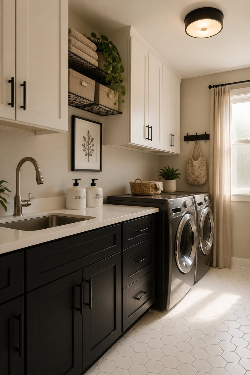
Lower cabinets in Tricorn Black and upper cabinets in a crisp white create the structural contrast that makes a beige, black, and white laundry room feel designed instead of default. The black grounds the room visually while the white keeps it from turning cave-like, and the beige walls between them act as a neutral bridge that softens the hard contrast. If your cabinets are builder-grade oak or dated almond, a coat of paint is the fastest way to pull them into the color story without replacing them.
Match hardware to the black: Matte black pulls on both upper and lower cabinets unify the hardware finish with the dark lower tone.
Keep uppers simple: Upper cabinets with flat or shaker-style doors in white stay visually quiet so the black base reads as the intentional anchor.
Use open shelving sparingly: One open shelf section breaks up the cabinet run and lets you display folded linens or beige storage bins without adding visual weight.
Check door gap consistency: Cabinet doors that hang unevenly get more noticeable when the doors are black — adjust hinges before painting.
the clean, bright white reads true under laundry room lighting without drifting yellow or gray.
matched from this photo — the closest Benjamin Moore shade.
 Estmoon 30 Pack Cabinet Handles Matte Black Cabinet Pulls with 3 Inch Hole Center, Stainless Steel Kitchen Cabinet Handles Black Kitchen Handles for Cabinets and Drawers, 76mm Hole Centers
View Price
Estmoon 30 Pack Cabinet Handles Matte Black Cabinet Pulls with 3 Inch Hole Center, Stainless Steel Kitchen Cabinet Handles Black Kitchen Handles for Cabinets and Drawers, 76mm Hole Centers
View Price
 2 Pcs 15.5" W x 29" H Unfinished Kitchen Cabinet Doors with 4 Hinges, Shaker Style Cabinet Door Front Replacement for Kitchen, Bathroom, Vanity, Closet
View Price
2 Pcs 15.5" W x 29" H Unfinished Kitchen Cabinet Doors with 4 Hinges, Shaker Style Cabinet Door Front Replacement for Kitchen, Bathroom, Vanity, Closet
View Price
 Laundry Room Shelves Wall Mounted with Wire Baskets, Over the Washer and Dryer Shelf with Clothes Drying Rack, Wire Shelves Baskets for Laundry Closet Organization and Storage, Wood+Metal, Black
View Price
Laundry Room Shelves Wall Mounted with Wire Baskets, Over the Washer and Dryer Shelf with Clothes Drying Rack, Wire Shelves Baskets for Laundry Closet Organization and Storage, Wood+Metal, Black
View Price
 OrganiHaus 15x11in Canvas Storage Baskets 3 Pack - Fabric Bins for Shelves
View Price
OrganiHaus 15x11in Canvas Storage Baskets 3 Pack - Fabric Bins for Shelves
View Price
 35oz Laundry Detergent Dispenser,Liquid Container,White with Plastic Tray
View Price
35oz Laundry Detergent Dispenser,Liquid Container,White with Plastic Tray
View Price
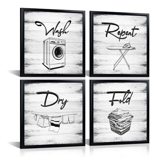 Artmyharbor 4 Pieces Laundry Room Wall Art
View Price
Artmyharbor 4 Pieces Laundry Room Wall Art
View Price
 dancrul Wall Mounted Clothes Drying Rack, Wall Clothes Hanger Hook for Laundry Room Hanger Foldable, Wall Clothes Rack Indoor, Perfect for Small Spaces, Matte Black 2 Packs
View Price
dancrul Wall Mounted Clothes Drying Rack, Wall Clothes Hanger Hook for Laundry Room Hanger Foldable, Wall Clothes Rack Indoor, Perfect for Small Spaces, Matte Black 2 Packs
View Price
 caktraie 4 Pack Stackable Closet Storage Basket - Stackable Storage Bins
View Price
caktraie 4 Pack Stackable Closet Storage Basket - Stackable Storage Bins
View Price
Countertops and Shelving That Tie the Laundry Room Palette Together
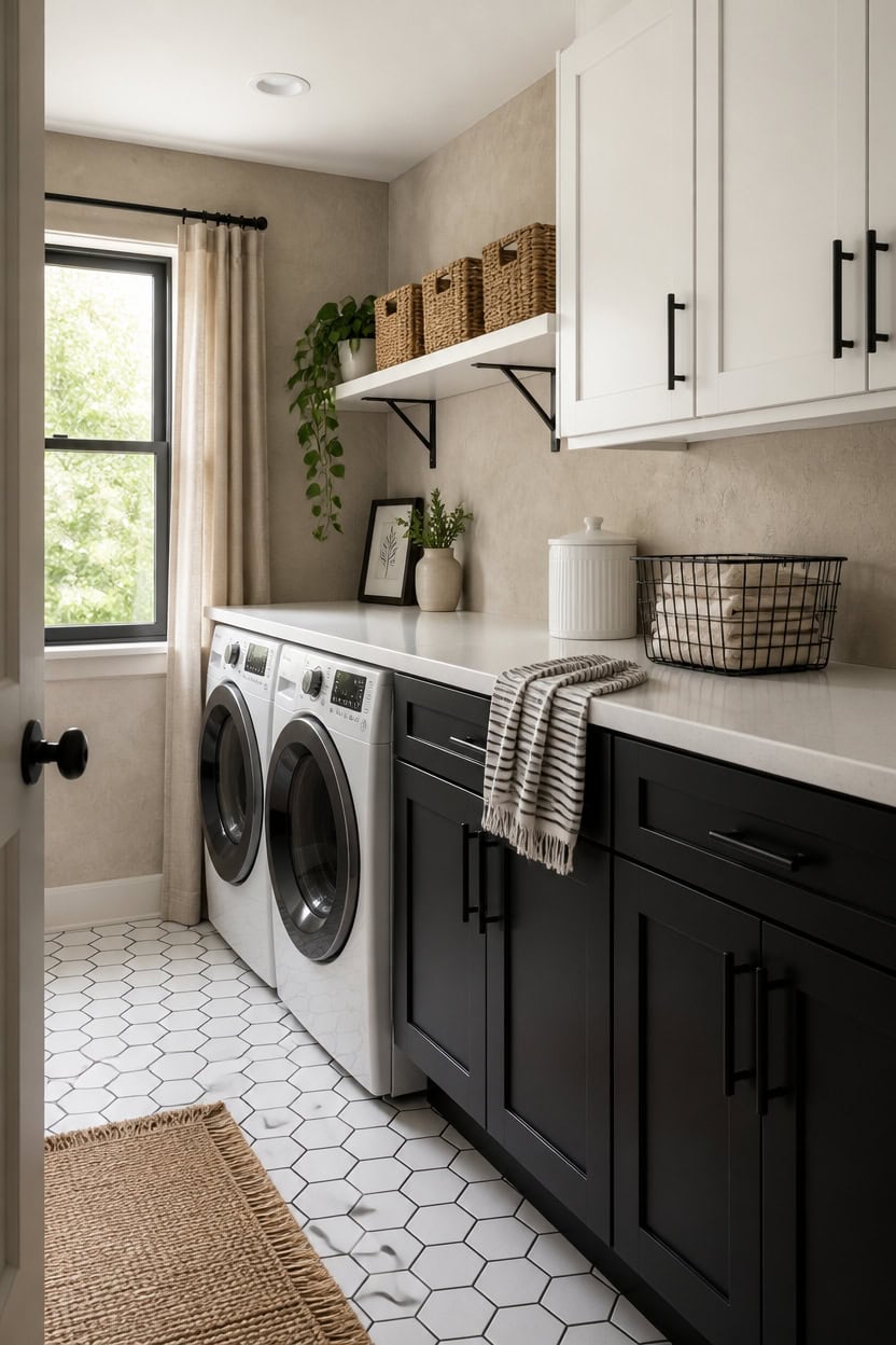
White quartz or butcher block countertops work harder in a beige, black, and white laundry room than any other surface because they connect the upper and lower cabinet colors without adding a third competing tone. White counters echo the upper cabinets and keep the room feeling bright, while butcher block adds warmth that softens the stark contrast between Tricorn Black bases and crisp white uppers. Either way, shelving in the same white or natural wood finish carries the palette vertically and makes the whole room feel like one deliberate decision.
Go matte on counters: A matte or honed finish on white counters reads softer than high-gloss and pairs better with matte black cabinet hardware.
Float one shelf above the machines: A single wall-mounted shelf directly above the washer and dryer gives you folding space for bins and baskets without blocking light.
Use beige bins on white shelves: Beige or natural woven storage bins on white shelving mirror the wall color and reinforce the three-tone palette as a full-room decision.
Keep shelf brackets black: Black metal shelf brackets echo the lower cabinet color and lock the shelving into the design instead of making it look like an afterthought.
the warm, sandy tone grounds the white shelves and black brackets without fighting either color.
matched from the wall in this photo — the closest Benjamin Moore shade.
 Livelynine 15.8x394 White Peel and Stick Countertops Waterproof Contact Paper Granite Countertop Marble Wallpaper for Kitchen Vinyl Wrap Quartz Counter Top Covers Table Sticker Laminate Cabinet Cover
View Price
Livelynine 15.8x394 White Peel and Stick Countertops Waterproof Contact Paper Granite Countertop Marble Wallpaper for Kitchen Vinyl Wrap Quartz Counter Top Covers Table Sticker Laminate Cabinet Cover
View Price
 WEKIS 12 Inch Heavy Duty Floating Shelf Bracket, Wall Mounting Industrial Black Shelf Brackets, 1/5 Inch Thick Iron Metal Brackets for Shelves 6 Packs
View Price
WEKIS 12 Inch Heavy Duty Floating Shelf Bracket, Wall Mounting Industrial Black Shelf Brackets, 1/5 Inch Thick Iron Metal Brackets for Shelves 6 Packs
View Price
 Axeman Floating Shelves for Wall, 16'' x 8'' White Wall Shelves Set of 2
View Price
Axeman Floating Shelves for Wall, 16'' x 8'' White Wall Shelves Set of 2
View Price
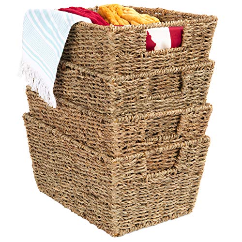 Best Choice Products Rustic Set Of 4 Multipurpose Stackable Seagrass Storage Basket, Handwoven Laundry Organizer Totes for Bedroom and Living Room, Shelves, Pantry w/Insert Handles - Natural
View Price
Best Choice Products Rustic Set Of 4 Multipurpose Stackable Seagrass Storage Basket, Handwoven Laundry Organizer Totes for Bedroom and Living Room, Shelves, Pantry w/Insert Handles - Natural
View Price
 Black and White Striped Hand Towels for Bathroom, Vintage Kitchen Decor
View Price
Black and White Striped Hand Towels for Bathroom, Vintage Kitchen Decor
View Price
 Decotalk 30"x120" Butcher Block Wood Contact Paper Peel and Stick Countertop Contact Paper Waterproof Wood Grain Wallpaper Butcher Block Wallpaper Removable Wooden Butcher Block Vinyl
View Price
Decotalk 30"x120" Butcher Block Wood Contact Paper Peel and Stick Countertop Contact Paper Waterproof Wood Grain Wallpaper Butcher Block Wallpaper Removable Wooden Butcher Block Vinyl
View Price
 American Atelier Bianca Dash Ceramic Canister Set 3-Piece, White
View Price
American Atelier Bianca Dash Ceramic Canister Set 3-Piece, White
View Price
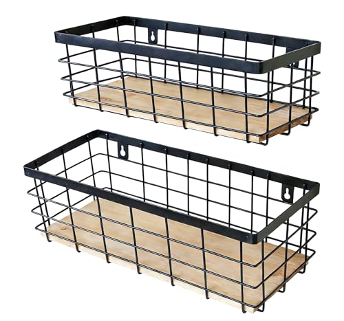 ShabbyDecor Metal Wire Basket for Kitchen Cabinet Pantry Bathroom Set of 2
View Price
ShabbyDecor Metal Wire Basket for Kitchen Cabinet Pantry Bathroom Set of 2
View Price
Storage Solutions That Look Intentional, Not Just Functional
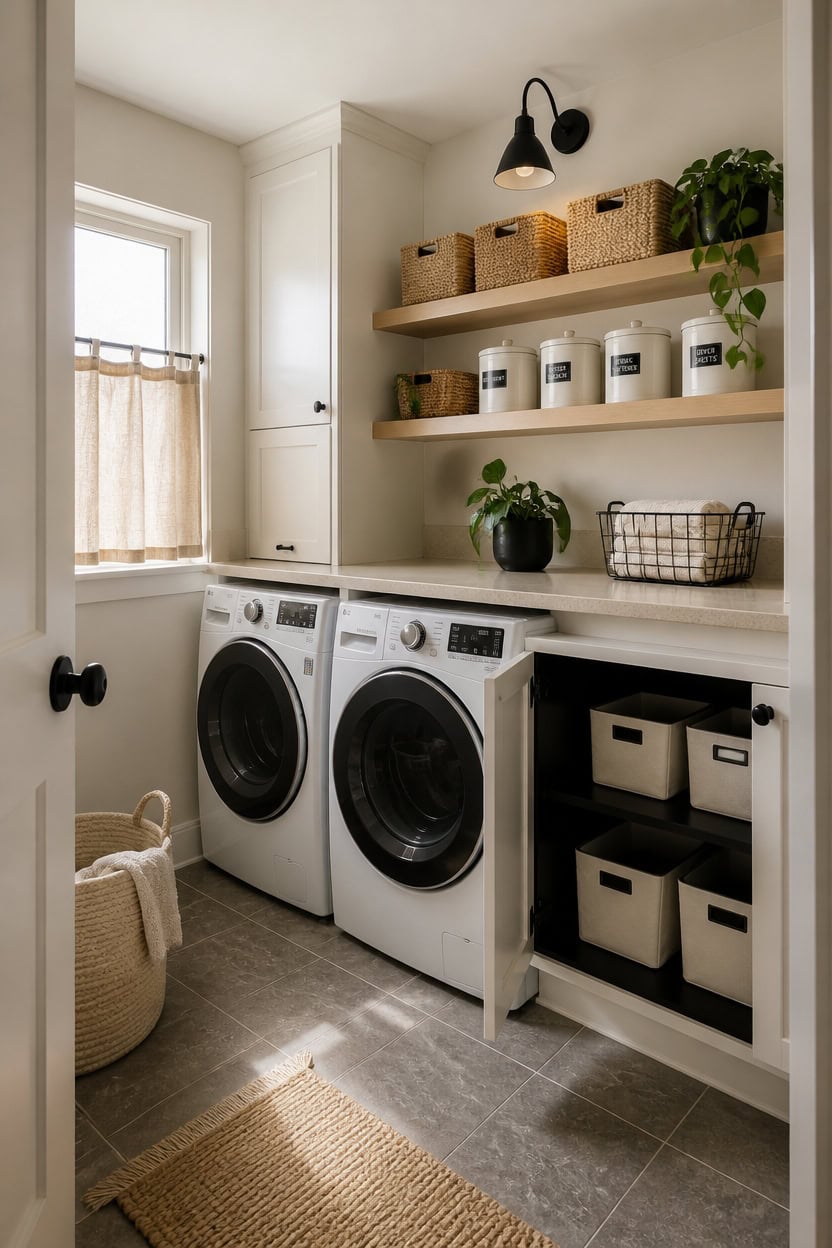
Storage that looks designed rather than thrown together starts with choosing containers that match your palette — not just whatever bin was on sale at the hardware store. In a beige, black, and white laundry room, cohesive storage means every basket, jar, and organizer reinforces the same three tones you already have on the walls and cabinets. Pick your containers first, then arrange them so they become part of the design instead of hiding from it.
Group by color, not category: Cluster beige baskets together and white canisters together so the storage itself reads as a pattern on the shelf.
Label everything consistently: Matching black-on-white labels on every container turn a row of mixed jars into a deliberate design moment.
Limit basket finishes to two: Choose one woven texture and one solid material — mixing rattan, wire, fabric, and plastic in the same room kills the intentional look instantly.
Leave breathing room on shelves: Don’t pack shelves to capacity; one or two empty spaces make the storage look curated instead of chaotic.
the warm sandy backdrop makes white canisters and black labels pop without competing with the storage display.
matched from the wall in this photo — the closest Benjamin Moore shade.
 3 Pack Natural Seagrass Woven Storage Baskets Woven Rectangular Organizer Set With Handles Decorative Wicker Bins For Shelves Bathroom Bedroom Living Room Home Decor Rustic Beige
View Price
3 Pack Natural Seagrass Woven Storage Baskets Woven Rectangular Organizer Set With Handles Decorative Wicker Bins For Shelves Bathroom Bedroom Living Room Home Decor Rustic Beige
View Price
 10 Strawberry Street Marble Ceramic Kitchen Canister Set, Set of 3, White/Black
View Price
10 Strawberry Street Marble Ceramic Kitchen Canister Set, Set of 3, White/Black
View Price
 8 Pack Wire Storage Baskets for Organizing with Removable Tags, Pantry Organization Bins for Kitchen Cabinets, Closet - Metal Basket for Laundry, Garage, Refridge, Bathroom Countertop Organizer, Black
View Price
8 Pack Wire Storage Baskets for Organizing with Removable Tags, Pantry Organization Bins for Kitchen Cabinets, Closet - Metal Basket for Laundry, Garage, Refridge, Bathroom Countertop Organizer, Black
View Price
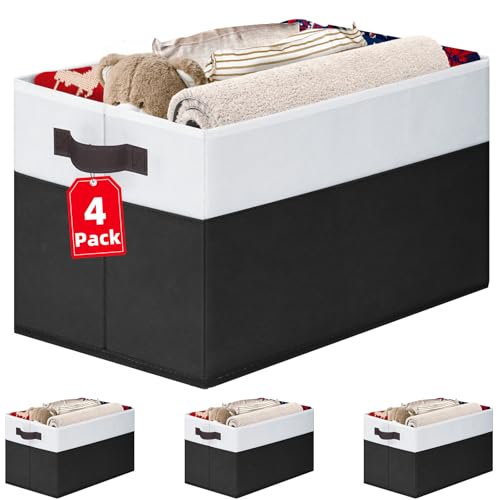 Criusia Large Storage Bins for Shelves 4 Pack, Closet Storage Baskets for Clothes Blanket Beddings Towels, Collapsible Fabric Closet Organizer Bins with Handles/ Laundry Room Organization
View Price
Criusia Large Storage Bins for Shelves 4 Pack, Closet Storage Baskets for Clothes Blanket Beddings Towels, Collapsible Fabric Closet Organizer Bins with Handles/ Laundry Room Organization
View Price
 v2croft 144 PCS Minimalist Laundry Room Labels, Waterproof Stickers, Black
View Price
v2croft 144 PCS Minimalist Laundry Room Labels, Waterproof Stickers, Black
View Price
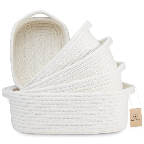 NaturalCozy 5-Piece Rectangle Storage Basket Set- Natural Cotton Rope Woven for Organizing! Small Basket for Montessori, Baby Nursery, Dog Toy Baskets, Cat Toy Box, Bathroom Organization Bin
View Price
NaturalCozy 5-Piece Rectangle Storage Basket Set- Natural Cotton Rope Woven for Organizing! Small Basket for Montessori, Baby Nursery, Dog Toy Baskets, Cat Toy Box, Bathroom Organization Bin
View Price
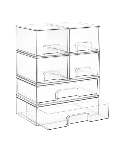 Vtopmart Stackable Storage Drawers Set of 6, Clear Plastic Organizer Bins for Bathroom Supplies, Ideal for Cabinet,Shelf, Pantry, Laundry Room Organization
View Price
Vtopmart Stackable Storage Drawers Set of 6, Clear Plastic Organizer Bins for Bathroom Supplies, Ideal for Cabinet,Shelf, Pantry, Laundry Room Organization
View Price
 Hongtamoya Adjustable Over the Door Organizer, Metal Hanging Door Organizer with 5 Wire Basket 7 Hooks, Wall Mounted Shelf for Pantry Laundry Organization and Storage, Black
View Price
Hongtamoya Adjustable Over the Door Organizer, Metal Hanging Door Organizer with 5 Wire Basket 7 Hooks, Wall Mounted Shelf for Pantry Laundry Organization and Storage, Black
View Price
Flooring Options That Ground Your Laundry Room Design
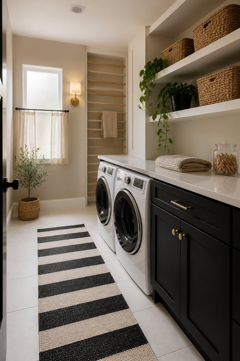
Porcelain tile with a matte finish in either white or soft beige grounds a laundry room without making the floor the loudest thing in the room. Hard, water-resistant surfaces hold up to the splash and spill cycle better than vinyl plank, which can lift at the seams near washing machines over time. If you want warmth underfoot, layer a washable cotton runner down the center aisle instead of switching the entire floor material.
Go matte over glossy: Matte tile hides water spots and detergent drips that gloss finishes magnify with every overhead light hit.
Match grout to tile tone: White grout on white tile or beige grout on beige tile reads as one seamless surface instead of a busy grid.
Size up the tile: Larger format tiles create fewer grout lines, which makes a compact laundry room feel less chopped up and easier to mop.
Anchor with a runner: A black-and-white cotton runner down the center connects the floor to your cabinet and storage palette without permanent commitment.
the sandy warm tone bridges white tile floors and dark cabinetry without flattening the room.
matched from the wall in this photo — the closest Benjamin Moore shade.
 Tenedos 12x12 White Porcelain Floor Wall Tile Backsplash (Exact Size 11-7/8 in) Semi Matte Glazed Finish for Flooring, Kitchen Backsplash, Bathroom Shower (1 Piece) (White)
View Price
Tenedos 12x12 White Porcelain Floor Wall Tile Backsplash (Exact Size 11-7/8 in) Semi Matte Glazed Finish for Flooring, Kitchen Backsplash, Bathroom Shower (1 Piece) (White)
View Price
 Uphome Boho Hallway Runner Rug 2'x 6', Beige Cotton Washable Kitchen Rug Runners with Tassels, Hand Woven Western Entryway Runner Rugs, Morrocan Accent Throw Carpet for Hallways Bedroom Bathroom
View Price
Uphome Boho Hallway Runner Rug 2'x 6', Beige Cotton Washable Kitchen Rug Runners with Tassels, Hand Woven Western Entryway Runner Rugs, Morrocan Accent Throw Carpet for Hallways Bedroom Bathroom
View Price
 U'Artlines Washable Hallway Runner Rug 2x6',Non-Slip, Black and White
View Price
U'Artlines Washable Hallway Runner Rug 2x6',Non-Slip, Black and White
View Price
 KIMODE Kitchen Mats 2 PCS, Cushioned Anti Fatigue Kitchen Rugs and Mats
View Price
KIMODE Kitchen Mats 2 PCS, Cushioned Anti Fatigue Kitchen Rugs and Mats
View Price
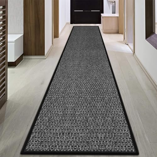 GOYLSER 15ft Jute Hallway Runner Rug Non Slip Washable, Rubber Backed Absorbent Laundry Rugs Laundry Room Runner, Black Long Entry Runner
View Price
GOYLSER 15ft Jute Hallway Runner Rug Non Slip Washable, Rubber Backed Absorbent Laundry Rugs Laundry Room Runner, Black Long Entry Runner
View Price
 Bedding Craft Jute Cotton Stripe Area Rug for Living Room 24x36 Inch - Natural Ivory - Machine Washable 2x3 Feet Rugs - 70% Jute and 30% Cotton
View Price
Bedding Craft Jute Cotton Stripe Area Rug for Living Room 24x36 Inch - Natural Ivory - Machine Washable 2x3 Feet Rugs - 70% Jute and 30% Cotton
View Price
 Art3d 30-Pack Hexagon Peel and Stick Vinyl Floor Tiles, White Marble
View Price
Art3d 30-Pack Hexagon Peel and Stick Vinyl Floor Tiles, White Marble
View Price
How Lighting Shapes the Mood of a Neutral Laundry Room
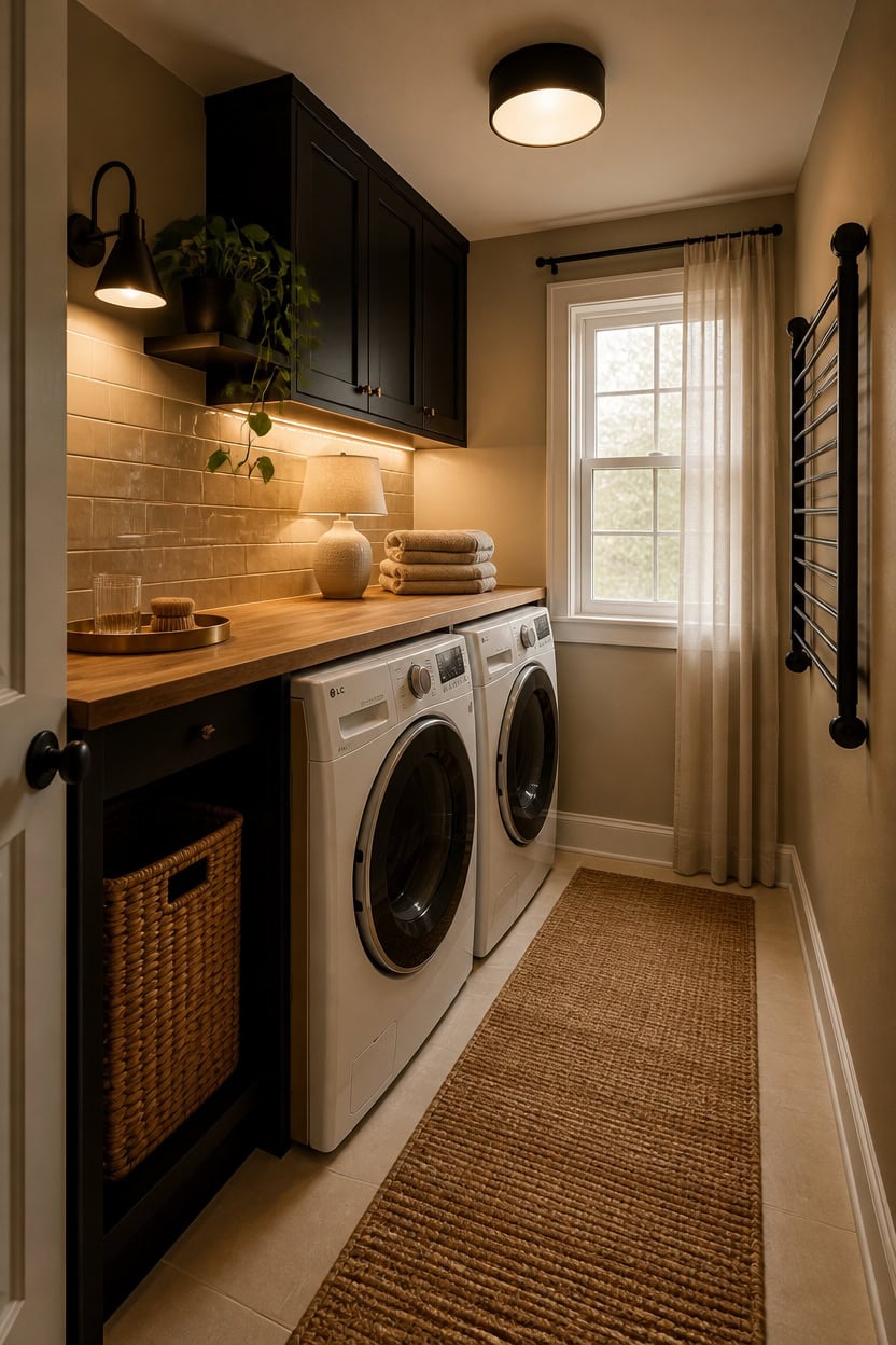
Warm, focused lighting over the work zones — washer controls, folding counter, shelf fronts — does more for a neutral laundry room than any single décor choice. Beige, black, and white palettes absorb flat ambient light and look washed out without layered sources pulling warmth into the space. Add one warm-toned overhead fixture plus under-shelf task lighting, and the room reads intentional rather than institutional.
Layer your sources: Combine one ceiling fixture with under-cabinet LED strips so the folding counter never sits in shadow.
Choose warm white bulbs: Bulbs in the 2700K–3000K range keep beige tones from shifting gray under cool overhead light.
Use black fixtures: A matte black pendant or flush mount ties into dark cabinetry and stops the ceiling from feeling disconnected from the room below.
Skip the single recessed can: One centered can creates a flat pool of light that flattens texture on beige tile and white cabinet fronts.
the warm sand tone bounces softer light back into the room than a stark white ceiling ever would.
matched from the wall in this photo — the closest Benjamin Moore shade.
 Gisisee 11.8 inch Modern Matte Black Flush Mount Ceiling Light Fixture
View Price
Gisisee 11.8 inch Modern Matte Black Flush Mount Ceiling Light Fixture
View Price
 MgLoyht Pendant Lights, Farmhouse Pendant Lamp with Metal Shade (White Inside), Matte Black Industrial Pendant Lighting for Kitchen Island, Dining Room, Bedroom, Hallway
View Price
MgLoyht Pendant Lights, Farmhouse Pendant Lamp with Metal Shade (White Inside), Matte Black Industrial Pendant Lighting for Kitchen Island, Dining Room, Bedroom, Hallway
View Price
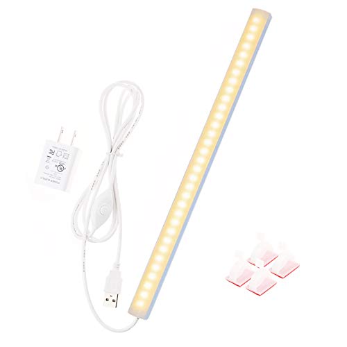 JUSJUBR 12-Inch Slim LED Under Cabinet Light with Memory Function, Warm White 3000K Dimmable USB Light Bar for Rooms
View Price
JUSJUBR 12-Inch Slim LED Under Cabinet Light with Memory Function, Warm White 3000K Dimmable USB Light Bar for Rooms
View Price
 Nourison Home 23" Distressed Cream/Beige Rustic Ceramic Jar Table Lamp for Bedroom, Living Room, Dining Office, with Ivory Shade
View Price
Nourison Home 23" Distressed Cream/Beige Rustic Ceramic Jar Table Lamp for Bedroom, Living Room, Dining Office, with Ivory Shade
View Price
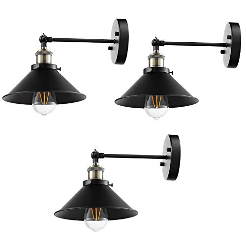 LABOREDUCER Hardwired Wall Sconce Set of 3,Black Industrial Vintage Wall Mounted Lights Sconces Wall Decor for Living Room Bedside Bedroom Indoor Doorway,Wall Lamp Fixture (E26 Bulbs NOT Included)
View Price
LABOREDUCER Hardwired Wall Sconce Set of 3,Black Industrial Vintage Wall Mounted Lights Sconces Wall Decor for Living Room Bedside Bedroom Indoor Doorway,Wall Lamp Fixture (E26 Bulbs NOT Included)
View Price
 Bargeni Farmhouse Light Fixtures, Antique White Flush Mount Ceiling Light
View Price
Bargeni Farmhouse Light Fixtures, Antique White Flush Mount Ceiling Light
View Price
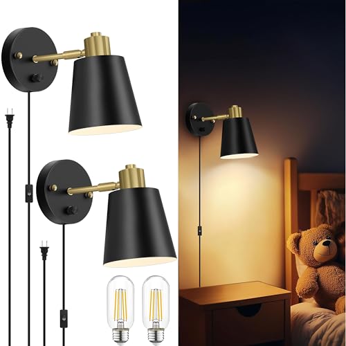 Lomoky Plug in Wall Sconces Set of 2, Dimmable Wall Lights with Plug in Cord and Dimmer On/Off Knob Switch, Adjustable Angle Black Wall Mounted Lamp for Bedside Bedroom Living Room (2 Bulbs Included)
View Price
Lomoky Plug in Wall Sconces Set of 2, Dimmable Wall Lights with Plug in Cord and Dimmer On/Off Knob Switch, Adjustable Angle Black Wall Mounted Lamp for Bedside Bedroom Living Room (2 Bulbs Included)
View Price
 6PACK Rechargeable Puck Lights with Remote Motion Sensor Light indoor White
View Price
6PACK Rechargeable Puck Lights with Remote Motion Sensor Light indoor White
View Price
Hardware and Fixtures Worth Upgrading in a Laundry Room
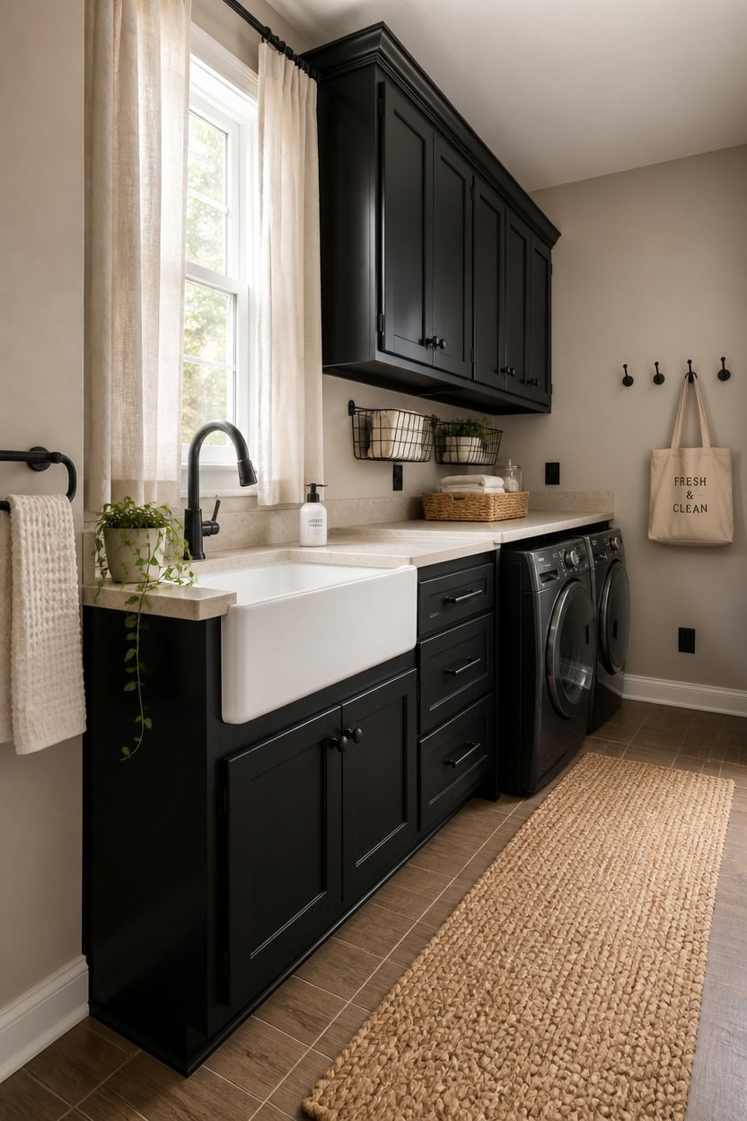
Hardware swaps are one of the fastest ways to make a beige, black, and white laundry room look intentional instead of builder-grade. Pulls, knobs, faucets, and hooks all sit at eye level — which means cheap or mismatched finishes register immediately. Replacing every visible metal piece with one consistent finish, matte black, ties the palette together without a single coat of paint.
Commit to one finish: Mixing brushed nickel, chrome, and black hardware in one small room creates visual noise that undermines the clean palette.
Go matte black over polished: Polished black shows water spots and fingerprints fast in a working laundry room — matte holds up and photographs better.
Include the utility sink faucet: A black utility faucet is one of the most impactful swaps because it anchors the sink area the same way dark cabinet hardware anchors storage.
Replace exposed hinges too: If cabinet hinges are visible and still chrome or brass, they pull the eye away from the intentional black-and-beige hardware story.
the warm sand undertone makes matte black hardware pop without the harshness of a stark white background.
matched from the wall in this photo — the closest Benjamin Moore shade.
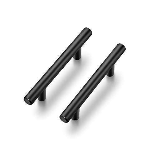 Ravinte Cabinet Handles,5" Length,3" Hole Center,Matte Black,30 Pack
View Price
Ravinte Cabinet Handles,5" Length,3" Hole Center,Matte Black,30 Pack
View Price
 Homewerks Single Handle Pull Out Laundry Faucet 1 or 3 Hole Installation with Deckplate, Universal Install, Utility Kitchen Sink or Laundry Tub, Garden Hose Adapter, Matte Black (903 U425MB)
View Price
Homewerks Single Handle Pull Out Laundry Faucet 1 or 3 Hole Installation with Deckplate, Universal Install, Utility Kitchen Sink or Laundry Tub, Garden Hose Adapter, Matte Black (903 U425MB)
View Price
 10Pcs Wall Hooks, Black Metal Coat and Towel Hooks, Holds Up to 40 lbs
View Price
10Pcs Wall Hooks, Black Metal Coat and Towel Hooks, Holds Up to 40 lbs
View Price
 OctinPris Matte Black Cabinet Knobs 4 Pack Black Drawer Knob Dresser Knob
View Price
OctinPris Matte Black Cabinet Knobs 4 Pack Black Drawer Knob Dresser Knob
View Price
 RTZEN Farmhouse Bathroom Towel Holder Wall Mount, Matte Black Decoration
View Price
RTZEN Farmhouse Bathroom Towel Holder Wall Mount, Matte Black Decoration
View Price
 Henne Bery Modern Edge Decorative Wall Plate Switch Plate Outlet Cover, Durable Solid Zinc Alloy (Single Duplex 2PK, Matte Black)
View Price
Henne Bery Modern Edge Decorative Wall Plate Switch Plate Outlet Cover, Durable Solid Zinc Alloy (Single Duplex 2PK, Matte Black)
View Price
 Spectrum Large Wire Wall Mount Storage Basket Matte Black, Wall Mount Storage Basket Organizer for Kitchen Bathroom Pantry, Versatile Wire Caddy Organizer
View Price
Spectrum Large Wire Wall Mount Storage Basket Matte Black, Wall Mount Storage Basket Organizer for Kitchen Bathroom Pantry, Versatile Wire Caddy Organizer
View Price
 Natheeph Soap Dispenser for Bathroom/Kitchen Fill Hand Soap/Dish Soap, 14OZ
View Price
Natheeph Soap Dispenser for Bathroom/Kitchen Fill Hand Soap/Dish Soap, 14OZ
View Price
Appliances That Disappear Into the Aesthetic
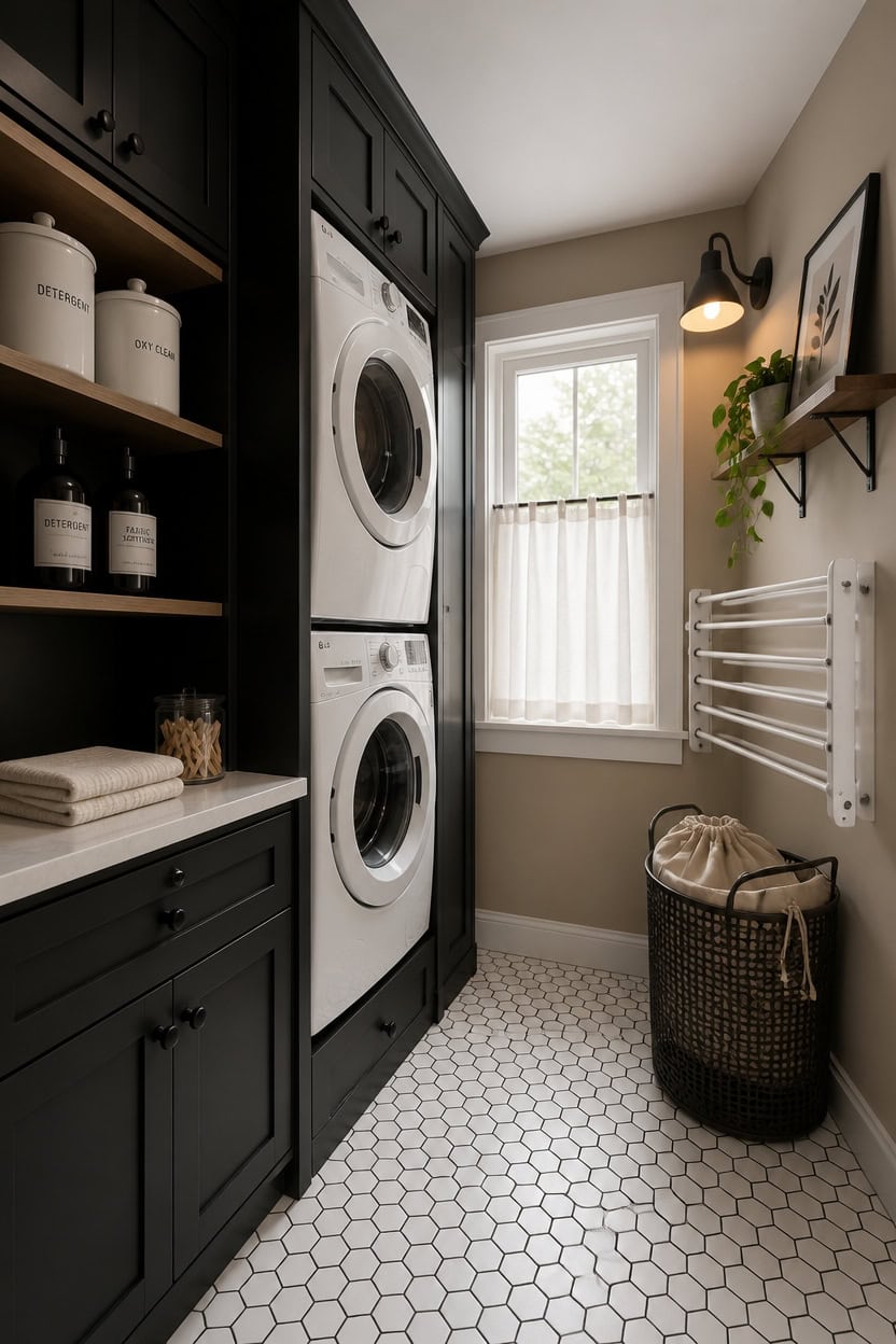
Appliances in a beige, black, and white laundry room don’t need to match the wall color — they need to stop competing with it. White or light gray machines naturally recede against beige walls, which keeps the eye moving toward intentional design details like black hardware and open shelving instead of landing on bulky equipment. If your machines are already white or platinum, the real work is in how you frame them, not replace them.
Frame with cabinetry: Surrounding machines with black or white cabinetry turns them into part of the built-in look instead of standalone eyesores.
Pedestal color matters: White pedestals extend the machine’s visual footprint cleanly — black pedestals create a grounding base that reads as a design choice.
Cover the control panel chaos: Knobs and buttons in different finishes are visual clutter; a consistent machine color keeps that chaos from registering at first glance.
Stack when possible: Stacked washer-dryer units shrink the appliance footprint and free up wall space for the black hooks and shelving that actually define the palette.
this warm sand tone wraps white appliances in softness so machines disappear rather than dominate.
matched from the wall in this photo — the closest Benjamin Moore shade.
 GDLF Washer and Dryer Pedestals, Universal Laundry Pedestal Stand, White
View Price
GDLF Washer and Dryer Pedestals, Universal Laundry Pedestal Stand, White
View Price
 6 Pack 6 Inch Shelf Brackets, 1/5" Thick Heavy Duty Floating Shelf Bracket
View Price
6 Pack 6 Inch Shelf Brackets, 1/5" Thick Heavy Duty Floating Shelf Bracket
View Price
 Tenforie White Ceramic Canisters Set with Airtight Lids, 82/48/30 oz Coffee Canisters Sets for the Kitchen, Large Jars for Flour, Sugar, Pasta, Coffee, Cookies, Tea - Set of 3, Embossed Pattern
View Price
Tenforie White Ceramic Canisters Set with Airtight Lids, 82/48/30 oz Coffee Canisters Sets for the Kitchen, Large Jars for Flour, Sugar, Pasta, Coffee, Cookies, Tea - Set of 3, Embossed Pattern
View Price
 Laundry Hamper with Wheels,150L Leather Patchwork Clothes Hamper Black
View Price
Laundry Hamper with Wheels,150L Leather Patchwork Clothes Hamper Black
View Price
 Vintage Vista 100% Cotton Laundry Bag with Drawstring Closure (Set of 4), Reusable & Washable Travel Laundry Bags for Dirty Clothes, Canvas Drawstring Bags, Laundromat Bag fo Easter, Natural Color
View Price
Vintage Vista 100% Cotton Laundry Bag with Drawstring Closure (Set of 4), Reusable & Washable Travel Laundry Bags for Dirty Clothes, Canvas Drawstring Bags, Laundromat Bag fo Easter, Natural Color
View Price
 HVSWLY Minimalist Laundry Room Labels,30 Matte Waterproof Labels for Jars Spray Bottles and Detergent Dispensers, Preprinted Laundry Room Organization Labels Set(Black), Large, TCD-87
View Price
HVSWLY Minimalist Laundry Room Labels,30 Matte Waterproof Labels for Jars Spray Bottles and Detergent Dispensers, Preprinted Laundry Room Organization Labels Set(Black), Large, TCD-87
View Price
 ZdwCyl Clothes Drying Rack,Laundry Space Saver Wall Mounted,Retractable,Collapsible(Tri-Fold), White Color Rack Clothing
View Price
ZdwCyl Clothes Drying Rack,Laundry Space Saver Wall Mounted,Retractable,Collapsible(Tri-Fold), White Color Rack Clothing
View Price
 AuraPeak Laundry Room Decor Wall Art, Black, 16"×11"
View Price
AuraPeak Laundry Room Decor Wall Art, Black, 16"×11"
View Price
How Texture Adds Depth in a Neutral Laundry Room
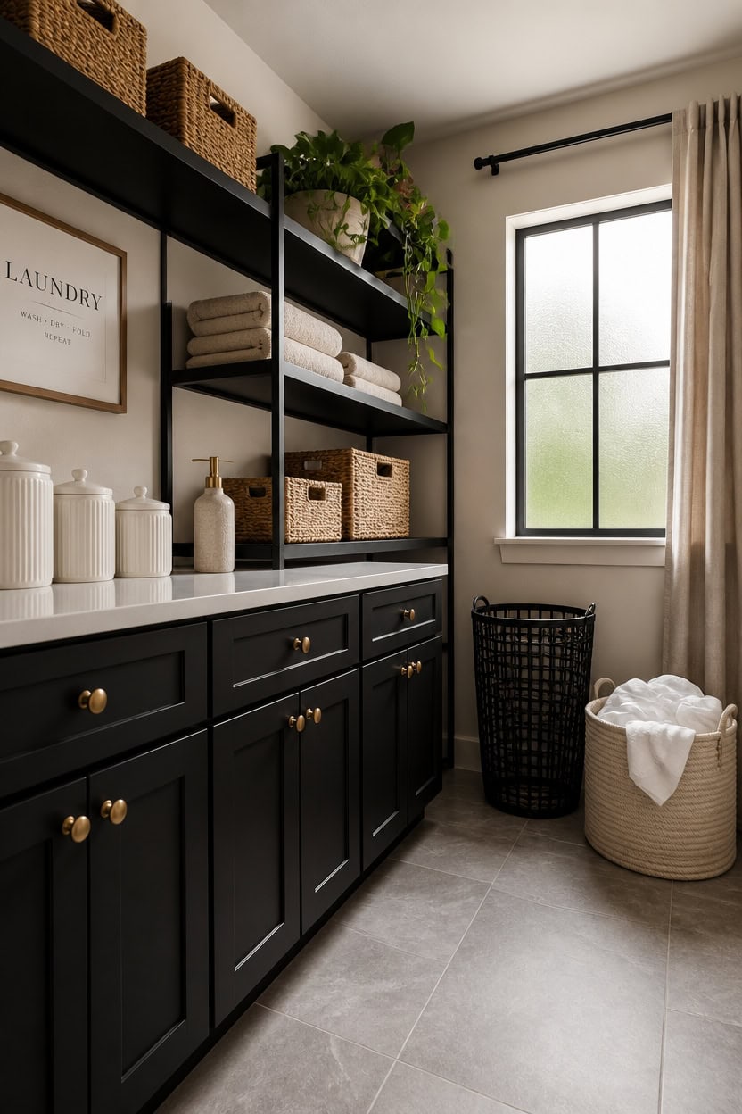
Texture in a neutral laundry room works the same way shadow works in a drawing — it creates the illusion of dimension without adding more color. Woven baskets, ribbed canisters, and matte versus glossy finishes on the same surface all register as visual variety even when everything stays within the beige, black, and white palette. The trick is to layer at least three different textures in each zone so the eye has something to move through instead of glazing over a flat wall.
Mix matte and gloss: Pairing a matte black shelf against a satin-finish white wall creates contrast the eye reads as depth, not just color difference.
Bring in natural fiber: Woven baskets or a cotton bin on an open shelf interrupt the hard surfaces and keep the space from reading as a sterile utility room.
Use ribbed or embossed ceramics: Textured canisters in white or cream add surface interest at counter height without pulling the eye away from the palette.
Layer fabrics deliberately: A beige cotton laundry bag next to a black metal hamper creates a soft-hard contrast that feels styled rather than accidental.
the warm sandy undertone makes woven textures and natural fiber accents read warmer and more intentional against it.
matched from the wall in this photo — the closest Benjamin Moore shade.
 MALACASA LYDIA Ceramic Canisters Set with Airtight Lids, 80/40/20 oz Coffee Canisters Sets for the Kitchen, Large Jars for Flour, Sugar, Pasta, Coffee, Cookies, Tea - Set of 3, Hexagon
View Price
MALACASA LYDIA Ceramic Canisters Set with Airtight Lids, 80/40/20 oz Coffee Canisters Sets for the Kitchen, Large Jars for Flour, Sugar, Pasta, Coffee, Cookies, Tea - Set of 3, Hexagon
View Price
 Handwoven Sea Grass Storage Baskets Set of 4-2 Round & 2 Square Woven Bins with Handles by Vietnamese Artisans, Natural Fiber Organizer for Living Room, Bathroom, Nursery, Shelves
View Price
Handwoven Sea Grass Storage Baskets Set of 4-2 Round & 2 Square Woven Bins with Handles by Vietnamese Artisans, Natural Fiber Organizer for Living Room, Bathroom, Nursery, Shelves
View Price
 Danpoo 16 inch Floating Shelf for Wall Organizer & Storage, Mini Display Shelf, Metal Wall Shelf for Bathroom, Living Room, Kitchen, Bedroom(Matte Black)
View Price
Danpoo 16 inch Floating Shelf for Wall Organizer & Storage, Mini Display Shelf, Metal Wall Shelf for Bathroom, Living Room, Kitchen, Bedroom(Matte Black)
View Price
 KAKAMAY Large Blanket Basket (20"x13"),Woven Baskets for storage Baby Laundry Hamper, Cotton Rope Blanket Basket for Living Room, Laundry, Nursery, Pillows, Baby Toy chest (White/Beige)
View Price
KAKAMAY Large Blanket Basket (20"x13"),Woven Baskets for storage Baby Laundry Hamper, Cotton Rope Blanket Basket for Living Room, Laundry, Nursery, Pillows, Baby Toy chest (White/Beige)
View Price
 Bathroom Soap Dispenser Set with Tray, 3-Piece Countertop Organizer White
View Price
Bathroom Soap Dispenser Set with Tray, 3-Piece Countertop Organizer White
View Price
 MEGASKET Black Woven Laundry Basket, 15"x18" Tall Basket for Blankets, Wicker Hamper for Bedroom Aesthetic, Decorative Storage Hamper for Clothes, Towel, Rope Storage Bin for Living Room, Bathroom
View Price
MEGASKET Black Woven Laundry Basket, 15"x18" Tall Basket for Blankets, Wicker Hamper for Bedroom Aesthetic, Decorative Storage Hamper for Clothes, Towel, Rope Storage Bin for Living Room, Bathroom
View Price
 Amazon Basics Collapsible Fabric Storage Cubes Organizer with Handles, Sturdy Storage Bins for Organization, 10.5" x 10.5" x 11", Beige, 6-Pack
View Price
Amazon Basics Collapsible Fabric Storage Cubes Organizer with Handles, Sturdy Storage Bins for Organization, 10.5" x 10.5" x 11", Beige, 6-Pack
View Price
 JOPOFI Towel Bar - 23.6 Inch Bathroom Towel Holder - Matte Black
View Price
JOPOFI Towel Bar - 23.6 Inch Bathroom Towel Holder - Matte Black
View Price
The Finishing Touches That Seal the Beige, Black and White Look
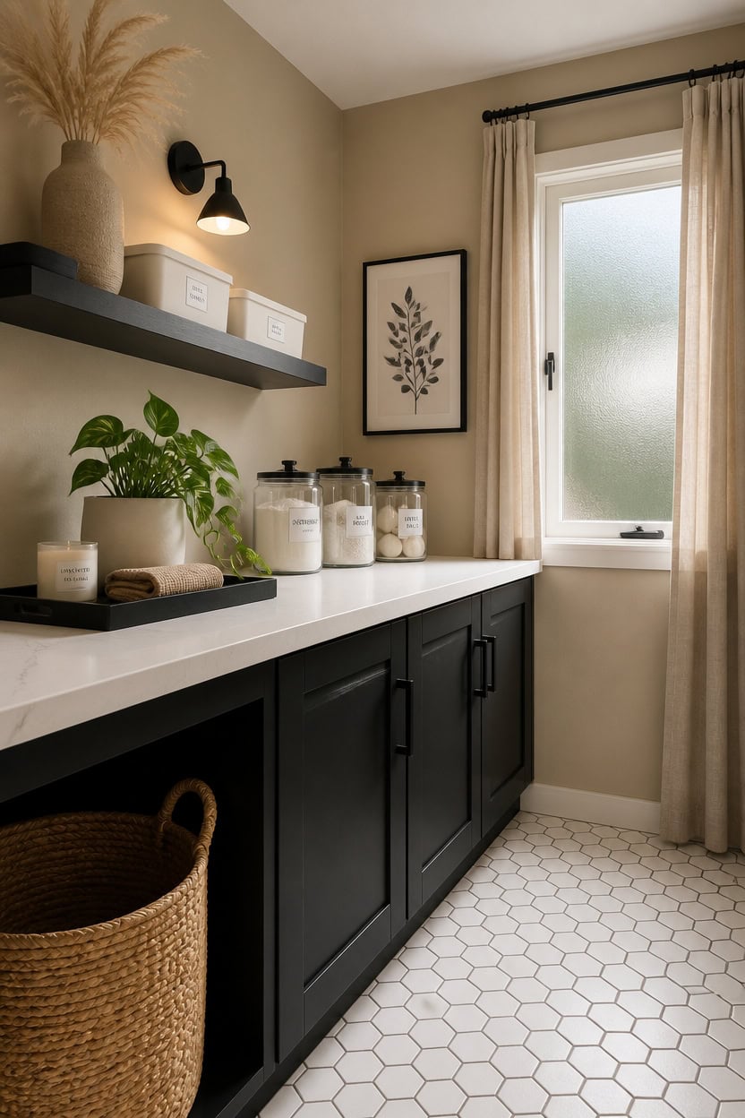
Finishing touches close the gap between a laundry room that looks assembled and one that looks intentional. Small decisions — a matching label set on the canisters, a coordinating pull for the cabinet, a single framed print on the wall — signal that the palette was a choice, not a coincidence. Add them last so they respond to what the room already has rather than fighting against it.
Label everything consistently: Uniform black-on-white labels on jars and bins tie the counter zone together without adding a new color.
Hang one piece of wall art: A simple framed print in black, white, or beige gives the eye a resting point and makes the room feel curated rather than purely functional.
Add a live plant or dried stem: A small potted plant or bundle of dried pampas grass in a white ceramic pot softens the hard palette and adds the one organic element a neutral room needs.
Use a tray to anchor loose items: Grouping soap, a small candle, and a folded cloth on a black tray turns scattered counter objects into a deliberate vignette.
the warm undertone makes the finishing details read cohesive and grounded rather than tacked on.
matched from the wall in this photo — the closest Benjamin Moore shade.
 Laundry Room Organizing Labels for Glass Jars, Canisters, Waterproof Home Storage Organization Washroom Cleaning Decal Stickers
View Price
Laundry Room Organizing Labels for Glass Jars, Canisters, Waterproof Home Storage Organization Washroom Cleaning Decal Stickers
View Price
 ELMCH Farmhouse Black and White Laundry Room Wall Art Decor 7x7 Inch
View Price
ELMCH Farmhouse Black and White Laundry Room Wall Art Decor 7x7 Inch
View Price
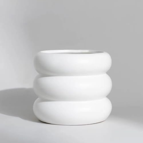 SANDYBAYTAS Ceramic Plant Pot Indoor, 4.5 Inch Flower Pot with Drainage Hole, Small Bubble Design Ceramic Planter for Home & Office Decor (White)
View Price
SANDYBAYTAS Ceramic Plant Pot Indoor, 4.5 Inch Flower Pot with Drainage Hole, Small Bubble Design Ceramic Planter for Home & Office Decor (White)
View Price
 Dried Pampas Grass Decor, 100 Stems Pampas Grass Contains Bunny Tails Dried Flowers, Reed Grass Bouquet for Wedding Boho Flowers Home Table Decor, Rustic Farmhouse Party (17", White and Brown)
View Price
Dried Pampas Grass Decor, 100 Stems Pampas Grass Contains Bunny Tails Dried Flowers, Reed Grass Bouquet for Wedding Boho Flowers Home Table Decor, Rustic Farmhouse Party (17", White and Brown)
View Price
 15.7"x5.9" Matte Black Rectangular Metal Tray, Candle & Jewelry Organizer
View Price
15.7"x5.9" Matte Black Rectangular Metal Tray, Candle & Jewelry Organizer
View Price
 Set of 4 White Unscented Soy Candles, White Glass Filled Votive Candles, Hand Poured Wax Candle for Home Décor Aromatherapy Spa Holidays Party and Weddings
View Price
Set of 4 White Unscented Soy Candles, White Glass Filled Votive Candles, Hand Poured Wax Candle for Home Décor Aromatherapy Spa Holidays Party and Weddings
View Price
 American Veteran Towel, Hand Towels for Bathroom Set of 4, 100% Cotton Turkish Hand Towel Sets, Soft Hand Face Towels, Beige Hand Towels
View Price
American Veteran Towel, Hand Towels for Bathroom Set of 4, 100% Cotton Turkish Hand Towel Sets, Soft Hand Face Towels, Beige Hand Towels
View Price
 HOME EDIT Matte Black Pulls Cabinet Handles 3 Inch 30 Pack
View Price
HOME EDIT Matte Black Pulls Cabinet Handles 3 Inch 30 Pack
View Price
Common Mistakes That Flatten a Neutral Laundry Room
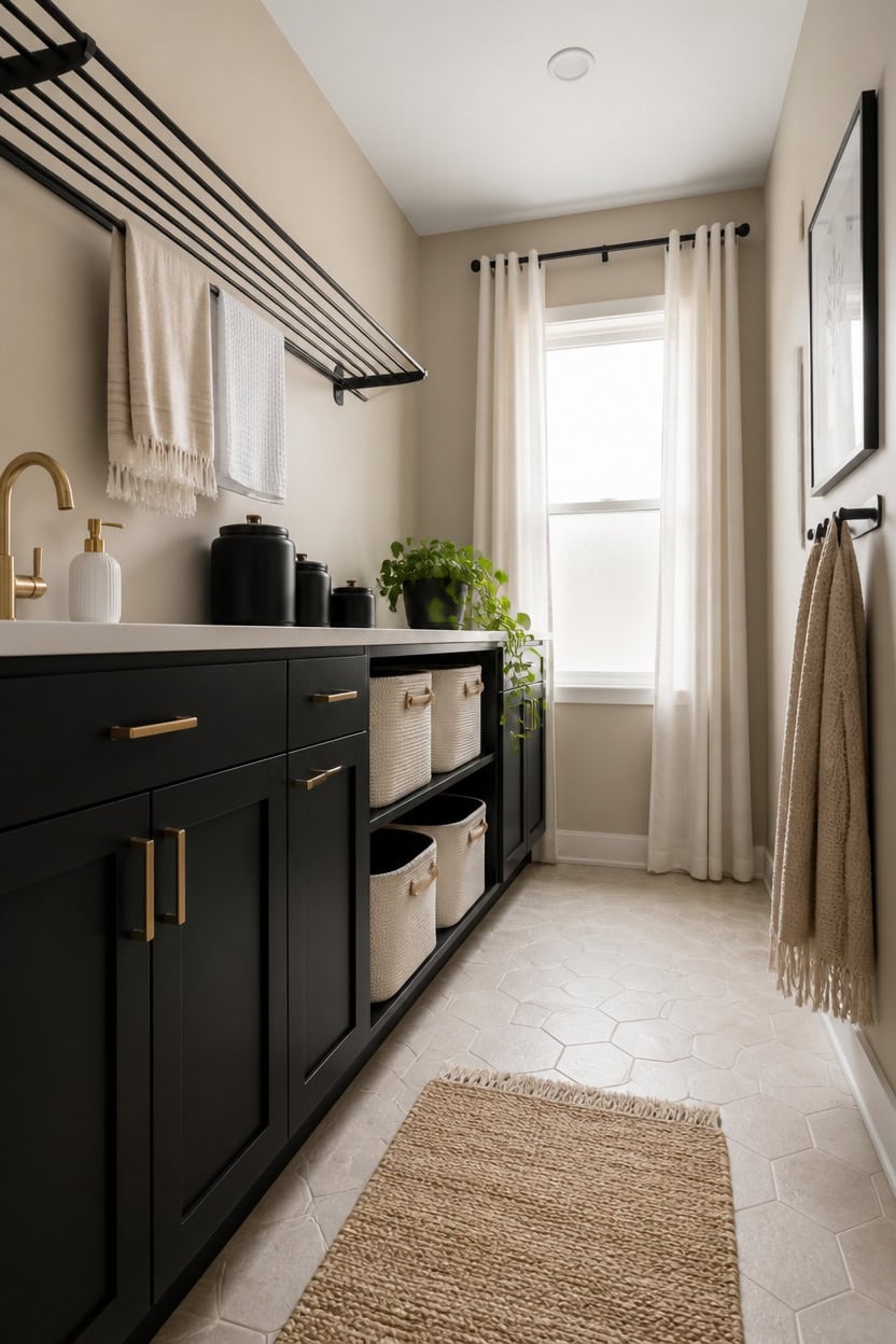
Neutral rooms fall flat when every element sits at the same visual weight — same tone, same texture, same finish across the board. A beige, black, and white laundry room needs contrast to read as designed rather than default. Pull back on any one of the three palette colors and the whole room loses the tension that makes it work.
Ignoring texture variety: Using only smooth surfaces drains depth from a neutral palette — mix matte, woven, and glossy finishes.
Over-relying on beige: Too much beige without enough black or white makes the room look washed out instead of warm and layered.
Skipping scale contrast: Keeping all decor pieces the same size removes visual hierarchy and makes the space feel unresolved.
Mixing too many whites: Cool white, warm white, and cream together fight each other — pick one white and stay consistent.
matched from the wall in this photo — the closest Benjamin Moore shade.
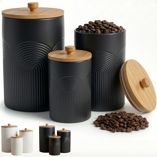 Ceramic Kitchen Canisters for Countertop Set of 3 w/ Airtight Bamboo Lids
View Price
Ceramic Kitchen Canisters for Countertop Set of 3 w/ Airtight Bamboo Lids
View Price
 WILLITAT White Baskets for Organizing, 3 Pack Woven Cotton Rope Storage Baskets for Shelves, Decorative Closet Bin, Cute Fabric Storage Bins for Bathroom, Toys, Towels, Clothes, Shoes Organization
View Price
WILLITAT White Baskets for Organizing, 3 Pack Woven Cotton Rope Storage Baskets for Shelves, Decorative Closet Bin, Cute Fabric Storage Bins for Bathroom, Toys, Towels, Clothes, Shoes Organization
View Price
 Zetez Foldable Wall Mounted Drying Rack - 31.5” Wide, 13.2 Ft Drying Space, 5 Aluminum Rods, Supports Up to 60 lbs - Retractable & Foldable Space-Saving Wall Mounted Clothes Drying Rack (Black)
View Price
Zetez Foldable Wall Mounted Drying Rack - 31.5” Wide, 13.2 Ft Drying Space, 5 Aluminum Rods, Supports Up to 60 lbs - Retractable & Foldable Space-Saving Wall Mounted Clothes Drying Rack (Black)
View Price
 White Linen Curtains 84 Inch Length for Living Room 2 Panel Back Tab Loop Pocket Drape Cotton Textured Light Filtering Semi Sheer Lightweight Curtain for Bedroom Boho Rustic Farmhouse Decor 52x84 Long
View Price
White Linen Curtains 84 Inch Length for Living Room 2 Panel Back Tab Loop Pocket Drape Cotton Textured Light Filtering Semi Sheer Lightweight Curtain for Bedroom Boho Rustic Farmhouse Decor 52x84 Long
View Price
 BATTILO HOME Beige Throw Blankets for Couch, Knitted Tan Throw Blanket for Twin Bed, Super Soft Warm Large Throws for Home Decor, 60" x 80"
View Price
BATTILO HOME Beige Throw Blankets for Couch, Knitted Tan Throw Blanket for Twin Bed, Super Soft Warm Large Throws for Home Decor, 60" x 80"
View Price
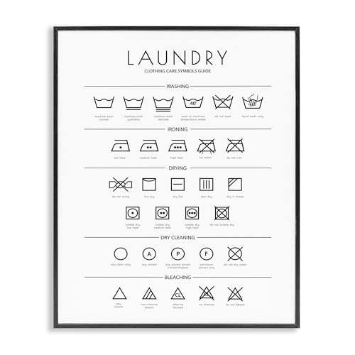 'Minimal Laundry Cleaning Symbols'| Framed Giclee Art
View Price
'Minimal Laundry Cleaning Symbols'| Framed Giclee Art
View Price
 17 OZ Hand Liquid&Lotion Soap Dispenser Pump Bottle Ceramic White for Kitchen Bathroom Countertop Laundry Room Holds Dish Soap Shampoo Laundry Liquid Shower Gel (Inlaid Rhinestone) (White)
View Price
17 OZ Hand Liquid&Lotion Soap Dispenser Pump Bottle Ceramic White for Kitchen Bathroom Countertop Laundry Room Holds Dish Soap Shampoo Laundry Liquid Shower Gel (Inlaid Rhinestone) (White)
View Price
 TICONN Wall Mounted Coat Rack, Five Heavy Duty Tri Hooks All Metal Construction for Jacket Coat Hat in Mudroom Entryway (Matte Black, 1-Pack)
View Price
TICONN Wall Mounted Coat Rack, Five Heavy Duty Tri Hooks All Metal Construction for Jacket Coat Hat in Mudroom Entryway (Matte Black, 1-Pack)
View Price
Shopping This Look Without Overspending
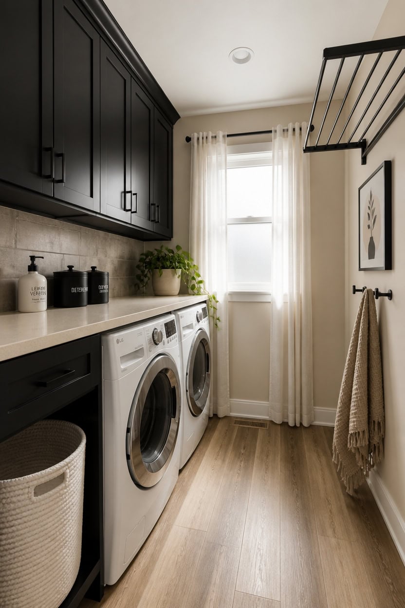
Prioritizing budget doesn’t mean settling for less contrast or character in a beige, black, and white laundry room. A few anchor pieces — like a matte black drying rack and a white woven basket — do more visual work than a full set of matching accessories ever could. Spend on the items that hold the longest visual weight, and fill the rest with simple, functional picks that stay within the palette.
Buy anchor pieces first: Spend on one or two high-contrast items like a black wire rack or white ceramic dispenser before filling in with smaller accessories.
Skip matching sets: Buying coordinated sets often duplicates function and drains budget without adding more visual variety to the room.
Use texture as a budget tool: A woven basket or a linen curtain panel adds layering without the cost of additional furniture or built-ins.
Repeat the palette, not the price: A single black framed print and a beige woven accent carry the same color story as expensive custom decor at a fraction of the cost.
the warm undertone grounds the palette without requiring expensive tile or wallpaper to add depth.
matched from the wall in this photo — the closest Benjamin Moore shade.
 HUMDMTHUT Retractable Clothes Drying Rack Wall Mounted, Black
View Price
HUMDMTHUT Retractable Clothes Drying Rack Wall Mounted, Black
View Price
 NaturalCozy Storage Cubes 11 Inch Cotton Rope Woven Baskets for Organizing, 3-Pack | Cube Storage Bin | Square Storage Baskets for Shelves Organizer, Classroom, Kids Toy Bins, Closet, Baby Nursery
View Price
NaturalCozy Storage Cubes 11 Inch Cotton Rope Woven Baskets for Organizing, 3-Pack | Cube Storage Bin | Square Storage Baskets for Shelves Organizer, Classroom, Kids Toy Bins, Closet, Baby Nursery
View Price
 Mowtanco Black Ceramic Canister & Jar Set, Airtight Bamboo Lids 3-Piece
View Price
Mowtanco Black Ceramic Canister & Jar Set, Airtight Bamboo Lids 3-Piece
View Price
 17 OZ Hand Liquid&Lotion Soap Dispenser Pump Bottle Ceramic White for Kitchen Bathroom Countertop Laundry Room Holds Dish Soap Shampoo Laundry Liquid Shower Gel (Inlaid Rhinestone) (White1)
View Price
17 OZ Hand Liquid&Lotion Soap Dispenser Pump Bottle Ceramic White for Kitchen Bathroom Countertop Laundry Room Holds Dish Soap Shampoo Laundry Liquid Shower Gel (Inlaid Rhinestone) (White1)
View Price
 OnesCosy Beige Throw Blanket, Moss Knit, 50" x 60", Ivory Beige
View Price
OnesCosy Beige Throw Blanket, Moss Knit, 50" x 60", Ivory Beige
View Price
 ELMCH Funny Black and White Laundry Room Wall Art Decor 7x7 Inch
View Price
ELMCH Funny Black and White Laundry Room Wall Art Decor 7x7 Inch
View Price
 BGment Oatmeal Linen Curtains 68 Inch Length 2 Panels Set, Country Rustic Window Drapes Textured Light Filtering for Bedroom Living Room Laundry Privacy, Each 52 Inch Wide
View Price
BGment Oatmeal Linen Curtains 68 Inch Length 2 Panels Set, Country Rustic Window Drapes Textured Light Filtering for Bedroom Living Room Laundry Privacy, Each 52 Inch Wide
View Price
 Decorative Coat Hooks Set of 5 for Wall Mount - Sturdy Black Metal Double
View Price
Decorative Coat Hooks Set of 5 for Wall Mount - Sturdy Black Metal Double
View Price
Why Restraint Is the Real Design Skill in a Laundry Room
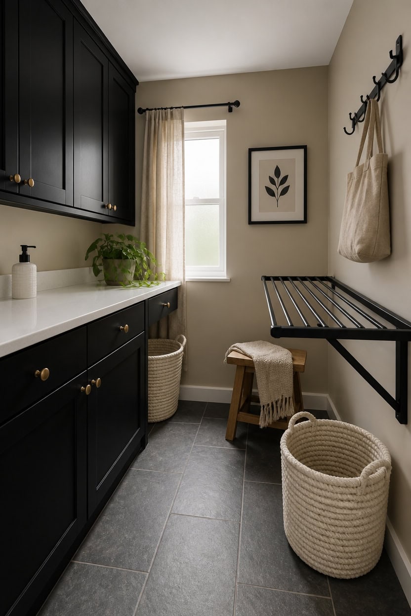
Restraint in a laundry room means choosing fewer pieces that each carry more visual weight rather than filling every surface with coordinated accessories. A three-color palette — beige, black, and white — only stays sharp when space is given between elements, letting each one register. One strong black hook strip, one white basket, and one warm beige textile do more than a full matching set ever could.
Edit before you add: Remove one item from every surface before deciding what stays — negative space is part of the design.
One material per function: Use one basket type for storage instead of mixing several; repetition of material creates calm without effort.
Let contrast breathe: Place black and white elements apart from each other so the eye moves across the room rather than clustering in one spot.
Anchor with one bold piece: A single matte black drying rack or framed print does more than three small black accessories stacked together.
matched from the wall in this photo — the closest Benjamin Moore shade.
 dancrul Wall Mounted Clothes Drying Rack, Wall Clothes Hanger Foldable, Laundry Hanger Hook for Bathroom, Wall Clothes Rack Indoor, Perfect for Small Spaces, Matte Black
View Price
dancrul Wall Mounted Clothes Drying Rack, Wall Clothes Hanger Foldable, Laundry Hanger Hook for Bathroom, Wall Clothes Rack Indoor, Perfect for Small Spaces, Matte Black
View Price
 ICERZCZ Storage Baskets for Organizing 12.5"x9.1"x7.9" (4 Packs) Off White
View Price
ICERZCZ Storage Baskets for Organizing 12.5"x9.1"x7.9" (4 Packs) Off White
View Price
 jinchan Striped Linen Kitchen Tier Curtains, 36 Inch, Beige, 2 Panels
View Price
jinchan Striped Linen Kitchen Tier Curtains, 36 Inch, Beige, 2 Panels
View Price
 18 OZ Hand Liquid&Lotion Soap Dispenser Ceramic White Lotion Pump Bottle for Kitchen Bathroom Countertop Laundry Room Holds Dish Soap Shampoo Laundry Liquid Shower Gel(Inlaid Rhinestone)
View Price
18 OZ Hand Liquid&Lotion Soap Dispenser Ceramic White Lotion Pump Bottle for Kitchen Bathroom Countertop Laundry Room Holds Dish Soap Shampoo Laundry Liquid Shower Gel(Inlaid Rhinestone)
View Price
 Coat Rack Wall Mounted,5 Coat Hooks for Hanging Coats,Heavy Duty Metal Double Hook Rack Hook Rail,Coat Rack with Hooks,Wall Mount Coat Hanger for Hat Towel Purse Robes ,Black,2Pack (Black2, 5 Hooks)
View Price
Coat Rack Wall Mounted,5 Coat Hooks for Hanging Coats,Heavy Duty Metal Double Hook Rack Hook Rail,Coat Rack with Hooks,Wall Mount Coat Hanger for Hat Towel Purse Robes ,Black,2Pack (Black2, 5 Hooks)
View Price
 26"x20" Extra Large Tall Woven Laundry Basket with Lid, Cotton Rope Blanket Storage Basket, Freestanding Decorative Bin for Bedroom Living Room, White & Light Grey
View Price
26"x20" Extra Large Tall Woven Laundry Basket with Lid, Cotton Rope Blanket Storage Basket, Freestanding Decorative Bin for Bedroom Living Room, White & Light Grey
View Price