
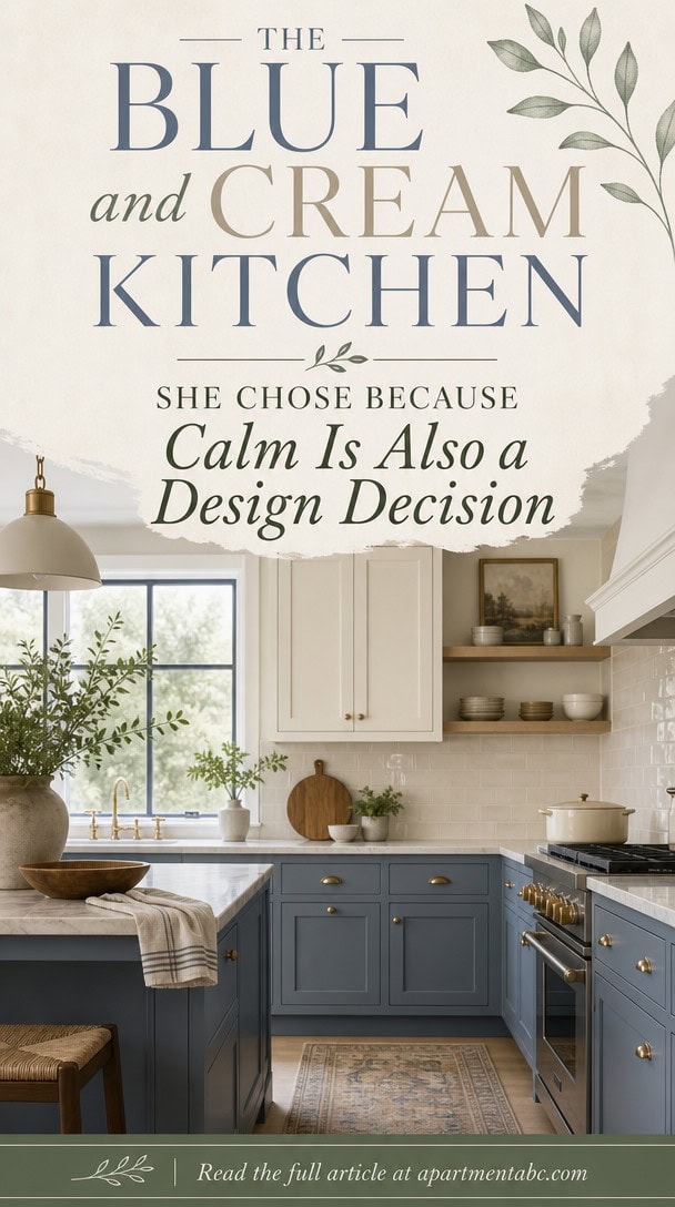
The Blue and Cream Kitchen She Chose Because Calm Is Also a Design Decision
Morning light slides across cream cabinets and settles into walls the color of a quiet sky.
You didn’t land here by accident. Every choice, from the brass pulls to the linen runner folded just so, works toward one feeling: composure.
But calm like this doesn’t happen on its own. There’s a method behind the mood, and it starts with understanding why blue and cream belong together in the first place.
What Makes a Blue and Cream Kitchen Feel Restful?
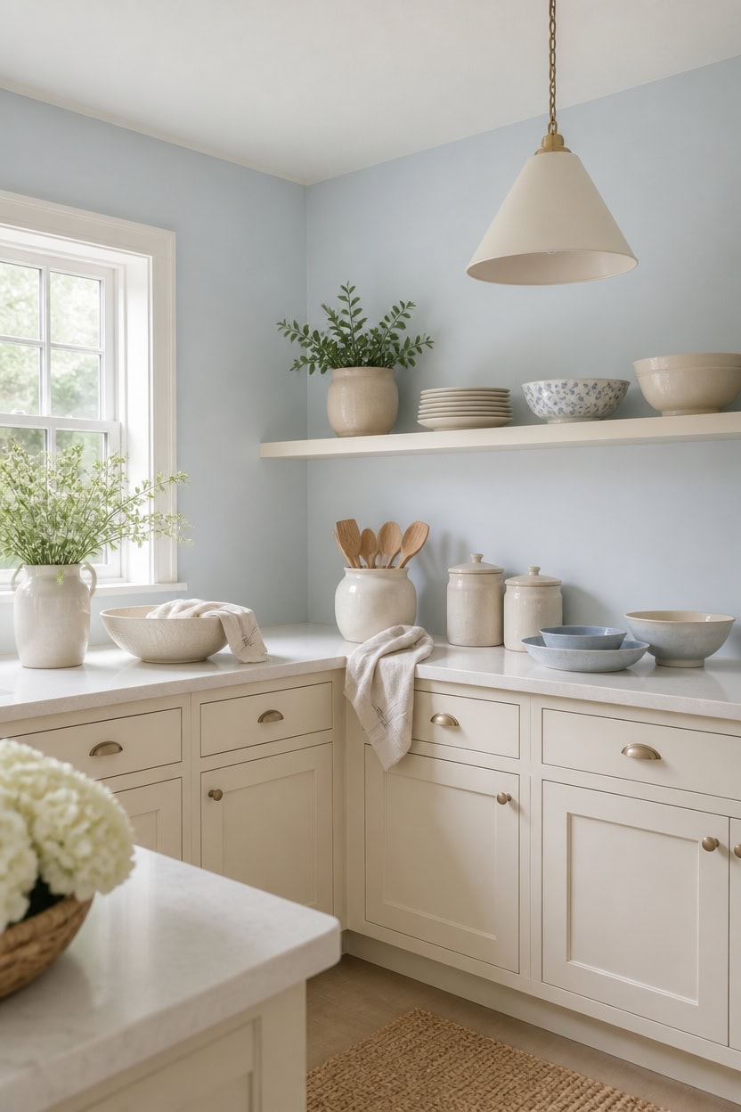
Very light blue Bashful Blue covers the main walls, keeping the kitchen feeling airy and unhurried. Very light cream Cotton Tail on the cabinets matches that softness so no single surface pulls focus. A ceramic utensil crock on the counter keeps everyday tools in reach while the palette stays restful.
Stay within one family: Choose blue and cream shades from the same lightness level to avoid clashing depths.
Balance warm and cool: Let the cream soften the coolness of the blue so the space doesn’t feel sterile.
Keep surfaces matte or eggshell: Low-sheen finishes read as calmer than semi-gloss under kitchen lighting.
Edit the counter: Only one or two functional objects should sit out at any time.
a quiet, pale blue that keeps the kitchen feeling open and calm. [very light]
a soft, warm cream that keeps the cabinets from feeling cold next to the blue. [very light]
 Utensil Holder, 360° Rotating Extra Large Ceramic Kitchen Utensil Holder for Countertop, 7.3“ Cooking Utensil Crocks for Kitchen Counter with Rotatable Wooden Base, Farmhouse Decor, Arctic White
View Price
 Oster Classic Series Heritage Blender with 6-Cup Glass Jar, 1000 Peak Watts, 600 Rated Watts, Stainless Steel Countertop Blender
View Price
 3-Pack Matte Black Pendant Lights Cone Kitchen Island Pendant Lighting
View Price
 LANE LINEN 100% Cotton Dish Towels for Kitchen Absorbent Lint-Free 12 Pack
View Price
 KooK Ceramic Nesting Bowls, Embossed, Oven Safe, Set of 4, Midnight Blue
View Price
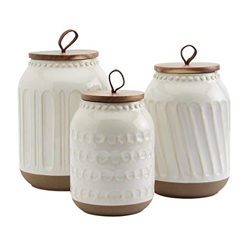 TTU Tabletops Gallery Ceramic Canister Collection- Stoneware Designed Kitchen Storage Embossed Acacia Wood White Set, 3 Piece Embossed Ziggy White Canister Set
View Price
 Amyoole Drinking Glasses Set of 8, 16oz Blue Hammered Glass Cup for Kitchen
View Price
The Best Blue Shades for a Soft, Calm Kitchen
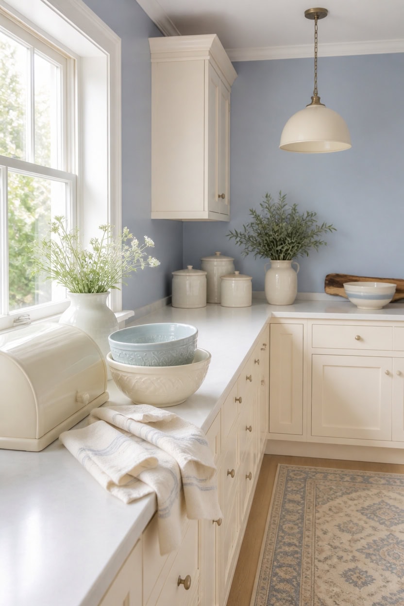
Light blue Labrador Blue on the main walls reflects daylight without turning stark, keeping the kitchen soft rather than sterile. Very light cream Philadelphia Cream on the cabinets warms that blue so the room never reads clinical. A cream bread box left on the counter keeps bread accessible while the palette stays calm.
Match value to mood: Choose a blue with the same lightness as the cream trim for a seamless look.
Test under kitchen light: View swatches at midday and evening since blue shifts cooler under LED bulbs.
Limit blue to one plane: Keep blue on walls or a single accent, not multiple surfaces, to avoid heaviness.
Pair with warm metals: Brass or brushed gold fixtures counter blue’s coolness without adding another color.
a soft, light blue that keeps the kitchen feeling calm without going flat. [light]
a warm, very light cream that keeps the blue from feeling cold. [very light]
 Aroma Housewares Select Stainless Rice Cooker & Warmer with Uncoated Inner Pot, 3-Cup(uncooked)/6-Cup(cooked)/ 1.2Qt, ARC-753SGB, Black
View Price
 ZICOTO Beautiful Bread Box With Wooden Lid For Your Kitchen Countertop
View Price
 BELLAFORTE Shatterproof Tritan Tall Tumbler, Set of 4, 18oz - Myrtle Beach Drinking Glasses - Unbreakable Plastic Drinking Glasses for Gifting, Parties, New Year - BPA Free - Dishwasher Safe - Blue
View Price
 Selamica Ceramic Mixing Bowls Set of 4, 20/36/60/123 oz, Vintage Blue
View Price
 Benson Mills Arani Set of 3 Kitchen Towels (18” X 28”, Oatmeal)
View Price
 SESIMENT Farmhouse Pendant Lighting for Kitchen Island,Black and Gold Dome Pendant Light Fixtures, Industrial Hanging Ceiling Light for Dining Room Foyer Cafe Kitchen Sink,2 Pack
View Price
 TTU Tabletops Gallery Ceramic Canister Collection- Stoneware Designed Kitchen Storage Acacia Wood White Set, 3 Piece Green Leaf Canister Set
View Price
 NCVCN 10" Large Ceramic Fruit Bowl for Kitchen Counter & Dining Room Table
View Price
Balancing Blue and Cream Without Losing Warmth
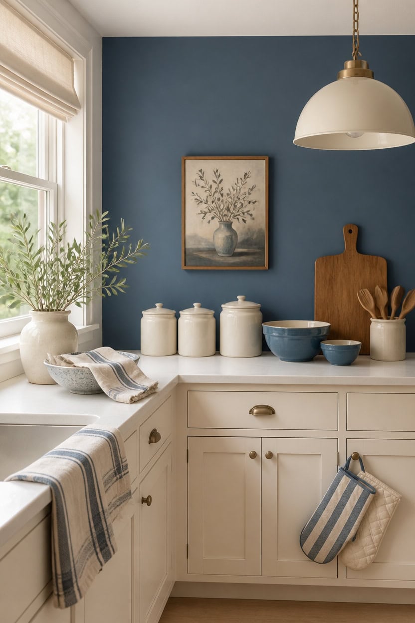
Balance the two colors on a 60/40 split: mid-tone blue Stained Glass covers the accent wall, very light cream Philadelphia Cream covers the cabinets. This ratio keeps the room warm because cream carries most of the surface area while blue adds depth in smaller doses. A ceramic canister set on the open shelf pulls both tones into one vignette without adding another color.
Anchor with warm metal: Brass or copper fixtures add warmth without changing the palette.
Use wood as a bridge: Open shelving in a light wood tone softens the blue-cream contrast.
Layer cream textures: Linen and stoneware keep cream from feeling flat next to bold blue.
Keep trim neutral: Painting trim in the same cream stops the blue from feeling isolated.
a mid-tone blue that adds depth without covering every wall. [mid-tone]
a very light cream that keeps the kitchen bright and balanced. [very light]
 Elite Gourmet ERC006SS 6-Cup Electric Rice Cooker with Stainless Steel Inner Pot, Makes Soups, Stews, Porridges, Grains and Cereals, 6 cup (3 cups uncooked), Black
View Price
 10 Strawberry Street Embossed Marquis Ceramic Kitchen Canister Set, Set of 3, Matte Black
View Price
 MosJos Kitchen Towels, Cotton Hand Towels, Sage Green and Cream Ribbed - Mini Weaved Stitched Set of 4 Absorbent Hand Drying Cloths, 18 x 28 Kitchen Linens
View Price
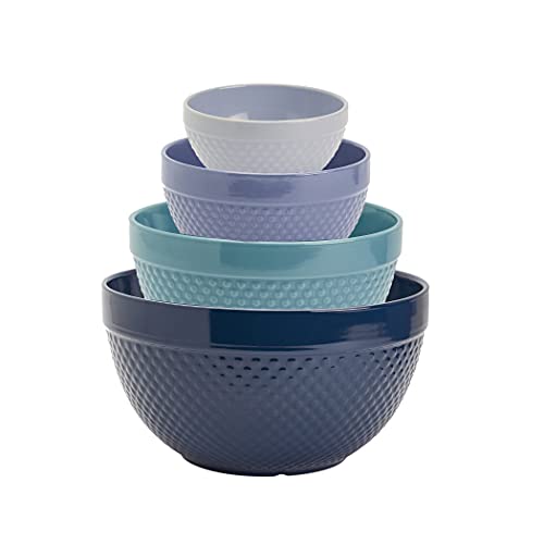 TTU Tabletops Gallery Hobnail Style 4 Piece Blue Storm Stoneware Nesting Mixing Bowl Set for Baking and Cooking
View Price
 WENSHUO Stoneware Fruit Bowl,Matte Curd Reactive Glaze,Handmade Deco Bowl
View Price
 PINDODO Industrial Pendant Light Fixtures,11.8" Black Dome Pendant Lights,Adjustable Vintage Hanging Lamp for Kitchen Island Restaurant Bar Cafe Dining Room Sink,3 Pack
View Price
 Martha Stewart Strie Medallion Oven Mitt 2-Pack Set, Navy Blue, 7"x13"
View Price
 ROYAL CRAFT WOOD Wooden Cutting Boards for Kitchen Appliances - Non Toxic Bamboo Wood Cutting Board Set with Deep Juice Groove, Side Handles, Charcuterie & Butcher Block for Meat, Meal Prep & Serving
View Price
See it in a whole home
The Blue and Cream home tour
Cabinet Colors That Set the Blue and Cream Tone
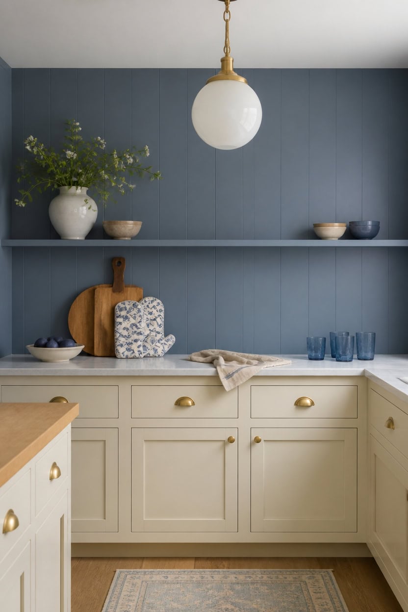
Cabinet color should carry more light than the walls, so mid-tone blue Hamilton Blue stays on the walls while very light cream Spring Bud covers the cabinets. Cream reflects daylight, keeping the blue from feeling heavy against the counters. Lean a wooden cutting board against the counter to add warm grain next to the cream cabinets.
Light before hue: Choose a cabinet finish lighter than the wall color so the kitchen reads bright first, blue second.
Sheen matters: Use a satin or semi-gloss on cabinet doors so cream surfaces catch and bounce more light.
One accent, not two: Keep the deeper blue confined to walls and let cabinets stay solidly cream for contrast.
Test in daylight: Sample both colors on a cabinet door and check them in morning and evening light before committing.
a mid-tone blue that gives the room depth without darkening the space. [mid-tone]
a very light cream that keeps the cabinet run bright and reflective. [very light]
 Instant Pot Duo 6 Qt 7-in-1 Electric Pressure Cooker, Stainless Steel
View Price
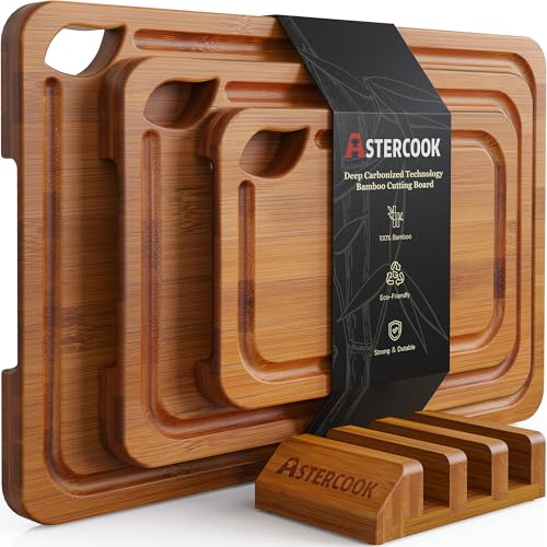 Astercook Deep-Carbonized Bamboo Cutting Boards for Kitchen with Wood Storage Stand, Reversible Charcuterie & Chopping Boards with Juice Grooves and Easy-Grip Handles, Fathers Day Gift for Men
View Price
 Herogo 4-Piece 10.43" Ceramic Dinner Plates Set, Starry Blue
View Price
 Ruvanti Linen Napkins Set of 12, Linen Cotton Blend 18”x18” - Natural
View Price
 KitchenAid Gingham Oven Mitt 2-Pack Set, Blue Velvet, 7"x13"
View Price
 HiEnd Accents Savannah 3 Piece Ceramic Cream Canister Set
View Price
 Audickic 3-Pack Pendant Lights Kitchen Island, Gold Hanging Lights Fixtures with Clear Glass Globe Shade, Brass Kitchen Island Lighting for Dining Room, AD-22280-1P3-GD
View Price
 Libbey Blue Ribbon Tumbler & Rocks Drinking Glasses Set of 16, Dimpled Cups
View Price
Countertops That Keep a Blue and Cream Kitchen Quiet
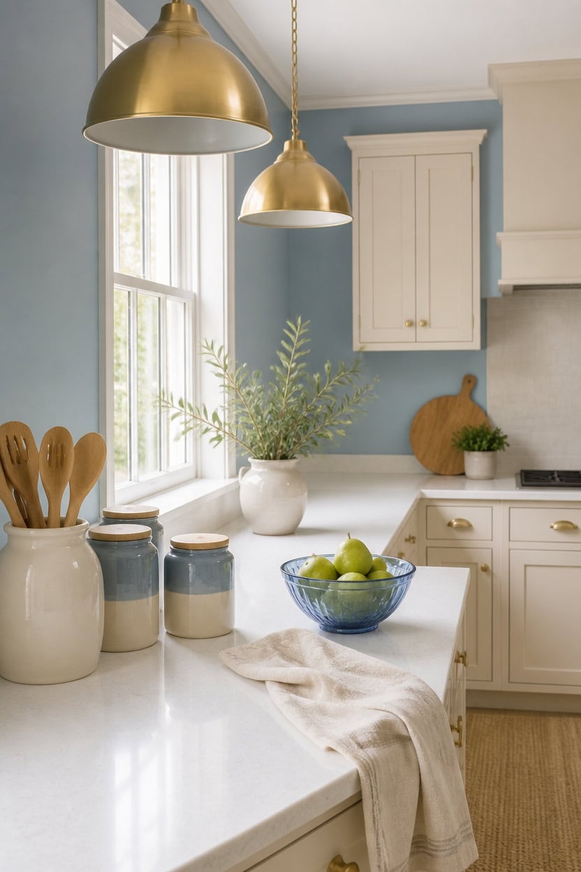
Quiet countertops use matte white quartz with faint gray veining, keeping focus on the light blue Porcelain Glaze walls and the very light cream Soft Beige cabinets. Neutral stone reflects daylight evenly, so the blue and cream palette reads calm rather than competing for attention. Set a ceramic utensil crock with wooden spoons near the sink for texture, not color.
Neutral stone first: Choose a countertop with subtle veining so cabinet and wall colors stay the visual lead.
Match undertones: Pick a stone with warm or cool undertones that echo the cream or blue, not both.
Limit veining contrast: Avoid countertops with dark veining that pulls the eye away from the walls.
Edge profile stays simple: A straight or eased edge keeps the countertop from competing with the palette.
a light blue that keeps the room airy while grounding the cream elsewhere. [light]
a very light cream that mirrors the quiet countertop tone and brightens the space. [very light]
 Mora Ceramic Kitchen Utensil Holder - Wooden Spoon & Spatula Crock for Countertop, Modern Farmhouse Home Decor, Extra Large 7.3" Cooking Organizer for Stove Top and Counter - Heavy & Sturdy - Vanilla
View Price
 DAOYOUSKY Bamboo Bread Box for Kitchen Countertop, White Vintage Wooden Counter Breadbox, Single Layer Rustic Wood Large Capacity Bread Storage Container Bin
View Price
 TTU Tabletops Gallery Ceramic Canister Collection- Stoneware Designed Kitchen Storage Acacia Wood White Set, 3 Piece Botanical Blue Canister Set
View Price
 LANE LINEN Dish Towels for Kitchen Cotton Soft & Absorbent 4 Pack - Beige
View Price
 MAGCOLOR Hand Painted Blue Woven Glass Crystal Salad & Fruit Bowl Decoration,Centerpiece For Home,Office,Wedding Decor, Fruit, Snack, Dessert, Server (Blue)
View Price
 Vanselia Ceramic Flower Vase Home Decor - Farmhouse Table Vases Rustic Vintage Living Room Kitchen Bedroom Decorations for House Book Shelf Office Coffee Desk Dining Fireplace (7.4" Rustic)
View Price
 Linea di Liara Lucera Modern Farmhouse Pendant Light Fixture Ceiling Hanging Large Glass Pendant Lighting for Kitchen Island Brass and Black Pendant Light Over Sink Light Fixtures, UL Listed
View Price
 Extra Thick Silicone Trivet Mat for Hot Dishes, Hot Pots and Pans, Pot Holder, Hot Pad to Protect Your Table and Countertop, Kitchen Decor and Accessories,Navy Blue, Set of 3
View Price
Kitchen Runners for This Palette
Rugs USA best-selling kitchen runners in this palette's colors, linked in 2' 6" x 6', the size for the floor in front of the sink and stove. Many are machine washable.
- Free shipping
- 30-day returns
- 210,000+ five-star reviews
 Jute And Denim Even Stripes Rug – Off White
View Price
 Flatweave Cotton Giant Octopus Rug – Blue Multicolor
View Price
 Everywhere Hand-Braided Indoor/Outdoor Rug – Navy
View Price
 Distressed Persian Rug – Blue
View Price
 Faded Abstract Washable Rug – Blue Grey
View Price
 Hand Braided Twined Jute And Denim Rug – Blue
View Price
 Reverse Herringbone Washable Rug – Blue
View Price
 Antique Chevron Rug – Blue
View Price
 Persian Vintage Rug – Teal
View Price
 Honeycomb Labyrinth Rug – Blue
View Price
 Faded Star Petal Emblem Rug – Blue
View Price
 Herringbone Cotton Flatwoven Rug – Navy
View Price
 Jute Braided Rug – Navy
View Price
 Hand Braided Denim And Jute Striped Diamonds Rug – Olive
View Price
 Patty Washable Rainy Days Rug – Blue Multicolor
View Price
 Paneled Geometric Rug – Navy
View Price
 Starfish Indoor/Outdoor Rug – Navy
View Price
 Fish Indoor/Outdoor Rug – Navy
View Price
 Serene Waterfall Rug – Blue
View Price
 Distressed Persian Rug – Dark Blue
View Price
 Jute Braided Saturn Border Rug – Navy
View Price
 Striped Border Indoor/Outdoor Flatweave Rug – Navy
View Price
 Withered Bloom In Bouquet Rug – Blue
View Price
 Floral Fringed Rug – Blue
View Price
 Moroccan Trellis Rug – Dark Blue
View Price
 Forever Vintage Rug – Light Blue
View Price
 Faded Shadow Mystique Rug – Blue
View Price
 Mod Trellis Rug – Navy
View Price
 Rasali Checkered Box Rug – Navy
View Price
 Hand Braided Denim And Jute Striped Diamonds Rug – Yellow
View Price
 Perfect Handwoven Jute-Blend Rug – Natural
View Price
 Jute Braided Rug – Natural
View Price
 Chunky Jute Tasseled Rug – Natural
View Price
 Chunky Jute Tasseled Rug – Off White
View Price
 Softest Knit Wool Rug – Off White
View Price
 Forever Vintage Rug – Neutral
View Price
 Floral Ornament Rug – Ivory
View Price
 Hand Woven Jute with Wool Fringe Rug – Natural
View Price
 Seagrass with Border Rug – Beige
View Price
 Handwoven Jute Ribbed Solid Rug – Natural
View Price
What to Use Instead of a Statement Wall
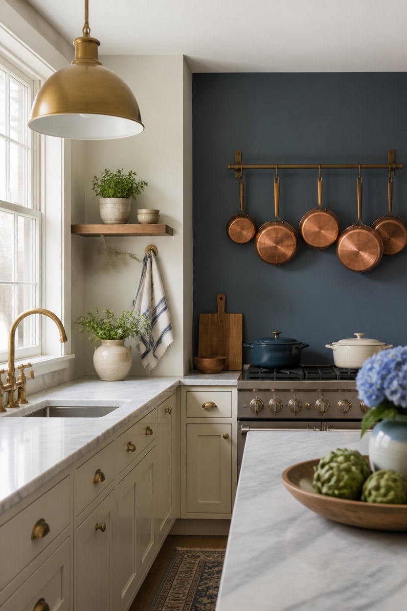
A wall-mounted pot rack with copper pots adds texture without a bold paint statement. Deep blue Gentleman’s Gray on the accent nook wall grounds the room, while very light cream Edgecomb Gray on the cabinets keeps things open. Hang the rack near the range so the pots read as daily tools, not decor.
Open shelving: Swap a solid painted wall for floating shelves that display everyday dishware.
Textured tile: Use a matte tile backsplash for depth instead of a bold color block.
Wallpaper panel: Add a small removable wallpaper panel behind open shelves for pattern without full paint commitment.
Layered lighting: Let pendant fixtures draw the eye instead of one dramatic wall.
a deep blue that adds quiet drama without a full statement wall. [dark]
a very light cream that keeps the room bright and balances the deeper accent. [very light]
 Half Dome Pot Rack w Grid in Black w Chrome Hooks (Hammered Copper/Black)
View Price
 Dash Mini Rice Cooker, 2-Cup Removable Ceramic Nonstick Pot, Black
View Price
 DII French Stripe Dishtowels, Kitchen Collection, 20 x 30 (Set of 3), Nautical Blue
View Price
 BAYKA Rustic Brown Bathroom Floating Shelves, 15.7in, 3Pk, Wall Mount Shelf
View Price
 Gold Pendant Light 2 Packs, Modern Farmhouse Pendant Lights Kitchen Island
View Price
 LOVADA Brown Wood Slat Peel and Stick Wallpaper - 17.5"x100" Textured Faux Wood Self-Adhesive, Waterproof Removable Wall Panel for Bedroom, Kitchen, Office - Easy Install
View Price
 Barnyard Designs Indoor Herb Garden Planter Pots with Tray Set/3 (White)
View Price
Lighting That Brings Out Blue and Cream Tones
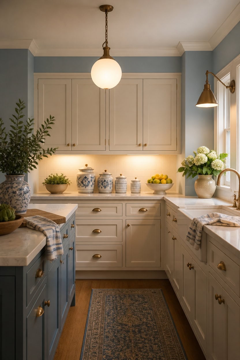
Warm-toned bulbs pull the blue forward while keeping the cream from turning gray. Light blue Franklin Lakes on the main walls stays crisp under warm bulbs, and very light cream Ivory Lustre on the cabinets reflects that glow across the room. Place a wall-mounted brass sconce beside the window so light hits both tones from two angles.
Layer three light sources: Combine ceiling, task, and accent lighting so no single fixture washes out the color.
Match bulb temperature: Use warm white bulbs instead of cool white to keep cream tones soft.
Add under-cabinet strips: Hidden LED strips highlight the blue trim without glare.
Dim for evening: A dimmer switch lets the blue read deeper at night and lighter during the day.
a light blue that stays bright under warm bulbs. [light]
a very light cream that bounces light across the room. [very light]
 VATONI Dimmable Wall Sconce, Plug in Wall Sconce Adjustable Angle Wall Lights with Plug in Cord and Dimmer On/Off knob Switch, Gold Wall Mounted Light for Bedside Bedroom Doorway(1 Pack, 1 Bulb)
View Price
 EDISHINE 2-Pack Pendant Light Kitchen Island Clear Glass Globe Black
View Price
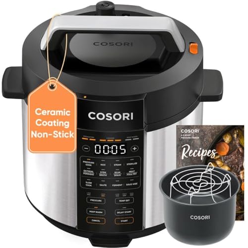 Cosori Pressure Cooker 6QT, 9-in-1, Ceramic Coating Pot, 12 Safety Features
View Price
 10 Strawberry Street Diamond Embossed Ceramic Kitchen Canister Set, Set of 3, Diamond Blue
View Price
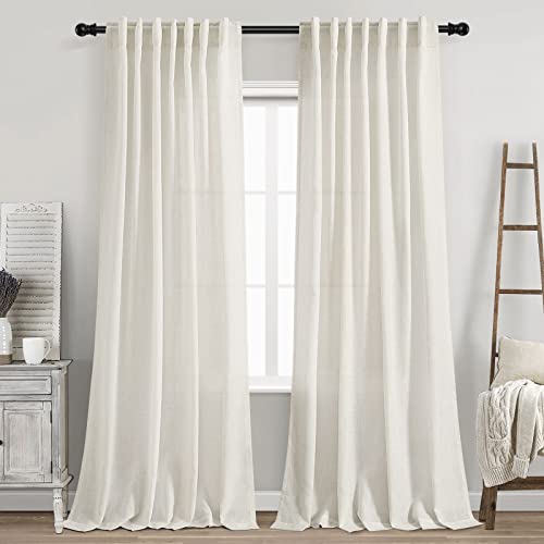 Cream Linen Back Tab Curtains 84 Inch Length for Living Room 2 Panel Set Neutral Modern Farmhouse Window Privacy Semi Sheer Linen Drapes Rustic Pinch Pleated Look Curtain Natural Ivory Colored
View Price
 Premium Kitchen Towels 6 Pack 100% Cotton 20"x28" Dish Towels Navy Striped
View Price
 MUUBOOX 10" Decorative Bowl,Ceramic Fruit Bowl for Kitchen Counter,Coffee Table, Dining Room,Table Centerpiece Bowel,Entryway Key Holder & Jewelry Organizer (Ocean Blue)
View Price
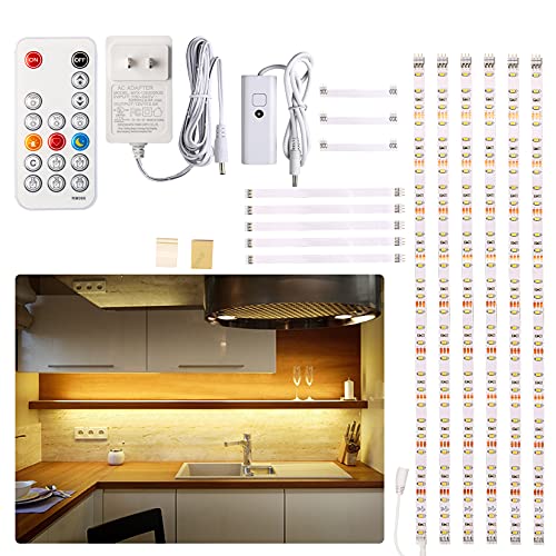 WOBANE Under Cabinet LED Lighting Kit,Dimmable Strip Lights with RF Remote
View Price
Our Favorite Kitchen Wall Art
The best-reviewed kitchen prints at Wayfair, with the ones in this palette's colors first.
- Free shipping over $35
- Picked at 4.6 stars or higher
 The Cafe Terrace by Vincent Van Gogh
View Price
 Fruit and Wine by Yoakum
View Price
 Sage Garden 2 Piece Picture Frame Graphic Art Print Set
View Price
 Sweet Experience
View Price
 Watercolor Lemons in Mason Jar Landscape by Tre Sorelle
View Price
 Interplay Print on Canvas
View Price
 Watercolor Lemons in Mason Jar on Shiplap by Tre Sorelle
View Price
 Autumn Kitchen by Danhui Nai
View Price
 Country Red and White
View Price
 Old Favorites by Irena Orlov
View Price
 Kitchen Food Culinary Gathering Pen and Ink Food and Drinks
View Price
 Wooden Kitchen Items
View Price
 Le Chateau Wrapped Canvas Machine Made Print
View Price
 White and Gold Champagne Flow V Champagne
View Price
 Kitchen Food Vintage Citrus Botanical Rustic Orange Framed
View Price
 Autumn Fall Thanksgiving Pumpkin in Orange Forest Nature
View Price
 Kitchen Food Herbs and Spice in Spoons Kitchen Cooking Food
View Price
Hardware That Doesn’t Compete With Blue and Cream
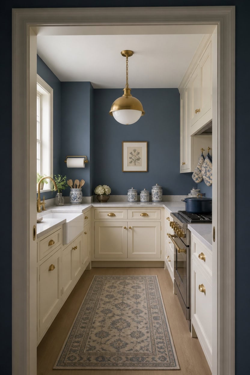
Cabinet hardware finishes work best when they stay quiet, letting mid-tone blue Azurite on the main walls and very light cream Plaster of Paris on the cabinets do the visual work. A single, low-contrast finish keeps pulls and knobs from fighting with the painted surfaces already carrying the color story. Add a brass wall-mounted paper towel holder near the sink for warmth that supports the palette instead of pulling focus from it.
Choose one finish: Stick to a single hardware finish throughout the kitchen for a cohesive look.
Skip busy shapes: Simple bar or knob shapes let the blue and cream tones stand out.
Match warm tones: Brass or warm nickel pulls pair well with cream cabinets without adding extra contrast.
Keep sizes modest: Small to mid-size hardware avoids competing with the painted surfaces.
a mid-tone blue that adds depth while hardware stays understated. [mid-tone]
a very light cream that keeps the room airy and lets hardware read as a quiet accent. [very light]
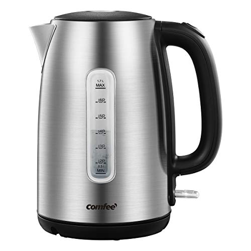 COMFEE' Stainless Steel Electric Kettle, 1.7 Liter Tea Kettle Electric & Hot Water Kettle, 1500W Fast Boil with LED Light, Auto Shut-Off and Boil-Dry Protection
View Price
 theaoo Under Cabinet Paper Towel Holder for Kitchen, Adhesive, Gold
View Price
 Ceramic Utensil Holder for Countertop, Blue and White Vintage Utensil Crock
View Price
 AnyDesign 4Pcs Blue Bird Floral Oven Mitts and Pot Holders Set, Chinoiserie
View Price
 ZeeMart Linen Checked Farmhouse Table Runner, 13x72 Inches Neutral Beige
View Price
 Libbey Cobalt Flare Blue Drinking Glasses Set of 8, Glass Cups
View Price
 Acacia Wood Cutting Board and Chopping Board with Handle for Meat, Cheese Board, Vegetables, Bread, and Charcuterie - Decorative Wooden Serving Board for Kitchen and Dining Room, Large 17" x 13"
View Price
 Nihow Food Storage Jar, Ceramic Canister Sets for The Kitchen,Set of 4,Blue
View Price
Flooring That Grounds a Blue and Cream Kitchen
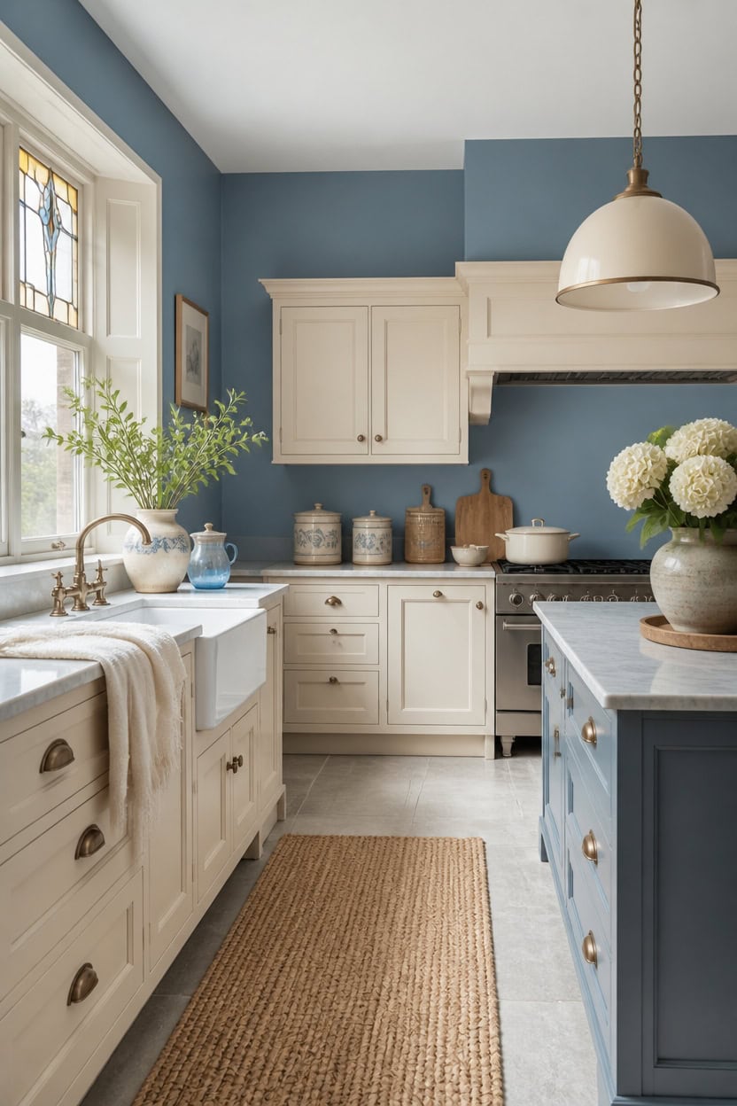
Large-format porcelain flooring in warm gray sets the tone before paint even enters the room, but the floor itself stays outside this section’s paint plan. Its neutral undertone gives mid-tone blue Stained Glass on the walls and very light cream Philadelphia Cream on the cabinets a stable base to sit on, so neither color feels like it is floating. A woven jute kitchen runner rug placed near the sink softens footsteps while keeping that grounded, neutral floor as the visual anchor.
Choose a neutral floor tone: Warm gray or greige tones keep blue and cream from competing for attention.
Match sheen to traffic: A matte or low-sheen finish hides scuffs better in a busy kitchen.
Keep grout lines slim: Thin, consistent grout lines let the floor stay quiet under bold cabinetry.
Layer in a runner: A textured rug adds warmth without introducing a third competing color.
a mid-tone blue that grounds the room without darkening it. [mid-tone]
a very light cream that keeps the palette airy above the grounded floor. [very light]
 Aroma Housewares Select Stainless Rice Cooker & Warmer with Uncoated Inner Pot, 6-Cup(cooked)/ 1.2Qt, ARC-753SGR, Red
View Price
 JONATHAN Y Pata Hand Woven Chunky Jute Navy Runner Rug, 2x8, Bohemian, Rustic, Cottage, Easy-Cleaning for Living Room, Bedroom, Kitchen, Non-Shedding (NRF102D-2)
View Price
 Mexican Hand Blown Glass Pitcher – Cobalt Blue Rim and Handle (84 oz)
View Price
 MgLoyht Pendant Lights, Farmhouse Pendant Lamp with Metal Shade (White Inside), Matte Black Industrial Pendant Lighting for Kitchen Island, Dining Room, Bedroom, Hallway
View Price
Our Favorite Cabinet Hardware
- Free shipping over $35
- Picked at 4.8 stars or higher
 Amerock Bar Pulls Center-to-Center Cabinet Pull
View Price
 GlideRite Roman Modern Bar Pull
View Price
 GlideRite Roman Bar Pull
View Price
 Amerock Bar Pulls T-Shaped Cabinet Knob
View Price
 Amerock Edona 1-1/4" Mushroom Cabinet Knob
View Price
 GlideRite Mushroom Knob Multipack
View Price
 Amerock 3" Center-to-Center Cup Pull Multipack
View Price
 GlideRite Classic 3" Cup/Bin Pull Multipack
View Price
 Top Knobs Channing Cup/Bin Pull
View Price
 Hickory Hardware Refined Rustic 12" Appliance Pull
View Price
 Franklin Brass Stratford 7-9/16" Bar Pull
View Price
Layering Texture in a Blue and Cream Kitchen
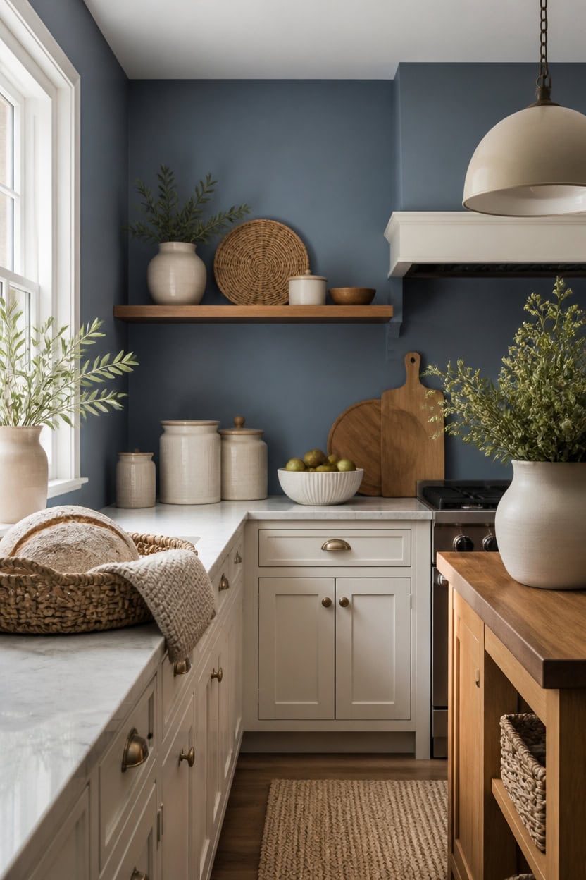
Mid-tone blue Stained Glass walls and very light cream Philadelphia Cream cabinets create a calm base for texture to build on. Layering matte ceramic, woven fiber, and brushed wood adds depth without adding another color. A woven rattan bread basket on the counter brings that same warmth to the space.
Mix matte and shine: Pair matte ceramic with glossy glass for contrast that catches light differently.
Vary fiber types: Combine jute, cotton, and rattan so no single texture dominates the counter.
Add raw wood: A cutting board or wood tray warms the cool blue and cream palette.
Keep patterns simple: Solid-color textiles let texture do the work instead of busy prints.
a mid-tone blue that gives the layered textures a steady backdrop. [mid-tone]
a very light cream that keeps woven and wood accents from feeling heavy. [very light]
 9.2" Medium Rattan Wicker Bread Basket, Fruit Basket for Kitchen Counter
View Price
 Aroma Housewares 6-Cup (Cooked yield ) / 1.2Qt. Select Stainless Pot-Style Rice Cooker, & Food Steamer, One-Touch Operation, White
View Price
 Homaxy 8 Pack 100% Cotton Kitchen Towels and Dishcloths Set, Navy Blue
View Price
 10 Strawberry Street Chinoiserie 3 Piece Canister Set, White/Blue
View Price
 Chardin Home Natural Jute and Ivory Placemats, Set of 4 – Rustic Handmade Boho Table Mats, 13x19 Inch Dining Table Placemats for Kitchen, Everyday Meals, Holidays, Farmhouse or Modern Table Décor
View Price
 GoCraft Acacia Wood Live Edge Cutting Board – 16 x 10 Inch – Rustic Handcrafted Charcuterie Board with Handle, Wooden Cheese Tray, Serving Platter, Chopping Block for Kitchen & Farmhouse Décor
View Price
 MERINEA Modern Black Glass Pendant Light, 10-Inch Dome, 1-Light E26
View Price
 STE-CER Ceramic Fruit Bowl for Kitchen Counter,Decorative Pedestal Bowl for Table Countertop,Large Footed Serving Bowl,10.2 Inch (Blue)
View Price
Pairing Blue and Cream With Natural Wood Accents
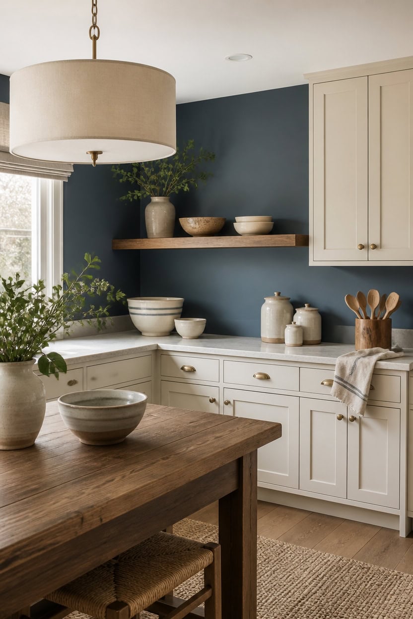
Deep blue Winding Waterway on the accent wall grounds the kitchen, while very light cream Maidenhair Fern on the cabinets keeps the room bright. Natural wood grain warms the contrast between these two cool tones without competing for attention. A wooden utensil holder on the counter ties the wood accents to the painted surfaces below.
Choose warm wood tones: Pick oak or walnut pieces that echo the cream’s warmth without matching it exactly.
Balance cool and warm: Let wood grain offset the blue’s coolness so the palette feels grounded.
Limit wood to one plane: Use wood on counters or shelves, not walls, so the blue and cream stay dominant.
Match hardware to wood: Brass or nickel finishes on wood pieces keep the look cohesive.
a deep blue that highlights the wood tones nearby. [dark]
a very light cream that keeps the kitchen bright against the wood accents. [very light]
 gorsent Acacia Wood Utensil Holder, 360° Rotating 7.3 in Kitchen Organizer
View Price
 KRUPS Coffee Maker 10 Cups Simply Brew Stainless Steel Drip Coffee Maker, 900 Watts Coffee Filter, Drip Free, Dishwasher Safe Pot , Black & Silver
View Price
 Allsum Extra Thick Wood Cutting Board for Kitchen, Reversible and Durable
View Price
 HILUXIA 18" Modern Double Drum Fabric Pendant Light, Large Hanging Ceiling Chandelier Fixture with Dual Layer Fabric Shade, Ideal for Dining Room, Living Room, Bedroom, and Kitchen
View Price
 Benson Mills Cosima Set of 3 Kitchen Towels (18” X 28”, Chambray Blue)
View Price
 KLM 3-Tier Spice Rack, 13.8 Inch Wood Step Shelf Countertop Spice Storage Holder, Kitchen Pantry Cabinet Organizer Cupboard for Spice Bottles, Jars, Seasonings, Baking Supplies,Bathroom Organizer
View Price
 American Atelier Ceramic Kitchen Canister Set w/Lids Medallions, Blue, 3PC
View Price
Our Favorite Aprons, Potholders and Towels
- Free shipping over $35
- Picked at 4.3 stars or higher
 Damontray 3-Piece Cotton Blend Pot Holder Set
View Price
 KitchenAid Beacon 2-Piece Potholder Set
View Price
 Lavish Home Silicone Pot Holder and Trivet Mat
View Price
 Annistyn Cotton Waffle Dish Cloths
View Price
 Assorted Cotton Waffle Dish Cloths
View Price
 Cerca Windowpane Waffle Dish Cloths
View Price
 KitchenAid Albany Kitchen Towel 4-Pack
View Price
 KitchenAid Albany Dishcloth 8-Pack
View Price
 T-fal Flat Waffle Kitchen Dishcloth Set
View Price
 KitchenAid Asteroid Textured Oven Mitt
View Price
 KitchenAid Ribbed Soft Silicone Oven Mitt
View Price
 Damontray 2-Piece Cotton Oven Mitt Set
View Price
 Solid Color Cotton Chef Apron
View Price
 Wolsingham Plaid Cotton Apron Set
View Price
 Zimmerman Striped Cotton Bib Apron
View Price
 Cotton Stripe Tea Towel
View Price
 KAF Home Popcorn Terry Towels
View Price
 Cotton Waffle Weave Tea Towel
View Price
Does a Blue and Cream Kitchen Work in Small Spaces?
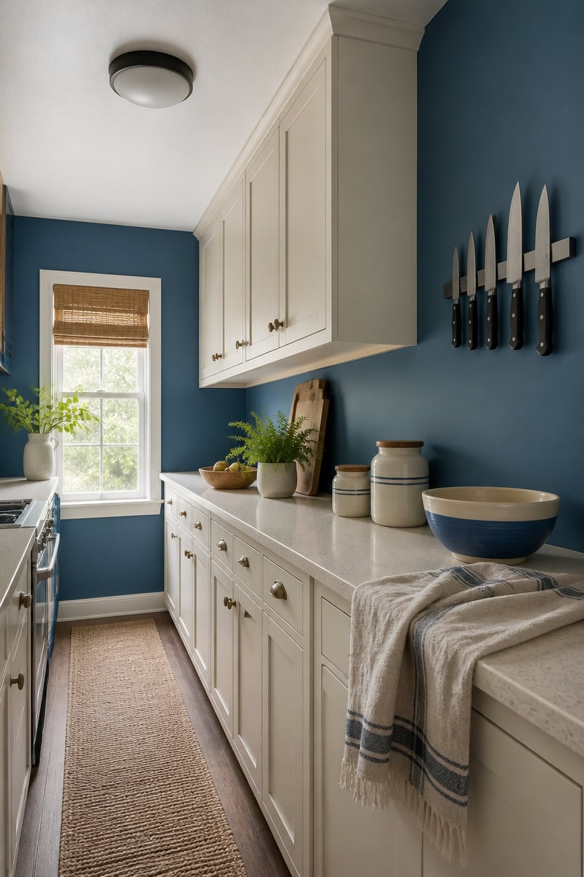
Deep blue Caribbean Azure on the accent wall doesn’t shrink a small kitchen because dark color recedes visually when balanced by light surfaces nearby. Very light cream Limestone on the cabinets reflects available light, keeping sightlines open across tight counters. A magnetic knife strip mounted on the wall frees counter space while echoing the blue-and-cream contrast overhead.
Use light on lower surfaces: Keep cabinets pale so the room reflects available light.
Reserve blue for one wall: Limit the deep color to a single accent wall to avoid visual weight.
Skip bulky accessories: Choose slim wall-mounted tools like a magnetic knife strip over freestanding blocks.
Add reflective surfaces: Glass or metal accents bounce light and make blue read brighter in tight rooms.
a deep blue that adds depth without closing in a small kitchen. [dark]
a very light cream that keeps the space feeling open and bright. [very light]
 Modern Innovations 16 Inch Stainless Steel Magnetic Knife Bar with Multi-Purpose Functionality as a Knife Holder, Knife Strip, Magnetic Tool Organizer, Art Supply Organizer & Home Organizer
View Price
 Cuisinart Air Fryer Toaster Oven Combo, Countertop, 7-in-1, 1800W, TOA-55
View Price
 Delamu 8 Tier Over the Door Pantry Organizer, 2in1 Hanging or Wall Mount Spice Rack Seasoning, Adjustable Heavy-Duty Narrow Pantry Door Organizer and Storage for Kitchen Cabinet and Bathroom,12" White
View Price
 Kitsure Dish Drying Rack for Kitchen Counter, 12''W x 15.5''L, Black
View Price
 Large Framed Abstract Landscape Wall Art for Living Room, 3 Piece Set 24x36
View Price
Bringing Blue and Cream Calm Into Open Layouts
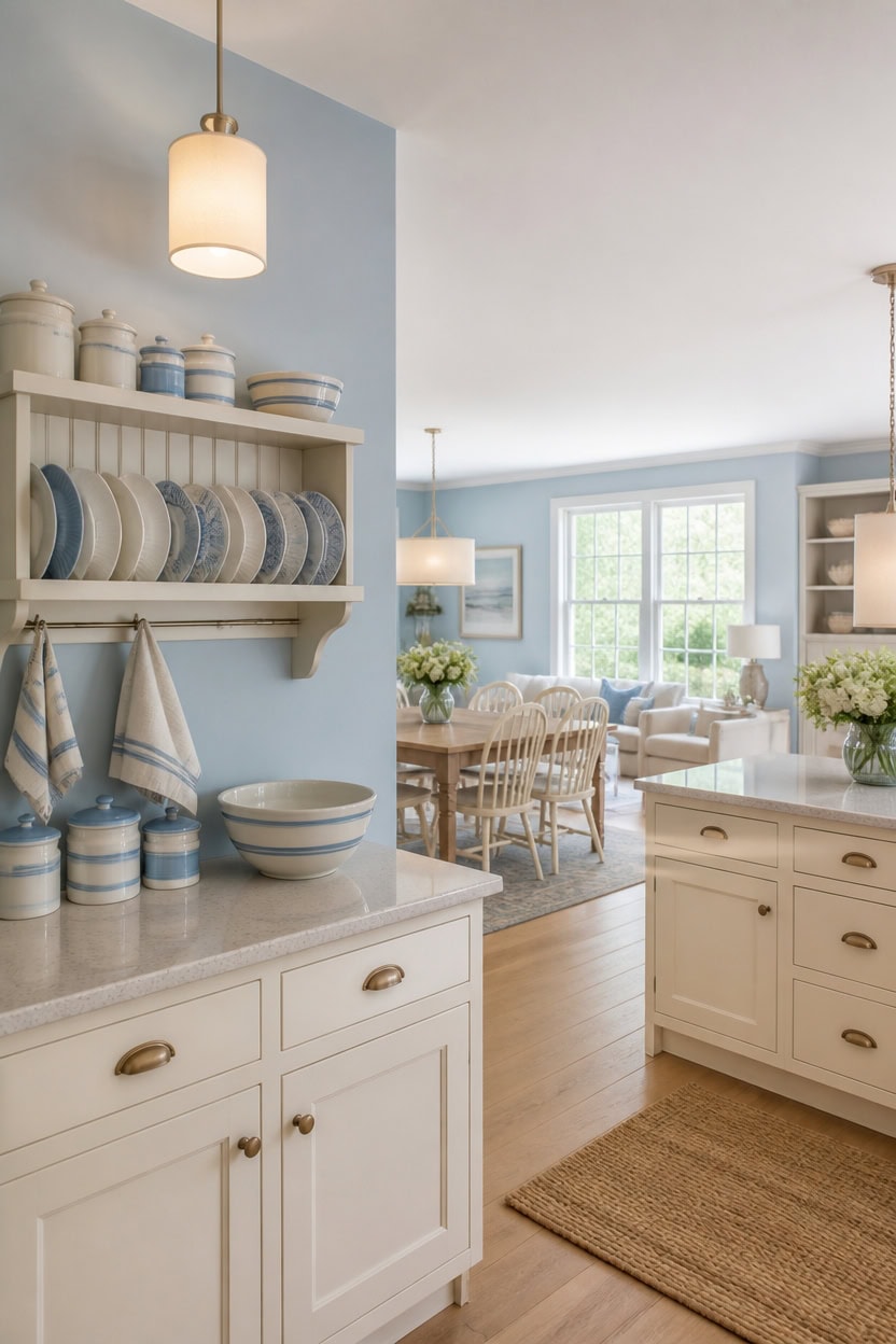
Light blue Chiswell Blue on the main walls and very light cream Montgomery White on the cabinets carry the same palette through an open kitchen without a break. This continuity keeps sightlines calm across cooking, dining, and living zones that share one open floor. A wall-mounted plate rack near the pass-through adds storage without a bulky cabinet blocking the flow.
Keep blue as anchor: Use the light blue wall color to link kitchen, dining, and living zones visually.
Let cream carry light: Keep cabinets and lower surfaces pale so daylight moves freely across the layout.
Limit accent clutter: Choose one open shelf or rack per zone instead of multiple mounted pieces.
Match sightline height: Keep upper storage low-profile so the eye travels unobstructed across the open plan.
a light blue that carries the palette across open sightlines without weighing down the space. [light]
a very light cream that bounces daylight across the open floor plan. [very light]
 junyuan Hanging Dish Drying Rack Wall Mount,Dish Racks Drainer,3 Tier Kitchen Plate Organizer Storage Shelf with Drain Tray with 3 Hooks,Stainless Steel Black Large Ajustable Height
View Price
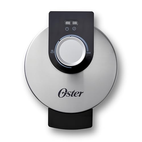 Oster Nonstick Belgian Waffle Maker, Nonstick Ceramic Waffle Iron
View Price
 Cerkik 3 Pcs 74/36/18 oz Ceramic Canisters Sets for Kitchen
View Price
 KAF Home Natural Rustic Farmhouse Slubbed Kitchen Towel | 100% Cotton Dish Towel, 18 x 28 Inches | Soft and Absorbent (Navy, Set of 4)
View Price
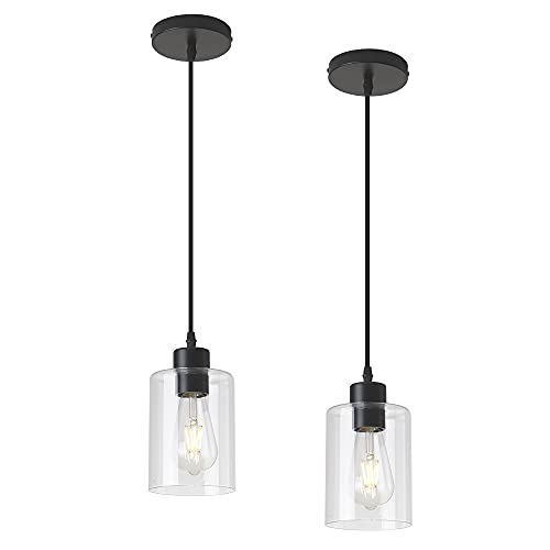 KLSS Modern Black Farmhouse Clear Glass Cylinder Pendant Light Fixture,Island Lights for Kitchen,Mini Pendant Lighting for Kitchen Island Decor - 4.75 Inch Shade 58 Inch Cord (Black 2 Pack)
View Price
 MIKIGEY Ceramic Succulent Pots with Drainage Hole & Saucer, 4 Inch Small Plant Pots, Ceramic Planter for Indoor Plants, Embossed Flower Pots, Home Decor, Set of 4, Off-White
View Price
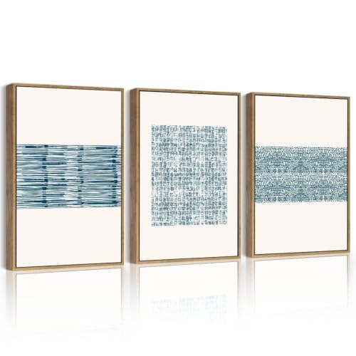 PHOPAGO Blue Abstract Framed Wall Art 11x14in Natural Framed
View Price
Our Favorite Cooking Utensils
- Free shipping over $35
- Picked at 4.4 stars or higher
 Lux Decor 23-Piece Nylon and Stainless Steel Kitchen Utensil Set
View Price
 Caraway 5-Piece Wooden Utensil Set
View Price
 BergHOFF Studio 23-Piece Tub of Cooking Utensils
View Price
 Rachael Ray Stainless Steel Bench Scraper
View Price
 Henckels Stainless Steel Silicone Tongs
View Price
 Cuisinox Disher Ice Cream Scoop
View Price
 Farberware Professional Ice Cream Scoop
View Price
 Henckels Stainless Steel Ladle
View Price
 Staub Silicone Spatula Spoon with Wood Handle
View Price
 KitchenAid Gourmet Stainless Steel Flex Turner
View Price
How to Bring This Blue and Cream Look Home
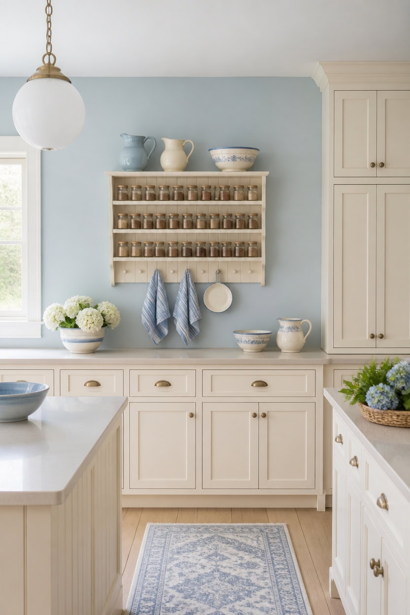
Light blue Franklin Lakes covers the main walls, and very light cream Ivory Lustre coats the cabinets for a soft, bright base. The light-to-very-light shift lets daylight travel evenly across both surfaces without harsh contrast. A wall-mounted spice rack near the stove ties into this same blue and cream pairing.
Repeat the ratio: Use the same blue-to-cream balance in every zone for visual consistency.
Anchor with one storage piece: Choose a single wall-mounted rack or shelf instead of multiple accents.
Layer soft textiles: Add blue and cream towels or linens to tie counters and walls together.
Keep sightlines open: Choose low-profile storage so the palette reads without visual clutter.
a light blue that keeps the kitchen calm and bright. [light]
a very light cream that reflects daylight across the room. [very light]
 3-Tier Adjustable Spice Rack Wall Mount, Heavy Duty Carbon Steel Countertop Spice Rack for Countertop or Wall, Multi-Functional Seasoning Organizer & Wall Mounted Spice Rack for Kitchen Storage, Black
View Price
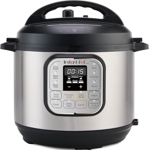 Instant Pot Duo 7-in-1 Mini Electric Pressure Cooker, Slow Rice Cooker, Steamer, Sauté, Yogurt Maker, Warmer & Sterilizer, Includes Free App with over 1900 Recipes, Stainless Steel, 3 Quart
View Price
 MQMQA 2 Pack Modern Globe Pendant Lights Kitchen Island Milk Glass
View Price
 Bico Blue Talavera Ceramic Sugar and Creamer Set, 11oz Sugar Bowl with Lid
View Price
 CHOOLD Blue Embossed Ceramic Sugar and Creamer Set with Lid Spoon Creamer Serving Set Coffee Serving Set, 10oz
View Price
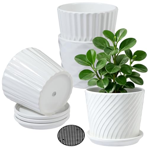 sietpoek 5.5” Ceramic Plant Pots with Drainage and Saucer 4PCs White
View Price
 RELEANY Washable Area Rug, Runner 2'x6', Blue/White/Gray
View Price