The Blue and White Kitchen Where the Dishes Are Part of the Design
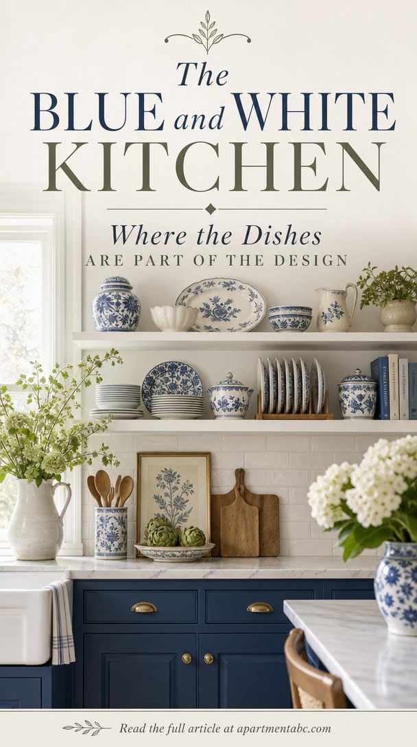
You reach for a dinner plate and realize it’s doing more work than you expected: it’s holding up the whole room’s design. That’s the quiet trick behind this kitchen, where blue and white dishes carry the color scheme.
The dishes aren’t hidden away for company; they’re the point. Once you see how deliberately these shelves are arranged, you’ll start questioning every cabinet you own.
The Color Palette Behind This Blue and White Kitchen
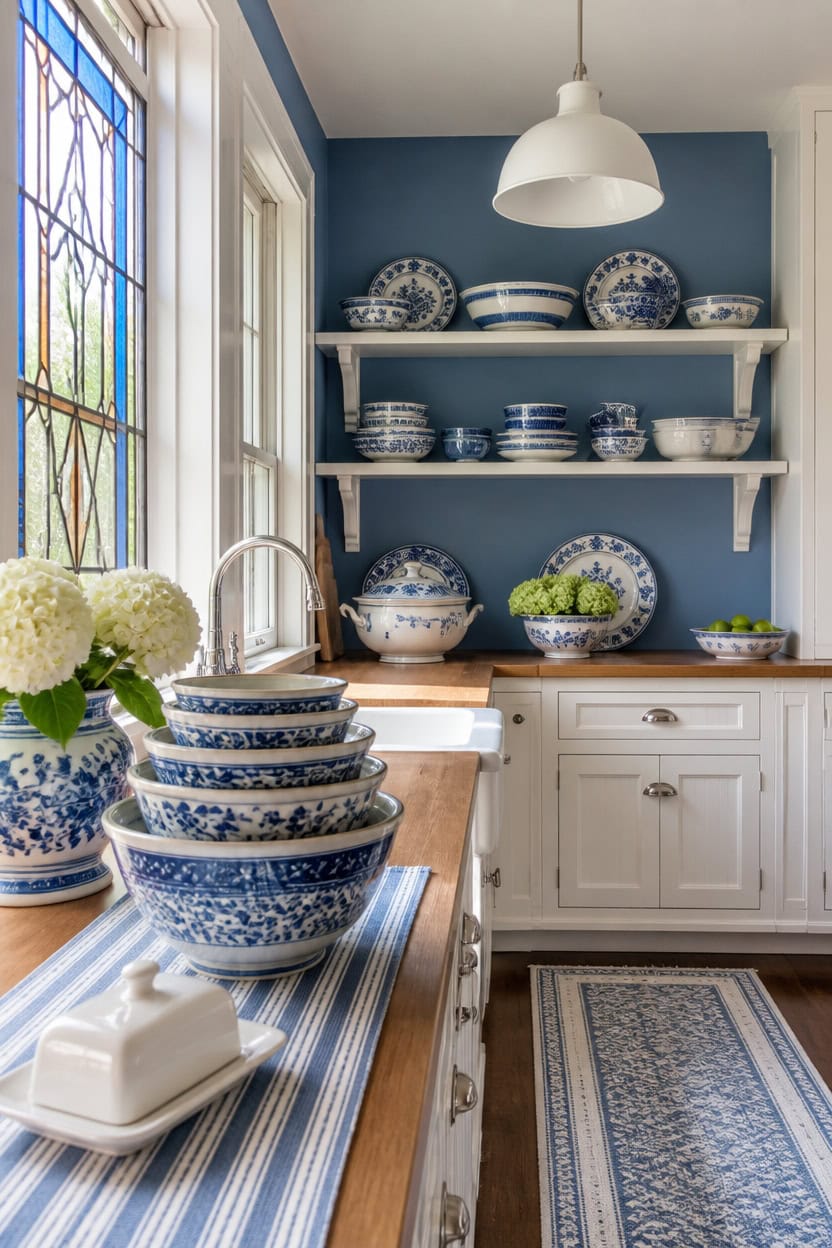
Mid-tone blue Stained Glass covers the main walls, giving the palette a deeper anchor than a pale wash. Very light white Etiquette on the cabinets balances that depth so light still bounces around the room. A stack of blue and white ceramic mixing bowls on the open counter repeats both tones without adding a third color to track.
Balance the ratio: Let one color own the large surfaces and use the second only as a rest for the eye.
Test large swatches: Paint poster-board samples and check them in morning and evening light before committing.
Anchor with one metal: Pick a single hardware finish so it doesn’t compete with the blue and white palette.
Layer texture, not color: Add depth through linen, ceramic, and wood instead of introducing a third hue.
a saturated blue that grounds the room without darkening it. [mid-tone]
a soft white that keeps the blue from reading heavy. [very light]
 Elite Gourmet ERC006SS 6-Cup Electric Rice Cooker with Stainless Steel Inner Pot, Makes Soups, Stews, Porridges, Grains and Cereals, 6 cup (3 cups uncooked), Black
View Price
Elite Gourmet ERC006SS 6-Cup Electric Rice Cooker with Stainless Steel Inner Pot, Makes Soups, Stews, Porridges, Grains and Cereals, 6 cup (3 cups uncooked), Black
View Price
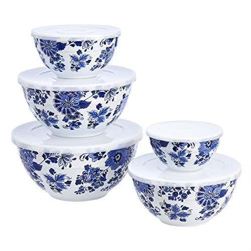 Amazon Basics Mixing Bowls with Lids, Nesting Melamine Serving Bowls, Non-Slip Base, BPA Free, Dishwasher Safe, 5 Sizes, Blue and White Floral, Set of 10
View Price
Amazon Basics Mixing Bowls with Lids, Nesting Melamine Serving Bowls, Non-Slip Base, BPA Free, Dishwasher Safe, 5 Sizes, Blue and White Floral, Set of 10
View Price
 Folkulture Table Runner 108 Inches Long | Blue & White Striped
View Price
Folkulture Table Runner 108 Inches Long | Blue & White Striped
View Price
 Bavonira Spice Rack Wall Mount - 4-Pack Wooden Hanging Spice Rack for Wall - Rustic Wood Spice Wall Rack for Kitchen Seasoning Organization (4, Rustic Brown, 15.7 Inches)
View Price
Bavonira Spice Rack Wall Mount - 4-Pack Wooden Hanging Spice Rack for Wall - Rustic Wood Spice Wall Rack for Kitchen Seasoning Organization (4, Rustic Brown, 15.7 Inches)
View Price
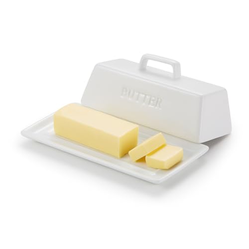 Kook Ceramic Butter Dish with Lid, Countertop, Dishes, Tray, White
View Price
Kook Ceramic Butter Dish with Lid, Countertop, Dishes, Tray, White
View Price
 Chardin home Blue & White Reversible Runner Rug, 2x5 feet Machine Washable Cotton Rug, Perfect for hallways, stairwell, Kitchen Bedroom
View Price
Chardin home Blue & White Reversible Runner Rug, 2x5 feet Machine Washable Cotton Rug, Perfect for hallways, stairwell, Kitchen Bedroom
View Price
 Ziqqeelam 2 Pack 11.8" White Pendant Light Kitchen Island Morden Pendant Light, Hanging Farmhouse Pendant Lights Fixture Kitchen Island, White Dome Pendant Lighting Over Island Dining Room
View Price
Ziqqeelam 2 Pack 11.8" White Pendant Light Kitchen Island Morden Pendant Light, Hanging Farmhouse Pendant Lights Fixture Kitchen Island, White Dome Pendant Lighting Over Island Dining Room
View Price
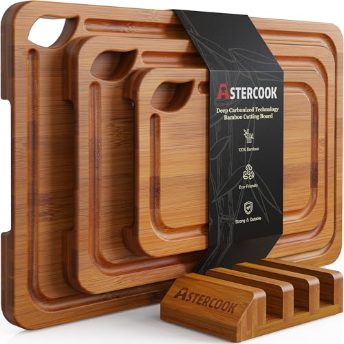 Astercook Deep-Carbonized Bamboo Cutting Boards for Kitchen with Wood Storage Stand, Reversible Charcuterie & Chopping Boards with Juice Grooves and Easy-Grip Handles, Fathers Day Gift for Men
View Price
Astercook Deep-Carbonized Bamboo Cutting Boards for Kitchen with Wood Storage Stand, Reversible Charcuterie & Chopping Boards with Juice Grooves and Easy-Grip Handles, Fathers Day Gift for Men
View Price
Why Open Shelving Works So Well in a Blue and White Kitchen
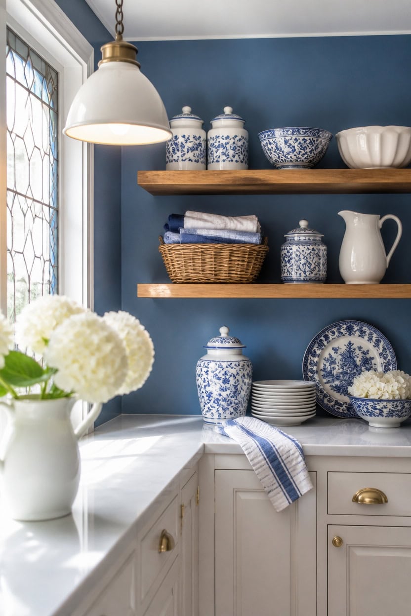
Open shelving works because it breaks up large color blocks, letting mid-tone blue Stained Glass show behind each shelf. Very light white Etiquette on the lower cabinets keeps that exposed wall from feeling heavy. Style one shelf with a woven basket of folded linen napkins to add texture, not a third color.
Group by height: Arrange stacked plates and bowls in ascending height so the eye moves smoothly across the shelf.
Leave breathing room: Fill shelves to about two-thirds capacity so the wall color still shows through.
Repeat the palette: Keep displayed items limited to blue and white pieces so the shelf reads intentional.
Anchor with brackets: Choose one bracket finish for every shelf run so the hardware doesn’t compete with the paint.
a saturated blue that shows through the open shelf gaps without darkening the room. [mid-tone]
a soft white that keeps the base of the room light under the open shelving. [very light]
 Aroma Housewares Select Stainless Rice Cooker & Warmer with Uncoated Inner Pot, 3-Cup(uncooked)/6-Cup(cooked)/ 1.2Qt, ARC-753SGB, Black
View Price
Aroma Housewares Select Stainless Rice Cooker & Warmer with Uncoated Inner Pot, 3-Cup(uncooked)/6-Cup(cooked)/ 1.2Qt, ARC-753SGB, Black
View Price
 Napkin Holder Wicker Woven Basket Kitchen Decor for Table Dinner Paper Tray
View Price
Napkin Holder Wicker Woven Basket Kitchen Decor for Table Dinner Paper Tray
View Price
 TTU Tabletops Gallery Ceramic Canister Collection- Stoneware Designed Kitchen Storage Acacia Wood White Set, 3 Piece Botanical Blue Canister Set
View Price
TTU Tabletops Gallery Ceramic Canister Collection- Stoneware Designed Kitchen Storage Acacia Wood White Set, 3 Piece Botanical Blue Canister Set
View Price
 QEEIG Floating Shelves for Wall Small Shelf (Brown, Set of 3, 15.7" x 6.7")
View Price
QEEIG Floating Shelves for Wall Small Shelf (Brown, Set of 3, 15.7" x 6.7")
View Price
 hjn Farmhouse Pitcher Vase for Flowers- Ceramic Pitcher White Flower Vase for Your Kitchen/Home Decor/Office/Living Room/Bookshelf/Mantel/-White
View Price
hjn Farmhouse Pitcher Vase for Flowers- Ceramic Pitcher White Flower Vase for Your Kitchen/Home Decor/Office/Living Room/Bookshelf/Mantel/-White
View Price
 Urban Villa Kitchen Towels 100% Cotton Dish Towels for Kitchen (Set of 6) 20”x30” Dish Cloths Highly Absorbent Kitchen Linen Set with Hanging Loop Perfect for Drying Dishes Cleaning Towels-Blue White
View Price
Urban Villa Kitchen Towels 100% Cotton Dish Towels for Kitchen (Set of 6) 20”x30” Dish Cloths Highly Absorbent Kitchen Linen Set with Hanging Loop Perfect for Drying Dishes Cleaning Towels-Blue White
View Price
 LamQee 18 Inch White and Gold Large Pendant Light Kitchen Island, Farmhouse Modern Dome Pendant Light Fixtures Ceiling Hanging Lighting Chandelier for Dining Room Over Table, Bar, Hallway, Entryway
View Price
LamQee 18 Inch White and Gold Large Pendant Light Kitchen Island, Farmhouse Modern Dome Pendant Light Fixtures Ceiling Hanging Lighting Chandelier for Dining Room Over Table, Bar, Hallway, Entryway
View Price
 LiWiBet Mini Acacia Wood Round Cutting Board with Handle, Wooden Kitchen Prep Board, Small Chopping Board for Fruit Vegetables Meat Bread Multipurpose Pizza Cheese Serving Tray for Restaurant & Party
View Price
LiWiBet Mini Acacia Wood Round Cutting Board with Handle, Wooden Kitchen Prep Board, Small Chopping Board for Fruit Vegetables Meat Bread Multipurpose Pizza Cheese Serving Tray for Restaurant & Party
View Price
Tile Choices That Reinforce the Blue and White Theme
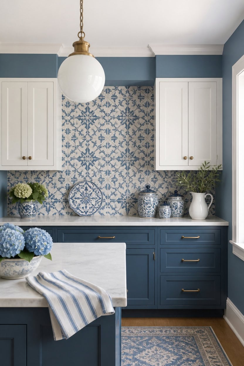
Pick tile with warm white grout against cool blue tile so the seams stay calm, not busy. Mid-tone blue Hamilton Blue walls ground the tile, while very light white Marilyn’s Dress on the upper cabinets keeps the pattern as the focal point. A ceramic tile trivet near the stove repeats that same blue and white pattern in one small piece.
Match grout warmth: Use warm white grout with cool blue tile so the tones don’t clash.
Repeat the shapes: Choose a tile shape that echoes existing fixture lines for cohesion.
Limit pattern size: Keep bold patterns to a small strip so the kitchen doesn’t feel busy.
Test in daylight: View samples near a window since blue undertones shift under artificial light.
a mid-tone blue that grounds the tile pattern without darkening the room. [mid-tone]
a very light white that keeps the tile as the visual focal point. [very light]
 Tretizl 10 Sheet Thicker Peel and Stick Backsplash, Self-Adhesive Wall Tiles for Kitchen Bathroom, Vinyl Material, Easy to Install, 12"x12", Blue and White
View Price
Tretizl 10 Sheet Thicker Peel and Stick Backsplash, Self-Adhesive Wall Tiles for Kitchen Bathroom, Vinyl Material, Easy to Install, 12"x12", Blue and White
View Price
 Pavilion Gift Company- Teal & Blue - 10.5" Ceramic Heat Resistant Trivet Summer Italian Mediterranean Kitchen Decor
View Price
Pavilion Gift Company- Teal & Blue - 10.5" Ceramic Heat Resistant Trivet Summer Italian Mediterranean Kitchen Decor
View Price
 Midea 12-in-1 Electric Pressure Cooker, 6 Quarts, 12 Presets, Multi-Functional Programmable Slow Cooker, Rice Cooker, Steamer, Sauté Pan, Yogurt Maker, and More, Stainless Steel
View Price
Midea 12-in-1 Electric Pressure Cooker, 6 Quarts, 12 Presets, Multi-Functional Programmable Slow Cooker, Rice Cooker, Steamer, Sauté Pan, Yogurt Maker, and More, Stainless Steel
View Price
 10 Strawberry Street Luca Ombre Embossed Ceramic Kitchen Canister Set, Set of 3, Matte Blue/White, Bamboo Lids
View Price
10 Strawberry Street Luca Ombre Embossed Ceramic Kitchen Canister Set, Set of 3, Matte Blue/White, Bamboo Lids
View Price
 KitchenAid Albany Kitchen Towel 4-Pack Set, Blue Velvet/White, 16"x26"
View Price
KitchenAid Albany Kitchen Towel 4-Pack Set, Blue Velvet/White, 16"x26"
View Price
 Creative Co-Op 87-Ounce Embossed Stripe Ceramic Pitcher, Distressed White
View Price
Creative Co-Op 87-Ounce Embossed Stripe Ceramic Pitcher, Distressed White
View Price
 Generation Lighting Leo Hanging Globe XL 1-Light Pendant in White
View Price
Generation Lighting Leo Hanging Globe XL 1-Light Pendant in White
View Price
 LAZIOPATER Wood Cutting Board Set, 3-Piece Rectangular Boards for Kitchen, 18x12x0.75 Inches, Hand Wash Only (Acacia Wood)
View Price
LAZIOPATER Wood Cutting Board Set, 3-Piece Rectangular Boards for Kitchen, 18x12x0.75 Inches, Hand Wash Only (Acacia Wood)
View Price
Countertops and Backsplashes That Keep the Theme Going
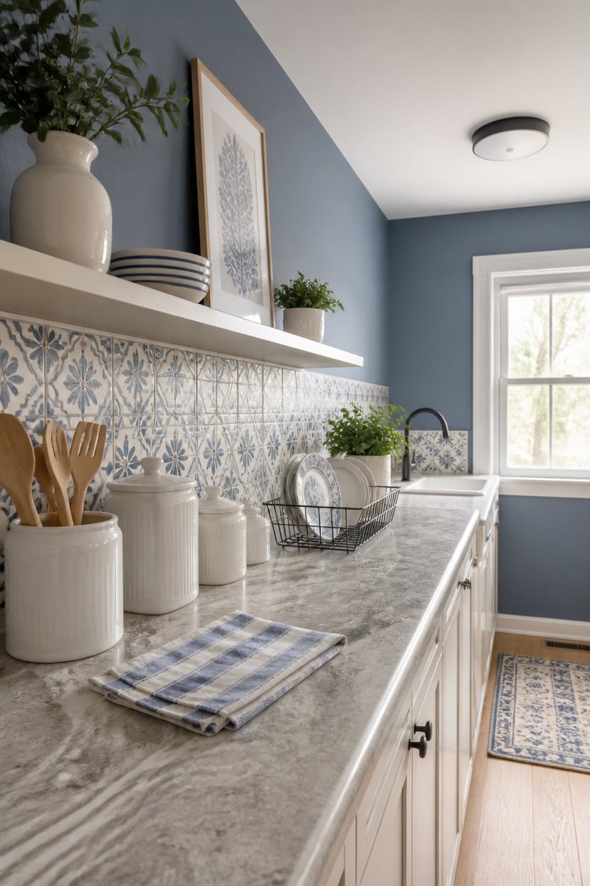
Countertop laminate and backsplash tile both read cooler under kitchen task lighting, so pairing them with the right wall and cabinet tones keeps the whole zone from feeling flat. Mid-tone blue Seaport Blue on the accent wall behind the range grounds the backsplash pattern, while very light white Stone White on the lower cabinets keeps the counter zone bright. This split lets grout lines and tile edges carry the visual story. Set a wire dish rack on the counter so the workspace looks lived-in, not staged.
Choose durable stone-look laminate: Use a stone-pattern laminate for countertops that resists water without the cost of natural stone.
Coordinate grout and cabinet tone: Match backsplash grout to the lower cabinet paint so the seam disappears.
Anchor with an accent wall: Paint one wall in a mid-tone blue to frame the countertop without overwhelming it.
Test samples under task lighting: Hold tile and paint chips near under-cabinet lights since color shifts happen there.
a mid-tone blue that frames the backsplash without competing with its pattern. [mid-tone]
a very light white that keeps the counter zone bright and easy to read. [very light]
 Urackify Stainless Steel Dish Drying Rack for Kitchen Counter, 16.9" x12.4"
View Price
Urackify Stainless Steel Dish Drying Rack for Kitchen Counter, 16.9" x12.4"
View Price
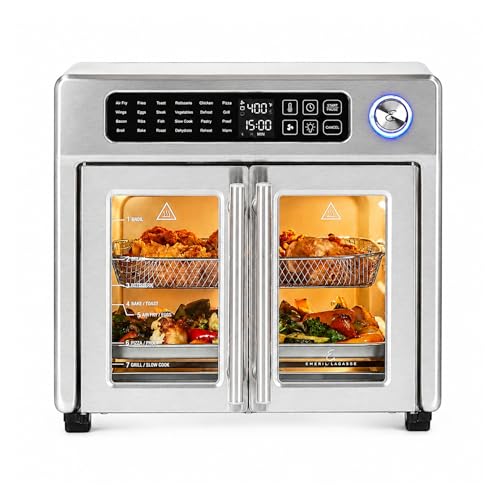 Emeril Lagasse 26QT French Door Multi-Function Air Fryer Toaster Oven
View Price
Emeril Lagasse 26QT French Door Multi-Function Air Fryer Toaster Oven
View Price
 Vamos Tile Thicker Peel and Stick Backsplash Tile,Light Blue,10-Sheet
View Price
Vamos Tile Thicker Peel and Stick Backsplash Tile,Light Blue,10-Sheet
View Price
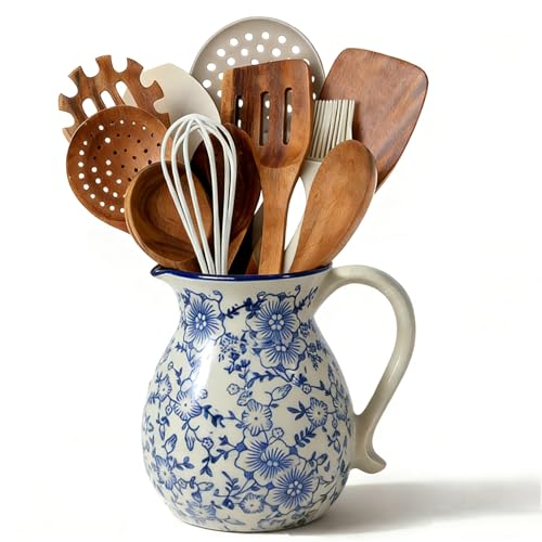 6.1" Blue & White Ceramic Farmhouse Utensil Holder for Kitchen Counter
View Price
6.1" Blue & White Ceramic Farmhouse Utensil Holder for Kitchen Counter
View Price
 Canister Sets For The Kitchen (4 Piece Set) White, High Gloss Ceramic | By Home Basics | Decorative| With Wooden Spoons, Countertop Set For Flour, Sugar, Coffee, and Snacks
View Price
Canister Sets For The Kitchen (4 Piece Set) White, High Gloss Ceramic | By Home Basics | Decorative| With Wooden Spoons, Countertop Set For Flour, Sugar, Coffee, and Snacks
View Price
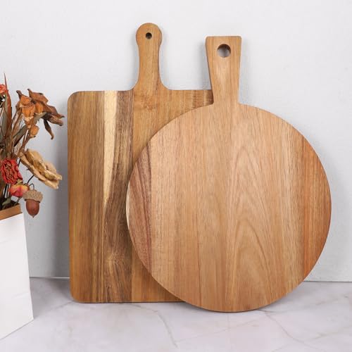 2 Pcs Wood Cutting Board with Handle Decorative Wooden Serving Board Large Chopping Cutting Board Set Charcuterie Board for Cheese Board Meat Bread Chopping Blocks
View Price
2 Pcs Wood Cutting Board with Handle Decorative Wooden Serving Board Large Chopping Cutting Board Set Charcuterie Board for Cheese Board Meat Bread Chopping Blocks
View Price
 Dos Sueños Hand Blown Mexican Drinking Glasses - Set of 6 Glasses with Cobalt Blue Rims (14 oz each)
View Price
Dos Sueños Hand Blown Mexican Drinking Glasses - Set of 6 Glasses with Cobalt Blue Rims (14 oz each)
View Price
The Dishware Collection Anchoring This Blue and White Kitchen
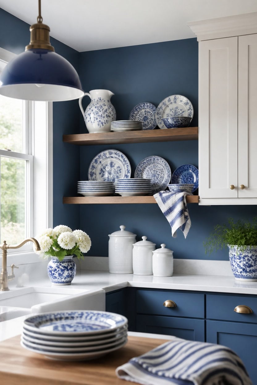
A curated dishware collection reads best when it repeats the same blue and white split already on the walls. Mid-tone blue Stained Glass on the main walls grounds the dinnerware, while very light white Etiquette on the upper cabinets keeps stacked plates and bowls easy to see. Stack blue and white ceramic plates on an open shelf so the pattern looks planned, not cluttered.
Group by color story: Cluster blue and white pieces together so the collection reads as one set, not scattered dishes.
Vary shapes, not palette: Mix bowls, plates, and pitchers in the same two tones for texture without visual noise.
Use open shelving: Display everyday dishware on open shelves near the upper cabinets so pieces stay visible and reachable.
Rotate seasonal pieces: Swap in a patterned bowl or platter now and then to keep the shelf feeling current.
a mid-tone blue that grounds the dishware display without competing with its pattern. [mid-tone]
a very light white that keeps stacked plates and bowls easy to spot. [very light]
 vancasso 10.25" Blue Dinner Plates Set of 6, Porcelain Vintage
View Price
vancasso 10.25" Blue Dinner Plates Set of 6, Porcelain Vintage
View Price
 Aroma Housewares Select Stainless Rice Cooker & Warmer with Uncoated Inner Pot, 14-Cup(cooked) / 3Qt, ARC-757SG
View Price
Aroma Housewares Select Stainless Rice Cooker & Warmer with Uncoated Inner Pot, 14-Cup(cooked) / 3Qt, ARC-757SG
View Price
 DOWAN 22 OZ White Ceramic Bowls Set of 4 - Perfect for Soup Bowls for Kitchen, Cereal Bowl, Ramen Bowl, Microwave Safe for Oatmeal, Fruit,Salad and Rice Bowl - Dishwasher & Microwave Safe
View Price
DOWAN 22 OZ White Ceramic Bowls Set of 4 - Perfect for Soup Bowls for Kitchen, Cereal Bowl, Ramen Bowl, Microwave Safe for Oatmeal, Fruit,Salad and Rice Bowl - Dishwasher & Microwave Safe
View Price
 Native Fab Blue Kitchen Dish Towels 16"x26" Set of 12 Herringbone Weave - Scandia Stripe 100% Cotton Tea Towels, Dishcloths, Absorbent Reusable Hand Towels with Hanging Loop - Blue White
View Price
Native Fab Blue Kitchen Dish Towels 16"x26" Set of 12 Herringbone Weave - Scandia Stripe 100% Cotton Tea Towels, Dishcloths, Absorbent Reusable Hand Towels with Hanging Loop - Blue White
View Price
 BAYKA Rustic Brown Floating Shelves 22.5in, 3 Pack, Wall Mount Wood Shelf
View Price
BAYKA Rustic Brown Floating Shelves 22.5in, 3 Pack, Wall Mount Wood Shelf
View Price
 Hand Blown Mexican Drinking Glasses - Set of 6 Tumbler Glasses with Cobalt Blue Rims (10 oz each)
View Price
Hand Blown Mexican Drinking Glasses - Set of 6 Tumbler Glasses with Cobalt Blue Rims (10 oz each)
View Price
 Ceramic Pitcher Vase, Blue and White Vase for Home Decor, Chinoiserie Decor
View Price
Ceramic Pitcher Vase, Blue and White Vase for Home Decor, Chinoiserie Decor
View Price
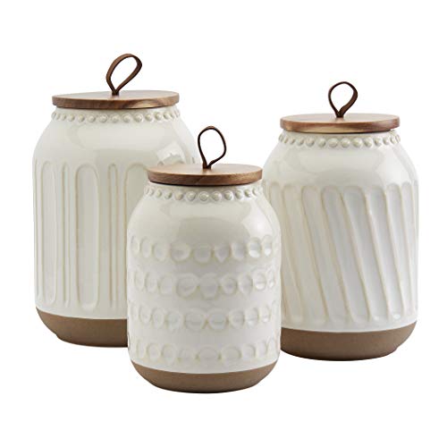 TTU Tabletops Gallery Ceramic Canister Collection- Stoneware Designed Kitchen Storage Embossed Acacia Wood White Set, 3 Piece Embossed Ziggy White Canister Set
View Price
TTU Tabletops Gallery Ceramic Canister Collection- Stoneware Designed Kitchen Storage Embossed Acacia Wood White Set, 3 Piece Embossed Ziggy White Canister Set
View Price
Striped Mugs and Patterned Bowls That Pair So Well
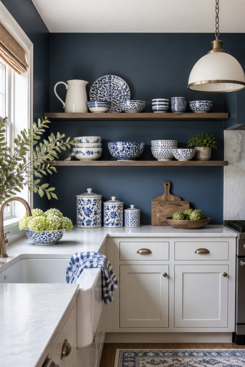
Deep blue Gentleman’s Gray covers the accent wall, and very light white Summer Shower covers the lower cabinets. The dark wall recedes so patterned dishware stands out against it. Group striped tumblers and patterned bowls on the open shelf against that wall.
Match Pattern Scale: Pair a bold striped piece with a busier patterned bowl so one design leads.
Keep a Shared Undertone: Choose blues and whites that lean toward the same undertone so mixed patterns feel cohesive.
Anchor With Solid Pieces: Add one solid blue or white piece between patterns to give the eye a rest.
Layer By Height: Stack bowls low and lean striped pieces upright so the shelf reads with rhythm.
a deep blue that lets striped and patterned dishware stand out. [dark]
a very light white that keeps the base of the kitchen bright and open. [very light]
 Aroma Housewares ARC-363-1NGB 3 Uncooked/6 Cups Cooked Rice Cooker, Steamer, Multicooker, 2-6 cups, Black
View Price
Aroma Housewares ARC-363-1NGB 3 Uncooked/6 Cups Cooked Rice Cooker, Steamer, Multicooker, 2-6 cups, Black
View Price
 Blue and White Plaid Kitchen Towels - Set of 6 Blue Checkered, 100% Cotton, Lint-Free Kitchen Towels with Hanging Loop - Versatile Uses Including Kitchen Towels, Hand Towels, Dish Towels (6 Pack)
View Price
Blue and White Plaid Kitchen Towels - Set of 6 Blue Checkered, 100% Cotton, Lint-Free Kitchen Towels with Hanging Loop - Versatile Uses Including Kitchen Towels, Hand Towels, Dish Towels (6 Pack)
View Price
 BAYKA Floating Shelves Set of 2, 22.5" Rustic Wood Wall Mounted Shelves for Bathroom, Bedroom, Living Room, Kitchen & Office, Hanging Display Shelf with 22 lbs Capacity (Rustic Brown)
View Price
BAYKA Floating Shelves Set of 2, 22.5" Rustic Wood Wall Mounted Shelves for Bathroom, Bedroom, Living Room, Kitchen & Office, Hanging Display Shelf with 22 lbs Capacity (Rustic Brown)
View Price
 Blue and White Ceramic Vase, 7.28 Inch Crackle Glaze Pitcher with Handle
View Price
Blue and White Ceramic Vase, 7.28 Inch Crackle Glaze Pitcher with Handle
View Price
 DII Variegated Tabletop Collection, Placemat Set3x19, Light Blue, 6 Piece
View Price
DII Variegated Tabletop Collection, Placemat Set3x19, Light Blue, 6 Piece
View Price
 Cerkik 3 Pcs 74/36/18 oz Ceramic Canisters Sets for Kitchen
View Price
Cerkik 3 Pcs 74/36/18 oz Ceramic Canisters Sets for Kitchen
View Price
 Pfaltzgraff Gabriela Blue Floral Rectangle Platter, 14.75 Inch
View Price
Pfaltzgraff Gabriela Blue Floral Rectangle Platter, 14.75 Inch
View Price
Hardware and Trim That Reinforce the Blue and White Look
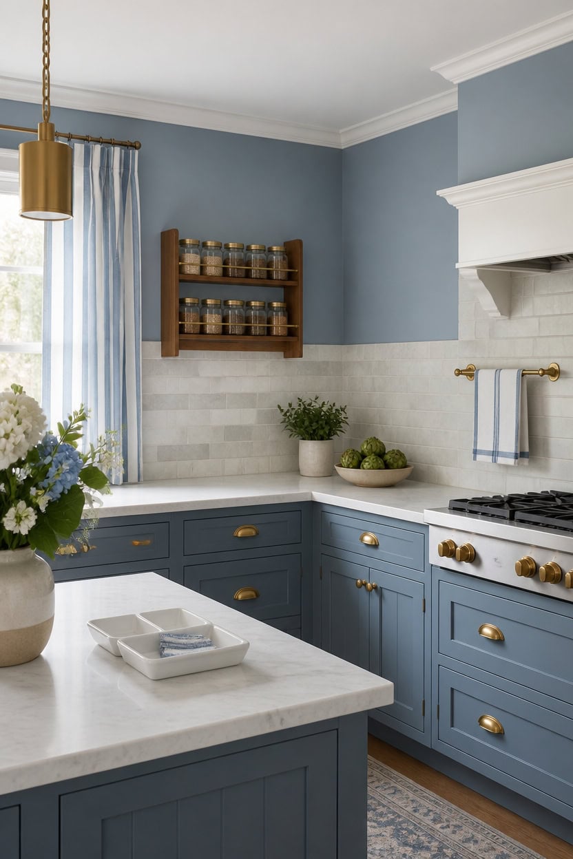
Chiswell Blue, a light blue, covers the main walls, while Gray Lake, a very light white, brightens the backsplash trim. The crisp trim outlines each cabinet edge, making the blue backdrop feel sharper and more intentional. Mount a wood spice rack with glass jars along that trim line to keep small storage in step with the palette.
Match Metal Tones: Keep the faucet, hinges, and light fixtures in the same finish for a cohesive line.
Trim in a Lighter Shade: Paint trim a step lighter than the walls so the edges stay visible.
Repeat the Finish: Carry one brass or nickel tone across hooks, bars, and rails throughout the room.
Keep It Simple: Choose clean-lined fixtures that support the blue and white palette instead of competing with it.
a light blue that gives the trim and fixtures a calm backdrop to stand out against. [light]
a very light white that sharpens the line where wall meets tile. [very light]
 KitHero 4-Tier Wall Mount Spice Rack Organizer with 24 Glass Jars, 216 Labels & Funnel - Screw/Adhesive Mount, Black Metal & Wood Spice Storage for Kitchen Pantry Cabinet, 11.6”L x 2.4”W x 3.2”H
View Price
KitHero 4-Tier Wall Mount Spice Rack Organizer with 24 Glass Jars, 216 Labels & Funnel - Screw/Adhesive Mount, Black Metal & Wood Spice Storage for Kitchen Pantry Cabinet, 11.6”L x 2.4”W x 3.2”H
View Price
 bella Fits-Anywhere Flip-n-Store Non-Toxic, Belgian Waffle Maker, Oatmilk
View Price
bella Fits-Anywhere Flip-n-Store Non-Toxic, Belgian Waffle Maker, Oatmilk
View Price
 KLSS Brass Pendant Lights Kitchen Island - Gold Clear Glass Pendant Light Fixture Multiple Stems Rods 3 Units 12 Inch 3 Units 4 Inch (3 Pack Brass)
View Price
KLSS Brass Pendant Lights Kitchen Island - Gold Clear Glass Pendant Light Fixture Multiple Stems Rods 3 Units 12 Inch 3 Units 4 Inch (3 Pack Brass)
View Price
 VSUINGO 9.2" Porcelain Small Bathroom Narrow Tray - Blue
View Price
VSUINGO 9.2" Porcelain Small Bathroom Narrow Tray - Blue
View Price
 zokyer Striped Window Curtains, Blue and White, 2 Panels, 42" W x 63" L
View Price
zokyer Striped Window Curtains, Blue and White, 2 Panels, 42" W x 63" L
View Price
 Design House Millbridge Towel Bar, 24", Polished Brass
View Price
Design House Millbridge Towel Bar, 24", Polished Brass
View Price
 maudibozz Charcuterie Acacia Wood Resin Spliced Board Resin Wave Pattern Cutting Board Cheese Meat Vegetable Steak Cutting Boards Serving Board (Blue)
View Price
maudibozz Charcuterie Acacia Wood Resin Spliced Board Resin Wave Pattern Cutting Board Cheese Meat Vegetable Steak Cutting Boards Serving Board (Blue)
View Price
 Aryroi Navy Blue and White Abstract Framed Canvas Wall Art Set- 16"x24"x3
View Price
Aryroi Navy Blue and White Abstract Framed Canvas Wall Art Set- 16"x24"x3
View Price
Lighting That Makes a Blue and White Display Pop
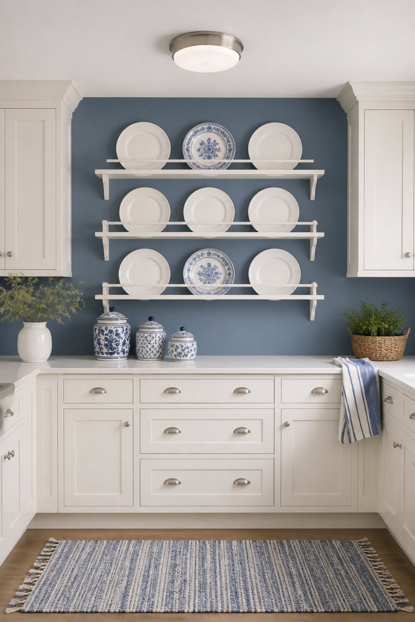
A flush mount fixture centered above the open shelf sends even light down onto the display instead of casting shadows across the room. Mid-tone Blue Dusk on the accent wall keeps glare low, letting the very light First Light cabinets bounce that glow back toward the counter. Mount a wall-mounted plate rack with white dinnerware under the fixture so the light catches every plate edge.
Layer the Light Sources: Pair a ceiling fixture with under-cabinet LEDs for even depth.
Choose Warm White Bulbs: Warm bulbs keep blue tones from reading cold after dark.
Aim Light at One Shelf: Point a single downlight at the plate rack so it stands out.
Add a Dimmer: A dimmer lets the blue and white contrast soften for evening use.
a mid-tone blue that keeps the fixture’s glow from washing out. [mid-tone]
a very light white that reflects the light back into the room. [very light]
 MyGift Wall Plate Display Rack, 3 Tier Farmhouse Whitewashed Wood Wall Mounted Plate Storage Rack, Holds 6-10inch Plates
View Price
MyGift Wall Plate Display Rack, 3 Tier Farmhouse Whitewashed Wood Wall Mounted Plate Storage Rack, Holds 6-10inch Plates
View Price
 hykolity 13 inch Flush Mount LED Ceiling Light Fixture,5CCT
View Price
hykolity 13 inch Flush Mount LED Ceiling Light Fixture,5CCT
View Price
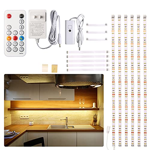 WOBANE Under Cabinet LED Lighting Kit,Dimmable Strip Lights with RF Remote
View Price
WOBANE Under Cabinet LED Lighting Kit,Dimmable Strip Lights with RF Remote
View Price
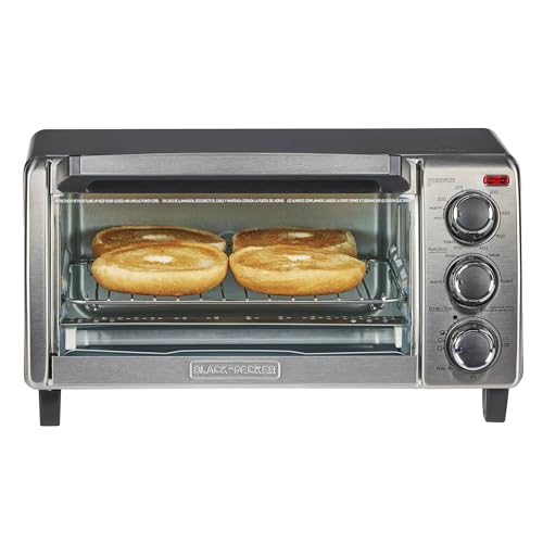 BLACK+DECKER TO1313SBD Toaster Oven, 15.47 Inch, Silver
View Price
BLACK+DECKER TO1313SBD Toaster Oven, 15.47 Inch, Silver
View Price
 Bico Blue Talavera Ceramic Canister Set of 3 for Kitchen Counter, 62oz, 40oz, 32oz each, with Wooden Air Tight Lid, Food Storage Jar for storing Coffee, Tea, Spice, Dishwasher Safe
View Price
Bico Blue Talavera Ceramic Canister Set of 3 for Kitchen Counter, 62oz, 40oz, 32oz each, with Wooden Air Tight Lid, Food Storage Jar for storing Coffee, Tea, Spice, Dishwasher Safe
View Price
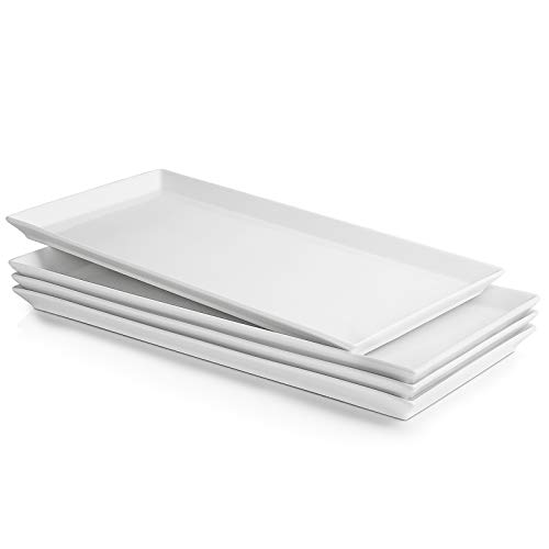 Sweese White Serving Platters, Porcelain Serving Trays for Parties, Large Rectangular Plates - 15.5 Inch, Set of 4
View Price
Sweese White Serving Platters, Porcelain Serving Trays for Parties, Large Rectangular Plates - 15.5 Inch, Set of 4
View Price
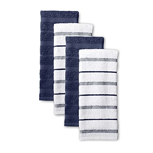 KitchenAid Albany Kitchen Towel 4-Pack Set, Blue Willow/White, 16"x26"
View Price
KitchenAid Albany Kitchen Towel 4-Pack Set, Blue Willow/White, 16"x26"
View Price
Where to Shop for Blue and White Kitchen Pieces
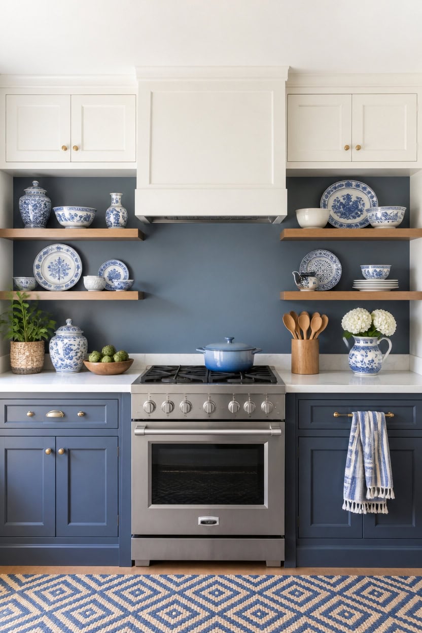
Mid-tone Blue Dusk on the accent wall and very light First Light on the upper cabinets set the exact shades to search for online. Matching swatches to real paint chips prevents the mismatched blue that photos alone can cause. Place a wooden utensil crock beside the stove as the anchor piece while shopping the rest of the room’s blue and white pieces.
Match Paint Chips to Screens: Hold a swatch beside your monitor before buying any blue accent piece.
Buy One Statement Piece First: Choose the utensil crock or a platter, then build smaller accents around it.
Order Fabric Swatches: Request swatches for towels and rugs before committing to a full set.
Group Small Buys by Undertone: Keep every blue accessory on the cool side so it matches the wall.
a mid-tone blue that anchors the room’s cool palette for anyone matching new pieces to it. [mid-tone]
a very light white that keeps the space bright for photographing purchases. [very light]
 Segtenant Utensil Holder, Acacia Wood Kitchen Utensil Holder for Countertop, 360°Rotating Cooking Utensil Crock for Kitchen Counter, 7.2" Large Utensil Organizer for Spatula
View Price
Segtenant Utensil Holder, Acacia Wood Kitchen Utensil Holder for Countertop, 360°Rotating Cooking Utensil Crock for Kitchen Counter, 7.2" Large Utensil Organizer for Spatula
View Price
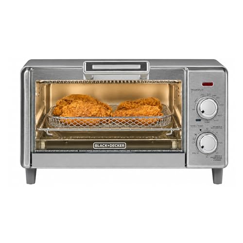 BLACK+DECKER 4-Slice Air Fry Toaster Oven, 5-in-1 Countertop Oven
View Price
BLACK+DECKER 4-Slice Air Fry Toaster Oven, 5-in-1 Countertop Oven
View Price
 Spode Blue Italian Pitcher
View Price
Spode Blue Italian Pitcher
View Price
 TEAKISS Large Ceramic Mixing Bowls, White Kitchen Bowls (1QT/2.3QT/4.6QT), Set of 3 Nesting Bowls for Baking, Cooking, Serving, Prepping, Dough Bread Making Bowl, Microwave and Dishwasher Safe
View Price
TEAKISS Large Ceramic Mixing Bowls, White Kitchen Bowls (1QT/2.3QT/4.6QT), Set of 3 Nesting Bowls for Baking, Cooking, Serving, Prepping, Dough Bread Making Bowl, Microwave and Dishwasher Safe
View Price
 BeLuyi Adjustable Bib Apron with 2 Pockets Chef Cooking Kitchen Restaurant Aprons for Women Men (Blue Pinstripe)
View Price
BeLuyi Adjustable Bib Apron with 2 Pockets Chef Cooking Kitchen Restaurant Aprons for Women Men (Blue Pinstripe)
View Price
 Homaxy Kitchen Towels and Dishcloths Set of 8, White & Navy Blue
View Price
Homaxy Kitchen Towels and Dishcloths Set of 8, White & Navy Blue
View Price
 JolieJulie 11" Ceramic Fruit Bowl for Kitchen Counter, White
View Price
JolieJulie 11" Ceramic Fruit Bowl for Kitchen Counter, White
View Price
 SAFAVIEH Cape Cod Collection Area Rug - 5' x 8', Natural & Blue, Handmade Flat Weave Diamond Braided Jute & Denim, Ideal for High Traffic Areas in Living Room, Bedroom (CAP354A)
View Price
SAFAVIEH Cape Cod Collection Area Rug - 5' x 8', Natural & Blue, Handmade Flat Weave Diamond Braided Jute & Denim, Ideal for High Traffic Areas in Living Room, Bedroom (CAP354A)
View Price
How to Style Open Shelves With Your Own Dishes
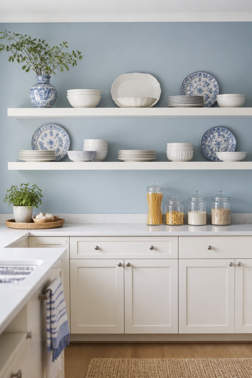
Open shelves earn their keep when the dishes themselves become the decoration. Light blue Saratoga Springs on the accent wall behind the open shelves keeps the backdrop soft so white dishware stands out. Very light white Vanilla Milkshake on the lower cabinets keeps the base bright with the same cool undertone. Set a glass canister of pasta and grains at one end of the shelf to break up rows of plates.
Group by Color: Cluster blue and white pieces together so the eye reads one palette instead of clutter.
Vary Height: Stack plates on risers or books to add rhythm across the shelf.
Leave Negative Space: Skip filling every inch so the shelf feels curated, not crowded.
Front-Face Patterns: Turn the most decorative plates and bowls forward so their patterns show.
a light blue that lets white dishware read as the main event. [light]
a very light white that keeps the base of the room bright and continues the cool undertone from the wall. [very light]
 ComSaf Glass Pasta Storage Containers with Acacia Wood Lids 1.7Qt 3Pack
View Price
ComSaf Glass Pasta Storage Containers with Acacia Wood Lids 1.7Qt 3Pack
View Price
 Vikko Dinner Plate, Set of 6 White Plates, 9 Inch Ceramic Dinner Plates Set, Stackable Dinner Plates for Every Day and Special Occasion, Restaurant Style, Dishwasher Safe, Microwave Safe
View Price
Vikko Dinner Plate, Set of 6 White Plates, 9 Inch Ceramic Dinner Plates Set, Stackable Dinner Plates for Every Day and Special Occasion, Restaurant Style, Dishwasher Safe, Microwave Safe
View Price
 vancasso SELENE 50 oz Large Pasta Bowls Set of 6, Porcelain Serving Bowls, 9.5 Inch Wide Shallow Salad & Soup Bowls, Kitchen Pasta Plates, Microwave and Dishwasher Safe, Blue White Floral Design
View Price
vancasso SELENE 50 oz Large Pasta Bowls Set of 6, Porcelain Serving Bowls, 9.5 Inch Wide Shallow Salad & Soup Bowls, Kitchen Pasta Plates, Microwave and Dishwasher Safe, Blue White Floral Design
View Price
 BLACK+DECKER 4-Slice Toaster Oven with Natural Convection, Stainless Steel, TO1760SS (TO1760SST-1)
View Price
BLACK+DECKER 4-Slice Toaster Oven with Natural Convection, Stainless Steel, TO1760SS (TO1760SST-1)
View Price
 2 Set Wooden Tiered Risers Display Stands for Vendor Events,Stackable Wood Cupcake Display Stand,Farmhouse Decor Wood Dessert Table Display Set,Vendor Booth Display Items,Food Display Risers for Party
View Price
2 Set Wooden Tiered Risers Display Stands for Vendor Events,Stackable Wood Cupcake Display Stand,Farmhouse Decor Wood Dessert Table Display Set,Vendor Booth Display Items,Food Display Risers for Party
View Price
 INFEI Plain Striped Cotton Linen Blended Dinner Cloth Napkins - Set of 12 (40 x 30 cm) - for Events & Home Use (Blue)
View Price
INFEI Plain Striped Cotton Linen Blended Dinner Cloth Napkins - Set of 12 (40 x 30 cm) - for Events & Home Use (Blue)
View Price
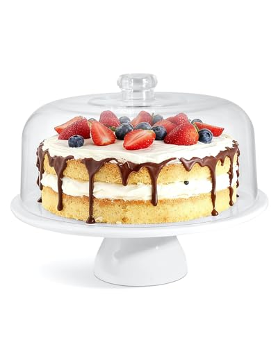 Yedio 12 Inch Porcelain Cake Stand with Acrylic Dome Lid, White Pedestal
View Price
Yedio 12 Inch Porcelain Cake Stand with Acrylic Dome Lid, White Pedestal
View Price
 Blue and White Chinoiserie vase - Vintage Ceramic vase with Antique Design, Perfect for Chinoiserie Home Decor 9in Flower vase04
View Price
Blue and White Chinoiserie vase - Vintage Ceramic vase with Antique Design, Perfect for Chinoiserie Home Decor 9in Flower vase04
View Price
Choosing a China Pattern That Doubles as Decor
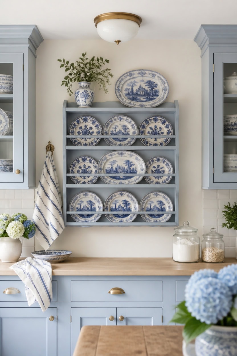
Choose a china pattern that reads as decor when it repeats three colors at most, not more. Light blue Saratoga Springs on the upper cabinets and very light white Vanilla Milkshake on the main walls keep the backdrop calm so the pattern stands out. Hang a wall-mounted plate rack filled with blue and white transferware plates to show the pattern like framed art.
Limit the Palette: Pick a pattern with two or three colors so it pairs easily with the room’s blues and whites.
Check Scale: A large motif works as a focal piece, while a busy print reads better in small doses.
Repeat the Pattern: Display the same china on a plate rack or shelf to turn it into wall art.
Test in Daylight: Hold the pattern against the accent wall color to confirm the blues actually match.
a light blue that frames patterned china behind glass doors. [light]
a very light white that keeps the backdrop calm so the china pattern stands out. [very light]
 MyGift 3-Tier Wall Mounted Plate Display Rack – Industrial Matte Black Metal & Dark Burnt Wood Storage for 6-10 Inch Plates, Decorative Plate Holder for Kitchen or Dining Room
View Price
MyGift 3-Tier Wall Mounted Plate Display Rack – Industrial Matte Black Metal & Dark Burnt Wood Storage for 6-10 Inch Plates, Decorative Plate Holder for Kitchen or Dining Room
View Price
 Spode Blue Room Traditions Plates | Set of 6 | 10.5-Inch Dinner and Salad Plate | Blue Serving Plate | Fine Earthenware | Microwave and Dishwasher Safe | Made in England
View Price
Spode Blue Room Traditions Plates | Set of 6 | 10.5-Inch Dinner and Salad Plate | Blue Serving Plate | Fine Earthenware | Microwave and Dishwasher Safe | Made in England
View Price
 HIC Kitchen Creamer Pitcher With Handle, Fine Porcelain, 32-Ounce Capacity, For Coffee, Tea, Dressings, Gravies, Sauces
View Price
HIC Kitchen Creamer Pitcher With Handle, Fine Porcelain, 32-Ounce Capacity, For Coffee, Tea, Dressings, Gravies, Sauces
View Price
![Utopia Towels Blue Dish Towels [12 Pack - 15 x 25 in] 100% Ring Spun Cotton](https://m.media-amazon.com/images/I/41GnvDITdwL._SL500_.jpg) Utopia Towels Blue Dish Towels [12 Pack - 15 x 25 in] 100% Ring Spun Cotton
View Price
Utopia Towels Blue Dish Towels [12 Pack - 15 x 25 in] 100% Ring Spun Cotton
View Price
 Jusalpha 12 Inches White Porcelain Cake Stand-Cupcake Stand with Glass Dome
View Price
Jusalpha 12 Inches White Porcelain Cake Stand-Cupcake Stand with Glass Dome
View Price
 ComSaf Glass Pantry Storage Containers (0.7Qt/1.2Qt/1.6Qt) Set of 6, Square
View Price
ComSaf Glass Pantry Storage Containers (0.7Qt/1.2Qt/1.6Qt) Set of 6, Square
View Price
 ooit Ceramic Vintage Vases Set of 3, Blue and White Flower Decorative Vase Chinoiserie Decor Rustic Farmhouse Retro Floral Vases for Table Bookshelf Mantel Kitchen Living Room Office
View Price
ooit Ceramic Vintage Vases Set of 3, Blue and White Flower Decorative Vase Chinoiserie Decor Rustic Farmhouse Retro Floral Vases for Table Bookshelf Mantel Kitchen Living Room Office
View Price
Mixing Patterns Without Overwhelming a Blue and White Kitchen
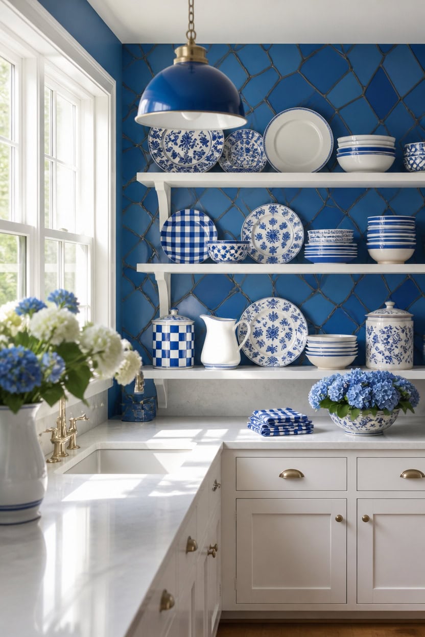
Mix no more than two patterns per sightline, then let one mid-tone surface act as breathing room between them. Mid-tone blue Stained Glass on the accent wall grounds the busier prints, while very light white Etiquette on the lower cabinets keeps the base of the room calm. Stack striped and floral plates on the open shelving unit, then check the pattern count before adding a third design.
Anchor Pattern: Choose one dominant motif and repeat it across two or three pieces so it reads as intentional.
Rule of Three: Cap the mix at three patterns per view, including stripes, florals, and checks.
Scale Contrast: Pair a large motif with a smaller print so neither competes for attention.
Solid Buffer: Break up patterns with solid blue or white plates set between busy pieces.
a mid-tone blue backdrop that lets mixed patterns stand out without clashing. [mid-tone]
a very light white that keeps the base of the room quiet. [very light]
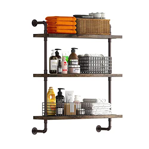 Helsin 3 Tier Industrial Pipe Shelf Rustic Wood Floating Shelves,Wall Display Bookshelf,Storage Rack Sundries Holder for Kitchen Office Bathroom Organization and Home Decor (24inch)
View Price
Helsin 3 Tier Industrial Pipe Shelf Rustic Wood Floating Shelves,Wall Display Bookshelf,Storage Rack Sundries Holder for Kitchen Office Bathroom Organization and Home Decor (24inch)
View Price
 Sweese 18Pcs Lightweight Porcelain Dinnerware Set for 6, Stripe Blue
View Price
Sweese 18Pcs Lightweight Porcelain Dinnerware Set for 6, Stripe Blue
View Price
 AROMA® Rice Cooker, 3-Cup (Uncooked) / 6-Cup (Cooked), Small Rice Cooker, Oatmeal Cooker, Soup Maker, Auto Keep Warm, 1.5 Qt, White, ARC-363NG
View Price
AROMA® Rice Cooker, 3-Cup (Uncooked) / 6-Cup (Cooked), Small Rice Cooker, Oatmeal Cooker, Soup Maker, Auto Keep Warm, 1.5 Qt, White, ARC-363NG
View Price
 Aimusego Blue and White Porcelain Fruit Bowl, Hand Painted Floral Retro Hollow Ceramic Fruit Tray Plate Dish, Colander, Chinoiserie Oval Decorative Candy Serving Basket for Housewarming
View Price
Aimusego Blue and White Porcelain Fruit Bowl, Hand Painted Floral Retro Hollow Ceramic Fruit Tray Plate Dish, Colander, Chinoiserie Oval Decorative Candy Serving Basket for Housewarming
View Price
 DII Buffalo Check Collection, Classic Farmhouse Cloth Napkin Set, 20x20, Light Blue & White, 6 Piece
View Price
DII Buffalo Check Collection, Classic Farmhouse Cloth Napkin Set, 20x20, Light Blue & White, 6 Piece
View Price
 Magclay 8Oz Creamer, Ceramic Milk Creamer Pitcher with Handle, Flowers
View Price
Magclay 8Oz Creamer, Ceramic Milk Creamer Pitcher with Handle, Flowers
View Price
 RELEANY Washable Area Rug, Runner 2'x6', Blue/White/Gray
View Price
RELEANY Washable Area Rug, Runner 2'x6', Blue/White/Gray
View Price
Adapting This Blue and White Look for a Smaller Kitchen
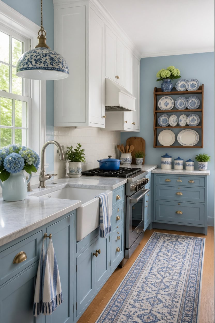
Light blue Labrador Blue on the main walls opens up a small kitchen, while very light white Etiquette on the upper cabinets keeps sightlines clear in a tight galley. Pale hues bounce more daylight than deep tones, making a compact room feel wider from doorway to sink. A slim wall-mounted plate rack near the window adds storage without clutter.
Vertical Sightlines: Keep upper cabinets and walls close in tone so the eye reads one continuous surface.
Mirror Trick: Add a mirrored backsplash panel near the window to double the sense of daylight.
Compact Storage: Swap a few base cabinets for open shelving to reduce visual bulk.
Single Accent: Limit bold blue to one small area so the room does not shrink.
a light blue that reflects daylight and keeps a small kitchen feeling open. [light]
a very light white that keeps sightlines clear from counter to ceiling. [very light]
 ClosetMaid 3-Tier Hanging Wall Mounted Metal Rack for Spices, Shelf Storage, Pantry Organization, Laundry, Kitchen, Bathroom, White, 8022
View Price
ClosetMaid 3-Tier Hanging Wall Mounted Metal Rack for Spices, Shelf Storage, Pantry Organization, Laundry, Kitchen, Bathroom, White, 8022
View Price
 BLACK+DECKER 6-Cup Rice Cooker with Steaming Basket
View Price
BLACK+DECKER 6-Cup Rice Cooker with Steaming Basket
View Price
 karyfine Mini Pendant Lights Kitchen Island White Blue Glass Lamp Shade Hand Blown Glass Pendant Light with Brush Nickel Finish Adjustable Cord for Kitchen Over Sink Hallway,Dining Room,Stairs Way
View Price
karyfine Mini Pendant Lights Kitchen Island White Blue Glass Lamp Shade Hand Blown Glass Pendant Light with Brush Nickel Finish Adjustable Cord for Kitchen Over Sink Hallway,Dining Room,Stairs Way
View Price
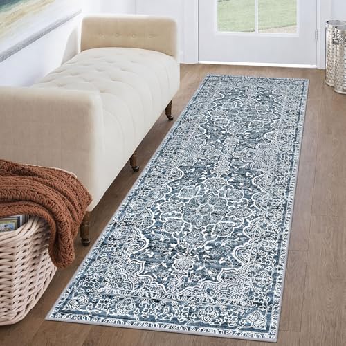 KUTA Vintage Washable Runner Rug 2x6 Blue White Runners for Hallways
View Price
KUTA Vintage Washable Runner Rug 2x6 Blue White Runners for Hallways
View Price
 10 Strawberry Street Chinoiserie 3 Piece Canister Set, White/Blue
View Price
10 Strawberry Street Chinoiserie 3 Piece Canister Set, White/Blue
View Price
 WanDwel Aluminum RV Folding Shelf 12 Inch Wall Mounted Fold Down Shelves
View Price
WanDwel Aluminum RV Folding Shelf 12 Inch Wall Mounted Fold Down Shelves
View Price
 Ceramic Utensil Holder for Countertop, Blue and White Vintage Utensil Crock
View Price
Ceramic Utensil Holder for Countertop, Blue and White Vintage Utensil Crock
View Price
Keeping Open Shelving Organized in a Blue and White Kitchen
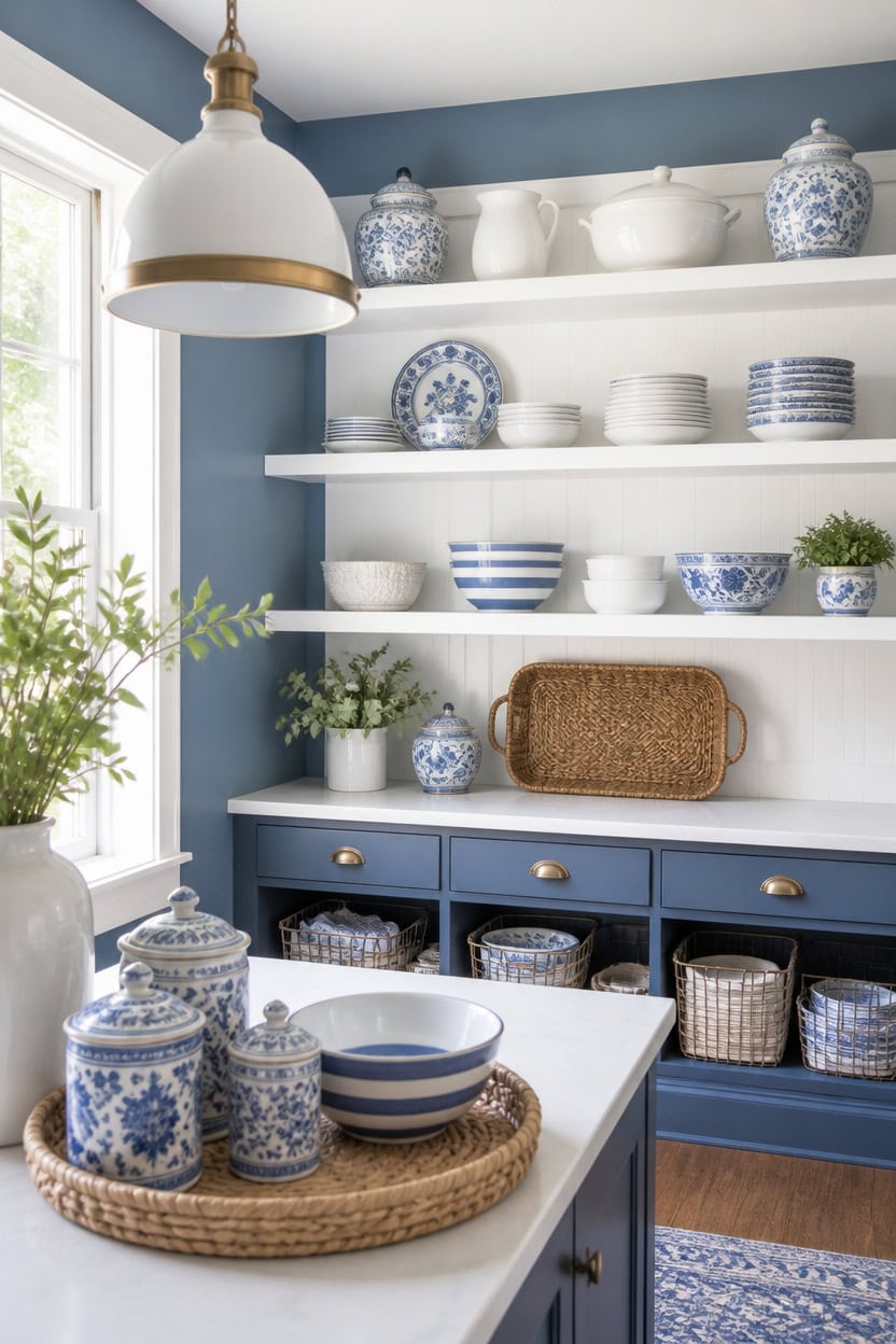
Mid-tone blue Stained Glass on the main walls anchors open shelving, while very light white Etiquette on the shelving backer boards keeps stacked dishware visible. The contrast keeps jars and bowls readable as separate shapes rather than a blur. Slide wire storage baskets onto the lower shelf to corral small items without hiding the display.
Group by Category: Cluster plates, bowls, and glassware by type so shelves read as intentional groupings.
Leave Breathing Room: Skip a few inches between stacks so the shelf doesn’t feel crowded.
Anchor With Baskets: Use wire or woven baskets for small items like spices or lids.
Repeat the Palette: Keep blue and white pieces on each shelf level for visual rhythm.
a mid-tone blue that grounds open shelving without darkening the room. [mid-tone]
a very light white that makes stacked dishware stand out. [very light]
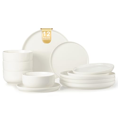 EWFEN Plates and Bowls Sets, 12 Pieces Ceramic Dinnerware Set for 4, Stoneware Dishware Dishes Set, Scratch Resistant Dishes Set, Dishwasher & Microwave Safe, White
View Price
EWFEN Plates and Bowls Sets, 12 Pieces Ceramic Dinnerware Set for 4, Stoneware Dishware Dishes Set, Scratch Resistant Dishes Set, Dishwasher & Microwave Safe, White
View Price
 QINLANG 6 Inch Blue and White Porcelain 30 oz Bowls Set of 6 for Soup, Cereal, desserts, ice cream and Rice - Striped Pattern
View Price
QINLANG 6 Inch Blue and White Porcelain 30 oz Bowls Set of 6 for Soup, Cereal, desserts, ice cream and Rice - Striped Pattern
View Price
 Lyuwanxian 4-Pack Stackable Wire Baskets for Closet Organizers and Storage, Open Storage Bins for Clothes, Toys, and Snacks - Rustic Metal Closet Organizer and Shelves in Black
View Price
Lyuwanxian 4-Pack Stackable Wire Baskets for Closet Organizers and Storage, Open Storage Bins for Clothes, Toys, and Snacks - Rustic Metal Closet Organizer and Shelves in Black
View Price
 AROMA Digital Rice Cooker, 4-Cup (Uncooked) / 8-Cup (Cooked), Steamer, Grain Cooker, Multicooker, 2 Qt, Stainless Steel Exterior, ARC-914SBD
View Price
AROMA Digital Rice Cooker, 4-Cup (Uncooked) / 8-Cup (Cooked), Steamer, Grain Cooker, Multicooker, 2 Qt, Stainless Steel Exterior, ARC-914SBD
View Price
 SAVVY & SORTED Glass Spice Jars with Label, 24PK Bamboo Jar Spices Set 4oz, 374 Spice Labels, Pepper Grinder, Empty Herb Seasoning Containers, Funnel and Shaker Lids
View Price
SAVVY & SORTED Glass Spice Jars with Label, 24PK Bamboo Jar Spices Set 4oz, 374 Spice Labels, Pepper Grinder, Empty Herb Seasoning Containers, Funnel and Shaker Lids
View Price
 Rattan Serving Tray,Rectangle Wicker Storage Basket Set of 3 for Organizing
View Price
Rattan Serving Tray,Rectangle Wicker Storage Basket Set of 3 for Organizing
View Price
 MERINEA Blue Hammered Glass Pendant Light, 10-Inch Dome, 1-Light E26
View Price
MERINEA Blue Hammered Glass Pendant Light, 10-Inch Dome, 1-Light E26
View Price
Balancing Everyday Use With a Curated Blue and White Display
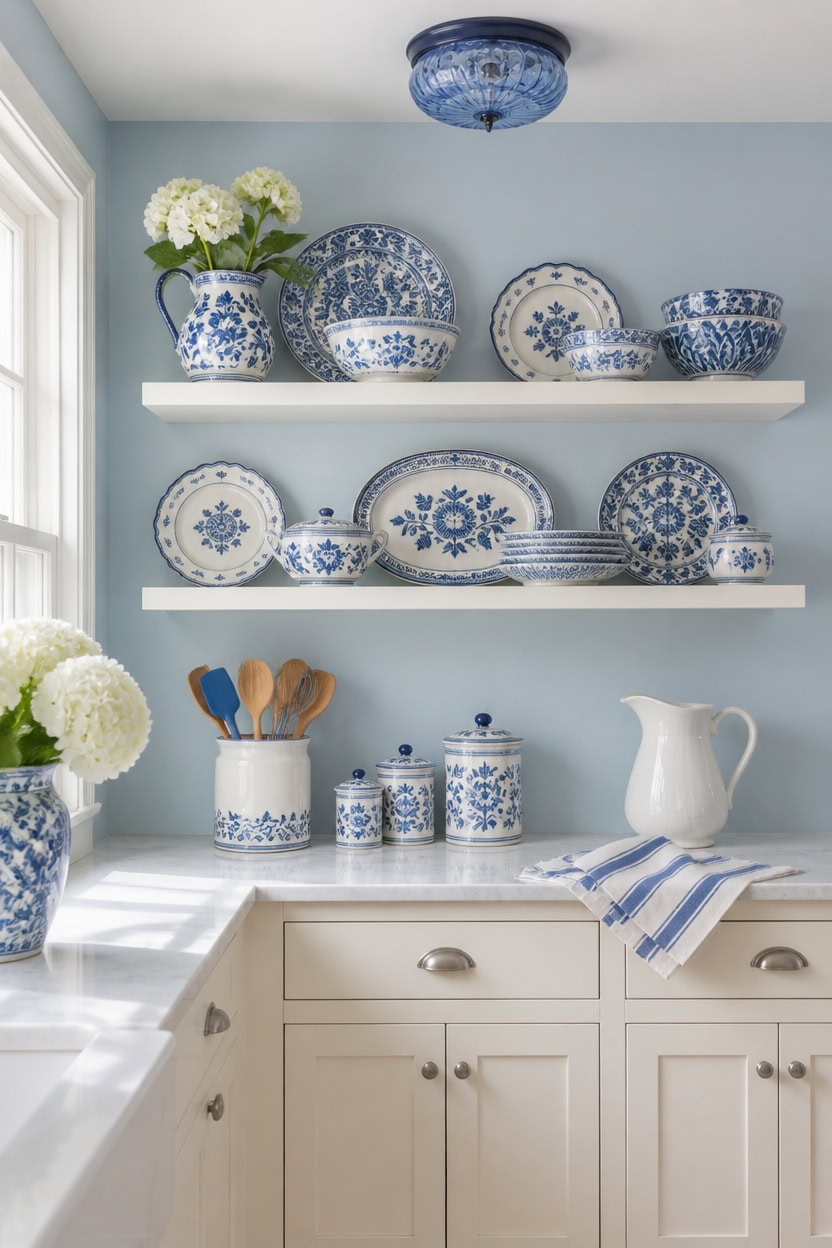
Reserve the very light white Vanilla Milkshake cabinets for closed storage, and let the light blue Saratoga Springs walls frame the open shelving where the curated collection lives. This split keeps clutter off the display shelf, so the blue and white collection stays easy to read. A ceramic utensil crock beside the stove holds daily spoons and whisks, separate from the curated shelf above.
Zone the Counters: Keep appliances and tools in one zone, decor pieces in another.
Rotate Display Pieces: Swap in seasonal blue and white items every few months to keep shelves fresh.
Use Closed Storage: Hide daily dishes in cabinets and save open shelves for curated pieces only.
Balance the Palette: Aim for roughly two-thirds white and one-third blue across displayed pieces.
a light blue that frames the open shelving without competing with the display. [light]
a very light white that keeps daily storage bright and easy to clean. [very light]
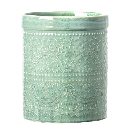 MIKIGEY Kitchen Utensil Holder, 7 Inches Large Ceramic Utensil Holder for Countertop, Lace Emboss Cooking Utensil Crocks for Kitchen, Home Decor, Off-White, Forest Green
View Price
MIKIGEY Kitchen Utensil Holder, 7 Inches Large Ceramic Utensil Holder for Countertop, Lace Emboss Cooking Utensil Crocks for Kitchen, Home Decor, Off-White, Forest Green
View Price
 Lareina Ceramic Mixing Bowls Set of 4, Large Serving Bowls, Ivory White
View Price
Lareina Ceramic Mixing Bowls Set of 4, Large Serving Bowls, Ivory White
View Price
 7.9″ Small Blue Semi Flush Mount Ceiling Light ,Blue Hallway Light Fixtures
View Price
7.9″ Small Blue Semi Flush Mount Ceiling Light ,Blue Hallway Light Fixtures
View Price
 Handwoven Rattan Fruit Basket Set, Round Wicker Bread Baskets for Serving
View Price
Handwoven Rattan Fruit Basket Set, Round Wicker Bread Baskets for Serving
View Price
 OTARTU White Ceramic Pitcher Vase, Flower Pitcher,Farmhouse vase for Home Décor, 8.5inch Jug Vase.
View Price
OTARTU White Ceramic Pitcher Vase, Flower Pitcher,Farmhouse vase for Home Décor, 8.5inch Jug Vase.
View Price
Simple Ways to Bring This Blue and White Style Home
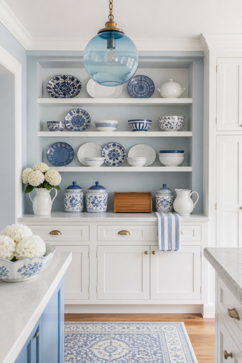
Simple changes make the biggest visual difference here. Light blue Franklin Lakes walls and very light white Candle White cabinets keep the same two-thirds white, one-third blue ratio seen throughout the kitchen. This consistency lets small changes, like new hardware, read as intentional rather than random. Set a wooden bread box on the counter to anchor the storage wall with a warm touch.
Start Small: Introduce one blue and white accessory before committing to larger pieces.
Anchor With Function: Choose everyday items, like a bread box, that also display the palette.
Repeat the Ratio: Keep roughly two-thirds white and one-third blue across new additions.
Layer Textures: Mix matte ceramics with glossy tile or glass for depth.
a light blue that keeps the kitchen bright without overwhelming the storage wall. [light]
a very light white that keeps the storage wall crisp and easy to clean. [very light]
 Sunhoo Bread Box for Kitchen Countertop Wooden Bread Storage Container Bin 2 Layer Breadbox Holder Large Capacity Keeper Vintage Farmhouse Food Organizer Pantry Shelf Acrylic Window (Brown)
View Price
Sunhoo Bread Box for Kitchen Countertop Wooden Bread Storage Container Bin 2 Layer Breadbox Holder Large Capacity Keeper Vintage Farmhouse Food Organizer Pantry Shelf Acrylic Window (Brown)
View Price
 Instant Pot Duo 6 Qt 7-in-1 Electric Pressure Cooker, Stainless Steel
View Price
Instant Pot Duo 6 Qt 7-in-1 Electric Pressure Cooker, Stainless Steel
View Price
 TTU Tabletops Gallery Hobnail Style 4 Piece Classic White Stoneware Nesting Mixing Bowl Set for Baking and Cooking
View Price
TTU Tabletops Gallery Hobnail Style 4 Piece Classic White Stoneware Nesting Mixing Bowl Set for Baking and Cooking
View Price
 White Ceramic Pitcher Vase, 8" Jug 1.5L Water Pitcher 50 Oz Versatile Jug Farmhouse Flower Vase for Home Décor, Utensil Holder Kitchen Storage Pot, for Home Office Hotel, Dishwasher & Microwave Safe
View Price
White Ceramic Pitcher Vase, 8" Jug 1.5L Water Pitcher 50 Oz Versatile Jug Farmhouse Flower Vase for Home Décor, Utensil Holder Kitchen Storage Pot, for Home Office Hotel, Dishwasher & Microwave Safe
View Price
 LBSQJ Blue Glass Pendant Lights Kitchen Island Lighting Globe Pendant Light Fixtures Modern Pendant Lighting for Kitchen Island Bedroom Living Dining Room Light Fixture(5.9in, 3-Pack)
View Price
LBSQJ Blue Glass Pendant Lights Kitchen Island Lighting Globe Pendant Light Fixtures Modern Pendant Lighting for Kitchen Island Bedroom Living Dining Room Light Fixture(5.9in, 3-Pack)
View Price
 DII Woven Rugs Collection Ribbed Reversible Cotton, 2x3', French Blue & Off-White
View Price
DII Woven Rugs Collection Ribbed Reversible Cotton, 2x3', French Blue & Off-White
View Price