How to Transform a Laundry Room with Blue & Beige for Calm Keepers
If your laundry room feels more chaotic than calming, a simple color shift can change everything. Pairing soft blues with warm beige tones creates a soothing retreat out of the space you probably overlook most.
You don’t need a full renovation—just the right palette and a few intentional choices to make laundry day feel a little less like a chore.
Why Blue and Beige Work So Well Together
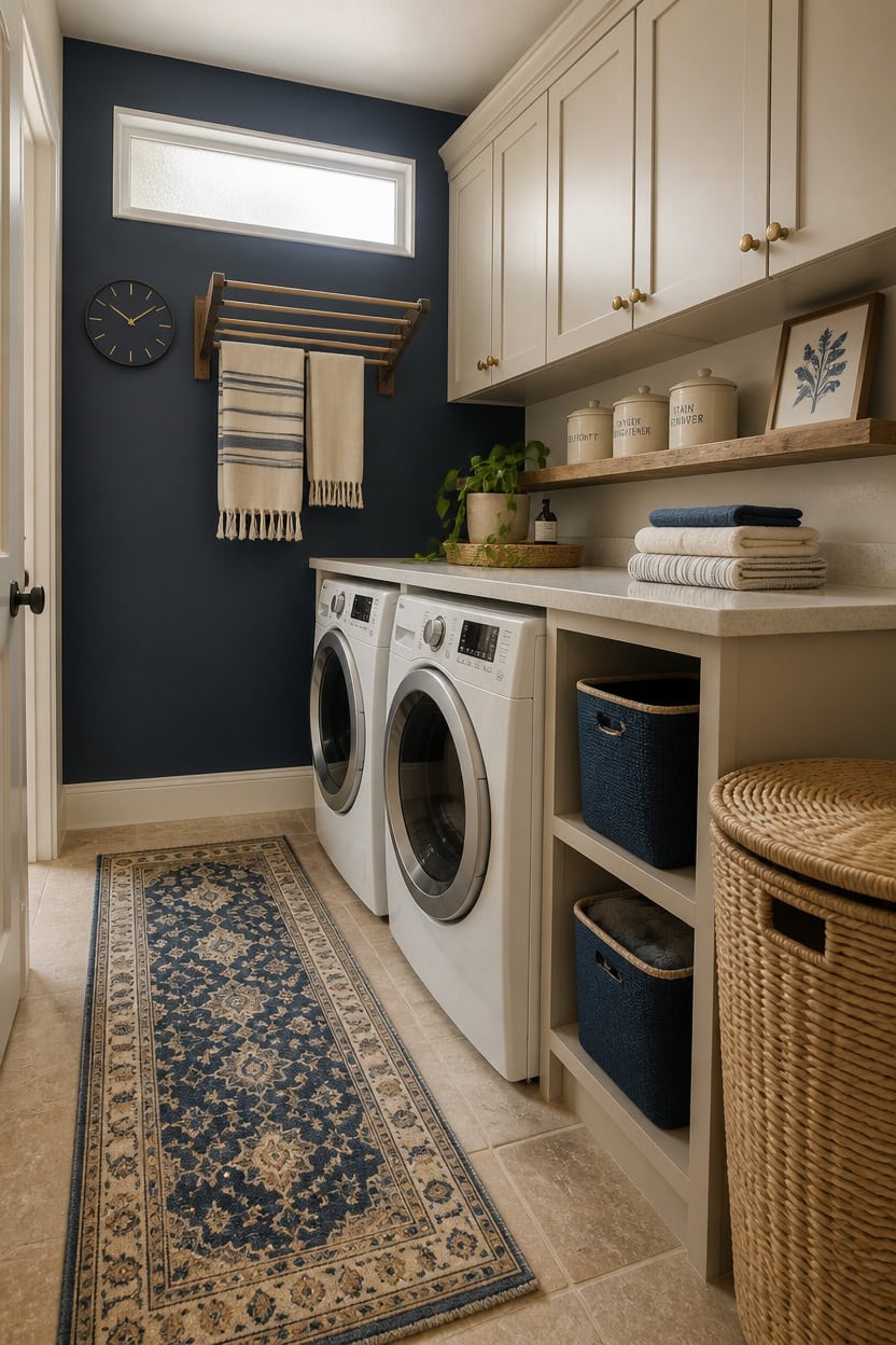
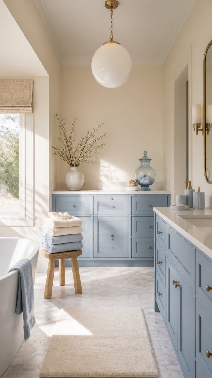
Blue and beige work because they sit on opposite sides of the warm-cool spectrum without fighting each other — blue cools the room down while beige adds warmth that keeps it from feeling cold or clinical. Beige’s natural undertones (usually yellow or tan) neutralize blue’s tendency to read as sterile, creating a grounded, calm atmosphere. In a laundry room, aim for a 60/30/10 split — beige on dominant surfaces, blue as a wall or cabinet color, and white or warm wood as the neutral bridge.
Use warm beige, not cool beige: A beige with yellow or tan undertones complements blue; a gray-beige will fight it and look muddy.
Let blue be the accent color: Blue on one wall, the cabinets, or the backsplash reads as intentional without overwhelming a small laundry space.
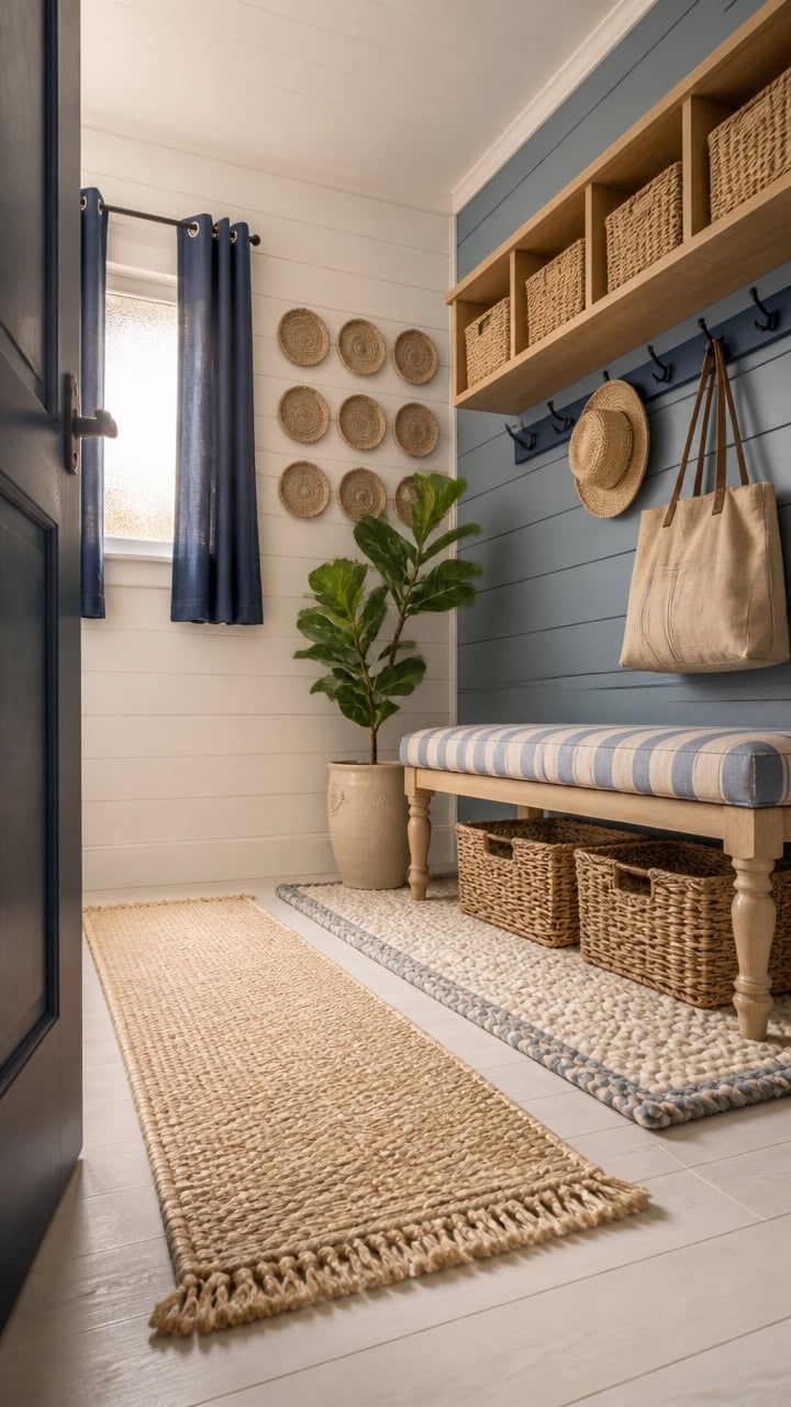
Anchor with warm wood or wicker: Natural textures like wood shelving or wicker baskets reinforce the beige tones and prevent the palette from feeling flat.
Keep whites warm, not bright: Bright white fixtures clash with beige; choose off-white or linen-toned pieces to keep the palette cohesive.
the deep blue creates a dramatic focal point that makes appliances look intentional rather than utilitarian.
this warm beige keeps the room from feeling heavy while tying the color palette together from floor to ceiling.
 LA JOLIE MUSE Bathroom Basket Organizers, Paper Rope Storage, Blue 4 Pack
View Price
LA JOLIE MUSE Bathroom Basket Organizers, Paper Rope Storage, Blue 4 Pack
View Price
 Ceramic Kitchen Canisters for Countertop Set of 3 w/Airtight Bamboo Lids
View Price
Ceramic Kitchen Canisters for Countertop Set of 3 w/Airtight Bamboo Lids
View Price
 Unique Loom Fars Collection Area Rug - Jordan (2' x 6' 1" Runner, Blue/ Light Blue)
View Price
Unique Loom Fars Collection Area Rug - Jordan (2' x 6' 1" Runner, Blue/ Light Blue)
View Price
 ONOTETUT 60 inch Long Floating Shelves for Wall,Solid Wood Long Shelves Set of 2,Walnut Rustic Mounted Shelves for Bathroom Bedroom Laundry Room (Walnut, 60 Inch)
View Price
ONOTETUT 60 inch Long Floating Shelves for Wall,Solid Wood Long Shelves Set of 2,Walnut Rustic Mounted Shelves for Bathroom Bedroom Laundry Room (Walnut, 60 Inch)
View Price
 Urban Villa Kitchen Towels 100% Cotton Dish Towels for Kitchen (Set of 6) 20”x30” Dish Cloths Highly Absorbent Kitchen Linen Set with Hanging Loop Perfect for Drying Dishes Cleaning Towels-Blue White
View Price
Urban Villa Kitchen Towels 100% Cotton Dish Towels for Kitchen (Set of 6) 20”x30” Dish Cloths Highly Absorbent Kitchen Linen Set with Hanging Loop Perfect for Drying Dishes Cleaning Towels-Blue White
View Price
 SONGMICS Laundry Hamper with Lid, 17.2 Gallon (65 L) Synthetic Rattan Clothes Laundry Basket with Lid and Handles, Foldable, Removable Liner, Chestnut Brown ULCB165K01
View Price
SONGMICS Laundry Hamper with Lid, 17.2 Gallon (65 L) Synthetic Rattan Clothes Laundry Basket with Lid and Handles, Foldable, Removable Liner, Chestnut Brown ULCB165K01
View Price
 ARTPOWER 35.5" Extra Large Farmhouse Wall Clock,Solid Wood Veneer,Navy Blue
View Price
ARTPOWER 35.5" Extra Large Farmhouse Wall Clock,Solid Wood Veneer,Navy Blue
View Price
 Framed Blue Botanical Wall Art Set of 3, Beige Leaves, 16 x 24 in
View Price
Framed Blue Botanical Wall Art Set of 3, Beige Leaves, 16 x 24 in
View Price
How to Choose the Right Shades of Blue and Beige
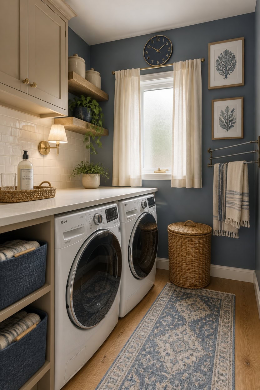
Choosing the right shades starts with understanding that blue and beige each have undertones that can either harmonize or clash depending on the specific hues you pick. A soft dusty blue reads warmer than a bright cobalt, while a golden beige feels more grounded than a gray-beige that leans cool. Test paint swatches on your laundry room wall under both natural and artificial light before committing, since the room’s smaller size makes color errors harder to hide.
Match undertones first: Warm blues with slight gray or green undertones pair best with beiges that lean yellow or tan, not pink.
Avoid bright saturated blue: A muted or dusty blue keeps the laundry room feeling calm; a vivid royal blue will overpower the beige entirely.
Choose deeper beige for contrast: A beige that’s one to two shades deeper than white gives the palette definition without competing with the blue.
Test in strips side by side: Hold blue and beige swatches next to each other on the actual wall to catch any undertone conflict before you buy a full gallon.
this muted coastal blue sits warm enough to complement beige without reading cold or institutional.
this golden-warm beige anchors the room and gives the blue wall a soft, natural counterpart.
 Bidtakay Storage Baskets Large Cube Storage Bins Fabric Baskets for Organizing Shelves 13x13 Navy Blue Square Storage Bins Large Set of 3 Linen Closet Organizers for Cabinet Home
View Price
Bidtakay Storage Baskets Large Cube Storage Bins Fabric Baskets for Organizing Shelves 13x13 Navy Blue Square Storage Bins Large Set of 3 Linen Closet Organizers for Cabinet Home
View Price
 Restydon Runner Rug 2x8 Runners for Hallways Non Slip Washable, Blue/Beige
View Price
Restydon Runner Rug 2x8 Runners for Hallways Non Slip Washable, Blue/Beige
View Price
 JONES CLOCKS® Studio Clock | Modern Round wall Clock | 12" | Navy Blue
View Price
JONES CLOCKS® Studio Clock | Modern Round wall Clock | 12" | Navy Blue
View Price
 SONGMICS Laundry Hamper With Lid, 130 L Wicker Handwoven Water Hyacinth
View Price
SONGMICS Laundry Hamper With Lid, 130 L Wicker Handwoven Water Hyacinth
View Price
 VOOVA & MOVAS Blue Striped Hand Towels 2 Pieces, 100% Cotton, 14x29 in
View Price
VOOVA & MOVAS Blue Striped Hand Towels 2 Pieces, 100% Cotton, 14x29 in
View Price
 upsimples 23.6" Long Floating Shelves for Wall, Room Decor Set of 2, Brown
View Price
upsimples 23.6" Long Floating Shelves for Wall, Room Decor Set of 2, Brown
View Price
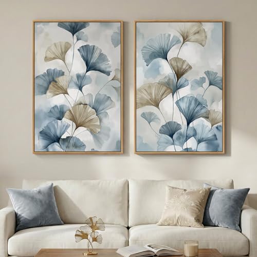 Large Framed Blue Neutral Botanical Ginkgo Wall Art Set of 2, 24x36 Inch
View Price
Large Framed Blue Neutral Botanical Ginkgo Wall Art Set of 2, 24x36 Inch
View Price
The Psychology of Color in a Laundry Room Setting
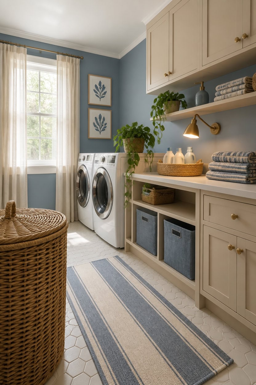
Color psychology plays a direct role in how a laundry room feels to use every day, not just how it looks in photos. Blue lowers perceived stress and slows the mental pace, which matters in a room tied to repetitive chores that can feel overwhelming. Pairing it with beige grounds that calming effect, preventing the blue from reading as cold or sterile.
Blue reduces task fatigue: Soft blue walls signal calm to the brain, making repetitive laundry tasks feel less mentally draining.
Beige adds psychological warmth: Without a warm neutral like beige, blue can trigger feelings of clinical detachment in small enclosed spaces.
Avoid high-contrast saturation: Vivid blue against stark white creates visual tension; muted blue against warm beige creates ease instead.
Light direction amplifies mood: North-facing laundry rooms need warmer beige to offset the cool flat light that makes blue feel heavy.
this hushed, muted blue reinforces the stress-reducing psychology without overwhelming the small space.
this warm beige-blush grounding tone anchors the calming blue and keeps the room feeling lived-in rather than sterile.
 Soap Dispenser Blue and White Lotion Bottle Ceramic Liquid Dispenser
View Price
Soap Dispenser Blue and White Lotion Bottle Ceramic Liquid Dispenser
View Price
 XUANGUO Cotton Rope Laundry Basket Hamper for Clothes, beige
View Price
XUANGUO Cotton Rope Laundry Basket Hamper for Clothes, beige
View Price
 3 Pack Small Storage Baskets for Organizing, 11.8×7.8×5.1", Light Blue
View Price
3 Pack Small Storage Baskets for Organizing, 11.8×7.8×5.1", Light Blue
View Price
 Casafield Large Laundry Hamper with Lid and Removable Liner Bag - Natural, Woven Water Hyacinth Rectangular Laundry Basket Sorter for Clothes and Towels
View Price
Casafield Large Laundry Hamper with Lid and Removable Liner Bag - Natural, Woven Water Hyacinth Rectangular Laundry Basket Sorter for Clothes and Towels
View Price
 Framed Minimalist Blue Botanical Wall Art for Living Room, 6 Piece 11x14 In
View Price
Framed Minimalist Blue Botanical Wall Art for Living Room, 6 Piece 11x14 In
View Price
 SKL Home CloudSoft Hand Towel Set, 2-Piece, 100% Cotton Luxury, Smoke Blue
View Price
SKL Home CloudSoft Hand Towel Set, 2-Piece, 100% Cotton Luxury, Smoke Blue
View Price
Paint or Wallpaper: Which Works Better for Laundry Rooms?
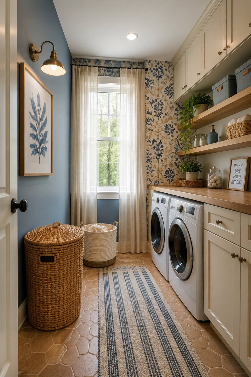
Paint holds up better than wallpaper in a laundry room when humidity from drying cycles and steam is a regular factor. Moisture causes wallpaper seams to lift, adhesive to weaken, and printed patterns to bubble or peel within a year or two in poorly ventilated spaces. If you do choose wallpaper, limit it to one low-humidity wall and use a peel-and-stick vinyl option that resists moisture better than traditional paste styles.
Paint wins on durability: Semi-gloss or satin paint resists moisture and wipes clean after detergent splashes far better than paper.
Wallpaper adds instant pattern: A single accent wall in a blue and beige geometric or botanical print creates visual interest without committing the whole room.
Ventilation determines the choice: Laundry rooms with exhaust fans or windows can support wallpaper; sealed rooms without airflow should stick with paint.
Peel-and-stick is the middle ground: Removable vinyl wallpaper lets you test a blue and beige pattern without risking permanent moisture damage.
this soft, weathered blue holds warmth without going cold under the harsh lighting typical of laundry rooms.
this creamy beige softens the blue walls and keeps the room feeling grounded rather than clinical.
 BKSTICK Navy Blue Floral Peel and Stick Wallpaper 17.7"x118"
View Price
BKSTICK Navy Blue Floral Peel and Stick Wallpaper 17.7"x118"
View Price
 Coastal Blue & White Ceramic Soap Dispenser Set with Gold Pump – 3-Piece Bathroom & Kitchen Accessories with Tray, Refillable Lotion & Dish Soap Pump Bottles for Beach House & Nautical Décor
View Price
Coastal Blue & White Ceramic Soap Dispenser Set with Gold Pump – 3-Piece Bathroom & Kitchen Accessories with Tray, Refillable Lotion & Dish Soap Pump Bottles for Beach House & Nautical Décor
View Price
 JMvicyroam 65L Large Woven Cotton Rope Blanket Basket, Oatmeal
View Price
JMvicyroam 65L Large Woven Cotton Rope Blanket Basket, Oatmeal
View Price
 3 Pack Storage Baskets for Organizing, 13.7×9.5×6.3", Black
View Price
3 Pack Storage Baskets for Organizing, 13.7×9.5×6.3", Black
View Price
 SONGMICS Laundry Hamper With Lid, 95 L Wicker Handwoven Water Hyacinth
View Price
SONGMICS Laundry Hamper With Lid, 95 L Wicker Handwoven Water Hyacinth
View Price
 joelsantiques 36 Inch Wooden Floating Shelves for Wall 36x7x3 (Beige, 1)
View Price
joelsantiques 36 Inch Wooden Floating Shelves for Wall 36x7x3 (Beige, 1)
View Price
The Best Blue and Beige Color Combinations for Laundry Rooms
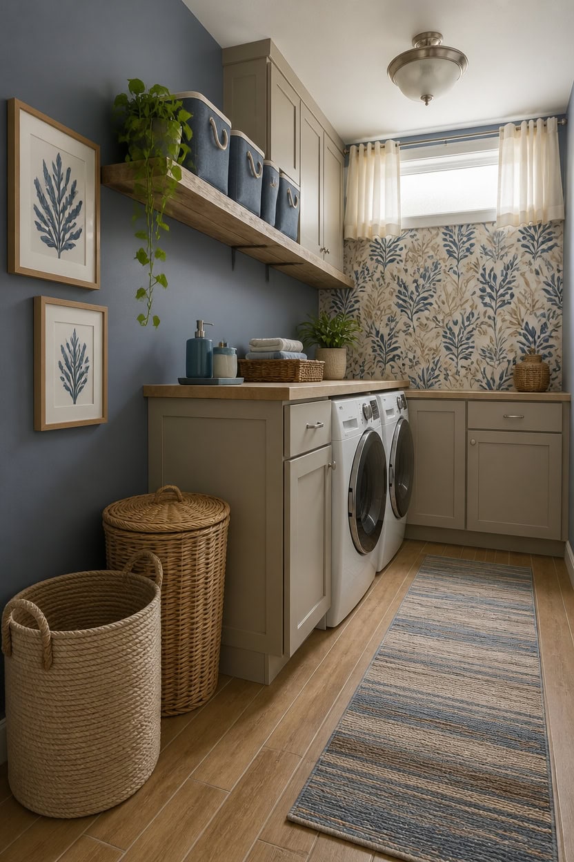
Blue and beige work in a laundry room because they pull from opposite ends of warmth without fighting each other. Dusty or muted blues carry enough gray undertone to stay calm under fluorescent or cool LED lighting, while warm beiges ground the palette so it doesn’t read sterile. The most livable combinations lean toward softer, washed versions of both colors rather than bright cobalt or stark ivory.
Dusty blue anchors the room: Shades like slate blue, French blue, or fog blue stay readable without overpowering a small functional space.
Warm beige prevents coldness: Cream-side beiges with yellow or pink undertones counteract the cool lean of blue and keep the room feeling inviting.
Contrast level sets the mood: A tight contrast pairing like pale blue and sand reads soft and subtle; a deeper navy against warm linen reads more structured and graphic.
Natural materials bridge both colors: Wicker, rattan, and raw wood sit visually between blue and beige and make the combination feel collected rather than color-blocked.
this dusty, greyed blue reads as soft and lived-in rather than bold, which keeps a compact laundry room from feeling visually heavy.
this warm greige beige pulls the blue walls into a grounded, cohesive combination without competing for attention.
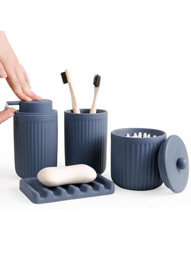 INGOFIN 4 Pcs Ceramic Bathroom Accessory Set - Liquid Soap Dispenser, Toothbrush Holder,Contain Cotton Swab Jar & Soap Dish,Countertop Accessories for Home, Guest Bathroom, Office, Matte Blue
View Price
INGOFIN 4 Pcs Ceramic Bathroom Accessory Set - Liquid Soap Dispenser, Toothbrush Holder,Contain Cotton Swab Jar & Soap Dish,Countertop Accessories for Home, Guest Bathroom, Office, Matte Blue
View Price
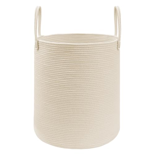 JMvicyroam 60L Cotton Rope Laundry Basket Hamper, Beige
View Price
JMvicyroam 60L Cotton Rope Laundry Basket Hamper, Beige
View Price
 SAFAVIEH Courtyard Outdoor Runner Rug 2'3"x6'7", Beige & Blue CY6062-233
View Price
SAFAVIEH Courtyard Outdoor Runner Rug 2'3"x6'7", Beige & Blue CY6062-233
View Price
 Handmade Rectangular Water Hyacinth Wicker Laundry Hamper with Lid Natural, Medium
View Price
Handmade Rectangular Water Hyacinth Wicker Laundry Hamper with Lid Natural, Medium
View Price
 3 Pack Small Storage Baskets for Organizing, 11.8×7.8×5.1", Orange
View Price
3 Pack Small Storage Baskets for Organizing, 11.8×7.8×5.1", Orange
View Price
 joelsantiques 42 Inch Wooden Floating Shelves for Wall 42x7x3 (Beige, 1)
View Price
joelsantiques 42 Inch Wooden Floating Shelves for Wall 42x7x3 (Beige, 1)
View Price
 Laatse Floral Bird Vintage Wallpaper Peel and Stick 17.5" x 393",Beige
View Price
Laatse Floral Bird Vintage Wallpaper Peel and Stick 17.5" x 393",Beige
View Price
Laundry Room Runners for This Palette
Rugs USA best-selling runners in this palette's colors, linked in 2' 6" x 6', the size that fits in front of a washer and dryer. Many are machine washable.
- Free shipping
- 30-day returns
- 210,000+ five-star reviews
 Jute And Denim Even Stripes Rug – Off White
View Price
Jute And Denim Even Stripes Rug – Off White
View Price
 Flatweave Cotton Giant Octopus Rug – Blue Multicolor
View Price
Flatweave Cotton Giant Octopus Rug – Blue Multicolor
View Price
 Everywhere Hand-Braided Indoor/Outdoor Rug – Navy
View Price
Everywhere Hand-Braided Indoor/Outdoor Rug – Navy
View Price
 Distressed Persian Rug – Blue
View Price
Distressed Persian Rug – Blue
View Price
 Faded Abstract Washable Rug – Blue Grey
View Price
Faded Abstract Washable Rug – Blue Grey
View Price
 Hand Braided Twined Jute And Denim Rug – Blue
View Price
Hand Braided Twined Jute And Denim Rug – Blue
View Price
 Reverse Herringbone Washable Rug – Blue
View Price
Reverse Herringbone Washable Rug – Blue
View Price
 Antique Chevron Rug – Blue
View Price
Antique Chevron Rug – Blue
View Price
 Persian Vintage Rug – Teal
View Price
Persian Vintage Rug – Teal
View Price
 Honeycomb Labyrinth Rug – Blue
View Price
Honeycomb Labyrinth Rug – Blue
View Price
 Faded Star Petal Emblem Rug – Blue
View Price
Faded Star Petal Emblem Rug – Blue
View Price
 Herringbone Cotton Flatwoven Rug – Navy
View Price
Herringbone Cotton Flatwoven Rug – Navy
View Price
 Jute Braided Rug – Navy
View Price
Jute Braided Rug – Navy
View Price
 Hand Braided Denim And Jute Striped Diamonds Rug – Olive
View Price
Hand Braided Denim And Jute Striped Diamonds Rug – Olive
View Price
 Patty Washable Rainy Days Rug – Blue Multicolor
View Price
Patty Washable Rainy Days Rug – Blue Multicolor
View Price
 Paneled Geometric Rug – Navy
View Price
Paneled Geometric Rug – Navy
View Price
 Starfish Indoor/Outdoor Rug – Navy
View Price
Starfish Indoor/Outdoor Rug – Navy
View Price
 Fish Indoor/Outdoor Rug – Navy
View Price
Fish Indoor/Outdoor Rug – Navy
View Price
 Serene Waterfall Rug – Blue
View Price
Serene Waterfall Rug – Blue
View Price
 Distressed Persian Rug – Dark Blue
View Price
Distressed Persian Rug – Dark Blue
View Price
 Jute Braided Saturn Border Rug – Navy
View Price
Jute Braided Saturn Border Rug – Navy
View Price
 Striped Border Indoor/Outdoor Flatweave Rug – Navy
View Price
Striped Border Indoor/Outdoor Flatweave Rug – Navy
View Price
 Withered Bloom In Bouquet Rug – Blue
View Price
Withered Bloom In Bouquet Rug – Blue
View Price
 Floral Fringed Rug – Blue
View Price
Floral Fringed Rug – Blue
View Price
 Moroccan Trellis Rug – Dark Blue
View Price
Moroccan Trellis Rug – Dark Blue
View Price
 Forever Vintage Rug – Light Blue
View Price
Forever Vintage Rug – Light Blue
View Price
 Faded Shadow Mystique Rug – Blue
View Price
Faded Shadow Mystique Rug – Blue
View Price
 Mod Trellis Rug – Navy
View Price
Mod Trellis Rug – Navy
View Price
 Rasali Checkered Box Rug – Navy
View Price
Rasali Checkered Box Rug – Navy
View Price
 Hand Braided Denim And Jute Striped Diamonds Rug – Yellow
View Price
Hand Braided Denim And Jute Striped Diamonds Rug – Yellow
View Price
 Perfect Handwoven Jute-Blend Rug – Natural
View Price
Perfect Handwoven Jute-Blend Rug – Natural
View Price
 Jute Braided Rug – Natural
View Price
Jute Braided Rug – Natural
View Price
 Chunky Jute Tasseled Rug – Natural
View Price
Chunky Jute Tasseled Rug – Natural
View Price
 Chunky Jute Tasseled Rug – Off White
View Price
Chunky Jute Tasseled Rug – Off White
View Price
 Softest Knit Wool Rug – Off White
View Price
Softest Knit Wool Rug – Off White
View Price
 Forever Vintage Rug – Neutral
View Price
Forever Vintage Rug – Neutral
View Price
 Floral Ornament Rug – Ivory
View Price
Floral Ornament Rug – Ivory
View Price
 Hand Woven Jute with Wool Fringe Rug – Natural
View Price
Hand Woven Jute with Wool Fringe Rug – Natural
View Price
 Seagrass with Border Rug – Beige
View Price
Seagrass with Border Rug – Beige
View Price
 Handwoven Jute Ribbed Solid Rug – Natural
View Price
Handwoven Jute Ribbed Solid Rug – Natural
View Price
Cabinetry Colors That Tie the Whole Palette Together
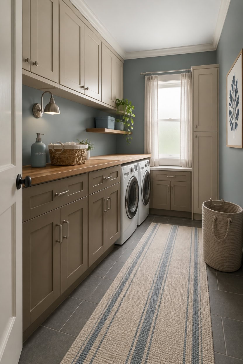
Cabinetry color does more work in a laundry room than walls do, because cabinets cover more visual surface and sit at eye level the entire time you’re in the space. In a blue and beige palette, painting cabinets in a warm greige or creamy beige pulls the cool blue walls toward warmth without flattening the contrast. If your cabinets run floor to ceiling or wrap most of the room, even a slightly warm white will read as beige next to a dusty blue wall.
Go warmer on lowers: Lower cabinets take on more shadow, so a warmer beige reads truer at floor level than it would on upper cabinets under direct light.
Use the same sheen on both: Satin finish on both blue walls and beige cabinets keeps the palette unified and prevents one from looking flat while the other glows.
Skip bright white trim: Crisp white trim between blue walls and beige cabinets breaks the warmth bridge; soft white or linen trim keeps the progression smooth.
Two-tone is an option: Upper cabinets in a lighter beige and lower cabinets in a slightly deeper warm taupe adds depth without introducing a third color.
this warm greige reads as soft beige against blue walls and anchors the room without competing with any surface around it.
this dusty, gray-leaning blue makes the warm beige cabinets feel grounded rather than washed out under laundry room lighting.
 Ninehaoou 4 Pcs Fall Chinoiserie Ceramic Bathroom Accessories Set
View Price
Ninehaoou 4 Pcs Fall Chinoiserie Ceramic Bathroom Accessories Set
View Price
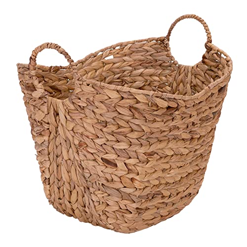 Household Essentials ML-4002 Tall Water Hyacinth Wicker Basket with Handles | Natural, Brown, Natural
View Price
Household Essentials ML-4002 Tall Water Hyacinth Wicker Basket with Handles | Natural, Brown, Natural
View Price
 Household Essentials 816-1 Café Cube Bin Storage Set with Lids and Handles | 2 Pack, Baby Blue Linen
View Price
Household Essentials 816-1 Café Cube Bin Storage Set with Lids and Handles | 2 Pack, Baby Blue Linen
View Price
 Solid Wood Floating Shelves for Wall 30 Inches Long, Walnut Wooden Shelf
View Price
Solid Wood Floating Shelves for Wall 30 Inches Long, Walnut Wooden Shelf
View Price
 okudolit Vintage Botanical Canvas Wall Art Set of 3 Blue Grey and Beige Neutral Plant Leaf Prints Boho Minimalist Floral Art Pictures Wall Decor for Living Room Bedroom bathroom Office-12x16in
View Price
okudolit Vintage Botanical Canvas Wall Art Set of 3 Blue Grey and Beige Neutral Plant Leaf Prints Boho Minimalist Floral Art Pictures Wall Decor for Living Room Bedroom bathroom Office-12x16in
View Price
 JMvicyroam 60L Cotton Rope Laundry Basket Hamper, Brown
View Price
JMvicyroam 60L Cotton Rope Laundry Basket Hamper, Brown
View Price
How Lighting Affects Blue and Beige in a Laundry Room
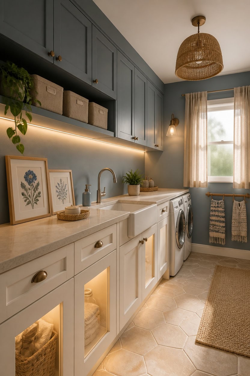
Warm light pulls beige toward gold and pushes blue toward green, so the bulb temperature you choose rewires how the entire palette reads. Laundry rooms typically run on overhead fluorescent or cool LED fixtures, which flatten warm beige into something closer to gray and make dusty blue feel cold rather than calm. Switching to bulbs rated between 2700K and 3000K restores the warmth to your beige surfaces and keeps the blue from reading as harsh under task lighting.
Layer your sources: A single overhead fixture flattens both colors; adding under-cabinet lighting fills shadows and brings out beige’s warmth on countertops.
Test at night: Blue and beige look completely different after dark under artificial light, so always check paint samples in the evening before committing.
Avoid cool white bulbs: Anything above 4000K turns beige chalky and shifts dusty blue into a clinical, institutional tone that kills the palette’s coziness.
Use warm LEDs near lower cabinets: Lower cabinets sit in shadow naturally, and a warm-toned puck light or strip light underneath rescues the beige from reading too dark or muddy.
this creamy warm white holds its soft beige quality under both warm LED and natural light without graying out near the blue walls.
this medium-depth dusty blue stays rich and settled under warm 2700K bulbs rather than shifting cold the way brighter blues do.
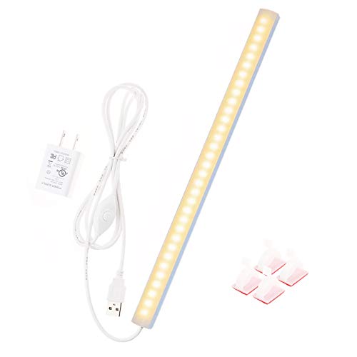 JUSJUBR 12-Inch Slim LED Under Cabinet Light with Memory Function, Warm White 3000K Dimmable USB Light Bar for Rooms
View Price
JUSJUBR 12-Inch Slim LED Under Cabinet Light with Memory Function, Warm White 3000K Dimmable USB Light Bar for Rooms
View Price
 Ceramic Soap Dispenser with Drainable Soap Dish 2-in-1 Set, Multifunctional Hand Soap Dispenser & Self Draining Soap Bar Holder for Bathroom & Kitchen, Refillable Hand Soap Pump Dispenser
View Price
Ceramic Soap Dispenser with Drainable Soap Dish 2-in-1 Set, Multifunctional Hand Soap Dispenser & Self Draining Soap Bar Holder for Bathroom & Kitchen, Refillable Hand Soap Pump Dispenser
View Price
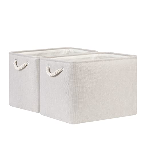 Bidtakay Large Fabric Storage Bins Beige Linen Closet Organizers Set of 2 Baskets for Shelves Clothes Bedroom 16x11.8x11.8 Inch Foldable Organization Baskets for Towels Blankets Storage Dog Toys
View Price
Bidtakay Large Fabric Storage Bins Beige Linen Closet Organizers Set of 2 Baskets for Shelves Clothes Bedroom 16x11.8x11.8 Inch Foldable Organization Baskets for Towels Blankets Storage Dog Toys
View Price
 Artoid Mode 2 Pcs Beige Navy Blue Arched Stripes Jacquard Hand Towels for Bathroom, Cotton Soft Absorbent Bathroom Decor Towels, 13.7 x 29.5 Inch
View Price
Artoid Mode 2 Pcs Beige Navy Blue Arched Stripes Jacquard Hand Towels for Bathroom, Cotton Soft Absorbent Bathroom Decor Towels, 13.7 x 29.5 Inch
View Price
 HMVPL Farmhouse Chandelier for Dining Room, 3-Light Boho Rattan Chandelier Light Fixture Ceiling Hanging with Woven Lampshade, Small Wicker Coastal Pendant Light for Kitchen Bedroom Island Hallway
View Price
okudolit Vintage Botanical Canvas Wall Art Set of 3 Blue Grey and Beige Neutral Plant Leaf Prints Boho Minimalist Floral Art Pictures Wall Decor for Living Room Bedroom bathroom Office-16x24in
View Price
HMVPL Farmhouse Chandelier for Dining Room, 3-Light Boho Rattan Chandelier Light Fixture Ceiling Hanging with Woven Lampshade, Small Wicker Coastal Pendant Light for Kitchen Bedroom Island Hallway
View Price
okudolit Vintage Botanical Canvas Wall Art Set of 3 Blue Grey and Beige Neutral Plant Leaf Prints Boho Minimalist Floral Art Pictures Wall Decor for Living Room Bedroom bathroom Office-16x24in
View Price
 YLXS Motion Sensor Puck Light with Remote, Warm White, 4-Pack
View Price
YLXS Motion Sensor Puck Light with Remote, Warm White, 4-Pack
View Price
Our Favorite Laundry Room Wall Art
- Free shipping over $35
- Picked at 4.7 stars or higher
 Laundry Symbols Guide Typography, Floater Frame on Wood
View Price
Laundry Symbols Guide Typography, Floater Frame on Wood
View Price
 Laundry Cleaning Symbols Minimal Design Framed Print
View Price
Laundry Cleaning Symbols Minimal Design Framed Print
View Price
 Alexa, Do the Laundry, Modern Minimal Typography Floater Frame Print
View Price
Alexa, Do the Laundry, Modern Minimal Typography Floater Frame Print
View Price
 Fresh Laundry I
View Price
Fresh Laundry I
View Price
 Laundry Room French Vintage I
View Price
Laundry Room French Vintage I
View Price
 Laundry Washer, Canvas Print
View Price
Laundry Washer, Canvas Print
View Price
 Laundry Pin I, 2-Piece Textual Art Print Set
View Price
Laundry Pin I, 2-Piece Textual Art Print Set
View Price
 24 Hours Laundry, Multi-Piece Canvas Print
View Price
24 Hours Laundry, Multi-Piece Canvas Print
View Price
 Minimal Laundry Clothespins 2-Piece Black Framed Giclee Set
View Price
Minimal Laundry Clothespins 2-Piece Black Framed Giclee Set
View Price
Countertop and Backsplash Ideas That Fit the Palette
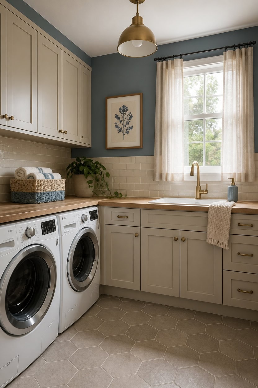
Matte ceramic tile in soft white or warm stone gives the blue and beige palette a grounded surface to rest against without fighting for attention. The slight texture variation in handmade-style tile adds visual interest while keeping the overall look calm enough to let the colors do their job. Choose a backsplash tile with a faint warm undertone rather than a bright cool white so it reads as part of the beige family instead of a harsh contrast.
Match undertones first: A backsplash tile with a yellow or cream undertone ties directly into beige cabinets and avoids the cold gap that stark white creates.
Keep grout warm: Gray grout with cool undertones pulls the backsplash away from the beige palette; choose an ivory or warm greige grout to hold the connection.
Use countertop as the bridge: A light quartz or butcher block surface sits between upper blue walls and lower beige cabinets, softening the visual shift between the two tones.
Limit pattern scale: Small-format subway or penny tile keeps the backsplash from overpowering the room, since laundry rooms have limited wall space to absorb busy patterns.
this creamy warm white holds the beige quality of the palette and keeps the cabinetry from reading as cold next to the blue walls.
this settled, medium-depth dusty blue anchors the room without overwhelming the lighter countertop and backsplash surfaces.
 Vamos Tile 100-Pack Glossy White Peel and Stick Backsplash on Subway Tile
View Price
Vamos Tile 100-Pack Glossy White Peel and Stick Backsplash on Subway Tile
View Price
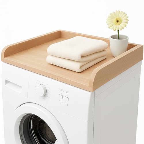 Skywin Washer Dryer Countertop 24 x 29.9 x 3.1 in, Solid Wood Butcher Block
View Price
Skywin Washer Dryer Countertop 24 x 29.9 x 3.1 in, Solid Wood Butcher Block
View Price
 Blue Donuts 17 oz Hand Lotion and Soap Dispenser Set Ceramic Pump Bottle with Caddy, Kitchen and Bathroom Soap Dispenser, White
View Price
Blue Donuts 17 oz Hand Lotion and Soap Dispenser Set Ceramic Pump Bottle with Caddy, Kitchen and Bathroom Soap Dispenser, White
View Price
 COTTON CRAFT Euro Spa Waffle Weave 6 Piece Towel Set - 100% Cotton - Linen
View Price
COTTON CRAFT Euro Spa Waffle Weave 6 Piece Towel Set - 100% Cotton - Linen
View Price
 CREA Low Profile Kitchen Faucet with Pull Out Sprayer,Bar Sink Faucet Single Hole Handle,Prep Wet Bar Laundry Utility Short Small Modern Outdoor RV Gold
View Price
CREA Low Profile Kitchen Faucet with Pull Out Sprayer,Bar Sink Faucet Single Hole Handle,Prep Wet Bar Laundry Utility Short Small Modern Outdoor RV Gold
View Price
 joybest 11inch Cube Storage Bins, Cotton Rope Woven Organizer Basket
View Price
joybest 11inch Cube Storage Bins, Cotton Rope Woven Organizer Basket
View Price
 HPNIUB Large Boho Blue Botanical Leaf Framed Wall Art Set -16"x24"x3
View Price
HPNIUB Large Boho Blue Botanical Leaf Framed Wall Art Set -16"x24"x3
View Price
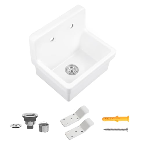 KARAMAG 21 Inch Wall Mount Utility Sink Countertop Farmhouse Sink White
View Price
KARAMAG 21 Inch Wall Mount Utility Sink Countertop Farmhouse Sink White
View Price
Flooring Options That Anchor the Blue and Beige Look
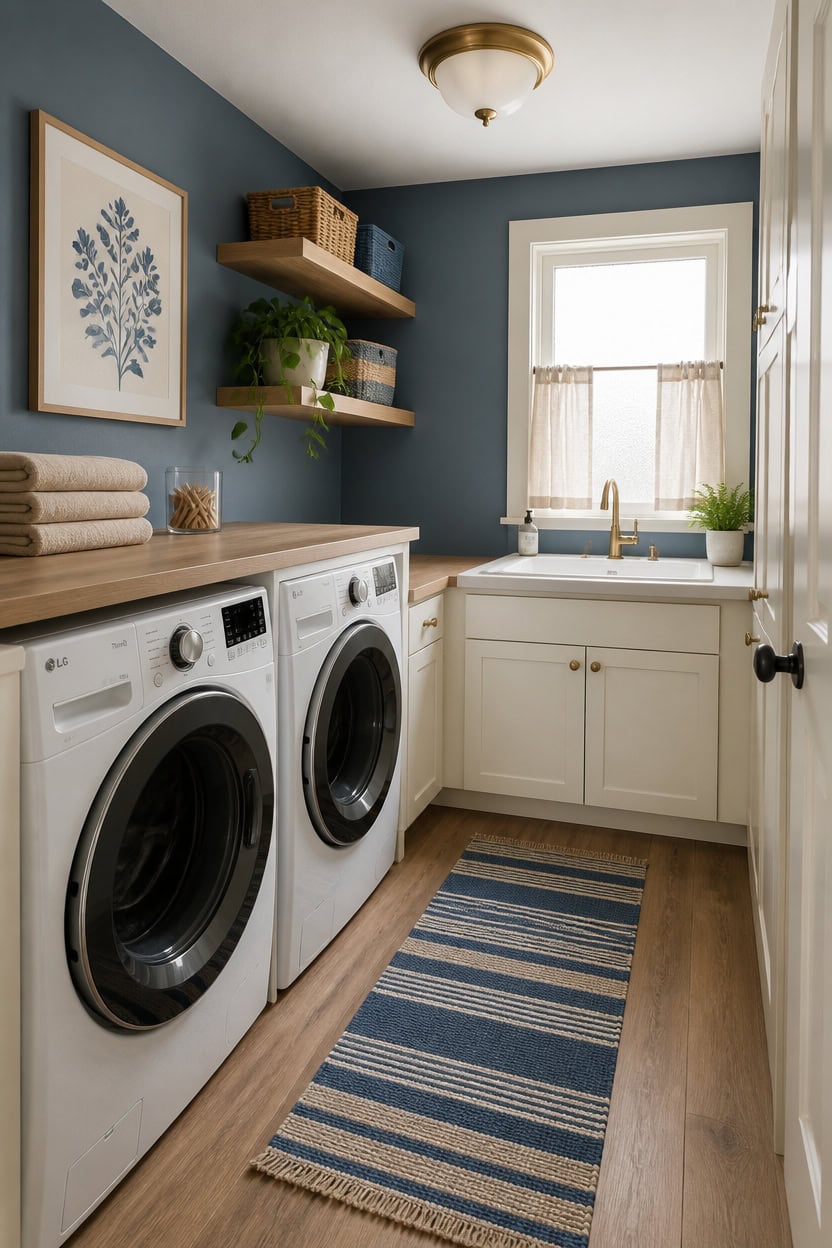
Warm-toned luxury vinyl plank flooring in a light oak or weathered wood finish gives the blue and beige palette a stable base that reads as neutral without disappearing into the background. The wood grain texture adds depth at eye level without competing with wall color or cabinetry, which matters in a compact laundry room where every surface is visible at once. If budget or moisture resistance is a concern, look for waterproof LVP rated for high-humidity spaces so the floor holds up to splashes near the utility sink.
Choose warm wood tones: A honey oak or driftwood LVP finish echoes beige cabinet tones and keeps the floor grounded in the warm half of the palette.
Avoid gray undertones: Cool gray LVP creates a visual split between the warm beige and cool blue instead of bridging them, so stick to beige-leaning or golden neutrals.
Add a washable runner: A cotton or jute runner in a blue and natural stripe laid in front of the machines ties the floor color to the wall color in one horizontal line.
Match the baseboard: White or cream baseboards along the floor edge frame the LVP and connect it to cabinetry above without creating a hard visual cut.
this dusty medium blue reads as settled and intentional above warm-toned flooring rather than harsh or cold.
this creamy warm white holds the beige quality of the palette and ties the cabinetry directly to the floor’s warm undertones.
 Light Oak Peel and Stick Floor Tile Waterproof Vinyl Flooring Wood 32-Pack
View Price
Light Oak Peel and Stick Floor Tile Waterproof Vinyl Flooring Wood 32-Pack
View Price
 Lahome Boho Bathroom Runner Rug, 2x6 Washable Rugs for Kitchen Hallway
View Price
Lahome Boho Bathroom Runner Rug, 2x6 Washable Rugs for Kitchen Hallway
View Price
 SAFAVIEH Natural Fiber Runner Rug 2'6"x6' Textured, Natural & Beige NF114A
View Price
SAFAVIEH Natural Fiber Runner Rug 2'6"x6' Textured, Natural & Beige NF114A
View Price
 Eridanus 24" Utility Sink, Wall Mount Farmhouse Laundry Sinks, Ceramic
View Price
Eridanus 24" Utility Sink, Wall Mount Farmhouse Laundry Sinks, Ceramic
View Price
 FORIOUS Gold Kitchen Faucet with Pull Down Sprayer, Stainless Steel
View Price
FORIOUS Gold Kitchen Faucet with Pull Down Sprayer, Stainless Steel
View Price
 WOPITUES Floating Shelves Set of 6 for Wall Decor & Storage, White
View Price
WOPITUES Floating Shelves Set of 6 for Wall Decor & Storage, White
View Price
 Framed Vintage Blue Floral Bird Botanical Wall Art for Living Room, 2 Piece
View Price
Framed Vintage Blue Floral Bird Botanical Wall Art for Living Room, 2 Piece
View Price
Removable Wallpaper for This Palette
Removable designer wallpaper from Wallshoppe, picked to match this palette. An easy way to add pattern to any room, and every design is available as a sample.
- Designed and printed in the USA
- Non-toxic inks
- Featured in NYT Wirecutter
 Tent Stripe Large Wallpaper by Chris Benz – Mustard
View Price
Tent Stripe Large Wallpaper by Chris Benz – Mustard
View Price
 Life is a Banquet Stripe Wallpaper by Lingua Franca – Blues
View Price
Life is a Banquet Stripe Wallpaper by Lingua Franca – Blues
View Price
 Stacks Wallpaper by Sarah Jessica Parker – Natural
View Price
Stacks Wallpaper by Sarah Jessica Parker – Natural
View Price
 Life is a Banquet Stripe Wallpaper by Lingua Franca – Persimmon + Blue
View Price
Life is a Banquet Stripe Wallpaper by Lingua Franca – Persimmon + Blue
View Price
 Tent Stripe Small Wallpaper by Chris Benz – Mustard
View Price
Tent Stripe Small Wallpaper by Chris Benz – Mustard
View Price
 Tent Stripe Large Wallpaper by Chris Benz – Blue
View Price
Tent Stripe Large Wallpaper by Chris Benz – Blue
View Price
 Tent Stripe Large Wallpaper by Chris Benz – Seaglass Blue
View Price
Tent Stripe Large Wallpaper by Chris Benz – Seaglass Blue
View Price
 Pinwheel Quilt Wallpaper by Chris Benz – Multi
View Price
Pinwheel Quilt Wallpaper by Chris Benz – Multi
View Price
 Tent Stripe Small Wallpaper by Chris Benz – Seaglass Blue
View Price
Tent Stripe Small Wallpaper by Chris Benz – Seaglass Blue
View Price
 Cranes In Clouds Wallpaper by Carly Beck – Oyster
View Price
Cranes In Clouds Wallpaper by Carly Beck – Oyster
View Price
 Tent Stripe Small Wallpaper by Chris Benz – Blues
View Price
Tent Stripe Small Wallpaper by Chris Benz – Blues
View Price
 Cranes In Clouds Wallpaper by Carly Beck – Cream
View Price
Cranes In Clouds Wallpaper by Carly Beck – Cream
View Price
 Townhouse Wallpaper by Sarah Jessica Parker – Peacock
View Price
Townhouse Wallpaper by Sarah Jessica Parker – Peacock
View Price
 Monroe Street Wallpaper by Chris Benz – Blue
View Price
Monroe Street Wallpaper by Chris Benz – Blue
View Price
 Pacifico Palm Wallpaper by Nathan Turner – Green on Indigo
View Price
Pacifico Palm Wallpaper by Nathan Turner – Green on Indigo
View Price
 Small Dumbo Wallpaper by Chris Benz – Navy
View Price
Small Dumbo Wallpaper by Chris Benz – Navy
View Price
 Buka Patchwork Wallpaper by Chris Benz – Blue
View Price
Buka Patchwork Wallpaper by Chris Benz – Blue
View Price
 The Queens Lace' Wallpaper by Sarah Jessica Parker – Misty Blue
View Price
The Queens Lace' Wallpaper by Sarah Jessica Parker – Misty Blue
View Price
 Arance Dolci Wallpaper by Carly Beck – Peacock
View Price
Arance Dolci Wallpaper by Carly Beck – Peacock
View Price
 Townhouse Wallpaper by Sarah Jessica Parker – Pearl on Parchment
View Price
Townhouse Wallpaper by Sarah Jessica Parker – Pearl on Parchment
View Price
 El Quijote Wallpaper by Chris Benz – Multi / Blue / Green
View Price
El Quijote Wallpaper by Chris Benz – Multi / Blue / Green
View Price
 Arance Dolci Wallpaper by Carly Beck – Blue
View Price
Arance Dolci Wallpaper by Carly Beck – Blue
View Price
 Sweet Caroline Wallpaper by Wallshoppe – Blue
View Price
Sweet Caroline Wallpaper by Wallshoppe – Blue
View Price
 Lafayette Patchwork Wallpaper by Chris Benz – Teal
View Price
Lafayette Patchwork Wallpaper by Chris Benz – Teal
View Price
 Buka Patchwork Wallpaper by Chris Benz – Flax
View Price
Buka Patchwork Wallpaper by Chris Benz – Flax
View Price
 Buka Patchwork Wallpaper by Chris Benz – Burlap
View Price
Buka Patchwork Wallpaper by Chris Benz – Burlap
View Price
 The Queens Lace' Wallpaper by Sarah Jessica Parker – Oyster
View Price
The Queens Lace' Wallpaper by Sarah Jessica Parker – Oyster
View Price
 Fiddle Fig Wallpaper by Nathan Turner – Indigo
View Price
Fiddle Fig Wallpaper by Nathan Turner – Indigo
View Price
 Townhouse Wallpaper by Sarah Jessica Parker – Morning Dew on Misty Blue
View Price
Townhouse Wallpaper by Sarah Jessica Parker – Morning Dew on Misty Blue
View Price
 Large Madison Stripe Wallpaper by Chris Benz – Indigo
View Price
Large Madison Stripe Wallpaper by Chris Benz – Indigo
View Price
 Lemons Wallpaper by Nathan Turner – Peacock
View Price
Lemons Wallpaper by Nathan Turner – Peacock
View Price
 El Quijote Wallpaper by Chris Benz – Multi / Blue / Coral
View Price
El Quijote Wallpaper by Chris Benz – Multi / Blue / Coral
View Price
 Small Dumbo Wallpaper by Chris Benz – Deep Sea
View Price
Small Dumbo Wallpaper by Chris Benz – Deep Sea
View Price
 Ojai Stripe Wallpaper by Wallshoppe – Iced Chai
View Price
Ojai Stripe Wallpaper by Wallshoppe – Iced Chai
View Price
 Lafayette Patchwork Wallpaper by Chris Benz – Blue
View Price
Lafayette Patchwork Wallpaper by Chris Benz – Blue
View Price
 Electric Palm Wallpaper by Nathan Turner – Pool
View Price
Electric Palm Wallpaper by Nathan Turner – Pool
View Price
 Large Madison Stripe Wallpaper by Chris Benz – Blue
View Price
Large Madison Stripe Wallpaper by Chris Benz – Blue
View Price
 Best Fronds Wallpaper by Wallshoppe – Gray
View Price
Best Fronds Wallpaper by Wallshoppe – Gray
View Price
 The Mums Wallpaper by Sarah Jessica Parker – Navy
View Price
The Mums Wallpaper by Sarah Jessica Parker – Navy
View Price
 Pebble Wallpaper by Sugar Paper – French Blue On White
View Price
Pebble Wallpaper by Sugar Paper – French Blue On White
View Price
Shelving, Baskets, and Built-Ins That Keep the Palette Clean
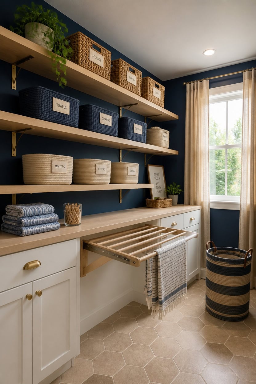
Open shelving with baskets does the heavy lifting in a laundry room where cabinets alone can’t cover every storage need. When shelves stay in warm white or natural wood tones and baskets stick to blue, beige, or natural weaves, the whole wall reads as one intentional unit rather than a collection of mismatched containers. Limit shelf bracket finishes to brushed brass or matte black so the hardware doesn’t pull the eye away from the palette.
Layer basket tones: Mix one solid blue basket with two natural wicker or beige woven baskets per shelf so the color repeats without overwhelming the neutral base.
Size baskets consistently: Baskets that match in height across a shelf line create a clean horizontal read, which matters most in a compact room where clutter reads louder.
Use floating shelves: Wall-mounted floating shelves in warm white or unfinished pine keep the storage light and open, which prevents the room from feeling boxed in.
Label with linen tags: Small linen or cream paper labels on basket fronts keep the organizational system visible without adding graphic noise or color contrast.
this deep, settled blue makes open shelving and natural basket textures pop against the wall without the shelves disappearing into the background.
this creamy warm white ties directly to natural wicker tones and keeps built-in storage from feeling stark or disconnected from the basket palette.
 Handwoven Sea Grass Storage Baskets Set of 4-2 Round & 2 Square Woven Bins with Handles by Vietnamese Artisans, Natural Fiber Organizer for Living Room, Bathroom, Nursery, Shelves
View Price
Handwoven Sea Grass Storage Baskets Set of 4-2 Round & 2 Square Woven Bins with Handles by Vietnamese Artisans, Natural Fiber Organizer for Living Room, Bathroom, Nursery, Shelves
View Price
 Household Essentials Wicker Laundry Basket with Handles in Handwoven Willow, and Removable Washable Liner, Natural
View Price
Household Essentials Wicker Laundry Basket with Handles in Handwoven Willow, and Removable Washable Liner, Natural
View Price
 Love-KANKEI 17" White Floating Wall Shelves with Lip,Solid Wood,Set of 2
View Price
Love-KANKEI 17" White Floating Wall Shelves with Lip,Solid Wood,Set of 2
View Price
 STYLENTDECOR Brass Brushed L Shape Shelf Bracket 5 7/8" x 7 7/8" – Heavy Duty Wall Mount Support for Floating Shelves, Durable & Stylish Metal Shelf Bracket for Home & Office (Pack of 1)
View Price
STYLENTDECOR Brass Brushed L Shape Shelf Bracket 5 7/8" x 7 7/8" – Heavy Duty Wall Mount Support for Floating Shelves, Durable & Stylish Metal Shelf Bracket for Home & Office (Pack of 1)
View Price
 4 Pack Storage Baskets for Organizing, Shelf Baskets with Handles, Jute
View Price
4 Pack Storage Baskets for Organizing, Shelf Baskets with Handles, Jute
View Price
 WARDOS Blue Striped Floral Storage Bin Box with Handles, Rustic Blue Flower Botanical Foldable Linen Fabric Laundry Basket for Home Bedroom Bathroom Girls Room Clothes Toys Books
View Price
WARDOS Blue Striped Floral Storage Bin Box with Handles, Rustic Blue Flower Botanical Foldable Linen Fabric Laundry Basket for Home Bedroom Bathroom Girls Room Clothes Toys Books
View Price
 dancrul Natural Wood Folding Clothes Hanger Rack for Laundry Room, Wall Mounted Clothes Drying Rack, Laundry Drying Rack Foldable, Perfect for Small Spaces, Beech Wood White
View Price
dancrul Natural Wood Folding Clothes Hanger Rack for Laundry Room, Wall Mounted Clothes Drying Rack, Laundry Drying Rack Foldable, Perfect for Small Spaces, Beech Wood White
View Price
Rugs, Curtains, and Décor Accents in Blue and Beige
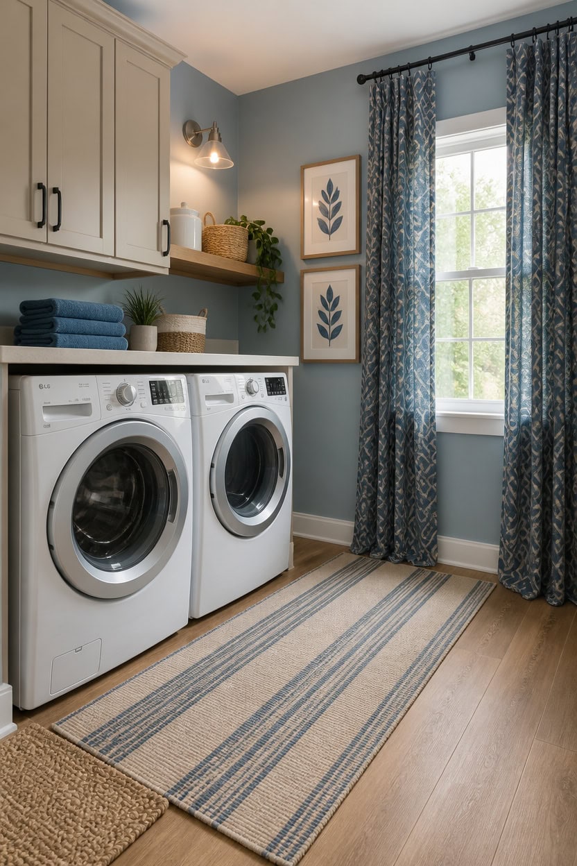
Rugs, curtains, and small décor pieces close the gap between a painted laundry room and one that actually feels finished. Soft textiles absorb the hard sound bounce that appliances create, making the space feel calmer during a spin cycle. Stick to blue as the print or pattern and beige as the ground color across all soft goods so the palette stays readable without looking forced.
Layer rugs under machines: A low-pile runner in beige or natural fiber placed in front of the washer and dryer protects flooring and grounds the whole color story.
Hang curtains high: Mounting curtain rods close to the ceiling and letting panels fall to the floor tricks the eye into reading the wall as taller than it is.
Keep décor groupings tight: Three items clustered together read as intentional; the same three items spread across a shelf read as clutter.
Repeat blue twice at eye level: A blue patterned rug plus one framed print at eye level creates rhythm without overloading the small space.
this soft blue keeps the backdrop calm while letting textiles carry the pattern and texture story.
this warm beige tone echoes the natural fiber rugs and woven baskets already in the space.
 HEBE Washable Hallway Runner Rug 2'x8', Cotton Woven Kitchen Rug Runner
View Price
HEBE Washable Hallway Runner Rug 2'x8', Cotton Woven Kitchen Rug Runner
View Price
 Hausattire Jute Braided Woven Kitchen Rug 2x3 Feet - Natural
View Price
Hausattire Jute Braided Woven Kitchen Rug 2x3 Feet - Natural
View Price
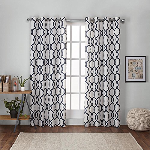 Exclusive Home Curtains - EH7988-06 2-96G Kochi Linen Blend Grommet Top Curtain Panel Pair, 54x96, Indigo, 2 Piece
View Price
Exclusive Home Curtains - EH7988-06 2-96G Kochi Linen Blend Grommet Top Curtain Panel Pair, 54x96, Indigo, 2 Piece
View Price
 Framed Boho Wall Art Set of 4 for Wooded Minimalist Botanical Print Wall Art for Rustic Vintage Farmhouse Home Kitchen Wall Decor (Brown, 11x14)
View Price
Framed Boho Wall Art Set of 4 for Wooded Minimalist Botanical Print Wall Art for Rustic Vintage Farmhouse Home Kitchen Wall Decor (Brown, 11x14)
View Price
 Set of 3 Handwoven Seagrass Storage Baskets with Handles, Decorative Round Wicker Basket Set for Blankets, Toys, Towels, Nursery, Living Room & Bedroom
View Price
Set of 3 Handwoven Seagrass Storage Baskets with Handles, Decorative Round Wicker Basket Set for Blankets, Toys, Towels, Nursery, Living Room & Bedroom
View Price
 Clotho 4 Pack Navy Blue Turkish Hand Towels for Bathroom | 100% Cotton 18 x 40 Inches | Decorative Kitchen Towels Set| White Striped Machine Washable Lightweight | Perfect Use for Face & Hair
View Price
Clotho 4 Pack Navy Blue Turkish Hand Towels for Bathroom | 100% Cotton 18 x 40 Inches | Decorative Kitchen Towels Set| White Striped Machine Washable Lightweight | Perfect Use for Face & Hair
View Price
 upsimples Floating Shelves for Wall Decor Storage, Natural, 6Pcs, 15.7''
View Price
upsimples Floating Shelves for Wall Decor Storage, Natural, 6Pcs, 15.7''
View Price
 10 Strawberry Street Embossed Ceramic Kitchen Canister Set, Set of 3, Hampton White
View Price
10 Strawberry Street Embossed Ceramic Kitchen Canister Set, Set of 3, Hampton White
View Price
Our Favorite Drying Racks
- Free shipping over $35
- Picked at 4.3 stars or higher
 Collapsible Accordion Wall-Mounted Drying Rack
View Price
Collapsible Accordion Wall-Mounted Drying Rack
View Price
 Folding Wall-Mounted Drying Rack
View Price
Folding Wall-Mounted Drying Rack
View Price
 Aluminum Foldable Wall-Mounted Drying Rack
View Price
Aluminum Foldable Wall-Mounted Drying Rack
View Price
 Metal Folding Large-Capacity Clothes Drying Rack
View Price
Metal Folding Large-Capacity Clothes Drying Rack
View Price
 3-Tier Collapsible Clothes Drying Rack
View Price
3-Tier Collapsible Clothes Drying Rack
View Price
 Foldable 3-Level Clothes Drying Rack with High Hanger
View Price
Foldable 3-Level Clothes Drying Rack with High Hanger
View Price
 Rolling Laundry Cart with Basket, Hanging Bar and Shelf
View Price
Rolling Laundry Cart with Basket, Hanging Bar and Shelf
View Price
 Daytek Steel Retractable Clothesline
View Price
Daytek Steel Retractable Clothesline
View Price
How to Stay Organized Without Cluttering the Space
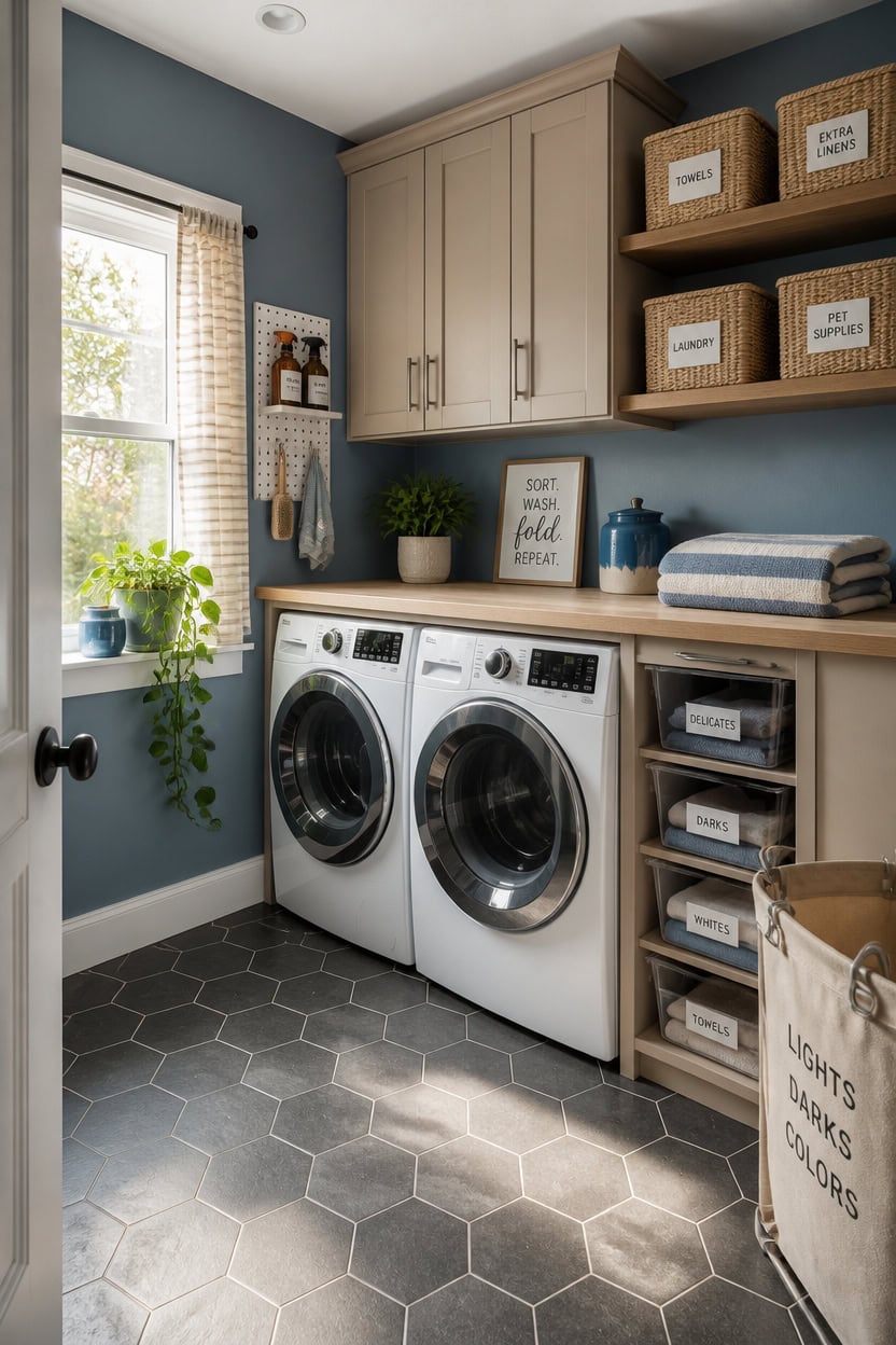
Organization in a laundry room works best when every item has a fixed home before it enters the space. When things land randomly on counters or pile up on top of machines, the room fills up fast and the blue and beige palette gets buried under visual noise. Assign a category to each storage zone first, then choose containers that match the palette so the organization itself becomes part of the design.
Use lidded bins for consumables: Detergent pods, dryer sheets, and stain sprays disappear inside beige lidded baskets so the counter stays clean.
Label everything at eye level: Clear labels on bins and canisters let you grab what you need without pulling everything out first.
Stack vertically, not horizontally: Wall-mounted shelves above the machines use dead space and keep the floor clear, which makes the room read larger.
Rotate stock to the back: When you restock supplies, move older items forward so nothing gets lost behind a full row of containers.
this muted blue keeps the backdrop calm so storage pieces and labeled baskets stay visually easy to scan.
this warm beige pulls the shelving and cabinet faces into the same family as the woven bins below.
 Plastic Storage Basket with Lid Set of 3, Woven Rattan Style Organizer Bins for Closet, Laundry, Pantry & Bathroom
View Price
Plastic Storage Basket with Lid Set of 3, Woven Rattan Style Organizer Bins for Closet, Laundry, Pantry & Bathroom
View Price
 Nihow Food Storage Jar, Ceramic Canister Sets for The Kitchen,Set of 4,Blue
View Price
Nihow Food Storage Jar, Ceramic Canister Sets for The Kitchen,Set of 4,Blue
View Price
 Vtopmart Clear Stackable Storage Drawers Set of 5, Plastic Organizer Bins
View Price
Vtopmart Clear Stackable Storage Drawers Set of 5, Plastic Organizer Bins
View Price
 AZSKY Floating Shelves Wall Mounted Set of 2 Natural Wood Picture Shelves Wall Shelves for Bedroom Bathroom Living Room Kitchen Laundry Room Storage & Decoration 24 Inch
View Price
AZSKY Floating Shelves Wall Mounted Set of 2 Natural Wood Picture Shelves Wall Shelves for Bedroom Bathroom Living Room Kitchen Laundry Room Storage & Decoration 24 Inch
View Price
 Keepo Peg Board Wall Organizer – Plastic Pegboard Panels, Modular Peg Board Storage System For Home Office, Craft Room, Gaming Setup (White, 33″×22″)
View Price
Keepo Peg Board Wall Organizer – Plastic Pegboard Panels, Modular Peg Board Storage System For Home Office, Craft Room, Gaming Setup (White, 33″×22″)
View Price
 Lifewit 75L Large Laundry Baskets, Laundry Hampers Bags, 2 Pack, Beige
View Price
Lifewit 75L Large Laundry Baskets, Laundry Hampers Bags, 2 Pack, Beige
View Price
 Talented Kitchen Storage Label Set - Clear Stickers for Home Organization - Garage Bin & Pantry Labeling - Waterproof Labels for Kitchen & Bathroom Organization - Pack of 138, 1" to 1.25" x 3", Black
View Price
Talented Kitchen Storage Label Set - Clear Stickers for Home Organization - Garage Bin & Pantry Labeling - Waterproof Labels for Kitchen & Bathroom Organization - Pack of 138, 1" to 1.25" x 3", Black
View Price
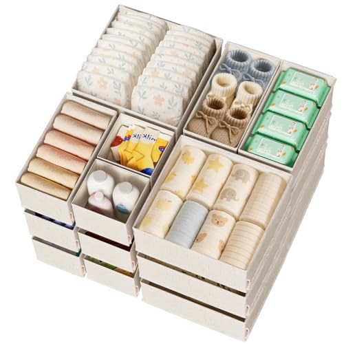 ZenStortage Cotton Linen Baby Drawer Organizers for Nursery, 20Pack Beige
View Price
ZenStortage Cotton Linen Baby Drawer Organizers for Nursery, 20Pack Beige
View Price
Budget-Friendly Ways to Achieve the Blue and Beige Look
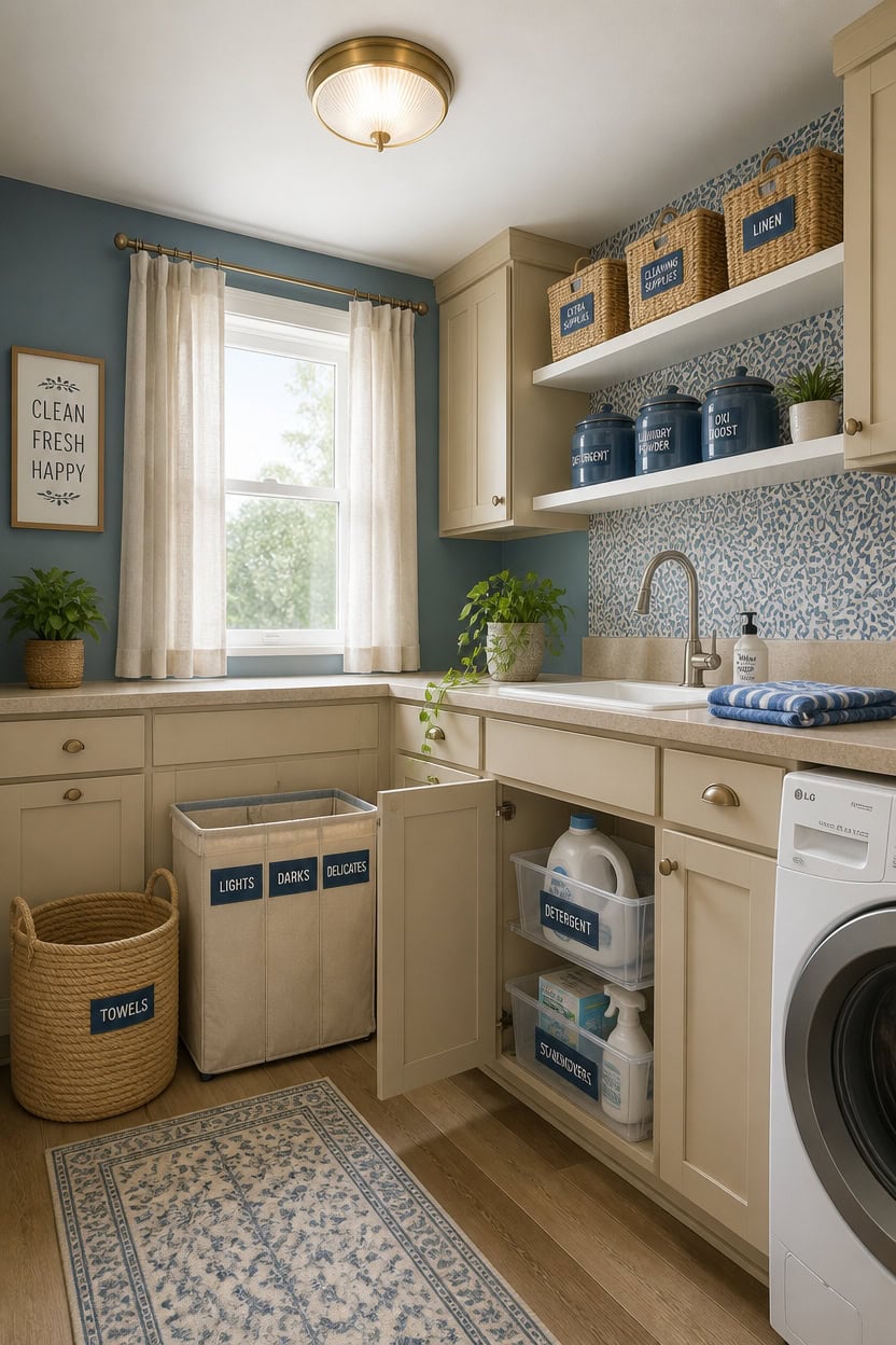
Achieving the blue and beige look in a laundry room does not require a big budget when you focus on paint, fabric, and a few well-placed accessories instead of full renovations. Paint alone shifts the entire mood of the room for under fifty dollars, and beige woven baskets from discount stores match the palette just as well as expensive boutique versions. Start with the walls and one or two storage pieces, then add smaller accents over time as your budget allows.
Shop discount stores first: Stores like HomeGoods, TJ Maxx, and Amazon Basics carry beige woven baskets and blue ceramic canisters at a fraction of boutique prices.
Use paint as your biggest impact move: One can of muted blue wall paint transforms the room more than any single accessory purchase could.
Repurpose what you already own: Plain baskets you already have can be spray-painted beige or lined with blue fabric to fit the palette without buying new.
Buy in sets, not singles: Canister sets and basket sets cost less per piece than individual items and keep the look cohesive instantly.
this soft blue makes the room feel calm and intentional without requiring any other major updates.
this warm beige unifies mismatched cabinetry into one clean, finished look for the cost of a single quart.
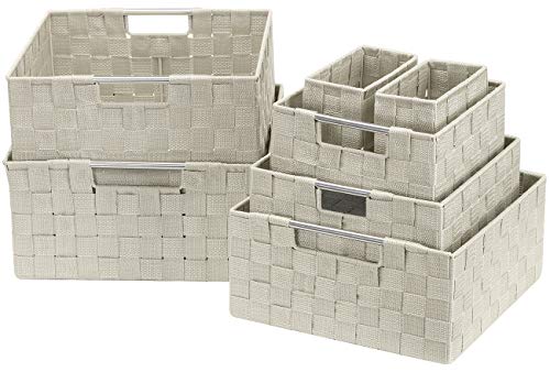 Sorbus Baskets for Organizing, 7-Piece Hand-Woven Storage Set (Beige)
View Price
Sorbus Baskets for Organizing, 7-Piece Hand-Woven Storage Set (Beige)
View Price
 Cerkik 3 Pcs 74/36/18 oz Ceramic Canisters Sets for Kitchen
View Price
Cerkik 3 Pcs 74/36/18 oz Ceramic Canisters Sets for Kitchen
View Price
 JMvicyroam 60L Cotton Rope Laundry Basket Hamper, Golden Jute
View Price
JMvicyroam 60L Cotton Rope Laundry Basket Hamper, Golden Jute
View Price
 VOLEAAR Serene Blue Natural Botanical Peel and Stick Wallpaper 17.5" x 118"
View Price
VOLEAAR Serene Blue Natural Botanical Peel and Stick Wallpaper 17.5" x 118"
View Price
 2 Pack Laundry Room Shelves Organization And Storage,Wall Mounted Clothes Drying Rack With Wire Mesh Basket Over Washer And Dryer,Large Capacity Floating Wall Shelf For Bathroom,Kitchen,Storeroom
View Price
2 Pack Laundry Room Shelves Organization And Storage,Wall Mounted Clothes Drying Rack With Wire Mesh Basket Over Washer And Dryer,Large Capacity Floating Wall Shelf For Bathroom,Kitchen,Storeroom
View Price
 Maxsilan 90L Large Laundry Basket Bag, Collapsible Tall Hamper, Beige
View Price
Maxsilan 90L Large Laundry Basket Bag, Collapsible Tall Hamper, Beige
View Price
 Hebayy 318 PCS Laundry Room & Linen Closet Organization Labels,No Stain Removal, Water/Oil Resistant Stickers for Laundry Room, Linen Closet, Home Office, Bathroom and the Beauty Organization.
View Price
Hebayy 318 PCS Laundry Room & Linen Closet Organization Labels,No Stain Removal, Water/Oil Resistant Stickers for Laundry Room, Linen Closet, Home Office, Bathroom and the Beauty Organization.
View Price
 VOTLEVT Acrylic Laundry Pods Contianer and Dryer Sheet Holder Set with Bamboo Lid, Dishwasher Pods Container, Laundry Pods Holder, Laundry Soap Organizer, Laundry Room Organization and Storage
View Price
VOTLEVT Acrylic Laundry Pods Contianer and Dryer Sheet Holder Set with Bamboo Lid, Dishwasher Pods Container, Laundry Pods Holder, Laundry Soap Organizer, Laundry Room Organization and Storage
View Price
Common Laundry Room Design Mistakes to Avoid
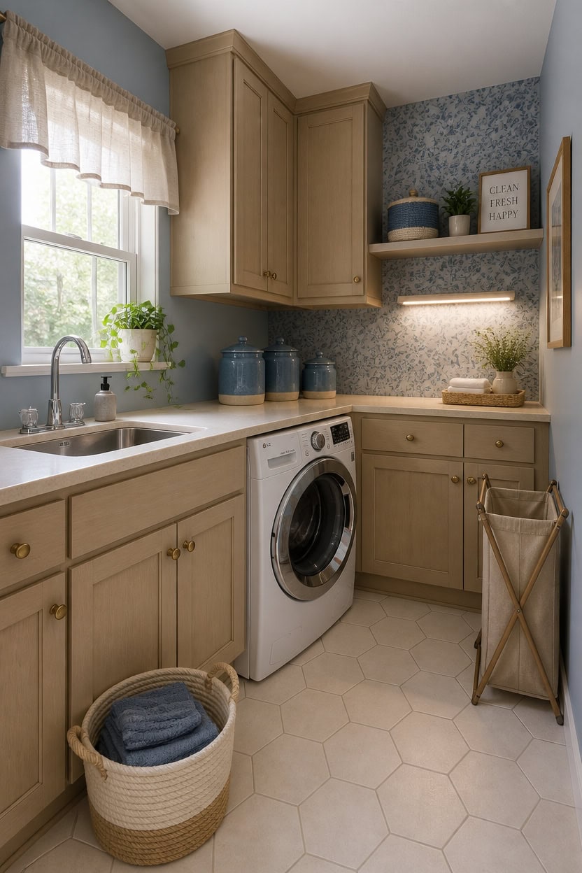
Most laundry room design mistakes come down to ignoring the room’s real function while chasing a finished look. A blue and beige palette can hide poor choices for a while, but cramped storage, clashing textures, and ignored lighting eventually make the space feel cluttered and frustrating. Catching these mistakes early saves money and keeps the design working the way it should.
Skipping the light check: Blue reads differently under warm versus cool bulbs, so test your paint color under the actual lighting before committing.
Mixing too many textures: Beige linen, wicker, cotton, and jute all work in the palette, but using all four at once fragments the look instead of unifying it.
Buying storage without measuring: Baskets and bins that are too tall or too wide block cabinet doors and waste the vertical space laundry rooms badly need.
Forgetting the ceiling and trim: Leaving the ceiling builder-white while the walls are blue creates an unfinished ceiling that pulls the eye up in the wrong way.
this soft muted blue corrects a cold or sterile laundry room feel without making the space feel smaller.
this warm beige keeps upper and lower cabinets looking intentional rather than builder-grade and mismatched.
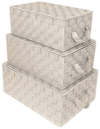 Sorbus Woven Storage Basket with Lid, Set of 3 (Beige)
View Price
Sorbus Woven Storage Basket with Lid, Set of 3 (Beige)
View Price
 Lifewit 80L Large Laundry Baskets, Laundry Hampers Bags, 3 Pack, Beige
View Price
Lifewit 80L Large Laundry Baskets, Laundry Hampers Bags, 3 Pack, Beige
View Price
 10 Strawberry Street Diamond Embossed Ceramic Kitchen Canister Set, Set of 3, Diamond Blue
View Price
10 Strawberry Street Diamond Embossed Ceramic Kitchen Canister Set, Set of 3, Diamond Blue
View Price
 OIAHOMY 50L Storage Basket Large Blanket Basket Living Room Yellow 3-Pack
View Price
OIAHOMY 50L Storage Basket Large Blanket Basket Living Room Yellow 3-Pack
View Price
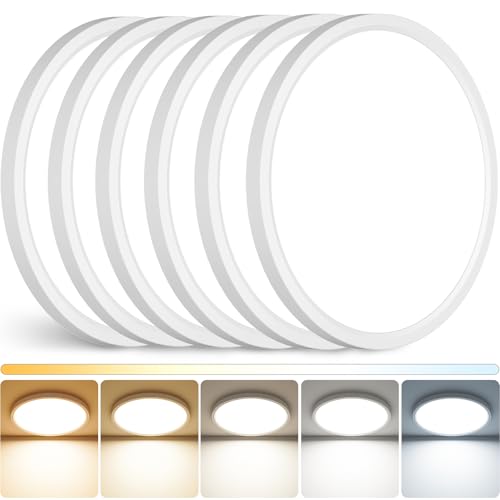 Peasur 12Inch LED Ceiling Light Flush Mount, 5CCT 3000K-6500K Adjustable Ceiling Light Fixture, 2400LM 24W Bright White Flat Lighting Fixture for Hallway Kitchen Bathroom Bedroom, 6Pack
View Price
Peasur 12Inch LED Ceiling Light Flush Mount, 5CCT 3000K-6500K Adjustable Ceiling Light Fixture, 2400LM 24W Bright White Flat Lighting Fixture for Hallway Kitchen Bathroom Bedroom, 6Pack
View Price
 H4D 24 Pack labels for Storage Bins, 4" x 6" Plastic Clear Adhesive Pockets
View Price
H4D 24 Pack labels for Storage Bins, 4" x 6" Plastic Clear Adhesive Pockets
View Price
 XWZO Sleeve Topper with Top Bottom Ruffle Sleeves Valances Home Décor Window Treatment Bedroom Nursery Kitchen Window Curtain Header, 58" x 5",1 Piece, Faux Linen-Beige
View Price
XWZO Sleeve Topper with Top Bottom Ruffle Sleeves Valances Home Décor Window Treatment Bedroom Nursery Kitchen Window Curtain Header, 58" x 5",1 Piece, Faux Linen-Beige
View Price
 Wall Wear Peel and Stick Wallpaper Panels, Untamed Spaces, 8-Pack
View Price
Wall Wear Peel and Stick Wallpaper Panels, Untamed Spaces, 8-Pack
View Price
Real Blue and Beige Laundry Room Transformations
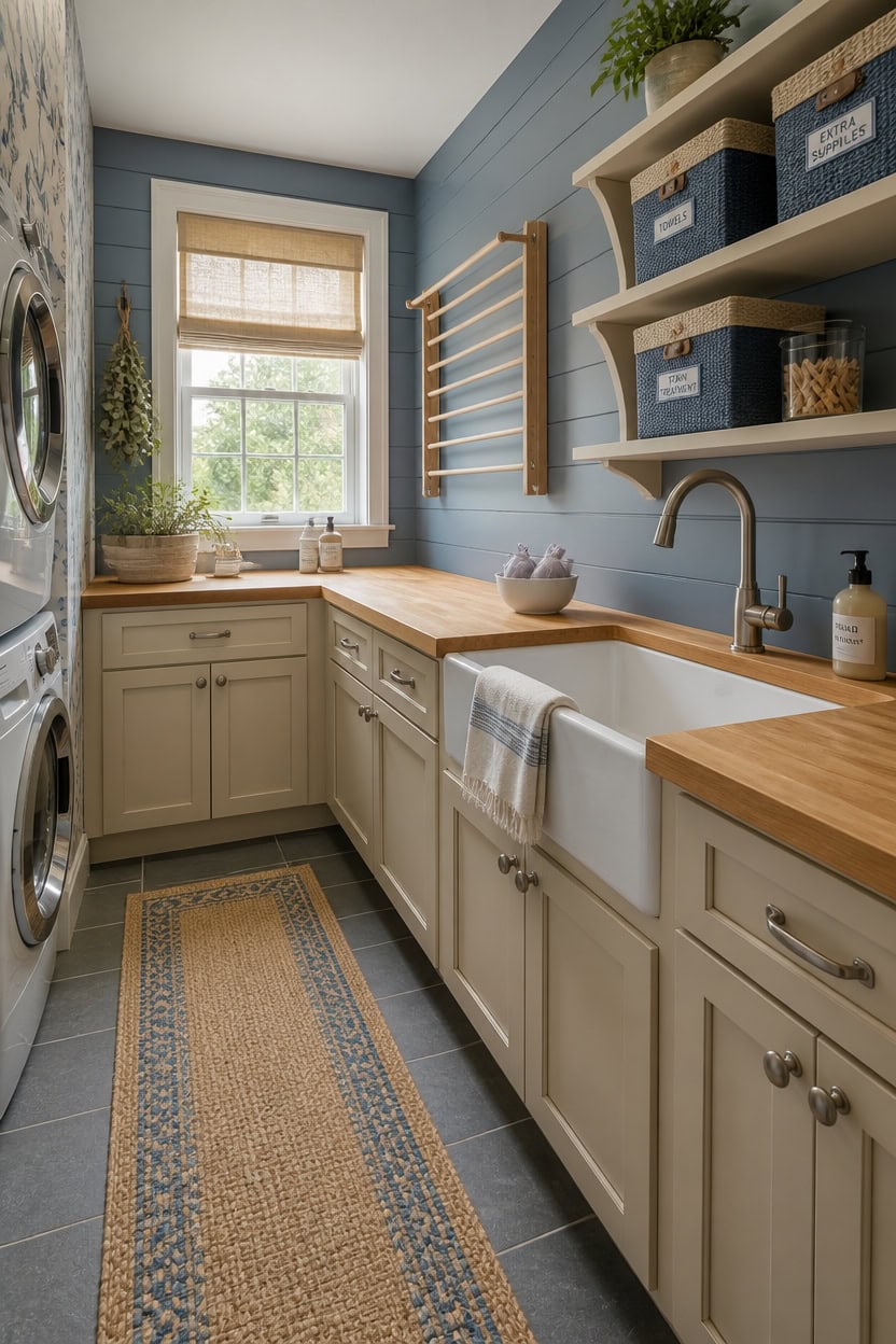
Real laundry room transformations work because homeowners commit to the palette in every layer of the space, not just the walls. Blue and beige hold together best when they show up in at least three different materials — paint, textiles, and storage — so the color scheme feels intentional rather than accidental. Start with the cabinet color and wall color, then let every accessory decision follow from there.
Anchor with paint first: Choosing wall and cabinet colors before buying any accessories prevents mismatched undertones from derailing the whole design.
Layer in textiles second: A beige linen hamper or blue woven basket brings softness that painted surfaces alone cannot deliver in a utilitarian space.
Add functional decor last: Labels, canisters, and window treatments should reinforce the palette without competing with the larger blue and beige elements already in place.
Photograph the space as you go: Progress photos reveal color balance issues early, before you have committed to every purchase.
this dusty mid-tone blue gives a laundry room a calm, finished character that builder white walls never achieve.
this warm sandy beige grounds the blue walls and makes upper and lower cabinets look like a deliberate design choice.
 COMFY-HOMI XXL Large Laundry Basket with Handles Blanket Baskets Living Room|Woven Cotton Rope Decorative Basket Laundry Hamper Baby Basket Nursery Dog Toy Storage Organizer Bin-16”x18”-White/Blue
View Price
COMFY-HOMI XXL Large Laundry Basket with Handles Blanket Baskets Living Room|Woven Cotton Rope Decorative Basket Laundry Hamper Baby Basket Nursery Dog Toy Storage Organizer Bin-16”x18”-White/Blue
View Price
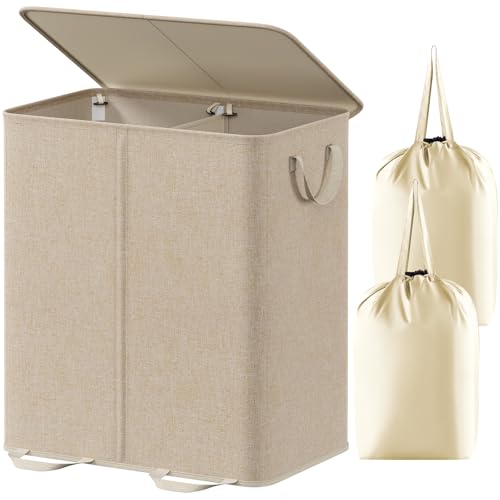 Lifewit Double Laundry Hamper with Lid, Removable Laundry Bags, Beige
View Price
Lifewit Double Laundry Hamper with Lid, Removable Laundry Bags, Beige
View Price
 Mixpresso 3-Pcs Blue Canisters Set for Kitchen Storage Airtight Jars
View Price
Mixpresso 3-Pcs Blue Canisters Set for Kitchen Storage Airtight Jars
View Price
 2-Pack 36W Dimmable LED Ceiling Light Fixtures Super Bright 3600LM, 12in Modern Flush Mount Ceiling Light, 2700K/3000K/3500K/4000K/5000K Adjustable Brushed Nickle Ceiling Lamp for Living Room Bathroom
View Price
2-Pack 36W Dimmable LED Ceiling Light Fixtures Super Bright 3600LM, 12in Modern Flush Mount Ceiling Light, 2700K/3000K/3500K/4000K/5000K Adjustable Brushed Nickle Ceiling Lamp for Living Room Bathroom
View Price
 18Pcs Laundry Room Labels Waterproof Minimalist Black Home Organization Stickers for Bottles Jars Containers Laundry Storage Labels for Detergent Soap Cleaning Supplies
View Price
18Pcs Laundry Room Labels Waterproof Minimalist Black Home Organization Stickers for Bottles Jars Containers Laundry Storage Labels for Detergent Soap Cleaning Supplies
View Price
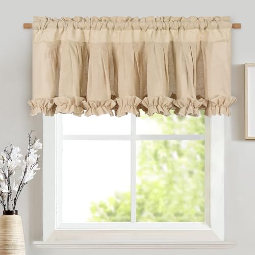 Likiyol Linen Valances for Windows Farmhouse Window Valances with Ruffle Rustic Country Light Filtering Kitchen Valance Curtains Rod Pocket Valance for Bathroom Cafe, Linen, 52" W X 18" L
View Price
BKSTICK Navy Blue Floral Peel and Stick Wallpaper 17.7"x78.8"
View Price
Likiyol Linen Valances for Windows Farmhouse Window Valances with Ruffle Rustic Country Light Filtering Kitchen Valance Curtains Rod Pocket Valance for Bathroom Cafe, Linen, 52" W X 18" L
View Price
BKSTICK Navy Blue Floral Peel and Stick Wallpaper 17.7"x78.8"
View Price
DIY vs. Hiring a Designer for Your Laundry Room Makeover
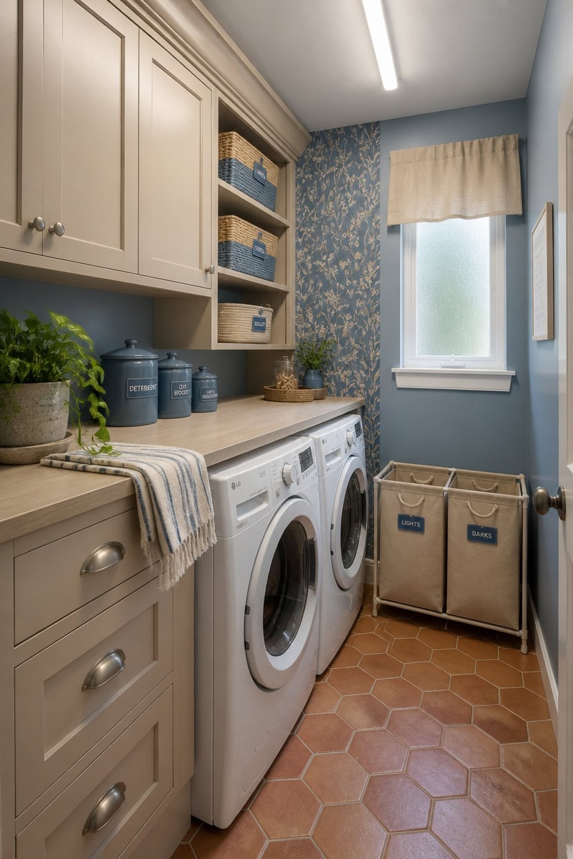
DIY work handles the blue and beige laundry room makeover well when the scope stays limited to paint, swapping out hardware, and adding new accessories. A designer earns their fee when the layout needs to change, cabinets need custom sizing, or the plumbing has to move to make the space actually functional. Knowing which category your project falls into before you spend a dollar saves both money and frustration.
Assess complexity first: If the footprint works but looks dated, DIY paint and accessories get you 80% of the transformation for 20% of the cost.
Hire for structural changes: Moving a washer hookup, adding ventilation, or installing custom cabinetry requires a professional to avoid costly mistakes.
Use a designer for palette confidence: If choosing between shades of blue and beige feels paralyzing, one consultation session often pays for itself in avoided wrong purchases.
Split the work when budget is tight: Hire a pro for plumbing and cabinet installation, then handle all the paint and accessory styling yourself.
this dusty mid-tone blue gives even a small laundry room a calm, polished character that no amount of new accessories alone can replicate.
this warm sandy beige pairs with the blue walls to create a two-tone cabinet-and-wall combo that looks custom without the custom price.
 BIRDROCK HOME Tall Double Laundry Hamper with Lid, Cream, 25.75”
View Price
BIRDROCK HOME Tall Double Laundry Hamper with Lid, Cream, 25.75”
View Price
 Kitchen Canisters Set 4,Dark Blue Metal Airtight Kitchen Storage Containers
View Price
Kitchen Canisters Set 4,Dark Blue Metal Airtight Kitchen Storage Containers
View Price
 Large Cotton Rope Storage Basket with Reinforced Handles, Foldable Neutral Woven Organizer Bin for Laundry Toys Baby Clothes Nursery Living Room (White+Light Brown, 17.72" x 13.78" x 11.02")
View Price
Large Cotton Rope Storage Basket with Reinforced Handles, Foldable Neutral Woven Organizer Bin for Laundry Toys Baby Clothes Nursery Living Room (White+Light Brown, 17.72" x 13.78" x 11.02")
View Price
 HVSWLY 28PCS Laundry Labels for Containers,Minimalist Laundry Labels for Jars,Removable Waterproof Laundry Room Label Stickers,Home Storage Organization(Black)
View Price
HVSWLY 28PCS Laundry Labels for Containers,Minimalist Laundry Labels for Jars,Removable Waterproof Laundry Room Label Stickers,Home Storage Organization(Black)
View Price