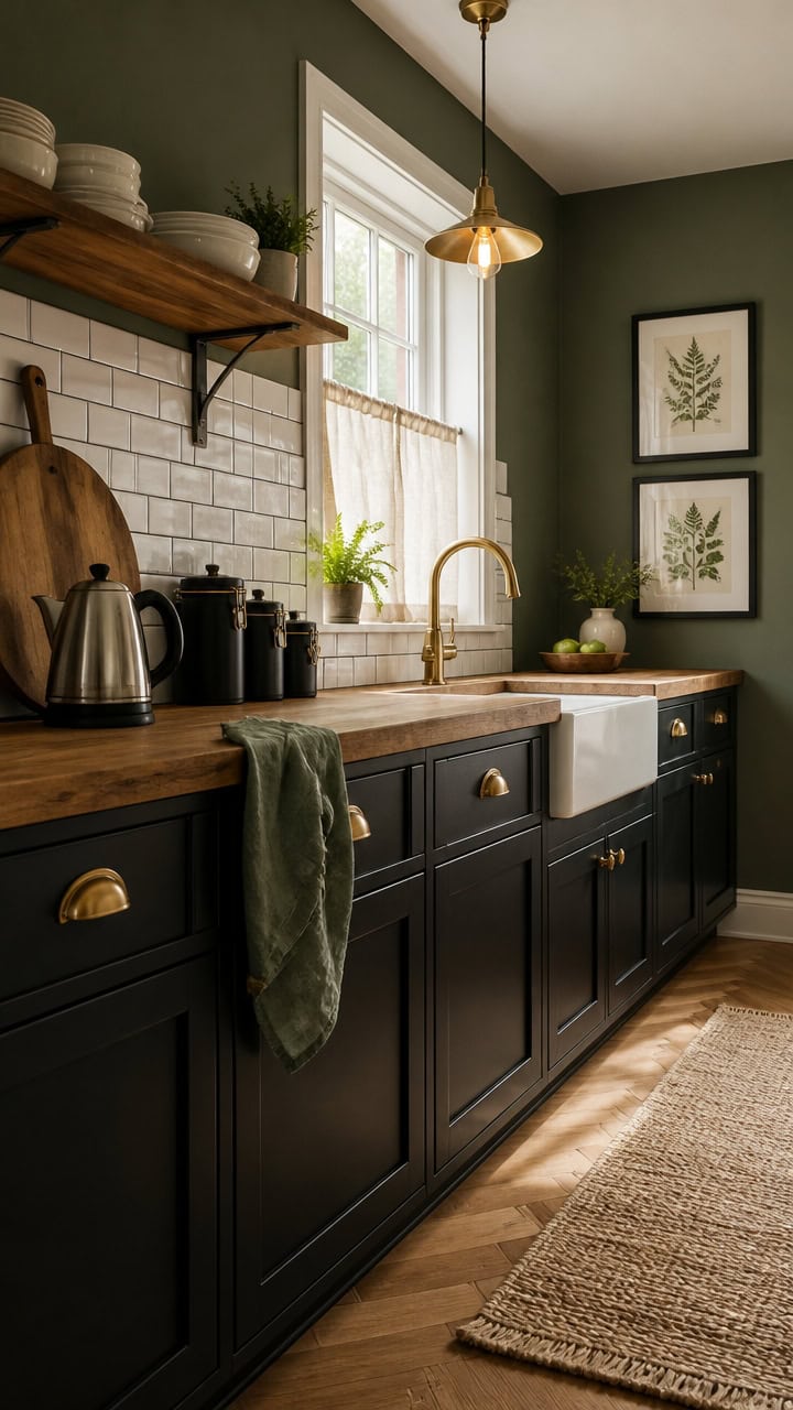
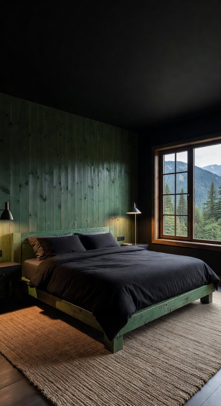
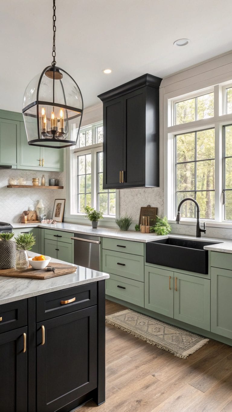
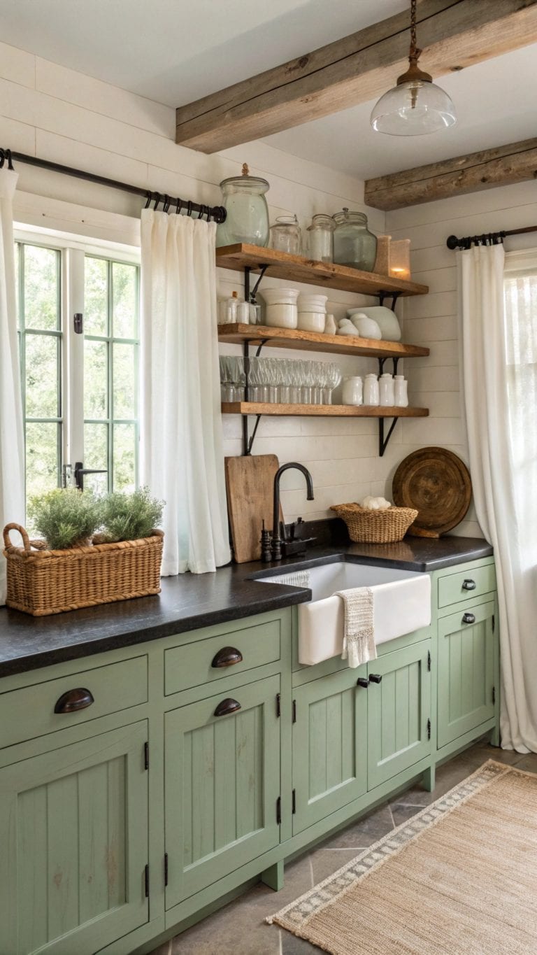
How to Paint a Moody Green & Black Office (Without It Feeling Like a Cave)
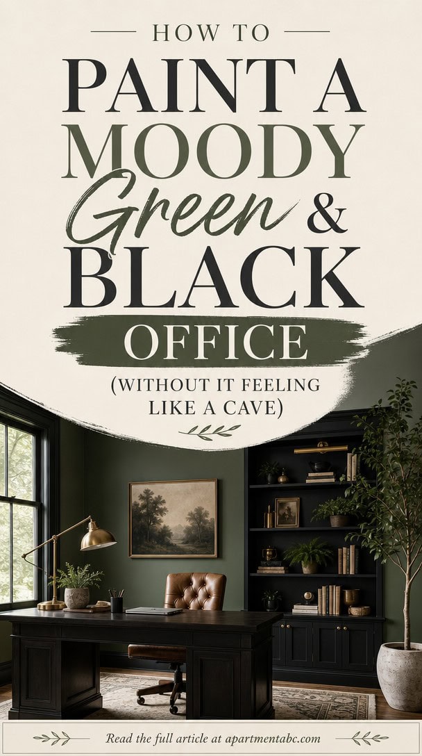
You saved that deep green office to your Pinterest board six months ago, and now that it’s actually on your walls, the room feels like a cave with overhead lighting.
The issue isn’t your taste — it’s undertones reacting to your specific light source.
This article breaks down exactly how to get that moody green-and-black combination to actually work in your space.
Why Moody Offices Turn Into Caves
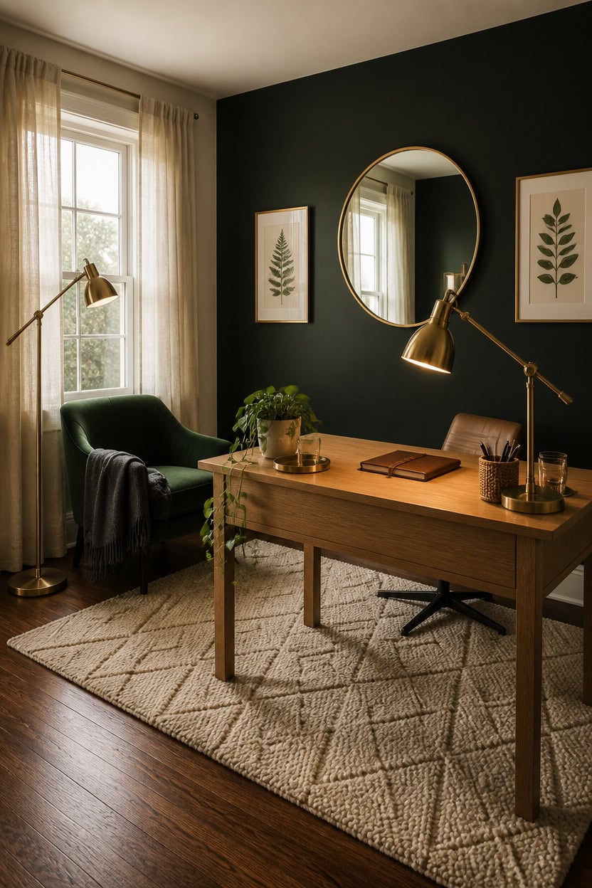
Dark walls absorb light instead of bouncing it back, and without enough contrast the whole room reads as one flat shadow. Moody offices need at least one bright surface, layered lighting, and metallic or light wood accents to keep the green and black from swallowing the space. Skipping these three elements is what turns a rich color scheme into a cave.
Add a light anchor: Keep one wall, the trim, or the ceiling trim in a pale tone to bounce light back into the room.
Layer three light sources: Combine overhead, task, and ambient lighting so no corner goes fully dark.
Use warm metallics: Brass or warm gold hardware and frames reflect light better than matte black finishes.
Add light wood tones: A desk or shelf in a lighter wood breaks up the dark palette and adds warmth.
a deep green-black that grounds the space without going fully black.
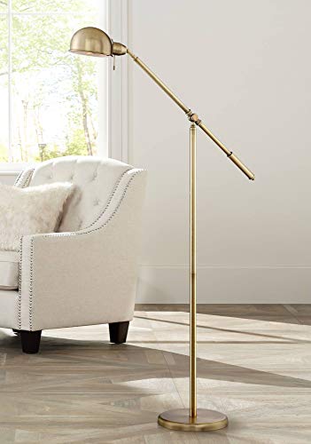 Dawson Antique Brass Adjustable Boom Arm Pharmacy 55" Tall Floor Lamp
View Price
Dawson Antique Brass Adjustable Boom Arm Pharmacy 55" Tall Floor Lamp
View Price
 CENSI 47" Natural Oak Writing Computer Laptop PC Desk, Light Wood
View Price
CENSI 47" Natural Oak Writing Computer Laptop PC Desk, Light Wood
View Price
 O'Bright Astrum - LED Desk Lamp with Dual USB Charging Ports, 100% Metal, 270 Degree Swivel Arms, Soft White Light (3000K), Bedside & Home Office Table Lamp, ETL Listed, Antique Brass Finish
View Price
O'Bright Astrum - LED Desk Lamp with Dual USB Charging Ports, 100% Metal, 270 Degree Swivel Arms, Soft White Light (3000K), Bedside & Home Office Table Lamp, ETL Listed, Antique Brass Finish
View Price
 nuLOOM Ago Cream Geometric Flatweave Wool Area Rug, 5' x 8'
View Price
nuLOOM Ago Cream Geometric Flatweave Wool Area Rug, 5' x 8'
View Price
 XRAMFY 30 Inch Round Mirror-Gold Circle Mirrors for Bathroom, Entryway
View Price
XRAMFY 30 Inch Round Mirror-Gold Circle Mirrors for Bathroom, Entryway
View Price
 Modern Home Office Chair Velvet Desk Chair Accent Armchair Gold Legs
View Price
Modern Home Office Chair Velvet Desk Chair Accent Armchair Gold Legs
View Price
 Guken Cream Linen Blackout Curtains 84 Inch Length 2 Panels Set for Living Room Bedroom Back Tab Thermal Insulated 100% Black Out Drapes Room Darkening Window Curtain Ivory Natural Beige
View Price
Guken Cream Linen Blackout Curtains 84 Inch Length 2 Panels Set for Living Room Bedroom Back Tab Thermal Insulated 100% Black Out Drapes Room Darkening Window Curtain Ivory Natural Beige
View Price
 Drsoum Botanical Plant Framed Wall Art Boho Wall Decor for Bathroom Sage Green Eucalyptus Leaf Prints Minimalist Aesthetic Ready to Hang Set of 4, 11x14 in (Natural Framed)
View Price
Drsoum Botanical Plant Framed Wall Art Boho Wall Decor for Bathroom Sage Green Eucalyptus Leaf Prints Minimalist Aesthetic Ready to Hang Set of 4, 11x14 in (Natural Framed)
View Price
Pick the Right Green Undertone for Your Office
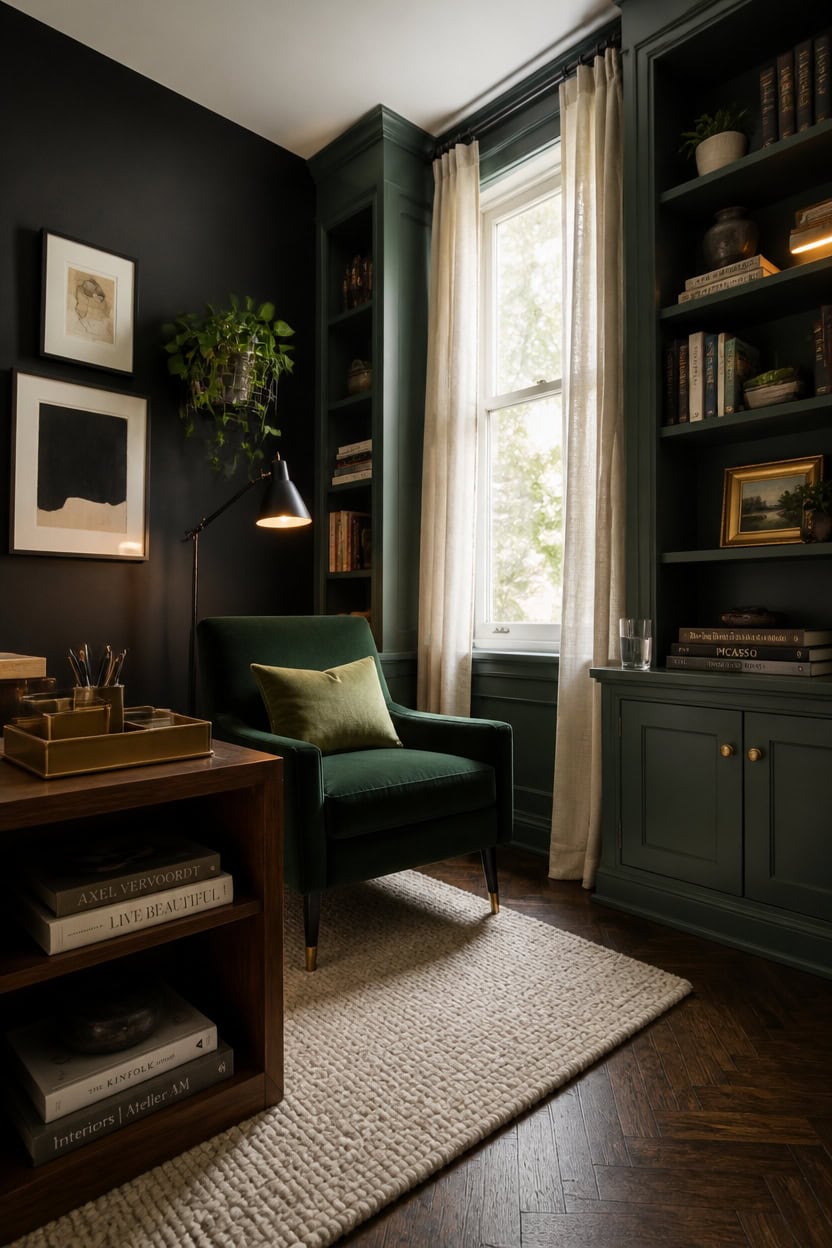
Rosepine leans slightly blue-gray, which keeps a green home office reading calm instead of muddy once the lights come on. Cool undertones like this sit well next to black because both share the same gray base, so neither color fights for attention. Hold swatches beside your existing black desk pieces before painting a full wall.
Check natural light first: Hold swatches near a window at midday to see the true undertone.
Sort warm from cool: Warm greens lean olive or khaki; cool greens lean blue or gray.
Test against black: A cool green blends with black trim while a warm green can look muddy beside it.
View under lamp light: Turn on your desk lamp at night to check if the green shifts warmer under the bulb.
a cool, blue-leaning green that stays calm instead of murky under mixed light.
a true gray-black backdrop that shows plainly whether the green’s undertone holds steady or turns warm.
 NIOIIKIT Velvet Office Desk Chair with Hand Woven Backrest, 360° Swivel & Height Adjustable Task Chairs, Makeup Chair, Living Room Chairs with Stainless Base and 5 Wheels (Emerald)
View Price
NIOIIKIT Velvet Office Desk Chair with Hand Woven Backrest, 360° Swivel & Height Adjustable Task Chairs, Makeup Chair, Living Room Chairs with Stainless Base and 5 Wheels (Emerald)
View Price
 Globe Electric 62000009 32" Multi-Joint Desk Lamp with Metal Clamp, Matte Black, Antique Brass Accents, On/Off Rotary Switch on Shade, Partially Adjustable Swing Arm, Home Décor, Office Accessory
View Price
Globe Electric 62000009 32" Multi-Joint Desk Lamp with Metal Clamp, Matte Black, Antique Brass Accents, On/Off Rotary Switch on Shade, Partially Adjustable Swing Arm, Home Décor, Office Accessory
View Price
 VASAGLE 5-Tier Bookshelf, Storage Organizer, 23.6 x 9.4 x 52.8 Inches
View Price
VASAGLE 5-Tier Bookshelf, Storage Organizer, 23.6 x 9.4 x 52.8 Inches
View Price
 Large Framed Boho Black White Abstract Wall Art for Living Room, 24x36 In
View Price
Large Framed Boho Black White Abstract Wall Art for Living Room, 24x36 In
View Price
 MIULEE Olive Green Chenille Couch Throw Pillow Covers, 18x18
View Price
MIULEE Olive Green Chenille Couch Throw Pillow Covers, 18x18
View Price
 BLU MONACO | Gold Desk Organizer Set with Detachable File Organizer, Stackable Paper Tray & Storage Drawer | Stylish Gold Desk Accessories for Women & Office Organization
View Price
BLU MONACO | Gold Desk Organizer Set with Detachable File Organizer, Stackable Paper Tray & Storage Drawer | Stylish Gold Desk Accessories for Women & Office Organization
View Price
 CISEANOL 2 Pcs Wall Mounted Hanging Planter Vase for Indoor and Outdoor Plants Modern Metal Wall and Ceiling Planter Minimalist Flower Pot (Black, 5.91 inch)
View Price
CISEANOL 2 Pcs Wall Mounted Hanging Planter Vase for Indoor and Outdoor Plants Modern Metal Wall and Ceiling Planter Minimalist Flower Pot (Black, 5.91 inch)
View Price
 SAFAVIEH Trace Area Rug 5x8, Wool Handmade Ivory TRC101C
View Price
SAFAVIEH Trace Area Rug 5x8, Wool Handmade Ivory TRC101C
View Price
Match Your Black Paint to That Green
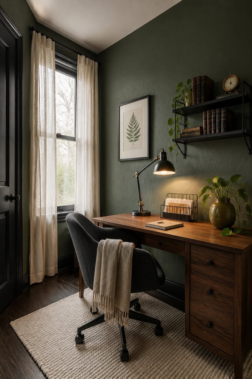
Matching black paint to a green undertone works best when both colors share the same base tone. Onyx has a true neutral gray-black base with no blue or brown creeping in, which lets Rosepine’s cool green read clearly instead of shifting warm. Test the pairing on the wall directly behind your desk before committing to trim or built-ins.
Match the base, not the shade: A gray-based black pairs with gray-based green without fighting for warmth.
Skip blue-blacks: Blacks with a blue tint can push a cool green toward teal instead of staying balanced.
Check trim separately: Trim painted black can look different from a black wall, so test both surfaces.
Layer black last: Paint the green surface first, then bring black swatches in to confirm the pairing reads calm.
the blue-leaning green sets a calm backdrop that won’t compete with black accents.
the true gray-black edge frames the green wall without adding warmth or contrast noise.
 LEYAOYAO Office Desk 48" with 3 Drawers Storage File Cabinet
View Price
LEYAOYAO Office Desk 48" with 3 Drawers Storage File Cabinet
View Price
 TORCHSTAR Metal Desk Lamp, Adjustable Swing Arm, E26, Black
View Price
TORCHSTAR Metal Desk Lamp, Adjustable Swing Arm, E26, Black
View Price
 Yaheetech Light Gray Velvet Makeup Vanity Desk Chair, Channel-Tufted Swivel
View Price
Yaheetech Light Gray Velvet Makeup Vanity Desk Chair, Channel-Tufted Swivel
View Price
 Vintage Botanical Prints Wall Art 16x24–3 Pc Black Frame Bathroom Decor
View Price
Vintage Botanical Prints Wall Art 16x24–3 Pc Black Frame Bathroom Decor
View Price
 Saga Green Ceramic Vase, GUKJOB Small Cute Flower Vase for Pampas Grass, Home, Living Room, Dining Table, Farmhouse, Office Decor, Bedroom, Table, and Kitchen Shelf (Saga Green)
View Price
Saga Green Ceramic Vase, GUKJOB Small Cute Flower Vase for Pampas Grass, Home, Living Room, Dining Table, Farmhouse, Office Decor, Bedroom, Table, and Kitchen Shelf (Saga Green)
View Price
 Kuntine.B Desk File Organizer Upright Mesh Desktop Organizer File Sorter Office Organization File Holder for Home, Office & Classroom (Black, 1 Pack 5-Section)
View Price
Kuntine.B Desk File Organizer Upright Mesh Desktop Organizer File Sorter Office Organization File Holder for Home, Office & Classroom (Black, 1 Pack 5-Section)
View Price
 KOZYFLY Washable 5x7 Living Room Rug, Non Slip Woven Area Rugs, Braided Floor Carpet for Entryway, Kitchen, Bedroom, Dining Room, Office, Cotton Rug Indoor Decor, Ivory Beige
View Price
KOZYFLY Washable 5x7 Living Room Rug, Non Slip Woven Area Rugs, Braided Floor Carpet for Entryway, Kitchen, Bedroom, Dining Room, Office, Cotton Rug Indoor Decor, Ivory Beige
View Price
 WOPITUES Floating Shelves for Wall Decor Set of 3, Black
View Price
WOPITUES Floating Shelves for Wall Decor Set of 3, Black
View Price
Test Your Green and Black Paint Colors First
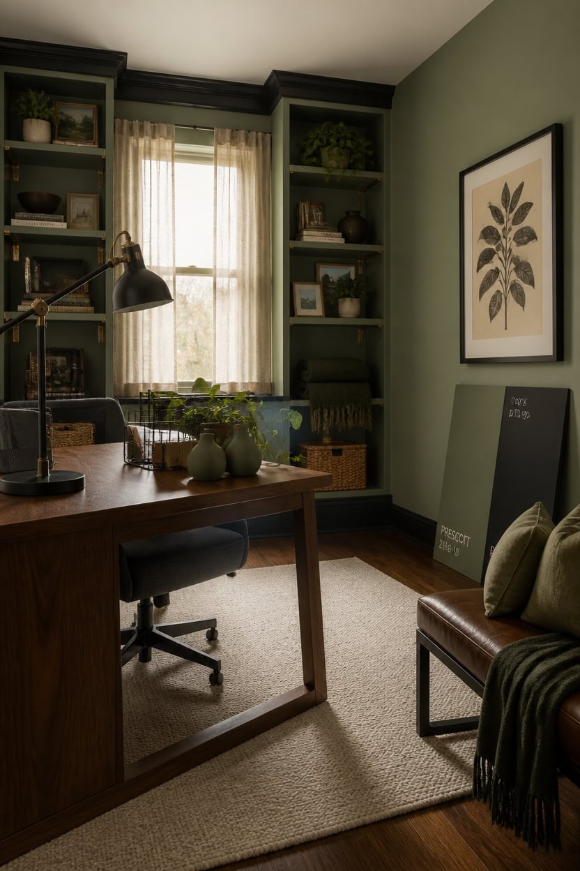
Painting over a sample swatch and living with it for a few days beats trusting a paint chip under store lighting. Rosepine can shift teal in north-facing rooms, while Onyx can look almost brown under warm bulbs at night. Paint two coats on foam board so you can move the sample around the office and check it against your actual desk lighting.
Use large boards: Paint poster-size boards instead of small chips so you see true depth and undertone.
Check three light times: View swatches in morning daylight, midday, and after dark with lamps on.
Move the board around: Hold samples near the desk, near trim, and near the floor since light hits each spot differently.
Wait before deciding: Let paint cure a full day since wet color looks darker and slightly different than dry.
a soft sage-green tone that lets you test the green family at a larger scale before committing to the accent wall.
the same true gray-black used on baseboards, so you can compare how it reads against both wall and shelf tones.
 Wayshome 100% Solid Wood Desk, Mid Century Modern Walnut Finish Home Office Computer Writing Desk with Drawers Perfect for Study & Living Room 55.11" W
View Price
Wayshome 100% Solid Wood Desk, Mid Century Modern Walnut Finish Home Office Computer Writing Desk with Drawers Perfect for Study & Living Room 55.11" W
View Price
 O'Bright Astrum - LED Desk Lamp with Dual USB Charging Ports, 100% Metal, 270 Degree Swivel Arms, Soft White Light (3000K), Bedside & Home Office Table Lamp, ETL Listed, Black
View Price
O'Bright Astrum - LED Desk Lamp with Dual USB Charging Ports, 100% Metal, 270 Degree Swivel Arms, Soft White Light (3000K), Bedside & Home Office Table Lamp, ETL Listed, Black
View Price
 HUIMO Home Office Chair Upholstered Armless Swivel Desk Chair with Wheels
View Price
HUIMO Home Office Chair Upholstered Armless Swivel Desk Chair with Wheels
View Price
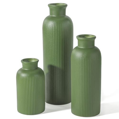 Small Sage Green Ceramic Vase Set of 3, Boho Modern Flower Vase Room Decor, Farmhouse Decor, Vases for Your Kitchen, Bathroom, Bedroom, Living Room, Office&Shelf Centerpiece Table Decorations
View Price
Small Sage Green Ceramic Vase Set of 3, Boho Modern Flower Vase Room Decor, Farmhouse Decor, Vases for Your Kitchen, Bathroom, Bedroom, Living Room, Office&Shelf Centerpiece Table Decorations
View Price
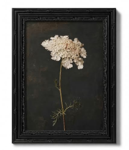 Dezrobew Dark Academia Black Framed Botanical Wall Art Gothic White Flower Painting Moody Vintage Floral Picture Aesthetic Nature Decor for Bedroom Living Room Bathroom Office 9''X11''
View Price
Dezrobew Dark Academia Black Framed Botanical Wall Art Gothic White Flower Painting Moody Vintage Floral Picture Aesthetic Nature Decor for Bedroom Living Room Bathroom Office 9''X11''
View Price
 MIULEE Boho Linen Fringe Decorative Throw Pillow Covers Olive Green 20x20
View Price
MIULEE Boho Linen Fringe Decorative Throw Pillow Covers Olive Green 20x20
View Price
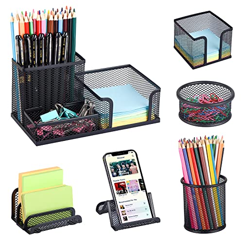 Desk Organizers set with Mesh Pen Holder Cup Office Supply(6 Piece set)
View Price
Desk Organizers set with Mesh Pen Holder Cup Office Supply(6 Piece set)
View Price
 KOZYFLY 6x9 Dining Room Rugs, Washable Area Rug for Living Room, Non Slip Rugs for Bedroom, Braided Floor Carpet for Nursery, Office, Cotton Rug Home Indoor Decor, Ivory Beige
View Price
KOZYFLY 6x9 Dining Room Rugs, Washable Area Rug for Living Room, Non Slip Rugs for Bedroom, Braided Floor Carpet for Nursery, Office, Cotton Rug Home Indoor Decor, Ivory Beige
View Price
Use the 60-30-10 Rule for Color Balance
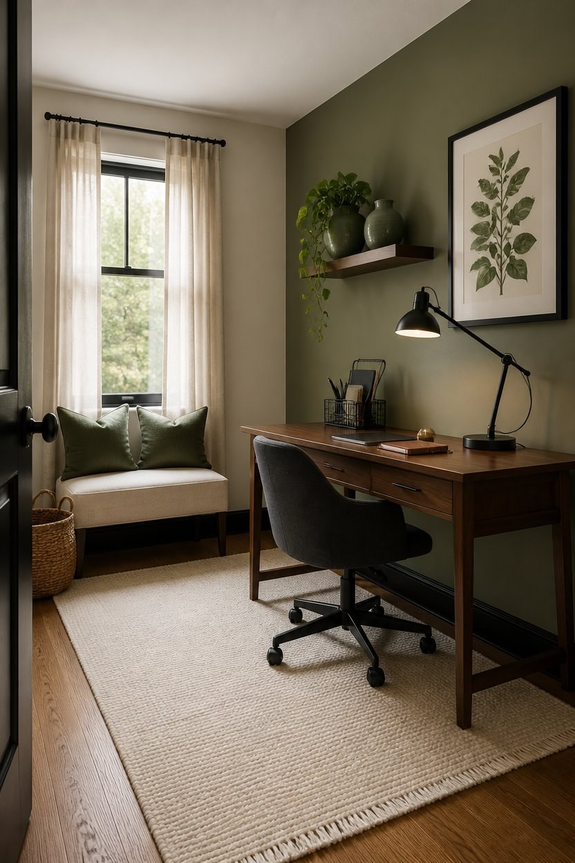
The 60-30-10 rule splits your office into three proportions: 60 percent dominant color, 30 percent secondary, and 10 percent accent. This ratio keeps a dark green and black scheme from feeling heavy or cave-like in a small room. Let Onyx trim and Prescott Green shelves stay minor, then let a lighter wall color carry the bulk of the visual weight.
Start with walls: Let Pale Oak or a similar light neutral cover 60 percent of the room so darker tones do not overwhelm the space.
Layer the secondary tone: Use Prescott Green on shelving or one accent wall for roughly 30 percent of the visual mix.
Reserve black for accents: Keep Onyx confined to trim, a lamp base, or small frames for the final 10 percent.
Step back and check: Photograph the room and look at the image in black and white to confirm the proportions read correctly.
this soft sage-green becomes the room’s 30 percent layer without darkening the whole space.
a thin band of true black grounds the room while staying under the 10 percent accent limit.
 NELYE Mid-Century Long Desk Table, 63" W x 20" D, Walnut
View Price
NELYE Mid-Century Long Desk Table, 63" W x 20" D, Walnut
View Price
 Upholstered Armless Office Chair Fabric Swivel Home Desk Chair with Wheels
View Price
Upholstered Armless Office Chair Fabric Swivel Home Desk Chair with Wheels
View Price
 Hug Donut Decorative Vase Set - Sage Green Modern Nordic Boho Style Vases Home Decor,Matte Ceramic Decorations for Living Room Shelf, Bookshelf Mantle Entryway Table or Console Décor(Green)
View Price
Hug Donut Decorative Vase Set - Sage Green Modern Nordic Boho Style Vases Home Decor,Matte Ceramic Decorations for Living Room Shelf, Bookshelf Mantle Entryway Table or Console Décor(Green)
View Price
 LEPOWER Metal Desk Lamp, Adjustable GooseNeck Reading Light for Bedroom
View Price
LEPOWER Metal Desk Lamp, Adjustable GooseNeck Reading Light for Bedroom
View Price
 MIULEE Pack of 2 Olive Green Decorative Pillow Covers 18x18 Inch
View Price
Dezrobew Dark Academia Black Framed Botanical Wall Art Gothic White Flower Painting Moody Vintage Floral Picture Aesthetic Nature Decor for Bedroom Living Room Bathroom Office 12''X16''
View Price
MIULEE Pack of 2 Olive Green Decorative Pillow Covers 18x18 Inch
View Price
Dezrobew Dark Academia Black Framed Botanical Wall Art Gothic White Flower Painting Moody Vintage Floral Picture Aesthetic Nature Decor for Bedroom Living Room Bathroom Office 12''X16''
View Price
 Black Desk Organizer and Accessories, Black Desk Asccessories Office Supply Kit Include Mesh Desktop Organizer Stapler 1000 Staples Tape Dispenser Pen Holder Staple Remover Clips Ruler Scissors
View Price
Black Desk Organizer and Accessories, Black Desk Asccessories Office Supply Kit Include Mesh Desktop Organizer Stapler 1000 Staples Tape Dispenser Pen Holder Staple Remover Clips Ruler Scissors
View Price
Check LRV Numbers Before You Buy Paint
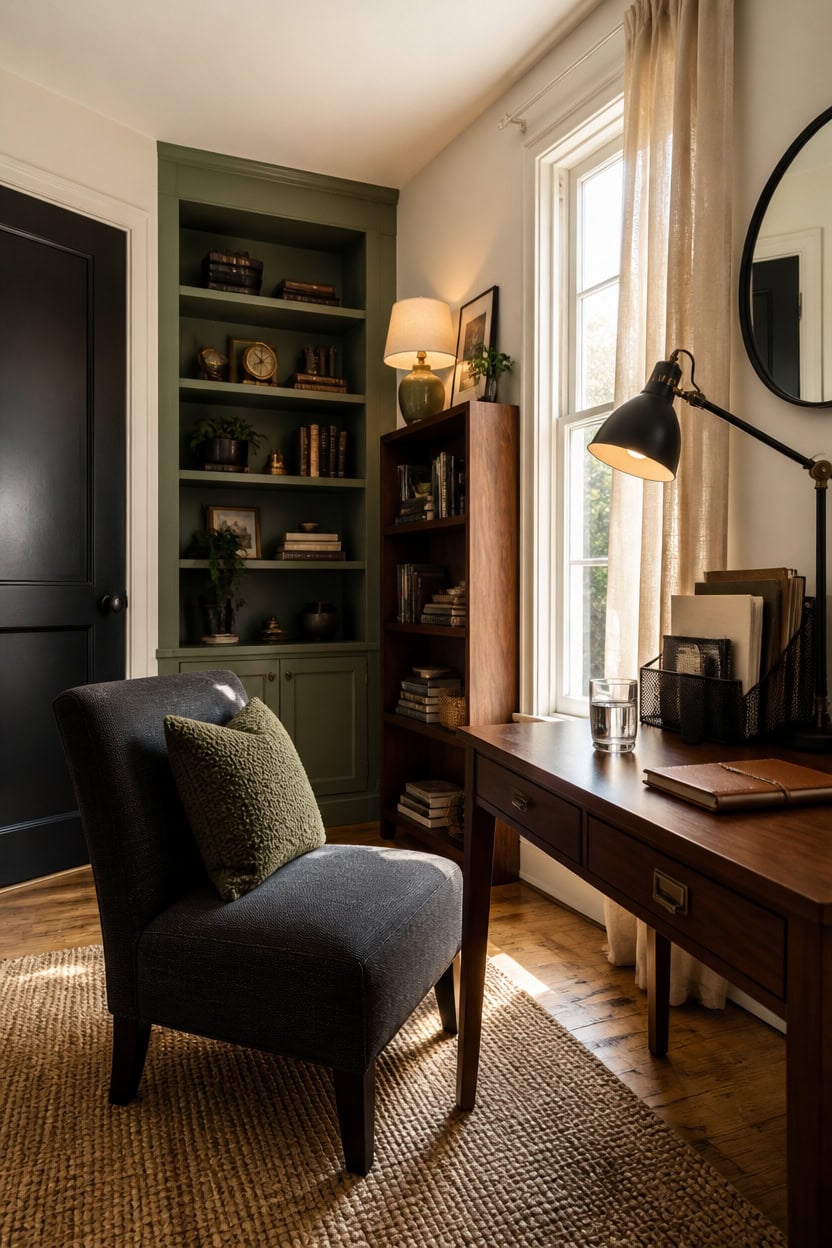
LRV, or light reflectance value, tells you how much light a paint color reflects back into a room. Colors under 20 read as true black or deep green in any light, while numbers above 40 keep a small office from feeling closed in. Test a swatch of Prescott Green on the built-in shelves before you commit to the full can.
Check the number: Look up LRV on the paint chip or ask the store for the data sheet before buying.
Test in real light: Paint a large swatch and view it in morning, midday, and evening light.
Compare to trim: Hold the sample next to Onyx trim so you can judge the contrast accurately.
Avoid guesswork: Skip any color with no listed LRV since dark greens vary widely in how much light they absorb.
the soft sage tone tests well against daylight while keeping the shelving from swallowing the room’s brightness.
a single dark door reads as a bold accent without adding visual weight to the main walls.
 shinelife LED Desk Lamp for Office Home, Bright Desk Light with USB Charging Port, Adjustable Dimmable Desk Lamps 5 Modes 5 Brightness, Touch Study Lamp for Nail, Craft, Puzzle, Sewing, Study, Black
View Price
shinelife LED Desk Lamp for Office Home, Bright Desk Light with USB Charging Port, Adjustable Dimmable Desk Lamps 5 Modes 5 Brightness, Touch Study Lamp for Nail, Craft, Puzzle, Sewing, Study, Black
View Price
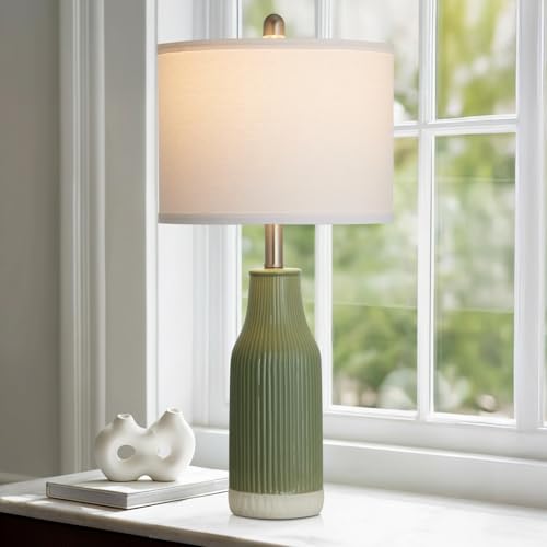 luxeflow 24.5" Ceramic Table Lamp for Bedroom, Sage Green Table Lamp for Living Room End Table, Small Farmhouse Bedside Lamp for Nightstand (1 Pack)
View Price
luxeflow 24.5" Ceramic Table Lamp for Bedroom, Sage Green Table Lamp for Living Room End Table, Small Farmhouse Bedside Lamp for Nightstand (1 Pack)
View Price
 5-Tier Bookshelf, Mid-Century Bookcase,Fluted Wood Booklshelf, Walnut
View Price
5-Tier Bookshelf, Mid-Century Bookcase,Fluted Wood Booklshelf, Walnut
View Price
 Sunniry Black Round Mirror, Round Mirror 24 inch, Matte Black Metal Frame
View Price
Sunniry Black Round Mirror, Round Mirror 24 inch, Matte Black Metal Frame
View Price
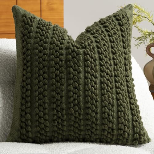 DEZENE Wool Boucle Throw Pillow Cover Premium Chic Accents Square Textured Decorative Pillow Case for Living Room Couch Sofa Home Decor 18"x18" Olive Green
View Price
DEZENE Wool Boucle Throw Pillow Cover Premium Chic Accents Square Textured Decorative Pillow Case for Living Room Couch Sofa Home Decor 18"x18" Olive Green
View Price
 OPNICE Desk Organizer, 4-Tier Desktop File Organizer with Drawer and Pen Holders, Office Desk Accessories, File Sorters, Workspace Organizers for Office Supplies(Black)
View Price
OPNICE Desk Organizer, 4-Tier Desktop File Organizer with Drawer and Pen Holders, Office Desk Accessories, File Sorters, Workspace Organizers for Office Supplies(Black)
View Price
 OWENIE Sheer Curtains 84 inch Length, Ivory Sheer Cutains 2 Panels Set for Bedroom/Living Room, Rod Pocket Voile Fimly Drapes, 2pcs, Each 42" W x 84" L
View Price
OWENIE Sheer Curtains 84 inch Length, Ivory Sheer Cutains 2 Panels Set for Bedroom/Living Room, Rod Pocket Voile Fimly Drapes, 2pcs, Each 42" W x 84" L
View Price
 BestMassage | Armless Chair | Grey | Pack of 1 | Hard Wood Accent Chair
View Price
BestMassage | Armless Chair | Grey | Pack of 1 | Hard Wood Accent Chair
View Price
Decide Where Black Goes vs Where Green Goes
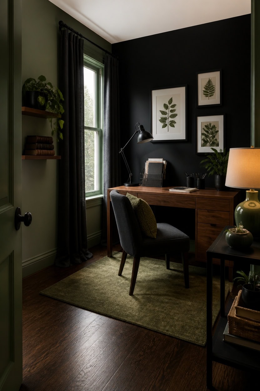
Black and green split the room by function, not by wall count, so the office reads intentional instead of random. Black anchors the focal point—usually the wall behind the desk—while green wraps the surfaces you touch or pass daily, like trim and shelving. This section uses Onyx as the anchor and Prescott Green as the supporting tone that keeps the black from taking over.
Anchor with black: Reserve Onyx for one focal wall, like the space behind the desk, so it reads as a feature.
Soften with green: Use Prescott Green on trim or moldings to keep the room from feeling like a cave.
Balance the ratio: Keep black to no more than 30 percent of visible wall space in a small office.
Test sightlines: Stand in the doorway and check that black doesn’t dominate the first thing you see.
a single black wall creates a focal point without darkening the whole room.
the sage tone softens the black anchor and ties the trim back to the shelving.
 Globe Electric 56963 31.5" Multi-Joint Desk Lamp with Metal Clamp, Black, On/Off Rotary Switch on Shade, Partially Adjustable Swing Arm, Home Essentials, Reading Light, Office Décor
View Price
Globe Electric 56963 31.5" Multi-Joint Desk Lamp with Metal Clamp, Black, On/Off Rotary Switch on Shade, Partially Adjustable Swing Arm, Home Essentials, Reading Light, Office Décor
View Price
 Foindtower Decorative Textured Boucle Throw Pillow Covers 26x26 Moss Green
View Price
Foindtower Decorative Textured Boucle Throw Pillow Covers 26x26 Moss Green
View Price
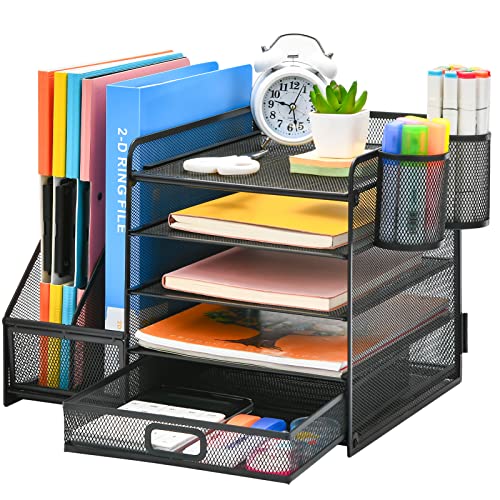 Marbrasse Desk Organizer with File Holder, 5-Tier Paper Letter Tray Organizer with Drawer and 2 Pen Holder, Mesh Desktop Organizer and Storage with Magazine Holder for Office Supplies(Black)
View Price
Marbrasse Desk Organizer with File Holder, 5-Tier Paper Letter Tray Organizer with Drawer and 2 Pen Holder, Mesh Desktop Organizer and Storage with Magazine Holder for Office Supplies(Black)
View Price
 Vortether 23.5" Bedside Lamps Set of 2,Green Ceramic Table Lamp for Bedroom
View Price
Vortether 23.5" Bedside Lamps Set of 2,Green Ceramic Table Lamp for Bedroom
View Price
 VESCASA Linen Upholstered Dining Chairs Set of 2, Mid Century Modern Padded Chair with Chrome Metal Frame for Restaurant, Dining Room, Kitchen, Charcoal
View Price
VESCASA Linen Upholstered Dining Chairs Set of 2, Mid Century Modern Padded Chair with Chrome Metal Frame for Restaurant, Dining Room, Kitchen, Charcoal
View Price
 ArtbyHannah Framed Bathroom Wall Art Decor, 12x16'' Botanical Leaf Prints
View Price
ArtbyHannah Framed Bathroom Wall Art Decor, 12x16'' Botanical Leaf Prints
View Price
 KOZYFLY Indoor Door Mat 2x3 ft Small Area Rugs Washable Front Door Mat Non Slip Rubber Backed Entryway Rug Cotton Entrance Doormat for Front Porch Kitchen Bedroom, Olive Green/Earthy Green
View Price
KOZYFLY Indoor Door Mat 2x3 ft Small Area Rugs Washable Front Door Mat Non Slip Rubber Backed Entryway Rug Cotton Entrance Doormat for Front Porch Kitchen Bedroom, Olive Green/Earthy Green
View Price
Work With Your Office’s Natural Light
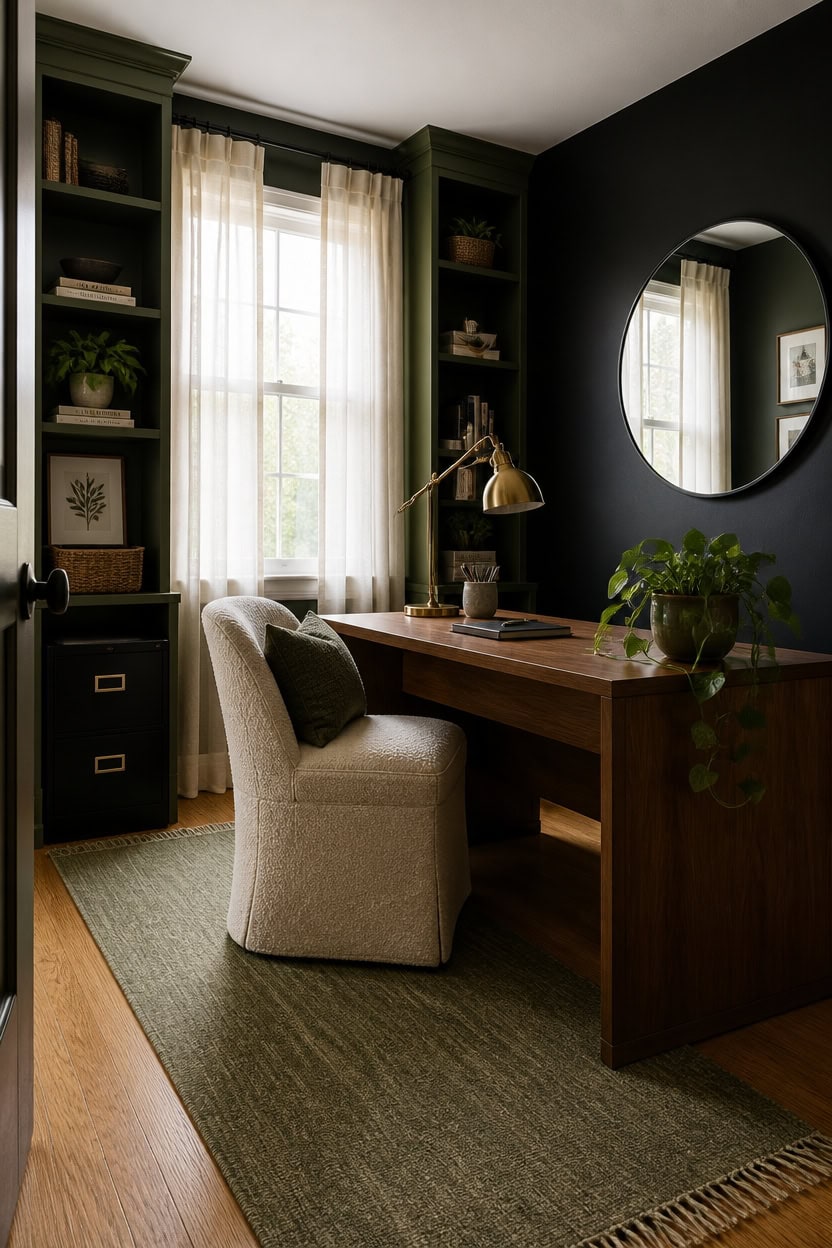
North-facing windows lose warmth by midafternoon, so pair Onyx on the wall away from the light source to avoid a flat, shadowed look. Placing dark paint opposite the window lets daylight bounce off lighter surfaces first, keeping the room from feeling closed in. Position your desk perpendicular to the window to catch indirect light without glare on a screen.
Track the light path: Note where sun hits at midday to place dark colors on shadowed walls only.
Use sheer curtains: Let sheer panels filter light so it spreads evenly across black and green surfaces.
Mirror the glow: Add a mirror across from the window to bounce daylight deeper into the room.
Keep sightlines clear: Avoid tall furniture blocking window light from reaching the black accent wall.
ties the shelves to the trim while still catching daylight.
grounds the shadowed side of the room without blocking incoming light.
 Nanspring White Linen Curtains 84 inches Long for Bedroom Back Tab Light Filtering Privacy Sheer Modern Farmhouse Coastal Decor Off Cotton Textured Gauze Curtain Living Room 2 Panel Set
View Price
Nanspring White Linen Curtains 84 inches Long for Bedroom Back Tab Light Filtering Privacy Sheer Modern Farmhouse Coastal Decor Off Cotton Textured Gauze Curtain Living Room 2 Panel Set
View Price
 VooBang Large Black Round Bathroom Mirror 48" with Thin Metal Frame
View Price
VooBang Large Black Round Bathroom Mirror 48" with Thin Metal Frame
View Price
 Bqueviant 17" Artificial Olive Plant White Ceramic Planter Indoor Decor
View Price
Bqueviant 17" Artificial Olive Plant White Ceramic Planter Indoor Decor
View Price
 Polup 2 Drawer File Cabinet with Lock, Metal Filing Cabinet for Home Office
View Price
Polup 2 Drawer File Cabinet with Lock, Metal Filing Cabinet for Home Office
View Price
 Yamaziot 2x6 Washable Hallway Runner Rug Non Slip Floral Carpet, Sage Green
View Price
Yamaziot 2x6 Washable Hallway Runner Rug Non Slip Floral Carpet, Sage Green
View Price
 Womina Armless Accent Chairs Set of 2 Upholstered Living Room Side Chairs
View Price
Womina Armless Accent Chairs Set of 2 Upholstered Living Room Side Chairs
View Price
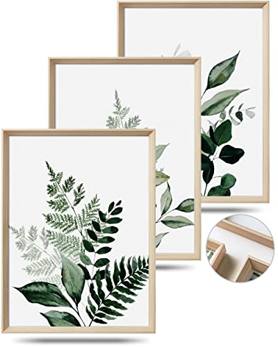 UPWOIGH Olive Leaf Wood Framed Wall Art, 12 x 16 Inch, Set of 3
View Price
UPWOIGH Olive Leaf Wood Framed Wall Art, 12 x 16 Inch, Set of 3
View Price
Layer Artificial Light to Brighten a Dark Office
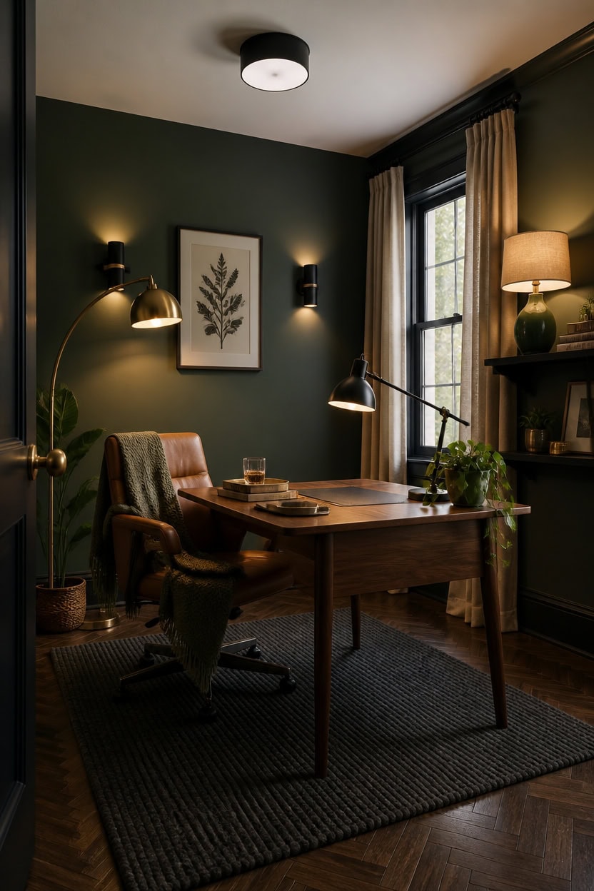
Layered lighting fixes the shadows that a black-and-green palette can create, since dark walls absorb more light than pale ones. A mix of overhead, task, and ambient sources keeps the room usable after sunset without washing out the deep tones on the walls. In this office, the wall behind the desk stays in Rosepine while trim edges pick up a crisp black to frame each light source.
Layer three sources: Combine a ceiling fixture, a desk lamp, and a floor lamp so no single spot goes dark.
Add a task lamp: Place an adjustable lamp on the desk to light paperwork without glare on screens.
Use warm bulbs: Choose warm white bulbs around 2700K to keep black and green surfaces from looking cold.
Wash the walls: Angle a floor lamp toward the dark wall to soften its edges after dusk.
crisp edges make each light fixture read sharper against the wall color.
the muted green absorbs lamp light softly instead of glaring back.
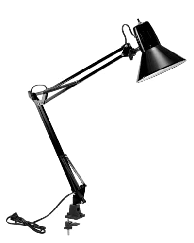 Bostitch Office VLF100 LED Swing Arm Desk Lamp with Clamp Mount, 36" Reach, Includes LED Bulb,Black
View Price
Bostitch Office VLF100 LED Swing Arm Desk Lamp with Clamp Mount, 36" Reach, Includes LED Bulb,Black
View Price
 Dimmable Floor Lamp for Living Room, 65" Tall Metal Standing Lamp with LED Bulb, Mid Century Modern Arc Floor Lamp with Linen Shade for Bedroom, Reading Room, Office & Nursery, Gold and Walnut Color
View Price
Dimmable Floor Lamp for Living Room, 65" Tall Metal Standing Lamp with LED Bulb, Mid Century Modern Arc Floor Lamp with Linen Shade for Bedroom, Reading Room, Office & Nursery, Gold and Walnut Color
View Price
 GE Relax LED Light Bulbs, Soft White A19, 60W Equivalent, 4 Pack
View Price
GE Relax LED Light Bulbs, Soft White A19, 60W Equivalent, 4 Pack
View Price
 Black Flush Mount Ceiling Light Fixtures, 2-Light Ceiling Mount for Farmhouse with Seeded Glass Lampshade, Industrial Flush Mount Light Fixture Farmhouse for Hallway, Kitchen, Entryway and Foyer
View Price
Black Flush Mount Ceiling Light Fixtures, 2-Light Ceiling Mount for Farmhouse with Seeded Glass Lampshade, Industrial Flush Mount Light Fixture Farmhouse for Hallway, Kitchen, Entryway and Foyer
View Price
 Aipsun Black Modern LED Wall Sconce Hardwired Indoor Wall Lights Set of 2 Up and Down Wall Mount Light for Living Room Bedroom Hallway Corridor Conservatory Warm White 3000K(with G9 Bulbs)
View Price
Aipsun Black Modern LED Wall Sconce Hardwired Indoor Wall Lights Set of 2 Up and Down Wall Mount Light for Living Room Bedroom Hallway Corridor Conservatory Warm White 3000K(with G9 Bulbs)
View Price
 Nourison Home 23" Olive Green Ceramic Pot Table Lamp for Bedroom, Living Room, Dining Office, with White Tapered Drum Shade
View Price
Nourison Home 23" Olive Green Ceramic Pot Table Lamp for Bedroom, Living Room, Dining Office, with White Tapered Drum Shade
View Price
 Bedsure 100% Cotton Blanket, Herringbone Weave, Queen Size, Sage Green
View Price
Bedsure 100% Cotton Blanket, Herringbone Weave, Queen Size, Sage Green
View Price
Paint the Ceiling to Open Up the Room
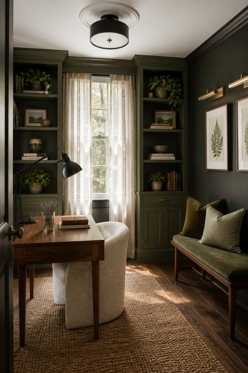
Keeping the ceiling in a soft white bounces available light back into the room instead of trapping it in dark corners. A flat black or deep green ceiling would push the walls in this office even closer together, so the ceiling stays pale while “Vintage Vogue” (462) covers the built-in shelves and “Onyx” (2133-10) grounds the walls below the ceiling line. This contrast keeps the room from feeling like a closed box even with two dark colors doing most of the work.
Leave the ceiling pale: A soft white or off-white ceiling reflects lamp and window light back down into the room.
Add a ceiling medallion or molding: A simple white detail at the ceiling line draws the eye up and adds height.
Skip a dark ceiling color: Dark ceilings work in tall rooms, but low ceilings need the lift a pale finish gives.
Use gloss sparingly: A satin or eggshell ceiling finish catches light without turning shiny under overhead fixtures.
the muted green gives the shelving depth without pulling focus from the pale ceiling above it.
the near-black tone stays grounded while the untouched ceiling keeps the room from feeling boxed in.
 Bueyfolt Ceiling Medallion 12-1/2" OD x 3-15/16" ID x 1-3/8"P, Ceiling Decorative Molded Round Ceiling Medallions for Chandeliers Home, White, 1 Pack
View Price
Bueyfolt Ceiling Medallion 12-1/2" OD x 3-15/16" ID x 1-3/8"P, Ceiling Decorative Molded Round Ceiling Medallions for Chandeliers Home, White, 1 Pack
View Price
 hykolity 12 Inch LED Round Flat Panel Light,3CCT,3000K/4000K/5000K
View Price
hykolity 12 Inch LED Round Flat Panel Light,3CCT,3000K/4000K/5000K
View Price
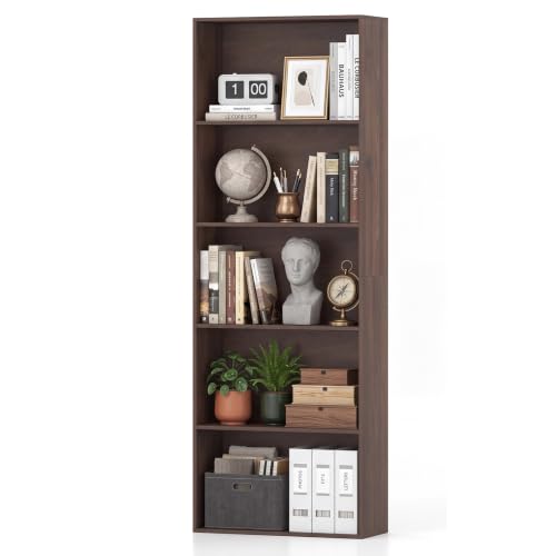 LOKO 67-inch 5-Tier Bookshelf, Freestanding Open Bookcase (1, Dark Walnut)
View Price
LOKO 67-inch 5-Tier Bookshelf, Freestanding Open Bookcase (1, Dark Walnut)
View Price
 LE TAUCI 10+8+6 Inch Ceramic Pots for Plants, Indoor Planters with Drainage Hole and Plug, Modern Cylinder Flower Pots Set of 3 for Living Room and Kitchen, Glossy, Sage Green
View Price
LE TAUCI 10+8+6 Inch Ceramic Pots for Plants, Indoor Planters with Drainage Hole and Plug, Modern Cylinder Flower Pots Set of 3 for Living Room and Kitchen, Glossy, Sage Green
View Price
 Craftersmark 24" Picture Lights for Wall with 8000mAh Battery - Brass Operated Wireless Wall Art Light with Remote Control for Large Portrait & Paintings Art
View Price
Craftersmark 24" Picture Lights for Wall with 8000mAh Battery - Brass Operated Wireless Wall Art Light with Remote Control for Large Portrait & Paintings Art
View Price
 Yaheetech Small 25.5in Wide Sherpa Barrel Accent Chair for Bedroom, Ivory
View Price
Yaheetech Small 25.5in Wide Sherpa Barrel Accent Chair for Bedroom, Ivory
View Price
Choose Trim Colors That Add Contrast
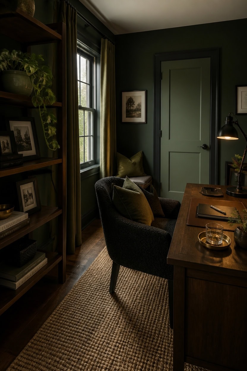
Painting trim in “Soot” removes the harsh line white trim draws against dark walls, letting the black and green surfaces blend into one plane. This near-black tone keeps window and door frames from competing with the walls for attention. Save a lighter green like Rosepine for one accent, such as a door, for definition.
Match trim to walls: Paint trim the same near-black as the walls to erase visual breaks between surfaces.
Use green for definition: A single door or window in green adds contrast without introducing a third dark tone.
Skip glossy white trim: Stark white trim breaks up the dark palette and pulls focus from the walls.
Test on one door first: Sample the trim color on a single door before committing the whole room.
the near-black tone blurs the line between trim and wall so the room reads as one continuous surface.
the muted green ties the floor line back to the shelving color without adding another dark black surface.
 TDCHINGES Rounded Matte Black Door Hinges 3.5 Inch 5/8" Radius Flat 30 Pack
View Price
TDCHINGES Rounded Matte Black Door Hinges 3.5 Inch 5/8" Radius Flat 30 Pack
View Price
 Lootkell 2 Pack Modern Black Curtain Rods Set for Windows 66 to 120 Inches Adjustable Length Heavy Duty 1" Diameter Window Curtain Rod with Decorative Finials for Outdoor Bedroom Kitchen Living Room
View Price
Lootkell 2 Pack Modern Black Curtain Rods Set for Windows 66 to 120 Inches Adjustable Length Heavy Duty 1" Diameter Window Curtain Rod with Decorative Finials for Outdoor Bedroom Kitchen Living Room
View Price
 eletecpro Aluminum Gallery Wall Frame Set of 7 with Glass Cover, Black
View Price
eletecpro Aluminum Gallery Wall Frame Set of 7 with Glass Cover, Black
View Price
 LE TAUCI Ceramic Pots for Plants, 8.3/7/6 Inch Indoor Planters with Drainage Holes & Mesh, Modern Glossy Glaze Cylinder Fluted Plant Pot for Snake Plant, Set of 3, Sage Green
View Price
LE TAUCI Ceramic Pots for Plants, 8.3/7/6 Inch Indoor Planters with Drainage Holes & Mesh, Modern Glossy Glaze Cylinder Fluted Plant Pot for Snake Plant, Set of 3, Sage Green
View Price
 Vicsoon LED Desk Lamp for Home Office with Wireless Charger, Black
View Price
Vicsoon LED Desk Lamp for Home Office with Wireless Charger, Black
View Price
 Yaheetech Compact Sherpa Accent Chairs Set of 2 for Small Spaces, Black
View Price
Yaheetech Compact Sherpa Accent Chairs Set of 2 for Small Spaces, Black
View Price
Pick Flooring That Lifts a Dark Room
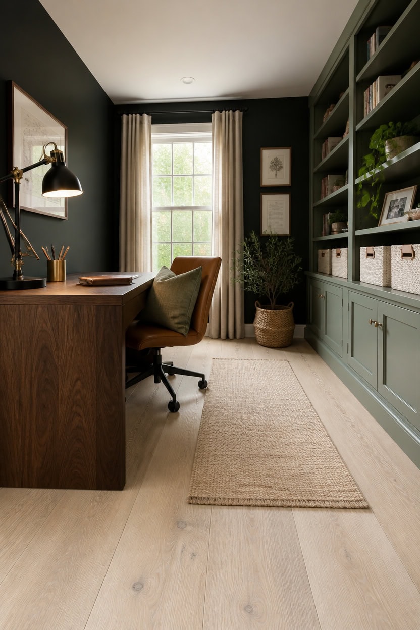
Light flooring is the fastest way to keep a green and black office from feeling like a cave. A pale wood or wood-look floor bounces available light back up onto the dark walls instead of absorbing it. Choose a floor at least three shades lighter than “Soot” on the walls so the contrast reads as intentional, not accidental.
Go pale on planks: Whitewashed or light oak flooring reflects more light than mid-tone wood.
Skip dark stains: Espresso or walnut floors add a third dark layer the room does not need.
Add a light rug: A pale jute or wool rug breaks up the floor and softens footsteps.
Keep sightlines open: Light flooring under a glass or light-wood desk keeps the base of the room feeling grounded, not heavy.
the muted green pulls light off the floor and keeps the storage wall from disappearing into the dark walls.
the near-black backdrop makes the lighter flooring below read as a clear, grounding contrast.
 Schweek 8x10 Brown Area Rugs Washable Vintage Large Rug for Living Room
View Price
Schweek 8x10 Brown Area Rugs Washable Vintage Large Rug for Living Room
View Price
 Chardin home 2x5 Jute Cotton Hand Woven Runner Rug, Natural Jute/Cream
View Price
Chardin home 2x5 Jute Cotton Hand Woven Runner Rug, Natural Jute/Cream
View Price
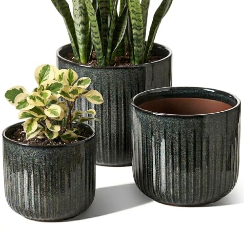 LE TAUCI Ceramic Pots for Plants, 8.3/7/6 Inch Indoor Planters with Drainage Holes & Mesh, Modern Glossy Glaze Cylinder Fluted Plant Pot for Snake Plant, Set of 3, Dark Olive
View Price
LE TAUCI Ceramic Pots for Plants, 8.3/7/6 Inch Indoor Planters with Drainage Holes & Mesh, Modern Glossy Glaze Cylinder Fluted Plant Pot for Snake Plant, Set of 3, Dark Olive
View Price
 Curver Set of 4 Large Cube 17L Jute Decorative Plastic Organization and Storage Baskets - Perfect Bins for Home Office, Closet Shelves, Kitchen Pantry and All Bedroom Essentials, White
View Price
Curver Set of 4 Large Cube 17L Jute Decorative Plastic Organization and Storage Baskets - Perfect Bins for Home Office, Closet Shelves, Kitchen Pantry and All Bedroom Essentials, White
View Price
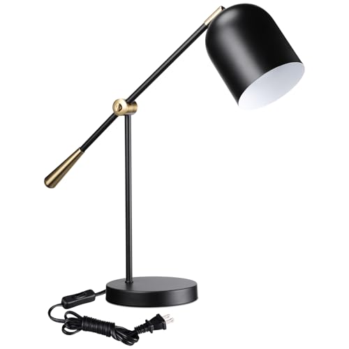 TORCHSTAR Adjustable Metal Desk Lamp Aesthetic, AC 110-120V E26 Base, Black
View Price
TORCHSTAR Adjustable Metal Desk Lamp Aesthetic, AC 110-120V E26 Base, Black
View Price
 MIULEE Decorative Couch Throw Pillow Covers 18x18 Inch Sage Green 2 Pack
View Price
MIULEE Decorative Couch Throw Pillow Covers 18x18 Inch Sage Green 2 Pack
View Price
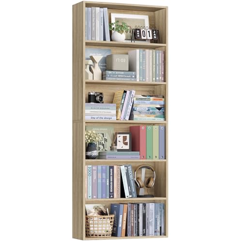 FOTOSOK 6 Tier Tall Bookshelf Bookcase with Open Display Shelves, Light Oak
View Price
FOTOSOK 6 Tier Tall Bookshelf Bookcase with Open Display Shelves, Light Oak
View Price
Balance Dark Walls With Lighter Furniture
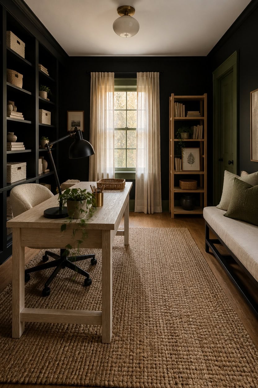
Light furniture keeps a green and black home office from feeling closed in, since pale wood or upholstery reflects light instead of adding a third dark layer. A 70/30 split works best: dark walls dominate, furniture stays light. This section pairs “Soot” walls with a whitewashed desk and cream seating for contrast that reads as designed, not accidental.
Pick a pale desk: A whitewashed or light oak desk breaks up the dark wall behind it.
Choose light seating: A cream or bone-colored office chair keeps the eye moving instead of sinking into the room.
Limit dark furniture pieces: One dark filing cabinet or bookcase is enough; more competes with the walls.
Layer in texture: Woven baskets or a jute rug add warmth without adding more dark color.
the soft green trim frames the room without the weight of a full dark wall.
the true black grounds the light furniture and keeps the storage wall from reading as an afterthought.
 IBF Modern White Computer Desk, Industrial Long Home Office Desk 60 Inch
View Price
IBF Modern White Computer Desk, Industrial Long Home Office Desk 60 Inch
View Price
 VANOMi Swivel Chairs for Living Room, 34" W Boucle Accent Chair, Cream
View Price
VANOMi Swivel Chairs for Living Room, 34" W Boucle Accent Chair, Cream
View Price
 FACBOTALL 82" Tall Bookshelf Bookcase 7-Tier Open Display Shelves,Light Oak
View Price
FACBOTALL 82" Tall Bookshelf Bookcase 7-Tier Open Display Shelves,Light Oak
View Price
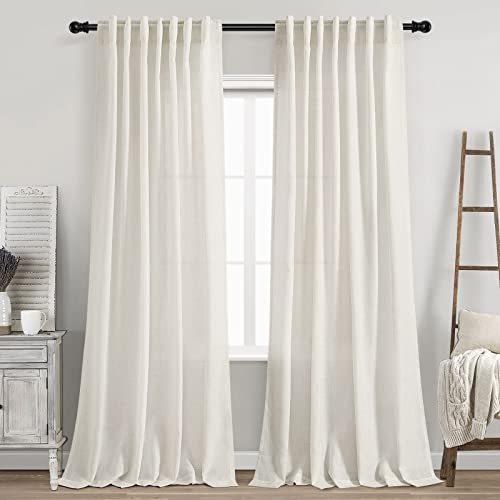 Cream Linen Back Tab Curtains 84 Inch Length for Living Room 2 Panel Set Neutral Modern Farmhouse Window Privacy Semi Sheer Linen Drapes Rustic Pinch Pleated Look Curtain Natural Ivory Colored
View Price
Cream Linen Back Tab Curtains 84 Inch Length for Living Room 2 Panel Set Neutral Modern Farmhouse Window Privacy Semi Sheer Linen Drapes Rustic Pinch Pleated Look Curtain Natural Ivory Colored
View Price
 Beverly Rug Easy Jute Natural Rug 8x10 Solid Washable Durable Outdoor Indoor Area Rugs for Living Dining Room Patio Office Stain Resistant Non Shedding Casual Indoor Outside Carpet 8 x 10 Natural
View Price
Beverly Rug Easy Jute Natural Rug 8x10 Solid Washable Durable Outdoor Indoor Area Rugs for Living Dining Room Patio Office Stain Resistant Non Shedding Casual Indoor Outside Carpet 8 x 10 Natural
View Price
 Vagusicc Wicker Storage Basket, Set of 2 Hand-Woven Paper Rope Wicker Basket, Small Storage Baskets for Organizing Toilet Paper Basket, Foldable Large Cube Storage Organizer Bins for Shelves (White)
View Price
Vagusicc Wicker Storage Basket, Set of 2 Hand-Woven Paper Rope Wicker Basket, Small Storage Baskets for Organizing Toilet Paper Basket, Foldable Large Cube Storage Organizer Bins for Shelves (White)
View Price
 MIULEE Faux Fur Decorative Throw Pillow Covers 18x18 Set of 2 Sage Green
View Price
MIULEE Faux Fur Decorative Throw Pillow Covers 18x18 Set of 2 Sage Green
View Price
Add Brass or Gold to Cut the Moodiness
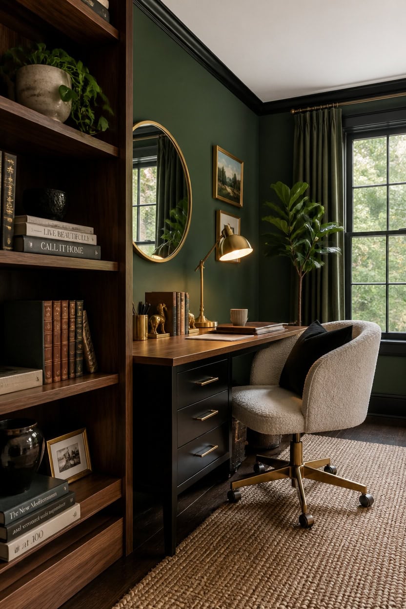
Warm metal finishes counter the weight of dark green and black walls by reflecting light instead of absorbing it the way matte paint does. Brass and gold read as warm accents against cool, moody backdrops, which keeps the room from feeling like a cave. In this office, the accent wall behind the desk gets painted a deep botanical green while trim stays black, and brass fixtures do the work of adding light back in.
Swap out hardware: Replace silver drawer pulls and cabinet knobs with brass or gold versions for an instant lift.
Layer in lighting: A brass desk lamp or gold-finished sconce throws warm light across dark walls.
Frame with gold: Gold picture frames or a mirror with a brass edge break up flat black or green surfaces.
Add small metal accents: A gold desk organizer or brass bookend keeps the metal story consistent without overdoing it.
the true black grounds the room and makes brass hardware pop against it.
the muted green softens the black trim and gives brass accents a warm surface to reflect against.
 eletecpro Aluminum Gallery Wall Frame Set of 7 with Glass Cover, Gold
View Price
eletecpro Aluminum Gallery Wall Frame Set of 7 with Glass Cover, Gold
View Price
 Goo-Ki 5 Inch Hole Center Antique Brass Zinc Alloy Cabinet Pulls Kitchen Cabinets Hardware, 6 Pack Vintage Brass Solid Cabinet Handles Drawer Pulls
View Price
Goo-Ki 5 Inch Hole Center Antique Brass Zinc Alloy Cabinet Pulls Kitchen Cabinets Hardware, 6 Pack Vintage Brass Solid Cabinet Handles Drawer Pulls
View Price
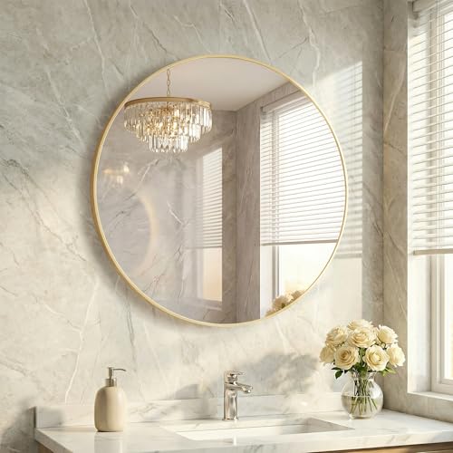 HAPPYMONT 24 Inch Gold Round Bathroom Wall Mirror, Round Mirrors for Wall Decor, Circle Mirror for with HD Shatter-Proof Glass for Entryway, Living Room, Bedroom, Dressing Room, Home Decor
View Price
HAPPYMONT 24 Inch Gold Round Bathroom Wall Mirror, Round Mirrors for Wall Decor, Circle Mirror for with HD Shatter-Proof Glass for Entryway, Living Room, Bedroom, Dressing Room, Home Decor
View Price
 BLU MONACO | Gold Desk Organizer Set with Mail Sorter, Sticky Note Holder, Pen Cup, Magazine Holder, Letter Tray & Business Card Holder | Stylish Desk Accessories for Women & Home Office Décor
View Price
BLU MONACO | Gold Desk Organizer Set with Mail Sorter, Sticky Note Holder, Pen Cup, Magazine Holder, Letter Tray & Business Card Holder | Stylish Desk Accessories for Women & Home Office Décor
View Price
 Alessk Dark Matte Gold Bookends for Shelves, Heavy Duty Metal Bookends Supports Heavy Books, Decorative Gold Stops for Home or Office Decoration - 3 Pairs (6 Pieces).
View Price
Alessk Dark Matte Gold Bookends for Shelves, Heavy Duty Metal Bookends Supports Heavy Books, Decorative Gold Stops for Home or Office Decoration - 3 Pairs (6 Pieces).
View Price
 SOFTHION Swivel Accent Chair, Sherpa Teddy Barrel Chair, Beige Cream White
View Price
SOFTHION Swivel Accent Chair, Sherpa Teddy Barrel Chair, Beige Cream White
View Price
Bring In Texture So Walls Don’t Go Flat
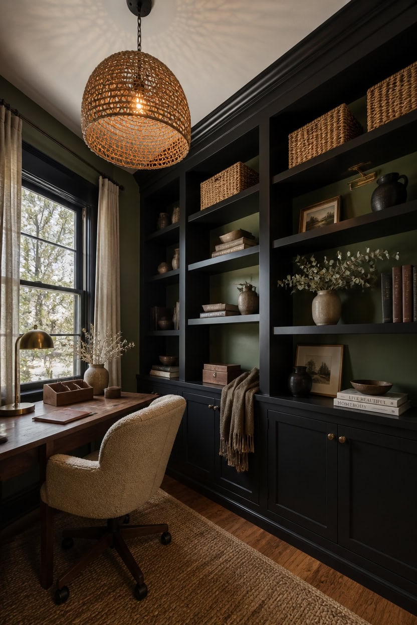
Layered materials—not just paint—give a moody office its depth, since flat sheens on green and black walls can look one-dimensional under warm light. Adding texture through woven baskets, wood grain, and matte versus glossy finishes creates visual movement without adding more color. This section keeps the built-in shelves as the texture hub, with painted back panels giving depth to whatever sits on them.
Mix matte and glossy: Pair a matte-painted wall with glossy black trim so light catches unevenly across the room.
Add woven baskets: Rattan or seagrass baskets on shelves break up smooth painted surfaces with natural texture.
Layer in wood grain: A wood desktop or wood-framed art adds warmth and grain against flat paint.
Use textiles on seating: A boucle or wool-blend chair cushion adds tactile softness that paint alone can’t provide.
the muted green gives depth behind books and objects without competing with them.
the near-black tone ties the shelves to the room’s black trim and lets textured items stand out.
 10.5 x 10.5in Seagrass Storage Baskets Set of 4, Cube Foldable Woven Storage Baskets for Shelves, Decorative Seagrass Shelf Basket
View Price
10.5 x 10.5in Seagrass Storage Baskets Set of 4, Cube Foldable Woven Storage Baskets for Shelves, Decorative Seagrass Shelf Basket
View Price
 pandapark Wood Organizer Tray,Black Walnut,Desk & Drawer Storage Box (Walnut Master)
View Price
pandapark Wood Organizer Tray,Black Walnut,Desk & Drawer Storage Box (Walnut Master)
View Price
 Foindtower Decorative Textured Boucle Throw Pillow Covers 24x24 Inch,White
View Price
Foindtower Decorative Textured Boucle Throw Pillow Covers 24x24 Inch,White
View Price
 LUCORUSC Hanging Light Lamp Shades Boho Rattan Lamp Shades, Woven LampShades for Floor Lamps Rattan Pendant Lights Boho Lamp Ceiling Light, Plug in Pendant Light Fixtures Hanging Lamp 1.54lb
View Price
LUCORUSC Hanging Light Lamp Shades Boho Rattan Lamp Shades, Woven LampShades for Floor Lamps Rattan Pendant Lights Boho Lamp Ceiling Light, Plug in Pendant Light Fixtures Hanging Lamp 1.54lb
View Price
 Large Modern Ceramic Vase Set, Black Ribbed Matte Finish, 3-Piece Decorative Vases for Home Living Room Office, 10 inch Tall, 4 inch Width (XL Black Mix)
View Price
Large Modern Ceramic Vase Set, Black Ribbed Matte Finish, 3-Piece Decorative Vases for Home Living Room Office, 10 inch Tall, 4 inch Width (XL Black Mix)
View Price
 SAFAVIEH Natural Fiber Area Rug 8x10, Jute Knotted Large Natural NF447A
View Price
SAFAVIEH Natural Fiber Area Rug 8x10, Jute Knotted Large Natural NF447A
View Price
 Shinnwa Dining Chair Cushions, Non-Slip Kitchen Chair Cushions with Ties and Machine Washable Cover, 17 x 16.5 x 2in, Natural Linen
View Price
Shinnwa Dining Chair Cushions, Non-Slip Kitchen Chair Cushions with Ties and Machine Washable Cover, 17 x 16.5 x 2in, Natural Linen
View Price
Hang Artwork That Pops Against Dark Walls
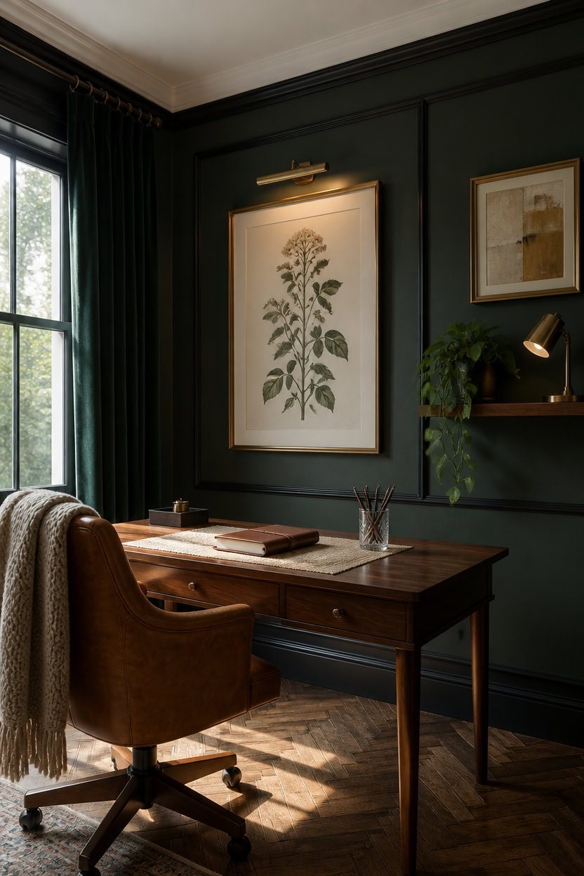
Artwork holds its color when the frame or mat creates a buffer between the piece and the wall behind it. Dark walls absorb light, so pieces with lighter backgrounds or metallic accents read clearly instead of disappearing into “Soot” or “Rosepine.” A single large piece above the desk works better than a cluttered gallery wall in a small office.
Choose high-contrast pieces: Botanical prints with cream backgrounds stand out against dark green or black walls.
Use metallic frames: Brass or gold frames catch light and separate the art from the wall.
Limit the count: One or two large pieces read better than many small ones in a compact room.
Add picture lights: A small brass picture light aims focus directly onto the art at night.
this deep muted green gives artwork a rich backdrop without pulling focus.
the near-black edge frames each piece like a built-in gallery.
 LLEEMPI Sage Green Botanical Wall Art Set of 3, 12x16 Wood Framed Prints
View Price
LLEEMPI Sage Green Botanical Wall Art Set of 3, 12x16 Wood Framed Prints
View Price
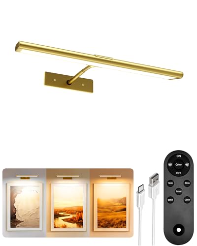 EZVALO Picture Light for Wall, 13'' Rechargeable Magnetic with Remote
View Price
EZVALO Picture Light for Wall, 13'' Rechargeable Magnetic with Remote
View Price
 ArtbyHannah Gallery Wall Frame Set, 8 Pack Neutral Wall Decor, Gold, Large
View Price
ArtbyHannah Gallery Wall Frame Set, 8 Pack Neutral Wall Decor, Gold, Large
View Price
 MUDECOR Framed Canvas Print Wall Art Abstract Neutral Tones Minimalist Earthy Color Palette Illustrations Modern Art Decorative Chic for Living Room, Bedroom, Office - 24"x36"x2 Natural
View Price
MUDECOR Framed Canvas Print Wall Art Abstract Neutral Tones Minimalist Earthy Color Palette Illustrations Modern Art Decorative Chic for Living Room, Bedroom, Office - 24"x36"x2 Natural
View Price
 Kate and Laurel Adlynn Traditional Picture Frame Set, Set of 5, Varying Sizes, Vintage Gold, Classic Wall Frame Set Collection with Hanging Template for Gallery Wall Picture Frame Display
View Price
Kate and Laurel Adlynn Traditional Picture Frame Set, Set of 5, Varying Sizes, Vintage Gold, Classic Wall Frame Set Collection with Hanging Template for Gallery Wall Picture Frame Display
View Price
 BAYKA Walnut-Like Floating Shelves 15.7in, 3 Pack, Wall Mounted Wall Decor
View Price
BAYKA Walnut-Like Floating Shelves 15.7in, 3 Pack, Wall Mounted Wall Decor
View Price
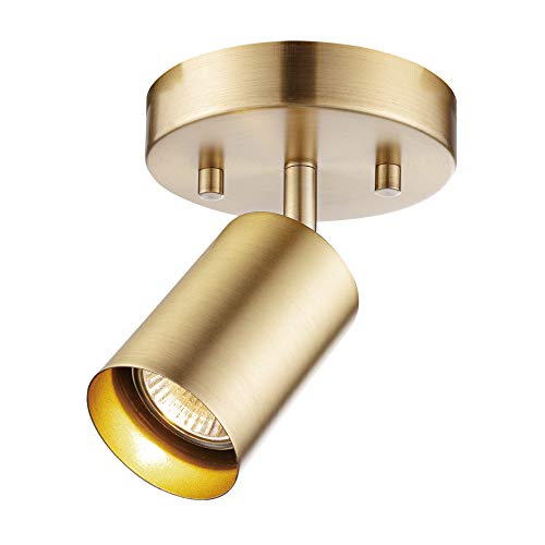 Globe Electric 1-Light Track Spotlight, Matte Brass, Pivoting Head, Dimmable, Modern Glam, 59765
View Price
Globe Electric 1-Light Track Spotlight, Matte Brass, Pivoting Head, Dimmable, Modern Glam, 59765
View Price
 Neutral Floral Wall Art Set of 3, Brown Framed Botanical Canvas Prints
View Price
Neutral Floral Wall Art Set of 3, Brown Framed Botanical Canvas Prints
View Price
Avoid Mistakes That Make a Moody Office Feel Cramped
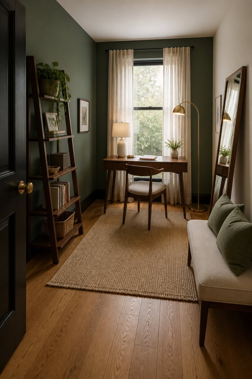
Cramped rooms usually suffer from too much dark saturation without a single light escape point, not from the dark color itself. A moody green and black office needs one pale surface, one reflective object, and floor-to-ceiling verticals to keep the eye moving upward instead of hitting a wall. Skip heavy drapery and bulky furniture that eats floor space near the door.
Skip full gloss walls: A flat or matte finish on dark green absorbs light evenly instead of bouncing glare around the room.
Leave one wall pale: Keep the wall opposite the desk in a light tone so the room has a visual exit point.
Avoid oversized furniture: A bulky credenza in a small office blocks sightlines and makes the ceiling feel lower.
Skip busy patterned rugs: A patterned rug under dark walls adds visual noise instead of grounding the room.
this muted sage green keeps storage from disappearing into the walls.
a matching dark line removes the boxy break between wall and floor.
 SHW Mission 32-Inch Home Office Computer Desk, Walnut
View Price
SHW Mission 32-Inch Home Office Computer Desk, Walnut
View Price
 Oneach 62" Gold Floor Lamp for Living Rooms Tall Arc Standing Lamps for Bedrooms Industrial Corner Nursery Girls Kid Vintage Mid-Century Modern Reading Light Office Antique Brass Shade Lantern
View Price
Oneach 62" Gold Floor Lamp for Living Rooms Tall Arc Standing Lamps for Bedrooms Industrial Corner Nursery Girls Kid Vintage Mid-Century Modern Reading Light Office Antique Brass Shade Lantern
View Price
 SOTTAE Modern Small Ceramic Table Lamp, White Irregular Geometric Bedside Table lamp for Bedroom,Nightstand Lamps with White Fabric Shade, Small Lamp for Kitchen Living Room
View Price
SOTTAE Modern Small Ceramic Table Lamp, White Irregular Geometric Bedside Table lamp for Bedroom,Nightstand Lamps with White Fabric Shade, Small Lamp for Kitchen Living Room
View Price
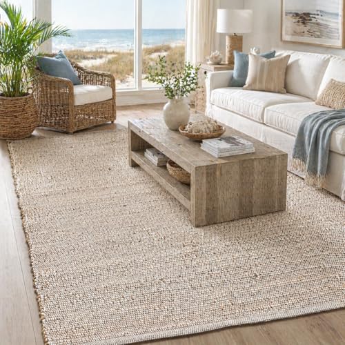 Chardin home 9x12 Jute Cotton Hand Woven Area Rug, Natural Jute/Cream
View Price
Chardin home 9x12 Jute Cotton Hand Woven Area Rug, Natural Jute/Cream
View Price
 LiveInUrban Acrylic Antique Mirror Wall Panels, Humidity Wall
View Price
LiveInUrban Acrylic Antique Mirror Wall Panels, Humidity Wall
View Price
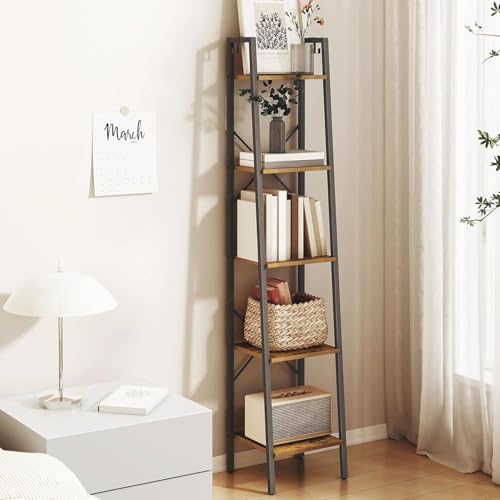 Hzuaneri Ladder Shelf, Bookshelf, Freestanding Corner Storage Shelf
View Price
Hzuaneri Ladder Shelf, Bookshelf, Freestanding Corner Storage Shelf
View Price
 MIULEE Set of 2 Sage Green Boho Decorative Pillow Covers 18x18 Inch
View Price
MIULEE Set of 2 Sage Green Boho Decorative Pillow Covers 18x18 Inch
View Price
 Wood Full Length Mirror 71"x30", Large Solid Wood Frame Floor Mirror
View Price
Wood Full Length Mirror 71"x30", Large Solid Wood Frame Floor Mirror
View Price