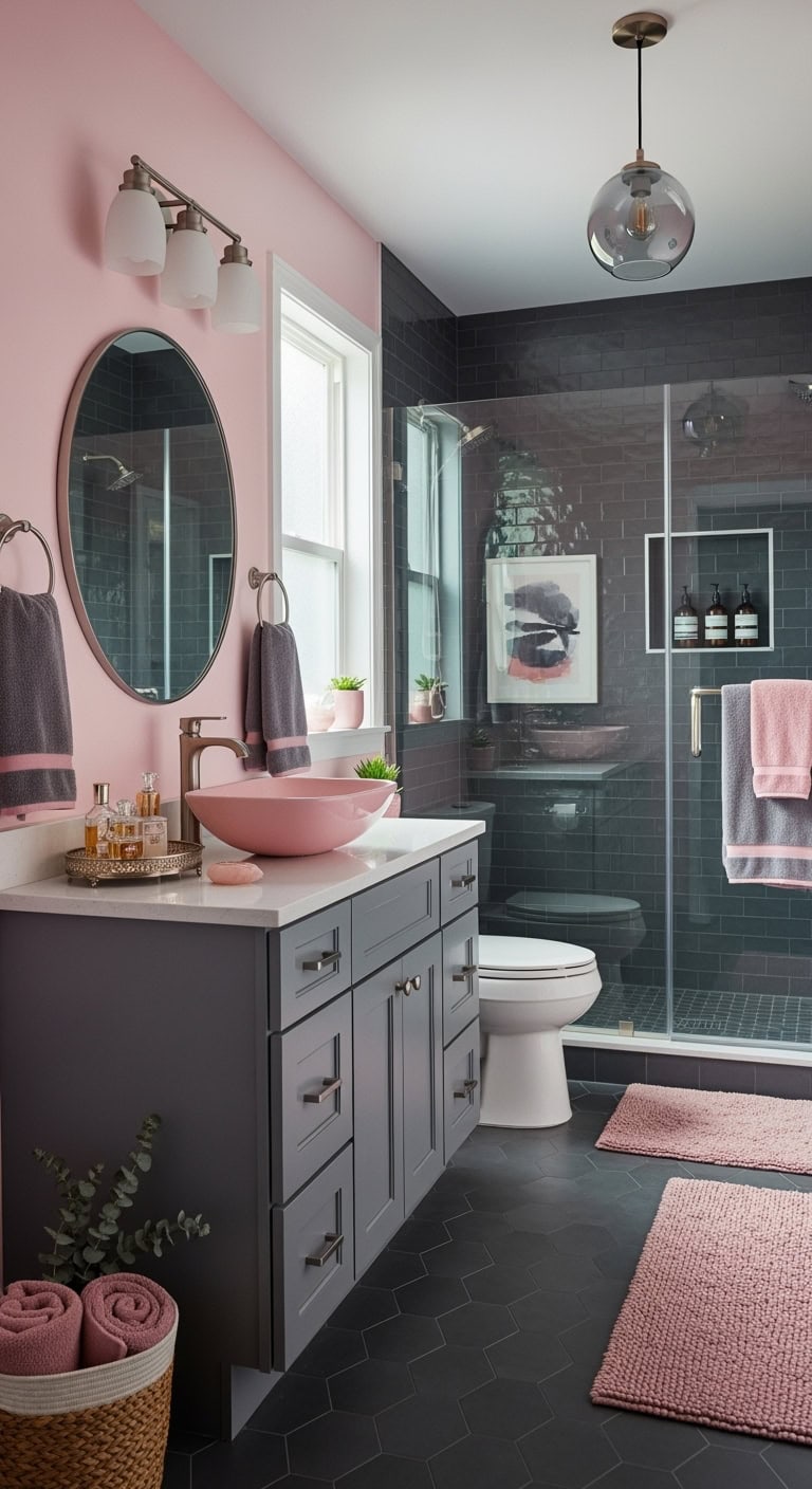
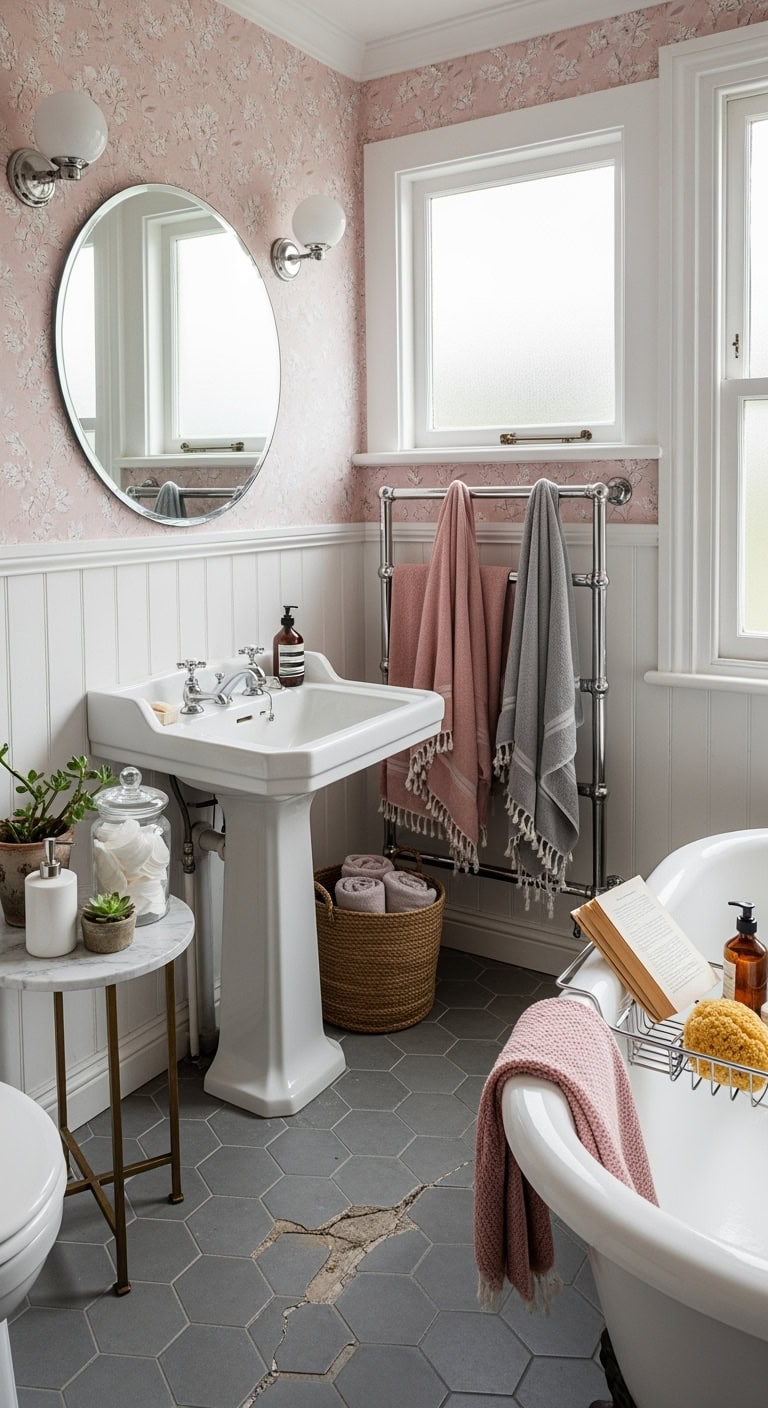
When Pink and Gray Bathroom Ideas Hit Differently Than Expected
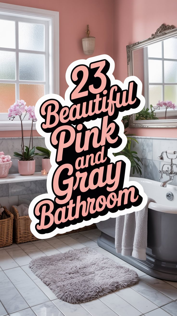
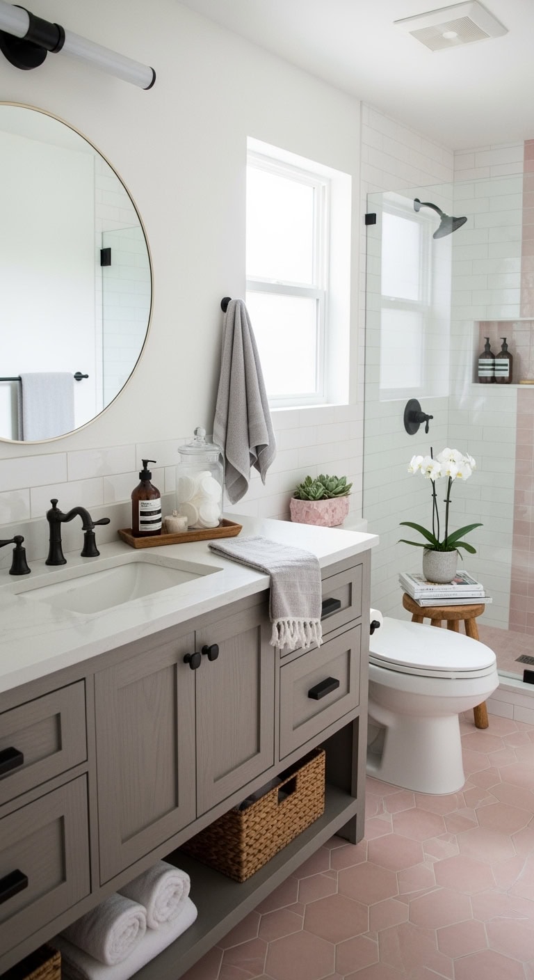
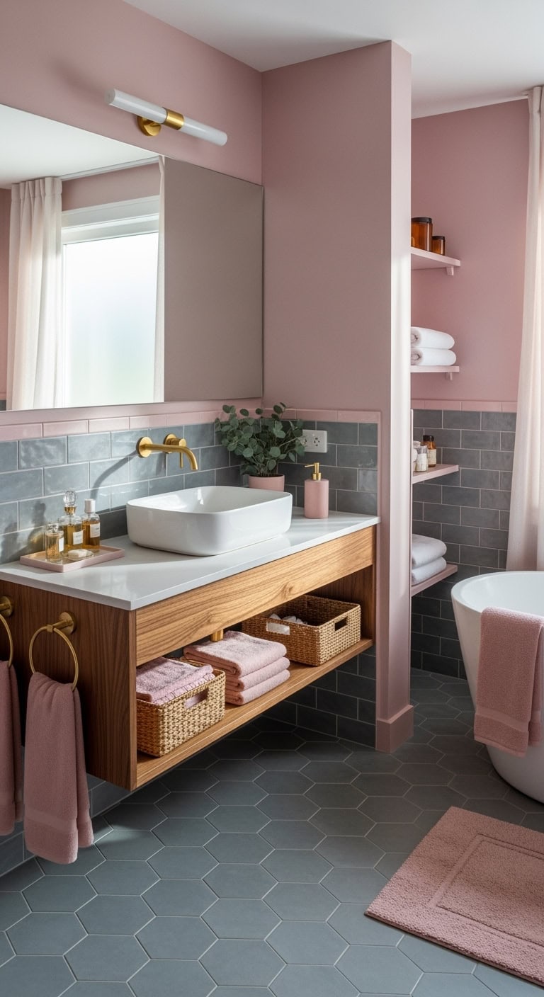
Oh my goodness, remember when you fell in love with that dreamy pink and gray bathroom on Pinterest? Totally get it! These colors are everywhere because they’re like the perfect marriage of cozy and chic.
The blush pink adds that soft, luxurious spa vibe, while gray keeps things grounded and modern. It’s basically the bathroom equivalent of rosé with your bestie – sophisticated but fun!
Table of Contents
1. Vintage Blush Tile Disaster
Remember that 1950s bathroom your grandma had with those pink tiles everywhere? Yeah, that’s what you’re desperately trying to avoid! The key is knowing when enough blush is enough – you don’t want your bathroom looking like a Pepto-Bismol explosion.
Here’s how to nail the vintage vibe without the disaster:
- Mix in crisp white subway tiles to break up the pink
- Add black fixtures for that retro-modern edge
- Include natural wood accents to ground the sweetness
- Choose one statement pink element (like just the vanity)
- Layer in metallics – brass or gold, not chrome
Pro Tip: Follow the 60-30-10 rule: 60% neutral (gray/white), 30% soft pink, and 10% accent color. This keeps your bathroom vintage-inspired rather than vintage-trapped!
2. Peeling Paint Reveals Avocado
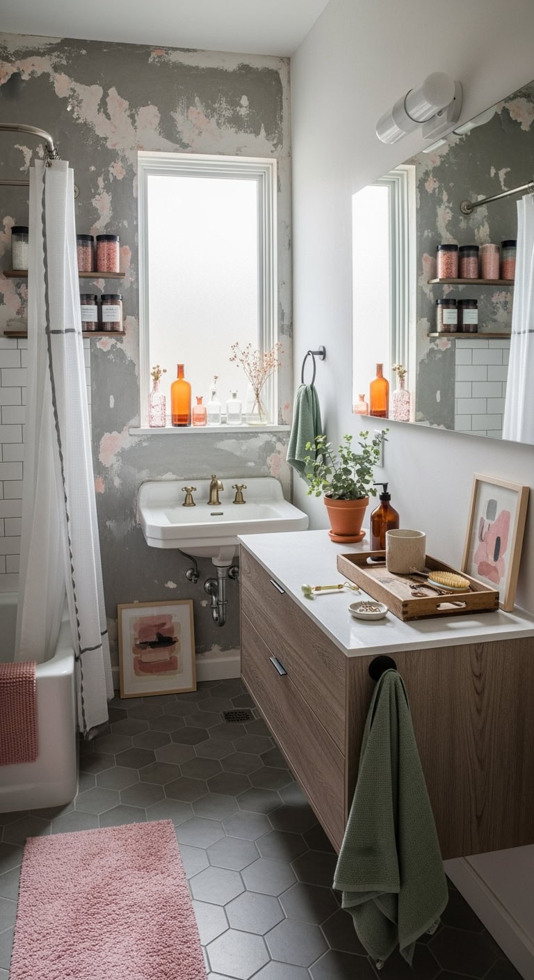
Oh no, you’ve started peeling that old paint and discovered the horror beneath – avocado green! Don’t panic, this actually creates an unexpectedly chic opportunity. That retro green can become your secret weapon for a sophisticated pink-gray palette.
Work with it, not against it:
- Frame the avocado area with crisp white molding
- Add dusty rose accents to create a vintage botanical vibe
- Incorporate sage green towels to bridge the color gap
- Install gray hexagon floor tiles for modern grounding
- Choose matte black hardware to tie everything together
Pro Tip: Embrace the “perfectly imperfect” trend by leaving one small section of that avocado visible behind glass shelving – it’s like displaying vintage wallpaper as art. Your friends will think you’re a design genius who planned it all along!
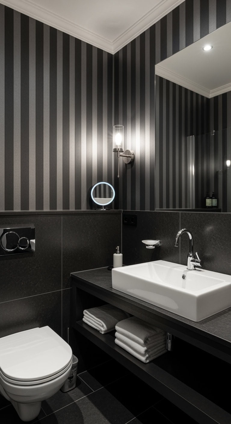
3. Millennial Pink Grout Catastrophe
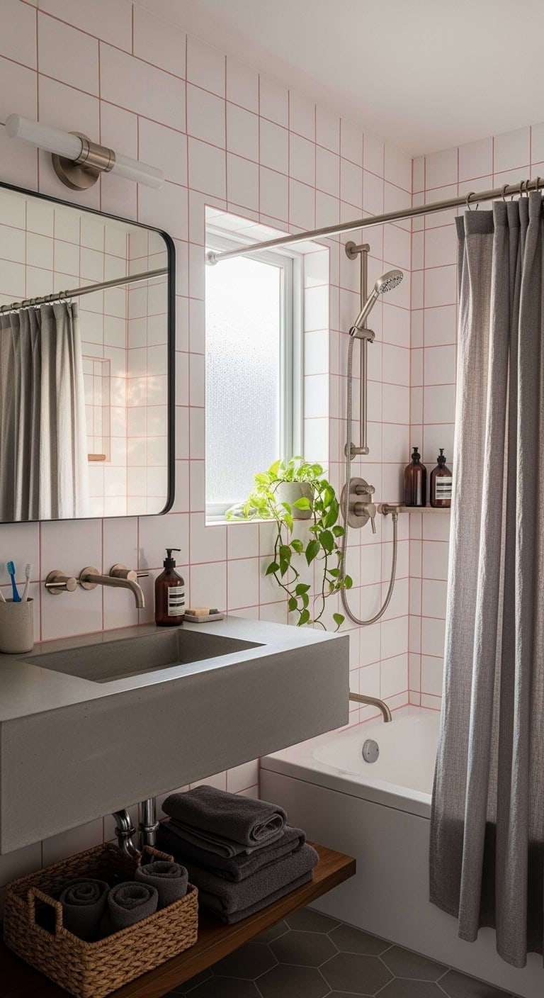
You went for that trendy millennial pink grout and now your bathroom looks like a Barbie fever dream gone wrong. We’ve all been there – Pinterest made it look so chic!
Apply gray grout pen over sections for an ombré effect
Install oversized charcoal tiles to minimize grout lines
Add concrete-look accessories for industrial balance
Hang matte gray shower curtains for visual relief
Choose brushed nickel fixtures to cool things down
Pro Tip: Lean into the mistake by creating a gradient effect – use the pink grout with white tiles up top, shifting to gray tiles with gray grout below. It’ll look intentional, like you’re channeling those trendy sunset walls everyone’s obsessed with!
4. Mirror Reflects Wrong Pink
That vintage mirror you scored at the flea market? Turns out it has a subtle pink tint that’s throwing off your whole gray palette. Now everything reflected looks like you’re living inside a rosé bottle!
- Switch to matte black or pewter frames for neutral reflection
- Layer multiple smaller mirrors to break up the pink cast
- Install LED strip lighting with cool tones around the mirror
- Place gray-leafed plants nearby to neutralize the reflection
- Add charcoal wall art to draw eyes away from the tinted glass
Pro Tip: Work with it! Position blush accessories strategically in the reflection while keeping the actual bathroom strictly gray. The mirror becomes an artistic element that adds warmth without overwhelming your cool color scheme.
5. Salmon Clashes With Charcoal
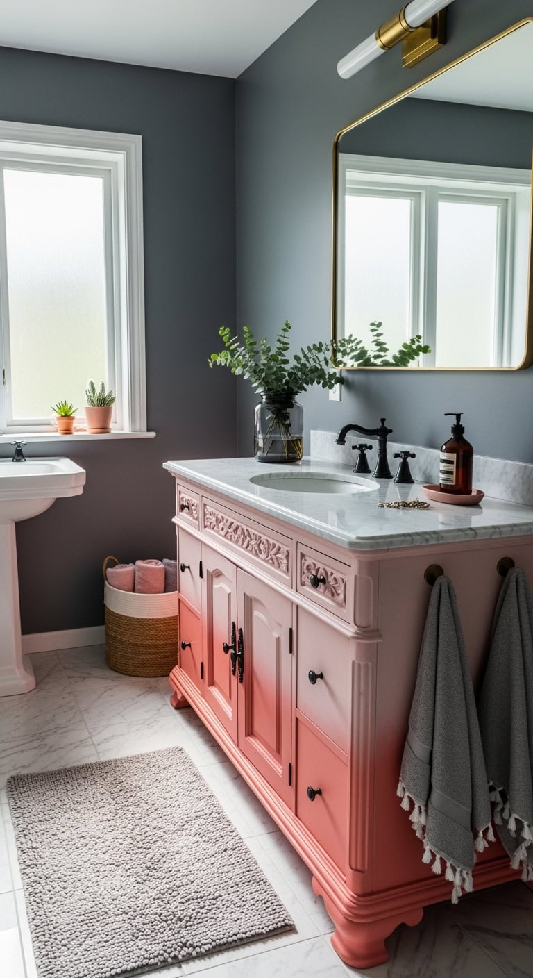
Remember that salmon-colored vanity you inherited from grandma? Yeah, it’s having a serious personality clash with your sleek charcoal walls. It’s like watching a tropical sunset argue with a thunderstorm – dramatic but not in a good way!
- Paint the vanity hardware matte black to bridge the gap
- Add warm gray towels to soften the contrast
- Install a white marble countertop as a neutral buffer
- Incorporate brass fixtures to warm up the charcoal
- Layer in dusty rose accents to create a gradient effect
Pro Tip: Embrace the drama by going full ombré! Paint the lower cabinets in graduated shades from salmon to dusty pink to gray. This creates intentional flow rather than accidental clash, turning your “oops” into a designer moment.


6. Mauve Vanity Meets Concrete
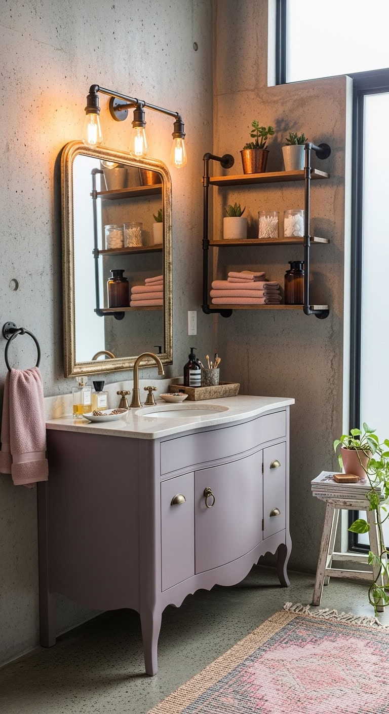
That mauve vanity you scored at the estate sale is giving your industrial concrete walls major identity crisis vibes. It’s like your bathroom can’t decide if it wants to be a French château or a Brooklyn loft – and honestly, the confusion is real!
- Add black iron shelving to marry industrial with feminine
- Layer in blush textiles to soften concrete’s harshness
- Install Edison bulb vanity lights for warm ambiance
- Incorporate weathered wood accents as a bridge material
- Hang a vintage mirror with ornate detailing
Pro Tip: Lean into the contrast by adding metallic copper accessories. They’ll warm up the concrete while complementing mauve’s undertones, creating an unexpectedly chic industrial-glam vibe that actually works!
7. Rose Gold Hardware Nightmare
So you went all-in on rose gold hardware and now your bathroom looks like a jewelry box exploded? Those handles are fighting with your gray walls harder than siblings over the last slice of pizza. The metallic overload is giving Vegas hotel bathroom, not spa sanctuary!
- Mix in matte black fixtures to break up the shine
- Add natural wood elements to ground the metallics
- Choose soft pink towels in linen or cotton textures
- Install dimmable lighting to control the glare
- Incorporate living plants for organic balance
Pro Tip: Keep rose gold to three key pieces max – faucet, mirror frame, and cabinet pulls. Balance with brushed nickel or matte finishes elsewhere. Your bathroom should whisper luxury, not scream it!
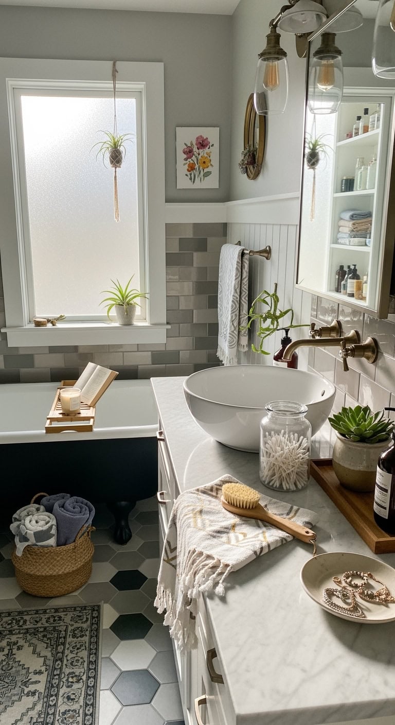
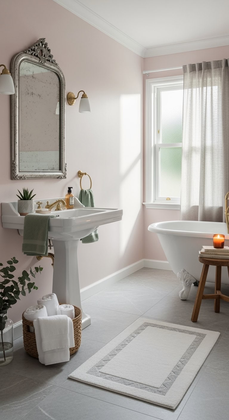
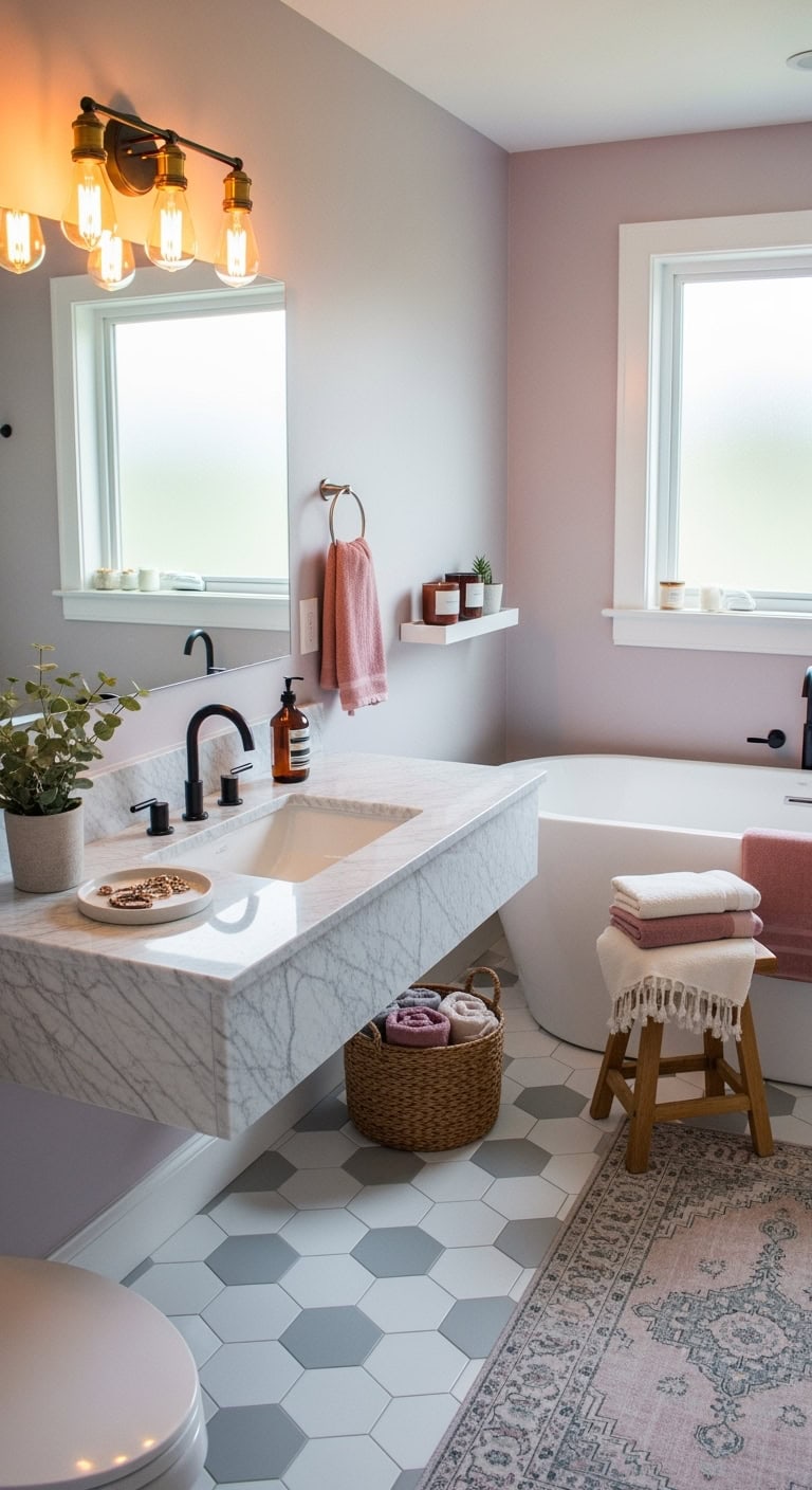
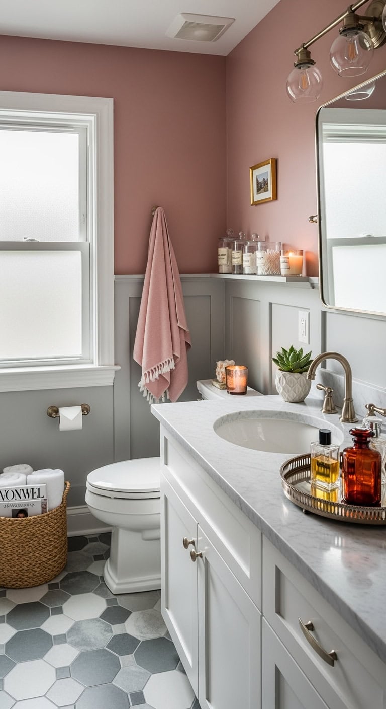
8. Dusty Rose Meets Slate
The most sophisticated combo in the pink-gray game! Dusty rose and slate gray are like that power couple everyone secretly envies – they just work. This palette screams “I read design blogs but also have a real job.” Your bathroom suddenly looks like it belongs in a boutique hotel where they serve cucumber water.
- Layer dusty rose bath mats over slate floor tiles
- Choose smoky gray marble with pink veining
- Add blush velvet storage baskets for texture
- Install slate gray subway tiles with pink grout
- Mix in brass accents for warmth
Pro Tip: Keep dusty rose to 30% of your color scheme – walls OR accessories, not both. Let slate dominate as your neutral base. This ratio keeps things elegant instead of Easter egg!

9. Bubble Gum Meets Storm
Talk about a plot twist! Pairing bubble gum pink with stormy gray is like wearing a tutu with combat boots – unexpected but totally works. This combo says “I’m fun but also mysterious.” Your bathroom becomes this moody-meets-playful space where serious adulting happens alongside spontaneous dance parties.
- Paint one accent wall in bubblegum pink
- Choose charcoal gray tiles with pink accessories
- Add storm-colored towels with pink piping
- Install a pink vessel sink against gray vanity
- Mix in silver hardware for cohesion
Pro Tip: Use stormy gray as your dominant color (70%) and let bubble gum pink pop through in strategic spots – mirror frame, artwork, or a statement light fixture. Too much pink and you’re in Barbie territory!
10. Powder Room Flamingo Fiasco
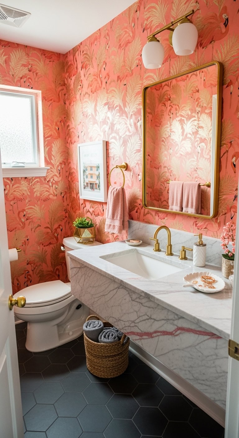
Who says powder rooms can’t party? A flamingo-inspired powder room is your chance to go full tropical drama without commitment. Think Miami meets your aunt’s vacation photos – vibrant, slightly chaotic, but somehow fabulous. This tiny space lets you release your inner maximalist while guests wonder if they’ve stumbled into a chic beach club.
- Flamingo pink wallpaper with metallic accents
- Gray marble countertop with pink veining
- Gold faucets and mirror frame
- Tropical artwork or actual flamingo prints
- Blush pink hand towels with gray embroidery
Pro Tip: Since powder rooms are small, you can afford to go bold without breaking the bank. Balance the flamingo frenzy with sophisticated gray flooring and keep the ceiling white – it prevents that “trapped in a pink box” feeling!
11. Coral Subway Tile Betrayal
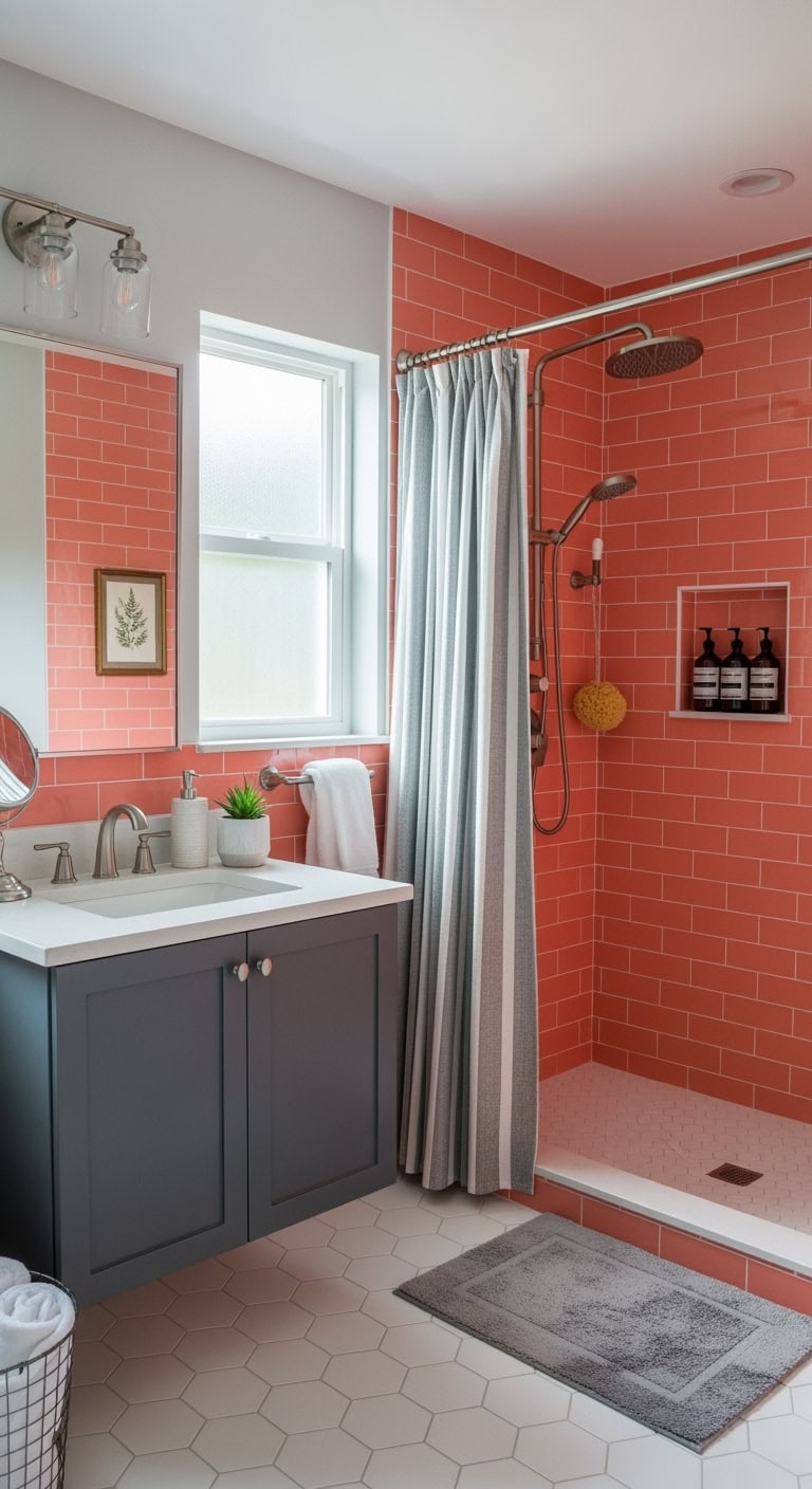
Remember that Pinterest board where coral subway tiles looked dreamy? Yeah, reality hits different. Your bathroom now screams “sunset gone wrong” every morning. But don’t reach for the sledgehammer yet! Those peachy-pink tiles can actually work with the right gray companions – think of it as taming a wild color with sophisticated neutrals.
- Soft dove gray walls to cool down the coral intensity
- White grout to crisp up the tile lines
- Charcoal gray vanity for grounding contrast
- Silver hardware and light fixtures
- Gray and white striped shower curtain
Pro Tip: Coral tiles reflect warm light, so stick with cool-toned LED bulbs to prevent your bathroom from looking like a tanning bed. Add plenty of white accessories to break up the coral dominance!

12. Fuchsia Overwhelms Pewter Walls
- Tone down with white wainscoting halfway up the fuchsia wall
- Add natural wood shelving to warm up the pewter
- Incorporate cream-colored towels and bath mats
- Install soft brass fixtures for warmth
- Layer in gray and white geometric prints
Pro Tip: Fuchsia needs breathing room! Paint just one accent section instead of the full wall, or create a fuchsia focal point with artwork instead. The 60-30-10 rule saves lives: 60% pewter, 30% white, 10% fuchsia.
13. Blush Wallpaper Peels Unexpectedly
Oh no, your dreamy blush wallpaper is staging its own dramatic exit! Don’t panic – this bathroom rebellion can totally work in your favor. Time to embrace the perfectly imperfect vibe:
- Layer removable peel-and-stick tiles over problem spots for instant texture
- Frame the peeling sections with decorative molding for that “intentional vintage” look
- Add floating shelves where wallpaper meets wall to hide seams
- Install a statement mirror that draws eyes away from rebel corners
- Mix in blush fabric shower curtains to echo the wallpaper’s soft tones
Pro Tip: Before you rip it all down, try wallpaper adhesive spray on loose edges first! If that fails, lean into the shabby chic aesthetic – sometimes the best designs happen by happy accident. Your bathroom’s telling its own story now!
14. Grout Lines Turn Purple
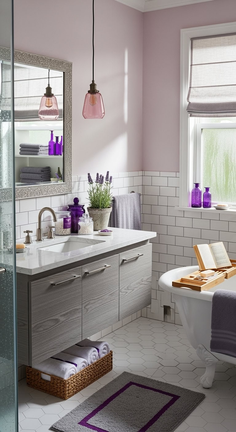
Purple grout? Your bathroom just went rogue with an unexpected color plot twist! Instead of scrubbing yourself silly, let’s make this funky situation totally fabulous:
- Add lavender bath accessories to make it look intentional
- Install pink-tinted lighting that makes purple grout appear rosier
- Bring in silver fixtures that complement both pink and purple tones
- Layer gray bath mats with purple accents to tie it all together
- Display amethyst-colored glass bottles for that spa-worthy vibe
Pro Tip: Mix equal parts baking soda and hydrogen peroxide for a DIY grout lightener if you’re really not feeling the purple life. But honestly? This accidental ombré effect might just be your bathroom’s signature look – lean into that unicorn energy!

15. Textured Pink Walls Gone Wrong
Textured pink walls looking more like bubble gum gone bad? Girl, we’ve all been there with those Pinterest fails! Transform your bumpy blush disaster into deliberate drama:
- Hang oversized mirrors to reflect light and minimize texture visibility
- Install floating gray shelves to break up the wall chaos
- Add smooth marble accessories for contrast against rough surfaces
- Layer white sheer curtains if near windows to soften the look
- Incorporate metallic wall sconces that draw eyes upward, not outward
Pro Tip: Embrace the texture by dry-brushing white paint over the highest points – it’ll create a sophisticated limewash effect that looks totally intentional. Sometimes the best fix isn’t covering up; it’s doubling down with confidence!
16. Marble Veining Turns Orange
That gorgeous pink marble you ordered arrived looking more peachy-orange than promised? Don’t panic – this color shift happens way more than Instagram admits! Work with what you’ve got:
- Paint walls in cool-toned gray to neutralize warm undertones
- Add crisp white fixtures and chrome hardware for balance
- Layer in deep charcoal textiles to ground the space
- Bring in eucalyptus plants for natural green contrast
- Install cool LED bulbs instead of warm ones
Pro Tip: Orange-toned marble actually pairs beautifully with sage green accents – think spa vibes meets sunset! Sometimes the “mistake” becomes your signature style when you lean into unexpected color combos.
17. Hex Code Translation Error
That perfect pink hex code looked stunning on your screen but painted up as bubblegum disaster? We’ve all been there! Digital colors are notorious liars. Here’s how to recover:
- Test paint samples in natural light AND evening lighting
- Mix custom shades – add tiny drops of gray to tone down brightness
- Use the “wrong” pink as an accent in artwork or towels
- Balance with matte black fixtures for instant sophistication
- Install dimmer switches to control color intensity
Pro Tip: Keep that receipt! Most paint stores will adjust custom colors for free within 30 days. Bring photos of your space in different lighting – they’ve seen every pink-gone-wrong scenario and know exactly which pigments to add for your perfect shade.
18. Two-Tone Terrazzo Floor Fails
That custom terrazzo floor with pink and gray chips looked amazing in the showroom, but now it’s reading more “static TV” than “sophisticated spa.” Don’t panic – you can absolutely work with this!
- Layer solid pink bath mats to create visual breaks
- Install floor-to-ceiling curtains to minimize floor visibility
- Add large-scale furniture pieces that interrupt the pattern
- Paint walls in solid coordinating shades to calm the chaos
- Use oversized mirrors to reflect attention upward
Pro Tip: Embrace the busy floor as your room’s “neutral” base – it actually pairs beautifully with bold wallpaper or dramatic light fixtures since it already contains both your key colors. Think of it as your built-in color palette!
19. Lighting Washes Colors Muddy
Your gorgeous pink and gray palette looks like dishwater under those builder-grade lights – we’ve all been there! The wrong bulbs can turn your dreamy blush into beige and your sophisticated gray into prison cell chic.
- Switch to 3000K warm white bulbs for flattering pink tones
- Install dimmer switches to control color intensity throughout the day
- Add vanity lights with adjustable color temperature
- Position accent lighting to highlight your prettiest pink accessories
- Use candlelight during evening soaks for instant ambiance
Pro Tip: Test paint swatches under different lighting conditions before committing! Tape samples in multiple spots and check them morning, noon, and night. Your “perfect pink” at noon might turn peachy at sunset – better to know before you paint the whole room!
20. Clashing Undertones Create Chaos
That perfect pink and gray combo can go sideways fast when undertones start fighting! Your cool gray walls might clash with warm peachy-pink towels, creating visual chaos that makes your spa sanctuary feel more like a design disaster.
- Choose pinks and grays with matching undertones (both cool or both warm)
- Test fabric swatches against your paint color before buying
- Stick to blue-based pinks with blue-gray companions
- Pair peachy pinks with warmer greige tones
- Use white as a neutral buffer between conflicting shades
Pro Tip: Hold a piece of pure white paper next to your pink and gray samples – if the pink looks orange-y and the gray looks green-ish together, they’re from different color families! Save yourself the headache and pick shades that play nice.
21. Matte Paint Shows Every Smudge
Visualize this: you’ve painted your bathroom in the dreamiest matte pink and gray combo, but now every fingerprint and water splash shows up like a neon sign! That gorgeous velvety finish you fell in love with? It’s basically a magnet for every single smudge, splash, and steamy handprint.
- Switch to satin or semi-gloss paint for easy wipe-downs
- Reserve matte finishes for the ceiling only
- Add a clear protective coating over matte walls
- Install wainscoting to protect high-traffic areas
- Choose darker shades that hide marks better
Pro Tip: Love that matte look but hate the maintenance? Use matte paint on your upper walls (above 4 feet) where little hands can’t reach, then go glossy below. You’ll get that sophisticated vibe without the constant cleaning marathon!
22. Waterproof Mascara Stains Everywhere
Visualize this nightmare: your beautiful pink and gray bathroom has become a crime scene of mascara smudges! Those waterproof formulas you swear by? They’re leaving dark streaks on your pristine pink towels and gray countertops like tiny rebellion marks.
- Install a magnifying mirror away from fabric surfaces
- Add a dedicated makeup station with wipeable surfaces
- Choose darker gray towels for face-wiping duties
- Keep makeup remover wipes in a stylish dispenser
- Use a silicone sink mat during your beauty routine
Pro Tip: Mount a small acrylic shelf directly under your bathroom mirror to catch any makeup fallout. It’s invisible when clean but saves your countertops from becoming a Jackson Pollock painting of beauty products!
23. Floor-to-Ceiling Gradient Gone Wrong
Picture walking into your bathroom where the pink-to-gray gradient looks less “sunset dreams” and more “confused cotton candy machine.” You started with blush at the ceiling, but somewhere around eye level, things went rogue – now it’s giving major “gender reveal party gone wrong” vibes!
- Break up the gradient with white horizontal trim at strategic heights
- Add artwork to interrupt the color flow where it gets muddy
- Install floating shelves to create visual breaks
- Use mirrors to reflect and balance the color shift
- Place plants at varying heights to distract from awkward color zones
Pro Tip: If your gradient’s already painted and looking wonky, add a chair rail at the worst changeover point and paint below it solid gray. Instant sophistication, zero redoing the whole wall!
Conclusion
You’re standing in your bathroom, watching the morning light expose every design flaw. The peeling avocado paint mocks your Pinterest dreams while salmon tiles clash violently with charcoal grout. That millennial pink you thought would photograph beautifully? It’s now a waterproof mascara-stained nightmare reflecting endlessly in your mirrors. Take a deep breath. Sometimes the boldest design choices teach the harshest lessons, but you’ll transform this color chaos into something stunning—eventually.