Why Black & Cream Living Rooms Were Made for Women Who Treat Their Home Like a Gallery

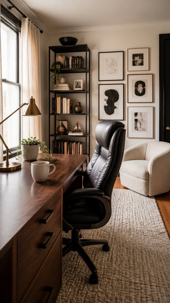
If you treat your living space like a personal gallery, a black and cream palette might be your perfect match. This timeless combination brings effortless sophistication to any room, letting each carefully chosen piece shine. Whether you’re refreshing your space or starting from scratch, here’s why this classic duo speaks to women who believe every detail matters.
Why Black and Cream Is a Design Philosophy, Not a Trend
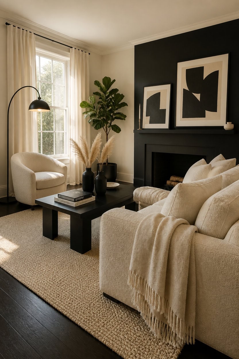
Black and cream work together because they share no competing undertone — one absorbs light and one reflects it, creating instant contrast without visual noise. That push-pull dynamic is what gives a room a gallery-like quality, where every object reads clearly against its background. Treat it as a permanent visual system rather than a color choice, and your room gains a timeless structure that never needs updating.
Anchor with black: Use black on one grounding element — a sofa leg, a light fixture, or a framed piece — to prevent cream from going flat.
Layer cream textures: Cream in linen, wool, and ceramic all read differently, so varying materials keeps the palette from looking monotone.
Limit pattern mixing: Stick to one geometric or organic pattern maximum; let the contrast between the two colors do the visual work.
Use proportion intentionally: A room that is 70% cream with 30% black feels airy and editorial rather than heavy or severe.
this pure, bright cream reflects natural light while making black accents feel sharp and deliberate.
this deep, matte black creates the kind of bold contrast that anchors the room like a piece of art.
 Womina Armless Accent Chairs Set of 2 Upholstered Living Room Side Chairs
View Price
Womina Armless Accent Chairs Set of 2 Upholstered Living Room Side Chairs
View Price
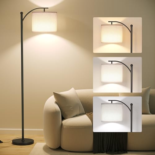 SUNMORY Arc Floor Lamp, Modern Floor Lamp with 3 Color Temperatures Bulb
View Price
SUNMORY Arc Floor Lamp, Modern Floor Lamp with 3 Color Temperatures Bulb
View Price
 Bedsure Lightweight 100% Cotton Waffle Blanket, Throw XL, Linen
View Price
Bedsure Lightweight 100% Cotton Waffle Blanket, Throw XL, Linen
View Price
 FWIEXA Modern Abstract Canvas Wall Art Set of 3, Framed Neutral Wall Decor, Large Black White Wall Painting, Beige Cream 24x36 Inch Prints Artworks for Living Room, Bedroom, Dining Room, Office
View Price
FWIEXA Modern Abstract Canvas Wall Art Set of 3, Framed Neutral Wall Decor, Large Black White Wall Painting, Beige Cream 24x36 Inch Prints Artworks for Living Room, Bedroom, Dining Room, Office
View Price
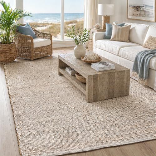 Chardin home 5x7 Jute Cotton Hand Woven Area Rug, Natural Jute/Cream Braided Boho Farmhouse Rug, Rustic Vintage Reversible Natural Fiber Rug for Living Room, Bedroom, Dining Room, Office, or Entryway
View Price
Chardin home 5x7 Jute Cotton Hand Woven Area Rug, Natural Jute/Cream Braided Boho Farmhouse Rug, Rustic Vintage Reversible Natural Fiber Rug for Living Room, Bedroom, Dining Room, Office, or Entryway
View Price
 Minimal Line Black Ceramic Vase Set of 3, Matte Decorative Flower Vases
View Price
Minimal Line Black Ceramic Vase Set of 3, Matte Decorative Flower Vases
View Price
 MIULEE Velvet Throw Pillow Covers 18x18 Inch Pack of 2 Cream White
View Price
MIULEE Velvet Throw Pillow Covers 18x18 Inch Pack of 2 Cream White
View Price
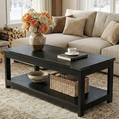 Homieasy 43.3” Farmhouse Coffee Table with Storage Shelf, Black
View Price
Homieasy 43.3” Farmhouse Coffee Table with Storage Shelf, Black
View Price
What a Black and Cream Living Room Does to the Mind and Mood
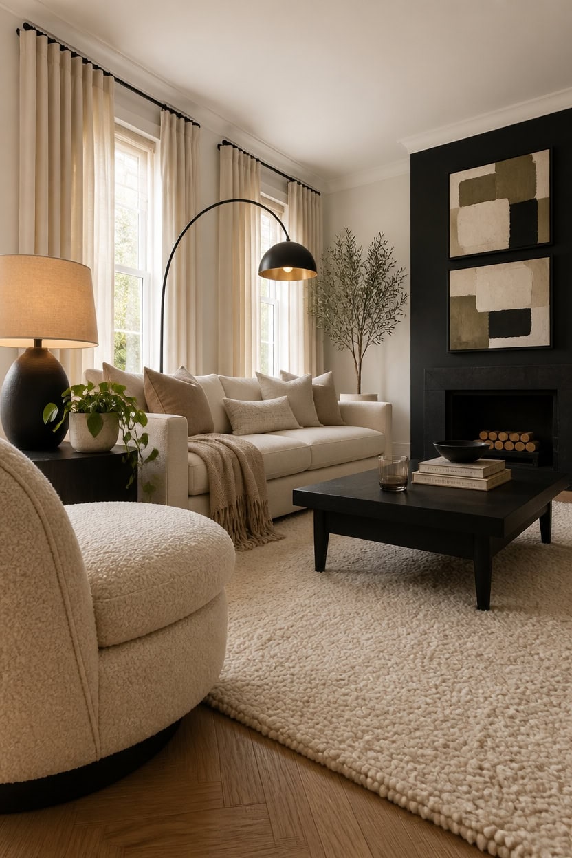
Black and cream create a psychological environment that is both stimulating and calming because the brain processes high contrast quickly, then relaxes into the quiet palette. That rapid read-and-settle effect is what makes a black and cream room feel organized without feeling sterile. Keep stimulating elements — bold black frames, dark vases — to the upper and lower edges of the room so the eye moves naturally without fatigue.
Use contrast to focus attention: Place black accents near the pieces you want noticed first, like art or a statement chair.
Let cream carry calm: Wide expanses of cream on walls and upholstery signal visual rest and reduce ambient stress in the space.
Ground restless energy: A black coffee table or dark rug anchors the room and prevents the all-cream base from feeling unresolved.
Control the pace: Fewer, larger black accents feel slow and editorial; scattered small ones feel busy and unsettled.
this soft, warm cream wraps the room in a low-stimulation tone that lets black accents land with full psychological weight.
this near-black anchors the mood and gives the eye one deliberate place to land and rest.
 KISLOT, Modern Boucle Accent Chair, Curved Backrest, Cream
View Price
KISLOT, Modern Boucle Accent Chair, Curved Backrest, Cream
View Price
 【Upgraded】Black Arc Floor Lamps for Living Room - Dimmable Arched Floor Lamp with Remote Control & 2700-6000K 9W LED Bulb Included, Modern Arch Standing lamp, Industrial Tall Lamp for Bedroom Reading
View Price
【Upgraded】Black Arc Floor Lamps for Living Room - Dimmable Arched Floor Lamp with Remote Control & 2700-6000K 9W LED Bulb Included, Modern Arch Standing lamp, Industrial Tall Lamp for Bedroom Reading
View Price
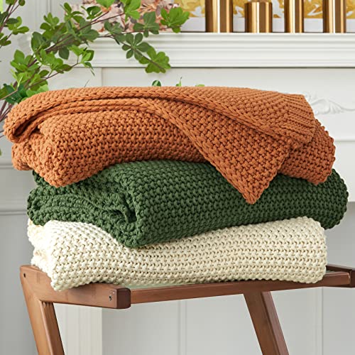 Longhui bedding Chunky Cable Knit Throw Blanket Lightweight Cream 100% Organic Cotton Blanket for Sofa Couch Bed Baby Nursery, Rustic Shabby Chic Modern Farmhouse, 51” x 63” Give Laundering Bag
View Price
Longhui bedding Chunky Cable Knit Throw Blanket Lightweight Cream 100% Organic Cotton Blanket for Sofa Couch Bed Baby Nursery, Rustic Shabby Chic Modern Farmhouse, 51” x 63” Give Laundering Bag
View Price
 HOURIA Mid Century Geometric Black Cat Framed Canvas Wall Art Set,Abstract Modern Orange and Cream Wall Decor,Round Eyes Playful Kitten Animal Artwork for Nursery,Living Room,Bedroom,Office- 16"x24"x3
View Price
HOURIA Mid Century Geometric Black Cat Framed Canvas Wall Art Set,Abstract Modern Orange and Cream Wall Decor,Round Eyes Playful Kitten Animal Artwork for Nursery,Living Room,Bedroom,Office- 16"x24"x3
View Price
 ANSSO Wool Rugs 8x10 for Living Room,80% Merino Wool and 20% Cotton Soft Tufted Area Rug with Cotton Non-Slip Backing,Large Area Rug for Bedroom Bedroom, Dining and Home Office (Beige Cream)
View Price
ANSSO Wool Rugs 8x10 for Living Room,80% Merino Wool and 20% Cotton Soft Tufted Area Rug with Cotton Non-Slip Backing,Large Area Rug for Bedroom Bedroom, Dining and Home Office (Beige Cream)
View Price
 Seealle 23" Modern Ceramic Table Lamps Set of 2, Lamps for Bedroom, Black
View Price
Seealle 23" Modern Ceramic Table Lamps Set of 2, Lamps for Bedroom, Black
View Price
 JUSPURBET Decorative Velvet Throw Pillow Covers 20x20 Set of 2,Cream White
View Price
JUSPURBET Decorative Velvet Throw Pillow Covers 20x20 Set of 2,Cream White
View Price
 24In Black Round Side Table, Modern Accent End Table with Curved Integrated Tripod Base, Minimalist Large Round Sofa Side Table Nightstand for Living Room Bedroom Balcony
View Price
24In Black Round Side Table, Modern Accent End Table with Curved Integrated Tripod Base, Minimalist Large Round Sofa Side Table Nightstand for Living Room Bedroom Balcony
View Price
What Gives a Black and Cream Living Room Its Gallery Feel?
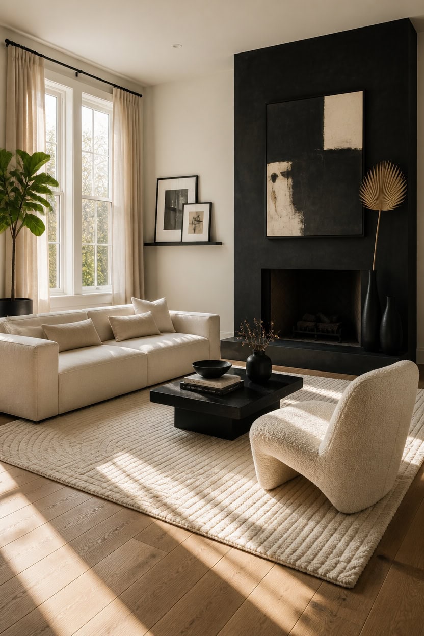
Gallery-feel rooms treat every object as an intentional decision, which means negative space is as important as what fills it. When cream walls act as the background and black objects are placed like curated pieces, the room stops feeling decorated and starts feeling edited. Limit black to five to seven deliberate placements, and the room reads as a collection rather than an accumulation.
Treat walls as backdrops: Cream walls do the same job as white gallery walls — they disappear and let the objects lead.
Frame everything visually: Place black-framed art, dark vessels, and sculptural objects with breathing room on all sides so each piece reads as intentional.
Edit ruthlessly: A gallery removes more than it keeps — pull out anything that doesn’t earn its place in the palette or the story.
Vary scale deliberately: Mixing a large black art piece with smaller dark accents creates the kind of visual hierarchy you see in a curated exhibit.
this warm cream acts as a neutral backdrop that makes every black accent read as a deliberate artistic choice.
this near-black transforms a structural surface into an anchor piece the way a gallery’s focal wall works.
 ArtbyHannah Black Gallery Wall Wood Picture Frame Set for Living Room Large
View Price
ArtbyHannah Black Gallery Wall Wood Picture Frame Set for Living Room Large
View Price
 Modway Monica 88 Inch Boucle Sofa in Cream – Comfortable Low Profile 3 Seater Fabric Couch for Living Room, Bedroom, Or Apartment
View Price
Modway Monica 88 Inch Boucle Sofa in Cream – Comfortable Low Profile 3 Seater Fabric Couch for Living Room, Bedroom, Or Apartment
View Price
 Large Framed Boho Black White Abstract Wall Art for Living Room, 24x36 In
View Price
Large Framed Boho Black White Abstract Wall Art for Living Room, 24x36 In
View Price
 Chifee & Vingol 28.9" Boucle Modern Swivel Accent Barrel Chair,Ivory
View Price
Chifee & Vingol 28.9" Boucle Modern Swivel Accent Barrel Chair,Ivory
View Price
 Modern Ceramic Vase Set, Black Ribbed Matte Design, 3-Piece Decorative Vases for Home, Living Room, Office (Black Mix)
View Price
ANSSO 5x7 Wool Rugs for Living Room,80% Merino Wool and 20% Cotton Soft Tufted Area Rug with Cotton Non-Slip Backing,Large Area Rug for Bedroom Bedroom, Dining and Home Office (Beige Cream)
View Price
Modern Ceramic Vase Set, Black Ribbed Matte Design, 3-Piece Decorative Vases for Home, Living Room, Office (Black Mix)
View Price
ANSSO 5x7 Wool Rugs for Living Room,80% Merino Wool and 20% Cotton Soft Tufted Area Rug with Cotton Non-Slip Backing,Large Area Rug for Bedroom Bedroom, Dining and Home Office (Beige Cream)
View Price
 MyGift 48 Inch Floating Picture Ledge Shelf, Black Metal Wall Mount
View Price
MyGift 48 Inch Floating Picture Ledge Shelf, Black Metal Wall Mount
View Price
 Mixhug Set of 2 Cozy Velvet Rectangle Decorative Throw Pillow Covers for Couch and Bed, Cream, 12 x 20 Inches
View Price
Mixhug Set of 2 Cozy Velvet Rectangle Decorative Throw Pillow Covers for Couch and Bed, Cream, 12 x 20 Inches
View Price
Why Contrast Is the Defining Logic of This Palette
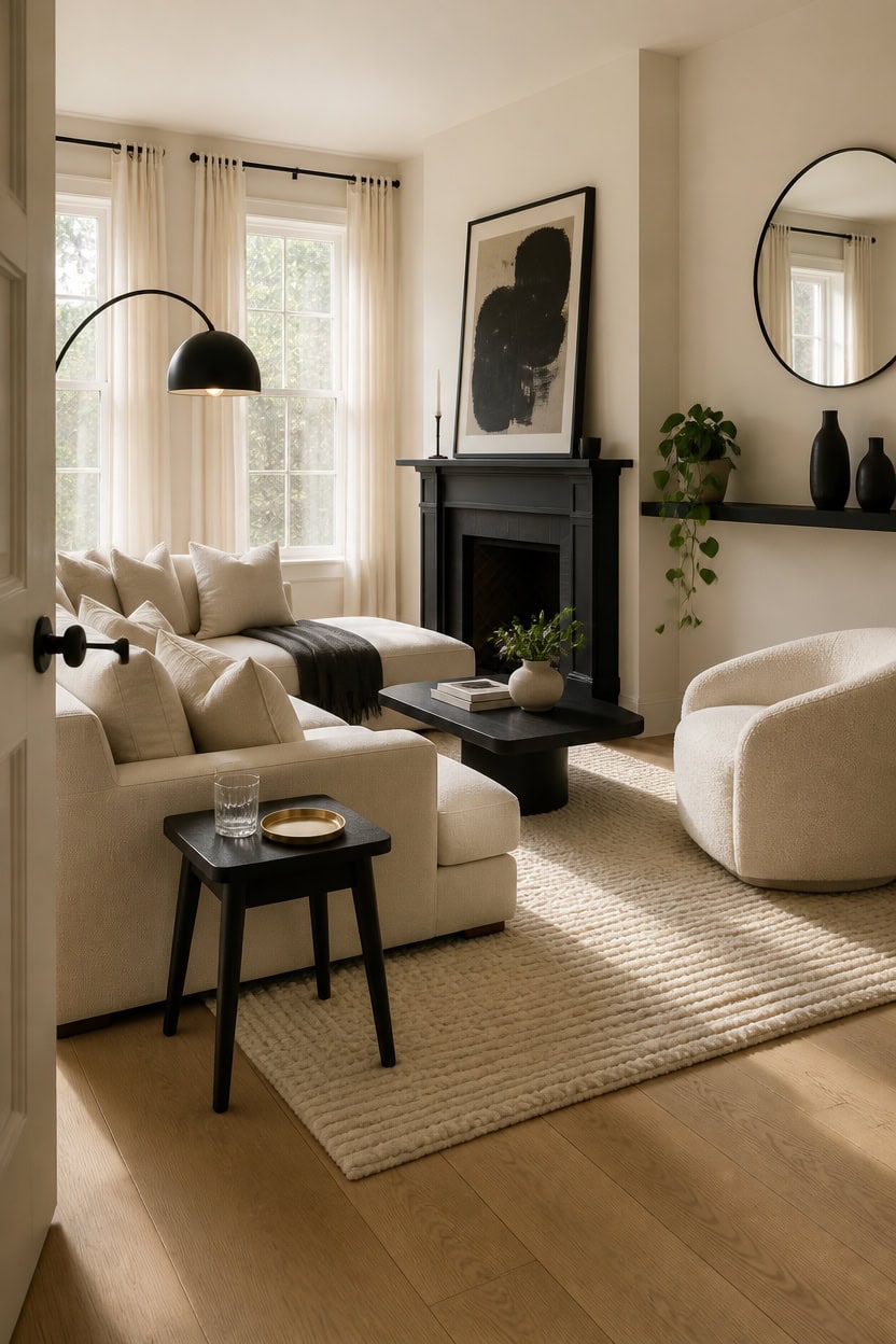
Black and cream work the way high contrast always works — one tone advances and one recedes, creating depth that a single-color room can never achieve. Cream softens the visual weight of black so the room stays livable instead of dramatic, while black gives cream the definition it needs to read as intentional rather than plain. The ratio that holds: roughly 70 percent cream to 30 percent black keeps the room open without losing its edge.
Lead with cream as the base: Cream handles walls, large upholstery, and rugs so the room starts from a place of calm.
Reserve black for structure: Use black on frames, legs, fixtures, and vessels — elements that define edges and create visual stops for the eye.
Let the gap do the work: Contrast only registers when the two tones have enough space between them; avoid muddying the palette with beiges, taupes, or off-whites that blur the line.
Anchor with one large black piece: A single oversized black element — art, a fireplace surround, or a dark shelf — sets the tone and gives the smaller accents something to respond to.
this warm cream creates the receding base tone that makes every black accent read as a sharp, deliberate contrast.
this deep black surface becomes the room’s strongest visual anchor and makes the cream walls glow around it.
 Acanva Altas Modular Sectional Sofa, Linen-Like-Cream
View Price
Acanva Altas Modular Sectional Sofa, Linen-Like-Cream
View Price
 Arc Floor Lamp with Remote and Dimmable Black Floor lamps for Living Room
View Price
Arc Floor Lamp with Remote and Dimmable Black Floor lamps for Living Room
View Price
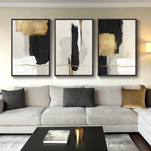 Large Framed Black and White Abstract Wall Art for Living Room, 3 Piece
View Price
Large Framed Black and White Abstract Wall Art for Living Room, 3 Piece
View Price
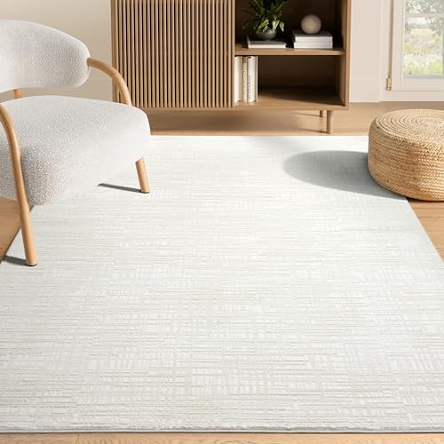 Abani Cream Area Rug - 8' x 10' - Living Room & Bedroom - Textured Weave Design - Indoor Use - Easy to Clean, Stain Resistant, Non-Shedding - Neutral Collection
View Price
Abani Cream Area Rug - 8' x 10' - Living Room & Bedroom - Textured Weave Design - Indoor Use - Easy to Clean, Stain Resistant, Non-Shedding - Neutral Collection
View Price
 Lvases Snuggle Hollow Ceramic Vase Set of 2 for Nordic Boho Home Decor
View Price
Lvases Snuggle Hollow Ceramic Vase Set of 2 for Nordic Boho Home Decor
View Price
 Yaheetech Accent Chairs with Ottoman, Boucle Fabric Barrel Chairs, Ivory
View Price
Yaheetech Accent Chairs with Ottoman, Boucle Fabric Barrel Chairs, Ivory
View Price
 upsimples 23.6'' Long Floating Shelves for Wall Decor and Storage, Black
View Price
upsimples 23.6'' Long Floating Shelves for Wall Decor and Storage, Black
View Price
 Tosleo Velvet Pillow Covers 18x18 inch Pack of 2 Gold Decor Cream
View Price
Tosleo Velvet Pillow Covers 18x18 inch Pack of 2 Gold Decor Cream
View Price
How to Choose the Right Cream for Your Walls
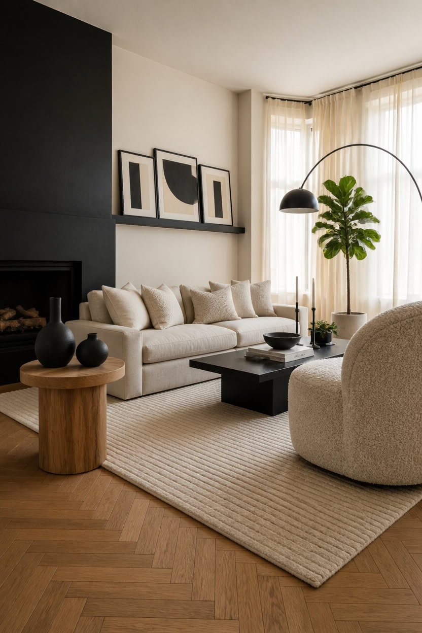
Cream is not a single color — it ranges from warm yellow-whites to cool gray-whites, and the wrong undertone will fight your black accents instead of framing them. Warm creams with yellow or pink undertones work best against true black because they create a soft contrast that reads as intentional warmth. Test your shortlisted creams against a black sample board before committing, because natural light shifts undertones dramatically throughout the day.
Check the undertone first: Hold your cream sample next to pure white — a warm cream reads yellow or peachy, while a cool cream reads gray or pink.
Match light direction: North-facing living rooms need warmer creams to avoid a cold, flat look; south-facing rooms can handle cooler creams without losing warmth.
Test against black directly: Pin a black fabric or card next to your paint sample to confirm the contrast reads sharp and clean, not muddy.
Finish matters as much as tone: Use a matte or eggshell finish on cream walls so the surface absorbs light softly instead of competing with high-gloss black accents.
this warm, yellow-leaning cream reads as luminous daylight white against black accents without going stark or cold.
this dense, flat black creates a hard edge that makes the surrounding cream walls look richer by direct comparison.
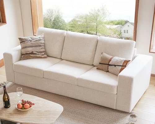 ELUCHANG 85" Modern Couches for Living Room, Natural Linen 3 Seat Sofa, Comfy Deep Seat Sofa, Spring Cushions, Removable Cover, Solid Wood Frame, Easy Assembly Loveseat for Small Space,Apartment,Beige
View Price
ELUCHANG 85" Modern Couches for Living Room, Natural Linen 3 Seat Sofa, Comfy Deep Seat Sofa, Spring Cushions, Removable Cover, Solid Wood Frame, Easy Assembly Loveseat for Small Space,Apartment,Beige
View Price
 Seaside village Arc Floor Lamps for Living Room, Modern Standing Lamp with Adjustable Hanging Drum Shade, Tall Pole Lamp with Foot Switch, Over Couch Arched Reading Light for Bedroom, Office (Black)
View Price
HOURIA Mid Century Geometric Black Cat Framed Canvas Wall Art Set,Abstract Modern Orange and Cream Wall Decor,Round Eyes Playful Kitten Animal Artwork for Nursery,Living Room,Bedroom,Office- 24"x36"x3
View Price
Seaside village Arc Floor Lamps for Living Room, Modern Standing Lamp with Adjustable Hanging Drum Shade, Tall Pole Lamp with Foot Switch, Over Couch Arched Reading Light for Bedroom, Office (Black)
View Price
HOURIA Mid Century Geometric Black Cat Framed Canvas Wall Art Set,Abstract Modern Orange and Cream Wall Decor,Round Eyes Playful Kitten Animal Artwork for Nursery,Living Room,Bedroom,Office- 24"x36"x3
View Price
 DecoVlog Black Ribbed Ceramic Vases Set of 3, Matte Minimalist Long-Necked Vases with Narrow Opening, Modern Decorative Vases for Centerpiece, Living Room, Bookshelf & Entryway Table
View Price
DecoVlog Black Ribbed Ceramic Vases Set of 3, Matte Minimalist Long-Necked Vases with Narrow Opening, Modern Decorative Vases for Centerpiece, Living Room, Bookshelf & Entryway Table
View Price
 FriFurne Swivel Accent Chair, Boucle Round Upholstered Barrel Chair
View Price
FriFurne Swivel Accent Chair, Boucle Round Upholstered Barrel Chair
View Price
 Floating Picture Ledge Shelves for Wall Set of 2, 55 Inches Picture Shelf with Ledge, Nursery Book Shelf for Toys Storage Kids Bookshelf Wall Mounted Living Room Bedroom Decor Frames, Black
View Price
Floating Picture Ledge Shelves for Wall Set of 2, 55 Inches Picture Shelf with Ledge, Nursery Book Shelf for Toys Storage Kids Bookshelf Wall Mounted Living Room Bedroom Decor Frames, Black
View Price
 GIGIZAZA Pack of 4 Decorative Velvet Pillow Covers 18x18 Ivory Gold
View Price
GIGIZAZA Pack of 4 Decorative Velvet Pillow Covers 18x18 Ivory Gold
View Price
8' x 10' Rugs for This Palette
Rugs USA best sellers in this palette's colors, linked in 8' x 10', the size that fits most living rooms with the front legs of the sofa and chairs on the rug. Every design comes in other sizes too.
- Free shipping
- 30-day returns
- 210,000+ five-star reviews
 Simple Serpent Rug – Black & Off White
View Price
Simple Serpent Rug – Black & Off White
View Price
 Everywhere Hand-Braided Indoor/Outdoor Rug – Salt And Pepper
View Price
Everywhere Hand-Braided Indoor/Outdoor Rug – Salt And Pepper
View Price
 Ring Around The Rosette Rug – Black
View Price
Ring Around The Rosette Rug – Black
View Price
 Jute Braided Rug – Black
View Price
Jute Braided Rug – Black
View Price
 Diamond Pinstripes Rug – Black
View Price
Diamond Pinstripes Rug – Black
View Price
 Seagrass with Border Rug – Black
View Price
Seagrass with Border Rug – Black
View Price
 Venetian Pinstripes Indoor/Outdoor Rug – Black
View Price
Venetian Pinstripes Indoor/Outdoor Rug – Black
View Price
 Dotted Diamond Trellis Rug – Black
View Price
Dotted Diamond Trellis Rug – Black
View Price
 Shaggy Moroccan Lattice Fringe Rug – Black
View Price
Shaggy Moroccan Lattice Fringe Rug – Black
View Price
 Moroccan Trellis Rug – Black
View Price
Moroccan Trellis Rug – Black
View Price
 Monochrome Bordered Indoor/Outdoor Rug – Grey
View Price
Monochrome Bordered Indoor/Outdoor Rug – Grey
View Price
 Moroccan Diamond Pinstripes Tassel Rug – Black
View Price
Moroccan Diamond Pinstripes Tassel Rug – Black
View Price
 Irregular Parallel Bars Rug – Black
View Price
Irregular Parallel Bars Rug – Black
View Price
 Striped Border Indoor/Outdoor Flatweave Rug – Black
View Price
Striped Border Indoor/Outdoor Flatweave Rug – Black
View Price
 Melrose Checked Rug – Charcoal
View Price
Melrose Checked Rug – Charcoal
View Price
 Jute Harlequin Trellis Rug – Black
View Price
Jute Harlequin Trellis Rug – Black
View Price
 Paddle Rug – Black
View Price
Paddle Rug – Black
View Price
 Downing Plaid Wool Rug by Nate Berkus – Grey
View Price
Downing Plaid Wool Rug by Nate Berkus – Grey
View Price
 Diamond Geometric Rug – Black
View Price
Diamond Geometric Rug – Black
View Price
 Serge Bordered Wool Rug by Nate Berkus – Tan
View Price
Serge Bordered Wool Rug by Nate Berkus – Tan
View Price
 Moroccan Trellis Rug – White and Black
View Price
Moroccan Trellis Rug – White and Black
View Price
 Perfect Handwoven Jute-Blend Rug – Natural
View Price
Perfect Handwoven Jute-Blend Rug – Natural
View Price
 Jute Braided Rug – Natural
View Price
Jute Braided Rug – Natural
View Price
 Softest Knit Wool Rug – Off White
View Price
Softest Knit Wool Rug – Off White
View Price
 Jute Braided Rug – Off White
View Price
Jute Braided Rug – Off White
View Price
 Maren Hazy Swirls Rug – Beige
View Price
Maren Hazy Swirls Rug – Beige
View Price
 Chunky Jute Tasseled Rug – Off White
View Price
Chunky Jute Tasseled Rug – Off White
View Price
 Floral Ornament Rug – Ivory
View Price
Floral Ornament Rug – Ivory
View Price
 Fading Herati Medallion Rug – Beige
View Price
Fading Herati Medallion Rug – Beige
View Price
 Chunky Jute Tasseled Rug – Natural
View Price
Chunky Jute Tasseled Rug – Natural
View Price
 Forever Vintage Rug – Neutral
View Price
Forever Vintage Rug – Neutral
View Price
 Native Collage Rug – Beige
View Price
Native Collage Rug – Beige
View Price
 Moroccan Diamond Pinstripes Tassel Rug – Off White
View Price
Moroccan Diamond Pinstripes Tassel Rug – Off White
View Price
 Handspun Jute Rug – Natural
View Price
Handspun Jute Rug – Natural
View Price
 Handwoven Jute Ribbed Solid Rug – Natural
View Price
Handwoven Jute Ribbed Solid Rug – Natural
View Price
 Melrose Checked Rug – Cream
View Price
Melrose Checked Rug – Cream
View Price
 Shaded Shag With Tassels Rug – Ivory
View Price
Shaded Shag With Tassels Rug – Ivory
View Price
 Plush Solid Shaggy Rug – Off White
View Price
Plush Solid Shaggy Rug – Off White
View Price
 Seagrass with Border Rug – Beige
View Price
Seagrass with Border Rug – Beige
View Price
 Anette Block Striped Rug – Beige
View Price
Anette Block Striped Rug – Beige
View Price
How Black Creates Depth, Grounding, and Visual Weight
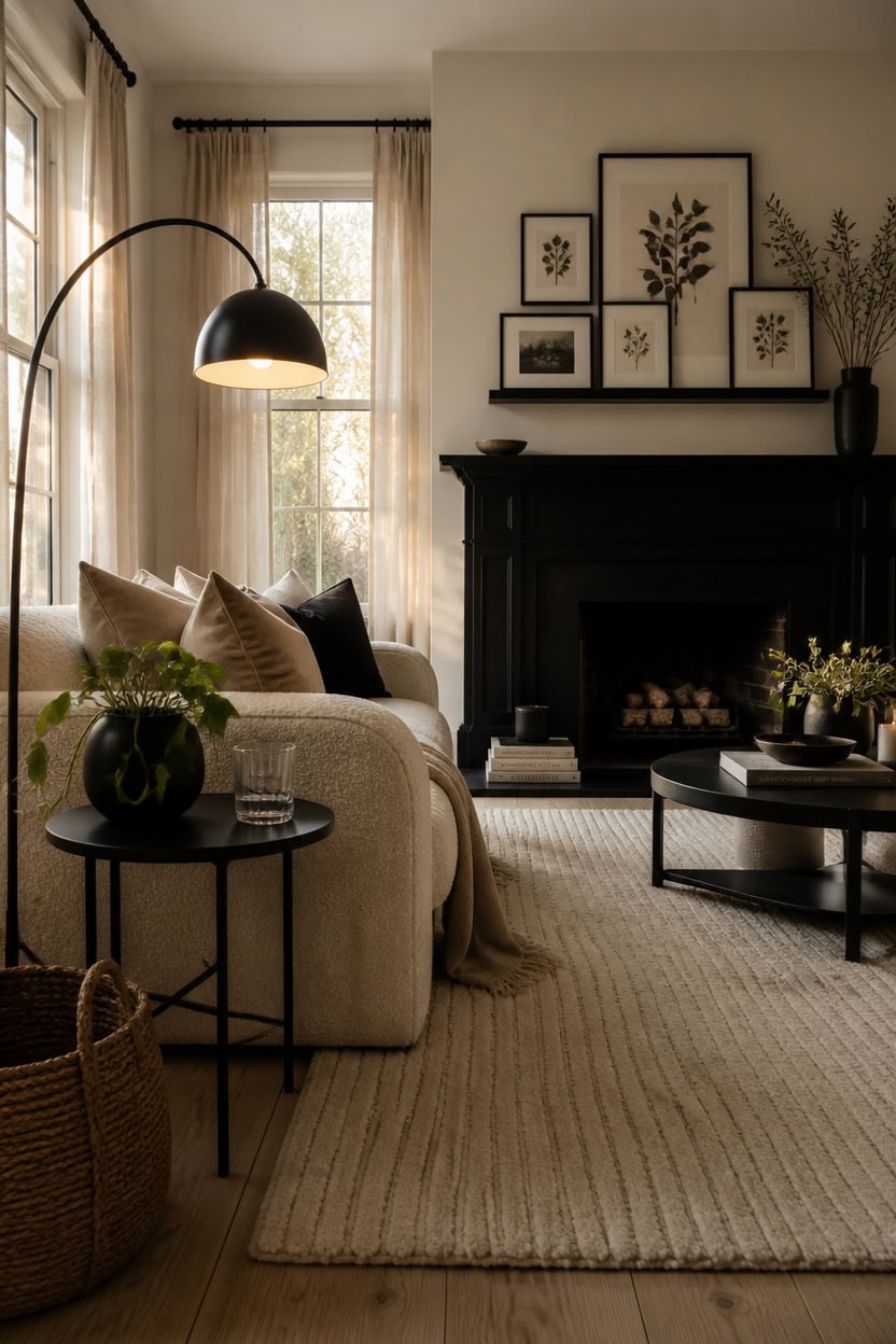
Black pulls a living room together the way a frame pulls a painting together — it defines the edges so everything inside reads with more intention. Without enough black, cream interiors risk looking soft to the point of formless, like a room that hasn’t fully decided what it is. Add black to the baseboards, the lamp, a single piece of furniture, or a framed wall cluster, and the cream walls suddenly look chosen rather than default.
Use black as your anchor: Place your heaviest black piece — a sofa leg, a floor lamp, a side table — low in the room to ground the eye at floor level.
Repeat black in at least three spots: One black piece looks accidental; three placed intentionally across the room creates a visual rhythm that feels curated.
Let black define your focal point: A black-painted fireplace surround or a cluster of black frames on one wall tells the eye exactly where to land first.
Balance visual weight with negative space: Heavy black accents need breathing room — keep the surrounding cream surfaces clear so the black reads as bold, not crowded.
this warm, historically grounded cream makes the surrounding room glow softly against any black accent you introduce.
this deep, grounded black creates the visual anchor that keeps the entire cream room from floating.
 91.5"W Modern Cream Boucle Sofas for Living Room, Oversized Loveseat Couch
View Price
91.5"W Modern Cream Boucle Sofas for Living Room, Oversized Loveseat Couch
View Price
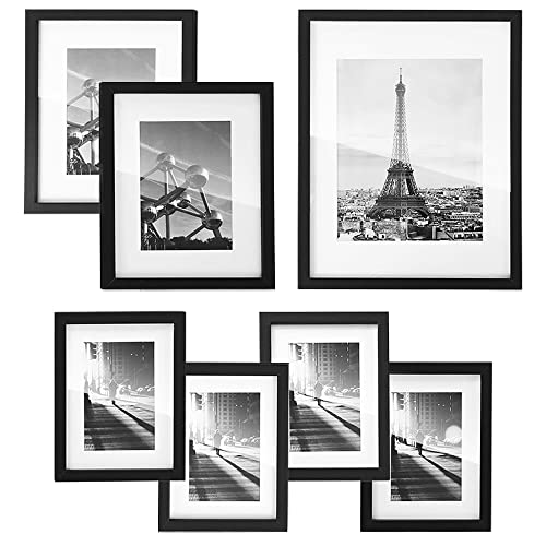 SONGMICS Gallery Wall Frame Set of 7, Hanging or Tabletop Display
View Price
SONGMICS Gallery Wall Frame Set of 7, Hanging or Tabletop Display
View Price
 Large Modern Ceramic Vase Set, Black Ribbed Matte Finish, 3-Piece Decorative Vases for Home Living Room Office, 10 inch Tall, 4 inch Width (XL Black Mix)
View Price
Large Modern Ceramic Vase Set, Black Ribbed Matte Finish, 3-Piece Decorative Vases for Home Living Room Office, 10 inch Tall, 4 inch Width (XL Black Mix)
View Price
 Metal Round End Table,Accent Side Table for Living Room,Black,15.7"Lx 19.7H
View Price
Metal Round End Table,Accent Side Table for Living Room,Black,15.7"Lx 19.7H
View Price
 Set of 2 Decorative Throw Pillow Covers 18x18, Fall Faux Fur Cream White
View Price
Set of 2 Decorative Throw Pillow Covers 18x18, Fall Faux Fur Cream White
View Price
 Picture Ledge Shelf, Floating Shelves for Wall, 48" W Set of 2, Black
View Price
Picture Ledge Shelf, Floating Shelves for Wall, 48" W Set of 2, Black
View Price
Furniture Choices That Honor the Black and Cream Palette
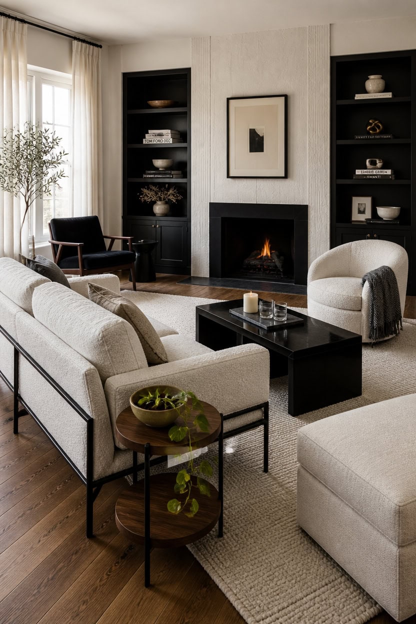
Furniture in a black and cream living room works hardest when each piece earns its place by clearly belonging to one side of the palette. A sofa, armchair, or coffee table that splits the difference — beige, taupe, greige — softens the contrast and makes the whole room feel less resolved. Commit fully: cream upholstery, black frames, and the occasional natural wood piece as a bridge.
Lead with one large black piece: A black-framed sofa or lacquered coffee table sets the room’s tone before anything else arrives.
Use cream for softness and mass: Large upholstered pieces in cream — sofas, armchairs, ottomans — balance the visual weight of black without competing with it.
Let natural wood bridge the gap: A walnut side table or oak shelf introduces warmth that keeps the palette from reading as stark or cold.
Keep mixed finishes intentional: Matte black and glossy black can coexist, but only if placed in separate zones so neither finish looks like a mistake.
this clean, luminous cream makes black furniture pop forward with sharp, gallery-worthy contrast.
this grounded, flat-finish black turns structural elements into bold furniture-level statements.
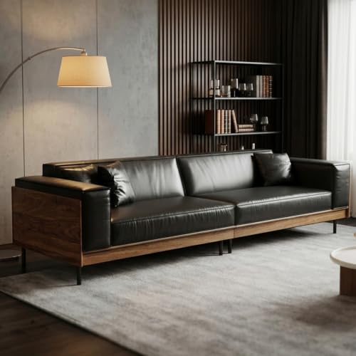 Upwivkre 110 Inch Mid-Century Modern Leather Sofa, Modern Black 4 Seater Deep Seat Couch with Wood Frame Construction, Large Living Room Sofa with Premium Upholstery for Apartment
View Price
Upwivkre 110 Inch Mid-Century Modern Leather Sofa, Modern Black 4 Seater Deep Seat Couch with Wood Frame Construction, Large Living Room Sofa with Premium Upholstery for Apartment
View Price
 48" Coffee Table with Open Storage Shelf, 2-Tier Minimalist Wooden Coffee Tables with Curved Profile Design, Modern Rectangular Center Table for Living Room, Office, Black Grey
View Price
48" Coffee Table with Open Storage Shelf, 2-Tier Minimalist Wooden Coffee Tables with Curved Profile Design, Modern Rectangular Center Table for Living Room, Office, Black Grey
View Price
 Small Round Coffee Table, 20in 2-Tier Storage Center Table for Living Room
View Price
Small Round Coffee Table, 20in 2-Tier Storage Center Table for Living Room
View Price
 Tbfit 35.5 Inch Large Square Ottoman with Storage, Lift Top, Beige
View Price
Tbfit 35.5 Inch Large Square Ottoman with Storage, Lift Top, Beige
View Price
 HOMISSUE Bookshelf, 7-Tier Bookshelf, Rustic Wood Metal Bookshelves and Bookcases, Freestanding Open Bookshelf, Industrial Tall Bookcase for Home Office, Living Room and Bedroom, Black
View Price
ANSSO Wool Area Rugs 9x12 Living Room,80% Merino Wool and 20% Cotton Soft Tufted Area Rug with Cotton Non-Slip Backing,Large Area Rug for Bedroom Bedroom, Dining and Home Office (Beige Cream)
View Price
HOMISSUE Bookshelf, 7-Tier Bookshelf, Rustic Wood Metal Bookshelves and Bookcases, Freestanding Open Bookshelf, Industrial Tall Bookcase for Home Office, Living Room and Bedroom, Black
View Price
ANSSO Wool Area Rugs 9x12 Living Room,80% Merino Wool and 20% Cotton Soft Tufted Area Rug with Cotton Non-Slip Backing,Large Area Rug for Bedroom Bedroom, Dining and Home Office (Beige Cream)
View Price
 Furnimart Black Velvet Accent Chair Mid Century Modern Living Room Chairs; Comfy Armchair Leisure Vanity Guest Wingback Chair for Office Study Vanity Bedroom Waiting Room
View Price
Furnimart Black Velvet Accent Chair Mid Century Modern Living Room Chairs; Comfy Armchair Leisure Vanity Guest Wingback Chair for Office Study Vanity Bedroom Waiting Room
View Price
Wall Art for This Palette
The best-reviewed prints at Wayfair in this palette's colors. Most come in several sizes.
- Free shipping over $35
- Picked at 4.5 stars or higher
 Mid Century Shape Abstract Contours Black and White Beige
View Price
Mid Century Shape Abstract Contours Black and White Beige
View Price
 Grunge Abstract Paint Stroke Effect Tan Gray Neutral
View Price
Grunge Abstract Paint Stroke Effect Tan Gray Neutral
View Price
 Geometric Subtle Abstract Modern Minimalist Neutral Home
View Price
Geometric Subtle Abstract Modern Minimalist Neutral Home
View Price
 Mid Century Modern Black and White Minimalist Abstract Home
View Price
Mid Century Modern Black and White Minimalist Abstract Home
View Price
 Sky Above Photograph
View Price
Sky Above Photograph
View Price
 Vintage Pine Tree Drawing Classic Country Rustic
View Price
Vintage Pine Tree Drawing Classic Country Rustic
View Price
 Crane Heron Bird Vibrant Watercolor Blue Heron
View Price
Crane Heron Bird Vibrant Watercolor Blue Heron
View Price
 Sweet Peonies I by Vincent Van Gogh
View Price
Sweet Peonies I by Vincent Van Gogh
View Price
 Amarian Decadent Young Woman After the Dance Ramon Casas
View Price
Amarian Decadent Young Woman After the Dance Ramon Casas
View Price
 Minimal Geometric Compostions of Elementary Forms XIV
View Price
Minimal Geometric Compostions of Elementary Forms XIV
View Price
 Watercolor Tan Brown Waves Organic Modern Abstract
View Price
Watercolor Tan Brown Waves Organic Modern Abstract
View Price
 And Minimal Woman Silhouette I Abstract Shapes
View Price
And Minimal Woman Silhouette I Abstract Shapes
View Price
 Sun Mountain Landscape Abstract Neutral Forest
View Price
Sun Mountain Landscape Abstract Neutral Forest
View Price
 Mid Century Modern Boho Organic Tropical Leaf
View Price
Mid Century Modern Boho Organic Tropical Leaf
View Price
 Beige Botanical Impressions III Abstract Botanicals
View Price
Beige Botanical Impressions III Abstract Botanicals
View Price
 Mid Century Modern Boho Bold Bright Yellow Green Leaves
View Price
Mid Century Modern Boho Bold Bright Yellow Green Leaves
View Price
 Mid Century Modern Boho Idea4wall
View Price
Mid Century Modern Boho Idea4wall
View Price
 Mid Century Modern Boho Duotone Beige Abstract Lines
View Price
Mid Century Modern Boho Duotone Beige Abstract Lines
View Price
 Pastel Tan Brown Green Hues
View Price
Pastel Tan Brown Green Hues
View Price
 Blue Wildfloers Liquid Ink I Modern Flowers
View Price
Blue Wildfloers Liquid Ink I Modern Flowers
View Price
 Bright Orange Boho Sun Burst
View Price
Bright Orange Boho Sun Burst
View Price
 Morning Rise by Alex Hanson Painting
View Price
Morning Rise by Alex Hanson Painting
View Price
 Mid Century Shape Muted Abstract Color Blocks
View Price
Mid Century Shape Muted Abstract Color Blocks
View Price
 Pine Tree Enchanted Forest II Tree Pine
View Price
Pine Tree Enchanted Forest II Tree Pine
View Price
 Rustic Countryside Moody Rural Countryside Landscape
View Price
Rustic Countryside Moody Rural Countryside Landscape
View Price
 Vintage Flower in Pastel Modern Art Wall Decor
View Price
Vintage Flower in Pastel Modern Art Wall Decor
View Price
 Abstract Botanical Classic Floral Plant
View Price
Abstract Botanical Classic Floral Plant
View Price
 Woodland Forest Landscape Green Watercolor Pastel Mountain
View Price
Woodland Forest Landscape Green Watercolor Pastel Mountain
View Price
 Abstract Landscape Earthy Neutral Green Woodland
View Price
Abstract Landscape Earthy Neutral Green Woodland
View Price
 Teal Orange Petal Mosaics II Abstract Botanicals
View Price
Teal Orange Petal Mosaics II Abstract Botanicals
View Price
 2 Piece Yellow Botanical Branch with Leaves I
View Price
2 Piece Yellow Botanical Branch with Leaves I
View Price
 Le Chateau Wrapped Canvas Machine Made Print
View Price
Le Chateau Wrapped Canvas Machine Made Print
View Price
 Minimal Purple Herbs Country Charm Flowers
View Price
Minimal Purple Herbs Country Charm Flowers
View Price
How Texture Replaces Color in a Black and Cream Room
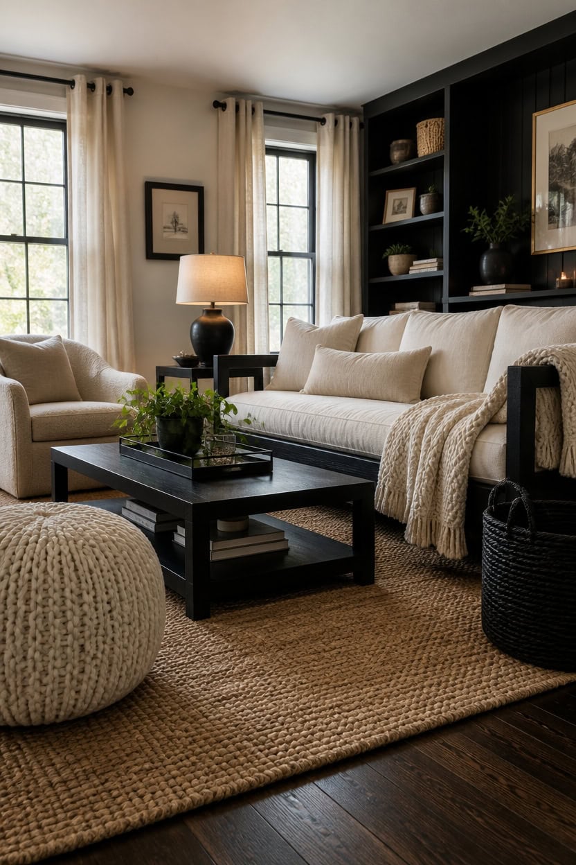
Texture does the work that color can’t in a black and cream room — it creates depth, warmth, and visual movement without introducing a third hue. A flat cream wall and a flat black sofa read as cold and graphic, but a cream boucle chair next to a matte black frame immediately feels layered and alive. Mix at least three distinct textures per surface zone: smooth, nubby, and woven is a reliable starting point.
Layer textiles first: Pile a chunky knit throw over a linen sofa cushion before adding any decor — fabric texture does the most heavy lifting in the room.
Let black surfaces go matte: Matte black absorbs light and reads as soft, which prevents the palette from feeling harsh or clinical against cream.
Add rough with smooth: Pair a sleek lacquered coffee table with a jute or sisal rug underneath to create the friction the eye needs to stay interested.
Use cream in multiple textures: Cream velvet, cream linen, and cream boucle can all share the same space because the texture difference reads as intentional variety, not repetition.
this soft, slightly warm white adds a subtle texture contrast against crisper walls without pulling the eye away from the room’s black anchors.
this deep, near-black finish makes the surface feel as tactile and intentional as the room’s darkest furniture.
 SAMIAH LUXE Chunky Knit Throw Blanket 50x70 in, 8 lb Buttercream Cream
View Price
SAMIAH LUXE Chunky Knit Throw Blanket 50x70 in, 8 lb Buttercream Cream
View Price
 Nourison Home 22" Black Ceramic Table Lamp with Oatmeal Linen Shade for Modern Farmhouse, Bedside Lamp, Living Room Lamp, Small Accent Lamp for Dining Room
View Price
Nourison Home 22" Black Ceramic Table Lamp with Oatmeal Linen Shade for Modern Farmhouse, Bedside Lamp, Living Room Lamp, Small Accent Lamp for Dining Room
View Price
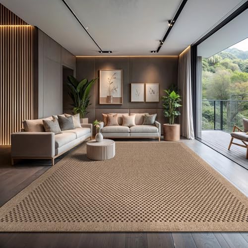 CAMILSON Easy Jute Rug 10x14, Indoor Outdoor Natural Color Fiber Area Rugs for Living Room Patio and Kitchen Rug, Sisal Boho Woven Design, Easy-Cleaning, Washable Outside Carpet Alfombras (10 x 14)
View Price
CAMILSON Easy Jute Rug 10x14, Indoor Outdoor Natural Color Fiber Area Rugs for Living Room Patio and Kitchen Rug, Sisal Boho Woven Design, Easy-Cleaning, Washable Outside Carpet Alfombras (10 x 14)
View Price
 Nonam Wicker Storage Basket with Lid,Seagrass Shelf Basket Set of 3,Black
View Price
Nonam Wicker Storage Basket with Lid,Seagrass Shelf Basket Set of 3,Black
View Price
 Jowels Natural Linen Grommet Curtains 108 Inch Long for Living Room Dining
View Price
Jowels Natural Linen Grommet Curtains 108 Inch Long for Living Room Dining
View Price
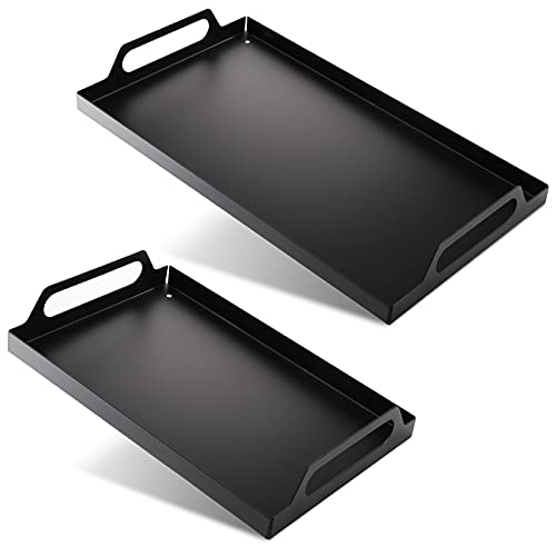 Peohud 2 Pack Black Metal Serving Tray, Decorative Coffee Table Tray with Handles, Vanity Platter Breakfast Tray for Eating, Storing, Bedroom, Kitchen, Living Room, Bathroom
View Price
Peohud 2 Pack Black Metal Serving Tray, Decorative Coffee Table Tray with Handles, Vanity Platter Breakfast Tray for Eating, Storing, Bedroom, Kitchen, Living Room, Bathroom
View Price
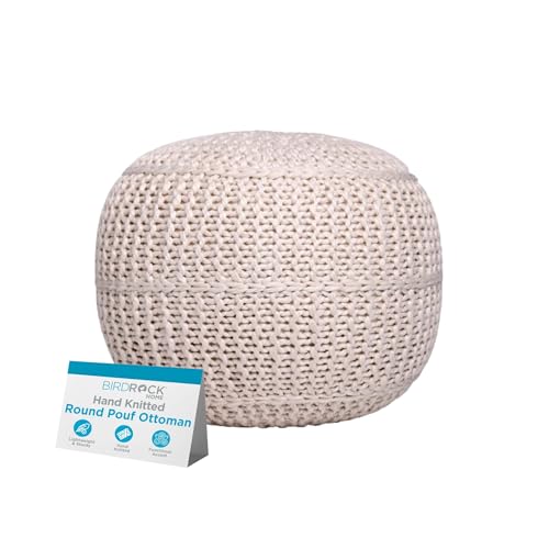 BIRDROCK HOME Round Pouf Ottoman Foot Rest, 18.5”x15”, Light Natural Cream
View Price
BIRDROCK HOME Round Pouf Ottoman Foot Rest, 18.5”x15”, Light Natural Cream
View Price
How Flooring Anchors a Black and Cream Living Room
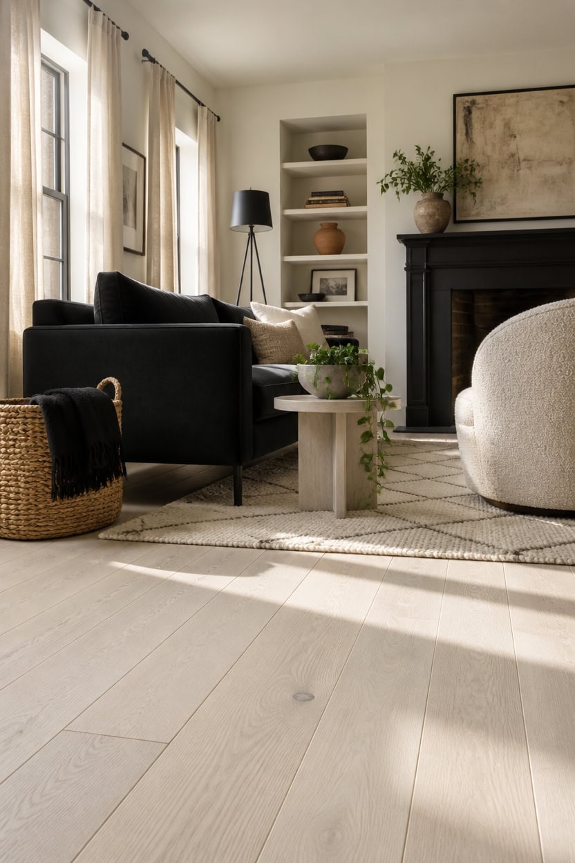
Light-toned flooring pulls the cream side of the palette forward and prevents a black-dominant room from reading as a cave. Hard flooring in pale oak, whitewashed wood, or bleached stone gives the eye a restful neutral plane that makes both black furniture and cream textiles appear intentional rather than accidental. If you’re working with existing dark floors, a large cream or natural fiber rug can perform the same anchoring function without touching the subfloor.
Go pale with wood: Light oak or whitewashed hardwood reflects enough light to keep the room feeling open rather than heavy when black anchors dominate.
Use rugs as floor corrections: A large natural fiber or cream wool rug over dark flooring resets the visual base and lets the palette read correctly from the doorway.
Keep patterns out of the floor: Busy floor patterns compete with the graphic black and cream contrast above them — solid, organic, or subtly textured surfaces work best.
Ground furniture with intention: Place a rug so that the front legs of every major seating piece sit on it, connecting the floor plane to the furniture arrangement above it.
this pure, crisp white makes pale flooring feel deliberate and frames the room’s black furniture like a gallery border.
this deep, true black anchors the lowest visual weight of the room exactly where flooring meets wall.
 SAFAVIEH Abstract Area Rug 9x12, Wool Handmade Large Ivory & Grey ABT468G
View Price
SAFAVIEH Abstract Area Rug 9x12, Wool Handmade Large Ivory & Grey ABT468G
View Price
 YIHOUSE 6×9 Ft Area Rugs for Living Room: Modern Washable Rug - Abstract Black and Cream White Rug for Bedroom Dining Room Office Playroom Nursery Home Decor - Nonslip Non-Shedding Striped Rugs
View Price
YIHOUSE 6×9 Ft Area Rugs for Living Room: Modern Washable Rug - Abstract Black and Cream White Rug for Bedroom Dining Room Office Playroom Nursery Home Decor - Nonslip Non-Shedding Striped Rugs
View Price
 SAFAVIEH Natural Fiber Area Rug 6x9, Jute Knotted Natural NF447A
View Price
SAFAVIEH Natural Fiber Area Rug 6x9, Jute Knotted Natural NF447A
View Price
 5x8 Cream Shag Area Rug for Living Room, Fluffy Plush Carpet
View Price
5x8 Cream Shag Area Rug for Living Room, Fluffy Plush Carpet
View Price
 BSTKEY 4Pcs 8CM/3 Inch Modern Metal Furniture Sofa Cabinet Legs with Mounting Screws - DIY Replacement Legs Set for Furniture Cabinet Foot Legs Sofa Bed Desk Table Feet Support, Black
View Price
BSTKEY 4Pcs 8CM/3 Inch Modern Metal Furniture Sofa Cabinet Legs with Mounting Screws - DIY Replacement Legs Set for Furniture Cabinet Foot Legs Sofa Bed Desk Table Feet Support, Black
View Price
 MyGift Wide Side Table, Slim End Sofa Table in Whitewashed Wood with Storage Shelf, Magazine and Remote Holder, Narrow Side Table
View Price
MyGift Wide Side Table, Slim End Sofa Table in Whitewashed Wood with Storage Shelf, Magazine and Remote Holder, Narrow Side Table
View Price
 Black Tripod Floor Lamp, 61” Floor Lamps for Living Room with Rotary Switch
View Price
Black Tripod Floor Lamp, 61” Floor Lamps for Living Room with Rotary Switch
View Price
Removable Wallpaper for This Palette
Removable designer wallpaper from Wallshoppe, picked to match this palette. An easy way to add pattern to any room, and every design is available as a sample.
- Designed and printed in the USA
- Non-toxic inks
- Featured in NYT Wirecutter
 Buka Patchwork Wallpaper by Chris Benz – Flax
View Price
Buka Patchwork Wallpaper by Chris Benz – Flax
View Price
 Buka Patchwork Wallpaper by Chris Benz – Blue
View Price
Buka Patchwork Wallpaper by Chris Benz – Blue
View Price
 Townhouse Wallpaper by Sarah Jessica Parker – Pearl on Charcoal
View Price
Townhouse Wallpaper by Sarah Jessica Parker – Pearl on Charcoal
View Price
 Townhouse Wallpaper by Sarah Jessica Parker – Pearl on Parchment
View Price
Townhouse Wallpaper by Sarah Jessica Parker – Pearl on Parchment
View Price
 Buka Patchwork Wallpaper by Chris Benz – Burlap
View Price
Buka Patchwork Wallpaper by Chris Benz – Burlap
View Price
 The Queens Lace' Wallpaper by Sarah Jessica Parker – Oyster
View Price
The Queens Lace' Wallpaper by Sarah Jessica Parker – Oyster
View Price
 Tent Stripe Large Wallpaper by Chris Benz – Mustard
View Price
Tent Stripe Large Wallpaper by Chris Benz – Mustard
View Price
 Pacifico Palm Wallpaper by Nathan Turner – Onyx
View Price
Pacifico Palm Wallpaper by Nathan Turner – Onyx
View Price
 Life is a Banquet Stripe Wallpaper by Lingua Franca – Blues
View Price
Life is a Banquet Stripe Wallpaper by Lingua Franca – Blues
View Price
 Ojai Stripe Wallpaper by Wallshoppe – Iced Chai
View Price
Ojai Stripe Wallpaper by Wallshoppe – Iced Chai
View Price
 Sidewalk Wallpaper by Chris Benz – Green
View Price
Sidewalk Wallpaper by Chris Benz – Green
View Price
 Fleur De Camomille Wallpaper by Sarah Jessica Parker – Parchment
View Price
Fleur De Camomille Wallpaper by Sarah Jessica Parker – Parchment
View Price
 Tent Stripe Large Wallpaper by Chris Benz – Brown Red
View Price
Tent Stripe Large Wallpaper by Chris Benz – Brown Red
View Price
 Arance Dolci Wallpaper by Carly Beck – Black
View Price
Arance Dolci Wallpaper by Carly Beck – Black
View Price
 Stacks Wallpaper by Sarah Jessica Parker – Natural
View Price
Stacks Wallpaper by Sarah Jessica Parker – Natural
View Price
 Eleanor Rigby Wallpaper by Wallshoppe – Charcoal / Umber
View Price
Eleanor Rigby Wallpaper by Wallshoppe – Charcoal / Umber
View Price
 El Quijote Wallpaper by Chris Benz – Black
View Price
El Quijote Wallpaper by Chris Benz – Black
View Price
 Life is a Banquet Stripe Wallpaper by Lingua Franca – Persimmon + Blue
View Price
Life is a Banquet Stripe Wallpaper by Lingua Franca – Persimmon + Blue
View Price
 Townhouse Wallpaper by Sarah Jessica Parker – Teal on Charcoal
View Price
Townhouse Wallpaper by Sarah Jessica Parker – Teal on Charcoal
View Price
 Large Dumbo Wallpaper by Chris Benz – Latte
View Price
Large Dumbo Wallpaper by Chris Benz – Latte
View Price
 Large Dumbo Wallpaper by Chris Benz – Black
View Price
Large Dumbo Wallpaper by Chris Benz – Black
View Price
 Pacifico Palm Wallpaper by Nathan Turner – Cappuccino
View Price
Pacifico Palm Wallpaper by Nathan Turner – Cappuccino
View Price
 El Quijote Wallpaper by Chris Benz – Umber / Charcoal
View Price
El Quijote Wallpaper by Chris Benz – Umber / Charcoal
View Price
 Large Madison Stripe Wallpaper by Chris Benz – Tan
View Price
Large Madison Stripe Wallpaper by Chris Benz – Tan
View Price
 Tent Stripe Large Wallpaper by Chris Benz – Rust Terracotta Pink
View Price
Tent Stripe Large Wallpaper by Chris Benz – Rust Terracotta Pink
View Price
 Tent Stripe Small Wallpaper by Chris Benz – Mustard
View Price
Tent Stripe Small Wallpaper by Chris Benz – Mustard
View Price
 Tent Stripe Large Wallpaper by Chris Benz – Magenta Red
View Price
Tent Stripe Large Wallpaper by Chris Benz – Magenta Red
View Price
 Fiddle Fig Wallpaper by Nathan Turner – Onyx
View Price
Fiddle Fig Wallpaper by Nathan Turner – Onyx
View Price
 Eleanor Rigby Wallpaper by Wallshoppe – Safari
View Price
Eleanor Rigby Wallpaper by Wallshoppe – Safari
View Price
 Tent Stripe Large Wallpaper by Chris Benz – Blue
View Price
Tent Stripe Large Wallpaper by Chris Benz – Blue
View Price
 Lafayette Patchwork Wallpaper by Chris Benz – Brown
View Price
Lafayette Patchwork Wallpaper by Chris Benz – Brown
View Price
 Tent Stripe Large Wallpaper by Chris Benz – Seaglass Blue
View Price
Tent Stripe Large Wallpaper by Chris Benz – Seaglass Blue
View Price
 Small Dumbo Wallpaper by Chris Benz – Latte
View Price
Small Dumbo Wallpaper by Chris Benz – Latte
View Price
 Barbara Ann Wallpaper by Wallshoppe – Aubergine
View Price
Barbara Ann Wallpaper by Wallshoppe – Aubergine
View Price
 Pinwheel Quilt Wallpaper by Chris Benz – Multi
View Price
Pinwheel Quilt Wallpaper by Chris Benz – Multi
View Price
 Townhouse Mural Wallpaper by Sarah Jessica Parker – Pearl on Parchment
View Price
Townhouse Mural Wallpaper by Sarah Jessica Parker – Pearl on Parchment
View Price
 Pinstripe Wallpaper by Sugar Paper – Black
View Price
Pinstripe Wallpaper by Sugar Paper – Black
View Price
 Tent Stripe Small Wallpaper by Chris Benz – Rust Terracotta Pink
View Price
Tent Stripe Small Wallpaper by Chris Benz – Rust Terracotta Pink
View Price
 Tent Stripe Small Wallpaper by Chris Benz – Seaglass Blue
View Price
Tent Stripe Small Wallpaper by Chris Benz – Seaglass Blue
View Price
 El Quijote Wallpaper by Chris Benz – Lapis / Black
View Price
El Quijote Wallpaper by Chris Benz – Lapis / Black
View Price
Lighting Decisions That Make or Break the Gallery Effect
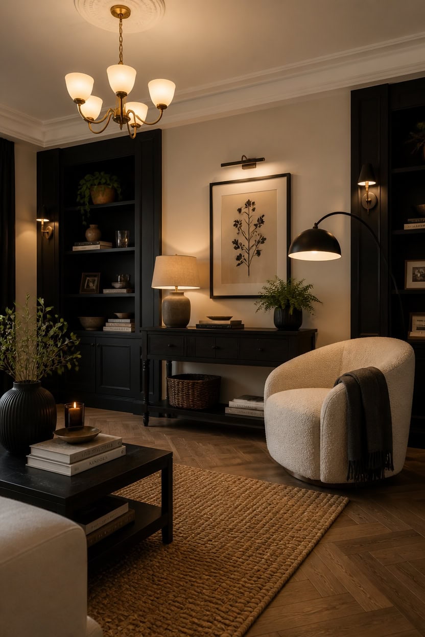
Layered light sources do more work in a black and cream living room than in almost any other palette because the contrast between the two tones is sharp enough that a single overhead fixture creates unflattering shadows that flatten the whole composition. Warm-toned bulbs in the 2700K–3000K range soften black surfaces without graying out cream textiles, keeping both colors looking intentional. Build from three levels — ambient overhead, task or reading lamps, and accent lighting aimed at art or architectural details — so the room reads as curated rather than lit by default.
Layer, don’t flood: One overhead light creates flat shadows across black furniture — combine ceiling, floor, and table sources to model the room dimensionally.
Match bulb warmth: Bulbs above 3500K push cream textiles toward stark white and make black surfaces look gray — stay at 2700K–3000K throughout.
Aim accent light at art: A picture light or directional spotlight trained on wall art reinforces the gallery effect that makes this palette feel intentional rather than decorative.
Use black fixtures deliberately: A matte black lamp or sconce reads as a design element within this palette, not just hardware — let it count as part of the composition.
this crisp near-white bounces warm light downward and makes the ceiling plane feel like a lit gallery backdrop above black and cream furnishings.
this deep true black makes accent lighting aimed at objects pop dramatically against the dark background, exactly as museum display cases do.
 Dimmable LED Lamps for Living Room with 3 Color Temperatures, Ultra Bright 2000LM Arc Floor Lamps, Modern Standing Tall Lamp with Remote Control Reading Floor Lamp for Bedroom Office Classroom
View Price
Dimmable LED Lamps for Living Room with 3 Color Temperatures, Ultra Bright 2000LM Arc Floor Lamps, Modern Standing Tall Lamp with Remote Control Reading Floor Lamp for Bedroom Office Classroom
View Price
 Dawnwake 17.7" Ceramic Table Lamps Set of 2 for Living Room Bedroom, Cream
View Price
Dawnwake 17.7" Ceramic Table Lamps Set of 2 for Living Room Bedroom, Cream
View Price
 Craftersmark Dimmable Cordless Picture Light for Wall 16in, 5000mAh Rechargeable Battery Wall Sconce Art Light, CRI 95+ 350LM Wall Light for Gallery Artwork, Paintings, Photo,Portraits - Black
View Price
Craftersmark Dimmable Cordless Picture Light for Wall 16in, 5000mAh Rechargeable Battery Wall Sconce Art Light, CRI 95+ 350LM Wall Light for Gallery Artwork, Paintings, Photo,Portraits - Black
View Price
 Ascher Vintage LED Edison Bulbs, 6W, Equivalent 60W, Non-Dimmable, High Brightness Warm White 2700K, ST58 Antique LED Filament Bulbs with 80+ CRI, E26 Medium Base, Clear Glass, Pack of 4
View Price
Ascher Vintage LED Edison Bulbs, 6W, Equivalent 60W, Non-Dimmable, High Brightness Warm White 2700K, ST58 Antique LED Filament Bulbs with 80+ CRI, E26 Medium Base, Clear Glass, Pack of 4
View Price
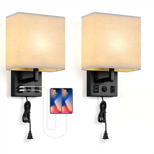 BTY Modern Wall Sconces Set of 2, Wall Lamps Bedroom Plug in with USB Charging Ports AC Socket Sconces Wall Lighting for Living Room Hallway, Black(2 Bulbs Included)
View Price
BTY Modern Wall Sconces Set of 2, Wall Lamps Bedroom Plug in with USB Charging Ports AC Socket Sconces Wall Lighting for Living Room Hallway, Black(2 Bulbs Included)
View Price
 VONLUCE Industrial Floor Lamp, Adjustable LED Floor Lamp for Living Room
View Price
VONLUCE Industrial Floor Lamp, Adjustable LED Floor Lamp for Living Room
View Price
 23" Modern Black Ceramic Table Lamps Set of 2, Farmhouse Table Lamps for Living Room, Classic Bedside Lamp with Ginger Jar Design, Elegant Bedroom Lamp for Night stand Desk Side End Table Home Decor
View Price
23" Modern Black Ceramic Table Lamps Set of 2, Farmhouse Table Lamps for Living Room, Classic Bedside Lamp with Ginger Jar Design, Elegant Bedroom Lamp for Night stand Desk Side End Table Home Decor
View Price
Window Treatments That Complete the Curated Look
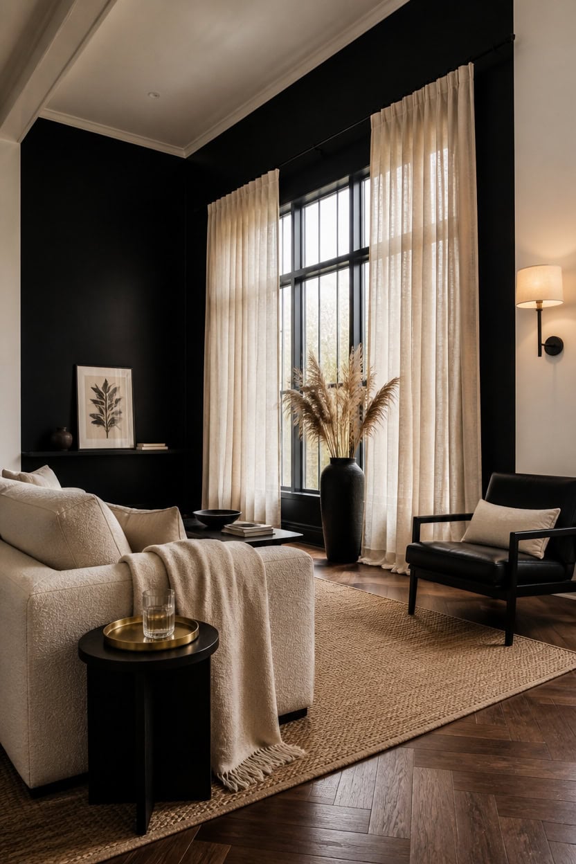
Linen or velvet drape panels in cream hung floor-to-ceiling on black curtain rods do the most reliable work in this palette because they add height while keeping both colors grounded in the same composition. The length matters more than the width — panels that puddle or just skim the floor signal intention, while panels that stop at the windowsill read as an afterthought. Mount the rod several inches above the window frame and extend it well beyond the glass on each side to make the window look larger without adding a single piece of furniture.
Go floor to ceiling: Hanging curtain panels from ceiling height to floor anchors the room vertically and signals deliberate curation rather than basic window coverage.
Keep rods black: A matte black curtain rod ties window hardware into the broader palette so the treatment reads as part of the room, not a separate decision.
Choose one texture: Linen, velvet, or boucle curtains each work — but mixing textures across panels in a single window creates visual noise that breaks the gallery calm.
Line your panels: Lined cream curtains block harsh midday light that would flatten the black and cream contrast and wash out the warmth the palette depends on.
this crisp near-white makes cream drape panels disappear softly into the wall plane while keeping the window architecture clean and gallery-precise.
this deep true black turns the window wall into a dramatic backdrop that makes cream panels read like framed fabric panels hanging in a curated space.
 Guken Cream Linen Blackout Curtains 84 Inch Length 2 Panels Set for Living Room Bedroom Back Tab Thermal Insulated 100% Black Out Drapes Room Darkening Window Curtain Ivory Natural Beige
View Price
Guken Cream Linen Blackout Curtains 84 Inch Length 2 Panels Set for Living Room Bedroom Back Tab Thermal Insulated 100% Black Out Drapes Room Darkening Window Curtain Ivory Natural Beige
View Price
 Curtain Rods for Windows 28 to 48 inch, 5/8 inch Black Curtain Rod Set with Brackets, Splicing Adjustable Metal Drapery Rod for Bedroom, Kitchen, Living Room, Matte Black
View Price
Curtain Rods for Windows 28 to 48 inch, 5/8 inch Black Curtain Rod Set with Brackets, Splicing Adjustable Metal Drapery Rod for Bedroom, Kitchen, Living Room, Matte Black
View Price
 Cream Trible Pinch Pleat Velvet Curtains for Living Room 1 Panel Set 80x84
View Price
Cream Trible Pinch Pleat Velvet Curtains for Living Room 1 Panel Set 80x84
View Price
 LLPJS Curtain Rings with Clips, 1.5 inch ID, 20 Pack, Black
View Price
LLPJS Curtain Rings with Clips, 1.5 inch ID, 20 Pack, Black
View Price
 Back Tab Linen Curtains 96 inches Long 2 Panels Set for Living Room Sliding Glass Door Ivory Cream Semi Sheer Curtains Light Filtering Canvas Cloth Linen Drapes 96 inch Floor to Ceiling Length
View Price
Back Tab Linen Curtains 96 inches Long 2 Panels Set for Living Room Sliding Glass Door Ivory Cream Semi Sheer Curtains Light Filtering Canvas Cloth Linen Drapes 96 inch Floor to Ceiling Length
View Price
 LOYORTY 12PCS Heavy Duty Double Curtain Rod Brackets, Adjustable Wall Mount Curtain Rod Holder, Double Drapery Rod Bracket Set with Screws for 1" and 0.7" Rod (Black)
View Price
LOYORTY 12PCS Heavy Duty Double Curtain Rod Brackets, Adjustable Wall Mount Curtain Rod Holder, Double Drapery Rod Bracket Set with Screws for 1" and 0.7" Rod (Black)
View Price
 HiEnd Accents Teddy Cream 60x90 inch Boucle Throw Blanket
View Price
HiEnd Accents Teddy Cream 60x90 inch Boucle Throw Blanket
View Price
Our Favorite Floor Lamps
- Free shipping over $35
- Picked at 4.5 stars or higher
 Coleford 65" 3-Light Tree Floor Lamp with Woven Rattan Shades
View Price
Coleford 65" 3-Light Tree Floor Lamp with Woven Rattan Shades
View Price
 Crevan 65" Dimmable Rattan Tree Floor Lamp with 3 Bulbs
View Price
Crevan 65" Dimmable Rattan Tree Floor Lamp with 3 Bulbs
View Price
 Rasch 65" Tree Floor Lamp with Dimmable Bulbs
View Price
Rasch 65" Tree Floor Lamp with Dimmable Bulbs
View Price
 Rhodes 63" 1-Light Traditional Floor Lamp
View Price
Rhodes 63" 1-Light Traditional Floor Lamp
View Price
 Brayana 64" Silver Traditional Floor Lamp
View Price
Brayana 64" Silver Traditional Floor Lamp
View Price
 Mctaggart 66" Distressed Traditional Floor Lamp
View Price
Mctaggart 66" Distressed Traditional Floor Lamp
View Price
 Aarzo 69.6" Arched Rattan Floor Lamp with LED and Remote
View Price
Aarzo 69.6" Arched Rattan Floor Lamp with LED and Remote
View Price
 Peavine 76" Rattan Arched Floor Lamp with Remote Control
View Price
Peavine 76" Rattan Arched Floor Lamp with Remote Control
View Price
 Atlasburg 63" Metal Arched Floor Lamp with Rattan Shade
View Price
Atlasburg 63" Metal Arched Floor Lamp with Rattan Shade
View Price
 Kigali 62.5" Light Wood Tripod Floor Lamp
View Price
Kigali 62.5" Light Wood Tripod Floor Lamp
View Price
 62.71" Solid Wood Floor Lamp with Linen Shade
View Price
62.71" Solid Wood Floor Lamp with Linen Shade
View Price
 Jan 65" Torchiere Floor Lamp
View Price
Jan 65" Torchiere Floor Lamp
View Price
 Pilsen 58" Task Floor Lamp
View Price
Pilsen 58" Task Floor Lamp
View Price
Art and Objects That Belong in This Palette
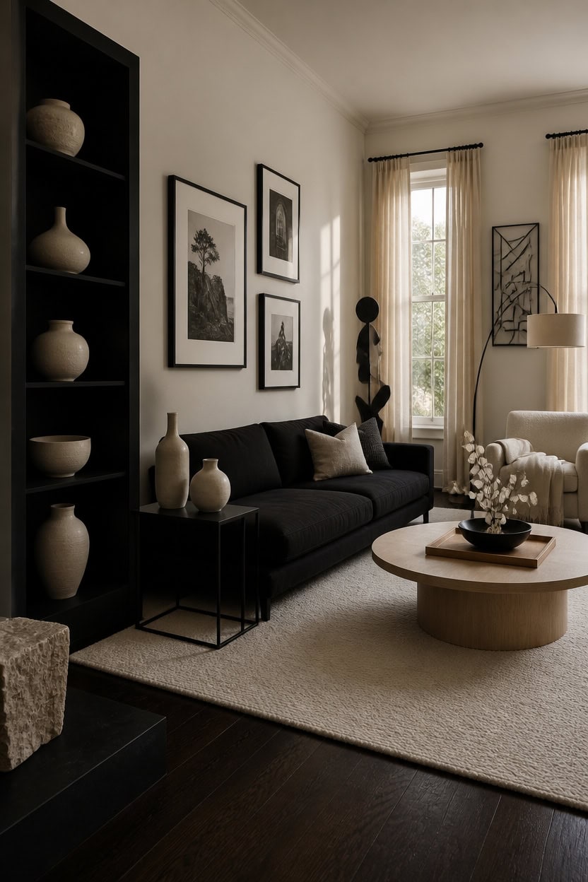
Art and objects chosen for a black and cream living room should carry visual weight without adding color, which means the most useful pieces rely on texture, material contrast, and organic form rather than hue. A black and cream palette rewards objects that feel collected over time — unglazed ceramics, monochrome photography, iron sculptures, and natural materials like bone, horn, and bleached wood that exist entirely within the existing range. One object that breaks the tonal boundary pulls focus away from the whole composition and forces the room to work harder to recover.
Lean on monochrome photography: Black and white fine art prints command the wall space this palette demands without introducing competing color.
Choose organic shapes: Irregular sculptural objects — asymmetric vases, eroded stone, curved iron — read as intentional rather than decorative filler in a gallery-style room.
Stack objects in odd numbers: Grouping three or five pieces on a surface creates visual rhythm that feels curated rather than randomly placed.
Let materials do the work: Matte black iron, raw linen, unglazed cream stoneware, and bleached natural wood all belong here without requiring any color justification.
this clean near-white creates a gallery wall effect that makes black frames and dark sculptural objects read as deliberate installations rather than wall clutter.
this true deep black turns any shelf or alcove into a shadow box that makes cream ceramics and natural objects appear to float inside the composition.
 wall26 Framed Canvas Print Wall Art Set Black & White NYC New York Cityscape Urban Architecture Photography Realism Scenic Landscape Decorative Colorful Multicolor for Bedroom - 24"x36"x3 Black
View Price
wall26 Framed Canvas Print Wall Art Set Black & White NYC New York Cityscape Urban Architecture Photography Realism Scenic Landscape Decorative Colorful Multicolor for Bedroom - 24"x36"x3 Black
View Price
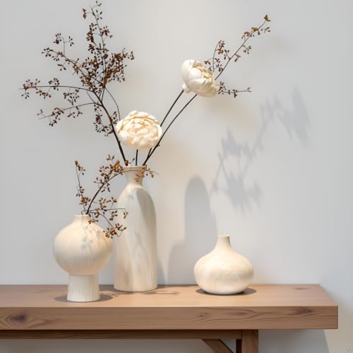 SincereLuxe White Ceramic Vase Set of 3, Modern Organic Home Decor
View Price
SincereLuxe White Ceramic Vase Set of 3, Modern Organic Home Decor
View Price
 6.5” Modern Starburst Metal Tabletop Sculpture, Black Shelf Accent Decor
View Price
6.5” Modern Starburst Metal Tabletop Sculpture, Black Shelf Accent Decor
View Price
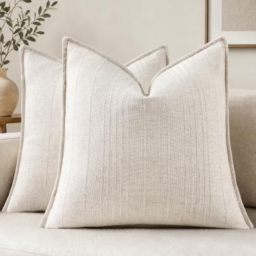 decorUhome Cream White Textured Linen Throw Pillow Covers 18x18 Set of 2
View Price
decorUhome Cream White Textured Linen Throw Pillow Covers 18x18 Set of 2
View Price
 Creative Scents Black Marble Look Decorative Bowl, Coffee Table Decor for Living/Dining Room, Modern Black Catch-All Key Dish Decorations for Entryway, Black Decor - Fruit Bowl for Kitchen Counter
View Price
Creative Scents Black Marble Look Decorative Bowl, Coffee Table Decor for Living/Dining Room, Modern Black Catch-All Key Dish Decorations for Entryway, Black Decor - Fruit Bowl for Kitchen Counter
View Price
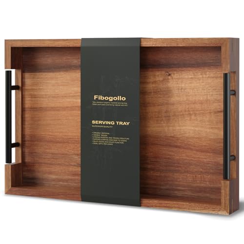 Fibogollo Acacia Wood Serving Tray with Metal Handles,15x10in Ottoman Decorative Trays Platter for Coffee Table,Living Room,Bar,Party(Medium)
View Price
Fibogollo Acacia Wood Serving Tray with Metal Handles,15x10in Ottoman Decorative Trays Platter for Coffee Table,Living Room,Bar,Party(Medium)
View Price
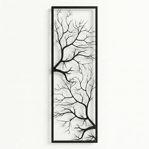 DEKADRON Metal Wall Art, Tree Wall Art, Tree Sign, Wall Decor, Branch Wall Decor, Geometric Art (14" W x 40" H / 34x100 cm)
View Price
DEKADRON Metal Wall Art, Tree Wall Art, Tree Sign, Wall Decor, Branch Wall Decor, Geometric Art (14" W x 40" H / 34x100 cm)
View Price
 KINWELL 34" W Sherpa Swivel Barrel Chairs with Pillow Set of 2, Cream
View Price
KINWELL 34" W Sherpa Swivel Barrel Chairs with Pillow Set of 2, Cream
View Price
How to Introduce a Third Color Without Disrupting the Palette
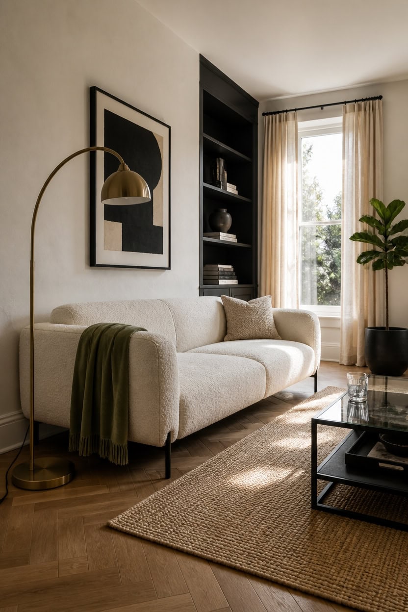
A third color enters a black and cream room the same way a guest moves through a gallery — quietly, without demanding attention. One accent shade, kept to under ten percent of the room’s visual field, adds dimension without competing with the palette’s existing contrast. The most successful choices are low-saturation tones that share at least one quality with black or cream — warmth, coolness, or neutrality — so they feel absorbed rather than added.
Use low-saturation color: Dusty sage, warm putty, aged brass, and charcoal blue all carry enough gray to sit inside a black and cream palette without pulling focus.
Limit to one surface or material: A single accent — one throw, one plant, one lamp finish — registers as intentional; two or three makes the palette feel undecided.
Repeat the accent twice at most: Placing the color in two locations creates visual rhythm without letting it become a competing scheme.
Test against both anchors: The third color must read well against black AND cream — if it only works against one, it will feel out of place when the room is viewed as a whole.
this clean near-white holds the palette’s cream anchor while letting one piece of furniture or textile carry the third color without the wall fighting for attention.
this deep charcoal-black creates a shadow backdrop that absorbs a third accent color placed in front of it rather than amplifying it into a disruption.
 Linecooo Sage Green Fleece Throw Blanket 50”×60” for Couch Sofa Livingroom
View Price
Linecooo Sage Green Fleece Throw Blanket 50”×60” for Couch Sofa Livingroom
View Price
 ONEMMLION 107" Modern Curved Sofas for Living Room, Cream White
View Price
ONEMMLION 107" Modern Curved Sofas for Living Room, Cream White
View Price
 Buckhead 22" High Table Lamp Warm Bronze Brown Accent Geometric Urn
View Price
Buckhead 22" High Table Lamp Warm Bronze Brown Accent Geometric Urn
View Price
 100% Blackout Linen Curtains 84 Inch Long 2 Panels Set, Butter Cream
View Price
100% Blackout Linen Curtains 84 Inch Long 2 Panels Set, Butter Cream
View Price
 CEMABT Modern Nordic Boho Vase Set - Elegant Blue Matte Ceramic Home Decor for Living Room, Bookshelf, Mantel, Entryway Table & Console Décor | Shelf Decorations Easter Gift
View Price
CEMABT Modern Nordic Boho Vase Set - Elegant Blue Matte Ceramic Home Decor for Living Room, Bookshelf, Mantel, Entryway Table & Console Décor | Shelf Decorations Easter Gift
View Price
 3Piece Abstract Solid Wood Framed Canvas Wall Art Black Brown Home Decor
View Price
3Piece Abstract Solid Wood Framed Canvas Wall Art Black Brown Home Decor
View Price
 Chardin home Malibu Boho Pillow Cover, Handwoven Decorative Throw Pillow (Set of 2). Soft Warm Cotton Woven Square Pillow Covers for Couch Sofa Bedroom, Size: 18”x18”, Color: Beige/Off White
View Price
Chardin home Malibu Boho Pillow Cover, Handwoven Decorative Throw Pillow (Set of 2). Soft Warm Cotton Woven Square Pillow Covers for Couch Sofa Bedroom, Size: 18”x18”, Color: Beige/Off White
View Price
Our Favorite Slipcovers
- Free shipping over $35
- Picked at 4.4 stars or higher
 Reversible Non-Slip Couch Cover for 3-Cushion Couch
View Price
Reversible Non-Slip Couch Cover for 3-Cushion Couch
View Price
 Medallion Reversible Sofa Pet Furniture Protector Slipcover
View Price
Medallion Reversible Sofa Pet Furniture Protector Slipcover
View Price
 Pizarro 4-Piece Stretch Jacquard Sofa Slipcover for 3-Cushion Couch
View Price
Pizarro 4-Piece Stretch Jacquard Sofa Slipcover for 3-Cushion Couch
View Price
 Water Resistant Non-Slip Recliner Chair Slipcover with Pocket
View Price
Water Resistant Non-Slip Recliner Chair Slipcover with Pocket
View Price
 Patchwork Reversible Recliner Pet Furniture Protector Slipcover
View Price
Patchwork Reversible Recliner Pet Furniture Protector Slipcover
View Price
 Medallion Reversible Recliner Pet Furniture Protector Slipcover
View Price
Medallion Reversible Recliner Pet Furniture Protector Slipcover
View Price
 Pizarro 3-Piece Stretch Jacquard Loveseat Slipcover for 2-Cushion Couch
View Price
Pizarro 3-Piece Stretch Jacquard Loveseat Slipcover for 2-Cushion Couch
View Price
 Soft Velvet Plush 3-Piece Stretch Loveseat Slipcover for 2-Cushion Couch
View Price
Soft Velvet Plush 3-Piece Stretch Loveseat Slipcover for 2-Cushion Couch
View Price
 100% Waterproof Microfiber Sofa Slipcover with Elastic Straps
View Price
100% Waterproof Microfiber Sofa Slipcover with Elastic Straps
View Price
 Medallion Reversible Chair Pet Furniture Protector Slipcover
View Price
Medallion Reversible Chair Pet Furniture Protector Slipcover
View Price
 Rich Velvet Stretch 2-Piece Box Cushion Armchair Slipcover
View Price
Rich Velvet Stretch 2-Piece Box Cushion Armchair Slipcover
View Price
 2-Piece L-Shaped Sectional Couch Cover, Machine Washable
View Price
2-Piece L-Shaped Sectional Couch Cover, Machine Washable
View Price
 Stretch Sectional Couch Cover with Anti-Slip Pet Protection
View Price
Stretch Sectional Couch Cover with Anti-Slip Pet Protection
View Price
The Case for Fewer, Better Pieces in a Black and Cream Room
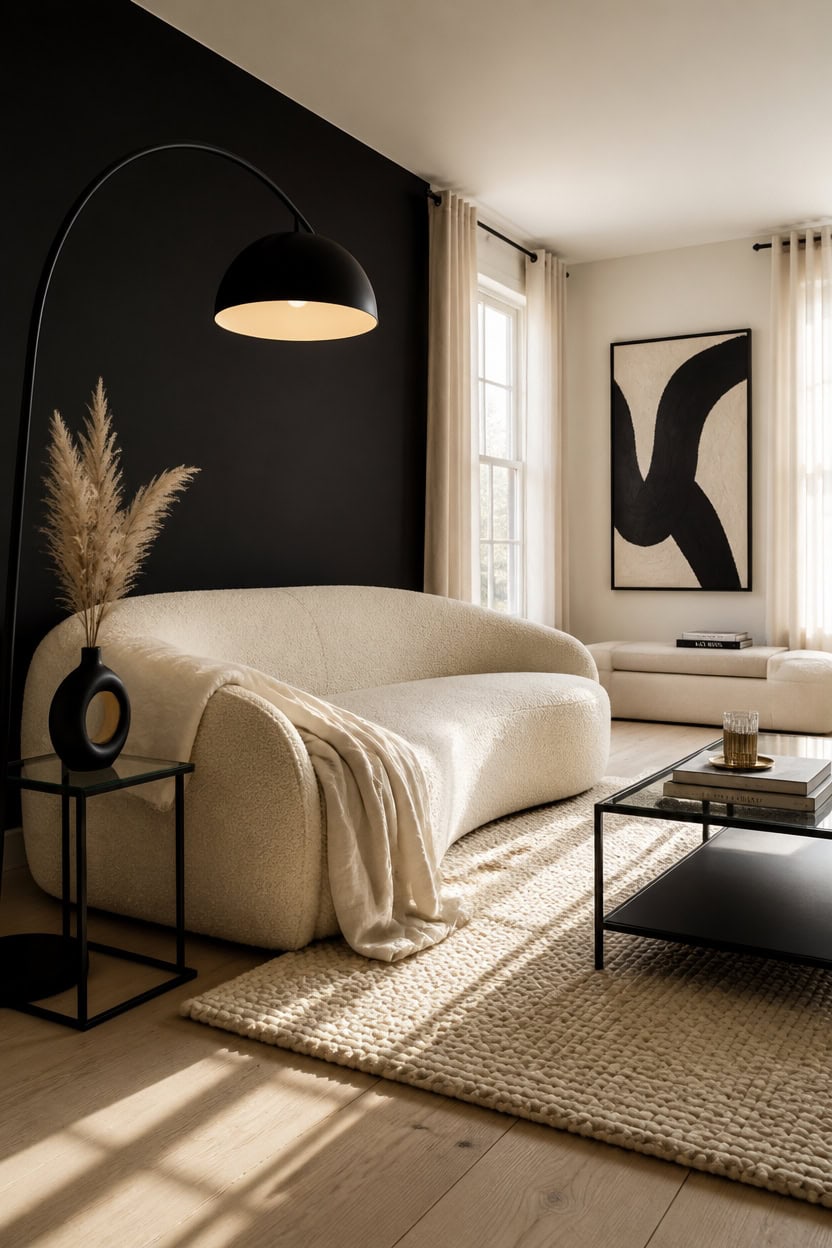
A room that holds fewer things holds them better. In a black and cream palette, each piece carries more visual weight because there is less competing around it — which means one weak choice is more visible, but one strong choice does more work. Edit down to pieces with physical presence: real weight, honest texture, or a silhouette that reads from across the room.
Lead with silhouette: Choose furniture with a distinct, clean shape — a curved sofa, a sculptural floor lamp — so each piece earns its place visually.
Prioritize material quality over quantity: One boucle throw in thick, tactile weave does more for a black and cream room than three thin, forgettable versions.
Leave negative space intact: Empty wall stretches and open floor area are not gaps to fill — they are the breathing room that makes each piece feel curated.
Edit by replacement, not addition: Before bringing anything new in, identify what it replaces; if nothing leaves, the room is already at capacity.
this clean near-white makes one bold black furniture piece read as a deliberate anchor rather than a random placement.
the deep black interior makes each displayed object feel gallery-selected rather than shelf-stuffed.
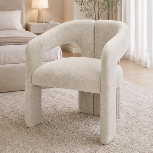 Tbillionnext Modern Boucle Accent Chair, Upholstered Barrel Armchair with Curved Open Back for Living Room Bedroom, Cream White
View Price
Tbillionnext Modern Boucle Accent Chair, Upholstered Barrel Armchair with Curved Open Back for Living Room Bedroom, Cream White
View Price
 Teamson Home Arquer 66.93" Arc Floor Lamp for Living Rooms, Home Offices, Dining Rooms, Bedrooms with Faux Black Marble Base and Black Bell Shade
View Price
Teamson Home Arquer 66.93" Arc Floor Lamp for Living Rooms, Home Offices, Dining Rooms, Bedrooms with Faux Black Marble Base and Black Bell Shade
View Price
 SAFAVIEH Abstract Area Rug 8x10, Wool Handmade Large Ivory & Blue ABT468M
View Price
SAFAVIEH Abstract Area Rug 8x10, Wool Handmade Large Ivory & Blue ABT468M
View Price
 Large Framed Black and White Abstract Wall Art for Living Room, 24x36 In
View Price
Large Framed Black and White Abstract Wall Art for Living Room, 24x36 In
View Price
 BATTILO HOME Beige Throw Blanket for Couch, Knitted Beige Throw for Bed, Neutral Throw Blankets Tan Throw Blanket for Room Decor Housewarming Gifts, 50" x 60"
View Price
BATTILO HOME Beige Throw Blanket for Couch, Knitted Beige Throw for Bed, Neutral Throw Blankets Tan Throw Blanket for Room Decor Housewarming Gifts, 50" x 60"
View Price
 Ceramic Vase - Set of 2 for Home Decor,Black Flower Shape Pampas Vases Minimalist Nordic Boho Style for Modern Farmhouse Decor, Living Room、 Kitchen、Mantle、Bedroom、Dining Table、Office
View Price
Ceramic Vase - Set of 2 for Home Decor,Black Flower Shape Pampas Vases Minimalist Nordic Boho Style for Modern Farmhouse Decor, Living Room、 Kitchen、Mantle、Bedroom、Dining Table、Office
View Price
 HomePop Malmo 36" Storage Bench - Gray & Cream Stripe
View Price
HomePop Malmo 36" Storage Bench - Gray & Cream Stripe
View Price
 Lynder & Co. Black Glass Side Table, Square End Table for Living Room
View Price
Lynder & Co. Black Glass Side Table, Square End Table for Living Room
View Price
Common Mistakes That Flatten a Black and Cream Room
Most black and cream rooms fail not because of what they include, but because of how those things are combined. Matching tones that are too similar — warm cream with warm black, for example — collapse the contrast that makes this palette sharp. The fix is deliberate tension: keep your cream cool and your black true, so each one holds its end of the visual pull.
Matching scale across pieces: When every item in the room is the same visual size, the space reads flat — vary scale between large, medium, and small deliberately.
Over-textured cream surfaces: One or two tactile cream elements anchor the palette; more than that turns the room into a craft fair, not a gallery.
Ignoring undertones: A warm ivory next to a blue-black creates an unintentional muddy shift — verify that your cream and black share the same cool or warm lean.
Spreading black too evenly: Black used in small doses everywhere loses its power; concentrate it in one or two anchor points so it reads as a decision, not decoration.
this precise near-white keeps the cream palette clean and prevents warm drift that flattens the black-and-cream contrast.
concentrating black in one architectural feature gives the palette a deliberate anchor instead of scattered visual noise.
 YOOBECH 101.57" Curved Sofa Couch for Living Room Modern Boucle Couch with 4 Throw Pillows 4 Seater Cream Upholstered Sofa for Living Room, Office
View Price
YOOBECH 101.57" Curved Sofa Couch for Living Room Modern Boucle Couch with 4 Throw Pillows 4 Seater Cream Upholstered Sofa for Living Room, Office
View Price
 Aesphrates Natural Linen Look Throw Pillow Covers 18x18 Inch Set of 4, Textured Woven Decorative Pillow Covers, Neutral Square Cushion Covers for Couch Sofa Living Room Bedroom, Ivory Cream
View Price
Aesphrates Natural Linen Look Throw Pillow Covers 18x18 Inch Set of 4, Textured Woven Decorative Pillow Covers, Neutral Square Cushion Covers for Couch Sofa Living Room Bedroom, Ivory Cream
View Price
 Small Black Ceramic Vase Set of 3,Modern Boho Farmhouse Flowers Vases
View Price
Small Black Ceramic Vase Set of 3,Modern Boho Farmhouse Flowers Vases
View Price
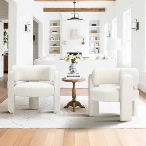 COLAMY Modern Accent Chair, Upholstered Barrel Chair with Curved Back,Cream
View Price
COLAMY Modern Accent Chair, Upholstered Barrel Chair with Curved Back,Cream
View Price
 Henn&Hart 36" Modern Coffee Table, Black
View Price
Henn&Hart 36" Modern Coffee Table, Black
View Price
How Small Black and Cream Rooms Can Still Feel Grand
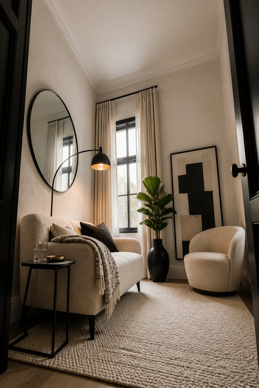
Small rooms don’t need more space to feel grand — they need higher contrast, taller vertical lines, and fewer but bolder pieces. A single large-scale black anchor, like an oversized mirror or a floor lamp with real height, pulls the eye up and out in a way that a cluster of small items never can. Keep your cream light and unbroken across the largest surfaces so the room breathes even when the square footage doesn’t.
Go vertical with black: A tall black element — lamp, mirror, or slim shelving — draws the eye upward and makes ceilings feel higher than they are.
Use cream as your dominant field: Walls, rug, and sofa in cream unify the space and prevent the room from feeling chopped up into smaller visual pieces.
Limit black to two anchor points: One on the floor plane, one at eye level or above keeps the contrast working without fragmenting what little space exists.
Choose furniture with visible legs: Pieces that show floor beneath them create breathing room and make the room read as open rather than stuffed.
this warm-edged near-white keeps the room feeling open and airy without pushing the cream palette toward yellow or beige.
crisp black framing on every opening creates the vertical definition that makes a small room feel deliberately designed rather than simply small.
 ONEMMLION 69" Modern Curved Loveseat Sofa for Living Room, Cream White
View Price
ONEMMLION 69" Modern Curved Loveseat Sofa for Living Room, Cream White
View Price
 RIDA HANDLOOM Area Rug Hand Knotted Oushak Rug for Living Room, Dining Room, Office, Bedroom, Hand Knotted Wool Rug, 12x15 feet Cream-Grey
View Price
RIDA HANDLOOM Area Rug Hand Knotted Oushak Rug for Living Room, Dining Room, Office, Bedroom, Hand Knotted Wool Rug, 12x15 feet Cream-Grey
View Price
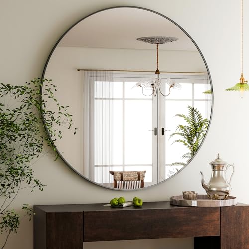 HARRITPURE 48 Inch Round Mirror Black Circle Bathroom Mirror
View Price
HARRITPURE 48 Inch Round Mirror Black Circle Bathroom Mirror
View Price
 Seeluck Off White Linen Curtains 96 Inch Length 2 Panels Set Grommet Drapes
View Price
Seeluck Off White Linen Curtains 96 Inch Length 2 Panels Set Grommet Drapes
View Price
 COLAMY Modern Accent Chair, Upholstered Barrel Chair with Curved Back,Cream
View Price
COLAMY Modern Accent Chair, Upholstered Barrel Chair with Curved Back,Cream
View Price
 DRACIT Large Modern Black and Beige Framed Canvas Wall Art Set-16"x24"x3
View Price
DRACIT Large Modern Black and Beige Framed Canvas Wall Art Set-16"x24"x3
View Price
Black and Cream Investment Pieces Worth Saving For
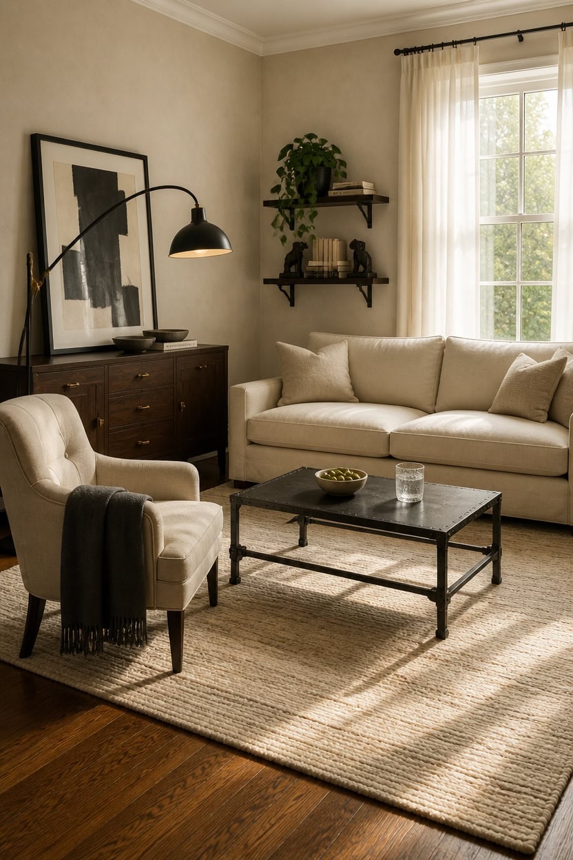
Investment pieces in a black and cream living room earn their price tag by holding their visual weight across decades, not just seasons. A well-made cream sofa in performance linen or a hand-knotted wool rug doesn’t just look good — it anchors the entire room’s palette so everything else reads as intentional. Save your budget for the pieces that touch every single design decision you make around them.
Start with the rug: A hand-knotted wool rug in cream is the single hardest-working investment because it sets the scale and tone of every other piece.
Choose black in weight: Black investment pieces — cast iron, solid wood, wrought iron — earn their price through permanence, not just color.
Prioritize upholstery quality: A cream sofa in performance fabric or tight-weave linen holds its shape and color longer than budget alternatives, making the investment pay out over years.
Buy art that scales: One large-format black and cream original or limited-edition print does more visual work than a gallery wall of smaller, cheaper pieces.
a pure, clean cream-white that gives expensive upholstery and black furniture the brightest possible backdrop without pulling yellow.
this deep, near-black anchors investment furniture and makes the room feel deliberately curated rather than casually assembled.
 HERA'S HOUSE 103.1" Modular Sectional Couch for Living Room Deep Seats
View Price
HERA'S HOUSE 103.1" Modular Sectional Couch for Living Room Deep Seats
View Price
 WiberWi Round Coffee Table Black 35.8" Circle Coffee Tables for Living Room Rustic Industrial Design with Sturdy Metal Frame Legs and Open Storage Shelf, Easy Assembly
View Price
RIDA HANDLOOM Area Rug Hand Knotted Oushak Rug for Living Room, Dining Room, Office, Bedroom, Hand Knotted Wool Rug, 5x8 feet Cream-Grey
View Price
WiberWi Round Coffee Table Black 35.8" Circle Coffee Tables for Living Room Rustic Industrial Design with Sturdy Metal Frame Legs and Open Storage Shelf, Easy Assembly
View Price
RIDA HANDLOOM Area Rug Hand Knotted Oushak Rug for Living Room, Dining Room, Office, Bedroom, Hand Knotted Wool Rug, 5x8 feet Cream-Grey
View Price
 FORTUNETEC 67" Sideboard Buffet Cabinet with Storage, Arched Doors, Black
View Price
FORTUNETEC 67" Sideboard Buffet Cabinet with Storage, Arched Doors, Black
View Price
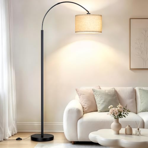 Arc Floor Lamps for Living Room, Black Standing Lamp with Linen Shade
View Price
Arc Floor Lamps for Living Room, Black Standing Lamp with Linen Shade
View Price
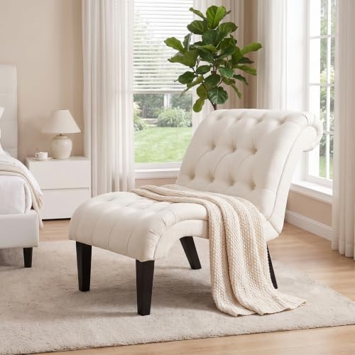 Yongqiang Mid Century Modern Accent Chair, Upholstered Button Tufted Chair
View Price
Yongqiang Mid Century Modern Accent Chair, Upholstered Button Tufted Chair
View Price
 Ambipolar Hands Style Decorative Bookends - Antique Black Cast Iron Decorative Accent for Home Decor, Bookshelf, Living Room Decor, Decorative Bookends for Heavy Books
View Price
Ambipolar Hands Style Decorative Bookends - Antique Black Cast Iron Decorative Accent for Home Decor, Bookshelf, Living Room Decor, Decorative Bookends for Heavy Books
View Price