What Makes Black & White Bathrooms Perfect for Women Who Edit Until It’s Perfect
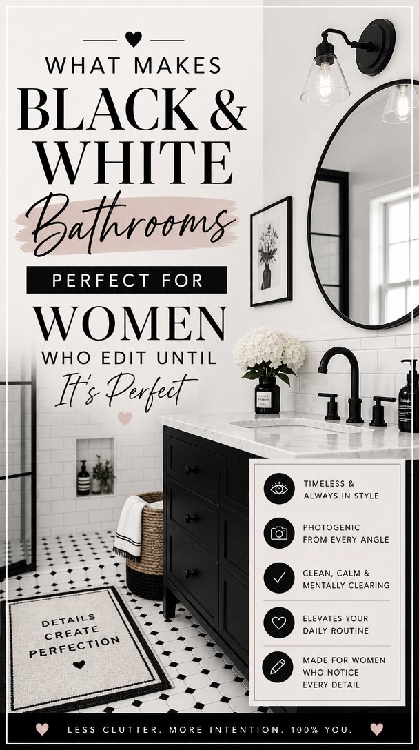
There’s something deeply satisfying about a bathroom that feels *finished*—where nothing competes and everything belongs.
A black and white palette gives you exactly that kind of clarity. It’s clean, striking, and endlessly refinable for anyone who can’t stop tweaking until every detail clicks.
Here’s why this timeless combination is made for your perfectionist eye.
Why Black and White Works in Every Bathroom
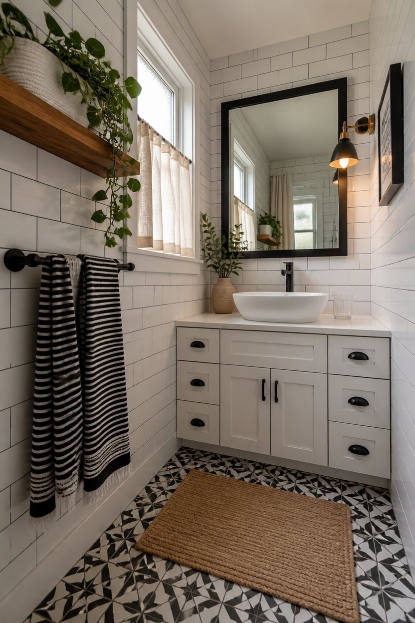
Black and white work together in a bathroom because the contrast gives your eye a clear visual anchor — dark against light — without requiring a third color to hold it together. Tile grout lines, fixtures, and surfaces all become intentional design details instead of accidents when you strip everything down to two tones. Start with white as your dominant surface color on walls and floors, then let black show up in fixtures, frames, and accent tile to control how bold the room feels.
Use white as your base: White walls and surfaces reflect light, making even a small bathroom feel open and clean.
Let black do the defining: Black fixtures and frames act like punctuation — they stop the eye and add structure without overwhelming the room.
Control the ratio: A 70/30 split, white dominant, keeps the room feeling fresh rather than dramatic or cave-like.
Add texture to avoid flatness: Matte black, glossy white, and natural materials like wood or linen keep the palette from looking sterile.
a crisp, blue-free white that reads clean and bright under bathroom lighting.
Paint the vanity cabinet in “Matte Black” (Rust-Oleum 285140) – a flat black finish that grounds the room and ties directly into black fixtures.
 Lordear Vessel Sink Rectangle 19 Inch Bathroom Sink,Rectangular Modern Above Counter Bathroom Sinks White 19x15 Inch Porcelain Ceramic Vessel Vanity Sink Art Basin
View Price
Lordear Vessel Sink Rectangle 19 Inch Bathroom Sink,Rectangular Modern Above Counter Bathroom Sinks White 19x15 Inch Porcelain Ceramic Vessel Vanity Sink Art Basin
View Price
 Ryuwanku Waterfall Bathroom Faucet, Matte Black Stainless Steel, 1-Handle
View Price
Ryuwanku Waterfall Bathroom Faucet, Matte Black Stainless Steel, 1-Handle
View Price
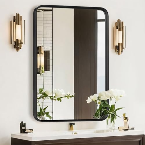 Atilioo Bathroom Mirror for Wall, 30x22 Inch Rectangle Mirror, Matte Black Metal Framed Bathroom Vanity Mirror for Restroom Farmhouse, Anti-Rust, Tempered Glass, Horizontally or Vertically Hanging
View Price
Atilioo Bathroom Mirror for Wall, 30x22 Inch Rectangle Mirror, Matte Black Metal Framed Bathroom Vanity Mirror for Restroom Farmhouse, Anti-Rust, Tempered Glass, Horizontally or Vertically Hanging
View Price
 FloorPops Black Parma Peel & Stick Floor Tiles, FP3828
View Price
FloorPops Black Parma Peel & Stick Floor Tiles, FP3828
View Price
 KLJKPA Black Bathroom Accessories Set, 4-Piece Bathroom Hardware Set
View Price
KLJKPA Black Bathroom Accessories Set, 4-Piece Bathroom Hardware Set
View Price
 24" White Shaker Bathroom Vanity Base – Ready-to-Assemble Sink Cabinet, Freestanding Bathroom Vanity Base Only, No Top or Sink
View Price
24" White Shaker Bathroom Vanity Base – Ready-to-Assemble Sink Cabinet, Freestanding Bathroom Vanity Base Only, No Top or Sink
View Price
 8 Piece Black and Ivory Towel Set, Super Soft & Absorbent Cotton Striped
View Price
8 Piece Black and Ivory Towel Set, Super Soft & Absorbent Cotton Striped
View Price
 3 Pack Small Woven Cotton Rope Baskets for Organizing, White
View Price
3 Pack Small Woven Cotton Rope Baskets for Organizing, White
View Price
Is a Black and White Bathroom Right for Your Home?
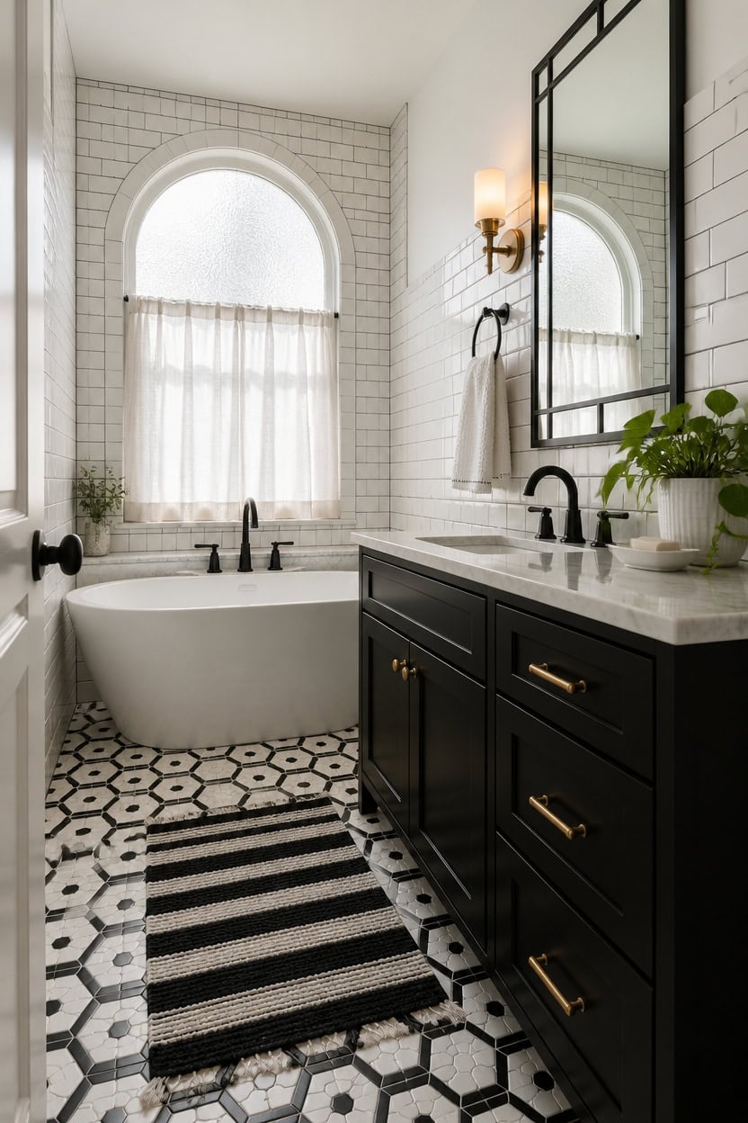
A black and white bathroom works best in homes that already have strong architectural bones — clean lines, good natural light, or at least one surface worth highlighting. The palette is unforgiving, meaning dated fixtures, cramped layouts, or mixed finishes will be more visible, not less. If your bathroom has even one standout feature — a deep tub, a tall window, or original tile — this color scheme will do the heavy lifting for you.
Assess your light first: Black surfaces absorb light, so bathrooms with small or no windows need more white to avoid feeling like a cave.
Check your fixtures: Mismatched chrome, brushed nickel, and gold hardware will clash hard against a black and white scheme — commit to one finish before you paint.
Consider your square footage: Small bathrooms benefit from a white-dominant ratio; larger bathrooms can carry more black without feeling closed in.
Look at your existing tile: If your floor or shower tile has a warm beige or gray undertone, pair it with a warm white like Benjamin Moore “White Dove” (OC-17) instead of a stark cool white.
a clean, shadow-free white that opens up the room without competing with your existing fixtures.
a grounded matte black that pulls the whole scheme together and makes hardware look intentional.
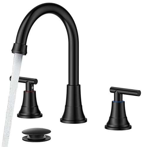 FORIOUS Black Bathroom Faucet 3 Hole, 8" Widespread Bathroom Vanity Faucet
View Price
FORIOUS Black Bathroom Faucet 3 Hole, 8" Widespread Bathroom Vanity Faucet
View Price
 Sarlai Undermount Bathroom Sink - 19 x16 inch Oval Vessel Sink Under counter Lavatory Sink White Ceramic Vanity Sink with Overflow, Modern Art Basin, Interior Size 17-2/5" x 14-1/9"
View Price
Sarlai Undermount Bathroom Sink - 19 x16 inch Oval Vessel Sink Under counter Lavatory Sink White Ceramic Vanity Sink with Overflow, Modern Art Basin, Interior Size 17-2/5" x 14-1/9"
View Price
 LOAAO 22X30 Inch Black Bathroom Mirror Metal Framed
View Price
LOAAO 22X30 Inch Black Bathroom Mirror Metal Framed
View Price
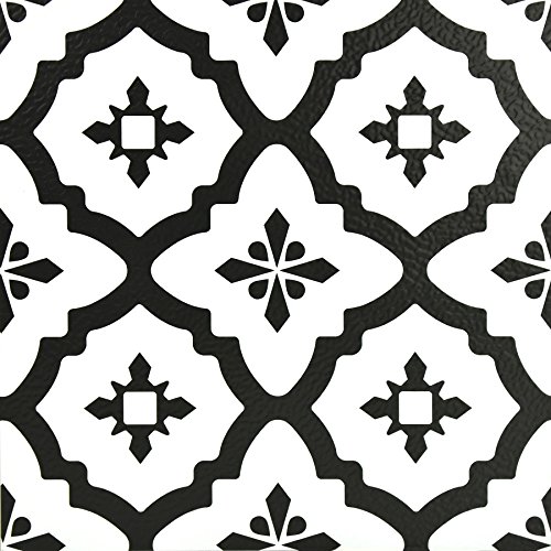 FloorPops Comet Peel and Stick Floor Tiles, Black, Geometric Vinyl Floor Tiles, Water Resistant, 12 in x 12 in, Pack of 10
View Price
FloorPops Comet Peel and Stick Floor Tiles, Black, Geometric Vinyl Floor Tiles, Water Resistant, 12 in x 12 in, Pack of 10
View Price
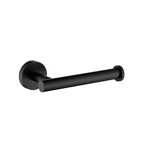 TASTOS Matte Black Toilet Paper Holder SUS304 Stainless Steel, Modern Round Tissue Roll Holders Wall Mount, Toilet Paper Roll Dispenser Bathroom 5 inch TP Holder for Kitchen Washroom
View Price
TASTOS Matte Black Toilet Paper Holder SUS304 Stainless Steel, Modern Round Tissue Roll Holders Wall Mount, Toilet Paper Roll Dispenser Bathroom 5 inch TP Holder for Kitchen Washroom
View Price
 Welhome James 450 GSM 100% Cotton Textured Stripe Towels - 6 Pack Hand Towels, Soft & Absorbent, White
View Price
Welhome James 450 GSM 100% Cotton Textured Stripe Towels - 6 Pack Hand Towels, Soft & Absorbent, White
View Price
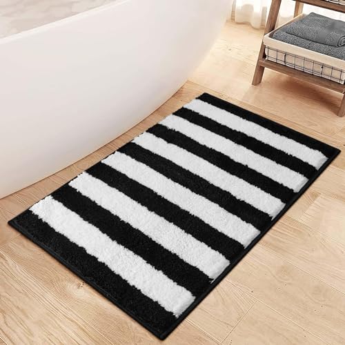 Sivilife Black and White Striped Bath Mats for Bathroom, Non Slip Machine Washable Bathroom Rugs, Soft Thick Plush Water Absorbent Bath Rugs Microfiber Geometric Door Mats for Shower Tub Sink, 20"x32"
View Price
Sivilife Black and White Striped Bath Mats for Bathroom, Non Slip Machine Washable Bathroom Rugs, Soft Thick Plush Water Absorbent Bath Rugs Microfiber Geometric Door Mats for Shower Tub Sink, 20"x32"
View Price
 RQYIXI Ceramic Bathroom Accessories Set,White,4 Piece,Embossed Design
View Price
RQYIXI Ceramic Bathroom Accessories Set,White,4 Piece,Embossed Design
View Price
What to Remove From a Black and White Bathroom
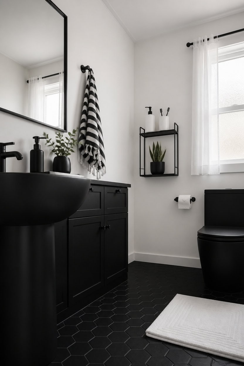
Removing the wrong things from a black and white bathroom makes the difference between a scheme that looks deliberate and one that looks unfinished. Every item that doesn’t belong pulls the eye away from the palette and breaks the visual rhythm you’re building. A focused edit — pulling out warm-toned accessories, cluttered surfaces, and mismatched materials — is often more effective than adding anything new.
Warm wood accessories: Swap out honey oak or pine frames and shelves, which fight the cool contrast of black and white.
Mixed metal hardware: Brushed nickel next to chrome next to gold creates visual noise — commit to one finish across all fixtures.
Colorful personal items: Move out colored bottles, bright toothbrushes, and patterned packaging that interrupt the palette.
Excess textiles: One or two folded towels read as decor; a pile of mismatched washcloths reads as clutter.
a clean, cool white that makes the room feel edited and intentional without competing with any black surface.
a flat, absorbing black that anchors the room and makes the white walls feel sharper by contrast.
 Kruodop 2 PCS Towel Hooks for Bathroom, Wall Mount Towel Holder, Black Matte Wall Robe Hook,Square Stainless Steel Door Hanger Towel Hook for Kitchen, Bedroom,Hotel,Pool,Coats
View Price
Kruodop 2 PCS Towel Hooks for Bathroom, Wall Mount Towel Holder, Black Matte Wall Robe Hook,Square Stainless Steel Door Hanger Towel Hook for Kitchen, Bedroom,Hotel,Pool,Coats
View Price
 Natheeph 14OZ Ceramic Soap Dispenser Bathroom/Kitchen Can Fill Liquid-White
View Price
Natheeph 14OZ Ceramic Soap Dispenser Bathroom/Kitchen Can Fill Liquid-White
View Price
 Jacquotha Black Hand Towels Set of 2, Cotton Quick Dry Bathroom Face Towels
View Price
Jacquotha Black Hand Towels Set of 2, Cotton Quick Dry Bathroom Face Towels
View Price
 Danpoo 12 inch Metal Wall Shelf, Black Floating Shelf, Small Bathroom Shelf, Display Shelves for Wall Storage
View Price
Danpoo 12 inch Metal Wall Shelf, Black Floating Shelf, Small Bathroom Shelf, Display Shelves for Wall Storage
View Price
 Ceramic Square Toothbrush Cup – Durable & Colorfast Toothbrush Holder for Bathroom, Hotel & Office Desk Storage – Modern Bathroom Countertop Holder for Toothpaste, Razors & Daily Essentials
View Price
Ceramic Square Toothbrush Cup – Durable & Colorfast Toothbrush Holder for Bathroom, Hotel & Office Desk Storage – Modern Bathroom Countertop Holder for Toothpaste, Razors & Daily Essentials
View Price
 Black Bathroom Vanity Mirror Over Sink 24x36, Large Wall Rectangle Mirror
View Price
Black Bathroom Vanity Mirror Over Sink 24x36, Large Wall Rectangle Mirror
View Price
 Avalon Towels White Bath Mat - 100% Cotton Set of 2 Absorbent Bathmat - Bathroom Mats Quick Dry Bath Mats for Bathrooms (22x34 Inches)
View Price
Avalon Towels White Bath Mat - 100% Cotton Set of 2 Absorbent Bathmat - Bathroom Mats Quick Dry Bath Mats for Bathrooms (22x34 Inches)
View Price
 Day Moon™ - Matte Black Toilet Paper Holder Wall Mount - Modern Roll Holder
View Price
Day Moon™ - Matte Black Toilet Paper Holder Wall Mount - Modern Roll Holder
View Price
How Black and White Bathrooms Outlast Every Trend
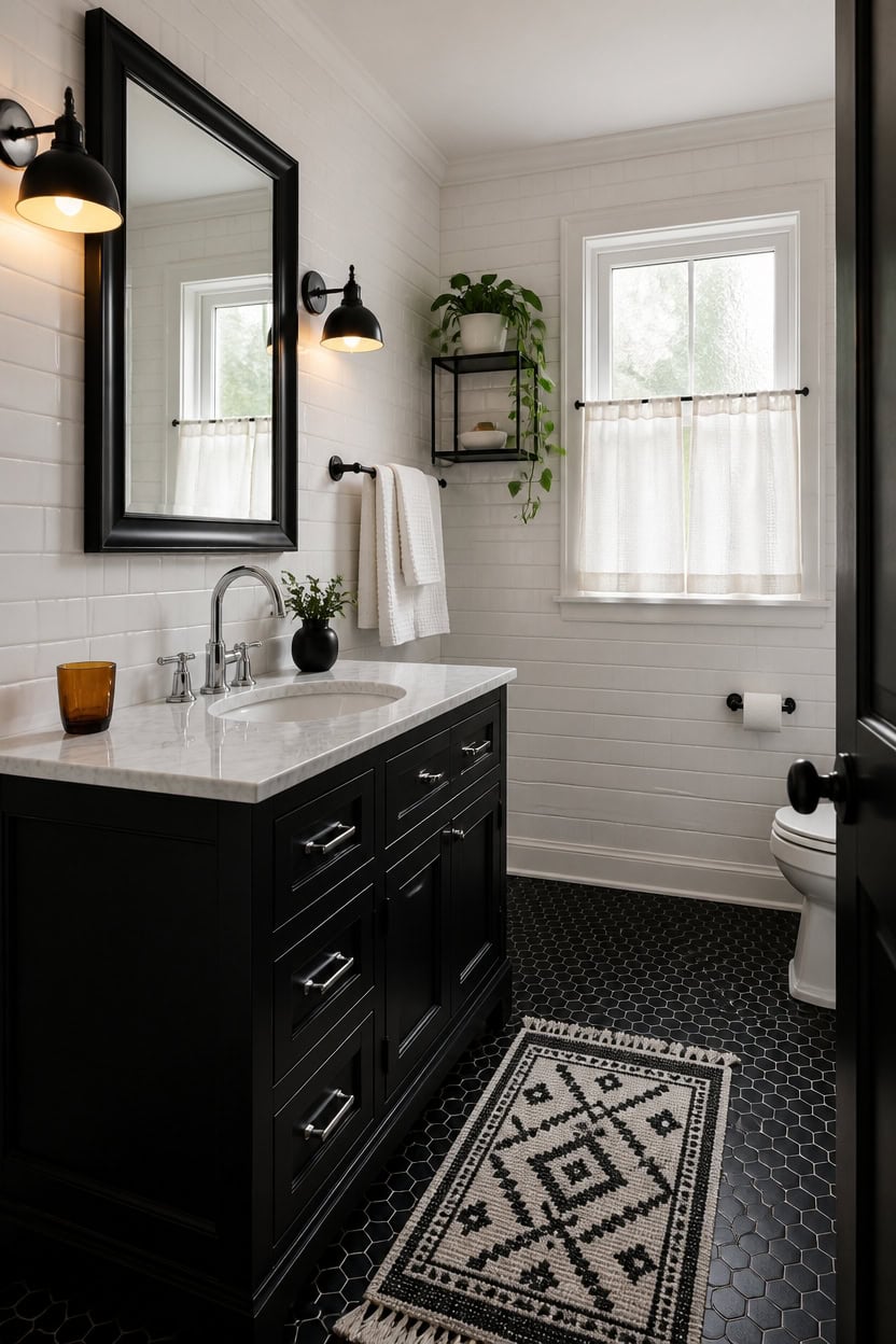
Black and white has survived every design cycle since the early 1900s because it isn’t a trend — it’s a ratio of contrast that the human eye finds naturally satisfying. The palette works in every era because it borrows nothing from a specific decade’s color obsessions or material fads. Swap in a modern faucet or a vintage sconce and the room updates without losing its identity.
Contrast is the constant: Every version of this palette — Victorian, mid-century, minimalist — relies on sharp contrast between light and dark surfaces.
Materials carry the decade: Subway tile reads as traditional, large-format marble reads as contemporary, but both work in black and white without clashing.
Accessories do the updating: Swap hardware finishes or towel textures and the room shifts to the current moment without repainting or retiling.
Nothing to date it: No mustard, no sage, no terracotta — removing color removes the timestamp entirely.
a pure, cool white that reads as timeless rather than trendy and makes every black surface pop.
a deep, saturated black that anchors the room and holds its weight across any style era.
 Briivue Black Metal Framed Bathroom Wall Mirror, 24x36 Inch
View Price
Briivue Black Metal Framed Bathroom Wall Mirror, 24x36 Inch
View Price
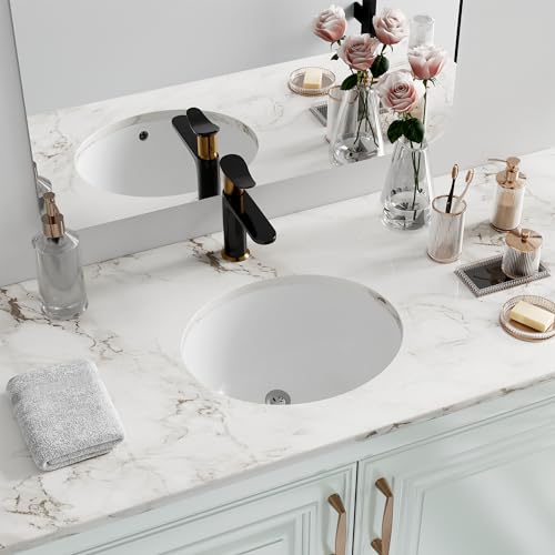 Undermount Bathroom Sink Oval, Hugsleek Interior Bowl Size 16 x 13 inch White Porcelain Ceramic Vessel Sink Under Counter Oval Exterior size 18x15in Bath Sink Bowl Basin Lavatory Vanity Fireclay
View Price
Undermount Bathroom Sink Oval, Hugsleek Interior Bowl Size 16 x 13 inch White Porcelain Ceramic Vessel Sink Under Counter Oval Exterior size 18x15in Bath Sink Bowl Basin Lavatory Vanity Fireclay
View Price
 RARXTR 3pc Bathroom Hardware Set with Matte Black Toilet Paper Holder, Towel Ring, Towel Bar SUS304 Stainless Steel Toilet Paper Roll Holder Wall Mount, Bathroom Towel Holder, Towel Rack Set
View Price
RARXTR 3pc Bathroom Hardware Set with Matte Black Toilet Paper Holder, Towel Ring, Towel Bar SUS304 Stainless Steel Toilet Paper Roll Holder Wall Mount, Bathroom Towel Holder, Towel Rack Set
View Price
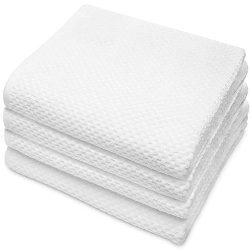 COTTON CRAFT Euro Spa Waffle Weave Bath Towels - Set of 4 White Towels
View Price
COTTON CRAFT Euro Spa Waffle Weave Bath Towels - Set of 4 White Towels
View Price
 Z metnal Small Floating Shelves for Wall, 8-Inch Modern Aluminum Metal Display Shelf, Rustproof Minimalist Decor Wall Shelf for Bathroom, Bedroom & Office, Wall Mount, Matte Black, 2-Pack
View Price
Z metnal Small Floating Shelves for Wall, 8-Inch Modern Aluminum Metal Display Shelf, Rustproof Minimalist Decor Wall Shelf for Bathroom, Bedroom & Office, Wall Mount, Matte Black, 2-Pack
View Price
 ANTIS'S HOME Ceramic Double Layer Self Draining White Soap Dish Bathroom Kitchen
View Price
ANTIS'S HOME Ceramic Double Layer Self Draining White Soap Dish Bathroom Kitchen
View Price
 QJHOMO Black and White Bathroom Rug Modern Geometric Bath Mat 18" x 26"
View Price
QJHOMO Black and White Bathroom Rug Modern Geometric Bath Mat 18" x 26"
View Price
 FEILERN Toilet Paper Holder Matte Black, Wall Mounted Pivoting for Bathroom
View Price
FEILERN Toilet Paper Holder Matte Black, Wall Mounted Pivoting for Bathroom
View Price
Small Black and White Bathrooms Done Right
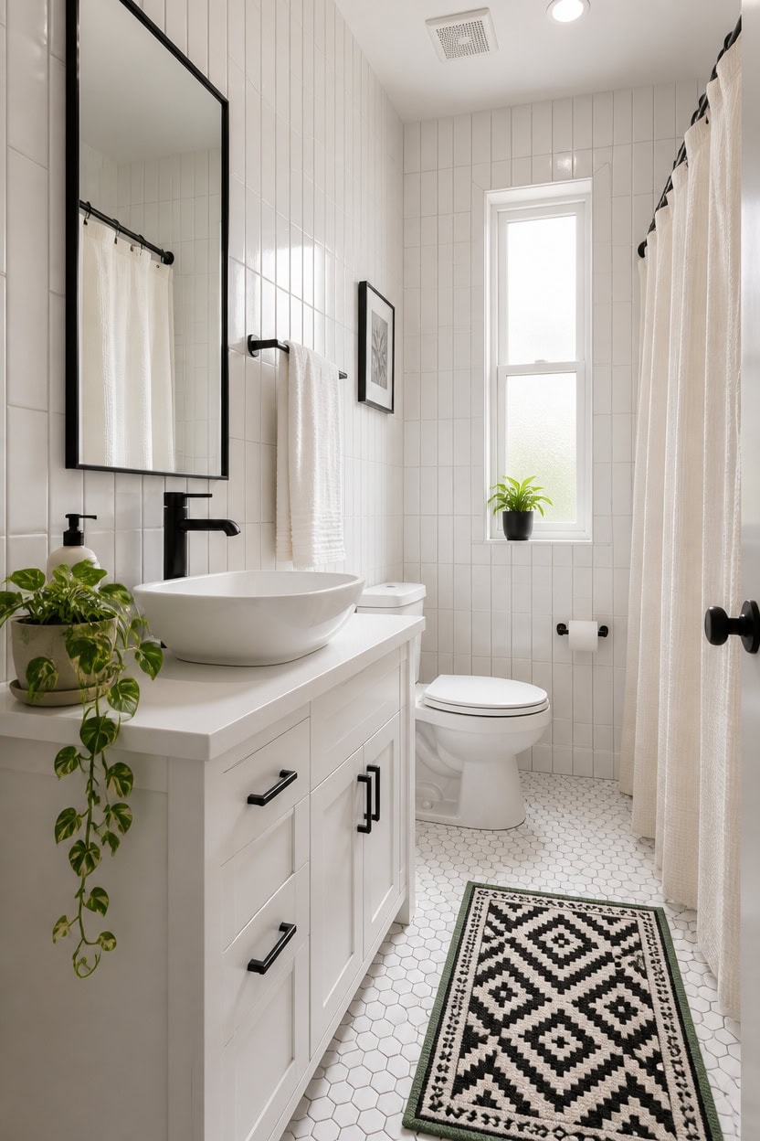
Small bathrooms fight back hardest when the contrast ratio is off — too much black in a tight space flattens the walls and shrinks the room visually. White should dominate at roughly 70 to 80 percent of the surface area, with black doing its work as a sharp accent on fixtures, frames, and hardware. This keeps the room feeling open while still delivering the high-contrast punch that makes the palette worth using.
Let white own the walls: White tile or paint on every wall prevents the ceiling from dropping and the room from closing in.
Black goes on the details: Fixtures, mirror frames, towel bars, and cabinet hardware are enough black in a small space — no need for dark tile walls.
Use vertical lines: Vertical subway tile or tall narrow frames draw the eye upward, making the ceiling read as higher than it is.
Keep the floor light: A white or pale grout floor bounces light and visually expands square footage more than any other single choice.
a clean, cool white that reflects light in tight spaces and keeps small walls from crowding in.
a deep black that anchors the room without needing to cover large square footage to make an impact.
 Tenedos 8x8 Subway Square Porcelain Floor Wall Tile Matte Finish for Backsplash Kitchen, Accent Decor, Bathroom Shower Tile (White, 1 Piece)
View Price
Tenedos 8x8 Subway Square Porcelain Floor Wall Tile Matte Finish for Backsplash Kitchen, Accent Decor, Bathroom Shower Tile (White, 1 Piece)
View Price
 ALBAD 16-Inch Modern Bathroom Vanity with Sink, Compact Bathroom Vanity Set with Storage, Freestanding Small Space Bath Cabinet, Single Sink Cabinet with Adjustable Shelf (White, 16 Inch)
View Price
ALBAD 16-Inch Modern Bathroom Vanity with Sink, Compact Bathroom Vanity Set with Storage, Freestanding Small Space Bath Cabinet, Single Sink Cabinet with Adjustable Shelf (White, 16 Inch)
View Price
 Modern Single Hole Bathroom Faucet, Luxury Matte Black Bathroom Sink Faucet
View Price
Modern Single Hole Bathroom Faucet, Luxury Matte Black Bathroom Sink Faucet
View Price
 White Classic Luxury White Hand Towels - 100% Turkish Cotton, 16x30, 6 Pack
View Price
White Classic Luxury White Hand Towels - 100% Turkish Cotton, 16x30, 6 Pack
View Price
 FORIOUS Commercial Toilet Paper Holder Wall Mount Bathroom Tissue Holder
View Price
FORIOUS Commercial Toilet Paper Holder Wall Mount Bathroom Tissue Holder
View Price
 FE 10 Oz Ceramic Hand Soap Dispenser for Bathroom and Kitchen, White
View Price
FE 10 Oz Ceramic Hand Soap Dispenser for Bathroom and Kitchen, White
View Price
 Yimobra Black and White Bathroom Rugs Non Slip Washable, Ultra Soft and Water Absorbent Bath Mats, Plush Fluffy Shower Mat Outside, Microfiber Thick Matts for Bathroom Floor/Sink, 24x17
View Price
Yimobra Black and White Bathroom Rugs Non Slip Washable, Ultra Soft and Water Absorbent Bath Mats, Plush Fluffy Shower Mat Outside, Microfiber Thick Matts for Bathroom Floor/Sink, 24x17
View Price
Washable Bathroom Rugs for This Palette
Machine-washable Rugs USA best sellers in this palette's colors, linked in 2' x 3', the size for in front of a vanity or tub.
- Free shipping
- 30-day returns
- 210,000+ five-star reviews
 Simple Serpent Rug – Black & Off White
View Price
Simple Serpent Rug – Black & Off White
View Price
 Ring Around The Rosette Rug – Black
View Price
Ring Around The Rosette Rug – Black
View Price
 Jute Braided Rug – Black
View Price
Jute Braided Rug – Black
View Price
 Shaggy Moroccan Lattice Fringe Rug – Black
View Price
Shaggy Moroccan Lattice Fringe Rug – Black
View Price
 Seagrass with Border Rug – Black
View Price
Seagrass with Border Rug – Black
View Price
 Moroccan Trellis Rug – Black
View Price
Moroccan Trellis Rug – Black
View Price
 Monochrome Bordered Indoor/Outdoor Rug – Grey
View Price
Monochrome Bordered Indoor/Outdoor Rug – Grey
View Price
 Ashen Braided Tassel Indoor/Outdoor Rug – Salt and Pepper
View Price
Ashen Braided Tassel Indoor/Outdoor Rug – Salt and Pepper
View Price
 Abstract Rainfall Rug – Black
View Price
Abstract Rainfall Rug – Black
View Price
 Chevron Stripes Indoor/Outdoor Rug – Black
View Price
Chevron Stripes Indoor/Outdoor Rug – Black
View Price
 Checker Weave Seagrass Rug – Black
View Price
Checker Weave Seagrass Rug – Black
View Price
 Seagrass Herringbone Rug – Black
View Price
Seagrass Herringbone Rug – Black
View Price
 Samson Machine Washable Rug by Bunny Williams – Black
View Price
Samson Machine Washable Rug by Bunny Williams – Black
View Price
 Watts Checkered Washable Rug by Nate Berkus – Charcoal
View Price
Watts Checkered Washable Rug by Nate Berkus – Charcoal
View Price
 Walker Checkered Washable Rug by Nate Berkus – Charcoal
View Price
Walker Checkered Washable Rug by Nate Berkus – Charcoal
View Price
 Diamond Pinstripes Washable Rug – White
View Price
Diamond Pinstripes Washable Rug – White
View Price
 Washable Solid Shag Rug – Off White
View Price
Washable Solid Shag Rug – Off White
View Price
 Ivana Checkered Plush Cloud Washable Rug – Off White
View Price
Ivana Checkered Plush Cloud Washable Rug – Off White
View Price
 Moroccan Washable Rug – White
View Price
Moroccan Washable Rug – White
View Price
 Kris Striped Plush Cloud Washable Rug – Off White
View Price
Kris Striped Plush Cloud Washable Rug – Off White
View Price
 Milazia Honeycomb Plush Cloud Washable Rug – White
View Price
Milazia Honeycomb Plush Cloud Washable Rug – White
View Price
When to Use Black and When to Let White Lead
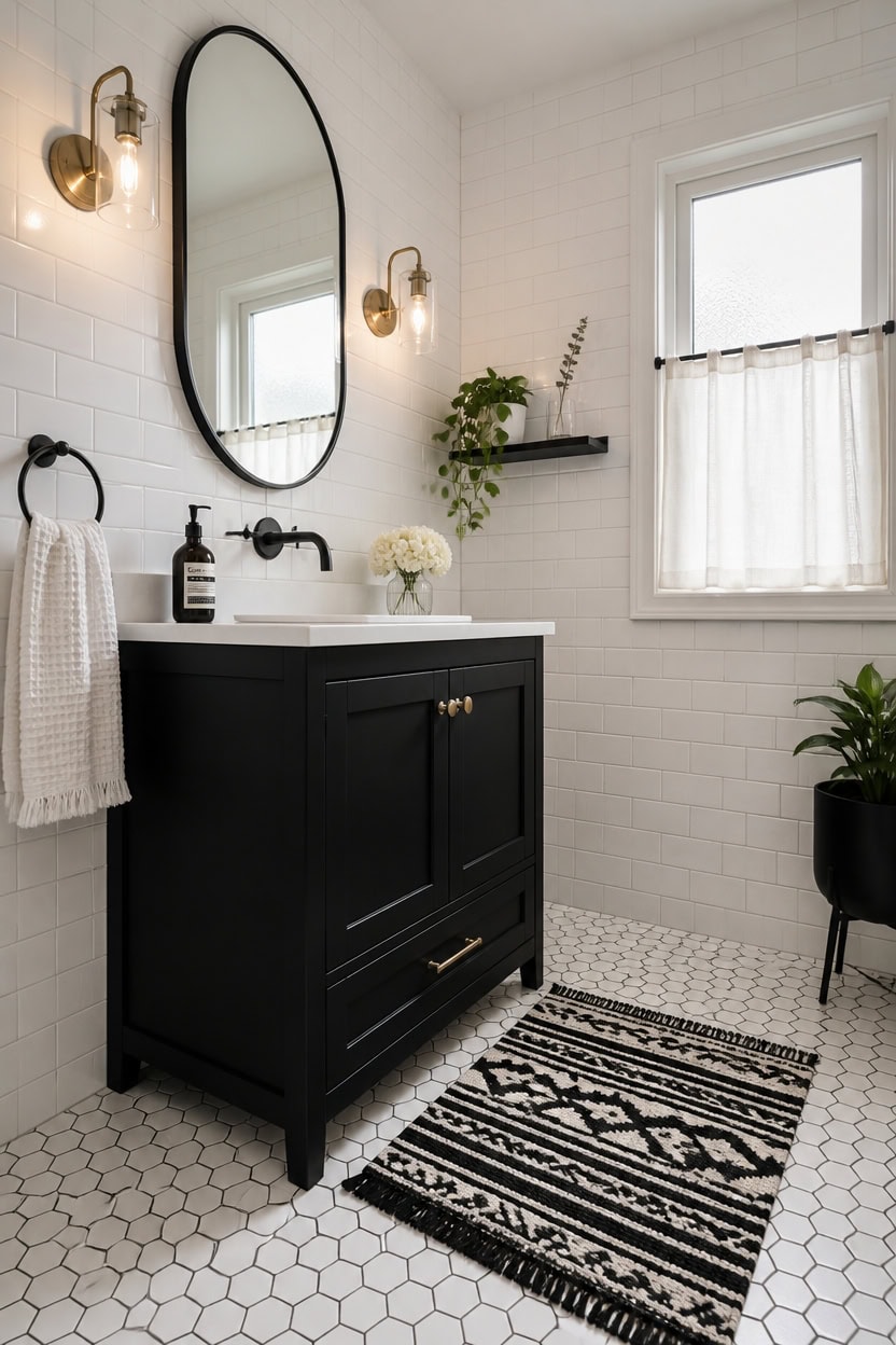
Black goes where the eye is meant to stop, and white goes everywhere else. Black draws attention — it signals importance, creates contrast, and anchors the room — so placing it on a focal point like the vanity or mirror frame gives the bathroom a clear visual center. White does the heavy lifting by keeping the rest of the space open, reflective, and calm.
Black at eye level: Use black on fixtures, mirror frames, and hardware where your eye naturally lands first.
White above and below: Walls and floors stay white to keep the room from feeling compressed or closed in.
One black statement: Pick one larger black element — a vanity, a light fixture, or a floor tile — and let everything else stay light.
Avoid scattered black: Too many small black accents spread around the room creates visual noise instead of contrast.
a crisp, reflective white that lets black fixtures and hardware read as bold without overwhelming the space.
a flat, authoritative black that creates one strong focal point without competing with white walls.
 ARCORA Wall Mount Bathroom Faucet, Matte Black Single Handle Bathroom Sink Faucet Wall Mounted, Rough-in Valve Included
View Price
ARCORA Wall Mount Bathroom Faucet, Matte Black Single Handle Bathroom Sink Faucet Wall Mounted, Rough-in Valve Included
View Price
 Eridanus Bathroom Pedestal Sink 21x19 Ceramic Single Hole with Overflow
View Price
Eridanus Bathroom Pedestal Sink 21x19 Ceramic Single Hole with Overflow
View Price
 ANDY STAR Black Oval Mirrors for Bathroom, 22x30 Inch Matte Black Stainless Steel Metal Framed Oval Wall Mirror, Modern Vanity Mirror Wall Mount Horizontal or Vertical
View Price
ANDY STAR Black Oval Mirrors for Bathroom, 22x30 Inch Matte Black Stainless Steel Metal Framed Oval Wall Mirror, Modern Vanity Mirror Wall Mount Horizontal or Vertical
View Price
 White Glossy Ceramic Subway Tile 3x6 Wall Backsplash Made in USA (Full Box 100 Pieces)
View Price
White Glossy Ceramic Subway Tile 3x6 Wall Backsplash Made in USA (Full Box 100 Pieces)
View Price
 Matte Black Towel Ring for Bathroom, Kitchen Bath Towel Holder Hangers Wall Mount Heavy Duty Stainless Steel
View Price
Matte Black Towel Ring for Bathroom, Kitchen Bath Towel Holder Hangers Wall Mount Heavy Duty Stainless Steel
View Price
 COTTON CRAFT Euro Spa Waffle Weave Bath Sheet - Set of 2 White Towel Sheets
View Price
COTTON CRAFT Euro Spa Waffle Weave Bath Sheet - Set of 2 White Towel Sheets
View Price
 Danpoo 20 inch Floating Shelf for Wall Organizer & Storage, Mini Display Shelf, Metal Wall Shelf for Bathroom, Living Room, Kitchen, Bedroom(Matte Black)
View Price
Danpoo 20 inch Floating Shelf for Wall Organizer & Storage, Mini Display Shelf, Metal Wall Shelf for Bathroom, Living Room, Kitchen, Bedroom(Matte Black)
View Price
 TYUU Waffle Bath Mat, Boho Bathroom Rugs Non Slip, 30x20 Black & White
View Price
TYUU Waffle Bath Mat, Boho Bathroom Rugs Non Slip, 30x20 Black & White
View Price
Black and White Bathroom Tile Patterns Worth Obsessing Over
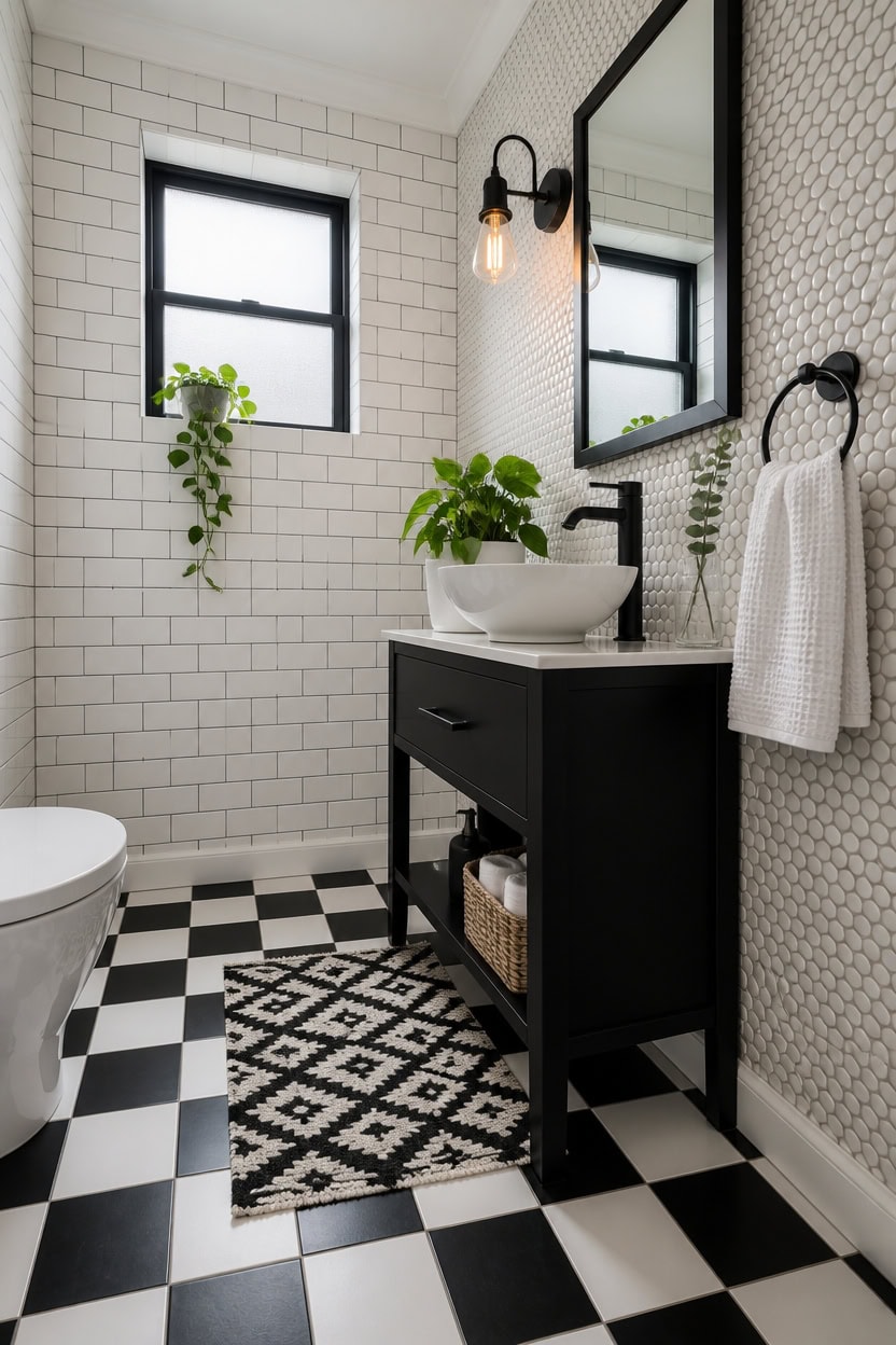
Tile patterns do more visual work than any other surface in a black and white bathroom because they cover the most ground. A checkerboard floor or a graphic mosaic wall reads from across the room before anything else registers, making pattern the first design decision — not the last. Choose your tile pattern before selecting fixtures, because the pattern sets the energy level the entire room has to match.
Checkerboard floors: Classic black and white squares ground the room with structure without needing any other bold design moves.
Mosaic accent walls: Small-scale hex or penny tiles on one wall add texture and visual interest without overwhelming the space.
Subway tile with dark grout: White subway tile paired with charcoal or black grout creates a grid pattern that adds contrast while staying timeless.
Mix scale intentionally: Pair a large-format floor tile with a small-scale wall tile so the two patterns don’t compete at the same visual weight.
a pure white that reflects tile pattern contrast upward and keeps the room feeling open above the bold floor.
a flat black that anchors the room and echoes the dark tile elements without adding another pattern.
 Tenedos Matte White Hexagon Porcelain Mosaic Tile with Black Flower Pattern – Bathroom Floor, Kitchen Backsplash, Accent Wall, Entryway (10 Sheets)
View Price
Tenedos Matte White Hexagon Porcelain Mosaic Tile with Black Flower Pattern – Bathroom Floor, Kitchen Backsplash, Accent Wall, Entryway (10 Sheets)
View Price
 Tenedos USCT 3x6 Glossy White Ceramic Subway Tile – Box of 10 Shiny Wall Tiles for Kitchen Backsplash, Bathroom, Shower, Accent Walls – Easy to Clean & Classic
View Price
Tenedos USCT 3x6 Glossy White Ceramic Subway Tile – Box of 10 Shiny Wall Tiles for Kitchen Backsplash, Bathroom, Shower, Accent Walls – Easy to Clean & Classic
View Price
 Biyoee Peel and Stick Floor Tile 30-Pack 12 x 12 inch,Black and White Self-Adhesive Waterproof Vinyl Flooring Plank for Bathroom,Kitchen, Dining Room, Bedrooms, Cover 30 Sq. Ft (15 Tiles per Color)
View Price
Biyoee Peel and Stick Floor Tile 30-Pack 12 x 12 inch,Black and White Self-Adhesive Waterproof Vinyl Flooring Plank for Bathroom,Kitchen, Dining Room, Bedrooms, Cover 30 Sq. Ft (15 Tiles per Color)
View Price
 ALBAD 16-Inch Modern Bathroom Vanity with Sink, Compact Bathroom Vanity Set with Storage, Freestanding Small Space Bath Cabinet, Single Sink Cabinet with Adjustable Shelf (Black, 16 Inch)
View Price
ALBAD 16-Inch Modern Bathroom Vanity with Sink, Compact Bathroom Vanity Set with Storage, Freestanding Small Space Bath Cabinet, Single Sink Cabinet with Adjustable Shelf (Black, 16 Inch)
View Price
 Tenedos Arctic White Penny Round Porcelain Mosaic Tile - Matte Finish for Bathroom Floor, Kitchen Backsplash, Accent Walls, Shower Surrounds (Box of 10 Sheets - 10 Sq.Ft)
View Price
Tenedos Arctic White Penny Round Porcelain Mosaic Tile - Matte Finish for Bathroom Floor, Kitchen Backsplash, Accent Walls, Shower Surrounds (Box of 10 Sheets - 10 Sq.Ft)
View Price
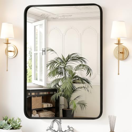 Sweetcrispy Bathroom Wall Mirror, 40x30 Inch Mirror for Over Sink, Black
View Price
Sweetcrispy Bathroom Wall Mirror, 40x30 Inch Mirror for Over Sink, Black
View Price
Our Favorite Bathroom Wall Art
- Free shipping over $35
- Picked at 4.6 stars or higher
 "Bathroom" Textual Art Print
View Price
"Bathroom" Textual Art Print
View Price
 "My Aim Is To Keep This Bathroom Clean" Print on Wood
View Price
"My Aim Is To Keep This Bathroom Clean" Print on Wood
View Price
 "Bathroom Rules" Wrapped Canvas Textual Art
View Price
"Bathroom Rules" Wrapped Canvas Textual Art
View Price
 Mallon "Love Embracing" by Rikki Drotar Print
View Price
Mallon "Love Embracing" by Rikki Drotar Print
View Price
 Luxury Bath "Bain De Luxe III" by Daphne Brissonnet
View Price
Luxury Bath "Bain De Luxe III" by Daphne Brissonnet
View Price
 Donkey Green Tub White Print
View Price
Donkey Green Tub White Print
View Price
 "Wash Your Paws" by Marla Rae Wrapped Canvas
View Price
"Wash Your Paws" by Marla Rae Wrapped Canvas
View Price
 Stupell Country Washroom Still Life Stretched Canvas
View Price
Stupell Country Washroom Still Life Stretched Canvas
View Price
 "Brady Wash Your Hands" by Jennifer Pugh Print on Wood
View Price
"Brady Wash Your Hands" by Jennifer Pugh Print on Wood
View Price
 Classic Bathroom Prints by Gregory Gorham 2-Piece Canvas Set
View Price
Classic Bathroom Prints by Gregory Gorham 2-Piece Canvas Set
View Price
 Stupell Chic Bathroom Interior 2-Piece Framed Art Set
View Price
Stupell Chic Bathroom Interior 2-Piece Framed Art Set
View Price
The Tile Choices That Actually Reward Close Attention
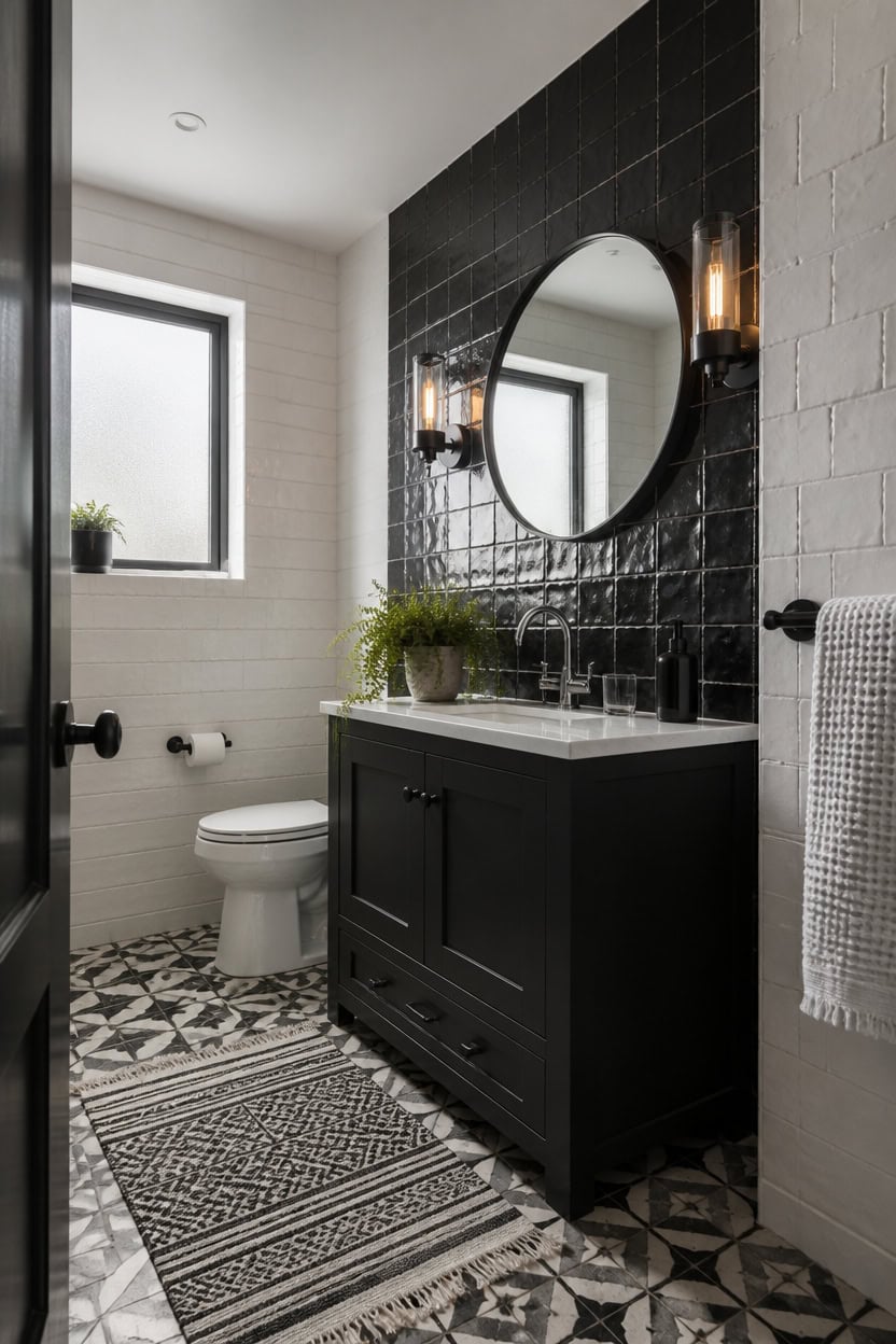
Tiles that reward close attention are the ones built from real materials with surface variation — not uniform machine perfection. Handmade ceramic, encaustic cement, and natural stone all have slight inconsistencies in tone and texture that catch light differently throughout the day. Run your hand across the sample before buying; if it feels perfectly smooth and identical across every piece, it will look flat on the wall.
Handmade ceramic: Slight color shifts between individual tiles create a living surface that looks more interesting as the room fills with light.
Encaustic cement: Pattern penetrates through the tile body, so chips and wear reveal the same design underneath rather than exposing plain clay.
Zellige tile: Irregular edges and a rippled glaze surface scatter light in ways that polished porcelain simply cannot replicate.
Unlevel installation: For natural stone and handmade tile, a slight lippage between tiles is expected and adds character rather than signaling poor work.
a clean pure white that lets handmade tile’s subtle color variation read clearly without competition overhead.
a deep matte black that anchors the room and echoes the dark veining in natural stone tile.
 12x12 Flora Black White Encaustic Ceramic Tile (one piece)
View Price
12x12 Flora Black White Encaustic Ceramic Tile (one piece)
View Price
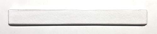 1.5x12 Bullnose White Crackled Glossy Ceramic Trim Tile
View Price
1.5x12 Bullnose White Crackled Glossy Ceramic Trim Tile
View Price
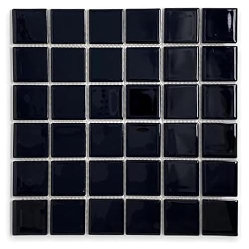 Tenedos 2x2 Inches Black Porcelain Mosaic Tile for Floor and Wall - 5 Sheets
View Price
Tenedos 2x2 Inches Black Porcelain Mosaic Tile for Floor and Wall - 5 Sheets
View Price
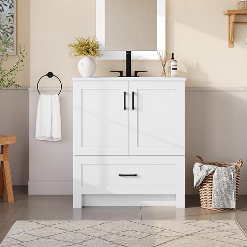 Yaheetech 30 Inch White Shaker Bathroom Vanity Cabinet with Sink Countertop
View Price
Yaheetech 30 Inch White Shaker Bathroom Vanity Cabinet with Sink Countertop
View Price
 HAPPYMONT Bathroom Round Mirrors for Over Sink, 24 Inch Wall Circle Mirror with Matte Metal Frame, Modern Wall Mount Vanity Mirror for Home Decor, Living Room, Bedroom, Black
View Price
HAPPYMONT Bathroom Round Mirrors for Over Sink, 24 Inch Wall Circle Mirror with Matte Metal Frame, Modern Wall Mount Vanity Mirror for Home Decor, Living Room, Bedroom, Black
View Price
 Newwiee 4 Pcs Black White Striped Bathroom Rugs and Towels, Halloween Decor
View Price
Newwiee 4 Pcs Black White Striped Bathroom Rugs and Towels, Halloween Decor
View Price
 POLYTE 430 GSM Poly Blend Microfiber Quick Dry Waffle Bath Towel Set of 6
View Price
POLYTE 430 GSM Poly Blend Microfiber Quick Dry Waffle Bath Towel Set of 6
View Price
 KASUNTING Hand Soap Dispenser Bathroom, Black Dish Soap Dispenser for Kitchen, 17 Fl Oz Plastic Hand and Dish Soap Dispensers Set with Bamboo Pump, 2 Pack Refillable Liquid Lotion Containers Bottle
View Price
KASUNTING Hand Soap Dispenser Bathroom, Black Dish Soap Dispenser for Kitchen, 17 Fl Oz Plastic Hand and Dish Soap Dispensers Set with Bamboo Pump, 2 Pack Refillable Liquid Lotion Containers Bottle
View Price
Grout Colors That Make or Break a Black and White Bathroom
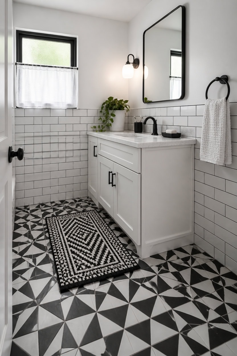
Grout color is the most underestimated decision in a black and white bathroom, and the wrong choice can flatten even the most beautiful tile work. White grout on white tile blurs the pattern into a soft, undefined surface, while dark grout on the same tile sharpens every line and makes the geometry read clearly across the room. Test grout samples on an actual tile section before committing, because dried grout looks completely different than it does wet in the bucket.
White grout on white tile: Creates a seamless, soft surface that reads as one material — good for small bathrooms that need to feel larger.
Dark grout on white tile: Sharpens every grout line and turns the tile layout itself into a design feature with strong graphic contrast.
Gray grout as the middle path: A medium charcoal grout holds contrast without the maintenance demands of bright white, which stains visibly over time.
Matching grout to tile tone: On black tile, black grout makes the surface recede and appear as a single bold plane rather than a grid.
a crisp pure white that keeps the eye on the tile’s grout lines rather than competing with them.
a deep matte black that anchors the grout color story and ties dark grout lines back to the room’s largest furniture piece.
 GBACHOOSE Peel and Stick Tile Floor, 20 Sheets Black and White Floral Vinyl Floor Tiles, 0.7 mm Thick Waterproof Self Adhesive Flooring for Bathroom, Laundry Room, Entryway and Apartment Refresh
View Price
GBACHOOSE Peel and Stick Tile Floor, 20 Sheets Black and White Floral Vinyl Floor Tiles, 0.7 mm Thick Waterproof Self Adhesive Flooring for Bathroom, Laundry Room, Entryway and Apartment Refresh
View Price
 Tenedos White Ceramic 3x6 Glossy Subway Wall Tile Backsplash for Kitchen, Bathroom Shower, Accent Decor, Fireplace (80 Pieces - Box of 10 sq.ft.)
View Price
Tenedos White Ceramic 3x6 Glossy Subway Wall Tile Backsplash for Kitchen, Bathroom Shower, Accent Decor, Fireplace (80 Pieces - Box of 10 sq.ft.)
View Price
 Mapei Keracaulk S Premium, Paintable, Sanded, Siliconized Acrylic Caulk, Expertly Formulated to Match Grout Colors, 10 oz., 5047 Charcoal- Sanded
View Price
Mapei Keracaulk S Premium, Paintable, Sanded, Siliconized Acrylic Caulk, Expertly Formulated to Match Grout Colors, 10 oz., 5047 Charcoal- Sanded
View Price
 Merax 21.6" Bathroom Vanity with Single Sink, Bathroom Floor Standing Cabinet with Side Storage, Modern Bathroom Vanity with 1 Door and White Ceramic Basin Sink Top, White
View Price
Merax 21.6" Bathroom Vanity with Single Sink, Bathroom Floor Standing Cabinet with Side Storage, Modern Bathroom Vanity with 1 Door and White Ceramic Basin Sink Top, White
View Price
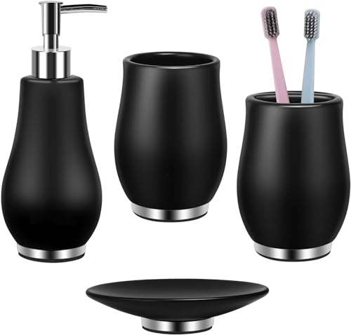 RQYIXI Ceramic Bathroom Accessories Set,Black,4 Piece,Tulip Design
View Price
RQYIXI Ceramic Bathroom Accessories Set,Black,4 Piece,Tulip Design
View Price
Removable Wallpaper for This Palette
Removable designer wallpaper from Wallshoppe, picked to match this palette. An easy way to add pattern to any room, and every design is available as a sample.
- Designed and printed in the USA
- Non-toxic inks
- Featured in NYT Wirecutter
 Townhouse Wallpaper by Sarah Jessica Parker – Pearl on Charcoal
View Price
Townhouse Wallpaper by Sarah Jessica Parker – Pearl on Charcoal
View Price
 El Quijote Wallpaper by Chris Benz – Black
View Price
El Quijote Wallpaper by Chris Benz – Black
View Price
 Large Dumbo Wallpaper by Chris Benz – Black
View Price
Large Dumbo Wallpaper by Chris Benz – Black
View Price
 Pinstripe Wallpaper by Sugar Paper – Black
View Price
Pinstripe Wallpaper by Sugar Paper – Black
View Price
 Townhouse Mural Wallpaper by Sarah Jessica Parker – Pearl on Charcoal
View Price
Townhouse Mural Wallpaper by Sarah Jessica Parker – Pearl on Charcoal
View Price
 Block Print Wallpaper by Sugar Paper – Black On White
View Price
Block Print Wallpaper by Sugar Paper – Black On White
View Price
 NYC Wallpaper by Nathan Turner – Onyx
View Price
NYC Wallpaper by Nathan Turner – Onyx
View Price
 Splattered Wallpaper by Nathan Turner – Black / Neutral
View Price
Splattered Wallpaper by Nathan Turner – Black / Neutral
View Price
 Townhouse Wallpaper by Sarah Jessica Parker – Peacock
View Price
Townhouse Wallpaper by Sarah Jessica Parker – Peacock
View Price
 Monroe Street Wallpaper by Chris Benz – Blue
View Price
Monroe Street Wallpaper by Chris Benz – Blue
View Price
 Pacifico Palm Wallpaper by Nathan Turner – Ivory
View Price
Pacifico Palm Wallpaper by Nathan Turner – Ivory
View Price
 The Queens Lace' Wallpaper by Sarah Jessica Parker – Silver
View Price
The Queens Lace' Wallpaper by Sarah Jessica Parker – Silver
View Price
 Monroe Street Wallpaper by Chris Benz – Brown
View Price
Monroe Street Wallpaper by Chris Benz – Brown
View Price
 Small Dumbo Wallpaper by Chris Benz – Navy
View Price
Small Dumbo Wallpaper by Chris Benz – Navy
View Price
 Persimmon Birds Wallpaper by Nathan Turner – Persimmon
View Price
Persimmon Birds Wallpaper by Nathan Turner – Persimmon
View Price
 Buka Patchwork Wallpaper by Chris Benz – Blue
View Price
Buka Patchwork Wallpaper by Chris Benz – Blue
View Price
 The Queens Lace' Wallpaper by Sarah Jessica Parker – Misty Blue
View Price
The Queens Lace' Wallpaper by Sarah Jessica Parker – Misty Blue
View Price
 El Quijote Wallpaper by Chris Benz – Multi / Blue / Green
View Price
El Quijote Wallpaper by Chris Benz – Multi / Blue / Green
View Price
 Monroe Street Wallpaper by Chris Benz – Yellow
View Price
Monroe Street Wallpaper by Chris Benz – Yellow
View Price
 Sweet Caroline Wallpaper by Wallshoppe – Blue
View Price
Sweet Caroline Wallpaper by Wallshoppe – Blue
View Price
 Buka Patchwork Wallpaper by Chris Benz – Flax
View Price
Buka Patchwork Wallpaper by Chris Benz – Flax
View Price
 Sweet Caroline Wallpaper by Wallshoppe – Fog
View Price
Sweet Caroline Wallpaper by Wallshoppe – Fog
View Price
 Townhouse Wallpaper by Sarah Jessica Parker – Morning Dew on Misty Blue
View Price
Townhouse Wallpaper by Sarah Jessica Parker – Morning Dew on Misty Blue
View Price
 Best Fronds Wallpaper by Wallshoppe – Storm
View Price
Best Fronds Wallpaper by Wallshoppe – Storm
View Price
 Persimmon Birds Wallpaper by Nathan Turner – Mustard
View Price
Persimmon Birds Wallpaper by Nathan Turner – Mustard
View Price
 El Quijote Wallpaper by Chris Benz – Multi / Blue / Coral
View Price
El Quijote Wallpaper by Chris Benz – Multi / Blue / Coral
View Price
 Persimmon Birds Wallpaper by Nathan Turner – Washed Sienna
View Price
Persimmon Birds Wallpaper by Nathan Turner – Washed Sienna
View Price
 Pacifico Palm Wallpaper by Nathan Turner – Onyx
View Price
Pacifico Palm Wallpaper by Nathan Turner – Onyx
View Price
 Small Dumbo Wallpaper by Chris Benz – Deep Sea
View Price
Small Dumbo Wallpaper by Chris Benz – Deep Sea
View Price
 Townhouse Wallpaper by Sarah Jessica Parker – Silver on Sage
View Price
Townhouse Wallpaper by Sarah Jessica Parker – Silver on Sage
View Price
 Ojai Stripe Wallpaper by Wallshoppe – Iced Chai
View Price
Ojai Stripe Wallpaper by Wallshoppe – Iced Chai
View Price
 Pinstripe Wallpaper by Sugar Paper – Grey
View Price
Pinstripe Wallpaper by Sugar Paper – Grey
View Price
 Pacifico Palm Wallpaper by Nathan Turner – Garcelle Pink
View Price
Pacifico Palm Wallpaper by Nathan Turner – Garcelle Pink
View Price
 Small Dumbo Wallpaper by Chris Benz – Black
View Price
Small Dumbo Wallpaper by Chris Benz – Black
View Price
 Sidewalk Wallpaper by Chris Benz – Green
View Price
Sidewalk Wallpaper by Chris Benz – Green
View Price
 Best Fronds Wallpaper by Wallshoppe – Gray
View Price
Best Fronds Wallpaper by Wallshoppe – Gray
View Price
 Townhouse Wallpaper by Sarah Jessica Parker – Pearl on Deep Navy
View Price
Townhouse Wallpaper by Sarah Jessica Parker – Pearl on Deep Navy
View Price
 Sweet Caroline Wallpaper by Wallshoppe – Green
View Price
Sweet Caroline Wallpaper by Wallshoppe – Green
View Price
 Lemons Wallpaper by Nathan Turner – White
View Price
Lemons Wallpaper by Nathan Turner – White
View Price
 Pebble Wallpaper by Sugar Paper – French Blue On White
View Price
Pebble Wallpaper by Sugar Paper – French Blue On White
View Price
Textures That Add Depth to a Black and White Bathroom
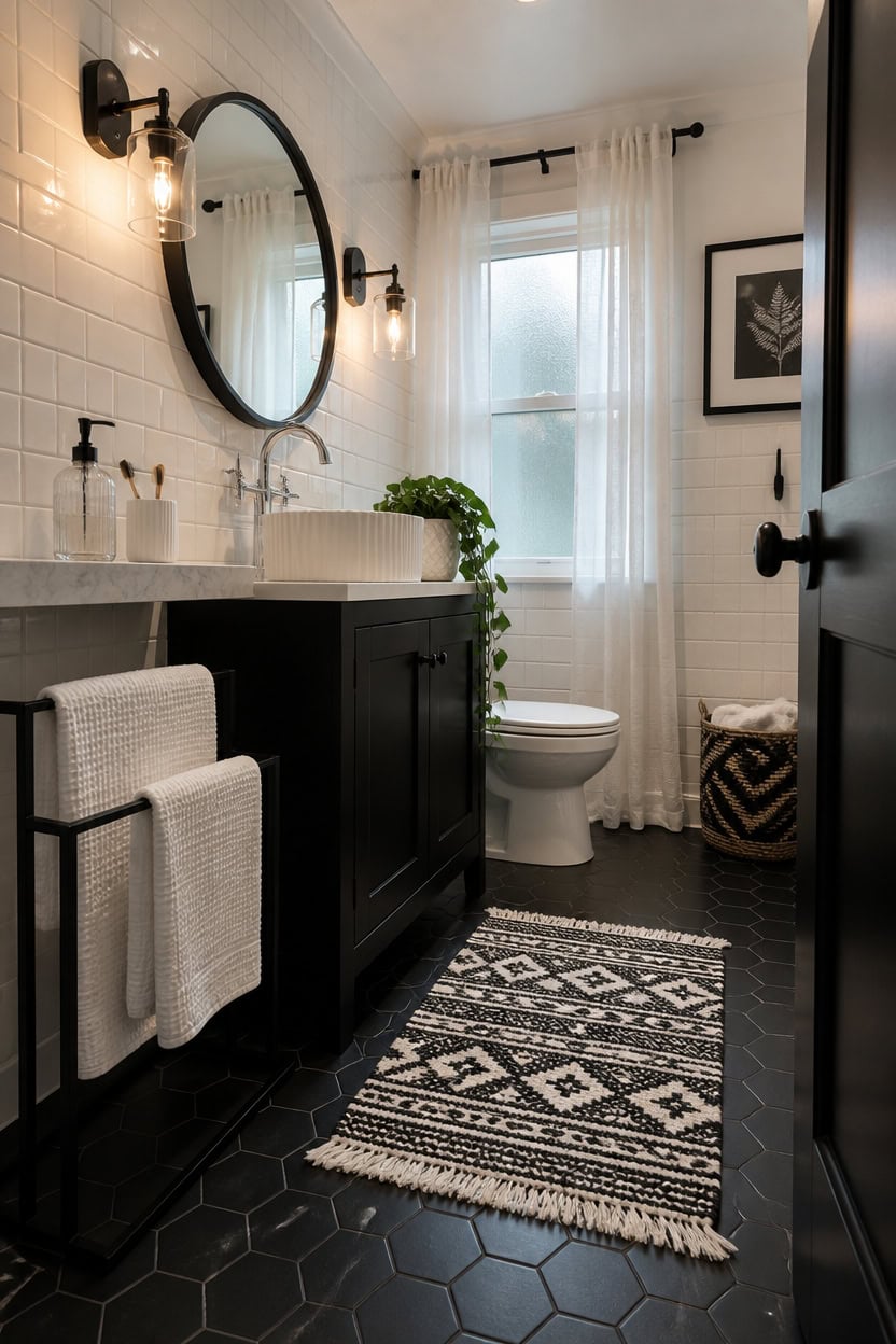
Layering different textures into a black and white bathroom prevents the palette from feeling cold or clinical, because contrast in surface finish does the same visual work as contrast in color. A matte black hex tile floor next to a glossy white subway tile wall creates depth without introducing a single new shade. Mix at least three surface finishes — matte, gloss, and woven or natural fiber — to keep the eye moving across the room.
Matte versus gloss: Pair flat matte tile with high-gloss surfaces so light hits different areas of the room unevenly, which reads as dimension.
Natural fiber as relief: A woven cotton or waffle-knit bath mat introduces a soft, tactile texture that breaks up hard ceramic and porcelain surfaces.
Ribbed and fluted accents: Fluted glass on a shower screen or ribbed ceramic vessels add vertical texture that stretches the perceived height of the room.
Stone or concrete finishes: A honed marble shelf or concrete-look tile brings an organic roughness that keeps the black and white palette from looking too digital or flat.
a pure flat white that lets glossy tile and matte surfaces take full credit for the room’s texture story.
a deep matte black that adds one more tactile layer through its velvety, light-absorbing finish.
 SomerTile FWRM4HMB Retro Super Hex Porcelain Mosaic Floor and Wall Tile, 10.88" x 11.38", Matte Black
View Price
SomerTile FWRM4HMB Retro Super Hex Porcelain Mosaic Floor and Wall Tile, 10.88" x 11.38", Matte Black
View Price
 Smiry Waffle Bathroom Rugs Sets 2 Piece (30x20+24x16, White)
View Price
Smiry Waffle Bathroom Rugs Sets 2 Piece (30x20+24x16, White)
View Price
 zuxzmj Clear Glass Foaming Hand Soap Dispenser
View Price
zuxzmj Clear Glass Foaming Hand Soap Dispenser
View Price
 Chardin home Farmhouse Rug 24''x36'' Black-White | Recycled Cotton Hand Woven Rug, Long Boho Rug | Perfect for Hallways, Kitchens, Bathroom, bedrooms, Meditation Yoga Mat | Machine Wash
View Price
Chardin home Farmhouse Rug 24''x36'' Black-White | Recycled Cotton Hand Woven Rug, Long Boho Rug | Perfect for Hallways, Kitchens, Bathroom, bedrooms, Meditation Yoga Mat | Machine Wash
View Price
 INGOFIN 3 Pcs Ceramic Bathroom Accessory Set - Liquid Soap Dispenser, Toothbrush Holder & Tray, Bathroom Counter Set, Countertop Essentials for Home, Guest Bathroom, or Office Use, White
View Price
INGOFIN 3 Pcs Ceramic Bathroom Accessory Set - Liquid Soap Dispenser, Toothbrush Holder & Tray, Bathroom Counter Set, Countertop Essentials for Home, Guest Bathroom, or Office Use, White
View Price
 WISATO Free Standing Towel Rack - Matte Black Finish with Marble Base
View Price
WISATO Free Standing Towel Rack - Matte Black Finish with Marble Base
View Price
 KES Bathroom Vessel Sink, 16" x 13" Oval Vessel Sink for Bathroom Vanity Countertop, Glossy White Ceramic Bowl Sink Egg Shape Above Counter, Modern Look, Crafted to Endure, BVS124
View Price
KES Bathroom Vessel Sink, 16" x 13" Oval Vessel Sink for Bathroom Vanity Countertop, Glossy White Ceramic Bowl Sink Egg Shape Above Counter, Modern Look, Crafted to Endure, BVS124
View Price
Lighting That Makes the Contrast Work Harder
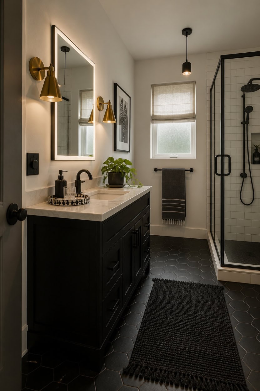
Warm light makes black absorb deeper and white glow brighter, so fixture placement determines whether your black and white bathroom feels dramatic or just high contrast. A single overhead light flattens both colors equally, which kills the dimension you built with mixed textures and finishes. Layer at least two light sources — one overhead and one at eye level flanking the mirror — so shadows fall in ways that reveal surface texture.
Flank the mirror: Wall sconces mounted at eye level on either side of the mirror eliminate the under-eye shadows that a single overhead fixture creates.
Warm versus cool bulbs: Choose bulbs in the 2700K–3000K range so white tiles read as warm cream and black fixtures avoid looking flat gray.
Accent the dark surfaces: A small directional light aimed at a matte black vanity or dark accent wall makes the depth of that color visible instead of lost.
Dimmable controls: Install a dimmer switch so the same fixtures that provide bright task light can shift to low ambient light in the evening.
a pure white that bounces warm bulb light evenly across the room without adding yellow or gray undertones.
a deep matte black that absorbs directed accent light in a way that creates visible shadow depth and dimension.
 Keep Shinning Black Wall Sconces Set of Two, Modern Bathroom Sconce with Frosted Glass, Hardwired Wall Light Fixtures for Bathroom Living Room Bedroom Hallway (Bulbs Not Included)
View Price
Keep Shinning Black Wall Sconces Set of Two, Modern Bathroom Sconce with Frosted Glass, Hardwired Wall Light Fixtures for Bathroom Living Room Bedroom Hallway (Bulbs Not Included)
View Price
 Brtstiun G25 LED Vanity Light Bulbs for Bathroom, Globe Bulb 40W Equivalent
View Price
Brtstiun G25 LED Vanity Light Bulbs for Bathroom, Globe Bulb 40W Equivalent
View Price
 PERMO Wall Sconces Set of 2 Brass Gold Wall Sconces Hardwired Vintage Bathroom Sconce with Pleated Fabric Shade and Brass Metal fram for Living Room, Bedroom, Hallway, Farmhouse
View Price
PERMO Wall Sconces Set of 2 Brass Gold Wall Sconces Hardwired Vintage Bathroom Sconce with Pleated Fabric Shade and Brass Metal fram for Living Room, Bedroom, Hallway, Farmhouse
View Price
 KLSS Black Modern Semi Flush Mount Ceiling Light,Rustic Ceiling Light Fixture for Closet Hallway Entryway,Matte Black Finish (1 Pack)
View Price
KLSS Black Modern Semi Flush Mount Ceiling Light,Rustic Ceiling Light Fixture for Closet Hallway Entryway,Matte Black Finish (1 Pack)
View Price
 WISSMIELS 36"x72" LED Bathroom Mirror with Lights, Dimmable, Anti-Fog, Lighted Bathroom Vanity Mirror for Wall, Backlit + Front Lit, Memory Function, Shatter-Proof, Tempered Glass
View Price
WISSMIELS 36"x72" LED Bathroom Mirror with Lights, Dimmable, Anti-Fog, Lighted Bathroom Vanity Mirror for Wall, Backlit + Front Lit, Memory Function, Shatter-Proof, Tempered Glass
View Price
 10"×6"×1" White Bathroom Vanity Tray for Countertop- Ceramic Decorative Organizer Tray for Dresser Tops, Toilet, Perfume, Sponge Holder Soap Dish Dispenser for Kitchen Counter- Black Stripes
View Price
10"×6"×1" White Bathroom Vanity Tray for Countertop- Ceramic Decorative Organizer Tray for Dresser Tops, Toilet, Perfume, Sponge Holder Soap Dish Dispenser for Kitchen Counter- Black Stripes
View Price
 LiteHistory G16.5 E12 Candelabra Bulb 40 watt,Warm Light Bulbs,2700K,6Pack
View Price
LiteHistory G16.5 E12 Candelabra Bulb 40 watt,Warm Light Bulbs,2700K,6Pack
View Price
 FLE Towel Bar, Black Wall Mount Towel Holder for Bathroom Kitchen,16 Inch
View Price
FLE Towel Bar, Black Wall Mount Towel Holder for Bathroom Kitchen,16 Inch
View Price
Our Favorite Medicine Cabinets
- Free shipping over $35
- Picked at 4.6 stars or higher
 Gervon Rectangle Recessed Medicine Cabinet
View Price
Gervon Rectangle Recessed Medicine Cabinet
View Price
 Haslem Recessed Framed Medicine Cabinet with Mirror
View Price
Haslem Recessed Framed Medicine Cabinet with Mirror
View Price
 Garnes Recessed or Surface Mount Framed Medicine Cabinet
View Price
Garnes Recessed or Surface Mount Framed Medicine Cabinet
View Price
 Farmhouse Recessed Metal Medicine Cabinet with Mirror
View Price
Farmhouse Recessed Metal Medicine Cabinet with Mirror
View Price
 Voijin 24" x 36" Framed Metal Medicine Cabinet
View Price
Voijin 24" x 36" Framed Metal Medicine Cabinet
View Price
 Bryand Farmhouse Surface Mount Metal Medicine Cabinet
View Price
Bryand Farmhouse Surface Mount Metal Medicine Cabinet
View Price
 Cyrille Recessed & Surface Framed Medicine Cabinet with Mirror
View Price
Cyrille Recessed & Surface Framed Medicine Cabinet with Mirror
View Price
 Chouchanik 3-Door Framed Medicine Cabinet with Mirror
View Price
Chouchanik 3-Door Framed Medicine Cabinet with Mirror
View Price
 Lunara 2-Door Framed Medicine Cabinet with Mirror
View Price
Lunara 2-Door Framed Medicine Cabinet with Mirror
View Price
 Husai Aluminum Frameless Medicine Cabinet with Mirrored Door
View Price
Husai Aluminum Frameless Medicine Cabinet with Mirrored Door
View Price
 Omeed Mirrored Aluminum Medicine Cabinet
View Price
Omeed Mirrored Aluminum Medicine Cabinet
View Price
 Gerding 31.5" Frameless Medicine Cabinet with Mirror
View Price
Gerding 31.5" Frameless Medicine Cabinet with Mirror
View Price
 Kassady LED Lighted Medicine Cabinet with Defog Mirror
View Price
Kassady LED Lighted Medicine Cabinet with Defog Mirror
View Price
 Livvia Frameless LED Medicine Cabinet with Anti-Fog
View Price
Livvia Frameless LED Medicine Cabinet with Anti-Fog
View Price
 Surface Mount Frameless Medicine Cabinet with LED Lighting
View Price
Surface Mount Frameless Medicine Cabinet with LED Lighting
View Price
Black and White Bathroom Storage That Keeps Clean Lines
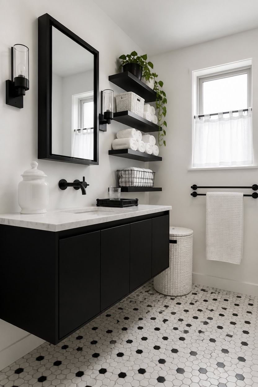
Storage in a black and white bathroom works best when the pieces themselves become part of the design rather than hiding behind it. Open shelving in matte black or white lacquer keeps the color story consistent while putting your towels and products on display like a curated shelf. Closed storage should be minimal and built-in-looking, so the eye reads the room as intentional rather than packed.
Go vertical: Wall-mounted shelves above the toilet or beside the vanity use dead space without crowding the floor.
Basket texture breaks monotony: White woven or black wire baskets inside open shelving add visual relief without introducing a third color.
Keep counters near-empty: Store everything except one or two daily-use items so the black and white palette stays visible instead of buried under product clutter.
Mirror storage doubles up: A mirrored medicine cabinet gives you hidden storage and the reflective surface that a black and white bathroom needs to feel bright.
a crisp, pure white that makes open black shelving units read as bold architectural lines rather than heavy objects.
a deep matte black that visually anchors the storage zone and makes white towels and white ceramic accessories pop against it.
 Black Floating Shelves for Wall, Bahtroom Wall Shelves Over Toilet
View Price
Black Floating Shelves for Wall, Bahtroom Wall Shelves Over Toilet
View Price
 Vagusicc Wicker Storage Basket, Paper Rope Wicker Baskets with Handles, Toilet Paper Basket for Toilet Tank Top, Small Wicke Baskets for Organizing Shelves, 2-Pack, White
View Price
Vagusicc Wicker Storage Basket, Paper Rope Wicker Baskets with Handles, Toilet Paper Basket for Toilet Tank Top, Small Wicke Baskets for Organizing Shelves, 2-Pack, White
View Price
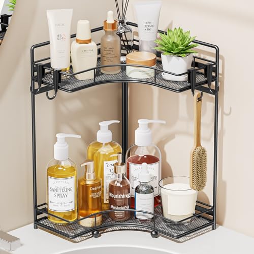 VITVITI 2-Tier Corner Bathroom Counter Organizer, Bathroom Countertop Organizer Storage for Sink, Metal Mesh Makeup Organizer for Vanity Countertop Kitchen with Hooks, Black
View Price
VITVITI 2-Tier Corner Bathroom Counter Organizer, Bathroom Countertop Organizer Storage for Sink, Metal Mesh Makeup Organizer for Vanity Countertop Kitchen with Hooks, Black
View Price
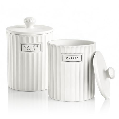 Ronasip White Ceramic Bathroom Organizer and Storage Jars with Lid, 2 Pack Qtip Holder and Cotton Pad Dispenser, Apothecary Canisters for Vanity, Kitchen Countertop, Home Decor
View Price
Ronasip White Ceramic Bathroom Organizer and Storage Jars with Lid, 2 Pack Qtip Holder and Cotton Pad Dispenser, Apothecary Canisters for Vanity, Kitchen Countertop, Home Decor
View Price
 MemoCastle 20x26 Frameless Medicine Cabinet with Mirror, Pre-Assembled Body
View Price
MemoCastle 20x26 Frameless Medicine Cabinet with Mirror, Pre-Assembled Body
View Price
 HIFIT Tall Bathroom Storage Cabinet with Drawer, Modern Linen Cabinet,White
View Price
HIFIT Tall Bathroom Storage Cabinet with Drawer, Modern Linen Cabinet,White
View Price
 Alise Double Bath Towel Bar, 24" Towel Racks for Bathroom, Matte Black
View Price
Alise Double Bath Towel Bar, 24" Towel Racks for Bathroom, Matte Black
View Price
 Bathroom Vanity Tray for Counter Bamboo Bathroom Decorative Tray, Dresser Top Perfume Tray for Home Decoration 11.3” L x 4.4” W x 1.14” H (White)
View Price
Bathroom Vanity Tray for Counter Bamboo Bathroom Decorative Tray, Dresser Top Perfume Tray for Home Decoration 11.3” L x 4.4” W x 1.14” H (White)
View Price
The Accessories That Complete a Black and White Bathroom
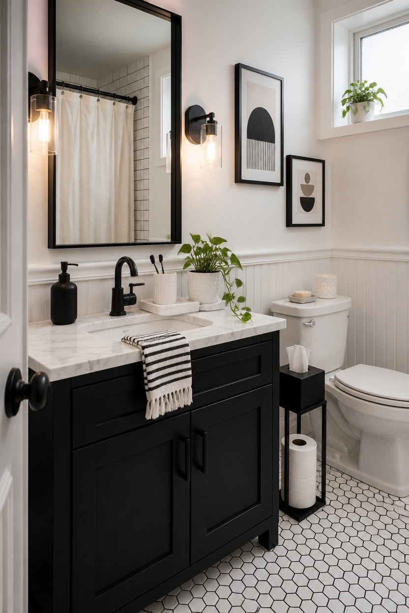
Accessories in a black and white bathroom do the heavy lifting that paint and tile cannot — they control whether the room feels clinical or curated. A single well-chosen piece, like a ceramic soap dispenser in matte black or a white marble tray, signals intentionality to anyone who walks in. Choose accessories with clean silhouettes and no fussy detailing, because in a high-contrast palette, every object reads twice as loud.
Match finishes within a color: Black accessories should share the same finish — matte or gloss — so the room reads as deliberate rather than mismatched.
Odd numbers work best: Group accessories in threes — a dispenser, a tray, and a small plant — so the eye lands somewhere instead of scanning endlessly.
One soft element per surface: A folded white hand towel or a small woven piece prevents the hard surfaces from making the room feel cold.
Let the counter breathe: Limit visible accessories to three or fewer items per surface so the black and white palette stays visible and clean.
a clean, bright white that lets black ceramic and matte black accessories read as sharp, intentional focal points.
a deep matte black that makes white accessories, white towels, and white marble trays pop without any additional styling effort.
 YAUKPH Small Soap Dispenser for Bathroom and Kitchen Matte Black
View Price
YAUKPH Small Soap Dispenser for Bathroom and Kitchen Matte Black
View Price
 Real Natural Marble Tray for Bathroom, Vanity, Kitchen Counter & Desktop
View Price
Real Natural Marble Tray for Bathroom, Vanity, Kitchen Counter & Desktop
View Price
 Black and White Striped Hand Towels for Bathroom, Vintage Kitchen Decor
View Price
Black and White Striped Hand Towels for Bathroom, Vintage Kitchen Decor
View Price
 White Ceramic Toothbrush Holder - Square Bathroom Toothbrush Holder, Toothbrush Cup Holder Aesthetic Toothpaste Holder, Modern Family Size Toothbrush Organizer, Bathroom Tumbler Cup
View Price
White Ceramic Toothbrush Holder - Square Bathroom Toothbrush Holder, Toothbrush Cup Holder Aesthetic Toothpaste Holder, Modern Family Size Toothbrush Organizer, Bathroom Tumbler Cup
View Price
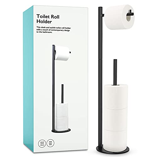 Toilet Paper Holder Stand, Bathroom Free Standing with Storage, Black
View Price
Toilet Paper Holder Stand, Bathroom Free Standing with Storage, Black
View Price
 CERBIOR Bathroom Accessories Set,4 PCS Ceramic Bath Accessory,White
View Price
CERBIOR Bathroom Accessories Set,4 PCS Ceramic Bath Accessory,White
View Price
 Drsoum Large 24x36in Black and White Abstract Framed Wall Art Decor Duotone Minimal Dark Brush Stroke Prints Shapes Illustrations Modern Art Decorative Ready To Hang - Black Framed
View Price
Drsoum Large 24x36in Black and White Abstract Framed Wall Art Decor Duotone Minimal Dark Brush Stroke Prints Shapes Illustrations Modern Art Decorative Ready To Hang - Black Framed
View Price
 Eyrozia White Round Soap Dispenser Tray - 8'' Ceramic Vanity Tray for Bathroom Decorative, Jewelry Ring Dish, Comestic Holder, Kitchen Sink Countertop Organizer Plate
View Price
Eyrozia White Round Soap Dispenser Tray - 8'' Ceramic Vanity Tray for Bathroom Decorative, Jewelry Ring Dish, Comestic Holder, Kitchen Sink Countertop Organizer Plate
View Price
Our Favorite Towel Bars
- Free shipping over $35
- Picked at 4.7 stars or higher
 Moen Align 24" Wall Mounted Towel Bar
View Price
Moen Align 24" Wall Mounted Towel Bar
View Price
 Delta Trinsic Wall Mount Towel Bar
View Price
Delta Trinsic Wall Mount Towel Bar
View Price
 AngleSimple 23.75" Stainless Steel Towel Bar
View Price
AngleSimple 23.75" Stainless Steel Towel Bar
View Price
 Moen Align 9" Modern Hand Towel Bar
View Price
Moen Align 9" Modern Hand Towel Bar
View Price
 Moen Triva 9" Wall Mounted Towel Bar
View Price
Moen Triva 9" Wall Mounted Towel Bar
View Price
 Moen Align 18" Wall Mounted Towel Bar
View Price
Moen Align 18" Wall Mounted Towel Bar
View Price
 Moen Brantford 24" Wall Mounted Towel Bar
View Price
Moen Brantford 24" Wall Mounted Towel Bar
View Price
 Moen Preston 24" Wall Mounted Towel Bar
View Price
Moen Preston 24" Wall Mounted Towel Bar
View Price
 Delta Cassidy 24" Wall Mounted Towel Bar
View Price
Delta Cassidy 24" Wall Mounted Towel Bar
View Price
 Moen Genta LX 24" Wall Mounted Towel Bar
View Price
Moen Genta LX 24" Wall Mounted Towel Bar
View Price
 Kohler Elate Wall Mounted Round Towel Bar
View Price
Kohler Elate Wall Mounted Round Towel Bar
View Price
 Kohler Alteo Wall Mounted Towel Bar
View Price
Kohler Alteo Wall Mounted Towel Bar
View Price
 Delta Trinsic 24" Double Wall Mount Towel Bar
View Price
Delta Trinsic 24" Double Wall Mount Towel Bar
View Price
 Moen Wynford Double 24" Wall Mounted Towel Bar
View Price
Moen Wynford Double 24" Wall Mounted Towel Bar
View Price
How to Layer a Black and White Bathroom Without Cluttering It
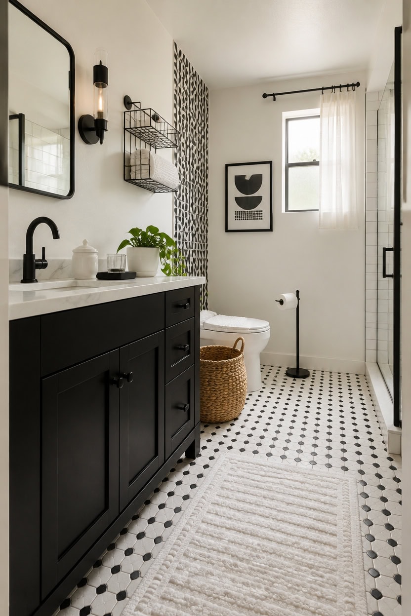
Layering a black and white bathroom means working in zones — walls, surfaces, and soft goods — so each layer adds depth without crowding the space. When one layer carries too many decisions, the whole room starts to look like a store display rather than a home. The rule that saves most black and white bathrooms is simple: one pattern per layer, one texture per surface, and one soft element per zone.
Start with the walls: Let the wall be your boldest layer — a patterned tile or a deep black vanity reads strongest against a plain white wall.
Keep surfaces flat: Countertops and shelves should hold three items or fewer so the high-contrast palette stays visible between objects.
Bring in one texture per zone: A woven basket near the toilet, a cotton rug underfoot, and a folded towel on the vanity each add warmth without stacking up visually.
Use height to separate layers: Place tall items like a floor tissue holder at floor level and low trays at counter level so your eye moves up instead of scanning left to right.
a crisp, shadow-free white that lets black tile, black hardware, and dark accessories register as clean focal points instead of clutter.
a flat, deep black that grounds the room’s lowest layer and makes white surfaces above it feel intentionally lifted.
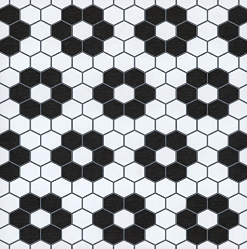 FloorPops Black Biscotto Peel & Stick Floor Tiles, FP3931
View Price
FloorPops Black Biscotto Peel & Stick Floor Tiles, FP3931
View Price
 2 Pack Ceramic Qtip Holder Dispenser with Gold Lids, White Apothecary Jars Bathroom Vanity Organizer for Home Decor - Bathroom Canister for Cotton Swabs, Rounds, Balls, Makeup Sponges, Bath Salts
View Price
2 Pack Ceramic Qtip Holder Dispenser with Gold Lids, White Apothecary Jars Bathroom Vanity Organizer for Home Decor - Bathroom Canister for Cotton Swabs, Rounds, Balls, Makeup Sponges, Bath Salts
View Price
 YUMORE Toilet Paper Holder Stand with Weighted Base, Matte Black
View Price
YUMORE Toilet Paper Holder Stand with Weighted Base, Matte Black
View Price
 PUSDON 2-Pack Minimalist Shower Caddy Wall Mount, Open Frame Bathroom Shelf Organizer with Mesh Base, Rustproof Floating Spice Rack for Kitchen, Holds 50 LBS, 4 Hooks - Matte Black, Guardrail
View Price
PUSDON 2-Pack Minimalist Shower Caddy Wall Mount, Open Frame Bathroom Shelf Organizer with Mesh Base, Rustproof Floating Spice Rack for Kitchen, Holds 50 LBS, 4 Hooks - Matte Black, Guardrail
View Price
 Ululusky Seagrass Handmade Basket with Lid, Small Round Basket for Storage, Decorative Home Organizer Decor(7"L X 5"H, White)
View Price
Ululusky Seagrass Handmade Basket with Lid, Small Round Basket for Storage, Decorative Home Organizer Decor(7"L X 5"H, White)
View Price
 2Pcs Framed Black and White Bathroom Canvas Wall Art Abstract Nude Prints Couple Modern Gallery Style Painting Pen sketch Posters Decorations Bedroom Living Room Bathroom 12x16 Inch Ready to Hang
View Price
2Pcs Framed Black and White Bathroom Canvas Wall Art Abstract Nude Prints Couple Modern Gallery Style Painting Pen sketch Posters Decorations Bedroom Living Room Bathroom 12x16 Inch Ready to Hang
View Price
 Madison Park Splendor Reversible 100% Cotton Bath Rug, 17 x 24, White
View Price
Madison Park Splendor Reversible 100% Cotton Bath Rug, 17 x 24, White
View Price