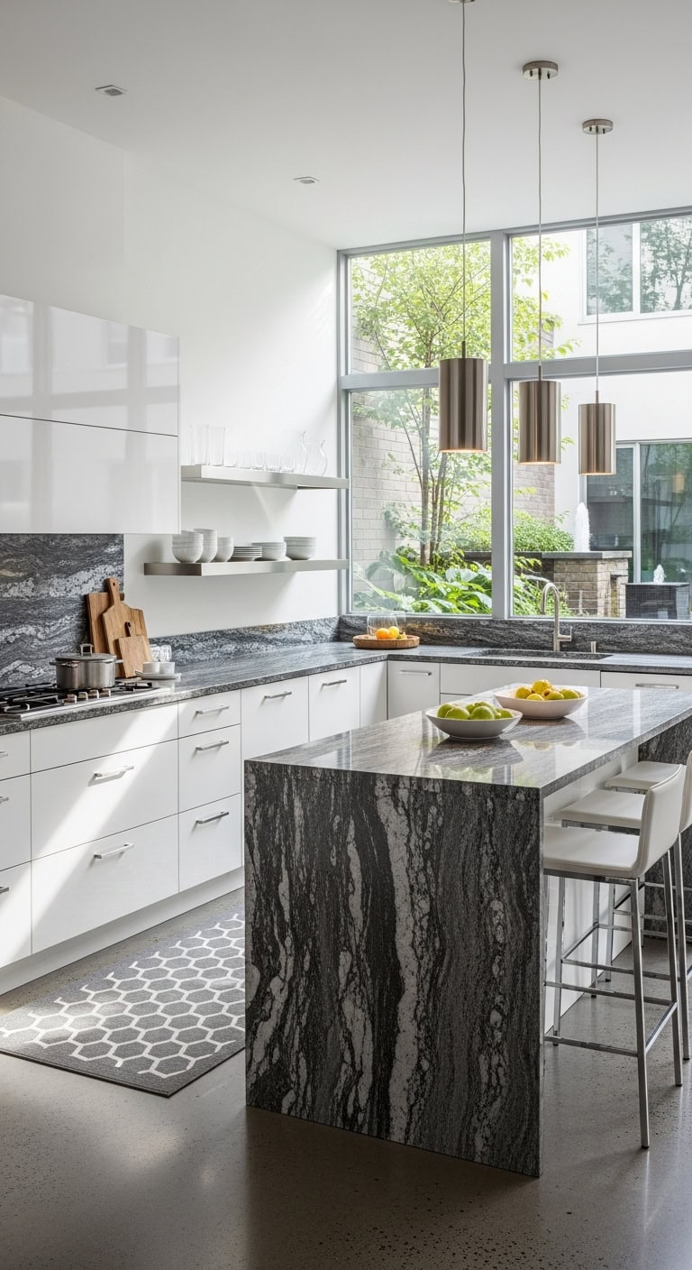
19 Dual Color Kitchen Cabinets Ideas to Create Visual Interest
Two-tone kitchen cabinets have become one of the most exciting ways to add personality and dimension to your cooking space. Whether you’re dreaming of a bold contrast or a subtle pairing, mixing cabinet colors lets you create a look that’s uniquely yours.
These inspiring combinations will help you find the perfect balance of style and sophistication.
Table of Contents
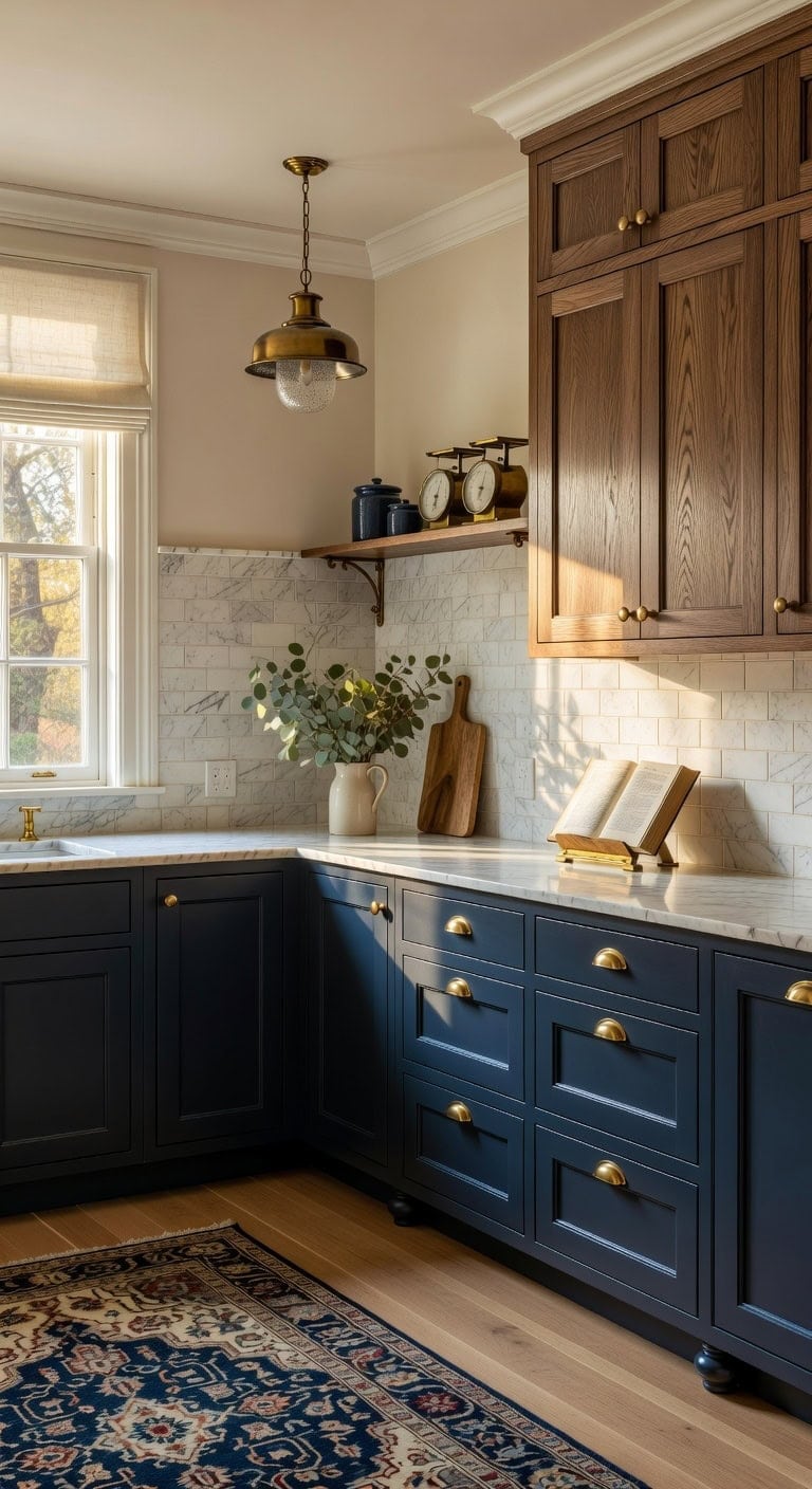
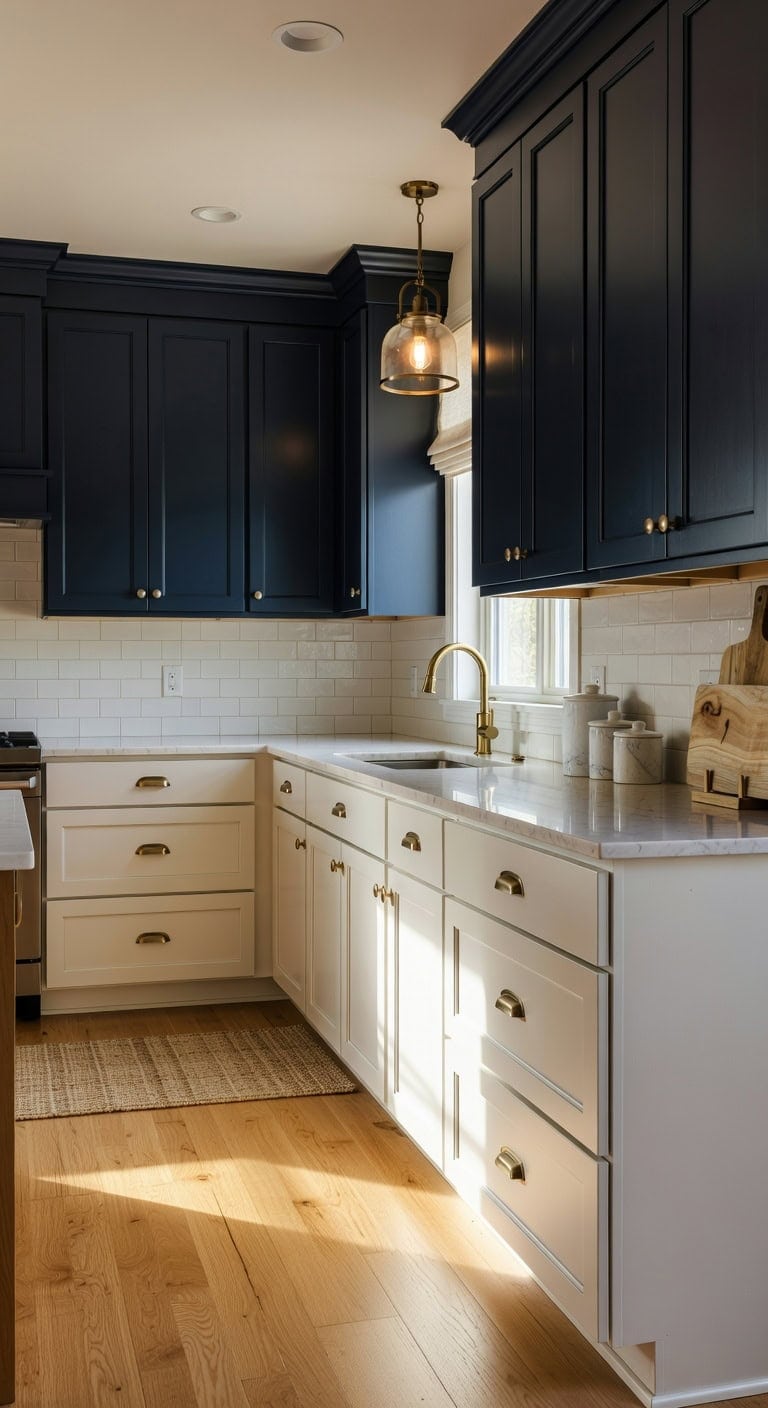
Classic White Uppers With Navy Blue Lower Cabinets
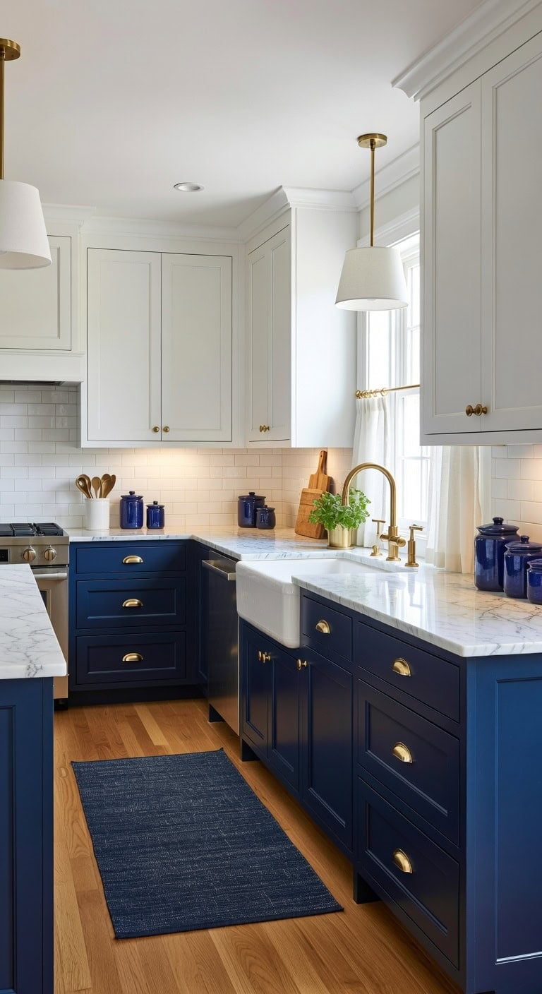
The pairing of crisp white upper cabinets with rich navy blue lowers creates a kitchen that feels both fresh and grounded. Smooth painted wood surfaces meet cool brushed brass hardware, while honed marble countertops add subtle texture between the two tones. This combination works beautifully whether your home leans traditional or modern, giving you flexibility to personalize with accessories.
Shop The Look
- Brushed brass cabinet cup pulls
- White ceramic subway tile backsplash
- Navy blue woven cotton runner rug
- Brass pendant lights with white shades
- Honed marble countertop edge pieces
- White linen cafe curtain panels
- Navy blue ceramic canister set
- Brass under-cabinet task lighting
DIY Paint Transformation
- Lower Cabinets: Paint in “Naval” (Sherwin-Williams SW 6244), a sophisticated deep navy with gray undertones that adds drama without overwhelming the space.
- Upper Cabinets: Paint in “Chantilly Lace” (Benjamin Moore OC-65), a clean true white that maximizes light reflection and keeps the upper portion of your kitchen bright and airy.
Best For: Galley kitchens or smaller spaces where you want visual depth without making the room feel closed in, as the white uppers draw the eye upward while the navy grounds the design.
Slate Blue and Antique White for Coastal Kitchens
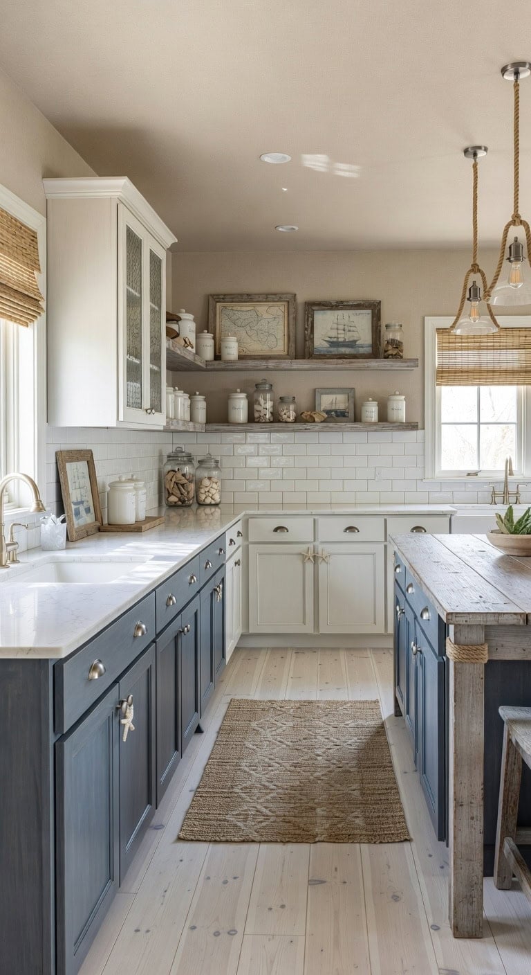
That peaceful feeling you get watching ocean waves can live in your kitchen every single day. Slate blue lower cabinets paired with antique white uppers create a calming contrast that feels like a beach cottage retreat. Natural rope textures, weathered wood accents, and smooth ceramic tile work together to complete this seaside-inspired look. This combination brings coastal charm without feeling like a themed restaurant.
Shop The Look
- Brushed nickel cup pull cabinet hardware
- Natural jute runner rug coastal pattern
- White ceramic subway tile backsplash glossy
- Woven bamboo roman shade window treatment
- Rope-wrapped pendant light brushed nickel
- Distressed wood floating shelf solid pine
- White ceramic canister set kitchen counter
- Starfish ceramic knob accent drawer pull
DIY Paint Transformation
- Lower Cabinets: Paint in “Distance” (Sherwin-Williams SW 6243) brings a sophisticated slate blue with gray undertones that mimics morning fog rolling over coastal waters.
- Upper Cabinets: Paint in “Antique White” (Benjamin Moore OC-83) delivers a warm, creamy white with subtle yellow undertones that resembles sun-bleached driftwood found along sandy shores.
Best For:
This palette works beautifully in kitchens with natural light, open floor plans connecting to living spaces, or any home near water where you want interior design to reflect your coastal surroundings.
Two-Tone Shaker Cabinets in Pale Blue and White
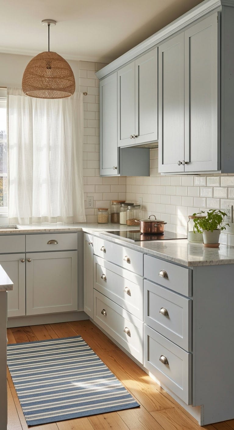
Walking into a kitchen dressed in pale blue and crisp white feels like a gentle gust of coastal serenity. The smooth matte finish of painted shaker cabinets pairs beautifully with brushed nickel hardware and natural marble countertops. This timeless combination creates warmth without overwhelming your space, making morning coffee feel like a mini vacation.
Shop The Look
- Pale blue shaker cabinet door fronts
- Brushed nickel cup pull cabinet handles
- White ceramic subway tile backsplash
- Carrara marble look quartz countertop sample
- Woven rattan pendant light fixture
- White linen cafe curtain panels
- Blue and white striped cotton rug
- Glass and nickel cabinet knob set
DIY Paint Transformation
- Upper Cabinets: Paint in “Breath of Coastal Calm” (Benjamin Moore 806) for a soft pale blue that captures seaside tranquility without feeling childish or overly bold on your upper cabinet boxes.
- Lower Cabinets: Paint in “Simply White” (Benjamin Moore OC-117) for a clean, warm white base that grounds the kitchen while letting the pale blue uppers take center stage.
Best For:
This two-tone combination works perfectly in galley kitchens, small eat-in spaces, or any kitchen where you want to add personality while maintaining a bright, open atmosphere that never feels dated.
Moody Teal Base Cabinets With Light Gray Uppers
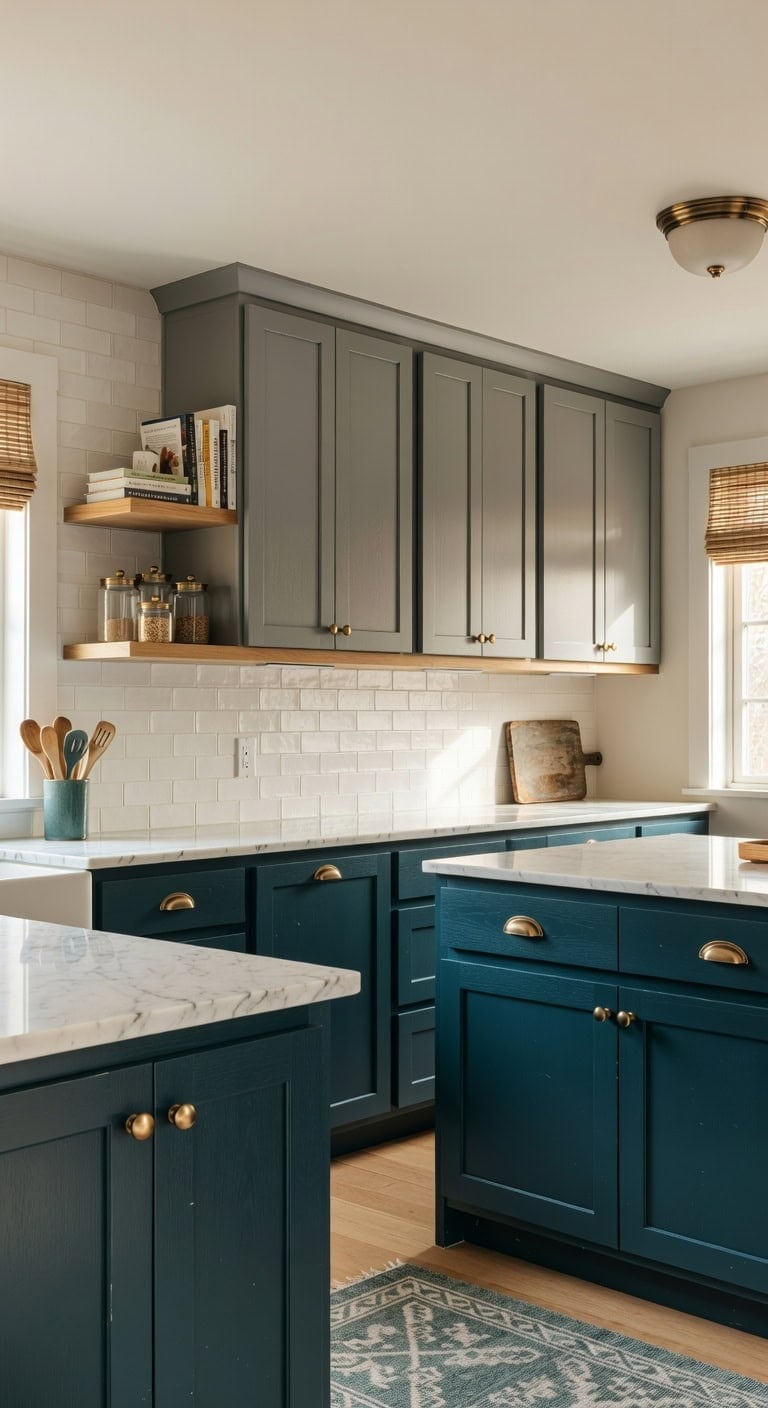
Your kitchen deserves that dramatic punch without feeling like a cave. Deep teal base cabinets anchor the room with sophisticated depth while light gray uppers keep everything breathable and bright. The interplay between brushed brass hardware, matte ceramic tile, and natural wood open shelving creates layers of texture that feel collected over time. This combination works whether you’re hosting book club or helping with homework at the island.
Shop The Look
- Brushed brass cup pull cabinet handles
- Handmade matte white subway backsplash tile
- Natural woven bamboo roman shade
- Teal ceramic utensil crock holder
- Brass semi-flush mount ceiling light
- Gray and white geometric cotton rug
- Floating oak wood display shelf
- Antique brass cabinet knob set
DIY Paint Transformation
- Base Cabinets: Paint in “Aegean Teal” (Benjamin Moore 2136-40), a moody blue-green that adds instant sophistication and pairs beautifully with warm metallic accents throughout your kitchen.
- Upper Cabinets: Paint in “Repose Gray” (Sherwin-Williams SW 7015), a versatile light gray with warm undertones that prevents the space from feeling too cold while letting your teal bases shine.
Best For: Medium to large kitchens with adequate natural light where the deep teal won’t overwhelm the space and the two-tone approach can create visual interest without making the room feel smaller.
Midnight Blue and Walnut for a Luxe Traditional Look
Deep midnight blue lower cabinets create a grounding anchor while warm walnut uppers bring organic richness overhead. The interplay between smooth painted surfaces, natural wood grain, and polished brass hardware delivers that collected-over-time elegance traditional kitchens do so well. This combination works beautifully whether your home leans colonial, Georgian, or simply classic American.
Shop The Look
- Walnut shaker upper cabinet doors
- Brass cup pull cabinet hardware
- Marble subway tile backsplash
- Navy blue ceramic canister set
- Brass pendant light aged finish
- Cream linen roman shade valance
- Persian style runner rug blue
- Walnut floating shelf with brackets
DIY Paint Transformation
- Lower Cabinets: Paint in “Hale Navy” (Benjamin Moore HC-154), a sophisticated midnight blue with subtle depth that reads luxurious without feeling too dark or overwhelming in traditional kitchen spaces.
- Kitchen Island or Accent Pieces: Stain in “Dark Walnut” (Minwax 2716), a rich brown tone that highlights natural wood grain and pairs seamlessly with the deep blue for authentic warmth.
Best For: Formal traditional kitchens in colonial homes, large eat-in kitchen spaces, or dining-adjacent layouts where elegance and warmth need equal presence.
Sage Green and Cream for a Soft Cottage Feel
Soft sage green base cabinets paired with creamy upper cabinets create the kind of kitchen that makes you want to linger over morning coffee. The matte painted wood surfaces play beautifully against brushed brass hardware, while natural linen window treatments add warmth. Handmade ceramic subway tiles bring subtle texture that catches afternoon light.
Shop The Look
- Sage green shaker base cabinet paint
- Brushed brass cup pull cabinet handles
- Handmade cream ceramic subway tile
- Natural linen cafe curtain panel
- Cream and sage striped cotton rug
- Aged brass schoolhouse pendant light
- Ceramic farmhouse canister set cream
- Round brass cabinet knobs antique finish
DIY Paint Transformation
- Base Cabinets: Paint in “Saybrook Sage” (Benjamin Moore HC-114) delivers that perfect muted green with gray undertones that reads sophisticated yet cozy in cottage-style spaces.
- Upper Cabinets: Paint in “Swiss Coffee” (Benjamin Moore OC-45) offers a warm cream tone that avoids stark white while complementing the sage beautifully.
Best For: Smaller kitchens in older homes where you want character without overwhelming the space, or anyone craving a calming retreat that still feels put-together.
Hunter Green Lowers With Brass-Accented White Uppers
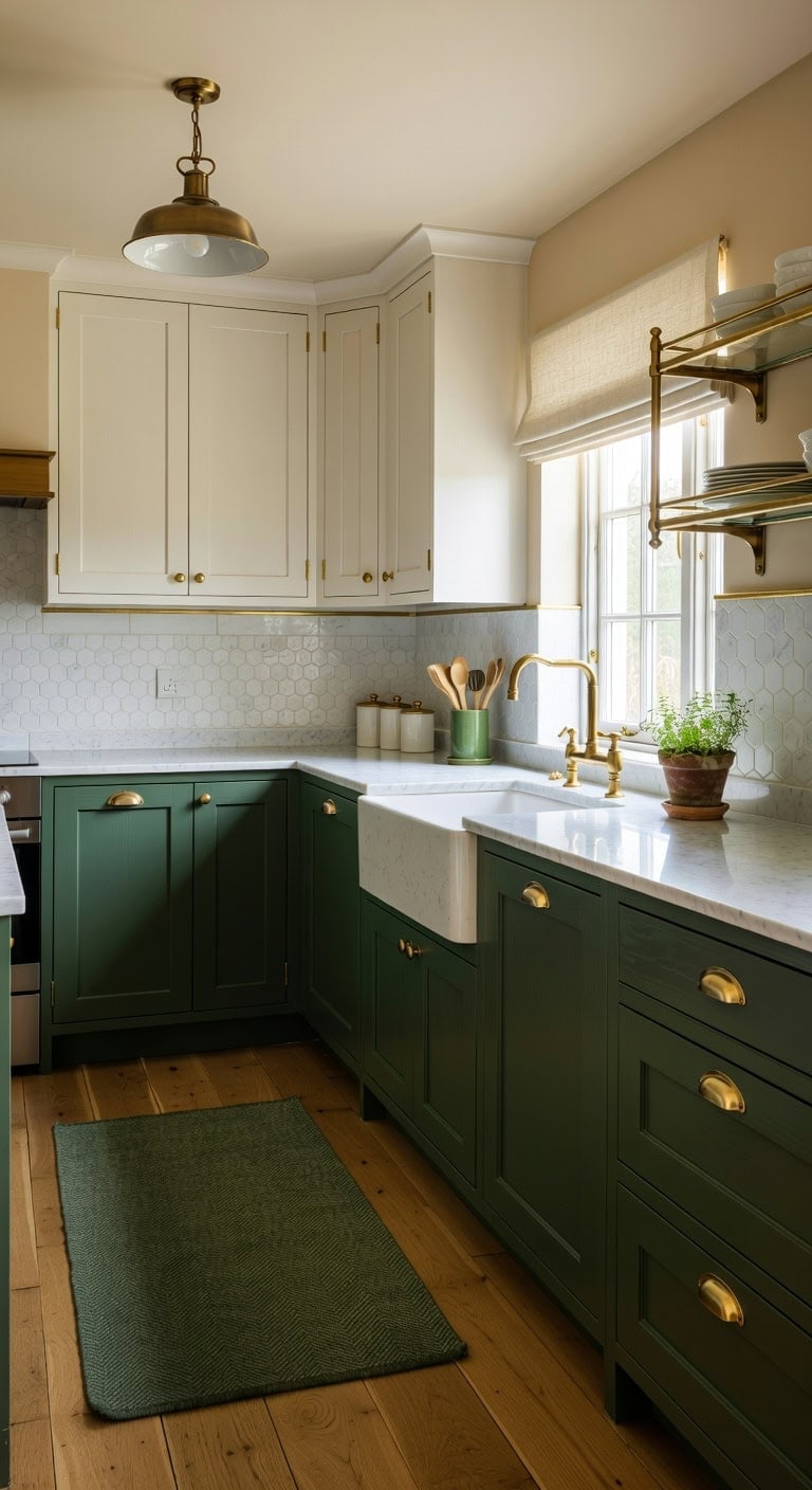
Walking into a kitchen where deep hunter green meets crisp white cabinetry feels like a shift, a change in atmosphere, with roots planted firmly in classic design. The matte green paint on lower cabinets creates a grounding anchor, while creamy white uppers keep the space from feeling heavy. Warm brass hardware ties everything together, catching light against both the smooth painted wood and cool marble countertops.
Shop The Look
- Brushed brass cabinet cup pulls
- Hunter green ceramic utensil crock
- White marble hexagon backsplash tile
- Natural brass pendant light fixture
- Cream linen Roman shade valance
- Forest green hand-knotted wool rug
- Brass and glass display shelf
- White ceramic canisters with brass lids
DIY Paint Transformation
- Lower cabinets: Paint in “Hunter Green” (Benjamin Moore HC-118) creates a sophisticated, nature-inspired base that pairs beautifully with brass accents and natural stone surfaces.
- Upper cabinets: Paint in “Simply White” (Benjamin Moore OC-117) delivers a clean, warm backdrop that reflects natural light and balances the richness of darker lower cabinetry.
Best For: Traditional or changing kitchens with good natural light where homeowners want timeless elegance without feeling too trendy.
Forest Green Island With All-White Perimeter Cabinets
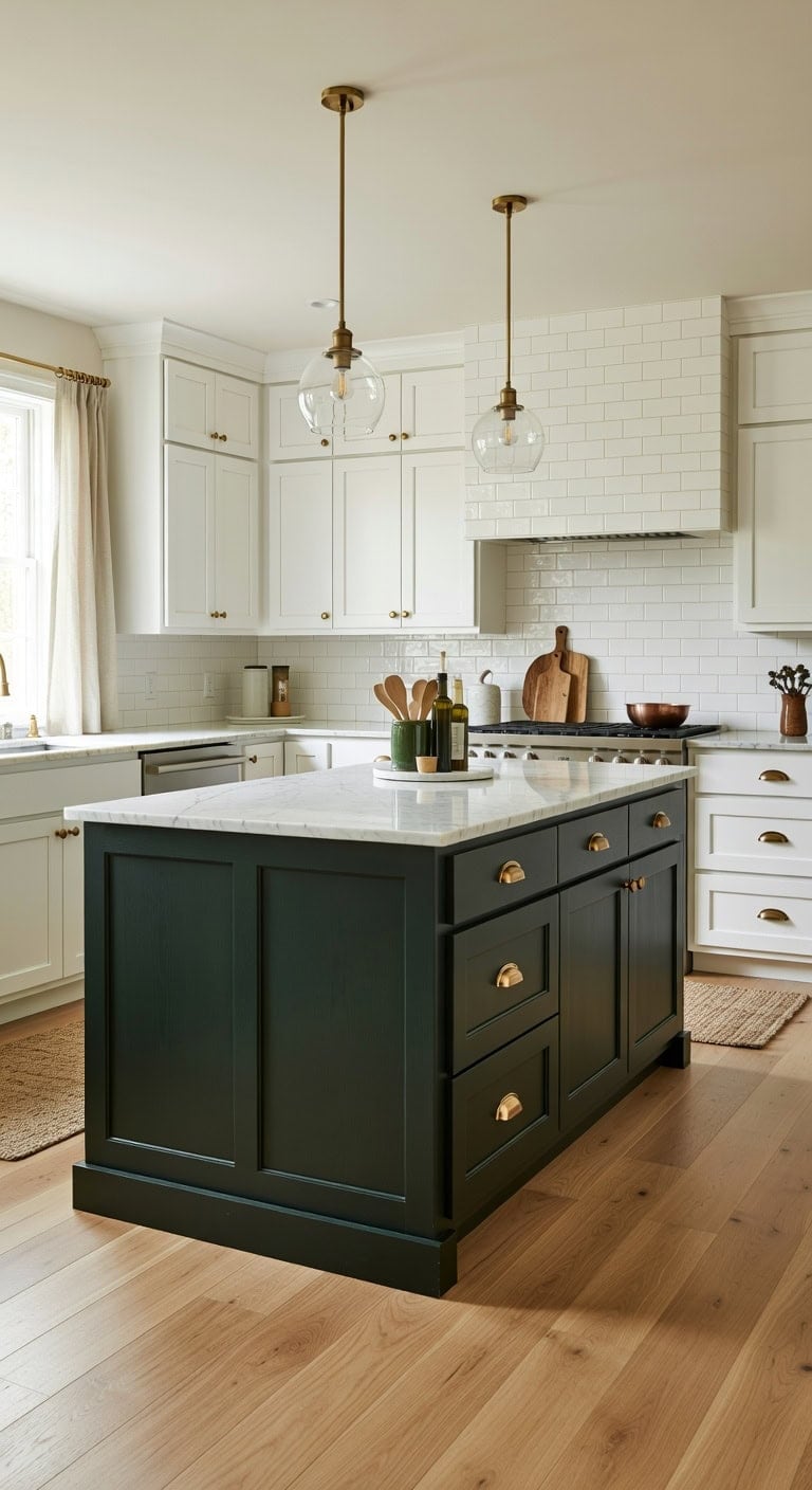
Walking into a kitchen where rich forest green meets crisp white feels like bringing the outdoors inside without sacrificing elegance. The deep green painted island anchors the space while smooth white cabinetry along the walls keeps everything bright and open. Brass hardware warms up the cool tones, and natural wood flooring adds organic texture underfoot. This combination works beautifully whether you’re hosting Sunday brunch or tackling weeknight dinner prep.
Shop The Look
- Brushed brass cup pull cabinet handles
- White subway tile peel stick backsplash
- Natural jute kitchen runner rug
- Clear glass pendant light brass finish
- White linen cafe curtain panel
- Marble lazy susan countertop organizer
- Brass cabinet knob round shape
- Ceramic utensil crock forest green
DIY Paint Transformation
- Island: Paint in “Hunter Green” (Benjamin Moore HC-118), a sophisticated deep forest shade that creates dramatic presence without overwhelming the room.
- Perimeter Cabinets: Paint in “Chantilly Lace” (Benjamin Moore OC-65), the purest crisp white that maximizes light reflection and provides stunning contrast against the green centerpiece.
Best For: Open-concept kitchens with good natural light where homeowners want a statement island without committing to dark cabinetry throughout the entire space.
Matte Olive Green With Creamy Off-White Uppers
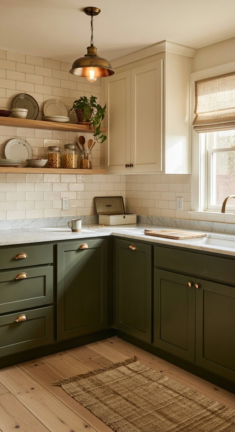
Earthy and elegant work together beautifully in this grounded kitchen combination. The matte olive green base cabinets bring organic warmth that pairs naturally with creamy off-white uppers, creating depth without overwhelming the space. Brushed brass hardware catches light against the muted green while natural wood open shelving adds textural contrast. This palette feels both current and timeless for everyday family living.
Shop The Look
- Matte olive green shaker lower cabinets
- Creamy off-white upper cabinet doors
- Brushed brass cup pull cabinet hardware
- Natural oak floating kitchen shelf
- Cream ceramic subway tile backsplash
- Brass dome pendant light fixture
- Woven jute kitchen runner rug
- Linen roman shade window treatment
DIY Paint Transformation
- Lower Cabinets: Paint in “Olive Grove” (Sherwin-Williams SW 9128) for a sophisticated matte green that grounds your kitchen with natural, forest-inspired character.
- Upper Cabinets: Paint in “Creamy” (Sherwin-Williams SW 7012) for a soft off-white that brightens the space while maintaining warmth against the earthy lower tones.
Best For: Open-concept kitchens where you want to add personality without creating visual heaviness, especially spaces with good natural light that can showcase the green undertones throughout the day.
Weathered Teal and Distressed White for Farmhouse Charm
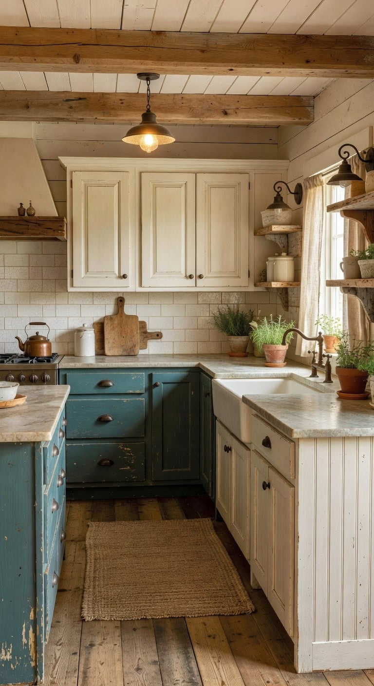
Farmhouse kitchens thrive on imperfection, and this pairing proves it beautifully. Weathered teal lower cabinets bring coastal-meets-country warmth while distressed white uppers keep the space bright and airy. The interplay of chippy painted wood, brushed bronze metal, and rustic ceramic creates that lived-in character every farmhouse lover craves.
Shop The Look
- Weathered teal shaker base cabinet doors
- Distressed white upper cabinet fronts
- Brushed bronze cup pull cabinet hardware
- Subway tile backsplash crackle glaze finish
- Rustic bronze farmhouse pendant light fixture
- Natural jute braided kitchen runner rug
- Linen cafe curtains rod pocket style
- Ceramic farmhouse canister set antique white
DIY Paint Transformation
- Lower Cabinets: Paint in “Aegean Teal” (Benjamin Moore 2136-40) then sand edges and corners to reveal wood grain underneath, creating authentic weathered character that looks decades old.
- Upper Cabinets: Paint in “Simply White” (Benjamin Moore OC-117) and distress lightly with fine sandpaper along raised panels and edges where natural wear would occur over time.
Best For: Galley or L-shaped kitchens in older homes where authentic farmhouse character complements original architectural details like beadboard or exposed ceiling beams.
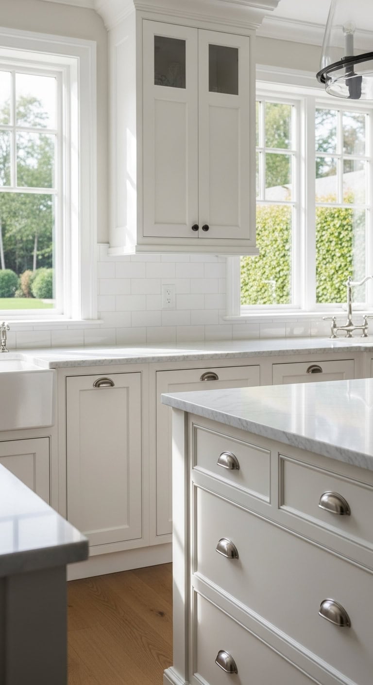
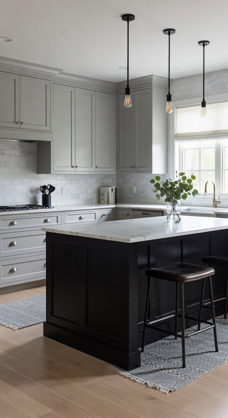
Two-Tone Gray Cabinets in Light and Dark Shades
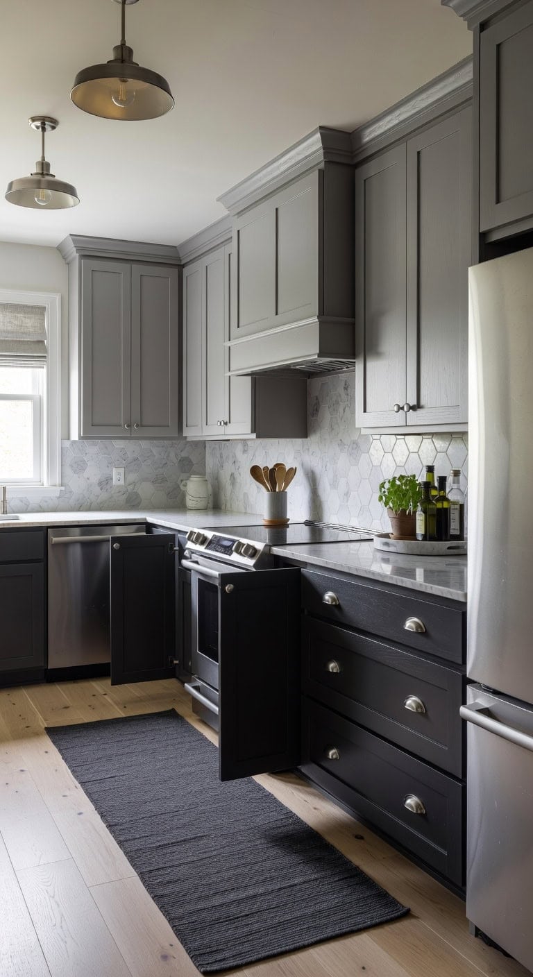
Pairing light gray uppers with charcoal lower cabinets creates a grounded, elegant kitchen that never feels cold or sterile. The soft dove gray surfaces bounce natural light around the room while brushed nickel hardware adds subtle metallic warmth against the matte cabinet finishes. Honed marble countertops bridge both gray tones beautifully, and natural linen window treatments soften the modern palette with organic texture.
Shop The Look
- Brushed nickel cup pull cabinet handles
- Gray linen Roman shade window treatment
- Honed Carrara marble hexagon backsplash tile
- Charcoal gray woven cotton runner rug
- Brushed nickel dome pendant light fixture
- Gray ceramic utensil crock holder
- Nickel bar pull long cabinet handles
- Light gray marble lazy Susan tray
DIY Paint Transformation
- Lower Cabinets: Paint in “Wrought Iron” (Benjamin Moore 2124-10) for a rich charcoal foundation that anchors the kitchen with dramatic depth without appearing black.
- Upper Cabinets: Paint in “Stonington Gray” (Benjamin Moore HC-170) for a versatile light gray that reads clean and airy while maintaining enough warmth to complement the darker base cabinets.
Best For: Open-concept kitchens where you want visual weight at the base while keeping upper areas bright and spacious feeling.
Charcoal Gray and Crisp White for Modern Contrast
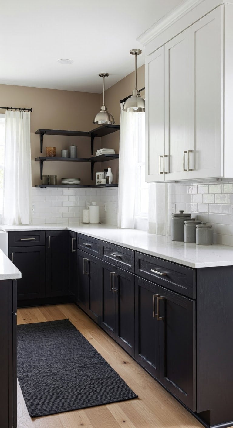
Bold charcoal gray lower cabinets grounded by sleek quartz countertops create a stunning anchor in this contemporary kitchen. The crisp white upper cabinets bounce light across brushed nickel hardware while matte ceramic subway tiles add subtle texture behind the range. This high-contrast pairing delivers drama without overwhelming your cooking space.
Shop The Look:
- Brushed nickel bar pull cabinet handles
- White matte ceramic subway backsplash tile
- Charcoal gray woven cotton runner rug
- Brushed nickel pendant light dome shade
- White linen cafe curtain panels
- Quartz countertop sample bright white veining
- Matte black iron open wall shelf
- Gray stoneware decorative canister set
DIY Paint Transformation
- Lower Cabinets: Paint in “Kendall Charcoal” (Benjamin Moore HC-166) for rich depth that anchors your kitchen with sophisticated warmth while hiding everyday scuffs and fingerprints beautifully.
- Upper Cabinets: Paint in “Chantilly Lace” (Benjamin Moore OC-65) for the brightest, cleanest white that reflects maximum light and creates that fresh, airy contrast against the dark base.
Best For: Kitchens with plenty of natural light where the dramatic contrast won’t make the space feel closed in or too heavy.
Dusty Pink Accents Against Neutral Greige Cabinets
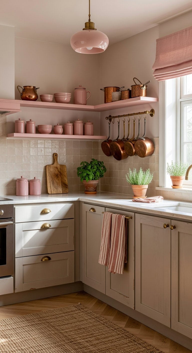
Warm and unexpected, this color combination brings gentle femininity to everyday cooking spaces without feeling overly sweet. The dusty pink accents pop beautifully against the muted greige cabinet base, creating visual interest through soft contrast. Matte ceramic tile meets brushed brass hardware while natural linen textures soften the overall look. This palette works especially well in kitchens where you want personality without overwhelming the senses.
Shop The Look
- Brushed brass cup pull cabinet handles
- Dusty pink linen roman shade valance
- Greige matte ceramic subway backsplash tile
- Blush glass pendant light brass accents
- Natural jute kitchen runner rug
- Pink ceramic decorative canisters set
- Brass wall-mounted pot rack shelf
- Terracotta and cream striped dish towels
DIY Paint Transformation
- Lower Cabinets: Paint in “Spalding Gray” (Sherwin-Williams SW 6074), a sophisticated greige that balances warm and cool undertones for timeless appeal across different lighting conditions throughout the day.
- Kitchen Island or Open Shelving: Paint in “Orchid Pink” (Benjamin Moore 2075-50), a muted dusty pink that adds warmth and personality without reading as childish or overly feminine in the space.
Best For: North-facing kitchens needing warmth or open-concept spaces where the kitchen connects to casual living areas and benefits from softer, approachable color combinations.
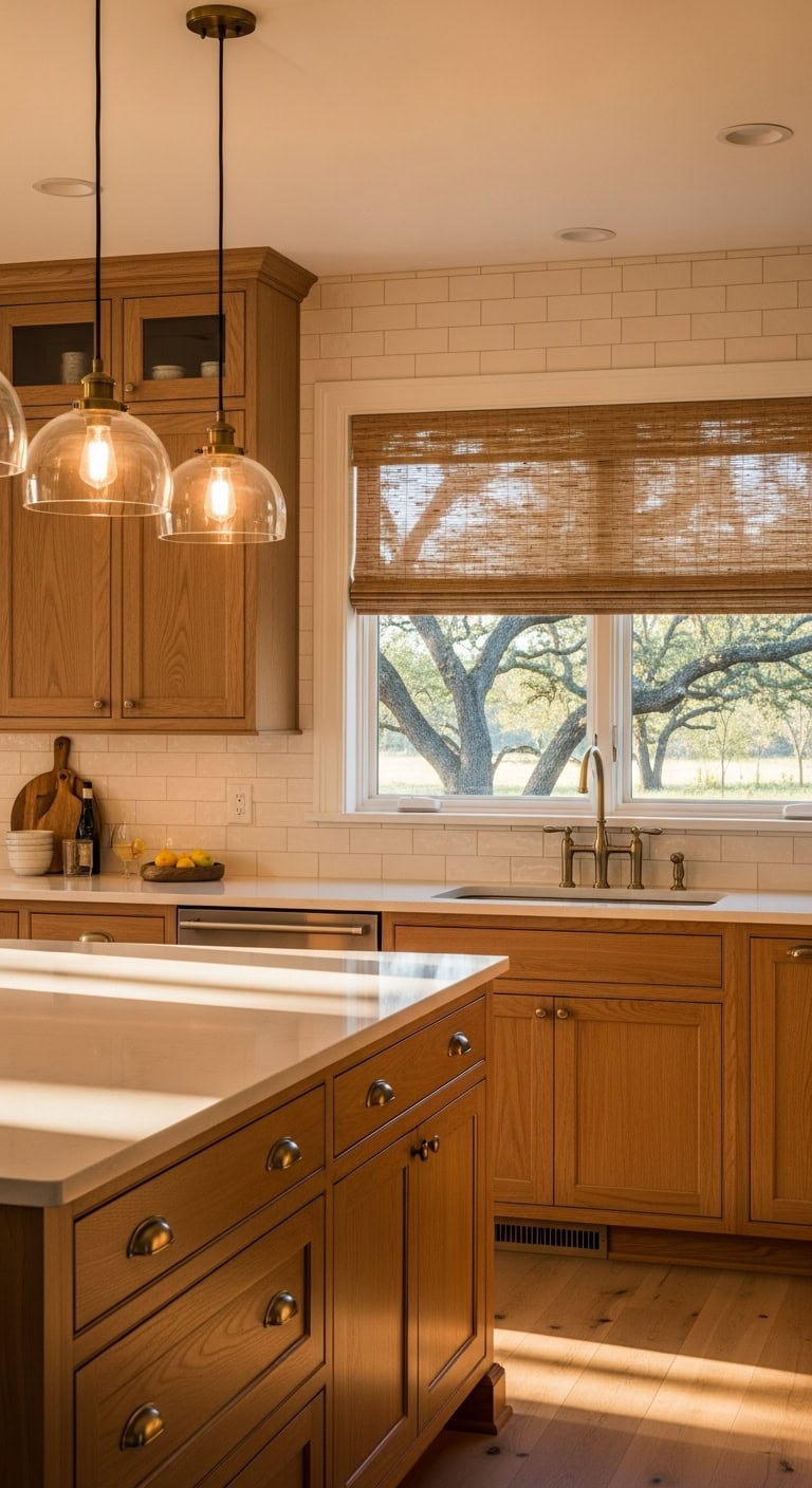
Bold Black Base Cabinets With Warm Wood Uppers
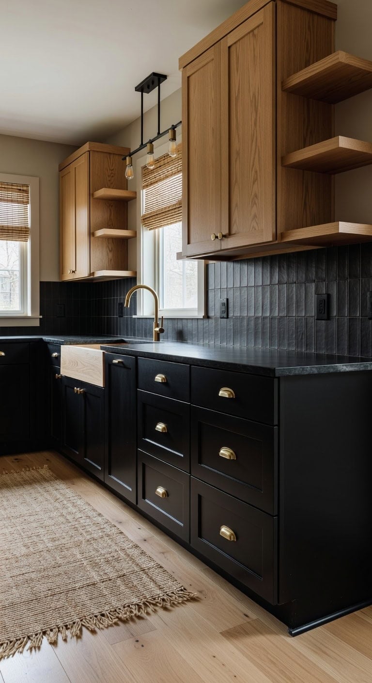
You’ve probably noticed black kitchens everywhere lately, but painting every cabinet feels too dark for everyday cooking and family meals. Pairing matte black base cabinets with honey-toned wood uppers creates drama at eye level while keeping the room bright and welcoming. The smooth painted finish below meets natural wood grain above, with brushed brass hardware connecting both zones beautifully.
Shop The Look
- Honey oak shaker upper cabinet doors
- Matte black ceramic subway tile backsplash
- Brushed brass cup pull cabinet hardware
- Black iron linear pendant light fixture
- Natural jute runner rug kitchen
- Woven bamboo roman shade window treatment
- Black granite composite farmhouse sink
- Oak floating open kitchen shelving
DIY Paint Transformation
- Base Cabinets: Paint in “Onyx” (Benjamin Moore 2133-10), a true rich black that creates sophisticated grounding weight beneath your wood uppers without appearing washed out.
- Upper Cabinets: Stain in “Golden Oak” (Minwax 210B), a warm honey tone that highlights natural wood grain and brings organic warmth to balance the dramatic black below.
Best For: Kitchens with good natural light where you want high-contrast drama without sacrificing the warmth that makes cooking spaces feel inviting and lived-in.
Natural Wood and Matte Black for Scandinavian Style
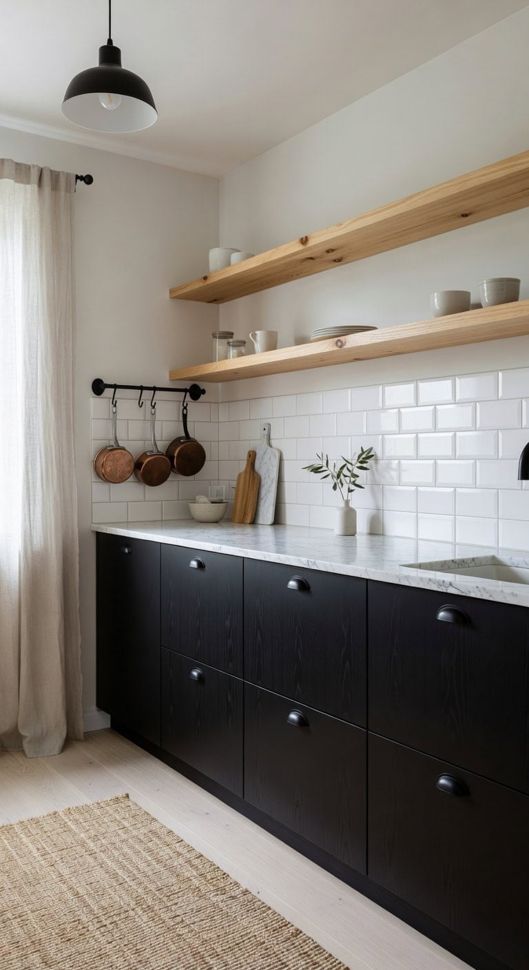
You want a kitchen that feels both cozy and modern without cluttering every surface. Natural wood tones paired with matte black create that perfect Scandinavian balance where warm grain textures soften industrial metal finishes. The combination brings depth to minimalist spaces while keeping everything feeling intentional and lived-in.
Shop The Look
- Light oak floating kitchen shelves
- Matte black cup pull cabinet handles
- White ceramic subway tile backsplash
- Black metal dome pendant light fixture
- Natural jute runner rug kitchen
- Linen cafe curtain white cotton
- Black iron wall mounted pot rack
- Marble and wood cutting board set
DIY Paint Transformation
- Lower Cabinets: Paint in “Tricorn Black” (Sherwin-Williams SW 6258) for that signature Scandinavian matte black base that grounds the entire kitchen without appearing harsh.
- Upper Cabinets or Open Shelving Area: Stain in “Classic Gray” (Minwax 271) to highlight natural wood grain while maintaining the pale, airy quality essential to Scandinavian design.
Best For: Smaller kitchens needing visual interest without overwhelming the space, or open-concept layouts where the kitchen connects to minimalist living areas.
Jet Black Island With Light Gray Perimeter Cabinets
Pairing a jet black island against light gray perimeter cabinets creates the kind of dramatic contrast that makes everyday cooking feel a little more special. The matte black surface plays beautifully against brushed nickel hardware, while natural stone countertops bridge the two tones with organic warmth. This combination delivers modern sophistication without feeling cold or sterile.
Shop The Look
- Jet black shaker kitchen island base
- Light gray wall cabinet set
- Brushed nickel cup pull handles
- White marble subway tile backsplash
- Black iron pendant light trio
- Gray and white geometric kitchen rug
- White linen roman window shade
- Black ceramic utensil crock holder
DIY Paint Transformation
- Island: Paint in “Onyx” (Benjamin Moore 2133-10), a true jet black that creates commanding presence and anchors your kitchen with timeless drama.
- Perimeter Cabinets: Paint in “Stonington Gray” (Benjamin Moore HC-170), a sophisticated light gray with balanced undertones that keeps walls feeling fresh and airy.
Best For: Open-concept kitchens with abundant natural light where the black island becomes a stunning focal point without overwhelming the space.
Pale Yellow Uppers With Deep Espresso Lower Cabinets
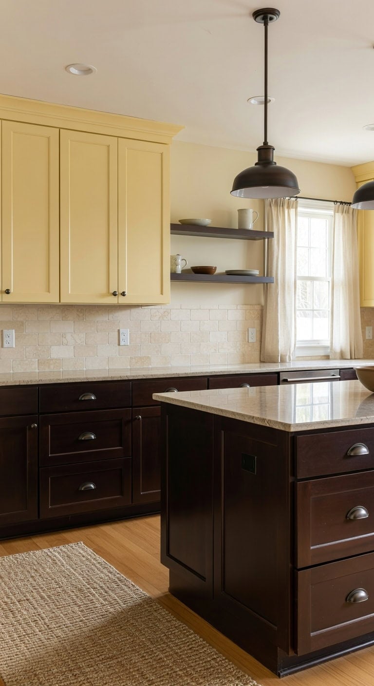
Walking into a kitchen where sunshine meets rich coffee tones instantly feels welcoming and grounded. The pale yellow upper cabinets bring cheerful warmth while the deep espresso lowers shift the space with sophisticated weight. Smooth painted wood surfaces play against brushed bronze hardware, and natural stone countertops connect these contrasting tones beautifully. This combination works whether you’re hosting Sunday brunch or helping kids with homework at the island.
Shop The Look
- Brushed bronze cup pull cabinet handles
- Cream travertine subway tile backsplash
- Sisal kitchen runner rug natural weave
- Oil rubbed bronze pendant light dome
- Linen cafe curtains ivory cotton blend
- Espresso wood floating display shelf
- Ceramic yellow butter dish with lid
- Bronze towel bar kitchen accent
DIY Paint Transformation
- Upper Cabinets: Paint in “Hawthorne Yellow” (Benjamin Moore HC-4), a soft buttery shade that catches morning light without feeling too bright or overwhelming in the kitchen space.
- Lower Cabinets: Paint in “Black Bean Soup” (Benjamin Moore 2130-10), a rich espresso brown with warm undertones that creates dramatic grounding and hides everyday wear beautifully.
Best For: Traditional or transitional kitchens that need energizing warmth balanced with sophisticated depth, especially in spaces with good natural lighting.
Burnt Orange Accent Cabinets With Warm White Surrounds
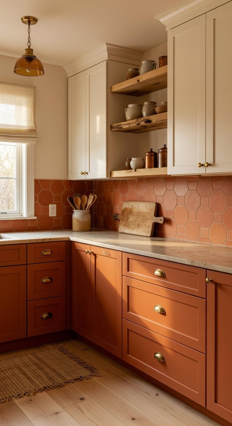
That pop of burnt orange against creamy white cabinets creates the kind of kitchen warmth you feel the moment you walk in. The matte finish of the orange lower cabinets plays beautifully against smooth white uppers, while natural wood open shelving adds rustic texture that grounds the whole space. Brushed brass hardware ties everything together with just enough shine.
Shop The Look
- Burnt orange shaker base cabinet doors
- Warm white wall cabinet door fronts
- Brushed brass cup pull cabinet handles
- Terracotta hexagon backsplash tile sheets
- Natural jute runner rug kitchen
- Brass pendant light amber glass shade
- Linen roman shade warm ivory color
- Floating oak kitchen display shelf
DIY Paint Transformation
- Lower Cabinets: Paint in “Cavern Clay” (Sherwin-Williams SW 7701) for that rich burnt orange that brings earthy energy without overwhelming your space.
- Upper Cabinets: Paint in “White Duck” (Sherwin-Williams SW 7010) for a warm white that feels cozy rather than stark, complementing the orange beautifully.
Best For: Open-concept kitchens where you want a conversation-starting focal point that still feels welcoming for everyday family meals.
Matte, Satin, or Gloss: Best Finishes for Two-Tone Cabinets
Choosing between matte, satin, or gloss finishes can feel overwhelming when you’re already juggling two cabinet colors. The right sheen makes navy uppers pop against creamy white lowers while brushed brass hardware catches light differently on each surface. Smooth painted wood meets cool ceramic tile, creating depth that flat photos never capture.
Shop The Look
- Brushed brass cabinet cup pulls
- Ceramic subway tile backsplash white
- Woven natural fiber kitchen runner
- Linen roman shade window treatment
- Glass pendant light antique brass
- Marble look ceramic canister set
- Wood cutting board display stand
- Satin nickel cabinet knob pulls
DIY Paint Transformation
- Upper Cabinets: Paint in “Naval” (Sherwin-Williams SW 6244), a sophisticated deep navy that looks stunning in satin finish, hiding minor imperfections while offering easy wipe-down cleaning for everyday kitchen use.
- Lower Cabinets: Paint in “Alabaster” (Sherwin-Williams SW 7008), a warm creamy white that performs beautifully in semi-gloss near the floor, resisting scuffs and moisture where cabinets take the most abuse.
Best For: Busy family kitchens where durability matters as much as style, especially homes with kids or pets that need surfaces standing up to daily wear.