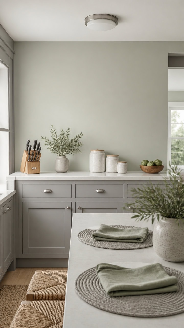
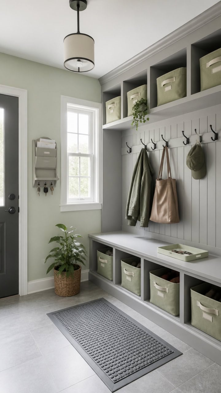
Gray and Green Bedrooms for Women Who Stopped Decorating for Guests
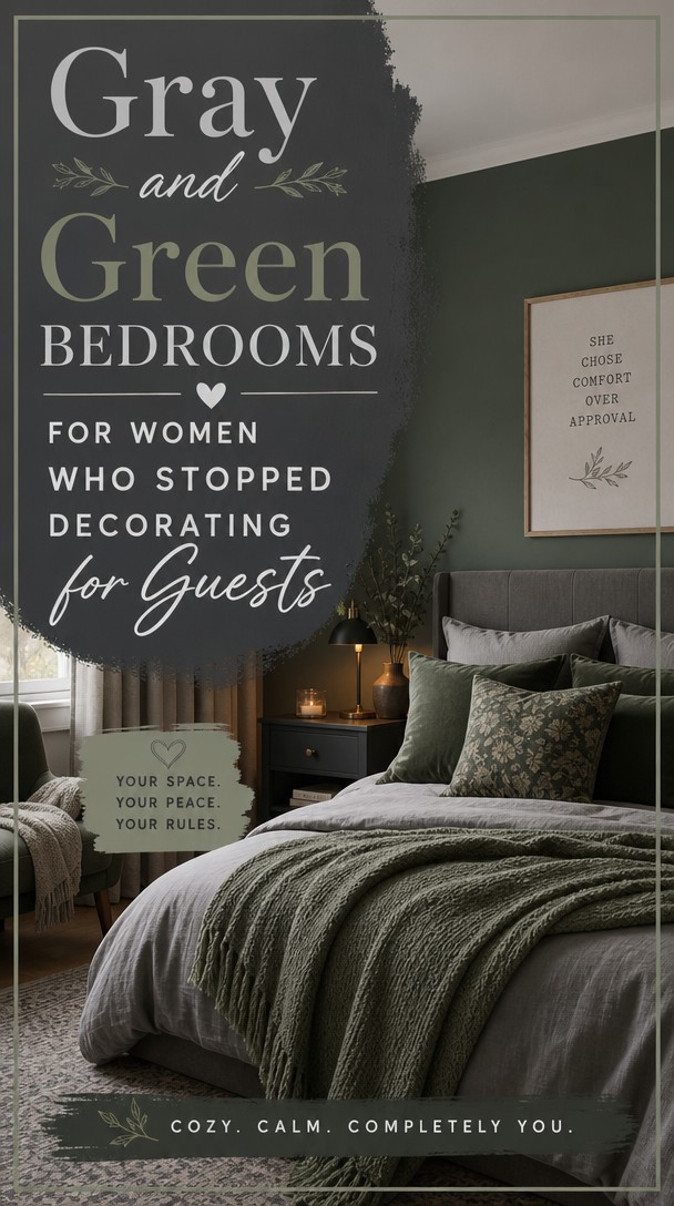
There’s a quiet freedom in decorating your bedroom for yourself—not for company, not for Instagram, just for the woman who actually sleeps there.
If you’re drawn to the grounded calm of gray paired with the fresh energy of green, you’re onto something beautiful.
These combinations will help you create a space that finally feels like yours.
Cool Grays vs. Warm Grays: Which One Is Yours?
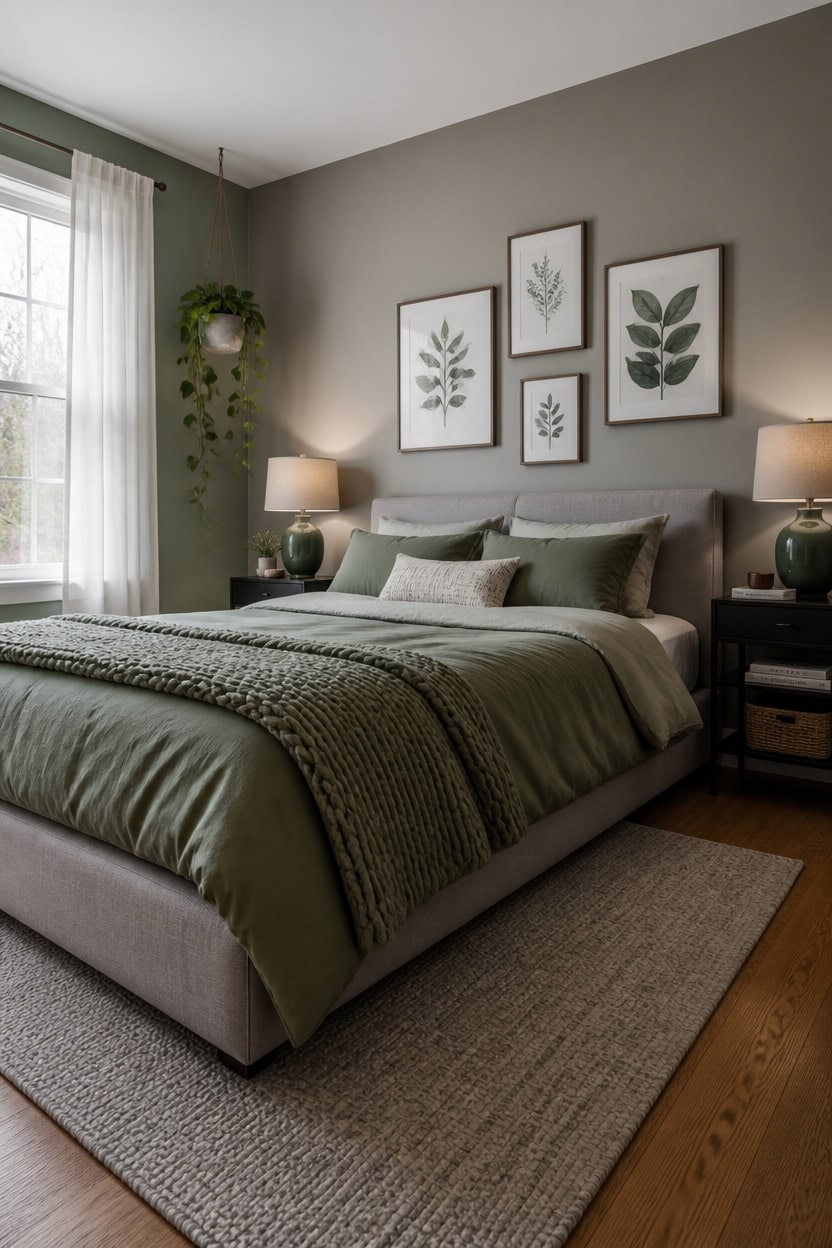
Cool grays pull blue or purple from their undertones, while warm grays lean toward beige, taupe, or greige — and that difference completely changes how green reads next to them. Cool gray makes green feel crisp, modern, and a little moody, while warm gray softens green into something earthier and more relaxed. If your bedroom gets cold north-facing light, warm gray will feel more livable; if you have warm afternoon sun, cool gray keeps the space from feeling too yellow.
Cool gray + green: Works best with blue-toned greens like sage, eucalyptus, or teal — the shared cool undertone creates visual harmony.
Warm gray + green: Pairs naturally with olive, moss, or hunter green — both colors share a muted, earthy base that reads cohesive.
Light test first: Hold a gray paint swatch next to your green accent fabric in natural daylight — undertones shift dramatically under artificial light.
Muddy mix warning: Pairing a warm gray with a cool blue-green creates a muddy, unresolved look that no amount of styling will fix.
matched from the wall in this photo — the closest Benjamin Moore shade.
Green Shades That Actually Feel Restful
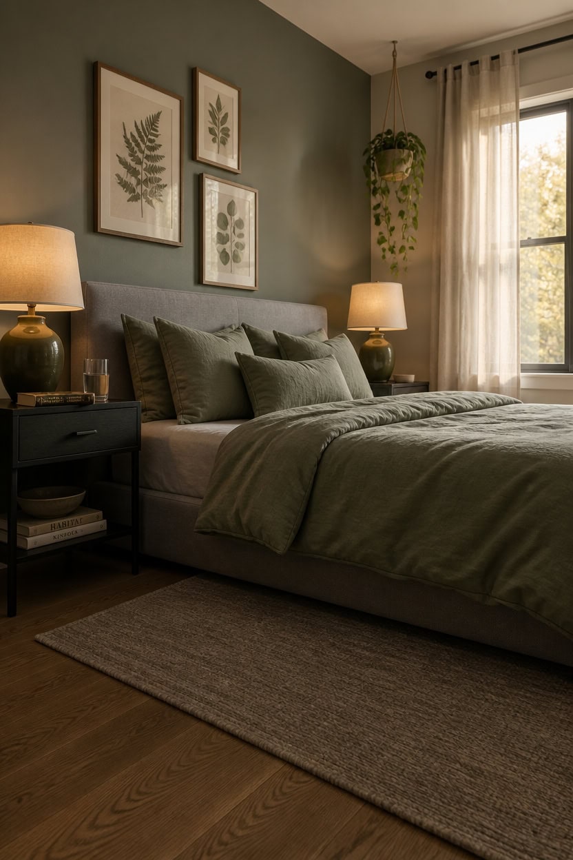
Sage, eucalyptus, and muted olive are the green shades most likely to lower your heart rate instead of stimulate it, because they carry enough gray in their base to feel settled rather than electric. That built-in gray keeps them from competing with your bedroom’s other neutrals and prevents the “painted jungle” effect that brighter greens create. If you’re unsure whether a green reads restful or jarring, hold the swatch next to your bedding in the late afternoon — restful greens will almost disappear into the room while energetic ones will suddenly feel loud.
Sage: The most forgiving restful green — its dusty, silvery quality reads almost neutral in low light, making it easy to layer without overpowering.
Eucalyptus: Slightly cooler and more blue-toned than sage, it creates a spa-like calm that works especially well in bedrooms with warm lighting.
Muted olive: The earthiest option — its yellow-brown undertones warm a gray bedroom and feel grounding rather than stimulating.
Avoid bright greens: Kelly, lime, and emerald carry too much chroma to feel restful — save them for rooms where energy is welcome.
matched from the wall in this photo — the closest Benjamin Moore shade.
Gray and Green Bedroom Pairings Worth Knowing
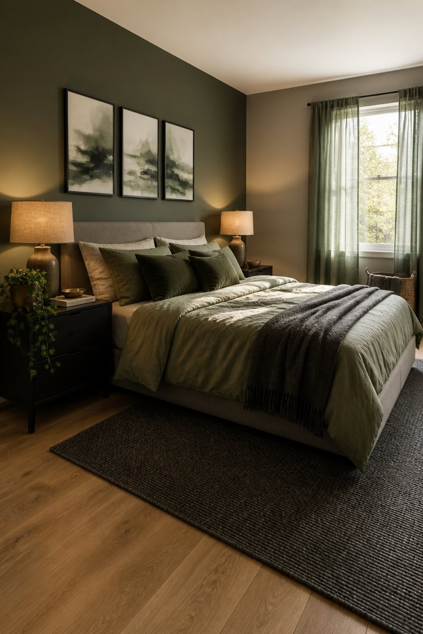
Four gray-green pairings show up again and again in bedrooms that feel genuinely calm: cool gray with sage, warm gray with olive, mid-gray with eucalyptus, and charcoal with deep hunter. Each pairing works because the gray controls how much the green reads as a color versus how much it reads as a neutral — and getting that ratio right is what separates a restful bedroom from one that feels like a decorating experiment.
Cool gray + sage: The coolness in both tones creates a quiet, seamless match that barely registers as two colors — ideal if you want calm over contrast.
Warm gray + olive: The brown undertones in both pull the room toward earthy rather than cold, making it the most grounding of the four pairings.
Mid-gray + eucalyptus: The slight blue in eucalyptus lifts a plain mid-gray without adding energy — this pairing reads as spa-like without trying.
Charcoal + deep hunter: The highest contrast of the four — use it only if you want the room to feel dramatic and cocooning rather than airy.
this deep, gray-leaning green anchors the headboard wall and makes the bed feel intentionally framed.
matched from the wall in this photo — the closest Benjamin Moore shade.
Why Gray and Green Work So Well Together
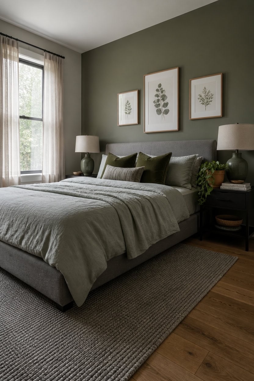
Gray and green share an underlying tonal relationship that most other color pairings don’t — both sit on the cool-to-neutral spectrum, which means they reinforce each other instead of competing. Gray naturally desaturates green’s intensity, pulling it away from bold or energetic and toward something quieter and more wearable as a bedroom backdrop. If your green reads too loud or your gray reads too flat on its own, pairing them together usually fixes both problems at once.
the green from this look, matched from the photo to its closest Benjamin Moore shade.
> Gray mutes green’s intensity without killing it
> Gray acts like a dimmer switch on green — keeping its organic quality intact while stripping out the brightness that makes a color feel demanding.
How to Set the Mood With Your Wall Color
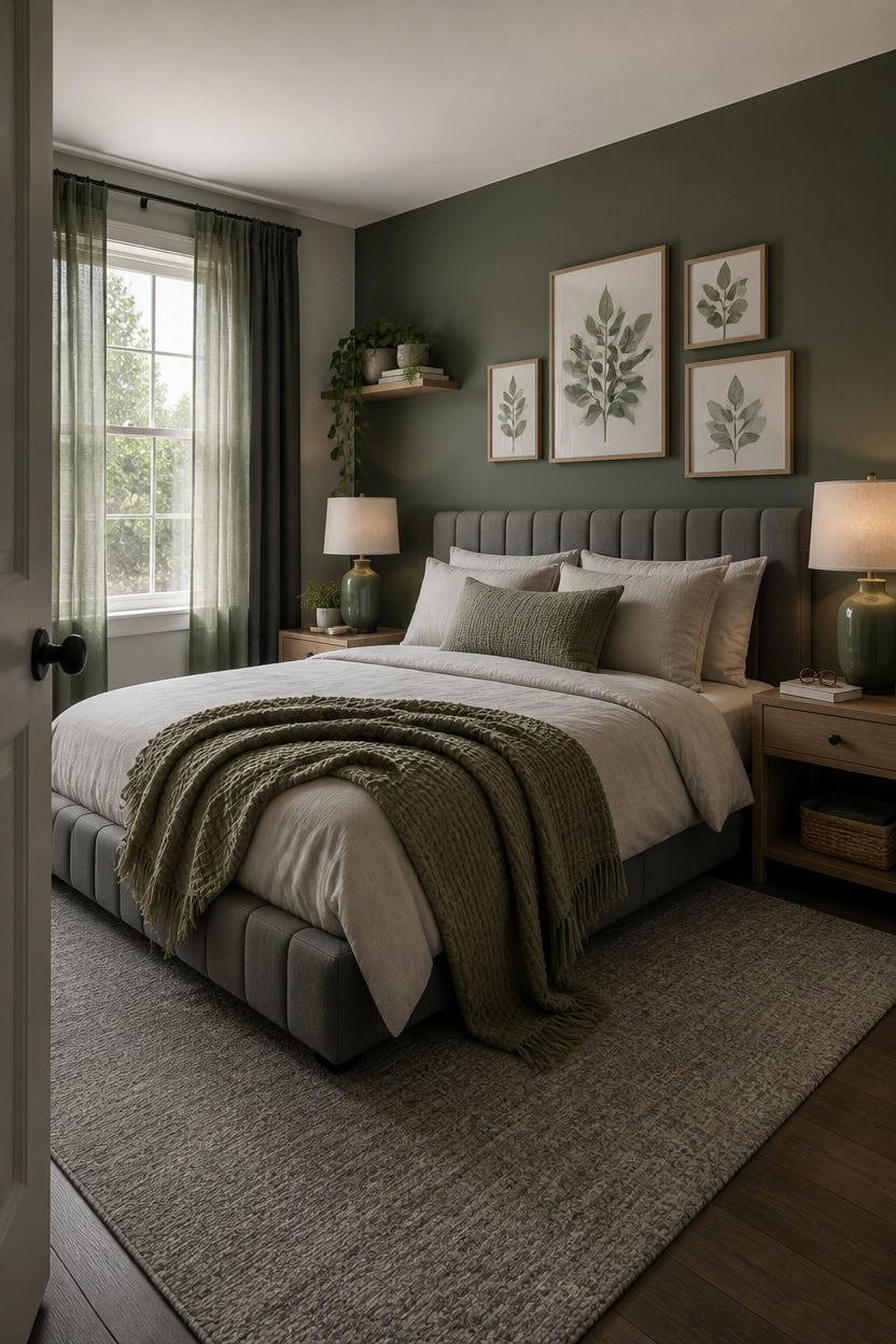
Cooler-toned wall colors make a gray and green bedroom feel more restful than warm ones because they don’t fight the green’s natural undertones. Warm beige or yellow-based grays pull the palette toward muddy territory, while a blue-leaning or true neutral gray keeps everything visually quiet. If your green bedding or curtains look more yellow than sage next to your wall color, your gray has too much warmth in it.
Light LRV grays (55–70): These reflect more light and keep the room airy without washing out your green accents.
Dark accent walls: A deep, muted green on the wall behind your bed adds depth without making the whole room feel smaller.
Undertone matching: Green with blue undertones needs a cool gray; green with yellow undertones can handle a slightly warmer gray.
Ceiling color: Painting the ceiling one shade lighter than the walls draws the eye up and keeps the room from feeling box-like.
matched from the wall in this photo — the closest Benjamin Moore shade.
8' x 10' Rugs for This Palette
Rugs USA best sellers in this palette's colors, linked in 8' x 10', the size for a queen bed: it sits under the lower two-thirds of the bed and leaves soft floor on both sides. Every design comes in other sizes too.
- Free shipping
- 30-day returns
- 210,000+ five-star reviews
 Bayberry Spill Proof Vintage Washable Rug – Green Grey
View Price
Bayberry Spill Proof Vintage Washable Rug – Green Grey
View Price
 Moroccan Trellis Rug – Grey
View Price
Moroccan Trellis Rug – Grey
View Price
 Keyara Spill Proof Washable Rug – Stone
View Price
Keyara Spill Proof Washable Rug – Stone
View Price
 Florid Dreams Rug – Silver
View Price
Florid Dreams Rug – Silver
View Price
 Everywhere Hand-Braided Indoor/Outdoor Rug – Salt And Pepper
View Price
Everywhere Hand-Braided Indoor/Outdoor Rug – Salt And Pepper
View Price
 Ring Around The Rosette Rug – Grey
View Price
Ring Around The Rosette Rug – Grey
View Price
 Broken Lattice Rug – Grey
View Price
Broken Lattice Rug – Grey
View Price
 Honeycomb Labyrinth Rug – Grey
View Price
Honeycomb Labyrinth Rug – Grey
View Price
 Ruby Distressed Mist Rug – Grey
View Price
Ruby Distressed Mist Rug – Grey
View Price
 Moroccan Trellis Rug – Dark Grey
View Price
Moroccan Trellis Rug – Dark Grey
View Price
 Harley Vintage Medallion Rug – Light Grey
View Price
Harley Vintage Medallion Rug – Light Grey
View Price
 Mae Traverse Stripes Rug – Grey
View Price
Mae Traverse Stripes Rug – Grey
View Price
 Adelaide Harlequin Indoor/Outdoor Rug – Dark Grey
View Price
Adelaide Harlequin Indoor/Outdoor Rug – Dark Grey
View Price
 Iris Textured Abstract Rug – Light Grey
View Price
Iris Textured Abstract Rug – Light Grey
View Price
 Striped Border Indoor/Outdoor Flatweave Rug – Dark Grey
View Price
Striped Border Indoor/Outdoor Flatweave Rug – Dark Grey
View Price
 Shaggy Lattice Tassel Rug – Light Grey
View Price
Shaggy Lattice Tassel Rug – Light Grey
View Price
 Broken Lattice Rug – Charcoal
View Price
Broken Lattice Rug – Charcoal
View Price
 Everywhere Hand-Braided Indoor/Outdoor Rug – Charcoal
View Price
Everywhere Hand-Braided Indoor/Outdoor Rug – Charcoal
View Price
 Ripple Waves Rug – Grey
View Price
Ripple Waves Rug – Grey
View Price
 Perfect Handwoven Jute-Blend Rug – Charcoal
View Price
Perfect Handwoven Jute-Blend Rug – Charcoal
View Price
 Fredrika Geometric Washable Rug – Light Grey
View Price
Fredrika Geometric Washable Rug – Light Grey
View Price
 Andrea Bordered Spill Proof Washable Rug – Charcoal
View Price
Andrea Bordered Spill Proof Washable Rug – Charcoal
View Price
 Iliana Striped Starfish Rug – Grey
View Price
Iliana Striped Starfish Rug – Grey
View Price
 Monochrome Bordered Indoor/Outdoor Rug – Grey
View Price
Monochrome Bordered Indoor/Outdoor Rug – Grey
View Price
 Melrose Checked Rug – Charcoal
View Price
Melrose Checked Rug – Charcoal
View Price
 Downing Plaid Wool Rug by Nate Berkus – Grey
View Price
Downing Plaid Wool Rug by Nate Berkus – Grey
View Price
 Sundara Modern Plaid Indoor/Outdoor Rug – Grey Multi
View Price
Sundara Modern Plaid Indoor/Outdoor Rug – Grey Multi
View Price
 Cranbury Plush Textured Washable Rug – Green
View Price
Cranbury Plush Textured Washable Rug – Green
View Price
 Speckled Wool-Blend Rug – Verdant Green
View Price
Speckled Wool-Blend Rug – Verdant Green
View Price
 Juniper Jute Tiled Rug – Natural
View Price
Juniper Jute Tiled Rug – Natural
View Price
 Melrose Checked Rug – Moss
View Price
Melrose Checked Rug – Moss
View Price
 Cape May Plush Textured Washable Rug – Green
View Price
Cape May Plush Textured Washable Rug – Green
View Price
 Persian Vintage Rug – Green
View Price
Persian Vintage Rug – Green
View Price
 Floral Fringed Rug – Olive
View Price
Floral Fringed Rug – Olive
View Price
 Shafali Tiled Trellis Rug – Green
View Price
Shafali Tiled Trellis Rug – Green
View Price
 Tropical Foliage Indoor/Outdoor Rug – Green Multicolor
View Price
Tropical Foliage Indoor/Outdoor Rug – Green Multicolor
View Price
 Petra High-Low Wool-Blend Rug – Verdant Green
View Price
Petra High-Low Wool-Blend Rug – Verdant Green
View Price
 Aylin Diamond Tasseled Rug – Green
View Price
Aylin Diamond Tasseled Rug – Green
View Price
 Rasali Checkered Box Rug – Green
View Price
Rasali Checkered Box Rug – Green
View Price
 Melrose Checked Rug – Green
View Price
Melrose Checked Rug – Green
View Price
Bedding That Makes a Gray and Green Bedroom Feel Intentional
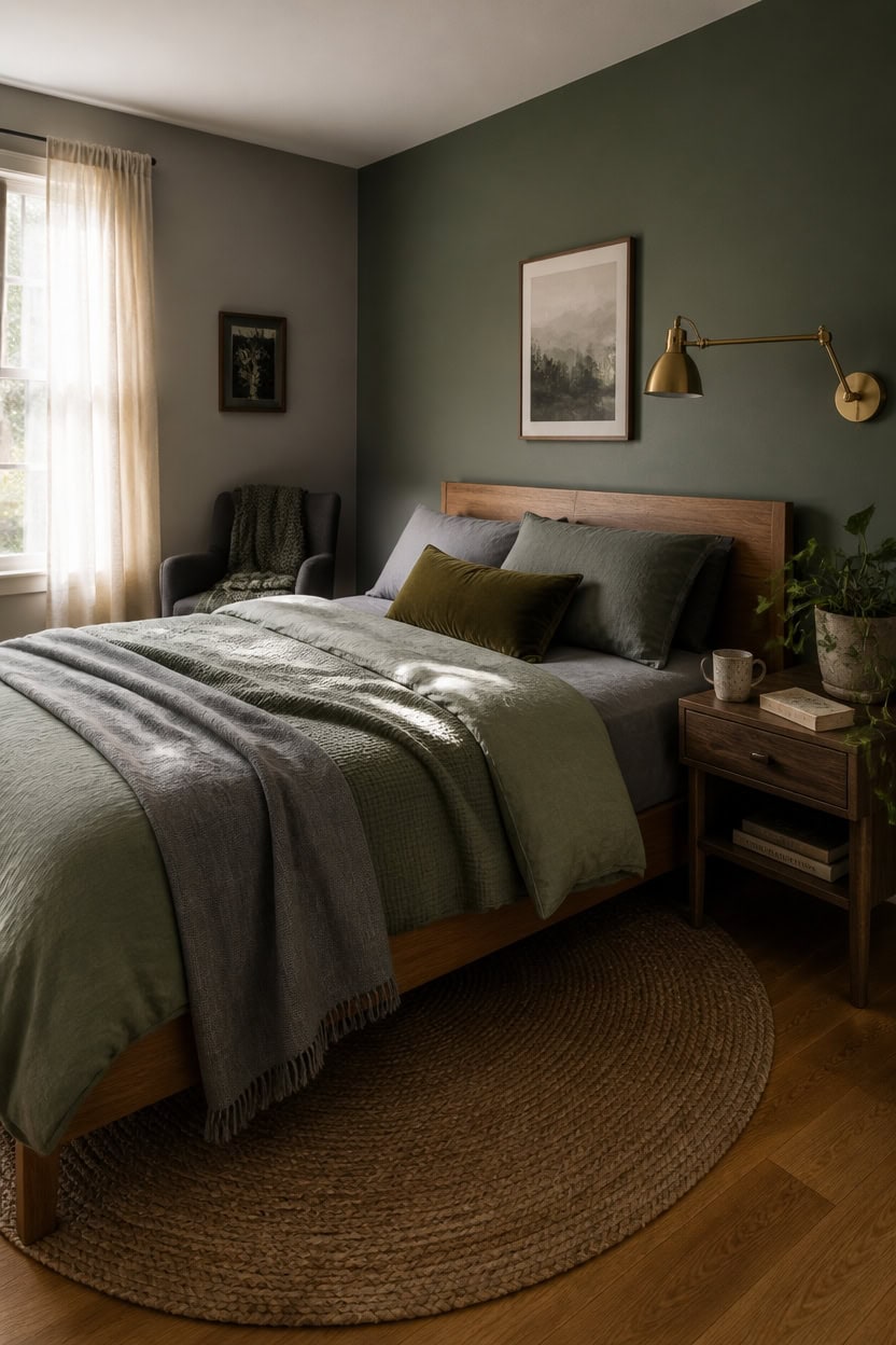
Bedding in a gray and green bedroom works best when one color leads and the other responds — not when they split evenly down the middle. A 60/40 ratio with gray as the dominant base and green as the accent layer keeps the palette from looking like a theme rather than a choice. If your green duvet and your gray pillowcases are the same visual weight, the bed reads busy instead of curated.
Layer order: Start with a gray fitted sheet, add a green or sage duvet, then pull back a gray throw at the foot for depth.
Texture over pattern: Solid or tonal weaves in waffle knit, linen, or matelassé look more intentional than printed sets in this palette.
Pillow count: Four pillows maximum — two sleeping pillows in gray cases, one euro in green or natural, and one textured lumbar in a muted olive or charcoal.
Duvet fill weight: A medium-weight insert (around 400–600 fill power) keeps the duvet from looking deflated or over-puffed, both of which undercut the layered look.
this muted, blue-leaning green grounds the bed without competing with your green bedding.
its cool, balanced undertone holds the bedding palette together without pulling the room warm.
Linen, Boucle, and Velvet: Textures This Palette Needs
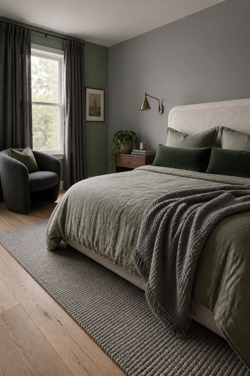
Linen brings softness without weight, boucle adds dimension without noise, and velvet delivers the kind of quiet richness that makes a gray and green bedroom feel finished rather than furnished. Each of these three textures works with this palette because they absorb and diffuse color instead of reflecting it, which keeps both gray and green from reading too cold or too flat. Use linen on your largest surface (duvet or curtains), boucle on one structural piece like a headboard or bench, and velvet as a punctuation point on pillows or a throw.
Linen placement: Use linen on the duvet cover or curtains — its natural variation keeps gray and green from looking too uniform or showroom-flat.
Boucle scale: Boucle works best on upholstered pieces like headboards, ottomans, or accent chairs — the looped texture adds visual weight without adding busy pattern.
Velvet as accent: Limit velvet to one or two small pieces like lumbar pillows or a folded throw — it reads as richness without dominating the palette.
Texture contrast rule: Never pair two of the same texture in adjacent pieces — linen duvet next to a linen pillow flattens the entire bed; swap one for boucle or velvet instead.
this soft, blue-leaning gray makes boucle and linen textures visually pop without competing with your green accents.
this muted, dusty green gives the textured pieces a grounded backdrop that keeps the room feeling deliberate rather than decorated.
Wall Art for This Palette
The best-reviewed prints at Wayfair in this palette's colors. Most come in several sizes.
- Free shipping over $35
- Picked at 4.5 stars or higher
 Minimal Landscape Grunge Green Gray Abstract
View Price
Minimal Landscape Grunge Green Gray Abstract
View Price
 Cool Grey Horizon I
View Price
Cool Grey Horizon I
View Price
 Sun Mountain Landscape Abstract Neutral Forest
View Price
Sun Mountain Landscape Abstract Neutral Forest
View Price
 Grunge Abstract Paint Stroke Effect Tan Gray Neutral
View Price
Grunge Abstract Paint Stroke Effect Tan Gray Neutral
View Price
 Sky Above Photograph
View Price
Sky Above Photograph
View Price
 Pine Tree Misty Mountain II
View Price
Pine Tree Misty Mountain II
View Price
 White and Grey Geometric Depths I Abstract Geometric
View Price
White and Grey Geometric Depths I Abstract Geometric
View Price
 Beige Botanical Impressions III Abstract Botanicals
View Price
Beige Botanical Impressions III Abstract Botanicals
View Price
 Ride on Time by Philippe Sainte Laudy
View Price
Ride on Time by Philippe Sainte Laudy
View Price
 Orange and Grey Forest Autumn Elegance II Forest
View Price
Orange and Grey Forest Autumn Elegance II Forest
View Price
 Violet Gray I Painting
View Price
Violet Gray I Painting
View Price
 Sweet Peonies I by Vincent Van Gogh
View Price
Sweet Peonies I by Vincent Van Gogh
View Price
 Abstract Shapes and Infinity Lines I Abstract Shapes
View Price
Abstract Shapes and Infinity Lines I Abstract Shapes
View Price
 Abstract Blue Landscape Modern Minimalist Navy Blue
View Price
Abstract Blue Landscape Modern Minimalist Navy Blue
View Price
 Sun Tipped Tropicals
View Price
Sun Tipped Tropicals
View Price
 Mid Century Modern Boho Organic Tropical Leaf
View Price
Mid Century Modern Boho Organic Tropical Leaf
View Price
 Mid Century Modern Boho Bold Bright Yellow Green Leaves
View Price
Mid Century Modern Boho Bold Bright Yellow Green Leaves
View Price
 Pastel Tan Brown Green Hues
View Price
Pastel Tan Brown Green Hues
View Price
 Abstract Botanical Faded Sage Green Tropical Palm Tree
View Price
Abstract Botanical Faded Sage Green Tropical Palm Tree
View Price
 Mid Century Modern Boho Pastel Green Geometric Jungle Palm
View Price
Mid Century Modern Boho Pastel Green Geometric Jungle Palm
View Price
 Forest Colors by Studio Arts
View Price
Forest Colors by Studio Arts
View Price
 Minimal Landscape Sage Green Modern Organic
View Price
Minimal Landscape Sage Green Modern Organic
View Price
 Mid Century Modern Boho Vibrant Green Yellow Abstract
View Price
Mid Century Modern Boho Vibrant Green Yellow Abstract
View Price
 Amarian Decadent Young Woman After the Dance Ramon Casas
View Price
Amarian Decadent Young Woman After the Dance Ramon Casas
View Price
 Minimal Landscape Muted Green Watercolor
View Price
Minimal Landscape Muted Green Watercolor
View Price
 Misty Mountain Lake with Pine Forest Pictures
View Price
Misty Mountain Lake with Pine Forest Pictures
View Price
 Woodland Forest Landscape Green Watercolor Pastel Mountain
View Price
Woodland Forest Landscape Green Watercolor Pastel Mountain
View Price
 Abstract Landscape Earthy Neutral Green Woodland
View Price
Abstract Landscape Earthy Neutral Green Woodland
View Price
 Autumn Kitchen by Danhui Nai
View Price
Autumn Kitchen by Danhui Nai
View Price
 Sunlight on Jakes Creek I by Danny Head
View Price
Sunlight on Jakes Creek I by Danny Head
View Price
 Rustic Countryside Country Village Rural Landscape Nature
View Price
Rustic Countryside Country Village Rural Landscape Nature
View Price
 Abstract Landscape Emerald Green Mountain Lake Nature
View Price
Abstract Landscape Emerald Green Mountain Lake Nature
View Price
 Simplity Wreath Green Flower Field Flower Field
View Price
Simplity Wreath Green Flower Field Flower Field
View Price
Natural Wood, Metal, or Both: Choosing Your Furniture Finish
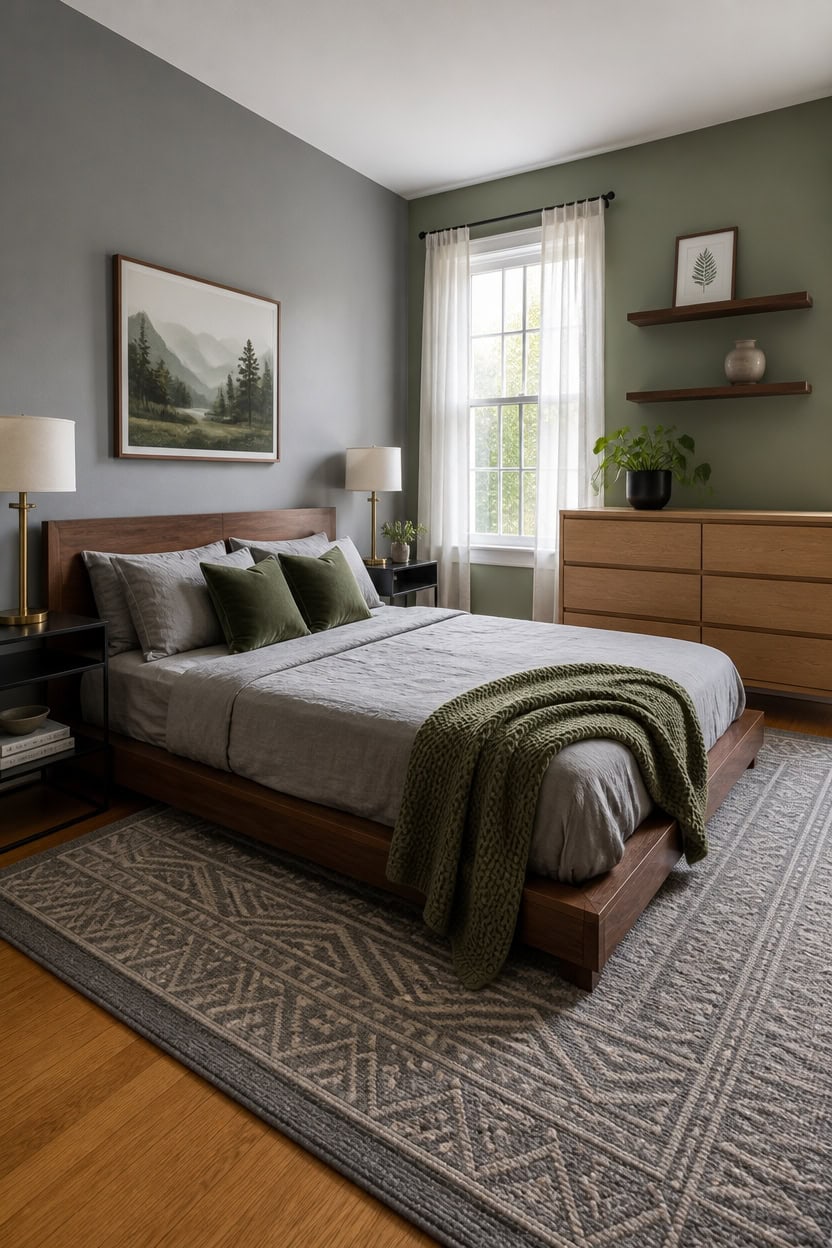
Natural wood leans warm in a gray and green bedroom, which is exactly why it works — it interrupts the coolness of the palette without abandoning it. Wood undertones in the amber-to-walnut range give gray something to anchor against and keep green from reading too cold or clinical. Metal works best as a secondary finish rather than a primary one, showing up in lamp bases, drawer pulls, or bed frames while wood carries the larger surfaces.
Wood tone matching: Warm walnut or honey oak reads best against gray and green — avoid pale birch or whitewashed finishes, which compete with gray walls.
Metal as accent: Use matte black or brushed brass for metal finishes — both bridge the gray-to-green gap without fighting either color for attention.
Mixing both finishes: Pair wood and metal by keeping wood on large pieces like a bed frame or dresser and metal on smaller details like lamps, legs, or hardware.
Scale awareness: One large wood piece anchors the room; more than two large wood surfaces makes the palette feel heavier than it should.
this clean, mid-tone gray makes warm wood tones glow while keeping the palette grounded.
this dusty sage green creates a backdrop that lets walnut and oak furniture read as warm rather than muddy.
Lighting That Flatters a Gray and Green Bedroom
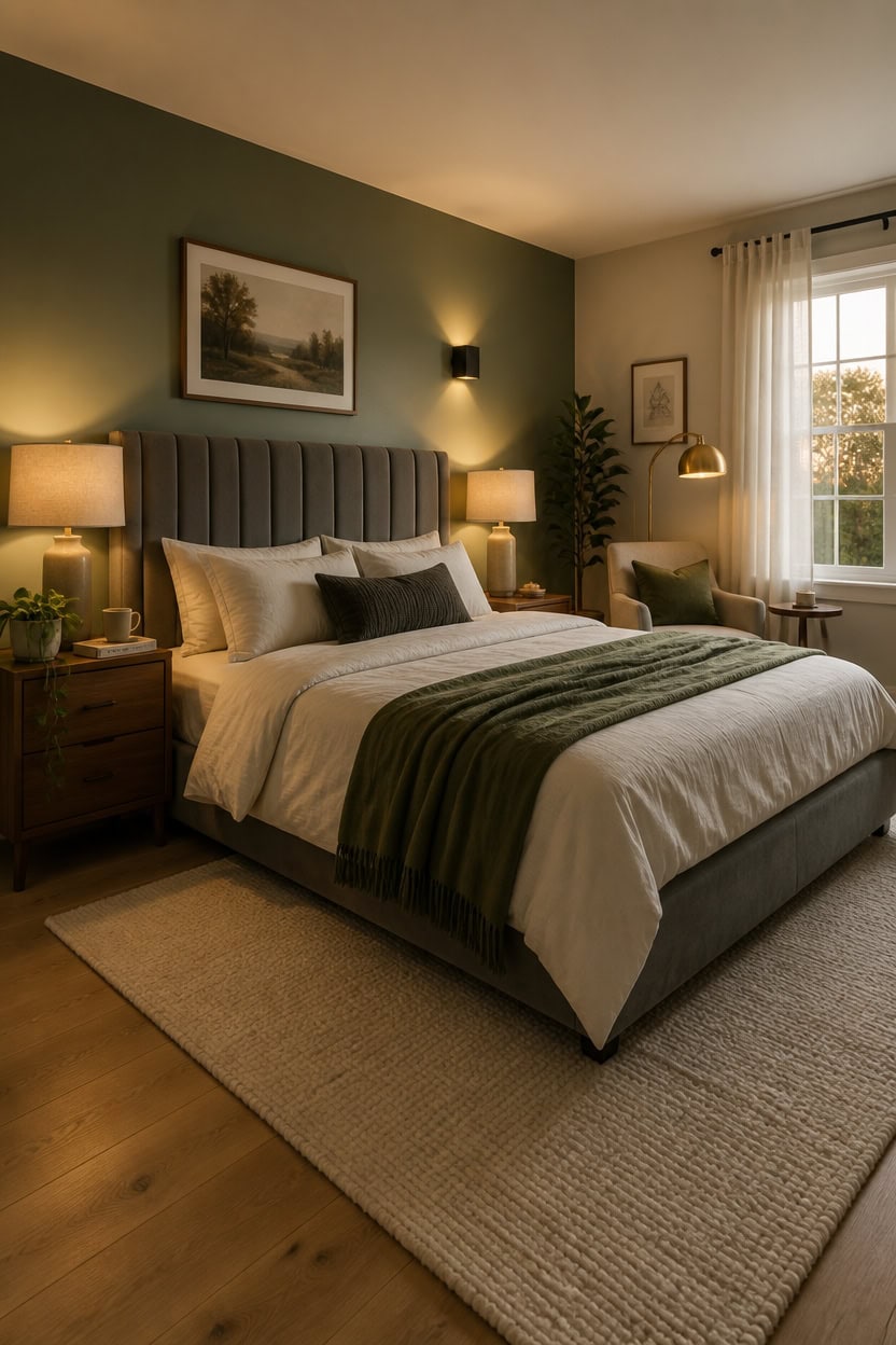
Warm-toned bulbs are the single most important lighting decision in a gray and green bedroom — the wrong temperature makes gray look lavender and green look muddy. Bulbs in the 2700K to 3000K range bring out the amber in wood furniture and keep both colors reading as intentional rather than accidental. Layer three light sources: overhead, bedside, and one ambient source like a floor or wall-mounted option to avoid the flat, shadowless look of a single ceiling fixture.
Bulb temperature: Use 2700K-3000K bulbs in every fixture — cooler bulbs above 4000K will push gray toward blue-purple under artificial light.
Layering sources: Pair overhead lighting with two bedside lamps and one floor or wall sconce to eliminate harsh shadows and create depth.
Fixture finish: Matte black or brushed brass fixtures read best against gray and green — chrome and nickel pull the palette too cool and clinical.
Dimmer switches: Install dimmers on overhead fixtures so you can drop the light level at night and keep the room feeling warm rather than washed out.
Paint the ceiling in “Pale Moon” (Benjamin Moore OC-108) — this soft warm white catches 2700K light beautifully and keeps the gray walls from making the ceiling feel heavy or low.
this muted green gives warm-toned lamps something rich to glow against without competing with the ceiling or side walls.
 Nintiue Upgraded Modern Arc Dimmable Tall Standing Floor Lamp with Linen Shade, 1200 Lumens LED Bulb Included, for Living & Reading Room, Bedroom, Office & Nursery, Brass
View Price
Nintiue Upgraded Modern Arc Dimmable Tall Standing Floor Lamp with Linen Shade, 1200 Lumens LED Bulb Included, for Living & Reading Room, Bedroom, Office & Nursery, Brass
View Price
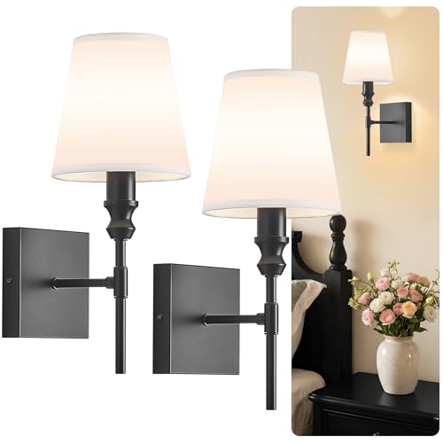 ZSMAIKU Vintage Bathroom Wall Sconce,Hardwired Bedside Wall Sconces Set of 2,Black Bathroom Light Fixture with White Fabric Shade for Bedroom Living Room Hallway Farmhouse,Convertible Height,E12 Base
View Price
ZSMAIKU Vintage Bathroom Wall Sconce,Hardwired Bedside Wall Sconces Set of 2,Black Bathroom Light Fixture with White Fabric Shade for Bedroom Living Room Hallway Farmhouse,Convertible Height,E12 Base
View Price
 TJOY A19 LED Edison Light Bulb, E26 Dimmable Bulb, 60W Equivalent, 6 Pack
View Price
TJOY A19 LED Edison Light Bulb, E26 Dimmable Bulb, 60W Equivalent, 6 Pack
View Price
 PoKat 20.75'' Ceramic Small Table Lamps for Bedroom, Modern Dark Gray Bedside Lamps Set of 2, Farmhouse Lamps for Living Room with Linen Lampshade for Night Stands Guest Room Side End Table Console
View Price
PoKat 20.75'' Ceramic Small Table Lamps for Bedroom, Modern Dark Gray Bedside Lamps Set of 2, Farmhouse Lamps for Living Room with Linen Lampshade for Night Stands Guest Room Side End Table Console
View Price
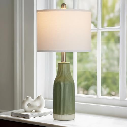 luxeflow 24.5" Ceramic Table Lamp for Bedroom, Sage Green Table Lamp for Living Room End Table, Small Farmhouse Bedside Lamp for Nightstand (1 Pack)
View Price
luxeflow 24.5" Ceramic Table Lamp for Bedroom, Sage Green Table Lamp for Living Room End Table, Small Farmhouse Bedside Lamp for Nightstand (1 Pack)
View Price
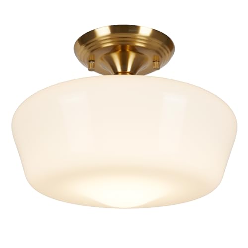 Schoolhouse Style Semi Flush Mount Ceiling Light Fixture, 12" Modern Gold Hallway Ceiling Lamp with Opal Milk Glass Shade Brass, Farmhouse Globe Light for Bedroom Kitchen Hallway Entryway Laundry
View Price
Schoolhouse Style Semi Flush Mount Ceiling Light Fixture, 12" Modern Gold Hallway Ceiling Lamp with Opal Milk Glass Shade Brass, Farmhouse Globe Light for Bedroom Kitchen Hallway Entryway Laundry
View Price
 Modway Lily Queen Biscuit Tufted Performance Velvet Headboard, Gray
View Price
Modway Lily Queen Biscuit Tufted Performance Velvet Headboard, Gray
View Price
 Govee Warm White LED Strip Lights 16.4ft with Control Box, 3000K, Dimmable
View Price
Govee Warm White LED Strip Lights 16.4ft with Control Box, 3000K, Dimmable
View Price
Removable Wallpaper for This Palette
Removable designer wallpaper from Wallshoppe, picked to match this palette. An easy way to add pattern to any room, and every design is available as a sample.
- Designed and printed in the USA
- Non-toxic inks
- Featured in NYT Wirecutter
 The Queens Lace' Wallpaper by Sarah Jessica Parker – Silver
View Price
The Queens Lace' Wallpaper by Sarah Jessica Parker – Silver
View Price
 The Queens Lace' Wallpaper by Sarah Jessica Parker – Pepper
View Price
The Queens Lace' Wallpaper by Sarah Jessica Parker – Pepper
View Price
 Bellport Madras Large Wallpaper by Chris Benz – Blue
View Price
Bellport Madras Large Wallpaper by Chris Benz – Blue
View Price
 Townhouse Wallpaper by Sarah Jessica Parker – Peacock
View Price
Townhouse Wallpaper by Sarah Jessica Parker – Peacock
View Price
 Pacifico Palm Wallpaper by Nathan Turner – Ivory
View Price
Pacifico Palm Wallpaper by Nathan Turner – Ivory
View Price
 Pacifico Palm Wallpaper by Nathan Turner – Green on Indigo
View Price
Pacifico Palm Wallpaper by Nathan Turner – Green on Indigo
View Price
 Arance Dolci Wallpaper by Carly Beck – Pink
View Price
Arance Dolci Wallpaper by Carly Beck – Pink
View Price
 Buka Patchwork Wallpaper by Chris Benz – Green
View Price
Buka Patchwork Wallpaper by Chris Benz – Green
View Price
 The Queens Lace' Wallpaper by Sarah Jessica Parker – Misty Blue
View Price
The Queens Lace' Wallpaper by Sarah Jessica Parker – Misty Blue
View Price
 Townhouse Wallpaper by Sarah Jessica Parker – Pearl on Charcoal
View Price
Townhouse Wallpaper by Sarah Jessica Parker – Pearl on Charcoal
View Price
 Pacifico Palm Wallpaper by Nathan Turner – Pink
View Price
Pacifico Palm Wallpaper by Nathan Turner – Pink
View Price
 Townhouse Wallpaper by Sarah Jessica Parker – Pearl on Parchment
View Price
Townhouse Wallpaper by Sarah Jessica Parker – Pearl on Parchment
View Price
 El Quijote Wallpaper by Chris Benz – Multi / Blue / Green
View Price
El Quijote Wallpaper by Chris Benz – Multi / Blue / Green
View Price
 Monroe Street Wallpaper by Chris Benz – Yellow
View Price
Monroe Street Wallpaper by Chris Benz – Yellow
View Price
 Lafayette Patchwork Wallpaper by Chris Benz – Teal
View Price
Lafayette Patchwork Wallpaper by Chris Benz – Teal
View Price
 Barbara Ann Wallpaper by Wallshoppe – Army Green
View Price
Barbara Ann Wallpaper by Wallshoppe – Army Green
View Price
 The Queens Lace' Wallpaper by Sarah Jessica Parker – Oyster
View Price
The Queens Lace' Wallpaper by Sarah Jessica Parker – Oyster
View Price
 Pacifico Palm Wallpaper by Nathan Turner – Peach
View Price
Pacifico Palm Wallpaper by Nathan Turner – Peach
View Price
 Fiddle Fig Wallpaper by Nathan Turner – Indigo
View Price
Fiddle Fig Wallpaper by Nathan Turner – Indigo
View Price
 Sweet Caroline Wallpaper by Wallshoppe – Fog
View Price
Sweet Caroline Wallpaper by Wallshoppe – Fog
View Price
 Townhouse Wallpaper by Sarah Jessica Parker – Morning Dew on Misty Blue
View Price
Townhouse Wallpaper by Sarah Jessica Parker – Morning Dew on Misty Blue
View Price
 Best Fronds Wallpaper by Wallshoppe – Storm
View Price
Best Fronds Wallpaper by Wallshoppe – Storm
View Price
 Arance Dolci Wallpaper by Carly Beck – Orange
View Price
Arance Dolci Wallpaper by Carly Beck – Orange
View Price
 Lemons Wallpaper by Nathan Turner – Peacock
View Price
Lemons Wallpaper by Nathan Turner – Peacock
View Price
 Pacifico Palm Wallpaper by Nathan Turner – Onyx
View Price
Pacifico Palm Wallpaper by Nathan Turner – Onyx
View Price
 Townhouse Wallpaper by Sarah Jessica Parker – Silver on Sage
View Price
Townhouse Wallpaper by Sarah Jessica Parker – Silver on Sage
View Price
 Pinstripe Wallpaper by Sugar Paper – Grey
View Price
Pinstripe Wallpaper by Sugar Paper – Grey
View Price
 Small Dumbo Wallpaper by Chris Benz – Black
View Price
Small Dumbo Wallpaper by Chris Benz – Black
View Price
 Sidewalk Wallpaper by Chris Benz – Green
View Price
Sidewalk Wallpaper by Chris Benz – Green
View Price
 Best Fronds Wallpaper by Wallshoppe – Gray
View Price
Best Fronds Wallpaper by Wallshoppe – Gray
View Price
 Townhouse Wallpaper by Sarah Jessica Parker – Pearl on Deep Navy
View Price
Townhouse Wallpaper by Sarah Jessica Parker – Pearl on Deep Navy
View Price
 Lafayette Patchwork Wallpaper by Chris Benz – Green
View Price
Lafayette Patchwork Wallpaper by Chris Benz – Green
View Price
 Sweet Caroline Wallpaper by Wallshoppe – Green
View Price
Sweet Caroline Wallpaper by Wallshoppe – Green
View Price
 Lemons Wallpaper by Nathan Turner – White
View Price
Lemons Wallpaper by Nathan Turner – White
View Price
 Pacifico Palm Wallpaper by Nathan Turner – Sky Blue
View Price
Pacifico Palm Wallpaper by Nathan Turner – Sky Blue
View Price
 Mums for Marion Wallpaper by Sarah Jessica Parker – Navy
View Price
Mums for Marion Wallpaper by Sarah Jessica Parker – Navy
View Price
 Bloc Wallpaper by Wallshoppe – Stone
View Price
Bloc Wallpaper by Wallshoppe – Stone
View Price
 Fleur De Camomille Wallpaper by Sarah Jessica Parker – Parchment
View Price
Fleur De Camomille Wallpaper by Sarah Jessica Parker – Parchment
View Price
 Eleanor Rigby Wallpaper by Wallshoppe – Storm
View Price
Eleanor Rigby Wallpaper by Wallshoppe – Storm
View Price
 Fiddle Fig Wallpaper by Nathan Turner – White
View Price
Fiddle Fig Wallpaper by Nathan Turner – White
View Price
Plants That Pull the Green Indoors Without Trying Too Hard
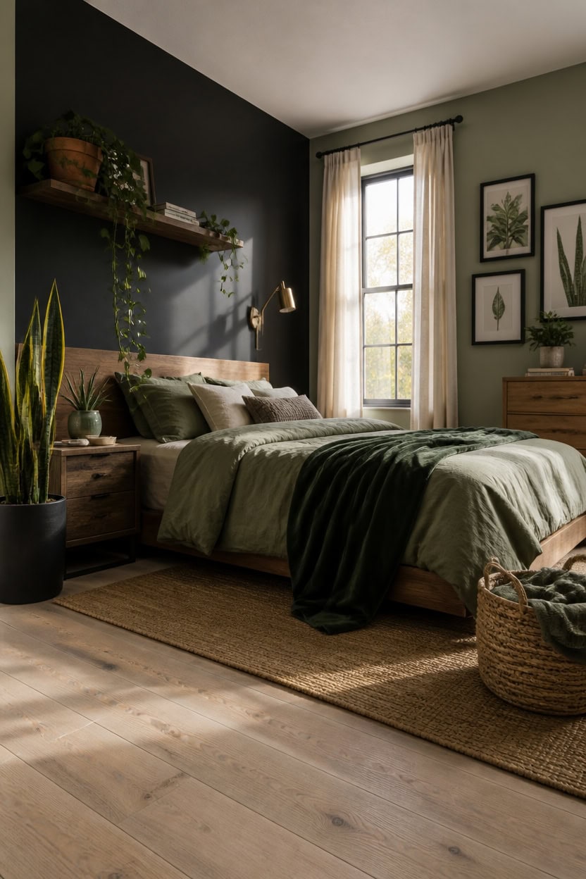
Low-maintenance plants with textural contrast work harder in a gray and green bedroom than anything lush or high-care. A snake plant’s upright, striped leaves echo the linear quality of gray linen and keep the green palette feeling intentional rather than decorative. Place one tall specimen in a matte black or terracotta pot at floor level and one trailing plant like pothos on a shelf or dresser to create height variation without crowding the space.
Go vertical first: A tall snake plant or fiddle leaf fig in the corner anchors the green palette without eating floor space.
Vary leaf texture: Mix one spiky or structured plant with one soft, trailing variety — the contrast reads like a deliberate design choice, not an afterthought.
Match pots to the palette: Matte black, warm terracotta, and sage ceramic pots all work — avoid bright white plastic, which fights the warmth of the room.
Keep it to three plants maximum: One floor-level, one mid-height on a nightstand or dresser, one shelf — more than three tips into greenhouse territory.
this deep, quiet gray gives leafy silhouettes something to pop against under warm lamp light.
this dusty green connects the plant colors to the architecture so the greenery feels grown into the room rather than placed in it.
 Keeplush 4ft Artificial Snake Plant – 46in Faux Sansevieria Plants, Fake Floor Plant for Indoor Outdoor, Front Porch Patio Home Office Decor, Mother-in-Law’s Tongue, Green 1Pcs
View Price
Keeplush 4ft Artificial Snake Plant – 46in Faux Sansevieria Plants, Fake Floor Plant for Indoor Outdoor, Front Porch Patio Home Office Decor, Mother-in-Law’s Tongue, Green 1Pcs
View Price
 Docrin Dark Green Ceramic Planter Set - 6.6"+5.5" Indoor Outdoor Pots with Drainage Holes & Saucers for Home Office Decor
View Price
Docrin Dark Green Ceramic Planter Set - 6.6"+5.5" Indoor Outdoor Pots with Drainage Holes & Saucers for Home Office Decor
View Price
 LOYWREE Small Fake Hanging Plant Artificial Potted Plants for Indoor Outdoor Aesthetic - 39in Realistic Faux Hanging Pothos with Ivy Vine for Shelf Decor in Home Office Gardens Greenery (Black Pot)
View Price
LOYWREE Small Fake Hanging Plant Artificial Potted Plants for Indoor Outdoor Aesthetic - 39in Realistic Faux Hanging Pothos with Ivy Vine for Shelf Decor in Home Office Gardens Greenery (Black Pot)
View Price
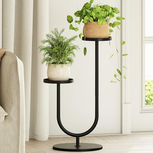 Bamworld Outdoor Plant Stand Metal Plant Stand Indoor
View Price
Bamworld Outdoor Plant Stand Metal Plant Stand Indoor
View Price
 Blueming Home Decor Large Plant Basket, Woven Seagrass Planter for Indoor Plants
View Price
Blueming Home Decor Large Plant Basket, Woven Seagrass Planter for Indoor Plants
View Price
 Puncuntex Fleece Throw Blanket Dark Green 50"×60" with Square Grid Design
View Price
Puncuntex Fleece Throw Blanket Dark Green 50"×60" with Square Grid Design
View Price
 D'vine Dev Terracotta Plant Pot with Saucer, 6 Inch, 40-X-A-3
View Price
D'vine Dev Terracotta Plant Pot with Saucer, 6 Inch, 40-X-A-3
View Price
Layering Pattern Without Chaos
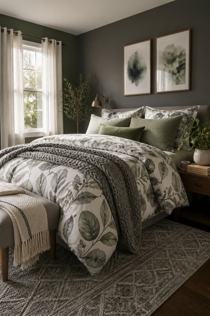
One pattern works in a gray and green bedroom when it stays in its lane — one dominant pattern, one secondary, one texture that reads as a near-solid. Mixing florals, stripes, and geometric prints at equal weight creates visual noise that exhausts rather than decorates. The clearest approach is a large-scale pattern on bedding, a smaller-scale repeat on one throw or pillow, and a woven texture (like a chunky knit or slubbed linen) that adds depth without competing.
Anchor with the largest pattern first: Choose your loudest print for the duvet or quilt, then build smaller and quieter from there.
Scale down as you layer: If the bedding is large-scale botanical, the pillow pattern should be a smaller stripe or subtle geometric — never the same scale stacked.
Keep pattern in one zone: Concentrate mixed prints on the bed; leave curtains, walls, and rugs in solid or near-solid tones so the eye has somewhere to rest.
Use green as the pattern bridge: A print that pulls both gray and green together — like a leaf or stem print in those exact tones — ties layers without forcing them.
the deep gray makes patterned bedding read as intentional rather than busy against a competing backdrop.
this grounded green turns the bedroom’s patterned layers into a cohesive palette rather than a collection of prints.
Our Favorite Faux Trees
- Free shipping over $35
- Picked at 4.4 stars or higher
 Altman Faux Olive Tree with White Planter
View Price
Altman Faux Olive Tree with White Planter
View Price
 Alvina 96" Artificial Olive Tree with White Planter
View Price
Alvina 96" Artificial Olive Tree with White Planter
View Price
 6 ft Faux Olive Tree with Fruit and Realistic Leaves
View Price
6 ft Faux Olive Tree with Fruit and Realistic Leaves
View Price
 Adarna 60" Artificial Fiddle Leaf Fig Tree
View Price
Adarna 60" Artificial Fiddle Leaf Fig Tree
View Price
 Adcock 8 ft Artificial Ficus Tree in White Planter
View Price
Adcock 8 ft Artificial Ficus Tree in White Planter
View Price
 Adcock Faux Ficus Tree in White Planter
View Price
Adcock Faux Ficus Tree in White Planter
View Price
 Adcock Artificial Dracaena Tree in Pot
View Price
Adcock Artificial Dracaena Tree in Pot
View Price
 Artificial Bamboo Tree in Pot
View Price
Artificial Bamboo Tree in Pot
View Price
 Adcock 6.5 ft Artificial Bamboo Tree in Cream Planter
View Price
Adcock 6.5 ft Artificial Bamboo Tree in Cream Planter
View Price
 Adcock Artificial Majesty Palm Tree in Pot
View Price
Adcock Artificial Majesty Palm Tree in Pot
View Price
 6.5 ft Artificial Bird of Paradise Tree in Black Cement Pot
View Price
6.5 ft Artificial Bird of Paradise Tree in Black Cement Pot
View Price
 6 ft Artificial Traveler's Palm in White Planter
View Price
6 ft Artificial Traveler's Palm in White Planter
View Price
Accent Colors That Actually Work Here
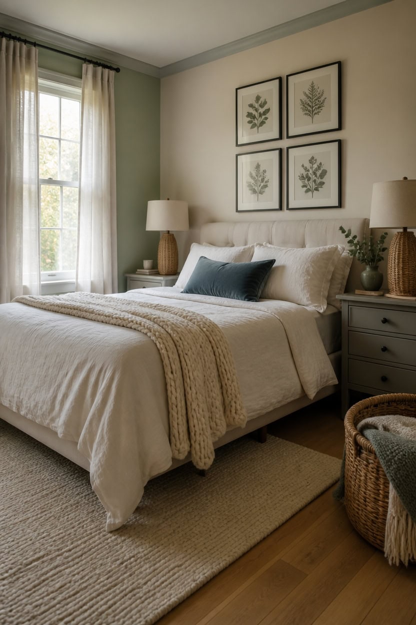
Terracotta, blush, and warm brass are the accent colors that consistently fail in gray and green bedrooms — they pull the palette toward warmth the cooler base can’t absorb. Dusty mauve, aged brass, and ochre tend to look muddy against sage or hunter green. Cream, soft white, warm linen, and muted dusty blue are the accents that actually resolve the palette without competing with it.
Cream and warm white: These neutrals soften the cool gray without introducing a contrasting temperature — they read as light, not as a new color.
Dusty blue as a third tone: A muted, desaturated blue bridges gray and green naturally because it shares undertones with both; keep it small — one pillow or one ceramic piece.
Natural wood and rattan: These add warmth through texture rather than color, which keeps the palette from feeling cold without disrupting the gray-green foundation.
Black as a sharp anchor: One or two black elements — a lamp base, a frame, a curtain rod — keep the softer palette from reading as formless or washed out.
this warm cream accent wall pulls the gray and green palette toward livable rather than clinical.
this soft gray unifies the room’s cooler tones and makes every accent color land with more precision.
Small Gray and Green Bedroom Ideas That Don’t Feel Cramped
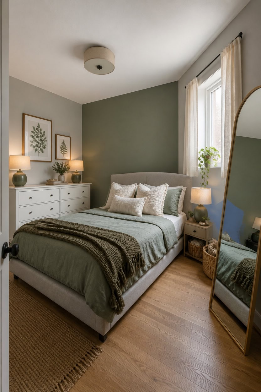
Light-colored furniture placed away from walls and mirrors used as vertical anchors are the two techniques that prevent a small gray and green bedroom from feeling like a storage unit with a mattress. Keeping large pieces — bed frame, dresser — in soft gray or white creates visual breathing room, while green stays concentrated in textiles and one wall surface. A low-profile bed is the single most impactful furniture choice in a compact room because it leaves more vertical wall visible, which reads as square footage.
Low bed frame: A platform or low-profile frame keeps the ceiling line visible longer, making the walls read taller than they are.
One green wall, not four: Painting a single wall in sage or muted green contains the color without closing the room in on itself.
Mirrors as square footage: A full-length or large wall mirror placed opposite the window doubles reflected light and tricks the eye into reading more depth.
Textiles do the color work: When walls and furniture stay in soft gray or white, green comes through in a duvet, two pillows, and one ceramic piece — enough color without visual crowding.
this soft gray keeps the small bedroom airy while anchoring the space without shrinking it.
this muted sage green introduces the title color without using a full wall, preserving the room’s open feel.
Our Favorite Bedding Sets
- Free shipping over $35
- Picked at 4.4 stars or higher
 Southshore Vilano Oversized Quilt Set with Shams
View Price
Southshore Vilano Oversized Quilt Set with Shams
View Price
 Basics by Wayfair Microfiber Reversible Diamond Quilt Set
View Price
Basics by Wayfair Microfiber Reversible Diamond Quilt Set
View Price
 Lush Decor Royal Empire Cotton Reversible 3-Piece Quilt Set
View Price
Lush Decor Royal Empire Cotton Reversible 3-Piece Quilt Set
View Price
 Madison Park Quebec Reversible Bedspread Set
View Price
Madison Park Quebec Reversible Bedspread Set
View Price
 Tommy Bahama Raffia Solid Cotton Reversible Quilt Set
View Price
Tommy Bahama Raffia Solid Cotton Reversible Quilt Set
View Price
 Striped Farmhouse Reversible Quilt Set with Shams
View Price
Striped Farmhouse Reversible Quilt Set with Shams
View Price
 Swift Home Floral Pintuck 3-Piece Comforter Set
View Price
Swift Home Floral Pintuck 3-Piece Comforter Set
View Price
 Becky Cameron Reversible Down-Alternative Comforter Set
View Price
Becky Cameron Reversible Down-Alternative Comforter Set
View Price
 Madison Park Odette Jacquard 8-Piece Comforter Set
View Price
Madison Park Odette Jacquard 8-Piece Comforter Set
View Price
 8-Piece Modern Comforter Set with Sheets, Bed in a Bag
View Price
8-Piece Modern Comforter Set with Sheets, Bed in a Bag
View Price
 Boysen Waffle Textured 3-Piece Down-Alternative Comforter Set
View Price
Boysen Waffle Textured 3-Piece Down-Alternative Comforter Set
View Price
 Bare Home Soft All-Season Comforter Set
View Price
Bare Home Soft All-Season Comforter Set
View Price
 Bedsure Pintuck Bed-in-a-Bag with Sheets
View Price
Bedsure Pintuck Bed-in-a-Bag with Sheets
View Price
 Bedsure Pintuck Pinch Pleat Bed-in-a-Bag, 5 or 7 Piece
View Price
Bedsure Pintuck Pinch Pleat Bed-in-a-Bag, 5 or 7 Piece
View Price
 Madison Park Essentials Joella 24-Piece Room in a Bag
View Price
Madison Park Essentials Joella 24-Piece Room in a Bag
View Price
 Nestl Bed-in-a-Bag Pleated Comforter Set with Sheets
View Price
Nestl Bed-in-a-Bag Pleated Comforter Set with Sheets
View Price
 Nestl Bed-in-a-Bag Reversible Comforter Set with Sheets
View Price
Nestl Bed-in-a-Bag Reversible Comforter Set with Sheets
View Price
 Bedsure Pinch Pleat Boho Bed-in-a-Bag Comforter Set
View Price
Bedsure Pinch Pleat Boho Bed-in-a-Bag Comforter Set
View Price
 Bedsure Farmhouse Tufted Boho Comforter Set
View Price
Bedsure Farmhouse Tufted Boho Comforter Set
View Price
 510 Design Porter Soft Washed Pinch Pleated Comforter Set
View Price
510 Design Porter Soft Washed Pinch Pleated Comforter Set
View Price
 Bedsure Tufted Embroidery All-Season Comforter Set
View Price
Bedsure Tufted Embroidery All-Season Comforter Set
View Price
 Bedsure Reversible Prewashed Comforter Set
View Price
Bedsure Reversible Prewashed Comforter Set
View Price
 Bedsure Shabby Elegance Embroidery Boho Duvet Cover Set
View Price
Bedsure Shabby Elegance Embroidery Boho Duvet Cover Set
View Price
 Bedsure Embroidered Tufted All-Season Comforter Set
View Price
Bedsure Embroidered Tufted All-Season Comforter Set
View Price
 Bedsure 100% Washed Cotton Duvet Cover Set
View Price
Bedsure 100% Washed Cotton Duvet Cover Set
View Price
 MooMee Striped Washed Cotton Duvet Cover Set
View Price
MooMee Striped Washed Cotton Duvet Cover Set
View Price
 Bedsure 100% Cotton Waffle Weave Plaid Duvet Cover
View Price
Bedsure 100% Cotton Waffle Weave Plaid Duvet Cover
View Price
 Bedsure Prewashed Microfiber Duvet Cover Set
View Price
Bedsure Prewashed Microfiber Duvet Cover Set
View Price
 Hyprest 100% French Linen Duvet Cover and Sham Set
View Price
Hyprest 100% French Linen Duvet Cover and Sham Set
View Price
 Bedsure Boho Embroidery Duvet Cover Set
View Price
Bedsure Boho Embroidery Duvet Cover Set
View Price
When to Go Dark and Moody With This Color Combination
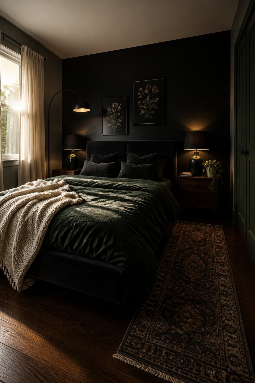
Dark, moody gray and green works when your room already has at least one strong natural light source — a south- or east-facing window that prevents the space from caving into itself after 10 a.m. The deep tones absorb light instead of reflecting it, which creates intimacy and visual weight rather than the airy openness lighter palettes rely on. If your bedroom has only one small window or faces north, stick to one dark surface and keep the rest in mid-tone gray so the room stays livable rather than dim.
Go dark only when the bones allow it:: Deep green and charcoal only feel luxurious when ceiling height is at least 8 feet — lower ceilings trap the color and feel oppressive.
One saturated wall is enough:: A single deep forest or hunter green wall behind the bed delivers the moody payoff without consuming the rest of the room.
this near-black charcoal gray grounds the moody palette without reading flat, making the bed feel like a deliberate focal point rather than furniture floating in a room.
this deep, saturated green introduces the moody title color on a surface that recedes when closed, so the drama is present without overwhelming the space.
Budget-Friendly Ways to Build This Palette
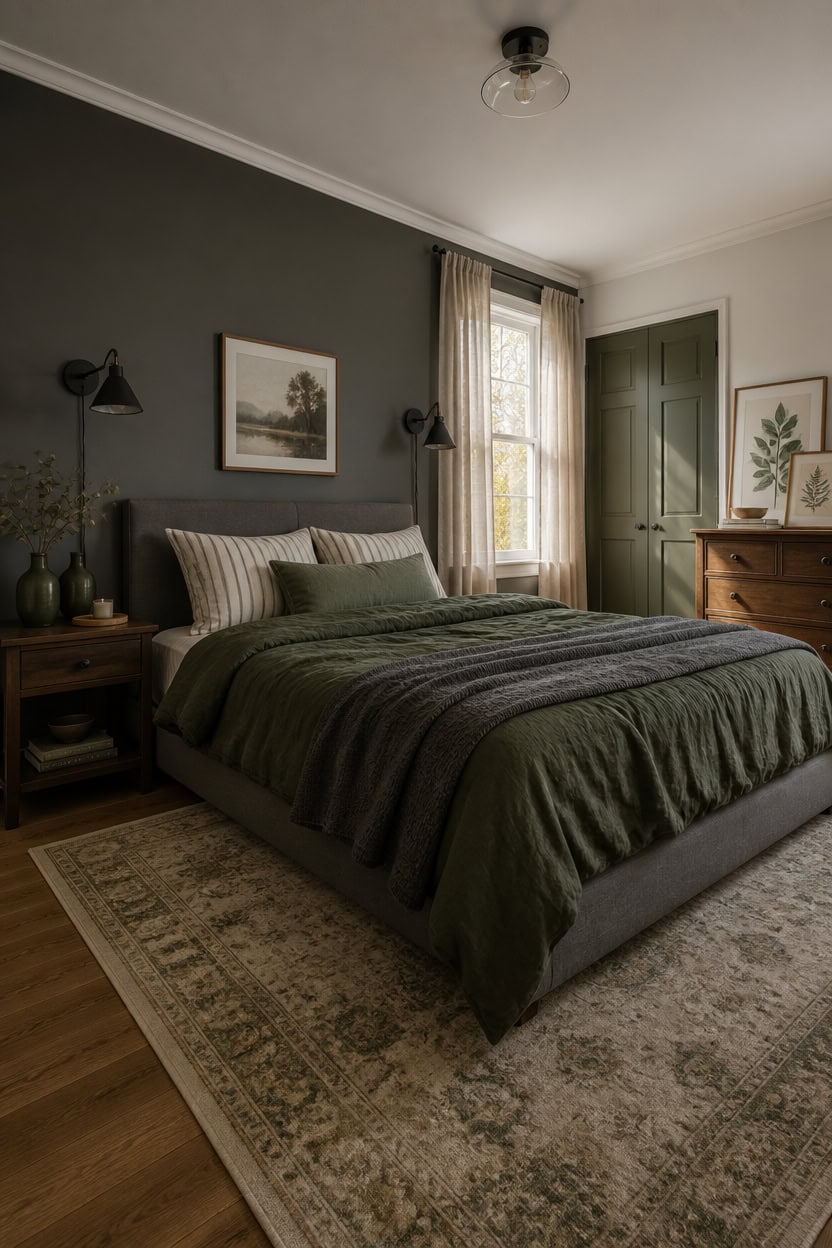
Thrifting, layering secondhand finds, and choosing strategic splurges over full room overhauls will get you a gray and green bedroom for under $400 without it looking assembled from leftovers. Gray and green are both forgiving palette anchors because neutral gray works in any price tier, and green shows up in nearly every product category from budget bedding to discount art prints. Start with one investment-worthy green duvet and build everything else around it using lower-cost gray textiles and thrifted wood accents.
Start with bedding: A single quality green duvet cover anchors the palette — everything else can be budget gray or secondhand.
Use gray walls as your free backdrop: If you already have white or off-white walls, a gray-toned paint refresh costs under $40 and replaces the need for wallpaper or accent décor.
Shop secondhand for wood: Nightstands, dressers, and frames in natural or dark walnut tones from thrift stores blend seamlessly into this palette without competing.
Buy green in small doses: Ceramic vases, throw pillows, and candles in forest or sage green cost under $25 each and deliver the color story without committing to expensive upholstery.
this medium-depth gray creates a grounded, intentional backdrop that makes even a budget bed frame look chosen rather than default.
this warm, earthy green introduces the palette’s second color on a receding surface where a $30 paint can does the visual work of a $300 accent piece.
Mistakes That Make Gray and Green Feel Cold or Flat
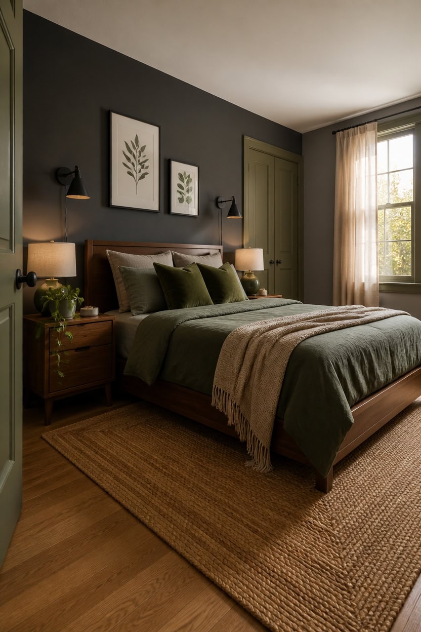
Cold comes from too much cool-toned gray with no warm material to interrupt it — bare walls, chrome fixtures, and synthetic fabrics all amplify that effect. Adding warmth through wood, linen, and matte finishes breaks the gray’s clinical edge without changing the palette. One jute rug or an unpainted wood nightstand does more to warm a gray and green bedroom than any additional color ever could.
Too much cool gray: Swap one cool-toned gray textile for a warm-toned one — mushroom, oat, or greige reads warmer without leaving the palette.
Flat, no-texture surfaces: Layer at least three different textures — woven cotton, matte ceramic, and raw wood — so gray reads as rich instead of dull.
Wrong green tone: Cool blue-greens in low light turn cold fast — use forest, sage, or olive to keep green grounded and livable.
No light source variation: Overhead lighting flattens gray and green both — add a warm-bulb lamp or plug-in sconce at nightstand height.
this deep, warm-leaning gray absorbs light evenly and keeps the wall from reading as cold or institutional.
this earthy, yellow-based green introduces warmth on a receding surface where it softens the overall room temperature.
How This Palette Changes Across Seasons and Light Conditions
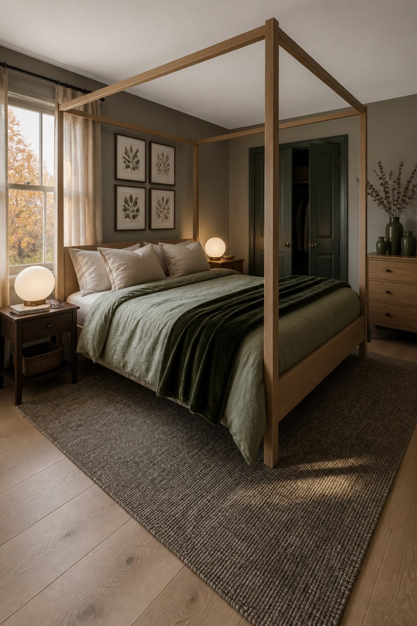
Gray reads warmest in spring and fall light, when sunlight angles low through windows and pulls out the undertone in whatever gray you chose — beige-grays glow, blue-grays sharpen. Green shifts more dramatically: sage turns almost neutral in winter’s flat light, while forest green deepens and gets richer. Knowing which direction each color drifts lets you choose the version that stays livable year-round rather than only in one season.
Winter flat light: Lean on warm-toned textiles — oat, flax, and raw linen — to compensate when gray loses its warmth in gray-sky months.
Summer direct sun: Cool sage and soft gray together reflect rather than absorb, so the room stays calm instead of hot and washed out.
Lamp color temperature: Use 2700K bulbs in fall and winter, 3000K in spring and summer — this keeps green from going muddy and gray from going cold.
Seasonal textile swaps: Switch to heavier olive or forest green in winter and lighter sage or celadon green in summer to stay in sync with outdoor light.
this warm-leaning gray holds its tone across changing seasons without shifting blue in winter light.
this deep forest green acts as a grounding anchor that reads consistent whether the room is flooded with July sun or dim in January.