Gray and Green Kitchens for Women Who Stopped Decorating for Guests
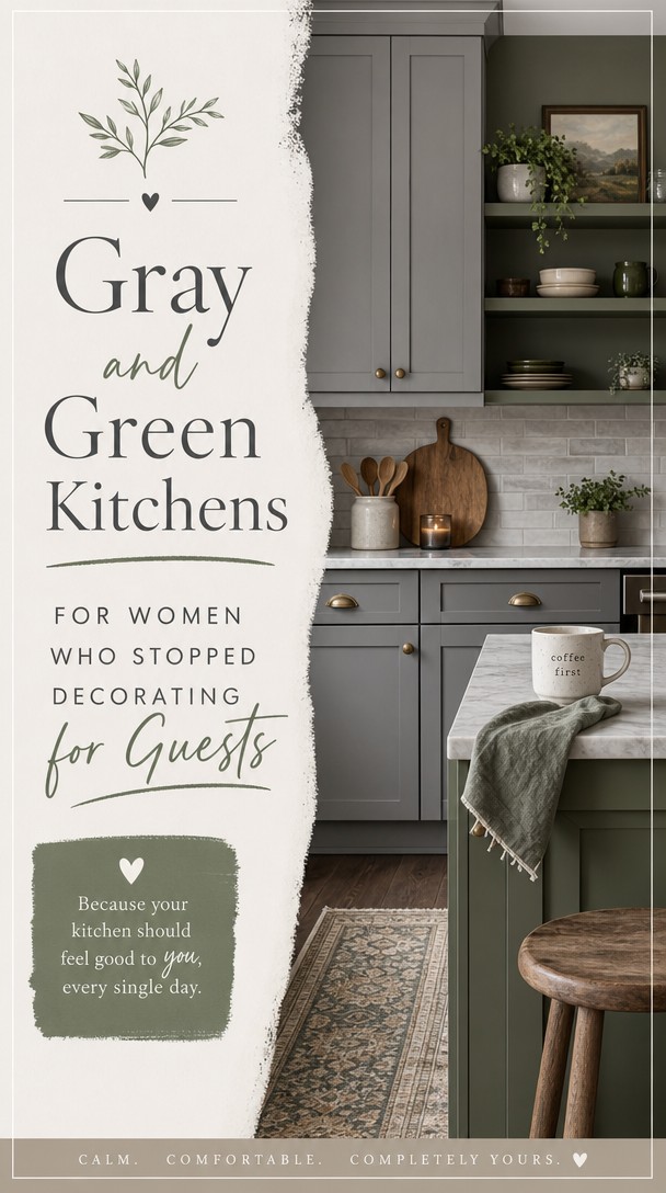
There’s a moment when you stop choosing colors to impress guests and start choosing them for yourself.
That shift changes everything—especially in the kitchen.
Gray and green together create a space that feels both grounded and alive, and when you get the balance right, your kitchen finally looks the way your life actually feels.
Why Gray and Green Kitchens Work When Other Palettes Don’t
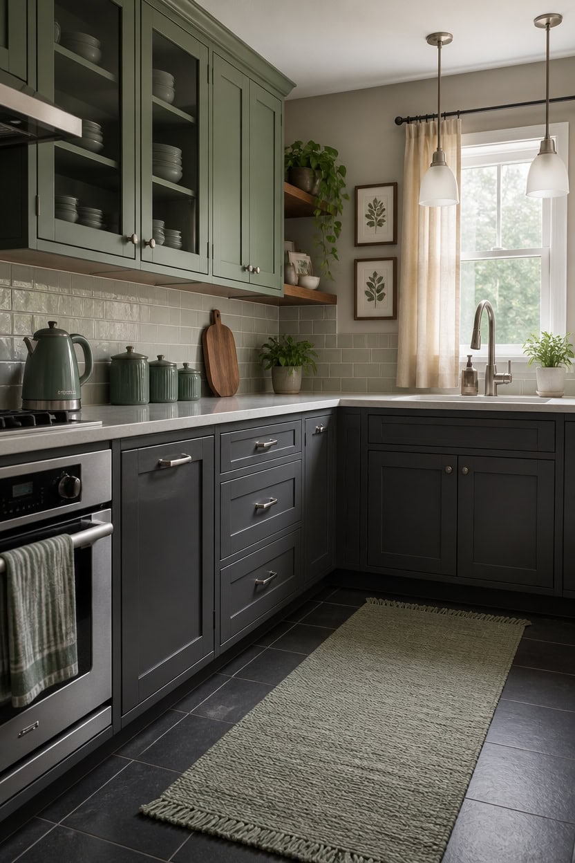
Gray absorbs green’s intensity while green rescues gray from looking cold and lifeless — that’s the chemistry behind why this pairing outlasts trendy palettes. Most color combinations fight for dominance, but gray and green share cool undertones that allow them to coexist without visual tension. In a kitchen, this means gray cabinets or walls hold the structure while green shows up in textiles, ceramics, and plants without the whole room feeling like a design project.
this mid-tone gray reads almost neutral under natural light, giving green accents room to breathe without competing.
this muted, dusty green reads sophisticated rather than bold and works directly against gray lower cabinets or gray walls.
Why You’re Tired of Kitchens That Perform for Other People
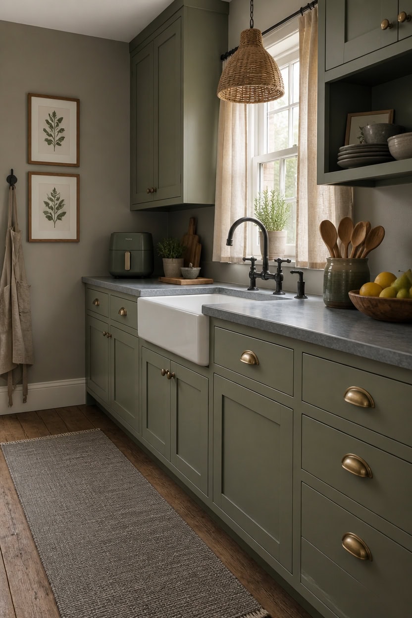
Most kitchens get designed around what visitors will think the moment they walk in — and that habit is exhausting to maintain. When you stop staging your kitchen for other people, you start making choices that actually serve how you cook, eat, and move through the space every day. The shift isn’t selfish; it’s just honest, and a gray and green kitchen is one of the few palettes that holds up under that kind of real, daily use.
Stop the staging reflex: Replace decorative-only items with things you reach for daily — a ceramic mug you love, a kettle that earns its place on the counter.
Let wear show: Matte gray and sage green surfaces don’t punish minor scuffs and watermarks the way high-gloss white does — choose finishes that age without looking neglected.
Edit for your habits: Keep the countertop clear of items you never use, and let the things you use constantly become the visual story.
Buy what pleases you: A green canister set or a gray bowl you picked because you liked it — not because it photographs well — is what makes a kitchen feel like yours.
matched from the wall in this photo — the closest Benjamin Moore shade.
this dusty, muted sage green gives the kitchen a grounded, lived-in quality that looks intentional without feeling precious.
Which Shades of Gray Actually Work in a Real Kitchen
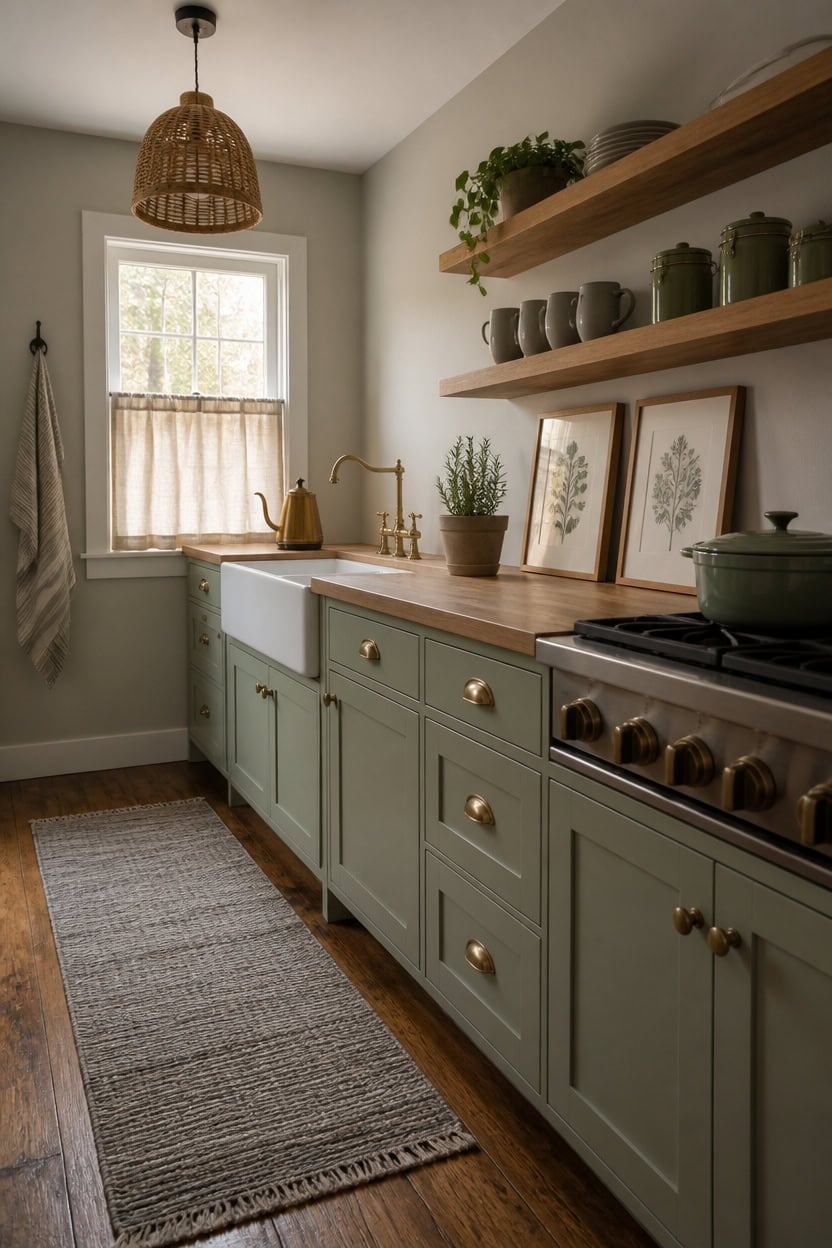
Warm grays with LRV scores between 55 and 65 are the ones that hold their color in a kitchen without shifting yellow under overhead lighting or turning icy near a window. Cooler grays in that middle range reflect the mix of natural and task lighting most kitchens deal with all day without turning the room feel sterile. If your kitchen runs warm — south-facing windows, wood floors, warm bulb temperature — pull toward grays with a faint blue or green undertone to keep the balance.
Too warm reads beige: Grays with strong red or brown undertones look muddy next to green cabinetry and lose their identity under incandescent light.
Too cool reads clinical: Blue-heavy grays can work in north-facing kitchens but often feel stark in spaces that get mixed light throughout the day.
Mid-tone is the safe range: Grays with LRV 55–65 adapt across lighting conditions and hold up against both sage and deeper olive greens without clashing.
Test on the actual wall: A 12×12 painted swatch looks different at 7 a.m. than at 6 p.m. — check the same gray under morning, afternoon, and evening light before committing.
matched from the wall in this photo — the closest Benjamin Moore shade.
this muted sage green grounds the lower half of the kitchen and gives the gray walls something calm and purposeful to anchor against.
Green Tones That Stay Quiet Without Disappearing
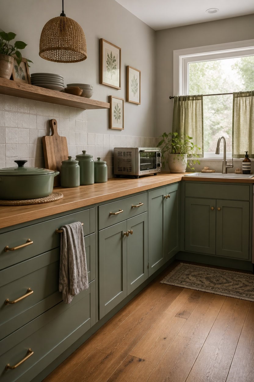
Muted greens that read as green without shouting sit in the gray-green and sage range, typically with low saturation and a LRV between 45 and 60. That middle saturation level is what keeps them from fading into gray or spiking into a color that demands attention every time you walk in. In a kitchen with gray walls, a green in this range gives you contrast you can actually see without the two colors competing.
Too desaturated turns gray: Greens below 20% saturation lose their identity next to gray walls and read as a dirty neutral rather than an intentional color.
Too saturated overwhelms: Kelly or hunter green at full saturation cancels out the calming effect of gray and pulls focus away from the rest of the kitchen.
Sage holds the middle ground: Sage greens with a faint gray or brown undertone sit quietly beside mid-tone gray without either color drowning out the other.
Olive adds depth without noise: Muted olive greens bring warmth that pure sage can’t, which helps the kitchen feel grounded rather than cool and showroom-flat.
matched from the wall in this photo — the closest Benjamin Moore shade.
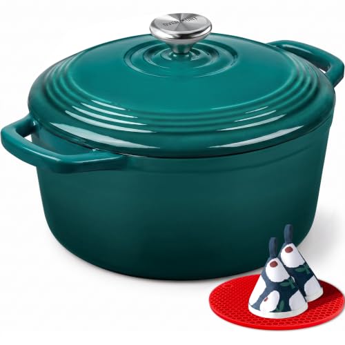 Overmont Enameled Cast Iron Dutch Oven - 5.5QT Pot with Lid Cookbook & Cotton Potholders - Heavy-Duty Cookware for Braising, Stews, Roasting, Sourdough Baking Bottle green
View Price
Overmont Enameled Cast Iron Dutch Oven - 5.5QT Pot with Lid Cookbook & Cotton Potholders - Heavy-Duty Cookware for Braising, Stews, Roasting, Sourdough Baking Bottle green
View Price
 Gibson Home Zuma 16 Piece Round Kitchen Dinnerware Set, Dishes, Plates, Bowls, Mugs, Service for 4, Matte Stoneware, Grey, Gray
View Price
Gibson Home Zuma 16 Piece Round Kitchen Dinnerware Set, Dishes, Plates, Bowls, Mugs, Service for 4, Matte Stoneware, Grey, Gray
View Price
 XTMYI Olive Green Linen Small Cafe Curtains 36 Inch Length Rod Pocket Farmhouse Boho Short Semi Sheer Curtains Tiers for Half Window Kitchen Bathroom Laundry Room RV,Set 2 Panels
View Price
XTMYI Olive Green Linen Small Cafe Curtains 36 Inch Length Rod Pocket Farmhouse Boho Short Semi Sheer Curtains Tiers for Half Window Kitchen Bathroom Laundry Room RV,Set 2 Panels
View Price
 DII Kitchen Accessories Collection, Textured Matte Ceramic Canister Set, Sage, Dimple, 2 Piece
View Price
DII Kitchen Accessories Collection, Textured Matte Ceramic Canister Set, Sage, Dimple, 2 Piece
View Price
 TERLEENART Bamboo Pendant Light,Set of 2 Boho Round Basket Chandelier Handmade Woven Pendant Light, Natural Bamboo Rattan Hanging Chandelier for Kitchen Island Dining Room Living Room Porch
View Price
TERLEENART Bamboo Pendant Light,Set of 2 Boho Round Basket Chandelier Handmade Woven Pendant Light, Natural Bamboo Rattan Hanging Chandelier for Kitchen Island Dining Room Living Room Porch
View Price
 Premium Kitchen Towels 6 Pack 100% Cotton 20"x28" Dish Towels Grey Striped
View Price
Premium Kitchen Towels 6 Pack 100% Cotton 20"x28" Dish Towels Grey Striped
View Price
 Wood Framed Sage Green Botanical Wall Art Set of 3, Boho Floral Canvas Wall Decor Paintings, Minimalist Flower Posters Prints Pictures for Bedroom Bathroom Living Room Home Decor 16x24 Inch
View Price
Wood Framed Sage Green Botanical Wall Art Set of 3, Boho Floral Canvas Wall Decor Paintings, Minimalist Flower Posters Prints Pictures for Bedroom Bathroom Living Room Home Decor 16x24 Inch
View Price
 BLACK+DECKER 4-Slice Toaster Oven with Natural Convection, Stainless Steel, TO1760SS (TO1760SST-1)
View Price
BLACK+DECKER 4-Slice Toaster Oven with Natural Convection, Stainless Steel, TO1760SS (TO1760SST-1)
View Price
When Green Is the Dominant Color and Gray Plays Support
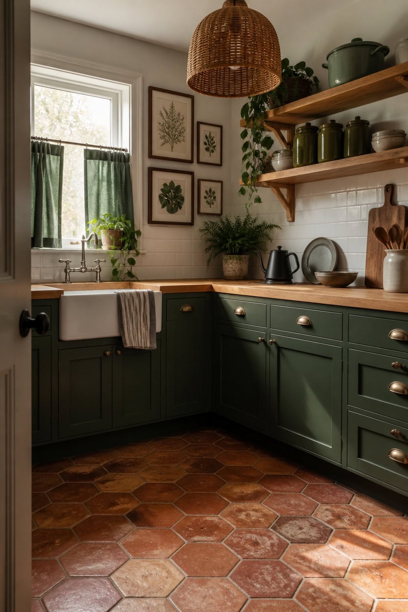
When green takes the lead in a kitchen color scheme, gray works best as a low-contrast backdrop rather than an equal partner. A green-dominant kitchen needs gray to stay pale and cool-toned so it recedes visually and lets the green breathe without competition. Aim for a 70/30 split — green on cabinets, an island, or an accent wall, with gray on remaining walls and as a secondary color in textiles.
Anchor green on lower cabinets: Lower cabinets carry more visual weight than uppers, so painting them green keeps the color grounded rather than floating.
Keep gray at high LRV: A light gray at LRV 65 or above reads almost white from a distance, which gives green the visual space to be the room’s clear focal point.
Use gray in repeating small doses: Gray dish towels, a gray ceramic bowl, or a gray pendant shade echo the wall color without building back up to a 50/50 balance.
Let green have one large uninterrupted surface: Breaking green up across too many small areas dilutes the dominant effect — one solid surface in green reads stronger than three small patches.
this deeply saturated, grounded green gives lower cabinets enough presence to anchor the room as the clear dominant color.
matched from the wall in this photo — the closest Benjamin Moore shade.
 Lodge Essential Enamel Cast Iron Dutch Oven, 6 Quart, Desert Sage
View Price
Lodge Essential Enamel Cast Iron Dutch Oven, 6 Quart, Desert Sage
View Price
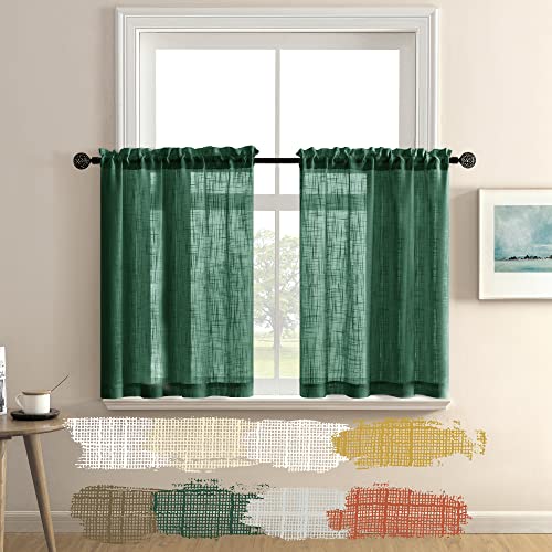 Sheer Green Curtains for Bedroom 2 Panels Rod Pocket Linen Small Window Tier Cafe Curtain Semi Privacy Short Dark Forest Green Curtains for Kitchen Bathroom Coverings 30 Inch Length Hunter Emerald
View Price
Sheer Green Curtains for Bedroom 2 Panels Rod Pocket Linen Small Window Tier Cafe Curtain Semi Privacy Short Dark Forest Green Curtains for Kitchen Bathroom Coverings 30 Inch Length Hunter Emerald
View Price
 TTU Tabletops Gallery Ceramic Canister Collection- Stoneware Designed Kitchen Storage Acacia Wood White Set, 3 Piece Green Leaf Canister Set
View Price
TTU Tabletops Gallery Ceramic Canister Collection- Stoneware Designed Kitchen Storage Acacia Wood White Set, 3 Piece Green Leaf Canister Set
View Price
 ELYONA 16” Large Boho Rattan Chandelier, Modern Japandi Wicker Pendant Light Fixtures, Basket Hand Woven Hanging Lamp for Coastal Kitchen Island Dining Room Living Room Bedroom Foyer (40cm*40cm)
View Price
ELYONA 16” Large Boho Rattan Chandelier, Modern Japandi Wicker Pendant Light Fixtures, Basket Hand Woven Hanging Lamp for Coastal Kitchen Island Dining Room Living Room Bedroom Foyer (40cm*40cm)
View Price
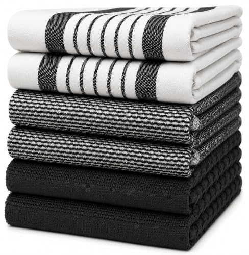 Premium Kitchen Towels 6 Pack 100% Cotton 20"x28" Dish Towels Black Striped
View Price
Premium Kitchen Towels 6 Pack 100% Cotton 20"x28" Dish Towels Black Striped
View Price
 Elite Gourmet EKT3001 1L Digital Kettle, 304 Stainless Steel, Matte Black
View Price
Elite Gourmet EKT3001 1L Digital Kettle, 304 Stainless Steel, Matte Black
View Price
Pairing Gray Cabinets With Green Accents That Hold Their Ground
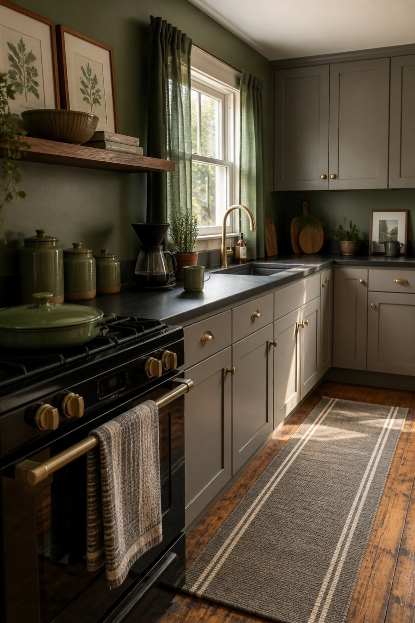
Gray cabinets anchor a kitchen without demanding attention, which makes them the ideal base for green accents that need room to register. Because gray has no strong undertone pull, it doesn’t compete with green — it simply holds space while green reads clearly wherever it lands. Choose muted, earthy greens like sage, moss, or olive rather than bright or cool greens, which can look sharp and out of place against gray’s neutral calm.
Keep green above the counter line: Green accents placed at eye level — on open shelves, window treatments, or a ceramic piece — are more visible than those tucked below the counter where they get lost.
Use green in at least three spots: One green item reads like an accident; three read like intention, and that repetition is what makes accents feel like a real design choice rather than clutter.
Match the value, not just the hue: A medium sage at the same lightness level as your gray cabinets blends in too much — go a shade or two darker so the green holds its own against the neutral backdrop.
Avoid glossy green finishes: Matte and satin green accents read as warmer and more settled against gray cabinets; glossy green surfaces pull forward and can feel jarring in an otherwise calm kitchen.
matched from the wall in this photo — the closest Benjamin Moore shade.
this soft, muted green sits comfortably on walls without overpowering the gray cabinets, keeping the palette calm and livable.
Gray and Green Combos That Live Better Than They Photograph
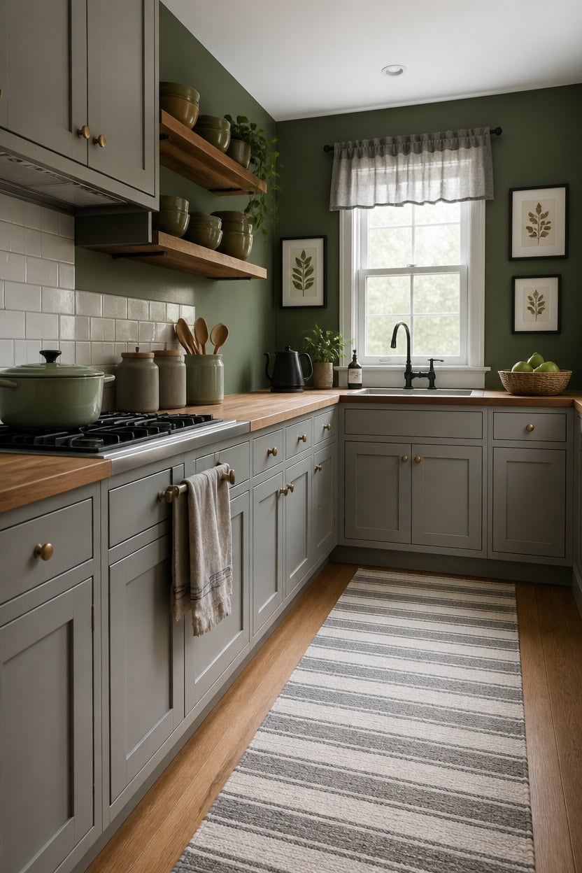
Gray and green combinations almost always look more sophisticated in person than they do on a screen, because the qualities that make them livable — depth, quietness, the way colors shift in natural light — don’t translate well to flat photography. What registers as dull in a photo is often exactly the richness that makes a kitchen feel settled and real. To experience whether a gray-green combination is working, look at it at different times of day rather than judging it in one lighting condition.
Trust the room over the photo: If a gray-green kitchen looks better in person than on your phone, that’s the combination doing its job, not a sign something is off.
Test with morning and evening light: Gray and earthy green shift more noticeably under warm evening light than most colors — morning light reads cool and composed, evening light reads warmer and more intimate.
Layer matte textures: Matte ceramics, linen textiles, and flat-finish paint surfaces are what create the depth you feel standing in the kitchen; they read as flat or dull in photos but feel rich in person.
Avoid editing your choices based on one photo: Natural light changes gray and sage green so markedly throughout the day that a single snapshot won’t ever show you what the room actually looks like.
this slightly warmer medium gray reads differently from morning to evening, shifting from cool and quiet at dawn to grounded and soft under artificial evening light.
this muted, sophisticated green deepens in low light and brightens in natural light, making the kitchen feel like it changes character throughout the day rather than staying flat.
The Cabinet Finish That Changes a Gray and Green Kitchen
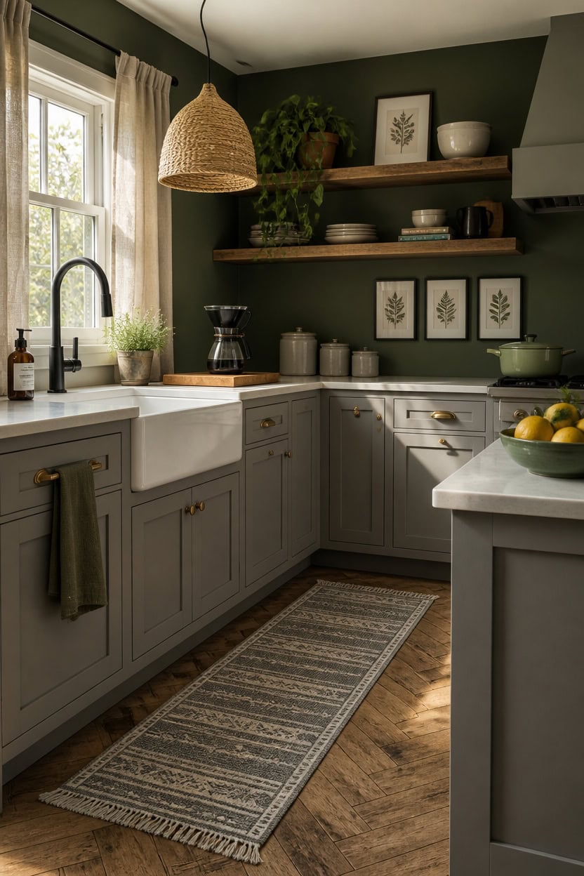
Matte finishes on cabinet doors absorb light instead of bouncing it, which is what keeps gray and green kitchens feeling grounded rather than cold or glossy. A flat or eggshell finish lets the paint color read as its true self — where satin or semi-gloss will pull out the cool undertones in gray and make the whole kitchen feel harder than you intended. If you already have satin cabinets you like, test a small matte-painted section on a less visible door before committing to the full repaint.
Matte over satin: Satin finish on gray cabinets amplifies cool undertones and flattens green wall color into dull contrast.
Eggshell for walls: Eggshell holds up to kitchen moisture while still reading soft enough not to compete with matte cabinet faces.
Avoid high-gloss on both surfaces: Pairing glossy cabinets with a green wall doubles the reflection and removes all depth from the room.
Repaint, don’t refinish: A matte cabinet repaint costs far less than refacing and changes the finish character entirely in one weekend.
this soft, settled gray reads warmer and more livable in matte finish, sitting quietly against green without pulling blue or silver into the room.
this grounded muted green deepens beautifully against matte gray cabinetry, giving the kitchen a composed, unhurried quality throughout the day.
Countertops That Don’t Compete With Your Gray and Green Palette
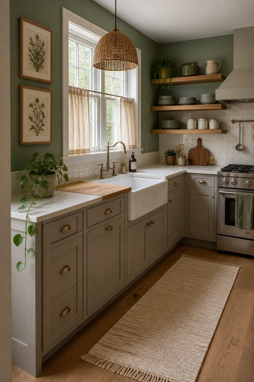
White or warm-toned stone countertops hold their neutrality better in gray and green kitchens than anything with heavy veining or cool marble patterns. Quartz in an off-white or soft cream tone sits between the two colors without pulling toward either, which keeps the palette from feeling like a tug-of-war. If you’re working with existing laminate counters, a honed or matte-finish light butcher block section near the sink area accomplishes the same visual truce at a fraction of the cost.
Off-white over bright white: Bright white counters under green walls read clinical; off-white or cream softens the contrast and lets both colors breathe.
Avoid cool gray stone: Gray-veined marble or quartz pulls cool undertones out of both the cabinets and the walls, collapsing the palette into one flat tone.
Butcher block for warmth: A wood-tone section near the sink introduces warmth that prevents the gray-and-green combination from reading too cool or serious.
Matte over polished: Polished countertops reflect green wall color back onto gray cabinets and muddy both — a honed or matte surface stops the color ping-pong.
this settled warm gray reads especially grounded when placed against stone-toned countertops, giving the lower half of the kitchen a quiet, anchored quality.
this muted green deepens without competing when countertops stay neutral and warm, letting the wall color carry the room’s personality without shouting.
Natural Light and What It Does to Gray and Green Together
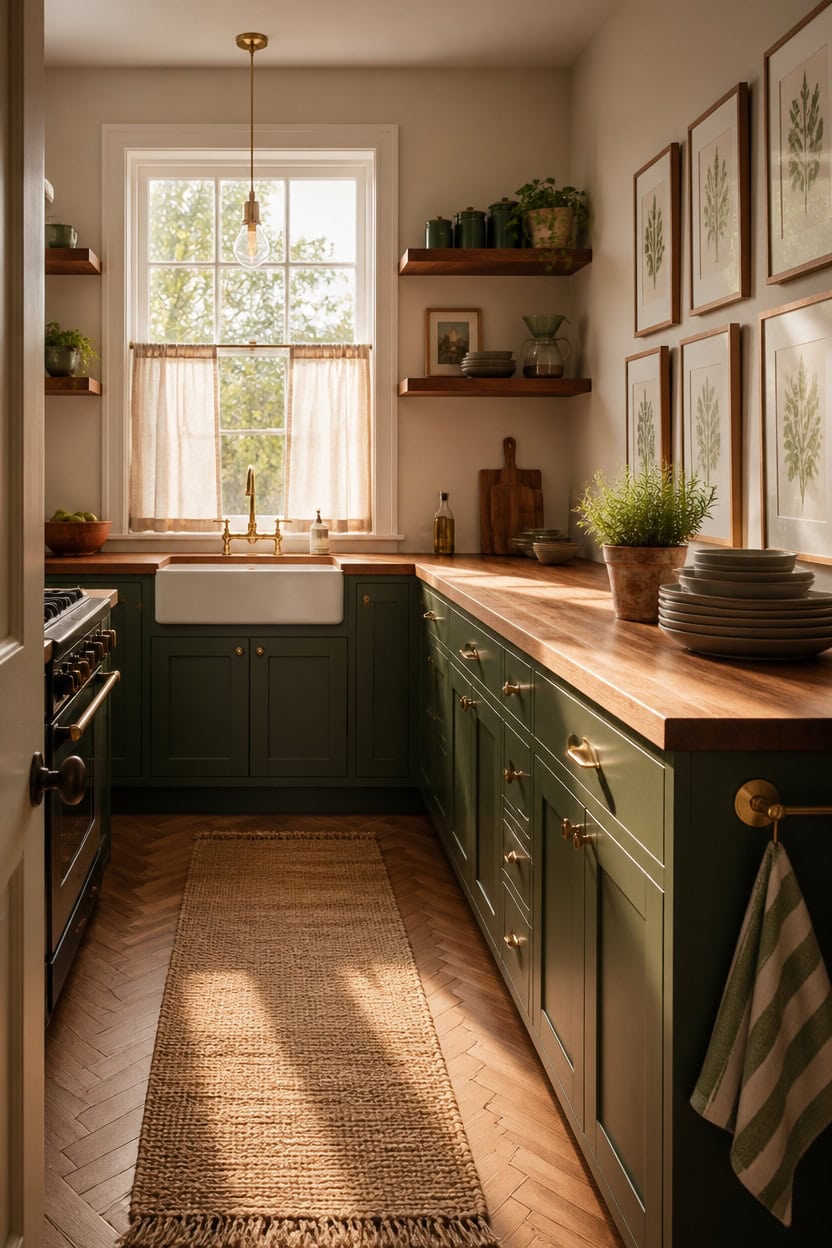
Morning light makes gray read cooler and green read more saturated — which means a gray and green kitchen that looks balanced at noon can feel slightly icy by 8 a.m. North-facing kitchens amplify this shift most, pushing the gray toward blue-gray and the green toward teal. To counteract it, anchor the space with warm-toned materials like wood shelving or brass accents that hold their temperature regardless of the light source.
North-facing rooms: Lean into a green with yellow or olive undertones rather than blue-green, so morning light doesn’t tip the whole room toward cold.
South-facing rooms: You can pull off a truer blue-gray because southern light warms it back toward neutral through most of the day.
Watch midday wash-out: Strong afternoon light flattens muted greens — choose a green with enough depth (LRV below 45) so it doesn’t disappear when the sun is direct.
Use warm textures as anchors: Wood, linen, and aged brass hold warmth when the light shifts, keeping the palette from going fully cool at any hour.
this soft, balanced gray stays readable in both harsh morning light and warm afternoon sun without shifting toward blue or purple.
this rich, deep green holds its depth even when flooded with direct southern light that bleaches out softer greens.
Small Gray and Green Kitchens That Feel Deliberately Designed
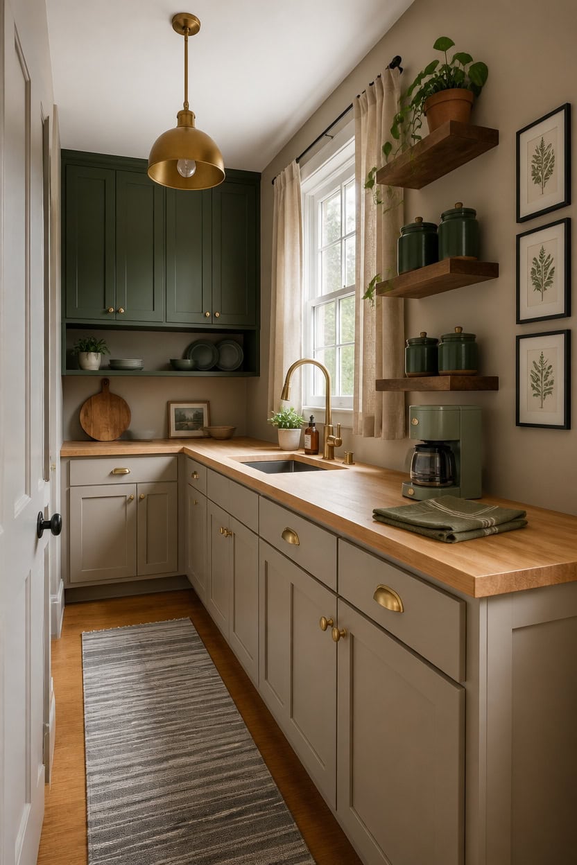
Small kitchens actually benefit from gray and green because both colors have a natural depth that makes you stop scanning the room and start actually seeing it. Gray acts as a visual pause — it prevents the eye from bouncing off too many competing surfaces, which is what makes tiny kitchens feel chaotic. Choose a gray with slight warm undertones for the dominant surface and a single strong green as your focal point so the space reads intentional rather than busy.
Scale your green down: One green surface — upper cabinets, a single accent wall, or open shelving — is enough in a small kitchen; spreading it everywhere shrinks the room further.
Use gray to unify: Painting lower cabinets and walls in the same gray reduces the visual interruptions that make small kitchens feel choppy.
Keep countertops neutral: White, concrete, or light butcher block keeps the eye moving horizontally, which reads as width.
Tall and vertical: Stack open shelving high and keep it lean — vertical green elements draw the eye up and make ceiling height feel taller.
this warm-leaning gray keeps a small kitchen feeling grounded without absorbing the limited light.
matched from the wall in this photo — the closest Benjamin Moore shade.
Backsplash Options That Don’t Steal the Conversation
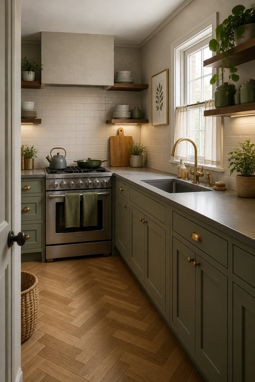
Subway tile, zellige, and shiplap all compete with the eye in a gray and green kitchen — a backsplash that sits quietly lets the cabinet color and wall tone do the work they were chosen to do. Matte or honed finishes in gray or white read as background, not focal point, which is exactly what a kitchen used by real people needs. A simple 3×6 white or soft gray tile in a running bond pattern costs less, installs faster, and disappears into the room the way a good supporting character should.
Go matte over glossy: A matte gray or off-white tile absorbs light instead of bouncing it, so the backsplash recedes and the green cabinets stay the visible choice.
Match grout to tile: Grout that blends with the tile eliminates the grid effect and makes the whole wall read as one calm surface instead of a pattern.
Limit the tile to one zone: Running backsplash only behind the stove and sink keeps costs manageable and prevents tile from circling the kitchen and taking over.
Avoid veined stone looks: Marble-look tile with heavy veining pulls attention exactly where you don’t want it — toward the wall instead of the objects in the room.
matched from the wall in this photo — the closest Benjamin Moore shade.
this warm near-white lifts the ceiling visually and keeps the room from feeling closed in when the walls and tile share similar cool tones.
Plants, Textiles, and Small Choices That Finish the Room
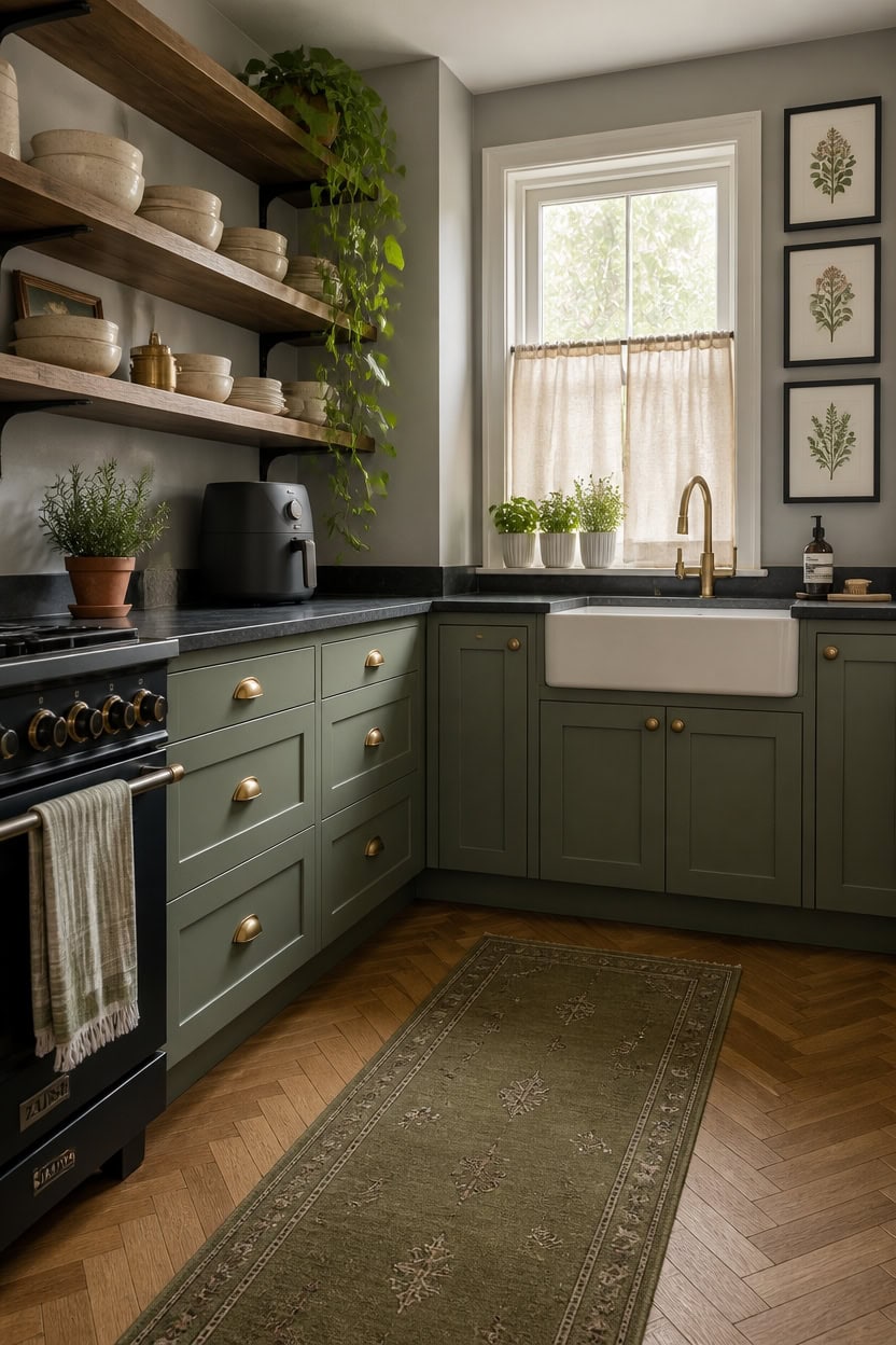
One trailing pothos on a shelf, a pair of linen dish towels, and a clay pot on the windowsill do more for a gray and green kitchen than most people realize — they close the gap between a designed space and a lived-in one. Plants pull green from the cabinets into the air and onto the counter without adding color that fights the palette. A dish towel in sage or olive draped over the oven handle costs almost nothing and ties the whole room together in a way that takes about four seconds.
Layer plants at different heights: A trailing plant on a high shelf, a small pot near the sink, and a cutting garden herb on the counter create vertical interest without adding new color.
Keep textiles in the same tone family: Dish towels, oven mitts, and a kitchen runner in sage, olive, or stone linen all read as one decision, not a collection of accidents.
Use clay and stoneware for vessels: Matte terracotta or cream ceramic pots blend into a gray and green palette better than plastic or shiny glazed finishes that catch light and look cheap.
Pick one textile pattern, repeat the solids: One striped towel is enough pattern — the rest of your textiles should be solid so the kitchen feels calm, not busy.
matched from the wall in this photo — the closest Benjamin Moore shade.
this warm near-white keeps the ceiling from absorbing light and makes the room feel open even when plants and textiles are layered throughout.
Bringing Wood Tones In Without Losing the Palette
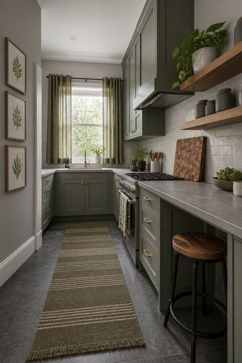
Warm wood tones stay in a gray and green kitchen when you treat them as neutrals, not as accent colors. Wood reads as a fourth neutral alongside gray, green, and white — it warms without pulling the palette toward brown or beige if you keep it in the medium range, like walnut or white oak. One or two wood surfaces is the right ceiling: a cutting board, open shelves, or a wooden stool, not wood countertops AND open shelves AND a table all at once.
Stay in the mid-tone wood range: Light ash and dark espresso both fight gray and green — walnut and white oak sit in the middle and disappear into the palette the way they should.
Keep wood horizontal or low: A wood cutting board, a wood tray, or a wood stool reads as grounded; wood upper shelves or overhead elements can tip the kitchen warm too fast.
Let gray be the bridge: The gray in your cabinets or walls naturally connects to wood because both carry cool and warm undertones — trust that relationship instead of adding more wood to force it.
Cap wood at two surfaces: More than two distinct wood surfaces in one kitchen creates visual noise that pulls attention away from the green and makes the room feel unresolved.
this soft gray anchors warm wood tones without pulling the room toward beige, letting green accents stay clean.
this near-white ceiling keeps light moving through the space so wood surfaces read warm without making the room feel heavy.
When Someone Tells You It’s Too Dark
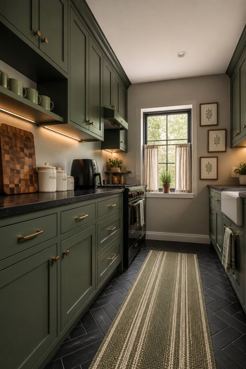
Someone telling you the kitchen is “too dark” usually means the lighting in the room is doing too little work, not that your color choices are wrong. Gray and green both absorb light differently depending on the time of day and the bulb temperature, so the same cabinet color that looks rich and intentional at noon can feel heavy by 7pm. Swap any bulb under 3000K for a warm white in the 3000-3500K range and reassess before you touch a single paint color.
Blame the bulbs first: Cool or yellow bulbs flatten gray and deaden green — warm white LEDs at 3000-3500K are almost always the fix.
Add a light source low: An under-cabinet LED strip or a countertop lamp brings light down to eye level where it actually lifts the palette.
Use white as a reset: One white surface — a dish towel, a ceramic canister, a light-colored runner — gives the eye a rest point that makes the whole room read lighter.
Call their bluff with contrast: A truly dark kitchen needs more contrast, not less color — add something bright white or light wood to give the gray and green something to push against.
this warm near-white bounces light back down into gray and green cabinets so the room reads open rather than closed in.
matched from the wall in this photo — the closest Benjamin Moore shade.