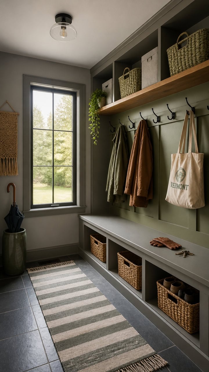
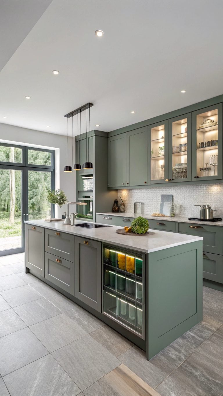
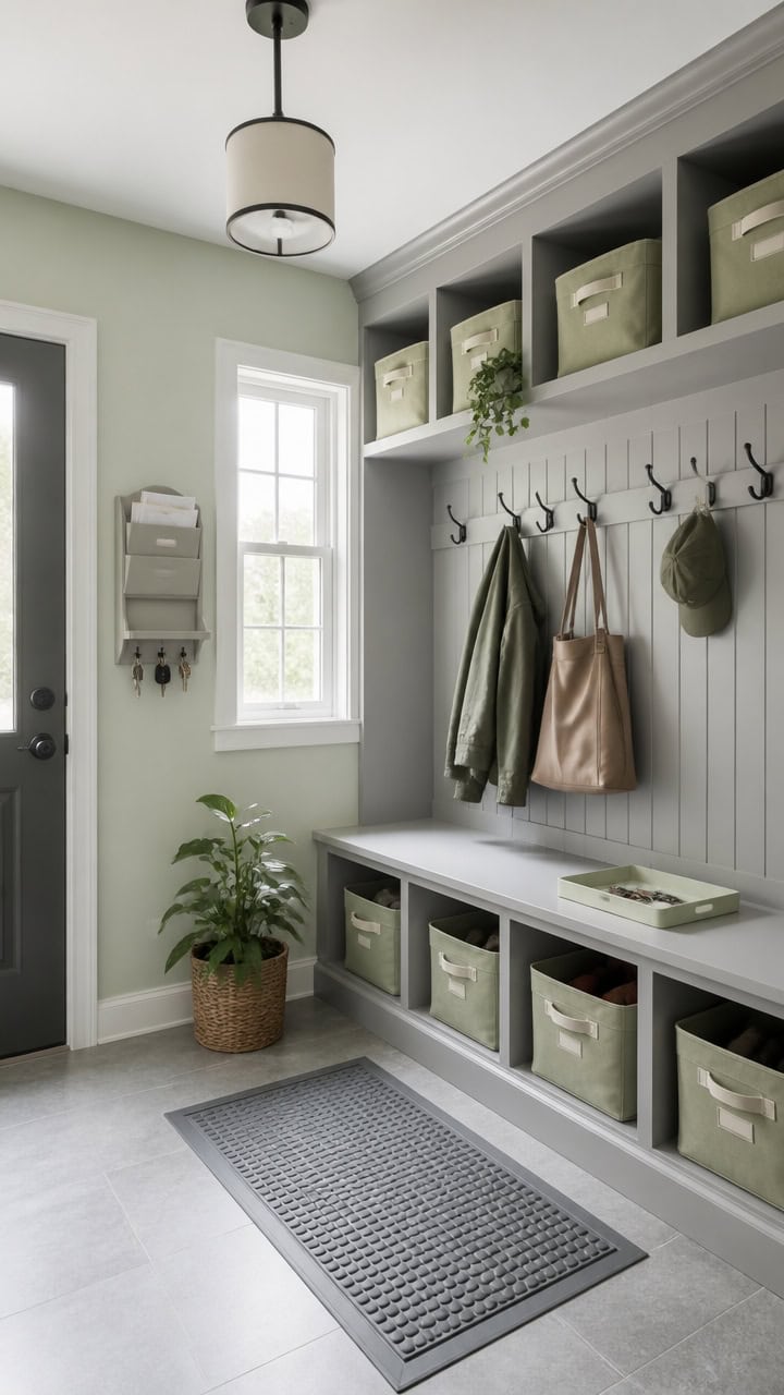
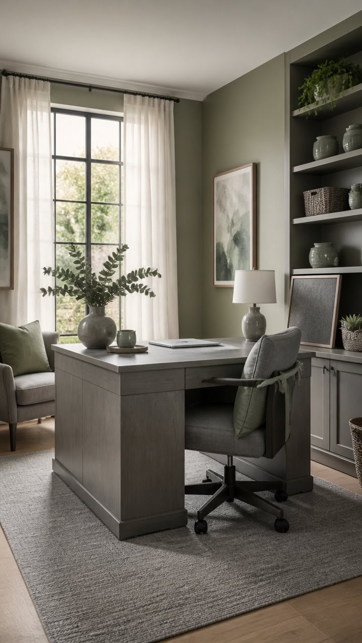
Gray and Green Living Rooms for Women Who Stopped Decorating for Guests
If your living room has been decorated for everyone except you, it’s time to change that.
A gray and green palette can create a space that feels calm, personal, and genuinely yours—no guest-proofing required.
This guide walks you through the combinations that actually work, so every corner reflects the way *you* want to live.
Why Gray and Green Finally Feel Like Home
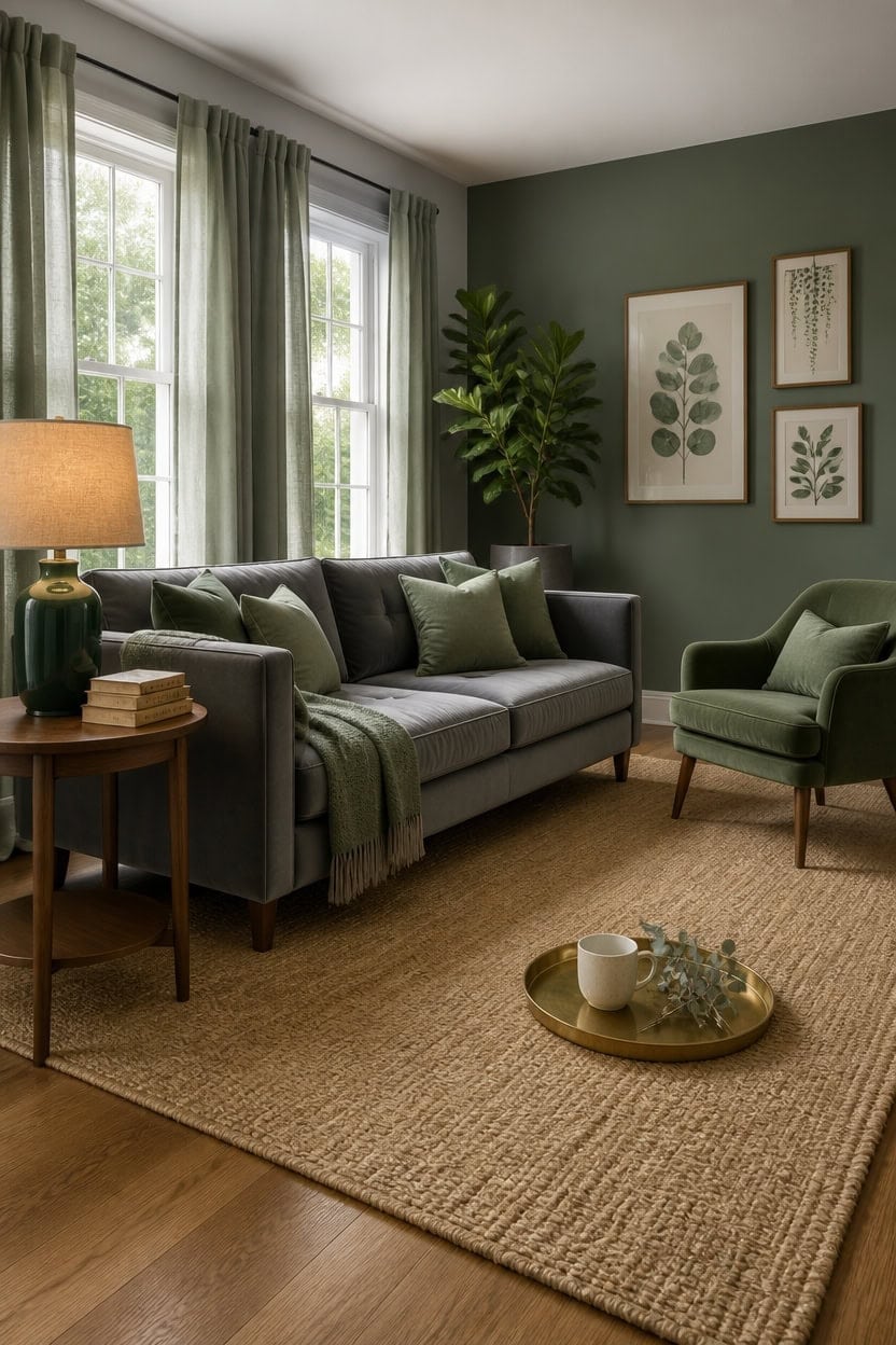
Gray reads as a true neutral only when it leans cool — blue or green undertones keep it from pulling yellow or beige under warm artificial light. That underlying cool shared base is exactly why gray and green stop competing and start complementing each other in a living room. Use a 60/40 split with gray as your dominant wall and sofa color and green carried through textiles, plants, and one statement piece.
Undertone matching: Choose a gray with green or blue undertones so both colors share the same cool base and feel intentional together.
Anchor with gray: Let gray hold the largest surfaces — walls, sofa, or rug — so green reads as accent rather than afterthought.
Layer green in levels: Bring green in at low (rug or throw), mid (pillows, plants, vase), and high (art or curtain) levels for visual balance.
Warm up the combo: Add natural wood, linen, or brass to prevent the gray-green palette from reading cold or clinical.
a soft cool gray that shifts slightly sage in natural light, making the room feel both calm and connected to green accents.
a muted, dusty green that bridges the gray-green palette without overwhelming the space.
Sage, Olive, or Forest: Which Green Belongs in Your Gray and Green Living Room?
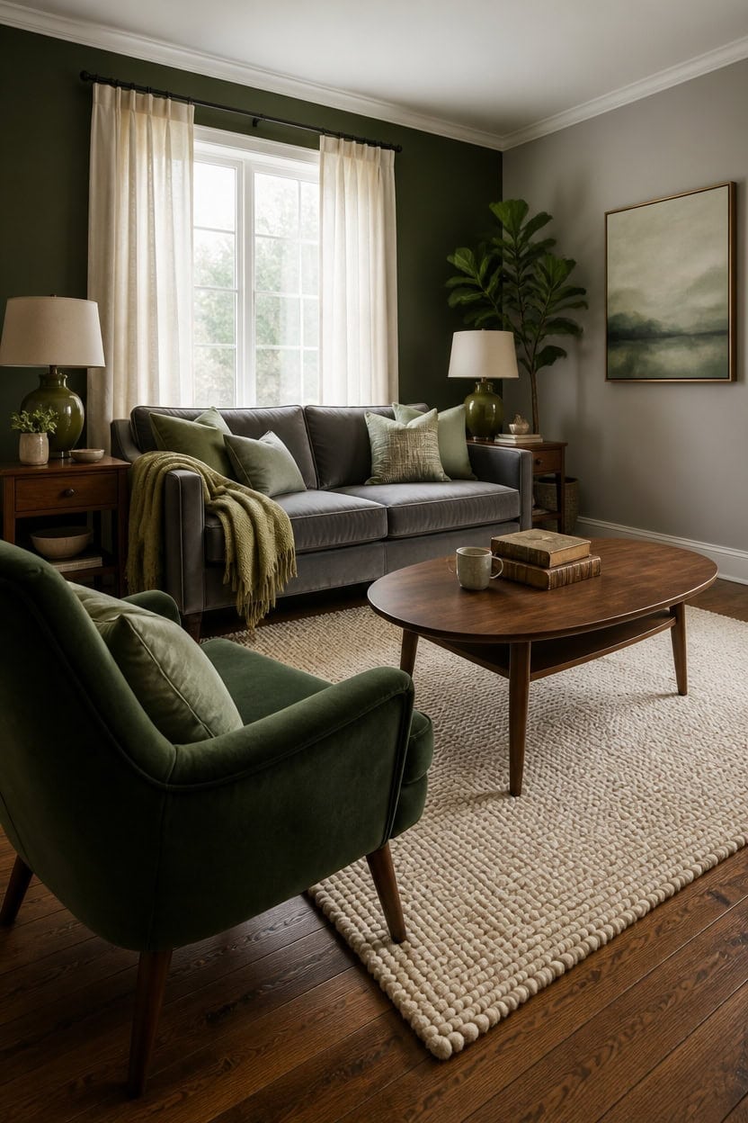
Sage reads youngest in a gray room, olive reads most grounded, and forest reads most dramatic — and knowing that hierarchy before you shop prevents buying the wrong green for how your living room actually functions. Sage softens gray without weight, which works well in rooms that already feel heavy with furniture or low ceilings. Olive and forest both need lighter gray companions or cream textiles to keep the room from settling into one flat, dark tone.
Sage: Pairs with almost any gray and brightens without overpowering — best choice for smaller living rooms or spaces with limited natural light.
Olive: Brings warmth and an earthy, lived-in quality that suits a cozy, layered living room better than a minimal one.
Forest: Makes the strongest statement and needs the most contrast — cream rugs, light trim, and warm wood keep it from overwhelming the room.
Mixing two greens: Use sage as the dominant and olive or forest as a single accent tone — reversing the ratio crowds the gray out entirely.
a versatile cool gray that lets sage, olive, and forest all read at their truest without color distortion.
matched from the wall in this photo — the closest Benjamin Moore shade.
Warm Gray or Cool Gray? Here’s How to Choose
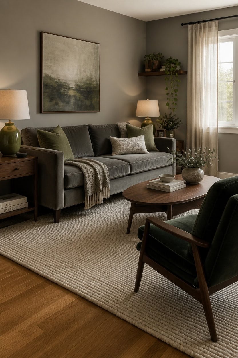
Warm gray pulls toward beige and cream, while cool gray pulls toward blue and silver — and that difference changes how green behaves next to it. Warm gray makes olive and forest green feel richer and more grounded, while cool gray sharpens sage and keeps the whole room feeling fresh rather than heavy. If your living room gets afternoon sun, cool gray reads muddy by 4pm, so warm gray is the safer choice for south- and west-facing rooms.
Warm gray + green: Olive and forest green feel cohesive here — the shared earthy undertone ties them together without effort.
Cool gray + green: Sage reads cleanest against cool gray — the shared blue-green undertone creates a calm, unified palette.
Undertone test: Hold a white piece of paper next to your gray paint sample — if the gray looks tan, it’s warm; if it looks lavender or blue, it’s cool.
Mixed light rooms: If your living room has both north and south-facing windows, a true mid-gray like Repose Gray bridges warm and cool without committing to either.
matched from the wall in this photo — the closest Benjamin Moore shade.
a cool mid-gray that lets you compare both undertone directions in one room before choosing furniture.
How to Layer Linen, Wool, and Velvet in a Gray and Green Room
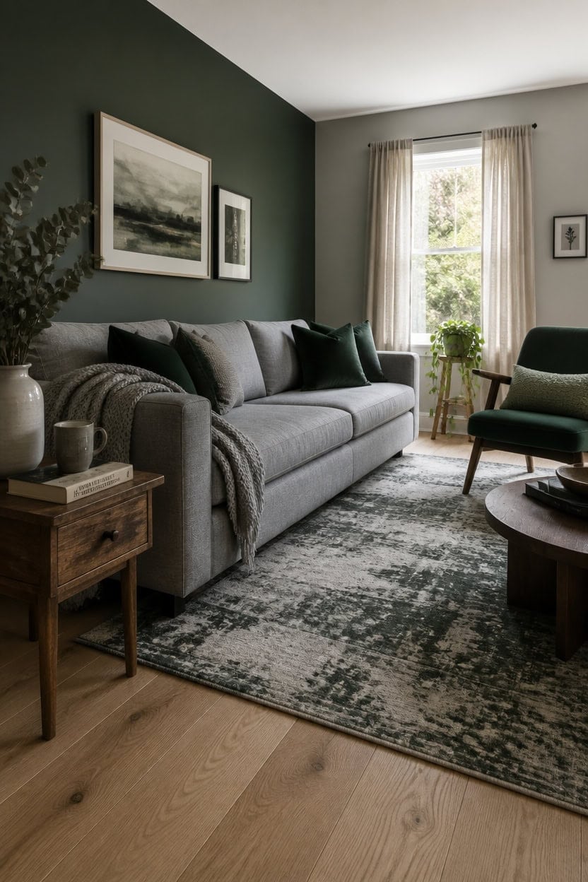
Linen works as your base, wool as your weight, and velvet as your accent — and in that order, the room gains depth without feeling overdone. Linen’s loose weave absorbs light quietly, wool adds density that makes the room feel finished, and velvet reflects just enough light to make the palette feel intentional. If you reverse the hierarchy and lead with velvet, the room tips from layered to heavy.
Linen placement: Use linen on your largest upholstered surface — a sofa or daybed — so the texture reads neutral and supports both gray and green without competing.
Wool grounding: A wool throw or area rug underneath seating anchors the room because wool absorbs sound and light differently than woven synthetics, giving the floor plane visual weight.
Velvet as punctuation: One or two velvet pieces — a side chair or set of cushions — create contrast against linen and wool without overtaking either.
Green through velvet: Forest or sage velvet reads richer than the same color in linen, so putting your green in velvet and your gray in linen keeps the green from fading into the background.
a balanced gray that lets linen, wool, and velvet textures read at full depth without the wall color pulling attention.
a deep forest green that makes layered textiles feel curated rather than collected.
The Right Lighting for a Moody Gray and Green Living Room
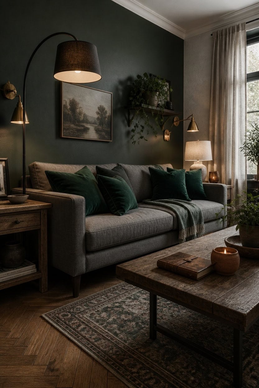
Layered lighting — not a single overhead source — is what makes a gray and green living room feel moody rather than just dim. Gray walls absorb light instead of bouncing it, which means you need multiple lower light sources to build warmth back into the room. A floor lamp in one corner, a table lamp on the opposite side, and sconces or shelf lighting at mid-height create a triangle that fills the room without exposing every shadow at once.
Floor lamp placement: Position a floor lamp behind or beside the main seating to create ambient light that pools downward rather than flooding the ceiling, which keeps the gray walls from going flat.
Table lamp height: Choose table lamps where the shade bottom sits at eye level when you’re seated — roughly 58 to 60 inches from the floor — so the light hits the room at a human scale instead of bouncing off the ceiling.
Bulb temperature: Use 2700K bulbs throughout, not daylight bulbs — cool bulbs fight the warmth that makes green and gray feel rich rather than clinical.
Velvet and light: Place at least one light source near your green velvet pieces since velvet absorbs directional light and reflects it back with depth, making the color shift and feel alive rather than flat.
matched from the wall in this photo — the closest Benjamin Moore shade.
a deep forest green that absorbs ambient light beautifully and gives the room its moody, finished quality after dark.
Rugs That Pull a Gray and Green Living Room Together
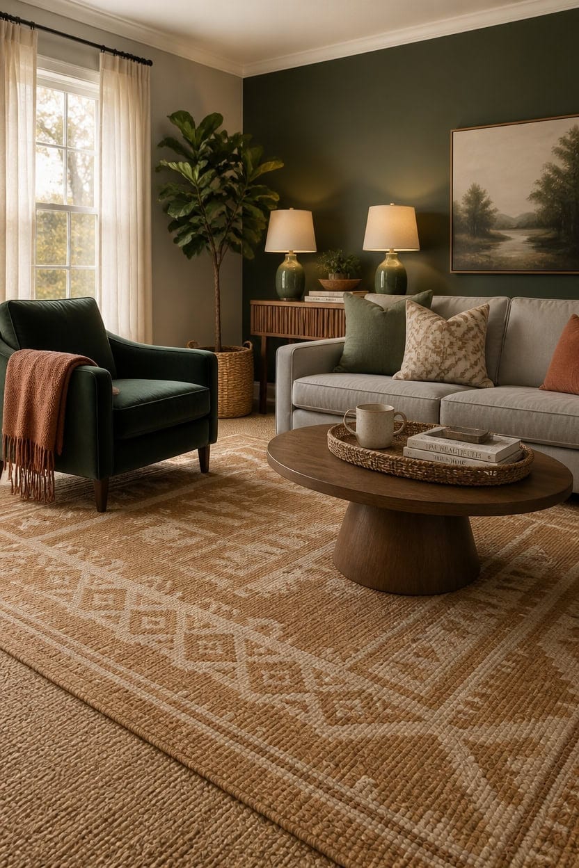
Warm-toned rugs in the tan, rust, and camel range bridge gray and green better than cool neutrals do because they add the third color a two-tone palette needs to feel complete rather than staged. Gray reads cooler under overhead light, and green has natural earthy undertones — a warm rug pulls both colors toward the same temperature without competing with either. Look for a rug with at least one thread color that matches your exact wall gray or your green accent to tie the room to the floor visually.
Pattern scale: Choose a rug pattern that’s larger than your sofa cushions — a small geometric repeat gets lost under furniture and reads as noise rather than design.
Pile height: Low to medium pile (0.25 to 0.5 inches) works best in gray and green rooms because higher shag traps shadow and fights the moody lighting layering the room depends on.
Rug size: In a standard living room, go 8×10 minimum — the front legs of every seating piece should sit on the rug, not float beside it on bare floor.
Color anchor: A rug with cream or off-white woven in gives the eye a resting place between the gray walls and green accents, so the room feels layered rather than heavy.
matched from the wall in this photo — the closest Benjamin Moore shade.
a deep forest green that anchors the rug’s color story and makes the floor feel connected to the room rather than dropped in.
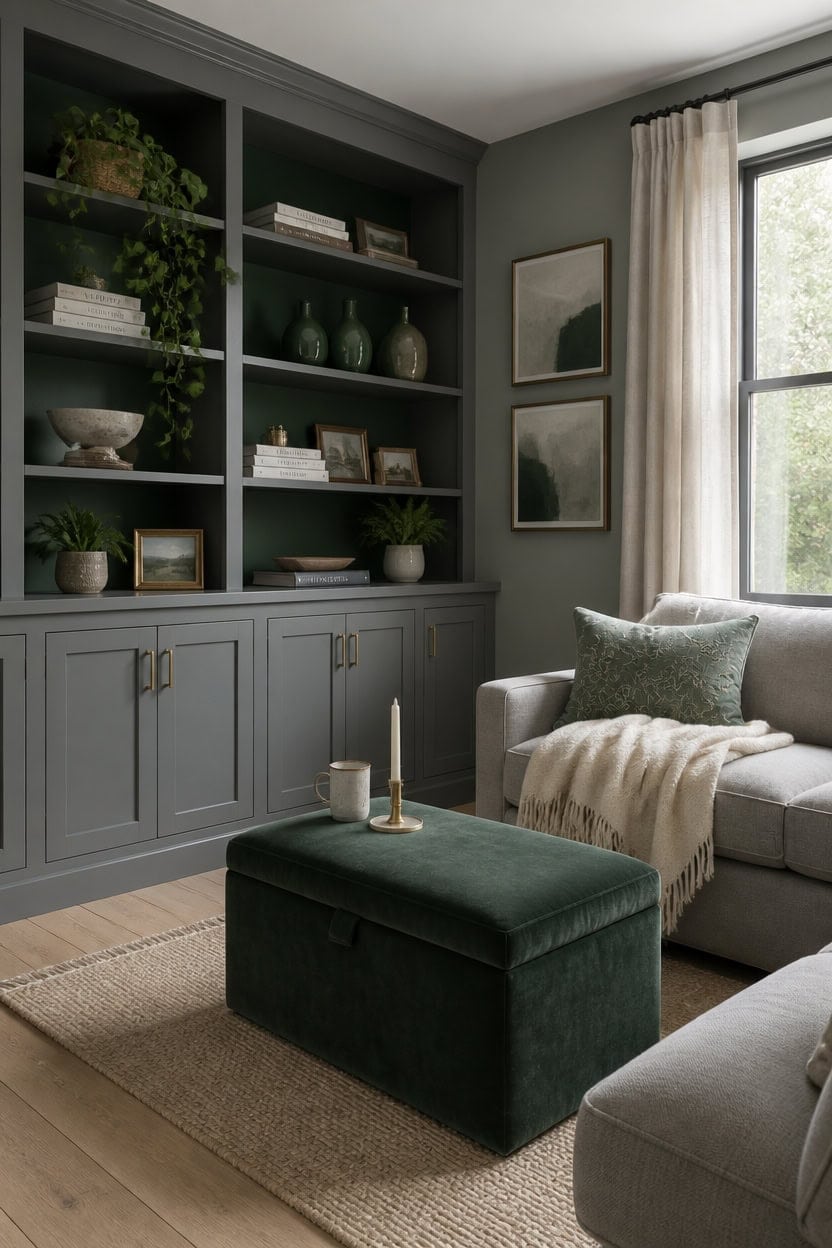
How to Make a Small Gray and Green Living Room Feel Bigger
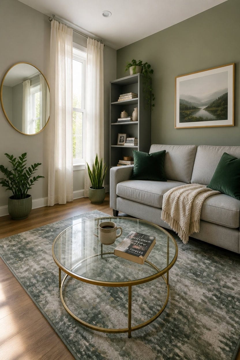
Light colors, reflective surfaces, and vertical lines are the three tools that consistently make a small gray and green living room read larger than it is. Keeping the gray light — in the mid-to-high LRV range — bounces available light around the room instead of absorbing it. Pair that with green used in small doses on plants, pillows, and one accent wall to avoid the visual weight that dark or heavily saturated green adds to a compact space.
Go light on the gray: Choose a gray with an LRV above 60 so walls recede instead of closing in — darker grays visually shrink a room by several feet.
Limit green to accents: Restrict green to 20 percent or less of the visual field — pillows, plants, and one textile — so it adds life without adding density.
Use vertical lines: Tall bookshelves, floor-length curtains hung at ceiling height, and vertical-striped textiles all pull the eye upward and make ceilings feel higher.
Reflect light strategically: One large mirror or a glass-topped coffee table doubles the natural light already in the room without adding square footage.
matched from the wall in this photo — the closest Benjamin Moore shade.
a soft, grayed green that adds depth and color without the visual weight of a saturated tone.
Gray and Green Living Rooms on a Budget That Don’t Look Cheap
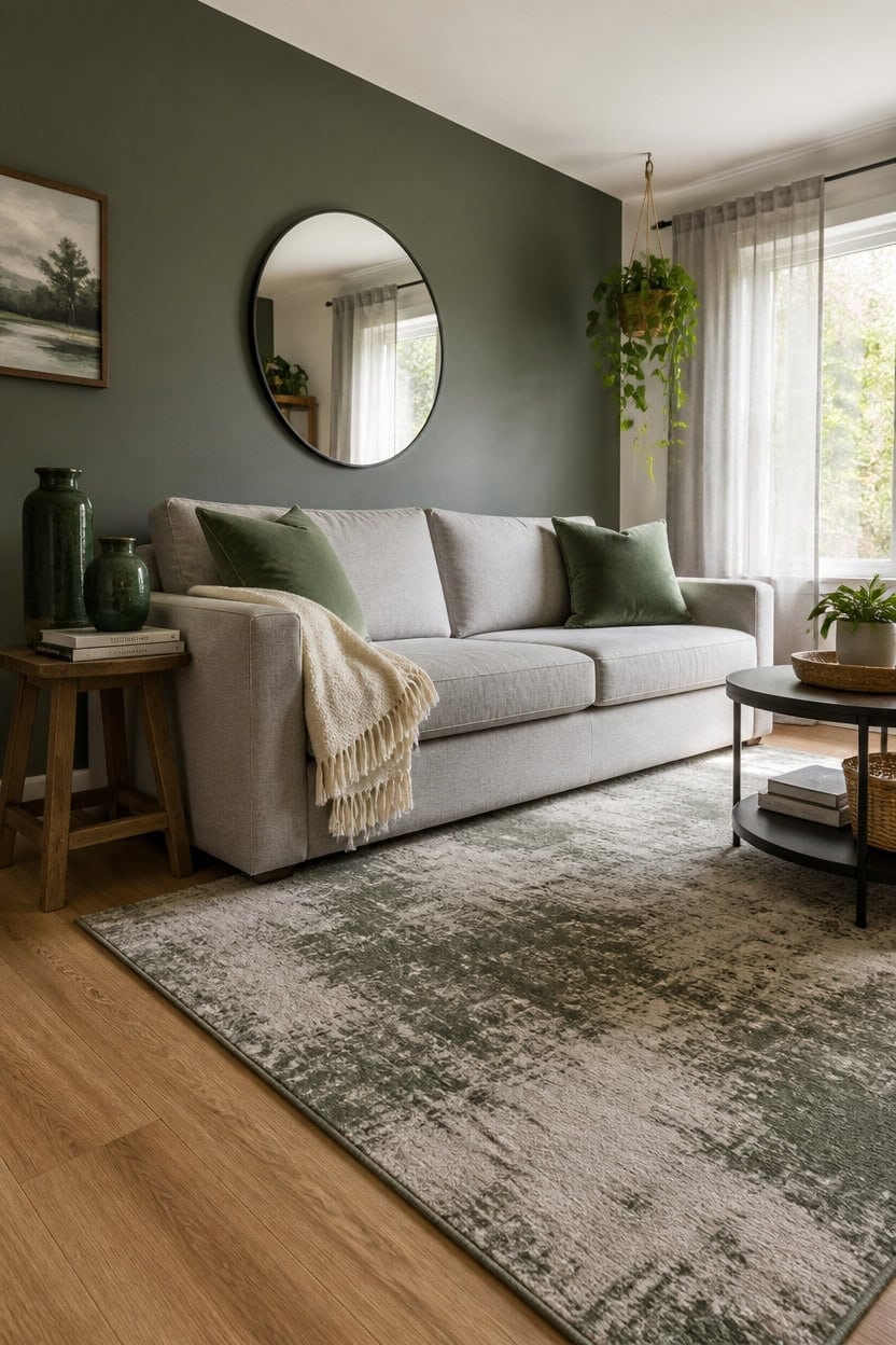
Thrift stores, discount retailers, and strategic shopping make a gray and green living room look intentional rather than assembled on the cheap. The key is spending on a few visible anchors — a rug, curtains, or a sofa — and keeping everything else under $50. Swapping out pillow covers, adding a trailing pothos, and layering a throw from TJ Maxx closes the gap between “budget room” and “curated room” faster than any single furniture purchase.
Spend on one anchor piece: Put 60 percent of your budget into one visible item — usually the rug or sofa — so the room has at least one thing that reads as quality.
Use plants as free filler: A $6 pothos from a grocery store does more visual work in a gray room than a $40 decorative object that collects dust.
Buy pillow covers, not pillows: Pillow covers in forest green or sage run $10–18 each and swap out seasonally without replacing the whole insert.
Lean on gray neutrals: Gray furniture from discount stores rarely looks cheap because the color itself reads as modern and deliberate, even at low price points.
matched from the wall in this photo — the closest Benjamin Moore shade.
a dusty, muted green that adds depth and sophistication on a single can of paint.
Gray and Green Living Rooms Designed for Actual Use, Not Instagram
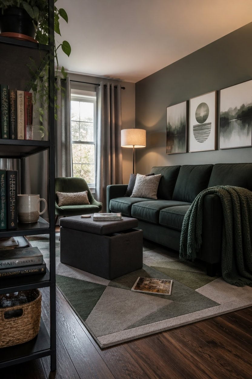
Gray and green living rooms built for actual use prioritize surfaces that hide wear, furniture that holds up to daily life, and a color palette that doesn’t demand constant maintenance to look right. A matte gray wall finish conceals scuffs better than eggshell, and deep green textiles in performance fabric resist pilling and fading far longer than decorative-only options. If your living room doubles as a workspace, a nap spot, or a dog’s favorite territory, the palette still works — you just have to choose materials that age honestly instead of ones that look pristine only in photographs.
Choose performance fabrics over pretty ones: Velvet reads as luxurious in photos but traps pet hair — opt for brushed microfiber or solution-dyed acrylic in deep green instead.
Skip the pale gray: Light gray shows every footprint, spill ring, and dust layer; a medium-to-dark gray in matte or satin finish actually improves with use.
Let functional pieces define the palette: A green wool throw folded on the sofa arm works harder than a styled vignette because it’s already where you actually use it.
Use rugs as your primary color anchor: A gray and green area rug does the design work of multiple accent pieces while absorbing the real-life noise and mess of daily use.
a warm medium gray with enough depth to hide wall wear while keeping the room grounded and livable rather than stark.
a muted sage that anchors the green side of the palette without demanding perfect styling around it to look intentional.
When to Break the Gray and Green Palette (and How to Do It Right)
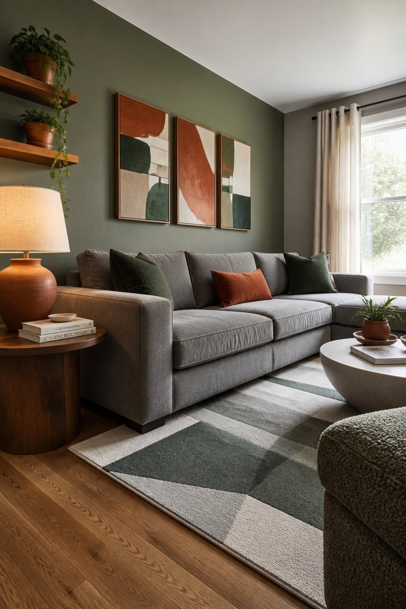
Breaking the gray and green palette works best when you introduce a third color through a single, high-impact piece rather than scattering it across the room. One warm element — a rust-colored pillow, a terracotta vase, a wood-toned shelf — gives your eye somewhere to land without dismantling the color foundation you’ve already built. Keep the addition under 20 percent of the room’s visual space or it stops reading as an accent and starts reading as an identity crisis.
When to add warmth: Bring in a warm neutral like terracotta or honey wood when the gray-green combo starts feeling cold or clinical.
When to add pattern: Introduce a printed textile only when every major surface is already solid — one patterned piece anchors the room without competing with itself.
When to go lighter: Swap a single dark green piece for a pale sage or celadon if the room feels heavier than it should at a specific time of year.
When to stop: If you’ve added a third color in more than two spots, it’s no longer an accent — pull one back before it takes over.
a warm medium gray that gives the third-color accent room to breathe without the walls competing for attention.
a grounded sage that holds the palette in place while a warm-toned accent piece does its work in front of it.
Gray and Green Mistakes Most People Make and How to Avoid Them
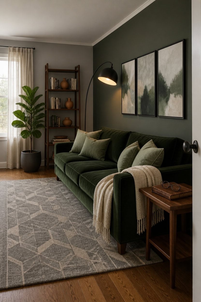
Most gray and green living rooms fail not because of bad taste, but because one color is scaled wrong for the space. Gray tends to get overused on every large surface, leaving green nowhere to land except in small accessories that can’t carry enough weight. Flip the proportion so green holds at least one major surface — a wall, a sofa, a large rug — and the room stops feeling like a gray room with green sprinkled in.
Too much gray, too little green: Reassign green to one major surface — a sofa or accent wall — so it reads as intentional, not decorative.
Wrong green undertone: Avoid yellow-leaning greens with cool grays — they clash at the undertone level and make the room feel unresolved.
All matte, no texture: A flat gray and flat green next to each other disappear — vary finish with a matte wall, a woven textile, and a glazed ceramic.
Accent color overload: One warm accent grounds the palette; three warm accents compete with it and erase the gray-green identity entirely.
matched from the wall in this photo — the closest Benjamin Moore shade.
a grounded sage that anchors the color story and gives the space a clear visual destination.
How to Build a Gray and Green Living Room One Step at a Time
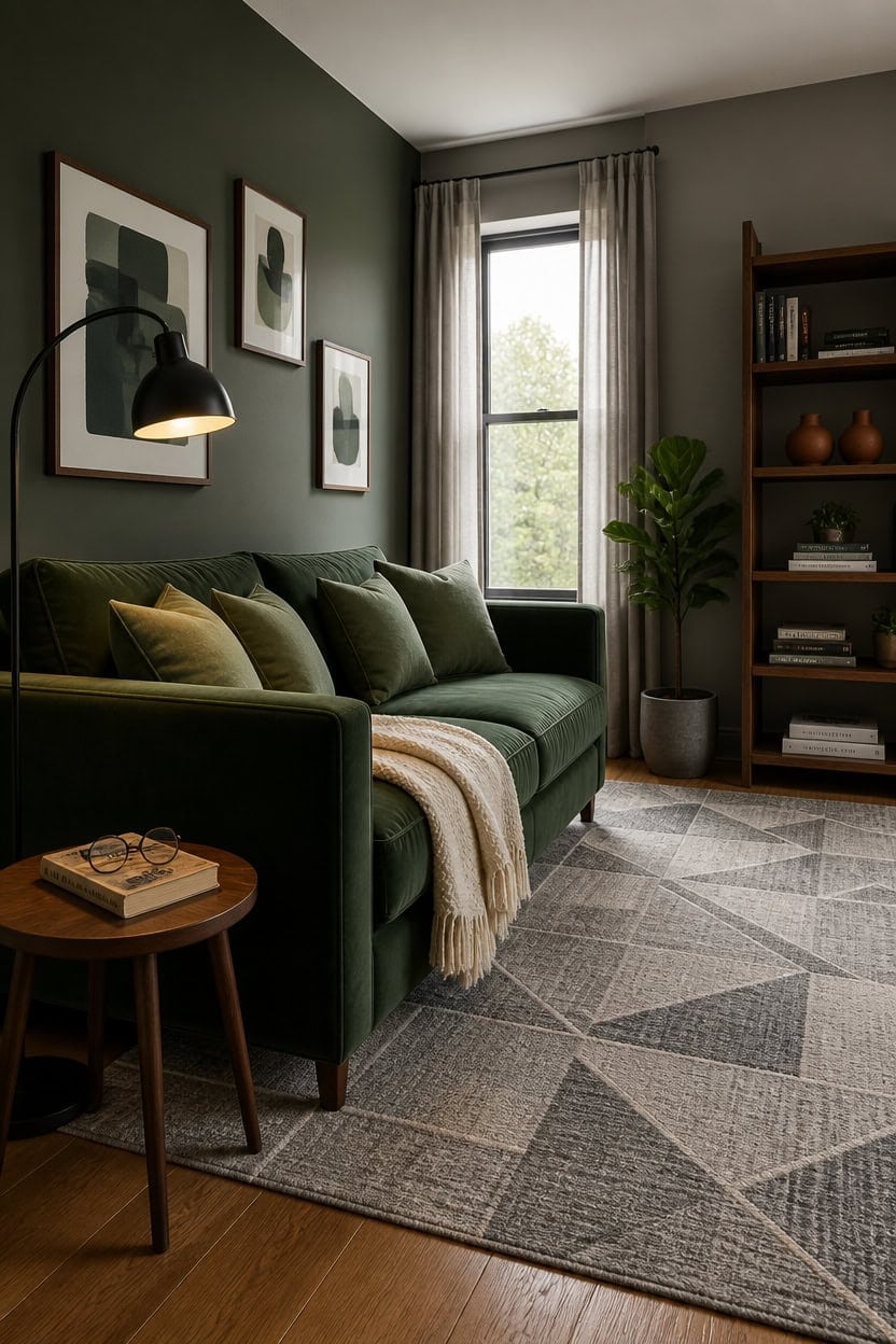
Start with the largest piece you’re willing to commit to, then let every other choice follow from it. Whether that’s a green sofa, a gray area rug, or a painted accent wall, anchoring the room to one bold decision removes the guesswork from everything else. Without that anchor, you end up buying pieces that feel individually nice but never cohere into a room.
Start with one anchor piece: Choose the largest item you’ll keep long-term — sofa, rug, or wall color — and let it set the dominant color.
Add the second color next: Once the anchor is placed, bring in the contrasting color on the next largest surface so the two read as intentional partners.
Layer texture before more color: After both colors are placed, add woven, glazed, or matte finishes before introducing any new hues.
Finish with small accents: Warm metallics or terracotta accents come last — adding them too early shifts the room’s identity before it’s fully set.
matched from the wall in this photo — the closest Benjamin Moore shade.
a deep, grounded green that gives the room a clear focal point before furniture arrives.