Slate Gray & Dark Walnut Home Offices for Women Who Lead by Day and Relax by Night
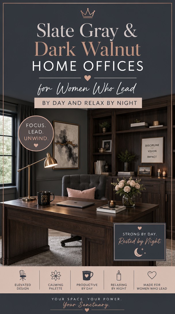
Your career commands respect—shouldn’t your home office do the same? Pairing rich slate gray with warm dark walnut creates a space that feels powerful during work hours and beautifully calm when the laptop closes.
This guide shows you how to nail that balance, so every detail reflects the ambitious, sophisticated woman you already are.
Why Slate Gray and Dark Walnut Work So Well Together
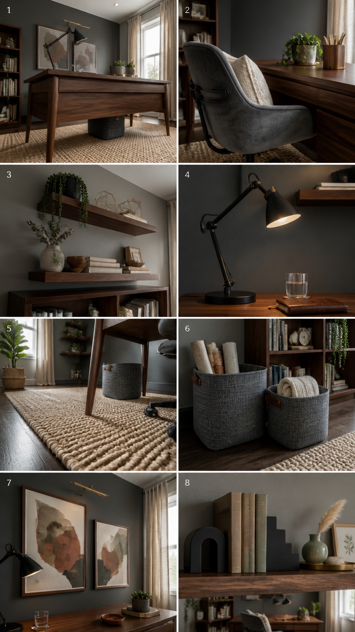
Slate gray and dark walnut create a natural contrast because one is cool and one is warm, and those opposing temperatures cancel out each other’s weaknesses. Gray alone can feel cold and sterile in a workspace, while dark walnut alone can feel heavy and cave-like — together, they strike a visual balance that reads as grounded and sophisticated. Use walnut as your dominant warm tone in the desk and shelving, then let slate gray take over the walls and larger surfaces.
Lead with walnut furniture: Anchor the desk and bookshelf in dark walnut to establish warmth before introducing the cool gray tones.
Keep gray on vertical surfaces: Slate gray works best on walls and built-in shelves where it frames the walnut pieces without competing with them.
Bridge the gap with black accents: Matte black hardware, lamp bases, or chair frames tie the two tones together by pulling from both their undertones.
Add texture to break monotony: A linen chair cushion, jute rug, or woven storage basket prevents the pairing from reading as flat or corporate.
this deep slate gray creates a moody, focused backdrop that makes walnut furniture pop forward dramatically.
this softer gray ties the shelving to the wall while letting dark walnut décor and books remain the visual stars.
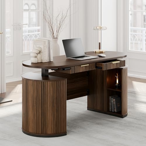 Perledesign Electric Standing Desk with Storage Drawers, 63'' Executive Height Adjustable Desk with Privacy Panel and Shelves, Wood Fluted Computer Desk for Home Office, Black Walnut
View Price
Perledesign Electric Standing Desk with Storage Drawers, 63'' Executive Height Adjustable Desk with Privacy Panel and Shelves, Wood Fluted Computer Desk for Home Office, Black Walnut
View Price
 Sudwesto Hand Woven Home Office Chair, Velvet Upholstered Ergonomic Task Chair with Height Adjustable, Swivel Desk Chair with Wheels, Vanity Chair, Computer Chair for Office, Studio (Grey)
View Price
Sudwesto Hand Woven Home Office Chair, Velvet Upholstered Ergonomic Task Chair with Height Adjustable, Swivel Desk Chair with Wheels, Vanity Chair, Computer Chair for Office, Studio (Grey)
View Price
 Hrbjunuo Solid Walnut Floating Shelves for Wall 16.5 Inch Set of 2, Round Edge Wall Mounted Shelf,Rustic Farmhouse Wooden Floating Shelf,Wood Wall Shelf for Bathroom Living Room,Bedroom,Kitchen
View Price
Hrbjunuo Solid Walnut Floating Shelves for Wall 16.5 Inch Set of 2, Round Edge Wall Mounted Shelf,Rustic Farmhouse Wooden Floating Shelf,Wood Wall Shelf for Bathroom Living Room,Bedroom,Kitchen
View Price
 Globe Electric 62000009 32" Multi-Joint Desk Lamp with Metal Clamp, Matte Black, Antique Brass Accents, On/Off Rotary Switch on Shade, Partially Adjustable Swing Arm, Home Décor, Office Accessory
View Price
Globe Electric 62000009 32" Multi-Joint Desk Lamp with Metal Clamp, Matte Black, Antique Brass Accents, On/Off Rotary Switch on Shade, Partially Adjustable Swing Arm, Home Décor, Office Accessory
View Price
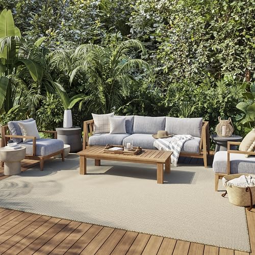 Nourison Home Courtyard Jute Ivory 8' x 10' Area Rug - Easy Clean, Non Shedding, Bed Room, Living Room, Dining Room, Kitchen (8' x 10')
View Price
Nourison Home Courtyard Jute Ivory 8' x 10' Area Rug - Easy Clean, Non Shedding, Bed Room, Living Room, Dining Room, Kitchen (8' x 10')
View Price
 Sorbus Baskets for Organizing, Woven Storage Set (Set of 3, Gray)
View Price
Sorbus Baskets for Organizing, Woven Storage Set (Set of 3, Gray)
View Price
 Framed 3D Textured Wall Art Set of 3, Organic Abstract Artwork, 24x36 In
View Price
Framed 3D Textured Wall Art Set of 3, Organic Abstract Artwork, 24x36 In
View Price
 Metal Moon Phases Bookends Heavy Duty Gothic Book Ends for Bookshelf
View Price
Metal Moon Phases Bookends Heavy Duty Gothic Book Ends for Bookshelf
View Price
How a Strong Office Design Supports Clearer Thinking
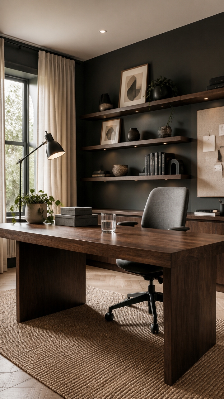
Your brain performs better when it has visual order to work within — a clear focal point, contained clutter, and a color palette that doesn’t compete for attention. When a workspace feels chaotic or unfinished, your mind spends energy processing the visual noise instead of focusing on the task. A home office designed around intentional structure gives your cognitive resources a place to land.
Anchor the desk zone: A defined desk area with a strong backdrop tells your brain where work begins and ends, reducing mental drift.
Limit competing colors: A two-tone palette like slate gray and dark walnut gives the eye a predictable path so focus settles faster.
Clear the sight line: Keep surfaces visible from your main seated position clean — visual clutter in your peripheral field raises cortisol and breaks concentration.
Use light intentionally: Position a task lamp to eliminate shadows across your work surface, since uneven lighting forces your eyes to constantly readjust.
this grounded slate gray creates a calm, focused anchor behind your workspace that reduces visual distraction.
this softer warm gray ties open shelving to dark walnut accessories without competing for attention.
 OneBlis 55" Fluted Executive Desk with Drawers & Charging Station, Large Wood Computer Desk with File Drawer and Storage Cabinet, Modern Home Office Desk with Power Outlets, Walnut Wood
View Price
OneBlis 55" Fluted Executive Desk with Drawers & Charging Station, Large Wood Computer Desk with File Drawer and Storage Cabinet, Modern Home Office Desk with Power Outlets, Walnut Wood
View Price
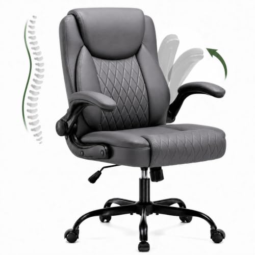 LUCKLIFE Home Office Chair, Flip-Up Arms, Desk Chair, Slate Gray
View Price
LUCKLIFE Home Office Chair, Flip-Up Arms, Desk Chair, Slate Gray
View Price
 Lepro LED Desk Lamp for Home Office, 9.5W 750LM Touch Desk Light, Black
View Price
Lepro LED Desk Lamp for Home Office, 9.5W 750LM Touch Desk Light, Black
View Price
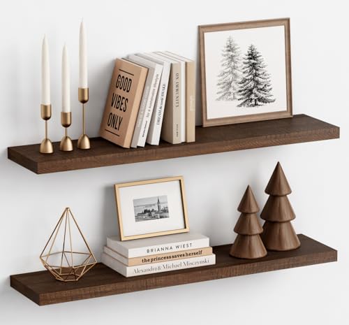 Harwaya 36 Inch Floating Shelves for Wall Set of 2, Large Long Wall Shelves for Living Room Decor, Walnut Brown Wooden Hanging Shelves for Bedroom Kitchen Bathroom Office Books Pictures (Dark Wood)
View Price
Harwaya 36 Inch Floating Shelves for Wall Set of 2, Large Long Wall Shelves for Living Room Decor, Walnut Brown Wooden Hanging Shelves for Bedroom Kitchen Bathroom Office Books Pictures (Dark Wood)
View Price
 U Brands Farmhouse Linen Bulletin Board, 30" x 20", White Wood Frame, Wall Mounted Pin Board for Home Office, Classroom & Kitchen, Includes Push Pins
View Price
U Brands Farmhouse Linen Bulletin Board, 30" x 20", White Wood Frame, Wall Mounted Pin Board for Home Office, Classroom & Kitchen, Includes Push Pins
View Price
 Framed Modern Minimalist Neutral Abstract Wall Art, 3 Piece Set, 16x24 In
View Price
Framed Modern Minimalist Neutral Abstract Wall Art, 3 Piece Set, 16x24 In
View Price
 Unique Bookends, Set of 2, Heavy Duty 1.5mm Steel; Active
View Price
Unique Bookends, Set of 2, Heavy Duty 1.5mm Steel; Active
View Price
Choosing the Right Shade of Slate Gray for Your Space
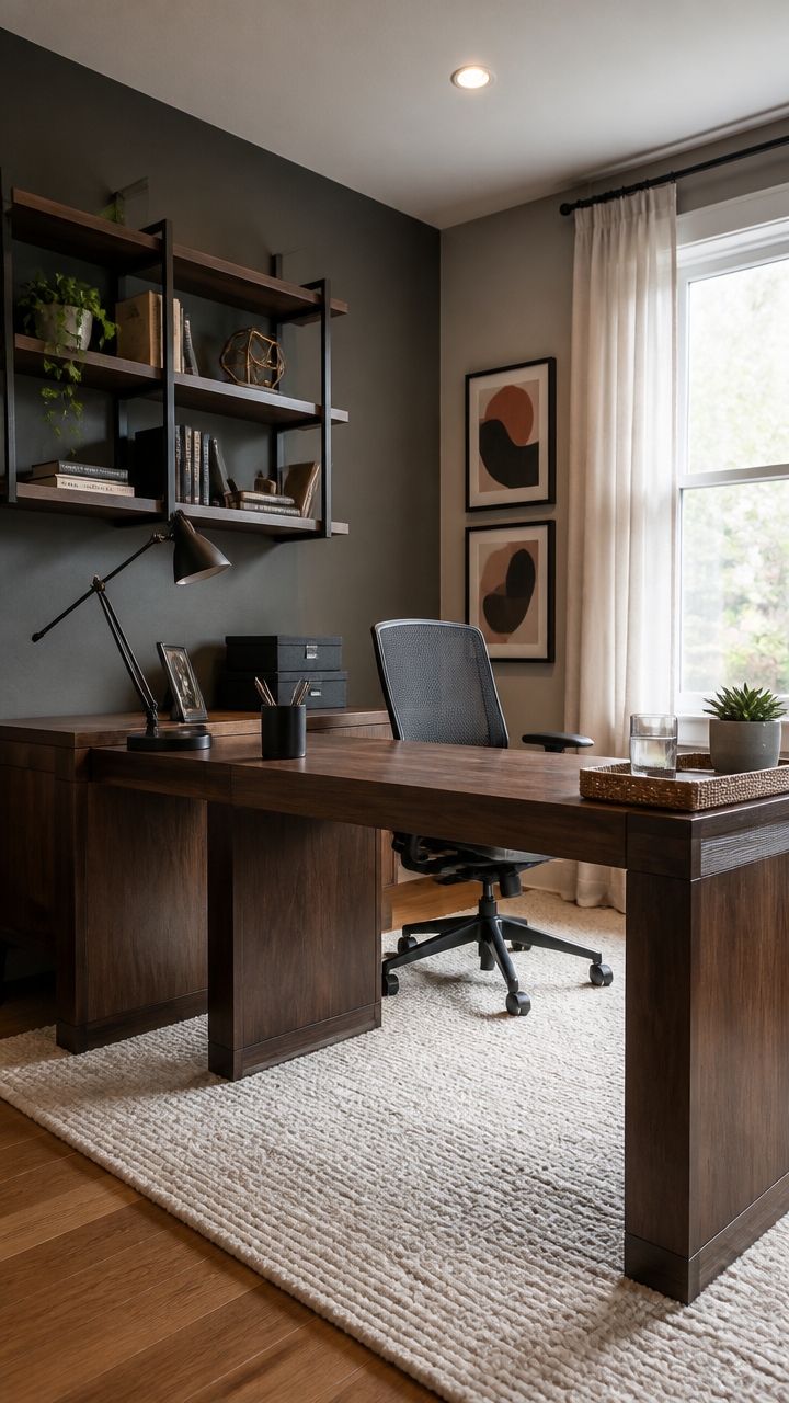
Slate gray reads differently depending on how much natural light your home office gets, and that variable decides whether you should pull warm or cool. A gray with blue undertones holds its depth in bright rooms but turns flat and cold in dim ones — while a gray with greige undertones stays readable across both. Test any candidate color in a twelve-inch painted swatch directly on your office wall and check it at three different times of day before committing.
Check the undertone first: Hold a white sheet next to your paint chip — blue, green, or purple casts mean cool gray, tan or pink mean warm.
Match to your fixed surfaces: If your desk or shelving is dark walnut, lean toward a warm or neutral gray so wood reads rich instead of muddy.
Respect the light source: North-facing offices need grays in the LRV 50-60 range to avoid a cave effect; south-facing rooms can handle deeper shades.
Commit to one dominant gray: Layering two similar grays on different walls creates a muddled look — pick one and use white or walnut as the contrast.
this slate gray anchors the desk zone with enough depth to make your screen colors pop without feeling oppressive.
this blue-toned mid-gray ties floating shelves to the darker accent wall while keeping the space visually cohesive.
 Tribesigns 63-inch Executive Desk, Vintage Home Office Computer Desk with Large Tabletop, Farmhouse Wood Writing Conference Table Workstation for Office, Study, Walnut Brown
View Price
Tribesigns 63-inch Executive Desk, Vintage Home Office Computer Desk with Large Tabletop, Farmhouse Wood Writing Conference Table Workstation for Office, Study, Walnut Brown
View Price
 FelixKing Office Chair, Ergonomic Desk Chair Breathable Mesh Chairs Adjustable High Back Lumbar Support Flip-up Armrests, Executive Rolling Swivel Comfy Computer Chairs Home Office Dark Gray
View Price
FelixKing Office Chair, Ergonomic Desk Chair Breathable Mesh Chairs Adjustable High Back Lumbar Support Flip-up Armrests, Executive Rolling Swivel Comfy Computer Chairs Home Office Dark Gray
View Price
 TORCHSTAR Metal Desk Lamp, Adjustable Swing Arm, E26, Black
View Price
TORCHSTAR Metal Desk Lamp, Adjustable Swing Arm, E26, Black
View Price
 AZSKY Floating Book Shelves Wall Mounted Photo Shelf Picture Ledge Deep Walnut Display Shelves for Home Living Room Bedroom Bathroom Office Set of 2
View Price
AZSKY Floating Book Shelves Wall Mounted Photo Shelf Picture Ledge Deep Walnut Display Shelves for Home Living Room Bedroom Bathroom Office Set of 2
View Price
 SONGMICS Storage Cubes, Set of 6, 11-Inch Foldable Closet Organizers
View Price
SONGMICS Storage Cubes, Set of 6, 11-Inch Foldable Closet Organizers
View Price
 ANSSO 5x7 Wool Rugs for Living Room,80% Merino Wool and 20% Cotton Soft Tufted Area Rug with Cotton Non-Slip Backing,Large Area Rug for Bedroom Bedroom, Dining and Home Office (Beige Cream)
View Price
ANSSO 5x7 Wool Rugs for Living Room,80% Merino Wool and 20% Cotton Soft Tufted Area Rug with Cotton Non-Slip Backing,Large Area Rug for Bedroom Bedroom, Dining and Home Office (Beige Cream)
View Price
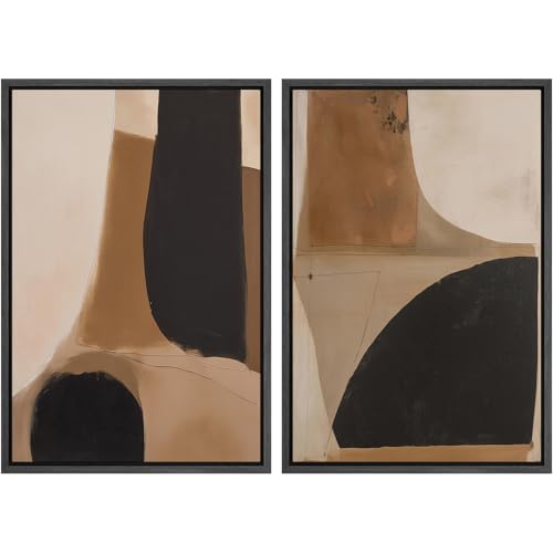 SIGNWIN Framed Canvas Print Wall Art Set Warm Neutral Abstract Shapes Illustrations Modern Art Rustic Colorful Ultra for Living Room, Bedroom, Office - 16"" x24 x2 Black
View Price
SIGNWIN Framed Canvas Print Wall Art Set Warm Neutral Abstract Shapes Illustrations Modern Art Rustic Colorful Ultra for Living Room, Bedroom, Office - 16"" x24 x2 Black
View Price
 Mind Reader Metal Pen Cups, Mesh Pencil Holders, Desktop Organizer Set, Metal, Set of 3, Black
View Price
Mind Reader Metal Pen Cups, Mesh Pencil Holders, Desktop Organizer Set, Metal, Set of 3, Black
View Price
The Lighting Setup That Drives Focus and Sets the Mood
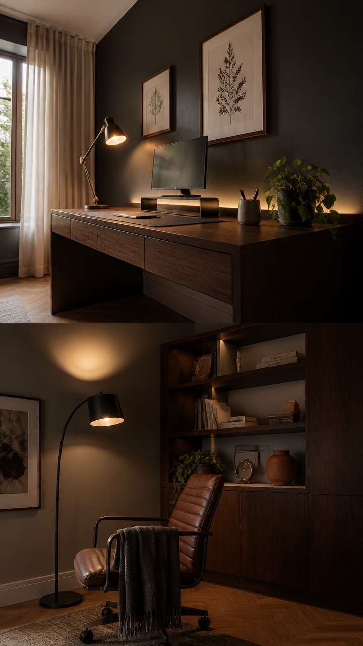
Layer your home office lighting in three distinct zones — task, ambient, and accent — to prevent the eye strain that comes from working under a single overhead source. A single ceiling fixture casts flat, shadowless light that actually makes screens harder to read because it eliminates depth cues the brain uses to stay alert. Position task lighting at desk level, ambient lighting above eye line, and accent lighting behind or beside the monitor to balance the brightness ratio across the whole room.
Layer task lighting first: A direct, adjustable desk lamp placed to the left of your monitor eliminates screen glare without shadowing your work surface.
Anchor ambient light high: A floor lamp angled toward the ceiling bounces soft, diffused light downward and keeps the room from feeling dim outside the desk zone.
Use warm-to-neutral color temperature: Bulbs in the 3000K–4000K range reduce eye strain during long work sessions better than cool daylight bulbs above 5000K.
Add bias lighting behind the monitor: A low-wattage LED strip mounted behind the screen reduces contrast between the bright display and the dark wall, easing fatigue.
the deep, matte tone absorbs competing glare sources so your layered lighting reads as intentional and controlled rather than scattered.
the soft blue-gray reflects ambient light gently, making the shelving zone feel luminous without drawing attention away from the desk area.
 ShineTech LED Desk Lamp for Home Office, 3000K Warm White Double Head Architect Task Lamps with Clamp, Dimmable Adjustable Flexible, Black
View Price
ShineTech LED Desk Lamp for Home Office, 3000K Warm White Double Head Architect Task Lamps with Clamp, Dimmable Adjustable Flexible, Black
View Price
 Dimmable LED Lamps for Living Room with 3 Color Temperatures, Ultra Bright 2000LM Arc Floor Lamps, Modern Standing Tall Lamp with Remote Control Reading Floor Lamp for Bedroom Office Classroom
View Price
Dimmable LED Lamps for Living Room with 3 Color Temperatures, Ultra Bright 2000LM Arc Floor Lamps, Modern Standing Tall Lamp with Remote Control Reading Floor Lamp for Bedroom Office Classroom
View Price
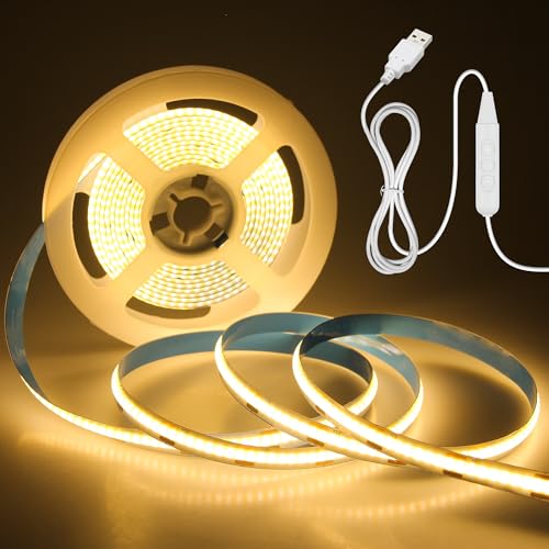 Aclorol USB COB LED Strip Lights Warm White LED TV Backlight 5V 3000K Dimmable LED Flexible Strip Light 9.84FT 960LEDS with 1.5M USB Cable for Bedroom Monitor Showcase Cabinet DIY Lighting CRI85+
View Price
Aclorol USB COB LED Strip Lights Warm White LED TV Backlight 5V 3000K Dimmable LED Flexible Strip Light 9.84FT 960LEDS with 1.5M USB Cable for Bedroom Monitor Showcase Cabinet DIY Lighting CRI85+
View Price
 IronHaul Solid Wood Desk with Drawer (Walnut Color, 47.2inch)
View Price
IronHaul Solid Wood Desk with Drawer (Walnut Color, 47.2inch)
View Price
 Distressed Leather Desk Mat - Non-Slip PU Desk Pad for Office and Home - Desk Organization and Accessories - Ideal for Large Mouse Pad and Desk Mats on Top of Desks(Slate Gray,36"x 17")
View Price
Distressed Leather Desk Mat - Non-Slip PU Desk Pad for Office and Home - Desk Organization and Accessories - Ideal for Large Mouse Pad and Desk Mats on Top of Desks(Slate Gray,36"x 17")
View Price
 Klearlook Computer Monitor Stand for Desk, Adjustable Foldable Monitor Riser with Storage Drawer & Tablet Phone Holder for Office, Home, Laptop, Desktop (Black)
View Price
Klearlook Computer Monitor Stand for Desk, Adjustable Foldable Monitor Riser with Storage Drawer & Tablet Phone Holder for Office, Home, Laptop, Desktop (Black)
View Price
 SYLVANIA Wifi LED Smart Light Bulb, A19, 60W, Soft White, Compatible with Alexa and Google Home Only - 4 Pack (75672)
View Price
SYLVANIA Wifi LED Smart Light Bulb, A19, 60W, Soft White, Compatible with Alexa and Google Home Only - 4 Pack (75672)
View Price
 ArtbyHannah Framed Bathroom Wall Art Decor, 10x10 Botanical Artwork Walnut
View Price
ArtbyHannah Framed Bathroom Wall Art Decor, 10x10 Botanical Artwork Walnut
View Price
Storage That Keeps Your Slate Gray Office Clutter-Free
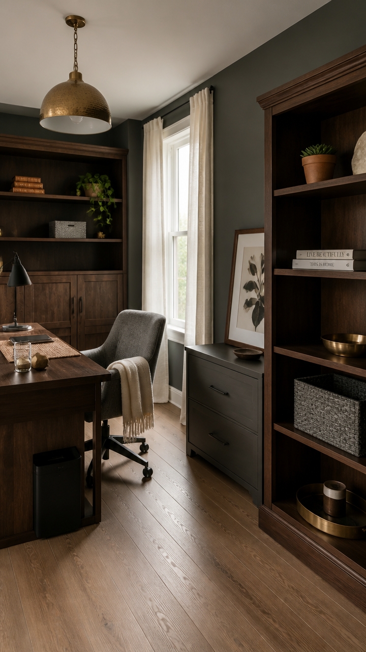
Built-in storage units with closed lower cabinets and open upper shelves eliminate clutter while keeping daily tools within reach in a slate gray home office. Closed doors hide cables, paper, and equipment that would visually compete with the room’s refined color palette, while open shelves hold only curated, intentional pieces. Choose units in dark walnut or charcoal-finished wood so the storage becomes part of the room’s design language rather than an afterthought.
Use closed base storage: Lower cabinets keep clutter completely out of sight and protect the room’s polished, intentional look.
Limit open shelf displays: Keep only three to five objects per shelf — books, a plant, or a decorative tray — so the arrangement reads as styled, not stuffed.
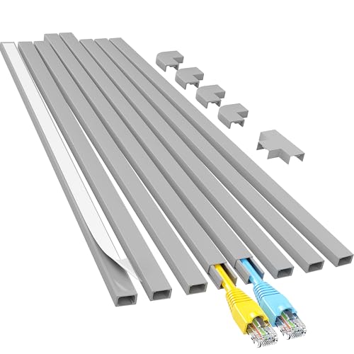
Route cables inside furniture: Use a desk with a built-in cable management channel or add a cable management box on the floor beside it to eliminate visible cord clutter.
Double up with a filing cabinet: A lateral file cabinet in slate gray or dark walnut handles paper and keeps documents off the desk surface where they accumulate fastest.
the deep slate tone anchors the room’s color story and makes open shelving and displayed objects stand out cleanly.
the warm, wood-toned brown unifies painted shelving with actual dark walnut furniture already in the room.
 SUPER DEAL Modern Bathroom Floor Storage Cabinet with Adjustable Shelf and Double Door Rust Proof, Living Room Modern Home Furniture Storage Organizer Cabinet, Grey
View Price
SUPER DEAL Modern Bathroom Floor Storage Cabinet with Adjustable Shelf and Double Door Rust Proof, Living Room Modern Home Furniture Storage Organizer Cabinet, Grey
View Price
 Halitaa Lateral File Cabinet with 2 Large Drawers for Home Office, Walnut
View Price
Halitaa Lateral File Cabinet with 2 Large Drawers for Home Office, Walnut
View Price
 BAYKA Walnut-Like Floating Shelves 15.7in, 3 Pack, Wall Mounted Wall Decor
View Price
BAYKA Walnut-Like Floating Shelves 15.7in, 3 Pack, Wall Mounted Wall Decor
View Price
 Cable Management Box,Cord Organizer for Home Office Cable Wire Hide,Black
View Price
Cable Management Box,Cord Organizer for Home Office Cable Wire Hide,Black
View Price
 Homsorout Trapezoid Bins for Organization - 8 Pack Storage Cubes, Decorative Fabric Organizer Bins, Large Baskets for Storage, Linen Storage Organizer for Clothes, Books, Home, Light Gray
View Price
Homsorout Trapezoid Bins for Organization - 8 Pack Storage Cubes, Decorative Fabric Organizer Bins, Large Baskets for Storage, Linen Storage Organizer for Clothes, Books, Home, Light Gray
View Price
 Sauder 5 Tier Book Shelf Wooden Bookcase Multipurpose Bookshelf for Home Office, Living Room, in Grand Walnut
View Price
Sauder 5 Tier Book Shelf Wooden Bookcase Multipurpose Bookshelf for Home Office, Living Room, in Grand Walnut
View Price
 Yaheetech Light Gray Velvet Makeup Vanity Desk Chair, Channel-Tufted Swivel
View Price
Yaheetech Light Gray Velvet Makeup Vanity Desk Chair, Channel-Tufted Swivel
View Price
 Framed Neutral Abstract Wall Art Set of 3, Modern Black and Brown Wall Decor Paintings, Minimalist Beige Textured Prints Pictures for Living Room Bedroom Office Home Decor 12x16 Inch
View Price
Framed Neutral Abstract Wall Art Set of 3, Modern Black and Brown Wall Decor Paintings, Minimalist Beige Textured Prints Pictures for Living Room Bedroom Office Home Decor 12x16 Inch
View Price
Wall Treatments That Anchor a Slate Gray and Dark Walnut Room
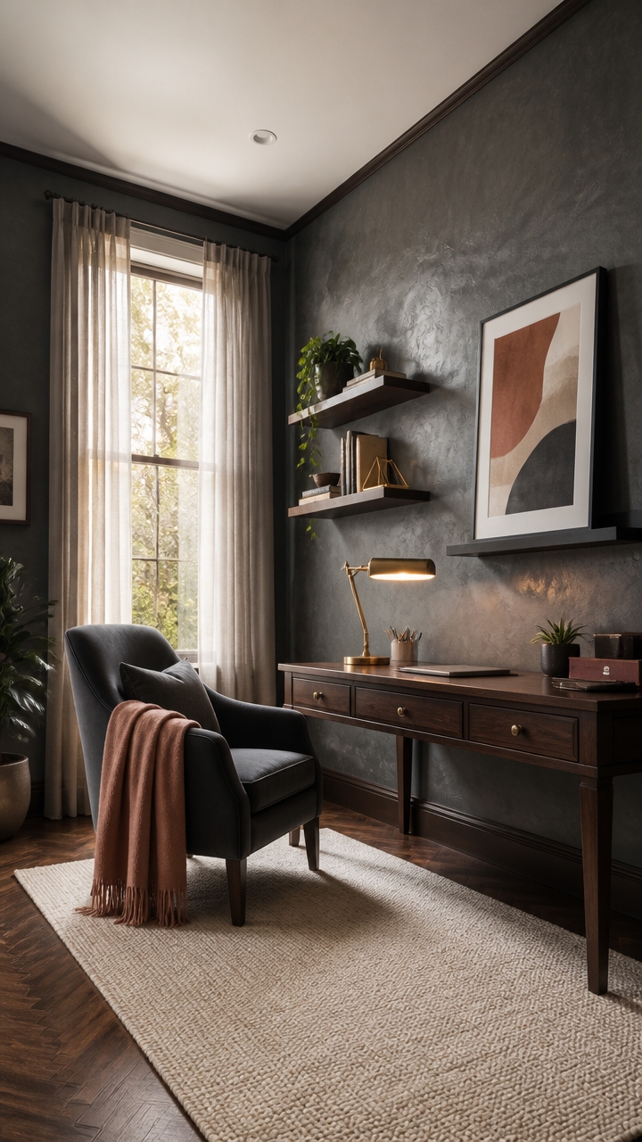
Textured wall treatments do more visual work than paint alone in a slate gray and dark walnut home office — the right wall finish adds depth that flat color can’t achieve. Slate gray absorbs light differently depending on surface texture, shifting from cool and crisp on smooth drywall to warm and dimensional on grasscloth, plank, or limewash. Focus texture on the wall directly behind the desk, where it frames your workspace like a backdrop and grounds the dark walnut furniture anchored in front of it.
Layer texture over color: Apply limewash or venetian plaster over slate gray walls so the finish reads dimensional rather than flat — texture catches light and prevents the dark palette from feeling heavy.
Use vertical shiplap strategically: Vertical planks painted in slate gray on the accent wall behind the desk draw the eye upward and make standard ceiling heights feel taller without architectural changes.
Frame with dark walnut trim: Replace standard white baseboard and door casing with dark walnut wood trim so the wall treatment segues cleanly into furniture without a visual break.
Treat one wall only: Limit the textured treatment to a single focal wall — applying it to all four walls in a home office creates visual noise that competes with work focus.
before applying a limewash topcoat — the deep slate base gives the finish richness and prevents the limewash from reading chalky or washed out.
the warm brown tone bridges the gap between painted walls and actual walnut furniture so nothing reads as mismatched.
 Meoded Paint & Plaster | Lime Wash | Lime Paint | Natural Matte Finish | Interior & Exterior
View Price
Meoded Paint & Plaster | Lime Wash | Lime Paint | Natural Matte Finish | Interior & Exterior
View Price
 4 Pack Wood Panels for Wall, 106.3" × 11" Wood Slat Acoustic Panels for Wall, Soundproof Panels, 3D Fluted Panels for Interior Wall Decor (Walnut)
View Price
4 Pack Wood Panels for Wall, 106.3" × 11" Wood Slat Acoustic Panels for Wall, Soundproof Panels, 3D Fluted Panels for Interior Wall Decor (Walnut)
View Price
 WADILE Grasscloth Peel and Stick Wallpaper 15.7in x 78.7in, Textured Contact Paper for Cabinets, Faux Linen Wall Paper Pull and Stick, Fabric Vinyl Wallpaper Self Adhesive Light Gray
View Price
WADILE Grasscloth Peel and Stick Wallpaper 15.7in x 78.7in, Textured Contact Paper for Cabinets, Faux Linen Wall Paper Pull and Stick, Fabric Vinyl Wallpaper Self Adhesive Light Gray
View Price
 Large Framed Brown Moody Abstract Wall Art, 1 Piece Vertical 30x60 In
View Price
Large Framed Brown Moody Abstract Wall Art, 1 Piece Vertical 30x60 In
View Price
 Forbena 48 Inch Black Picture Ledge Shelf Set of 4, Extra Long Floating Shelves for Wall with Lip, Narrow Wall Mounted Shelves for Living Room Bedroom Photo Frames, Art Pictures, Books, Legos
View Price
Forbena 48 Inch Black Picture Ledge Shelf Set of 4, Extra Long Floating Shelves for Wall with Lip, Narrow Wall Mounted Shelves for Living Room Bedroom Photo Frames, Art Pictures, Books, Legos
View Price
 Hahafelt Linen Fabric Bulletin Board Pinboard, 36"x24", Grey
View Price
Hahafelt Linen Fabric Bulletin Board Pinboard, 36"x24", Grey
View Price
 Yaheetech Barrel Accent Chair, Upholstered Modern Armchair, Gray
View Price
Yaheetech Barrel Accent Chair, Upholstered Modern Armchair, Gray
View Price
Dark Walnut Furniture Pairings That Always Work
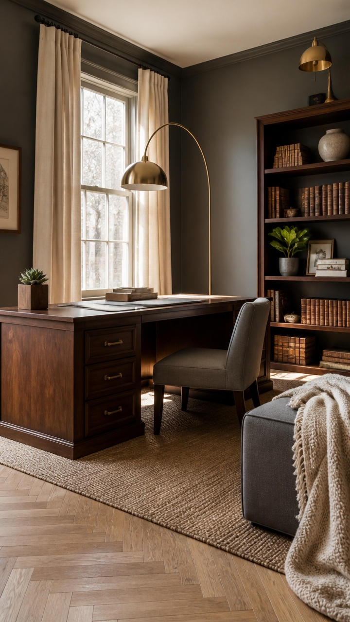
Dark walnut furniture pairs most reliably with materials that either reflect or absorb light in opposite ways — matte textiles, warm metals, and light-toned stone create natural contrast against the wood’s deep, rich grain. The density of dark walnut can visually anchor a home office, but only when surrounding pieces stay lighter in tone or cooler in finish to prevent the room from closing in. Treat slate gray walls as your neutral reset, and let walnut furniture do the heavy lifting as the room’s dominant warm element.
Pair with light stone: A white or cream marble desk pad or tray surface sits cleanly against dark walnut and reflects overhead light back into the workspace.
Balance with warm metal accents: Brushed brass or antique gold hardware on lamps, shelving brackets, and organizers echoes the warm undertones already present in walnut grain.
Add contrast through textiles: Slate gray or cream upholstered seating next to dark walnut furniture prevents the room from reading as a single unbroken block of dark tones.
Keep leg finishes consistent: If walnut furniture includes metal legs, repeat that same metal finish across other room elements so the palette stays cohesive rather than scattered.
the deep slate tone makes walnut furniture pop forward without competing for visual weight.
wrapping architectural trim in walnut tone makes freestanding furniture feel built-in and intentional.
 Wayshome 100% Solid Wood Desk, Mid Century Modern Walnut Finish Home Office Computer Writing Desk with Drawers Perfect for Study & Living Room 55.11" W
View Price
Wayshome 100% Solid Wood Desk, Mid Century Modern Walnut Finish Home Office Computer Writing Desk with Drawers Perfect for Study & Living Room 55.11" W
View Price
 YOUTASTE Grey Armless Office Chair, Modern Adjustable Swivel Desk Chair with Wheels, Upholstered PU Leather, Gray Metal Legs, Back Support for Home Office, Study, Vanity, Bedroom
View Price
YOUTASTE Grey Armless Office Chair, Modern Adjustable Swivel Desk Chair with Wheels, Upholstered PU Leather, Gray Metal Legs, Back Support for Home Office, Study, Vanity, Bedroom
View Price
 360 Lighting Cora 72" Tall Brass Metal Modern Arc Floor Lamp
View Price
360 Lighting Cora 72" Tall Brass Metal Modern Arc Floor Lamp
View Price
 Laokiiy Desk Mat, Desk Pad Dual Leather Sided Desktop Mat for Office and Home,Desk Organization and Accessories - Ideal for Large Mouse Pad and Desk Mats on Top of Desks (White Marble 31.5"x 15.7")
View Price
Laokiiy Desk Mat, Desk Pad Dual Leather Sided Desktop Mat for Office and Home,Desk Organization and Accessories - Ideal for Large Mouse Pad and Desk Mats on Top of Desks (White Marble 31.5"x 15.7")
View Price
 TVU 5-Tier Wood Book Shelf, 47" Wide Large Bookshelf and Bookcase, 62" Tall Bookshelf with Curved Side Shelves, Freestanding Wood Display Book Shelves for Living Room, Home Office, Walnut
View Price
TVU 5-Tier Wood Book Shelf, 47" Wide Large Bookshelf and Bookcase, 62" Tall Bookshelf with Curved Side Shelves, Freestanding Wood Display Book Shelves for Living Room, Home Office, Walnut
View Price
 SIMPLIHOME Dover 36 inch Wide Contemporary Square Coffee Table Storage Ottoman in Slate Grey Linen Look Fabric, Assembled, for the Living Room and Bedroom
View Price
SIMPLIHOME Dover 36 inch Wide Contemporary Square Coffee Table Storage Ottoman in Slate Grey Linen Look Fabric, Assembled, for the Living Room and Bedroom
View Price
 GyroVu Touch Control Table Lamps Set of 2, Gold Bedside Lamps for Bedroom
View Price
GyroVu Touch Control Table Lamps Set of 2, Gold Bedside Lamps for Bedroom
View Price
 Amélie Home Premium Chenille Throw Blanket, Soft Cozy Moss Stitch Knit Blanket for Couch, Sofa, Chair, Home Decor, Cream White 50"x60"
View Price
Amélie Home Premium Chenille Throw Blanket, Soft Cozy Moss Stitch Knit Blanket for Couch, Sofa, Chair, Home Decor, Cream White 50"x60"
View Price
How to Layer Textures in a Slate Gray Office So It Feels Warm
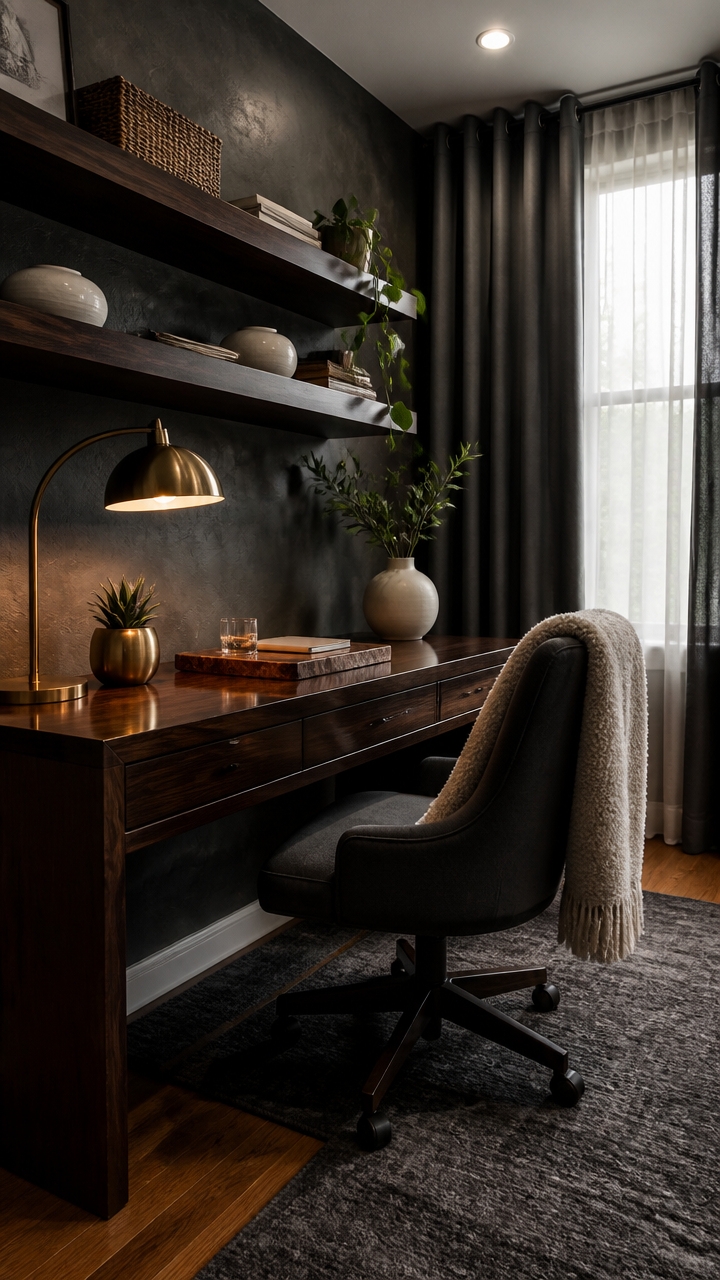
Slate gray reads cold on its own, but layering three or four distinct textures — rough, soft, smooth, and organic — gives the color something to warm against. The contrast between a nubby wool throw and a sleek lacquered desk surface is what makes the gray feel intentional rather than sterile. Start with one hard texture, one soft textile, and one natural material, then build from there.
Lead with soft textiles: A boucle or chunky-knit throw draped over the desk chair immediately softens the hardness of a gray palette.
Bring in one natural material: Walnut wood, rattan, or a live-edge shelf introduces warmth that no paint color or fabric can fully replicate on its own.
Use matte and gloss together: Pair a matte plaster or limewash wall finish with a glossy ceramic vase or lacquered desk surface to create depth without adding more color.
Ground the space with a textured rug: A jute or low-pile wool rug under the desk chair pulls the eye down and anchors the layers above it.
the charcoal depth anchors the slate gray palette and makes the workspace feel deliberately designed.
the warm white creates just enough contrast to keep the dark accent wall from closing the room in.
 Knit Throw Blanket Chenille Chevron Cozy Breathable Decor, Ivory, 50"x60"
View Price
Knit Throw Blanket Chenille Chevron Cozy Breathable Decor, Ivory, 50"x60"
View Price
 AZSKY Floating Picture Ledge 36 Inch Wall Mount Floating Shelves Long Wood Floating Book Shelves for Kids Room Wall Shelves for Bathroom Decor Deep Walnut Set of 2
View Price
AZSKY Floating Picture Ledge 36 Inch Wall Mount Floating Shelves Long Wood Floating Book Shelves for Kids Room Wall Shelves for Bathroom Decor Deep Walnut Set of 2
View Price
 JONATHAN Y Haze Solid Low-Pile Gray Indoor Area Rug 8x10, Coastal,Bohemian,Minimalist,Classic, Easy-Cleaning for Living Room,Bedroom,Kitchen,Pet Friendly,Non-Shedding (SEU100A-8)
View Price
JONATHAN Y Haze Solid Low-Pile Gray Indoor Area Rug 8x10, Coastal,Bohemian,Minimalist,Classic, Easy-Cleaning for Living Room,Bedroom,Kitchen,Pet Friendly,Non-Shedding (SEU100A-8)
View Price
 Ceramic Vases Set of 2,Modern Vases for Home Decor, White Boho Style for Living Room Kitchen Mantle Bedroom Dining Table Office Farmhouse Decorative Design
View Price
Ceramic Vases Set of 2,Modern Vases for Home Decor, White Boho Style for Living Room Kitchen Mantle Bedroom Dining Table Office Farmhouse Decorative Design
View Price
 Simplify 3 Piece Set Woven Rattan Tote Baskets | Multi-Size | Handles | Storage & Organization | Toys | Bathroom Accessories | Home | Office | Dorm | Playroom | Closet | Grey
View Price
Simplify 3 Piece Set Woven Rattan Tote Baskets | Multi-Size | Handles | Storage & Organization | Toys | Bathroom Accessories | Home | Office | Dorm | Playroom | Closet | Grey
View Price
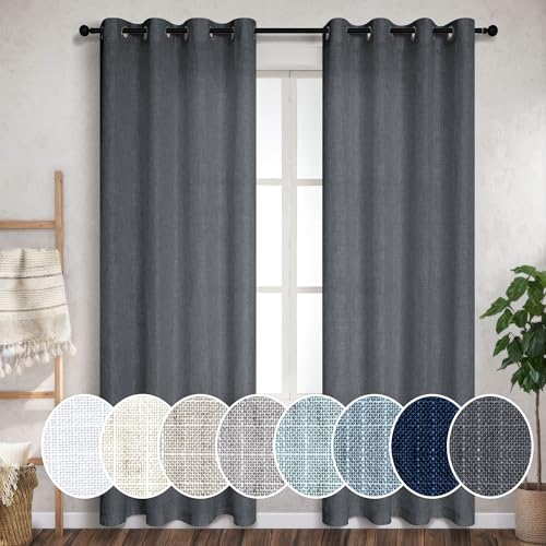 Pitalk Dark Grey Curtains 108 Inches Long Set of 2 Panels Grommet Unique Light Filtering Semi Sheer Office Curtains for Men Living Room Bedroom Charcoal Gray 52x108 Inch Length
View Price
Pitalk Dark Grey Curtains 108 Inches Long Set of 2 Panels Grommet Unique Light Filtering Semi Sheer Office Curtains for Men Living Room Bedroom Charcoal Gray 52x108 Inch Length
View Price
 Arc Floor Lamp with Remote and Dimmable Gold Floor lamps for Living Room
View Price
Arc Floor Lamp with Remote and Dimmable Gold Floor lamps for Living Room
View Price
 NiOffice Wooden Letter Tray Natural Pine Wood Desktop Organizer, Multi-Functional Storage for Office, Kitchen - Perfect for Files, Supplies and Small Accessories, Stackable Space-Saving (Rustic Burnt)
View Price
NiOffice Wooden Letter Tray Natural Pine Wood Desktop Organizer, Multi-Functional Storage for Office, Kitchen - Perfect for Files, Supplies and Small Accessories, Stackable Space-Saving (Rustic Burnt)
View Price



Accent Colors That Complement Slate Gray and Dark Walnut
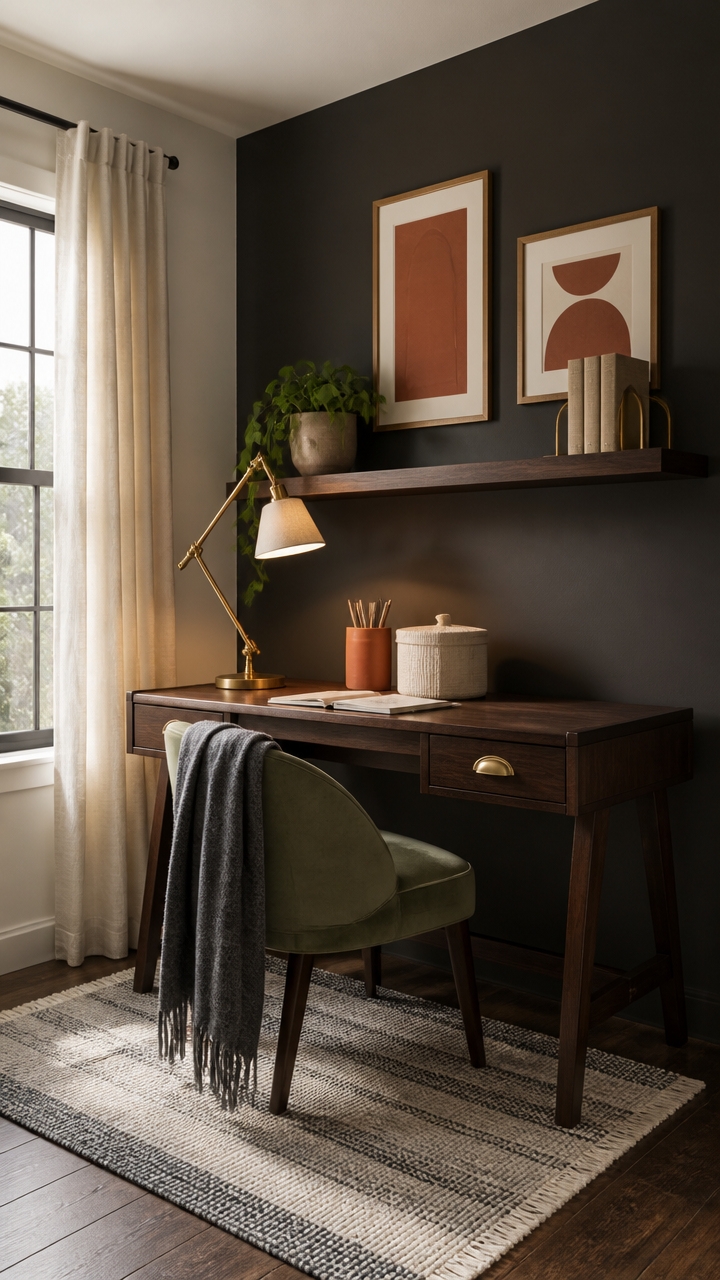
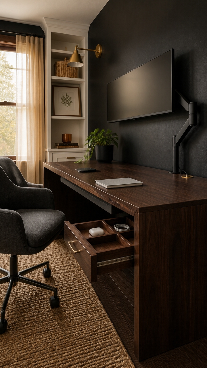
Warm terracotta, dusty sage, and aged brass pull double duty alongside slate gray and dark walnut because they share the same muted, earthy undertone rather than competing with it. Slate gray acts as a natural bridge between warm and cool, making it unusually forgiving as a base. Introduce accent colors in a 70/20/10 ratio — gray and walnut as the dominant foundation, one accent color as a secondary, and a third only in small doses through hardware or a single textile.
Terracotta as a secondary: One terracotta pillow, ceramic object, or small textile brings warmth without softening the purposeful, grounded quality of walnut and gray.
Dusty sage as relief: Sage introduces color without brightness — use it on a chair cushion or a small planter to break up the heavier tones without adding visual noise.
Aged brass for hardware: Brass reads warm like walnut and metallic like gray, making it the single finish that connects both materials without introducing a third visual story.
Cream for contrast: A cream lamp shade or storage bin keeps the palette from going too heavy, lifting the space without introducing stark white.
the deep slate tone anchors the walnut desk and pulls the two materials into a single unified backdrop.
the warm white keeps the charcoal wall from absorbing too much light while complementing walnut’s natural grain.
 Fcacti 12 PCS Small Mini Clay Pots with Drainage Holes for Plants,2.5inch Terra Cotta Pot Clay Ceramic Pottery Planter,Succulent Nursery Pot/Cactus Plant Pot,for Indoor/Outdoor Plants,Crafts
View Price
Fcacti 12 PCS Small Mini Clay Pots with Drainage Holes for Plants,2.5inch Terra Cotta Pot Clay Ceramic Pottery Planter,Succulent Nursery Pot/Cactus Plant Pot,for Indoor/Outdoor Plants,Crafts
View Price
 HULALA HOME Velvet Home Office Desk Chair with Gold Base, Sage
View Price
HULALA HOME Velvet Home Office Desk Chair with Gold Base, Sage
View Price
 lianheng Desk Lamp for Home Office, Desk Light with Adjustable Multi-Joint Metal Swing Arms Table Lamp, Industrial Table Light for for Home Office, Work, Study, Reading, E26 Base (Antique Brass)
View Price
lianheng Desk Lamp for Home Office, Desk Light with Adjustable Multi-Joint Metal Swing Arms Table Lamp, Industrial Table Light for for Home Office, Work, Study, Reading, E26 Base (Antique Brass)
View Price
 Honygebia Bamboo Decorative Storage Boxes - Set of 3 Woven Lined Storage Basket with Lids, White Wicker Lidded Baskets for Home Kitchen Shelf Organizer Decor
View Price
Honygebia Bamboo Decorative Storage Boxes - Set of 3 Woven Lined Storage Basket with Lids, White Wicker Lidded Baskets for Home Kitchen Shelf Organizer Decor
View Price
 100% Wool Throw Blanket 71 x 47 Inches, Breathable Soft Wool Blanket Checkered Print Decorative Throw Blanket for Couch Home Reading Chair Decor, Charcoal Grey White
View Price
100% Wool Throw Blanket 71 x 47 Inches, Breathable Soft Wool Blanket Checkered Print Decorative Throw Blanket for Couch Home Reading Chair Decor, Charcoal Grey White
View Price
 Framed Orange Abstract Mountain Wall Art for Living Room, 3 Piece, 24x36 In
View Price
Framed Orange Abstract Mountain Wall Art for Living Room, 3 Piece, 24x36 In
View Price
 ANONYO Tree of Life Bookends Set Heavy Duty Metal Book Ends for Shelves | Antique Brass Iron Decorative Bookend Pair for Home, Office, Library or Study | Elegant Vintage Style Book Holder Décor
View Price
ANONYO Tree of Life Bookends Set Heavy Duty Metal Book Ends for Shelves | Antique Brass Iron Decorative Bookend Pair for Home, Office, Library or Study | Elegant Vintage Style Book Holder Décor
View Price
How to Zone a Home Office for Deep Work and Downtime
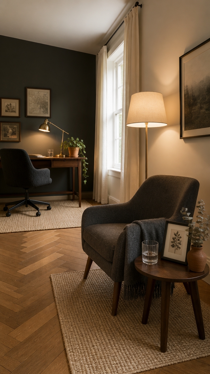
Zoning a home office into two distinct areas — one for focused work, one for rest or thinking — prevents the mental blur that makes remote work exhausting over time. When every part of the room signals “productivity,” the brain never gets permission to slow down, which drains creative energy faster than a long task list. Anchor each zone with a different type of lighting and at least one furniture piece that signals a different mode, so the shift between work and downtime feels physical, not just mental.
Define the work zone first: Place the primary desk against the most task-friendly wall — ideally facing away from the relaxation corner so the two zones don’t visually compete.
Use a reading chair as the downtime anchor: A comfortable chair with a side table and soft lamp creates a second destination that the brain learns to associate with rest, not output.
Separate lighting types by zone: Overhead or adjustable task lighting belongs at the desk; a warm floor lamp or table lamp marks the downtime corner as a lower-stimulus space.
Use a small rug to lock each zone in place: Even a compact rug under the chair or beneath the desk creates a visual boundary that keeps the two areas from bleeding together.
the deep, grounded tone signals focus and keeps the work zone visually separate from the rest of the room.
the warm white softens the downtime corner and creates a lighter, lower-pressure atmosphere that contrasts the work zone intentionally.
 LuxeSand 100% Solid Wood 32 x 16 in Small Desk with Drawers
View Price
LuxeSand 100% Solid Wood 32 x 16 in Small Desk with Drawers
View Price
 Elegant Oversized Accent Reading Armchairs Set of 2, 42.1", Chenille, Gray
View Price
Elegant Oversized Accent Reading Armchairs Set of 2, 42.1", Chenille, Gray
View Price
 Kenroy Home 30163 Desk Lamps, Polished Brass 12.70x9.60x12.40
View Price
Kenroy Home 30163 Desk Lamps, Polished Brass 12.70x9.60x12.40
View Price
 Nintiue 【Upgraded】 Dimmable Floor Lamp, 1000 Lumens LED Bulb Included, Arc Floor Lamps for Living Room Modern Standing Lamp with Linen Shade, Tall Lamp for Bedroom Office Reading Dining Room- Black
View Price
Nintiue 【Upgraded】 Dimmable Floor Lamp, 1000 Lumens LED Bulb Included, Arc Floor Lamps for Living Room Modern Standing Lamp with Linen Shade, Tall Lamp for Bedroom Office Reading Dining Room- Black
View Price
 WRGHOME Modern Abstract Indoor Area Rug Cream 2' x 3'
View Price
WRGHOME Modern Abstract Indoor Area Rug Cream 2' x 3'
View Price
 AWASEN Small Side Table, Mid Century End Table Living Room, Small Table
View Price
AWASEN Small Side Table, Mid Century End Table Living Room, Small Table
View Price
 The Original Office Chair Blanket by SnuggleBack; Cozy Comfy Office Desk Chair Wrap Attaches for Hands-Free Warmth. Stay Warm In The Winter or Summer. (Silver Grey Faux Fur)
View Price
The Original Office Chair Blanket by SnuggleBack; Cozy Comfy Office Desk Chair Wrap Attaches for Hands-Free Warmth. Stay Warm In The Winter or Summer. (Silver Grey Faux Fur)
View Price
 Terracotta Pots, 8+6 Inch Plant Pots, 2 Pcs with Drainage Holes
View Price
Terracotta Pots, 8+6 Inch Plant Pots, 2 Pcs with Drainage Holes
View Price
Art and Decor That Reflect Confidence and Character
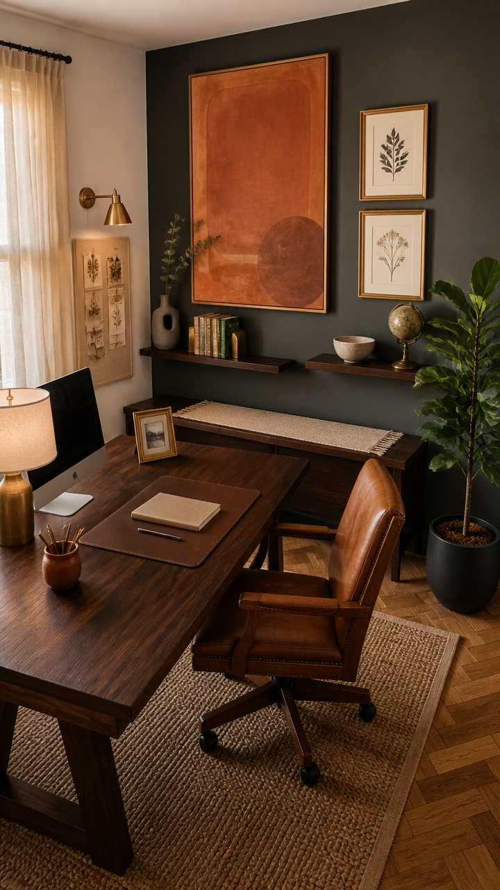
Art and decor choices set the tone of a home office faster than any furniture purchase, and the pieces that hold up over time are the ones that mean something specific to the person working there. A generic motivational print fades into the background within weeks, but a piece of art tied to a real interest, a trip, or a skill creates a daily anchor that reinforces identity. Choose decor that would only make sense in your office — not anyone else’s.
Lead with one large statement piece: A single oversized framed print or canvas above the desk communicates confidence better than a cluster of small unrelated items.
Layer in personal objects with visual weight: A sculptural bookend, a ceramic object, or a small framed photograph adds character without competing with the art.
Keep the color grounded: In a slate gray and dark walnut palette, art with warm amber, terracotta, or deep green tones pulls the room together without looking forced.
Edit down to what you’d actually defend: If you can’t explain why a piece is on your wall, it’s filling space rather than reflecting character.
the deep, grounded backdrop makes art pop and gives statement pieces the contrast they need to land.
the warm white keeps the room from feeling too heavy and lets lighter decor pieces breathe naturally.
 Framed Abstract Floral Wall Art, Boho Vintage Flower Pictures Wall Decor, Mid Century Modern Botanical Paintings Canvas Prints for Living Room Bedroom Office 12x16 inch
View Price
Framed Abstract Floral Wall Art, Boho Vintage Flower Pictures Wall Decor, Mid Century Modern Botanical Paintings Canvas Prints for Living Room Bedroom Office 12x16 inch
View Price
 Hug Donut Decorative Vase Set - Dark Gray Modern Minimalism Industrial Style Vases Home Decor, Matte Ceramic Decorations for Living Room Shelf, Bookshelf Mantle Entryway Table or Console Décor(Gray)
View Price
Hug Donut Decorative Vase Set - Dark Gray Modern Minimalism Industrial Style Vases Home Decor, Matte Ceramic Decorations for Living Room Shelf, Bookshelf Mantle Entryway Table or Console Décor(Gray)
View Price
 Metal Unique Office Desk Bookends Decorative Cute Book Ends for Kids Book
View Price
Metal Unique Office Desk Bookends Decorative Cute Book Ends for Kids Book
View Price
 Dark Botanical Framed Wall Art Black Gold Moody Fern Floral Print
View Price
Dark Botanical Framed Wall Art Black Gold Moody Fern Floral Print
View Price
 Forbena 36 Inch Picture Ledge Shelf, Floating Nursery Shelves for Wall
View Price
Forbena 36 Inch Picture Ledge Shelf, Floating Nursery Shelves for Wall
View Price
 DAHAPYBOO Cork Board with Linen White,Bulletin Board 36"x24"
View Price
DAHAPYBOO Cork Board with Linen White,Bulletin Board 36"x24"
View Price
Window Treatments That Control Light Without Losing Style

Roller shades layered with sheer panels give a home office the most flexible light control without locking you into one look. The sheer softens harsh midday glare while the roller blocks it completely when needed, so the same window works for video calls and focused work. Mount both treatments on separate brackets at ceiling height to make the window feel taller and the room more intentional.
Layer, don’t choose: A sheer panel behind a blackout roller lets you dial light in stages rather than choosing between fully open or fully shut.
Stay within the palette: Slate gray, warm white, or linen-toned fabrics disappear into the design instead of drawing the eye away from the work zone.
Go ceiling-mounted: Installing the rod or track at ceiling height rather than frame height adds visual length to any window and makes the room feel more finished.
Match hardware to the room: Matte black or brushed brass curtain rods connect to the dark walnut and slate tones already present in the space.
the deep slate ground makes linen and gray window treatments read as intentional rather than understated.
the soft warm white keeps natural light bouncing through sheer panels without washing out the darker palette.
 HESTIA Cordless Zebra Roller Shades, Slate Gray, 30''W x 64''H
View Price
HESTIA Cordless Zebra Roller Shades, Slate Gray, 30''W x 64''H
View Price
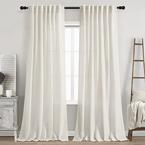 Cream Linen Back Tab Curtains 84 Inch Length for Living Room 2 Panel Set Neutral Modern Farmhouse Window Privacy Semi Sheer Linen Drapes Rustic Pinch Pleated Look Curtain Natural Ivory Colored
View Price
Cream Linen Back Tab Curtains 84 Inch Length for Living Room 2 Panel Set Neutral Modern Farmhouse Window Privacy Semi Sheer Linen Drapes Rustic Pinch Pleated Look Curtain Natural Ivory Colored
View Price
 Ceiling Mounted Double Curtain Rod, Black 48-84, Black Double Curtain Rod
View Price
Ceiling Mounted Double Curtain Rod, Black 48-84, Black Double Curtain Rod
View Price
 Drapery Curtain Wood Single Bracket for 1 3/8" Drapery Rod - Walnut - Set of 2
View Price
Drapery Curtain Wood Single Bracket for 1 3/8" Drapery Rod - Walnut - Set of 2
View Price
 MIULEE 100% Blackout Linen Curtains for Bedroom 52x84 Inches Dusty Blue
View Price
MIULEE 100% Blackout Linen Curtains for Bedroom 52x84 Inches Dusty Blue
View Price
 Lootkell Warm Gold Curtain Rods for Windows 48 to 84 Inches Adjustable Length Heavy Duty 1" Diameter Brass Window Curtain Rod with Solid Metal Finials for Outdoor Farmhouse Bedroom Kitchen Living Room
View Price
Lootkell Warm Gold Curtain Rods for Windows 48 to 84 Inches Adjustable Length Heavy Duty 1" Diameter Brass Window Curtain Rod with Solid Metal Finials for Outdoor Farmhouse Bedroom Kitchen Living Room
View Price
 MYSTIC-HOME Sheer Curtains White 63 Inch Length, Rod Pocket Voile Drapes for Living Room, Bedroom, Window Treatments Semi Crinkle Curtain Panels for Yard, Patio, Villa, Parlor, Set of 2, 52"x 63"
View Price
MYSTIC-HOME Sheer Curtains White 63 Inch Length, Rod Pocket Voile Drapes for Living Room, Bedroom, Window Treatments Semi Crinkle Curtain Panels for Yard, Patio, Villa, Parlor, Set of 2, 52"x 63"
View Price
 Aiyufeng 100% Blackout Curtain Liner 2 Panles Set, 100% Darkening Blackout Curtain Liners for 72 Inch Curtains Behind, 2 Liners Per Set with 18 Pieces Rings, (Greyish White, 50W x 68L, 2 Pieces)
View Price
Aiyufeng 100% Blackout Curtain Liner 2 Panles Set, 100% Darkening Blackout Curtain Liners for 72 Inch Curtains Behind, 2 Liners Per Set with 18 Pieces Rings, (Greyish White, 50W x 68L, 2 Pieces)
View Price
How to Get This Look on Any Budget
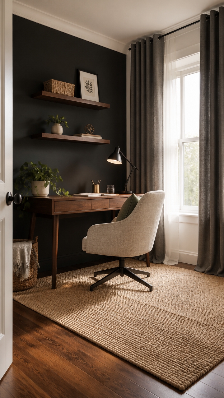
Budget doesn’t determine how pulled-together a home office looks — material choices do. A $30 linen curtain panel from a discount retailer reads the same as a $200 one when it’s ceiling-mounted and paired with the right wall color. The difference between a cheap room and a curated one is usually proportion and restraint, not price tag.
Start with paint: A deep accent wall behind the desk costs under $50 and does more visual work than any furniture upgrade at the same price.
Invest in one anchor piece: Put the budget toward a desk or chair that looks intentional, then fill in with affordable textiles and decor.
Buy neutral, not trendy: Slate gray, warm white, and linen tones age well and don’t need replacing when trends shift.
Use ceiling height strategically: Mounting curtains high costs nothing extra but makes budget rods and panels look deliberate and finished.
the deep slate anchors the room and makes even affordable furniture look intentional against it.
the warm white bounces light and keeps the space from feeling heavy on a budget palette.
 KOUFALL Charcoal Gray Curtains 96 Inches Long for Living Room 2 Panel Set Dark Grommet Linen Sheer Curtains 96 Inch Length,Dark Grey
View Price
KOUFALL Charcoal Gray Curtains 96 Inches Long for Living Room 2 Panel Set Dark Grommet Linen Sheer Curtains 96 Inch Length,Dark Grey
View Price
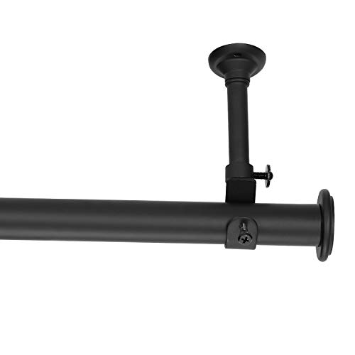 YunNephele Ceiling Curtain Rod 56-108 inch Matte Black,Adjustable Metal Single Window Curtain Rods Set,1 inch diameter Hanging /Wall Mount Drapery Rod
View Price
YunNephele Ceiling Curtain Rod 56-108 inch Matte Black,Adjustable Metal Single Window Curtain Rods Set,1 inch diameter Hanging /Wall Mount Drapery Rod
View Price
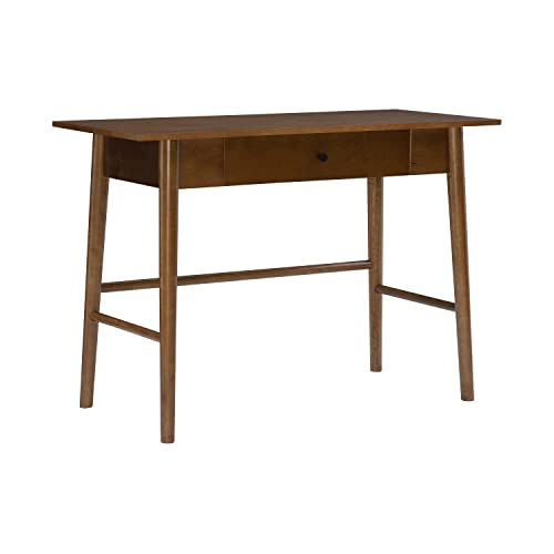 Melissa Mid Century Walnut Desk by Linon
View Price
Melissa Mid Century Walnut Desk by Linon
View Price
 LA JOLIE MUSE Small Wicker Baskets for Organizing, White 3 Pack
View Price
LA JOLIE MUSE Small Wicker Baskets for Organizing, White 3 Pack
View Price
 O'Bright Astrum - LED Desk Lamp with Dual USB Charging Ports, 100% Metal, 270 Degree Swivel Arms, Soft White Light (3000K), Bedside & Home Office Table Lamp, ETL Listed, Black
View Price
O'Bright Astrum - LED Desk Lamp with Dual USB Charging Ports, 100% Metal, 270 Degree Swivel Arms, Soft White Light (3000K), Bedside & Home Office Table Lamp, ETL Listed, Black
View Price
 Meekio Set of 2 Ivory Throw Pillow Covers 18x18, Modern Farmhouse Linen Blend Decorative Pillow Covers for Couch Sofa Bed, Neutral Home Decor
View Price
Meekio Set of 2 Ivory Throw Pillow Covers 18x18, Modern Farmhouse Linen Blend Decorative Pillow Covers for Couch Sofa Bed, Neutral Home Decor
View Price
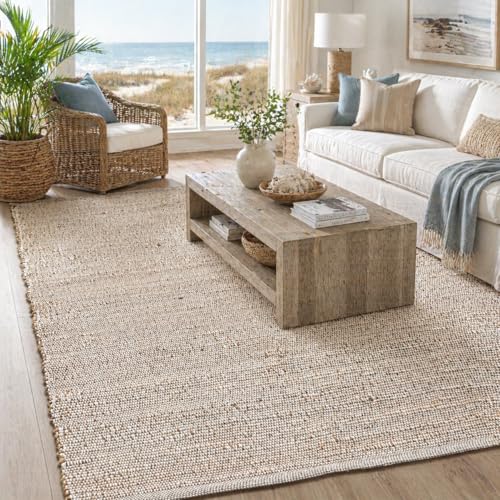 Chardin home 6x9 Jute Cotton Hand Woven Area Rug, Natural/Cream
View Price
Chardin home 6x9 Jute Cotton Hand Woven Area Rug, Natural/Cream
View Price
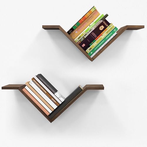 Mazjoaru Walnut Book Shelves for Wall, Modern Hanging Bookshelf Set of 2
View Price
Mazjoaru Walnut Book Shelves for Wall, Modern Hanging Bookshelf Set of 2
View Price