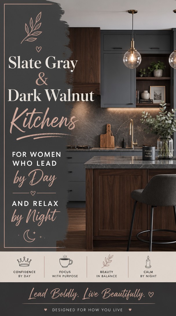
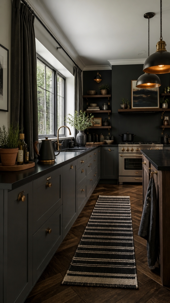
Slate Gray & Dark Walnut Kitchens for Women Who Lead by Day and Relax by Night
You spend your days leading, deciding, and showing up for everyone else—so your kitchen should feel like it’s showing up for you.
The rich pairing of slate gray with dark walnut creates a space that’s equal parts sophisticated and soul-soothing. Here’s how to bring this moody, grounded palette to life without losing warmth.
Table of Contents
Why Slate Gray and Dark Walnut Work Together
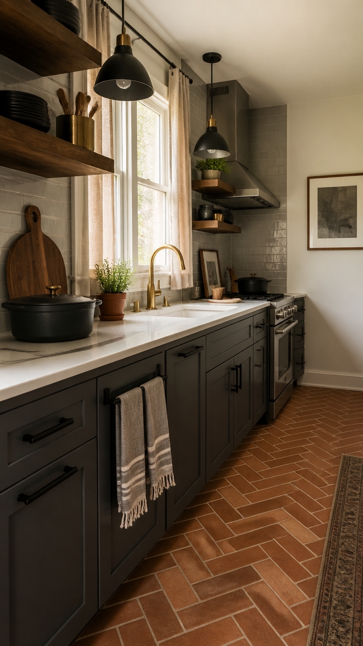
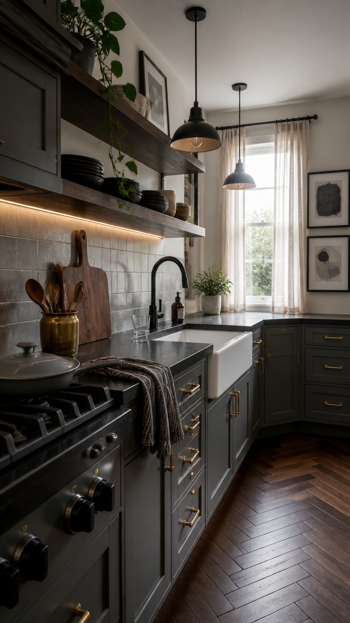
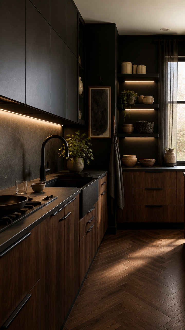
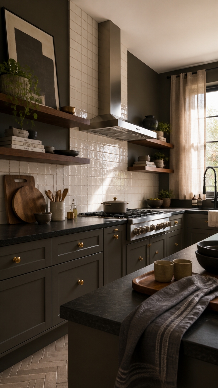
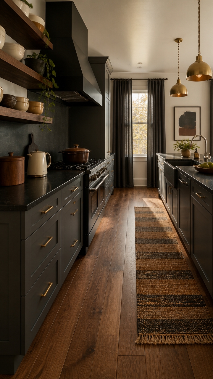
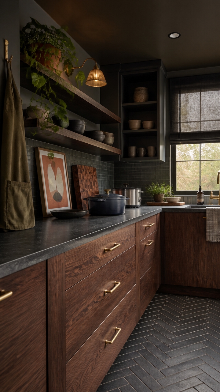
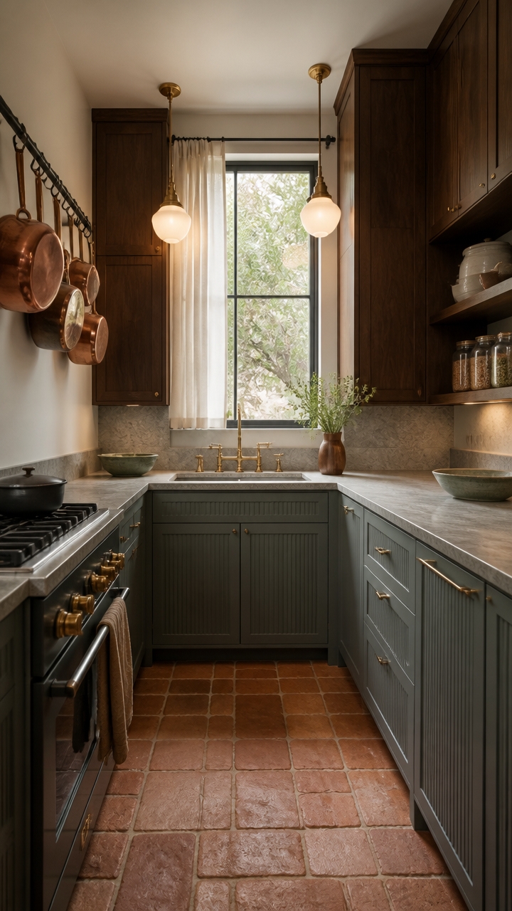
Slate gray and dark walnut create contrast without conflict because they share the same visual weight — both are deep, grounded tones that anchor a kitchen without competing for attention. Gray’s cool undertones pull the warmth out of walnut just enough to keep it from feeling heavy or dated. Use walnut on lower cabinets and open shelving, then let slate gray take the upper cabinets and walls so the room breathes without going flat.
Here’s how to nail it:
- Lead with walnut lower: Dark walnut on base cabinets grounds the room while keeping the visual mass low and stable.
- Gray holds the upper half: Slate gray on upper cabinets or walls prevents the kitchen from feeling like a dark cave.
- Metal matters here: Matte black or brushed bronze hardware bridges both tones without introducing a third color story.
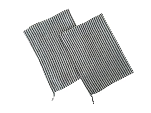
- Warm up with textiles: Cream, off-white, or rust linen dish towels and a kitchen runner stop the palette from reading cold.
DIY Paint Transformation
- Upper cabinets: Paint the upper cabinet faces in “Magnetic” (Sherwin-Williams SW 7058) – this true slate gray sits cool enough to contrast walnut without clashing.
- Accent wall: Paint the wall behind open walnut shelving in “Minwax Dark Walnut” tone matched to “Kona” (Benjamin Moore 2107-10) – this warm espresso-brown wall color makes floating shelves read as intentional, not heavy.
Shop The Look
- Slate gray ceramic pour-over coffee maker kitchen countertop
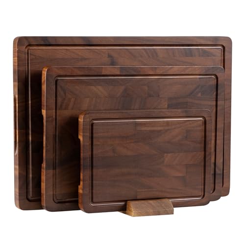
- Dark walnut wood cutting board large rectangular kitchen
- Charcoal enameled Dutch oven cast iron kitchen
- Dark walnut open floating shelf wall mount kitchen
- Slate gray linen dish towel set kitchen
- Matte black pendant light set modern kitchen
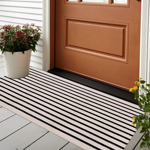
- Cream and charcoal striped kitchen runner rug cotton washable
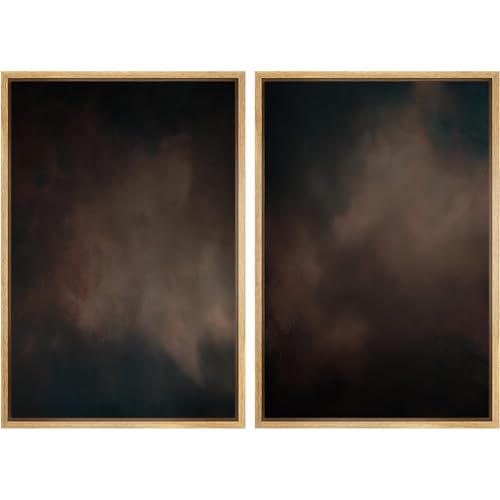
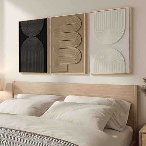
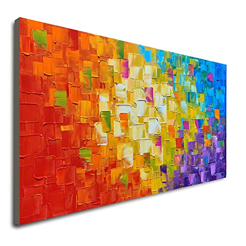
- Framed abstract kitchen wall art dark tones set


The Psychology Behind Dark, Moody Kitchen Palettes
Dark kitchens trigger a psychological shift that lighter spaces simply cannot — they lower cortisol, reduce visual noise, and create a contained environment where focused thinking happens naturally. The brain reads deep, saturated color as enclosure, and enclosure signals safety, which is why moody palettes feel productive rather than oppressive when done right. If you work in high-stakes environments all day, a dark kitchen gives you a decompression zone that matches your need for quiet authority at home.
Here’s how to nail it:
- Enclosure over openness: Dark walls pull the room inward, creating a sense of control that energizes rather than drains focused people.
- Reduce decision fatigue: A monochromatic dark palette eliminates visual competition, so your brain can rest between demands.
- Layer depth, not darkness: Stack matte, satin, and glossy finishes in the same dark tone to keep the room visually rich without adding clutter.
- Anchor with warmth: One warm-toned material — wood, brass, or terracotta — prevents the palette from reading as cold or sterile.
DIY Paint Transformation
- Upper cabinets: Paint the upper cabinet faces in “Tricorn Black” (Sherwin-Williams SW 6258) – this near-black with warm gray undertones deepens the kitchen without making it feel airless or closed off.
- Accent wall: Paint the wall behind the range or open shelving in “Kendall Charcoal” (Benjamin Moore HC-166) – this mid-depth charcoal creates a focal backdrop that makes dark walnut accents read as intentional and grounded.
Shop The Look
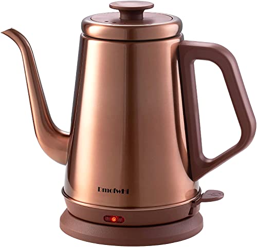
- Slate gray electric kettle gooseneck stainless steel kitchen countertop
- Dark walnut wood serving board large kitchen
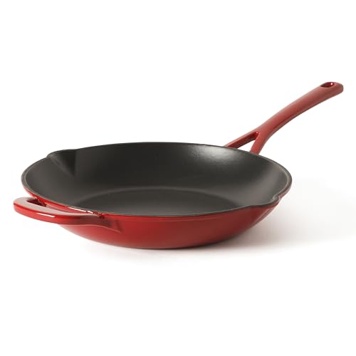
- Matte black enameled cast iron skillet kitchen
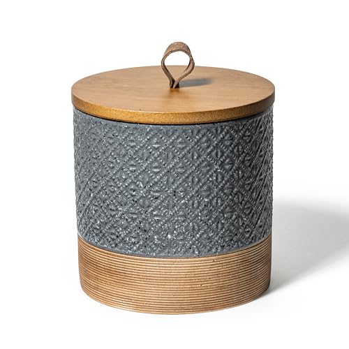
- Charcoal ceramic canister set airtight kitchen storage
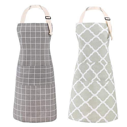
- Slate gray linen apron adjustable unisex kitchen
- Dark bronze pendant light set industrial kitchen
- Black and cream striped kitchen runner rug cotton washable
- Moody abstract kitchen wall art framed dark tones set


How Slate Gray Cabinetry Sets the Right Tone
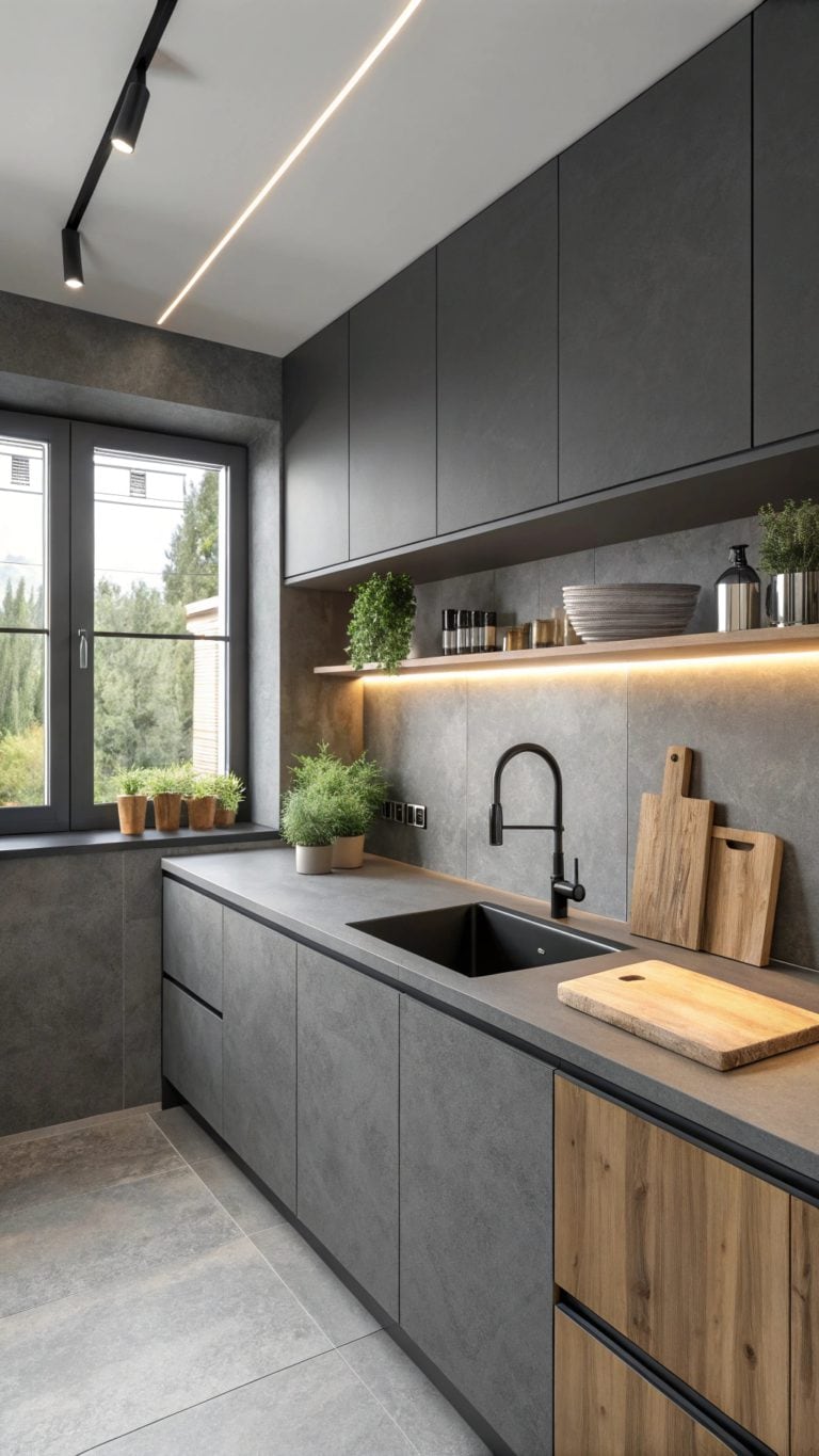
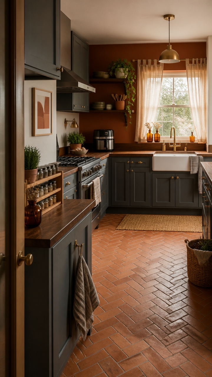
Slate gray cabinetry works because it occupies the middle ground between stark white and full black, giving your kitchen visual weight without the high-contrast drama that demands constant styling to look intentional. Gray reads as neutral but carries authority — it doesn’t compete with food, countertops, or natural light the way bolder colors do. Choose a gray with cool undertones for modern kitchens and one with green or brown undertones for spaces that lean warmer or more traditional.
Here’s how to nail it:
- Start with undertone: Hold cabinet samples against your countertop in natural light to confirm undertones match, not clash.
- Control the sheen: Use satin on cabinet faces for easy cleaning and a soft reflective quality that keeps gray from going flat.
- Limit competing colors: Slate gray pairs best with one accent — brass, black, or natural wood — not all three at once.
- Let hardware anchor the tone: Dark or warm-metal hardware tells the eye whether the gray reads cool and modern or warm and grounded.
DIY Paint Transformation
- Cabinet faces: Paint your lower cabinet faces in “Peppercorn” (Sherwin-Williams SW 7674) – this medium-depth slate gray with warm violet undertones grounds the kitchen without overpowering lighter countertops or upper walls.
- Accent wall: Paint the wall behind open shelving or the range in “Amherst Gray” (Benjamin Moore HC-167) – this blue-leaning slate creates a layered, tonal effect when paired with Peppercorn cabinetry below.
Shop The Look
- Slate gray toaster oven compact stainless steel kitchen countertop
- Matte black ceramic dinnerware set kitchen modern
- Dark walnut wood cutting board large kitchen
- Brass utensil holder ceramic kitchen countertop
- Slate gray linen dish towel set striped kitchen
- Charcoal enameled cast iron Dutch oven kitchen
- Black metal pendant light set kitchen industrial
- Abstract gray kitchen wall art framed set large


Which Slate Gray Cabinet Finishes Hold Up to Daily Use?
Painted slate gray cabinet finishes fail most often not because of color choice, but because of sheen level and primer quality. A factory-applied finish bonds differently than brush or roller paint, so DIY or refinished cabinets need a bonding primer and at least two coats of a hard-wearing enamel to hold up to daily grease, steam, and cleaning. Satin or semi-gloss finishes outperform flat or eggshell on cabinet doors because they resist moisture and wipe clean without breaking down the paint film.
Here’s how to nail it:
- Choose enamel over latex: Cabinet-specific enamel paint cures harder than standard wall paint and resists yellowing on gray tones over time.
- Avoid high-gloss on gray: High-gloss amplifies every brush mark and surface flaw, making gray cabinets look uneven under kitchen lighting.
- Test the finish at the hinge points: Hinges and drawer edges take the most wear — check these areas first when evaluating how a finish holds up after six months.
- Seal with a topcoat: A water-based polycrylic topcoat over painted slate gray cabinets adds an extra layer of protection without shifting the color warm.
DIY Paint Transformation
- Cabinet faces: Paint lower cabinet faces in “Peppercorn” (Sherwin-Williams SW 7674) – this medium-depth slate gray holds its tone under kitchen lighting without reading purple or brown as it ages.
- Accent wall: Paint the wall behind open shelving in “Amherst Gray” (Benjamin Moore HC-167) – this blue-leaning slate creates a layered tonal backdrop that makes the cabinet finish look intentional rather than flat.
Shop The Look
- Slate gray air fryer compact stainless steel kitchen countertop
- Matte black ceramic dinner plate set kitchen modern
- Dark walnut wood serving board large kitchen
- Brass finish utensil holder ceramic kitchen counter
- Charcoal linen dish towel set striped kitchen
- Gray enameled cast iron skillet preseasoned kitchen
- Black metal pendant light set kitchen modern
- Abstract gray framed wall art set large kitchen


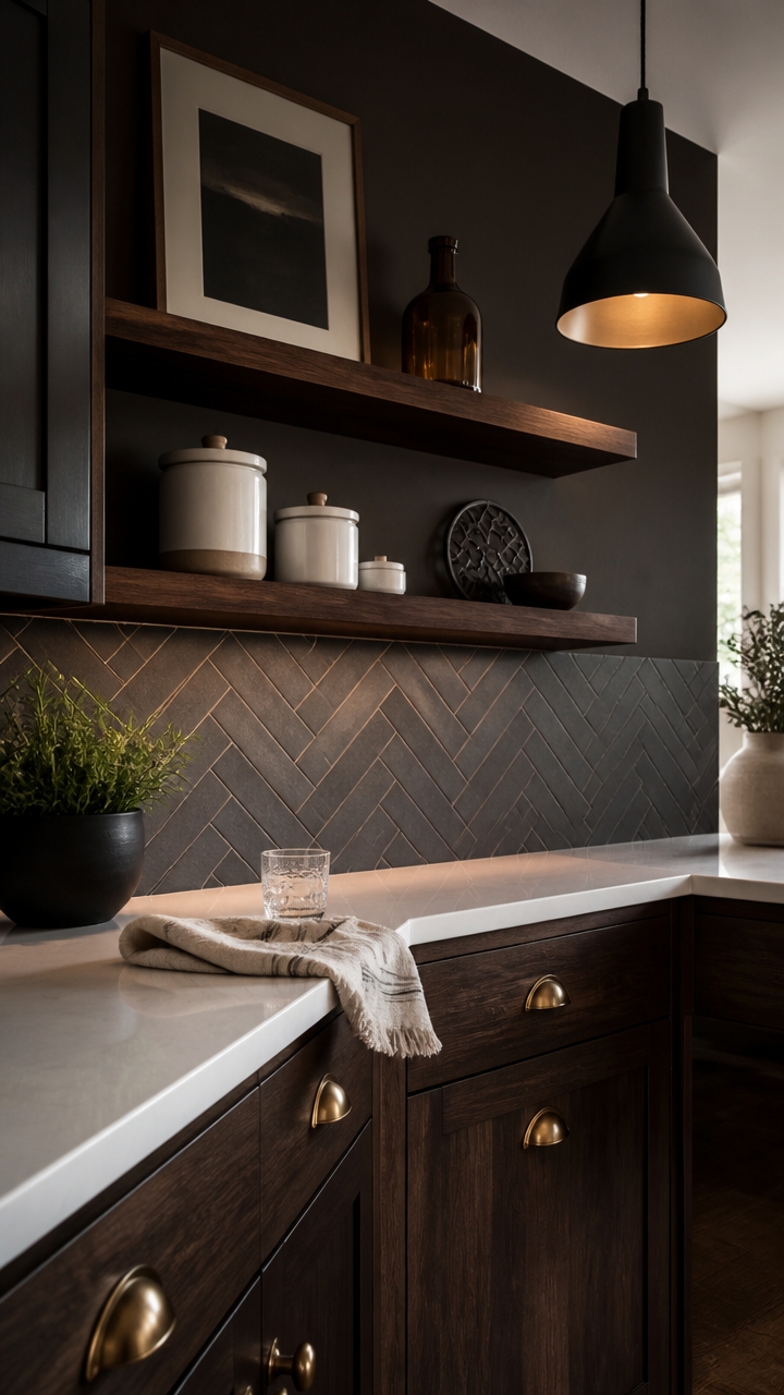
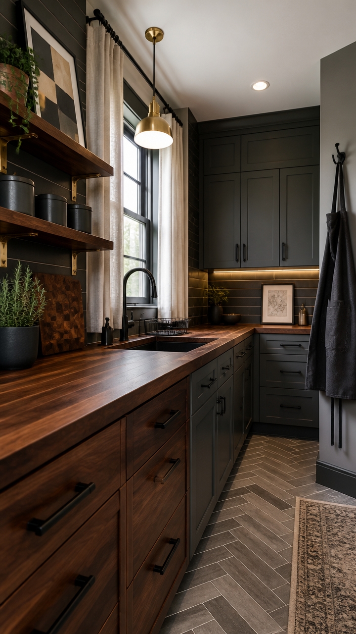
Dark Walnut Accents: Islands, Shelves, and Range Hoods
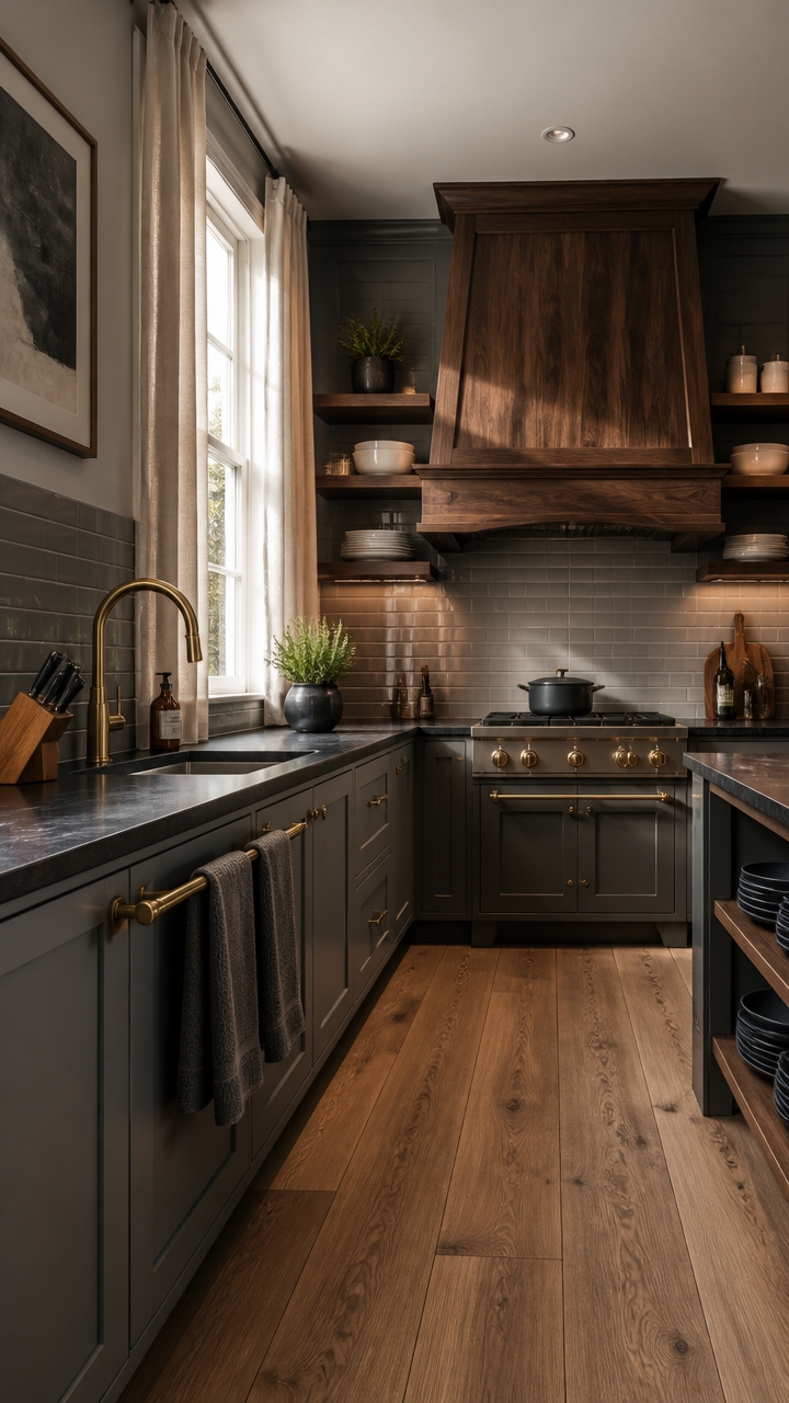
Dark walnut works best in a kitchen when it functions as a grounding element rather than a decorative afterthought — the grain and warmth of real walnut cut through the flatness of dark cabinetry in a way that stained oak or painted wood simply cannot replicate. Its natural variation in tone pulls warm undertones from slate gray without making the space feel golden or dated. Use it in three or fewer locations to avoid the layered-wood look that makes a kitchen feel heavy instead of rich.
Here’s how to nail it:
- Anchor with the island: A dark walnut island top or waterfall panel creates a visual center point that reads as furniture rather than construction.
- Float the shelves: Open walnut shelving above a counter or beside a range brings warmth at eye level, where painted cabinets above and below would otherwise feel like a closed box.
- Treat the hood as sculpture: A shiplap or solid walnut range hood surround becomes the focal wall in a kitchen — it replaces the need for a backsplash statement and tile budget in the same zone.
- Match the undertone, not the shade: Choose walnut with a medium-brown undertone rather than red-brown to stay in harmony with cool slate gray cabinet finishes.
DIY Paint Transformation
- Island base: Paint the island base in “Tricorn Black” (Sherwin-Williams SW 6258) – this near-true black grounds a dark walnut top without competing with its grain pattern or reading as a second wood tone.
- Accent wall behind open shelving: Paint the wall behind floating walnut shelves in “Kendall Charcoal” (Benjamin Moore HC-166) – this deep blue-gray backdrop makes walnut grain read warmer and more intentional against a dark kitchen palette.
Shop The Look
- Dark walnut wood floating wall shelf set kitchen modern
- Slate gray enameled cast iron Dutch oven kitchen stovetop
- Brass finish kitchen faucet single handle modern
- Matte black ceramic dinner plate set kitchen
- Walnut wood knife block set countertop kitchen
- Charcoal linen oven mitt and dish towel set kitchen
- Warm white LED under cabinet light bar kitchen plug-in
- Abstract dark toned framed wall art set large kitchen


Open Shelving vs. Closed Cabinetry in a Dark Kitchen
In a dark kitchen, open shelving pulls double duty — it breaks up visual weight while putting your most intentional pieces on display. Closed cabinetry keeps clutter hidden, which matters more in a dark palette where visual noise reads louder against deep finishes. The strongest approach combines both: closed cabinets for storage-heavy zones and open shelves placed where warmth and texture need to show up most.
Here’s how to nail it:
- Open shelves earn their spot: Place floating shelves only where you can style them with items worth seeing — walnut, ceramics, and plants rather than mismatched containers.
- Closed upper cabinets create enclosure: In a dark kitchen, upper cabinets in slate gray read as a cohesive wall rather than visual clutter when they stay uniform and handleless.
- Mix intentionally, not randomly: Stack closed cabinets on one run and open shelves on another — splitting them mid-wall on the same run looks unfinished rather than designed.
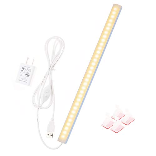
- Light the open zones: Install under-shelf LED lighting above open shelving so the display area glows instead of disappearing into the dark cabinet palette around it.
DIY Paint Transformation
- Open shelf wall backing: Paint the recessed wall behind floating shelves in “Tricorn Black” (Sherwin-Williams SW 6258) – this near-true black makes walnut grain and light ceramics pop against the dark surround without competing tones.
- Closed upper cabinet interior: Paint the inside of any glass-front closed cabinets in “Kendall Charcoal” (Benjamin Moore HC-166) – this deep blue-gray interior makes displayed objects read layered and intentional rather than floating in plain white.
Shop The Look
- Slate gray ceramic canister set airtight kitchen countertop storage
- Walnut wood open wall shelf bracket set kitchen floating
- Matte black ceramic bowl set nesting kitchen serveware
- Warm white LED plug-in under shelf light bar kitchen
- Charcoal linen kitchen apron adjustable unisex
- Cast iron enameled skillet kitchen stovetop dark
- Abstract dark toned framed wall art set large kitchen
- Black woven seagrass basket set open shelf kitchen storage


Countertops That Complement Slate Gray and Dark Walnut
Quartz and honed concrete are the two countertop materials that consistently hold their own against slate gray and dark walnut without competing with either. Quartz in a charcoal vein pattern echoes the gray cabinet tone while the stone’s natural movement prevents the surface from reading flat. Concrete-look quartz or actual honed concrete pulls the organic warmth from walnut grain rather than fighting it, which keeps the palette cohesive instead of busy.
Here’s how to nail it:
- Go veined, not solid: A charcoal or smoke-veined quartz reads as intentional contrast next to flat slate gray cabinets, while a solid gray slab disappears into the palette.
- Honed beats polished: A matte or honed finish on dark countertops holds up better visually next to walnut’s natural texture — polished surfaces reflect light in a way that flattens wood grain nearby.
- Keep the edge simple: A straight or eased edge on countertops keeps the look clean and modern against the heavy tones of gray and walnut without adding ornate detail that clutters the eye.
- Watch the undertone: Countertops with warm brown undertones tie back to walnut; countertops with cool blue undertones anchor the slate gray — pick one direction and commit.
DIY Paint Transformation
- Cabinet interiors: Paint the inside back walls of upper cabinets in “Peppercorn” (Sherwin-Williams SW 7674) — this warm slate gray turns open shelving into a moody, curated backdrop that makes dishware look intentional rather than stored.
- Kitchen accent wall: Paint the wall behind open shelving or a breakfast nook bench in “Kona” (Benjamin Moore 2107-10) — this deep walnut-toned brown deepens the dark palette without adding another hard material to the space.
Shop The Look
- Slate gray veined quartz countertop sample kit kitchen remodel
- Charcoal concrete look placemat set kitchen table
- Dark walnut wood cutting board end grain large kitchen
- Matte black pour-over coffee maker kitchen countertop
- Slate gray ceramic serving platter set kitchen
- Dark linen kitchen apron adjustable unisex neutral
- Charcoal and walnut abstract framed wall art large kitchen
- Black cast iron skillet pre-seasoned kitchen stovetop


Backsplash Tiles That Work With This Dark Palette
Subway tile and slab stone are the two backsplash formats that consistently hold a dark palette together without overwhelming it. In a slate gray and dark walnut kitchen, the backsplash functions as visual breathing room — it needs enough texture or pattern to stay interesting but not so much that it competes with two already-dominant materials. Stick to cool-toned neutrals, soft movement, and matte or honed finishes to keep everything grounded.
Here’s how to nail it:
- Choose warm whites over bright whites: A warm white or cream subway tile softens the contrast against dark walnut shelving better than a stark white that reads cold and clinical next to it.
- Lean into texture, not pattern: Handmade-style, zellige, or tumbled tile introduces enough surface variation to hold interest without adding a bold graphic element that fights the palette.
- Go matte over glossy: A glossy backsplash tile throws light back into the room in a way that visually breaks up the walnut grain — matte finishes let both materials read as equally intentional.
- Use grout as a design tool: Charcoal or warm gray grout on lighter tiles ties the backsplash back to the slate gray cabinets instead of creating a bright grid line that sections the wall.
DIY Paint Transformation
- Backsplash accent wall: Paint the wall section above open shelving in “Peppercorn” (Sherwin-Williams SW 7674) — this warm slate gray creates a moody, unified backdrop that makes tile and floating shelves read as one cohesive feature wall.
- Kitchen ceiling: Paint the ceiling in “Kona” (Benjamin Moore 2107-10) — this deep walnut-toned brown wraps the upper kitchen in warmth and makes lighter backsplash tiles pop against both the ceiling and dark cabinetry below.
Shop The Look
- Slate gray zellige peel and stick backsplash tile kitchen wall
- Warm white handmade-style ceramic subway tile kitchen backsplash
- Charcoal matte finish rectangular tile kitchen peel and stick
- Matte black electric kettle gooseneck stainless kitchen countertop
- Dark walnut wood serving board rectangular kitchen
- Slate gray linen dish towel set striped kitchen
- Charcoal and cream abstract framed wall art large kitchen
- Slate gray ceramic bowl set nesting kitchen


Hardware and Fixtures for a Slate and Walnut Kitchen
Matte black and brushed brass are the two finishes that anchor a slate and walnut kitchen without pulling it in competing directions. Black hardware reads as a natural extension of the dark cabinet palette, while brass adds warmth that echoes the golden undertones already living in the walnut grain. Use black for cabinet pulls and faucets, then let brass carry the lighter fixtures and accent details.
Here’s how to nail it:
- Match metal to surface weight: Heavier surfaces like cabinets and the sink get matte black hardware, while lighter elements like open shelving brackets and light fixtures carry the brass.
- Stay matte, not polished: Polished black reflects light in a way that competes with walnut grain — matte finishes let both materials hold equal visual weight.
- Limit to two finishes only: Introducing a third metal like chrome or nickel fractures the palette and makes the hardware feel accidental rather than designed.
- Scale pulls to cabinet size: Use longer bar pulls on lower cabinet drawers and shorter ones on upper doors so the hardware stays proportional and doesn’t visually overwhelm smaller panels.
DIY Paint Transformation
- Kitchen island or open shelving wall: Paint the accent wall behind open shelving in “Peppercorn” (Sherwin-Williams SW 7674) — this warm slate gray deepens the backdrop so matte black hardware disappears into the surface intentionally.
- Kitchen ceiling: Paint the ceiling in “Kona” (Benjamin Moore 2107-10) — this dark walnut-toned brown draws the eye upward and makes brass fixtures glow against a deep, rich overhead plane.
Shop The Look
- Matte black gooseneck bridge kitchen faucet modern
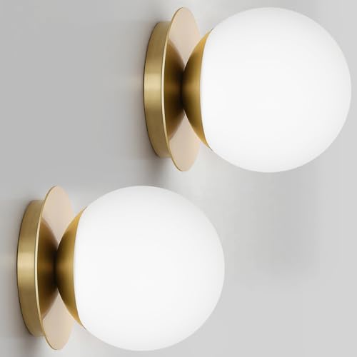
- Brushed brass pendant light kitchen island hanging
- Slate gray ceramic canister set airtight kitchen counter storage
- Dark walnut wood cutting board end grain kitchen large
- Brushed brass under-cabinet LED light bar kitchen
- Matte black dish drying rack compact kitchen countertop
- Slate and cream abstract framed wall art large kitchen
- Charcoal linen kitchen apron adjustable unisex


Lighting That Makes a Dark Kitchen Feel Warm, Not Heavy
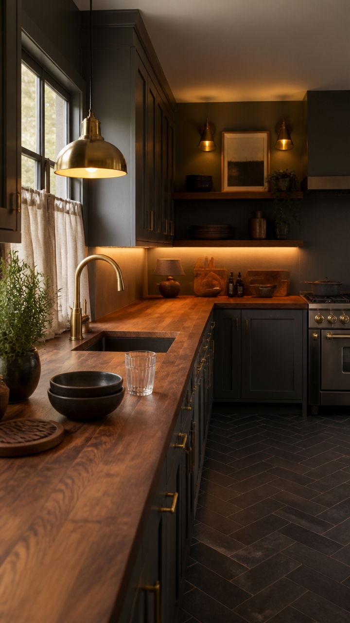
Layered light sources — not a single overhead fixture — are what keep a dark kitchen from feeling like a cave. When you stack ambient, task, and accent lighting at different heights, each layer catches a different surface and the room reads as intentional rather than dim. Aim for at least three light sources in any slate and walnut kitchen, and make sure at least one operates on a dimmer.
Here’s how to nail it:
- Go warm in color temperature: Choose bulbs rated at 2700K–3000K so the light pulls gold from the walnut instead of flattening it to brown.
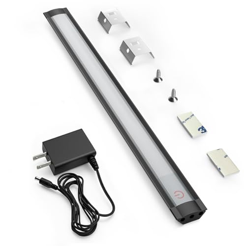
- Light the counters, not just the ceiling: Under-cabinet lighting eliminates the heavy shadow line that makes dark lower cabinets feel like a wall closing in.
- Use pendants to anchor the island: Hanging lights break up the vertical mass of tall slate cabinets and give the eye a mid-level resting point.
- Dim everything independently: Separate switches for overhead, task, and accent lighting let you shift the room from bright and functional to warm and settled without replacing a single bulb.
DIY Paint Transformation
- Kitchen accent wall behind open shelving: Paint the wall in “Peppercorn” (Sherwin-Williams SW 7674) — the warm slate gray makes brass pendant light fixtures glow against it like they were made for each other.
- Kitchen ceiling: Paint the ceiling in “Kona” (Benjamin Moore 2107-10) — this deep walnut-brown overhead plane absorbs harsh overhead light and reflects back a rich, amber-toned warmth.
Shop The Look
- Brushed brass dome pendant light kitchen island hanging
- Matte black under-cabinet LED light bar kitchen warm white
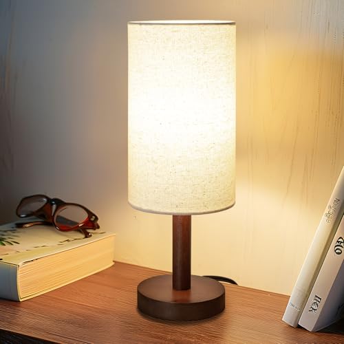
- Walnut wood table lamp base kitchen counter small
- Slate gray linen drum shade table lamp neutral
- Brass wall sconce set matte finish kitchen modern
- Charcoal ceramic serving bowl set nested kitchen
- Dark walnut wood trivet set heat-resistant kitchen counter
- Slate and amber abstract framed wall art large kitchen


Flooring That Grounds a Slate Gray and Walnut Kitchen
Engineered hardwood in a dark walnut finish is the strongest flooring choice for a slate gray and walnut kitchen because it pulls the cabinet color down to the ground and creates a unified vertical flow. When the floor, lower cabinets, and walnut open shelving share the same warm brown undertone, the room reads as a cohesive whole instead of a stack of competing materials. If hardwood isn’t in the budget, a large-format porcelain tile in warm taupe or charcoal achieves the same grounding effect without the maintenance concerns.
Here’s how to nail it:
- Match undertones, not shades: Walnut cabinets read warm brown, so choose flooring with gold or red undertones rather than cool gray-brown to avoid an undertone clash.
- Go large format: Bigger planks or tiles mean fewer grout lines and seams, which keeps the floor from visually fragmenting a room anchored by bold dark cabinetry.
- Add a runner at the sink: A washable kitchen runner in charcoal or warm amber breaks up the floor expanse and protects the finish where you stand the most.
- Keep the junction clean: Use the same flooring material from the kitchen into the adjacent dining or living area so the slate and walnut palette doesn’t get interrupted by a jarring threshold.
DIY Paint Transformation
- Kitchen accent wall behind open shelving: Paint the wall in “Peppercorn” (Sherwin-Williams SW 7674) — the cool slate gray anchors the walnut shelving above a dark floor without making the space feel like a tunnel.
- Kitchen ceiling: Paint the ceiling in “Kona” (Benjamin Moore 2107-10) — this deep walnut brown overhead plane echoes the floor color and pulls the entire room into one rich, layered envelope.
Shop The Look
- Dark walnut laminate flooring plank click lock kitchen
- Charcoal gray slate ceramic floor tile large format
- Washable cotton kitchen runner rug dark amber stripe
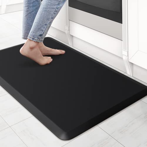
- Slate gray anti-fatigue mat kitchen sink standing
- Cast iron enameled Dutch oven walnut brown kitchen
- Dark walnut wood canister set kitchen counter storage
- Slate and walnut abstract framed wall art large kitchen
- Warm white gooseneck electric kettle matte kitchen countertop


How to Add Color Without Breaking the Palette
Color shows up best in a slate gray and walnut kitchen when it’s introduced through texture rather than painted surfaces. Warm terracotta, aged brass, deep olive, and muted burgundy all carry enough warmth to harmonize with walnut’s red-brown undertone without pulling the eye away from the cabinet palette. One rule that holds across all of these: keep each accent color contained to a single material category — all the green in the textiles, all the brass in the hardware, all the terracotta in the ceramics — so it registers as intentional instead of scattered.
Here’s how to nail it:
- Lead with warmth: Accent colors with gold, red, or brown undertones — terracotta, amber, olive — land naturally against walnut without fighting the base palette.
- Use the texture rule: Introduce color through tactile materials like linen dish towels, woven baskets, or matte ceramics so the eye reads it as depth, not decoration.
- Hold the line at three: One primary accent color, one supporting neutral, and the existing slate-walnut base is all the palette needs — a fourth color reads as clutter.
- Let greenery count: A potted herb or trailing plant adds living color that reads as intentional without committing to a permanent hue.
DIY Paint Transformation
- Kitchen accent wall behind open shelving: Paint the wall in “Roycroft Copper Red” (Sherwin-Williams SW 2839) — this muted terracotta tone bridges the walnut shelving and slate gray cabinetry with a warm earthy accent that feels collected, not loud.
- Kitchen island or lower cabinet refresh: Paint in “Pewter Green” (Sherwin-Williams SW 6208) — this deep muted olive reads as a near-neutral against slate gray while adding just enough color contrast to anchor the lower half of the kitchen.
Shop The Look
- Terracotta ceramic utensil holder large kitchen counter
- Matte olive green ceramic serving bowl set kitchen
- Dark amber glass bud vase set kitchen window
- Aged brass pendant light kitchen modern fixture
- Slate gray linen dish towel set kitchen striped
- Walnut wood spice rack countertop organizer kitchen
- Warm terracotta framed abstract wall art large kitchen
- Stainless steel air fryer compact kitchen countertop


Where to Spend and Where to Cut in This Design Style
Spending smart in a slate gray and walnut kitchen means protecting the elements that carry the most visual weight while cutting costs on the pieces that blend into the background. Cabinetry, countertops, and lighting fixtures are the anchors — skimping there shows immediately. Everything in the middle tier, from small appliances to cookware, is where you recover the budget without losing the look.
Here’s how to nail it:
- Spend on cabinetry: Solid walnut or quality walnut veneer fronts define the entire palette — this is not the place to substitute with faux wood laminate.
- Spend on countertops: Honed slate or a quality slate-look porcelain surface reads immediately as intentional; polished substitutes undercut the matte-forward aesthetic.
- Cut on open shelving: Standard oak or pine shelves stained to match walnut cost a fraction of custom built-ins and read identically at room distance.
- Cut on textiles and decor: Dish towels, ceramics, and baskets carry the accent color story — these are high-visibility, low-cost swap items that do real design work.
DIY Paint Transformation
- Upper cabinet interior back panels: Paint in “Peppercorn” (Sherwin-Williams SW 7674) — this deep slate tone deepens open shelving displays and makes walnut dishware and ceramics read like a styled vignette rather than storage.
- Kitchen ceiling: Paint in “Roycroft Walnut” (Sherwin-Williams SW 2767) — this warm brown-black pulls the walnut cabinetry upward and makes the slate gray lower zone feel anchored and intentional from every angle.
Shop The Look
- Slate gray linen Roman shade kitchen window light filtering
- Walnut wood cutting board large end grain kitchen
- Matte black ceramic serving bowl set kitchen modern
- Aged brass wall sconce set kitchen modern warm
- Cast iron enameled Dutch oven slate blue kitchen
- Olive green linen kitchen apron adjustable unisex
- Warm terracotta abstract framed wall art large kitchen
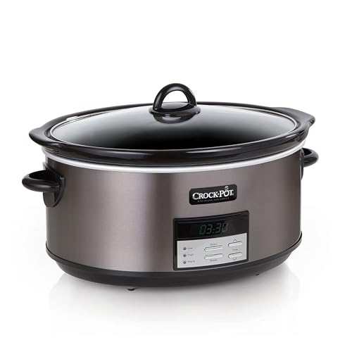
- Compact stainless steel slow cooker programmable kitchen countertop


Real Slate and Walnut Kitchens Worth Studying Closely
Real kitchens built around slate gray and walnut reward study because the color interaction changes completely depending on how much natural light the space receives. Warm walnut under flat northern light reads almost chocolate brown, while the same material under south-facing light glows amber — both versions need different gray tones to stay balanced. Use these documented spaces as calibration references, not blueprints.
Here’s how to nail it:
- Watch the undertone shift: Walnut grain reads warmer or cooler based on finish — satin finishes amplify warmth while matte finishes cool it down noticeably.
- Count the gray zones: Successful rooms use slate gray in at least two distinct areas — usually lower cabinets and flooring — to prevent the palette from feeling top-heavy.
- Study the crossover points: Where walnut meets slate gray hardware or counters is the moment that defines whether a kitchen feels curated or accidental.
- Note the lighting placement: Task lighting positioned under upper cabinets in these kitchens reveals grain texture in walnut and prevents slate gray surfaces from reading flat.
DIY Paint Transformation
- Kitchen island or lower cabinet interiors: Paint in “Peppercorn” (Sherwin-Williams SW 7674) – this deep slate tone reinforces the gray foundation and makes walnut grain appear richer by contrast.
- Kitchen ceiling: Paint in “Kaffee” (Sherwin-Williams SW 6104) – this warm brown-toned neutral pulls the walnut cabinetry upward and unifies the full palette from floor to ceiling.
Shop The Look
- Slate gray linen Roman shade kitchen window light filtering
- Walnut wood large end grain cutting board kitchen
- Matte black ceramic dinnerware set modern kitchen
- Aged brass pendant light set kitchen modern warm
- Cast iron enameled skillet slate gray kitchen stovetop
- Stainless steel electric kettle gooseneck kitchen countertop
- Dark walnut wood utensil holder large kitchen counter
- Warm terracotta abstract framed wall art large kitchen