When Warm Beige & Soft White Meets the Kitchen: A Guide for Women Who Crave a Quiet Mind

There’s something about pairing warm beige with soft white that can make a kitchen feel like a deep exhale—but only when you get the balance right.
These two neutrals may look simple, yet their undertones can clash or click depending on your light.
If you’ve been craving a calmer, more grounded kitchen, this guide will show you exactly where to start.
Why Warm Beige and Soft White Create a Calmer Kitchen
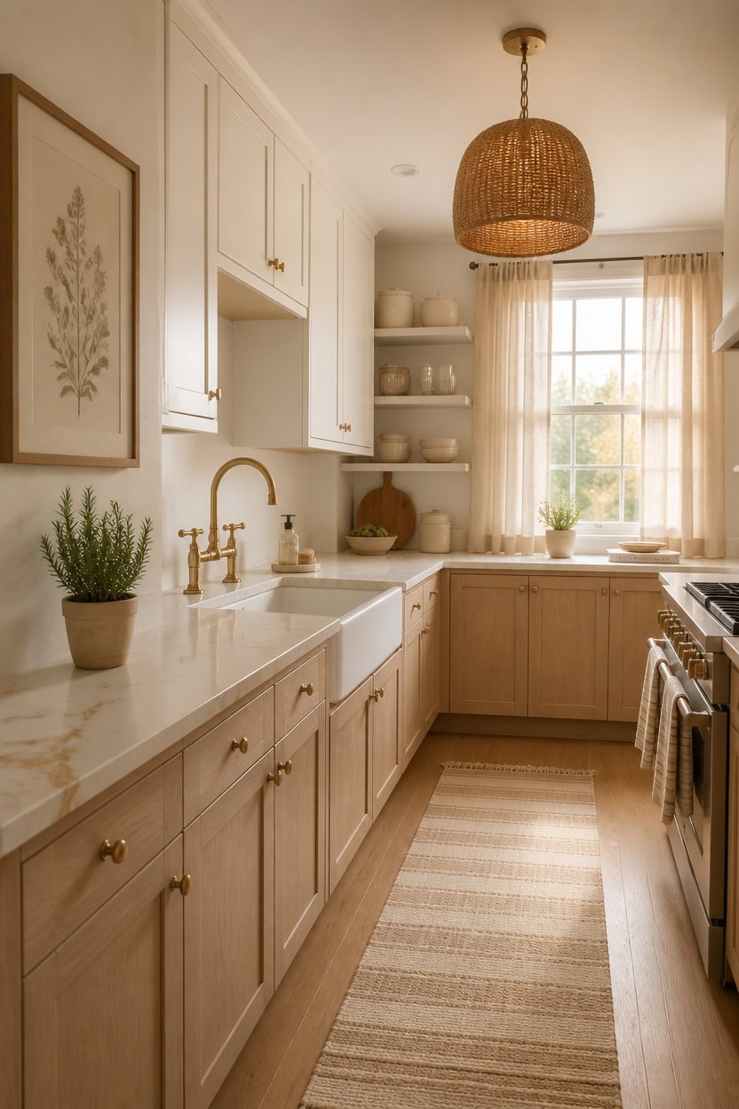
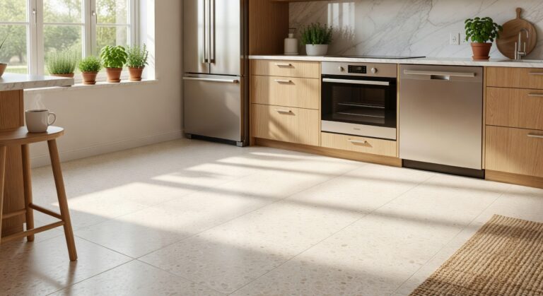
Warm beige and soft white lower visual noise in a kitchen by removing the sharp contrast that brighter whites or bold colors create. These tones share a similar undertone warmth, which means the eye moves across surfaces without stopping or tensing. Use beige on the heavier elements — lower cabinets, counters, or flooring — and soft white on walls and upper cabinets to keep the space feeling lifted and open.
Layer tones, not colors: Use at least two shades of beige and white together so the palette feels intentional instead of flat.
Warm your light source: Pair these tones with warm-white bulbs around 2700K to stop soft white from reading as cold or clinical.
Ground with texture: Add woven, linen, or wood textures so the neutral palette stays visually interesting without adding busy color.
Watch your undertones: Beige with pink undertones can clash with beige that pulls yellow — pull samples and compare them in your actual kitchen light.
a soft white with just enough warmth to prevent the upper half of your kitchen from feeling stark or cold.
this warm beige anchors the space and creates a gentle contrast that makes the whole kitchen feel cohesive.
 Stoneware Dinnerware Sets for 4, 12Pcs Ribbed Plates and Bowls Set, Beige
View Price
Stoneware Dinnerware Sets for 4, 12Pcs Ribbed Plates and Bowls Set, Beige
View Price
 Mecity Electric Gooseneck Kettle With Keep Warm Function & LCD Display Automatic Shut Off Coffee Kettle Temperature Control Pour Over Kettle 1200 Watt, 0.8L, 120V, Off White
View Price
Mecity Electric Gooseneck Kettle With Keep Warm Function & LCD Display Automatic Shut Off Coffee Kettle Temperature Control Pour Over Kettle 1200 Watt, 0.8L, 120V, Off White
View Price
 MosJos Kitchen Towels, Cotton Hand Towels, Sage Green and Cream Ribbed - Mini Weaved Stitched Set of 4 Absorbent Hand Drying Cloths, 18 x 28 Kitchen Linens
View Price
MosJos Kitchen Towels, Cotton Hand Towels, Sage Green and Cream Ribbed - Mini Weaved Stitched Set of 4 Absorbent Hand Drying Cloths, 18 x 28 Kitchen Linens
View Price
 ELYCCUPA 20”Hand Woven Rattan Chandelier Boho Pendant Light Adjustable Coastal Pendant Light for Kitchen Island Dining Living Room, White, UL Listed
View Price
ELYCCUPA 20”Hand Woven Rattan Chandelier Boho Pendant Light Adjustable Coastal Pendant Light for Kitchen Island Dining Living Room, White, UL Listed
View Price
 KOZYFLY Runners for Hallways 2x6 ft Washable Kitchen Runner Non Slip Rubber Backed Hall Runners Cotton Entryway Runner Rugs for Indoor Backdoor Bedroom Kitchen, Oatmeal Beige
View Price
KOZYFLY Runners for Hallways 2x6 ft Washable Kitchen Runner Non Slip Rubber Backed Hall Runners Cotton Entryway Runner Rugs for Indoor Backdoor Bedroom Kitchen, Oatmeal Beige
View Price
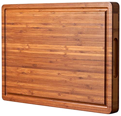 Allsum Extra Thick Wood Cutting Board for Kitchen, Reversible and Durable
View Price
Allsum Extra Thick Wood Cutting Board for Kitchen, Reversible and Durable
View Price
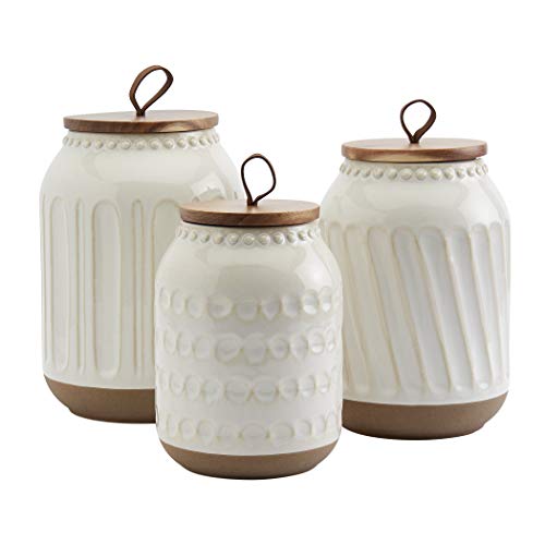 TTU Tabletops Gallery Ceramic Canister Collection- Stoneware Designed Kitchen Storage Embossed Acacia Wood White Set, 3 Piece Embossed Ziggy White Canister Set
View Price
TTU Tabletops Gallery Ceramic Canister Collection- Stoneware Designed Kitchen Storage Embossed Acacia Wood White Set, 3 Piece Embossed Ziggy White Canister Set
View Price
 LLEEMPI Sage Green Botanical Wall Art Set of 3, 16x24 Wood Framed Prints
View Price
LLEEMPI Sage Green Botanical Wall Art Set of 3, 16x24 Wood Framed Prints
View Price
What’s the Real Difference Between Warm Beige and Soft White?
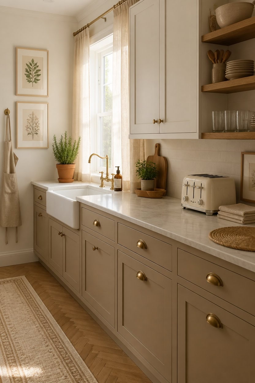
Warm beige sits closer to tan and carries yellow, brown, or peachy undertones that feel grounded and earthy. Soft white leans toward cream or off-white and reflects light instead of absorbing it, which is what keeps it from reading as stark. The practical difference is weight — beige feels heavier and more anchored, while soft white feels lighter and more open.
Undertone check: Hold beige and soft white samples side by side in your kitchen’s natural light to confirm they pull in the same direction.
Assign by surface weight: Use beige on heavier surfaces like lower cabinets or counters, and soft white on walls and upper cabinets where you want lift.
Test at different times: These tones shift dramatically between morning light and evening artificial light, so check samples across a full day before committing.
Avoid mixing undertone directions: Beige with a pink undertone paired with soft white that pulls blue will make both look off — match the warmth family.
this soft white keeps the upper half of your kitchen feeling airy without tipping into cold or clinical territory.
this warm beige adds visual weight exactly where the kitchen needs it most.
 AmorArc Stoneware Dinnerware Sets for 4,12 Pcs Plates and Bowls Set
View Price
AmorArc Stoneware Dinnerware Sets for 4,12 Pcs Plates and Bowls Set
View Price
 Jubatus 2 Pack 100% Cotton Aprons with 2 Pockets Cooking Chef Kitchen Adjustable Bib Apron for Women Men, Beige
View Price
Jubatus 2 Pack 100% Cotton Aprons with 2 Pockets Cooking Chef Kitchen Adjustable Bib Apron for Women Men, Beige
View Price
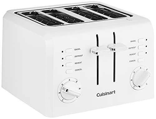 Cuisinart 4-Slice Compact Plastic Toaster, White, CPT-142P1
View Price
Cuisinart 4-Slice Compact Plastic Toaster, White, CPT-142P1
View Price
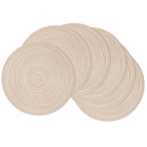 SHACOS 15 inch Round Placemats Set of 6, Cotton Polyester Woven Braided Place Mats, Washable Heat Resistant Circle Table Mats for Dining Table (Beige, 6)
View Price
SHACOS 15 inch Round Placemats Set of 6, Cotton Polyester Woven Braided Place Mats, Washable Heat Resistant Circle Table Mats for Dining Table (Beige, 6)
View Price
 Framed Farmhouse Botanical Floral Canvas Wall Art for Living Room, 24x36 In
View Price
Framed Farmhouse Botanical Floral Canvas Wall Art for Living Room, 24x36 In
View Price
 gorsent Acacia Wood Utensil Holder, 360° Rotating 7.3 in Kitchen Organizer
View Price
gorsent Acacia Wood Utensil Holder, 360° Rotating 7.3 in Kitchen Organizer
View Price
 Ruvanti Linen Napkins Set of 12, Linen Cotton Blend 18”x18” - Natural
View Price
Ruvanti Linen Napkins Set of 12, Linen Cotton Blend 18”x18” - Natural
View Price
 EARTHALL Woven Runner Rug 2x6 Ft Washable Runners for Hallways Cotton Non Slip Rubber Backed Kitchen Runner Braided Indoor Floor Carpet for Entryway, Hallway, Kitchen, Bedroom, Beige/Ivory
View Price
EARTHALL Woven Runner Rug 2x6 Ft Washable Runners for Hallways Cotton Non Slip Rubber Backed Kitchen Runner Braided Indoor Floor Carpet for Entryway, Hallway, Kitchen, Bedroom, Beige/Ivory
View Price
How These Two Shades Work Together Without Competing
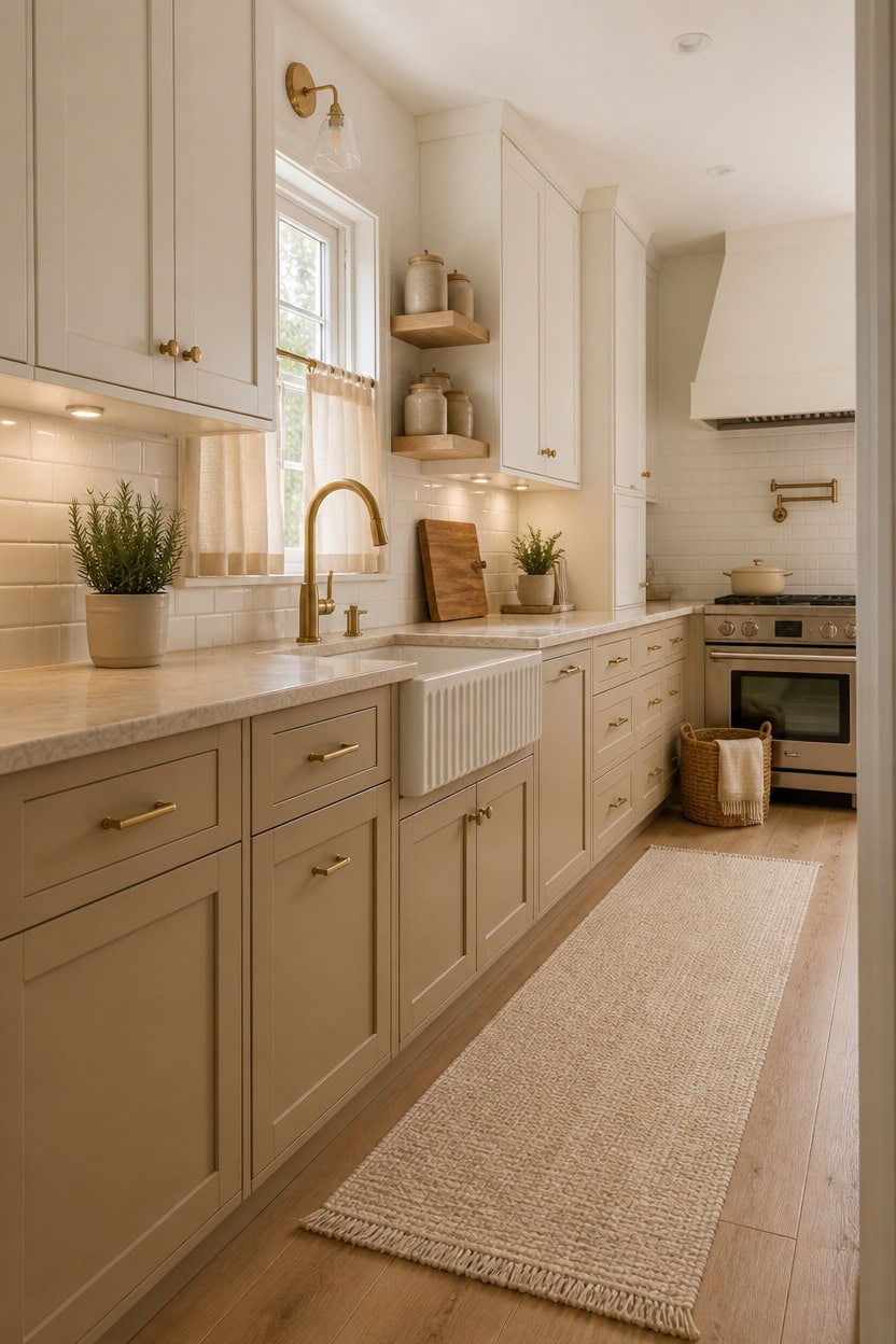
Warm beige and soft white stay out of each other’s way because one absorbs light while the other reflects it, creating natural contrast without visual competition. That difference in light behavior is what gives each shade its own lane — beige grounds a surface, and soft white lifts it. Use the surfaces themselves to separate the two: heavier materials like lower cabinets and counters carry beige, while walls and upper cabinets carry soft white.
Let contrast do the work: Place soft white directly above or adjacent to beige so the light difference between them reads as intentional layering.
Repeat each tone twice: Beige and soft white should each appear in at least two spots so neither reads as an accident or afterthought.
Anchor with a hard edge: A countertop or open shelf between beige lowers and soft white uppers creates a natural break that keeps both tones reading cleanly.
Keep textures aligned: Pair matte beige with matte soft white, or satin with satin — mismatched sheens create more visual noise than the color difference itself.
this pure soft white reflects light upward and keeps the top half of your kitchen feeling open and uncluttered.
this warm, grounded beige anchors the base of the kitchen and makes the soft white above it look intentional rather than accidental.
 KooK Ceramic Nesting Bowls, Embossed, Oven Safe, Set of 4, Ivory
View Price
KooK Ceramic Nesting Bowls, Embossed, Oven Safe, Set of 4, Ivory
View Price
 LANE LINEN Dish Towels for Kitchen Cotton Soft & Absorbent 4 Pack - Beige
View Price
LANE LINEN Dish Towels for Kitchen Cotton Soft & Absorbent 4 Pack - Beige
View Price
 PUBMIND Kitchen Bib Chef Apron for Women Men, Beige, 1 Count
View Price
PUBMIND Kitchen Bib Chef Apron for Women Men, Beige, 1 Count
View Price
 Posprica Woven Storage Baskets for Organizing, Small Black Baskets Cube Bin Container Tote Organizer Divider for Drawer, Closet, Shelf, Dresser, Set of 4(Beige)
View Price
Posprica Woven Storage Baskets for Organizing, Small Black Baskets Cube Bin Container Tote Organizer Divider for Drawer, Closet, Shelf, Dresser, Set of 4(Beige)
View Price
 FWIEXA 3D Beige White Floral Canvas Wall Art Set 3,Texture Neutral Botanical Framed Prints, Rustic Farmhouse Flower Paintings,24x36In Watercolor Minimalist Magnolia Artwork for Living Room,Bedroom,Office
View Price
FWIEXA 3D Beige White Floral Canvas Wall Art Set 3,Texture Neutral Botanical Framed Prints, Rustic Farmhouse Flower Paintings,24x36In Watercolor Minimalist Magnolia Artwork for Living Room,Bedroom,Office
View Price
 NIRMAN Acacia Wood Rectangular Wooden Platters for Home Decor, Food, Vegetables, Fruit, Charcuterie, Appetizer Serving Tray (13" x 5.5" x 0.75") (Set of 3)
View Price
NIRMAN Acacia Wood Rectangular Wooden Platters for Home Decor, Food, Vegetables, Fruit, Charcuterie, Appetizer Serving Tray (13" x 5.5" x 0.75") (Set of 3)
View Price
 ZEBERBO 4 Piece Airtight Ceramic Canister Set With Attached Wooden Spoon Reusable Chalk Labels For Dry Goods Sugar Coffee Tea Kitchen Storage Use (Cream)
View Price
ZEBERBO 4 Piece Airtight Ceramic Canister Set With Attached Wooden Spoon Reusable Chalk Labels For Dry Goods Sugar Coffee Tea Kitchen Storage Use (Cream)
View Price
Small Kitchens Benefit Most From This Color Pairing
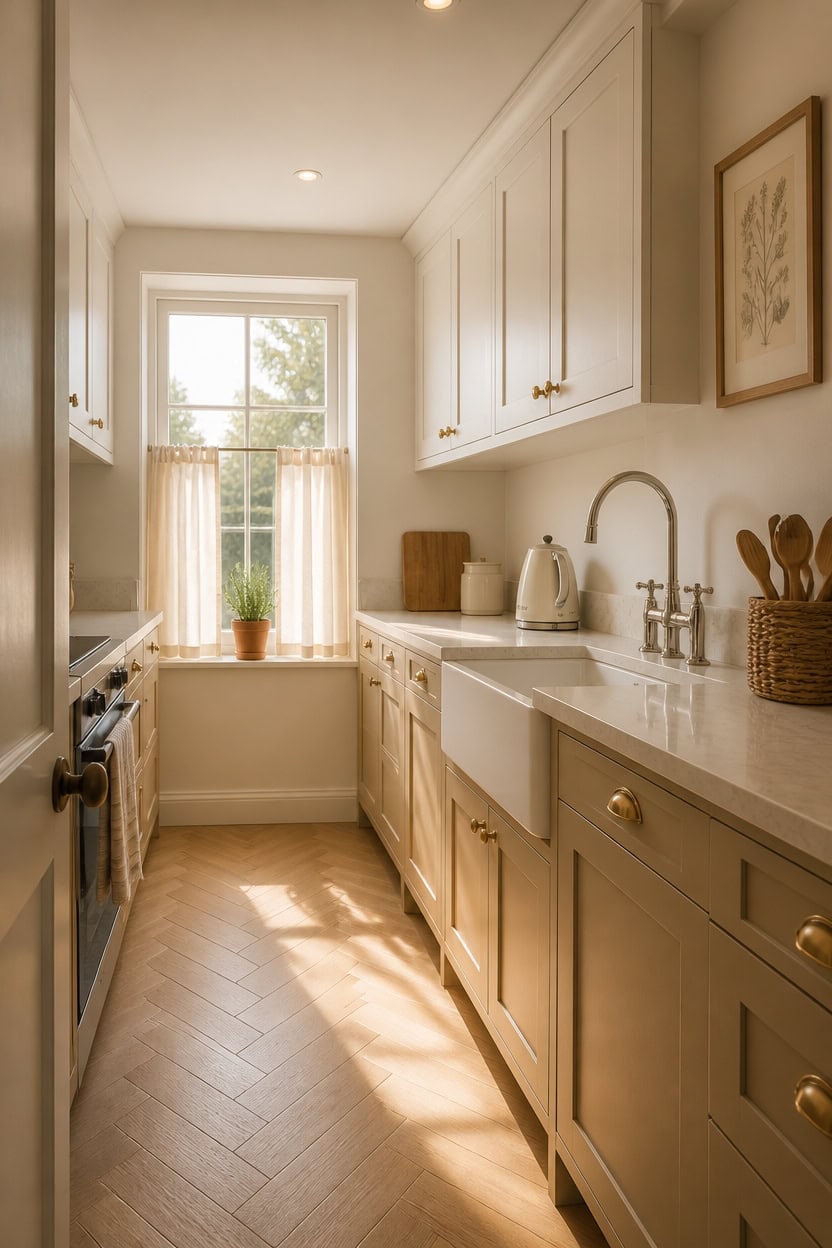
Small kitchens gain the most from warm beige and soft white because both colors reflect and absorb light in ways that push walls back visually without requiring extra square footage. Beige on lower surfaces keeps the floor zone grounded while soft white on upper surfaces and walls makes the ceiling feel higher. That upward light lift is what makes a compact kitchen feel less boxed in on all sides.
Keep lowers light: Warm beige on lower cabinets reads as grounded without pulling the walls closer the way dark colors do.
Open the ceiling zone: Soft white on upper cabinets and walls directs the eye upward, which adds perceived height in tight spaces.
Limit pattern: In a small kitchen, solid beige and solid soft white do more work than any patterned mix — pattern competes with the light trick.
Use reflective surfaces sparingly: One glossy soft white surface, like an upper cabinet door, bounces light further than matte finishes alone.
this warm soft white keeps the walls from feeling cold or stark while visually expanding the room.
this grounded warm beige anchors the base without closing in the already limited floor space.
 Famiware Pluto 12-Piece Stoneware Dinnerware Set, Matte Beige White
View Price
Famiware Pluto 12-Piece Stoneware Dinnerware Set, Matte Beige White
View Price
 Epeios Gooseneck Electric Kettle With Temp Control,1200W,0.9L,Cream White
View Price
Epeios Gooseneck Electric Kettle With Temp Control,1200W,0.9L,Cream White
View Price
 LANE LINEN Kitchen Dish Towels 100% Cotton Soft & Absorbent 6 Pack - Beige
View Price
LANE LINEN Kitchen Dish Towels 100% Cotton Soft & Absorbent 6 Pack - Beige
View Price
 Wicker Baskets with Liner for Counter, Natural Paper Rope Rattan Storage Basket,Hand Woven Pantry Table Organizer Bins for Bedroom Living Room Bathroom School Shelves Office Desk (3 Pack Beige)
View Price
Wicker Baskets with Liner for Counter, Natural Paper Rope Rattan Storage Basket,Hand Woven Pantry Table Organizer Bins for Bedroom Living Room Bathroom School Shelves Office Desk (3 Pack Beige)
View Price
 Gtencemen Small Acacia Wood Cutting Boards for Kitchen with Hanging
View Price
Gtencemen Small Acacia Wood Cutting Boards for Kitchen with Hanging
View Price
 Ceramic Kitchen Canisters for Countertop Set of 3 w/Airtight Bamboo Lids
View Price
Ceramic Kitchen Canisters for Countertop Set of 3 w/Airtight Bamboo Lids
View Price
Choose Your Starting Point: Walls, Cabinets, or Both
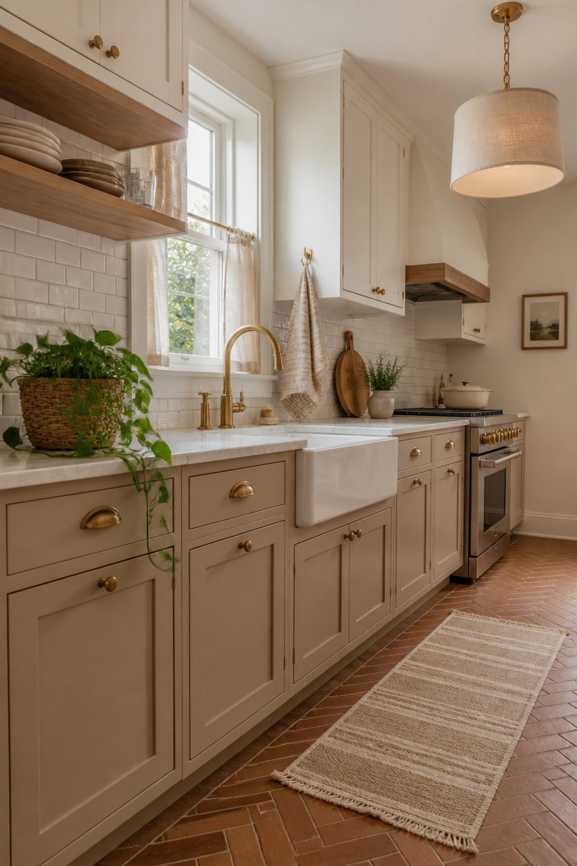
Deciding where to start — walls, cabinets, or both — depends on what you own right now and what you’re willing to commit to changing. If your cabinets are builder-grade white or a dated oak, starting with cabinet color gives you the biggest visual return because cabinets cover the most surface area in a kitchen. If your cabinets are staying, walls are the faster, lower-cost move that still shifts the whole feel of the space.
Start with cabinets if: Your cabinetry is the most dated or mismatched element — paint there first and let walls respond.
Start with walls if: Your cabinets are neutral or staying untouched — wall color sets the tone with less labor and cost.
Do both when: You’re doing a full refresh or the current combo is fighting itself — mismatched undertones kill the warmth.
Test before committing: Sample both surfaces in the same lighting before buying full quantities — kitchen light shifts color more than any other room.
this soft warm white unifies the space without flattening it, giving the room a clean but livable backdrop.
this grounded warm beige anchors the base and creates a layered two-tone look that feels intentional rather than default.
 AmorArc Ceramic Dinnerware Sets for 8, 24Pcs Plates and Bowls Sets Dishes
View Price
AmorArc Ceramic Dinnerware Sets for 8, 24Pcs Plates and Bowls Sets Dishes
View Price
 DII 100% Cotton Solid Chambray Kitchen Set, Chef Apron, Natural, 1 Piece
View Price
DII 100% Cotton Solid Chambray Kitchen Set, Chef Apron, Natural, 1 Piece
View Price
 Kikcoin 20”×14” Bamboo Cutting Boards for Kitchen, Wooden Healthy Cutting Boards for Charcuterie, Vegetables, Cheese, Bread, Extra Large Chopping Boards with Deep Juice Groove and Handle, Natural
View Price
Kikcoin 20”×14” Bamboo Cutting Boards for Kitchen, Wooden Healthy Cutting Boards for Charcuterie, Vegetables, Cheese, Bread, Extra Large Chopping Boards with Deep Juice Groove and Handle, Natural
View Price
 Hand-Woven Rattan-Style Storage Basket with Handles, Beige Oval Organizer Tray for Bathroom Kitchen Living Room | Fruit, Snack, Cosmetic & Toiletries Organizer | Decorative Multi-Purpose Basket
View Price
Hand-Woven Rattan-Style Storage Basket with Handles, Beige Oval Organizer Tray for Bathroom Kitchen Living Room | Fruit, Snack, Cosmetic & Toiletries Organizer | Decorative Multi-Purpose Basket
View Price
 Enameled Cast Iron Dutch Oven - Umite Chef 5QT Pot with Lid & Cotton Potholders - Heavy-Duty Cookware for Bread Baking, Braising, Stews, Roasting(Cream White)
View Price
Enameled Cast Iron Dutch Oven - Umite Chef 5QT Pot with Lid & Cotton Potholders - Heavy-Duty Cookware for Bread Baking, Braising, Stews, Roasting(Cream White)
View Price
 KOZYFLY Runners for Hallways 2x5 ft Washable Kitchen Runner Non Slip Rubber Backed Hall Runners Cotton Entryway Runner Rugs for Indoor Backdoor Bedroom Kitchen, Oatmeal Beige
View Price
KOZYFLY Runners for Hallways 2x5 ft Washable Kitchen Runner Non Slip Rubber Backed Hall Runners Cotton Entryway Runner Rugs for Indoor Backdoor Bedroom Kitchen, Oatmeal Beige
View Price
Kitchen Runners for This Palette
Rugs USA best-selling kitchen runners in this palette's colors, linked in 2' 6" x 6', the size for the floor in front of the sink and stove. Many are machine washable.
- Free shipping
- 30-day returns
- 210,000+ five-star reviews
 Chunky Jute Tasseled Rug – Off White
View Price
Chunky Jute Tasseled Rug – Off White
View Price
 Softest Knit Wool Rug – Off White
View Price
Softest Knit Wool Rug – Off White
View Price
 Jute Braided Rug – Off White
View Price
Jute Braided Rug – Off White
View Price
 Jute Braided Saturn Border Rug – Off White
View Price
Jute Braided Saturn Border Rug – Off White
View Price
 Simple Serpent Rug – Black & Off White
View Price
Simple Serpent Rug – Black & Off White
View Price
 Jute And Denim Even Stripes Rug – Off White
View Price
Jute And Denim Even Stripes Rug – Off White
View Price
 Handwoven Jute Jagged Chevron Rug – Off White
View Price
Handwoven Jute Jagged Chevron Rug – Off White
View Price
 Handwoven Jute Ribbed Solid Rug – Off White
View Price
Handwoven Jute Ribbed Solid Rug – Off White
View Price
 Perfect Handwoven Jute-Blend Rug – Natural
View Price
Perfect Handwoven Jute-Blend Rug – Natural
View Price
 Jute Braided Rug – Natural
View Price
Jute Braided Rug – Natural
View Price
 Chunky Jute Tasseled Rug – Natural
View Price
Chunky Jute Tasseled Rug – Natural
View Price
 Forever Vintage Rug – Neutral
View Price
Forever Vintage Rug – Neutral
View Price
 Floral Ornament Rug – Ivory
View Price
Floral Ornament Rug – Ivory
View Price
 Hand Woven Jute with Wool Fringe Rug – Natural
View Price
Hand Woven Jute with Wool Fringe Rug – Natural
View Price
 Seagrass with Border Rug – Beige
View Price
Seagrass with Border Rug – Beige
View Price
 Handwoven Jute Ribbed Solid Rug – Natural
View Price
Handwoven Jute Ribbed Solid Rug – Natural
View Price
 Brenda Hazy Heraldry Washable Rug – Beige
View Price
Brenda Hazy Heraldry Washable Rug – Beige
View Price
 Everywhere Hand-Braided Indoor/Outdoor Rug – Ivory
View Price
Everywhere Hand-Braided Indoor/Outdoor Rug – Ivory
View Price
 Handspun Jute Rug – Natural
View Price
Handspun Jute Rug – Natural
View Price
 Fading Herati Medallion Rug – Beige
View Price
Fading Herati Medallion Rug – Beige
View Price
 Scandinavia Diamond Rug – Beige
View Price
Scandinavia Diamond Rug – Beige
View Price
 Vanni Checkered Fringed Rug – Beige
View Price
Vanni Checkered Fringed Rug – Beige
View Price
 Melrose Checked Rug – Cream
View Price
Melrose Checked Rug – Cream
View Price
 Timeless Charm Spill Proof Washable Rug – Beige
View Price
Timeless Charm Spill Proof Washable Rug – Beige
View Price
 Ricki Mottled Abstract Rug – Beige
View Price
Ricki Mottled Abstract Rug – Beige
View Price
 Melange Tiles Rug – Beige
View Price
Melange Tiles Rug – Beige
View Price
 Aylin Diamond Tasseled Rug – Beige
View Price
Aylin Diamond Tasseled Rug – Beige
View Price
 Patricia Jute and Wool Rug – Ivory
View Price
Patricia Jute and Wool Rug – Ivory
View Price
 Ruth Washable Splatter Rug – Ivory
View Price
Ruth Washable Splatter Rug – Ivory
View Price
 Paddle Rug – Ivory
View Price
Paddle Rug – Ivory
View Price
 Rosette Medallion Fringed Rug – Beige
View Price
Rosette Medallion Fringed Rug – Beige
View Price
 Cardinal Cartouche Rug – Beige
View Price
Cardinal Cartouche Rug – Beige
View Price
 Sisal Border Rug – Beige
View Price
Sisal Border Rug – Beige
View Price
 Shia Bordered Washable Indoor/Outdoor Rug – Beige
View Price
Shia Bordered Washable Indoor/Outdoor Rug – Beige
View Price
 Native Collage Rug – Beige
View Price
Native Collage Rug – Beige
View Price
 Meena Fading Garden Spill Proof Washable Rug – Beige
View Price
Meena Fading Garden Spill Proof Washable Rug – Beige
View Price
 Bayberry Spill Proof Vintage Washable Rug – Sand
View Price
Bayberry Spill Proof Vintage Washable Rug – Sand
View Price
 Speckled Wool-Blend Rug – Wheat
View Price
Speckled Wool-Blend Rug – Wheat
View Price
 Diamond Pinstripes Washable Rug – White
View Price
Diamond Pinstripes Washable Rug – White
View Price
 Moroccan Washable Rug – White
View Price
Moroccan Washable Rug – White
View Price
The Best Warm Beige Paint Shades for a Kitchen That Breathes
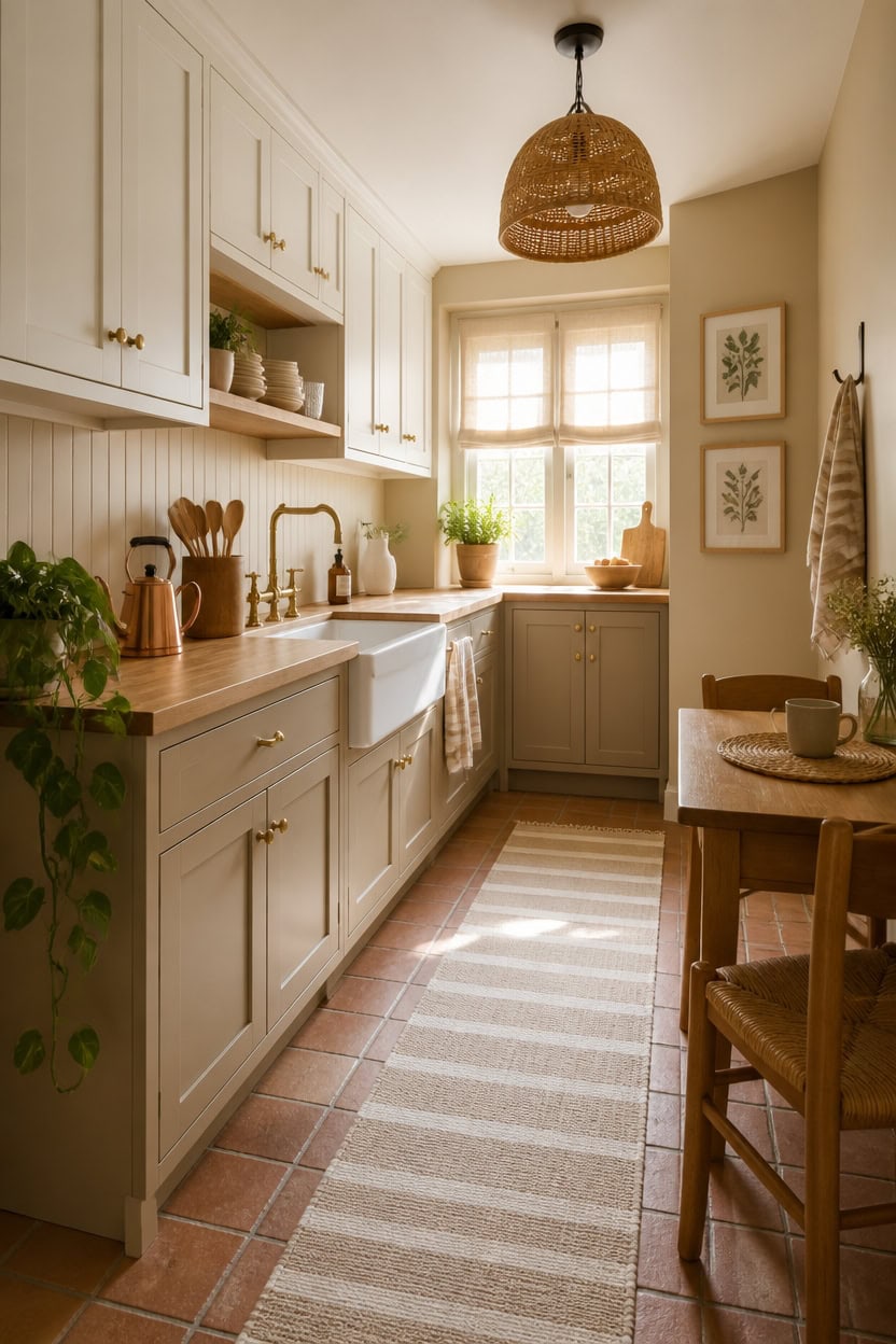
Warm beige paint shades work best in kitchens when they lean toward yellow-red undertones rather than gray or pink, because gray-based beiges go flat under the cool, inconsistent light most kitchens deal with. Yellow-red undertones hold warmth even under harsh overhead lighting, which is where pink and gray-leaning beiges tend to fail. Test any beige sample next to your existing cabinetry and countertop material in both natural morning light and artificial evening light before committing.
Undertone first: Check the wet paint chip against white trim — if beige looks pink or gray, keep looking.
Depth matters: Lighter beiges work on walls; deeper, grounded beiges anchor lower cabinets without overpowering the space.
Pair with warm whites: Beige fights cool whites — always pair with a white that shares yellow or cream undertones.
Natural materials amplify warmth: Wood, linen, and rattan next to warm beige walls make the color read richer without going darker.
this soft warm beige shifts from barely-there blush to honeyed neutral depending on the light, keeping the room feeling open and lived-in.
this creamy soft white lifts the upper zone while staying warm enough to harmonize with the beige walls below.
 AmorArc Ceramic Dinnerware Sets for 12,36Pcs Plates and Bowls Sets Dishes
View Price
AmorArc Ceramic Dinnerware Sets for 12,36Pcs Plates and Bowls Sets Dishes
View Price
 Niviy Burlap Placemats Set of 4, 12x18 Inch Natural Cotton Jute and Kitchen Woven Placemats with Tassels for Dining Table Centerpiece Thanksgiving Home Decorations
View Price
Niviy Burlap Placemats Set of 4, 12x18 Inch Natural Cotton Jute and Kitchen Woven Placemats with Tassels for Dining Table Centerpiece Thanksgiving Home Decorations
View Price
 Persilux Light Filtering Roman Shades for Indoor Windows Cordless,Pull Down Linen Fabric Roman Blinds,Privacy Window Shades for Door,Bedroom,Office,Easy to Install,Light Filtering-Cream,Custom Size
View Price
Persilux Light Filtering Roman Shades for Indoor Windows Cordless,Pull Down Linen Fabric Roman Blinds,Privacy Window Shades for Door,Bedroom,Office,Easy to Install,Light Filtering-Cream,Custom Size
View Price
 HoJang Gooseneck Electric Kettle 1.0L,1000W, Smart, Pour Over, Copper
View Price
HoJang Gooseneck Electric Kettle 1.0L,1000W, Smart, Pour Over, Copper
View Price
 KAF Home Assorted Flat Kitchen Towels - Set of 10, 18 x 28 Inch (Beige)
View Price
KAF Home Assorted Flat Kitchen Towels - Set of 10, 18 x 28 Inch (Beige)
View Price
 Large Acacia Wood Utensil Holder, Countertop Kitchen Storage Organizer
View Price
Large Acacia Wood Utensil Holder, Countertop Kitchen Storage Organizer
View Price
 Liswit Framed Boho Wall Art Set of 4 for Wooded Minimalist Botanical Print Wall Art for Rustic Vintage Farmhouse Home Kitchen Wall Decor (Brown, 12x16)
View Price
Liswit Framed Boho Wall Art Set of 4 for Wooded Minimalist Botanical Print Wall Art for Rustic Vintage Farmhouse Home Kitchen Wall Decor (Brown, 12x16)
View Price
Soft White Paint Colors That Don’t Look Cold or Sterile
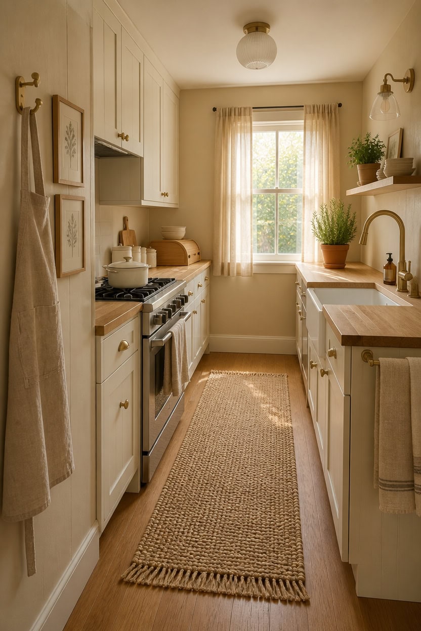
Soft whites that stay warm depend almost entirely on their undertones — yellows and creams keep a white from reading clinical, while blue-based whites turn a kitchen into a cold, fluorescent-feeling space the moment the sun goes down. Cream undertones reflect the warm tones already present in wood counters, linen textiles, and brass fixtures, creating a natural cohesion instead of contrast. Test any white chip next to your cabinetry under both daylight and your kitchen’s evening lighting before buying a full gallon.
Skip blue-white: Any white with a blue or gray base will look stark under kitchen lighting — check the chip next to a tissue to reveal undertone.
Lean cream or yellow: Whites with yellow or cream undertones stay soft under overhead lighting and glow warmer in evening light.
Pair with natural textures: Wood, linen, and jute next to a warm white prevent it from reading flat or overexposed.
Use sheen wisely: Eggshell or satin on cabinets reflects light without creating the harsh glare that makes white look cold.
this soft warm beige creates a grounded backdrop that keeps the room from feeling stark or overlit.
this creamy soft white sits warm enough to complement the beige below without creating a cold visual break.
 DOWAN 20 OZ Cereal Bowls, White Ceramic Bowls Set of 6, Microwave Safe
View Price
DOWAN 20 OZ Cereal Bowls, White Ceramic Bowls Set of 6, Microwave Safe
View Price
 HANEE Kitchen Apron for Women and Men (Beige) Linen Cooking Aprons with pocket
View Price
HANEE Kitchen Apron for Women and Men (Beige) Linen Cooking Aprons with pocket
View Price
 LANE LINEN Hand Towels for Kitchen 100% Cotton Absorbent 4 Pack - Beige
View Price
LANE LINEN Hand Towels for Kitchen 100% Cotton Absorbent 4 Pack - Beige
View Price
 Wieghda Large Farmhouse Bread Box with Window - Natural Wood Bread Storage Container for Kitchen Countertop
View Price
Wieghda Large Farmhouse Bread Box with Window - Natural Wood Bread Storage Container for Kitchen Countertop
View Price
 Overmont Enameled Cast Iron Dutch Oven - 5.5QT Pot with Lid Cookbook & Cotton Potholders - Heavy-Duty Cookware for Braising, Stews, Roasting, Sourdough Baking White
View Price
Overmont Enameled Cast Iron Dutch Oven - 5.5QT Pot with Lid Cookbook & Cotton Potholders - Heavy-Duty Cookware for Braising, Stews, Roasting, Sourdough Baking White
View Price
 Ceramic Kitchen Canisters for Countertop Set of 3 w/ Airtight Ceramic Lids
View Price
Ceramic Kitchen Canisters for Countertop Set of 3 w/ Airtight Ceramic Lids
View Price
Our Favorite Kitchen Wall Art
The best-reviewed kitchen prints at Wayfair, with the ones in this palette's colors first.
- Free shipping over $35
- Picked at 4.6 stars or higher
 Country Red and White
View Price
Country Red and White
View Price
 White and Gold Champagne Flow V Champagne
View Price
White and Gold Champagne Flow V Champagne
View Price
 The Cafe Terrace by Vincent Van Gogh
View Price
The Cafe Terrace by Vincent Van Gogh
View Price
 Sage Garden 2 Piece Picture Frame Graphic Art Print Set
View Price
Sage Garden 2 Piece Picture Frame Graphic Art Print Set
View Price
 Sweet Experience
View Price
Sweet Experience
View Price
 Watercolor Lemons in Mason Jar Landscape by Tre Sorelle
View Price
Watercolor Lemons in Mason Jar Landscape by Tre Sorelle
View Price
 Interplay Print on Canvas
View Price
Interplay Print on Canvas
View Price
 Watercolor Lemons in Mason Jar on Shiplap by Tre Sorelle
View Price
Watercolor Lemons in Mason Jar on Shiplap by Tre Sorelle
View Price
 Autumn Kitchen by Danhui Nai
View Price
Autumn Kitchen by Danhui Nai
View Price
 Old Favorites by Irena Orlov
View Price
Old Favorites by Irena Orlov
View Price
 Kitchen Food Culinary Gathering Pen and Ink Food and Drinks
View Price
Kitchen Food Culinary Gathering Pen and Ink Food and Drinks
View Price
 Wooden Kitchen Items
View Price
Wooden Kitchen Items
View Price
 Le Chateau Wrapped Canvas Machine Made Print
View Price
Le Chateau Wrapped Canvas Machine Made Print
View Price
 Fruit and Wine by Yoakum
View Price
Fruit and Wine by Yoakum
View Price
 Kitchen Food Vintage Citrus Botanical Rustic Orange Framed
View Price
Kitchen Food Vintage Citrus Botanical Rustic Orange Framed
View Price
 Autumn Fall Thanksgiving Pumpkin in Orange Forest Nature
View Price
Autumn Fall Thanksgiving Pumpkin in Orange Forest Nature
View Price
 Kitchen Food Herbs and Spice in Spoons Kitchen Cooking Food
View Price
Kitchen Food Herbs and Spice in Spoons Kitchen Cooking Food
View Price
How Lighting Shapes the Way Beige and White Actually Look
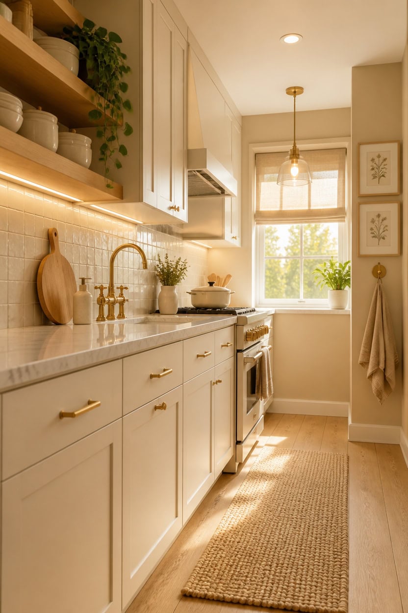
Light direction, time of day, and bulb type all determine whether warm beige reads as honey and golden or shifts toward a muddy tan — and soft white either glows cleanly or turns flat and dingy depending on the same factors. Natural north-facing light keeps both colors cooler and more consistent throughout the day, while south- and west-facing kitchens flood walls and cabinets with warm afternoon light that deepens beige and gives white a creamy amber cast. Pay attention to what happens in your kitchen between 7 a.m. and 8 p.m. before finalizing any wall or cabinet color.
North-facing kitchens: Expect beige to read slightly cooler and more gray — choose a warmer-toned beige to compensate for the lack of direct sun.
South and west exposure: Afternoon light intensifies warmth, so soft white cabinets can shift noticeably yellow — test swatches at 3 p.m. specifically.
Overhead bulb temperature: Bulbs below 3000K push warm beige toward orange and flatten soft white — aim for 2700K to 3000K for the most balanced read.
Under-cabinet lighting: Task lighting aimed directly at a backsplash brightens both tones and makes the palette feel more intentional and layered.
this warm beige shifts noticeably under different light conditions, so testing it through a full day of natural and artificial light reveals exactly how it performs in your kitchen.
this soft white holds its creamy tone reliably across changing light rather than swinging cold or yellow at the extremes.
 Madison Park Cordless Roman Shades, Linen Blend Blinds, 31x64 Natural
View Price
Madison Park Cordless Roman Shades, Linen Blend Blinds, 31x64 Natural
View Price
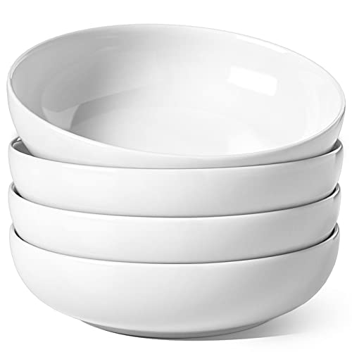 LE TAUCI Pasta Bowls 45 oz, Salad Bowls Set for Serving Soup, Pasta, Noodle, Dinner, Large Kitchen Bowl Plates, Microwave Safe - 8.5 Inch, Set of 4, White
View Price
LE TAUCI Pasta Bowls 45 oz, Salad Bowls Set for Serving Soup, Pasta, Noodle, Dinner, Large Kitchen Bowl Plates, Microwave Safe - 8.5 Inch, Set of 4, White
View Price
 Walnut Wood Cutting Board for Kitchen, End Grain Chopping Boards
View Price
Walnut Wood Cutting Board for Kitchen, End Grain Chopping Boards
View Price
 Homaxy 8 Pack 100% Cotton Kitchen Towels and Dishcloths Set, Beige
View Price
Homaxy 8 Pack 100% Cotton Kitchen Towels and Dishcloths Set, Beige
View Price
 Nonstick Enameled Cast Iron Cookware Set - 8 Piece Pots and Pans with Lid, Frying Pan, Skillet, Dutch Oven Set for All Stovetops, Ideal for Sourdough Bread Baking, Cream White
View Price
Nonstick Enameled Cast Iron Cookware Set - 8 Piece Pots and Pans with Lid, Frying Pan, Skillet, Dutch Oven Set for All Stovetops, Ideal for Sourdough Bread Baking, Cream White
View Price
Which Cabinet Finish Suits a Warm Beige and Soft White Kitchen?
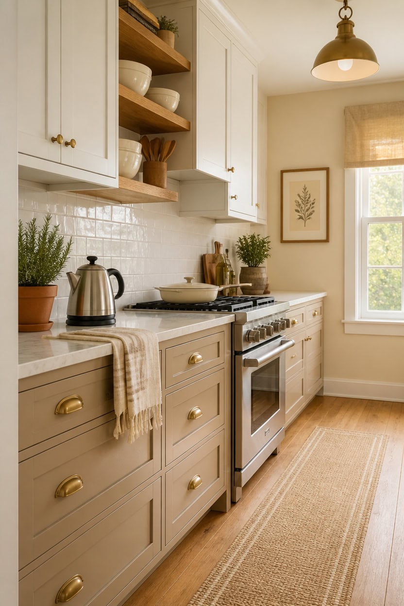
Matte and satin finishes outperform high-gloss in a warm beige and soft white kitchen because they absorb light rather than bounce it, which prevents color shifts from becoming exaggerated throughout the day. A flat or matte finish on walls reads more consistent across changing light conditions, while satin on cabinets adds just enough sheen to feel polished without creating hot spots. Choose eggshell for walls and satin for cabinets as your baseline finish pairing before considering anything shinier.
Matte walls: A flat or eggshell finish on warm beige walls keeps the tone even and prevents afternoon sun from making the color look washed out.
Satin cabinets: Satin holds up to cleaning and gives soft white cabinets a subtle glow without distorting the color under overhead lighting.
Avoid high-gloss: Glossy cabinet finishes amplify every light change, which causes soft white to swing between yellow and cold blue depending on the hour.
Trim finish: Semi-gloss on window trim and baseboards creates a clean boundary that makes the overall palette feel more intentional and complete.
using a satin finish — this warm beige reads grounded and rich on cabinet faces without competing with lighter upper tones.
using an eggshell finish — the soft white stays even and clean across the full wall surface without shifting dramatically under different light.
 Chyhomenyc Stone Beige Valance for Windows, Light Filtering Faux Linen Textured Small Window Kitchen Curtain, Rod Pocket Short Valance for Bathroom Laundry Basement, 60Wx14L inch, 1 Piece
View Price
Chyhomenyc Stone Beige Valance for Windows, Light Filtering Faux Linen Textured Small Window Kitchen Curtain, Rod Pocket Short Valance for Bathroom Laundry Basement, 60Wx14L inch, 1 Piece
View Price
 MIKIGEY Ceramic Mixing Bowls, Embossed Nesting Bowls Set of 4, Mixing Bowl Set for Serving, Baking, Cooking and Gift, Microwave and Dishwasher Safe, 20/47/99/148 oz, Off-White
View Price
MIKIGEY Ceramic Mixing Bowls, Embossed Nesting Bowls Set of 4, Mixing Bowl Set for Serving, Baking, Cooking and Gift, Microwave and Dishwasher Safe, 20/47/99/148 oz, Off-White
View Price
 RMCOKGX Utensil Holder for Kitchen Countertop - Extra Large 4 Compartment Wooden Organizer in Acacia Wood, Storage for Cooking Tools and Cutlery, Farmhouse Style for Home Cooking
View Price
RMCOKGX Utensil Holder for Kitchen Countertop - Extra Large 4 Compartment Wooden Organizer in Acacia Wood, Storage for Cooking Tools and Cutlery, Farmhouse Style for Home Cooking
View Price
 MosJos Kitchen Towels Set of 4, Cotton Waffle Weave Dish Towels, 2 Solid & 2 Striped Kitchen Hand Towels, Super Absorbent Taupe and White Tea Towels, 18 x 28 Inch
View Price
MosJos Kitchen Towels Set of 4, Cotton Waffle Weave Dish Towels, 2 Solid & 2 Striped Kitchen Hand Towels, Super Absorbent Taupe and White Tea Towels, 18 x 28 Inch
View Price
 INTASTING Gooseneck Electric Kettle with ±1℉ Temperature Control, 0.9L
View Price
INTASTING Gooseneck Electric Kettle with ±1℉ Temperature Control, 0.9L
View Price
 MueyHel Neutral Botanical Flower Wall Art Set of 3, Wood Framed 16x24 Inch
View Price
MueyHel Neutral Botanical Flower Wall Art Set of 3, Wood Framed 16x24 Inch
View Price
 Hisencn Enameled Cast Iron Skillet,Ceramic Cast Iron Frying Pan Sets,White
View Price
Hisencn Enameled Cast Iron Skillet,Ceramic Cast Iron Frying Pan Sets,White
View Price
Our Favorite Cabinet Hardware
- Free shipping over $35
- Picked at 4.8 stars or higher
 Amerock Bar Pulls Center-to-Center Cabinet Pull
View Price
Amerock Bar Pulls Center-to-Center Cabinet Pull
View Price
 GlideRite Roman Modern Bar Pull
View Price
GlideRite Roman Modern Bar Pull
View Price
 GlideRite Roman Bar Pull
View Price
GlideRite Roman Bar Pull
View Price
 Amerock Bar Pulls T-Shaped Cabinet Knob
View Price
Amerock Bar Pulls T-Shaped Cabinet Knob
View Price
 Amerock Edona 1-1/4" Mushroom Cabinet Knob
View Price
Amerock Edona 1-1/4" Mushroom Cabinet Knob
View Price
 GlideRite Mushroom Knob Multipack
View Price
GlideRite Mushroom Knob Multipack
View Price
 Amerock 3" Center-to-Center Cup Pull Multipack
View Price
Amerock 3" Center-to-Center Cup Pull Multipack
View Price
 GlideRite Classic 3" Cup/Bin Pull Multipack
View Price
GlideRite Classic 3" Cup/Bin Pull Multipack
View Price
 Top Knobs Channing Cup/Bin Pull
View Price
Top Knobs Channing Cup/Bin Pull
View Price
 Hickory Hardware Refined Rustic 12" Appliance Pull
View Price
Hickory Hardware Refined Rustic 12" Appliance Pull
View Price
 Franklin Brass Stratford 7-9/16" Bar Pull
View Price
Franklin Brass Stratford 7-9/16" Bar Pull
View Price
Countertops That Work in a Warm Beige and Soft White Kitchen
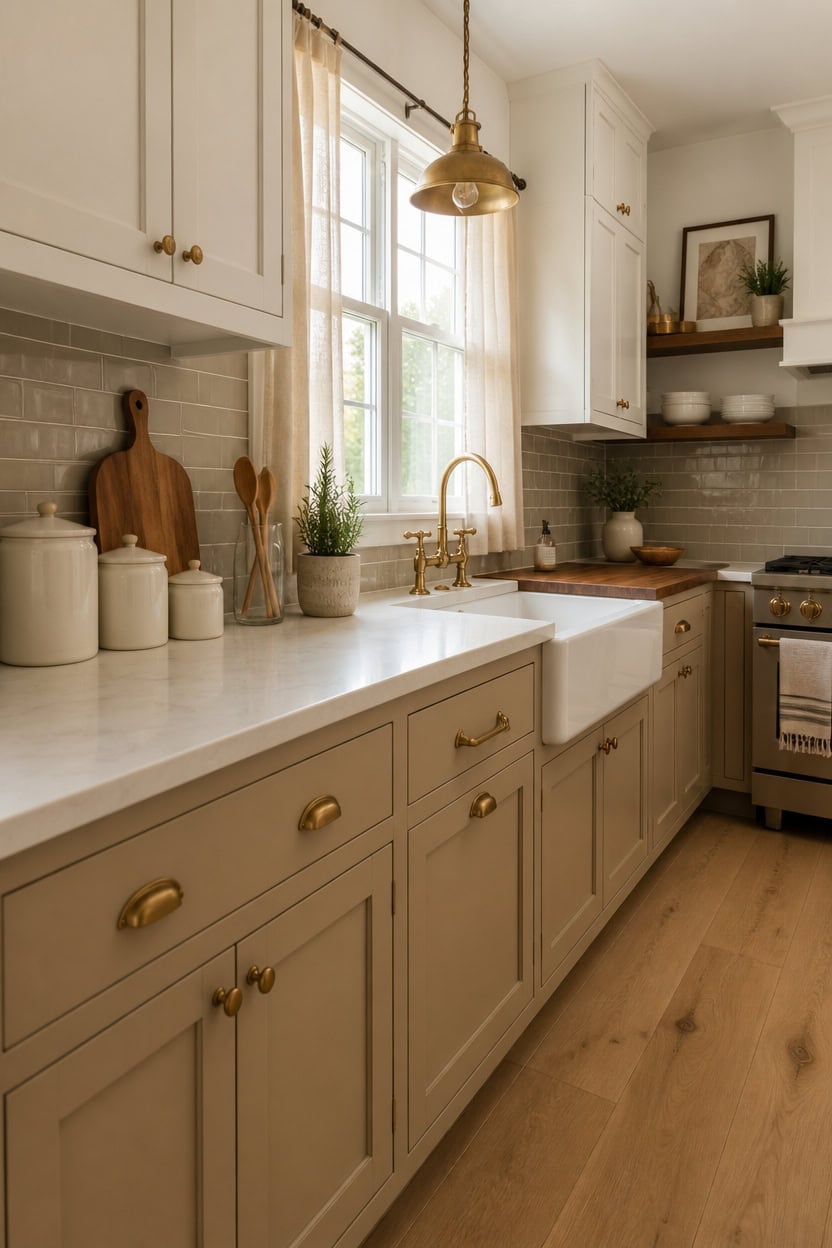
Quartz and butcher block make the strongest case for a warm beige and soft white kitchen because each material brings warmth without competing with the cabinet palette. Quartz with a cream or warm greige veining reads as intentional and cohesive alongside soft white uppers, while butcher block on a lower section or island adds organic texture that grounds the room. Avoid stark white or cool gray slabs, which pull the palette toward cold and undermine the warmth both colors are working to build.
Warm-veined quartz: Choose a quartz with subtle gold or taupe veining — it mirrors the warmth in your beige cabinets without mimicking stone too literally.
Butcher block contrast: A butcher block section next to quartz adds natural texture that prevents the countertop zone from feeling flat or overly uniform.
Edge profile matters: A simple eased or beveled edge keeps the countertop from drawing too much attention and lets the cabinet colors stay the focus.
Avoid cool undertones: Countertops with blue, gray, or stark white bases shift the whole kitchen toward cold, which fights the palette rather than supporting it.
using a satin finish — this warm beige anchors the countertop zone and makes natural stone veining read richer against it.
using an eggshell finish — the soft white keeps surrounding surfaces quiet so the countertop becomes the natural visual anchor.
 CRE8TIVE Large Size 36"x354" Matte Beige Cloudy Marble Contact Paper Counter Top Peel and Stick Waterproof Cream White Marble Wallpaper for Kitchen Bedroom Dressers Adhesive Renter Friendly Wallpaper
View Price
CRE8TIVE Large Size 36"x354" Matte Beige Cloudy Marble Contact Paper Counter Top Peel and Stick Waterproof Cream White Marble Wallpaper for Kitchen Bedroom Dressers Adhesive Renter Friendly Wallpaper
View Price
 Teakhaus Edge-Grain Teak Wood Cutting Board with Grip Handles, Extra Large
View Price
Teakhaus Edge-Grain Teak Wood Cutting Board with Grip Handles, Extra Large
View Price
 Lodge Essential Enamel Cast Iron Dutch Oven, 6 Quart, Oyster White
View Price
Lodge Essential Enamel Cast Iron Dutch Oven, 6 Quart, Oyster White
View Price
 3D Textured Large Framed Boho Neutral Abstract Wall Art Set of 3, 20x30 In
View Price
3D Textured Large Framed Boho Neutral Abstract Wall Art Set of 3, 20x30 In
View Price
 Ninja Flip Toaster Oven & Air Fryer, 8-in-1, Stainless Steel, SP151
View Price
Ninja Flip Toaster Oven & Air Fryer, 8-in-1, Stainless Steel, SP151
View Price
 Cotton Dish Towels For Kitchen Drying - Highly Absorbent Wide Beige Striped Plaid Tea Towels - 18"X28" Set Of 6 Farmhouse Linen Dishtowels In Bulk - Pano De Prato Para Cozinha - T Towles Towls
View Price
Cotton Dish Towels For Kitchen Drying - Highly Absorbent Wide Beige Striped Plaid Tea Towels - 18"X28" Set Of 6 Farmhouse Linen Dishtowels In Bulk - Pano De Prato Para Cozinha - T Towles Towls
View Price
Backsplash Ideas That Don’t Break the Quiet Mood
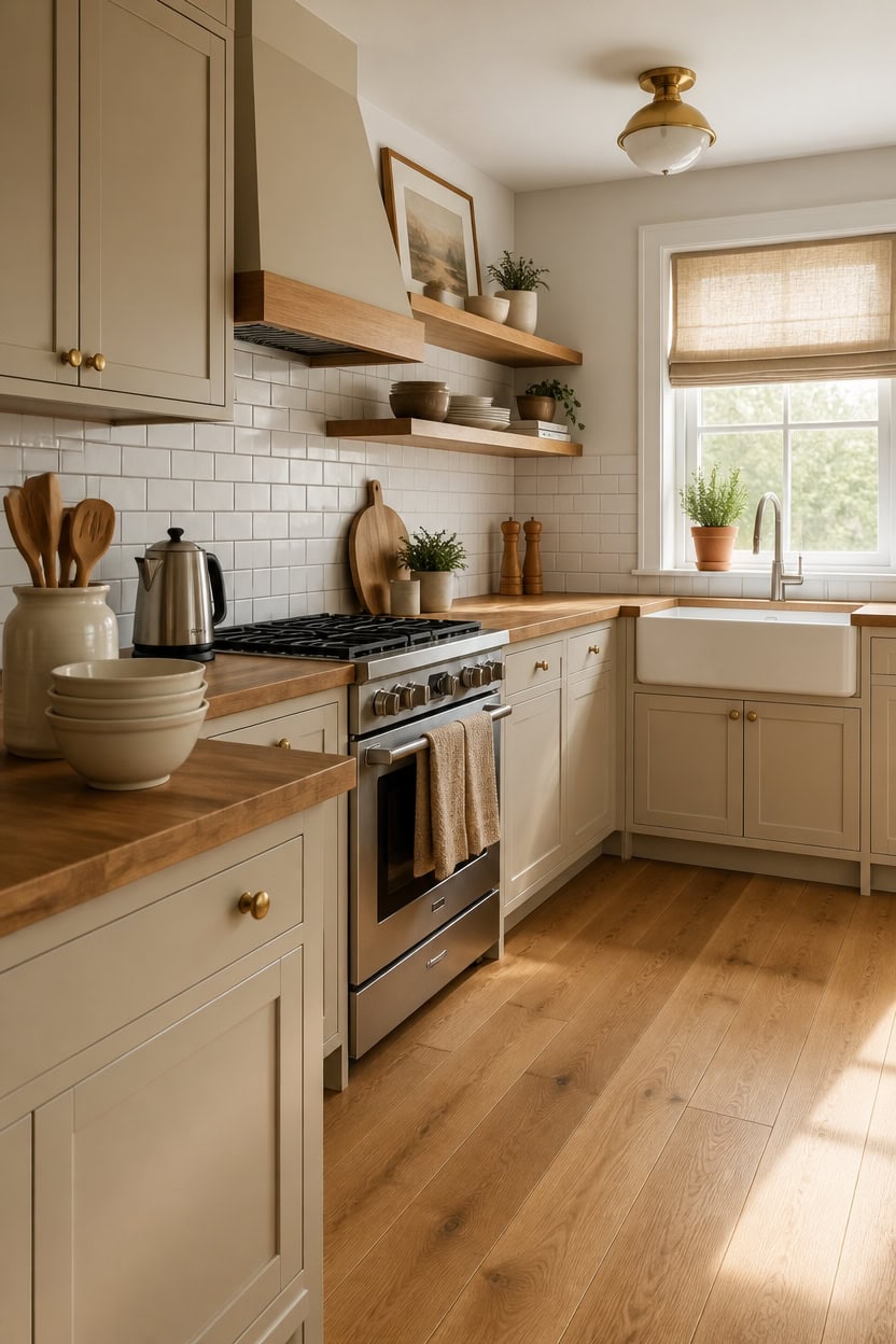
Subway tile in soft white with a warm grout tone holds this palette together without pulling focus away from the cabinetry. The grout color is doing more work than most people expect — a warm putty or linen tone ties the tile into the beige cabinet zone, while a bright white grout pushes the backsplash into stark contrast territory. Keep the tile format simple, like a classic stacked or offset brick pattern, so the texture reads as quiet background rather than a statement wall.
Grout color first: Choose a warm putty or sand grout instead of bright white — it blends the tile into the palette rather than cutting against it.
Offset brick pattern: A traditional brick offset layout gives enough texture to feel intentional without competing with the cabinet colors.
Avoid glossy finishes: High-gloss tiles bounce light harshly and make the backsplash feel colder than it actually is — matte or satin surfaces stay warmer.
Peel-and-stick option: A warm cream or beige peel-and-stick tile lets you test the look before committing to a permanent installation.
using an eggshell finish — this warm beige anchors the backsplash zone and makes the tile grout read richer and more cohesive.
using an eggshell finish — the soft white keeps the room bright without pulling the backsplash into cold contrast.
 Smart Tiles Peel and Stick backsplash, Subway Cream Beige, 11.55"x8.38"
View Price
Smart Tiles Peel and Stick backsplash, Subway Cream Beige, 11.55"x8.38"
View Price
 Tenedos White 3x6 Matte Ceramic Subway Wall Tile – Italian Design for Kitchen Backsplash, Shower, Bathroom & Accent Walls (Box of 80 Tiles, Covers 10 Sqft)
View Price
Tenedos White 3x6 Matte Ceramic Subway Wall Tile – Italian Design for Kitchen Backsplash, Shower, Bathroom & Accent Walls (Box of 80 Tiles, Covers 10 Sqft)
View Price
 Chicology Cordless Roman Window Shade, Belgian Flax, 34"W x 64"H
View Price
Chicology Cordless Roman Window Shade, Belgian Flax, 34"W x 64"H
View Price
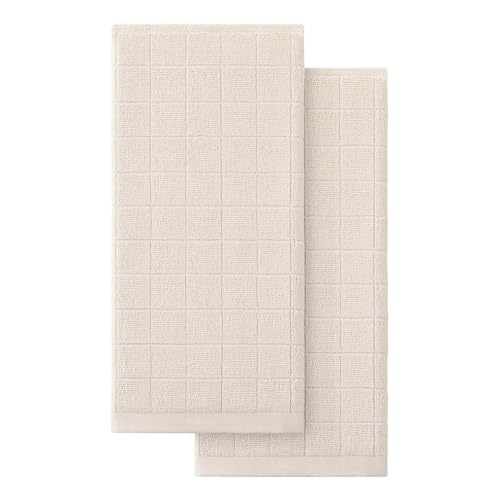 Homaxy 100% Cotton Terry Kitchen Towels, 2 Pack, Beige
View Price
Homaxy 100% Cotton Terry Kitchen Towels, 2 Pack, Beige
View Price
 LOVECASA Ceramic Utensil Holder Set of 2, 7.2'' & 5.4'' Kitchen Crocks
View Price
LOVECASA Ceramic Utensil Holder Set of 2, 7.2'' & 5.4'' Kitchen Crocks
View Price
 Cosori Gooseneck Electric Kettle with Temperature Control, 0.8L, Black
View Price
Cosori Gooseneck Electric Kettle with Temperature Control, 0.8L, Black
View Price
 SIGNFORD Framed Canvas Print Wall Art Set Light Marble Geometric Neutral Stone Tile Pattern Illustrations Modern Art Minimal Relax/Calm for Living Room, Bedroom, Office - 16"x16"x2 Natural
View Price
SIGNFORD Framed Canvas Print Wall Art Set Light Marble Geometric Neutral Stone Tile Pattern Illustrations Modern Art Minimal Relax/Calm for Living Room, Bedroom, Office - 16"x16"x2 Natural
View Price
Our Favorite Aprons, Potholders and Towels
- Free shipping over $35
- Picked at 4.3 stars or higher
 Damontray 3-Piece Cotton Blend Pot Holder Set
View Price
Damontray 3-Piece Cotton Blend Pot Holder Set
View Price
 KitchenAid Beacon 2-Piece Potholder Set
View Price
KitchenAid Beacon 2-Piece Potholder Set
View Price
 Lavish Home Silicone Pot Holder and Trivet Mat
View Price
Lavish Home Silicone Pot Holder and Trivet Mat
View Price
 Annistyn Cotton Waffle Dish Cloths
View Price
Annistyn Cotton Waffle Dish Cloths
View Price
 Assorted Cotton Waffle Dish Cloths
View Price
Assorted Cotton Waffle Dish Cloths
View Price
 Cerca Windowpane Waffle Dish Cloths
View Price
Cerca Windowpane Waffle Dish Cloths
View Price
 KitchenAid Albany Kitchen Towel 4-Pack
View Price
KitchenAid Albany Kitchen Towel 4-Pack
View Price
 KitchenAid Albany Dishcloth 8-Pack
View Price
KitchenAid Albany Dishcloth 8-Pack
View Price
 T-fal Flat Waffle Kitchen Dishcloth Set
View Price
T-fal Flat Waffle Kitchen Dishcloth Set
View Price
 KitchenAid Asteroid Textured Oven Mitt
View Price
KitchenAid Asteroid Textured Oven Mitt
View Price
 KitchenAid Ribbed Soft Silicone Oven Mitt
View Price
KitchenAid Ribbed Soft Silicone Oven Mitt
View Price
 Damontray 2-Piece Cotton Oven Mitt Set
View Price
Damontray 2-Piece Cotton Oven Mitt Set
View Price
 Solid Color Cotton Chef Apron
View Price
Solid Color Cotton Chef Apron
View Price
 Wolsingham Plaid Cotton Apron Set
View Price
Wolsingham Plaid Cotton Apron Set
View Price
 Zimmerman Striped Cotton Bib Apron
View Price
Zimmerman Striped Cotton Bib Apron
View Price
 Cotton Stripe Tea Towel
View Price
Cotton Stripe Tea Towel
View Price
 KAF Home Popcorn Terry Towels
View Price
KAF Home Popcorn Terry Towels
View Price
 Cotton Waffle Weave Tea Towel
View Price
Cotton Waffle Weave Tea Towel
View Price
Wood, Linen, and Stone: Textures That Belong in This Palette
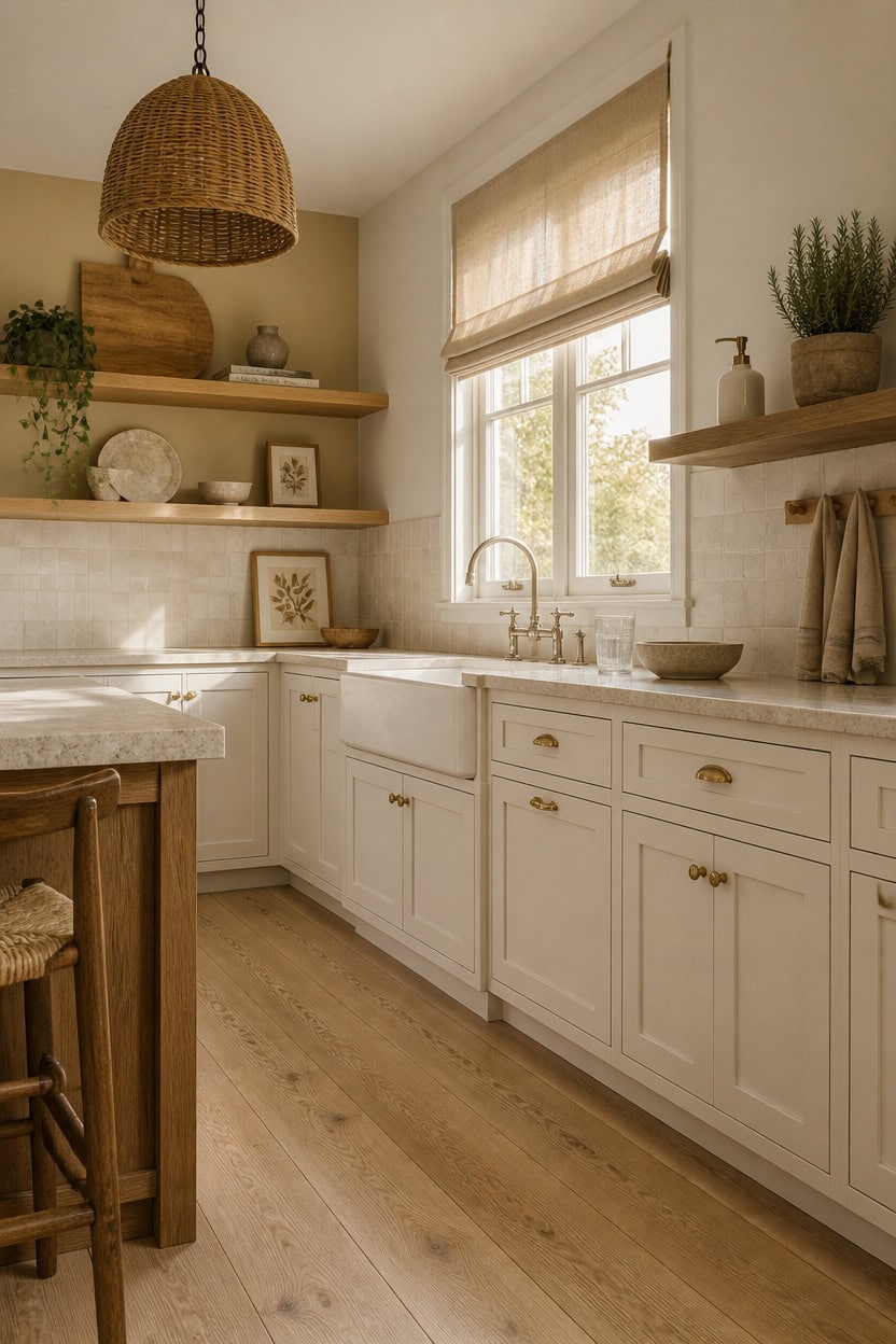
Wood grain, raw linen, and matte stone each bring a layer of warmth that paint and tile alone can’t replicate in a beige and white kitchen. These materials share a muted, low-contrast quality that fits naturally inside a soft neutral palette without pushing toward rustic or cold territory. Introduce them through cutting boards, window treatments, open shelving, and countertop accessories so the texture builds gradually rather than landing as a single heavy statement.
Layer grain tones: Light oak and warm walnut both read as warm, but mixing them adds depth without competing with the cabinetry color.
Linen over cotton for softness: Linen dish towels and window treatments absorb light instead of reflecting it, keeping the room feeling settled rather than bright and sharp.
Stone in small doses: A honed travertine trivet or matte stone soap dish brings the texture of natural stone without the visual weight of a full countertop slab.
Keep finishes matte: Matte and honed surfaces on wood, stone, and linen accessories keep the texture visible without adding glare that pulls the room cold.
using an eggshell finish — this warm beige makes the natural wood grain read richer and more intentional against the cabinetry.
using an eggshell finish — the soft white keeps the stone and linen textures from pulling the room toward a darker, heavier feel.
 Acacia Wood Chopping Cutting Boards for Kitchen Wooden Charcuterie Board
View Price
Madison Park Cordless Roman Shades, Linen Blend Blinds, 35x64 Natural
View Price
Acacia Wood Chopping Cutting Boards for Kitchen Wooden Charcuterie Board
View Price
Madison Park Cordless Roman Shades, Linen Blend Blinds, 35x64 Natural
View Price
 SPESHSTONES Travertine Trivets for Hot Dishes Set of 2
View Price
SPESHSTONES Travertine Trivets for Hot Dishes Set of 2
View Price
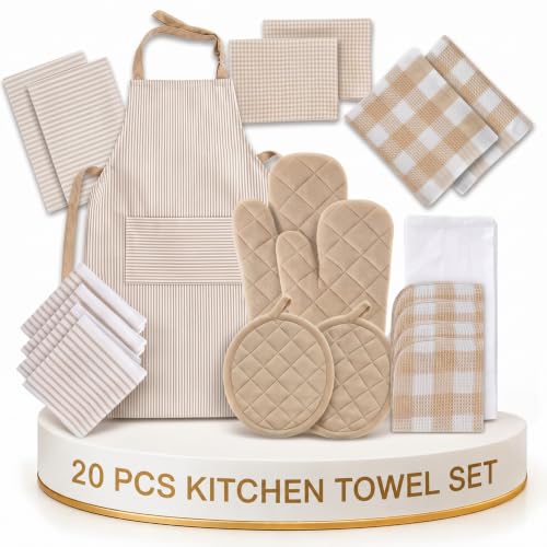 LANE LINEN 20 Piece Kitchen Linen Set - Soft Absorbent Cotton Dish Towels, Reusable Terry Dish Cloths, Flour Sack Towels for Baking, Quilted Oven Mitts & Pot Holders for Everyday Cooking - Beige
View Price
LANE LINEN 20 Piece Kitchen Linen Set - Soft Absorbent Cotton Dish Towels, Reusable Terry Dish Cloths, Flour Sack Towels for Baking, Quilted Oven Mitts & Pot Holders for Everyday Cooking - Beige
View Price
 GE 2 Slice Stainless Steel Toaster, Extra Wide Slots for Toasting Bagels, Breads, Waffles & More, 7 Adjustable Shade Settings, Removable Crumb Tray, Countertop Kitchen Essentials, 850 Watts
View Price
GE 2 Slice Stainless Steel Toaster, Extra Wide Slots for Toasting Bagels, Breads, Waffles & More, 7 Adjustable Shade Settings, Removable Crumb Tray, Countertop Kitchen Essentials, 850 Watts
View Price
 AyshwillDec 2 Pack Wicker Pendant Light Natural Woven Pendant Light Boho Chandelier Light Fixture Dome Rustic Farmhouse Pendant Lights Rattan Light Fixture for Kitchen Island Dining Room (Bulb Incl.)
View Price
AyshwillDec 2 Pack Wicker Pendant Light Natural Woven Pendant Light Boho Chandelier Light Fixture Dome Rustic Farmhouse Pendant Lights Rattan Light Fixture for Kitchen Island Dining Room (Bulb Incl.)
View Price
 Ceramic Soap Dispenser Set, Kitchen Soap Dispenser with Sponge Holder,White
View Price
Ceramic Soap Dispenser Set, Kitchen Soap Dispenser with Sponge Holder,White
View Price
 CHDITB 3D Colorful Wildflower Wall Art,Neutral Rustic Stone Botanical Decor
View Price
CHDITB 3D Colorful Wildflower Wall Art,Neutral Rustic Stone Botanical Decor
View Price
Accents and Hardware for a Warm Beige and Soft White Kitchen
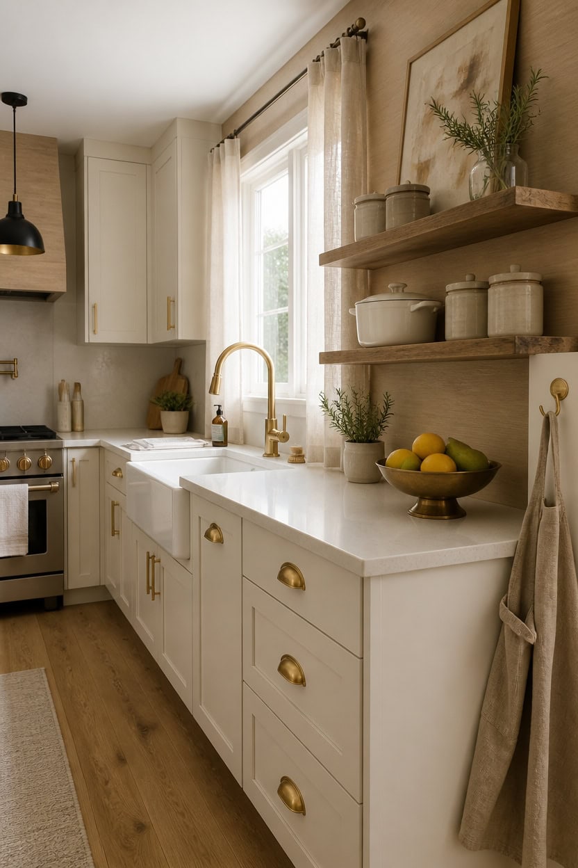
Brass, matte black, and unlacquered bronze all work in a warm beige and soft white kitchen, but the finish that holds the palette together best is one that leans warm rather than cool or highly polished. Chrome and brushed nickel pull the eye toward a cooler, more sterile register that fights against the softness beige and white are trying to create. Pick one metal finish and repeat it across faucets, light fixtures, and cabinet hardware so the kitchen reads as intentional rather than collected over time.
Go warm over cool: Brass, unlacquered bronze, and matte gold all read as warm finishes that reinforce the beige tones in your cabinetry.
One finish per room: Mixing too many metals in a small kitchen creates visual noise — pick one and let it anchor the space.
Matte over polished: A matte or satin finish reflects less light and stays consistent with the soft, settled quality of a warm neutral kitchen.
Scale hardware to cabinets: Slender bar pulls on upper cabinets and slightly heavier cup pulls on lower drawers creates a natural visual weight difference that feels refined.
the warm beige brings out the richness of brass and bronze hardware nearby.
the soft white keeps warm metal finishes from making the room feel heavy or overly dark.
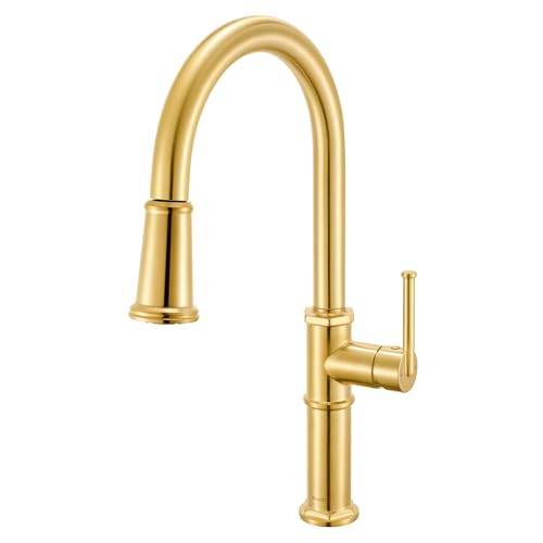 Ruvati Idris Brushed Gold Pull-Down Kitchen Faucet with Sprayer - RVF1239SG
View Price
Ruvati Idris Brushed Gold Pull-Down Kitchen Faucet with Sprayer - RVF1239SG
View Price
 Modern Pendant Lights Kitchen Island, Matte Black Pendant Light Fixtures with 10" Clear Hammered Glass Shade, Industrial Hanging Pendant Lights Fixture for Kitchen Island Dining Room Bedroom Entryway
View Price
Modern Pendant Lights Kitchen Island, Matte Black Pendant Light Fixtures with 10" Clear Hammered Glass Shade, Industrial Hanging Pendant Lights Fixture for Kitchen Island Dining Room Bedroom Entryway
View Price
 QOGRISUN 5-Pack Unlacquered Brass Cabinet Pulls,5-1/16" Hole Center
View Price
QOGRISUN 5-Pack Unlacquered Brass Cabinet Pulls,5-1/16" Hole Center
View Price
 RUSTIQUE LINENS Cotton Crossback Apron with Waterproof Lining, 2 Pockets, Adjustable Water-Resistant Chef Apron - Khaki
View Price
RUSTIQUE LINENS Cotton Crossback Apron with Waterproof Lining, 2 Pockets, Adjustable Water-Resistant Chef Apron - Khaki
View Price
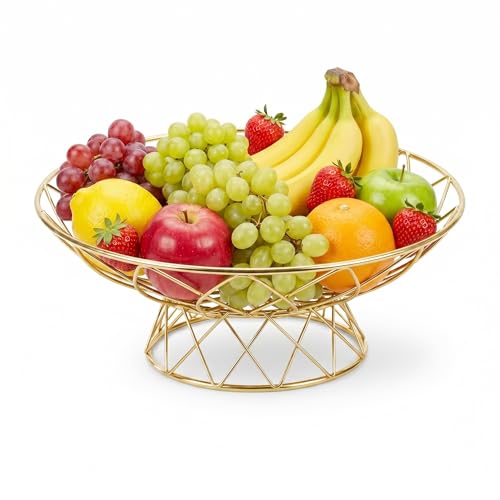 AIYICIII Modern Metal Fruit Basket, 12" Wire Footed Bowl for Kitchen(Gold)
View Price
AIYICIII Modern Metal Fruit Basket, 12" Wire Footed Bowl for Kitchen(Gold)
View Price
 HLNIUC Large Abstract 3 Piece Wall Art 24x36, Neutral Distant Mountain Wall Decor, Watercolor Beige Dusty Nature Landscape Painting, Modern Pastel Scenery Art Prints for Living Room, Bedroom, Office
View Price
HLNIUC Large Abstract 3 Piece Wall Art 24x36, Neutral Distant Mountain Wall Decor, Watercolor Beige Dusty Nature Landscape Painting, Modern Pastel Scenery Art Prints for Living Room, Bedroom, Office
View Price
Our Favorite Cooking Utensils
- Free shipping over $35
- Picked at 4.4 stars or higher
 Lux Decor 23-Piece Nylon and Stainless Steel Kitchen Utensil Set
View Price
Lux Decor 23-Piece Nylon and Stainless Steel Kitchen Utensil Set
View Price
 Caraway 5-Piece Wooden Utensil Set
View Price
Caraway 5-Piece Wooden Utensil Set
View Price
 BergHOFF Studio 23-Piece Tub of Cooking Utensils
View Price
BergHOFF Studio 23-Piece Tub of Cooking Utensils
View Price
 Rachael Ray Stainless Steel Bench Scraper
View Price
Rachael Ray Stainless Steel Bench Scraper
View Price
 Henckels Stainless Steel Silicone Tongs
View Price
Henckels Stainless Steel Silicone Tongs
View Price
 Cuisinox Disher Ice Cream Scoop
View Price
Cuisinox Disher Ice Cream Scoop
View Price
 Farberware Professional Ice Cream Scoop
View Price
Farberware Professional Ice Cream Scoop
View Price
 Henckels Stainless Steel Ladle
View Price
Henckels Stainless Steel Ladle
View Price
 Staub Silicone Spatula Spoon with Wood Handle
View Price
Staub Silicone Spatula Spoon with Wood Handle
View Price
 KitchenAid Gourmet Stainless Steel Flex Turner
View Price
KitchenAid Gourmet Stainless Steel Flex Turner
View Price
Mistakes That Make Beige Feel Boring Instead of Beautiful
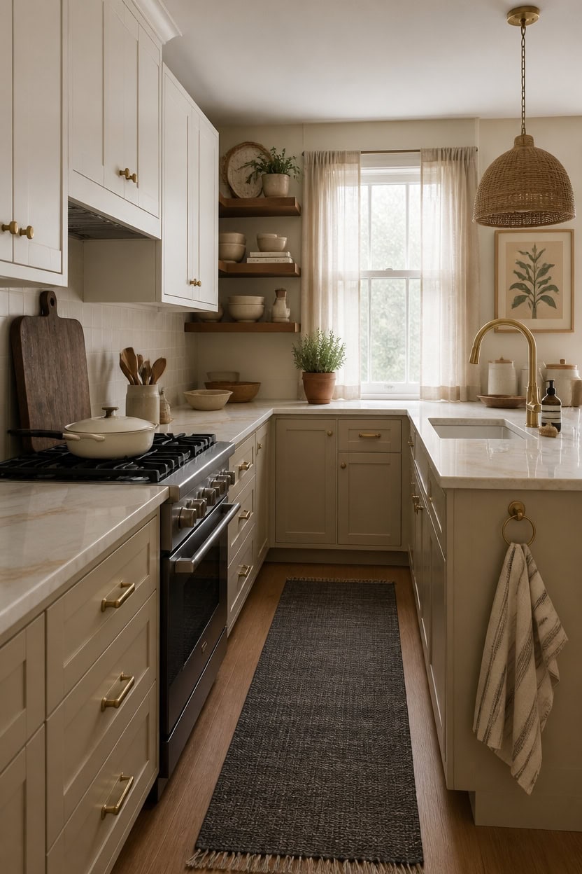
Beige turns flat and forgettable when everything in the room sits at the same visual weight. A kitchen needs contrast — between light and shadow, smooth and textured, warm and slightly cooler — to make a neutral palette feel alive. Introduce one darker element, like a deep wood cutting board or a charcoal-toned rug, to give the eye somewhere to land.
Avoid matching everything: When beige cabinetry, countertops, and walls share the same tone, the room loses definition and reads as one flat wash of color.
Break up texture: Smooth painted cabinets paired with only smooth surfaces create a dull, lifeless kitchen — add woven textiles, rough wood, or matte ceramics to create depth.
Add intentional contrast: A darker accent — charcoal, deep walnut, or warm black — gives a beige kitchen visual structure that keeps it from disappearing into itself.
Layer warm whites with warm beiges: Pairing a stark cool white with warm beige creates a clash that reads as unfinished rather than curated.
the warm soft white lifts the eye upward without fighting the beige tones below.
the warm beige depth adds layered richness that makes the whole kitchen feel intentional.
 Umite Chef Dinnerware Set for 4, 12 Pieces Plates and Bowls Set
View Price
Umite Chef Dinnerware Set for 4, 12 Pieces Plates and Bowls Set
View Price
 CONSDAN Butcher Block Counter Top, Walnut Solid Hardwood Countertop, Wood Slabs for Kitchen, Reversible, Both Side Polished, Prefinished with Food-safe Oil, 1.5" Thickness, 60"x25"
View Price
CONSDAN Butcher Block Counter Top, Walnut Solid Hardwood Countertop, Wood Slabs for Kitchen, Reversible, Both Side Polished, Prefinished with Food-safe Oil, 1.5" Thickness, 60"x25"
View Price
 KOZYFLY Runners for Hallways 2x6 ft Washable Kitchen Runner Non Slip Rubber Backed Hall Runners Cotton Entryway Runner Rugs Floor Carpet for Indoor Backdoor Bedroom Kitchen, Grey/Dark Grey
View Price
KOZYFLY Runners for Hallways 2x6 ft Washable Kitchen Runner Non Slip Rubber Backed Hall Runners Cotton Entryway Runner Rugs Floor Carpet for Indoor Backdoor Bedroom Kitchen, Grey/Dark Grey
View Price
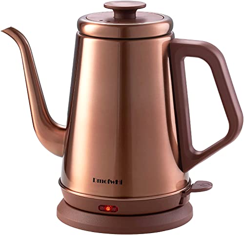 DmofwHi 1000W Gooseneck Electric Kettle (1.0L),100% Stainless Steel BPA Free Tea Kettle with Auto Shut - Off Protection, Pour Over Coffee Kettle -Copper
View Price
DmofwHi 1000W Gooseneck Electric Kettle (1.0L),100% Stainless Steel BPA Free Tea Kettle with Auto Shut - Off Protection, Pour Over Coffee Kettle -Copper
View Price
 LANE LINEN 100% Cotton Dish Towels for Kitchen Absorbent Lint-Free 12 Pack
View Price
LANE LINEN 100% Cotton Dish Towels for Kitchen Absorbent Lint-Free 12 Pack
View Price
 CAROTE 3.4QT Enamel Cast Iron Cookware, Skillet with Lid, White Dutch Oven
View Price
CAROTE 3.4QT Enamel Cast Iron Cookware, Skillet with Lid, White Dutch Oven
View Price
 Hand-Woven Rattan Pendant Lights Kitchen Island wiht 12 Inch Wickel Shade
View Price
MueyHel Neutral Botanical Flower Wall Art Set of 3, Wood Framed 12x16 Inch
View Price
Hand-Woven Rattan Pendant Lights Kitchen Island wiht 12 Inch Wickel Shade
View Price
MueyHel Neutral Botanical Flower Wall Art Set of 3, Wood Framed 12x16 Inch
View Price
Budget-Friendly Ways to Start This Kitchen Palette Now
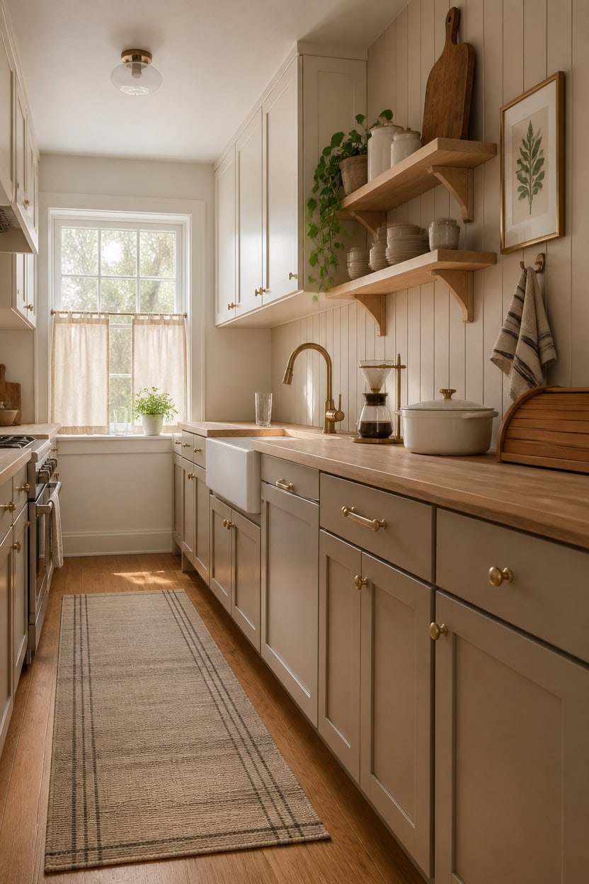
Starting small with one or two swappable pieces is the fastest and most affordable way to shift a kitchen toward warm beige and soft white without committing to a full renovation. Textiles, lighting, and open-shelf decor carry enormous visual weight at a fraction of the cost of cabinets or countertops. Focus your first purchases on pieces that touch multiple senses — texture, warmth, and material — so each item does more than one job.
Start with textiles: A warm beige linen dish towel or neutral cotton runner rug instantly grounds the palette without any installation.
Swap small appliances: A soft white or warm brass kettle or toaster on the counter reads as a deliberate design choice and costs far less than new cabinetry.
Layer open shelving decor: Warm white ceramics and a wood cutting board displayed on existing shelves create a styled, intentional look with zero construction.
Use affordable wall art: A framed warm neutral botanical print adds color story and vertical interest for under thirty dollars.
the creamy soft white adds warmth and lift without requiring new hardware or cabinet replacements.
this warm beige depth makes inexpensive open shelving look intentional and richly layered.
 LE TAUCI Plates and Bowls Sets for 4, 12 Piece Ceramic Dinnerware Sets for Kitchen, Reactive Glaze Dishes Set, Oven & Microwave & Dishwasher Safe, Birch Wheat Relief (8" & 10" Plate, 27oz Bowl)
View Price
LE TAUCI Plates and Bowls Sets for 4, 12 Piece Ceramic Dinnerware Sets for Kitchen, Reactive Glaze Dishes Set, Oven & Microwave & Dishwasher Safe, Birch Wheat Relief (8" & 10" Plate, 27oz Bowl)
View Price
 HONEST WEAVE Organic Cotton Kitchen Towels, Warm Grey, 6-Pack, 20x30 in
View Price
HONEST WEAVE Organic Cotton Kitchen Towels, Warm Grey, 6-Pack, 20x30 in
View Price
 Sunhoo Bread Box for Kitchen Countertop Wooden Bread Storage Container Bin 2 Layer Breadbox Holder Large Capacity Keeper Vintage Farmhouse Food Organizer Pantry Shelf Acrylic Window (Brown)
View Price
Sunhoo Bread Box for Kitchen Countertop Wooden Bread Storage Container Bin 2 Layer Breadbox Holder Large Capacity Keeper Vintage Farmhouse Food Organizer Pantry Shelf Acrylic Window (Brown)
View Price
 TYGHF Pour Over Coffee Maker Stand,Foldable Portable Electric Espresso Machine Stand,Holder for Coffee Grinder,Universal Dripper,V60 Dripper,Travel Coffee Maker, Press Round&Golden
View Price
TYGHF Pour Over Coffee Maker Stand,Foldable Portable Electric Espresso Machine Stand,Holder for Coffee Grinder,Universal Dripper,V60 Dripper,Travel Coffee Maker, Press Round&Golden
View Price
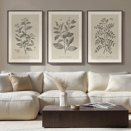 Large Framed 3 Piece Vintage Botanical Wall Art for Living Room, 20x30 In
View Price
Large Framed 3 Piece Vintage Botanical Wall Art for Living Room, 20x30 In
View Price
 10 Strawberry Street Embossed Ceramic Kitchen Canister Set, Set of 3, Hampton White
View Price
10 Strawberry Street Embossed Ceramic Kitchen Canister Set, Set of 3, Hampton White
View Price
The Warm Beige and Soft White Kitchen Shopping Checklist
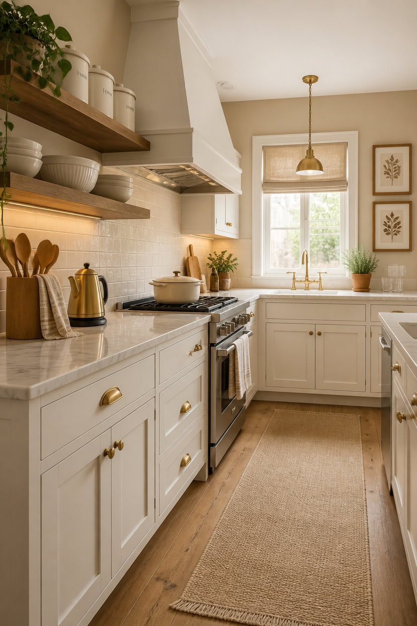
A complete shopping checklist pulls together every category — textiles, cookware, storage, lighting, and decor — so nothing gets left out when you’re building toward a warm beige and soft white kitchen. Having a clear list prevents the common mistake of buying pieces that clash with the palette because you shopped by feel instead of by plan. Print this list, check off categories as you shop, and prioritize the items that will show up most in your daily cooking space.
Lead with textiles: Dish towels, runner rugs, and linen window shades are the fastest way to unify the palette across the whole kitchen.
Anchor with cookware: A soft white or warm neutral Dutch oven or cast iron piece on the stovetop does double duty as decor and daily function.
Fill storage with purpose: Matching canister sets and utensil holders in warm white or natural wood keep the counters looking calm and intentional.
Close the loop with lighting: A warm-toned pendant or under-cabinet light ties all the beige and white pieces together with a consistent glow.
this creamy soft white brightens the space while keeping the warmth the palette needs.
this warm beige makes the entire checklist come to life as a layered, cohesive design.
 2-in-1 Enameled Cast Iron Braiser Pan with Grill Lid - 3.3-Quart Small Dutch Oven, Serves as Both Casserole & Stovetop Grill Pan, Cast Iron Cookware
View Price
2-in-1 Enameled Cast Iron Braiser Pan with Grill Lid - 3.3-Quart Small Dutch Oven, Serves as Both Casserole & Stovetop Grill Pan, Cast Iron Cookware
View Price
 Segtenant Utensil Holder, Acacia Wood Kitchen Utensil Holder for Countertop, 360°Rotating Cooking Utensil Crock for Kitchen Counter, 7.2" Large Utensil Organizer for Spatula
View Price
Segtenant Utensil Holder, Acacia Wood Kitchen Utensil Holder for Countertop, 360°Rotating Cooking Utensil Crock for Kitchen Counter, 7.2" Large Utensil Organizer for Spatula
View Price
 Nueve&Five Electric Gooseneck Kettle with Thermometer, 1.0L Pour Over Hot Water Kettle for Coffee and Tea, 1000W, Auto Shutoff, Boil-Dry Protection,Copper
View Price
Nueve&Five Electric Gooseneck Kettle with Thermometer, 1.0L Pour Over Hot Water Kettle for Coffee and Tea, 1000W, Auto Shutoff, Boil-Dry Protection,Copper
View Price